Embed Size (px)
Citation preview
Text – background polarity affects performanceirrespective of ambient illumination
and colour contrast
A. BUCHNER* and N. BAUMGARTNER
Institut fur Experimentelle Psychologie, Heinrich-Heine-Universitat,
D-40225 Dusseldorf, Germany
In a series of experiments, proofreading performance was consistently better
with positive polarity (dark text on light background) than with negative
polarity displays (light text on dark background). This positive polarity
advantage was independent of ambient lighting (darkness vs. typical office
illumination) and of chromaticity (black and white vs. blue and yellow).
A final experiment showed that colour contrast (red text on green back-
ground) could not compensate for a lack of luminance contrast. Physiological
measures of effort and strain (breathing rate, heart rate, heart rate variability
and skin conductance level) and self-reported mood, fatigue, arousal,
eyestrain, headache, muscle strain and back pain did not vary as a function
of any of the independent variables, suggesting that participants worked
equally hard in all experimental conditions, so that the interpretation of the
primary performance measure was unlikely to be contaminated by a
performance–effort trade-off.
Keywords: Display polarity; Ambient illumination; Luminance contrast;
Colour contrast; Visual displays; Reading
1. Introduction
Early research indicated that reading text from television sets or computer monitors may be
much slower (Muter et al. 1982, Gould and Grischkowsky 1984, Kruk and Muter 1984)
and more error-prone (Wright and Lickorish 1983, Creed et al. 1987, Wilkinson and
Robinshaw 1987) than reading text from ordinary paper. However, it has also been shown
that reading from a monitor could be as fast as reading from paper when the monitor
display parameters were explicitly optimized such that, among other things, character fonts
resembled those on paper, font size was large, line spacing was large and dark characters
were presented on light background (Gould et al. 1987b, Muter and Maurutto 1991).
The latter variable – the presenting of dark letters on light background – is usually
referred to as negative contrast (because contrast c¼ (Lo7Lb)/Lb turns negative if object
*Corresponding author. Email: [email protected]
Ergonomics
Vol. 50, No. 7, July 2007, 1036–1063
ErgonomicsISSN 0014-0139 print/ISSN 1366-5847 online ª 2007 Taylor & Francis
http://www.tandf.co.uk/journalsDOI: 10.1080/00140130701306413
luminance, Lo, is lower than background luminance, Lb) or positive polarity. Early
research has already indicated that presenting text on a monitor in positive polarity
results in better performance than presenting text in negative polarity. For instance, letter
string identification (Bauer and Cavonius 1980) or the transcribing of letters onto paper
(Radl 1980) were better under conditions of positive polarity. In both of these studies, the
vast majority of the participants also preferred the positive to the negative display
polarity.
However, the currently available evidence on the effects of display polarity is
surprisingly mixed. On the one hand, a number of studies were able to replicate those
earlier findings, showing that positive polarity resulted in smaller reductions in contrast
sensitivity for low, albeit not for medium, spatial frequency components of text
(Magnussen et al. 1992), better comprehension of text displayed in a leading display
(Wang et al. 2003) and faster reading performance (Chan and Lee 2005).
On the other hand, quite a few studies did not find significant benefits of positive over
negative display polarity. For instance, Cushman (1984, 1986) reported no significant
polarity-related difference in reading times and text comprehension, but visual fatigue
was more pronounced with positive than with negative polarity of text. Similar results
were reported by Gould et al. (1987a). Legge et al. (1985, 1987) also concluded that
polarity had little, if any, effect on reading rate. Creed et al. (1988) reported no difference
between positive and negative polarity in a proofreading task. Pastoor (1990) found that
polarity did not affect reading times or the time needed to search for a word among
distractors. Along the same lines, Ling and van Schaik (2002) found no benefit in search
performance for words in blue-on-yellow as opposed to yellow-on-blue text displays.
Shieh (2000) suggested that viewing distance could be used as an indicator of fatigue in
that near-distance eye fixations would necessitate greater forces exerted by the ciliary
muscles. He reported that display polarity did not significantly affect viewing distance
with screen reflections created by fluorescent lamps, but viewing distance was reduced for
a positive relative to a negative polarity display without such reflections. Subjective
fatigue, however, was not affected by display polarity. Wang and Chen (2000) found that
visual acuity and subjective preference were not affected by polarity. Hall and Hanna
(2004) reported that readability-rating differences between positive and negative polarity
were not statistically significant, although, at a descriptive level, positive polarity resulted
in higher readability ratings than negative polarity.
There are several variables that may help to explain this apparent inconsistency in the
findings. An important point is that a performance–effort trade-off may exist, in that
participants may increase their effort in the ‘difficult’ conditions in which the legibility of
text is particularly poor (see Pastoor 1990). If readability differed between text displayed
in positive and negative polarity, this difference could thus be masked by additional effort
invested in the more difficult condition. Such differential effort allocations are quite
plausible, particularly for the popular within-subject designs in which participants
perform the same task in several conditions. Participants’ goal may well be to maintain a
certain performance level across conditions, in which case they would obviously need to
increase or decrease their effort as a reaction to an increase or decrease of the task
difficulty, respectively. Between-subjects designs may be less prone to this problem, which
is why display polarity was manipulated between-subjects in the present series of
experiments. However, even with between-subjects designs the problem cannot be
ignored on a priori grounds. For instance, it seems possible that participants perform at
‘normal’ levels with the familiar and ‘normal’ positive display polarity, whereas
participants may increase their effort beyond the normal level with the ‘difficult’ negative
Contrast polarity, ambient illumination and colour contrast 1037
display polarity. In order to assess whether or not this occurs in a particular condition,
independent measures of effort are needed. It was decided to use physiological measures
(breathing rate, heart rate, heart rate variability and skin conductance level) as on-line
indicators of effort, and self-reported mood, fatigue, arousal, eyestrain, headache, muscle
strain and back pain were used as additional indicators of the effects of effort invested in
the task in the present experiments. If indeed participants tended to ‘try harder’ in the
more difficult condition, then performance measures would not necessarily reflect effects
of the experimental manipulations. In this case, physiological or subjective or both types
of measures of effort should reflect these manipulations. The present authors are not
aware of any studies investigating polarity effects that have used physiological measures
to assess how participants react to the difficulty of the task at hand. This is surprising,
given the obvious possibility of a performance–effort trade-off.
However, it should be noted that such a trade-off is only one possible outcome. In
principle, effort and performance measures may also point in the same direction. For
instance, both types of measures may indicate that one type of polarity is superior, or that
there really is no difference between positive and negative polarity. Alternatively, if the
assumption is correct that between-subjects manipulations of polarity make perfor-
mance–effort trade-offs unlikely, because participants experience only one condition and
thus cannot have much of a basis for condition-specific resource allocations, then only the
primary performance measure, but not physiological or subjective measures of effort,
should reflect the manipulations of display polarity. In any case, the important point is
that without any information about participants’ effort allocation, performance measures
are difficult to interpret.
An obvious reason for the relatively frequent lack of statistically significant polarity
effects on performance in the literature seems to be that many of the studies mentioned
earlier used very small sample sizes. As a consequence, the statistical power, that is, the
probability of observing an effect in a sample if the effect exists in the population, has
often been low. For instance, the number of participants in some of the reading studies
investigating polarity effects was as small as 15 (Gould et al. 1987b), ten (Gould et al.
1987a), six (Legge et al. 1985) or even two (Legge et al. 1987). Even ‘large’ effects (Cohen
1977) cannot be detected with an acceptable probability using such small samples. To
illustrate, the size of the statistically non-significant advantage of positive over negative
polarity reported by Gould et al. (1987b) was actually as large as Z2¼ 0.154, but with only
15 participants, the probability of detecting an effect of this size in the sample data given
a¼ 0.05 was merely 1 – b¼ 0.34. The present experiments differ from most of the earlier
studies in that a priori power analyses were performed with the goal to determine
adequate sample sizes.
Relatively little has been done to systematically investigate potential moderator
variables of a possible polarity effect. Two such variables were manipulated in the present
series of experiments. The first of these variables was ambient illumination. Very little
seems to be known about the size and direction of polarity effects depending on
variations in ambient illumination. Taptagaporn and Saito (1990) investigated changes in
pupil diameter as a function of display polarity and ambient illumination. Pupil diameter
was smaller with positive than with negative polarity displays. This finding implies that
there should be a greater depth of field and less spherical aberration and thus a higher
quality of the retinal image with positive than with negative polarity displays. This, in
turn, should be an advantage when reading text from positive polarity displays, as was
noted by Taptagaporn and Saito, although in their study participants did not read but
simply looked at a monitor. Interestingly, the difference in pupil diameter between
1038 A. Buchner and N. Baumgartner
positive and negative polarity displays was much larger with dark (20 lx) than with
medium (500 lx) or bright (1200 lx) ambient illumination, suggesting that the advantage
of positive over negative polarity displays should be even larger with dark than with
brighter ambient illumination. This is so, because the larger difference in pupil diameter
implies a larger difference in the quality of the retinal image (larger depth of field, less
spherical aberration) between positive and negative polarity. Hence, a larger advantage of
positive over negative polarity was expected when reading in darkness compared to
reading in a well-illuminated room. In contrast to what might be expected given this
finding, Taptagaporn and Saito recommended negative polarity displays for dark
environments. The reason for this surprising recommendation was their focusing on
changes in pupil diameter as an indicator of possible eye fatigue. In dark environments,
the changes in pupil diameter during the task were smaller with negative than with
positive polarity displays when objects, such as the keyboard, were fixated in addition to
the computer monitor. In brighter environments, in contrast, changes in pupil size during
the task were smaller with positive than with negative polarity.
One obvious issue is that pupil diameter measurements deliver only indirect indicators
that may not indicate much about performance when reading from positive or negative
polarity displays in dark or bright environments. It was therefore thought important to
assess performance under these conditions in experiment 1, using black text on white
background and white text on black background for positive and negative polarity
displays, respectively. In subsequent experiments, colour was added to explore the
interaction between polarity, ambient illumination and chromatic contrast.
In all experiments reported here, thin film transistor (TFT) monitors were used to
present text for the proofreading task. The use of TFT monitors seemed important in that
some of the arguments that were used in favour of negative over positive polarity displays
in the past were connected to the physical properties of cathode-ray tube (CRT)
monitors. For instance, with negative polarity, the display is predominantly dark so that
the flicker problem of earlier types of CRT monitors with slow refresh rates would be less
of an issue (Krueger 1984, Pawlak 1986). In fact, Cushman (1984, 1986) interpreted his
finding of greater visual fatigue with positive than with negative polarity of text as being
due to the 60 Hz flicker of the monitor he used. With TFT monitors, flicker is no longer a
concern and neither is the property of CRT monitors that, with positive polarity, the
horizontal lines of symbols are typically lighter than the vertical lines. These and other
improvements seem to translate into generally better performance with TFT than with
CRT monitors (Menozzi et al. 2001, Nasanen et al. 2001) and it seems possible that
polarity effects are more pronounced when using TFT rather than CRT monitors. An
additional consideration concerns the reading of text from TFT monitors that can be
considered ubiquitous given that these monitors are widely used with home or office
computers, ticket vending machines, automatic teller machines, public information
displays, driver assistance systems in cars and many other devices with which individuals
frequently interact.
2. Experiment 1
Experiment 1 was designed to assess the effects of positive and negative display polarity in
a proofreading task under two different conditions of ambient illumination, these being
typical office illumination (550 lx) and almost complete darkness (5 lx). Both variables
were manipulated between subjects so as to minimize possible performance–effort trade-
offs. The number of errors detected served as the primary performance measure. In order
Contrast polarity, ambient illumination and colour contrast 1039
to assess possible performance–effort trade-offs, physiological measures of effort and
strain, as well as self-reported mood, fatigue, arousal, eyestrain, headache, muscle strain
and back pain were used as indicators of the effort invested in the task.
2.1. Method
2.1.1. Participants. Participants were 80 volunteers (48 women) who were paid for their
participation. Their age ranged from 19 to 55 (mean 28) years. All participants were
tested individually. Participants were randomly assigned to the experimental groups with
the restrictions that, at the end of the experiment, an equal number of male and female
participants with an approximately equal age distribution had to be in each of the four
groups defined by the present 262 design; in addition, across-group quadruples of
participants who were matched by age and gender were tested at a similar time of day. All
participants had German as their native language and none reported any cardiovascular
problems. All participants had normal or corrected-to-normal vision. They were
instructed not to consume beverages containing caffeine and to avoid physical work
within a period of 6 h prior to the experiment.
2.1.2. Apparatus and materials. The text materials were presented using an Apple 17-
inch TFT ‘Studio Display’, which was controlled by a PowerMacintosh computer.
Chromaticity coordinates and luminance values (see table 1) were determined using a
Minolta Colormeter CS-100 (Konica Minolta Co. Ltd, Tokyo, Japan). A chin rest
assured a constant viewing distance of 56 cm.
Physiological measurements were recorded using a AD Instruments PowerLab/8SP 16
Bit analogue-digital converter. Breathing rate was assessed by recording dynamically the
chest measurement using an elastic chest belt (AD Instruments MLT 1132) equipped with
an expansion sensor. The sensor translated expansion linearly into voltage, which was
recorded using a 40 Hz sampling rate. For each of the 1763-min measurement intervals
(pre-baseline, 15 spell-checking intervals, post-baseline; see below) the number of breaths
was counted and transformed into the mean breathing rate (reported in Hz).
Table 1. Chromaticity coordinates and luminance values of the colours used to display text in
the present experiments*.
Chromaticity coordinates
Colour x y Luminance (cd/m2)
Experiment 1
Black 0.294 0.296 0.53{White 0.316 0.335 192{
Experiment 2
Blue 0.143 0.098 22.3{Yellow 0.420 0.485 188{
Experiment 4
Red 0.297 0.548 31.5xGreen 0.627 0.353 31.5x
*The data for black and white in experiments 3 and 4 were identical to those of experiment 1.
{Luminance contrast (Lmax – Lmin)/(LmaxþLmin)¼ 0.98.
{Luminance contrast (Lmax – Lmin)/(LmaxþLmin)¼ 0.79.
xLuminance contrast (Lmax – Lmin)/(LmaxþLmin)¼ 0.0.
1040 A. Buchner and N. Baumgartner
Cardiovascular parameters were measured using an infrared pulse plethysmograph
(AD Instruments 1020 EC) attached to the tip of the ear, using a sampling rate of
1000 Hz and a 200 Hz low-pass filter. Movement artefacts were removed manually and
the missing heartbeats were reconstructed by interpolation before the number of
heartbeats was determined and transformed into the mean heart rate (reported in beats
per min; bpm). Finally, heart rate variability was calculated as the percentage of intervals
between two heartbeats that differed by more than 50 ms. (Alternative measures, such as
the square root of the mean square of successive differences and the standard deviation of
all normal-to-normal intervals NN intervals yielded essentially the same results.)
Skin conductance level was measured using bipolar electrodes attached to the middle
segments of the index and middle fingers of a participant’s left hand, which rested
comfortably in its natural rest position on a soft pad on the table. All left-handed
participants stated that they were sufficiently capable of using the computer mouse with
their right hand. The electrodes were connected to an electrically isolated preamplifier
(AD Instruments ML 116), which provided a constant voltage (22 mV, 75 Hz) to one of
the electrodes. High-frequency fluctuations were eliminated using a second-order 1 Hz
low-pass filter. Sampling rate was 10 Hz. The main interest was in measuring tonic skin
response level as an index of effort and strain. The phasic component was ignored
because it was sensitive to events, such as the sighing at the beginning of the presentation
of a fresh short story and, most obviously, to error detection. Thus, a simple mean across
a 3-min spell-checking interval would have largely reflected the error detection
performance. The recoding of participants’ error detection performance across time
allowed the identification of the points in time when error detection occurred. It was
possible to identify a period of 20–40 s at the end of every 3-min interval (see below),
which was free of phasic influences for virtually all of the participants. Therefore, this
period was used for assessing the tonic skin conductance level.
Eyestrain, headache, muscle strain and back pain were assessed using a questionnaire
designed by Heuer et al. (1989). Each of these categories is represented by a number of
items describing physical complaints (e.g. ‘My eyes are aching’). Participants rated the
degree to which these complaints described their own state on a 7-point scale from ‘not at
all’ (1) to ‘very much’ (7). Additionally, two parallel versions (henceforth A and B) of the
short form of the multi-dimensional mood questionnaire (Steyer et al. 1994, 1997) were
used to measure subjective well-being along three bipolar scales: pleasant vs. unpleasant
mood; alertness vs. fatigue; calmness vs. agitation. Each dimension is represented by a
series of adjectives (e.g. alert, relaxed), which participants rate, on a 5-point scale, as ‘not
at all’ (1) up to ‘very much’ (5) describing their current state of mind.
Participants performed the spell-checking task in a room with shutters completely
closed (effectively excluding any exterior light source) either under constant ambient
illumination as is typical for office environments (550 lx, artificial lighting) or in a dark
room (5 lx). Room temperature was 238C.Participants read 15 separate short stories by various authors. Each story was 875
words long and was presented in 14 point Helvetica, in which it filled one page on the
computer screen (between 35 and 40 lines of text). Each story contained 30 errors of five
different types (duplicate letters, missing letters, pair-wise letter inversions, incorrect
letters and grammar errors, such as incorrect flexion or conjugation, which forced
participants to comprehend the text rather than simply skim individual words). None of
the results differed systematically as a function of the type of spelling error, which is why
this paper will report only the overall number of detected errors. Text was presented
either in black on white background (positive polarity) or in white on black background
Contrast polarity, ambient illumination and colour contrast 1041
(negative polarity). Chromaticity coordinates and luminance values of both colours and
the resulting luminance contrast values are presented in table 1.
2.1.3. Procedure. During the first and the last of the five phases of the experiment,
participants filled out versions A (first phase) and B (last phase) or vice versa of the multi-
dimensional mood questionnaire (Steyer et al. 1997), followed by the questionnaire
assessing eyestrain, headache, muscle strain and back pain (Heuer et al. 1989). In the first
phase only, the chin rest and the chair were then properly positioned and the chest belt,
the plethysmograph and the electrodes to measure the skin conductance level were
applied after the participants’ hands had undergone a standard cleaning procedure.
Absolute skin conductance level was determined during the subsequent 3-min interval,
during which participants sat in front of the empty screen and did not move. Next,
participants were instructed that their task in this experiment was to find as many errors
of various types in a series of short stories that they would be asked to read. They
received a training passage of text containing the different types of errors. Participants
learned that they were to mark errors by double-clicking the relevant word using the
computer mouse. If they were certain they had selected a spelling error, they were to click
on the ‘record’ button displayed to the right of the text passage, after which the selected
word was recorded for later evaluation. The word was then de-selected automatically.
Otherwise, participants could de-select the word by clicking the ‘cancel’ button. It was
not possible to select more than one word.
The second and fourth phases of the experiment each consisted of a 3-min rest period,
during which the pre-baseline and the post-baseline of breathing rate, heart rate and skin
conductance level were measured. During these phases, participants looked at a black
screen and moved the computer mouse as if they were to generate moderate mouse-
pointer movements across the screen. This was important in order to avoid confounding
any differences between the rest periods and the spell-checking task with motor activity.
In other words, by requiring movements during the rest periods that resembled those of
the spell-checking task, it can be concluded that any differences between the three phases
of the experiment in any of the physiological variables cannot be due to motor activity.
Instead, any differences in the physiological variables can be attributed to the differences
in effort and strain implied by participants’ reactions to the task requirements.
In the third phase, every participant received a random sequence of 15 short stories.
Every short story was presented for 3 min, during which participants had to select as
many errors as they could. Breathing rate, heart rate and skin conductance level were
measured during these 3-min periods just like during the 3-min baseline-phases of the
experiment. Prior testing had confirmed that the stories were too long to be read
completely within 3 min and, indeed, no participant in this or in any of the other
experiments reported here was able to complete the spell checking for a given story within
this interval. After 3 min had passed, participants were asked to mark the last line they
had read completely, using a marker that appeared to the left of the text. After this, the
next story was presented without a pause.
During the entire experiment, an experimenter was in the experimental room and
recorded events that could lead to artefacts in the physiological measurements (coughing,
speaking, extended movements, etc.). Overall, the experiment took about 1.5 h.
2.1.4. Design. The between-subjects independent variables in the present 262 design
were text display polarity (black-on-white vs. white-on-black) and ambient illumination
(550 lx vs. 5 lx). The dependent variables were: (a) performance (number of spelling
1042 A. Buchner and N. Baumgartner
errors detected); (b) physiological measures of effort and strain (breathing rate, heart rate,
heart rate variability, skin conductance level); (c) self-reported effects of strain on
subjective well-being (eyestrain, headache, muscle strain and back pain, as well as the
mood dimensions of the multi-dimensional mood questionnaire).
Given a total sample size of n¼ 80 and assuming a¼ 0.05, population effects of size
f¼ 0.40 (i.e. ‘large’ effects as defined by Cohen 1977) could be detected for the polarity
and ambient illumination variables with a probability of 1 – b¼ 0.94. All power
calculations were conducted using the G.Power program (Buchner et al. 1996, Erdfelder
et al. 1996).
2.2. Results
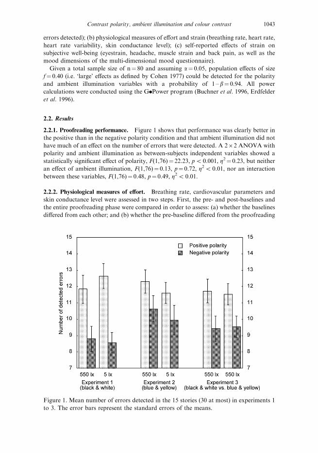
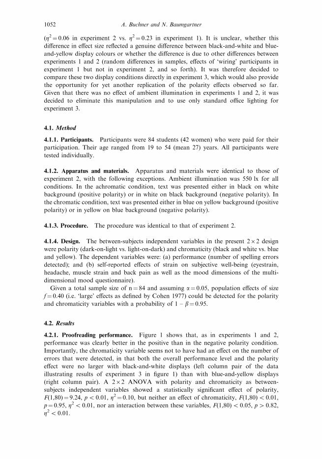
2.2.1. Proofreading performance. Figure 1 shows that performance was clearly better in
the positive than in the negative polarity condition and that ambient illumination did not
have much of an effect on the number of errors that were detected. A 262 ANOVA with
polarity and ambient illumination as between-subjects independent variables showed a
statistically significant effect of polarity, F(1,76)¼ 22.23, p5 0.001, Z2¼ 0.23, but neither
an effect of ambient illumination, F(1,76)¼ 0.13, p¼ 0.72, Z25 0.01, nor an interaction
between these variables, F(1,76)¼ 0.48, p¼ 0.49, Z25 0.01.
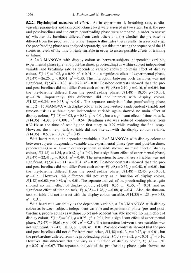
2.2.2. Physiological measures of effort. Breathing rate, cardiovascular parameters and
skin conductance level were assessed in two steps. First, the pre- and post-baselines and
the entire proofreading phase were compared in order to assess: (a) whether the baselines
differed from each other; and (b) whether the pre-baseline differed from the proofreading
Figure 1. Mean number of errors detected in the 15 stories (30 at most) in experiments 1
to 3. The error bars represent the standard errors of the means.
Contrast polarity, ambient illumination and colour contrast 1043
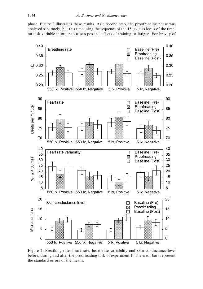
phase. Figure 2 illustrates these results. As a second step, the proofreading phase was
analysed separately, but this time using the sequence of the 15 texts as levels of the time-
on-task variable in order to assess possible effects of training or fatigue. For brevity of
Figure 2. Breathing rate, heart rate, heart rate variability and skin conductance level
before, during and after the proofreading task of experiment 1. The error bars represent
the standard errors of the means.
1044 A. Buchner and N. Baumgartner
presentation, these results are not illustrated graphically, which seemed justified given
that they were not of primary importance.
A 26263 multivariate ANOVA (MANOVA) with polarity and ambient illumination
as between-subjects independent variables, experimental phase (pre- and post-baselines,
proofreading) as within-subject independent variable and breathing rate as dependent
variable showed no main effect of polarity, F(1,76)¼ 0.07, p¼ 0.78, Z25 0.01, no main
effect of ambient illumination, F(1,76)¼ 0.21, p¼ 0.65, Z25 0.01, but a significant effect
of experimental phase, F(2,75)¼ 54.37, p5 0.001, Z2¼ 0.59. None of the interactions
between any of these variables was significant, F(1,76)¼ 1.32, p¼ 0.25, Z25 0.01, and all
Fs(2,75)5 1.35, p4 0.26, Z25 0.04. Post-hoc contrasts showed that the pre- and post-
baselines did not differ from each other, F(1,76)¼ 1.32, p¼ 0.25, Z2¼ 0.02, but the pre-
baseline differed from the proofreading phase, F(1,76)¼ 51.63, p5 0.001, Z2¼ 0.41.
Importantly, this difference did not interact with polarity, F(1,76)¼ 0.01, p¼ 0.91,
Z25 0.01 or ambient illumination, F(1,76)¼ 0.01, p¼ 0.93, Z25 0.01. The separate
analysis of the proofreading phase using a 262615 MANOVA with polarity and
ambient illumination as between-subjects independent variables and time on task (in 15
intervals defined by the 15 short stories) as within-subject independent variable again
showed no main effect of polarity, F(1,76)¼ 0.11, p¼ 0.74, Z25 0.01, no main effect of
ambient illumination, F(1,76)¼ 0.01, p¼ 0.92, Z25 0.01, but a significant effect of time
on task, F(14,63)¼ 5.35, p5 0.001, Z2¼ 0.54. Breathing rate was reduced continuously
from 0.32 Hz at the time of reading the first story to 0.29 while reading the final story.
However, the time-on-task variable did not interact with any of the other variables, all
Fs(14,63)5 1.37, p4 0.19, Z25 0.23. There was also again no interaction between
polarity and ambient illumination, F(1,76)¼ 2.35, p¼ 0.13, Z2¼ 0.03.
With heart rate as the dependent variable, a 26263 MANOVA showed no main effect
of polarity, F(1,76)¼ 0.92, p¼ 0.34, Z2¼ 0.01, no main effect of ambient illumination,
F(1,76)¼ 0.01, p¼ 0.91, Z25 0.01, but a significant effect of experimental phase,
F(2,75)¼ 43.13, p5 0.001, Z2¼ 0.54. None of the interactions between any of these
variables was significant, F(1,76)¼ 0.91, p¼ 0.34, Z2¼ 0.01, and all Fs(2,75)5 2.76,
p4 0.07, Z25 0.07. Post-hoc contrasts showed that the pre- and post-baselines did not
differ from each other, F(1,76)¼ 0.09, p¼ 0.25, Z2¼ 0.02, but the pre-baseline differed
from the proofreading phase, F(1,76)¼ 47.73, p5 0.001, Z2¼ 0.39. Importantly, this
difference did not vary as a function of polarity or ambient illumination, Fs(1,76)5 3.39,
p4 0.07, Z2¼ 0.04. The separate analysis of the proofreading phase again showed no
main effect of polarity, F(1,76)¼ 1.76, p¼ 0.19, Z2¼ 0.02, no main effect of ambient
illumination, F(1,76)¼ 0.01, p¼ 0.93, Z25 0.01, but a significant effect of time on task,
F(14,63)¼ 2.57, p5 0.01, Z2¼ 0.36. Heart rate was reduced continuously from 81 bpm at
the time of reading the first story to 78 bpm while reading the final story. However, the
time-on-task variable did not interact with any of the other variables, all
Fs(14,63)5 1.41, p4 0.17, Z25 0.24. There was also again no interaction between
polarity and ambient illumination, F(1,76)¼ 0.33, p¼ 0.53, Z25 0.01.
With heart rate variability as the dependent variable, a 26263 MANOVA showed no
main effect of polarity, F(1,76)¼ 0.06, p¼ 0.80, Z25 0.01, no main effect of ambient
illumination, F(1,76)¼ 1.37, p¼ 0.25, Z2¼ 0.02, but a significant effect of experimental
phase, F(2,75)¼ 26.96, p5 0.001, Z2¼ 0.42. None of the interactions between any of
these variables was significant, F(1,76)¼ 1.88, p¼ 0.18, Z2¼ 0.02, and all Fs(2,75)5 2.76,
p4 0.07, Z25 0.07. Post-hoc contrasts showed that the pre- and post-baselines did not
differ from each other, F(1,76)¼ 0.50, p¼ 0.48, Z25 0.01, but the pre-baseline differed
from the proofreading phase, F(1,76)¼ 31.23, p5 0.001, Z2¼ 0.29. Importantly, this
Contrast polarity, ambient illumination and colour contrast 1045
difference did not vary as a function of polarity or ambient illumination, Fs(1,76)5 1.28,
p4 0.26, Z2¼ 0.02. The separate analysis of the proofreading phase again showed no
main effect of polarity, F(1,76)¼ 0.43, p¼ 0.56, Z25 0.01, no main effect of ambient
illumination, F(1,76)¼ 1.44, p¼ 0.23, Z2¼ 0.02, and no significant effect of time on task,
F(14,63)¼ 1,10, p¼ 0.38, Z2¼ 0.20. Also, the time-on-task variable did not interact with
any of the other variables, all Fs(14,63)5 1.83, p4 0.05, Z25 0.29. There was also again
no interaction between polarity and ambient illumination, F(1,76)¼ 1.16, p¼ 0.28,
Z2¼ 0.02.
With skin conductance level as the dependent variable, a 26263 MANOVA showed
no main effect of polarity, F(1,76)¼ 0.89, p¼ 0.38, Z2¼ 0.01, no main effect of ambient
illumination, F(1,76)¼ 0.89, p¼ 0.38, Z2¼ 0.01, but a significant effect of experimental
phase, F(2,75)¼ 42.76, p5 0.001, Z2¼ 0.53. The only significant interaction was that
between polarity and phase, F(2,75)¼ 4.40, p¼ 0.02, Z2¼ 0.10, reflecting that the post-
baseline skin conductance levels increased somewhat over the levels of the proofreading
phase for the positive polarity conditions, but stayed constant or decreased somewhat in
the negative polarity conditions. The origin of this effect is unclear, but given that it is
only of minor importance it will not be discussed further. None of the other interactions
was significant, F(1,76)¼ 0.36, p¼ 0.55, Z25 0.01 and all, Fs(2,75)5 1.59, p4 0.21,
Z25 0.04. Post-hoc contrasts showed that this time the pre- and post-baselines differed
from each other, F(1,76)¼ 61.31, p5 0.001, Z2¼ 0.45, as did the pre-baseline and the
proofreading phase, F(1,76)¼ 85.88, p5 0.001, Z2¼ 0.53. Importantly, however, this
latter difference did not vary as a function of polarity or ambient illumination,
Fs(1,76)5 1.73, p4 0.19, Z2¼ 0.02. The separate analysis of the proofreading phase
again showed no main effect of polarity, F(1,76)¼ 0.34, p¼ 0.56, Z25 0.01, no main
effect of ambient illumination, F(1,76)¼ 0.87, p¼ 0.35, Z2¼ 0.01, but a significant effect
of time on task, F(14,63)¼ 2.43, p5 0.01, Z2¼ 0.35. Skin conductance level was increased
continuously from 7.2 microsiemens at the time of reading the first story to 9.8
microsiemens while reading the final story. However, the time-on-task variable did not
interact with any of the other variables, all Fs(14,63)5 0.89, p4 0.57, Z25 0.17. There
was also again no interaction between polarity and ambient illumination, F(1,76)¼ 0.64,
p¼ 0.43, Z25 0.01.
In essence, then, all measures of effort consistently indicated a pronounced difference
between the pre-baseline and the proofreading phase, but the size of this difference or the
variability of the measures within the sequence of stories were not affected by polarity or
ambient illumination.
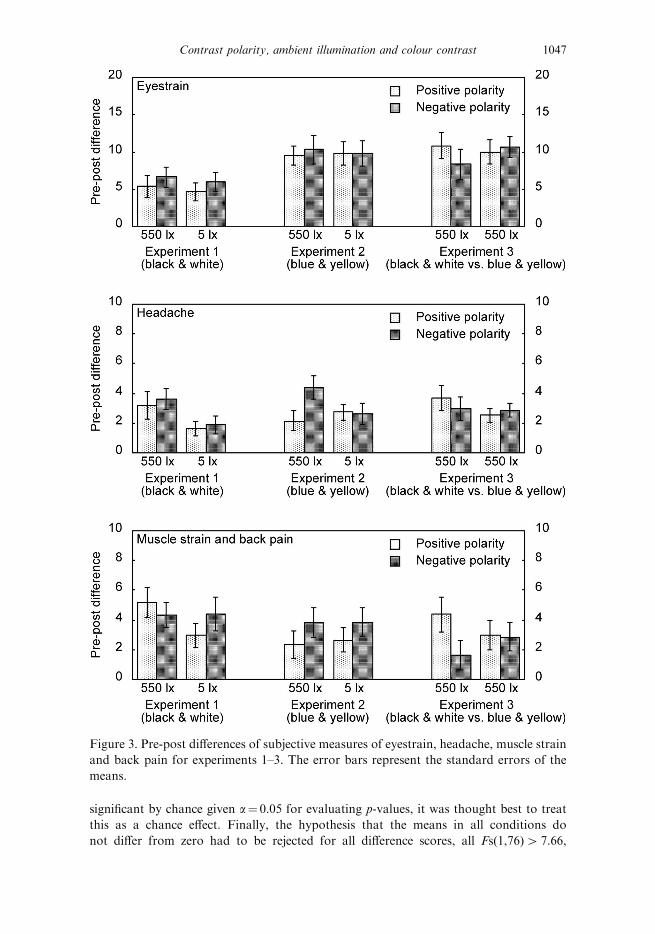
2.2.3. Eyestrain, headache, muscle strain, back pain and subjective well-being. Differences
between pre- and post-measurements were computed for the three scores derived from
questionnaire scales on eyestrain, headache, muscle strain and back pain (Heuer et al.
1989) as well as for the three scores derived from the bipolar scales of the multi-
dimensional mood questionnaire (Steyer et al. 1994, 1997). Figures 3 and 4 illustrate these
difference scores as a function of polarity and ambient illumination. When these six
different measures were analysed using separate 262 ANOVAs with polarity and
ambient illumination as independent variables, only one of the 18 different tests for main
effects and interactions was significant, that is, the effect of ambient illumination when the
headache pre-post difference was used as the dependent variable, F(1,76)¼ 5.28, p¼ 0.02,
Z2¼ 0.07. All other main effects or interactions were not statistically significant, all
Fs(1,76)5 3.07, p4 0.08, Z25 0.04. Given that this effect was not replicated in
experiment 2 and also considering that one out of 20 tests is expected to turn out
1046 A. Buchner and N. Baumgartner
significant by chance given a¼ 0.05 for evaluating p-values, it was thought best to treat
this as a chance effect. Finally, the hypothesis that the means in all conditions do
not differ from zero had to be rejected for all difference scores, all Fs(1,76)4 7.66,
Figure 3. Pre-post differences of subjective measures of eyestrain, headache, muscle strain
and back pain for experiments 1–3. The error bars represent the standard errors of the
means.
Contrast polarity, ambient illumination and colour contrast 1047
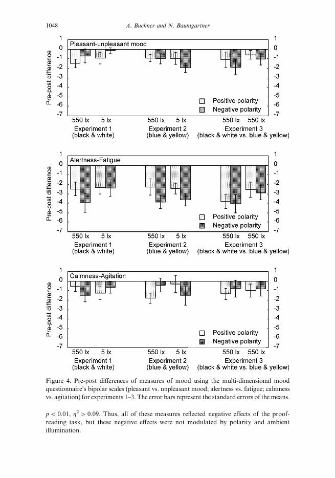
p5 0.01, Z24 0.09. Thus, all of these measures reflected negative effects of the proof-
reading task, but these negative effects were not modulated by polarity and ambient
illumination.
Figure 4. Pre-post differences of measures of mood using the multi-dimensional mood
questionnaire’s bipolar scales (pleasant vs. unpleasant mood; alertness vs. fatigue; calmness
vs. agitation) for experiments 1–3. The error bars represent the standard errors of the means.
1048 A. Buchner and N. Baumgartner
2.3. Discussion
Proofreading performance was clearly superior with positive than with negative display
polarity and this effect was independent of ambient illumination. Thus, possible
illumination-related variations of pupil diameter that should have occurred, given the
results of Taptagaporn and Saito (1990), do not seem to have affected performance. More
importantly, the fact that neither the physiological nor the self-report measures of effort
and strain differed as a function in display polarity demonstrates that the interpretation
of the primary performance measure is not complicated by a performance–effort trade-
off. It appears that the participants in all conditions simply tried to perform as well as
they could rather than tailoring their effort according to the difficulty of the experimental
situation they encountered. It is suspected that the between-subjects design used here
helped to avoid effort allocations that take task difficulty into account.
The physiological measures were obviously sensitive to variations in effort and
strain, as is indicated by the fact that all measures clearly indicated the onset and, with
the exception of the skin conductance level, also the offset of the proofreading. Thus, it
seems unlikely that the lack of a difference between conditions in those measures was
due to a lack of sensitivity of those measures. The decreases in breathing and heart
rates during the proofreading task seem to reflect adaptations to the experimental
procedure. Heart rate variability, in contrast, was consistently high during the
proofreading task, most likely reflecting a relatively consistent level of effort. Similarly,
the increase in the skin conductance level also seems to reflect the cumulated effects of
sustained effort.
3. Experiment 2
Experiment 2 had two major purposes. First, given the mixed results on display polarity
effects in the literature, it was thought important to replicate conceptually the findings of
experiment 1. The second major purpose was to determine whether the conclusions about
the effects of display polarity could be generalized from achromatic to chromatic displays
because colour as a design element for written text has become increasingly important.
Therefore, both the ambient illumination and the text display polarity variables were
maintained, but the black and white text and background colours were replaced by blue
and yellow.
Blue and yellow were used because this colour combination makes it easy to combine a
high luminance contrast (a Michelson contrast of 0.79 in the present case, see table 1)
with a high colour contrast. This parameter constellation seemed interesting in the light
of the finding that, with regard to reading rate, luminance and colour contrast effects
were not additive in past research (Legge et al. 1990). Rather, it seemed that if a certain
luminance contrast is accompanied by a certain colour contrast, then reading rate can be
expected to be determined by the single attribute that yields the highest performance and
is unaffected by the other. Similarly, Knoblauch et al. (1991) reported that, for low levels
of luminance contrast that produced a modest decrement in reading performance relative
to a high-contrast display, the introduction of chromatic contrast did not result in
improvements of reading performance. Thus, adding a colour contrast to a large
luminance contrast should not affect performance. What is more, Knoblauch et al.
observed only modest performance decrements even for very large reductions of
luminance contrast (i.e. from 0.92 to 0.12). Relative to this, reducing the luminance
contrast from 0.98 to 0.79 can be qualified as minor. It should thus lead to negligible
Contrast polarity, ambient illumination and colour contrast 1049
proofreading decrements. Therefore, essentially the same pattern of results was expected
as in experiment 1.
However, there are two reasons as to why this expectation may not hold. First, Legge
et al. (1990) already qualified their results by stating explicitly that their findings might
only apply to the low luminance contrasts used in their studies. One of the purposes of
experiments 2 and 3 thus was to test whether the single-attribute hypothesis of Legge
et al. would also hold for high-contrast displays. What is more, Wang et al. (2003) found
that of all the colour combinations tested in a leading display, blue-on-yellow resulted in
the lowest level of comprehension of the displayed text. Both black-on-white and white-
on-black apparently were associated with much better performance. This finding seems to
indicate that colour contrast not only fails to be beneficial, but rather that colour contrast
may hinder performance, perhaps because the associated loss of luminance contrast is not
negligible after all.
Experiment 2 therefore differed from experiment 1 in that blue and yellow replaced
black and white as display colours. All other manipulations, materials, procedure and
design were identical to those of experiment 1. There was no reason to expect that
participants would approach the task in a different way compared to experiment 1, that
is, it was expected that they would try to perform as well as they could, independent of
the experimental condition they were assigned to. It seemed thus justified to omit
independent physiological measures of effort and strain.
3.1. Method
3.1.1. Participants. Participants were 80 volunteers (52 women) who were paid for their
participation. Their age ranged from 19 to 53 (mean 27) years. All participants were
tested individually. Participants were randomly assigned to the experimental groups with
the restriction that, at the end of the experiment, an equal number of male and female
participants had to be in each of the four groups defined by the present 262 design. All
participants had German as their native language and none reported any cardiovascular
problems. All participants had normal or corrected-to-normal vision. They were
instructed not to consume beverages containing caffeine and to avoid physical work
within a period of 6 h prior to the experiment.
3.1.2. Apparatus and materials. Apparatus and materials were identical to those of
experiment 1, with the following exceptions. First, no physiological measures were
recorded. Second, text was presented either in blue on yellow background (positive
polarity) or in yellow on blue background (negative polarity). Chromaticity coordinates
and luminance values of both colours and the resulting luminance contrast values are
presented in table 1.
3.1.3. Procedure. The procedure was identical to that of experiment 1, with the
exception that no chest belt, no plethysmograph and no electrodes were applied. The
3-min intervals to record the pre- and post-baselines of the physiological measures were
dropped.
3.1.4. Design. The between-subjects independent variables in the present 262 design
were text display polarity (blue-on-yellow vs. yellow-on-blue) and ambient illumination
(550 lx vs. 5 lx). The dependent variables were: (a) performance (number of spelling
errors detected); and (b) self-reported effects of strain on subjective well-being (eyestrain,
1050 A. Buchner and N. Baumgartner
headache, muscle strain, and back pain as well as the mood dimensions of the multi-
dimensional mood questionnaire).
Given a total sample size of n¼ 80 and assuming a¼ 0.05, population effects of size
f¼ 0.40 (i.e. ‘large’ effects as defined by Cohen 1977) could be detected for the polarity
and ambient illumination variables with a probability of 1 – b¼ 0.94.
3.2. Results
3.2.1. Proofreading performance. Figure 1 shows that, as in experiment 1, performance
was clearly better in the positive than in the negative polarity condition, and that ambient
illumination did not have much of an effect on the number of errors that were detected. A
262 ANOVA with polarity and ambient illumination as between-subjects independent
variables showed a statistically significant effect of polarity, F(1,76)¼ 4.83, p¼ 0.03,
Z2¼ 0.06, but neither an effect of ambient illumination, F(1,76)¼ 0.85, p¼ 0.36, Z2¼ 0.01,
nor an interaction between these variables, F(1,76)5 0.01, p4 0.99, Z25 0.01.
3.2.2. Eyestrain, headache, muscle strain, back pain and subjective well-being. Figures 3
and 4 illustrate the pre-post-difference scores derived from questionnaire scales on eyestrain,
headache, muscle strain and back pain (Heuer et al. 1989) as well as from the bipolar scales
of the multi-dimensional mood questionnaire (Steyer et al. 1994, 1997) as a function of
polarity and ambient illumination. When these six different measures were analysed using
separate 262 ANOVAs with polarity and ambient illumination as independent variables,
the polarity effect on the subjective measure of fatigue just missed the preset level of
significance, F(1,76)¼ 3.93, p¼ 0.051, Z2¼ 0.05, and all other main effects or interactions
were also not statistically significant. As with the ambient illumination effect on the
headache scale in experiment 1, it is thought best to treat this near-significant polarity effect
as being due to chance. The hypothesis that the means in all conditions do not differ from
zero had to be rejected for all difference scores, all Fs(1,76)4 5.86, p5 0.02, Z24 0.07.
Thus, all of these measures reflected negative effects of the proofreading task, but these
negative effects were not modulated by polarity and ambient illumination.
3.3. Discussion
The results of experiment 2 replicate those of experiment 1 in basically all respects. There
was a polarity effect on performance, but performance was not affected by ambient
illumination and, more importantly, there was no interaction between these two variables.
Thus, it may be concluded that performance is better with positive than with negative
polarity and that this is so in typical office illumination and in total darkness. In addition,
subjective measures of eyestrain, headache, muscle strain and back pain and of mood
along three bipolar scales of the multidimensional mood questionnaire all reflected
adverse effects of the proofreading task but did not differ among the cells of the
experimental design, suggesting that participants in all conditions invested equivalent
amounts of effort.
4. Experiment 3
One possible problem with an interpretation of the results of experiment 2 is that the
polarity effect was clearly smaller than that of experiment 1, both in terms of the absolute
performance differences (see figure 1) and in terms of standardized effect size measure
Contrast polarity, ambient illumination and colour contrast 1051
(Z2¼ 0.06 in experiment 2 vs. Z2¼ 0.23 in experiment 1). It is unclear, whether this
difference in effect size reflected a genuine difference between black-and-white and blue-
and-yellow display colours or whether the difference is due to other differences between
experiments 1 and 2 (random differences in samples, effects of ‘wiring’ participants in
experiment 1 but not in experiment 2, and so forth). It was therefore decided to
compare these two display conditions directly in experiment 3, which would also provide
the opportunity for yet another replication of the polarity effects observed so far.
Given that there was no effect of ambient illumination in experiments 1 and 2, it was
decided to eliminate this manipulation and to use only standard office lighting for
experiment 3.
4.1. Method
4.1.1. Participants. Participants were 84 students (42 women) who were paid for their
participation. Their age ranged from 19 to 54 (mean 27) years. All participants were
tested individually.
4.1.2. Apparatus and materials. Apparatus and materials were identical to those of
experiment 2, with the following exceptions. Ambient illumination was 550 lx for all
conditions. In the achromatic condition, text was presented either in black on white
background (positive polarity) or in white on black background (negative polarity). In
the chromatic condition, text was presented either in blue on yellow background (positive
polarity) or in yellow on blue background (negative polarity).
4.1.3. Procedure. The procedure was identical to that of experiment 2.
4.1.4. Design. The between-subjects independent variables in the present 262 design
were polarity (dark-on-light vs. light-on-dark) and chromaticity (black and white vs. blue
and yellow). The dependent variables were: (a) performance (number of spelling errors
detected); and (b) self-reported effects of strain on subjective well-being (eyestrain,
headache, muscle strain and back pain as well as the mood dimensions of the multi-
dimensional mood questionnaire).
Given a total sample size of n¼ 84 and assuming a¼ 0.05, population effects of size
f¼ 0.40 (i.e. ‘large’ effects as defined by Cohen 1977) could be detected for the polarity
and chromaticity variables with a probability of 1 – b¼ 0.95.
4.2. Results
4.2.1. Proofreading performance. Figure 1 shows that, as in experiments 1 and 2,
performance was clearly better in the positive than in the negative polarity condition.
Importantly, the chromaticity variable seems not to have had an effect on the number of
errors that were detected, in that both the overall performance level and the polarity
effect were no larger with black-and-white displays (left column pair of the data
illustrating results of experiment 3 in figure 1) than with blue-and-yellow displays
(right column pair). A 262 ANOVA with polarity and chromaticity as between-
subjects independent variables showed a statistically significant effect of polarity,
F(1,80)¼ 9.24, p5 0.01, Z2¼ 0.10, but neither an effect of chromaticity, F(1,80)5 0.01,
p¼ 0.95, Z25 0.01, nor an interaction between these variables, F(1,80)5 0.05, p4 0.82,
Z25 0.01.
1052 A. Buchner and N. Baumgartner
4.2.2. Eyestrain, headache, muscle strain, back pain and subjective well-being. Figures 3
and 4 illustrate the pre-post-difference scores derived from questionnaire scales on
eyestrain, headache, muscle strain and back pain (Heuer et al. 1989), as well as from the
bipolar scales of the multi-dimensional mood questionnaire (Steyer et al. 1994, 1997) as a
function of polarity and ambient illumination. When these six different measures were
analysed using separate 262 ANOVAs with polarity and chromaticity as independent
variables, no main effect or interaction was significant, F(1,80)5 2.10, p4 0.15,
Z25 0.03. The hypothesis that the means in all conditions do not differ from zero had
to be rejected for all difference scores, all Fs(1,80)4 7.10, p5 0.01, Z24 0.08. Thus, all of
these measures reflected negative effects of the proofreading task, but these negative
effects were not modulated by polarity and ambient illumination.
4.3. Discussion
Experiment 3 replicated once more the polarity effects of experiments 1 and 2. Dark
letters on light background led to better proofreading performance than light letters on
dark background. In addition, the results of experiment 3 showed that the size of the
polarity effect was independent of whether the display colours were black and white or
whether they were blue and yellow. This result is consistent with earlier results showing
that if a certain amount of luminance contrast is present, then reading rate is not
improved by adding colour contrast (Matthews 1989, Legge et al. 1990, Knoblauch et al.
1991).
However, for a situation in which luminance contrast was near the threshold for
reading, Knoblauch et al. (1991) concluded that colour contrast ‘sustained reading rates
almost as high as those found with high luminance contrasts’ and suggested that this may
be so because, among other things, chromatic aberrations may have the beneficial effect
of creating luminance transients that function as outlines of the characters and thus
create letter–background luminance contrasts. Such a conclusion may easily be mistaken
to imply that colour contrast may effectively compensate for a lack of direct luminance
contrast. However, others have clearly reported the worst identification performance in a
task with no luminance contrast but only colour contrast (Lin 2003). Even in the study
reported by Knoblauch et al., the differences between the equiluminant colour contrast
conditions and the high-luminance contrast conditions seems considerable at a
descriptive level, although the lack of relevant test statistics makes it difficult to tell
just how big the difference was. In addition, it is impossible to tell whether a
performance–effort trade-off may have complicated the results of Knoblauch et al. in that
the two participants in their study simply ‘tried harder’ in conditions that appeared
particularly difficult, that is, in the equiluminant colour contrast conditions. Evidence
suggesting that this may have been the case comes from other studies investigating the
effects of text–background colour contrasts. For instance, Pastoor (1990) reported that
different text–background colour combinations did not result in differences in reading or
search performance, and Shieh et al. (1997) reported that the percentage of briefly
presented characters that were identified correctly did not differ as a function of the text–
background colour combination. Yet, in both of these studies, some text–background
colour combinations—red text on green background in particular—were rated to be more
aversive than others (Pastoor 1990, Shieh et al. 1997). This pattern of data would be
expected if participants’ goal was to perform equally well in all conditions, forcing them
to invest more effort in the more difficult conditions, which were thus more aversive.
Pastoor (1990) already suggested such an explanation of his findings.
Contrast polarity, ambient illumination and colour contrast 1053
In fact, some studies have indicated that red text on green background may result in
worse performance than other text–background colour combinations. For instance,
search accuracy has been shown to be somewhat worse with red characters on
equiluminant green or on blue background than with other colour combinations
(Matthews et al. 1989) and the preferred viewing distance—quite plausibly an indicator of
effort to overcome difficult viewing conditions—in a search task was shorter with red and
green than with other text–background colour combinations (Shieh and Chen 1997).
Given this state of affairs, it was thought important to compare performance using an
equiluminant red-on-green colour contrast with the black-on-white, high-luminance
contrast of experiment 1, but using a between-subjects design. This was done in
experiment 4.
5. Experiment 4
One methodological conclusion from experiment 1 was that between-subjects designs
may help to avoid performance–effort trade-offs. More precisely, participants in
experiment 1 seemed to have tried to perform as well as they could in all conditions
rather than tailoring their effort according to the difficulty of the experimental situation
they encountered. As a control measure, physiological parameters as in experiment 1
(breathing rate, heart rate, heart rate variability and skin conductance level) were also
recorded to be used as on-line indicators of effort, and self-reported mood, fatigue,
arousal, eyestrain, headache, muscle strain and back pain were used as additional
indicators of the effects of effort invested in the task in the present experiments.
5.1. Method
5.1.1. Participants. Participants were 50 volunteers (26 women) who were paid for their
participation. Their age ranged from 18 to 50 (mean 28) years. All participants were
tested individually. Participants were randomly assigned to the experimental groups with
the restriction that, at the end of the experiment, an equal number of male and female
participants with an approximately equal age distribution had to be in each of the two
groups defined by the present design; in addition, across-group pairs of participants who
were matched by age and gender were tested at a similar time of day. All participants had
German as their native language and none reported any cardiovascular problems. All
participants had normal or corrected-to-normal vision. They were instructed not to
consume beverages containing caffeine and to avoid physical work within a period of 6 h
prior to the experiment.
5.1.2. Apparatus and materials. Apparatus and materials were identical to those of
experiment 1, with the following exceptions. First, ambient illumination was 5 lx for both
groups. Second, text was presented either in black on white background (achromatic,
maximum luminance contrast) or in red on green background (chromatic, no luminance
contrast). Chromaticity coordinates and luminance values of both colours and the
resulting luminance contrast values are presented in table 1.
5.1.3. Procedure. The procedure was identical to that of experiment 1.
5.1.4. Design. The between-subjects independent variable had two levels defined by a
combination of chromaticity and luminance contrast (achromatic, maximum luminance
1054 A. Buchner and N. Baumgartner
contrast vs. chromatic, no luminance contrast). For simplicity, this variable will be
referred to as display colour. The dependent variables were: (a) performance (number of
spelling errors detected); (b) physiological measures of effort and strain (breathing rate,
heart rate, heart rate variability, skin conductance level); (c) self-reported effects of strain
on subjective well-being (eyestrain, headache, muscle strain and back pain as well as the
mood dimensions of the multi-dimensional mood questionnaire).
In terms of the experimental setup (the physiological measurements in particular),
experiment 4 was most similar to experiment 1. It thus seems reasonable to base any
expectations about the display colour effect in experiment 4 on the results of experiment
1, in which the sample effect size of the polarity effect was Z2¼ 0.23. Taking into account
that sample effect sizes generally overestimate the population effect size, Hays (1981) was
followed in estimating the population effect size from the sample data as o2¼ 0.21,
which corresponds to an effect of f¼ 0.52. Given a total sample size of n¼ 50 and
assuming a¼ 0.05, population effects of this size could be detected with a probability of
1 –b¼ 0.95.
5.2. Results
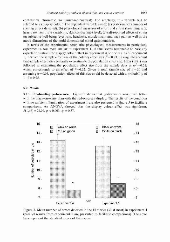
5.2.1. Proofreading performance. Figure 5 shows that performance was much better
with the black-on-white than with the red-on-green display. The results of the condition
with no ambient illumination of experiment 1 are also presented in figure 5 to facilitate
comparisons. An ANOVA showed that the display colour effect was significant,
F(1,48)¼ 28,07, p5 0.001, Z2¼ 0.37.
Figure 5. Mean number of errors detected in the 15 stories (30 at most) in experiment 4
(parallel results from experiment 1 are presented to facilitate comparisons). The error
bars represent the standard errors of the means.
Contrast polarity, ambient illumination and colour contrast 1055
5.2.2. Physiological measures of effort. As in experiment 1, breathing rate, cardio-
vascular parameters and skin conductance level were assessed in two steps. First, the pre-
and post-baselines and the entire proofreading phase were compared in order to assess:
(a) whether the baselines differed from each other; and (b) whether the pre-baseline
differed from the proofreading phase. Figure 6 illustrates these results. In a second step,
the proofreading phase was analysed separately, but this time using the sequence of the 15
stories as levels of the time-on-task variable in order to assess possible effects of training
or fatigue.
A 263 MANOVA with display colour as between-subjects independent variable,
experimental phase (pre- and post-baselines, proofreading) as within-subject independent
variable and breathing rate as dependent variable showed no main effect of display
colour, F(1,48)¼ 0.02, p¼ 0.90, Z25 0.01, but a significant effect of experimental phase,
F(2,47)¼ 26.26, p5 0.001, Z2¼ 0.53. The interaction between both variables was not
significant, F(2,47)¼ 0.33, p¼ 0.72, Z2¼ 0.01. Post-hoc contrasts showed that the pre-
and post-baselines did not differ from each other, F(1,48)¼ 2.10, p¼ 0.16, Z2¼ 0.04, but
the pre-baseline differed from the proofreading phase, F(1,48)¼ 18.35, p5 0.001,
Z2¼ 0.28. Importantly, this difference did not interact with display colour,
F(1,48)¼ 0.24, p¼ 0.63, Z25 0.01. The separate analysis of the proofreading phase
using 2615 MANOVA with display colour as between-subjects independent variable and
time-on-task as within-subject independent variable again showed no main effect of
display colour, F(1,48)¼ 0.03, p¼ 0.87, Z25 0.01, but a significant effect of time on task,
F(14,35)¼ 4.38, p5 0.001, Z2¼ 0.64. Breathing rate was reduced continuously from
0.32 Hz at the time of reading the first story to 0.29 while reading the final story.
However, the time-on-task variable did not interact with the display colour variable,
F(14,35)¼ 0.57, p¼ 0.87, Z2¼ 0.19.
With heart rate as the dependent variable, a 263 MANOVA with display colour as
between-subjects independent variable and experimental phase (pre- and post-baselines,
proofreading) as within-subject independent variable showed no main effect of display
colour, F(1,48) ¼ 1.84, p¼ 0.67, Z25 0.01, but a significant effect of experimental phase,
F(2,47)¼ 22,41, p5 0.001, Z2¼ 0.49. The interaction between these variables was not
significant, F(2,47)¼ 1.11, p¼ 0.34, Z2¼ 0.05. Post-hoc contrasts showed that the pre-
and post-baselines did not differ from each other, F(1,48)¼ 0.52, p¼ 0.48, Z2¼ 0.01, but
the pre-baseline differed from the proofreading phase, F(1,48)¼ 12.45, p5 0.001,
Z2¼ 0.21. However, this difference did not vary as a function of display colour,
F(1,48)¼ 0.02, p¼ 0.89, Z25 0.01. The separate analysis of the proofreading phase again
showed no main effect of display colour, F(1,48)¼ 0.36, p¼ 0.55, Z2¼ 0.01, and no
significant effect of time on task, F(14,35)¼ 1.78, p¼ 0.08, Z2¼ 0.41. Also, the time-on-
task variable did not interact with the display colour variable, F(14,35)¼ 1.23, p¼ 0.38,
Z2¼ 0.31.
With heart rate variability as the dependent variable, a 263 MANOVA with display
colour as between-subjects independent variable and experimental phase (pre- and post-
baselines, proofreading) as within-subject independent variable showed no main effect of
display colour, F(1,48)¼ 0.01, p¼ 0.93, Z25 0.01, but a significant effect of experimental
phase, F(2,47)¼ 10.61, p5 0.001, Z2¼ 0.31. The interaction between these variables was
not significant, F(2,47)¼ 0.13, p¼ 0.88, Z2¼ 0.01. Post-hoc contrasts showed that the pre-
and post-baselines did not differ from each other, F(1,48)¼ 0.13, p¼ 0.72, Z25 0.01, but
the pre-baseline differed from the proofreading phase, F(1,48)¼ 9.02, p5 0.01, Z2¼ 0.16.
However, this difference did not vary as a function of display colour, F(1,48)¼ 3.50,
p¼ 0.07, Z2¼ 0.07. The separate analysis of the proofreading phase again showed no
1056 A. Buchner and N. Baumgartner
Figure 6. Breathing rate, heart rate, heart rate variability and skin conductance level
before, during and after the proofreading task of experiment 4. The error bars represent
the standard errors of the means.
Contrast polarity, ambient illumination and colour contrast 1057
main effect of display colour, F(1,48)¼ 0.04, p¼ 0.85, Z25 0.01, and no significant effect
of time on task, F(14,35)¼ 1.46, p¼ 0.18, Z2¼ 0.37. However, the time-on-task variable
interacted with the display colour variable, F(14,35)¼ 2.34, p¼ 0.02, Z2¼ 0.48. There was
no clear data pattern to help with the interpretation of this significant interaction effect.
The two groups seemed to differ unsystematically at certain points during the task. It is
thus suggested that this interaction is conceived of as a chance effect.
With skin conductance level as the dependent variable, a 263 MANOVA with display
colour as between-subjects independent variable and experimental phase (pre- and post-
baselines, proofreading) as within-subject independent variable showed no main effect of
display colour, F(1,48)¼ 0.44, p¼ 0.51, Z2¼ 0.01, but a significant effect of experimental
phase, F(2,47)¼ 26.28, p5 0.001, Z2¼ 0.53. The interaction between these variables was
not significant, F(2,47)¼ 0.31, p¼ 0.74, Z2¼ 0.01. Post-hoc contrasts showed that, as in
experiment 1, the pre- and post-baselines differed from each other, F(1,48)¼ 40.65,
p5 0.001, Z2¼ 0.47, as did the pre-baseline and the proofreading phase, F(1,48)¼ 50.58,
p5 0.001, Z2¼ 0.53. Importantly, however, this latter difference did not vary as a
function of display colour, Fs(1,48)¼ 0.62, p¼ 0.44, Z2¼ 0.01. The separate analysis
of the proofreading phase again showed no main effect of display colour, F(1,48)¼ 0.34,
p¼ 0.56, Z25 0.01, no significant effect of time on task, F(14,35)¼ 1.39, p¼ 0.21,
Z2¼ 0.36, and no interaction between these variables, F (14,35)¼ 1.04, p¼ 0.44, Z2¼ 0.29.
In essence, then, all measures of effort consistently indicated a pronounced difference
between the pre-baseline and the proofreading phase, but the size of this difference or the
variability of the measures within the sequence of stories were not systematically affected
by display colour.
5.2.3. Eyestrain, headache, muscle strain, back pain and subjective well-being. Differences
between pre- and post-measurements were computed for the three scores derived from
questionnaire scales on eyestrain, headache, muscle strain and back pain (Heuer et al.
1989) as well as for the three scores derived from the bipolar scales of the multi-
dimensional mood questionnaire (Steyer et al. 1994, 1997). Figure 7 illustrates these
difference scores as a function of display colour. When these six different measures were
analysed using separate ANOVAs with display colour as independent variable, none of
the effects was statistically significant, all Fs(1,48)5 2.87, p4 0.09, Z25 0.06. The
hypothesis that the means in all conditions do not differ from zero had to be rejected for
five of the difference scores, all Fs(1,48)4 7.66, p5 0.01, Z24 0.09, the exception being
the calmness–agitation scale of the multidimensional mood questionnaire. Thus, most of
these measures reflect negative effects of the proofreading task, but these negative effects
were not modulated by display colour.
5.3. Discussion
The results of experiment 4 show that contrasts of equiluminant colours cannot
compensate a lack of luminance contrast. Proofreading performance was clearly worse
with red text on green background than with black text on white background. In order to
facilitate an assessment of the size of the performance decrements with equiluminant
colours, figure 5 shows the data from the low ambient illumination condition of
experiment 1 together with the data from experiment 4. These datasets invite comparisons
because they were obtained under basically identical conditions. The performance
differences between the black-on-white and the white-on-black conditions from
experiment 1 and the difference between the black-on-white and the red-on-green
1058 A. Buchner and N. Baumgartner
conditions in experiment 4 clearly were in the same order of magnitude. In fact, the latter
difference was even slightly larger than the former, both in terms of the number of errors
detected (4.1 vs. 5.4) and in terms of standardized effect sizes (Z2¼ 0.23 vs. Z2¼ 0.37).
Thus, it seems that negative polarity and the present combination of equiluminant text
and background colours both reduced proofreading performance substantially.
The finding that neither the physiological nor the self-report measures of effort and
strain differed as a function of text–background display colours runs parallel to the
findings of experiment 1 and suggests that the participants in all conditions simply tried
to perform as well as they could rather than tailoring their effort according to the
difficulty of the experimental situation they encountered. The interpretation of the
differences in the primary performance variable is thus not complicated by condition-
specific performance–effort trade-offs.
6. General discussion
The present series of experiments consistently showed effects of display polarity.
Proofreading performance was clearly better with dark text on light background than
Figure 7. Pre-post differences of subjective measures of eyestrain, headache, muscle strain
and back pain and of measures of mood using the multi-dimensional mood
questionnaire’s bipolar scales (pleasant vs. unpleasant mood; alertness vs. fatigue;
calmness vs. agitation) for experiment 4. The error bars represent the standard errors of
the means.
Contrast polarity, ambient illumination and colour contrast 1059
with the reverse assignment. This finding clearly contradicts recommendations that can
sometimes be found even in ergonomics textbooks that, for visual display units, light text
(white, yellow, etc.) should be used against a dark background (e.g. Bridger 2003). The
polarity effect was equally large for high-contrast achromatic (black and white) and for
high-contrast chromatic (blue and yellow) displays. Thus, adding colour contrast (of
opponent colours in the present case) did not affect the size of the polarity effect. The
present results are also in sharp contrast to suggestions such as those provided by Murch
(1984) that: ‘blue should be avoided for text [. . .] but for all the same reasons, blue is an
excellent background colour’. In the present experiments, blue text on yellow background
was just as good as black text on white background, whereas as a background colour,
blue was just as bad as black. Also, colour contrast, at least the red–green opponent
colour contrast used in experiment 4, can compensate for a lack of luminance contrast to
a limited degree only. In addition, the advantage of positive over negative polarity
displays was independent of ambient illumination. The current experiments thus provide
no basis for Taptagaporn and Saito’s (1990) recommendation that negative polarity
displays should be used for very low levels of ambient illumination.
The major finding reported here is a clear advantage of positive over negative
display polarity. The consistency with which positive polarity was superior to negative
polarity in the present experiments is remarkable given the inconsistency of the literature
reviewed in the introduction. It is thought that two variables were most relevant for
the conspicuousness of the present findings. First, as the physiological measurements in
experiments 1 and 4 as well as the self-reported complaints and mood states in all
experiments show, there was no evidence of a performance–effort trade-off, which is most
likely due to the use of between-subjects designs for comparing display conditions. It is
assumed that performance–effort trade-offs may easily develop in within-subjects
designs, which were used in the vast majority of the studies reviewed in the introduction.
In these designs, participants experience a range of different conditions. As a result,
they may increase their effort in the ‘difficult’ conditions, that is, the conditions in
which the legibility of text is particularly poor (see Pastoor 1990), which would reduce
the chances of finding a performance difference between ‘difficult’ and ‘easy’ viewing
conditions. For the present experiments it seems relatively certain that most of the
effects of the display manipulations are reflected in the proofreading performance
measure.
A second reason for the consistency of the finding of a polarity effect may be due to the
relatively large samples that were used. The sample effect size in the present experiments
was Z2¼ 0.23, Z2¼ 0.06, and Z2¼ 0.10 in experiments 1, 2, and 3, respectively. As a rough
approximation the mean of these sample effect sizes can be taken as an estimate of the
population effect size, that is, Z2¼ 0.13. This is equivalent to an effect of f¼ 0.39, that is, a
‘large’ effect in terms of the effect size conventions introduced by Cohen (1977).
Incidentally, this is just about the population effect size that had been assumed for the a
priori power analyses, as a result of which the sample sizes that had been selected led to
the expectation of finding a statistically significant effect of that size with probabilities
varying between 0.94 and 0.95. Given that sample sizes in the literature are typically
much smaller than that, it may well be that a lack of statistical power is an important
reason for the frequent finding of no advantage of positive over negative polarity
displays. Also it should be noted that, with rare exceptions, the dominant pattern
emerging from the literature is that studies either report an advantage of positive over
negative polarity or that the two types of displays do not differ with regard to some
performance variable. This is the pattern that would be expected if a positive polarity
1060 A. Buchner and N. Baumgartner
advantage existed but frequently failed to become statistically significant because the
studies investigating it lack statistical power.
The study reported by Cushman (1984, 1986) represents an exception to this pattern.
He reported no significant polarity-related difference in reading times and text
comprehension, but visual fatigue was more pronounced with positive than with negative
display polarity. As has been mentioned above, adverse effects of positive polarity may
well have to do with the fact that problems of CRT monitors, such as flicker, may be
more prominent with positive than with negative display and thus counteract the
advantages of positive polarity to a degree to which these advantages are annihilated
or even reversed. In the present experiments, TFT monitors were used, which lack
many of these problems and thus lead to superior performance relative to CRT monitors
(Menozzi et al. 2001, Nasanen et al. 2001). In addition, TFT monitors are by
now ubiquitous, which underscores the importance of investigating variables affecting
the quality of information display with such monitors from an ecological validity
perspective.
What determines the advantage of positive over negative polarity displays? First,
individuals are probably much more familiar with reading text printed in black ink on
white background given the abundant experience with books, journals, newspapers and
printed office documents, among other things. It should, thus, not be surprising that the
perceptual processes involved in reading can operate more efficiently when the display
conditions are more similar to those on which these processes were trained for years.
Second, possible screen reflections should be less visible and thus less disturbing in a light
than in a dark screen (but note that in the 5 lx ambient illumination condition the lack of
external light source prevented reflections). Third, the higher luminance associated with
positive polarity displays results in more pupillary contraction, which leads to a higher-
quality retinal image by reducing the effects of spherical aberrations and by increasing the
depth of field, thereby reducing the focusing effort (Krueger 1984). Whether both of these
variables in fact determine the positive polarity advantage is currently unknown, but it
seems plausible that both variables should be effective independent of the ambient
illumination level, which would be compatible with the present finding that ambient
illumination did not affect the polarity effect. In fact, ambient illumination did not affect
proofreading performance at all. This casts doubts on the validity of parameters such as
pupil diameter (cf. Taptagaporn and Saito 1990) as predictors of performance measures,
the latter of which will often be the variables of primary interest.
References
BAUER, D. and CAVONIUS, C.R., 1980, Improving the legibility of visual display units through contrast reversal. In
Ergonomic Aspects of Visual Display Terminals, E. Grandjean and E. Vigliani (Eds.), pp. 137–142 (London:
Taylor & Francis).
BRIDGER, R.S., 2003, Introduction to Ergonomics, 2nd ed. (London: Taylor & Francis).
BUCHNER, A., FAUL, F. and ERDFELDER, E., 1996, G.Power: A priori, post-hoc, and compromise power analyses
for the Macintosh (version 2.1.2) program (Dusseldorf, Germany: Heinrich-Heine-Universitat) Available
online at: http://www.psycho.uni-duesseldorf.de/aap/projects/gpower/
CHAN, A.H.S. and LEE, P.S.K., 2005, Effect of display factors on Chinese reading times, comprehension scores
and preferences. Behaviour and Information Technology, 24, 81–91.
COHEN, J., 1977, Statistical Power Analysis for the Behavioral Sciences, Revised ed. (Hillsdale, NJ: Erlbaum).
CREED, A., DENNIS, I. and NEWSTEAD, S., 1987, Proof-reading on VDUs. Behaviour and Information Technology,
6, 3–13.
CREED, A., DENNIS, I. and NEWSTEAD, S., 1988, Effects of display format on proof-reading with VDUs. Behaviour
and Information Technology, 7, 467–478.
Contrast polarity, ambient illumination and colour contrast 1061
CUSHMAN, W.H., 1984, Reading from microfiche, from a VDT, and from the printed page; subjective fatigue
and performance: A preliminary report. In Ergonomics and Health in Modern Offices, E. Grandjean (Ed.),
pp. 322–328 (London: Taylor & Francis).
CUSHMAN, W.H., 1986, Reading from microfiche, a VDT, and the printed page: Subjective fatigue and
performance. Human Factors, 28, 63–73.
ERDFELDER, E., FAUL, F. and BUCHNER, A., 1996, GPOWER: A general power analysis program. Behavior
Research Methods, Instruments, & Computers, 28, 1–11.
GOULD, J.D., ALFARO, L., BARNES, V., FINN, R., GRISCHKOWSKY, N. and MINUTO, A., 1987a, Reading is slower
from CRT displays than from paper: Attempts to isolate a single-variable explanation. Human Factors, 29,
269–299.
GOULD, J.D., ALFARO, L., FINN, R. and HAUPT, B., 1987b, Reading from CRT displays can be as fast as reading
from paper. Human Factors, 29, 497–517.
GOULD, J.D. and GRISCHKOWSKY, N., 1984, Doing the same work with hard copy and with cathode-ray tube
(CRT) computer terminals. Human Factors, 26, 323–337.
HALL, R.H. and HANNA, P., 2004, The impact of web page text-background colour combinations on readability,
retention, aesthetics and behavioural intention. Behaviour and Information Technology, 23, 183–195.
HAYS, W.L., 1981, Statistics, 3rd ed. (New York: Holt, Rinehart, and Winston).
HEUER, H., HOLLENDIEK, G., KROGER, H. and ROMER, T., 1989, Die Ruhelage der Augen und ihr Einfluß auf
Beobachtungsabstand und visuelle Ermudung bei Bildschirmarbeit [Resting position of the eyes and its
influence on observation distance and visual fatigue during visual display work]. Zeitschrift fur Experimentelle
und Angewandte Psychologie, 36, 538–566.
KNOBLAUCH, K., ARDITI, A. and SZLYK, J., 1991, Effects of chromatic and luminance contrast on reading. Journal
of the Optical Society of America A, 8, 428–439.
KRUEGER, H., 1984, Lighting characteristics, legibility and visual comfort of displays. Behaviour and Information
Technology, 3, 291–299.
KRUK, R.S. and MUTER, P., 1984, Reading of continuous text on video screens. Human Factors, 26, 339–345.
LEGGE, G.E., PARISH, D.H., LUEBKER, A. and WURM, L.H., 1990, Psychophysics of reading: XI. Comparing color
contrast and luminance contrast. Journal of the Optical Society of America A, 7, 2002–2010.
LEGGE, G.E., PELLI, D.G., RUBIN, G.S. and SCHLESKE, M.M., 1985, Psychophysics of reading: I. Normal vision.
Vision Research, 25, 239–252.
LEGGE, G.E., RUBIN, G.S. and LUEBKER, A., 1987, Psychophysics of reading: V. The role of contrast in normal
vision. Vision Research, 27, 1165–1177.
LIN, C.C., 2003, Effects of contrast ratio and text color on visual performance with TFT-LCD. International
Journal of Industrial Ergonomics, 31, 65–72.
LING, J. and VAN SCHAIK, P., 2002, The effect of text and background colour on visual search of Web pages.
Displays, 23, 223–230.
MAGNUSSEN, S., DYRNES, S., GREENLEE, M.W. and NORDBY, K., 1992, Time course of contrast adaptation to
VDU-displayed text. Behaviour and Information Technology, 11, 334–337.
MATTHEWS, M.L., 1989, Visual performance with coloured CRT displays: Research update. Applied Ergonomics,
20, 58.
MATTHEWS, M.L., LOVASIK, J.V. and MERTINS, K., 1989, Visual performance and subjective discomfort in
prolonged viewing of chromatic displays. Human Factors, 31, 259–271.
MENOZZI, M., LANG, F., NAEPFLIN, U., ZELLER, C. and KRUEGER, H., 2001, CRT versus LCD: Effects of refresh
rate, display technology and background luminance in visual performance. Displays, 22, 79–85.
MURCH, G.M., 1984, Physiological principles for the effective use of color. IEEE Computer Graphics and
Applications, 4, 49–54.
MUTER, P., LATREMOUILLE, S.A., TREURNIET, W.C. and BEAM, P., 1982, Extended reading of continuous text on
television screens. Human Factors, 24, 501–508.
MUTER, P. and MAURUTTO, P., 1991, Reading and skimming from computer screens and books: The paperless
office revisited? Behaviour and Information Technology, 10, 257–266.
NASANEN, R., KARLSSON, J. and OJANPAEAE, H., 2001, Display quality and the speed of visual letter search.
Displays, 22, 107–113.
PASTOOR, S., 1990, Legibility and subjective preference for color combinations in text. Human Factors, 32, 157–
171.
PAWLAK, U., 1986, Ergonomic aspects of image polarity. Behaviour and Information Technology, 5, 335–348.
RADL, G.W., 1980, Experimental investigations for optimal presentation mode and colours of symbols on the
CRT-screen. In Ergonomic Aspects of Visual Display Terminals, E. Grandjean and E. Vigliani (Eds.), pp. 125–
137 (London: Taylor & Francis).
1062 A. Buchner and N. Baumgartner
SHIEH, K.K., 2000, Effects of reflection and polarity on LCD viewing distance. International Journal of Industrial
Ergonomics, 25, 275–282.
SHIEH, K.K. and CHEN, M.T., 1997, Effects of screen color combinations, work-break schedule, and workplace
on VDT viewing distance. International Journal of Industrial Ergonomics, 20, 11–18.
SHIEH, K.K., CHEN, M.T. and CHUANG, J.H., 1997, Effects of color combination and typography on identification
of characters briefly presented on VDTs. International Journal of Human Computer Interaction, 9, 169–181.
STEYER, R., SCHWENKMEZGER, P., NOTZ, P. and EID, M., 1994, Testtheoretische Analysen des Mehrdimensionalen
Befindlichkeitsfragebogen (MDBF) [Test-theoretical analysis of a multidimensional mood questionnaire
(MDBF)]. Diagnostica, 40, 320–328.
STEYER, R., SCHWENKMEZGER, P., NOTZ, P. and EID, M., 1997, Der mehrdimensionale Befindlichkeitsfragebogen
(MDBF) [The multidimensional mood questionnaire (MDBF)] (Gottingen: Hogrefe).
TAPTAGAPORN, S. and SAITO, S., 1990, How display polarity and lighting conditions affect the pupil size of VDT
operators. Ergonomics, 33, 201–208.
WANG, A.H. and CHEN, M.T., 2000, Effects of polarity and luminance contrast on visual performance and VDT
display quality. International Journal of Industrial Ergonomics, 25, 415–421.
WANG, A.H., FANG, J.J. and CHEN, C.H., 2003, Effects of VDT leading-display design on visual performance of
users in handling static and dynamic display information dual-tasks. International Journal of Industrial
Ergonomics, 32, 93–104.
WILKINSON, R.T. and ROBINSHAW, H.M., 1987, Proof-reading: VDU and paper text compared for speed, accuracy
and fatigue. Behaviour and Information Technology, 6, 125–133.
WRIGHT, P. and LICKORISH, A., 1983, Proof-reading texts on screen and paper. Behaviour and Information
Technology, 2, 227–235.
Contrast polarity, ambient illumination and colour contrast 1063