Embed Size (px)
Citation preview
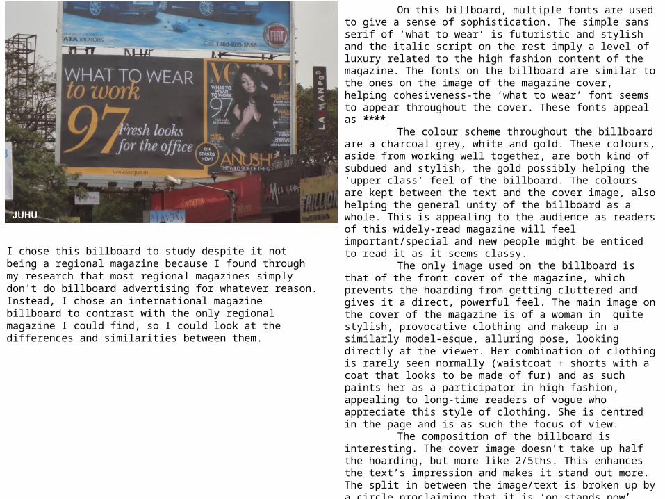
On this billboard, multiple fonts are used to give a sense of sophistication. The simple sans serif of ‘what to wear’ is futuristic and stylish and the italic script on the rest imply a level of luxury related to the high fashion content of the magazine. The fonts on the billboard are similar to the ones on the image of the magazine cover, helping cohesiveness-the ‘what to wear’ font seems to appear throughout the cover. These fonts appeal as ****
The colour scheme throughout the billboard are a charcoal grey, white and gold. These colours, aside from working well together, are both kind of subdued and stylish, the gold possibly helping the ‘upper class’ feel of the billboard. The colours are kept between the text and the cover image, also helping the general unity of the billboard as a whole. This is appealing to the audience as readers of this widely-read magazine will feel important/special and new people might be enticed to read it as it seems classy.
The only image used on the billboard is that of the front cover of the magazine, which prevents the hoarding from getting cluttered and gives it a direct, powerful feel. The main image on the cover of the magazine is of a woman in quite stylish, provocative clothing and makeup in a similarly model-esque, alluring pose, looking directly at the viewer. Her combination of clothing is rarely seen normally (waistcoat + shorts with a coat that looks to be made of fur) and as such paints her as a participator in high fashion, appealing to long-time readers of vogue who appreciate this style of clothing. She is centred in the page and is as such the focus of view.
The composition of the billboard is interesting. The cover image doesn’t take up half the hoarding, but more like 2/5ths. This enhances the text’s impression and makes it stand out more. The split in between the image/text is broken up by a circle proclaiming that it is ‘on stands now’, which continues a golden line below the main text area and above the magazine, keeping the billboard from looking too rigidly defined and keeping the design mildly interesting.
Overall this billboard is effective, striking yet not gimmicky, and appealing to Vogue’s middle/upper-class readership through its use of colour and composition.
I chose this billboard to study despite it not being a regional magazine because I found through my research that most regional magazines simply don't do billboard advertising for whatever reason. Instead, I chose an international magazine billboard to contrast with the only regional magazine I could find, so I could look at the differences and similarities between them.
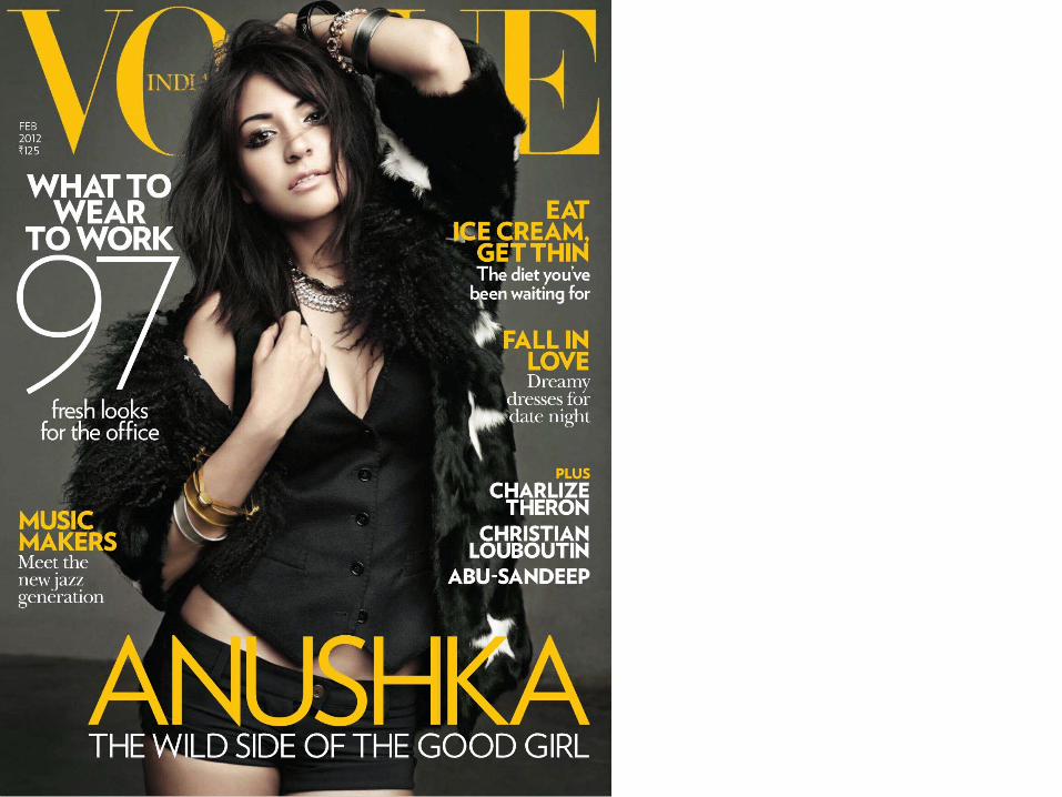
This billboard is for a high-class, regional magazine based in London, where many individual parts of London have their own version of The Resident so as to focus on local events for their readership. The tagline ‘your magazine, your London’ reflects this as each issue would be tailored to the reader’s particular part of London. It also brings a feeling of ownership and authority when the magazine is said to be ‘yours’. The title itself, ‘The resident [sic]’ also echoes this as it means a person who lives somewhere with a degree of permanence, just like the people who live in London and like London enough to get a luxury magazine about London.
The font choice here attract the audience by being neat and elegant and appealing to people who want a more sophisticated magazine. The colour scheme of the billboard is a kind of cream, black and pumpkin orange, quite non-traditional colours for advertising in this way as orange in a public environment either connotes safety (traffic cones etc.) or autumn, both not really representative of the magazine. The cream is quite sophisticated however, and the use of it brings down the brightness of the orange, lending it a mildly classy look. The black and cream as detailing are quite effective as they are high-contrast but still bring to mind luxury, like pianos and smartphones.
The only image used on this billboard is that of the magazine cover itself, placed behind the same magazine issue on a tablet computer and a smartphone (iPods and iPhone). This advertises their magazine as being available on widely-used products and would bring in readers who want to have easy access to their magazines on the go
Composition-wise, the billboard has a lot of empty space in-between the title/tagline and the image of the product, which is appealing aesthetically to upper/middle class readers as minimalism is popular and expensive. The title of the magazine takes up far more space than the magazine covers being advertised.
https://www.youtube.com/watch?v=kehpOuN8OMo
This advertisement is for a restaurant chain rather than a magazine, because radio adverts for magazines are almost non-existent, but as they are both still advertising and selling a product and following radio advertisement codes, I can use the techniques found in these ads for my own.
This particular advert is for the Nando's restaurant and it's an average 40 seconds long. It uses voices from various people describing their Nando’s experience in a way that sounds devotional, with shaky voices and dramatic phrases like ‘I remember a time…’ and ‘I ate there.’ The music used is kind of a cinematic but ethnic style, probably Portuguese music due to the fact that Nando’s is a Portuguese chain. The phrases used like ‘I stood shoulder to shoulder with the whole team [waiting for lemon and herb wraps with a side order of coleslaw]’ and ‘now I know why they call it the beautiful chicken’ sound like they could be references to football. This would hopefully stir up the same kind of feelings about Nando’s as someone’s favourite football team, and place them on the same level of importance in society.
The use of normal people recounting their experiences is an effective technique as it allows listeners to identify with the advert. The advert ends with a radio-announcer style voice (deep, slightly exaggerated) saying the price of one of their meals and recounting the slogan used earlier in the advert, ‘I ate there’.
This advert is for Warburton’s Half + Half bread, and is roughly 30 seconds in length. It starts with the sound effect of a voicemail beep from a phone, setting the scene and providing context for the listeners. A child’s voice begins, and speaks directly to ‘Mr Warburton’, airing a complaint about how the bread allows his mum to ‘sneak’ wholegrain into his favourite sandwiches.
The advert uses humour in its concept by playing to the stereotype of children hating ‘healthy’ foods like vegetables and whole grain bread, and then with the child saying ‘it’s really nice. I’m letting it go’ it suggests that this wholegrain bread is so good /effective at tasting like white bread that even health-phobic children love it. The ‘if I find anything like broccoli in my bread’ part is also a reference to children disliking vegetables.
The whole advert is framed like a threat directly to ‘Mr Warburton’, as shown by the ‘I’m watching you’ part the child’s part of advert ends on. This is humorous as children are not really normally authoritative/threatening like this.
The advert appeals to parents who are used to their kids refusing to try new/different foods, but not really to anyone else as adults don’t generally have a problem with bread/are going to listen to children.
https://www.youtube.com/watch?v=GQIh8nVPSeE