Embed Size (px)
Citation preview
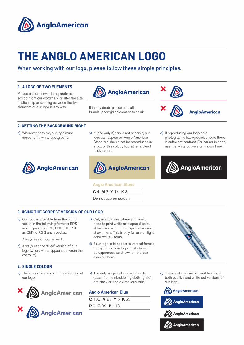
a) Our logo is available from the brand toolkit in the following formats: EPS, raster graphics, JPG, PNG, TIF, PSD as CMYK, RGB and specials.
Always use official artwork.
b) Always use the ‘filled’ version of our logo (where white appears between the contours).
c) Only in situations where you would need to print white as a special colour should you use the transparent version, shown here. This is only for use on light coloured 3D items.
d) If our logo is to appear in vertical format, the symbol of our logo must always be uppermost, as shown on the pen example here.
When working with our logo, please follow these simple principles.
THE ANGLO AMERICAN LOGO
1. A LOGO Of TwO ELEMENTs
Please be sure never to separate our symbol from our wordmark or alter the size relationship or spacing between the two elements of our logo in any way.
a) Wherever possible, our logo must appear on a white background.
b) If (and only if) this is not possible, our logo can appear on Anglo American Stone but should not be reproduced in a box of this colour, but rather a bleed background.
c) If reproducing our logo on a photographic background, ensure there is sufficient contrast. For darker images, use the white out version shown here.
2. GETTING THE bACkGROuNd RIGHT
3. usING THE CORRECT vERsION Of OuR LOGO
a) There is no single colour tone version of our logo.
b) The only single colours acceptable (apart from embroidering clothing etc) are black or Anglo American Blue
c) These colours can be used to create both positive and white out versions of our logo.
4. sINGLE COLOuR
Anglo American Blue
C 100 M 85 Y 5 K 22
R 0 G 39 B 118
Anglo American Stone
C 4 M 3 Y 14 K 8
Do not use on screen
If in any doubt please consult [email protected]
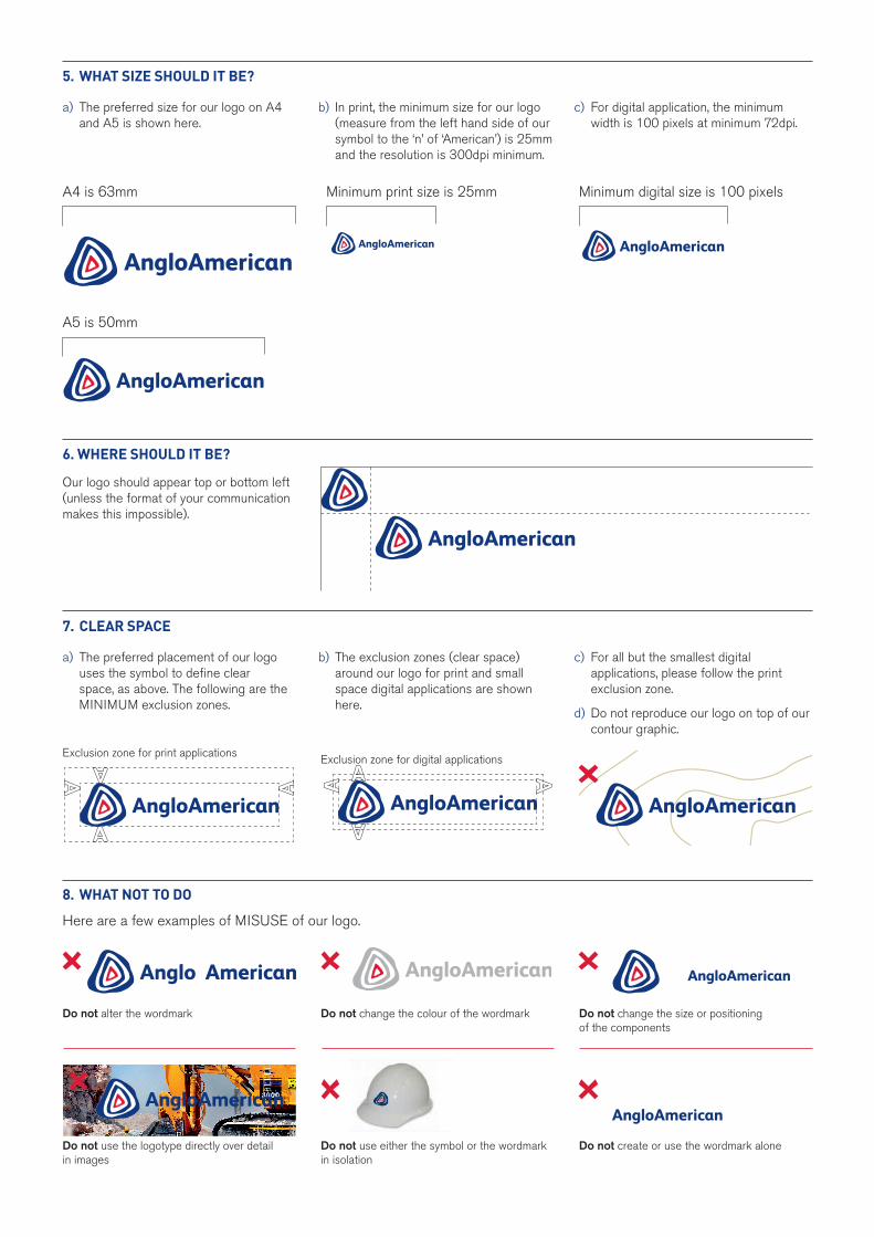
5. wHAT sIzE sHOuLd IT bE?
7. CLEAR spACE
8. wHAT NOT TO dO
6. wHERE sHOuLd IT bE?
a) The preferred size for our logo on A4 and A5 is shown here.
b) In print, the minimum size for our logo (measure from the left hand side of our symbol to the ‘n’ of ‘American’) is 25mm and the resolution is 300dpi minimum.
c) For digital application, the minimum width is 100 pixels at minimum 72dpi.
a) The preferred placement of our logo uses the symbol to define clear space, as above. The following are the MINIMUM exclusion zones.
b) The exclusion zones (clear space) around our logo for print and small space digital applications are shown here.
c) For all but the smallest digital applications, please follow the print exclusion zone.
d) Do not reproduce our logo on top of our contour graphic.
Here are a few examples of MISUSE of our logo.
Our logo should appear top or bottom left (unless the format of your communication makes this impossible).
A4 is 63mm Minimum print size is 25mm Minimum digital size is 100 pixels
A5 is 50mm
Exclusion zone for print applications Exclusion zone for digital applications
Do not alter the wordmark
Do not use the logotype directly over detail in images
Do not change the colour of the wordmark
Do not use either the symbol or the wordmark in isolation
Do not change the size or positioning of the components
Do not create or use the wordmark alone