Embed Size (px)
Citation preview

Chapter 1
The Big Picture
•
User Interface Design for the Busy Developer
•
Thinking About Software
•
Finding a Few Guiding Lights
•
Basics of a Good User Interface
4361Book.fm Page 1 Thursday, November 18, 2004 8:45 PM
COPYRIG
HTED M
ATERIAL

2
Chapter 1 • The Big Picture
M
y goal with this book is simple: to help you design and improve user interfaces for your Windows and web applications. By designing better user interfaces (UIs), you can improve
user satisfaction and make users more productive. Ultimately, this will make you more appre-ciated and in demand as a developer. Along the way, I’ll pass on lots of little tips and drill into many of the details that make for a good user interface. Most of the book will focus on little things, from toolbar buttons to laying out a web application. But before getting into the details, it will help to have an overall framework for thinking about user interface design. That’s where this chapter comes in.
User Interface Design for the Busy Developer
Depending on the size of your development team and the workflow in your organization, several people may be responsible for designing an application’s user interface:
●
If you have project managers whose responsibilities include writing software specifications, they may include user interface mockups in the specification.
●
If you’re using extreme programming (XP) practices, you might have a customer represen-tative dictating the design of the user interface.
●
If the organization is sufficiently large, you may have user interface design specialists who do nothing but work on these issues.
●
If the user interface isn’t completely specified at the time that the code has to be written, it falls on the developer to make the initial design decisions. This is not usually the best possible situation. Without user feedback, it’s hard to come up with a good design. But the task still needs to be done.
I’m primarily a developer myself, so if you’re in that last category, I empathize. Designing the user interface is just one of the dozens of things that most developers have to do in the course of their jobs. Even if it’s not your primary focus, you need to understand enough about user interface design to get the job done.
But remember: Designing a good user interface does not relieve you of the responsibility to develop a working application. You can’t afford to invest all your development time in making the user interface pretty. That approach would sacrifice functionality. Instead, it’s your job to strike a balance among all the competing demands on your time.
Take heart, however. Although you may never have thought about user interface design in detail, the basics are fairly straightforward. And like any other skill, they can be learned. I offer these words of comfort for the busy developer faced with user interface design:
TIP
If you can learn a computer language, you can learn to build a functional, usable, and reasonablyattractive user interface.
4361Book.fm Page 2 Thursday, November 18, 2004 8:45 PM

3
Thinking About Software
Thinking About Software
What do you think about when you think about software? Ones and zeroes? Loops and condi-tional statements? Although these may be good ways to think about the internal construction of computer programs, they don’t do much to illuminate the task of building a good user interface for an application. In this section, I’ll guide you through some alternate ways of thinking about your software. These ways have proven helpful to me in the past when I’ve had user interface design work to do.
Software as a Conversation
One way to think of your software is as a conversation between the developer and the user. The user starts the conversation by running your application. You return with an opening gambit that lists the things you’re ready to talk about. The user selects one, and you respond. The inter-change of the user taking an action and then you responding (through your software) continues through the life of the application.
Thinking about software as a conversation makes it clear that you need to communicate with the users of your application. It’s unrealistic to expect users to figure out what the application does and how to make it work by guesswork alone. Fortunately, there are several ways to com-municate with the user: help files, printed documentation, and the user interface all contribute to your end of the conversation. Of these, the only one that you can depend on the user “hear-ing” is the user interface itself. Help files can be closed, manuals can be left unread, but it’s the rare user who can fire up the application and then ignore the user interface completely.
But don’t push this way of looking at things too far. Although you do communicate with users through the user interface of your application, it’s a very limited kind of communication. You don’t have any way to react to the user’s facial expression or body language. You can’t tell from timing whether they’re understanding your intentions or missing them wildly. Despite these limitations in the software-as-a-conversation model, there’s one big lesson to be learned here. In a real-life conversation, you wouldn’t arbitrarily start speaking Esperanto or Hungarian without some indication that listeners are expecting the switch. Similarly, in software it is very dangerous to suddenly discard well-known user interface conventions without a good reason. A confused user is an unhappy user.
Similes, Metaphors, and Software
Another way to think about software is to compare it to some real-world object. This is a familiar tactic for making computer programs less scary—and their functions more obvious—to users. For example, Windows was originally designed as a sort of electronic rendition of an office worker’s desktop, with file folders and documents and a calculator and a clock. You can move documents from one file folder to another, or discard them into a recycling bin. You can punch buttons on the calculator to do simple math, or set the time on the clock.
4361Book.fm Page 3 Thursday, November 18, 2004 8:45 PM

4
Chapter 1 • The Big Picture
This may all seem quite obvious to you as a Windows user in the first decade of the 21st century. But when Windows first came out in the early 1990s, it was a revolutionary way to interact with computers. The similarities between the Windows desktop and a physical desktop helped many of us figure out how to use this new breed of software.
Sometimes software developers speak of this sort of thing as coming up with a
metaphor
for their software. But they’re wrong: the relation between applications and the real world is one of
simile
, not metaphor. Think back to your middle-school English classes, and you may recall the difference between a metaphor and a simile:
●
A metaphor is a figure of speech in which one thing is equated to another, as in “Windows is an office worker’s desktop.”
●
A simile is a figure of speech in which one thing is said to be like another, as in “Windows is like an office worker’s desktop.”
The distinction is important, because these comparisons between applications and parts of the real world inevitably break down at some point. For example, you can’t keep a pint of whiskey in the bottom drawer of the Windows desktop or spill ink on the letter you’re writing. But the Windows desktop lets you change the label on a file folder without needing an eraser or a type-writer—something that would be quite a trick in the real world. The point is that the Windows application is not identical to the real world. At best, it is similar to the real world.
Another way to think about this is to consider applications as analogies to the real world. One dictionary definition of analogy is as a similarity in some respect between things that are other-wise dissimilar. We know that computer applications and the real world are two different things, and they are wildly dissimilar: The real world is made up of atoms, and applications are made up of bits. But there are areas where the two are similar. Thus, the Windows desktop does have an analogy to a real desktop, and by conjuring up the image of a real desktop in the user’s mind, it suggests to the user how the Windows desktop can be manipulated.
Because applications are at best similar to the real world, users are forced to construct a map (a set of correspondences) between the application and more familiar objects. That is, some reasoning takes place of the sort “this application behaves like X, so I should be able to do Y,” either consciously or unconsciously, as the user tries to figure out which parts of the real world experience are applicable to the software at hand. Not all such mappings are created equal. Figure 1.1 shows schematically how two different applications might compare to their real-world counterparts.
The upper part of the diagram demonstrates an application that maps very closely to its real-world model. There are a few things about the application that aren’t in the real world, and vice versa, but the overlap between the two is substantial. The application behaves mainly as if it were a part of the real world. In the lower part of the diagram, a second application is a much less precise match to its real-world partner. Many things about the application can’t be under-stood by reference to the real world.
4361Book.fm Page 4 Thursday, November 18, 2004 8:45 PM

5
Thinking About Software
F I G U R E 1 . 1
Similarities between software and the real world
It’s tempting to suppose that more an application will be better and easier to use if it is a more precise match to its real-world model. This in turn implies that the user interface should mimic some portion of the real world. But that is not necessarily true. Remember Microsoft Bob? That was Microsoft’s most “realistic” user interface to date, and it was a resounding flop. Among other problems, imposing too much of the real world on the way the system worked led to very difficult navigation, with artificial constraints to traveling around from one part of the applica-tion to another. That’s fine in a game, but not in an operating system.
Another reason to beware of software similes is that they can lead to tunnel vision. If you’re trying to exactly mimic some piece of real-world hardware in a software application, you may well miss opportunities to add and extend functionality that would benefit users. So if you start with a simile in mind, make sure that you don’t stop there.
Software as a Means
As a final way to think about software, remember that software is a means rather than an end. The chance that a user will be running your application just because they want to run your application is almost zero. Instead, they will have some goal in mind, and your application is a way to reach that goal. Even when a user launches your application to explore its capabilities, they usually have a goal in mind, such as evaluating whether the application will meet their needs.
Keeping this principle in mind is a good way to avoid making your software overly cute at the expense of usability. Spending effort to add a photorealistic three-dimensional user interface
Real WorldBehavior
ApplicationBehavior
4361Book.fm Page 5 Thursday, November 18, 2004 8:45 PM

6
Chapter 1 • The Big Picture
inspired by your favorite movie may make you feel extremely clever, but if users can’t find the menus among the clutter, it’s a step backward for your application. Users also don’t care about how clever your code is, or how much work went into the program. They just want to reach their goals. If your program is the best means to that end, great. If not, there are plenty of other programs out there to try.
This is an area where a good user interface can give you a boost in the market. If your applica-tion is easy to use, then it will be a more natural means. This can translate directly into happier users and more sales.
Finding a Few Guiding Lights
The next step beyond thinking about applications is to thinking about user interfaces. Some applications, of course, have no user interface (or so little user interface as to be practically none at all): Windows services are a prime example of such applications. But most applications display information to the user and allow the user to interact with the application in turn.
Before getting into specific guidelines for what constitutes a good user interface, there are three overall principles that you ought to keep in mind:
●
Task orientation
●
Idiom reuse
●
Intuition isn’t
I’ll discuss each of these principles in turn.
Concentrating on the Task
Just as user has a long-term goal in mind for their overall use of your application, they have a short-term goal to focus on at any given point. Writing a letter in a word processor, for example, might be broken down into three steps:
1.
Choose an appropriate template to create the skeleton of the letter.
2.
Type the text of the letter.
3.
Print the letter.
Although the user wants to write a letter through this entire process, they need to perform a number of tasks along the way. The user interface is their only way to convince the applica-tion to perform these tasks in the right order. Making sure that the user can always perform their next desired task is part of the job of building a user interface.
4361Book.fm Page 6 Thursday, November 18, 2004 8:45 PM

7
Finding a Few Guiding Lights
At any given point, a good user interface will offer ways for the user to perform the next task that they have in mind. In most cases, though, you won’t know precisely what the user wants to do next, so the user interface must offer choices. Even so, sometimes you can target your choices. Figure 1.2 shows the task pane that Microsoft Excel 2003 displays when you first launch the application. At this point, it’s a good bet that the user wants to either create a new document or open an existing document, so the choices are focused in those directions.
F I G U R E 1 . 2
Excel 2003 attempts to make likely tasks easy to perform
Task panes like this strike a nice balance between making common tasks easy and making uncommon tasks possible. Most users can probably get to their proper starting point by choos-ing an option in this task pane, but the task pane doesn’t block access to the other menus and icons within Excel. If you have some other starting point in mind, and you know what you’re doing, the task pane won’t get in your way.
If you’re having trouble figuring out the tasks that a user might want to perform with your software at any given time, try writing some scenarios. A
scenario
is just an informal story about what a user might want to do with your software. For example, if you’re writing the perfect application for sending out spam, a couple of your scenarios might read this way:
“Judy is a new spammer who isn’t quite sure how to get the maximum returns from her ads for dubious imported pharmaceuticals. She launches SpamOVator and tells it to create a new spam e-mail. She then types in the text of her ad and presses the Analyze button. SpamOVator
4361Book.fm Page 7 Thursday, November 18, 2004 8:45 PM
8
Chapter 1 • The Big Picture
automatically inserts misspellings and obfuscates the URLs, while keeping the sense of the message intact and suggesting some subject lines. Judy selects a subject line from the list, presses the Send button, and spews out 100,000 copies of her ad.”
“Bob is an experienced spammer who has limited time to get things done. He starts SpamO-Vator and imports his ad text from a Microsoft Word file. He’s already crafted his own keywords to get past Bayesian filters, so he simply types in his subject line, hits Send, and goes on to his next project.”
In a real product specification, each of these scenarios would be much longer, and there would be others to supplement them. The key to writing a good scenario is to focus in on a particular real-world user and describe their interaction with the software. From the scenarios, you can then derive a list of tasks that might be performed at any given time. For example, it’s already clear that SpamOVator must both allow creating new messages from scratch and importing messages cre-ated in other applications, and that both of these tasks should be possible to perform as soon as you launch the program.
Using Common Idioms
The dictionary offers several definitions of the word
idiom
; the one that concerns me here is “The specific grammatical, syntactic, and structural character of a given language.” (Thanks to the fourth edition of the
American Heritage Dictionary of the English Language
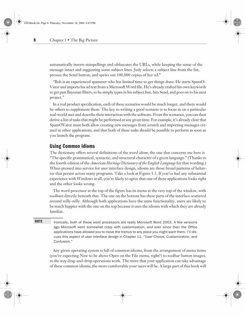
for that wording.) When pressed into service for user interface design, idioms are those broad patterns of behav-ior that persist across many programs. Take a look at Figure 1.3. If you’ve had any substantial experience with Windows at all, you’re likely to agree that one of these applications looks right and the other looks wrong.
The word processor at the top of the figure has its menu at the very top of the window, with toolbars directly beneath that. The one on the bottom has these parts of the interface scattered around willy-nilly. Although both applications have the same functionality, users are likely to be much happier with the one on the top because it uses the idioms with which they are already familiar.
NOTE
Ironically, both of these word processors are really Microsoft Word 2003. A few versionsago Microsoft went somewhat crazy with customization, and ever since then the Officeapplications have allowed you to move the menus to any place you might want them. I’ll dis-cuss this aspect of user interface design in Chapter 11, “User Choice, Customization, andConfusion.”
Any given operating system is full of common idioms, from the arrangement of menu items (you’re expecting New to be above Open on the File menu, right?) to toolbar button images, to the way drag-and-drop operations work. The more that your application can take advantage of these common idioms, the more comfortable your users will be. A large part of this book will
4361Book.fm Page 8 Thursday, November 18, 2004 8:45 PM

9
Finding a Few Guiding Lights
go toward teasing out the ways that Microsoft Windows applications work in the Windows XP and Windows 2003 era.
Another way to think of a language idiom is as an expression in which the meaning isn’t derived from the literal meaning of the words themselves, but from a cultural understanding of the aggre-gate expression; for example, “She heard it straight from the horse’s mouth.” This is useful in talk-ing about software design because much of what “makes sense” to us are simply conventions that we’ve learned to understand and use. For example, it makes no literal sense to have a trashcan on a desk (unless you’re a night janitor), but we’ve come to accept it and find it useful. The literal mean-ing of the trash can on screen is pretty silly, but so is the literal meaning of a language idiom. Sim-ilarly, why would a user have a menu, unless he works in a restaurant? It doesn’t make a lot of sense, but because everyone has gotten used to the convention and finds it very useful, software designers keep it. A designer could change the convention to something that made more literal sense, but that would probably be a lot more trouble than it’s worth—and it would confuse users to boot.
F I G U R E 1 . 3
Common idioms used and abused
4361Book.fm Page 9 Thursday, November 18, 2004 8:45 PM

10
Chapter 1 • The Big Picture
Debunking the Myth of Intuition
A lot has been made of the supposedly intuitive nature of various computer operating systems and applications. I won’t say that this is all nonsense because I haven’t tried out every applica-tion under the sun. So to be charitable, I’ll simply quote Sturgeon’s Law:
Sure, 90 percent of science fiction is crud. That’s because 90 percent of everything is crud.
I could tell you a lot of stories to illustrate my point, but I’ll start with one from the earliest days of Windows. Back in the prehistoric era (around the release of Windows 2.0), I spent part of my time teaching 3-hour night school classes in Windows Basics. We got a wide variety of computer users, from hobbyists to business users. Many of them had never worked with a com-puter mouse. Perhaps you think the mouse is an intuitive device. It probably is, for you, right now. But then why did so many of my students attempt to move the cursor by waving the mouse in the air?
As another example, Figure 1.4 shows a new toolbar button that showed up in the Office 2003 user interface. Does your intuition help you guess what this button does?
F I G U R E 1 . 4
A mystery toolbar button
The icon is a combination of the New Document icon and the international Stop symbol. Don’t allow new documents? Stop others from making new documents? Insert a new stop sign icon in the document? Take a break from word processing? When faced with a new icon like this, intuition is pretty worthless, no matter how obvious things might have seemed to the developer.
That’s why a good user interface offers hints. Things can be “intuitive” the second time you see them as long as they’re explained the first time that you see them. Microsoft invented the ToolTip as a way to provide user interface hints. Hover your mouse pointer over the mystery icon, and you’ll see the ToolTip shown in Figure 1.5.
In fact, this icon opens the Permission dialog box, which allows you to set rights management properties for the document. A few years from now, the icon will be intuitive—but only because you had a chance to learn what it does.
F I G U R E 1 . 5
The mystery explained
4361Book.fm Page 10 Thursday, November 18, 2004 8:45 PM

11
Basics of a Good User Interface
The bottom line is this: Nothing is intuitive unless you’re a wild beast; for humans, every-thing is learned. Therefore, one of the differences between good and bad GUI design is simply how easy the software is to learn for the targeted user.
Basics of a Good User Interface
There are many ways to define “good” when it comes to user interfaces. Is it one that is esthet-ically pleasing? Is it one the works like a Microsoft application? As an overall rule, I’m happy with this definition:
RULE
A good user interface is one that lets the user accomplish the task that they want to accom-plish, without putting obstacles in their way.
In this book, I’ll teach you to construct user interfaces that meet that definition of “good.” As a starting point, here are my guidelines for what goes into a good user interface:
●
Respect the User
●
Keep Things Simple
●
Be Direct
●
Be Forgiving
●
Be Consistent
Respect the User
Without the user, your application is useless. That’s why I put respecting the user at the top of my list. You need to obtain the user’s cooperation to get them to continue using your appli-cation. The application’s user interface can play an important part in obtaining this coopera-tion. If users have a positive experience with an application (it does what they want, it’s easy to use, and so on), they’re more likely to use it again in the future.
In some rare cases, you may have a captive audience and be able to ignore this precept. For example, if you’re building internal applications in a Fortune 500 corporation, and your boss is experienced at corporate politics, it’s quite likely that people will be told to use the applica-tions whether they’re any good or not. But even if you can get by with not respecting the user, you ignore this guideline at your own peril. It’s entirely possible that you won’t have that luxury at your next job, and it’s hard enough to write software without having to unlearn bad habits.
One element of respecting the user is to leave the user in control as much as possible. Remem-ber the task pane that you saw in Figure 1.2? The task pane makes it easy to perform common tasks, but it does not limit the user to performing only common tasks. The rest of the Excel user interface is still available in case the user should feel the urge to perform an uncommon task.
4361Book.fm Page 11 Thursday, November 18, 2004 8:45 PM

12
Chapter 1 • The Big Picture
One way to keep the user in control is to make your application modeless (as opposed to modal). In a
modeless
application, the user has access to the full range of program functionality no matter what’s going on. In a
modal
application, what the user can do is determined by the mode that the program is in.
Although you’ll sometimes see modeless applications recommended as an absolute good thing, reality is a bit more complex. As a trivial example, some modes are mutually exclusive. For example, when you’re working with many Windows applications, the Insert key toggles data entry between insert and overwrite modes. If you’re inserting characters, you can’t over-write characters without switching to the other mode. Well, you could define some strange keystroke combination to insert characters while in overwrite mode or vice versa, but then you’d be ignoring a common Windows idiom.
On a less trivial level, modes can be useful in limiting the complexity of your application when the user is focused on performing a particular task. For example, most wizards (and similar inter-faces, whatever their names) are modal. When the user is working through the steps in a wizard, it’s a good bet that they’re trying to perform a specific task through following the steps that you lay out in code. In that case, it’s only a distraction to make the rest of the application’s function-ality available while the wizard is on the screen.
NOTE
I’ll discuss wizards in Chapter 8, “Common Windows User Interface Elements.”
Finally, modes can reflect underlying limitations in your code. For example, you might simply not be able to show changes to the underlying document while a print preview window is open on screen because your preview rendering code doesn’t get called correctly. In such cases, modal behavior is far preferable to wrong or crashing behavior.
The other important element of putting the user in control is to assume that the user is intelligent (if perhaps not experienced). It’s up to you not to waste the user’s time with unnecessary steps and wasteful dialog boxes. The key is to come up with a user interface that works for both inexperienced and experienced users. In general, you can achieve this through careful hinting. (You already saw one example of this in Figure 1.5 earlier in the chapter.) ToolTips act as hints for less experienced users while remaining invisible (and therefore unobtrusive) for more experienced users.
Another area in which hinting works well is with explanatory dialog boxes. You can’t depend on users to read the help file before using your application, but sometimes there is extremely important information that you want like to convey. For example, consider the status message shown in Figure 1.6.
The problem with status messages like this is that they age quickly. If the user hasn’t looked at the manual, this is useful information the first time that the message pops up. If they have, it might be a slight annoyance. If it keeps popping up, the message rapidly escalates into a major annoyance, with users shouting at the screen, “I know that, you stupid program!”
4361Book.fm Page 12 Thursday, November 18, 2004 8:45 PM

13
Basics of a Good User Interface
You can remove most of the annoyance potential with one simple change, shown in Figure 1.7.
This change puts the user back in control. With a single mouse click, they can decide that they know enough about this aspect of the application and have it stop bothering them. Now the original message is a piece of information rather than an insult to their intelligence.
TIP
You could improve this piece of the user interface even more by rewriting the text to usenormal English instead of computer jargon.
This example illustrates another aspect of user interface design as well: Design decisions have consequences. What if the user accidentally turns off the notification? You should pro-vide some way to turn these messages back on (short of removing and reinstalling the entire application). One way to handle this is to add a check box labeled “Show all warning and informational messages” to your application’s customize dialog box. Thus, you could turn off each message individually, but if you ever went too far in disabling all messages, you could get them all back together.
Keep Things Simple
Some applications are overwhelmingly complex. Figure 1.8, for example, shows a portion of the options settings dialog boxes for Microsoft Outlook 2003. By clicking a few buttons, I’ve gotten modal dialog boxes stacked five deep, and this is just a small part of the hundreds of options that Outlook offers its users.
F I G U R E 1 . 6
A potentially annoying message
F I G U R E 1 . 7
The annoyance defanged
4361Book.fm Page 13 Thursday, November 18, 2004 8:45 PM

14
Chapter 1 • The Big Picture
F I G U R E 1 . 8
Outlook offers too much complexity for most users
4361Book.fm Page 14 Thursday, November 18, 2004 8:45 PM

15
Basics of a Good User Interface
The designers and developers of Outlook would probably defend this interface by saying that every option in it is useful to some of their target audience, and that if they remove any control, users complain. And, of course, I did just recommend leaving the user in control. But the expe-rience I have with Outlook users is rather telling. There are quite a few people who know that I’ve been using Outlook since the very first release, and I get instant messages and phone calls whose general subject is “how the heck do I do X with Outlook?”
Now, I’m not going to pretend that I have the solution to reorganizing Outlook’s rat’s nest of options into a more manageable format. But I do think that users are not given any meaningful measure of control by being presented with hundreds of options that they do not understand and cannot find. Part of what’s going on here, I think, is a confusion of two different dimensions of user interface design. If you think of control as requiring complexity, your mental map of these factors looks like Figure 1.9.
F I G U R E 1 . 9
Two dimensions collapsed into one
If you think that simplicity and lack of control are the same thing, it’s going to be hard to keep the user in control and have a simple application. But thinking a bit deeper, you’ll probably agree with me that the situation is better represented by Figure 1.10, in which simplicity and control are two distinct dimensions that can be independently varied.
As Figure 1.10 suggests, you can have a simple system in which the user has a high level of control (for example, the Segway human transporter) or a complex system that offers little control (for example, the stock market). For software, the sweet spot is to have a simple system that still offers the user enough control to perform all the tasks that they have in mind for your software. You’re unlikely to design the perfectly simple application that keeps the user per-fectly in control, but it’s a goal worth striving for.
To make life even more confusing, simplicity itself is not a simple concept. When you try to make an application simpler, you might be doing any of these things:
●
Removing extra controls from the user interface
●
Minimizing the lines of code in the application
●
Removing functionality from the application
●
Adding hints or help to make the application easier to use
●
Organizing controls into logical groups
●
Hiding controls until they’re needed
Lack ofControl
Simple
Plenty ofControl
Complex
4361Book.fm Page 15 Thursday, November 18, 2004 8:45 PM

16
Chapter 1 • The Big Picture
●
Adding wizards to step the user through tasks
●
Breaking up large dialog boxes into smaller ones
Any of these activities is a reasonable way to decrease the complexity of an application. But remember, the goal isn’t just to make the program simpler: it’s to make the user’s interaction with the program simpler. One way to test whether you’re moving in the right direction is to go back to the scenarios you’ve constructed for using the application. Imagine that you’ve built the application, and now you need to explain to one of your prototypical users how to use it to accomplish their tasks. Given two choices of user interface, the one that’s easier to explain is almost certainly the simpler one.
There’s one other test you should perform when using scenarios to test simplicity. Print out the user interface on paper, and work through your scenarios. As you use each piece of the interface in carrying out the users’ tasks, cross that control out on the printout. When you’re all done with scenarios, inspect the printout. If any controls are not crossed out, there are two possibilities. Either they’re superfluous and your application’s user interface can be simplified further, or you’ve missed an important scenario and should write it up for your master list.
F I G U R E 1 . 1 0
A better way to think about simplicity and control
Be Direct
Consider the problem of applying formatting to text in a word processing application. What would you think if the user interface shown in Figure 1.11 were the only way to format text?
Certainly you
could
format a document this way—but it would be exceedingly tedious and painful. You’d need to count character positions, then open the modal dialog box and fill it in, and then hit OK. If you made any mistakes, it would be back to the dialog box. Each time you had to make a change it would require the same process, interrupting your train of thought.
Lack ofControl
Simple
Plenty ofControl
Complex
4361Book.fm Page 16 Thursday, November 18, 2004 8:45 PM

17
Basics of a Good User Interface
Now compare this with the way that Microsoft Word actually handles this task, as shown in Figure 1.12.
Word’s approach to the formatting problem is much more
direct
than the modal dialog box. You select the text that you want to format, and then click controls to dictate the formatting. Feedback is instantaneous, and you’re not prevented from working on other tasks while you’re deciding on formatting (this is an example of a modeless approach, as discussed earlier in the chapter).
In general, indirect user interfaces seem to appeal more to developers, whereas direct user interfaces are better for end users. As coders, we’re used to writing instructions to tell the computer what to do. But for people who live a bit closer to the physical world than we do, it’s more natural to pick an object and apply a tool to it. Most people would rather grab a hammer and take a whack at a nail than write detailed instructions telling someone else how to do it.
Directness in user interfaces comes into play any time there is some object that can be selected within the application. Note that I’m using “object” here in a rather naïve end-user sense, rather than in the technical sense of object-oriented programming. From the user’s point of view, an object is anything (a database row, a cell in a spreadsheet, a paragraph of text, a rectangle on a drawing) that they can select. If it can also be dragged around the screen with the mouse, the illusion of objecthood is enhanced.
Given a set of end-user objects within an application, a direct user interface allows the user to select an object, and then choose a tool or operation to apply to that object. For example:
●
Select a database row and click the Delete toolbar button to remove the row.
●
Select a cell in a spreadsheet and use the Format menu to change the cell’s background color.
●
Select a paragraph of text and choose a font for the text from a drop-down menu.
●
Select a rectangle and pour a new color into its interior with a paint bucket tool.
F I G U R E 1 . 1 1
Indirect text formatting
4361Book.fm Page 17 Thursday, November 18, 2004 8:45 PM

18
Chapter 1 • The Big Picture
F I G U R E 1 . 1 2
Direct text formatting
There’s a common noun-verb pattern here. More informally, you might call this idiom “grab-this-do-that.” My experience has been that this idiom is easy to explain, easy to remember, and a good fit for the way in which most users work with the computer.
WARNING
Remember, though: No matter how direct you make your interface, the computer is not the realworld. Don’t be afraid to abandon directness if an indirect interface makes more sense.
Another approach to directness is illustrated by many of the Windows Control Panel applets, such as the Power Options dialog box shown in Figure 1.13. When you make a change in options here, the Apply button is available to save the changes.
The three buttons at the bottom of this dialog box have three distinct functions:
●
OK saves the changes and closes the dialog box.
●
Apply saves the changes and leaves the dialog box open.
●
Cancel discards the changes and closes the dialog box.
F I G U R E 1 . 1 3
Direct application of new options
4361Book.fm Page 18 Thursday, November 18, 2004 8:45 PM

19
Basics of a Good User Interface
Although this is by now a well-established Windows idiom, and it fits the “grab-this-do-that” pattern, it tends to be confusing to new users. If you choose to use this idiom in your own appli-cations, you’ll want to make sure you explain the difference between Apply and OK somewhere in the application’s help file.
Be Forgiving
As Alexander Pope reminds us, to forgive is divine. Although your application probably doesn’t aspire to divinity, forgiveness is still a virtue well worth keeping in mind. Users will rapidly develop a dislike for your application if it seems to be unforgiving of mistakes. This is an area that deserves particular attention because developers tend to develop blind spots to the unfor-giving parts of their own applications. When you’ve written all of the code, it’s quite easy to run through a usage scenario without making any missteps. But if you do this, you’ll miss the places where one bad menu choice or errant toolbar button click can wipe out substantial work.
There are three main strategies that you can use to make applications more forgiving. The first is to make sure, as best you can, that users want to perform potentially destructive actions. Figure 1.14 shows the prompt that Windows XP displays when you tell it to delete a file.
Such prompts help make sure that a user actually intends to delete a file, but they can get annoying after a while. If you do opt to use confirmation prompts, you should provide a way to suppress or sidestep the prompts. This might involve a check box to suppress prompts in the future or a special key combination such as Alt+Delete to delete without prompting.
The second way to make your application more forgiving is to move rather than destroy information. Even if you tell Windows to go ahead and delete a file, it doesn’t
really delete the file. Instead, it moves the file to the Recycle Bin, from which you can recover it later if you change your mind. As with confirmation prompts, there are potential problems with this approach. In particular, you need to be sure that the user understands the consequences of their actions with respect to confidential information. You need to provide a way to do a real, permanent deletion of sensitive material. In fact, Microsoft does provide a way to really delete a file: Press Shift+Delete instead of Delete. But there isn’t any easy way for most users to dis-cover this shortcut.
F I G U R E 1 . 1 4 Confirming a destructive action
4361Book.fm Page 19 Thursday, November 18, 2004 8:45 PM

20 Chapter 1 • The Big Picture
The final step toward application forgiveness is to implement some sort of undo facility. Most experienced Windows users have the Ctrl+Z keyboard combination wired into their fin-gertips because it’s the most common shortcut for undo. Building undo into your applications allows users to recover quickly from mistakes by reversing the mistaken actions.
Some applications supply more sophisticated undo facilities than a simple reversal of the most recent action. For example, the Windows Recycle Bin preserves everything that you delete until you decide to empty it. As another example, Figure 1.15 shows the Undo drop-down list in Microsoft Word, which lets you reverse a whole set of actions at once.
F I G U R E 1 . 1 5 Multiple undo in Microsoft Word
Be ConsistentIf I had to choose just one guideline for good user interface design, it would be this one: Be con-sistent. I briefly mentioned this earlier in the chapter when discussing common idioms, but it’s a topic worth a more extended discussion.
Consistency in software programs comes in at three different levels:
● Internal consistency
● Suite consistency
● Platform consistency
Internal consistency refers to an application’s consistency with itself. If you implement ToolTips for toolbar buttons in the application, you should implement them for every toolbar button in the application. If you use pale yellow to indicate missing information on one dialog box, use that same color for the same purpose throughout the application. The goal of internal consistency is to establish a set of standards for the application that your users can depend on. This helps them build up their knowledge of how the application works more quickly and contributes to reaching a comfort level with your program.
Depending on the application, suite consistency may or may not come into play. If you’re producing more than one program, and if they’re meant to work together, you need to consider suite consistency. Microsoft Office is the prime example of how suite consistency works. If you know how an operation (such as multiple-level undo) works in one of the Office applications, you likely know how it works in all the rest. Office’s suite consistency isn’t perfect, but it is way
4361Book.fm Page 20 Thursday, November 18, 2004 8:45 PM
21Summary
ahead of that found in most groups of applications. By developing your own set of standards, you can make it easier for users of one of your applications to pick up on others. That tends to translate to increased sales, which is always a good thing.
Finally, platform consistency is concerned with making sure that your applications feel like they belong on the operating system (Microsoft Windows in the case of this book). To take a trivial example, Windows uses Ctrl+C for copy, Ctrl+X for cut, and Ctrl+V for paste. Your application should implement those same key combinations for those operations. To do oth-erwise is to leave users baffled and angry.
TIP Microsoft has published an entire online book, The Windows User Experience, which discussesthe standards for Windows applications. This book is available online (http://msdn.microsoft.com/library/default.asp?url=/library/en-us/dnwue/html/welcome.asp) and on the MSDN Library CD-ROMs, and should be required reading for anyone buildingWindows user interfaces.
Why is consistency so important? Because it cuts the learning curve for applications substan-tially. Whether they’ve been using Word and Excel or Notepad and Calculator, the chance is that users know something about the Windows standards. Any part of those standards that they can apply to your program is one less thing to learn. Similarly, suite consistency and internal consistency make it easier for people to figure out how your application works in the context of your other applications, or as a stand-alone program.
SummaryIn this chapter, I tried to give you a broad overview of user interface design as it’s practiced by developers. You learned some ways to think about software, some overall principles, and some basic guidelines. The rest of the book will show you how to apply these principles and guide-lines to user interface construction in more detail. I’ll start the process in the next chapter by looking at some of the issues surrounding the simple display of text on the user’s computer monitor.
4361Book.fm Page 21 Thursday, November 18, 2004 8:45 PM

4361Book.fm Page 22 Thursday, November 18, 2004 8:45 PM