Embed Size (px)
Citation preview

The Bottles of Phillips Milk of Magnesia
Bill Lockhart, Beau Shriever, and Carol Serr
As often happens, sources of the early history of Charles H. Phillips, his most prominent
invention, and his business are confused and confusing. The following history has ignored the
often-copied incorrect information from the internet and concentrated on best cited and/or most
rational information we could find.
Soon after its invention by Charles H. Phillips in 1873, Milk of Magnesia became
Phillips’ most popular product. After Phillips died in 1882, his four sons gained control of the
business, incorporating as the Chas. H. Phillips Chemical Co. in 1885. Although the product
sold nationally, it probably did not become a household word until the Sterling Products Corp.
purchased the firm in 1923 and stepped up national advertising. Sterling introduced Milk of
Magnesia Tablets in 1931. The bottles for both the liquid and the tablets followed a logical
progression of embossing and paper labels, enabling me to present a reasonable chronology of
the product.
History
Charles H. Phillips, an English chemist (pharmacist), moved from England to Elizabeth,
New Jersey, where he operated as a retail druggist before relocating to what became known as
the Phillips Mansion, 666 Hope St., in the Glenbrook subdivision of Stamford, Connecticut, in
1848. He established the Phillips Camphor and Wax Co. along the Noroton River on the same
property, a bit east of the house, in 1849. Along with camphor and wax, the factory produced
essential oils as well as Phillips’ Palatable Cod Liver Oil (emulsion) and Phillips’
Phosphor-Nutritine (Mills 2018; Old Main Artifacts 2014; Sullivan 2013).
In 1873, Phillips patented an 8% suspension of hydrate of magnesium and water, naming
the formula Milk of Magnesia because of its milky whiteness. Even though he produced his
products at Glenbrook, he advertised as Charles H. Phillips, Manufacturing Chemist, through a
sales office at “Nos. 2 & 4 Platt Street,” New York City by at least 1879. He used his own name
and the New York address until at least 1883 and almost certainly until the incorporation. After
1
Figure 1 – Phillips logo
Phillips’ death in 1882, his four sons gained control of the business, incorporating as the Charles
H. Phillips Chemical Co. in 1885. By 1886, the product line included Phillips’ Phospho-Muriate
of Quinine, Milk of Magnesia, Phillips’ Palatable Cod Liver Oil Emulsion, Phillips’ Digestible
Cocoa, and Phillips’ Wheat Phosphates (American Journal of Electrology and Neurology
1879:81; Boston Medical and Surgical Journal 1886:1; Mills 2018; Old Main Artifacts 2014;
Popular Science News 1883:9).
The Sterling Products Corp. acquired the business in 1923, soon increasing the Milk of
Magnesia product line and expanding the factory. Sterling added Phillips’ Milk of Magnesia
Toothpaste in 1924, Phillips’ Dental Magnesia & Tooth Powder in 1925, and Phillips’ Milk of
Magnesia Tablets in 1931, stepping up the advertising by the 1930s. Sterling renamed the
Phillips section as the National Brands Division, Glenbrook Laboratories, in 1958. About 1980,
Sterling closed the factory and it became an office complex occupied by 45 small businesses as
of 1985. Bayer HealthCare acquired Sterling in 1995, continuing Phillips’ Milk of Magnesia to
the present (Connie C. 2012; Mills 2015; Sullivan 2013).
Bottles and Marks
Some generalities became apparent early in this study and are worth a short preface. The
earliest Milk of Magnesia bottles were generic with paper labels. These were followed by a
series of embossed bottles then a return to generic bottles with paper labels in the 1960s (possibly
slightly earlier). See Table 1 for a list of pertinent dates for bottle identification.
Although several internet sources have noted that the Phillips
logo was first used in 1906, that date is very misleading. Justia
(2018) noted that the Phillips Chemical Co. registered the famous
trademark on August 21, 1906, the date embossed on many bottles
and paper labels. However, the firm claimed a first use in 1885! The
logo consisted of “PHILLIPS’ / MILK OF / {monogram} /
MAGNESIA.” The monogram consisted of a highly stylized “CHP”
(Charles H. Phillips) within a shield “surrounded by buckled strap”
(Figure 1).
2
Glass bottle use may be divided into two sections: liquid Milk of Magnesia (marked
Antacid-Laxative on the paper labels) and Milk of Magnesia Tablets. Since the tablets were
introduced much later than the liquid (by Sterling in 1931), the chronology is much different.
Both the embossing and the paper labels for the tablets were distinctively different from those
used on the liquid. We will begin with the much older liquid chronology.
Glass Bottles for liquid Milk of Magnesia may also be divided into two groups: mouth-
blown and machine-made bottles. Although these two are distinct by manufacturing
characteristics, the embossing was identical on the final mouth-blown bottles and the initial
machine-made one. Logically, we begin with the mouth-blown containers.
Table 1 – Significant Years for Milk of Magnesia
Dates Significant Events
1849 founding of Phillips Camphor and Wax Co at Glenbrook
1873 Milk of Magnesia patent
1885 incorporation of Charles H. Phillips Chemical Co.; first use of Milk of Magnesia
trademark in April
1906 trademark registered August 21
1918 Hazel-Atlas began making cobalt blue glass
1920 Hazel-Atlas absorbed Kearns-Gorsuch (K - number)
1923 Sterling Drug acquisition
ca. 1925 Kearns-Gorsuch converted a tank to cobalt blue glass; Lynch machines
1925-1930 adoption of CT finishes
1931 Tablets (all CT finishes)
ca. 1937 K-G lost its identity as part of HA (K-number + HA logo)
1962 first use of 5-digit postal codes – on ALL paper labels on cobalt blue bottles
3
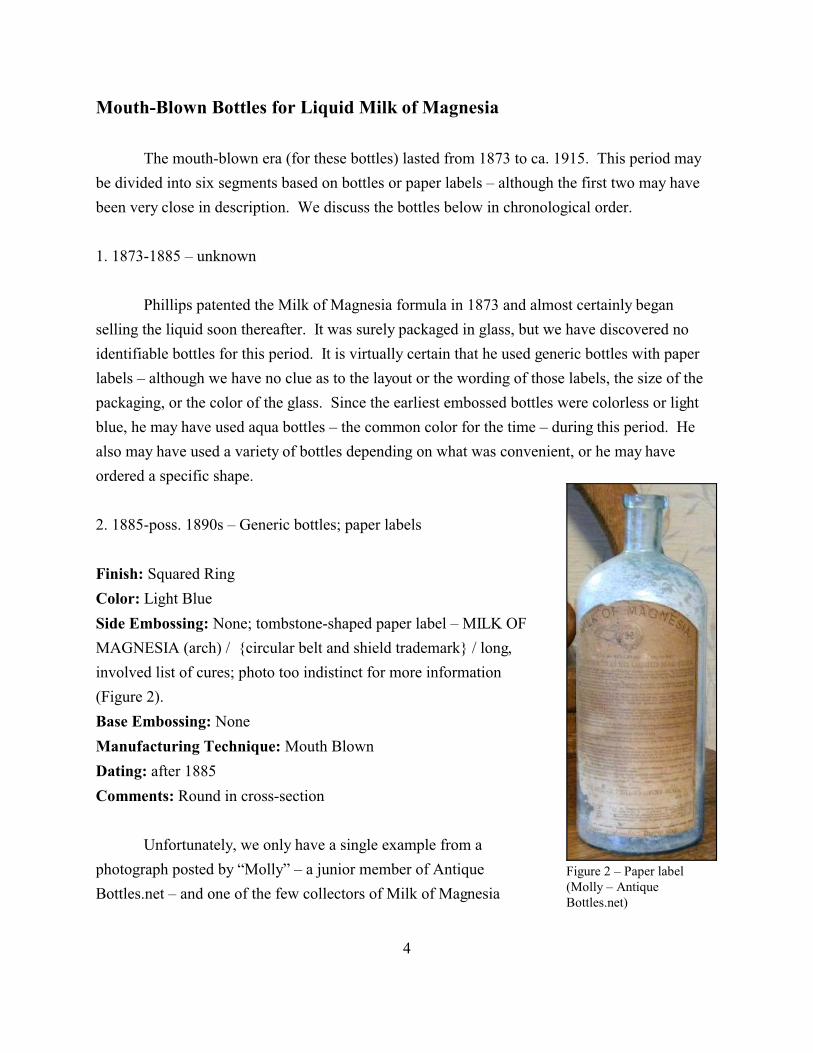
Figure 2 – Paper label(Molly – AntiqueBottles.net)
Mouth-Blown Bottles for Liquid Milk of Magnesia
The mouth-blown era (for these bottles) lasted from 1873 to ca. 1915. This period may
be divided into six segments based on bottles or paper labels – although the first two may have
been very close in description. We discuss the bottles below in chronological order.
1. 1873-1885 – unknown
Phillips patented the Milk of Magnesia formula in 1873 and almost certainly began
selling the liquid soon thereafter. It was surely packaged in glass, but we have discovered no
identifiable bottles for this period. It is virtually certain that he used generic bottles with paper
labels – although we have no clue as to the layout or the wording of those labels, the size of the
packaging, or the color of the glass. Since the earliest embossed bottles were colorless or light
blue, he may have used aqua bottles – the common color for the time – during this period. He
also may have used a variety of bottles depending on what was convenient, or he may have
ordered a specific shape.
2. 1885-poss. 1890s – Generic bottles; paper labels
Finish: Squared Ring
Color: Light Blue
Side Embossing: None; tombstone-shaped paper label – MILK OF
MAGNESIA (arch) / {circular belt and shield trademark} / long,
involved list of cures; photo too indistinct for more information
(Figure 2).
Base Embossing: None
Manufacturing Technique: Mouth Blown
Dating: after 1885
Comments: Round in cross-section
Unfortunately, we only have a single example from a
photograph posted by “Molly” – a junior member of Antique
Bottles.net – and one of the few collectors of Milk of Magnesia
4
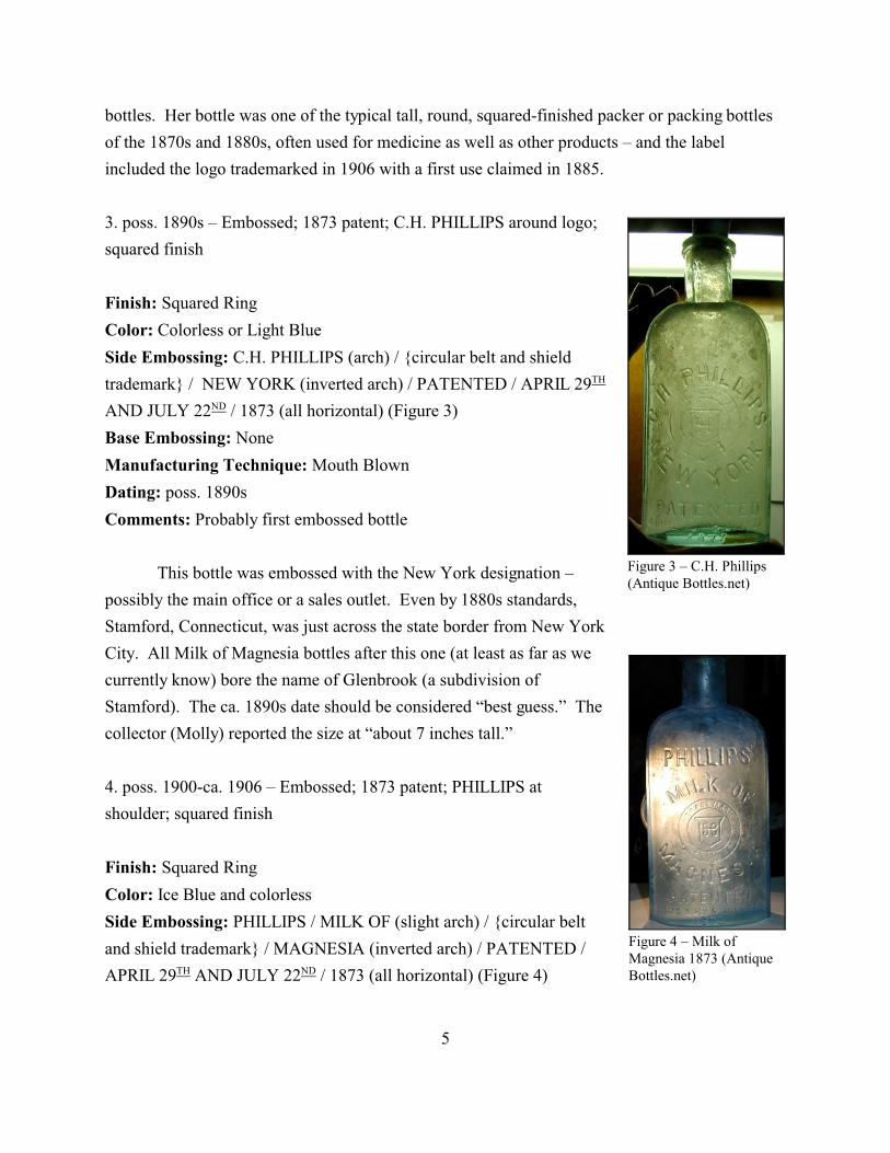
Figure 3 – C.H. Phillips(Antique Bottles.net)
Figure 4 – Milk ofMagnesia 1873 (AntiqueBottles.net)
bottles. Her bottle was one of the typical tall, round, squared-finished packer or packing bottles
of the 1870s and 1880s, often used for medicine as well as other products – and the label
included the logo trademarked in 1906 with a first use claimed in 1885.
3. poss. 1890s – Embossed; 1873 patent; C.H. PHILLIPS around logo;
squared finish
Finish: Squared Ring
Color: Colorless or Light Blue
Side Embossing: C.H. PHILLIPS (arch) / {circular belt and shield
trademark} / NEW YORK (inverted arch) / PATENTED / APRIL 29TH
AND JULY 22ND / 1873 (all horizontal) (Figure 3)
Base Embossing: None
Manufacturing Technique: Mouth Blown
Dating: poss. 1890s
Comments: Probably first embossed bottle
This bottle was embossed with the New York designation –
possibly the main office or a sales outlet. Even by 1880s standards,
Stamford, Connecticut, was just across the state border from New York
City. All Milk of Magnesia bottles after this one (at least as far as we
currently know) bore the name of Glenbrook (a subdivision of
Stamford). The ca. 1890s date should be considered “best guess.” The
collector (Molly) reported the size at “about 7 inches tall.”
4. poss. 1900-ca. 1906 – Embossed; 1873 patent; PHILLIPS at
shoulder; squared finish
Finish: Squared Ring
Color: Ice Blue and colorless
Side Embossing: PHILLIPS / MILK OF (slight arch) / {circular belt
and shield trademark} / MAGNESIA (inverted arch) / PATENTED /
APRIL 29TH AND JULY 22ND / 1873 (all horizontal) (Figure 4)
5
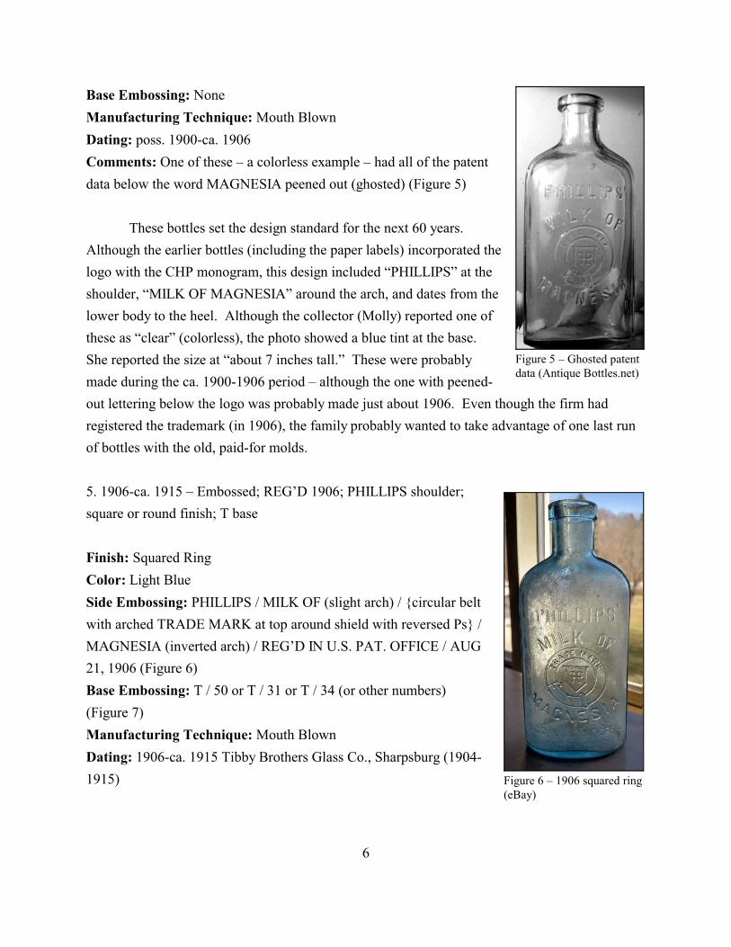
Figure 5 – Ghosted patentdata (Antique Bottles.net)
Figure 6 – 1906 squared ring(eBay)
Base Embossing: None
Manufacturing Technique: Mouth Blown
Dating: poss. 1900-ca. 1906
Comments: One of these – a colorless example – had all of the patent
data below the word MAGNESIA peened out (ghosted) (Figure 5)
These bottles set the design standard for the next 60 years.
Although the earlier bottles (including the paper labels) incorporated the
logo with the CHP monogram, this design included “PHILLIPS” at the
shoulder, “MILK OF MAGNESIA” around the arch, and dates from the
lower body to the heel. Although the collector (Molly) reported one of
these as “clear” (colorless), the photo showed a blue tint at the base.
She reported the size at “about 7 inches tall.” These were probably
made during the ca. 1900-1906 period – although the one with peened-
out lettering below the logo was probably made just about 1906. Even though the firm had
registered the trademark (in 1906), the family probably wanted to take advantage of one last run
of bottles with the old, paid-for molds.
5. 1906-ca. 1915 – Embossed; REG’D 1906; PHILLIPS shoulder;
square or round finish; T base
Finish: Squared Ring
Color: Light Blue
Side Embossing: PHILLIPS / MILK OF (slight arch) / {circular belt
with arched TRADE MARK at top around shield with reversed Ps} /
MAGNESIA (inverted arch) / REG’D IN U.S. PAT. OFFICE / AUG
21, 1906 (Figure 6)
Base Embossing: T / 50 or T / 31 or T / 34 (or other numbers)
(Figure 7)
Manufacturing Technique: Mouth Blown
Dating: 1906-ca. 1915 Tibby Brothers Glass Co., Sharpsburg (1904-
1915)
6
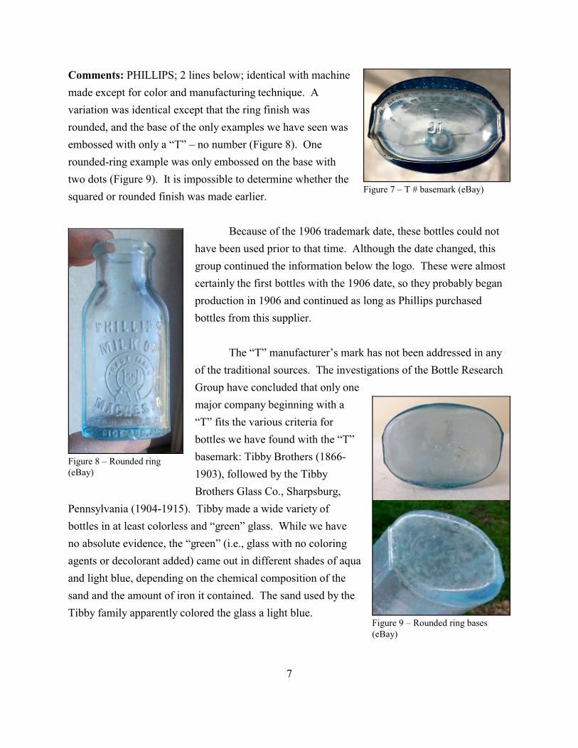
Figure 7 – T # basemark (eBay)
Figure 8 – Rounded ring(eBay)
Figure 9 – Rounded ring bases(eBay)
Comments: PHILLIPS; 2 lines below; identical with machine
made except for color and manufacturing technique. A
variation was identical except that the ring finish was
rounded, and the base of the only examples we have seen was
embossed with only a “T” – no number (Figure 8). One
rounded-ring example was only embossed on the base with
two dots (Figure 9). It is impossible to determine whether the
squared or rounded finish was made earlier.
Because of the 1906 trademark date, these bottles could not
have been used prior to that time. Although the date changed, this
group continued the information below the logo. These were almost
certainly the first bottles with the 1906 date, so they probably began
production in 1906 and continued as long as Phillips purchased
bottles from this supplier.
The “T” manufacturer’s mark has not been addressed in any
of the traditional sources. The investigations of the Bottle Research
Group have concluded that only one
major company beginning with a
“T” fits the various criteria for
bottles we have found with the “T”
basemark: Tibby Brothers (1866-
1903), followed by the Tibby
Brothers Glass Co., Sharpsburg,
Pennsylvania (1904-1915). Tibby made a wide variety of
bottles in at least colorless and “green” glass. While we have
no absolute evidence, the “green” (i.e., glass with no coloring
agents or decolorant added) came out in different shades of aqua
and light blue, depending on the chemical composition of the
sand and the amount of iron it contained. The sand used by the
Tibby family apparently colored the glass a light blue.
7
In our dating, we have made the assumption that Phillips continued to buy bottles from
the Tibby Brothers until the glass house shut down its Sharpsburg operations in 1915. It appears
that all of this final style of Milk of Magnesia bottles were marked with the “T” logo on the bases
and were light blue in color. Phillips may have shifted to another supplier earlier, so the 1915
end date for this style should not be regarded as absolute. We suggest, however, that Phillips
remained with its supplier until forced to switch.
Machine-Made Bottles for Liquid Milk of Magnesia
The machine-made era lasted from ca. 1915 until some point during the late-1960s-mid-
1970s, when the firm shifted to plastic containers. This era must be subdivided into two parts
because of the inception of Milk of Magnesia Tablets by Sterling in 1931. Sterling used a single
style of embossed bottle for the tablets as well as at least five variations of paper labels on
generic bottles. However, we will discuss the bottles intended for liquid Milk of Magnesia first.
These consisted of five embossed variations, followed by three paper-labels on generic bottles.
For archaeologists, the number of labels is moot, since the identifying basemarks are identical on
all of the generic bottles except for manufacturer’s initials and mold numbers.
There appears to be an important distinction between the bottles made for Phillips and
those produced for Sterling Products Corp. None of the pre-Sterling bottles have been found in
the quantities of the ones used by Sterling. In part, of course, we can expect smaller quantities of
older bottles just because of attrition with age. But Sterling stepped up advertising dramatically.
Where Phillips mostly advertised in druggists’ journals – expecting the stores to do the
interacting with the customers – Sterling boasted in national magazines with full-page ads. This
has to have increased sales dramatically.
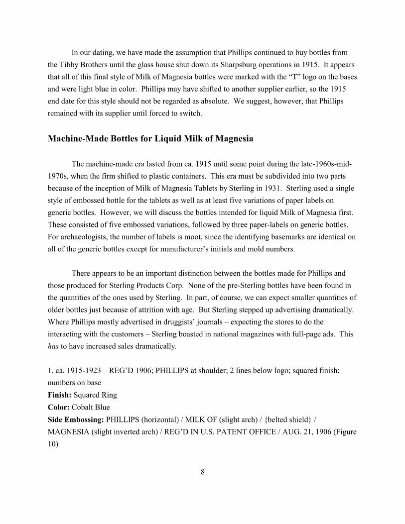
1. ca. 1915-1923 – REG’D 1906; PHILLIPS at shoulder; 2 lines below logo; squared finish;
numbers on base
Finish: Squared Ring
Color: Cobalt Blue
Side Embossing: PHILLIPS (horizontal) / MILK OF (slight arch) / {belted shield} /
MAGNESIA (slight inverted arch) / REG’D IN U.S. PATENT OFFICE / AUG. 21, 1906 (Figure
10)
8
Figure 10 – Square ring(eBay)
Figure 11 – Numbers (eBay)
Base Embossing: 10 or 5 or 7 (probably other numbers) in machine
scar (Figure 11)
Manufacturing Technique: Machine
Dating: ca. 1915-1923 – followed the “T” mouth-blown bottle.
Continuous-thread finishes were not available until the mid- to late
1920s. These were probably used by Phillips from the end of the
Tibby Brothers to the sale to Sterling in 1923.
Comments: Strap side; PHILLIPS above logo; 2 lines below;
identical with mouth blown except for color and manufacturing
technique
As noted above, these were almost certainly used from the end
of the Tibby Brothers to the sale to Sterling Products in 1923. These
were the last bottles to carry the Phillips name
embossed above the circular belt-and-shield logo.
These bottles were identical to the Tibby containers
except for two characteristics. First, or course, they
were machine made with a distinct scar on the base
and a parting line just below the finish. Second, they
were cobalt blue in color. Despite the lack of a
manufacturer’s mark, these may have been made by
the Maryland Glass Corp., the largest producer of
cobalt blue bottles in the world at that time. The
machine scars were typical of glass machines but were not specifically diagnostic.
2. 1923-ca. 1928 – REG’D 1906; no PHILLIPS; Glenbrook; 5 lines below; squared finish; M or
K basemarks
Finish: Squared Ring
Color: Cobalt Blue
Side Embossing: MILK OF (slight arch) / {circular belt with arched TRADE MARK at top
around shield with reversed Ps} / MAGNESIA (inverted arch) / REG’D IN U.S. PATENT
OFFICE / AUG. 21, 1906 / THE CHAS W PHILLIPS / CHEMICAL COMPANY /
GLENBROOK, CONN. (Figure 12)
9
Figure 12 – Square ring(eBay)
Base Embossing: 12 K 929 with machine scar or
K 928 / U.S.A. / 26 (with base vertical) or
18 K 929 or
5•M•9
Manufacturing Technique: Machine
Dating: Sterling – 1923-ca. 1928
Comments: Strap side; no PHILLIPS; 5 lines below
This begins the Sterling Products Corp. years. The basic layout
of the bottle remains the same as the Phillips style, but the name
“PHILLIPS” at the top is notably absent. Sterling also added company
name and location below the trademark date. The bases were
embossed with either the “M” used by the Maryland Glass Corp. or the
“K 928” (or 929) of the Kearns-Gorsuch Glass Co. The earliest of
these were the “M” bottles, made for Sterling from 1923 to ca. 1925.
The Hazel-Atlas Glass Co. acquired Kearns-Gorsuch in 1920, but the plant did not
convert a continuous tank to cobalt blue glass until ca. 1925. The “K” bottles were made from
about that date to ca. 1928, when continuous-thread finishes and screw caps became available.
One bottle in our sample included “U.S.A.” on the base, suggesting that the initials appeared
during the end of this period – ca. 1928 – and that Sterling was selling the product outside the
U.S. by this time.
The timing for this addition is interesting and almost certainly was no accident.
According to King (1987:248), all bottles made by the Dominion Glass Co. for export to the
United States after June 27, 1928, had to be embossed “MADE IN CANADA” because of a
newly instituted American requirement. This same law almost certainly demanded “MADE IN
U.S.A” to be similarly embossed on U.S. bottles produced for export – although we have been
unable to find a direct reference to the statue.
Unlike Phillips, Sterling was not loyal to a single glass house, although we do not know
the firm’s reasoning. Sales may have been so large that a single plant could not meet the
demand, or Sterling may just have preferred diversity – taking advantage of sales or using the
prices of one glass house as leverage against another one.
10
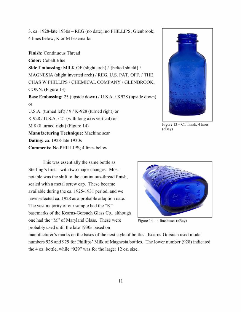
Figure 13 – CT finish, 4 lines(eBay)
Figure 14 – 4 line bases (eBay)
3. ca. 1928-late 1930s – REG (no date); no PHILLIPS; Glenbrook;
4 lines below; K or M basemarks
Finish: Continuous Thread
Color: Cobalt Blue
Side Embossing: MILK OF (slight arch) / {belted shield} /
MAGNESIA (slight inverted arch) / REG. U.S. PAT. OFF. / THE
CHAS W PHILLIPS / CHEMICAL COMPANY / GLENBROOK,
CONN. (Figure 13)
Base Embossing: 25 (upside down) / U.S.A. / K928 (upside down)
or
U.S.A. (turned left) / 9 / K-928 (turned right) or
K 928 / U.S.A. / 21 (with long axis vertical) or
M 8 (8 turned right) (Figure 14)
Manufacturing Technique: Machine scar
Dating: ca. 1928-late 1930s
Comments: No PHILLIPS; 4 lines below
This was essentially the same bottle as
Sterling’s first – with two major changes. Most
notable was the shift to the continuous-thread finish,
sealed with a metal screw cap. These became
available during the ca. 1925-1931 period, and we
have selected ca. 1928 as a probable adoption date.
The vast majority of our sample had the “K”
basemarks of the Kearns-Gorsuch Glass Co., although
one had the “M” of Maryland Glass. These were
probably used until the late 1930s based on
manufacturer’s marks on the bases of the next style of bottles. Kearns-Gorsuch used model
numbers 928 and 929 for Phillips’ Milk of Magnesia bottles. The lower number (928) indicated
the 4 oz. bottle, while “929” was for the larger 12 oz. size.
11

Figure 15 – Windsor (eBay)
Figure 16 – Windsor base (eBay)
3a. ca. 1928-late 1930s – same as 3 but Windsor Ontario
Finish: Continuous Thread
Color: Cobalt Blue
Side Embossing: MILK OF (slight arch) / {belted shield} /
MAGNESIA (slight inverted arch) / REG. CAN. PAT. OFF. / THE
CHAS W PHILLIPS / CHEMICAL COMPANY / WINDSOR,
ONTARIO (Figure 15)
Base Embossing: Diamond-D / 11 {embossing faint} (Figure 16)
K 928 / U.S.A. / 21 (with long axis vertical) or
M 8 (8 turned right)
Manufacturing Technique: Machine scar
Dating: ca. 1928-later 1930s
Comments: No PHILLIPS; 4 lines below
This was the same as No. 3 above except that the location
was changed to Windsor, Ontario, Canada. These Canadian
bottles were made during the same period as No. 3 – ca. 1928-ca.
the mid-1940s. The Dominion Glass Co. – with branches in
several Canadian cities – used the Diamond-D logo from 1928 to
the 1970s. It makes sense that the Canadian branch of Sterling
used bottles made in Canada.
4. late 1930s-late 1950s – no REG; no PHILLIPS; Glenbrook; 3 lines below; K or HA basemarks
Finish: Continuous Thread
Color: Cobalt Blue
Side Embossing: MILK OF (slight arch) / {circular belt with arched TRADE MARK at top
around shield with reversed Ps} / MAGNESIA (inverted arch) / THE CHAS W PHILLIPS /
CHEMICAL COMPANY / GLENBROOK, CONN. (Figure 17)
Base Embossing: HA logo (facing left) U.S.A. K-928 (facing right) / 12 or
MADE IN / HA logo (facing left) K-928 (facing right) / U.S.A. or
MADE IN / HA logo (facing left) 22 (facing right) / U.S.A. or
12
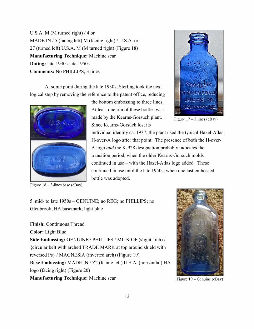
Figure 17 – 3 lines (eBay)
Figure 18 – 3-lines base (eBay)
Figure 19 – Genuine (eBay)
U.S.A. M (M turned right) / 4 or
MADE IN / 5 (facing left) M (facing right) / U.S.A. or
27 (turned left) U.S.A. M (M turned right) (Figure 18)
Manufacturing Technique: Machine scar
Dating: late 1930s-late 1950s
Comments: No PHILLIPS; 3 lines
At some point during the late 1930s, Sterling took the next
logical step by removing the reference to the patent office, reducing
the bottom embossing to three lines.
At least one run of these bottles was
made by the Kearns-Gorsuch plant.
Since Kearns-Gorsuch lost its
individual identity ca. 1937, the plant used the typical Hazel-Atlas
H-over-A logo after that point. The presence of both the H-over-
A logo and the K-928 designation probably indicates the
transition period, when the older Kearns-Gorsuch molds
continued in use – with the Hazel-Atlas logo added. These
continued in use until the late 1950s, when one last embossed
bottle was adopted.
5. mid- to late 1950s – GENUINE; no REG; no PHILLIPS; no
Glenbrook; HA basemark; light blue
Finish: Continuous Thread
Color: Light Blue
Side Embossing: GENUINE / PHILLIPS / MILK OF (slight arch) /
{circular belt with arched TRADE MARK at top around shield with
reversed Ps} / MAGNESIA (inverted arch) (Figure 19)
Base Embossing: MADE IN / Z2 (facing left) U.S.A. (horizontal) HA
logo (facing right) (Figure 20)
Manufacturing Technique: Machine scar
13
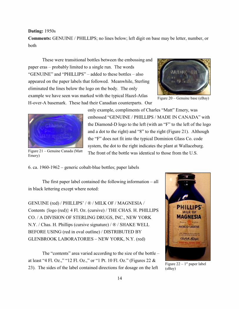
Figure 21 – Genuine Canada (MattEmery)
Figure 20 – Genuine base (eBay)
Figure 22 – 1st paper label(eBay)
Dating: 1950s
Comments: GENUINE / PHILLIPS; no lines below; left digit on base may be letter, number, or
both
These were transitional bottles between the embossing and
paper eras – probably limited to a single run. The words
“GENUINE” and “PHILLIPS” – added to these bottles – also
appeared on the paper labels that followed. Meanwhile, Sterling
eliminated the lines below the logo on the body. The only
example we have seen was marked with the typical Hazel-Atlas
H-over-A basemark. These had their Canadian counterparts. Our
only example, compliments of Charles “Matt” Emery, was
embossed “GENUINE / PHILLIPS / MADE IN CANADA” with
the Diamond-D logo to the left (with an “F” to the left of the logo
and a dot to the right) and “8” to the right (Figure 21). Although
the “F” does not fit into the typical Dominion Glass Co. code
system, the dot to the right indicates the plant at Wallaceburg.
The front of the bottle was identical to those from the U.S.
6. ca. 1960-1962 – generic cobalt-blue bottles; paper labels
The first paper label contained the following information – all
in black lettering except where noted:
GENUINE (red) / PHILLIPS’ / ® / MILK OF / MAGNESIA /
Contents {logo (red)} 4 Fl. Oz. (cursive) / THE CHAS. H. PHILLIPS
CO. / A DIVISION OF STERLING DRUGS, INC., NEW YORK
N.Y. / Chas. H. Phillips (cursive signature) / ® / SHAKE WELL
BEFORE USING (red in oval outline) / DISTRIBUTED BY
GLENBROOK LABORATORIES – NEW YORK, N.Y. (red)
The “contents” area varied according to the size of the bottle –
at least “4 Fl. Oz.,” “12 Fl. Oz.,” or “1 Pt. 10 Fl. Oz.” (Figures 22 &
23). The sides of the label contained directions for dosage on the left
14
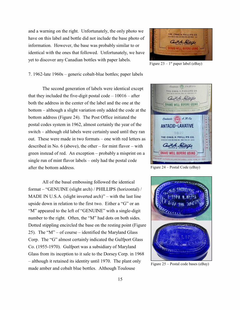
Figure 23 – 1st paper label (eBay)
Figure 24 – Postal Code (eBay)
Figure 25 – Postal code bases (eBay)
and a warning on the right. Unfortunately, the only photo we
have on this label and bottle did not include the base photo of
information. However, the base was probably similar to or
identical with the ones that followed. Unfortunately, we have
yet to discover any Canadian bottles with paper labels.
7. 1962-late 1960s – generic cobalt-blue bottles; paper labels
The second generation of labels were identical except
that they included the five-digit postal code – 10016 – after
both the address in the center of the label and the one at the
bottom – although a slight variation only added the code at the
bottom address (Figure 24). The Post Office initiated the
postal codes system in 1962, almost certainly the year of the
switch – although old labels were certainly used until they ran
out. These were made in two formats – one with red letters as
described in No. 6 (above), the other – for mint flavor – with
green instead of red. An exception – probably a misprint on a
single run of mint flavor labels – only had the postal code
after the bottom address.
All of the basal embossing followed the identical
format – “GENUINE (slight arch) / PHILLIPS (horizontal) /
MADE IN U.S.A. (slight inverted arch)” – with the last line
upside down in relation to the first two. Either a “G” or an
“M” appeared to the left of “GENUINE” with a single-digit
number to the right. Often, the “M” had dots on both sides.
Dotted stippling encircled the base on the resting point (Figure
25). The “M” – of course – identified the Maryland Glass
Corp. The “G” almost certainly indicated the Gulfport Glass
Co. (1955-1970). Gulfport was a subsidiary of Maryland
Glass from its inception to it sale to the Dorsey Corp. in 1968
– although it retained its identity until 1970. The plant only
made amber and cobalt blue bottles. Although Toulouse
15

Figure 26 – Later label (eBay)
Figure 27 – Later label (eBay)
Figure 29 – Plastic bottle(eBay)
Figure 28 – Later base (eBay)
(1971:210) only noted a Circle-G logo, the “G” within that circle is
identical with the “G” on the Phillips bottles. Therefore, we can
confidently date these bottles between 1962 (postal code) and the
closing of Gulfport in 1970.
8. late 1960s-poss. mid-1970s
The final generation of paper labels on glass bottles changed
the information below “ANTACID – LAXATIVE” to: “Chas. H.
Phillips (signature) followed by the red logo / THE CHAS. H.
PHILLIPS CO. / A DIVISION OF STERLING DRUGS, INC., NEW
YORK N.Y. / CONTENTS 4 FL.
OZ.” (Figures 26 & 27). Note that
the contents information migrated
to the bottom, changing from
cursive to block capitals, and the Phillips logo moved from the
center of the contents data to a position following the signature.
Only the locations changed; the information remained the same.
The bases with the “M”
manufacturer’s mark remained the
same as with the previous bottle,
but we have found none with “G”
logos (Figure 28). Some of this
generation, however, had a Circle-
B mark to the right of
“GENUINE” and a one- or two-
digit number to the left – as well as curved stippling (resembling a line
of parentheses) at the resting point. The Circle-B logo was the mark of
the Brockway Glass Co. used from 1933 to ca. 2000. At some point,
probably the mid-1970s, Sterling adopted plastic bottles and a change
of paper label – but plastics are beyond the scope of this research
(Figure 29).
16
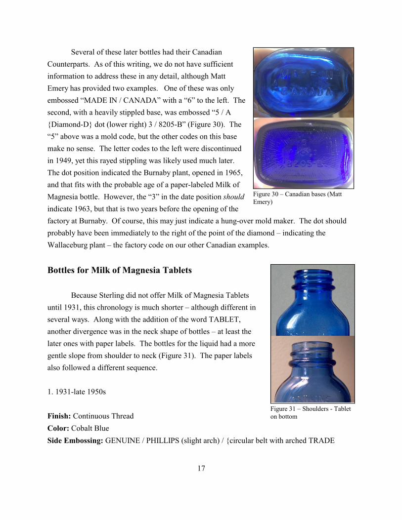
Figure 30 – Canadian bases (MattEmery)
Figure 31 – Shoulders - Tableton bottom
Several of these later bottles had their Canadian
Counterparts. As of this writing, we do not have sufficient
information to address these in any detail, although Matt
Emery has provided two examples. One of these was only
embossed “MADE IN / CANADA” with a “6” to the left. The
second, with a heavily stippled base, was embossed “5 / A
{Diamond-D} dot (lower right) 3 / 8205-B” (Figure 30). The
“5” above was a mold code, but the other codes on this base
make no sense. The letter codes to the left were discontinued
in 1949, yet this rayed stippling was likely used much later.
The dot position indicated the Burnaby plant, opened in 1965,
and that fits with the probable age of a paper-labeled Milk of
Magnesia bottle. However, the “3” in the date position should
indicate 1963, but that is two years before the opening of the
factory at Burnaby. Of course, this may just indicate a hung-over mold maker. The dot should
probably have been immediately to the right of the point of the diamond – indicating the
Wallaceburg plant – the factory code on our other Canadian examples.
Bottles for Milk of Magnesia Tablets
Because Sterling did not offer Milk of Magnesia Tablets
until 1931, this chronology is much shorter – although different in
several ways. Along with the addition of the word TABLET,
another divergence was in the neck shape of bottles – at least the
later ones with paper labels. The bottles for the liquid had a more
gentle slope from shoulder to neck (Figure 31). The paper labels
also followed a different sequence.
1. 1931-late 1950s
Finish: Continuous Thread
Color: Cobalt Blue
Side Embossing: GENUINE / PHILLIPS (slight arch) / {circular belt with arched TRADE
17
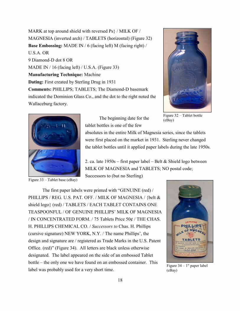
Figure 32 – Tablet bottle(eBay)
Figure 33 – Tablet base (eBay)
Figure 34 – 1st paper label(eBay)
MARK at top around shield with reversed Ps} / MILK OF /
MAGNESIA (inverted arch) / TABLETS (horizontal) (Figure 32)
Base Embossing: MADE IN / 6 (facing left) M (facing right) /
U.S.A. OR
9 Diamond-D dot 8 OR
MADE IN / 16 (facing left) / U.S.A. (Figure 33)
Manufacturing Technique: Machine
Dating: First created by Sterling Drug in 1931
Comments: PHILLIPS; TABLETS; The Diamond-D basemark
indicated the Dominion Glass Co., and the dot to the right noted the
Wallaceburg factory.
The beginning date for the
tablet bottles is one of the few
absolutes in the entire Milk of Magnesia series, since the tablets
were first placed on the market in 1931. Sterling never changed
the tablet bottles until it applied paper labels during the late 1950s.
2. ca. late 1950s – first paper label – Belt & Shield logo between
MILK OF MAGNESIA and TABLETS; NO postal code;
Successors to (but no Sterling)
The first paper labels were printed with “GENUINE (red) /
PHILLIPS / REG. U.S. PAT. OFF. / MILK OF MAGNESIA / {belt &
shield logo} (red) / TABLETS / EACH TABLET CONTAINS ONE
TEASPOONFUL / OF GENUINE PHILLIPS’ MILK OF MAGNESIA
/ IN CONCENTRATED FORM. / 75 Tablets Price 50¢ / THE CHAS.
H. PHILLIPS CHEMICAL CO. / Successors to Chas. H. Phillips
(cursive signature) NEW YORK, N.Y. / The name Phillips’, the
design and signature are / registered as Trade Marks in the U.S. Patent
Office. (red)” (Figure 34). All letters are black unless otherwise
designated. The label appeared on the side of an embossed Tablet
bottle – the only one we have found on an embossed container. This
label was probably used for a very short time.
18
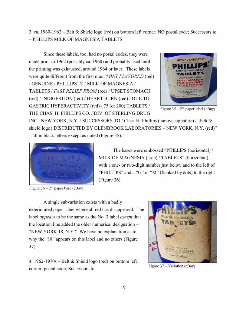
Figure 35 – 2nd paper label (eBay)
Figure 36 – 2nd paper base (eBay)
Figure 37 – Variation (eBay)
3. ca. 1960-1962 – Belt & Shield logo (red) on bottom left corner; NO postal code; Successors to
– PHILLIPS MILK OF MAGNESIA TABLETS
Since these labels, too, had no postal codes, they were
made prior to 1962 (possibly ca. 1960) and probably used until
the printing was exhausted, around 1964 or later. These labels
were quite different from the first one: “MINT FLAVORED (red)
/ GENUINE / PHILLIPS’ ® / MILK OF MAGNESIA /
TABLETS / FAST RELIEF FROM (red) / UPSET STOMACH
(red) / INDIGESTION (red) / HEART BURN (red) / DUE TO
GASTRIC HYPERACTIVITY (red) / 75 (or 200) TABLETS /
THE CHAS. H. PHILLIPS CO. / DIV. OF STERLING DRUG
INC., NEW YORK, N.Y. / SUCCESSORS TO / Chas. H. Phillips (cursive signature) / {belt &
shield logo} DISTRIBUTED BY GLENBROOK LABORATORIES – NEW YORK, N.Y. (red)”
– all in black letters except as noted (Figure 35).
The bases were embossed “PHILLIPS (horizontal) /
MILK OF MAGNESIA (arch) / TABLETS” (horizontal)
with a one- or two-digit number just below and to the left of
“PHILLIPS” and a “G” or “M” (flanked by dots) to the right
(Figure 36).
A single subvariation exists with a badly
deteriorated paper label where all red has disappeared. The
label appears to be the same as the No. 3 label except that
the location line added the older numerical designation –
“NEW YORK 18, N.Y.” We have no explanation as to
why the “18” appears on this label and no others (Figure
37).
4. 1962-1970s – Belt & Shield logo (red) on bottom left
corner; postal code; Successors to
19

Figure 38 – Postal code (eBay)
Figure 39 – Last label (eBay)
The only difference between this and the No. 3 label is the
addition of the postal code after the location – placing the use of
these labels at 1962 or later (Figure 38). We have been unable to
determine the approximate date of the next change. The bases of
these were embossed the same as No. 3 except the word
“PHILLIPS” was notably larger. The bases have both “•M•” and
“G” manufacturer’s marks. These bottles were very likely used
until the early 1970s, possible until the middle of the decade.
5. early-mid-1970s – Original Formula (in red oval at top); no belt & shield logo
The final paper label on glass bottles had “ORIGINAL /
FORMULA in white letters in a red oval atop a thick blue bar
above NDC 12843-373-09 / GENUINE / PHILLIPS’ ® /
MAGNESIA / TABLETS (blue-green) / FAST ANTACID
RELIEF (red) / FROM ACID INDIGESTION (blue-green) /
SOUR STOMACH AND HEARTBURN (blue-green) / MINT
FLAVORED / the Chas. H. Phillips Co. / Division of Sterling
Drug, Inc. / New York, N.Y. 10016 / A Product from Glenbrook
Laboratories / 200 TABLETS 4.8 grs. each” (Figure 39). Letters
were black unless otherwise designated. This was certainly the
final paper label used on glass bottles, and it may have transferred over to plastics.
The bottle base was embossed “PHILLIPS (large letters) / MAGNESIA / TABLETS”
with a number to the left of “MAGNESIA” but no manufacturer’s mark. Note that “MILK OF”
had been retired. These bottles were probably used only during the early to mid-1970s, likely
only at the end of that period. As noted above, the study of plastic bottles and their labels is
beyond the scope of this work.
20
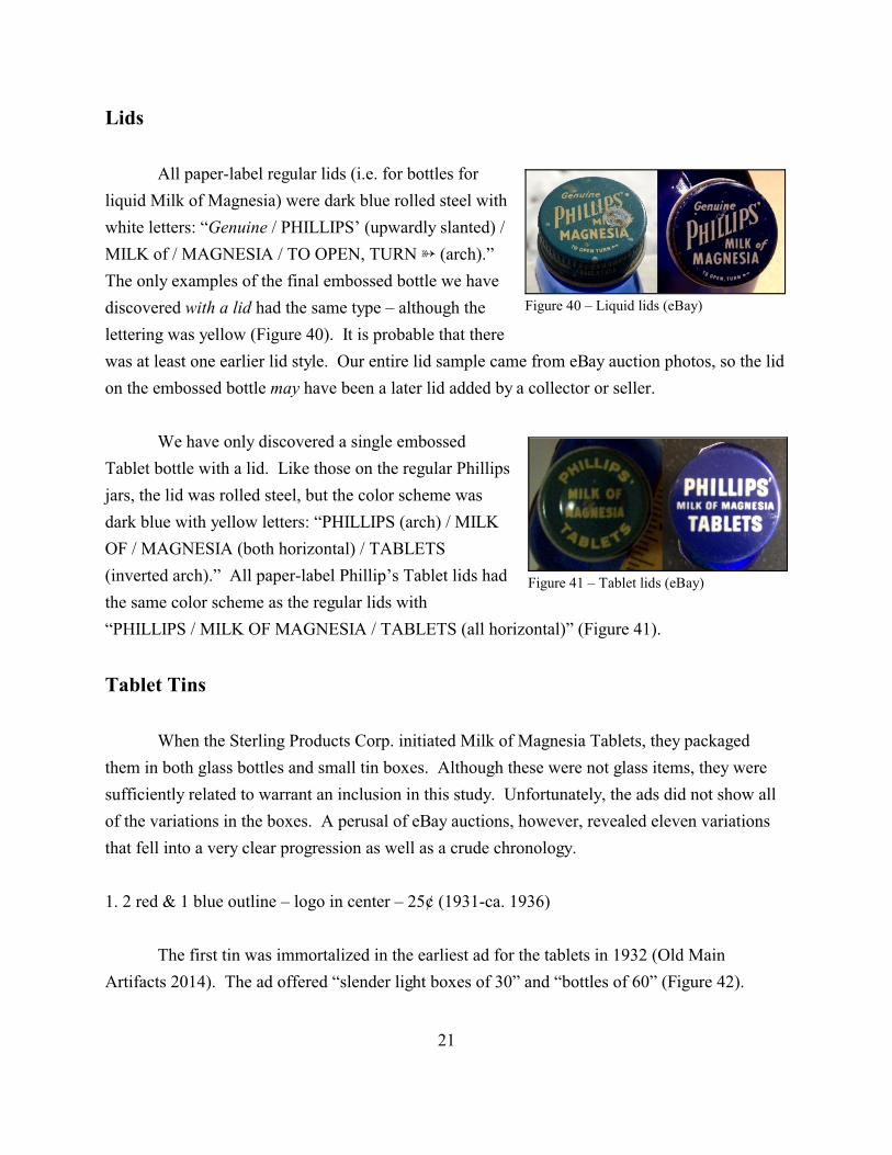
Figure 40 – Liquid lids (eBay)
Figure 41 – Tablet lids (eBay)
Lids
All paper-label regular lids (i.e. for bottles for
liquid Milk of Magnesia) were dark blue rolled steel with
white letters: “Genuine / PHILLIPS’ (upwardly slanted) /
MILK of / MAGNESIA / TO OPEN, TURN ¼ (arch).”
The only examples of the final embossed bottle we have
discovered with a lid had the same type – although the
lettering was yellow (Figure 40). It is probable that there
was at least one earlier lid style. Our entire lid sample came from eBay auction photos, so the lid
on the embossed bottle may have been a later lid added by a collector or seller.
We have only discovered a single embossed
Tablet bottle with a lid. Like those on the regular Phillips
jars, the lid was rolled steel, but the color scheme was
dark blue with yellow letters: “PHILLIPS (arch) / MILK
OF / MAGNESIA (both horizontal) / TABLETS
(inverted arch).” All paper-label Phillip’s Tablet lids had
the same color scheme as the regular lids with
“PHILLIPS / MILK OF MAGNESIA / TABLETS (all horizontal)” (Figure 41).
Tablet Tins
When the Sterling Products Corp. initiated Milk of Magnesia Tablets, they packaged
them in both glass bottles and small tin boxes. Although these were not glass items, they were
sufficiently related to warrant an inclusion in this study. Unfortunately, the ads did not show all
of the variations in the boxes. A perusal of eBay auctions, however, revealed eleven variations
that fell into a very clear progression as well as a crude chronology.
1. 2 red & 1 blue outline – logo in center – 25¢ (1931-ca. 1936)
The first tin was immortalized in the earliest ad for the tablets in 1932 (Old Main
Artifacts 2014). The ad offered “slender light boxes of 30” and “bottles of 60” (Figure 42).
21

Figure 42 – 1932 ad (Old MainArtifacts)
Figure 43 – 1st tin (eBay)
Figure 44 – 2nd tin (eBay)
Although the ad did not show color, the box it illustrated was an
exact match for the earliest tin offered on eBay. The top of the lid
contained black lettering (unless otherwise noted): “GENUINE
(slight arch - red) / REG. U.S. PAT. OFF. AND CANADA.”
Below that was a box made of three lines, the outer on blue, the
other two red. “PHILLIPS’” created a break in the top of the box.
Inside was “MILK OF MAGNESIA (arch) / {shield & buckle logo}
/ TABLETS / EACH TABLET CONTAINS ONE
TEASPOONFUL OF / PHILLIPS’ MILK OF MAGNESIA / IN
CONCENTRATED FORM. / 30 TABLETS PRICE 25¢”
(Figure 43).
The back had directions in a double-outlined red box with
“Prepared only by / THE CHAS. H. PHILLIPS CHEMICAL CO. /
successors to Chas. H. Phillips (signature in cursive) NEW YORK CITY” below the directions.
The tin was originally sealed shut with a strip of tape containing the Phillips signature. This
variation showed in ads as late as 1935 but was replaced by the next style in the 1938 ad, so we
have selected ca. 1936 as an end date. A
few of these also had the NRA symbol (an
black eagle with the letters NRA above).
The initials indicated the National Recovery
Administration, and attempt to pull the
country out of the Great Depression – not
the National Rifle Assn.
2. 1 red & 1 blue outline – logo in center – 25¢ (ca. 1936-ca. 1940)
In this second variation, the
outlines were reduced to one red (outside)
and one blue (inside) with “REG. U.S.
PAT. OFF.” moved below “PHILLIPS’”
followed by the same information as in
the first one. Between the lines at the
bottom was “THE NAME PHILLIPS’,
22
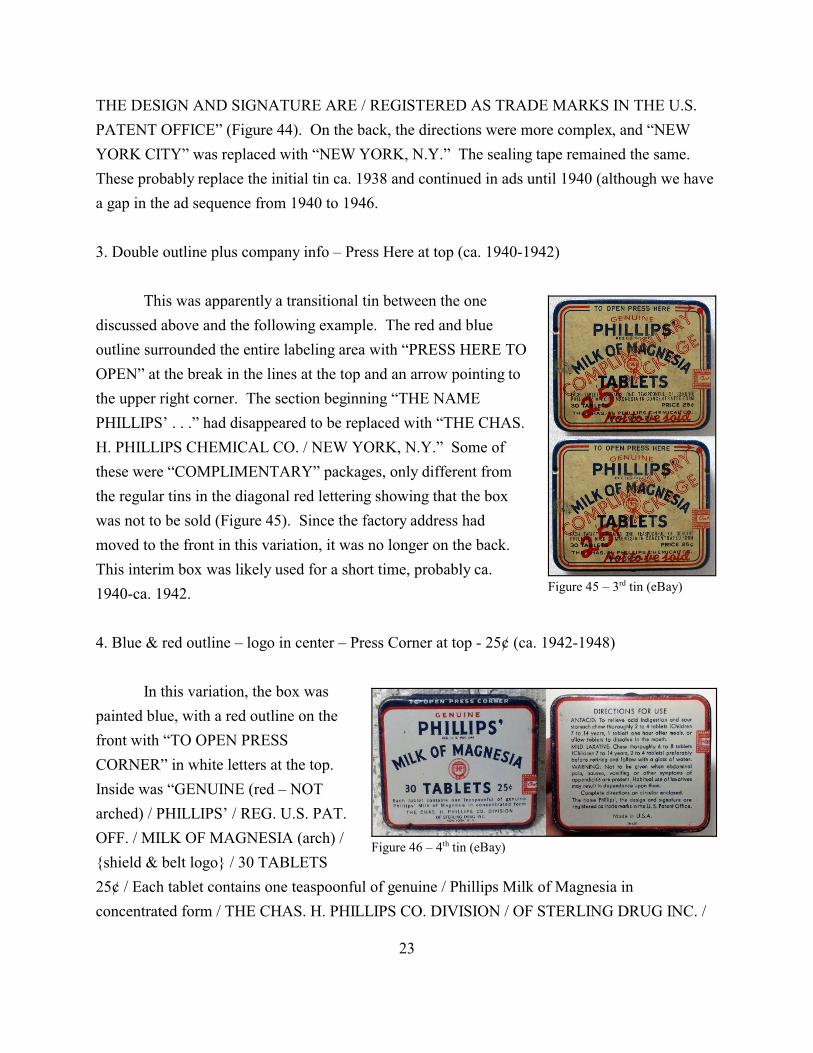
Figure 45 – 3rd tin (eBay)
Figure 46 – 4th tin (eBay)
THE DESIGN AND SIGNATURE ARE / REGISTERED AS TRADE MARKS IN THE U.S.
PATENT OFFICE” (Figure 44). On the back, the directions were more complex, and “NEW
YORK CITY” was replaced with “NEW YORK, N.Y.” The sealing tape remained the same.
These probably replace the initial tin ca. 1938 and continued in ads until 1940 (although we have
a gap in the ad sequence from 1940 to 1946.
3. Double outline plus company info – Press Here at top (ca. 1940-1942)
This was apparently a transitional tin between the one
discussed above and the following example. The red and blue
outline surrounded the entire labeling area with “PRESS HERE TO
OPEN” at the break in the lines at the top and an arrow pointing to
the upper right corner. The section beginning “THE NAME
PHILLIPS’ . . .” had disappeared to be replaced with “THE CHAS.
H. PHILLIPS CHEMICAL CO. / NEW YORK, N.Y.” Some of
these were “COMPLIMENTARY” packages, only different from
the regular tins in the diagonal red lettering showing that the box
was not to be sold (Figure 45). Since the factory address had
moved to the front in this variation, it was no longer on the back.
This interim box was likely used for a short time, probably ca.
1940-ca. 1942.
4. Blue & red outline – logo in center – Press Corner at top - 25¢ (ca. 1942-1948)
In this variation, the box was
painted blue, with a red outline on the
front with “TO OPEN PRESS
CORNER” in white letters at the top.
Inside was “GENUINE (red – NOT
arched) / PHILLIPS’ / REG. U.S. PAT.
OFF. / MILK OF MAGNESIA (arch) /
{shield & belt logo} / 30 TABLETS
25¢ / Each tablet contains one teaspoonful of genuine / Phillips Milk of Magnesia in
concentrated form / THE CHAS. H. PHILLIPS CO. DIVISION / OF STERLING DRUG INC. /
23
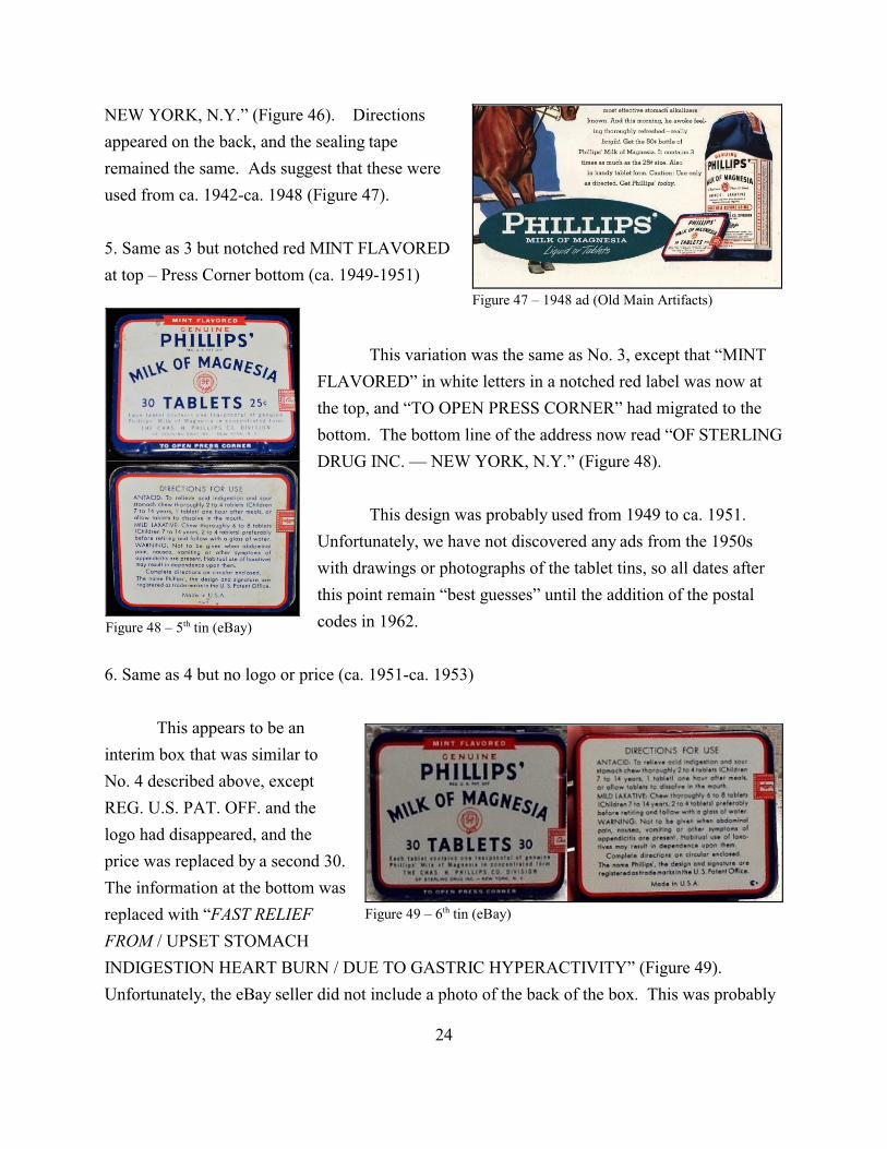
Figure 47 – 1948 ad (Old Main Artifacts)
Figure 48 – 5th tin (eBay)
Figure 49 – 6th tin (eBay)
NEW YORK, N.Y.” (Figure 46). Directions
appeared on the back, and the sealing tape
remained the same. Ads suggest that these were
used from ca. 1942-ca. 1948 (Figure 47).
5. Same as 3 but notched red MINT FLAVORED
at top – Press Corner bottom (ca. 1949-1951)
This variation was the same as No. 3, except that “MINT
FLAVORED” in white letters in a notched red label was now at
the top, and “TO OPEN PRESS CORNER” had migrated to the
bottom. The bottom line of the address now read “OF STERLING
DRUG INC. — NEW YORK, N.Y.” (Figure 48).
This design was probably used from 1949 to ca. 1951.
Unfortunately, we have not discovered any ads from the 1950s
with drawings or photographs of the tablet tins, so all dates after
this point remain “best guesses” until the addition of the postal
codes in 1962.
6. Same as 4 but no logo or price (ca. 1951-ca. 1953)
This appears to be an
interim box that was similar to
No. 4 described above, except
REG. U.S. PAT. OFF. and the
logo had disappeared, and the
price was replaced by a second 30.
The information at the bottom was
replaced with “FAST RELIEF
FROM / UPSET STOMACH
INDIGESTION HEART BURN / DUE TO GASTRIC HYPERACTIVITY” (Figure 49).
Unfortunately, the eBay seller did not include a photo of the back of the box. This was probably
24
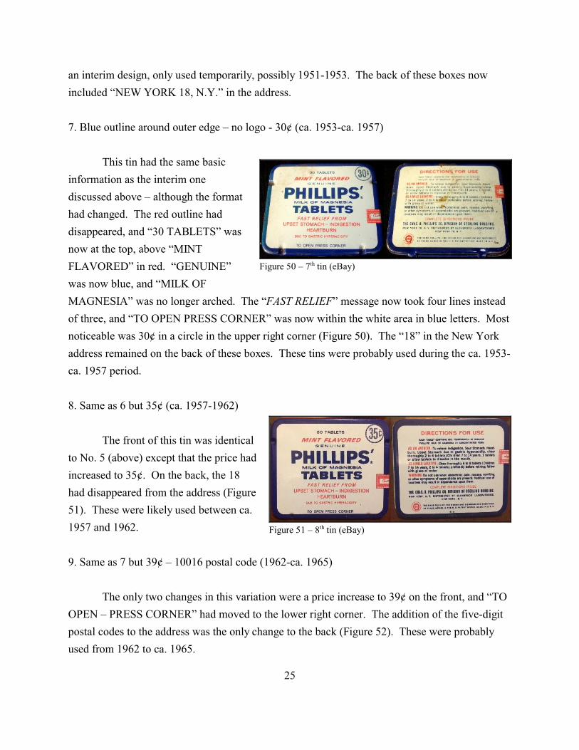
Figure 50 – 7th tin (eBay)
Figure 51 – 8th tin (eBay)
an interim design, only used temporarily, possibly 1951-1953. The back of these boxes now
included “NEW YORK 18, N.Y.” in the address.
7. Blue outline around outer edge – no logo - 30¢ (ca. 1953-ca. 1957)
This tin had the same basic
information as the interim one
discussed above – although the format
had changed. The red outline had
disappeared, and “30 TABLETS” was
now at the top, above “MINT
FLAVORED” in red. “GENUINE”
was now blue, and “MILK OF
MAGNESIA” was no longer arched. The “FAST RELIEF” message now took four lines instead
of three, and “TO OPEN PRESS CORNER” was now within the white area in blue letters. Most
noticeable was 30¢ in a circle in the upper right corner (Figure 50). The “18” in the New York
address remained on the back of these boxes. These tins were probably used during the ca. 1953-
ca. 1957 period.
8. Same as 6 but 35¢ (ca. 1957-1962)
The front of this tin was identical
to No. 5 (above) except that the price had
increased to 35¢. On the back, the 18
had disappeared from the address (Figure
51). These were likely used between ca.
1957 and 1962.
9. Same as 7 but 39¢ – 10016 postal code (1962-ca. 1965)
The only two changes in this variation were a price increase to 39¢ on the front, and “TO
OPEN – PRESS CORNER” had moved to the lower right corner. The addition of the five-digit
postal codes to the address was the only change to the back (Figure 52). These were probably
used from 1962 to ca. 1965.
25
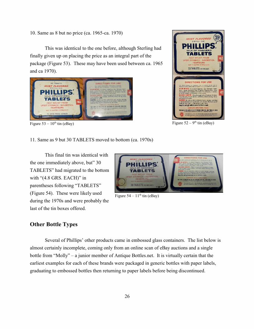
Figure 52 – 9th tin (eBay)Figure 53 – 10th tin (eBay)
Figure 54 – 11th tin (eBay)
10. Same as 8 but no price (ca. 1965-ca. 1970)
This was identical to the one before, although Sterling had
finally given up on placing the price as an integral part of the
package (Figure 53). These may have been used between ca. 1965
and ca 1970).
11. Same as 9 but 30 TABLETS moved to bottom (ca. 1970s)
This final tin was identical with
the one immediately above, but” 30
TABLETS” had migrated to the bottom
with “(4.8 GRS. EACH)” in
parentheses following “TABLETS”
(Figure 54). These were likely used
during the 1970s and were probably the
last of the tin boxes offered.
Other Bottle Types
Several of Phillips’ other products came in embossed glass containers. The list below is
almost certainly incomplete, coming only from an online scan of eBay auctions and a single
bottle from “Molly” – a junior member of Antique Bottles.net. It is virtually certain that the
earliest examples for each of these brands were packaged in generic bottles with paper labels,
graduating to embossed bottles then returning to paper labels before being discontinued.
26
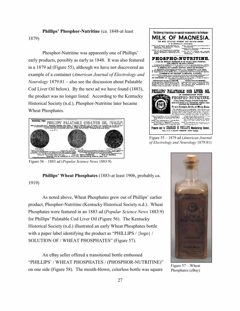
Figure 55 – 1879 ad (American Journalof Electrology and Neurology 1879:81)
Figure 56 – 1883 ad (Popular Science News 1883:9)
Figure 57 – WheatPhosphates (eBay)
Phillips’ Phosphor-Nutritine (ca. 1848-at least
1879)
Phosphor-Nutritine was apparently one of Phillips’
early products, possibly as early as 1848. It was also featured
in a 1879 ad (Figure 55), although we have not discovered an
example of a container (American Journal of Electrology and
Neurology 1879:81 – also see the discussion about Palatable
Cod Liver Oil below). By the next ad we have found (1883),
the product was no longer listed. According to the Kentucky
Historical Society (n.d.), Phosphor-Nutritine later became
Wheat Phosphates.
Phillips’ Wheat Phosphates (1883-at least 1906, probably ca.
1919)
As noted above, Wheat Phosphates grew out of Phillips’ earlier
product, Phosphor-Nutritine (Kentucky Historical Society n.d.). Wheat
Phosphates were featured in an 1883 ad (Popular Science News 1883:9)
for Phillips’ Palatable Cod Liver Oil (Figure 56). The Kentucky
Historical Society (n.d.) illustrated an early Wheat Phosphates bottle
with a paper label identifying the product as “PHILLIPS / {logo} /
SOLUTION OF / WHEAT PHOSPHATES” (Figure 57).
An eBay seller offered a transitional bottle embossed
“PHILLIPS’ / WHEAT PHOSPHATES / (PHOSPHOR-NUTRITINE)”
on one side (Figure 58). The mouth-blown, colorless bottle was square
27
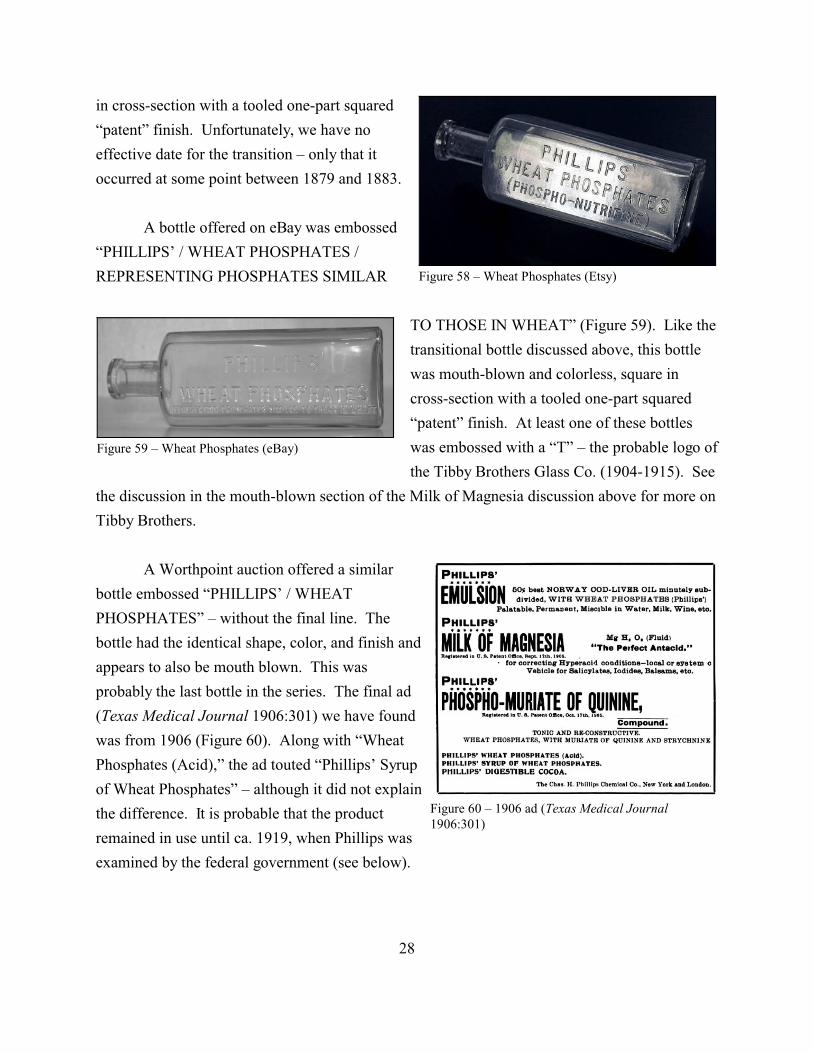
Figure 58 – Wheat Phosphates (Etsy)
Figure 59 – Wheat Phosphates (eBay)
Figure 60 – 1906 ad (Texas Medical Journal1906:301)
in cross-section with a tooled one-part squared
“patent” finish. Unfortunately, we have no
effective date for the transition – only that it
occurred at some point between 1879 and 1883.
A bottle offered on eBay was embossed
“PHILLIPS’ / WHEAT PHOSPHATES /
REPRESENTING PHOSPHATES SIMILAR
TO THOSE IN WHEAT” (Figure 59). Like the
transitional bottle discussed above, this bottle
was mouth-blown and colorless, square in
cross-section with a tooled one-part squared
“patent” finish. At least one of these bottles
was embossed with a “T” – the probable logo of
the Tibby Brothers Glass Co. (1904-1915). See
the discussion in the mouth-blown section of the Milk of Magnesia discussion above for more on
Tibby Brothers.
A Worthpoint auction offered a similar
bottle embossed “PHILLIPS’ / WHEAT
PHOSPHATES” – without the final line. The
bottle had the identical shape, color, and finish and
appears to also be mouth blown. This was
probably the last bottle in the series. The final ad
(Texas Medical Journal 1906:301) we have found
was from 1906 (Figure 60). Along with “Wheat
Phosphates (Acid),” the ad touted “Phillips’ Syrup
of Wheat Phosphates” – although it did not explain
the difference. It is probable that the product
remained in use until ca. 1919, when Phillips was
examined by the federal government (see below).
28
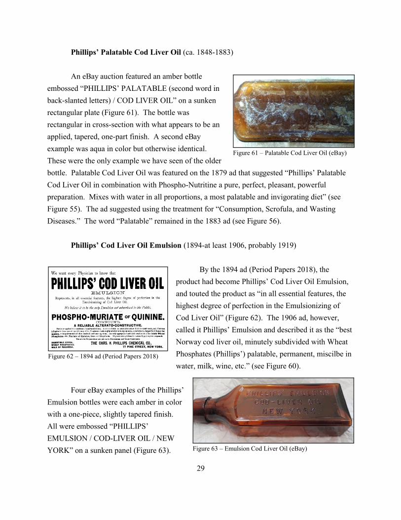
Figure 61 – Palatable Cod Liver Oil (eBay)
Figure 62 – 1894 ad (Period Papers 2018)
Figure 63 – Emulsion Cod Liver Oil (eBay)
Phillips’ Palatable Cod Liver Oil (ca. 1848-1883)
An eBay auction featured an amber bottle
embossed “PHILLIPS’ PALATABLE (second word in
back-slanted letters) / COD LIVER OIL” on a sunken
rectangular plate (Figure 61). The bottle was
rectangular in cross-section with what appears to be an
applied, tapered, one-part finish. A second eBay
example was aqua in color but otherwise identical.
These were the only example we have seen of the older
bottle. Palatable Cod Liver Oil was featured on the 1879 ad that suggested “Phillips’ Palatable
Cod Liver Oil in combination with Phospho-Nutritine a pure, perfect, pleasant, powerful
preparation. Mixes with water in all proportions, a most palatable and invigorating diet” (see
Figure 55). The ad suggested using the treatment for “Consumption, Scrofula, and Wasting
Diseases.” The word “Palatable” remained in the 1883 ad (see Figure 56).
Phillips’ Cod Liver Oil Emulsion (1894-at least 1906, probably 1919)
By the 1894 ad (Period Papers 2018), the
product had become Phillips’ Cod Liver Oil Emulsion,
and touted the product as “in all essential features, the
highest degree of perfection in the Emulsionizing of
Cod Liver Oil” (Figure 62). The 1906 ad, however,
called it Phillips’ Emulsion and described it as the “best
Norway cod liver oil, minutely subdivided with Wheat
Phosphates (Phillips’) palatable, permanent, miscilbe in
water, milk, wine, etc.” (see Figure 60).
Four eBay examples of the Phillips’
Emulsion bottles were each amber in color
with a one-piece, slightly tapered finish.
All were embossed “PHILLIPS’
EMULSION / COD-LIVER OIL / NEW
YORK” on a sunken panel (Figure 63).
29

Figure 65 – Paper label (eBay)
Figure 64 – Emulsion base (eBay)
The bottles were rectangular in cross-section, and two appear to
have been mouth blown, while the other two show a parting line
below the finish – a certain machine characteristic. One
machine-made bottle was embossed “T5” – the probable mark
from the Tibby Bros. (see above) – on the base but showed no
machine scar (Figure 64). One example, probably machine made,
still exhibited a
mostly intact paper
label, calling the product “PHILLIPS’ /
PALATABLE / Emulsion of Cod Liver Oil” (Figure
65). While a machine-made, small-mouth bottle
could have been made in 1906, these were likely
produced at least in the teens. The product was likely
discontinued ca. 1919, when other Phillips’ items
were examined by the federal government.
Phillips’ Phospho-Muriate of Quinine (1885-ca. 1919)
We have a fairly solid beginning date for Phillips’ Phospho-Muriate of Quinine. The
brand was absent from Phillips’ 1883 ad (see Figure 56) but appeared in 1885 (Boston Medical
and Surgical Journal 1885:1), suggesting a debut in the latter year. The only bottle we have
discovered was in a Worthpoint auction. The bottle had a paper label with the words
“PHILLIPS’ / Phospho- / Muriate of Quinine, / COMPOUND” and was embossed “THE CHAS
PHILLIPS / CHEMICAL CO. / NEW YORK” on one side of the bottle. Square in cross-section,
this was identical to bottle described immediately below and appeared to be colorless, although
the liquid inside was very dark – appearing black in the photo.
Based on data from 1918, a book by the American Medical Assn. (1922:197-198) noted
that the Phillips firm claimed that “the quantities of quinin and strychnin [apparently the correct
spellings at that time] in this preparation are so well balanced that relieve the depression and
fatigue from mental or physical exertion without the necessity of recourse to alcoholic
stimulation” but added the claim was “nonsensical if indeed it is not mendacious balderdash.”
The study concluded that the compound was
30
Figure 66 – Phillips’ Chemical Co. (Molly –Antique Bottles.net)
a complex and irrational mixture exploited by means of unwarranted claims. It is
a survival of the old days of therapeutic chaos when impossible and fantastic
chemical formulas were gravely published and as solemnly accepted without
question and also without the slightest understanding on the part of many, when
the most eminent of practitioners did not hesitate to give glowing testimonials for
lithia waters that contained no more lithium than ordinary river water, when no
therapeutic claim was too preposterous to receive acceptance, no theory too
nonsensical to justify the use of all manner of claptrap mixtures for all manner of
conditions.
It is virtually certain that Phillips withdrew the product from the market by the following
year. In fact, it is likely that all of the Phillips products vanished during this two-year period with
the exception of Milk of Magnesia.
Chas. H. Phillips Chemical Co. (mid-1880s-ca. 1919)
Molly posted a photo of a colorless, mouth-
blown bottle embossed “THE CHAS. H. PHILLIPS /
CHEMICAL CO. / NEW YORK” on one face
(Figure 66). The bottle appears square in cross-
section in the photo with a squared, one-part
“packer” finish. There are three vent marks on the
shoulder and at least one (probably more) along one
side seam. The bottle almost certainly sported a paper label when it was used. At least one
example was used for Phillips’ Phospho-Muriate of Quinine (see above).
Phillips’ Digestible Cocoa (1885-1913)
Absent from the 1883 ad, Digestible Cocoa appeared in 1885, another pretty solid
beginning date. The ad called the Cocoa “a Delicious Beverage. Nourishing to a High Degree.
Easily Digested” and described it as “a reliable article of diet (their emphasis) for the sick room
and a substitute for Tea or Coffee for every day use. As it is often digested when milk or other
nutrients cause distress, it becomes a superior food in irritable conditions of the stomach”
(Boston Medical and Surgical Journal 1885:1).
31
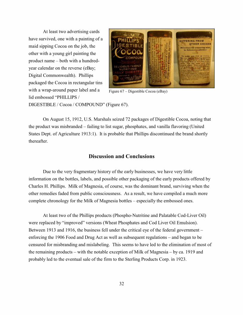
Figure 67 – Digestible Cocoa (eBay)
At least two advertising cards
have survived, one with a painting of a
maid sipping Cocoa on the job, the
other with a young girl painting the
product name – both with a hundred-
year calendar on the reverse (eBay;
Digital Commonwealth). Phillips
packaged the Cocoa in rectangular tins
with a wrap-around paper label and a
lid embossed “PHILLIPS /
DIGESTIBLE / Cocoa / COMPOUND” (Figure 67).
On August 15, 1912, U.S. Marshals seized 72 packages of Digestible Cocoa, noting that
the product was misbranded – failing to list sugar, phosphates, and vanilla flavoring (United
States Dept. of Agriculture 1913:1). It is probable that Phillips discontinued the brand shortly
thereafter.
Discussion and Conclusions
Due to the very fragmentary history of the early businesses, we have very little
information on the bottles, labels, and possible other packaging of the early products offered by
Charles H. Phillips. Milk of Magnesia, of course, was the dominant brand, surviving when the
other remedies faded from public consciousness. As a result, we have compiled a much more
complete chronology for the Milk of Magnesia bottles – especially the embossed ones.
At least two of the Phillips products (Phospho-Nutritine and Palatable Cod-Liver Oil)
were replaced by “improved” versions (Wheat Phosphates and Cod Liver Oil Emulsion).
Between 1913 and 1916, the business fell under the critical eye of the federal government –
enforcing the 1906 Food and Drug Act as well as subsequent regulations – and began to be
censured for misbranding and mislabeling. This seems to have led to the elimination of most of
the remaining products – with the notable exception of Milk of Magnesia – by ca. 1919 and
probably led to the eventual sale of the firm to the Sterling Products Corp. in 1923.
32
This work should be considered a preliminary study. Future researchers should
concentrate on finding new sources to show transitions in bottles, labels, and tins. Hopefully,
more examples of the older bottles, both those with paper labels and embossed examples will
appear in both collectors’ and archaeological sources. We especially need better dating for the
1940s-1970s for both bottles and tins.
Acknowledgments
We wish to thank Wanda Wakkinen for proofreading this study.
Sources
American Journal of Electrology and Neurology
1879 Advertisement: “The Following Preparations are Recommended to the Profession.”
American Journal of Electrology and Neurology 1(1):81. [July]
American Medical Assn.
1922 Propaganda for Reform in Proprietary Medicines. Vol. 2. Press of American
Medical Assn., Chicago.
Boston Medical and Surgical Journal
1885 Advertisement: “Phillips’ Palatable Cod Liver Oil.” Boston Medical and Surgical
Journal 113(18):1. [October 29]
1886 Advertisement: “Phillips’ Phospho-Muriate of Quinine.” Boston Medical and
Surgical Journal 115(13):1. [September 30]
Connie C.
2012 “Old Glass Bottles and Items of Antiquity: Genuine Phillips’ Milk of Magnesia.”
http://productmanufacturers.blogspot.com/2012/10/genuine-phillips-milk-of-magnesia.ht
ml
33

Justia Trademarks
2018 “PHILLIPS' MILK OF MAGNESIA - Trademark Details.”
https://trademarks.justia.com/710/16/phillips-milk-of-71016576.html
Kentucky Historical Society
n.d. “Object Record.” Kentucky Historical Society
http://kyhistory.pastperfectonline.com/webobject/7AF4A189-31E2-48D2-A5D7-6218206
73224
King, Thomas B.
1987 Glass in Canada. Boston Mills Press, Ontario.
Mills: Making Places in Connecticut
2018 “Charles H. Phillips Chemical Co.”
https://connecticutmills.org/find/details/charles-h.-phillips-chemical-co
Old Main Artifacts
2014 “Phillips’ Milk of Magnesia, Glenbrook, CT.”
https://oldmainartifacts.wordpress.com/2014/05/21/phillips-milk-of-magnesia-glenbrook-
ct/
Popular Science News
1883 Advertisement: “Phillips Palatable Cod-Liver Oil.” Popular Science News
17(December 1):9.
Sullivan, Eve
2013 “The Dart: Youthful admiration leads to long relationship - with a house.”
Stamford Advocate (9/22/2013).
Texas Medical Journal
1906 “Phillips’ Emulsion.” Texas Medical Journal 21(January):301.
Toulouse, Julian Harrison
1971 Bottle Makers and Their Marks. Thomas Nelson, New York.
34

United States Dept. of Agriculture
1913 “Notice of Judgement No. 2186: Adulteration and Misbranding of Phillips’
Digestible Coca.”
Last updated 4/23/2018
35

36