Embed Size (px)
Citation preview
The Building Blocks of Design
The elements of design are the building blocks of design. These
elements are a part of every page a Web designer builds. An
understanding of these basic elements will help the Web
designer build more powerful Web pages.
Balance
• The distribution of heavy and light elements on the page.
• Larger, darker elements appear heavier in the design than smaller, lighter elements.
What is Balance in Design
• Balance is a visual interpretation of gravity in the design.
• Designs can be balanced three ways: »symmetrical balance »asymmetrical balance »discordant or off-balance
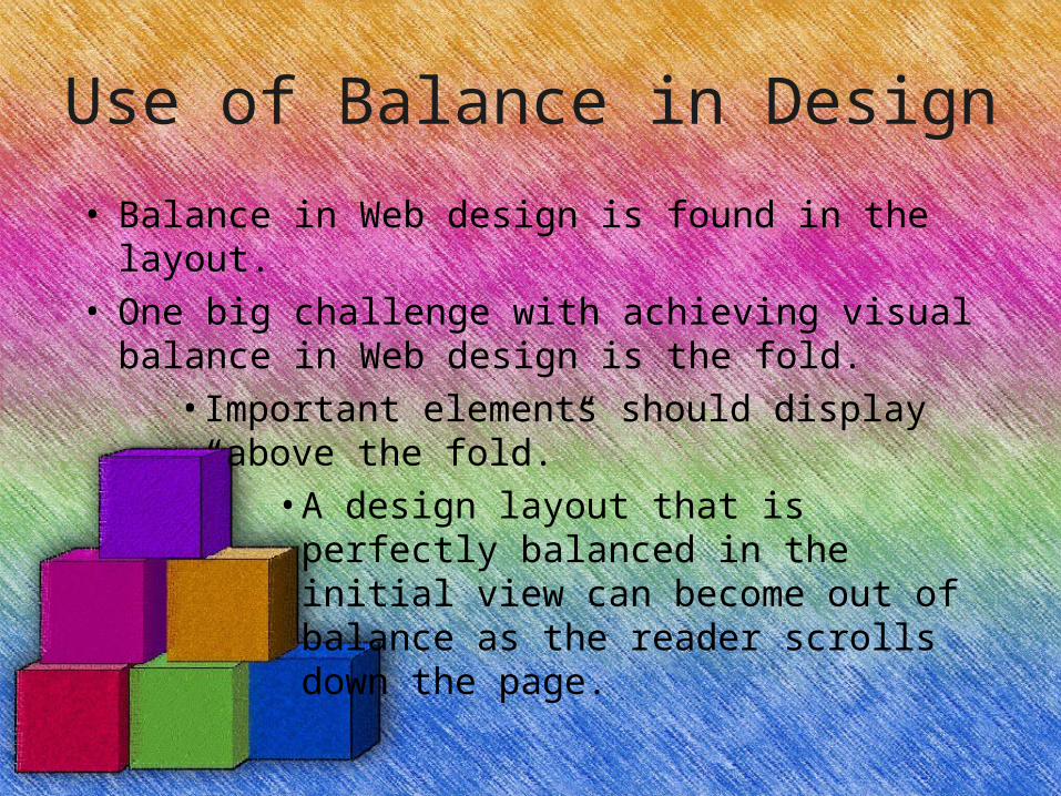
Use of Balance in Design
• Balance in Web design is found in the layout.
• One big challenge with achieving visual balance in Web design is the fold.
• Important elements should display “above the fold.”
• A design layout that is perfectly balanced in the initial view can become out of balance as the reader scrolls down the page.

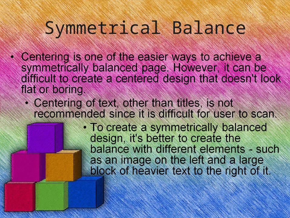
Symmetrical Balance
• Symmetrical balance is achieved by placing elements in a very even fashion in the design.
• If there is a large, heavy element on the right side of the layout, it should display a matching heavy element on the left.
Symmetrical Balance
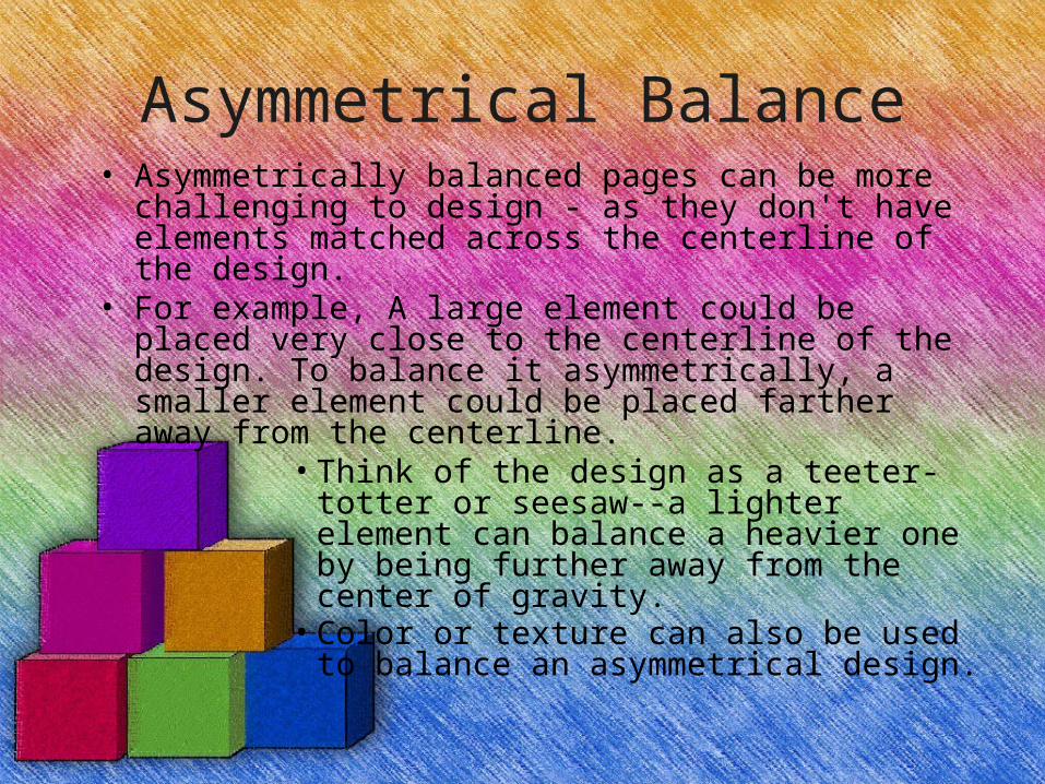
Asymmetrical Balance• Asymmetrically balanced pages can be more
challenging to design - as they don't have elements matched across the centerline of the design.
• For example, A large element could be placed very close to the centerline of the design. To balance it asymmetrically, a smaller element could be placed farther away from the centerline.
• Think of the design as a teeter-totter or seesaw--a lighter element can balance a heavier one by being further away from the center of gravity.
• Color or texture can also be used to balance an asymmetrical design.
Discordant or Off-Balance
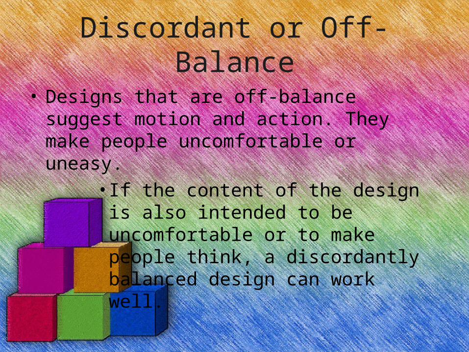
• Designs that are off-balance suggest motion and action. They make people uncomfortable or uneasy.
• If the content of the design is also intended to be uncomfortable or to make people think, a discordantly balanced design can work well.
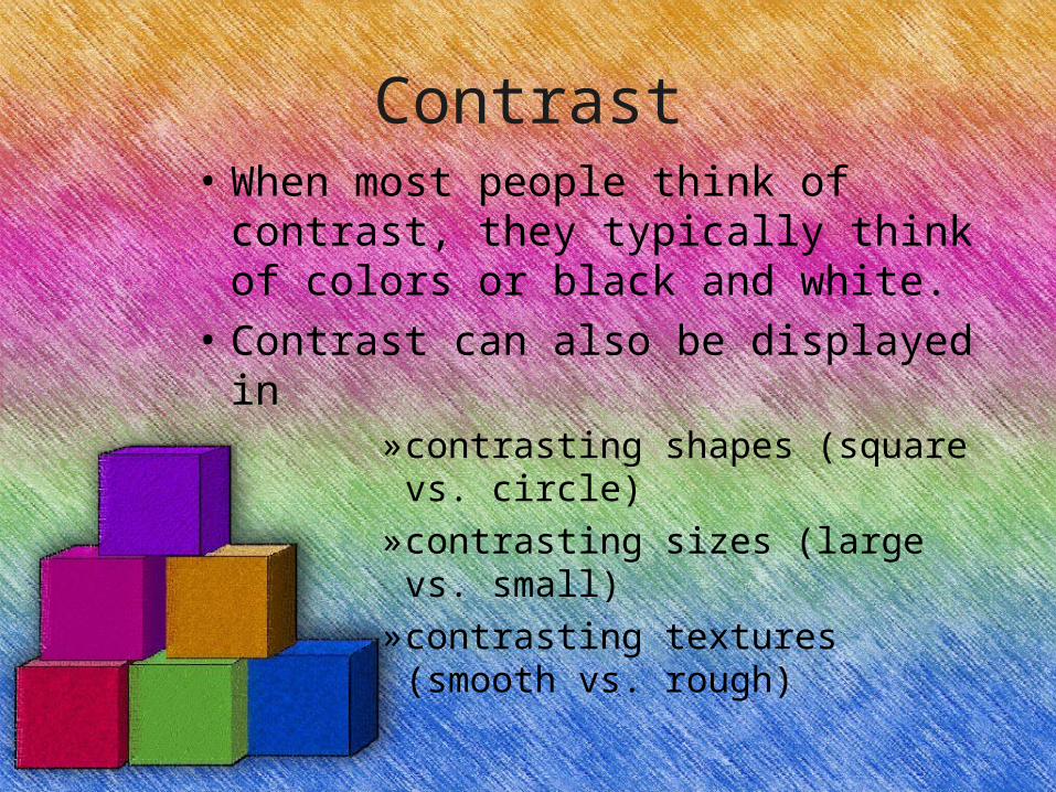
Contrast• When most people think of contrast,
they typically think of colors or black and white.
• Contrast can also be displayed in»contrasting shapes (square
vs. circle)»contrasting sizes (large vs.
small)»contrasting textures (smooth
vs. rough)
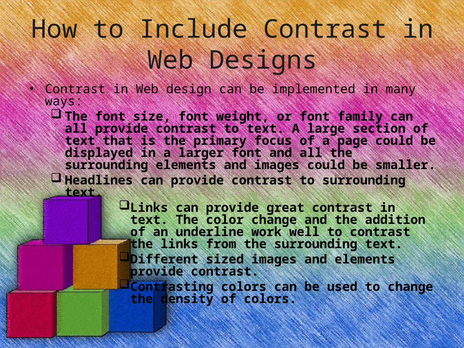
How to Include Contrast in Web Designs
• Contrast in Web design can be implemented in many ways: The font size, font weight, or font family can all provide
contrast to text. A large section of text that is the primary focus of a page could be displayed in a larger font and all the surrounding elements and images could be smaller.
Headlines can provide contrast to surrounding text. Links can provide great contrast in text. The
color change and the addition of an underline work well to contrast the links from the surrounding text.
Different sized images and elements provide contrast.
Contrasting colors can be used to change the density of colors.
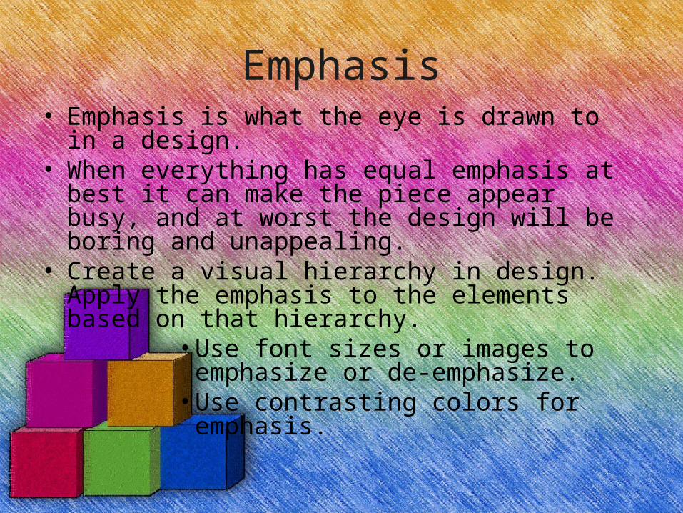
Emphasis• Emphasis is what the eye is drawn to in a design. • When everything has equal emphasis at best it can
make the piece appear busy, and at worst the design will be boring and unappealing.
• Create a visual hierarchy in design. Apply the emphasis to the elements based on that hierarchy.
• Use font sizes or images to emphasize or de-emphasize.
• Use contrasting colors for emphasis.
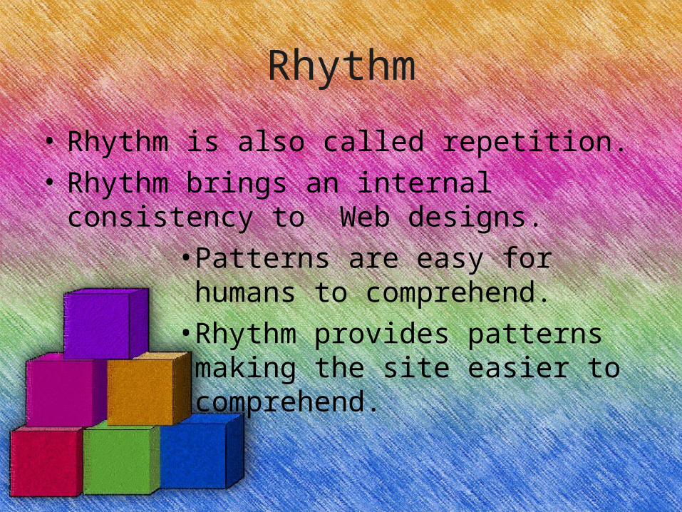
Rhythm
• Rhythm is also called repetition.
• Rhythm brings an internal consistency to Web designs.
• Patterns are easy for humans to comprehend.
• Rhythm provides patterns making the site easier to comprehend.
Use of Rhythm in Design
• A headline can be repeated.
• An image can be repeated across the top of the page (Navigation buttons)
• A style can be utilized throughout the pages to provide consistency.
Unity
• Unity is also called proximity.
• Unity keeps like elements together and diverse elements further apart.
• Unity pulls elements together.
Use of Unity in Design
• Unity in design is achieved primarily through placement in page layout.
• It can also be achieved through margin and padding changes to the page elements.
Find the Points of Interest on a Web Page
• Points of interest are the focal points of a design - the places where the eye is drawn.
• By changing the spacing around points of interest, those points can be affected.
» For example, an image might be the focal point of your Web page. The image could be centered on the page.
» OR look at the other elements on the page and change the margins around the image to create a design that heightens the interest in that picture.
Lines in Design
• Lines in Web design can be used in many ways:
»borders around elements »dividing lines between elements »contours around elements »decoration
How to Include Lines in Web Design
• There are three ways to include lines in Web design work:
» Place horizontal lines in Web page documents.
» With borders on one or two sides of an element, you can create lines that are a little more interesting than a simple boxy border.
» Images can be used as lines and borders to create more decorative effects.
Shape
• Shapes make up any enclosed contour in the design.
• Shapes on most Web pages are square or rectangular.
• Images can be used to generate other shapes within designs.
What are Shapes in Design
• Shapes are a basic element of design.
• Shapes are used to convey meaning and organize information. Shapes can be 2-dimensional or 3-dimensional.
– There are three basic types of shapes: » geometric shapes » natural shapes » abstract shapes
Use of Shapes in Design
• Shapes in Web design can be used in many ways:
»add interest to a design »sustain interest »organize or separate elements »direct the eye through the design
Geometric Shapes
• Geometric shapes are what most people think of when they think of shapes.
• Most geometric shapes on Web pages are created through layout and CSS.
• Some common geometric shapes found on Web pages are:
• squares and rectangles • circles • triangles • diamonds
Natural Shapes
• Natural shapes are shapes that are found in nature, but they are also shapes of man-made items.
• Most natural shapes in Web pages are created with images.
– Some examples of natural shapes are (there are tons of them):
» leaves » puddles
Abstract Shapes• Abstract shapes are those that have a recognizable
form but are not "real" in the same way as natural shapes.
• Example: a stick-figure drawing of a dog is an abstract dog shape, but another dog in a photo is a natural shape.
• Abstract shapes in Web designs are usually added through images.
– Examples of abstract shapes would be: » alphabet glyphs » Icons » symbols
Texture
• Texture is what gives a design the feeling of a surface. • It is the tactile sense of the elements in the design. • In Web design, texture is visual, but it provides the
illusion of physical texture. • A combination of elements on a page can combine
together to look textured. – Some common textures are:
» Rough » smooth » hard » soft
Use of Texture in Design
• Texture in Web design can be used in many ways:
»backgrounds »emphasis »stylized designs like engravings or
etchings
Color
• Color is the one design element that most Web designers are acutely aware of.
• Color is not a required element of any design. • A good plan in design is to create the
design without color first, then add as little color as you can to enhance the design.
Use of Color in Design
• Color in Web design can be used in many ways:
»backgrounds »text and foregrounds » images »accents
How to Include Color in Web Designs
• Color is very easy to add to Web pages. There are many style properties that add color, including:
» color - for foreground color, like fonts and text » background-color - does what it sounds like,
changes the background color of the element » border-color - to change the color of borders
around elements
• Color can also be added to Web design through images.
» JPEG images for photographs and images with millions of colors
» GIF images for flat color images.
What is Direction in Design• Direction in design provides mood
and atmosphere.
• Direction gives the illusion of movement within a design.
• There are three basic directions in design:
»horizontal »vertical »diagonal
Use of Direction in Design• Good designs lead the eye through the
design in a deliberate fashion so that the viewer sees what the designer wants.
• In Web design, direction is most often portrayed by the images on the page.
• Direction can be imposed through the placement of elements on the page.
• Arrows provide a simple way to give direction.
How to Include Direction in Web Designs
• Incorporate direction in your Web designs in the following ways:
» Look at your images to determine what direction the subjects are facing.
» If the people in a picture are looking to the right, then place the image on the left side of the page. Otherwise the direction of the eyes in the photo will direct the readers' eyes away from the page.
» Let the layout to suggest direction. Position dense elements, like photos, in horizontal, vertical, or diagonal lines. While less dense elements, like text, surround them.
» Use lines or images to suggest movement and direction.
• Concepts taken from www.about.com