Embed Size (px)
Citation preview
The cost of housing for low-income renters
Neil Amin Smith, David Phil-lips, Polly SimpsonInstitute for Fiscal Studies
David EiserFraser of Allander Institute
Robert JoyceMatthew MitchellAgnes Norris Keiller

The cost of housing for low-income renters
Robert Joyce, Matthew Mitchell and Agnes Norris Keiller Copy-edited by Judith Payne
The Institute for Fiscal Studies
Published by
The Institute for Fiscal Studies
7 Ridgmount Street London WC1E 7AE
Tel: +44 (0) 20-7291 4800 Fax: +44 (0) 20-7323 4780 Email: [email protected] Website: http://www.ifs.org.uk
© The Institute for Fiscal Studies, October 2017
ISBN 978-1-911102-66-3
Preface The Joseph Rowntree Foundation has supported this project as part of its programme of research and innovative development projects, which it hopes will be of value to policymakers, practitioners and service users. The facts presented and views expressed in this report are, however, those of the authors and not necessarily those of the Foundation. Neither are the views expressed necessarily those of the other individuals or institutions mentioned here, including the Institute for Fiscal Studies (IFS), which has no corporate view. Co-funding from the ESRC-funded Centre for the Microeconomic Analysis of Public Policy at IFS (grant number ES/M010147/1) is also very gratefully acknowledged.
Data from the Family Resources Survey were made available by the Department for Work and Pensions, which bears no responsibility for the interpretation of the data in this report. The English House Condition Survey (EHCS) and the English Housing Survey (EHS) data are produced by the Department for Communities and Local Government and may not exactly reproduce National Statistics aggregates. They are Crown Copyright and reproduced with the permission of the Controller of HMSO and Queen’s Printer for Scotland. The EHS and EHCS data were made available through the UK Data Service.
The authors would like to thank Carl Emmerson, Paul Johnson, Brian Robson and members of the advisory group for their helpful comments. Any errors and all views expressed are those of the authors.
Contents Executive summary 1 1. Introduction 5 2. Trends in housing tenure 7 3. Trends in rents and incomes 12
3.1 Rent and income in the private rented sector 12 3.2 Rent and income among low-income private renters 17 3.3 Rent and income in the social rented sector 25
4. Trends in the characteristics of rented housing 32 4.1 Characteristics of private rented housing 32 4.2 Private rent levels and property characteristics 35
5. Conclusions 39 Appendix A. Additional figures for Chapter 3 41 Appendix B. Additional figures for Chapter 4 43 References 45
Executive summary
© Institute for Fiscal Studies 1
Executive summary
The rise of renting
Declines in homeownership and in social housing mean many more people are renting privately, especially among the young.
The overall proportion of the population of Great Britain who live in rented accommodation has risen to 35%, up from 29% in the mid 1990s. But this growth has been entirely in the private rather than social sector and heavily concentrated among the young. Just 12% of 25- to 34-year-olds rented privately in the mid 1990s. This has since trebled to 37%.
The rise of private renting has been spread quite evenly across the income distribution.
The shift towards private renting largely reflects falls in owner-occupation towards the top and (especially) the middle of the income distribution; and falls in social renting towards the bottom of the distribution.
Rents and incomes
Renters are paying considerably more for their homes than 20 years ago, though in the private sector this is due to trends before the recession.
Relative to the general price level, the average (median) private rent paid in the mid 2010s was 53% higher than that in the mid 1990s in London and 29% higher in the rest of Britain. Those rises mainly occurred in the late 1990s and early 2000s (in London) or in the early and mid 2000s (in the rest of Britain). By contrast, social housing rents consistently grew in real terms from the mid 1990s until the (temporary) changes to social rent uprating policy from 2016.
The cost of housing for low-income renters
2 © Institute for Fiscal Studies
These higher rents paid do not seem to be explained by changes in the characteristics of rented properties.
Detailed data on housing characteristics available within England show that, for the most part, increases in private rents paid since the turn of the century are not explained by improvements in the quality of property in the private rented sector. Rather, people generally seem to be paying more for similar properties.
Londoners spend more of their income on rent than renters elsewhere and the differential between London and the rest of the country has increased recently.
In 2013‒2015, the average (median) rent-to-income ratio among private renters was 40% in London and 28% in the rest of Great Britain. This ratio increased by 5 percentage points (ppts) in London between 2006–2008 and 2013–2015, while not changing in the rest of Great Britain. This is because the incomes of private renters have fallen in London whereas they have flatlined in other parts of the country.
Low-income households: rents, incomes and housing benefit
Low-income renters spend a higher portion of their income on rent than higher-income renters, even after accounting for the help they get through housing benefit (HB).
When comparing income groups, we look at rent-to-income ratios excluding housing benefit (HB) from rent and income: how much of their other income must renters use to pay the part of their rent not covered by HB? On this measure, the median rent-to-income ratio is 35% among private renters in the bottom income quintile, 24% in the middle quintile and 19% in the top quintile.
This differential has risen over time. The median rent-to-income ratio among private renters in the top two income quintiles is about the same as two decades ago. But it is higher than two decades ago for the bottom half of the income distribution.
Executive summary
© Institute for Fiscal Studies 3
The proportion of low-income renters who do not have all of their rent covered by HB has risen.
Looking just at low-income renters in the private sector (those in the bottom 40% of the income distribution in each region), the fraction whose housing benefit does not cover all of their rent has increased quite steadily, from 74% in the mid 1990s to 90% in the mid 2010s. The biggest change occurred among low-income working-age households with children, where it rose from 63% to 90% over the same period. In the social housing sector, the increase has been concentrated in recent years, jumping from 56% in 2010‒2012 to 68% in 2013‒2015.
The impacts of housing benefit reforms
Significant cuts to the generosity of HB have been made since 2011.
We estimate that reforms since 2011 have cut the HB entitlements of 1.9 million privately renting households (containing 4.8 million people) and 600,000 social-renting households (containing 1.3 million people). This includes two-thirds of low-income private renters and one-sixth of low-income social renters.
Those cuts have significantly increased the number of low-income renters whose HB entitlement falls short of their rent.
The proportion of low-income renters with a ‘shortfall’ between rent and HB entitlement is 12ppts higher in the private sector (an extra 600,000 people), and 10ppts higher in the social sector (an extra 700,000 people), than it would have been without the cuts made since 2011.
The cost of housing for low-income renters
4 © Institute for Fiscal Studies
Private sector tenants will continue to be affected by the policy not to increase HB caps in line with local rents.
Instead, these caps will, for the most part, be frozen until April 2020 and then increased in line with general prices. Between now and 2025, we estimate that, relative to local rent indexation, this will result in another 4% of low-income private renters (or 200,000 people) facing a shortfall between HB entitlement and rent. It will also increase the proportion facing an especially large shortfall, of at least 50% of (non-HB) income, by 2ppts (an extra 100,000 people), and by 5ppts (50,000 people) in London.
The system of locally varying HB caps is also set to be gradually rolled out to the social rented sector from April 2019.
If done now, this would mean an extra 3% of low-income social renters (an extra 200,000 people) with a shortfall between HB entitlement and rent. Although significant, this is a smaller impact than seen from the recent reforms already implemented. One reason for this is that the caps were (until recently) linked to private sector rent levels. Since rents in social housing are lower, they fall below these caps relatively often.
The impacts of these caps on social tenants will be larger for some groups, however.
These groups include tenants renting from a housing association (HA) rather than a local authority, and households without children. This is at least in part because rents in HA properties and in smaller properties tend to be closer to private sector levels, making the caps more binding.
Introduction
© Institute for Fiscal Studies 5
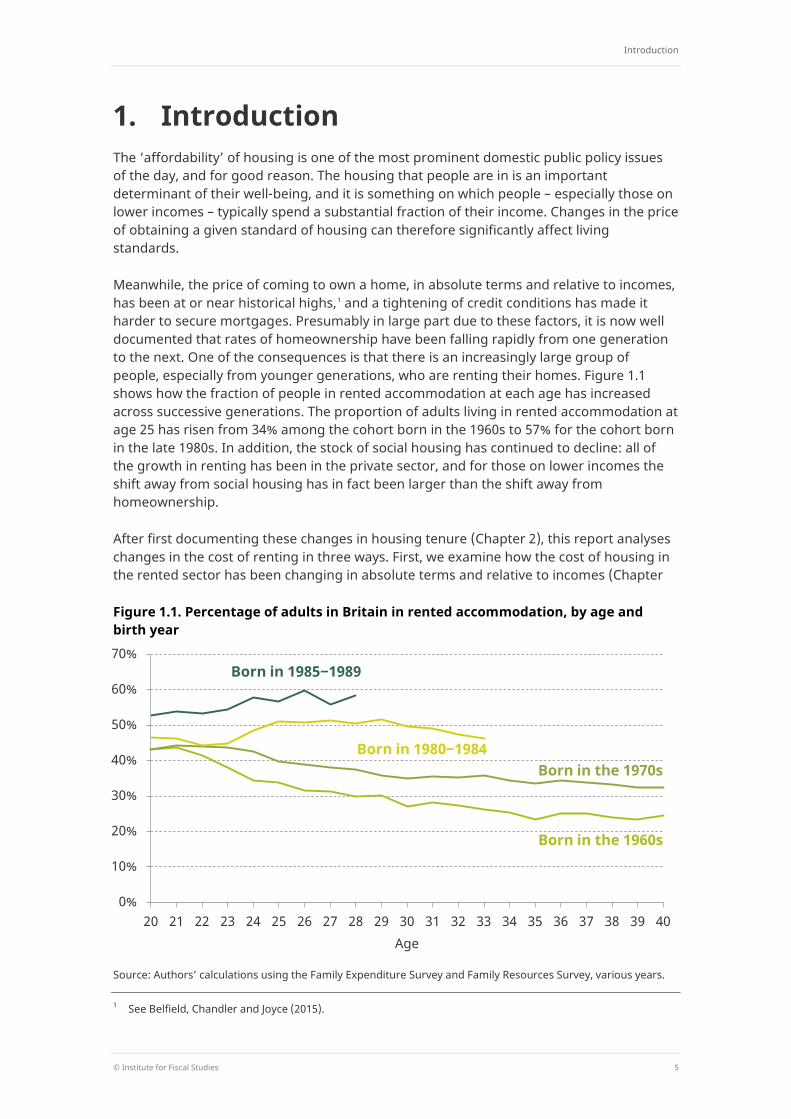
1. Introduction The ‘affordability’ of housing is one of the most prominent domestic public policy issues of the day, and for good reason. The housing that people are in is an important determinant of their well-being, and it is something on which people – especially those on lower incomes – typically spend a substantial fraction of their income. Changes in the price of obtaining a given standard of housing can therefore significantly affect living standards.
Meanwhile, the price of coming to own a home, in absolute terms and relative to incomes, has been at or near historical highs,1 and a tightening of credit conditions has made it harder to secure mortgages. Presumably in large part due to these factors, it is now well documented that rates of homeownership have been falling rapidly from one generation to the next. One of the consequences is that there is an increasingly large group of people, especially from younger generations, who are renting their homes. Figure 1.1 shows how the fraction of people in rented accommodation at each age has increased across successive generations. The proportion of adults living in rented accommodation at age 25 has risen from 34% among the cohort born in the 1960s to 57% for the cohort born in the late 1980s. In addition, the stock of social housing has continued to decline: all of the growth in renting has been in the private sector, and for those on lower incomes the shift away from social housing has in fact been larger than the shift away from homeownership.
After first documenting these changes in housing tenure (Chapter 2), this report analyses changes in the cost of renting in three ways. First, we examine how the cost of housing in the rented sector has been changing in absolute terms and relative to incomes (Chapter
Figure 1.1. Percentage of adults in Britain in rented accommodation, by age and birth year
Source: Authors’ calculations using the Family Expenditure Survey and Family Resources Survey, various years.
1 See Belfield, Chandler and Joyce (2015).
0%
10%
20%
30%
40%
50%
60%
70%
20 21 22 23 24 25 26 27 28 29 30 31 32 33 34 35 36 37 38 39 40 Age
Born in the 1960s
Born in the 1970s Born in 1980‒1984
Born in 1985‒1989
The cost of housing for low-income renters
6 © Institute for Fiscal Studies
3). We look separately at trends among those on lower incomes, a group that is particularly likely to be renting and to be spending large fractions of income on rent. It has also been affected by big recent changes to housing benefit policy. Second, we quantify the impact of those policy changes, and illustrate the likely effects of further planned reforms. Third, we examine how changes in the cost of renting in England have been accompanied by changes in the quality of rented accommodation (Chapter 4). We do this because the types of properties being rented now may be quite different from those being rented in the past – in part, perhaps, because the kinds of people in the sector are different – so simply comparing the rents paid by renters over time may not be comparing like with like.
Our analysis draws on two main sources of data.
The Family Resources Survey (FRS), run by the Department for Work and Pensions (DWP), collects information on rent, household income and demographic characteristics for a large and broadly representative sample of households2 (currently about 20,000 per year) from across the UK. It has been running since 1994–95.
For the detailed analysis of the characteristics of rented housing in Chapter 4, we use the ’dwellings sample’ of the English Housing Survey (EHS), run by the Department for Communities and Local Government (DCLG). This is a rolling survey of about 6,000 dwellings per year containing detailed information on housing use and quality in England.3 The EHS was created by merging the English House Condition Survey (EHCS) and the Survey of English Housing in 2008.
2 A household is defined – as in the 2011 Census – as a group of people (not necessarily related) living at the
same address who share cooking facilities and share a living room or sitting room or dining area. 3 Unfortunately, a smaller number of ‘survey years’ are available for the equivalent surveys covering housing in
Scotland, Wales and Northern Ireland. As a result, we are not able to track changes in housing costs and quality over time in parts of the UK other than England.
Trends in housing tenure
© Institute for Fiscal Studies 7
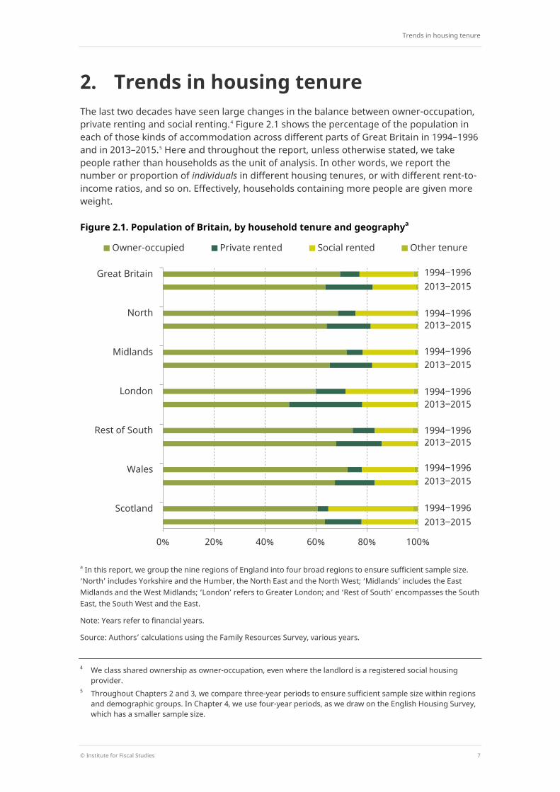
2. Trends in housing tenure The last two decades have seen large changes in the balance between owner-occupation, private renting and social renting.4 Figure 2.1 shows the percentage of the population in each of those kinds of accommodation across different parts of Great Britain in 1994–1996 and in 2013–2015.5 Here and throughout the report, unless otherwise stated, we take people rather than households as the unit of analysis. In other words, we report the number or proportion of individuals in different housing tenures, or with different rent-to-income ratios, and so on. Effectively, households containing more people are given more weight.
Figure 2.1. Population of Britain, by household tenure and geographya
a In this report, we group the nine regions of England into four broad regions to ensure sufficient sample size. ‘North’ includes Yorkshire and the Humber, the North East and the North West; ‘Midlands’ includes the East Midlands and the West Midlands; ‘London’ refers to Greater London; and ‘Rest of South’ encompasses the South East, the South West and the East.
Note: Years refer to financial years.
Source: Authors’ calculations using the Family Resources Survey, various years.
4 We class shared ownership as owner-occupation, even where the landlord is a registered social housing
provider. 5 Throughout Chapters 2 and 3, we compare three-year periods to ensure sufficient sample size within regions
and demographic groups. In Chapter 4, we use four-year periods, as we draw on the English Housing Survey, which has a smaller sample size.
0% 20% 40% 60% 80% 100%
Great Britain
North
Midlands
London
Rest of South
Wales
Scotland
Owner-occupied Private rented Social rented Other tenure
1994‒1996 2013‒2015
1994‒1996
1994‒1996
1994‒1996
1994‒1996
1994‒1996
1994‒1996
2013‒2015
2013‒2015
2013‒2015
2013‒2015
2013‒2015
2013‒2015
The cost of housing for low-income renters
8 © Institute for Fiscal Studies
Note that some people in owner-occupied housing are not themselves the owners of the home: for example, some are adults living with their home-owning parents. Assuming that only the head of a household and their partner (if applicable) are the owners of a property, 13% of all adults in owner-occupied housing in 2013–2015 did not own the property they were living in. These people are still classified as being in owner-occupied accommodation for the purposes of Figure 2.1.
The overall proportion of Great Britain living in rented accommodation has risen to 35%, from 29% in the mid 1990s. But Figure 2.1 shows that it is specifically the private rented sector which has grown: it accounted for 8% of the population in the mid 1990s but accounts for 19% now. In most parts of Great Britain, we see a similar proportion, and a similar increase in the proportion, of individuals in the private rented sector. The two exceptions are London and Scotland, where the increases in private renting have been more marked, and from a higher base in London and a lower base in Scotland.
In England and Wales, the increase in private renters is the result of both a reduction in the proportion of people living in owner-occupied housing and a fall in the share of social renters as the stock of social housing has declined.6 In Scotland, by contrast, there has been a slight increase in the fraction of people living in owner-occupied housing and the increase in private renting has entirely been driven by reductions in the social rented sector.
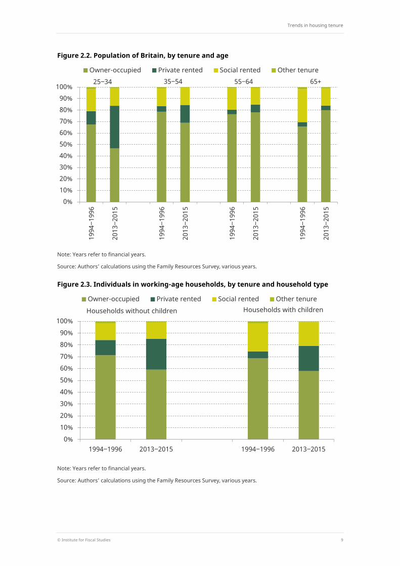
Figure 2.2 shows that the decline in the likelihood of living in owner-occupied accommodation in Great Britain over the past two decades has been by far greatest (21 percentage points) among adults aged 25–34, the point at which many people might previously have bought their first home. Note that the fall in the number of this group who actually own their home themselves has been slightly larger still, at 24 percentage points, due to an increase in the proportion who live with homeowning parents – which may of course be related to difficulties affording housing. There have also been declines in social renting among younger households. Together, these have resulted in large increases in private renting among the young. The proportion of 25- to 34-year-olds in the private rented sector has trebled from 12% to 37% in two decades.
Over the same period, the percentage of people aged 65 or older that live in owner-occupied accommodation has increased by 14 percentage points. Private renting remains rare among older households: for them, the increase in owner-occupation has largely occurred alongside a reduction in social renting (this is likely to reflect, at least in part, the lagged effect of the Right to Buy scheme introduced for council tenants in the 1980s, as many of the beneficiaries of that pass pensioner age).
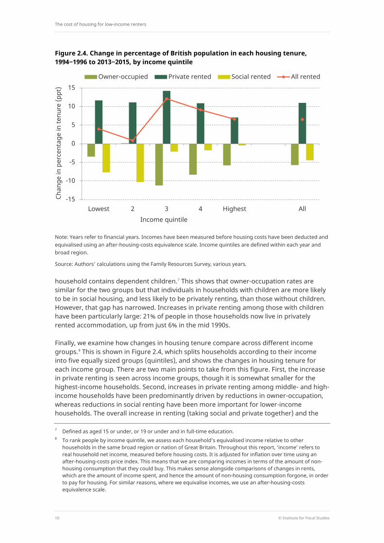
Figure 2.3 focuses on people living in working-age households (defined as those where all adults are below their state pension age) and divides this group according to whether the
6 For example, the number of households in England grew by an estimated 14% between 1999 and 2015,
compared with a 48% fall in the stock of socially rented and other public sector dwellings, as shown by DCLG dwelling stock statistics, https://www.gov.uk/government/uploads/system/uploads/attachment_data/file/519499/LT_104.xls and household projections, https://www.gov.uk/government/uploads/system/uploads/attachment_data/file/536731/Household_Projections_Published_Tables.xlsx.
Trends in housing tenure
© Institute for Fiscal Studies 9
Figure 2.2. Population of Britain, by tenure and age
Note: Years refer to financial years.
Source: Authors’ calculations using the Family Resources Survey, various years.
Figure 2.3. Individuals in working-age households, by tenure and household type
Note: Years refer to financial years.
Source: Authors’ calculations using the Family Resources Survey, various years.
0% 10% 20% 30% 40% 50% 60% 70% 80% 90%
100% 19
94‒1
996
2013
‒201
5
1994
‒199
6
2013
‒201
5
1994
‒199
6
2013
‒201
5
1994
‒199
6
2013
‒201
5
Owner-occupied Private rented Social rented Other tenure 35‒54 55‒64 65+ 25‒34
0% 10% 20% 30% 40% 50% 60% 70% 80% 90%
100%
1994‒1996 2013‒2015 1994‒1996 2013‒2015
Owner-occupied Private rented Social rented Other tenure
Households without children Households with children
The cost of housing for low-income renters
10 © Institute for Fiscal Studies
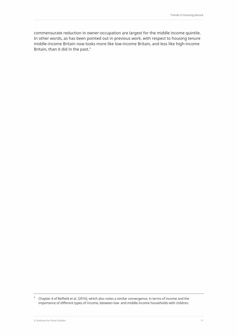
Figure 2.4. Change in percentage of British population in each housing tenure, 1994‒1996 to 2013‒2015, by income quintile
Note: Years refer to financial years. Incomes have been measured before housing costs have been deducted and equivalised using an after-housing-costs equivalence scale. Income quintiles are defined within each year and broad region.
Source: Authors’ calculations using the Family Resources Survey, various years.
household contains dependent children.7 This shows that owner-occupation rates are similar for the two groups but that individuals in households with children are more likely to be in social housing, and less likely to be privately renting, than those without children. However, that gap has narrowed. Increases in private renting among those with children have been particularly large: 21% of people in those households now live in privately rented accommodation, up from just 6% in the mid 1990s.
Finally, we examine how changes in housing tenure compare across different income groups.8 This is shown in Figure 2.4, which splits households according to their income into five equally sized groups (quintiles), and shows the changes in housing tenure for each income group. There are two main points to take from this figure. First, the increase in private renting is seen across income groups, though it is somewhat smaller for the highest-income households. Second, increases in private renting among middle- and high-income households have been predominantly driven by reductions in owner-occupation, whereas reductions in social renting have been more important for lower-income households. The overall increase in renting (taking social and private together) and the
7 Defined as aged 15 or under, or 19 or under and in full-time education. 8 To rank people by income quintile, we assess each household’s equivalised income relative to other
households in the same broad region or nation of Great Britain. Throughout this report, ‘income’ refers to real household net income, measured before housing costs. It is adjusted for inflation over time using an after-housing-costs price index. This means that we are comparing incomes in terms of the amount of non-housing consumption that they could buy. This makes sense alongside comparisons of changes in rents, which are the amount of income spent, and hence the amount of non-housing consumption forgone, in order to pay for housing. For similar reasons, where we equivalise incomes, we use an after-housing-costs equivalence scale.
-15
-10
-5
0
5
10
15
Lowest 2 3 4 Highest All
Chan
ge in
per
cent
age
in te
nure
(ppt
)
Income quintile
Owner-occupied Private rented Social rented All rented
Trends in housing tenure
© Institute for Fiscal Studies 11
commensurate reduction in owner-occupation are largest for the middle income quintile. In other words, as has been pointed out in previous work, with respect to housing tenure middle-income Britain now looks more like low-income Britain, and less like high-income Britain, than it did in the past.9
9 Chapter 4 of Belfield et al. (2016), which also notes a similar convergence, in terms of income and the
importance of different types of income, between low- and middle-income households with children.
The cost of housing for low-income renters
12 © Institute for Fiscal Studies
3. Trends in rents and incomes We now turn to trends in rents paid by the growing group of renters. We focus initially on the private rented sector which, as we have seen, is where the growth in numbers has been.
3.1 Rent and income in the private rented sector10
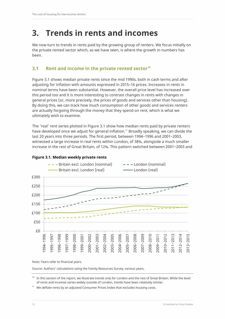
Figure 3.1 shows median private rents since the mid 1990s, both in cash terms and after adjusting for inflation with amounts expressed in 2015–16 prices. Increases in rents in nominal terms have been substantial. However, the overall price level has increased over this period too and it is more interesting to contrast changes in rents with changes in general prices (or, more precisely, the prices of goods and services other than housing). By doing this, we can track how much consumption of other goods and services renters are actually forgoing through the money that they spend on rent, which is what we ultimately wish to examine.
The ‘real’ rent series plotted in Figure 3.1 show how median rents paid by private renters have developed once we adjust for general inflation.11 Broadly speaking, we can divide the last 20 years into three periods. The first period, between 1994‒1996 and 2001‒2003, witnessed a large increase in real rents within London, of 38%, alongside a much smaller increase in the rest of Great Britain, of 12%. This pattern switched between 2001‒2003 and
Figure 3.1. Median weekly private rents
Note: Years refer to financial years.
Source: Authors’ calculations using the Family Resources Survey, various years.
10 In this section of the report, we illustrate trends only for London and the rest of Great Britain. While the level
of rents and incomes varies widely outside of London, trends have been relatively similar. 11 We deflate rents by an adjusted Consumer Prices Index that excludes housing costs.
£0
£50
£100
£150
£200
£250
£300
1994
‒199
6
1995
‒199
7
1996
‒199
8
1997
‒199
9
1998
‒200
0
1999
‒200
1
2000
‒200
2
2001
‒200
3
2002
‒200
4
2003
‒200
5
2004
‒200
6
2005
‒200
7
2006
‒200
8
2007
‒200
9
2008
‒201
0
2009
‒201
1
2010
‒201
2
2011
‒201
3
2012
‒201
4
2013
‒201
5
Britain excl. London (nominal) London (nominal) Britain excl. London (real) London (real)
Trends in rents and incomes
© Institute for Fiscal Studies 13
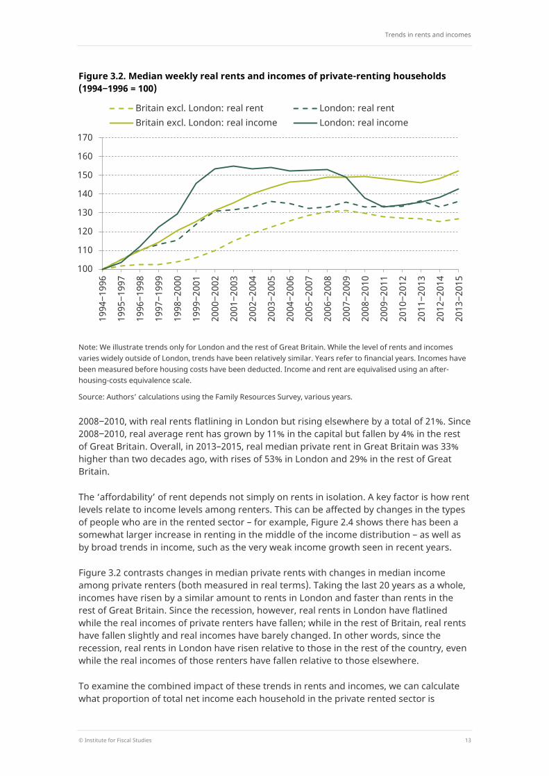
Figure 3.2. Median weekly real rents and incomes of private-renting households (1994‒1996 = 100)
Note: We illustrate trends only for London and the rest of Great Britain. While the level of rents and incomes varies widely outside of London, trends have been relatively similar. Years refer to financial years. Incomes have been measured before housing costs have been deducted. Income and rent are equivalised using an after-housing-costs equivalence scale.
Source: Authors’ calculations using the Family Resources Survey, various years.
2008‒2010, with real rents flatlining in London but rising elsewhere by a total of 21%. Since 2008‒2010, real average rent has grown by 11% in the capital but fallen by 4% in the rest of Great Britain. Overall, in 2013–2015, real median private rent in Great Britain was 33% higher than two decades ago, with rises of 53% in London and 29% in the rest of Great Britain.
The ‘affordability’ of rent depends not simply on rents in isolation. A key factor is how rent levels relate to income levels among renters. This can be affected by changes in the types of people who are in the rented sector – for example, Figure 2.4 shows there has been a somewhat larger increase in renting in the middle of the income distribution – as well as by broad trends in income, such as the very weak income growth seen in recent years.
Figure 3.2 contrasts changes in median private rents with changes in median income among private renters (both measured in real terms). Taking the last 20 years as a whole, incomes have risen by a similar amount to rents in London and faster than rents in the rest of Great Britain. Since the recession, however, real rents in London have flatlined while the real incomes of private renters have fallen; while in the rest of Britain, real rents have fallen slightly and real incomes have barely changed. In other words, since the recession, real rents in London have risen relative to those in the rest of the country, even while the real incomes of those renters have fallen relative to those elsewhere.
To examine the combined impact of these trends in rents and incomes, we can calculate what proportion of total net income each household in the private rented sector is
100
110
120
130
140
150
160
170
1994
‒199
6
1995
‒199
7
1996
‒199
8
1997
‒199
9
1998
‒200
0
1999
‒200
1
2000
‒200
2
2001
‒200
3
2002
‒200
4
2003
‒200
5
2004
‒200
6
2005
‒200
7
2006
‒200
8
2007
‒200
9
2008
‒201
0
2009
‒201
1
2010
‒201
2
2011
‒201
3
2012
‒201
4
2013
‒201
5
Britain excl. London: real rent London: real rent Britain excl. London: real income London: real income
The cost of housing for low-income renters
14 © Institute for Fiscal Studies
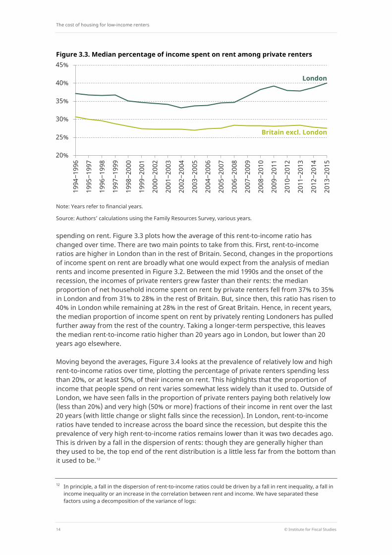
Figure 3.3. Median percentage of income spent on rent among private renters
Note: Years refer to financial years.
Source: Authors’ calculations using the Family Resources Survey, various years.
spending on rent. Figure 3.3 plots how the average of this rent-to-income ratio has changed over time. There are two main points to take from this. First, rent-to-income ratios are higher in London than in the rest of Britain. Second, changes in the proportions of income spent on rent are broadly what one would expect from the analysis of median rents and income presented in Figure 3.2. Between the mid 1990s and the onset of the recession, the incomes of private renters grew faster than their rents: the median proportion of net household income spent on rent by private renters fell from 37% to 35% in London and from 31% to 28% in the rest of Britain. But, since then, this ratio has risen to 40% in London while remaining at 28% in the rest of Great Britain. Hence, in recent years, the median proportion of income spent on rent by privately renting Londoners has pulled further away from the rest of the country. Taking a longer-term perspective, this leaves the median rent-to-income ratio higher than 20 years ago in London, but lower than 20 years ago elsewhere.
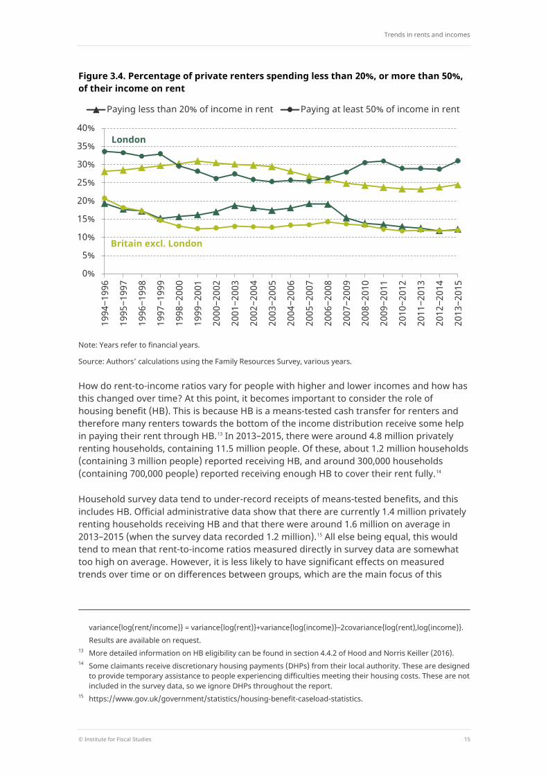
Moving beyond the averages, Figure 3.4 looks at the prevalence of relatively low and high rent-to-income ratios over time, plotting the percentage of private renters spending less than 20%, or at least 50%, of their income on rent. This highlights that the proportion of income that people spend on rent varies somewhat less widely than it used to. Outside of London, we have seen falls in the proportion of private renters paying both relatively low (less than 20%) and very high (50% or more) fractions of their income in rent over the last 20 years (with little change or slight falls since the recession). In London, rent-to-income ratios have tended to increase across the board since the recession, but despite this the prevalence of very high rent-to-income ratios remains lower than it was two decades ago. This is driven by a fall in the dispersion of rents: though they are generally higher than they used to be, the top end of the rent distribution is a little less far from the bottom than it used to be.12
12 In principle, a fall in the dispersion of rent-to-income ratios could be driven by a fall in rent inequality, a fall in
income inequality or an increase in the correlation between rent and income. We have separated these factors using a decomposition of the variance of logs:
20%
25%
30%
35%
40%
45% 19
94‒1
996
1995
‒199
7
1996
‒199
8
1997
‒199
9
1998
‒200
0
1999
‒200
1
2000
‒200
2
2001
‒200
3
2002
‒200
4
2003
‒200
5
2004
‒200
6
2005
‒200
7
2006
‒200
8
2007
‒200
9
2008
‒201
0
2009
‒201
1
2010
‒201
2
2011
‒201
3
2012
‒201
4
2013
‒201
5
Britain excl. London
London
Trends in rents and incomes
© Institute for Fiscal Studies 15
Figure 3.4. Percentage of private renters spending less than 20%, or more than 50%, of their income on rent
Note: Years refer to financial years.
Source: Authors’ calculations using the Family Resources Survey, various years.
How do rent-to-income ratios vary for people with higher and lower incomes and how has this changed over time? At this point, it becomes important to consider the role of housing benefit (HB). This is because HB is a means-tested cash transfer for renters and therefore many renters towards the bottom of the income distribution receive some help in paying their rent through HB.13 In 2013–2015, there were around 4.8 million privately renting households, containing 11.5 million people. Of these, about 1.2 million households (containing 3 million people) reported receiving HB, and around 300,000 households (containing 700,000 people) reported receiving enough HB to cover their rent fully.14
Household survey data tend to under-record receipts of means-tested benefits, and this includes HB. Official administrative data show that there are currently 1.4 million privately renting households receiving HB and that there were around 1.6 million on average in 2013–2015 (when the survey data recorded 1.2 million).15 All else being equal, this would tend to mean that rent-to-income ratios measured directly in survey data are somewhat too high on average. However, it is less likely to have significant effects on measured trends over time or on differences between groups, which are the main focus of this
variance{log(rent/income)} = variance{log(rent)}+variance{log(income)}–2covariance{log(rent),log(income)}. Results are available on request. 13 More detailed information on HB eligibility can be found in section 4.4.2 of Hood and Norris Keiller (2016). 14 Some claimants receive discretionary housing payments (DHPs) from their local authority. These are designed
to provide temporary assistance to people experiencing difficulties meeting their housing costs. These are not included in the survey data, so we ignore DHPs throughout the report.
15 https://www.gov.uk/government/statistics/housing-benefit-caseload-statistics.
0%
5%
10%
15%
20%
25%
30%
35%
40%
1994
‒199
6
1995
‒199
7
1996
‒199
8
1997
‒199
9
1998
‒200
0
1999
‒200
1
2000
‒200
2
2001
‒200
3
2002
‒200
4
2003
‒200
5
2004
‒200
6
2005
‒200
7
2006
‒200
8
2007
‒200
9
2008
‒201
0
2009
‒201
1
2010
‒201
2
2011
‒201
3
2012
‒201
4
2013
‒201
5
Paying less than 20% of income in rent Paying at least 50% of income in rent
London
Britain excl. London
The cost of housing for low-income renters
16 © Institute for Fiscal Studies
report. It will also have no impact on our analysis of changes to HB policy in Sections 3.2 and 3.3, as this is based on simulated entitlements rather than self-reported receipts.
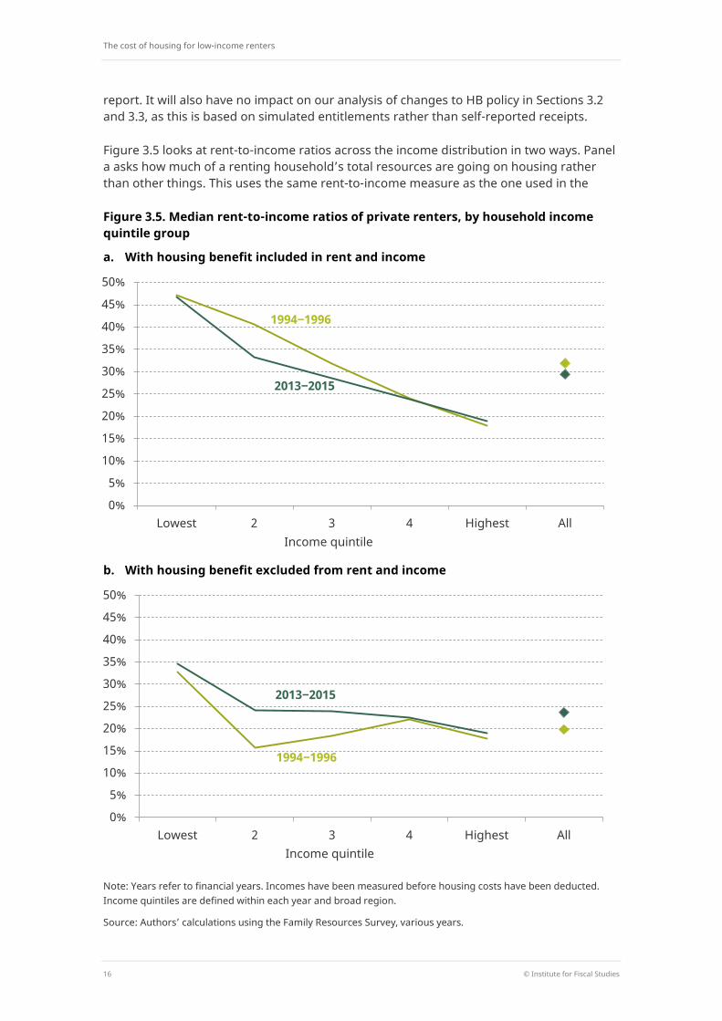
Figure 3.5 looks at rent-to-income ratios across the income distribution in two ways. Panel a asks how much of a renting household’s total resources are going on housing rather than other things. This uses the same rent-to-income measure as the one used in the
Figure 3.5. Median rent-to-income ratios of private renters, by household income quintile group
a. With housing benefit included in rent and income
b. With housing benefit excluded from rent and income
Note: Years refer to financial years. Incomes have been measured before housing costs have been deducted. Income quintiles are defined within each year and broad region.
Source: Authors’ calculations using the Family Resources Survey, various years.
0%
5%
10%
15%
20%
25%
30%
35%
40%
45%
50%
Lowest 2 3 4 Highest All Income quintile
1994‒1996
2013‒2015
0%
5%
10%
15%
20%
25%
30%
35%
40%
45%
50%
Lowest 2 3 4 Highest All Income quintile
1994‒1996
2013‒2015
Trends in rents and incomes
© Institute for Fiscal Studies 17
analysis up to now. Any HB received is simply a part of income, just as other cash transfers from the state are a part of income, so we compare the rent the landlord gets (irrespective of how much of that is covered by HB) with the income of the tenant (including HB). But an alternative question to ask is ‘How much of their other (non-HB) income do tenants have to give up to cover the part of their rent not covered by HB?’. To answer this, panel b looks at rent-to-income ratios after deducting HB from both rent and income.16 We call this measure ‘rent-to-income excluding housing benefit’.
Figure 3.5 shows that those with lower incomes tend to spend a higher fraction of their income on rent, even accounting for housing benefit. On this measure (panel b), the median rent-to-income ratio is 35% in the bottom income quintile, 24% in the middle quintile and 19% in the top quintile. Looking at trends over time, there is an interesting contrast between the two panels of the figure. Whereas panel a shows a fall in the median rent-to-income ratio among those on lower-middle and middle incomes over the past 20 years, panel b shows the opposite – an increase in the median for all private renters across those in the bottom half of the income distribution. This suggests that HB receipts have not been keeping pace with rent increases – a theme to which we return in more detail below.
3.2 Rent and income among low-income private renters
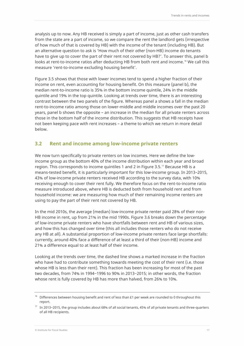
We now turn specifically to private renters on low incomes. Here we define the low-income group as the bottom 40% of the income distribution within each year and broad region. This corresponds to income quintiles 1 and 2 in Figure 3.5.17 Because HB is a means-tested benefit, it is particularly important for this low-income group. In 2013–2015, 43% of low-income private renters received HB according to the survey data, with 10% receiving enough to cover their rent fully. We therefore focus on the rent-to-income ratio measure introduced above, where HB is deducted both from household rent and from household income: we are measuring how much of their remaining income renters are using to pay the part of their rent not covered by HB.
In the mid 2010s, the average (median) low-income private renter paid 28% of their non-HB income in rent, up from 21% in the mid 1990s. Figure 3.6 breaks down the percentage of low-income private renters who have shortfalls between rent and HB of various sizes, and how this has changed over time (this all includes those renters who do not receive any HB at all). A substantial proportion of low-income private renters face large shortfalls: currently, around 40% face a difference of at least a third of their (non-HB) income and 21% a difference equal to at least half of their income.
Looking at the trends over time, the dashed line shows a marked increase in the fraction who have had to contribute something towards meeting the cost of their rent (i.e. those whose HB is less than their rent). This fraction has been increasing for most of the past two decades, from 74% in 1994‒1996 to 90% in 2013‒2015; in other words, the fraction whose rent is fully covered by HB has more than halved, from 26% to 10%.
16 Differences between housing benefit and rent of less than £1 per week are rounded to 0 throughout this
report. 17 In 2013‒2015, the group includes about 68% of all social tenants, 45% of all private tenants and three-quarters
of all HB recipients.
The cost of housing for low-income renters
18 © Institute for Fiscal Studies
Figure 3.6. Percentage of low-income private renters with shortfalls between HB and rent, by size of shortfall relative to income (excluding HB from income)
Note: Years refer to financial years.
Source: Authors’ calculations using the Family Resources Survey, various years.
The solid lines of Figure 3.6 show that, taking the past 20 years as a whole, there have also been increases in the share of low-income private renters with shortfalls between their HB and their rent that exceed one-tenth, one-fifth and one-third of their income. There are two subtleties to this worth pointing out, however. First, for the most part, this was driven by trends preceding the recession: since then, these proportions have changed little or fallen. Second, we see a different story when looking at the fraction paying very large shares of income (at least 50%) in rent: this is lower than 20 years ago and lower than before the recession. This broadly echoes the finding in Figure 3.4 when looking at private renters as a whole: dispersion in rent-to-income ratios has fallen, in particular through reductions in the number paying especially large fractions of income in rent. The pattern in Figure 3.6 is again driven by a fall in the dispersion of rents.
In interpreting these trends, note that HB entitlement can change over time even if neither rent nor HB policy changes. If more low-income renters are in employment than previously, for example, it is likely that a greater fraction of this group will have their HB entitlement reduced through the means test. 25% of low-income privately renting households had an adult in paid work in 1994–95, but this has risen to 47% now.18 All else equal, this will reduce the amount of HB that these families are entitled to. Earnings growth among low-earning households would have a similar effect. Using the IFS tax and benefit simulation model, TAXBEN, we estimate that in 1994–95 35% of low-income private
18 Reduced take-up of HB entitlements may also play a role, and families in work do tend to have lower take-up
rates for means-tested benefits; though the latest official estimates suggest that take-up of HB did not change much between 2009‒10 and 2014‒15 (see https://www.gov.uk/government/uploads/system/uploads/attachment_data/file/535362/ir-benefits-take-up-main-report-2014-15.pdf).
0% 10% 20% 30% 40% 50% 60% 70% 80% 90%
100%
1994
‒199
6
1995
‒199
7
1996
‒199
8
1997
‒199
9
1998
‒200
0
1999
‒200
1
2000
‒200
2
2001
‒200
3
2002
‒200
4
2003
‒200
5
2004
‒200
6
2005
‒200
7
2006
‒200
8
2007
‒200
9
2008
‒201
0
2009
‒201
1
2010
‒201
2
2011
‒201
3
2012
‒201
4
2013
‒201
5
Any shortfall between HB and rent Shortfall equal to at least ...
... 10% of income
... 20% of income
... 33% of income
... 50% of income
Trends in rents and incomes
© Institute for Fiscal Studies 19
renters had their entitlement to HB reduced by the means test, in light of their other income or assets (including those who had it reduced to zero by the means test). We estimate that by 2015–16 this fraction had risen to 59%. This is one of the drivers, then, of increases in the number of renters who have a shortfall between their rent and their HB. When thinking about the role of HB in driving trends in rent-to-income ratios, we might be more interested in the effects of explicit changes to HB policy, rather than the kinds of effects just described. This is precisely the subject of the next subsection.
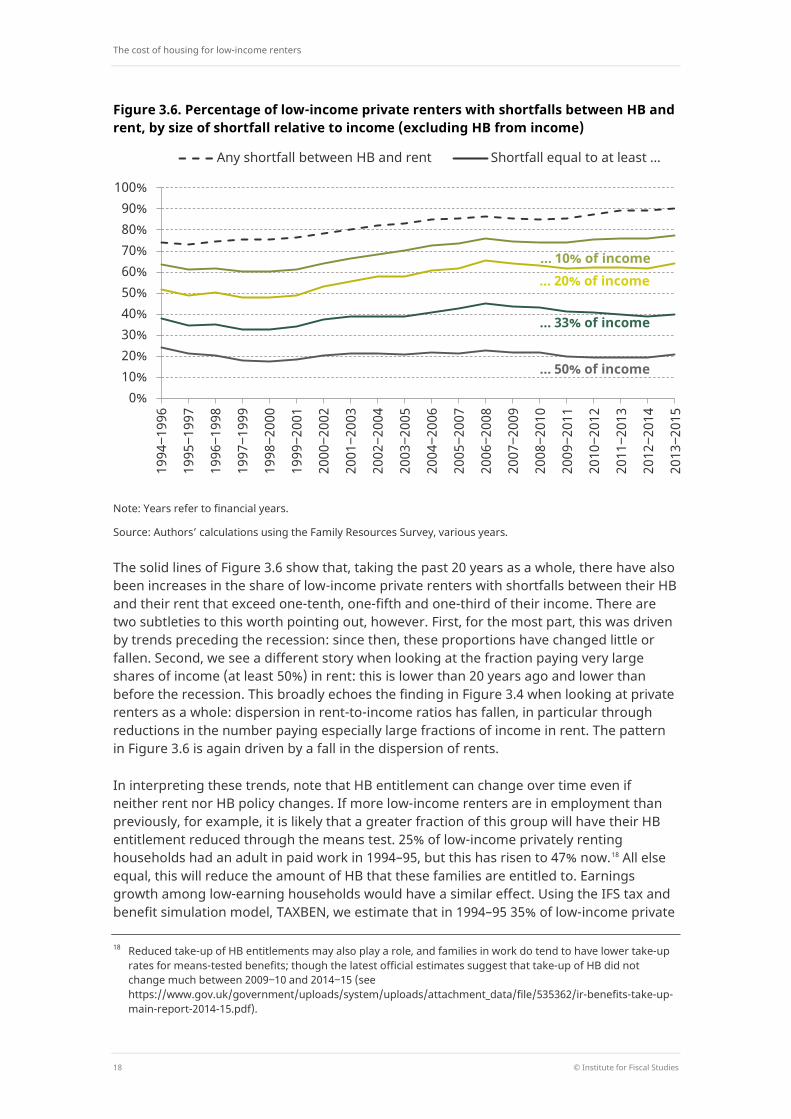
Taking the past two decades as a whole, Figure 3.7 breaks down how these trends have differed between low-income private renters in different parts of Britain and in different types of household.
Looking across Great Britain, the increase in the proportion of low-income private renters whose rent is not fully covered by HB has been greatest in Scotland, where it rose from 64% in the mid 1990s to 88% now, and London, where it rose from 70% to 92%. Looking across household types, there is a very clear pattern. It is working-age households with children who have seen by far the biggest rise in the proportion with a shortfall between HB and rent: 63% of people in low-income working-age households containing children received less HB than their rent during the mid 1990s, but 90% of them did by the mid 2010s.
Figure 3.7 also shows that Londoners and working-age households without children are the most likely low-income private renters to have especially large shortfalls between the
Figure 3.7. Percentage of low-income private renters with shortfalls between HB and rent (excluding HB from income), by geography and household type
Note: Years refer to financial years.
Source: Authors’ calculations using the Family Resources Survey, various years.
0% 10% 20% 30% 40% 50% 60% 70% 80% 90%
100%
All
Nor
th
Mid
land
s
Lond
on
Rest
of S
outh
Wal
es
Scot
land
1994‒1996 2013‒2015
Pens
ione
r ho
useh
olds
Wor
king
-age
ho
useh
olds
, no
chi
ldre
n W
orki
ng-a
ge
hous
ehol
ds
with
chi
ldre
n
Shortfall between rent and HB
Shortfall at least 50% of income
The cost of housing for low-income renters
20 © Institute for Fiscal Studies
HB they receive and their rent. This was true two decades ago and remains true. In addition, London has seen a further increase in the proportion facing large shortfalls over the past two decades – bucking the overall trend, along with Scotland.
In contrast, working-age households with children are now slightly more likely to have a large gap between their rent and HB than 20 years ago, but large shortfalls remain relatively uncommon among this group. In fact, a large amount of the overall reduction in large shortfalls between HB and rent shown in Figure 3.7 is explained by the change in the composition of the private rented sector documented in Chapter 2: households with children are now much more likely to be in the private rented sector than they used to be, and that group are also less likely than others to have large shortfalls between their HB and their rent.
The role of housing benefit reforms Trends in these rent-to-income ratios are the product of the interplay between changes in rents, changes in HB receipts, and changes in other sources of income for low-income renters. The start of this chapter distinguished between changes in rents and changes in total income. We now turn to the impact of HB specifically.
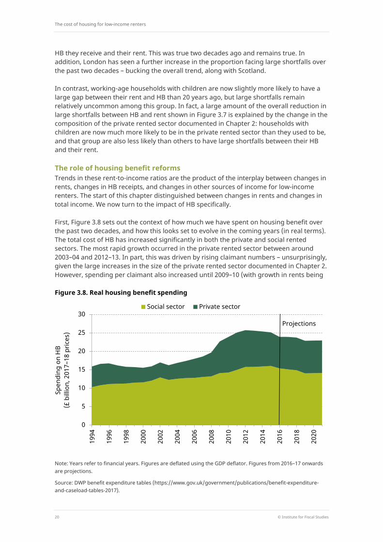
First, Figure 3.8 sets out the context of how much we have spent on housing benefit over the past two decades, and how this looks set to evolve in the coming years (in real terms). The total cost of HB has increased significantly in both the private and social rented sectors. The most rapid growth occurred in the private rented sector between around 2003–04 and 2012–13. In part, this was driven by rising claimant numbers – unsurprisingly, given the large increases in the size of the private rented sector documented in Chapter 2. However, spending per claimant also increased until 2009–10 (with growth in rents being
Figure 3.8. Real housing benefit spending
Note: Years refer to financial years. Figures are deflated using the GDP deflator. Figures from 2016–17 onwards are projections.
Source: DWP benefit expenditure tables (https://www.gov.uk/government/publications/benefit-expenditure-and-caseload-tables-2017).
0
5
10
15
20
25
30
1994
1996
1998
2000
2002
2004
2006
2008
2010
2012
2014
2016
2018
2020
Spen
ding
on
HB
(£ b
illio
n, 2
017–
18 p
rices
)
Social sector Private sector
Projections
Trends in rents and incomes
© Institute for Fiscal Studies 21
the obvious main explanation). In the social rented sector, rises in HB spending have largely been due to rising spending per claimant, which in turn is likely to have been driven by the gradual increases in rents in social housing documented in Section 3.3. The number of social sector claimants fell from the mid 1990s to the mid 2000s, reflecting in part the continued decline in the size of the social housing sector, though it did then increase sharply during the recession.
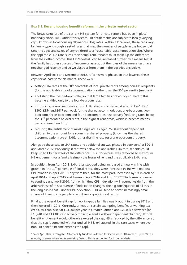
Figure 3.8 also shows that there has been a turning point recently, with HB spending starting to come down again. This is entirely explained by cuts to the generosity of HB, which are currently saving the exchequer around £3 billion per year relative to the scenario in which no reforms have been made since 2011.19 The fiscal context, then, is clear. With rising rents and an expanding private rented sector, HB was on a rapidly rising trend. This has been halted by significant cuts – but the cost of these has been borne by low-income renters. It is to the effects on those renters that we now turn, starting here with cuts in the private rented sector (detailed in Box 3.1) and turning to the social rented sector in Section 3.3.
We assess the impact of reforms to HB by using the IFS tax and benefit simulation model, TAXBEN, to calculate the amount of HB that low-income private renters would currently be entitled to had none of the recent changes in HB policy occurred. For example, we set the applicable LHA rate for each household in the data – given the household’s local area and household type – to the value that it would currently take had none of the recent cuts been implemented, and calculate the household’s HB entitlement on that basis.20 We can then compare this with what they are entitled to under the actual system as it stands currently (i.e. in 2017‒18).21 We can also look forward and assess the impacts of future policy by simulating the impacts of continuing not to index LHA rates to rents (see Box 3.1) for another eight years, up to 2025, under the illustrative assumption that rents in the meantime grow in line with average earnings.
Note that, because we are simulating what households are entitled to rather than looking at the HB they report receiving, the figures are fundamentally different from those presented so far. For example, some households that are entitled to HB do not take it up, and some households may misreport the amount of HB that they receive. The key advantage of using simulation techniques is that we can isolate the impact of policy changes on HB holding everything else constant (such as the earnings levels and employment rates of low-income renters). It also means that we can be more up to date, in the sense that we can look at entitlements under the current (2017–18) system, whereas we could look at self-reported receipts of HB only up to the latest available data, which are for 2015–16.
19 Source: authors’ calculations using table 2.3 of Hood and Phillips (2015) and Department for Work and
Pensions (2016). 20 The median of private rents in each broad rental market area (BRMA) – which is what LHA rates were based
on until 2011 – is no longer published, so there is no direct measure of what LHA rates would currently be in each BRMA were it not for the reforms. However, we do know the growth in the 30th percentile of rents in each BRMA since 2011. Assuming that this is the same as growth at the median in the relevant BRMA, we can estimate the counterfactual LHA rates by applying that BRMA-specific growth rate to the observed 2011 medians.
21 This analysis holds rents constant between policy scenarios and therefore assumes no impact of levels of HB on rents charged in the private market. Research looking at whether the cuts to HB did reduce rents found that, at least in the short term, there was little discernible impact (Brewer et al., 2014).
The cost of housing for low-income renters
22 © Institute for Fiscal Studies
Box 3.1. Recent housing benefit reforms in the private rented sector
The broad structure of the current HB system for private renters has been in place nationally since 2008. Under this system, HB entitlements are subject to locally varying caps, known as local housing allowance (LHA) rates. Within a local area, these caps vary by family type, through a set of rules that map the number of people in the household (and the ages and sexes of any children) to a ‘reasonable’ accommodation size. Where the applicable LHA rate is less than actual rent, tenants must make up the difference from their other income. This HB ‘shortfall’ can be increased further by a means test if the family has other sources of income or assets, but the rules of the means test have not changed recently and so we abstract from them in the descriptions below.
Between April 2011 and December 2012, reforms were phased in that lowered these caps for at least some claimants. These were:
• setting LHA rates at the 30th percentile of local private rents among non-HB recipients (for the applicable size of accommodation), rather than the 50th percentile (median);
• abolishing the five-bedroom rate, so that large families previously entitled to this became entitled only to the four-bedroom rate;
• introducing overall national caps on LHA rates, currently set at around £261, £261, £302, £354 and £417 per week for the shared accommodation, one-bedroom, two-bedroom, three-bedroom and four-bedroom rates respectively (reducing rates below the 30th percentile of local rents in the highest-rent areas, which in practice means parts of inner London);
• reducing the entitlement of most single adults aged 25–34 without dependent children to the amount for a room in a shared property (known as the shared accommodation rate or SAR), rather than the rate for a one-bedroom property.
Alongside these cuts to LHA rates, one additional cut was phased in between April 2011 and March 2012. Previously, if rent was below the applicable LHA rate, tenants could keep up to £15 per week of the difference. This £15 ‘excess’ was removed so maximum HB entitlement for a family is simply the lesser of rent and the applicable LHA rate.
In addition, from April 2013, LHA rates stopped being increased annually in line with growth in (the 30th percentile of) local rents. They were increased in line with national CPI inflation in April 2013. They were then, for the most part, increased by 1% in each of April 2014 and April 2015 and frozen in April 2016 and April 2017.a The freeze is planned to continue until April 2020, from which time CPI indexation will resume. Aside from the arbitrariness of this sequence of indexation changes, the big consequence of all this in the long run is that – under CPI indexation – HB will tend to cover increasingly small shares of low-income people’s rent if rents grow in real terms.
Finally, the overall benefit cap for working-age families was brought in during 2013 and then lowered in 2016. Currently, unless on certain exempting benefits or working tax credit, this cap is set at £23,000 per year in Greater London and £20,000 elsewhere (or £15,410 and £13,400 respectively for single adults without dependent children). If total benefit entitlement would otherwise exceed the cap, HB is reduced by the difference, so that the cap is complied with (or until all HB is exhausted, in the rare cases where even non-HB benefit income exceeds the cap).
a From April 2014, a ‘Targeted Affordability Fund’ has allowed for increases in LHA rates of up to 3% in a minority of areas where rents are rising fastest. This is accounted for in our analysis.
Trends in rents and incomes
© Institute for Fiscal Studies 23
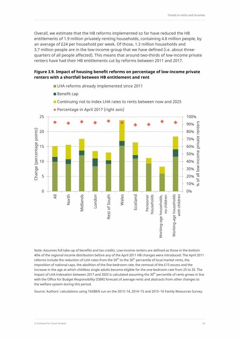
Overall, we estimate that the HB reforms implemented so far have reduced the HB entitlements of 1.9 million privately renting households, containing 4.8 million people, by an average of £24 per household per week. Of those, 1.3 million households and 3.7 million people are in the low-income group that we have defined (i.e. about three-quarters of all people affected). This means that around two-thirds of low-income private renters have had their HB entitlements cut by reforms between 2011 and 2017.
Figure 3.9. Impact of housing benefit reforms on percentage of low-income private renters with a shortfall between HB entitlement and rent
Note: Assumes full take-up of benefits and tax credits. Low-income renters are defined as those in the bottom 40% of the regional income distribution before any of the April 2011 HB changes were introduced. The April 2011 reforms include the reduction of LHA rates from the 50th to the 30th percentile of local market rents, the imposition of national caps, the abolition of the five-bedroom rate, the removal of the £15 excess and the increase in the age at which childless single adults become eligible for the one-bedroom rate from 25 to 35. The impact of LHA indexation between 2017 and 2025 is calculated assuming the 30th percentile of rents grows in line with the Office for Budget Responsibility (OBR) forecast of average rents and abstracts from other changes to the welfare system during this period.
Source: Authors’ calculations using TAXBEN run on the 2013‒14, 2014‒15 and 2015‒16 Family Resources Survey.
0%
10%
20%
30%
40%
50%
60%
70%
80%
90%
100%
0
5
10
15
20
25
All
Nor
th
Mid
land
s
Lond
on
Rest
of S
outh
Wal
es
Scot
land
% o
f all
low
-inco
me
priv
ate
rent
ers
Chan
ge (p
erce
ntag
e po
ints
)
LHA reforms already implemented since 2011
Benefit cap
Continuing not to index LHA rates to rents between now and 2025
Percentage in April 2017 (right axis)
Pens
ione
r ho
useh
olds
Wor
king
-age
hou
seho
lds,
no
chi
ldre
n
Wor
king
-age
hou
seho
lds
with
chi
ldre
n
The cost of housing for low-income renters
24 © Institute for Fiscal Studies
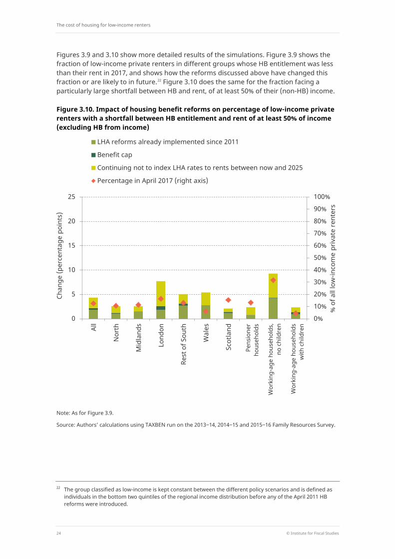
Figures 3.9 and 3.10 show more detailed results of the simulations. Figure 3.9 shows the fraction of low-income private renters in different groups whose HB entitlement was less than their rent in 2017, and shows how the reforms discussed above have changed this fraction or are likely to in future.22 Figure 3.10 does the same for the fraction facing a particularly large shortfall between HB and rent, of at least 50% of their (non-HB) income.
Figure 3.10. Impact of housing benefit reforms on percentage of low-income private renters with a shortfall between HB entitlement and rent of at least 50% of income (excluding HB from income)
Note: As for Figure 3.9.
Source: Authors’ calculations using TAXBEN run on the 2013‒14, 2014‒15 and 2015‒16 Family Resources Survey.
22 The group classified as low-income is kept constant between the different policy scenarios and is defined as
individuals in the bottom two quintiles of the regional income distribution before any of the April 2011 HB reforms were introduced.
0%
10%
20%
30%
40%
50%
60%
70%
80%
90%
100%
0
5
10
15
20
25
All
Nor
th
Mid
land
s
Lond
on
Rest
of S
outh
Wal
es
Scot
land
% o
f all
low
-inco
me
priv
ate
rent
ers
Chan
ge (p
erce
ntag
e po
ints
)
LHA reforms already implemented since 2011
Benefit cap
Continuing not to index LHA rates to rents between now and 2025
Percentage in April 2017 (right axis)
Pens
ione
r ho
useh
olds
Wor
king
-age
hou
seho
lds,
no
chi
ldre
n
Wor
king
-age
hou
seho
lds
with
chi
ldre
n
Trends in rents and incomes
© Institute for Fiscal Studies 25
The main points are:
The changes to HB policy since 2011 – largely the changes to LHA rules – have had substantial impacts on the financial burden of private renting among low-income households. Overall, the percentage of low-income private renters whose HB entitlement does not cover all of their rent is currently 12 percentage points (ppts) higher than it would have been without these reforms (which equates to an extra 600,000 people, in 200,000 households), while the percentage whose shortfall is at least half of their income is 2ppts higher (equating to an extra 100,000 people, in 60,000 households).
In the higher-rent areas of London and the rest of the South, reforms have so far had less impact on the proportion of low-income private tenants with a shortfall between HB entitlement and rent. This is to be expected, as they had larger fractions already facing a shortfall (Figure 3.7). But these regions have been affected most so far in terms of numbers tipped into paying at least half of their income in rent by HB reforms, which has increased by 3ppts in both areas.
Continued lack of rent indexation for LHA rates will have a significant impact too. Another eight years of it would increase the fraction of low-income private renters facing a shortfall between their rent and HB entitlement by a further 4ppts (an extra 200,000 people). Around half of that is due to the next two years, in which LHA rates will be frozen, with the other half due to the following six years of CPI indexation (compared with rent indexation, in both cases). The impacts are particularly large in Wales and the North of England (7ppts and 5ppts – an extra 20,000 and 60,000 people – respectively).
Indexation policy over the next eight years would also further increase the proportion whose shortfall is at least 50% of their income, by about as much (2ppts, representing an extra 100,000 people) as all the reforms seen so far since 2011, with just under half the increase occurring over the next two years. The impact is greatest in London, where the proportion paying at least half of their income in rent would rise by 5ppts (representing an extra 50,000 people).
Low-income working-age private renters with children are the most affected by policy changes in terms of the proportion with a shortfall between HB entitlement and rent: reforms already implemented since 2011 have caused 14ppts more of this group (approximately 500,000 people, from 100,000 households) to see their HB entitlement fall below their rent, while continuing not to increase LHA rates in line with rents would cause a further rise of 4ppts by 2025. On the other hand, low-income working-age households without children are most impacted in terms of the proportion paying very large fractions of income in rent.
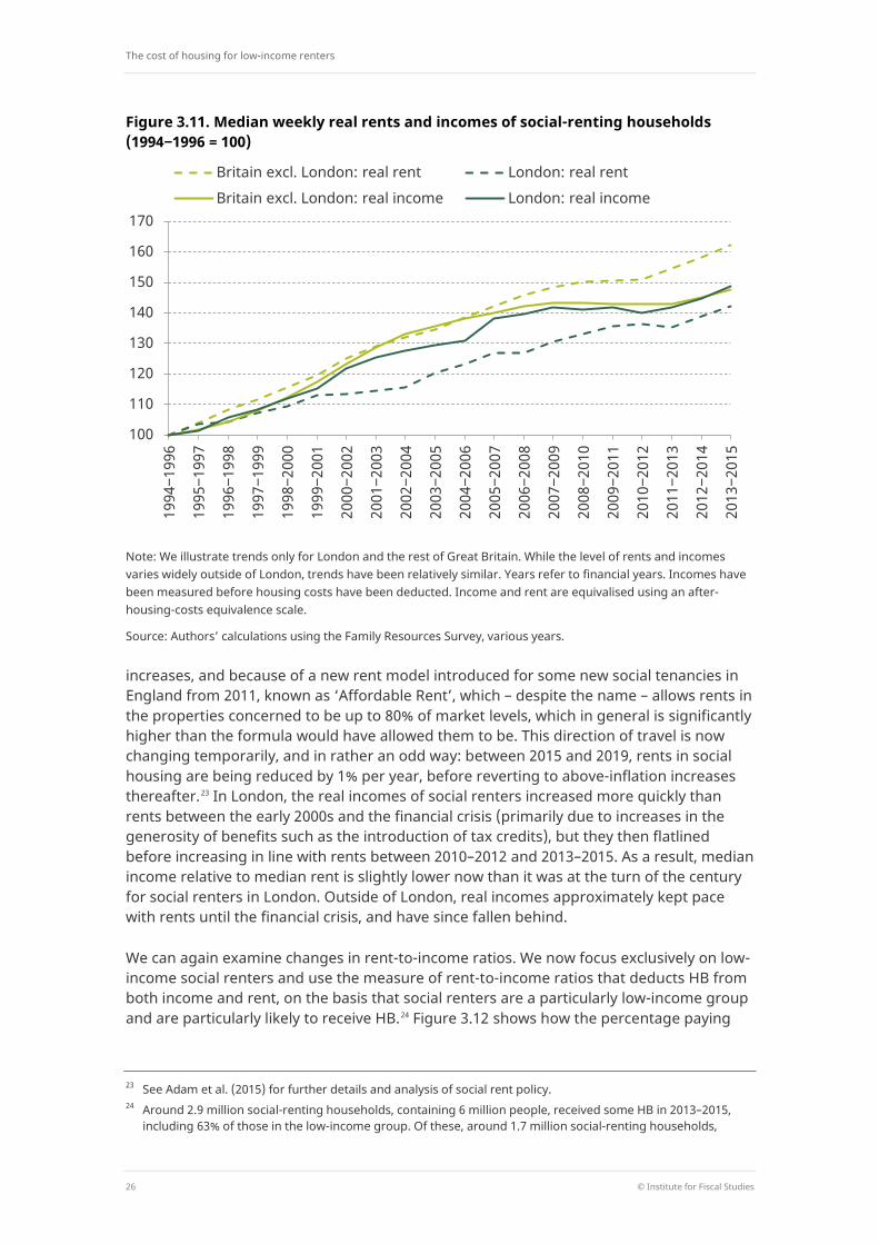
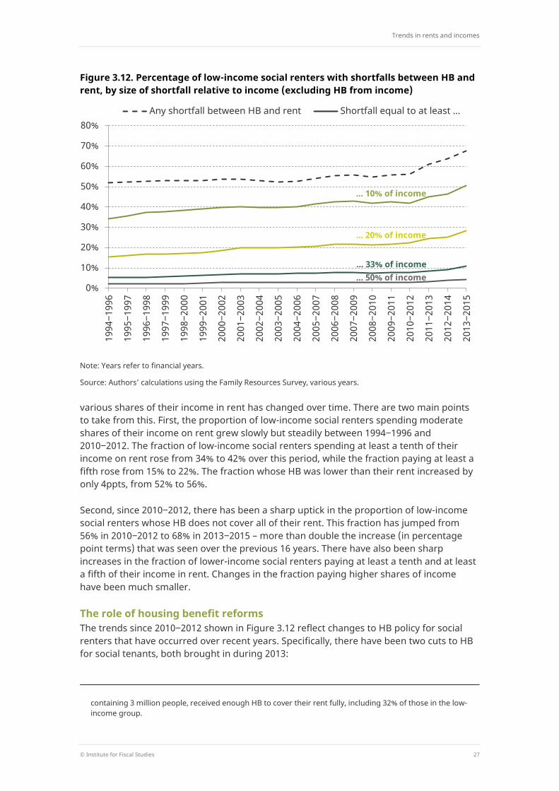
3.3 Rent and income in the social rented sector
Trends within the social rented sector – which, as we have seen, has shrunk rather than grown – have been different. Figure 3.11 shows that rent levels in social housing have consistently grown faster than prices between the mid 1990s and the mid 2010s. This is because rents in the social sector are set using a centrally set formula that mandated real
The cost of housing for low-income renters
26 © Institute for Fiscal Studies
Figure 3.11. Median weekly real rents and incomes of social-renting households (1994‒1996 = 100)
Note: We illustrate trends only for London and the rest of Great Britain. While the level of rents and incomes varies widely outside of London, trends have been relatively similar. Years refer to financial years. Incomes have been measured before housing costs have been deducted. Income and rent are equivalised using an after-housing-costs equivalence scale.
Source: Authors’ calculations using the Family Resources Survey, various years.
increases, and because of a new rent model introduced for some new social tenancies in England from 2011, known as ‘Affordable Rent’, which – despite the name – allows rents in the properties concerned to be up to 80% of market levels, which in general is significantly higher than the formula would have allowed them to be. This direction of travel is now changing temporarily, and in rather an odd way: between 2015 and 2019, rents in social housing are being reduced by 1% per year, before reverting to above-inflation increases thereafter.23 In London, the real incomes of social renters increased more quickly than rents between the early 2000s and the financial crisis (primarily due to increases in the generosity of benefits such as the introduction of tax credits), but they then flatlined before increasing in line with rents between 2010–2012 and 2013–2015. As a result, median income relative to median rent is slightly lower now than it was at the turn of the century for social renters in London. Outside of London, real incomes approximately kept pace with rents until the financial crisis, and have since fallen behind.
We can again examine changes in rent-to-income ratios. We now focus exclusively on low-income social renters and use the measure of rent-to-income ratios that deducts HB from both income and rent, on the basis that social renters are a particularly low-income group and are particularly likely to receive HB.24 Figure 3.12 shows how the percentage paying
23 See Adam et al. (2015) for further details and analysis of social rent policy. 24 Around 2.9 million social-renting households, containing 6 million people, received some HB in 2013–2015,
including 63% of those in the low-income group. Of these, around 1.7 million social-renting households,
100
110
120
130
140
150
160
170
1994
‒199
6
1995
‒199
7
1996
‒199
8
1997
‒199
9
1998
‒200
0
1999
‒200
1
2000
‒200
2
2001
‒200
3
2002
‒200
4
2003
‒200
5
2004
‒200
6
2005
‒200
7
2006
‒200
8
2007
‒200
9
2008
‒201
0
2009
‒201
1
2010
‒201
2
2011
‒201
3
2012
‒201
4
2013
‒201
5
Britain excl. London: real rent London: real rent Britain excl. London: real income London: real income
Trends in rents and incomes
© Institute for Fiscal Studies 27
Figure 3.12. Percentage of low-income social renters with shortfalls between HB and rent, by size of shortfall relative to income (excluding HB from income)
Note: Years refer to financial years.
Source: Authors’ calculations using the Family Resources Survey, various years.
various shares of their income in rent has changed over time. There are two main points to take from this. First, the proportion of low-income social renters spending moderate shares of their income on rent grew slowly but steadily between 1994‒1996 and 2010‒2012. The fraction of low-income social renters spending at least a tenth of their income on rent rose from 34% to 42% over this period, while the fraction paying at least a fifth rose from 15% to 22%. The fraction whose HB was lower than their rent increased by only 4ppts, from 52% to 56%.
Second, since 2010‒2012, there has been a sharp uptick in the proportion of low-income social renters whose HB does not cover all of their rent. This fraction has jumped from 56% in 2010‒2012 to 68% in 2013‒2015 – more than double the increase (in percentage point terms) that was seen over the previous 16 years. There have also been sharp increases in the fraction of lower-income social renters paying at least a tenth and at least a fifth of their income in rent. Changes in the fraction paying higher shares of income have been much smaller.
The role of housing benefit reforms The trends since 2010‒2012 shown in Figure 3.12 reflect changes to HB policy for social renters that have occurred over recent years. Specifically, there have been two cuts to HB for social tenants, both brought in during 2013:
containing 3 million people, received enough HB to cover their rent fully, including 32% of those in the low-income group.
0%
10%
20%
30%
40%
50%
60%
70%
80%
1994
‒199
6
1995
‒199
7
1996
‒199
8
1997
‒199
9
1998
‒200
0
1999
‒200
1
2000
‒200
2
2001
‒200
3
2002
‒200
4
2003
‒200
5
2004
‒200
6
2005
‒200
7
2006
‒200
8
2007
‒200
9
2008
‒201
0
2009
‒201
1
2010
‒201
2
2011
‒201
3
2012
‒201
4
2013
‒201
5
Any shortfall between HB and rent Shortfall equal to at least ...
... 10% of income
... 20% of income
... 33% of income
... 50% of income

The cost of housing for low-income renters
28 © Institute for Fiscal Studies
The overall benefit cap for working-age families (described in Box 3.1).
Cuts to HB for working-age families living in properties with more bedrooms than they are now deemed to need. This is known by its critics as the ‘bedroom tax’. The number of bedrooms needed is defined by the government using the same rules mapping family type to ‘reasonable’ property size that are used to determine LHA rates in the private sector. The maximum amount of HB payable is reduced by 14% where a family has one more bedroom than it is now deemed to need and by 25% where it has two or more bedrooms than it is now deemed to need.
Scotland is effectively not implementing the ‘bedroom tax’, by compensating those who would otherwise have lost out, in part through the discretionary housing payment (DHP) budget that it is allocated by central government.
Both of these changes mean that, for the first time, some working-age social renters with no other sources of income or assets might not be entitled to enough HB to cover all of their rent. The definition of ‘working age’ for the purposes of these two policies is families in which no one is over the female state pension age. This currently includes about 80% of social-renting households.
Figure 3.13. Impact of housing benefit reforms on percentage of low-income social renters with a shortfall between HB entitlement and rent, by geography
Note: Assumes full take-up of benefits and tax credits. Low-income renters are defined as those in the bottom 40% of the regional income distribution before any of the HB changes were introduced.
Source: Authors’ calculations using TAXBEN run on the 2013‒14, 2014‒15 and 2015‒16 Family Resources Survey.
0%
10%
20%
30%
40%
50%
60%
70%
80%
90%
100%
0
5
10
15
20
25
All
Nor
th
Mid
land
s
Lond
on
Rest
of S
outh
Wal
es
Scot
land
% o
f all
low
-inco
me
soci
al re
nter
s
Chan
ge (p
erce
ntag
e po
ints
)
‘Bedroom tax’ Benefit cap
Future application of LHA rates Percentage in April 2017 (right axis)
Trends in rents and incomes
© Institute for Fiscal Studies 29
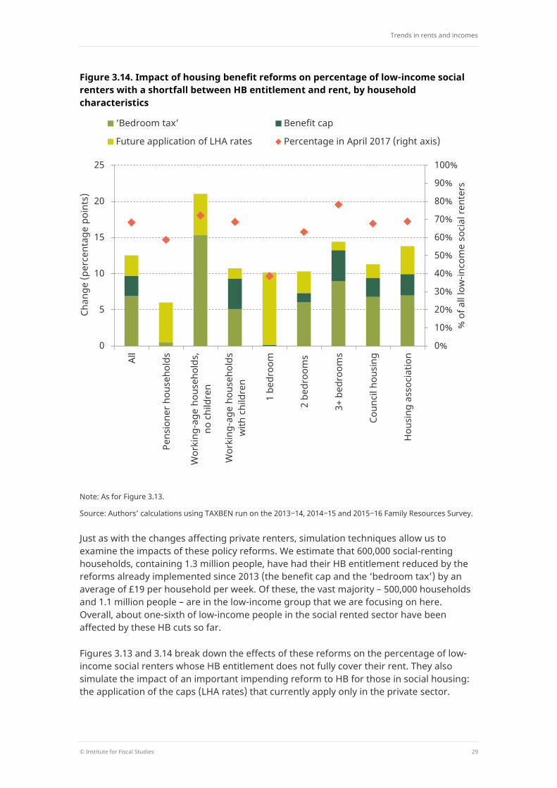
Figure 3.14. Impact of housing benefit reforms on percentage of low-income social renters with a shortfall between HB entitlement and rent, by household characteristics
Note: As for Figure 3.13.
Source: Authors’ calculations using TAXBEN run on the 2013‒14, 2014‒15 and 2015‒16 Family Resources Survey.
Just as with the changes affecting private renters, simulation techniques allow us to examine the impacts of these policy reforms. We estimate that 600,000 social-renting households, containing 1.3 million people, have had their HB entitlement reduced by the reforms already implemented since 2013 (the benefit cap and the ‘bedroom tax’) by an average of £19 per household per week. Of these, the vast majority – 500,000 households and 1.1 million people – are in the low-income group that we are focusing on here. Overall, about one-sixth of low-income people in the social rented sector have been affected by these HB cuts so far.
Figures 3.13 and 3.14 break down the effects of these reforms on the percentage of low-income social renters whose HB entitlement does not fully cover their rent. They also simulate the impact of an important impending reform to HB for those in social housing: the application of the caps (LHA rates) that currently apply only in the private sector.
0%
10%
20%
30%
40%
50%
60%
70%
80%
90%
100%
0
5
10
15
20
25
All
Pens
ione
r hou
seho
lds
Wor
king
-age
hou
seho
lds,
no
chi
ldre
n
Wor
king
-age
hou
seho
lds
with
chi
ldre
n
1 be
droo
m
2 be
droo
ms
3+ b
edro
oms
Coun
cil h
ousi
ng
Hou
sing
ass
ocia
tion
% o
f all
low
-inco
me
soci
al re
nter
s
Chan
ge (p
erce
ntag
e po
ints
)
‘Bedroom tax’ Benefit cap
Future application of LHA rates Percentage in April 2017 (right axis)
The cost of housing for low-income renters
30 © Institute for Fiscal Studies
These are to be rolled out gradually from April 2019, applying from that point to tenancies signed from April 2016.
The analysis shows the following:
The ‘bedroom tax’ has already had a sizeable effect, increasing the fraction of low-income social renters facing a shortfall between HB entitlement and rent by 7ppts (equating to about 500,000 people, in 300,000 households). The impact has been especially large in Wales (17ppts) and in the North of England (12ppts). There is no impact in Scotland because, as mentioned above, the ‘bedroom tax’ is effectively not being implemented there.
These impacts were, however, concentrated among certain social-renting households – most obviously because pensioners are exempt25 and because single-bedroom properties cannot be affected. The policy acted to increase the fraction of low-income social tenants facing a shortfall between HB entitlement and rent by 15ppts among working-age households without children and by 9ppts among those with three bedrooms or more.
The benefit cap has increased the fraction of low-income social renters facing a shortfall between HB entitlement and rent by a further 3ppts (equating to about 200,000 people in 40,000 households). Essentially all of the impact of this policy on low-income social renters has been among households with children. This is because they are the group most likely to have sufficient other benefit income to take them above the cap.
Taken together with the ‘bedroom tax’, however, it is people in low-income working-age households without children that have been most affected by recent HB reforms in the social sector overall: 15% of them have an HB entitlement that falls below their rent as a direct result of these reforms, compared with 9% of those with children.
Looking to the future, the imposition of the system of LHA caps on those in social housing will eventually be significant. If implemented in full now to all social renters, it would lead to a further 3ppt increase in the fraction of low-income social renters having to finance a gap between their HB entitlement and their rent (an extra 200,000 people). In practice, it will of course be a number of years before this is rolled out to a large proportion of the social rented sector.
That said, this effect is smaller than that seen already from the reforms discussed above. This reflects the fact that rents in social housing are generally significantly lower than the market rents to which LHA rates were (until recently) linked, meaning that the LHA caps will have less impact on social tenants than they do on private tenants. The impact on housing association (HA) tenants is greater than that on council tenants, however. This is to be expected as HA rents tend to be closer to market rents than are council rents.
25 For the purposes of the ‘bedroom tax’, as well as the benefit cap, the exemption applies where no adult in the
family is above the female state pension age. Our definition of a pensioner household is a household containing at least one adult above their state pension age. This is why a very small number of ‘pensioner households’ are affected by the ‘bedroom tax’ in Figure 3.14.
Trends in rents and incomes
© Institute for Fiscal Studies 31
The imposition of LHA rates on social tenants will eventually have a larger impact among low-income pensioner households and households without children, causing a 6ppt increase in the fraction of those social tenants with a shortfall between HB entitlement and rent. Note that the impacts on pensioners will probably take longer to materialise, though, because people who are already pensioners are relatively unlikely to begin a new social tenancy. The effects will tend to be on generations who are currently of working age (but who, of course, will later become pensioners).
This is probably related to the fact that we see bigger effects of the LHA caps in smaller properties (as measured by number of bedrooms). One likely reason for this is that rents in smaller social properties are closer to market levels than rents in larger properties.26 Note that this is the opposite of the impacts of the ‘bedroom tax’, which affects those in larger properties more.
The result is that the impacts of reforms across social tenants in different sizes of property are more even when past and future reforms are considered together. But working-age households without children are hit relatively hard by both sets of reforms: the imposition of LHA rates will hit those in smaller properties especially hard (increasing the proportion of low-income working-age households without children with a shortfall by 6ppts – an extra 90,000 people), and those without children who live in less small properties have already been hit by the ‘bedroom tax’ (which has increased the proportion with a shortfall by 15ppts, which represents 250,000 people).
Even after all these reforms, it will remain relatively rare for low-income social tenants to face especially large shortfalls between their HB entitlement and their rent, although the relative impacts on the prevalence of large shortfalls across different groups of social tenants are similar to those described above. They are shown in Appendix A.
26 See Adam et al. (2015).
The cost of housing for low-income renters
32 © Institute for Fiscal Studies
4. Trends in the characteristics of rented housing
The analysis so far has looked at how much renters are paying for their housing and how this compares with their incomes. However, when tracking rents over time, we may not be comparing like with like. For example, if renters today are in better-quality housing than in the past, higher rents could simply reflect the fact that tenants value quality. The implications for their living standards could be quite different from a situation in which tenants are simply having to pay more (and hence forgo more other consumption) to secure the same kind of housing as before.
In this chapter, we first document some of the key trends in the characteristics of rented housing. We then relate these formally to the amounts of rent being paid, focusing on the private rented sector, where rents reflect market prices and can therefore be linked to the implicit values placed on different kinds of housing.27
In order to examine housing characteristics in detail, we use the English House Condition Survey (EHCS) and the English Housing Survey (EHS). We are therefore unable to examine changes outside of England. Our results do not perfectly replicate the published EHCS and EHS reports for each year (which are National Statistics).28 This is because our focus is on making consistent comparisons over time. This leads to us deviating slightly from official methodology, which, over time, has changed the way that the EHCS data are weighted and the way that some variables from both the EHCS and EHS are derived.
4.1 Characteristics of private rented housing
Figure 4.1 documents changes in dwelling types in the private rented sector between the four-year period spanning 2002–2005 and the period spanning 2010–2013 (reflecting the availability of consistent data at the time of writing). Across England as a whole, there has been little change, but in fact this masks differences across the country. In particular, flats have grown as a fraction of the privately rented stock across much of the country. The clear exception is London, where flats remain far more common than in other regions, but in recent years have declined as a proportion of the stock.
Across England as a whole, Figure 4.2 shows there has been a slight (1%) decline in the average size of privately rented properties (measured in terms of square metres of floor space). The largest fall occurred in the North, where the size of the average privately rented property decreased by 4%. In London, by contrast, properties in the private rented sector have become 5% larger on average, although the average privately rented property in the capital remains smaller than in other parts of the country.
27 For brevity, we do not discuss changes in the characteristics of properties in the social rented sector, as
changes in the social rented housing stock are similar to those observed among properties in the private rented sector but generally of a smaller magnitude. Equivalent figures for the social rented sector are provided in Appendix B.
28 These reports are published by the Department for Communities and Local Government and are available at https://www.gov.uk/government/collections/english-housing-survey.
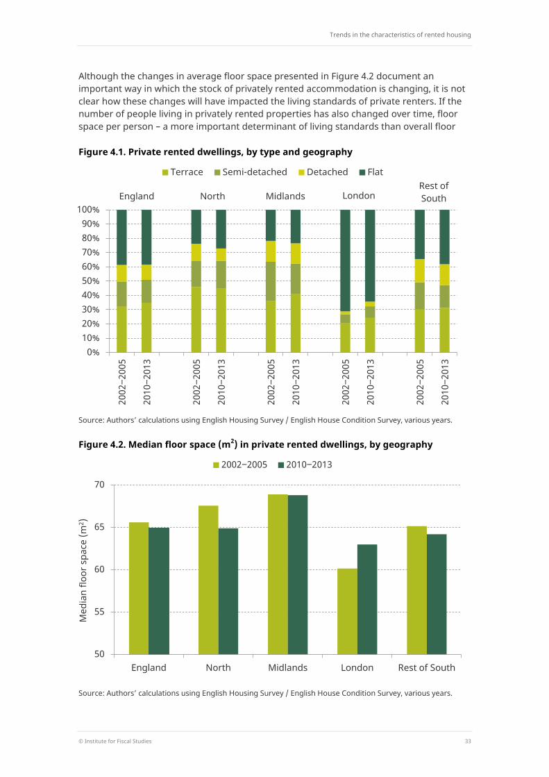
Trends in the characteristics of rented housing
© Institute for Fiscal Studies 33
Although the changes in average floor space presented in Figure 4.2 document an important way in which the stock of privately rented accommodation is changing, it is not clear how these changes will have impacted the living standards of private renters. If the number of people living in privately rented properties has also changed over time, floor space per person – a more important determinant of living standards than overall floor
Figure 4.1. Private rented dwellings, by type and geography
Source: Authors’ calculations using English Housing Survey / English House Condition Survey, various years.
Figure 4.2. Median floor space (m2) in private rented dwellings, by geography
Source: Authors’ calculations using English Housing Survey / English House Condition Survey, various years.
0% 10% 20% 30% 40% 50% 60% 70% 80% 90%
100%
2002
‒200
5
2010
‒201
3
2002
‒200
5
2010
‒201
3
2002
‒200
5
2010
‒201
3
2002
‒200
5
2010
‒201
3
2002
‒200
5
2010
‒201
3
Terrace Semi-detached Detached Flat
England North Midlands London Rest of South
50
55
60
65
70
England North Midlands London Rest of South
Med
ian
floor
spa
ce (m
2 )
2002‒2005 2010‒2013
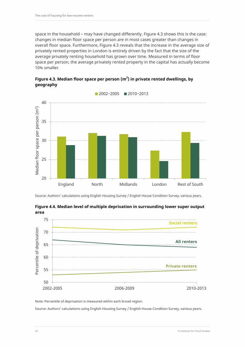
The cost of housing for low-income renters
34 © Institute for Fiscal Studies
space in the household – may have changed differently. Figure 4.3 shows this is the case: changes in median floor space per person are in most cases greater than changes in overall floor space. Furthermore, Figure 4.3 reveals that the increase in the average size of privately rented properties in London is entirely driven by the fact that the size of the average privately renting household has grown over time. Measured in terms of floor space per person, the average privately rented property in the capital has actually become 10% smaller.
Figure 4.3. Median floor space per person (m2) in private rented dwellings, by geography
Source: Authors’ calculations using English Housing Survey / English House Condition Survey, various years.
Figure 4.4. Median level of multiple deprivation in surrounding lower super output area
Note: Percentile of deprivation is measured within each broad region.
Source: Authors’ calculations using English Housing Survey / English House Condition Survey, various years.
20
25
30
35
40
England North Midlands London Rest of South
Med
ian
floor
spa
ce p
er p
erso
n (m
2 )
2002‒2005 2010‒2013
50
55
60
65
70
75
2002-2005 2006-2009 2010-2013
Perc
entil
e of
dep
rivat
ion
Private renters
Social renters
All renters
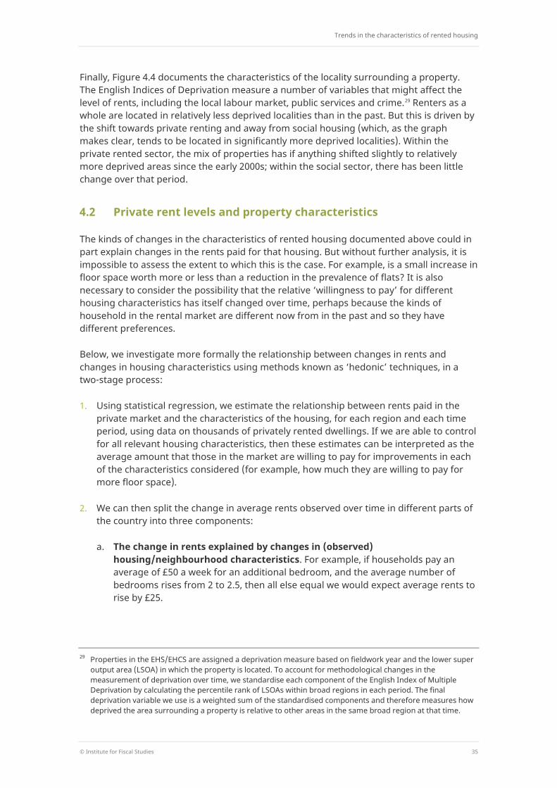
Trends in the characteristics of rented housing
© Institute for Fiscal Studies 35
Finally, Figure 4.4 documents the characteristics of the locality surrounding a property. The English Indices of Deprivation measure a number of variables that might affect the level of rents, including the local labour market, public services and crime.29 Renters as a whole are located in relatively less deprived localities than in the past. But this is driven by the shift towards private renting and away from social housing (which, as the graph makes clear, tends to be located in significantly more deprived localities). Within the private rented sector, the mix of properties has if anything shifted slightly to relatively more deprived areas since the early 2000s; within the social sector, there has been little change over that period.
4.2 Private rent levels and property characteristics
The kinds of changes in the characteristics of rented housing documented above could in part explain changes in the rents paid for that housing. But without further analysis, it is impossible to assess the extent to which this is the case. For example, is a small increase in floor space worth more or less than a reduction in the prevalence of flats? It is also necessary to consider the possibility that the relative ‘willingness to pay’ for different housing characteristics has itself changed over time, perhaps because the kinds of household in the rental market are different now from in the past and so they have different preferences.
Below, we investigate more formally the relationship between changes in rents and changes in housing characteristics using methods known as ‘hedonic’ techniques, in a two-stage process:
1. Using statistical regression, we estimate the relationship between rents paid in the private market and the characteristics of the housing, for each region and each time period, using data on thousands of privately rented dwellings. If we are able to control for all relevant housing characteristics, then these estimates can be interpreted as the average amount that those in the market are willing to pay for improvements in each of the characteristics considered (for example, how much they are willing to pay for more floor space).
2. We can then split the change in average rents observed over time in different parts of the country into three components:
a. The change in rents explained by changes in (observed) housing/neighbourhood characteristics. For example, if households pay an average of £50 a week for an additional bedroom, and the average number of bedrooms rises from 2 to 2.5, then all else equal we would expect average rents to rise by £25.
29 Properties in the EHS/EHCS are assigned a deprivation measure based on fieldwork year and the lower super
output area (LSOA) in which the property is located. To account for methodological changes in the measurement of deprivation over time, we standardise each component of the English Index of Multiple Deprivation by calculating the percentile rank of LSOAs within broad regions in each period. The final deprivation variable we use is a weighted sum of the standardised components and therefore measures how deprived the area surrounding a property is relative to other areas in the same broad region at that time.
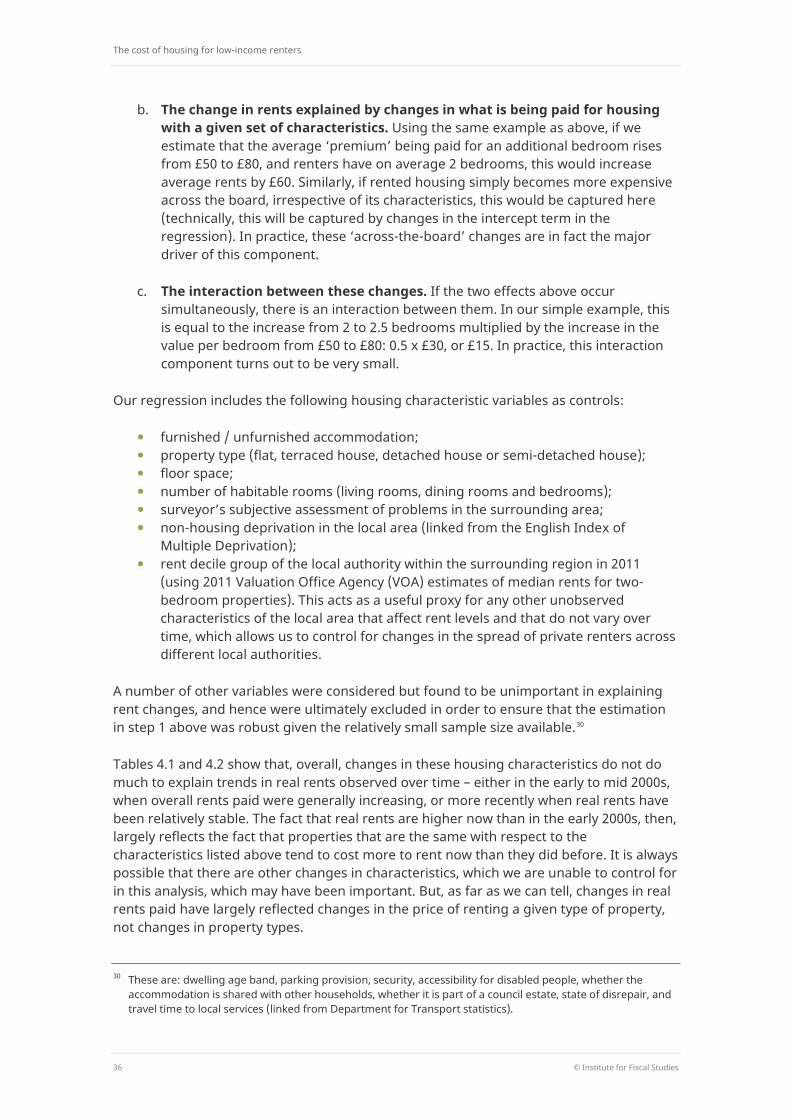
The cost of housing for low-income renters
36 © Institute for Fiscal Studies
b. The change in rents explained by changes in what is being paid for housing with a given set of characteristics. Using the same example as above, if we estimate that the average ‘premium’ being paid for an additional bedroom rises from £50 to £80, and renters have on average 2 bedrooms, this would increase average rents by £60. Similarly, if rented housing simply becomes more expensive across the board, irrespective of its characteristics, this would be captured here (technically, this will be captured by changes in the intercept term in the regression). In practice, these ‘across-the-board’ changes are in fact the major driver of this component.
c. The interaction between these changes. If the two effects above occur simultaneously, there is an interaction between them. In our simple example, this is equal to the increase from 2 to 2.5 bedrooms multiplied by the increase in the value per bedroom from £50 to £80: 0.5 x £30, or £15. In practice, this interaction component turns out to be very small.
Our regression includes the following housing characteristic variables as controls:
furnished / unfurnished accommodation; property type (flat, terraced house, detached house or semi-detached house); floor space; number of habitable rooms (living rooms, dining rooms and bedrooms); surveyor’s subjective assessment of problems in the surrounding area; non-housing deprivation in the local area (linked from the English Index of
Multiple Deprivation); rent decile group of the local authority within the surrounding region in 2011
(using 2011 Valuation Office Agency (VOA) estimates of median rents for two-bedroom properties). This acts as a useful proxy for any other unobserved characteristics of the local area that affect rent levels and that do not vary over time, which allows us to control for changes in the spread of private renters across different local authorities.
A number of other variables were considered but found to be unimportant in explaining rent changes, and hence were ultimately excluded in order to ensure that the estimation in step 1 above was robust given the relatively small sample size available.30
Tables 4.1 and 4.2 show that, overall, changes in these housing characteristics do not do much to explain trends in real rents observed over time – either in the early to mid 2000s, when overall rents paid were generally increasing, or more recently when real rents have been relatively stable. The fact that real rents are higher now than in the early 2000s, then, largely reflects the fact that properties that are the same with respect to the characteristics listed above tend to cost more to rent now than they did before. It is always possible that there are other changes in characteristics, which we are unable to control for in this analysis, which may have been important. But, as far as we can tell, changes in real rents paid have largely reflected changes in the price of renting a given type of property, not changes in property types.
30 These are: dwelling age band, parking provision, security, accessibility for disabled people, whether the
accommodation is shared with other households, whether it is part of a council estate, state of disrepair, and travel time to local services (linked from Department for Transport statistics).
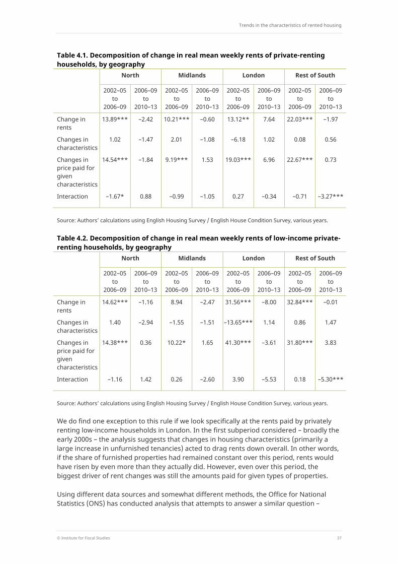
Trends in the characteristics of rented housing
© Institute for Fiscal Studies 37
Table 4.1. Decomposition of change in real mean weekly rents of private-renting households, by geography North Midlands London Rest of South
2002–05 to
2006–09
2006–09 to
2010–13
2002–05 to
2006–09
2006–09 to
2010–13
2002–05 to
2006–09
2006–09 to
2010–13
2002–05 to
2006–09
2006–09 to
2010–13
Change in rents
13.89*** –2.42 10.21*** –0.60 13.12** 7.64 22.03*** –1.97
Changes in characteristics
1.02 –1.47 2.01 –1.08 –6.18 1.02 0.08 0.56
Changes in price paid for given characteristics
14.54*** –1.84 9.19*** 1.53 19.03*** 6.96 22.67*** 0.73
Interaction –1.67* 0.88 –0.99 –1.05 0.27 –0.34 –0.71 –3.27***
Source: Authors’ calculations using English Housing Survey / English House Condition Survey, various years.
Table 4.2. Decomposition of change in real mean weekly rents of low-income private-renting households, by geography North Midlands London Rest of South
2002–05 to
2006–09
2006–09 to
2010–13
2002–05 to
2006–09
2006–09 to
2010–13
2002–05 to
2006–09
2006–09 to
2010–13
2002–05 to
2006–09
2006–09 to
2010–13
Change in rents
14.62*** –1.16 8.94 –2.47 31.56*** –8.00 32.84*** –0.01
Changes in characteristics
1.40 –2.94 –1.55 –1.51 –13.65*** 1.14 0.86 1.47
Changes in price paid for given characteristics
14.38*** 0.36 10.22* 1.65 41.30*** –3.61 31.80*** 3.83
Interaction –1.16 1.42 0.26 –2.60 3.90 –5.53 0.18 –5.30***
Source: Authors’ calculations using English Housing Survey / English House Condition Survey, various years.
We do find one exception to this rule if we look specifically at the rents paid by privately renting low-income households in London. In the first subperiod considered – broadly the early 2000s – the analysis suggests that changes in housing characteristics (primarily a large increase in unfurnished tenancies) acted to drag rents down overall. In other words, if the share of furnished properties had remained constant over this period, rents would have risen by even more than they actually did. However, even over this period, the biggest driver of rent changes was still the amounts paid for given types of properties.
Using different data sources and somewhat different methods, the Office for National Statistics (ONS) has conducted analysis that attempts to answer a similar question –
The cost of housing for low-income renters
38 © Institute for Fiscal Studies
quantifying the role of compositional changes in property characteristics in explaining changes in private rent levels, looking at the period between 2005–06 and 2014–15.31 Its conclusions look broadly consistent with those reached here. In London, the ONS does find some substantial upwards effects on rents of shifts in private renting towards more affluent localities since 2010–11. This is not evident from our results, although it is difficult to compare directly the EHS sample is not large enough to allow us to track trends since 2010–11. But the ONS finds the opposite compositional effect occurring between 2005–06 and 2010–11, implying that these effects have been close to neutral overall over the past decade. In England as a whole, the ONS finds a much smaller role for compositional change and again it is close to neutral over the past decade.
31 Lewis, 2015.
Conclusions
© Institute for Fiscal Studies 39
5. Conclusions As the cost of purchasing homes has risen, the rise of renting has been rapid. The private rented sector has expanded particularly rapidly as the stock of social housing has declined. Many more Britons look set to be obtaining their housing in this way in the years, and perhaps decades, to come than has been the case in our recent past.
Meanwhile, renting is costing people more than it used to; and of course the general squeeze on incomes in recent years has left many with a choice between allowing rents to take up an even larger share of their budget or cutting back on their housing. In fact, since the recession, it is the squeeze on real incomes, rather than rises in real rents, that has been putting upwards pressure on rent-to-income ratios.
Unsurprisingly, given that basic housing is a necessity, those on lower incomes tend to spend a higher proportion of their total budget on housing than those on higher incomes, on average. This is true even after accounting for the help they get via housing benefit, by looking at their rents net of HB as a proportion of their non-HB income. If anything, this pattern of higher rent-to-income ratios for those on lower incomes has become more pronounced over the past 20 years.
The challenges in housing policy are huge and extend well beyond the scope of this report. But the starkness of the choice over the direction of HB policy is highlighted directly by this analysis. Cuts to HB have already played a significant role in increasing the amounts of rent that even some of the lowest-income tenants have to finance themselves, in both the private and social rented sectors. Going forward, the recently introduced policy to break the link between local private sector rent levels and caps on HB in each locality will, wherever real rents grow, have an ever-increasing impact on the amounts of rent that low-income tenants have to find out of their other income. The extension of these caps to those in social housing will mean that the same issue applies there. It will represent a substantial further step in the direction that the government has already started to embark on: making even some of the lowest-income social tenants pay for some of the cost of their housing.
Breaking the link between rent levels and the amounts of support available through HB is a big decision. The way in which it has been done is certainly not logical: by preserving the differences in HB caps across the country that existed in 2012, while not updating those differences in light of subsequent rent changes, we now have a system in place in which HB caps do vary geographically according to historical (2012) differences in rent levels, but do not vary according to current differences. If they are to vary, then it should surely be current differences that they vary with.
More fundamentally, the sustainability of not linking support for housing costs to the cost of housing looks questionable. If housing costs keep growing, there would be a different kind of sustainability risk from the alternative path: increases in HB spending of the kind of magnitude seen in recent decades would continue to drive up the overall welfare bill. HB reforms since 2011 are currently saving the exchequer around £3 billion per year. But the status quo, while limiting the effect of further rent rises on the housing benefit bill, effectively puts most of the risk of further rises in rents onto low-income tenants. This leaves HB vulnerable to becoming increasingly irrelevant with respect to its purpose – maintaining the affordability of adequate housing for those on low incomes. Of course,

The cost of housing for low-income renters
40 © Institute for Fiscal Studies
these trade-offs would feel much less acute if we could make progress with the wider problems in the housing market that are driving up the cost of housing in the first place.
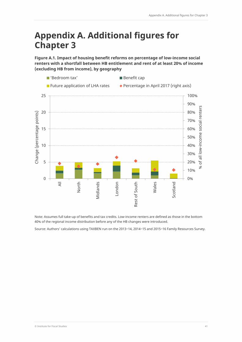
Appendix A. Additional figures for Chapter 3
© Institute for Fiscal Studies 41
Appendix A. Additional figures for Chapter 3 Figure A.1. Impact of housing benefit reforms on percentage of low-income social renters with a shortfall between HB entitlement and rent of at least 20% of income (excluding HB from income), by geography
Note: Assumes full take-up of benefits and tax credits. Low-income renters are defined as those in the bottom 40% of the regional income distribution before any of the HB changes were introduced.
Source: Authors’ calculations using TAXBEN run on the 2013‒14, 2014‒15 and 2015‒16 Family Resources Survey.
0%
10%
20%
30%
40%
50%
60%
70%
80%
90%
100%
0
5
10
15
20
25
All
Nor
th
Mid
land
s
Lond
on
Rest
of S
outh
Wal
es
Scot
land
% o
f all
low
-inco
me
soci
al re
nter
s
Chan
ge (p
erce
ntag
e po
ints
)
‘Bedroom tax’ Benefit cap
Future application of LHA rates Percentage in April 2017 (right axis)
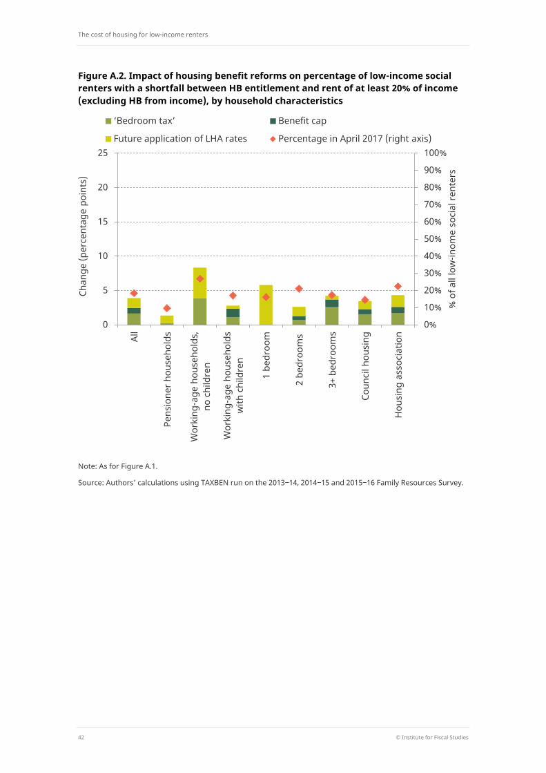
The cost of housing for low-income renters
42 © Institute for Fiscal Studies
Figure A.2. Impact of housing benefit reforms on percentage of low-income social renters with a shortfall between HB entitlement and rent of at least 20% of income (excluding HB from income), by household characteristics
Note: As for Figure A.1.
Source: Authors’ calculations using TAXBEN run on the 2013‒14, 2014‒15 and 2015‒16 Family Resources Survey.
0%
10%
20%
30%
40%
50%
60%
70%
80%
90%
100%
0
5
10
15
20
25
All
Pens
ione
r hou
seho
lds
Wor
king
-age
hou
seho
lds,
no
chi
ldre
n
Wor
king
-age
hou
seho
lds
with
chi
ldre
n
1 be
droo
m
2 be
droo
ms
3+ b
edro
oms
Coun
cil h
ousi
ng
Hou
sing
ass
ocia
tion
% o
f all
low
-inom
e so
cial
rent
ers
Chan
ge (p
erce
ntag
e po
ints
)
‘Bedroom tax’ Benefit cap
Future application of LHA rates Percentage in April 2017 (right axis)
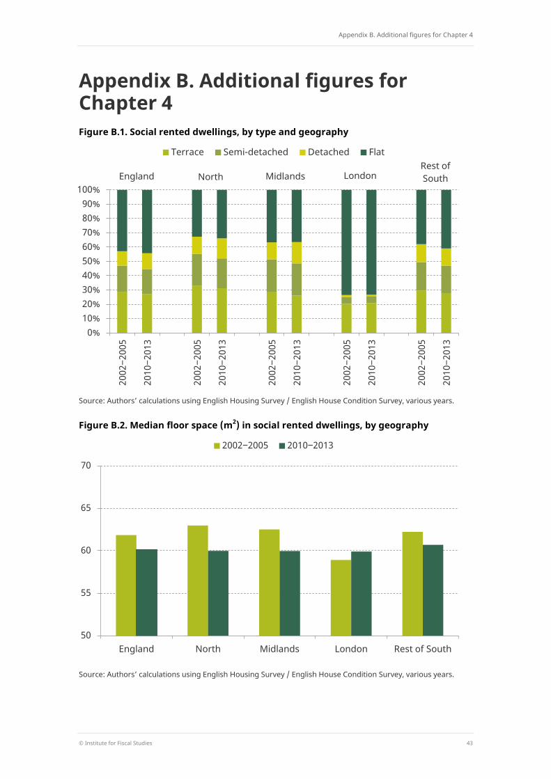
Appendix B. Additional figures for Chapter 4
© Institute for Fiscal Studies 43
Appendix B. Additional figures for Chapter 4 Figure B.1. Social rented dwellings, by type and geography
Source: Authors’ calculations using English Housing Survey / English House Condition Survey, various years.
Figure B.2. Median floor space (m2) in social rented dwellings, by geography
Source: Authors’ calculations using English Housing Survey / English House Condition Survey, various years.
0% 10% 20% 30% 40% 50% 60% 70% 80% 90%
100%
2002
‒200
5
2010
‒201
3
2002
‒200
5
2010
‒201
3
2002
‒200
5
2010
‒201
3
2002
‒200
5
2010
‒201
3
2002
‒200
5
2010
‒201
3
Terrace Semi-detached Detached Flat
England North Midlands London Rest of South
50
55
60
65
70
England North Midlands London Rest of South
2002‒2005 2010‒2013
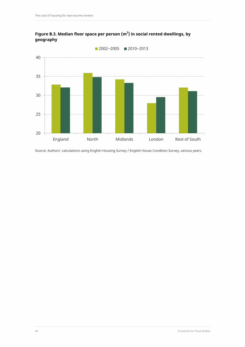
The cost of housing for low-income renters
44 © Institute for Fiscal Studies
Figure B.3. Median floor space per person (m2) in social rented dwellings, by geography
Source: Authors’ calculations using English Housing Survey / English House Condition Survey, various years.
20
25
30
35
40
England North Midlands London Rest of South
2002‒2005 2010‒2013
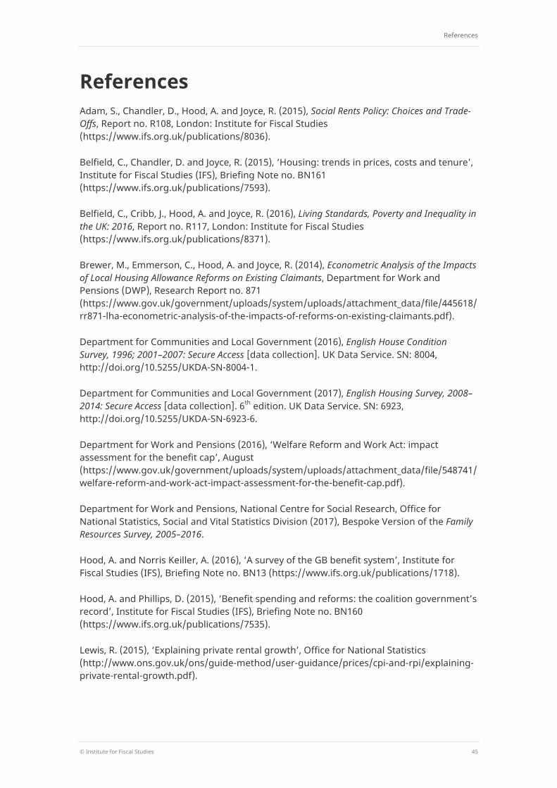
References
© Institute for Fiscal Studies 45
References Adam, S., Chandler, D., Hood, A. and Joyce, R. (2015), Social Rents Policy: Choices and Trade-Offs, Report no. R108, London: Institute for Fiscal Studies (https://www.ifs.org.uk/publications/8036).
Belfield, C., Chandler, D. and Joyce, R. (2015), ‘Housing: trends in prices, costs and tenure’, Institute for Fiscal Studies (IFS), Briefing Note no. BN161 (https://www.ifs.org.uk/publications/7593).
Belfield, C., Cribb, J., Hood, A. and Joyce, R. (2016), Living Standards, Poverty and Inequality in the UK: 2016, Report no. R117, London: Institute for Fiscal Studies (https://www.ifs.org.uk/publications/8371).
Brewer, M., Emmerson, C., Hood, A. and Joyce, R. (2014), Econometric Analysis of the Impacts of Local Housing Allowance Reforms on Existing Claimants, Department for Work and Pensions (DWP), Research Report no. 871 (https://www.gov.uk/government/uploads/system/uploads/attachment_data/file/445618/rr871-lha-econometric-analysis-of-the-impacts-of-reforms-on-existing-claimants.pdf).
Department for Communities and Local Government (2016), English House Condition Survey, 1996; 2001–2007: Secure Access [data collection]. UK Data Service. SN: 8004, http://doi.org/10.5255/UKDA-SN-8004-1.
Department for Communities and Local Government (2017), English Housing Survey, 2008–2014: Secure Access [data collection]. 6th edition. UK Data Service. SN: 6923, http://doi.org/10.5255/UKDA-SN-6923-6.
Department for Work and Pensions (2016), ‘Welfare Reform and Work Act: impact assessment for the benefit cap’, August (https://www.gov.uk/government/uploads/system/uploads/attachment_data/file/548741/welfare-reform-and-work-act-impact-assessment-for-the-benefit-cap.pdf).
Department for Work and Pensions, National Centre for Social Research, Office for National Statistics, Social and Vital Statistics Division (2017), Bespoke Version of the Family Resources Survey, 2005–2016.
Hood, A. and Norris Keiller, A. (2016), ‘A survey of the GB benefit system’, Institute for Fiscal Studies (IFS), Briefing Note no. BN13 (https://www.ifs.org.uk/publications/1718).
Hood, A. and Phillips, D. (2015), ‘Benefit spending and reforms: the coalition government’s record’, Institute for Fiscal Studies (IFS), Briefing Note no. BN160 (https://www.ifs.org.uk/publications/7535).
Lewis, R. (2015), ‘Explaining private rental growth’, Office for National Statistics (http://www.ons.gov.uk/ons/guide-method/user-guidance/prices/cpi-and-rpi/explaining-private-rental-growth.pdf).