Embed Size (px)
Citation preview

Kansas State University Libraries Kansas State University Libraries
New Prairie Press New Prairie Press
NPP eBooks Monographs
2019
The Economics of Food and Agricultural Markets The Economics of Food and Agricultural Markets
Andrew Barkley Kansas State University, [email protected]
Follow this and additional works at: https://newprairiepress.org/ebooks
Part of the Agricultural Economics Commons, Agricultural Education Commons, and the Higher
Education Commons
This work is licensed under a Creative Commons Attribution-Noncommercial 4.0 License
Recommended Citation Recommended Citation Barkley, Andrew, "The Economics of Food and Agricultural Markets" (2019). NPP eBooks. 28. https://newprairiepress.org/ebooks/28
This Book is brought to you for free and open access by the Monographs at New Prairie Press. It has been accepted for inclusion in NPP eBooks by an authorized administrator of New Prairie Press. For more information, please contact [email protected].

The Economics of Food and Agricultural Markets


The Economics of Food and Agricultural Markets
Second Edition
ANDREW BARKLEY
NEW PRAIRIE PRESS
MANHATTAN

The Economics of Food and Agricultural Markets by Andrew Barkley is licensed under a Creative Commons Attribution-NonCommercial 4.0 International License, except where otherwise noted.
Second Edition Copyright © 2019 Andrew Barkley
New Prairie Press
Kansas State University Libraries
Manhattan, Kansas
Cover design by: Kansas State University Libraries
Electronic editions available online at:
https://newprairiepress.org/ebooks/28
Web book online at:
https://kstatelibraries.pressbooks.pub/economicsoffoodandag/

Contents
Author's Note for the Second Edition 1
Chapter 1. Introduction to Economics
1.1 Introduction to the Study of Economics 3
1.2 Supply and Demand 5
1.3 Markets: Supply and Demand 13
1.4 Elasticities 23
1.5 Welfare Economics: Consumer and Producer Surplus 40
1.6 The Motivation for and Consequences of Free Trade 44
3
Chapter 2. Welfare Analysis of Government Policies
2.1 Price Ceiling 49
2.2 Price Support 56
2.3 Quantitative Restriction 67
2.4 Import Quota 69
2.5 Taxes 75
2.6 Subsidies 79
2.7 Immigration 82
2.8 Welfare Impacts of International Trade 89
49
Chapter 3. Monopoly and Market Power
3.1 Market Power Introduction 93
3.2 Monopoly Profit-Maximizing Solution 94
3.3 Marginal Revenue and the Elasticity of Demand 103
3.4 Monopoly Characteristics 108
3.5 Monopoly Power 113
3.6 Monopsony 120
93

Chapter 4. Pricing with Market Power
4.1 Introduction to Pricing with Market Power 129
4.2 Price Discrimination 130
4.3 Intertemporal Price Discrimination 138
4.4 Peak Load Pricing 140
4.5 Two-Part Pricing 141
4.6 Bundling 145
4.7 Advertising 147
129
Chapter 5. Monopolistic Competition and Oligopoly
5.1 Market Structures 153
5.2 Monopolistic Competition 156
5.3 Oligopoly Models 159
5.4 Oligopoly, Collusion, and Game Theory 167
153
Chapter 6. Game Theory
6.1 Game Theory Introduction 175
6.2 Cooperative Strategy (Collusion) 181
175
Chapter 7. Game Theory Applications
7.1 Repeated and Sequential Games 185
7.2 First Mover Advantage 187
185

Author's Note for the Second Edition
The Second Edition of Economics of Food and Agricultural Markets is written for applied intermediate
microeconomics courses. The book showcases the power of economic principles to explain and predict issues
and current events in the food, agricultural, agribusiness, international trade, labor markets, and natural
resource sectors. The field of agricultural economics is relevant, important and interesting. The study of market
structures, also called industrial organization, provides powerful, timely, and useful tools for any individual or
group making personal choices, business decisions, or public policies in food and agricultural industries.
Readers will benefit from a large number of real-world examples and applications of the economic concepts
under discussion. The book introduces economic principles in a succinct and reader-friendly format, providing
students and instructors with a clear, up-to-date, and straightforward approach to learning how a market-
based economy functions, and how to use simple economic principles for improved decision making. The
principles are applied to timely, interesting, and important real-world issues through words, graphs, and simple
algebra and calculus. This book is intended for students who study agricultural economics, microeconomics,
rural development and/or environmental policy.
The goal of the book is to encourage students to learn to “think like an economist” through application of
benefits and costs to every decision, idea, and strategic decision. This objective is accomplished by including
extended examples that cover a broad range of topics including the analysis of consumer decisions, supply and
demand, and market efficiency; the design of pricing strategies; advertising and marketing decisions; and public
policy analysis.
Contents
The book begins with a review and introduction of economic principles, including markets, scarcity, and
the scientific method. Supply and demand are examined carefully and completely, with numerous real-world
examples. The power of the market model is employed to explain and predict economic phenomena and current
events. Elasticities are defined, explained, and put to use in decision making for all individuals, businesses, and
policy makers.
Next, the motivation for and consequences of globalization, immigration, and international trade are explored.
Government policies are surveyed, including taxes, subsidies, trade policies, and immigration policies.
Monopoly and monopsony are presented, using numerous real-world examples and anecdotes. Pricing
strategies are comprehensively discussed, including price discrimination, peak-load pricing, two-part pricing,
bundling, and advertising.
Monopolistic competition and oligopoly are defined, explained, and used to understand real-world markets.
Game theory, or strategic decision making, is introduced and used to demonstrate how to make better
decisions in numerous situations when other individuals and groups are affected by a choice or strategy.
Repeated games, sequential games, and first-mover advantage are carefully presented and considered.
–Andrew Barkley
July 31, 2019
Author's Note for the Second Edition | 1


Chapter 1. Introduction to Economics
1.1 Introduction to the Study of Economics
1.1.1 Economics is Important and Interesting!
The Economics of food and agriculture is important and interesting! Food and agricultural markets are in the
news and on social media every day. Numerous fascinating and complex issues are the subject of this course:
food prices, food safety, diet and nutrition, agricultural policy, globalization, immigration, agricultural labor
markets, obesity, use of antibiotics and hormones in meat production, hog confinement, and many more. As we
work through the course material this semester, please find examples of the economics of food and agriculture
in the news. Application of economic principles to food and agricultural issues in real time will enhance the
relevance, timeliness, and importance of learning economics.
1.1.2 Scarcity
Economics can be defined as, “the study of choice.” The concept of scarcity is the foundation of economics.
Scarcity reflects the human condition: fixed resources and unlimited wants, needs, and desires.
Scarcity = Unlimited wants and needs, together with fixed resources.
Since we have unlimited desires, and only a fixed amount of resources available to meet those desires, we can’t
have everything that we want. Thus, scarcity forces us to choose: we can’t have everything. Since scarcity forces
us to choose, and economics is the study of choice, scarcity is the fundamental concept of all economics. If
there were no scarcity, there would be no need to choose between alternatives, and no economics!
1.1.3 Microeconomics and Macroeconomics
The subject of economics is divided into two major categories: microeconomics and macroeconomics.
Microeconomics = The study of individual decision-making units, such as firms and households.
Macroeconomics = The study of economy-wide aggregates, such as inflation, unemployment,
economic growth, and international trade.
This course studies microeconomics, the investigation of firm and household decision making. Our basic
assumption is that firms desire to maximize profits, and households seek to maximize utility, also called
satisfaction.
Chapter 1. Introduction to Economics | 3

1.1.4 Economic Models and Theories
The real world is enormously complex. Think of how complicated your daily life is: just waking up and getting
ready for class has a huge number of possible complications! Since our world is complicated, we must simplify
the real world to understand it. A Model is a simplified representation of the world, not intended to be realistic.
Model = A theoretical construct, or representation of a system using symbols, such as a flow chart,
schematic, or equation.
We frequently use models in physical sciences such as biology, chemistry, and physics. Think of the model of
an atom, with the atomic particles: neutron, proton, and electrons. No one has ever seen an atom, but there
is significant evidence for this model. It is easy to be critical of economic models, since we are in many cases
more familiar with economic events than scientific observations. When we simplify supply and demand into a
model, we can think of many oversimplifications and limitations of the theory… the real world is complicated.
However, this is how all science works: we must simplify the complex real world in order to understand it.
1.1.4.1 The Scientific Method
Our economic models are built and used following the Scientific Method.
Scientific Method = A body of techniques for investigating phenomena, acquiring new knowledge, or
correcting and integrating previous knowledge.
The major characteristic of the scientific method is to use measurable evidence to support or detract from a
given model or theory. Following this method, economists will keep a theory as long as evidence backs it up.
If the evidence does not support the model, the theory will be modified or replaced. Science, or knowledge,
advances in this imperfect manner. To repeat, “We have to simplify the real world in order to understand it.”
Science is limited, and the human condition continues to be one of imperfect knowledge, finite lives, and an
enduring search for solutions to poverty, pain, and suffering.
1.1.5 Positive Economics and Normative Economics
As social scientists, economists seek to be unbiased and objective in their study of the world. Economists have
developed two terms to separate factual statements from value judgments, or opinions.
Positive Economics = Statements that include only factual information, with no value judgments.
“What is.”
Normative Economics = Statements that include value judgments, or opinions. “What ought to be.”
In our study of food and agriculture, we will strive to purge our discussions, analysis, and understanding from
opinions and value judgments. Our background and experience can make this challenging. For example, a corn
producer might say, “The price of corn is higher, which is a good thing.” But, the buyer of the corn, a livestock
4 | Andrew Barkley | The Economics of Food and Agricultural Markets

feedlot operator, might see things differently. All price changes have winners and losers, so economists try to
avoid describing price movements in terms of “good” or “bad.”
Economists who study food and agriculture seek to be neutral, unbiased, and professional in their work. This
can be challenging at times, when we present our finding and observations to individuals or groups who may
not like the outcomes. For example, an economist might be asked to study organic, natural, or local foods and
report eh results to farmers and ranchers of conventional food products. Economists could be asked to study
and report Chipotle’s impact on the demand for beef, or the profit margins on cage-free eggs. Although some
individuals may not like the results of these studies, economists try to be unbiased and objective in reporting
their scientific work.
1.2 Supply and Demand
The study of markets is a powerful, informative, and useful method for understanding the world around us,
and interpreting economic events. The use of supply and demand allows us to understand how the world
works, how changes in economic conditions affect prices and production, and how government policies and
programs affect prices, producers, and consumers. A huge number of diverse and interesting issues can be
usefully analyzed using supply and demand.
1.2.1 Supply
The Supply of a good represents the behavior of firms, or producers. Supply refers to how much of a good will
be produced at a given price.
Supply = The relationship between the price of a good and quantity supplied, ceteris paribus.
Notice the important term, “ceteris paribus” at the end of the definition of supply. Recall the complexity of the
real world, and how economists must simplify the world to understand it. Use of the concept, ceteris paribus,
allows us to understand the supply of a good. In the real world, there are numerous forces affecting the supply
of a good: weather, prices, input prices, just to name a few.
Ceteris Paribus = Holding all else constant (Latin).
When studying supply, we seek to isolate the relationship between the price and quantity supplied of a good.
We must hold everything else constant (ceteris paribus) to make sure that the other supply determinants
are not causing changes in supply. An example is the supply of organic cotton. Patagonia spearheaded the
movement into using organic cotton in the production of clothing. Nike and other clothing manufacturers are
increasing organic clothing production to meet the growing demand for this good. Interestingly, conventional
(non-organic) cotton is the most chemical-intensive field crop, and can result in agricultural chemical runoff
Chapter 1. Introduction to Economics | 5

in the soil and groundwater. A small but convicted group of consumers are willing to pay high premiums for
clothing made with organic cotton, to reduce the potential environmental damage from agricultural chemicals
used in cotton production. Notice that this graph has two items on each axis: (1) a label, and (2) units. Every
graph drawn must have both labels and units on each axis to effectively communicate what the graph is about.
Figure 1.1 Market Supply Curve of Organic Cotton
The supply curve seen in Figure 1.1 is a market supply curve, as it represents the entire market of organic cotton
(note that cotton is sold in bales). The market supply curve was derived by horizontal summation all of the
individual firm supply curves. This is indicated by the notation Qs = ΣMCi in Figure 1.1. The individual firm supply
curve is the firm’s marginal cost curve (MC) for all prices above the shut down point, and equal to zero for all
prices below the shut down point. The shut down point is the minimum point on the firm’s average variable cost
curve (AVC), as shown in Figure 1.2
Since the market supply curve is the sum of all of the individual firms’ marginal cost curves (ΣMCi), the market
supply curve represents the cost of production: the total amount that a business firm must pay to produce a
given quantity of a good.
There are three properties of a market supply curve.
6 | Andrew Barkley | The Economics of Food and Agricultural Markets

Figure 1.2 Individual Firm Supply Curve of Organic Cotton
1.2.1.1 Properties of Supply
1. Upward-sloping: if price increases, quantity supplied increases,
2. Qs = f(P), and
3. Ceteris Paribus, Latin for “holding all else constant.”
The first property reflects the Law of Supply, which states that there is a direct relationship between price and
quantity supplied.
Chapter 1. Introduction to Economics | 7
Law of Supply = There is a direct, positive relationship between the price of a good and the quantity
supplied, ceteris paribus.
The second property demonstrates that price (P) is the independent variable, and quantity supplied (Qs) is the
dependent variable. Graphs of supply and demand are drawn “backward” with the independent variable (P)
on the vertical axis. In all other fields of mathematics and science, when a function such as y=f(x) is graphed,
the independent variable (x) appears on the horizontal axis, and the dependent variable (y) is drawn on the
vertical axis. Supply and demand graphs are drawn, “backwards” due to economist Alfred Marshall, who drew
the original supply and demand graphs this way in his Principles of Economics book in 1890. The third property
reflects the need to simplify all of the determinants of supply to isolate the relationship between price and
quantity supplied, using the ceteris paribus assumption.
1.2.1.2 The Determinants of Supply
There are numerous determinants of supply, so we will focus on five important ones. The most important
supply determinant, or driver, is price (P). Other determinants include input prices (Pi), the prices of related
goods (Pr), technology (T), and government taxes and subsidies (G).
(1.1) Qs = f(P, Pi, Pr, T, G)
To draw a supply curve, we focus on the most important determinant of supply: the good’s own price. We
hold all of the other determinants constant. To show this in equation form, we use a vertical bar to designate
ceteris paribus: all variables that appear to the right of the vertical bar are held constant. Equation 1.2 shows
the relationship between quantity supplied and price, holding all else constant. This relationship is the market
supply curve in Figure 1.1 and in supply and demand graphs.
(1.2) Qs = f(P| Pi, Pr, T, G)
Input prices (Pi) are important determinants of supply, since the supply curve represents the cost of production.
Prices of related goods (Pr) represent prices of substitutes and complements in production. Substitutes in
production are goods that are produced either/or, such as corn and soybeans. One land parcel can be used to
grow either corn or soybeans. Complements in production are goods that are produced together in a fixed ratio.
Beef and leather are complements in production. Technology (T) is major driver of supply, as new methods and
techniques become available, they increase the amount of food produced. Technological change allows more
output to be produced with the same level of inputs. Restated, the same level of output can be produced with
fewer inputs. Government policies and programs (G) can shift the supply of a good through taxes or subsidies.
1.2.1.3 Movements Along vs. Shifts In Supply
The supply curve represents the mathematical relationship between the price and quantity supplied of a good.
Therefore, when a good’s own price changes, it is as a movement along the supply curve. When any of the other
supply curve determinants change, it will shift the entire curve.
8 | Andrew Barkley | The Economics of Food and Agricultural Markets
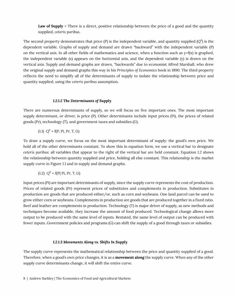
A movement along a supply curve, caused by a change in the good’s own price, is called a change in quantity
supplied (left panel, figure 1.3). A shift in the supply curve, caused by a change in any supply determinant other
than the good’s own price, is called a change in supply (right panel, figure 1.3). The change in supply shown in
Figure 1.3 is an increase in supply, since it increases the quantity supplied at any given price.
Figure 1.3 Movement Along and Shift in the Supply of Organic Cotton
Notice that the supply curve has shifted down, yet this represents an increase in supply. The supply change
is measured on the horizontal axis, so a movement from left to right represents an increase in supply. The
shift shown could be the impact of technological change on organic cotton supply: suppose that biotechnology
allows for higher yielding varieties of organic cotton.
1.2.2 Demand
The Demand of a good represents the behavior of households, or consumers. Demand refers to how much of a
good will be purchased at a given price.
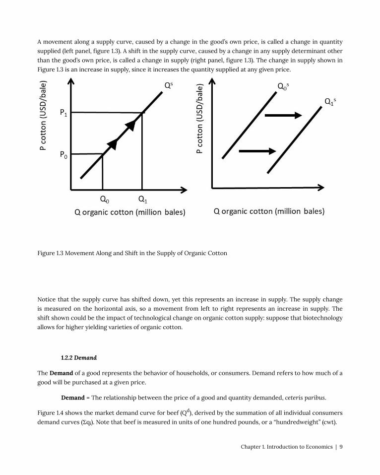
Demand = The relationship between the price of a good and quantity demanded, ceteris paribus.
Figure 1.4 shows the market demand curve for beef (Qd), derived by the summation of all individual consumers
demand curves (Σqi). Note that beef is measured in units of one hundred pounds, or a “hundredweight” (cwt).
Chapter 1. Introduction to Economics | 9
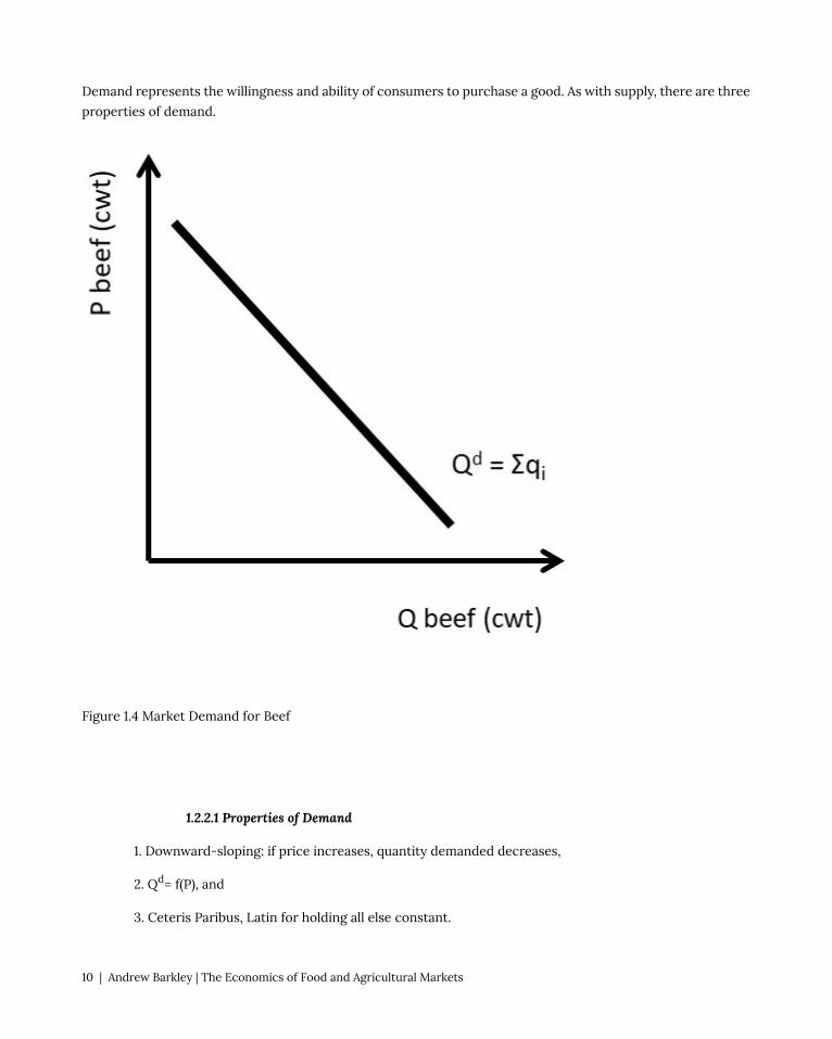
Demand represents the willingness and ability of consumers to purchase a good. As with supply, there are three
properties of demand.
Figure 1.4 Market Demand for Beef
1.2.2.1 Properties of Demand
1. Downward-sloping: if price increases, quantity demanded decreases,
2. Qd= f(P), and
3. Ceteris Paribus, Latin for holding all else constant.
10 | Andrew Barkley | The Economics of Food and Agricultural Markets

The first property reflects the Law of Demand, which states that if the price of a good increases, the quantity
demanded of that good decreases, holding all else constant.
Law of Demand = There is an inverse relationship between the price of a good and the quantity
supplied, ceteris paribus.
The Law of Demand is one of the major “take home messages” of economic principles. Price increases lead to
smaller quantities of goods purchased. The Law of Demand does not say that all consumers will stop buying
a good, it says that at least some consumers will decrease consumption of the good. The magnitude of the
decrease will depend on the price elasticity of demand for the good, as will be discussed in Section 1.4 below.
1.2.2.2 The Determinants of Demand
There are numerous demand shifters, or determinants of demand. Six of the most important determinants are
included in the demand equation in Equation 1.3. The good’s own price (P) is the most important determinant.
Demand is also influenced by: the price of related goods (Pr), futures prices (Pf), income (I), tastes and
preferences (T), and government programs and policies (G).
(1.3) Qd = f(P, Pr, Pf, I, T, G)
Related goods include substitutes and complements in consumption. Substitutes in consumption are goods that
are purchased either/or, such as hot dogs and hamburgers. If the price of hot dogs increases, at least some
consumers will shift out of hot dogs and into hamburgers. Complements in consumption are goods that are
consumed together, for example hot dogs and hot dog buns. If the price of hot dogs increases, consumers will
purchased fewer hot dogs and fewer buns.
Expectations of future prices (Pf) have a large influence on consumption decisions today. If the price of corn
was expected to increase in the future, corn demand would increase today, as corn buyers would seek to buy
prior to the price increase. This would allow traders to “buy low and sell high,” providing profit from arbitrage
across time.
Income (I) can have a large impact on purchase decisions. Cars, houses, and other expensive items will be
affected by changes in income. Inexpensive items such as used clothes or ramen noodles are also influenced
greatly by income changes. During the great recession of 2008-2010, Walmart had high profit levels, while boat
manufacturers and country clubs lost profits due to significant decreases in income.
Tastes and preferences (T) shift the demand for goods and services based on the diverse wants, needs, and
desires of consumers in the market. Taxes and subsidies, as well as other government programs, policies, and
regulations (G) influence demand, sometimes significantly. Government programs and policies will be explored
in Sections 1.4 through 1.6, and in Chapter 2 below.
To draw a demand curve, the most important determinant of demand is isolated: the good’s own price. We hold
all of the other determinants constant, ceteris paribus.
(1.4) Qd = f(P | Pr, Pf, I, T, G)
Chapter 1. Introduction to Economics | 11

1.2.2.3 Movements Along vs. Shifts In Demand
The demand curve represents the mathematical relationship between the price and quantity demanded of a
good. Therefore, when a good’s own price changes, it is depicted as a movement along the demand curve. When
any of the other demand curve determinants change, it will shift the entire curve.
Figure 1.5 Movement Along and Shift in the Demand for Beef
As with supply, if the good’s own price changes, it results in a movement along the demand curve, called a
change in quantity demanded. If any other demand determinant changes, it causes a shift in demand, called a
change in demand. The shift shown in the right panel of Figure 1.5 is an increase in demand, since the demand
curve has shifted upward and to the right.
Supply and demand form the foundation for the study of markets. Markets are defined as the interaction of
supply and demand. Market analysis is the core concept and foundation of all of economics, and will be explored
in the next section.
12 | Andrew Barkley | The Economics of Food and Agricultural Markets

1.3 Markets: Supply and Demand
In the previous section, supply and demand were introduced and explored separately. In what follows, the
interaction of supply and demand will be presented. The market mechanism is a useful and powerful analytical
tool. The market model can be used to explain and forecast movements in prices and quantities of goods and
services. The market impacts of current events, government programs and policies, and technological changes
can all be evaluated and understood using supply and demand analysis. Markets are the foundation of all
economics!
A market equilibrium can be found at the intersection of supply and demand curves, as illustrated for the wheat
market in Figure 1.6. An equilibrium is defined as, “a point from which there is no tendency to change.” Wheat is
traded in units of metric tons (MT), or 1000 kilograms, equal to approximately 2,204.6 pounds.
Equilibrium = a point from which there is no tendency to change.
Chapter 1. Introduction to Economics | 13

Figure 1.6 Wheat Market
Point E is the only equilibrium in the wheat market shown in Figure 1.6. At any other price, market forces
would come into play, and bring the price back to the equilibrium market price, P*. At any price higher than P*,
such as P’ in Figure 1.7, producers would increase the quantity supplied to Q1 million metric tons of wheat, and
consumers would decrease the quantity demanded to Q0 million metric tons of wheat. A surplus would result,
since quantity supplied is greater than quantity demanded (Q1 > Q0).
Figure 1.7 Wheat Market Surplus
A wheat surplus such as the one shown in Figure 1.7 would bring market forces into play since Qs ≠ Qd. Wheat
producers would lower the price of wheat in order to sell it. It would be preferable to earn a lower price than to
let the surplus go unsold. Consumers would increase the quantity demanded along Qd and producers decrease
the quantity supplied along Qs until the equilibrium point E was reached. In this way, any price higher than
the market equilibrium price will be temporary, as the resulting surplus will bring the price back down to the
equilibrium price P*.
Market forces also come into play at prices lower than the equilibrium market price, as shown in Figure 1.8. At
14 | Andrew Barkley | The Economics of Food and Agricultural Markets

the lower price P’’, producers reduce the quantity supplied along Qs to Q0, and consumers increase the quantity
demanded to Q1. A shortage occurs, since the quantity demanded is greater than the quantity supplied Q1 >
Q2. The shortage will bring market forces into play, as consumers will bid up the price in order to purchase
more wheat and producers will produce more wheat along Qs. This process will continue until the market price
returns to the equilibrium market price, P*.
The market mechanism that results in an equilibrium price and quantity performs a truly amazing function in
the economy. Markets are self-regulating, since no government intervention or coercion is needed to achieve
desirable outcomes. If there is a drought, the price of wheat will rise, causing more resources to be devoted to
wheat production, which is desirable, since wheat is in short supply during a drought. If good weather causes
a surplus, the price will fall, causing wheat producers to shift resources out of wheat and into more profitable
opportunities. In this fashion, the market mechanism allows voluntary trades between willing parties to allocate
resources to the highest return. Efficiency of resource use and high incomes are a feature of market-based
economies.
Although markets provide huge benefits to society, not everyone wins from free market economies, and market
changes over time. Price increases help producers, but hurt consumers. Technological change has provided
lowered food prices enormously over time, but has led to farm and ranch consolidation, and the large migration
of farmers and their families out of rural regions and into urban areas.
Chapter 1. Introduction to Economics | 15

Figure 1.8 Wheat Market Shortage
The market graphs of supply and demand are based on the assumption of perfectly competitive markets.
Perfect competition is an ideal state, different from actual market conditions in the real world. Once again,
economists simplify the complex real world in order to understand it. We will begin with the extreme pure case
of perfect competition, and later introduce realism into our analysis.
1.3.1 Competitive Market Properties
A competitive market has four properties:
1. homogeneous product,
2. numerous buyers and sellers,
3. freedom of entry and exit, and
4. perfect information.
The first property of perfect competition is a homogeneous product. This means that the consumer can
not distinguish any differences in the good, no matter which firm produced it. Wheat is an example, as it
is not possible to determine which farmer produced the wheat. A John Deere tractor is an example of a
nonhomogeneous good, since the brand is displayed on the machine, not to mention the company’s well known
green paint and deer logo.
The assumption of numerous buyers and sellers means something specific. The word, “numerous” refers to an
industry so large that each individual firm can not affect the price. Each firm is so small relative to the industry
that it is a price taker.
Freedom of entry and exit means that there are no legal, financial, or regulatory barriers to entering the market.
A wheat market allows anyone to produce and sell wheat. Attorneys and physicians, however, do not have
freedom of entry. To practice law or medicine, a license is required.
Perfect information is an assumption about industries where all firms have access to information about all input
and output prices, and all technologies. There are no trade secrets or patented technologies in a perfectly
competitive industry. These four properties of perfect competition are stringent, and do not reflect real-world
industries and markets. Our study of market structures in this course will examine each of these properties,
and use them to define industries where these properties do not hold. Competitive markets have a number of
attractive properties.
1.3.2 Outcomes of Competitive Markets
16 | Andrew Barkley | The Economics of Food and Agricultural Markets

Competitive markets result in desirable outcomes for economies. A competitive market maximizes social
welfare, or the total amount of well-being in a market. Competitive markets use voluntary exchange, or
mutually beneficial trades, to achieve this result. In a market-based economy, no one is forced, or coerced, to
do anything that they do not want to do. In this way, all trades are mutually beneficial: a producer or consumer
would never make a trade unless it made him or her better off. This idea will be a theme throughout this course:
free markets and free trade lead to superior economic outcomes.
It should be emphasized that free markets and free trade are not perfect, since there are negative features
associated with markets and capitalism. Income inequality is an example. Markets do not solve all of society’s
problems, but they do create conditions for higher levels of income and wealth than other economic
organizations, such as a command economy (as found in a communist or fascist nation). There are winners
and losers to market changes. An example is free trade. Free trade lowers prices for consumers, but often
causes hardships for producers in importing nations. Similarly, open borders allow immigrants to improve their
conditions and earnings by moving from low-income nations to high-income nations such as the United States
(US) or the European Union (EU). Workers in the US and the EU will face competition from a larger labor supply,
causing reductions in wages and salaries. A simple example of markets is an increase in the price of corn. Corn
producers are made better off, but livestock producers, the major buyers of corn, are made worse off. Thus, the
market shifts that allow prosperity also create winners and losers in a free market economy.
1.3.3 Supply and Demand Shift Examples
Given our knowledge of markets and the market mechanism, current events and policies can be better
understood.
1.3.3.1 Demand Increase
China was a command economy until 1986. At that time, the government introduced the Household
Responsibility System, which allowed farmers to earn income based on how much agricultural output they
produced. The new policy worked very well, and China moved from being a net food importer to a net food
exporter. Soon, the policy was extended to all industries, and China was on its way to a market-based economy.
The result has been a truly unprecedented increase in income. China has gone from a low income nation to
a middle income nation, and the rates of economic growth are higher than any nation in history. And, these
growth rates are for the world’s most populous nation: 1.4 billion people (for comparison, the United States
(USA) has approximately 326 million people).
This historical income growth in China has been good for US farmers and ranchers. As incomes increase,
consumers shift out of grain-based diets such as rice and wheat, and into meat. There has been a large increase
in beef consumption in China as incomes increased. This is an increase in the demand for US beef, as shown
in Figure 1.9. The units for beef are hundredweight (cwt), or one hundred pounds. This is called an increase in
demand (do you remember why this is not an increase in quantity demanded?). The outward shift in demand
results in a movement from equilibrium E0 to E1. The movement along the supply curve for beef is called an
increase in quantity supplied. The equilibrium market price increases from P0 to P1, and the equilibrium market
Chapter 1. Introduction to Economics | 17

quantity increases from Q0 to Q1. An increase in demand results in higher prices and higher quantities. As a
result, the best way to increase profitability for a firm is to increase demand.
Figure 1.9 Increase in China Income Impact on US Beef Market
Interestingly, income growth in China is beneficial to not only US beef producers, who face an increased
demand for beef, but also for grain farmers in the USA. The major input into the production of beef is corn,
sorghum (also called milo), and soybeans. These grains are fed to cattle in feedlots. Seven pounds of grain are
required to produce one pound of beef. Therefore, any increase in the global demand for beef will result in an
increase in demand for beef, and a large increase in the demand for feed grains.
1.3.3.2 Demand Decrease
In the United States, the demand for beef offals (tripe, tongue, heart, liver, etc.) has decreased in the past few
decades. As incomes increase, consumers shift out of these goods and into more expensive meat products such
as hamburger and steaks. The demand for offals has decreased as a result, as in Figure 1.10. This is a decrease in
18 | Andrew Barkley | The Economics of Food and Agricultural Markets

demand (shift inward), and a decrease in quantity supplied (movement along the supply curve). The outcome is
a decrease in the equilibrium market price and quantity of beef offals.
Figure 1.10 Increase in US Income Impact on US Beef Offal Market
1.3.3.3 Supply Decrease
A large share of citrus fruit in the US is grown in Florida and California. If there is bad weather in either State,
the market for oranges, lemons, limes, and grapefruit is affected. An early freeze can damage the citrus fruit,
resulting in a decrease in supply (Figure 1.11).
Chapter 1. Introduction to Economics | 19

Figure 1.11 Frost Damage Impact on US Orange Market
The supply decrease is a shift in the supply curve to the left, resulting in a movement along the demand curve:
a decrease in quantity demanded. The equilibrium price increases, and the equilibrium quantity decreases.
1.3.3.4 Supply Increase
Technological change is a constant in global agriculture. Science and technology has provided more output
from the same levels of inputs for many decades, and especially since 1950. Biotechnology in field crops has
been a recent enhancement in the world food supply. Biotechnology is also referred to as genetically modified
organisms (GMOs). Although GMOs are often in the news media as a potential health risk or environmental
risk, they have been produced and consumed in the US for many years, with no documented health issues.
However, the herbicide glyphosate has been determined to be a carcinogen in recent studies. Glyphosate is the
ingredient in “RoundUp,” a widely used herbicide in corn and soybean production. Genetically modified corn
20 | Andrew Barkley | The Economics of Food and Agricultural Markets

and soybeans are resistant to this herbicide, so it has been used extensively since the introduction of GM crops.
Biotechnology has increased the availability of food enormously, and is considered the largest technological
change in the history of agriculture. The impact of biotechnology is shown in Figure 1.12.
Figure 1.12 Biotechnology Impact on Corn Market
Biotechnology results in an increase in supply, the rightward shift in the supply curve. This supply shift results
in a movement along the demand curve, an increase in quantity demanded. The equilibrium quantity increases,
and the equilibrium price decreases. It may seem that the decrease in price is bad for corn producers. However,
in a global economy, this keeps the US competitive in global grain markets. Since a large fraction of US grain
crops are exported, this provides additional income to the corn industry.
Chapter 1. Introduction to Economics | 21

1.3.4 Mathematics of Supply and Demand
The above market analyses are qualitative, or non-numerical. Numbers can be added to the supply and demand
graphs to provide quantitative results. The numbers used here are simple, but can be replaced with actual
estimates of supply and demand to yield important and interesting quantitative results to market events.
As an example, consider the phone market. Let the inverse demand for phones be given by Equation 1.5.
The equation is called, “inverse” because the independent variable (P) appears on the left-hand side and the
dependent variable (Qd) appears on the right hand side. Traditionally, the independent variable (x) is on the
right, and the dependent variable (y) is on the left. We use inverse supply and demand equations for easier
graphing, since P is on the vertical axis, typically used for the dependent variable (can you remember why these
graphs are backwards?).
(1.5) P = 100 – 2Qd
In the inverse demand equation, P is the price of phones in USD/unit, and Q is the quantity of phones in
millions. The inverse supply equation is given in Equation 1.6.
(1.6) P = 20 + 2Qs
These examples of inverse supply and demand functions are called “price-dependent” for ease of graphing. The
equations can be quickly and easily inverted to “quantity-dependent” form. To do this, use simple algebra to
isolate Qd or Qs on the left-hand side of the equations.
To find equilibrium, set Qs = Qd = Qe. This is the point where the market “clears,” and supply is equal to demand.
By inspection of the market graph (Figure 1.13), there is only one price where this can occur: the equilibrium
price: Pe.
P = 100 – 2Qe = 20 + 2Qe
80 = 4Qe
Qe = 20
To find the equilibrium price, plug Qe into the inverse demand equation:
Pe = 100 – 2Qe = 100 – 2*20 = 100 – 40 = 60.
This result can be checked by plugging Qe = 20 into the inverse supply equation:
Pe = 20 + 2Qe = 20 + 2*20 = 20 + 40 = 60
The equilibrium price and quantity of phones are:
Pe = USD 60/phones, and Qe = 20 million phones.
Notice that these equilibrium values have both labels (phones) and units.
22 | Andrew Barkley | The Economics of Food and Agricultural Markets

Figure 1.13 Phone Market Equilibrium
We will be using quantitative market analysis throughout the rest of the course. If you have any questions about
how to graph the functions, or how to solve for equilibrium price and quantity, be sure to review the material
in this chapter carefully. We will be using these graphs throughout our study of market structures!
1.4 Elasticities
1.4.1 Introduction to Elasticities
An elasticity is a measure of responsiveness.
Elasticity = How responsive one variable is to a change in another variable.
Chapter 1. Introduction to Economics | 23

An elasticity (E), or responsiveness, is measured by the percentage change of each variable. The change in a
variable is the ending value (X1) minus the initial value (X0), or ΔX = X1 – X0. A percentage change in a variable
is defined as the change in the variable divided by the initial value of the variable: %ΔX = ΔX/X0. Using this
formula, Equation 1.7 shows the responsiveness of Y to a change in X:
(1.7) E = %ΔY/%ΔX = (ΔY/Y)/(ΔX/X) = (ΔY/ΔX)(X/Y).
Elasticities can be calculated for any two variables. Elasticities are widely used in economics to measure
how responsive producers and consumers are to changes in prices, income, and other economic variables.
Elasticities have a very desirable property: they do not have units. Since the two variables are measured in
percentage changes, the units of each variable are cancelled, and the resulting elasticity has no units. This
allows elasticities to be compared to each other, when prices and quantities cannot be directly compared. For
example, the quantity of apples cannot be directly compared to the quantity of orange juice, since they are in
different units. However, the elasticities of oranges and apples can be compared directly, since there are no
units for elasticities.
1.4.2 Own Price Elasticity of Demand: Ed
The own-price elasticity of demand (most often called simply the “price elasticity of demand” or the “elasticity
of demand”) measures the responsiveness of consumers to a change in price, as shown in Equation 1.8:
(1.8) Ed = %ΔQd/%ΔP = (ΔQd/ΔP)(P/Qd).
Own Price Elasticity of Demand = the percentage change in quantity demanded given a one percent
change in the good’s own price, ceteris paribus.
The own-price elasticity of demand is the most important thing that a business firm can know. The price
elasticity informs the business about how a change in price will affect the quantity demanded. If consumers
are responsive to price changes, the firm may think twice before raising the price and losing customers to
the competition. On the other hand, if consumers are relatively unresponsive to price changes, the firm may
increase the price, and most customers will continue to purchase the good at the higher price. Food is an
example of an inelastic good, since we all need to eat.
The price elasticity of demand (Ed) depends on the availability of substitutes. If there are no substitutes for a
good (food, toilet paper, toothpaste), the good is called, “price inelastic.” Consumers will purchase the good even
at a high price. If substitutes are available, the good is considered to be “price elastic:” a higher price will cause
customers to decrease consumption of the good by buying the substitute good. Green shirts are an example: if
the price of green shirts is increased, consumers will shift purchases to blue shirts, or shirts of a different color.
The price elasticity of demand is the most critical aspect of a business firm, since it provides the most crucial
information about customers! Knowledge of the price elasticity of demand provides information to a business
firm on how consumers would react to price changes, allowing the firm to identify the profit-maximizing price
to charge consumers.
24 | Andrew Barkley | The Economics of Food and Agricultural Markets
1.4.2.1 Price Elasticity of Demand Example
Suppose that the price of wheat is equal to USD 4/bu of wheat, and increases to USD 6/bu. Due to the higher
price, suppose that wheat millers reduce their purchases of wheat from 10 million bushels (m bu) to 8 million
bushels. The price elasticity of demand for wheat can be calculated using Equation 1.9. By convention, the initial
values of P and Qd are used in the elasticity calculation for the variables P and Qd.
(1.9) Ed = %ΔQd/%ΔP=(ΔQd/ΔP)(P/Qd) = (8-10 m bu)/(6-4 USD/mt)*(4 USD/bu)/(10 m bu)
Notice that the units cancel: there are (m bu) in both the numerator and denominator, and (USD/bu) also
appears in both numerator and denominator. This allows the math to be greatly simplified:
Ed = (-2/2)*(4/10) = (-1)/(0.4) = -0.4
The price elasticity of demand is always negative, due to the Law of Demand. By convention, economists take
the absolute value to make Ed positive. For example, in this case, Ed= – 0.4, then |Ed|= 0.4. The own price
elasticity of demand provides important information about the wheat market: how responsive wheat buyers are
to a change in price. To interpret the elasticity, it means that for a one percent increase in price, the quantity
demanded of wheat will decrease by 0.4 percent. This is a relatively inelastic response, since the change in
quantity demanded is smaller than the price change.
Elasticities are classified into three categories, based on consumer responsiveness to a one percent change in
price.
Price elastic |Ed| > 1
Price inelastic |Ed| < 1
Unitary elastic |Ed| = 1
Goods that are price elastic have substitutes available, and the percentage change in quantity demanded will
decrease more than the percentage increase change in price (%ΔQd > %ΔP, therefore |Ed|> 1). A price inelastic
good, on the other hand, will have a smaller percentage change in quantity demanded than the percentage
increase in price (%ΔQd < %ΔP, therefore |Ed|< 1). For unitary elastic goods, the percentage change in quantity
demanded is equal to the percentage change in price (%ΔQd = %ΔP, therefore |Ed|= 1).
1.4.2.2 Elastic and Inelastic Demand Examples
To compare elastic and inelastic demands, think of a student who would like to purchase a pack of cigarettes
during a late night study session for an exam. If the student arrives at the convenience store to find that
the price of Marlboros, her usual brand, has doubled, she could switch to many other brands: Lucky Strikes,
Winstons, etc. The demand for Marlboro cigarettes is price elastic (left panel, Figure 1.14). The price elasticity
of demand depends on the availability of substitutes. An elastic demand will have a relatively flat slope, since a
small change in price results in a relatively larger change in quantity demanded.
Chapter 1. Introduction to Economics | 25

Figure 1.14 Price Elasticity of Demand for Marlboros and Cigarettes
On the other hand, if the convenience store increases the price of all cigarettes, the student will pay for a pack,
since there are no substitutes for all cigarettes (right panel, Figure 1.14). More narrowly defined goods will have
larger absolute values of own price elasticities, since there are more substitutes for narrowly defined goods.
For example, apples are more price elastic than all fruit, and green shirts are more price elastic than all shirts.
An inelastic good will have a steep slope, since the change in quantity demanded is small relative to the change
in price.
Figure 1.15 shows a range of own price elasticities, from perfectly inelastic to perfectly elastic.
26 | Andrew Barkley | The Economics of Food and Agricultural Markets

Figure 1.15 Price Elasticity of Demand
A good that is perfectly inelastic is one that consumers purchase no matter what the price is. Within a certain
range of prices, this could be food or electricity. In this case, quantity demanded is completely unresponsive
to changes in price: |Ed|= 0. An inelastic demand is one where the percentage change in price is larger than
the percentage change in quantity demanded: %ΔQd < %ΔP, and |Ed|< 1. Goods that are price inelastic are
characterized by consumers being unresponsive to price changes. Goods that are price elastic exhibit relatively
high levels of consumer responsiveness to price movements. For elastic goods, the percentage change in
quantity demanded is larger than the percentage change in price: %ΔQd > %ΔP, and |Ed|> 1. A perfectly elastic
good is characterized by a horizontal demand curve. In this case, if the price of the good is increased even one
cent, all customers decrease purchases of the good to zero. An individual wheat farmer’s crop is an example.
If the farmer tries to raise the price by one cent more than the prevailing market price, no consumers would
purchase her wheat. There are a large number of perfect substitutes available from other wheat farmers, so the
price elasticity is infinite, and the good is called, “perfectly elastic.”
1.4.3 Own Price Elasticity of Supply: Es
Producer responsiveness to a change in price is measured with the own price elasticity of supply, often called
the price elasticity of supply, or the elasticity of supply (Es). The formula for the price elasticity of supply is
given in Equation 1.10:
(1.10) Es = %ΔQs/%ΔP.
Chapter 1. Introduction to Economics | 27

Own Price Elasticity of Supply = the percentage change in quantity supplied given a one percent
change in the good’s own price, ceteris paribus.
The own price elasticity of supply is always positive, because of the Law of Supply: there is a direct, positive
relationship between the quantity supplied of a good and the good’s own price, ceteris paribus. Similar to the
price elasticity of demand, the price elasticity of supply is categorized into three elasticity classifications.
Price elastic Es > 1
Price inelastic Es < 1
Unitary elastic Es = 1
A good with an elastic supply is one where the percentage change in quantity supplied is greater than the
percentage change in price: %ΔQs > %ΔP, and Es > 1. Since Es is always positive, the absolute value is not
necessary (redundant). A good with an inelastic supply has a smaller percentage change in quantity supplied,
given a percent change in price: %ΔQs < %ΔP, and Es < 1. A good with unitary elasticity of supply has equal
percent changes in quantity supplied and price: %ΔQs = %ΔP, and Es = 1. Figure 1.16 illustrates the different
categories of the own price elasticity of supply.
Figure 1.16 Price Elasticity of Supply
28 | Andrew Barkley | The Economics of Food and Agricultural Markets

1.4.4 Income Elasticity: Ei
The income elasticity (Ei) measures how consumers of a good respond to a one percent increase in income (I),
as shown in Equation 1.11:
(1.11) Ei = %ΔQd/%ΔI.
The income elasticity is defined in a similar way as the price elasticities.
Income Elasticity = the percentage change in demand given a one percent change in income, ceteris
paribus.
Income elasticities are also categorized into responsiveness classifications. A normal good is one that increases
with an increase in income (Ei > 0). There are two subcategories of normal goods: necessities and luxury goods. Notice that necessity goods and luxury goods are normal goods. They represent subgroups of the normal
category, since Ei is positive in both cases.
Normal Good Ei > 0
Necessity Good 0 < Ei < 1
Luxury Good Ei > 1
Inferior Good Ei < 0
The graphs of the relationship between income and demand are called, “Engel Curves,” named for Ernst Engel
(1821-1896), a German statistician who first investigated the impact of income on consumption.
A necessity good is a normal good that has a positive, but small, increase in demand given a one percent
increase in income. Food is an example, since consumers increase the consumption of food with an increase in
income, but the total amount of food consumed reaches an upper limit. This is shown in Figure 1.17, left panel.
Chapter 1. Introduction to Economics | 29

Figure 1.17 Engel Curves for Necessity Goods and Luxury Goods
A luxury good is one that has increasing demand as income increases, as shown in the right panel of Figure
1.17. Good such as boats, golf club memberships, and expensive clothing are examples of luxury goods. Inferior
goods (Figure 1.18) are characterized by lower levels of consumption as income increases: ramen noodles and
used clothes are examples.
30 | Andrew Barkley | The Economics of Food and Agricultural Markets
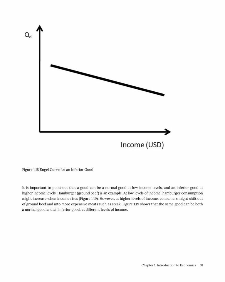
Figure 1.18 Engel Curve for an Inferior Good
It is important to point out that a good can be a normal good at low income levels, and an inferior good at
higher income levels. Hamburger (ground beef) is an example. At low levels of income, hamburger consumption
might increase when income rises (Figure 1.19). However, at higher levels of income, consumers might shift out
of ground beef and into more expensive meats such as steak. Figure 1.19 shows that the same good can be both
a normal good and an inferior good, at different levels of income.
Chapter 1. Introduction to Economics | 31
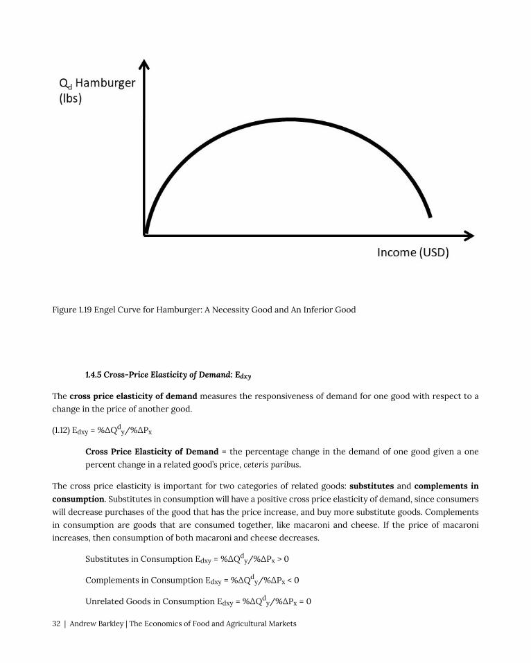
Figure 1.19 Engel Curve for Hamburger: A Necessity Good and An Inferior Good
1.4.5 Cross-Price Elasticity of Demand: Edxy
The cross price elasticity of demand measures the responsiveness of demand for one good with respect to a
change in the price of another good.
(1.12) Edxy = %ΔQdy/%ΔPx
Cross Price Elasticity of Demand = the percentage change in the demand of one good given a one
percent change in a related good’s price, ceteris paribus.
The cross price elasticity is important for two categories of related goods: substitutes and complements in consumption. Substitutes in consumption will have a positive cross price elasticity of demand, since consumers
will decrease purchases of the good that has the price increase, and buy more substitute goods. Complements
in consumption are goods that are consumed together, like macaroni and cheese. If the price of macaroni
increases, then consumption of both macaroni and cheese decreases.
Substitutes in Consumption Edxy = %ΔQdy/%ΔPx > 0
Complements in Consumption Edxy = %ΔQdy/%ΔPx < 0
Unrelated Goods in Consumption Edxy = %ΔQdy/%ΔPx = 0
32 | Andrew Barkley | The Economics of Food and Agricultural Markets

Unrelated goods have a cross price elasticity of demand equal to zero. This is because a change in the price of
a good has no effect on the quantity demanded of an unrelated good.
1.4.6 Cross-Price Elasticity of Supply: Esxy
The cross price elasticity of supply captures the responsiveness of the supply of one good, given a change in
the price of another good.
(1.13) Esxy = %ΔQsy/%ΔPx
Cross Price Elasticity of Supply = the percentage change in the supply of one good given a one percent
change in a related good’s price, ceteris paribus.
Substitutes in production are goods that are produced “either/or,” such as corn and soybeans. The same
resources (land, machinery, labor, etc.) could be used to produce either corn or soybeans, but the two crops can
not be grown on the same land at the same time. The cross price elasticity of supply of substitutes in production
is negative. If the price of corn increases, for example, then producers will devote more land to corn and less to
soybeans.
Substitutes in Production Esxy = %ΔQsy/%ΔPx < 0
Complements in Production Esxy = %ΔQsy/%ΔPx > 0
Unrelated Goods in Production Esxy = %ΔQsy/%ΔPx = 0
Complements in production are goods that are produced together, such as beef and leather. Complements in
production have a positive cross price elasticity: if the price of beef increases, both more beef and more leather
will be supplied to the market. Unrelated goods in production have a cross price elasticity of supply equal to
zero, since the price of an unrelated good has no impact on the demand of the other unrelated good.
1.4.7 Price Elasticities and Time
The magnitude of the price elasticity of supply measures how easy it is for the firm to adjust to price changes.
In the immediate run (a short time period), the firm can not adjust the production process, so the supply is
typically perfectly inelastic. In the short run, a time period when some inputs are fixed and some inputs are
variable, the firm may be able to adjust some inputs, so supply is inelastic, but not perfectly inelastic. In the long
run, all inputs are variable, and the firm can make adjustments to the production process. In this case, supply is
elastic. As more time passes, the price elasticity of supply increases.
This relationship also holds for the price elasticity of demand. If the price of a good increases in the immediate
run, there is little consumers can do other than purchase the good. Air travelers who have an emergency that
they need to attend to will pay a high price of an airline ticket on the same day of the flight. As time passes,
there are more options available to the consumer, and the price elasticity of demand becomes more elastic with
the passage of time.
Chapter 1. Introduction to Economics | 33

1.4.8 Elasticity of Demand along a Linear Demand Curve
Interestingly, the elasticity of demand changes along a linear demand curve. This is due to the calculation of the
own price elasticity of demand as percentage change in quantity demanded caused by a percentage change in
the price of the good. In Figure 1.20, the slope of the demand function is constant: it does not change over the
entire demand curve.
For example, suppose that the inverse demand function is given by: P = 10 – Qd, where P is the price of the good
and Qd is the quantity demanded. In this case, the vertical intercept (y-intercept) is equal to 10, and the slope is
equal to negative one. It should be emphasized that, in this case, the slope is constant and equal to minus one
for the entire demand curve.
The elasticity of demand, however, changes in value quite dramatically from the y-intercept to the x-intercept.
It changes from a value of zero on the x-axis to a value of negative infinity on the y-axis. The cause is the
calculation of percentage change.
34 | Andrew Barkley | The Economics of Food and Agricultural Markets
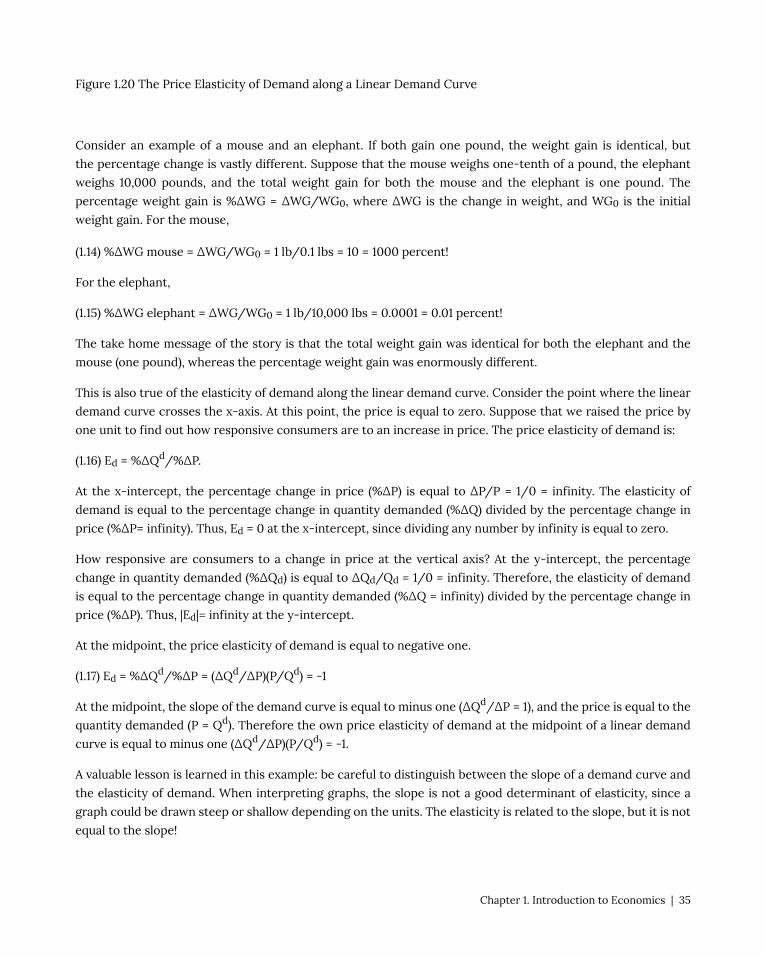
Figure 1.20 The Price Elasticity of Demand along a Linear Demand Curve
Consider an example of a mouse and an elephant. If both gain one pound, the weight gain is identical, but
the percentage change is vastly different. Suppose that the mouse weighs one-tenth of a pound, the elephant
weighs 10,000 pounds, and the total weight gain for both the mouse and the elephant is one pound. The
percentage weight gain is %ΔWG = ΔWG/WG0, where ΔWG is the change in weight, and WG0 is the initial
weight gain. For the mouse,
(1.14) %ΔWG mouse = ΔWG/WG0 = 1 lb/0.1 lbs = 10 = 1000 percent!
For the elephant,
(1.15) %ΔWG elephant = ΔWG/WG0 = 1 lb/10,000 lbs = 0.0001 = 0.01 percent!
The take home message of the story is that the total weight gain was identical for both the elephant and the
mouse (one pound), whereas the percentage weight gain was enormously different.
This is also true of the elasticity of demand along the linear demand curve. Consider the point where the linear
demand curve crosses the x-axis. At this point, the price is equal to zero. Suppose that we raised the price by
one unit to find out how responsive consumers are to an increase in price. The price elasticity of demand is:
(1.16) Ed = %ΔQd/%ΔP.
At the x-intercept, the percentage change in price (%ΔP) is equal to ΔP/P = 1/0 = infinity. The elasticity of
demand is equal to the percentage change in quantity demanded (%ΔQ) divided by the percentage change in
price (%ΔP= infinity). Thus, Ed = 0 at the x-intercept, since dividing any number by infinity is equal to zero.
How responsive are consumers to a change in price at the vertical axis? At the y-intercept, the percentage
change in quantity demanded (%ΔQd) is equal to ΔQd/Qd = 1/0 = infinity. Therefore, the elasticity of demand
is equal to the percentage change in quantity demanded (%ΔQ = infinity) divided by the percentage change in
price (%ΔP). Thus, |Ed|= infinity at the y-intercept.
At the midpoint, the price elasticity of demand is equal to negative one.
(1.17) Ed = %ΔQd/%ΔP = (ΔQd/ΔP)(P/Qd) = -1
At the midpoint, the slope of the demand curve is equal to minus one (ΔQd/ΔP = 1), and the price is equal to the
quantity demanded (P = Qd). Therefore the own price elasticity of demand at the midpoint of a linear demand
curve is equal to minus one (ΔQd/ΔP)(P/Qd) = -1.
A valuable lesson is learned in this example: be careful to distinguish between the slope of a demand curve and
the elasticity of demand. When interpreting graphs, the slope is not a good determinant of elasticity, since a
graph could be drawn steep or shallow depending on the units. The elasticity is related to the slope, but it is not
equal to the slope!
Chapter 1. Introduction to Economics | 35

1.4.9 Agricultural Policy Example of Elasticity of Demand
The impact of agricultural policies depends critically on the elasticity of demand. It was claimed earlier that
the price elasticity of demand is the most important thing that a business firm can know. This section provides
evidence of the importance of the price elasticity of demand. The own price elasticity of demand for food is
inelastic in a domestic economy with no trade. Everyone must eat, and the caloric intake will not be greatly
influenced by the price of food.
This changes enormously in a global economy. In an open economy that has international trade, there are many
overseas customers for food exports, and many competing nations that export food. For example, the US is
a major wheat exporter. Other wheat exporting nations include: Canada, Australia, Argentina, the European
Union (EU), and many of the former Soviet nations in Eastern Europe such as Ukraine. In this case, the US faces
a highly elastic demand for wheat in the global economy: if the US increased the price of wheat above the world
price, wheat importers would shift purchases from the US to other wheat exporters. A global economy changes
the effectiveness of price policies enormously.
Figure 1.21 Price Elasticity and Price Policies
Prior to 1972, the United States agricultural sector could be characterized as a domestic economy, with less food
36 | Andrew Barkley | The Economics of Food and Agricultural Markets

and agricultural trade. In this case, the demand for food was primarily domestic, and thus relatively inelastic
(Figure 1.21, left panel).
Starting in 1933, agricultural price supports increased the price of wheat above the market equilibrium level.
This policy worked well, as long as the surplus was eliminated. One way to eliminate the surplus was through
acreage restrictions, which limited the number of acres planted to wheat (ΔQ in the left panel of Figure 1.21).
Acreage limitations and production quotas were used to decrease the quantity of wheat in the market. These
policies worked well prior to 1972, since the US agricultural economy was primarily domestic, characterized
by an inelastic demand curve. The decrease in quantity led to a larger increase in price (ΔP > ΔQd), given the
inelastic demand in a domestic economy.
In 1972, major changes in international exchange rate policies, together with poor weather in Asia, led to the
globalization of US food and agricultural markets. A larger percentage of the US wheat crop was exported,
and the inelastic demand that prevailed prior to 1972 became more elastic in the globalized environment (right
panel, Figure 1.21). Although the wheat market became globalized, the policies did not. During the 1980s, the US
maintained price supports and production controls in the seven basic commodities (defined by the USDA as:
wheat, corn, sorghum, sugar, cotton, rice, and tobacco). These policies were counterproductive, as they priced
the grain out of the world market. The US attempted to increase the market share of wheat trade, only to find
that the US price was higher than the other major wheat exporters.
Figure 1.21 shows why the policies implemented in 1933 were hurting more than they were helping. Production
controls were decreasing the quantity of wheat. In the domestic economy (left panel of Figure 1.21, pre-1970),
this achieved the objectives of the policies: wheat producer were made better off, since the increase in price
was greater than the decrease in quantity. This all changed in the globalized world after 1972 (right panel of
Figure 1.21, post 1972). With an elastic demand, the decrease in quantity did not result in large price increases.
Price supports raised the US price above the world price of wheat. These policies were not working, and in
1996, they were changed to make the US grain industry more competitive in the global market. Today, a large
fraction of all grain produced in the US is exported.
In summary, policies intended to help producers have greatly divergent outcomes, depending on the price
elasticity of demand. In a domestic economy, the demand for food and agricultural products is typically
inelastic. In this case, production controls and price supports will achieve the policy goal of helping producers:
the price increases will be larger than the quantity decreases (left panel, Figure 1.21). In a global economy, the
demand for food and agricultural goods is elastic: there are many nations that export grains (right panel, Figure
1.21). In this case the policy that helps producers the most is technological change, which will shift the supply
curve to the right. With an elastic demand, the increase in quantity is larger than the decrease in price.
This is the same strategy that Walmart utilizes: everyday low prices. Sam Walton found that the increase in sales
due to low prices more than offset the decrease in price (ΔQd > ΔP). This is true in any market characterized
by an elastic demand. Since most consumer goods in the United States have many substitutes, Walton’s lower-
price strategy led to Walmart becoming the most successful retailer in the history of the world.
1.4.10 Calculation of Market Supply and Demand Elasticities
Chapter 1. Introduction to Economics | 37

In Section 1.3.4 above, inverse supply and demand curves were used to calculate the equilibrium price and
quantity of phones.
The inverse demand and supply functions were:
(1.18) P = 100 – 2Qd
(1.19) P = 20 + 2Qs
Where P is the price of phones in USD/unit, and Q is the quantity of phones in millions. By setting the two
equations equal to each other, the intersection of the inverse supply and demand curves was found, yielding
the equilibrium market price and quantity:
Pe = USD 60/phones, and
Qe = 20 million phones.
The graph of the phone market is replicated in Figure 1.22.
To calculate the own price elasticities of supply and demand, simple calculus provides an easy solution. Recall
the definition of the own price elasticity of demand:
(1.20) Ed = %ΔQd/%ΔP = (ΔQd/ΔP)(P/Qd) = (∂Qd/∂P)(P/Qd)
The delta sign (Δ) refers to a small change in a variable. This is the same as the derivative sign, “∂.” The difference
is that the derivative indicates in infinitesimally small change, whereas the delta sign is a discrete change, which
is the same idea, just larger. Therefore, the delta signs can be replaced with the derivative signs in the equation
that defines the price elasticity of demand. For example, the slope of a function is Δy/Δx. The slope of the
function at a given point on the function is ∂y/∂x.
The last expression in the equation shows that to calculate Ed, use the derivative of quantity with respect to
price, and the levels of P and Q. At the equilibrium point, the equilibrium levels of P and Q are known. To find
the derivative, begin by taking the derivative of the inverse demand equation (Equation 1.18).
(1.21) ∂P/∂Qd = – 2
38 | Andrew Barkley | The Economics of Food and Agricultural Markets

Figure 1.22 Phone Market Equilibirum
This is simply the power function rule from calculus [if y =axb, then ∂y/∂x = abx(b-1)]. Notice something
important: the derivative of the inverse demand equation is the inverse of what is needed to calculate the price
elasticity. This is due to the inverse demand function being, “price-dependent,” with P on the left hand side. To
find the derivative ∂Qd/∂P, invert the derivative by dividing one by the derivative.
(1.22) ∂Qd/∂P = – (1/2)
(1.23) Ed = %ΔQd/%ΔP = (ΔQd/ΔP)(P/Qd) = (∂Qd/∂P)(P/Qd) = (-1/2)(60/20) = -1.5
The absolute value of the own price elasticity of demand at the equilibrium point is:
| Ed| = 1.5. The demand for phones is elastic: if the price were increased one percent, the decrease in phone
purchases would be 1.5 percent.
The own price elasticity of supply can be found using the same procedure:
(1.24) Es = %ΔQs/%ΔP = (ΔQs/ΔP)(P/Qs) = (∂Qs/∂P)(P/Qs)
Chapter 1. Introduction to Economics | 39

First, take the derivative of the inverse supply function (equation 1.19).
(1.25) ∂P/∂Qs = + 2
Invert this derivative to find the derivative needed to calculate the price elasticity of supply:
(1.26) ∂Qs/∂P = + (1/2).
Then plug in the ingredients of the own price elasticity of supply:
(1.27) Es = %ΔQs/%ΔP = (ΔQs/ΔP)(P/Qs) = (∂Qs/∂P)(P/Qs) = (1/2)(60/20) = 1.5
The price elasticity of supply is also elastic: a one percent increase in price results in a 1.5 percent increase in
the quantity supplied of phones.
Two points are worth mentioning here. First, the price elasticities of supply and demand are not always
symmetrical, as they are in this case (-1.5 and +1.5). The elasticities depend on the shape of the inverse supply
and demand functions. The symmetry of the functions used here can be seen in Figure 1.22. When the inverse
supply and demand functions are not symmetrical, the absolute values of the elasticities will be of different
magnitudes. The second important point concerns the use of inverse supply and demand functions. The
inverse functions are used to align with the “backwards” nature of the supply and demand graphs: price is
the independent variable, but appears on the vertical axis. To find the derivative needed to calculate the price
elasticities, the procedure above first took the derivative of the inverse function, then inverted it to achieve
∂Q/∂P. This derivative could also be found be first, inverting the inverse function to get the quantity isolated
on the left hand side, then taking the derivative. This alternative procedure will result in the same elasticity
calculation as the one used above. To test your knowledge, try this procedure to double check your answers!
1.5 Welfare Economics: Consumer and Producer Surplus
1.5.1 Introduction to Welfare Economics
Welfare economics is concerned with how well off individuals and groups are. Welfare economics is not about
government programs to assist the needy… that is a different type of welfare. In economics, welfare economics
is used to see how the welfare, or well-being of individuals and groups changes with a change in policies,
programs, or current events.
Welfare Economics = The study and calculation of gains and losses to market participants from
changes in market conditions and economic policies.
1.5.2 Consumer Surplus and Producer Surplus
40 | Andrew Barkley | The Economics of Food and Agricultural Markets

The two most important groups that are studied in welfare economics are producers and consumers. The
concepts of Consumer Surplus (CS) and Producer Surplus (PS) are used to measure the wellbeing of
consumers and producers, respectively.
Consumer Surplus (CS) = A measure of how well off consumers are. Willingness to pay minus the price
actually paid.
Producer Surplus (PS) = A measure of how well off producers are. Price received minus the cost of
production.
The intuition of consumer surplus provides a good method of learning the concept. Suppose that I am on my
way to the store to purchase a hammer, and I think to myself, “I am willing to pay six dollars for the hammer.”
When I arrive at the store, I find that the price of the hammer is four dollars. My consumer surplus is equal to
two dollars: the willingness to pay minus the actual price paid. In this manner, we can add up all consumers
in the market to measure consumer surplus for all consumers. This can be seen in Figure 1.23. If each point on
the demand curve is considered an individual consumer, then CS is the difference between each point on the
demand curve and the price line. The demand curve represents the consumers’ willingness and ability to pay
for a good. The CS area is a triangle, and equal to the level of consumer surplus in the market (Figure 1.23).
Similarly, the intuition of producer surplus is a good place to start. If a wheat producer can produce a bushel
of wheat for four dollars, and she receives six dollars per bushel when she sells her wheat, then her level of
producer surplus is equal to two dollars. Producer surplus is the price received minus the cost of production.
In Figure 1.23, this is the difference between the price line and the supply curve. The market supply curve was
derived by summing all individual firms’ marginal cost curves. Therefore, the supply curve represents the cost
of production. The PS area is the area identified in Figure 1.23.
Chapter 1. Introduction to Economics | 41
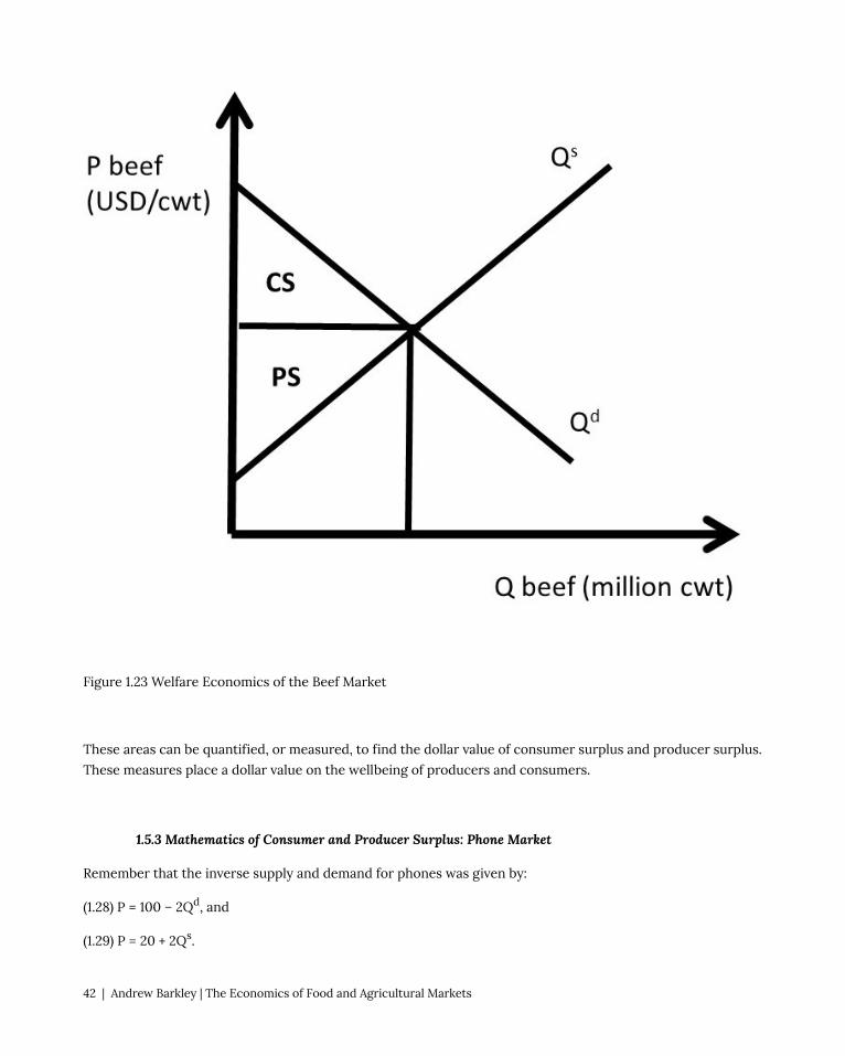
Figure 1.23 Welfare Economics of the Beef Market
These areas can be quantified, or measured, to find the dollar value of consumer surplus and producer surplus.
These measures place a dollar value on the wellbeing of producers and consumers.
1.5.3 Mathematics of Consumer and Producer Surplus: Phone Market
Remember that the inverse supply and demand for phones was given by:
(1.28) P = 100 – 2Qd, and
(1.29) P = 20 + 2Qs.
42 | Andrew Barkley | The Economics of Food and Agricultural Markets

Where P is the price of phones in dollars/unit, and Q is the quantity of phones in millions. The equilibrium price
and quantity of phones were calculated above in section 1.4.10:
Pe = USD 60/phone
Qe = 20 million phones.
These values, together with the supply and demand functions, allow us to measure the well-being of both
consumers and producers. From geometry, the area of a triangle is one half base times height. To calculate CS
and PS, multiply the base of the triangle times the height of the triangle in Figure 1.24, then multiply by one half,
or 0.5 (Equations 1.30 and 1.31).
(1.30) CS = 0.5(100 – 60)(20) = 0.5(40)(20) = 400 million USD
(1.31) PS = 0.5(60 – 20)(20) = 0.5(40)(20) = 400 million USD
We will use the concepts of consumer surplus and producer surplus extensively in what follows, where we will
explore the consequences of policies, international trade, and immigration in food and agriculture.
Chapter 1. Introduction to Economics | 43

Figure 1.24 Consumer and Producer Surplus Calculations in the Phone Market
The units for both CS and PS are in terms of dollars (USD). These measures capture how well off consumers
and producers are in dollars, or the dollar value of their happiness, or well-being. The units are price units
multiplied by quantity units, or (USD/phone)*(million phones). Notice that the phone units are in both the
numerator and denominator, so they are cancelled, leaving million dollars.
1.6 The Motivation for and Consequences of Free Trade
1.6.1 The Motivation for Free Trade and Globalization
Globalization and free trade result in enormous economic benefits to nations that trade. These benefits have
led to high incomes in many nations throughout the world, particularly since 1950. As with all national policies,
there are benefits and costs to international trade: there are winners and losers to globalization. When trade is
voluntary, the gains are mutually beneficial, and the overall benefits are greater than the costs. There is a strong
motivation to trade, and the nations of the world continue to become more globalized over time.
A nation’s consumption possibilities are vastly increased with trade. In nations North of the equator such as
the USA, Japan, EU, and China, fresh fruit and vegetables can be purchased during the winter from nations in
the Southern hemisphere. In the United States, tropical products including coffee, sugar, bananas, cocoa, and
pineapple are imported, since the costs of producing these goods are much lower in tropical climates than in
the USA.
The principle of comparative advantage provides large benefits to individuals, nations, and firms that specialize
in what they do best, and trade for other goods. This process greatly expands the consumption possibilities of
all nations, due to efficiency gains that arise from specialization and gains from trade. For example, if Canada
specializes in wheat production, and Costa Rica produces bananas, both nations could be better off through
specialization and trade.
A nation that does not trade with other nations is called a closed economy.
Closed Economy = A nation that does not trade. All goods and services consumed must be produced
within the nation. There are no imports or exports.
Open Economy = A nation that allows trade. Imports and exports exist.
If a nation does not trade, then consumers in the closed economy must only consume what it produces. In
this case, quantity supplied must equal quantity demanded (Qs = Qd). Trade allows this equality to be broken,
providing the opportunity for imports (Qs < Qd) or exports (Qs > Qd). The concepts of Excess Supply and Excess
44 | Andrew Barkley | The Economics of Food and Agricultural Markets

Demand will be introduced in the next section to aid in understanding the motivation and consequences of free
trade.
1.6.2 Excess Supply and Excess Demand
We will use wheat as an example to see how and why trade occurs. We will investigate wheat trade between the
USA and Japan. Japan is one of the largest international buyers of wheat from the United States. The USA is a
wheat exporter. The left panel of Figure 1.25 show the USA wheat market. Define Pe to be the price of wheat in
the exporting nation. At price Pe, domestic consumption (Qd) is equal to domestic production (Qs).
Figure 1.25 The Excess Supply of Wheat
Excess supply is defined to be the quantity of exportable surplus, or Qs – Qd. At prices higher than Pe, the
quantity supplied becomes greater than the quantity demanded, and excess supply exists.
Excess Supply (ES) = Quantity supplied minus quantity demanded at a given price, Qs – Qd.
At prices higher than Pe, wheat producers increase the quantity supplied along the supply curve Qs due to the
Chapter 1. Introduction to Economics | 45

Law of Supply. Wheat consumers decrease purchases of wheat along the demand curve Qd, due to the Law
of Demand. The result is a surplus, or excess supply, at the higher price. If excess supply existed in a closed
economy, market forces would come into play to bring the higher price back down to the market equilibrium
level, Pe. In an open economy, however, it is possible to maintain the high market price through exports. In
the right-hand panel of Figure 1.25, the ES function represents excess supply, equal to the horizontal distance
between Qs and Qd in the left-hand panel. Note that ES = 0 at Pe, and becomes larger as the price of wheat
increases.
Free trade allows the USA to use its resource to produce more wheat than it consumes, and export what is
left over to enhance what producer revenues. Trade also provides the opportunity to buy imported goods from
other nations.
Figure 1.26 The Excess Demand of Wheat
Define Pi to be the price of wheat in the importing nation (Japan in this case). An importing nation such as Japan
is characterized by a price lower than the domestic market equilibrium price (Pi), where Qs = Qd (Figure 1.26). In
an importing nation, quantity demanded is greater than quantity supplied (Qs < Qd), and the price is lower than
the market equilibrium price. If the price is lower than Pi in Figure 1.26, consumers increase purchases of the
good due to the Law of Demand, and producers decrease production of the good, following the Law of Supply.
This results in an Excess Demand for the good.
46 | Andrew Barkley | The Economics of Food and Agricultural Markets

Excess Demand (ED) = Quantity demanded minus quantity supplied at a given price, Qd – Qs.
Note that any shift in either supply or demand of wheat in the importing nation will shift the ED curve.
Domestic events in the markets for traded goods have international consequences. What happens in China
has a large impact on USA wheat producers. Next, the exporting and importing nations will be linked through
international trade.
The ED curve shown in the right-hand panel of Figure 1.26 represents excess demand, equal to the horizontal
distance between Qd and Qs in the left-hand panel. Note that ED = 0 at Pi, and becomes larger as the price of
wheat decreases.
1.6.3 Three Panel Diagram of Trade between Two Nations
Now consider the wheat exporting nation (USA) and wheat importing nation (Japan) in the same diagram, Figure
1.27. The wheat market in the exporting nation is shown in the left panel, and the wheat market in the importing
nation is shown in the right panel (Figure 1.27). The trade sector is in the middle panel. Excess demand (ED)
is downward sloping, and is derived from the domestic supply (Qsi) and demand (Qd
i) in the importing nation,
Japan in this case. Excess Supply (ES) is upward sloping, derived from the supply (Qse) and demand (Qd
e) curves
in the exporting nation, the USA. In reality, the right panel is composed of many nations: all countries that
import wheat. For simplicity, the model here is for one importing nation and one exporting nation. As price
(Pi) decreases in Japan, quantity demanded (Qdi) increases and quantity supplied (Qs
i) decreases, causing ED to
have a negative slope. Similarly, price (Pe) increases in the exporting nation (USA) result in a higher quantity
supplied of wheat (Qse) and a lower quantity demanded (Qd
e). Equilibrium in the global wheat market is found
in the center panel at the point where ED = ES.
The quantity of wheat traded (QT) is equal to ED at the world price (Pw), which is also equal to ES at the world
price. Note that it must be true that ED=ES: any imported goods in one nation must be exported by the other
nation. Therefore, QT = ED = ES = (Qdi – Qs
i) = (Qse – Qd
e).
In a multi-nation model, this equilibrium would occur when the sum of all wheat supplied from all exporting
nations (= ΣES = Qse – Qd
e) is equal to the sum of all wheat demanded from all importing nations (= ΣED = Qdi
-Qsi). The equilibrium quantity traded (QT) is equal to the quantity of wheat imported by Japan (EDi) and the
quantity of wheat exported by the USA (ESe) since exports must equal imports (QT = exports = imports). This
equilibrium in the world market determines the world price (Pw), which is the price of wheat for all trading
partners, Japan and the USA in this model.
Chapter 1. Introduction to Economics | 47

Figure 1.27 International Trade in Wheat: USA and Japan
The three-panel diagram demonstrates two important characteristics about free trade. First, the motivation for
trade is simple: “buy low and sell high.” If a price difference exists between two locations, arbitrage provides
profit opportunities for traders. A firm (or nation) that buys wheat at a lower price in the USA and sells the
wheat at a higher price in Japan can earn profits. Note that this simple model ignores transportation costs and
exchange rates. Second, anything that affects the supply or demand of wheat in either trading nation affects
the global price and quantity of wheat. Therefore, all consumers and producers of a good are interconnected:
the welfare of all wheat producers and consumers is affected by weather, growing conditions, food trends, and
all other supply and demand determinants in all trading nations.
This point is enormously important in a globalized economy: the well-being of all producers and consumers
depends on people, politicians, and current events all over the globe. The three-panel diagram is useful in
understanding the determinants of food and agricultural exports: all supply and demand shifters in all wheat
exporting and importing nations.
48 | Andrew Barkley | The Economics of Food and Agricultural Markets

Chapter 2. Welfare Analysis of Government Policies
2.1 Price Ceiling
In some circumstances, the government believes that the free market equilibrium price is too high. If there is
political pressure to act, a government can impose a maximum price, or price ceiling, on a market.
Price Ceiling = A maximum price policy to help consumers.
A price ceiling is imposed to provide relief to consumers from high prices. In food and agriculture, these policies
are most often used in low-income nations, where political power is concentrated in urban consumers. If food
prices increase, there can be demonstrations and riots to put pressure on the government to impose price
ceilings. In the United States, price ceilings were imposed on meat products in the 1970s under President
Richard M. Nixon. Price ceilings were also used for natural gas during this period of high inflation. It was
believed that the cost of living had increased beyond the ability of family earnings to pay for necessities, and
the market interventions were used to make beef, other meat, and natural gas more affordable.
Price ceilings are often imposed on housing prices in US urban areas. Rent control has been a longtime feature
in New York City, where rent-controlled apartments continue to have low rental rates relative to the free
market rate. The boom in the software industry has increased housing prices and rental rates enormously in the
San Francisco Bay Area, Seattle, and the Puget Sound region. Rent control is being considered in both places to
make San Francisco and Seattle more affordable for middle-class workers.
2.1.1 Welfare Analysis
Welfare analysis can be used to evaluate the impacts of a price ceiling. In what follows, we will compare a
baseline free market scenario to a policy scenario, and compare the benefits and costs of the policy relative to
the baseline of free markets and competition. Consider the price ceilings imposed on the natural gas markets.
The purpose, or objective, of this policy was to help consumers. We will see that the policy does help some consumers, but makes other consumers worse off. The policy also hurts producers.
This unanticipated outcome is worth restating: price ceilings help some consumers, but hurt other consumers.
All producers are made worse off. This outcome is not the intent of policy makers. Economists play an
important role in the analysis and communication of policy outcomes to policy makers.
The baseline scenario for all policy analysis is free markets. Figure 2.1 shows the free market equilibrium for the
natural gas market. The quantity of natural gas is in trillion cubic feet (tcf) and the price of natural gas in in
dollars per million cubic feet (USD/mcf).
Chapter 2. Welfare Analysis of Government Policies | 49

Social welfare is maximized by free markets, because the size of the welfare area CS + PS is largest under the
free market scenario. As we will see, any government intervention into a market will necessarily reduce the total
level of surplus available to consumers and producers. All price and quantity policies will help some individuals
and groups, hurt others, and have a net loss to society. Policy makers typically ignore or downplay individuals
and groups who are negatively affected by a proposed policy. The two triangles CS and PS are as large as
possible in Figure 2.1.
Figure 2.1 Natural Gas Market Baseline Scenario: Free Markets
The price ceiling policy is evaluated in Figure 2.2, where P’ is the price ceiling. Here, the government has passed
a law that does not allow natural gas to be bought or sold at any price higher than P’ (P’ < P). For a price ceiling
to have an impact, it must be “binding.” This occurs only when the price ceiling is set below the market price (P’
< P). If the price ceiling were set above P (P’ > P), it would have no effect, since the good is bought and sold at
the market price, which is below the price ceiling, and legally permissible. Such a law would not be binding on
market transactions.
50 | Andrew Barkley | The Economics of Food and Agricultural Markets

If the price ceiling is set at P’, then the new equilibrium quantity under the price ceiling (Q’) is found at the
minimum of quantity demanded (Qd) and quantity supplied (Qs), as in Equation 2.1.
(2.1) Q’ = min(Qs, Qd)
This condition states that the quantity at any nonequilibrium price (P) will be the smallest of production or
consumption. At the low price P’, producers decrease quantity supplied, and consumers increase quantity
demanded, resulting in Q’ = Qs (Figure 2.2). This is the maximum amount of natural gas placed on the market,
although consumers desire a much larger amount.
The first step in the welfare analysis is to assign letters to each area in the price ceiling graph. Next, the letters
corresponding to the baseline free market scenario are recorded (initial, or baseline, values have a subscript 0),
followed by the surpluses under the price ceiling (ending values have a subscript 1). Finally, the change from free
markets to the price policy are calculated to conclude the qualitative analysis of a price ceiling. If the supply
and demand curves have numbers (actual data) associated with them, a numerical analysis can be conducted.
The initial, baseline, free market values in the natural gas market at market equilibrium price P are:
CS0 = A + B, and
PS0 = C + D + E.
Social welfare is defined as the total amount of surplus available in the market, CS + PS:
SW0 = A + B + C + D + E.
After the price ceiling is put in place, the price is P’, and the quantity is Q’. New surplus values are found in the
same way as under free markets. Consumer surplus is the willingness to pay minus price actually paid, or the
area beneath the demand curve and above the price line at the new price P’: (A + C). Producer surplus is the
price received minus the cost of production, or the area above the supply curve and below the price line (E):
CS1 = A + C,
PS1= E, and
SW1 = A + C + E.
Recall that social welfare (SW) is equal to the sum of all surpluses available in the market: SW = CS + PS. The
welfare analysis outcomes are found by calculating the changes in surplus:
ΔCS = CS1 – CS0 = + C – B
ΔPS = PS1 – PS0 = – C – D
ΔSW = SW1 – SW0 = – B – D
The results are fascinating, since the sign of the change in consumer surplus is ambiguous: the sign of ΔCS
depends on the relative magnitude of areas C and B. If demand is elastic, and supply is inelastic, the price ceiling
is more likely to yield a positive change in consumer surplus (C > B). The policy makes some consumers better
Chapter 2. Welfare Analysis of Government Policies | 51

off, and some consumers worse off. The consumers located on the demand curve between the origin (0, 0) and
Q’ are made better off by area C, as they purchase natural gas at a lower price (P’ < P). Consumers located on the
demand curve between Q’ and Q have a lower willingness to pay than consumers located between the origin
and Q’, and are made worse off by the price ceiling (-B) since they are unable to purchase natural gas at the
lower price ceiling (P’ <P). The price ceiling created a shortage of natural gas, as natural gas producers reduce
the quantity supplied in reaction to the legislated lower price. The decrease in quantity supplied of natural gas
makes these consumers unable to buy the good.
Natural gas producers are made unambiguously worse off by the price ceiling: both the price (P) and the
quantity (Q) are decreased (P’ < P; Q’ < Q), and the change in producer surplus due to the policy is
unambiguously negative (– C – D)
The term deadweight loss (DWL) is used to designate the loss in surplus to the market from government
intervention, in this case a price ceiling. Deadweight loss is found by reversing the negative sign on the change
in social welfare (–ΔSW):
DWL = –ΔSW = B + D.
The deadweight loss area BD is called the welfare triangle, and is typical for market interventions. Interestingly,
and perhaps unexpectedly, all government interventions have deadweight loss to society. Free markets are
voluntary, with no coercion. Any price or quantity restriction will necessarily reduce the surplus available to
producers and/or consumers in a market.
In current debates over rent control in congested urban areas, economists continue to point out the potential
impact of rent control policies: a reduction in affordable housing. These policies are often put in place in spite
of economic views, with mixed results. Renters who can find a rent-controlled property win, but many renters
are unable to find housing, and must relocated outside the urban center and commute to work from a distant
home.
52 | Andrew Barkley | The Economics of Food and Agricultural Markets

Figure 2.2 A Price Ceiling in the Natural Gas Market
As indicated above, price ceilings on food and agricultural products are most often used in low-income nations,
such as in Asia and Sub-Saharan Africa. Price supports for food and agricultural products are most often used
in high-income nations such as the US, European Union (EU), Japan, Australia, and Canada.
2.1.2 Quantitative Analysis
In this example, that beef consumers lobby the government to pass a price ceiling on beef products. This
happened in the USA in the 1970s, during a period of high inflation. Beef consumers believe that prices are
too high and democratically elected officials give their constituents what they want. Suppose that the inverse
supply and demand for beef are given by:
Chapter 2. Welfare Analysis of Government Policies | 53

(2.1) P = 20 – 2Qd, and
(2.2) P = 4 + 2Qs.
Where P is the price of beef in USD/lb, and Q is the quantity of beef in million lbs. The equilibrium price and
quantity of beef can be calculated by setting the inverse supply and demand equations equal to each other to
achieve:
Pe = USD 12/lb beef, and
Qe = 4 million lbs beef.
These values, together with the supply and demand functions, allow us to measure the well-being of both
consumers and producers before and after the price ceiling policy is implemented (Figure 2.3).
54 | Andrew Barkley | The Economics of Food and Agricultural Markets

Figure 2.3 A Quantitative Price Ceiling in the Beef Market
The free-market equilibrium levels of CS and PS are designated with the subscript 0, calculated in equations 2.3
and 2.4.
(2.3) CS0 = A + B = 0.5(20 – 12)(4) = 0.5(8)(4) = USD 16 million
(2.4) PS0 = C + D + E = 0.5(12 – 4)(4) = 0.5(8)(4) = USD 16 million
The level of social welfare is the sum of all surplus in the market, as in equation 2.5.
(2.5) SW0 = A + B + C + D + E = 0.5(20 – 4)(4) = 0.5(16)(4) = USD 32 million
Assume that the price ceiling is set by the Government at P’ = 10 USD/lb beef. The quantity is found by finding
the minimum of quantity supplied and quantity demanded. In the case of a binding price ceiling (P’ < P), the
quantity supplied will be the relevant quantity, since producers will produce only Q’ lbs of beef. Consumers will
desire to purchase a much larger amount at P’ < P, but are unable to at the lower price P’, since production falls
from Q to Q’. The quantity of Q’ is found by substituting the new price into the inverse supply equation.
(2.6) P = 4 + 2Qs = 10 = 4 + 2Qs therefore, Q’ = 3
The price ceiling (P’) and reduced quantity (Q’) can be seen in Figure 2.3. Next, the levels of CS, PS, and SW are
calculated at the price ceiling level. To find the surplus level of area A, split the shape into one triangle and one
rectangle by substitution of Q’ = 3 into the inverse demand curve to get P = 14. Area A is equal to: 0.5(20 – 14)3 +
(14 – 12)3 = 9 + 6 = 15 million USD. We are now ready to calculate the level of surplus for the price ceiling.
(2.7) CS1 = A + C = 15 + (12 – 10)(3) = 15 + 6 = USD 21 million
(2.8) PS1 = E = 0.5(10 – 4)(3) = 0.5(6)(3) = USD 9 million
(2.9) SW1 = A + C + E = 21 + 9 = USD 30 million
The changes in welfare due to the price ceiling are:
(2.10) ΔCS = CS1 – CS0 = + C – B = 21 – 16 = USD + 5 million
(2.11) ΔPS = PS1 – PS0 = – C – D = 9 – 16 = USD – 7 million
(2.12) ΔSW = SW1 – SW0 = – B – D = 30 – 32 = USD – 2 million
The Dead Weight Loss (DWL) of the price ceiling is the loss to social welfare, of the negative of the change in
social welfare:
(2.13) DWL = – ΔSW = 2 USD million.
The quantitative analysis of a price ceiling provides timely, important, and interesting results. First, only a
subset of consumers are made better off due to a price ceiling. These consumers win because they pay a lower
price for the good under the price ceiling than in the free market (P’ < P). Second, some consumers are made
Chapter 2. Welfare Analysis of Government Policies | 55

worse off due to the price ceiling, since the quantity of the good available is reduced (Q’ < Q). This is because
producers reduce the quantity supplied if the price is lowered (the Law of Supply). Third, all producers of the
good are made unambiguously worse off due to the price ceiling, since both price and quantity are reduced (P’
< P; Q’ < Q).
The magnitude of the consumer gains and losses are determined by the elasticities of supply and demand.
Elastic demand and inelastic supply provide larger consumer benefits, since area B in Figure 2.3 is relatively
small under these conditions. If demand is inelastic and supply is elastic, consumers are less likely to gain from
the price ceiling, as area C in Figure 2.3 is relatively small in this case.
2.2 Price Support
This section continues the welfare analysis of price policies by investigating the welfare analysis of a price support, also called a minimum price. Price supports are intended to help producers. The outcome of the
welfare analysis demonstrates that price supports can increase producer surplus, but in many cases at a large
cost to the rest of society. Figure 2.4 shows the impact of a price support in the wheat market. This policy is
more likely to be enacted in a high-income nation where agricultural producers are a small group that can be
more easily subsidized by a large economy.
Price Support = A minimum price policy enacted to help producers.
56 | Andrew Barkley | The Economics of Food and Agricultural Markets

Figure 2.4 Case One: Price Support in Wheat Market, No Surplus
The price support mandates that all wheat be bought or sold at a minimum price of P’. If the price support were
set at a level lower than the market equilibrium price (P’ < P), it would have no effect (it would not be “binding”).
The quantity of wheat on the market depends on how the policy works. There are three possibilities for how
the price support is implemented: (1) no surplus exists, (2) the surplus exists, and (3) the government purchases
the surplus. Each case will be described in detail in what follows.
2.2.1 Case One: Price Support with No Surplus
The first case is the simplest, but least realistic. In Case One, we assume that producers correctly forecast
the quantity demanded, and produce only enough to meet demand. No surplus exists. In Figure 2.4, the price
support is set by the government at P’. It is assumed in this case that producers forego increasing quantity
Chapter 2. Welfare Analysis of Government Policies | 57

supplied along the supply curve to price P’, and instead produce only enough wheat to meet consumer needs,
Q’:
Q’ = min(Qs, Qd).
In Case One, no surplus exists. The producers produce and sell only enough wheat to meet the low level of
quantity demanded, Q’. The initial, free market surplus levels are:
CS0 = A + B + C
PS0= D + E
SW0 = A + B + C + D + E
After the price support is put in place, the new levels of surplus are;
CS1 = A,
PS1= B + D, and
SW1 = A + B + D.
Changes in surplus from free markets to the price support with no surplus are:
ΔCS = – B – C,
ΔPS = + B – E,
ΔSW = – C – E, and
DWL = – ΔSW = C + E.
Consumers are unambiguously worse off: price is higher (P’ > P) and quantity is lower (Q’ < Q), relative to the
free market case. Producers may or may not be better off, depending on the relative size of areas B and E. If
demand is inelastic and supply is elastic, it is more likely that producer surplus is higher with the price support
(B > E). This reflects the analysis of price support in the previous chapter. The producers with low production
costs, located on the supply curve between the origin (0, 0) and Q’, are made better off since they receive a
higher price for the wheat that they produce (P’ > P). The high-cost producers, located on the supply curve
between Q’ and Q, are made worse off, since they no longer produce wheat.
The deadweight loss (DWL) equals welfare triangle CE. The price support helps producers, if demand is
sufficiently inelastic, but at the expense of the rest of society. In high-income nations such as the US, this policy
transfers surplus from the average consumer to producers. Wheat producers have higher levels of income and
wealth than the average consumers, so the policy represents a transfer of income to individuals who are better
off than the consumers.
2.2.2 Case Two: Price Support When Surplus Exists
58 | Andrew Barkley | The Economics of Food and Agricultural Markets

Case Two is more realistic than Case One. In Case Two, wheat producers increase quantity supplied to Q’’,
found at the intersection of P’ and the supply curve. This is shown in Figure 2.5. At the price support level P’,
consumers purchase only Q’, so a surplus exists equal to Q’’ – Q’.
Surplus = Quantity supplied minus quantity demanded = Qs – Qd.
Note that this surplus of quantity shared the same world as consumer surplus and producer surplus, but refers
to an excess quantity instead of an excess value. The initial values of surplus at free market levels are:
CS0 = A + B + C,
PS0= D + E, and
SW0 = A + B + C + D + E.
After the price support is put in place, the new levels of surplus reflect the large costs of producing the surplus,
with no buyers at the high price (P’ > P). The cost of producing the surplus is the area under the supply curve,
between Q’ and Q’’: GHI. The area GHI is the cost of producing the surplus, Q’’ – Q’, because it is the area under
the supply curve. The surplus levels with the price support, assuming that the surplus exists are:
CS1 = A,
PS1= B + D – G – H – I, and
SW1 = A + B + D – G – H – I.
Changes in surplus from free markets to the price support with the surplus are:
ΔCS = – B – C,
ΔPS = + B – E – G – H – I,
ΔSW = – C – E – G – H – I, and
DWL = – ΔSW = C + E + G + H + I.
The impact on consumers remains the same as in Case One, but the impact on producers is much costlier. The
surplus is costly to produce, and does not have a buyer. If this policy were to be implemented, the government
would have to do something with the surplus of wheat created by the policy, or market forces would put
pressure on the wheat market to return to equilibrium.
If the surplus remained, market forces would put downward pressure on the price of what making the price
support more difficult and more expensive to maintain. This leads to Case Three, where the government
purchases the surplus grain and removes it from the market, described in the next section.
Chapter 2. Welfare Analysis of Government Policies | 59

Figure 2.5 Case Two: Price Support in Wheat Market, Surplus Exists
2.2.3 Case Three: Price Support When Government Purchases Surplus
The surplus created by a price support is costly to producers, and if nothing is done to eliminate the surplus,
the policy does not achieve the objective of helping producers. There are three methods for the government to
eliminate the surplus:
(1) Destroy the surplus,
(2) Give the surplus away domestically, or
60 | Andrew Barkley | The Economics of Food and Agricultural Markets

(3) Give the surplus away internationally.
In all three cases, the government purchases the surplus at the price support level. This is the only way to
maintain the price support. Without government purchases, the surplus would result in market forces that put
downward pressure on the price of wheat. Destroying the surplus is not politically popular, since it involves
eliminating food when there are hungry people in the world. The US did this in earlier decades by dumping
surplus grain in the ocean, killing baby pigs, and dumping milk on the ground. This was not popular with
consumers, producers, or politicians. The practice of destroying food to maintain higher food prices is not used
today.
Domestic food programs make more sense as a method for eliminating the surplus. School breakfast and
school lunch programs make use of the food surpluses by assisting those in need. Food aid is using the surplus
food from the USA to alleviate hunger in other nations. Food aid and other forms of international assistance
are popular programs that help the US producers and the recipient nation’s consumers. Food aid can be
controversial, since it lowers food prices in receiving nations, and can cause “dependency” of the recipient on
the donor nation.
Food aid results in lower prices, which cause a decrease in the quantity of food supplied in the recipient nation.
Although food aid may alleviate hunger and/or starvation, it decreases the incentives for a nation to produce
food. This is a true paradox, making food and agricultural policy a challenge for policy makers: there are winner
and losers that result from all public policies.
Case Three is shown in Figure 2.6, where the government purchases the surplus (Q’’ – Q’).
As in the two previous cases, the initial values of surplus at free market levels are:
CS0 = A + B + C,
PS0= D + E,
G0 = 0, and
SW0 = A + B + C + D + E.
Note that the government (G) is included in this case of the price support. After the price support is put in place,
the new levels of surplus reflect the large costs of the government buying the surplus. The cost of producing
the surplus (Q’’ – Q’) at the price support level equals P’ multiplied by (Q’’ – Q’), which is equal to area CEFGHI
(Figure 2.6), the cost of producing the surplus. The surplus levels with the price support, assuming that the
surplus exists are:
CS1 = A,
PS1= B + C + D + E + F,
G1 = – C – E – F – G – H – I, and
SW1 = A + B + D – G – H – I.
Chapter 2. Welfare Analysis of Government Policies | 61

Changes in surplus from free markets to the price support with the surplus are:
ΔCS = – B – C,
ΔPS = + B + C + F,
ΔG = – C – E – F – G – H – I,
ΔSW = – C – E – G – H – I, and
DWL = – ΔSW = C + E + G + H + I.
Figure 2.6 Case Three: Price Support in Wheat Market, Government Purchases Surplus
62 | Andrew Barkley | The Economics of Food and Agricultural Markets

The total societal surplus changes are identical in Cases Two and Three: DWL = CEGHI in both cases. The
distribution of benefits is quite different, however. In Case Two, the producers bear the large costs of
overproduction: -GHI. In Case Two, the government has attempted to help producers, but has decreased
producer surplus due to the unintended consequence of wheat growers producing too much food at the high
level of the price support. If the government does purchase the surplus as in Case 3, these high costs are shifted
to taxpayers, and producers are helped by the price support program.
The price support does meet the objective of helping producers in Case 3, but at a high cost to society. As in the
case of the price ceiling, the price support results in losses to society (DWL > 0). This is true of all government
interventions into the market. The maximum level of surplus occurs with free markets and free trade. In food
and agriculture, there are numerous cases of government intervention into markets, reflecting objectives other
than maximizing social welfare.
In some circumstances, policy makers determine that the distributional consequences of a policy are more
important than maximizing social welfare. In these cases, who gets what determines policy outcomes, rather
than the overall efficiency of the market.
2.2.4 Quantitative Analysis of a Price Support
In this example, wheat producers are successful in their efforts to convince Congress to pass a law that
authorizes a price support for wheat. Suppose that the inverse supply and demand for wheat are given by:
(2.1) P = 10 – Qd, and
(2.2) P = 2 + Qs.
Where P is the price of wheat in USD/MT, and Q is the quantity of wheat in million metric tons (MMT).
The equilibrium price (Pe) and quantity of wheat (Qe)are calculated by setting the inverse supply and demand
equations equal to each other to achieve:
Pe = USD 6/MT wheat, and
Qe = 4 MMT wheat.
These values, together with the supply and demand functions, allow us to measure the changes in surpluses for
both consumers and producers due to the price support (Figure 2.7).
Chapter 2. Welfare Analysis of Government Policies | 63

Figure 2.7 Case One: Quantitative Price Support in Wheat Market, No Surplus
The calculations will proceed by directly determining the changes in surplus, rather than calculating the initial
and ending values of surplus, as we did above for the price ceiling. To find the dollar values of the areas in
Figure 2.7, recall that you can always find a price or quantity by substitution of a P or Q into the inverse supply
or inverse demand curve. There is always enough information provided to find prices, quantities, and the areas
that represent surplus values.
Assume that the price support is set at P’ = 8 USD/MT wheat. The quantity is found by the minimum of
quantity demanded (Qd) and quantity supplied (Qs): min(Qs, Qd). Therefore, the quantity is Q’ = Qd, the quantity
demanded. Surplus changes are:
ΔCS = – B – C = – 4 – 2 = – 6 USD million
64 | Andrew Barkley | The Economics of Food and Agricultural Markets

ΔPS = + B – E = + 4 – 2 = + 2 USD million
ΔG = 0
ΔSW = – C – E = – 2 – 2 = – 4 USD million
DWL = – ΔSW = C + E = + 4 USD million
The government does nothing in Case One, and wheat producers supply only enough wheat to the market to
meet consumer demand. Case Two is shown in Figure 2.8. In Case Two, producers produce a large amount of
wheat (Q’’) due to the high price P’. There is a large surplus created, but in this case there is no intervention
by the government. Wheat producers have very large costs, since they produce 6 million metric tons (Q’’), and
consumers only purchase 2 million metric tons (Q’, Figure 2.8).
Figure 2.8 Case Two: Quantitative Price Support in Wheat Market, Surplus Exists
Chapter 2. Welfare Analysis of Government Policies | 65

ΔCS = – B – C = – 4 – 2 = – 6 USD million
ΔPS = + B – E – G – H – I = + 4 – 26 = – 22 USD million
ΔG = 0
ΔSW = – C – E – G – H – I = – 28 USD million
DWL = – ΔSW = C + E + G + H + I = + 28 USD million
In Case Three, the government intervenes and buys the surplus. This allows the price to stay at the price
support level, P’. Quantity supplied and quantity demanded are at the same levels as in Case Two, but the
government’s expenses are large, and wheat producers benefit from the high price (P’ > Pe) and larger quantity
sold (Q’’ > Qe, Figure 2.9).
66 | Andrew Barkley | The Economics of Food and Agricultural Markets

Figure 2.9 Case Three: Quantitative Wheat Price Support, Government Buys Surplus
ΔCS = – B – C = – 4 – 2 = – 6 USD million
ΔPS = + B + C + F = 4 + 2 + 4 = + 10 USD million
ΔG = – C – E – F – G – H – I = – 32 USD million
ΔSW = – C – E – G – H – I = – 28 USD million
DWL = – ΔSW = C + E + G + H + I = + 28 USD million
In Case Three, the price support has large costs, paid for by the government. One benefit that is not explicitly
included is the food aid that could be provided to domestic and foreign consumers. These benefits would
provide noneconomic gains, but no added surplus value to the program. Price supports can increase producer
surplus, but at a cost. Government interventions often have unintended consequences, such as the surplus of
grain in this case.
After World War II, European nations subsidized food and agriculture heavily. Since they had experienced
massive food shortages during the War, Europeans did not want to rely on other nations for food. The large
subsidies resulted in large surpluses of food that had to be exported at below-market prices to maintain the
high food prices within Europe. In the next section, we will discuss quantitative restrictions as another means
of increasing prices in food and agriculture.
2.3 Quantitative Restriction
Governments in high income nations often subsidize agricultural producers. A price support is one public policy
intended to increase producer surplus. The unintended consequence of the price support is a large surplus
that is costly to either producers, the government, or both. Another policy intended to help producers is a
quantitative restriction, also called output control or supply control. The idea of supply control is to decrease
output in order to increase the price. The analysis of elasticity in Chapter One demonstrated that this policy
would work only if the demand for the good is inelastic.
Chapter 2. Welfare Analysis of Government Policies | 67

Figure 2.10 Quantitative Restriction in Wheat Market
A quantitative restriction in the wheat market is shown in Figure 2.10. Wheat output is restricted to Q’ < Qe,
resulting in a higher price P’ > Pe. The welfare analysis of this policy is identical to that of a price support: if
wheat output is reduced by an amount that raises the price to P’, the policy is equivalent to Case One of the
Price Support analyzed in the previous section. Therefore, the welfare analysis of the quantitative restriction in
Figure 2.10 is:
ΔCS = – B – C,
ΔPS = + B – E,
68 | Andrew Barkley | The Economics of Food and Agricultural Markets

ΔSW = – C – E, and
DWL = – ΔSW = C + E.
The magnitudes of these welfare changes depend on the elasticities of supply and demand. Note that producers
only gain if the demand curve is sufficiently inelastic. If wheat demand is sufficiently inelastic relative to the
elasticity of supply, then B > E, and the change in producer surplus is positive. However, if the demand is
sufficiently elastic relative to the elasticity of supply, then B < E, and producers lose. This result emphasizes one
of the important agricultural policy conclusions of this course: in a global economy, the demand for agricultural
goods is elastic due to global competition, and price supports and supply control will hurt producers more than
they will help them. This was the result found in Section 1.4.9 above. The welfare analysis of the quantitative
restriction highlights this important policy contribution.
The benefit of the quantitative restriction is the lack of a surplus, which is a costly weakness of price supports.
One difficulty with supply control is administration and enforcement. Wheat producers will not be free to
choose how much wheat that they produce. Instead, the government will allow only a certain amount of wheat
produced by each farmer, called a quota. This quantitative restriction can be accomplished through acreage
controls also, where wheat producers can only plant a percentage of their total acreage to wheat. This is an
imperfect policy, since producers could increase yield per acre on the acres that they are allowed to plant. If
the output is restricted, it is difficult to enforce the policy, and if overproduction occurs, it is difficult to remove
the surplus.
Although government programs and policies are well intended, they often cause unintended consequences.
Price supports and quantitative restrictions can help producers, but at the expense of consumers.
2.4 Import Quota
The large benefits of free trade have been emphasized in this book. Free markets and free trade are based on
voluntary, mutually-beneficial transactions that make both trading partners better off. The global economic
gains from free trade have been enormous, as they enhance efficiency of resource use. Comparative advantage
and gains from trade allow each individual, firm, or nation to “do what they do best, and trade for the rest.”
Not everyone wins from trade, however. As was emphasized in Section 1.6.3 above, the overall net benefits
are positive, but there are winners and losers from trade. Specifically, producers in importing nations and
consumers in exporting nations lose due to price changes that negatively affect them. Like all public policies,
free trade has winners and losers. The overall size of the economy is maximized under free markets and free
trade, but there are distributional consequences that result in winners and losers.
Trade barriers are most often erected to protect domestic producers from imports. Sugar is produced in the
United States, but at higher production costs than sugar production in tropical climates found in Cuba, the
Dominican Republic, and Haiti. If free trade prevailed, all sugar consumed in the USA would be imported, since
Chapter 2. Welfare Analysis of Government Policies | 69

it is cheaper to buy sugar than to produce it domestically. Sugar producers are interested in maintaining sugar
production in the USA, as this is how they make their living. Agricultural trade policy has limited sugar imports
to a much smaller amount than the free trade level, through a sugar quota, demonstrated in Figure 2.11. The
import reduction makes sugar in the USA more scarce, and therefore more valuable.
In a closed economy, market forces ensure that supply and demand are equal (Qs = Qd). If the USA were a closed
economy, the price of sugar would be very high, well above the world market price of sugar Pw. Suppose that
the USA is a “small nation” purchaser of sugar: this means that the USA is a “price taker,” facing a constant world
price of sugar for all quantities purchased. The assumption of an importing nation being a small nation, or price
taker, simplifies our analysis. In the real world, the importer may be large enough to influence the world price
of sugar through large purchases of sugar on the global market.
This is represented as a horizontal line at Pw in Figure 2.11. At the world price of Pw, the USA would produce
Qs domestically and consume Qd. The difference between quantity demanded and quantity supplied is imports
(Qd – Qs). The equality of domestic supply and demand has been broken by the ability to import less expensive
sugar from other nations. Note that in a situation with no imports, the domestic price in the USA would be at
the intersection of Qs and Qd.
Domestic sugar producers lobby the government for protection, and receive it in the form of a sugar quota,
meaning a maximum amount of sugar imports. The right to import sugar is auctioned off to the highest bidders,
who pay for the right to import sugar. Suppose that the quota is set at Qd’ – Qs’. This level of quota is binding,
since (Qd’ – Qs’) < (Qd – Qs).
70 | Andrew Barkley | The Economics of Food and Agricultural Markets

Figure 2.11 Sugar Import Quota
This level of imports is the horizontal distance between Qd’ and Qs’ in Figure 2.11. At this quota level, the price
of sugar increases to P’, since the quantity of sugar in the market is reduced from free market levels. At this
high price (P’ > Pw), quantity supplied increases from Qs to Qs’, and quantity demanded decreases from Qd to
Qd’. These changes are due to the quota, which decreases the amount of sugar allowed into the country. Sugar
producers are pleased with this policy, since the price is higher and domestic quantity supplied (Qs’ > Qs) larger.
2.4.1 Welfare Analysis of an Import Quota
The welfare analysis of the import quota identifies the changes in economic surplus of producers, consumers,
and the government. The government gains from selling the import quota permits to the sugar importers. These
Chapter 2. Welfare Analysis of Government Policies | 71

firms will compete with each other to win the right to import sugar. The firms will bid up the price in an auction
until the price is equal to the market value of the quota. In this case, the market value is equal to (P’ – Pw), since
this is the gain from importing one pound of sugar into the USA. The complete welfare analysis is:
ΔCS = – A – B – C – D,
ΔPS = + A,
ΔG = + C,
ΔSW = – B – D, and
DWL = B + D.
Producers gain, but with large costs to consumers. The government gains from the sale of the quota permits (or
licenses) to sugar importers. Sugar consumers are made much worse off from this policy. The area B is called
the “production loss” of the policy. This area is equal to the losses of using scarce resources to produce sugar in
the USA instead of buying it at the world price. Area B represents the production costs, since it is the area under
the supply curve, and above the world price (Pw). These resources could be more efficiently used producing
something other than sugar. Area D is called the “consumption loss” of the import quota. This is the area under
the demand curve and above the world price (Pw), which represents the extra dollars spent by US consumers
buying domestic sugar instead of low-cost imported sugar. Areas B and D represent the loss in social welfare,
or the deadweight loss, of the government intervention. Free markets and free trade would provide efficiency
of resource use and lower costs to consumers.
In the USA, sugar prices are typically one to two times higher than the world price, resulting in billions of
dollar losses to sugar consumers. This policy also has an interesting unintended consequence. High fructose
corn syrup (HFCS) is a perfect substitute in consumption for sucrose (sugar made from sugar cane or sugar
beets). Corn producers lobby the government to maintain the sugar import quota, to keep the price of sugar
high. When the sugar price is high, buyers of sugar (Coca Cola, Pepsi, Mars, etc.) switch out of sucrose and into
fructose. Corn farmers are among the largest supporters of the sugar import quota! The positive impact on corn
producers is a truly unique and unanticipated cause and effect of protection of domestic sweetener producers
from foreign competition.
2.4.2 Quantitative Welfare Analysis of an Import Quota
Suppose that the inverse demand and supply of sugar are given by:
P = 100 – Qd, and
P = 10 + Qs,
Where P is the price of sugar in USD/lb, and Q is the quantity of sugar in million pounds. Suppose also that the
world price of sugar is given by Pw = 20 USD/lb, as shown in Figure 2.12. In a closed economy, there would be
no imports or exports, so Qs = Qd at this market equilibrium, where supply is equal to demand:
72 | Andrew Barkley | The Economics of Food and Agricultural Markets

Qe = 45 million pounds of sugar and Pe = 55 USD/lb.
This is a high price of sugar relative to the world price, occurring at the intersection of Qs and Qd in Figure
2.12. If imports are allowed, the USA can break the equality of production and consumption (Qs ≠ Qd) through
imports of less expensive sugar (Qs < Qd). If we assume that the USA is a “small nation” in sugar trade, then
the USA is a price taker, and can import as much or as little sugar as it desires at the world price. Note that a
“large nation” means that a country is a price maker, and has enough market power to influence the price of
the imported good.
Figure 2.12 Quantitative Sugar Import Quota
The free market equilibrium in an open economy can be calculated by substitution of the world price into the
inverse supply and demand functions. At the world price, Qs = 10 m lbs sugar and Qd = 80 m lbs sugar. Imports
are equal to Qs – Qd = 70 m lbs sugar. Social welfare is maximized at this free trade equilibrium, since sugar is
produced by the lowest cost producers. Ten million pounds of sugar are produced by domestic producers along
Chapter 2. Welfare Analysis of Government Policies | 73

the supply curve below the world price, and 70 m lbs are produced by foreign sugar producers at the world
price of 20 USD/lb.
Now assume that a sugar import quota is implemented, equal to 50 m lbs of sugar. To be binding, the import
quota must be less than the free-market level of imports. Since this is less than the free trade import level, it
will decrease the amount of sugar available in the USA, and cause price to increase. The sugar price that results
from the quota (P’) can be calculated using the inverse supply and demand curves and the import quota:
Qd’ – Qs’ = 50,
P’ = 100 – Qd’, and
P’ = 10 + Qs’.
Rearranging the first equation: Qd = 50 + Qs. Substitution of the first equation into the inverse demand equation
yields:
P’ = 100 – (50 + Qs’) = 50 – Qs’.
This equation can be set equal to the inverse supply equation:
P’ = 50 – Qs’ = 10 + Qs’.
Solving for Qs’:
2Qs’ = 50 – 10, or Qs’ = 40/2 = 20 m lbs sugar.
Substituting this into the import equation and the inverse supply function yield:
P’ = 30 USD/ lb, and
Qd’ = 70 m lbs sugar.
These values are all shown in Figure 2.12. Notice that quantity supplied has increased (Qs’ > Qs) and quantity
demanded has decreased (Qd’ < Qd) due to the import quota and the resulting higher price (P’ > Pw). The welfare
analysis can now be conducted by calculation of the areas in the graph.
ΔCS = – A – B – C – D = – 750 USD million
ΔPS = + A = + 150 USD million
ΔG = + C = + 500 million
ΔSW = – B – D = – 100 USD million
DWL = B + D = + 100 million
The government gains area C by auctioning off the permits that allow firms to import sugar. The quantitative
results confirm that import restrictions help domestic producers, but at thigh costs to domestic consumers.
74 | Andrew Barkley | The Economics of Food and Agricultural Markets

The high price for sugar also provides support to corn producers, since High Fructose Corn Syrup (HFCS) is a
close substitute to sucrose. Taxes are analyzed in the next section.
2.5 Taxes
Taxes are often imposed to provide government revenue. The government also uses taxes to decrease the
consumption of a good such as alcohol or tobacco. These taxes are called “sin taxes,” on goods that are not
favored by society. These goods often have inelastic demands, which allows the government to apply a tax and
earn revenues. Taxes can also be used to meet environmental objectives, or other societal goals: goods such as
gasoline and coal emissions are taxed.
There are two types of tax: (1) specific tax, and (2) ad valorem tax.
Specific Tax = A tax imposed per-unit of the good to be taxed.
Ad Valorem Tax = A tax imposed as a percentage of the good to be taxed.
Both types of tax have the same qualitative effects, so we will study a specific, or per-unit tax (t = USD/
unit). Taxes result in price changes for both buyers and sellers of the taxed good. The welfare analysis of a tax
provides important results on who pays for the tax: the buyers or sellers? The term, “tax incidence,” refers to
how a tax is divided between buyers and sellers. Let Pb be the buyer’s price, and Ps be the seller’s price. In
markets without a tax, buyers and sellers both pay the same equilibrium market price (Pb = Ps = Pe). In a market
for a taxed good, however, this equality is broken. With a tax, the buyer’s price is higher than the seller’s price
by the amount of the tax:
Pb = Ps + t
Economists say that the tax drives a wedge between the buyer’s price and the seller’s price, as shown in Figure
2.13. The specific tax (t) is equal to the vertical distance between Pb and Ps. The tax incidence, or who pays for
the tax, depends of the elasticities of supply and demand.
Chapter 2. Welfare Analysis of Government Policies | 75

Figure 2.13 Tax on Gasoline
2.5.1 Welfare Analysis of a Tax
The welfare analysis of the tax compares the initial market equilibrium with the post-tax equilibrium.
ΔCS = – A – B,
ΔPS = – C – D,
ΔG = + A + C,
ΔSW = – B – D, and
76 | Andrew Barkley | The Economics of Food and Agricultural Markets

DWL = B + D.
In Figure 2.13, the incidence of the tax is equal between buyers and sellers of gasoline (Pb – Pe = Pe – Ps). This
is because the supply and demand curves are drawn symmetrically. In the real world, the tax incidence will
depend on the supply and demand elasticities. The pass through fraction is the percentage of the tax “passed
through” from producers to consumers.
Pass Through Fraction = Es/(Es – Ed)
We will calculate this for the gasoline market in the next section.
2.5.2 Quantitative Welfare Analysis of a Tax
Suppose that the inverse demand and supply of gasoline are given by:
Pb = 8 – Qd, and
Ps = 2 + Qs,
Where P is the price of gasoline in USD/gal, and Q is the quantity of gasoline in million gallons. Market
equilibrium is found where supply equals demand: Qe = 3 million gallons of gasoline and Pe = Pb = Ps = 5 USD/
gal of gasoline (Figure 2.14).
Chapter 2. Welfare Analysis of Government Policies | 77

Figure 2.14 Tax on Gasoline
With the tax, the price relationship is given by:
Pb = Ps + t.
Assume that the government sets the tax equal to 2 USD/gal (t = 2). Substitution of the inverse supply and
demand equations into the price equation yields:
8 – Qd = 2 + Qs + 2
Since Qd = Qs = Q’ after the tax:
4 = 2Q’
Q’ = 2 million gallons of gasoline.
The quantity can be substituted into the inverse supply and demand equations to find the buyer’s and seller’s
prices.
Pb = 6 USD/gal, and
Ps = 4 USD/gal.
These prices are shown in Figure 2.14. The welfare analysis is:
ΔCS = – A – B = – 2.5 USD million
ΔPS = – C – D = – 2.5 USD million
ΔG = + A + C = + 4 USD million
ΔSW = – B – D = – 1 USD million
DWL = B + D = + 1 USD million
Note that the change in social welfare equals the sum of the welfare changes due to the tax: ΔSW = ΔCS + ΔPS
+ ΔG.
The pass through fraction can now be calculated to find the tax incidence.
PTF = Es/(Es – Ed)
The elasticity of demand at the market equilibrium is equal to -5/3, and the supply elasticity is +5/3. See
Section 1.4.10 above for a review of how to calculate elasticities.
This yields:
PTF = Es/(Es – Ed) = (5/3) / (5/3 – (–5/3)) = (5/3)/(10/3) = 0.5.
78 | Andrew Barkley | The Economics of Food and Agricultural Markets

This result shows that consumers pay for exactly one half of the tax, and producers pay for one half of the tax.
The tax achieved the objective of increasing government revenues, but it did lower the quantity of the good
produced and consumed, with lower social welfare. In free markets, consumers re able to pay the lower market
price and consume more of the good. Producers receive a higher price, and produce and sell a larger quantity
of the good than in the no-tax case. Therefore, taxes imposed by the government decrease social welfare, but
allow the government to provide goods and services such as national defense at the federal level; highways,
schools, and jails at the State level; and roads and parks at the local level. The next section will discuss subsidies.
2.6 Subsidies
The policy objective of a subsidy is to help producers, or encourage the use of a good. The seller’s price is higher
than the buyer’s price by the amount of the subsidy (s).
Ps = Pb + s
The subsidy is the vertical distance between the seller’s price and the buyer’s price, as shown in Figure 2.15.
Chapter 2. Welfare Analysis of Government Policies | 79
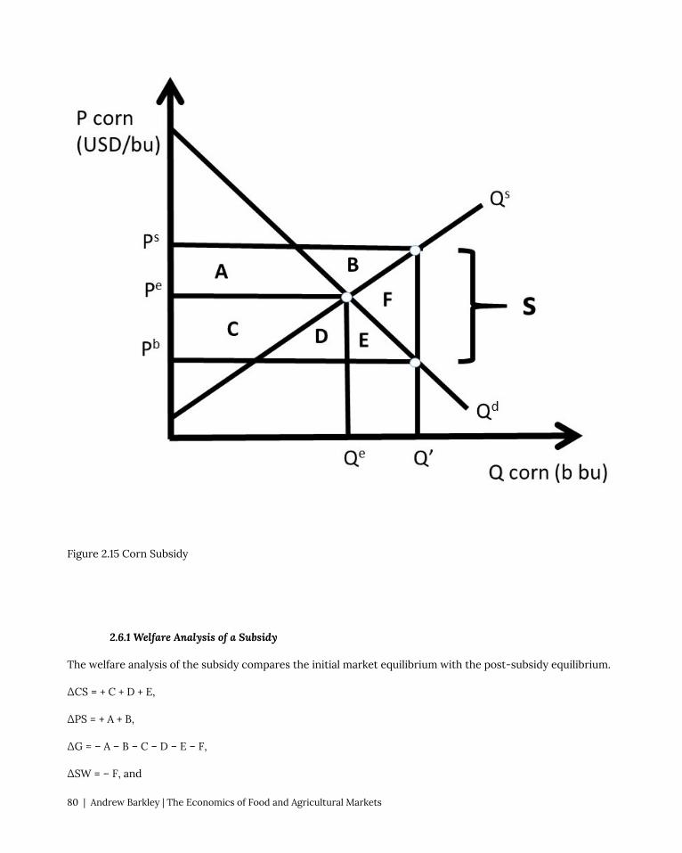
Figure 2.15 Corn Subsidy
2.6.1 Welfare Analysis of a Subsidy
The welfare analysis of the subsidy compares the initial market equilibrium with the post-subsidy equilibrium.
ΔCS = + C + D + E,
ΔPS = + A + B,
ΔG = – A – B – C – D – E – F,
ΔSW = – F, and
80 | Andrew Barkley | The Economics of Food and Agricultural Markets

DWL = F.
Both consumers and producers gain from the subsidy, but at a large cost to tax payers (the government).
2.6.2 Quantitative Welfare Analysis of a Subsidy
Suppose that the inverse demand and supply of corn are given by:
Pb = 12 – 2Qd, and
Ps = 2 + 2Qs,
Where P is the price of corn in USD/bu, and Q is the quantity of corn in billion bushels. Market equilibrium is
found where supply equals demand: Qe = 2.5 billion bu of corn and Pe = Pb = Ps = 7 USD/bu of corn (Figure 2.16).
Figure 2.16 Corn Subsidy
With the subsidy, the price relationship is given by:
Ps = Pb + s.
Chapter 2. Welfare Analysis of Government Policies | 81

Assume that the government sets the corn subsidy equal to 2 USD/bu. Substitution of the inverse supply and
demand equations into the price equation yields:
2 + 2Qs = 12 – 2Qd + 2
Since Qd = Qs = Q’ after the tax:
4Q’ = 12
Q’ = 3 billion bushels of corn.
The quantity can be substituted into the inverse supply and demand equations to find the buyer’s and seller’s
prices.
Pb = 6 USD/bu, and
Ps = 8 USD/bu.
These prices are shown in Figure 2.14. The welfare analysis is:
ΔCS = + C + D + E = + 2.75 USD billion
ΔPS = + A + B = + 2.75 USD billion
ΔG = – A – B – C – D – E – F = – 6 USD billion
ΔSW = – F = – 0.5 USD billion
DWL = F = + 0.5 USD billion
Note again that the change in social welfare equals the sum of the welfare changes due to the tax: ΔSW = ΔCS
+ ΔPS + ΔG. Although the deadweight loss is not large, the government cost is large, making subsidies effective
in helping producers and encouraging consumption of the good, but expensive for society.
2.7 Immigration
Labor-intensive agriculture such as fruit and vegetable production in high income nations employs immigrant
workers and pays low wages. These workers offer an enormous contribution to the agricultural economy
through hard work in the production of food and fiber. However, it is possible that immigration can have a
negative impact on rural towns, since the provision of public services such as medical facilities, schools, and
housing for low-wage workers is often costly.
Most farm workers in the USA are immigrants, in spite of the massive labor-saving technological change
over many decades. Technological change has occurred in many crops through mechanization and the use of
82 | Andrew Barkley | The Economics of Food and Agricultural Markets

agricultural chemicals: over time, machines and chemicals have replaced farm workers in the USA and other
high income nations. The number of persons employed on US farms has been stable for several decades, due
to two offsetting forces: (1) a large increase in the production of hand-harvested fruits and vegetables, and (2)
rapid labor-saving technological change. Most of these farm workers live in “farm work communities,” defined
as cities with a population under 20,000 that are typically poor and growing rapidly.
In theory, the economic impact of immigration on rural communities could be either positive or negative.
New immigrants can stimulate job and wage growth through induced economic activity from the increased
demand for housing, food, clothing, and services. However, it is possible that immigration and growth in the
local labor supply could result in lower wages and displaced employment opportunities for existing workers.
The actual economic outcome is highly complex, dynamic, and difficult to measure. Immigration has resulted
in the description of the USA as a “melting pot” of people and groups all nationalities, ethnicities, races, and
religions. Immigration is often controversial, as existing groups may clash with more recent immigrants.
2.7.1 Welfare Analysis of Immigration: Short Run
Welfare analysis can be usefully utilized to better understand the economic impact of immigration. Adjustments
take time, so initial impacts can differ markedly from long run impacts. The economic impacts depend crucially
on both the number of migrants and the skill level of new migrant workers. Economic theory suggests that
the destination, or receiving nation has large economic benefits from immigration, but there are winners and
losers. Who wins and who loses depends on the wage structure, and availability and mobility of capital, as
explained below.
It is important to emphasize that if capital is mobile, and can adjust quickly, and technology can adapt to
changing labor composition, then the economy with migrants is a larger version of the original economy before
immigration. In this case, the native-born workers are neither winners nor losers. Economic adjustments to
new immigrants require time, and it is during the transition to the new workers that winners and losers occur.
When immigration occurs, goods that are produced using migrant labor have an increase in production. In
Figure 2.17, the wage rate is the price of labor, the initial demand for labor is given by Qd0, and the labor supplied
by native workers (original workers in the receiving nation) is Qs0, which is assumed to be perfectly inelastic
at L0 million workers. The real-world labor supply is not fixed, as it is shown in Figure 2.17, as higher wages
will result in more work supplied to the market. However, the inelastic model illustrated in Figure 2.17 is good
approximation of labor markets: the qualitative results of the model accurately depict the real world.
The initial, pre-immigration labor market equilibrium occurs at E0, characterized by wage rate W0 and labor
supply L0. The total social welfare in this market is the sum of producer surplus and consumer surplus (SW = PS
+ CS). This is the area under the demand curve at L0 (=ABD). Recall that the workers are the suppliers of labor,
thus producer surplus is the economic value of worker well-being. The consumer in this case is the firms, since
the employers purchase (hire) labor. The consumer surplus in the labor market shown here is the economic
value to the business firms, or employers.
Before immigration occurs, producer surplus is the entire rectangle (BD). The supply curve is vertical in this
case, causing the area under the supply curve to be nonexistent. The workers receive this amount of income,
Chapter 2. Welfare Analysis of Government Policies | 83

since area BD is equal to the wage rate times the quantity of labor employed in the economy (W0*L0). Firms,
or employers of workers, receive the consumer surplus, which before immigration occurs is equal to area A in
Figure 2.17.
Figure 2.17 Welfare Analysis of Immigration Impact on Labor Market: Short Run
After immigration occurs, the labor force is increased by the number of migrants (M): L1 = L0 +M. In the short
run, no adjustments in the labor and capital market take place, and the result of an increase in the quantity
of labor is a decrease in the price of labor: the wage rate falls from W0 to W1. Native workers lose area B in
producer surplus, with a new level of economic surplus equal to D (W1*L0). Migrants receive wage rate W1, and
migrant earnings are equal to area E (W1*M). Presumably, the wage rate earned in the receiving nation is larger
than the wage rate available in the immigrants’ nation of origin. The wage rate is also likely to be large enough
to induce workers to change locations, which can be a costly transition. Employers in the receiving nation are
the winners, as consumer surplus (economic value of the firms who hire either native workers or migrants)
increases from area A before immigration to area ABC after immigration.
84 | Andrew Barkley | The Economics of Food and Agricultural Markets

The welfare analysis of immigration can be summarized in the usual way:
ΔCS = employer gains = + B + C
ΔPSL = native worker gains = − B
ΔPSM = migrant worker gains = + E
ΔSW = net gain to entire economy = + C + E
Notice that there is a net gain in total economic activity due to immigration: the magnitude of economic activity
in the receiving nation is larger after immigration occurs. This is due to the influx of new resources, bringing
economic value and spending. This differs from government interventions in the free market economy. This
is because government programs and policies all result in a loss of voluntary exchange between buyers and
sellers, and dead weight loss. In the case of labor immigration into a nation, more voluntary exchange takes
place, with large overall economic benefits to the receiving nation. The controversy surrounding immigration
is the distributional effects: in the short run, native workers lose, due to decreasing wages. As the economy
adjusts to the new workers, the benefits become larger and the negative impacts are diminished, as will be
explained in the next section.
2.7.2 Welfare Analysis of Immigration: Long Run
Workers and firms can make many adjustments once the new migrants join the economy. In an economy
with many types of skilled and unskilled workers, native workers can take jobs in areas of their comparative
advantage, and invest in human capital (education and training) to allow them to increase wages by moving out
of low paying jobs and into high paying jobs. Given sufficient time, migrants can do this too, and will move into
higher paying jobs as new waves of immigration occur.
Migrants who bring capital or work skills with them can enter growing sectors, such as technology, medicine,
and services. The demand for labor in these areas is large and growing, so wages continue to increase together
with new workers entering the economy.
In the long run, this type of adjustment in capital and labor markets, together with technological change, will
result in economic growth, and broad-based wage and income growth in the receiving economy. The USA has
had high levels of immigration simultaneous with high and growing levels of income for most of its history:
immigration has catalyzed economic growth in the high income nations of the world. This desirable outcome
does require change, adjustment, and in many cases labor migration, both occupational and locational. Growth
mandates change, and change is often difficult. This is one of the major features of free markets and free
trade. When economic agents are free to make decisions in their own interest, great things can happen. But
improvement requires change. When workers and their families are free to locate where they desire to live and
work, economic growth is likely to occur, but the transition can be challenging, and when cultures and values
differ, controversy can occur.
The long run effects of immigration can be seen in Figure 2.18. New workers joining the economy cause an
increase in the aggregate demand for goods in the economy, and this economic growth entices firms to produce
Chapter 2. Welfare Analysis of Government Policies | 85

more goods. More production requires more workers, and the demand for labor increases from Qd0 to Qd
1. The
long run equilibrium is found at E1. The increase in labor demand offsets the downward pressure on wage rates,
resulting in wages returning to their original level, W0. The economy grows, so consumer surplus (economic
value of employers, or business firms) increases to include the area under the demand curve and above the new
price line: AFG. Native worker earnings are restored to their initial level (BD), and migrant worker surplus is
increased to CHE.
The overall economy gains significantly once these adjustments have occurred. Adding more resources to an
economy in the long run, given sufficient time for the transition to occur, will yield large economic growth, as
the economy is growing by the size of the new migrant labor force.
ΔCS = employer gains = + F + G
ΔPSL = native worker gains = 0
ΔPSM = migrant worker gains = + C + H + E
ΔSW = net gain to entire economy = + C + E + F + G + H
The potential gains from immigration can be thwarted during periods of economic recession, when the overall
demand for goods increases at a decreasing rate. This economic stagnation can lead to a decrease in the
demand for labor. When native workers face poor economic conditions, they are less likely to favor new
migrants.
86 | Andrew Barkley | The Economics of Food and Agricultural Markets

Figure 2.18 Welfare Analysis of Immigration Impact on Labor Market: Long Run
In agriculture, recent immigrants perform many tasks that native workers would not do at the low wages
offered to migrants. These tasks can include meatpacking, chemical application, and harvesting fruit and
vegetables. The USA currently allows millions of workers to enter the country and work in farm jobs. If this
supply of workers were to be eliminated, the cost of labor would rise enormously and the cost of food would
increase. To examine the gains and benefits of migration of agricultural workers, the next section broadens the
welfare analysis to include a model of two nations: the receiving nation and the nation of migrant origin.
Chapter 2. Welfare Analysis of Government Policies | 87

2.7.3 Welfare Analysis of Labor Immigration into the USA from Mexico
To demonstrate the effects of the movement of labor from one nation to another, the three panel diagram
of Section 1.6.3 can be usefully employed. The welfare analysis of agricultural labor migration from Mexico
to the USA provides a summary of who wins, who loses,, and by how much. The analysis demonstrates that
both Mexico and the USA have net gains from labor migration. However, as in all economic changes, there are
winners and losers. Figure 2.19 shows labor movements for the receiving nation (USA) in the left panel, and the
source nation (Mexico) in the right panel. The trade sector is represented in the middle panel.
Figure 2.19 Welfare Analysis of Farm Worker Immigration into the USA from Mexico
If the two nations have isolated labor markets, wages in the USA (WUSA) are higher than wages in Mexico
(WMEX). This wage differential (WUSA > WMEX) provides the motivation for workers to leave Mexican jobs and
migrate to the United States. When the movement of labor is possible, the number of migrants is shown in the
middle panel, equal to QT million hours of work. If QT hours of work are transferred from Mexico to the USA, the
wage rates are equalized at W* in both nations. Note that this model ignores exchange rates and transportation
costs of migration.
The graphical model demonstrated in Figure 2.19 also assumes freedom of movement between the two nations.
In agriculture, there is considerable freedom for farm workers to enter the USA from Mexico to supply labor
to farms. The H-2A Temporary Agricultural Program allows foreign-born workers to legally enter the United
States to perform seasonal farm labor on a temporary basis for up to 10 months. The seasonal needs of crop
farmers (fruit, vegetables, and grains) can be met with this program, but most livestock producers, (ranches,
88 | Andrew Barkley | The Economics of Food and Agricultural Markets

dairies, and hog and poultry operations) are not able to use the program. An exception is made for livestock
producers on the range, (sheep and goat producers), who can use H-2A workers year-round.
The welfare analysis in Figure 2.19 shows the same results for labor as were obtained for commodities such
as wheat in Section 1.6.3. Winners include consumers (employers) in the importing (receiving) nation, and
producers (workers) in the exporting (source) nation. In this case, US farmers who employ migrant workers
are made better off by area (A + B), but native workers (USA workers employed prior to immigration) are made
worse off by area A. The gains and losses are due to the decrease in wages from WUSA to W*. The movement of
workers out of Mexico results in gains for Mexican workers (area C + D), but losses for employers of workers in
Mexico (area C). This is due to the wage increase in Mexico from WMEX to W*.
Both origin and receiving nations have net benefits: rea B in the USA and area D in Mexico. This result explains
why immigration has been a large, significant feature in US history (the United States is often referred to as
a “Nation of Immigrants”). The gains and losses in each nation demonstrate why immigration continue to be
controversial issue: large economic gains and losses in each nation.
In the long run, the gains to immigration are large for the recipient nation. This is for two reasons: (1) migrant
workers are most often complementary to native workers: low-skill immigrants combine with high-skill native
workers to enhance productivity for all workers in the receiving nation, and (2) increased population generates
increased demand for all goods and services in the USA, resulting in enhanced economic conditions for all
workers in the receiving nation.
2.8 Welfare Impacts of International Trade
The welfare analysis of international trade can be conducted using the three-panel diagram (Figure 2.20). The
welfare impacts on wheat consumers and producers can be calculated by measuring the changes in consumer
surplus and producer surplus before trade (time t=0) and after trade (time t=1). The welfare changes for the
exporting nation are shown in the left panel of Figure 2.20. Prior to trade, the closed economy price is Pe at
the closed economy market equilibrium, where Qs = Qd. After trade, export opportunities allow the price to
increase to the world price Pw. Quantity supplied increases and quantity demanded decreases. Consumers lose,
since the price is now higher (Pw > Pe) and the quantity consumed lower. The loss in consumer surplus is equal
to area A, the area between the two price lines and below the demand curve: ΔCS = -A. Producers receive a
higher price (Pw > Pe) and a larger quantity, and an increase in producer surplus equal to the area between the
two price lines and above the supply curve: ΔPS = + A + B (Figure 2.20).
The net gain to all groups in the exporting nation, or change in social welfare (SW), is defined to be ΔSW = ΔCS
+ ΔPS. Thus, ΔSW = +B, since area A represents a transfer of surplus (dollars) from consumers to producers in
the exporting nation (USA). Interestingly and importantly, the exporting nation is better off with international
trade ΔSW > 0. However, not all individuals and groups are made better off with trade. Wheat producers in
Chapter 2. Welfare Analysis of Government Policies | 89

the exporting nation gain, but wheat consumers in the exporting nation lose. Trade has a positive overall net
benefit.
Figure 2.20 Welfare Impacts of International Trade in Wheat
In the importing nation, consumers win and producers lose from trade (right panel, Figure 2.20). The pre-trade
price in the importing nation is Pi, and trade provides the opportunity for imports (Qd > Qs). With imported
wheat, the market price falls from Pi to the world price Pw. Quantity demanded increases and quantity supplied
decreases. Consumers gain at the lower price (Pw < Pi): ΔCS = + C + D. Producers lose at the lower price (Pw
< Pi): ΔPS = – C. The net gain to the importing nation, or change in social welfare (SW) is ΔSW = + D. The area
C represents a transfer of surplus from producers to consumers in the importing nation. As in the exporting
nation, the net gains are positive, but not everyone is helped by trade. Producers in importing nations will
oppose trade. This is a general result from out model of trade: producers in importing nations will oppose trade,
since they face competition from imported goods.
The results of the three-panel model clarify and explain the politics behind trade agreements. Politicians
representing the entire nation will support the overall benefits from trade, brought about by efficiency gains
from globalization. However, representatives of constituent groups who are hurt by trade will oppose new free
trade agreements. A large number of trade barriers are erected to protect domestic producers from import
competition, including tariffs, quotas, and import bans.
The world is better off due to globalization and trade: the global economy gains areas B + D from producing
wheat in nations that have superior grain production characteristics. These efficiency gains provide real
90 | Andrew Barkley | The Economics of Food and Agricultural Markets

economic benefits to both nations. However, globalization requires change, and many workers and resources
will have to change jobs (and many times locations) to achieve the potential gains. Labor with specific skills and
other inflexibilities will have high adjustment costs to globalization. However, there have been huge increases
in the incomes of trading nations due to moving resources from less efficient employments into more efficient
employment over time.
The three-panel diagram highlights who gains and who loses from trade. Producers in exporting nations
and consumers in importing nations gain, in many cases enormously. Producers in importing nations and
consumers in exporting nations lose, and in many cases lose a great deal. Industrial workers and textile workers
in the USA and the EU used to be employed in one of the major sectors of the economy. Today, these jobs are
in nations with low labor costs: China, Indonesia, Malaysia, and Viet Nam are examples.
Should a nation support free trade? The economic analysis provides an answer to this question: unambiguously
yes. The overall benefits to society outweigh costs, with the net benefits equal to areas B and D in Figure 2.20.
Economists have devised the Compensation Principle for situations when there are both gains and losses to a
public policy.
Compensation Principle = A decision rule where if the prospective winners gain enough to
compensate the prospective losers, then the policy should be undertaken, from an economic point of
view.
The actual compensation can be difficult to achieve in the real world, but the net benefits of the program
suggest that if society gain from the policy, it should be undertaken.
Agricultural producers in most high income nations are subsidized by the government. These subsidies can
be viewed as compensation for the impacts of the adoption of labor-saving technological change over time.
Technological change has made agriculture in the USA and the EU enormously productive. However, it has led
to massive migration of labor out of agriculture. Subsidies can be viewed as the provision of compensation for
the massive substitution of machines and chemicals for labor in agricultural production.
Chapter 2. Welfare Analysis of Government Policies | 91


Chapter 3. Monopoly and Market Power
3.1 Market Power Introduction
This chapter will explore firms that have market power, or the ability to set the price of the good that they
produce.
Market Power = Ability of a firm to set the price of a good. Also called monopoly power.
A monopoly is defined as a single firm in an industry with no close substitutes. An industry is defined as a group
of firms that produce the same good.
Monopoly = A single firm in an industry with no close substitutes.
The phrase, “no close substitutes” is important, since there are many firms that are the sole producer of a good.
Consider McDonalds Big Mac hamburgers. McDonalds is the only provider of Big Macs, yet it is not a monopoly
because there are many close substitutes available: Burger King Whoppers, for example.
Market power is also called monopoly power. A competitive firm is a “price taker.” Thus, a competitive firm
has no ability to change the price of a good. Each competitive firm is small relative to the market, so has no
influence on price. On the other hand, firms with market power are also called “price makers.”
Price Taker = A competitive firm with no ability to set the price of a good.
Price Maker = A noncompetitive firm with market power, defined as the ability to set the price of a
good.
A monopolist is considered to be a price maker, and can set the price of the product that it sells. However, the
monopolist is constrained by consumer willingness and ability to purchase the good, also called demand. For
example, suppose that an agricultural chemical firm has a patent for an agricultural chemical used to kill weeds,
a herbicide. The patent is a legal restriction that permits the patent holder to be the only seller of the herbicide,
as it was invented by the company through their research program. In Figure 3.1, an agricultural chemical firm
faces an inverse demand curve equal to: P = 100 – Qd, where P is the price of the agricultural chemical in dollars
per ounce (USD/oz), and Qd is the quantity demanded of the chemical in million ounces (m oz).
Chapter 3. Monopoly and Market Power | 93

Figure 3.1 Demand Facing a Monopolist: Agricultural Chemical
The monopolist can set a price, but the resulting quantity is determined by the consumers’ willingness to pay,
or the demand curve. For example, if the price is set at P0, consumers will purchase Q0. Alternatively, the
monopolist could set quantity at Q0, and consumers would be willing to pay P0 for Q0 units of the chemical.
Thus, a monopolist has the ability to set any price that it would like to, but with important limitation: the
monopolist is constrained by consumer willingness to pay for the product.
3.2 Monopoly Profit-Maximizing Solution
The profit-maximizing solution for the monopolist is found by locating the biggest difference between total
revenues (TR) and total costs (TC), as in Equation 3.1.
(3.1) max π = TR – TC
94 | Andrew Barkley | The Economics of Food and Agricultural Markets

3.2.1 Monopoly Revenues
Revenues are the money that a firm receives from the sale of a product.
Total Revenue [TR] = The amount of money received when the producer sells the product. TR = PQ
Average Revenue [AR] = The average dollar amount receive per unit of output sold AR = TR/Q
Marginal Revenue [MR] = the addition to total revenue from selling one more unit of output.
MR = ΔTR/ΔQ = ∂TR/∂Q.
TR = PQ (USD)
AR = TR/Q = P(USD/unit)
MR = ΔTR/ΔQ = ∂TR/∂Q (USD/unit)
For the agricultural chemical company:
TR = PQ = (100 – Q)Q = 100Q – Q2
AR = P = 100 – Q
MR = ∂TR/∂Q = 100 – 2Q
Total revenues for the monopolist are shown in Figure 3.2. Total Revenues are in the shape of an inverted
parabola. The maximum value can be found by taking the first derivative of TR, and setting it equal to zero. The
first derivative of TR is the slope of the TR function, and when it is equal to zero, the slope is equal to zero.
(3.2) max TR = PQ ∂TR/∂Q = 100 – 2Q = 0 Q* = 50
Substitution of Q* back into the TR function yields TR = USD 2500, the maximum level of total revenues (Figure
3.2).
Chapter 3. Monopoly and Market Power | 95

Figure 3.2 Total Revenues for a Monopolist: Agricultural Chemical
96 | Andrew Barkley | The Economics of Food and Agricultural Markets

Figure 3.3 Per-Unit Revenues for a Monopolist: Agricultural Chemical
It is important to point out that the optimal level of chemical is not this level. The optimal level of chemical
to produce and sell is the profit-maximizing level, which is revenues minus costs. If the monopolist were to
maximize revenues instead of profits, it might cost too much relative to the gain in revenue. Profits include
both revenues and costs.
Average revenue (AR) and marginal revenue (MR) are shown in Figure 3.3. The marginal revenue curve has
the same y-intercept and twice the slope as the average revenue curve. This is always true for linear demand
(average revenue) curves. This is one of the major take home messages of economics: maximize revenues may
cost too much to make it worth it. For example, a corn farmer who maximizes yield (output per acre of land)
may be spending too much on inputs such as fertilizer and chemicals make the higher yield payoff. From an
economic perspective, the corn farmer should consider both revenues and costs.
Chapter 3. Monopoly and Market Power | 97

3.2.2 Monopoly Costs
The costs for the chemical include total, average, and marginal costs.
Total Costs [TC] = The sum of all payments that a firm must make to purchase the factors of
production. The sum of Total Fixed Costs and Total Variable Costs. TC = C(Q) = TFC + TVC.
Total Fixed Costs [TFC] = Costs that do not vary with the level of output.
Total Variable Costs [TVC] = Costs that do vary with the level of output.
Average Costs [AC] = total costs per unit of output. AC = TC/Q. Note that the terms, Average Costs
and Average Total Costs are interchangeable.
Marginal Costs [MC] = the increase in total costs due to the production of one more unit of output.
MC = ΔTC/ΔQ = ∂TC/∂Q.
TC = C(Q)(USD)
AC = TC/Q(USD/unit)
MC = ΔTC/ΔQ = ∂TC/∂Q (USD/unit)
Suppose that the agricultural chemical firm is a constant cost industry. This means that the per-unit cost of
producing one more ounce of chemical is the same, no matter what quantity is produced. Assume that the cost
per unit is ten dollars per ounce (10 USD/oz).
TC = 10Q
AC = TC/Q = 10
MC = ΔTC/ΔQ = ∂TC/∂Q = 10
The total costs are shown in Figure 3.4, and the per-unit costs are in Figure 3.5.
98 | Andrew Barkley | The Economics of Food and Agricultural Markets

Figure 3.4 Total Costs for a Monopolist: Agricultural Chemical
Chapter 3. Monopoly and Market Power | 99

Figure 3.5 Per-Unit Costs for a Monopolist: Agricultural Chemical
3.2.3 Monopoly Profit-Maximizing Solution
There are three ways to communicate economics: verbally, graphically, and mathematically. The firm’s profit
maximizing solution is one of the major features and important conclusions of economics. The verbal
explanation is that a firm should continue any activity as long as the additional (marginal) benefits are greater
than the additional (marginal) costs. The firm should continue the activity until the marginal benefit is equal to
the marginal cost. This is true for any activity, and for profit maximization, the firm will find the optimal, profit
maximizing level of output where marginal revenues equal marginal costs (MR = MC).
The graphical solution takes advantage of pictures that tell the same story, as in Figures 3.6 and 3.7. Figure 3.6
shows the profit maximizing solution using total revenues and total costs. The profit-maximizing level of output
is found where the distance between TR and TC is largest: π = TR – TC. The solution is found by setting the
slope of TR equal to the slope of TC: this is where the rates of change are equal to each other (MR = MC).
100 | Andrew Barkley | The Economics of Food and Agricultural Markets

Figure 3.6 Total Profit Solution for a Monopolist: Agricultural Chemical
The same solution can be found using the marginal graph (Figure 3.7). The firm sets MR equal to MC to find
the profit-maximizing level of output (Q*), then substitutes Q* into the consumers’ willingness to pay (demand
curve) to find the optimal price (P*). The profit level is an area in Figure 3.7, defined by TR and TC. Total
revenues are equal to price times quantity (TR = P*Q), so TR are equal to the rectangle from the origin to P*
and Q*. Total costs are equal to the rectangle defined by the per-unit cost of ten dollars per ounce times the
quantity produced, Q*. If the TC rectangle is subtracted from the TR rectangle, the shaded profit rectangle
remains: profits are the residual of revenues after all costs have been paid (π = TR – TC).
Chapter 3. Monopoly and Market Power | 101

Figure 3.7 Marginal Profit Solution for a Monopolist: Agricultural Chemical
The math solution for profit maximization is found by using calculus. The maximum level of a function is found
by taking the first derivative and setting it equal to zero. Recall that the inverse demand function facing the
monopolist is P = 100 – Qd, and the per unit costs are ten dollars per ounce.
max π = TR – TC
= P(Q)Q – C(Q)
= (100 – Q)Q – 10Q
= 100Q – Q2 – 10Q
∂π/∂Q= 100 – 2Q – 10 = 0
102 | Andrew Barkley | The Economics of Food and Agricultural Markets

2Q = 90
Q* = 45 million ounces of agricultural chemical
The profit-maximizing price is found by substituting Q* into the inverse demand equation:
P* = 100 – Q* = 100 – 45 = 55 USD/ounce of agricultural chemical.
The maximum profit level can be found by substitution of P* and Q* into the profit equation:
π = TR – TC = P(Q)Q – C(Q) = 55*45 – 10*45 = 45*45 = 2025 million USD.
This profit level is equal to the distance between the TR and TC curves at Q* in Figure 3.6, and the profit
rectangle identified in Figure 3.7. The profit-maximizing level of output and price have been found in three
ways: verbally, graphically, and mathematically.
3.3 Marginal Revenue and the Elasticity of Demand
We have located the profit-maximizing level of output and price for a monopoly. How does the monopolist
know that this is the correct level? How is the profit-maximizing level of output related to the price charged,
and the price elasticity of demand? This section will answer these questions. The firm’s own price elasticity of
demand captures how consumers of a good respond to a change in price. Therefore, the own price elasticity
of demand captures the most important thing that a firm can know about its customers: how consumers will
react if the good’s price is changed.
3.3.1 The Monopolist’s Tradeoff between Price and Quantity
What happens to revenues when output is increased by one unit? The answer to this question reveals useful
information about the nature of the pricing decision for firms with market power, or a downward sloping
demand curve. Consider what happens when output is increased by one unit in Figure 3.8.
Chapter 3. Monopoly and Market Power | 103
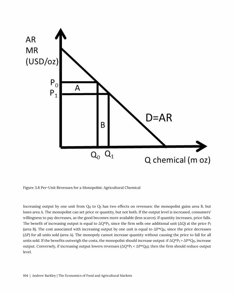
Figure 3.8 Per-Unit Revenues for a Monopolist: Agricultural Chemical
Increasing output by one unit from Q0 to Q1 has two effects on revenues: the monopolist gains area B, but
loses area A. The monopolist can set price or quantity, but not both. If the output level is increased, consumers’
willingness to pay decreases, as the good becomes more available (less scarce). If quantity increases, price falls.
The benefit of increasing output is equal to ΔQ*P1, since the firm sells one additional unit (ΔQ) at the price P1
(area B). The cost associated with increasing output by one unit is equal to ΔP*Q0, since the price decreases
(ΔP) for all units sold (area A). The monopoly cannot increase quantity without causing the price to fall for all
units sold. If the benefits outweigh the costs, the monopolist should increase output: if ΔQ*P1 > ΔP*Q0, increase
output. Conversely, if increasing output lowers revenues (ΔQ*P1 < ΔP*Q0), then the firm should reduce output
level.
104 | Andrew Barkley | The Economics of Food and Agricultural Markets

3.3.2 The Relationship between MR and Ed
There is a useful relationship between marginal revenue (MR) and the price elasticity of demand (Ed). It is
derived by taking the first derivative of the total revenue (TR) function. The product rule from calculus is used.
The product rule states that the derivative of an equation with two functions is equal to the derivative of
the first function times the second, plus the derivative of the second function times the first function, as in
Equation 3.3.
(3.3) ∂(yz)/∂x = (∂y/∂x)z + (∂z/∂x)y
The product rule is used to find the derivative of the TR function. Price is a function of quantity for a firm with
market power. Recall that MR = ∂TR/∂Q, and the equation for the elasticity of demand:
Ed = (∂Q/∂P)P/Q
This will be used in the derivation below.
TR = P(Q)Q
∂TR/∂Q = (∂P/∂Q)Q + (∂Q/∂Q)P
MR = (∂P/∂Q)Q + Pnext, divide and multiply by P:
MR = [(∂P/∂Q)Q/P]P + P
MR = [1/Ed]P + P
MR = P(1 + 1/Ed)
This is a useful equation for a monopoly, as it links the price elasticity of demand with the price that maximizes
profits. The relationship can be seen in Figure 3.9.
(3.4) MR = P(1 + 1/Ed)
Chapter 3. Monopoly and Market Power | 105

Figure 3.9 The Relationship between MR and Ed
At the vertical intercept, the elasticity of demand is equal to negative infinity (section 1.4.8). When this elasticity
is substituted into the MR equation, the result is MR = P. The MR curve is equal to the demand curve at the
vertical intercept. At the horizontal intercept, the price elasticity of demand is equal to zero (Section 1.4.8,,
resulting in MR equal to negative infinity. If the MR curve were extended to the right, it would approach minus
infinity as Q approached the horizontal intercept. At the midpoint of the demand curve, P is equal to Q, the
price elasticity of demand is equal to -1, and MR = 0. The MR curve intersects the horizontal axis at the midpoint
between the origin and the horizontal intercept.
This highlights the usefulness of knowing the elasticity of demand. The monopolist will want to be on the
elastic portion of the demand curve, to the left of the midpoint, where marginal revenues are positive. The
monopolist will avoid the inelastic portion of the demand curve by decreasing output until MR is positive.
Intuitively, decreasing output makes the good more scarce, thereby increasing consumer willingness to pay for
the good.
106 | Andrew Barkley | The Economics of Food and Agricultural Markets

3.3.3 Pricing Rule I
The useful relationship between MR and Ed in Equation 3.4 can be used to derive a pricing rule.
MR = P(1 + 1/Ed)
MR = P + P/Ed
Assume profit maximization [MR = MC]
MC = P + P/Ed
–P/Ed = P – MC
–1/Ed = (P – MC)/P
(P – MC)/P = –1/Ed
This pricing rule relates the price markup over the cost of production (P – MC) to the price elasticity of demand.
(3.5) (P – MC)/P = –1/Ed
A competitive firm is a price taker, as shown in Figure 3.10. The market for a good is depicted on the left hand
side of Figure 2.10, and the individual competitive firm is found on the right hand side. The market price is
found at the market equilibrium (left panel), where market demand equals market supply. For the individual
competitive firm, price is fixed and given at the market level (right panel). Therefore, the demand curve facing
the competitive firm is perfectly horizontal (elastic), as shown in Figure 3.10.
The price is fixed and given, no matter what quantity the firm sells. The price elasticity of demand for a
competitive firm is equal to negative infinity: Ed = -. When substituted into Equation 3.5, this yields (P – MC)P =
0, since dividing by infinity equals zero. This demonstrates that a competitive firm cannot increase price above
the cost of production: P = MC. If a competitive firm increases price, it loses all customers: they have perfect
substitutes available from numerous other firms.
Monopoly power, also called market power, is the ability to set price. Firms with market power face a downward
sloping demand curve. Assume that a monopolist has a demand curve with the price elasticity of demand equal
to negative two: Ed = -2. When this is substituted into Equation 3.5, the result is: (P – MC)/P = 0.5. Multiply
both sides of this equation by price (P): (P – MC) = 0.5P, or 0.5P = MC, which yields: P = 2MC. The markup (the
level of price above marginal cost) for this firm is two times the cost of production. The size of the optimal,
profit-maximizing markup is dictated by the elasticity of demand. Firms with responsive consumers, or elastic
demands, will not want to charge a large markup. Firms with inelastic demands are able to charge a higher
markup, as their consumers are less responsive to price changes.
Chapter 3. Monopoly and Market Power | 107

Figure 3.10 The Demand Curve of a Competitive Firm
In the next section, we will discuss several important features of a monopolist, including the absence of a supply
curve, the effect of a tax on monopoly price, and a multiplant monopolist.
3.4 Monopoly Characteristics
3.4.1 The Absence of a Supply Curve for a Monopolist
There is no supply curve for a monopolist. This differs from a competitive industry, where there is a one-
to-one correspondence between price (P) and quantity supplied (Qs). For a monopoly, the price depends on
the shape of the demand curve, as shown in Figure 3.11. A mathematical “function” is defined as a one-to-one
correspondence between each point in the range (x) and the domain (y). A supply curve, then, requires a single
price (P) for each quantity (Q). This graph shows that there is more than one price associated with each quantity.
At quantity Q0, for demand curve D1, the monopolist maximizes profits by setting MR1 = MC, which results in
price P1. However, for demand curve D2, the monopolist would set MR2=MC, and charge a lower price, P2. Since
108 | Andrew Barkley | The Economics of Food and Agricultural Markets
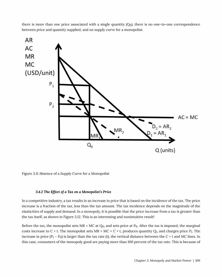
there is more than one price associated with a single quantity (Q0), there is no one-to-one correspondence
between price and quantity supplied, and no supply curve for a monopolist.
Figure 3.11 Absence of a Supply Curve for a Monopolist
3.4.2 The Effect of a Tax on a Monopolist’s Price
In a competitive industry, a tax results in an increase in price that is based on the incidence of the tax. The price
increase is a fraction of the tax, less than the tax amount. The tax incidence depends on the magnitude of the
elasticities of supply and demand. In a monopoly, it is possible that the price increase from a tax is greater than
the tax itself, as shown in Figure 3.12. This is an interesting and nonintuitive result!
Before the tax, the monopolist sets MR = MC at Q0, and sets price at P0. After the tax is imposed, the marginal
costs increase to C + t. The monopolist sets MR = MC = C + t, produces quantity Q1, and charges price P1. The
increase in price (P1 – P0) is larger than the tax rate (t), the vertical distance between the C + t and MC lines. In
this case, consumers of the monopoly good are paying more than 100 percent of the tax rate. This is because of
Chapter 3. Monopoly and Market Power | 109
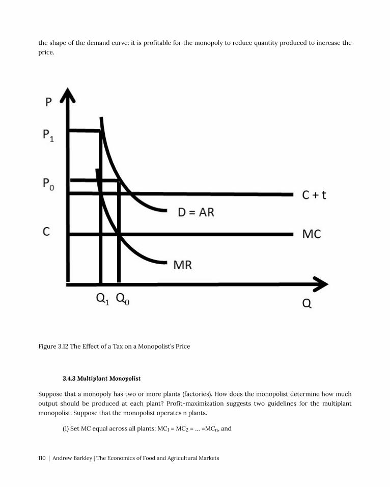
the shape of the demand curve: it is profitable for the monopoly to reduce quantity produced to increase the
price.
Figure 3.12 The Effect of a Tax on a Monopolist’s Price
3.4.3 Multiplant Monopolist
Suppose that a monopoly has two or more plants (factories). How does the monopolist determine how much
output should be produced at each plant? Profit-maximization suggests two guidelines for the multiplant
monopolist. Suppose that the monopolist operates n plants.
(1) Set MC equal across all plants: MC1 = MC2 = … =MCn, and
110 | Andrew Barkley | The Economics of Food and Agricultural Markets

(2) Set MR = MC in all plants.
A mathematical model of a multiplant monopolist demonstrates profit-maximization. The result is interesting
and important, as it shows that multiplant firms will not always close older, less efficient plants. This is true
even if the older plants have higher production costs than newer, more efficient plants.
Suppose that a monopolist has two plants, and total output (QT) is the sum of output produced in plant 1 (Q1)
and plant 2 (Q2).
(3.6) Q1 + Q2 = QT
The profit-maximizing model for the two-plant monopolist yields the solution. The costs of producing output
in each plant differ. Assume that the old plant (plant 1) is less efficient than the new plant (plant 2): C1 > C2.
max π = TR – TC
= P(QT)QT – C1(Q1) – C2(Q2)
∂π/∂Q1 = ∂TR/∂Q1 – C1’(Q1) = 0
∂π/∂Q2 = ∂TR/∂Q2 – C2’(Q2) = 0
The profit-maximizing solution is:
(3.7) MR = MC1 = MC2
The multiplant monopolist solution is shown in Figure 3.13. The marginal cost curve for plant 1 is higher than the
marginal cost curve for plant 2, reflecting the older, less efficient plant. Rather than shutting the less efficient
plant down, the monopolist should produce some output in each plant, and set the MC of each plant equal
to MR, as shown in the graph. Let MCT be the total (sum) of the marginal cost curves: MT = MC1 + MC2. The
profit maximizing quantity (QT) is found by setting MR equal to MCT. At the profit maximizing quantity (QT), the
monopolist sets price equal to P, found by plugging QT into the consumers’ willingness to pay, or the demand
curve (D).
Chapter 3. Monopoly and Market Power | 111
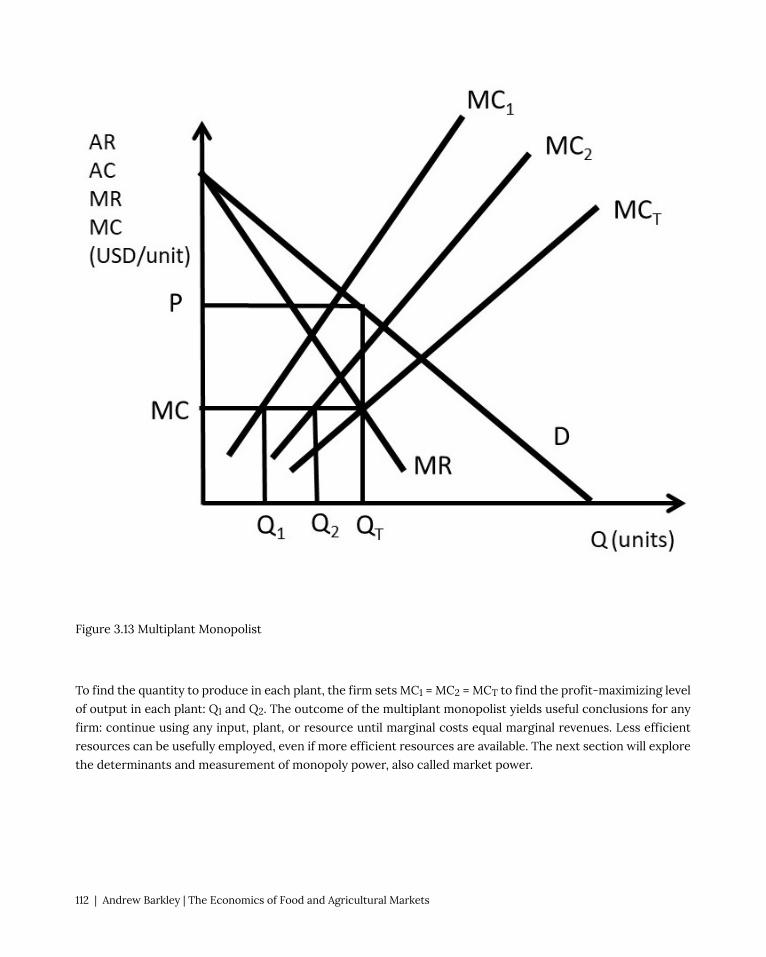
Figure 3.13 Multiplant Monopolist
To find the quantity to produce in each plant, the firm sets MC1 = MC2 = MCT to find the profit-maximizing level
of output in each plant: Q1 and Q2. The outcome of the multiplant monopolist yields useful conclusions for any
firm: continue using any input, plant, or resource until marginal costs equal marginal revenues. Less efficient
resources can be usefully employed, even if more efficient resources are available. The next section will explore
the determinants and measurement of monopoly power, also called market power.
112 | Andrew Barkley | The Economics of Food and Agricultural Markets

3.5 Monopoly Power
In this section, the determinants and measurement of monopoly power are examined.
3.5.1 The Lerner Index of Monopoly Power
Economists use the Lerner Index to measure monopoly power, also called market power. The index is the
percent markup of price over marginal cost.
(3.8) L = (P – MC)/P
The Lerner Index is a positive number (L ≥ 0), increasing in the amount of market power. A perfectly competitive
firm has a Lerner Index equal to zero (L = 0), since price is equal to marginal cost (P = MC). A monopolist will
have a Lerner Index greater than zero, and the index will be determined by the amount of market power that
the firm has. A larger Lerner Index indicates more market power. In Section 3.3.3, a Pricing Rule was derived: (P
– MC)/P = – 1/Ed, where Ed is the price elasticity of demand. Substitution of this pricing rule into the definition
of the Lerner Index provides the relationship between the percent markup and the price elasticity of demand.
(3.9) L = (P – MC)/P = – 1/Ed
An example of a Lerner Index might be Big Macs. There are substitutes available for Big Macs, so if the
price increases, consumers can buy a competing brand such as Whoppers. In the case of a good with close
substitutes, the price elasticity of demand is larger (more elastic), causing the percent markup to be smaller: the
Lerner Index is relatively small. A monopoly is defined as a single seller in an industry with no close substitutes.
Therefore, a monopoly that produces a good with no close substitutes would have a higher Lerner Index.
A second pricing rule can be derived from equation (3.9), if we assume that the firm maximizes profits (MR =
MC). In that case, the relationship between price and marginal revenue is equal to: MR = P(1 + 1/Ed). If profit-
maximization (MR = MC) is assumed, then:
(3.10) MC = P(1 + 1/Ed)
Rearranging:
(3.11) P = MC/(1 + 1/Ed)
This is a useful equation, as it relates price to marginal cost. For example, a perfectly competitive firm has a
perfectly elastic demand curve (Ed = negative infinity). Substitution of this elasticity into the pricing rule yields
P = MC. For a monopoly that has a price elasticity equal to –2, P = 2MC. The price is two times the production
costs in this case. To summarize:
(1) if Ed is large, the firm has less market power, and a small markup
(2) if Ed is small, the firm has more market power, and a large markup.
Chapter 3. Monopoly and Market Power | 113

A monopoly example is useful to review monopoly and the Lerner Index. Suppose that the inverse demand
curve facing a monopoly is given by: P = 500 – 10Q. The monopoly production costs are given by: C(Q) = 10Q2 +
100Q. Profit-maximization yields the optimal monopoly price and quantity.
max π = TR – TC
= P(Q)Q – C(Q)
= (500 – 10Q)Q – (10Q2 + 100Q)
= 500Q – 10Q2 – 10Q2 – 100Q
∂π/∂Q= 500 – 20Q – 20Q – 100 = 0
40Q = 400
Q* = 10 units
P* = 500 – 10Q* = 500 – 100 = 400 USD/unit.
To calculate the value of the Lerner Index, price and marginal cost are needed (equation 3.9).
MC = C’(Q) = 20Q + 100.
MC* = 20(10) + 100 = 300 units
L = (P – MC)/P = (400 – 300)/400 = 100/400 = 0.25
This result can be checked with the pricing rule: (P – MC)/P = – 1/Ed.
Ed = (∂Q/∂P)(P/Q)
For this monopoly, ∂P/∂Q = –10. This is the first derivative of the inverse demand function. Therefore, ∂Q/∂P =
– 1/10.
Ed = (∂Q/∂P)(P/Q) = (– 1/10)(400/10) = – 400/100 = – 4.
L = (P – MC)/P = – 1/Ed = –1/–4 = 0.25.
The same result was achieved using both methods, so the Lerner Index for this monopoly is equal to 0.25.
3.5.2 Welfare Effects of Monopoly
The welfare effects of a market or policy change are summarized as, “who is helped, who is hurt, and by
how much.” To measure the welfare impact of monopoly, the monopoly outcome is compared with perfect
competition. In competition, the price is equal to marginal cost (P = MC), as in Figure 3.14. The competitive
price and quantity are Pc and Qc. The monopoly price and quantity are found where marginal revenue equals
marginal cost (MR = MC): PM and QM. The graph indicates that the monopoly reduces output from the
114 | Andrew Barkley | The Economics of Food and Agricultural Markets
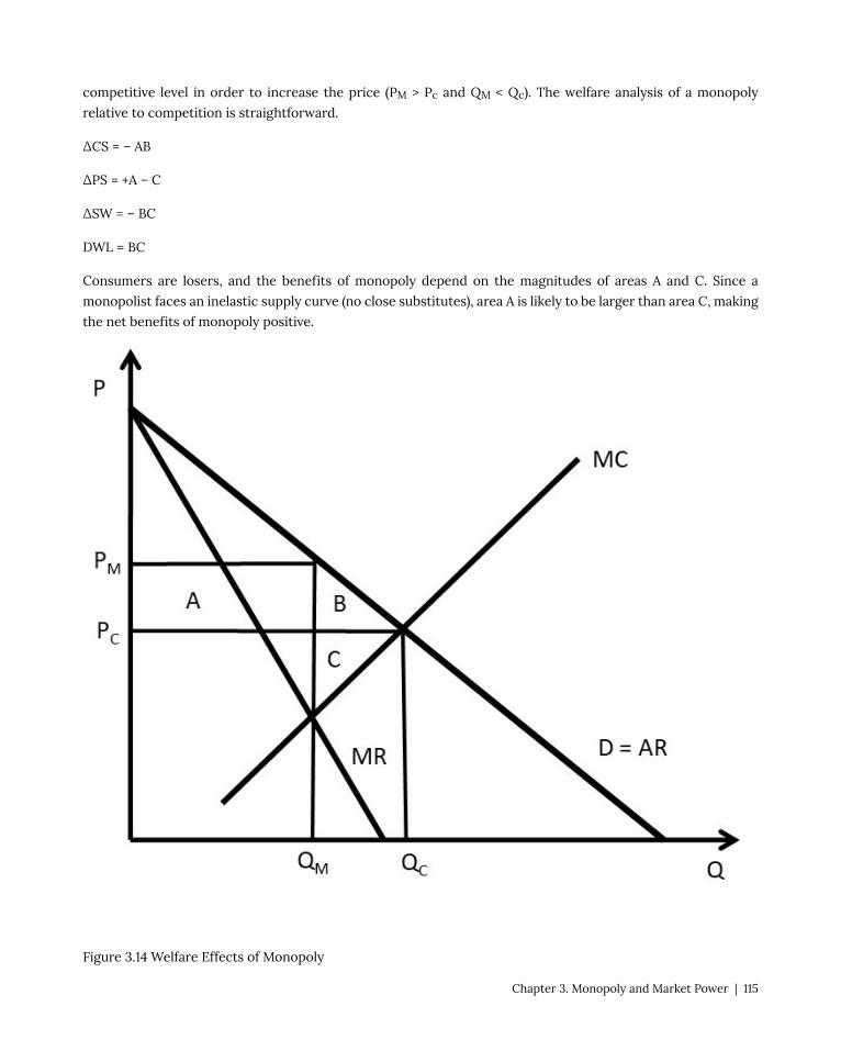
competitive level in order to increase the price (PM > Pc and QM < Qc). The welfare analysis of a monopoly
relative to competition is straightforward.
ΔCS = – AB
ΔPS = +A – C
ΔSW = – BC
DWL = BC
Consumers are losers, and the benefits of monopoly depend on the magnitudes of areas A and C. Since a
monopolist faces an inelastic supply curve (no close substitutes), area A is likely to be larger than area C, making
the net benefits of monopoly positive.
Figure 3.14 Welfare Effects of Monopoly
Chapter 3. Monopoly and Market Power | 115

The monopoly example from the previous section 3.5.1 shows the magnitude of the welfare changes. From
above, the inverse demand curve is given by P = 500 – 10Q, and the costs are given by C(Q) = 10Q2 + 100Q. In this
case, PM = 400 USD/unit and QM = 10 units (see section 3.5.1 above). The competitive solution is found where
the demand curve intersects the marginal cost curve.
500 – 10Q = 20Q + 100
30Q = 400
Qc = 13.3 units
Pc = 500 – 10(13.3) = 500 – 133 = 367 USD/unit
ΔCS = – AB = –(400 – 367)10 – (0.5)(400 – 367)(13.3 – 10) = – 330 –54.5 = – 384.5 USD
ΔPS = +A – C = +330 – (0.5)(367 – 300)(13.3 – 10) = +330 – 110.5 = +219.5 USD
ΔSW = – BC = (0.5)(100)(3.3) = – 165 USD
DWL = BC = 165 USD
The welfare analysis of monopoly has been used by the government to justify breaking up monopolies into
smaller, competing firms. In food and agriculture, many individuals and groups are opposed to large
agribusiness firms. One concern is that these large firms have monopoly power, which results in a transfer of
welfare from consumers to producers, and deadweight loss to society. It will be shown below that outlawing or
banning monopolies would have both benefits and costs. There is some economic justification for the existence
of large firms due to economies of scale and natural monopoly, as will be explored below. Next, the sources of
monopoly power will be listed and explained.
3.5.3 Sources of Monopoly Power
There are three major sources of monopoly power:
(1) the price elasticity of demand (Ed),
(2) the number of firms in a market, and
(3) interaction among firms.
The price elasticity of demand is the most important determinant of market power, due to the pricing rule: L =
(P – MC)/P = – 1/Ed. When the price elasticity is large ( |Ed| > 1), demand is relatively elastic, and the firm has
less market power. When the price elasticity is small ( |Ed| < 1), demand is relatively inelastic, and the firm has
more market power.
116 | Andrew Barkley | The Economics of Food and Agricultural Markets

The price elasticity of demand depends on how large the firm is relative to the market. The firm’s price elasticity
of demand is always more elastic than the market demand:
|Edfirm| > |Ed
market| .
If the price of the firm’s output is increased, consumers can substitute into outputs produced by other firms.
However, if all firms in the market increase the price of the good, consumers have no close substitutes, so must
pay the higher price (Figure 3.15). Therefore, the firm’s price elasticity of demand is more elastic than the market
demand. The firm’s price elasticity of demand depends on how large the firm is relative to the other firms in
the market.
Figure 3.15 Price Elasticity of Demand for Firm and Industry
The second determinant of market power is the number of firms in an industry. This is related to Figure 3.15. If a
firm is the only seller in an industry, then the firm is the same as the market, and the price elasticity of demand
is the same for both the firm and the market. The more firms there are in a market, the more substitutes a
consumer has available, making the price elasticity of demand more elastic as the number of firms increases. In
the extreme case, a perfectly competitive firm has numerous other firms in the industry, causing the demand
curve to be perfectly elastic, P = MC, and L = 0. To summarize, the more firms there are in an industry, the less
market power the firm has.
Chapter 3. Monopoly and Market Power | 117

The number of firms in an industry is determined by the ease or difficulty of entry. This market feature is
captured by the concept of, “Barriers to Entry.” Barriers to entry include:
(1) patents,
(2) copyrights,
(3) contracts,
(4) economies to scale (natural monopoly),
(5) excess capacity, and
(6) licenses.
Each of these barriers to entry increases the difficulty of entering a market when positive economic profits
exist. Economies to scale and natural monopoly are defined and described in the next section. The number of
firms is important, but the number of “major firms” is also important. Some industries are characterized by one
or two dominant firms. These large firms often exert market power.
The third source of market power is interaction among firms. This will be extensively discussed in Chapter 5,
“Oligopoly.” If firms compete aggressively with each other, less market power results. On the other hand, if firms
cooperate and act together, the firms can have more market power. When firms join together, they are said to
“collude,” or act as if they were a single firm. These strategic interactions between firms form the heart of the
discussion in Chapter 5, and the foundation for game theory, explored in Chapters 6 and 7.
3.5.4 Natural Monopoly
A natural monopoly is a firm that has a high level of costs that do not vary with output.
Natural Monopoly = A firm characterized by large fixed costs.
Recall that total costs are the sum of total variable costs and total fixed costs (TC = TVC + TFC). The fixed costs
are those costs that do not vary with the level of output. When fixed costs are high, then average total costs are
declining, as seen in Figure 3.16.
Another way of describing high fixed costs is the term, “economies of scale.”
Economies of Scale = Per-unit costs of production decrease when output is increased.
Figure 3.16 shows the defining characteristic of a natural monopoly: declining average costs (AC). This means
that the demand curve intersects the AC curve while it is declining. At some point, the average costs will
increase, but for firms characterized by economies of scale, the relevant range of the AC curve is the declining
portion, of the left side of a typical “U-shaped” cost function.
The reason for the name, “natural monopoly” can also be found in Figure 3.16. The demand curve has a portion
above the AC curve, so positive profits are possible. Suppose that the monopoly was making positive economic
118 | Andrew Barkley | The Economics of Food and Agricultural Markets

profits, and attracted a competitor into the industry. The second firm would cause the demand facing each of
the two firms to be cut in half. This possibility can be seen in Figure 3.16: if two firms served the customers,
each firm would have a demand curve equal to the MR curve. This is because for a linear demand curve, the MR
curve has the same y-intercept and twice the slope. Notice the position of the MR curve for a natural monopoly:
it lies everywhere below the AC curve. Therefore, positive profits are not possible for two firms serving this
market. The demand is not large enough to cover the fixed costs.
Fig 3.16 Natural Monopoly
The fixed costs are typically large investments that must be made before the good can be sold. For example,
Chapter 3. Monopoly and Market Power | 119

an electricity company must build both a huge generating plant and a distribution network that connects all
residences and businesses to the power grid. These enormous costs do not vary with the level of output: they
must be paid whether the firm sells zero kilowatt hours or one million kilowatt hours. The average fixed costs
decline as they are spread out over larger quantities (AFC = TFC/Q). As the output (Q) increases, average costs
(AC = TC/Q) decline.
This feature is true for many large businesses, and provides economic justification for large firms: the per-
unit costs of production are smaller, providing lower costs to consumers. There is a tradeoff for consumers
who purchase goods from large firms: the cost is lower due to economies of scale, but the firm may have
market power, which can result in higher prices. This tradeoff makes the economic analysis of large firms both
fascinating and important to society. Current examples include the giant technology companies Microsoft,
Apple, Google, and Amazon.
Natural monopolies have important implications for how large businesses provide goods to consumers, as is
explicitly shown in Figure 3.16. The industry in Figure 3.16 is a natural monopoly, since demand intersects
average costs while they are declining. If a single firm was in the depicted industry, it would set marginal costs
equal to marginal revenues (MR = MC), and produce and sell QM units of output at a price equal to PM. The price
is high: consumers lose welfare and society is faced with deadweight losses.
If competition were possible, price would be set at marginal cost (P = MC). The resulting price and quantity
under competition would be PC and QC (Figure 3.16. This is a desirable outcome for the consumers. However,
there is a major problem with this outcome: price is below average costs, and any business firm that charged
the competitive price PC would be forced out of business. In this case, the firm does not have enough revenue
to cover the fixed costs. The natural monopoly is considered a “market failure” since there is no good market-
based solution. A single monopoly firm could earn enough revenue to stay in business, but consumers would
pay a high monopoly price PM). If competition occurred, the consumers would pay the cost of production (PC),
but the firms would not cover their costs.
One solution to a natural monopoly is government regulation. If the government intervened, it could set the
regulated price equal to average costs (PR = AC), and the regulated quantity equal to QR. This solves the problem
of natural monopoly with a compromise: consumers pay a price just high enough to cover the firm’s average
costs. This analysis explains why the government regulates many public utilities for electricity, natural gas,
water, sewer, and garbage collection.
The next section will investigate monopsony, or a single buyer with market power.
3.6 Monopsony
A monopsony is defined as a market characterized by a single buyer.
Monopsony = single buyer of a good.
120 | Andrew Barkley | The Economics of Food and Agricultural Markets

Monopsony power is market power of buyers. A firm with monopsony power is a buyer that is large enough
relative to the market to influence the price of a good. Competitive firms are price takers: prices are fixed and
given, no matter how little or how much they buy. In food and agriculture, beef packers are often accused of
having market power, and pay lower prices for cattle than the competitive price. This section will explore the
causes and consequences of monopsony power.
3.6.1 Terminology of Monopsony
Consider any decision from an economic point of view. Thinking like an economist results in comparing the
benefits and costs of any decision. This section will apply economic thinking to the quantity and price of a
purchase. It will follow the same economic approach that has been emphasized, but will define new terminology
to distinguish the buyer’s decision (monopsony) from the seller’s decision (monopoly). It is useful to recall the
meaning of supply and demand curves. The demand curve represents the consumers’ willingness and ability to
pay for a good. The demand curve is downward sloping, reflecting scarcity: larger quantities are less scarce,
and thus less valuable. The supply curve represents the producers’ cost of production, and is upward sloping.
As more of a good is produced, the marginal costs of production increase, since it requires more resources
to produce larger quantities. These economic principles will be useful in what follows, an analysis of a buyer’s
decision to purchase a good.
The economic approach to the purchase of a good is to employ marginal decision making by continuing to
purchase a good as long as the marginal benefits outweigh the marginal costs. The following terms are defined
to aid in our analysis of buyer’s market power.
Marginal Value (MV) = The additional benefits of buying one more unit of a good.
Marginal Expenditure (ME) = The additional costs of buying one more unit of a good.
Average Expenditure (AE) = The price paid per unit of a good.
A review of competitive buyers and sellers is a good starting point for our analysis.
Chapter 3. Monopoly and Market Power | 121

Figure 3.17 Competitive Buyer and Seller
Figure 3.17 demonstrates the competitive solution for a competitive buyer and a competitive seller. The
competitive buyer faces a price that is fixed and given (P*). The price is constant because the buyer is so
small relative to the market that her purchases do not affect the price. Average expenditures (AE) and marginal
expenditures (ME) for this buyer are constant and equal (AE = ME). The buyer will continue purchasing the good
until the marginal benefits, defined to be the marginal value (MV) are equal to marginal expenditures (ME) at
q*, the optimal, profit-maximizing level of good to purchase.
A competitive seller takes the price as fixed and given (P*). The price is constant because the seller is so small
relative to the market that his sales do not affect the price. Average revenues (AR) and marginal revenues (MR)
for this seller are constant and equal (AR = MR). The seller will continue producing and selling the good until the
marginal benefits, defined to be the marginal revenues (MR) are equal to marginal costs (MC) at q*, the optimal,
profit-maximizing level of good to produce.
A monopsony uses the same decision making framework, comparing marginal benefits and marginal costs.
The distinction is that a monopsony is large enough relative to the market to influence the price. Thus, the
monopsony faces an upward-sloping supply curve: as the monopsony purchases more of the good, it drives the
price up (Figure 3.18).
122 | Andrew Barkley | The Economics of Food and Agricultural Markets

Figure 3.18 Monopsony
Since the firm is large, when it purchases more of a good, it drives the price higher. The average expenditure
(AE) curve is the supply curve of the good faced by a monopsony. An example might be Ford Motor Company.
When Ford purchases more steel (or glass or tires), the firm is so large relative to the market for steel that it
drives the price up. Steel companies will need to buy more resources to produce more steel, and it will cost
them more, since Ford is so large a buyer in the steel market.
The profit-maximizing solution is found by setting MV = ME, and purchasing the corresponding quantity QM.
Note that the monopsony is restricting quantity, as a monopoly restricts output to drive the price up. However,
Chapter 3. Monopoly and Market Power | 123
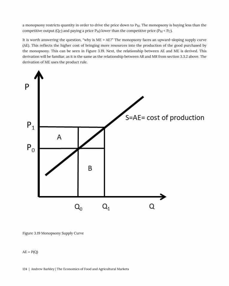
a monopsony restricts quantity in order to drive the price down to PM. The monopsony is buying less than the
competitive output (QC) and paying a price PM) lower than the competitive price (PM < PC).
It is worth answering the question, “why is ME > AE?” The monopsony faces an upward-sloping supply curve
(AE). This reflects the higher cost of bringing more resources into the production of the good purchased by
the monopsony. This can be seen in Figure 3.19. Next, the relationship between AE and ME is derived. This
derivation will be familiar, as it is the same as the relationship between AR and MR from section 3.3.2 above. The
derivation of ME uses the product rule.
Figure 3.19 Monopsony Supply Curve
AE = P(Q)
124 | Andrew Barkley | The Economics of Food and Agricultural Markets

TE = P(Q)Q
ME = ∂TE/∂Q = (∂P/∂Q)Q + P
ME = AE + (∂P/∂Q)Q
The first term in the expression for ME is AE, which corresponds to area B in Figure 3.19 (P0ΔQ). Average
expenditure is equal to P0 at quantity Q0. The second term, (∂P/∂Q)Q, is equal to area A in the diagram. This
area represents the change in price given a small change in quantity (∂P/∂Q), multiplied by the quantity (Q). For
a competitive firm, (∂P/∂Q) = 0, since the competitive firm is a price taker. For a competitive firm, AE = ME, as
shown in the left of Figure 3.17. For a monopsony, the firm pays the initial price plus the increase in price caused
by an increase in output. The monopsony must pay this new price (P1 in Figure 3.19) for all units purchased (Q).
This causes ME to be above AE.
It is instructive to view the monopoly graph next to the monopsony graph (Figure 3.20).
Figure 3.20 Monopoly and Monopsony
The monopoly in the left panel of Figure 3.20 restricts output to drive up the price. The monopoly output is less
than the competitive output (QM < QC), and the monopoly price is higher than the competitive price (PM > PC).
Chapter 3. Monopoly and Market Power | 125

The monopsony in the right panel of Figure 3.20 restricts output to drive down the price (PM < PC). Both firms
are maximizing profit by using the market characteristics that they face.
3.6.2 Welfare Effects of Monopsony
To measure the welfare impact of monopsony, the monopsony outcome is compared with perfect competition.
In competition, the price is equal to marginal cost (PC = MC), as in Figure 3.21. The competitive price and
quantity are Pc and Qc. The monopsony price and quantity are found where marginal value (MV) equals
marginal expenditure (MV = ME): PM and QM. The graph indicates that the monopsony reduces output from the
competitive level in order to decrease the price (PM < Pc and QM < Qc). The welfare analysis of a monopsony
relative to competition is straightforward.
ΔCS = +A – B
ΔPS = –AC
ΔSW = – BC
DWL = BC
Consumers are winners, and the benefits of monopsony depend on the magnitudes of areas A and B.
126 | Andrew Barkley | The Economics of Food and Agricultural Markets
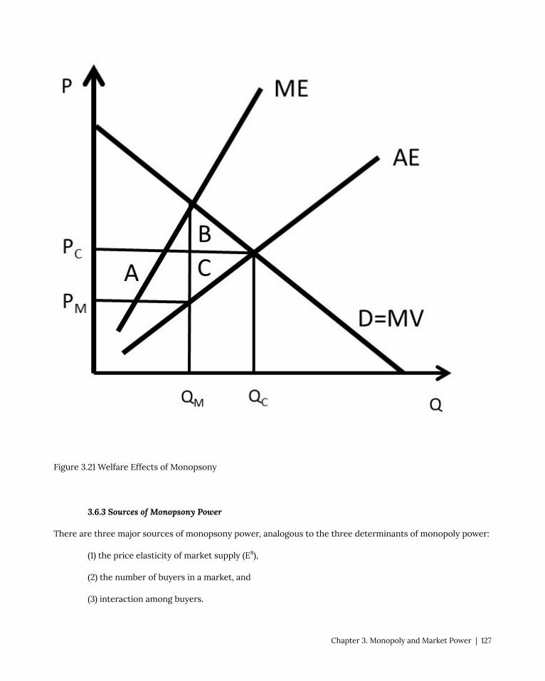
Figure 3.21 Welfare Effects of Monopsony
3.6.3 Sources of Monopsony Power
There are three major sources of monopsony power, analogous to the three determinants of monopoly power:
(1) the price elasticity of market supply (Es),
(2) the number of buyers in a market, and
(3) interaction among buyers.
Chapter 3. Monopoly and Market Power | 127

The price elasticity of supply is the most important determinant of monopsony power, and the monopsony
benefits from an inelastic supply curve. When the price elasticity is large (Es > 1), the supply is relatively elastic,
and the firm has less market power. When the price elasticity is small (Es < 1), the demand is relatively inelastic,
and the firm has more market power. This is shown in Figure 3.22.
Figure 3.22 Price Elasticity of Supply Impact on Monopsony
The second determinant of monopsony power is the number of firms in an industry. If a firm is the only buyer
in an industry, the firm is a monopsony, and has market power. The more firms there are in a market, the more
competition the firm faces, and the less market power.
The third source of monopsony power is interaction among firms. If firms compete aggressively with each
other, less monopsony power results. On the other hand, if firms cooperate and act together, the firms can have
more monopsony power. The next Chapter will explore how firms with market power determine optimal prices.
128 | Andrew Barkley | The Economics of Food and Agricultural Markets

Chapter 4. Pricing with Market Power
4.1 Introduction to Pricing with Market Power
In economics, the firm’s objective is assumed to be to maximize profits. Firms with market power do this by
capturing consumer surplus, and converting it to producer surplus. In Figure 4.1, a monopoly finds the profit-
maximizing price and quantity by setting MR equal to MC. This strategy maximizes profits for a firm setting a
single price (PM) and charging all customers the same price. In some situations, it is possible for a monopolist
to increase profits beyond the single price monopoly solution. Figure 4.1 shows that there are two sources of
consumer willingness to pay that the monopoly has not taken advantage of by producing a quantity of QM and
selling it at price PM.
Chapter 4. Pricing with Market Power | 129

Figure 4.1 Pricing Strategy for Firms with Market Power
Area A along the demand curve represents consumers with a higher willingness to pay than the monopoly price
PM. Area B represents consumers who have been priced out of the market, since the monopoly price is higher
than their willingness to pay. These two groups of consumers represent two areas of untapped consumer
surplus for a monopoly.
The monopoly price PM represents the profit-maximizing price if the monopolist is constrained to set only a
single price, and charge all customers the same single price. However, if the monopolist could charge more than
one price, it may be able to capture more consumer surplus (willingness to pay) and convert it into producer
surplus (profits). This Chapter describes and explains several pricing strategies for firms with market power.
These strategies enhance profits over and above the single price profit level shown in Figure 4.1. The strategies
include price discrimination, peak-load pricing, and two-part pricing.
4.2 Price Discrimination
Price discrimination is the practice of charging different prices to different customers. There are three forms
of price discrimination, defined and explained in what follows.
Price Discrimination = charging different prices to different customers.
4.2.1 First Degree Price Discrimination
First degree price discrimination is the extreme form of charging different prices to different consumers, and
makes use of the concept of “reservation price.” A consumer’s maximum willingness to pay is defined to be their
reservation price.
Reservation Price = The maximum price that a consumer is willing to pay for a good.
First Degree Price Discrimination = Charging each consumer her reservation price.
First degree price discrimination is shown in Figure 4.2, where the initial levels of consumer surplus (CS0) and
producer surplus (PS0) are defined for the competitive equilibrium. The competitive quantity is QC, and the
competitive price is PC. A monopoly could charge a price PM at quantity QM to maximize profits with a single
price.
Each individual’s willingness to pay is given by a point on the demand curve. If the firm knows each consumer’s
maximum willingness to pay, or reservation price, it can transfer all consumer surplus to producer surplus. The
130 | Andrew Barkley | The Economics of Food and Agricultural Markets

firm extracts every dollar of surplus available in the market by charging each consumer the maximum price
that they are willing to pay. First degree price discrimination results in levels of producer surplus and consumer
surplus PS1 and CS1, as shown in equation 4.1.
(4.1) PS1 = PS0 + CS0; CS1 = 0.
Every dollar of consumer surplus has been transferred to the firm. First degree price discrimination is also
called, “Perfect Price Discrimination.”
Figure 4.2 First Degree Price Discrimination
Chapter 4. Pricing with Market Power | 131

In most circumstances, it is difficult for the firm to practice first degree price discrimination. First, it is
difficult to charge different prices to different consumers. In many cases, it is illegal to charge different
prices to different people. Second, it is difficult and costly to elicit reservation prices from every consumer.
Therefore, first degree price discrimination is an extreme, idealized case of charging different prices to
different consumers. It is rare in the real world.
“Imperfect Price Discrimination” is a term used to describe markets that approach perfect price discrimination.
Examples of imperfect price discrimination include car sales and college tuition rates for students in college.
Car dealerships often post a “sticker price” and then lower the actual price, depending on how much the
consumer is willing to pay. Successful car sales people are often those who have exceptional abilities to discern
exactly how much each consumer is willing to pay, or their reservation price. Colleges and universities use
imperfect price discrimination by offering scholarships and financial aid packages to students based on their
willingness to enroll and attend an institution.
Imperfect price discrimination is shown in Figure 4.3, where different groups of consumers are charged
different prices based on their willingness to pay. Price P1 is a high price to capture consumers with high
willingness to pay, price P2 is the monopoly price (PM), and price P3 is the competitive price. If a firm can
distinguish different consumer groups’ willingness to pay, it can enhance profits through this form of price
discrimination.
132 | Andrew Barkley | The Economics of Food and Agricultural Markets

Figure 4.3 Imperfect Price Discrimination
4.2.2 Second Degree Price Discrimination
Second Degree Price Discrimination is a quantity discount.
Second Degree Price Discrimination = Charging different per-unit prices for different quantities of
the same good.
Chapter 4. Pricing with Market Power | 133

Second degree price discrimination is a common form of pricing and packaging. Consider an example of
two different sized packages of salsa with different prices per unit. Suppose that consumers have different
preferences for different sized salsa packages, and different demand curves reflect this.
For simplicity, assume that there are two consumers (consumer 1 and consumer 2) and two choices of package
size (A and B).
A: 8 oz jar, price = 2 USD, price per unit = 0.25 USD/oz
B: 32 oz jar, price = 4.80 USD, price per unit = 0.15 USD/oz
Figure 4.4 shows consumer demand for each of the two consumers.
Figure 4.4 Second Degree Price Discrimination
Consumer 1 has a preference for smaller quantities. This consumer could be a single person who desires to
purchase a small jar of salsa. Consumer 1’s demand curve demonstrates that she is willing to pay for the 8 ounce
jar of salsa (A), but not the 32 ounce jar (B). This is because A lies below demand curve D1, but not B. On the
other hand, consumer 2 desires the large jar of salsa, perhaps this is a family of four persons. Consumer 2 is
willing to purchase the 32 ounce jar (B), but not the 8 ounce jar (A). This is because B lies below the demand
curve D2, but not A.
It can be shown that the salsa firm can enhance profits by offering both sizes A and B. Assume that the costs of
producing salsa are equal to ten cents per ounce:
MC = 0.10 USD/oz.
134 | Andrew Barkley | The Economics of Food and Agricultural Markets

Situation One. Firm sells 8-ounce jar only.
Consumer 1 buys, Consumer 2 does not buy.
Q = 8 oz; P = 0.25 USD/oz; MC = 0.10 USD/oz
π1 = (P – MC)Q = (0.25 – 0.10)8 = (0.15)8 = 1.20 USD
Situation Two. Firm sells 32-ounce jar only.
Consumer 2 buys, Consumer 1 does not buy.
Q = 32 oz; P = 0.15 USD/oz; MC = 0.10 USD/oz
π2 = (P – MC)Q = (0.15 – 0.10)32 = (0.05)32 = 1.60 USD
Situation Three. Firm sells both 8-ounce and 32-ounce jars.
Consumer 1 buys 8 ounce jar, Consumer 2 buys 32 ounce jar.
π3 = (0.25 – 0.10)8 + (0.15 – 0.10)32 = (0.15)8 + (0.05)32 = 2.80 USD
Profits are larger if different sized packages are sold at the same time. Second degree price discrimination takes
advantage of differences between consumers, and is usually more profitable than offering a good in only one
package size. This explains the huge diversity of package sizes available for a large number of consumer goods.
4.2.3 Third Degree Price Discrimination
Third degree price discrimination is a practice of charging different prices to different consumer groups.
Third Degree Price Discrimination = Charging different prices to different consumer groups.
A firm that faces more than one group of consumers can increase profits by offering a good at different prices
to groups of consumers with different levels of willingness to pay. The firm will maximize profits by setting the
marginal revenue (MR) for each consumer group equal to the marginal cost of production (MC). This solution is
shown in equation 4.2 for two consumer groups:
(4.2) MR1 = MR2 = MC.
Two things are interesting about this result. First, the firm practicing third degree price discrimination is simply
following the profit-maximizing strategy of continuing any activity as long as the benefits outweigh the costs.
The firm will stop when marginal benefits from selling the good to both groups are equal to the marginal costs
Chapter 4. Pricing with Market Power | 135

of producing the good. Second, this solution is similar to the solution for the multiplant monopoly: MC1 = MC2 =
MR. Profit-maximizing firms use the same strategy for multiple plants and multiple consumers groups: set MR
equal to MC in all circumstances.
Movie theaters often offer a student discount to students, as well as discounts for children, senior citizens, and
military personnel. It may seem as if the theaters and other firms that offer these discounts are being nice to
these groups. In reality, however, the firms are practicing third degree price discrimination to maximize profits!
These groups of consumers have more elastic demands for movies, and would purchase a smaller number of
movie tickets if the price was not discounted for them. A numerical example will demonstrate how third degree
price discrimination works. Suppose that movie tickets are in thousands.
Movie ticket price = 12 USD/ticket
Student ticket price = 7 USD/ticket
Inverse Demand for movies: P1 = 20 – 4Q1
Inverse Demand for students: P2 = 10 – Q2
MC = 4 USD/ticket
max π = TR – TC
= TR1 – TC1 + TR2 – TC2
= P1Q1 – 4Q1 + P2Q2 – 4Q2
= (20 – 4Q1)Q1 – 4Q1 + (10 – Q2)Q2 – 4Q2
= 20Q1 – 4Q12 – 4Q1 + 10Q2 – Q2
2 – 4Q2
∂π/∂Q1 = 20 – 8Q1 – 4 = 0
8Q1 = 16
Q1* = 2 thousand movie tickets
P1* = 20 – 4(2) = 12 USD/ticket
∂π/∂Q2 = 10 – 2Q2 – 4 = 0
2Q2 = 6
Q2* = 3 thousand student movie tickets
P2* = 10 – (3) = 7 USD/ticket for students
The third degree price discrimination strategy is graphed in Figure 4.5.
136 | Andrew Barkley | The Economics of Food and Agricultural Markets

Figure 4.5 Third Degree Price Discrimination
A pricing rule for third degree price discrimination can be derived. Recall the pricing rule that was derived for
a monopoly in Chapter 3:
(4.3) MR = P[1 + (1/Ed)]
This pricing rule can be extended to include two groups of consumers, as follows.
MR1 = MR2 = MC
P1[1 + (1/E1)] = P2[1 + (1/E2)]
P1/P2 = [1 + (1/E2)] / [1 + (1/E1)]
The pricing rule for the third degree price discriminating firm shows that the highest price is charged to the
consumer group with the smallest (most inelastic) price elasticity of demand (Ed). This follows what we have
learned about the elasticity of demand: consumers with an elastic demand will switch to a substitute good if
the price increases, whereas consumers with an inelastic demand are more likely to pay the price increase.
The next section will present intertemporal price discrimination, or charging different prices at different times.
Chapter 4. Pricing with Market Power | 137

4.3 Intertemporal Price Discrimination
Intertemporal price discrimination provides a method for firms to separate consumer groups based
on willingness to pay. The strategy involves charging a high price initially, then lowering price after
time passes. Many technology products and recently-released products follow this strategy.
Intertemporal Price Discrimination = charging a high price initially, then lowering price after time
passes.
Intertemporal price discrimination is similar to second degree price discrimination, but charges a different
price across time. Second degree price discrimination charges a different price for different quantities at the
same time. Intertemporal price discrimination is shown in Figure 4.6.
Figure 4.6 Intertemporal Price Discrimination, Graph One
The first group has a higher willingness to pay for the good, as shown by demand curve D1. This group will pay
the higher initial price charged by the firm. A new iPhone release is a good example. Over time, Apple will lower
the price to capture additional consumer groups, such as group two in Figure 4.6. In this fashion, the firm will
extract a larger amount of consumer surplus than with a single price.
138 | Andrew Barkley | The Economics of Food and Agricultural Markets
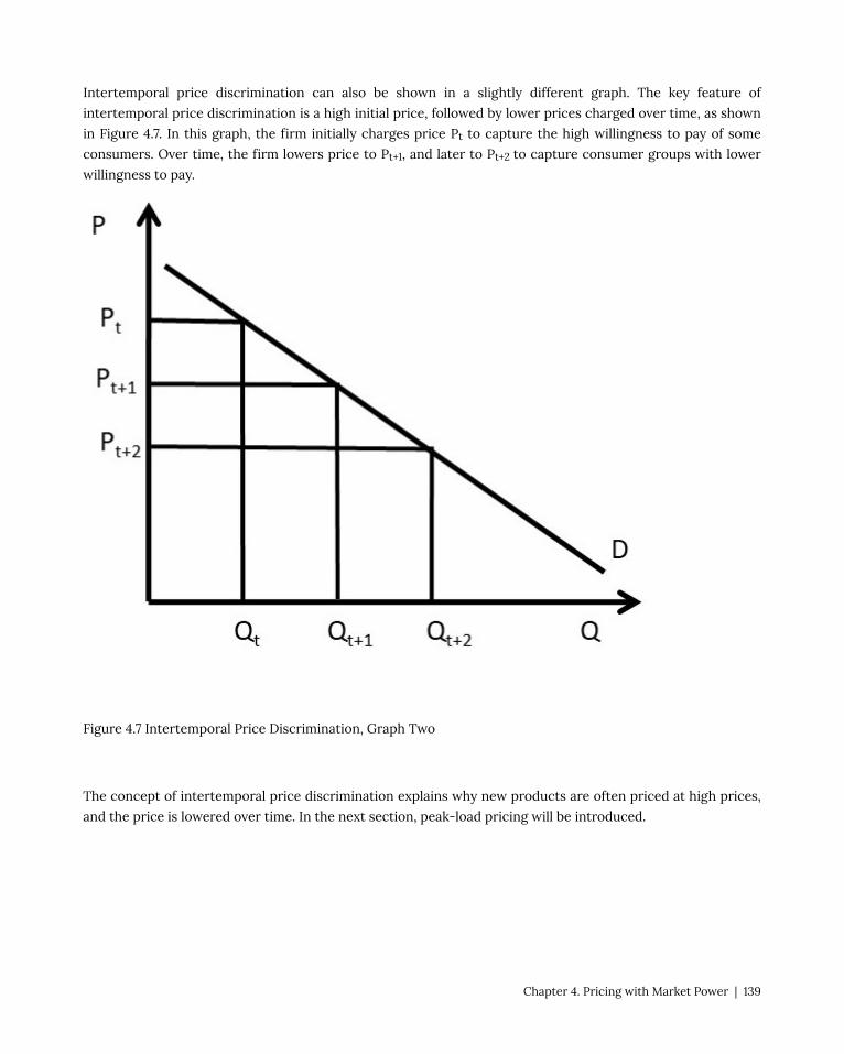
Intertemporal price discrimination can also be shown in a slightly different graph. The key feature of
intertemporal price discrimination is a high initial price, followed by lower prices charged over time, as shown
in Figure 4.7. In this graph, the firm initially charges price Pt to capture the high willingness to pay of some
consumers. Over time, the firm lowers price to Pt+1, and later to Pt+2 to capture consumer groups with lower
willingness to pay.
Figure 4.7 Intertemporal Price Discrimination, Graph Two
The concept of intertemporal price discrimination explains why new products are often priced at high prices,
and the price is lowered over time. In the next section, peak-load pricing will be introduced.
Chapter 4. Pricing with Market Power | 139

4.4 Peak Load Pricing
The demand for many goods is larger during certain times of the day or week. For example, roads are congested
during rush hours during the morning and evening commutes. Electricity has larger demand during the day
than at night. Ski resorts have large (peak) demands during the weekends, and smaller demand during the week.
Peak Load Pricing = Charging a high price during demand peaks, and a lower price during off-peak
time periods.
Figure 4.8 Peak Load Pricing
140 | Andrew Barkley | The Economics of Food and Agricultural Markets

Figure 4.8 demonstrates the demand for electricity during the day. Demand curve D1 represents demand at off-
peak hours at night. The electricity utility company will charge a price P1 for the off-peak hours. The costs of
producing electricity increase dramatically during peak hours. Electricity generation reaches the capacity of
the generating plants, causing larger quantities of electricity to be expensive to produce. For large coal-fired
plants, when capacity is reached, the firm will use natural gas to generate the peak demand. To cover these
higher costs, the firm will charge the higher price P2 during peak hours. The same graph represents a large
number of other goods that have peak demand at different times during a day, week, or year (ski resorts, toll
roads, parking lots, etc.).
Economic efficiency is greatly improved by charging higher prices during peak times. If the utility were
required to charge a single price at all times, it would lose the ability to charge consumers an appropriate price
during peak demand periods. Charging a higher price during peak hours provides an incentive for consumers to
switch consumption to off-peak hours. This saves society resources, since costs are lower during those times.
An example is electricity consumption. If consumers are charged higher prices during peak hours, they are
able to shift some electricity demand to night, the off-peak hours. Dishwashers, laundry, and bathing can be
shifted to off-peak hours, saving the consumer money and saving society resources. Electricity companies also
promote “smart grid” technology that automatically turns thermostats down when individuals and families are
not at home… saving the consumer and society money.
The next section will discuss a two-part tariff, or charging consumers a fixed fee for the right to purchase a
good, and a per-unit fee for each unit purchased.
4.5 Two-Part Pricing
A monopoly or any firm with market power can increase profits by charging a price structure with a fixed
component, or entry fee, and a variable component, or usage fee.
Two-Part Pricing (also called Two Part Tariff) = A form of pricing in which consumers are charged
both an entry fee (fixed price) and a usage fee (per-unit price).
Examples of two-part pricing include a phone contract that charges a fixed monthly charge and a per-minute
charge for use of the phone. Amusement parks often charge an admission fee and an additional price per ride.
Golf clubs typically charge an initiation fee and then usage fees based on meals eaten and golf rounds played.
College football tickets usually require a “donation” to the athletic department, used for scholarships, and a per-
ticket charge for the tickets.
Two-part pricing is shown in Figure 4.9, where a monopoly graph is presented.
Chapter 4. Pricing with Market Power | 141

Figure 4.9 Two-Part Pricing
Suppose that the graph represents an individual consumer’s demand. In competitive equilibrium (subscript 0),
price is equal to MC, output is equal to Q0, and producer and consumer surplus are given by:
PS0 = 0
CS0 = +ABCDE
The firm charges a price equal to the constant marginal cost (P = MC), and there is no producer surplus.
142 | Andrew Barkley | The Economics of Food and Agricultural Markets

Consumers receive the total area between the demand curve (willingness to pay) and the price line (price paid),
equal to area ABCDE.
A profit-maximizing firm (subscript 1) that charged a single price would maximize profits by producing Q1 units
of the good, and charging a price of P1. Surplus levels would be:
PS1 = +CD
CS1 = +AB
In this case, consumers have transferred areas C and D to producers, but still have surplus equal to area
AB. Producers interested in increasing profits could devise a two-part pricing strategy that transfers more
consumer surplus into producer surplus. Since CS > 0, consumers are willing to pay more than the monopoly
price, and firms can extract a greater level of consumer surplus. The firm could charge an entry fee (T), and
consumers would be willing to pay as long as the fee was less than their consumer surplus at the monopoly
level (CS1 = AB).
Consider the following two-part pricing scheme (subscript 2):
Usage fee: P2 = MC
Entry fee: T = A+B+C+D+E [T is set equal CS0 = CS under competition]
PS2 = +ABCDE
CS2 = 0
With a two-part pricing scheme, the firm has extracted every dollar of willingness to pay from consumers. The
total amount of producer surplus under two-part pricing is given by:
PS2 = T + (P2 – MC)Q2 = ABCDE
Notice that the firm earns zero profit from the usage fee (P2 = per-unit fee), since it sets the usage fee equal to
the cost of production (P2 = MC). All of the profits come from the entry fee (T = fixed price) in this case.
To summarize, a two-part tariff for consumers with identical demands would (1) set usage fee (price per unit)
equal to MC (P = MC), and (2) set a membership fee (entry fee) equal to consumer surplus at this price (T = CS
at P = MC). The two-part price will result in (1) CS = 0, and (2) PS = T + (P – MC)Q = T.
A numerical example will further elucidate the two-part price. Assume that an individual’s inverse demand
curve is given by: P = 20 – 2Q, and the cost function is C(Q) = 2Q. The firm seeks to find the optimal, profit-
maximizing two-part tariff. The situation is shown in Figure 4.10.
Chapter 4. Pricing with Market Power | 143

Figure 4.10 Two-Part Pricing Example
The firm will set the usage fee (per-unit price) equal to marginal cost: P* = MC = 2. At this price, the quantity
sold is found by substitution of the price into the inverse demand function: 2 = 20 – 2Q, or 2Q = 18, Q* = 9
units, as shown in Figure 4.10. Next, the firm will determine the entry fee (fixed price), by calculating the area
of consumer surplus at this price: CS = 0.5(20 – 2)(9 – 0) = 0.5(18)(9) = 9*9 = 81 USD. Therefore, the firm sets the
usage fee: T = 81 USD. The resulting levels of surplus are CS = 0 and PS = 81 USD. To summarize, the optimal
two-part tariff is to set the usage fee equal to marginal cost and the entry fee equal to the level of consumer
surplus at that price: P* = 2 USD/unit, T* = 81 USD.
144 | Andrew Barkley | The Economics of Food and Agricultural Markets
In our investigation of two-part pricing, identical consumer demands have been assumed. In the real world,
consumer demands may differ quite markedly across individuals. Given this possibility, the two-part pricing
strategy can be summarized as follows.
(1) If consumer demands are nearly identical, a two-part pricing scheme could increase profits by
charging a price close to marginal cost and an entry fee.
(2) If consumer demands are different, a two-part pricing scheme or a single price scheme could be
utilized by setting a price well above marginal cost and a lower entry fee to capture all consumers. Or,
set a single price.
In the next section, commodity bundling will be explained and explored.
4.6 Bundling
The practice of bundling is that of selling two or more goods together as a package.
Bundling = The practice of selling two or more goods together as a package.
Bundling is a widely-practiced sales strategy that takes advantage of differences in consumer willingness to
pay for different goods. McDonalds Happy Meals are an example of bundling, since the customer purchases a
hamburger, French fries, beverage, and toy as a single purchase. McDonalds was an innovator in bundling, and
has expanded the practice to include “Value Meals.” Communication companies often package internet service,
cable television, and phone service together into a package.
4.6.1 Bundling Examples
A simple example of bundling is a value meal at a fast food restaurant. To make things simple, assume that there
are two consumers (A and B), two products (burger and fries) and marginal costs are equal to zero. The zero-
cost assumption is not realistic, but the model results do not change when we assume zero costs.
Table 4.1 shows the reservation prices (willingness to pay) for both consumers for each good.
Chapter 4. Pricing with Market Power | 145

Recall that the reservation price is the maximum amount that a consumer is willing to pay for a good. The
reservation price for the bundle (shown in the right column of table 4.1) is simply the sum of the two reservation
prices for the burger and fries. Next, a comparison is made between selling the two good individually versus
selling them as a bundle.
CASE ONE: Sell each product individually.
Πburger 1. If set Pburger = 6 USD/unit, A buys, Πburger = 6*1 = 6 USD
2. If set Pburger = 4 USD/unit, A and B buy, Πburger = 4*2 = 8 USD
>>>Set P*burger = 4 USD/unit; Πburger = 8 USD
Πfries 1. If set Pfries = 2 USD/unit, A and B buy, Πfries = 2*2 = 4 USD
2. If set Pfries = 3 USD/unit, B buys, Πfries = 3*1 = 3 USD
>>>Set P*fries = 2 USD/unit; Πfries = 4 USD
Πtotal individualΠtotal individual = PbQb + PfQf = 4*2 + 2*2 = 8 + 4 = 12 USD
CASE TWO: Bundle burger and fries into a single package.
Πbundle 1. If set Pbundle = 8 USD/unit, A buys, Πbundle = 8*1 = 8 USD
2. If set Pbundle = 7 USD/unit, A and B buy, Πbundle = 7*2 = 14 USD
>>>Set P*bundle = 7 USD/unit; Πbundle = 14 USD
Bundling increases profit from 12 to 14 USD. This result will occur if the reservation prices are inversely
146 | Andrew Barkley | The Economics of Food and Agricultural Markets

correlated. To see this, work out the profits for selling goods individually and as a bundle for the reservation
prices that appear in Table 4.2.
Bundling enhances profits only when consumers have uncorrelated reservation prices. In this way, bundling
takes advantage of differences in consumer willingness to pay.
Many firms have used “Green Bundling” to tie goods with environmental or sustainable goods (natural, organic,
local, etc.). As long as consumer preferences for the good and the sustainability goal are uncorrelated, this
strategy will increase profits.
4.6.2 Tying
A practice related to bundling is tying.
Tying = The practice of requiring a customer to purchase one good in order to purchase another.
Tying is a specific form of bundling. An example is Microsoft selling Windows software together with Internet
Explorer, a web browser. A second example is printers and ink cartridges. Many hardware companies make a
great deal of profit from selling ink cartridges for printers. The cartridges do not have a universal shape, so
must be purchased specifically for each printer. The next section will discuss advertising.
4.7 Advertising
Advertising is a huge industry, with billions spent every year on marketing products. Are these enormous
expenditures worth it? The benefits of increased sales and revenues must be at least as large as the increased
costs to make it a good investment. In this section, the profit-maximizing level of advertising will be identified
and evaluated.
Chapter 4. Pricing with Market Power | 147

One important point about advertising is the costs associated with advertising expenditures. If advertising
works, it increases sales of the product. There are two major costs, the direct costs of advertising and the
additional costs associated with increasing production if the advertising is effective.
A typical analysis sets the marginal revenues of advertising equal to the marginal costs of advertising (MRA =
MCA). This would be correct if the level of output remained constant. However, the output level will increase if
advertising works, and the additional costs of increased output must be taken into account for a comprehensive
and correct analysis, as will be shown below.
4.7.1 Graphical Analysis of Advertising
The graph for advertising is shown in Figure 4.11. Notice the two major effects of advertising and marketing
efforts: (1) an increase in demand, in this case from D0 to DA, and (2) an increase in costs, shown here as the
movement from ATC0 to ATCA. In the analysis shown here, advertising costs are considered to be fixed costs
that do not vary with the level of output. This is true for a billboard, or television commercial. Note that the
marginal costs do not change, since marginal costs are variable costs. The analysis could be easily extended to
include variable advertising costs.
Economic analysis of advertising and marketing is straightforward: continue to advertise as long as the benefits
outweigh the costs. In Figure 4.11, the optimal level of advertising occurs at quantity QA and price PA. Profits
with advertising are shown by the rectangle πA. If profits with advertising are larger than profits without
advertising (πA > π0), then advertising should be undertaken.
148 | Andrew Barkley | The Economics of Food and Agricultural Markets

In general, if the increase in sales (DA – D0) is larger than the increase in costs, advertising should be
undertaken. The optimal level of advertising can be found using marginal economic analysis, as described in the
next section.
4.7.2 General Rule for Advertising
The profit-maximizing level of advertising can be derived, and the outcome is interesting and important, since
it diverges from setting the marginal costs of advertising equal to the marginal revenues of advertising. Note
that the graphical and mathematical analyses of advertising presented here could be used for any marketing
program, not only advertising campaigns.
Assume that the demand for a product is given in Equation (4.4), where quantity demanded (Qd) is a function of
price (P) and the level of advertising (A).
(4.4) Qd = Q(P, A)
This demand equation differs from the usual approach of using an inverse demand equation. For this model, it
Chapter 4. Pricing with Market Power | 149

is more useful to use the actual demand equation instead of an inverse demand equation [P=P(Qd)]. The profit
equation is shown in Equation (4.5), where the cost function is given by C(Q).
(4.5) max π = TR – TC
max π = PQ(P, A) – C(Q) – A
The profit-maximizing level of advertising (A*) is found by taking the first derivative of the profit function, and
setting it equal to zero. This derivative is slightly more complex than usual, since the quantity that appears in
the cost function depends on advertising, as shown in Equation 4.4. Therefore, to find the first derivative, we
will need to use the chain rule from calculus, which is used to differentiate a composition of functions, such as
the derivative of the function f(g(x)) shown in Equation (4.6).
(4.6) If f(g(x)) then ∂f/∂x = f’(g(x))*g’(x)
The chain rule simply says that to differentiate a composition of functions, first differentiate the outer layer,
leaving the inner layer unchanged [the term f'(g(x))], then differentiate the inner layer [the term g'(x)].
In Equation (4.5), the cost function is a composition of the cost function and the demand function: C(Q(P, A)). So
the derivative ∂C/∂A = C’(Q(A))*Q’(A) = (∂C/∂Q)*(∂Q/∂A). Thus, the first derivative of the profit equation with
respect to advertising is given by:
∂π/∂A = P(∂Q/∂A) – (∂C/∂Q)*(∂Q/∂A) – 1 = 0
Rearranging, the first derivative can be written as in Equation (4.7):
(4.7) P(∂Q/∂A) = MC*(∂Q/∂A) + 1.
The term on the left hand side is marginal revenues of advertising (MRA), and the term on the right hand side is
the marginal cost of advertising (MCA = 1), plus the additional costs associated with producing a larger output
to meet the increased demand resulting from advertising [MC*(∂Q/∂A)].
This result can be used to find an optimal “rule of thumb” for advertising, or a “General Rule for Advertising.”
There are three preliminary definitions that will be useful in deriving this important result. First, the advertising
to sales ratio is given by A/PQ, and reflects the percentage of advertising in total revenues (price multiplied by
quantity, PQ). Second, the advertising elasticity of demand is defined.
Advertising Elasticity of Demand (EA) = The percentage change in quantity demanded resulting from
a one percent change in advertising expenditure.
(4.8) EA = %ΔQd/%ΔA = (∂Q/∂A)(A/Q).
Third, recall the Lerner Index (L), a measure of monopoly power. We derived the relationship between the
Lerner Index and the price elasticity of demand, shown in Equation (4.9):
(4.9) L = (P – MC)/P = – 1/Ed.
With these three preliminary equations, we can derive a relatively simple and very useful general rule of
advertising from the profit-maximizing condition for advertising, given in Equation (4.7).
150 | Andrew Barkley | The Economics of Food and Agricultural Markets

P(∂Q/∂A) = MC*(∂Q/∂A) + 1
(P – MC)(∂Q/∂A) = 1
(P – MC)/P *(∂Q/∂A)(A/Q) = (A/PQ)
A/PQ = -EA/Ed
This simple rule states that the profit-maximizing advertising to sales ratio (A/PQ) is equal to minus the
elasticity of advertising (EA) divided by the price elasticity of demand (–Ed). The result is simple and powerful:
(1) if the elasticity of advertising is large, increase the advertising to sales ratio, and (2) if the price elasticity of
demand is large, decrease the advertising to sale ratio. A firm with monopoly power, or a higher Lerner Index,
will want to advertise more (Ed small), since the marginal profit from each additional dollar of advertising or
marketing expenditure is greater.
Most business firms have at least crude approximations of the two elasticities needed to use this simple
rule. Many firms advertise less than the optimal rate, since marketing can appear to be expensive if it is a
large percentage of sales. However, simple economic principles can be used to determine the optimal, profit-
maximizing level of advertising and/or marketing expenditures using this simple rule.
Chapter 4. Pricing with Market Power | 151


Chapter 5. Monopolistic Competition and Oligopoly
5.1 Market Structures
5.1.1 Market Structure Spectrum and Characteristics
Table 5.1 shows the four major categories of market structures and their characteristics.
Table 5.1 Market Structure Characteristics
Perfect Competition Monopolistic Competition Oligopoly Monopoly
Homogeneous good Differentiated good Differentiated good One good
Numerous firms Many firms Few firms One firm
Free entry and exit Free entry and exit Barriers to entry No entry
Perfect competition is on one end of the market structure spectrum, with numerous firms. The word,
“numerous” has special meaning in this context. In a perfectly competitive industry, each firm is so small
relative to the market that it cannot affect the price of the good. Each perfectly competitive firm is a price taker.
Therefore, numerous firms means that each firm is so small that it is a price taker.
Monopoly is the other extreme of the market structure spectrum, with a single firm. Monopolies have monopoly
power, or the ability to change the price of the good. Monopoly power is also called market power, and is
measured by the Lerner Index.
This chapter defines and describes two intermediary market structures: monopolistic competition and
oligopoly.
Monopolistic Competition = A market structure characterized by a differentiated product and
freedom of entry and exit.
Monopolistically Competitive firms have one characteristic that is like a monopoly (a differentiated product
provides market power), and one characteristic that is like a competitive firm (freedom of entry and exit). This
form of market structure is common in market-based economies, and a trip to the grocery store reveals large
numbers of differentiated products: toothpaste, laundry soap, breakfast cereal, and so on.
Chapter 5. Monopolistic Competition and Oligopoly | 153

Next, we define the market structure oligopoly.
Oligopoly = A market structure characterized by barriers to entry and a few firms.
Oligopoly is a fascinating market structure due to interaction and interdependency between oligopolistic firms.
What one firm does affects the other firms in the oligopoly.
Since monopolistic competition and oligopoly are intermediary market structures, the next section will review
the properties and characteristics of perfect competition and monopoly. These characteristics will provide the
defining characteristics of monopolistic competition and oligopoly.
5.1.2 Review of Perfect Competition
The perfectly competitive industry has four characteristics:
(1) Homogenous product,
(2) Large number of buyers and sellers (numerous firms),
(3) Freedom of entry and exit, and
(4) Perfect information.
The possibility of entry and exit of firms occurs in the long run, since the number of firms is fixed in the short
run.
An equilibrium is defined as a point where there is no tendency to change. The concept of equilibrium can be
extended to include the short run and long run.
Short Run Equilibrium = A point from which there is no tendency to change (a steady state), and a
fixed number of firms.
Long Run Equilibrium = A point from which there is no tendency to change (a steady state), and entry
and exit of firms.
In the short run, the number of firms is fixed, whereas in the long run, entry and exit of firms is possible, based
on profit conditions. We will compare the short and long run for a competitive firm in Figure 5.1. The two panels
in Figure 5.1 are for the firm (left) and industry (right), with vastly different units. This is emphasized by using “q”
for the firm’s output level, and “Q” for the industry output level. The graph shows both short run and long run
equilibria for a perfectly competitive firm and industry. In short run equilibrium, the firms faces a high price
(PSR), produces quantity QSR at PSR = MC, and earns positive profits πSR.
154 | Andrew Barkley | The Economics of Food and Agricultural Markets

Figure 5.1 Short Run and Long Run Equilibria for a Perfectly Competitive Firm
Positive profits in the short run (πSR > 0) lead to entry of other firms, as there are no barriers to entry in a
competitive industry. The entry of new firms shifts the supply curve in the industry graph from supply SSR to
supply SLR. Entry will occur until profits are driven to zero, and long run equilibrium is reached at Q*LR. In the
long run, economic profits are equal to zero, so there is no incentive for entry or exit. Each firm is earning
exactly what it is worth, the opportunity costs of all resources. In long run equilibrium, profits are zero (πLR =
0), and price equals the minimum average cost point (P = min AC = MC). Marginal costs equal average costs at
the minimum average cost point. At the long run price, supply equals demand at price PLR.
5.1.3 Review of Monopoly
The characteristics of monopoly include: (1) one firm, (2) one product, and (3) no entry (Table 5.1). The monopoly
solution is shown in Figure 5.2.
Chapter 5. Monopolistic Competition and Oligopoly | 155

Figure 5.2 Monopoly Profit Maximization
Note that long-run profits can exist for a monopoly, since barriers to entry halt any potential entrants from
joining the industry. In the next section, we will explore market structures that lie between the two extremes
of perfect competition and monopoly.
5.2 Monopolistic Competition
156 | Andrew Barkley | The Economics of Food and Agricultural Markets
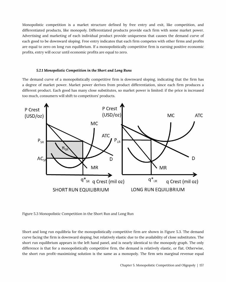
Monopolistic competition is a market structure defined by free entry and exit, like competition, and
differentiated products, like monopoly. Differentiated products provide each firm with some market power.
Advertising and marketing of each individual product provide uniqueness that causes the demand curve of
each good to be downward sloping. Free entry indicates that each firm competes with other firms and profits
are equal to zero on long run equilibrium. If a monopolistically competitive firm is earning positive economic
profits, entry will occur until economic profits are equal to zero.
5.2.1 Monopolistic Competition in the Short and Long Runs
The demand curve of a monopolistically competitive firm is downward sloping, indicating that the firm has
a degree of market power. Market power derives from product differentiation, since each firm produces a
different product. Each good has many close substitutes, so market power is limited: if the price is increased
too much, consumers will shift to competitors’ products.
Figure 5.3 Monopolistic Competition in the Short Run and Long Run
Short and long run equilibria for the monopolistically competitive firm are shown in Figure 5.3. The demand
curve facing the firm is downward sloping, but relatively elastic due to the availability of close substitutes. The
short run equilibrium appears in the left hand panel, and is nearly identical to the monopoly graph. The only
difference is that for a monopolistically competitive firm, the demand is relatively elastic, or flat. Otherwise,
the short run profit-maximizing solution is the same as a monopoly. The firm sets marginal revenue equal
Chapter 5. Monopolistic Competition and Oligopoly | 157

to marginal cost, produces output level q*SR and charges price PSR. The profit level is shown by the shaded
rectangle π.
The long run equilibrium is shown in the right hand panel. Entry of other firms occurs until profits are equal
to zero; total revenues are equal to total costs. Thus, the demand curve is tangent to the average cost curve at
the optimal long run quantity, q*LR. The long run profit-maximizing quantity is found where marginal revenue
equals marginal cost, which also occurs at q*LR.
5.2.2 Economic Efficiency and Monopolistic Competition
There are two sources of inefficiency in monopolistic competition. First, dead weight loss (DWL) due to
monopoly power: price is higher than marginal cost (P > MC). Second, excess capacity: the equilibrium quantity
is smaller than the lowest cost quantity at the minimum point on the average cost curve (q*LR < qminAC). These
two sources of inefficiency can be seen in Figure 5.4.
Figure 5.4 Comparison of Efficiency for Competition and Monopolistic Competition
First, there is dead weight loss (DWL) due to market power: the price is higher than marginal cost in long run
equilibrium. In the right hand panel of Figure 5.4, the price at the long run equilibrium quantity is PLR, and
marginal cost is lower: PLR > MC. This causes dead weight loss to society, since the competitive equilibrium
158 | Andrew Barkley | The Economics of Food and Agricultural Markets

would be at a larger quantity where P = MC. Total dead weight loss is the shaded area beneath the demand
curve and above the MC curve in figure 5.4.
The second source of inefficiency associated with monopolistic competition is excess capacity. This can also be
seen in the right hand panel of Figure 5.4, where the long run equilibrium quantity is lower than the quantity
where average costs are lowest (qminAC). Therefore, the firm could produce at a lower cost by increasing output
to the level where average costs are minimized.
Given these two inefficiencies associated with monopolistic competition, some individuals and groups have
called for government intervention. Regulation could be used to reduce or eliminate the inefficiencies by
removing product differentiation. This would result in a single product instead of a large number of close
substitutes.
Regulation is probably not a good solution to the inefficiencies of monopolistic competition, for two reasons.
First, the market power of a typical firm in most monopolistically competitive industries is small. Each
monopolistically competitive industry has many firms that produce sufficiently substitutable products to
provide enough competition to result in relatively low levels of market power. If the firms have small levels of
market power, then the deadweight loss and excess capacity inefficiencies are likely to be small.
Second, the benefit provided by monopolistic competition is product diversity. The gain from product diversity
can be large, as consumers are willing to pay for different characteristics and qualities. Therefore, the gain from
product diversity is likely to outweigh the costs of inefficiency. Evidence for this claim can be seen in market-
based economies, where there is a huge amount of product diversity.
The next chapter will introduce and discuss oligopoly: strategic interactions between firms!
5.3 Oligopoly Models
An oligopoly is defined as a market structure with few firms and barriers to entry.
Oligopoly = A market structure with few firms and barriers to entry.
There is often a high level of competition between firms, as each firm makes decisions on prices, quantities, and
advertising to maximize profits. Since there are a small number of firms in an oligopoly, each firm’s profit level
depends not only on the firm’s own decisions, but also on the decisions of the other firms in the oligopolistic
industry.
5.3.1 Strategic Interactions
Each firm must consider both: (1) other firms’ reactions to a firm’s own decisions, and (2) the own firm’s
Chapter 5. Monopolistic Competition and Oligopoly | 159

reactions to the other firms’ decisions. Thus, there is a continuous interplay between decisions and reactions to
those decisions by all firms in the industry. Each oligopolist must take into account these strategic interactions
when making decisions. Since all firms in an oligopoly have outcomes that depend on the other firms, these
strategic interactions are the foundation of the study and understanding of oligopoly.
For example, each automobile firm’s market share depends on the prices and quantities of all of the other firms
in the industry. If Ford lowers prices relative to other car manufacturers, it will increase its market share at the
expense of the other automobile companies.
When making decisions that consider the possible reactions of other firms, firm managers usually assume that
the managers of competing firms are rational and intelligent. These strategic interactions form the study of
game theory, the topic of Chapter 6 below. John Nash (1928-2015), an American mathematician, was a pioneer
in game theory. Economists and mathematicians use the concept of a Nash Equilibrium (NE) to describe a
common outcome in game theory that is frequently used in the study of oligopoly.
Nash Equilibrium = An outcome where there is no tendency to change based on each individual
choosing a strategy given the strategy of rivals.
In the study of oligopoly, the Nash Equilibrium assumes that each firm makes rational profit-maximizing
decisions while holding the behavior of rival firms constant. This assumption is made to simplify oligopoly
models, given the potential for enormous complexity of strategic interactions between firms. As an aside, this
assumption is one of the interesting themes of the motion picture, “A Beautiful Mind,” starring Russell Crowe as
John Nash. The concept of Nash Equilibrium is also the foundation of the models of oligopoly presented in the
next three sections: the Cournot, Bertrand, and Stackelberg models of oligopoly.
5.3.2 Cournot Model
Augustin Cournot (1801-1877), a French mathematician, developed the first model of oligopoly explored here.
The Cournot model is a model of oligopoly in which firms produce a homogeneous good, assuming that the
competitor’s output is fixed when deciding how much to produce.
A numerical example of the Cournot model follows, where it is assumed that there are two identical firms
(a duopoly), with output given by Qi (i=1,2). Therefore, total industry output is equal to: Q = Q1 + Q2. Market
demand is a function of price and given by Qd = Qd(P), thus the inverse demand function is P = P(Qd). Note that
the price depends on the market output Q, which is the sum of both individual firm’s outputs. In this way, each
firm’s output has an influence on the price and profits of both firms. This is the basis for strategic interaction
in the Cournot model: if one firm increases output, it lowers the price facing both firms. The inverse demand
function and cost function are given in Equation 5.1.
(5.1) P = 40 – QC(Qi) = 7Qi i = 1,2
Each firm chooses the optimal, profit-maximizing output level given the other firm’s output. This will result in
a Nash Equilibrium, since each firm is holding the behavior of the rival constant. Firm One maximizes profits as
follows.
160 | Andrew Barkley | The Economics of Food and Agricultural Markets

max π1 = TR1 – TC1
max π1 = P(Q)Q1 – C(Q1)[price depends on total output Q = Q1 + Q2]
max π1 = [40 – Q]Q1 – 7Q1
max π1 = [40 – Q1 – Q2]Q1 – 7Q1
max π1 = 40Q1 – Q12 – Q2Q1 – 7Q1
∂π1/∂Q1= 40 – 2Q1 – Q2 – 7 = 0
2Q1 = 33 – Q2
Q1* = 16.5 – 0.5Q2
This equation is called the “Reaction Function” of Firm One. This is as far as the mathematical solution can be
simplified, and represents the Cournot solution for Firm One. It is a reaction function since it describes Firm
One’s reaction given the output level of Firm Two. This equation represents the strategic interactions between
the two firms, as changes in Firm Two’s output level will result in changes in Firm One’s response. Firm One’s
optimal output level depends on Firm Two’s behavior and decision making. Oligopolists are interconnected in
both behavior and outcomes.
The two firms are assumed to be identical in this duopoly. Therefore, Firm Two’s reaction function will be
symmetrical to the Firm One’s reaction function (check this by setting up and solving the profit-maximization
equation for Firm Two):
Q2* = 16.5 – 0.5Q1
The two reaction functions can be used to solve for the Cournot-Nash Equilibrium. There are two equations
and two unknowns (Q1 and Q2), so a numerical solution is found through substitution of one equation into the
other.
Q1* = 16.5 – 0.5(16.5 – 0.5Q1)
Q1* = 16.5 – 8.25 + 0.25Q1
Q1* = 8.25 + 0.25Q1
0.75Q1* = 8.25
Q1* = 11
Due to symmetry from the assumption of identical firms:
Qi = 11 i = 1,2Q = 22units P = 18 USD/unit
Profits for each firm are:
πi = P(Q)Qi – C(Qi) = 18(11) – 7(11) = (18 – 7)11 = 11(11) = 121 USD
Chapter 5. Monopolistic Competition and Oligopoly | 161

This is the Cournot-Nash solution for oligopoly, found by each firm assuming that the other firm holds its
output level constant. The Cournot model can be easily extended to more than two firms, but the math does
get increasingly complex as more firms are added. Economists utilize the Cournot model because is based on
intuitive and realistic assumptions, and the Cournot solution is intermediary between the outcomes of the two
extreme market structures of perfect competition and monopoly.
This can be seen by solving the numerical example for competition, Cournot, and monopoly models, and
comparing the solutions for each market structure.
In a competitive industry, free entry results in price equal to marginal cost (P = MC). In the case of the numerical
example, PC = 7. When this competitive price is substituted into the inverse demand equation, 7 = 40 – Q, or Qc
= 33. Profits are found by solving (P – MC)Q, or πc = (7 – 7)Q = 0. The competitive solution is given in Equation
(5.2).
(5.2) Pc = 7 USD/unitQc = 33 unitsπc = 0 USD
The monopoly solution is found by maximizing profits as a single firm.
max πm = TRm – TCm
max πm = P(Qm)Qm – C(Qm)[price depends on total output Qm]
max πm = [40 – Qm]Qm – 7Qm
max πm = 40Qm – Qm2 – 7Qm
∂πm/∂Qm= 40 – 2Qm – 7 = 0
2Qm = 33
Qm* = 16.5
Pm = 40 – 16.5 = 23.5
πm = (Pm – MCm)Qm = (23.5 – 7)16.5 = 16.5(16.5) = 272.25 USD
The monopoly solution is given in Equation (5.3).
(5.3) Pm = 23.5 USD/unit Qm = 16.5 unitsπm = 272.5 USD
The competitive, Cournot, and monopoly solutions can be compared on the same graph for the numerical
example (Figure 5.5).
162 | Andrew Barkley | The Economics of Food and Agricultural Markets

Figure 5.5 Comparisons of Perfect Competition, Cournot, and Monopoly Solutions
The Cournot price and quantity are between perfect competition and monopoly, which is an expected result,
since the number of firms in an oligopoly lies between the two market structure extremes.
5.3.3 Bertrand Model
Joseph Louis François Bertrand (1822-1900) was also a French mathematician who developed a competing
model to the Cournot model. Bertrand asked the question, “what would happen in an oligopoly model if each
firm held the other firm’s price constant?” The Bertrand model is a model of oligopoly in which firms produce a
homogeneous good, and each firm takes the price of competitors fixed when deciding what price to charge.
Assume two firms in an oligopoly (a duopoly), where the two firms choose the price of their good
simultaneously at the beginning of each period. Consumers purchase from the firm with the lowest price, since
Chapter 5. Monopolistic Competition and Oligopoly | 163
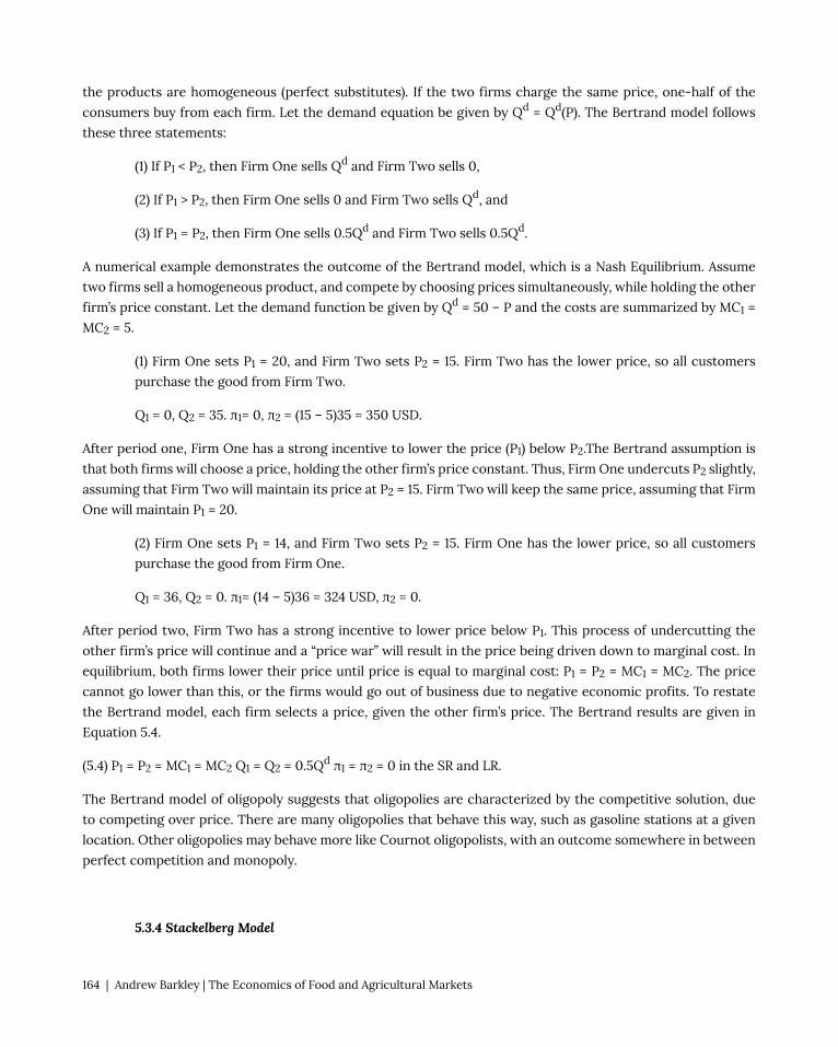
the products are homogeneous (perfect substitutes). If the two firms charge the same price, one-half of the
consumers buy from each firm. Let the demand equation be given by Qd = Qd(P). The Bertrand model follows
these three statements:
(1) If P1 < P2, then Firm One sells Qd and Firm Two sells 0,
(2) If P1 > P2, then Firm One sells 0 and Firm Two sells Qd, and
(3) If P1 = P2, then Firm One sells 0.5Qd and Firm Two sells 0.5Qd.
A numerical example demonstrates the outcome of the Bertrand model, which is a Nash Equilibrium. Assume
two firms sell a homogeneous product, and compete by choosing prices simultaneously, while holding the other
firm’s price constant. Let the demand function be given by Qd = 50 – P and the costs are summarized by MC1 =
MC2 = 5.
(1) Firm One sets P1 = 20, and Firm Two sets P2 = 15. Firm Two has the lower price, so all customers
purchase the good from Firm Two.
Q1 = 0, Q2 = 35. π1= 0, π2 = (15 – 5)35 = 350 USD.
After period one, Firm One has a strong incentive to lower the price (P1) below P2.The Bertrand assumption is
that both firms will choose a price, holding the other firm’s price constant. Thus, Firm One undercuts P2 slightly,
assuming that Firm Two will maintain its price at P2 = 15. Firm Two will keep the same price, assuming that Firm
One will maintain P1 = 20.
(2) Firm One sets P1 = 14, and Firm Two sets P2 = 15. Firm One has the lower price, so all customers
purchase the good from Firm One.
Q1 = 36, Q2 = 0. π1= (14 – 5)36 = 324 USD, π2 = 0.
After period two, Firm Two has a strong incentive to lower price below P1. This process of undercutting the
other firm’s price will continue and a “price war” will result in the price being driven down to marginal cost. In
equilibrium, both firms lower their price until price is equal to marginal cost: P1 = P2 = MC1 = MC2. The price
cannot go lower than this, or the firms would go out of business due to negative economic profits. To restate
the Bertrand model, each firm selects a price, given the other firm’s price. The Bertrand results are given in
Equation 5.4.
(5.4) P1 = P2 = MC1 = MC2 Q1 = Q2 = 0.5Qd π1 = π2 = 0 in the SR and LR.
The Bertrand model of oligopoly suggests that oligopolies are characterized by the competitive solution, due
to competing over price. There are many oligopolies that behave this way, such as gasoline stations at a given
location. Other oligopolies may behave more like Cournot oligopolists, with an outcome somewhere in between
perfect competition and monopoly.
5.3.4 Stackelberg Model
164 | Andrew Barkley | The Economics of Food and Agricultural Markets

Heinrich Freiherr von Stackelberg (1905-1946) was a German economist who contributed to game theory and
the study of market structures with a model of firm leadership, or the Stackelberg model of oligopoly. This
model assumes that there are two firms in the industry, but they are asymmetrical: there is a “leader” and a
“follower.” Stackelberg used this model of oligopoly to determine if there was an advantage to going first, or a
“first-mover advantage.”
A numerical example is used to explore the Stackelberg model. Assume two firms, where Firm One is the leader
and produces Q1 units of a homogeneous good. Firm Two is the follower, and produces Q2 units of the good.
The inverse demand function is given by P = 100 – Q, where Q = Q1 + Q2. The costs of production are given by
the cost function: C(Q) = 10Q.
This model is solved recursively, or backwards. Mathematically, the problem must be solved this way to find
a solution. Intuitively, each firm will hold the other firm’s output constant, similar to Cournot, but the leader
must know the follower’s best strategy to move first. Thus, Firm One solves Firm Two’s profit maximization
problem to know what output it will produce, or Firm Two’s reaction function. Once the reaction function of
the follower (Firm Two) is known, then the leader (Firm One) maximizes profits by substitution of Firm Two’s
reaction function into Firm One’s profit maximization equation. All of this is shown in the following example.
Firm One starts by solving for Firm Two’s reaction function:
max π2 = TR2 – TC2
max π2 = P(Q)Q2 – C(Q2)[price depends on total output Q = Q1 + Q2]
max π2 = [100 – Q]Q2 – 10Q2
max π2 = [100 – Q1 – Q2]Q2 – 10Q2
max π2 = 100Q2 – Q1Q2 – Q22 – 10Q2
∂π2/∂Q2= 100 – Q1 – 2Q2 – 10 = 0
2Q2 = 90 – Q1
Q2* = 45 – 0.5Q1
This is the reaction function of the follower, Firm Two. Next, Firm One, the leader, maximizes profits holding
the follower’s output constant using the reaction function.
max π1 = TR1 – TC1
max π1 = P(Q)Q1 – C(Q1)[price depends on total output Q = Q1 + Q2]
max π1 = [100 – Q]Q1 – 10Q1
max π1 = [100 – Q1 – Q2]Q1 – 10Q1
max π1 = [100 – Q1 – (45 – 0.5Q1)]Q1 – 10Q1 [substitution of One’s reaction function]
Chapter 5. Monopolistic Competition and Oligopoly | 165

max π1 = [100 – Q1 – 45 + 0.5Q1]Q1 – 10Q1
max π1 = [55 – 0.5Q1]Q1 – 10Q1
max π1 = 55Q1 – 0.5Q12 – 10Q1
∂π1/∂Q1= 55 – Q1 – 10 = 0
Q1* = 45
This can be substituted back into Firm Two’s reaction function to solve for Q2*.
Q2* = 45 – 0.5Q1 = 45 – 0.5(45) = 45 – 22.5 = 22.5
Q = Q1 + Q2 = 45 + 22.5 = 67.5
P = 100 – Q = 100 – 67.5 = 32.5
π1 = (32.5 – 10)45 = 22.5(45) = 1012.5 USD
π2 = (32.5 – 10)22.5 = 22.5(22.5) = 506.25 USD
We have now covered three models of oligopoly: Cournot, Bertrand, and Stackelberg. These three models are
alternative representations of oligopolistic behavior. The Bertand model is relatively easy to identify in the real
world, since it results in a price war and competitive prices. It may be more difficult to identify which of the
quantity models to use to analyze a real-world industry: Cournot or Stackelberg?
The model that is most appropriate depends on the industry under investigation.
(1) The Cournot model may be most appropriate for an industry with similar firms, with no market
advantages or leadership.
(2) The Stackelberg model may be most appropriate for an industry dominated by relatively large firms.
Oligopoly has many different possible outcomes, and several economic models to better understand the
diversity of industries. Notice that if the firms in an oligopoly colluded, or acted as a single firm, they could
achieve the monopoly outcome. If firms banded together to make united decisions, the firms could set the
price or quantity as a monopolist would. This is illegal in many nations, including the United States, since the
outcome is anti-competitive, and consumers would have to pay monopoly prices under collusion.
If firms were able to collude, they could divide the market into shares and jointly produce the monopoly
quantity by restricting output. This would result in the monopoly price, and the firms would earn monopoly
profits. However, under such circumstances, there is always an incentive to “cheat” on the agreement by
producing and selling more output. If the other firms in the industry restricted output, a firm could increase
profits by increasing output, at the expense of the other firms in the collusive agreement. We will discuss this
possibility in the next section.
To summarize our discussion of oligopoly thus far, we have two models that assume that a firm holds the other
firm’s output constant: Cournot and Stackelberg. These two models result in positive economic profits, at a
166 | Andrew Barkley | The Economics of Food and Agricultural Markets
level between perfect competition and monopoly. The third model, Bertrand, assumes that each firm holds the
other firm’s price constant. The Bertrand model results in zero economic profits, as the price is bid down to the
competitive level, P = MC.
The most important characteristic of oligopoly is that firm decisions are based on strategic interactions. Each
firm’s behavior is strategic, and strategy depends on the other firms’ strategies. Therefore, oligopolists are
locked into a relationship with rivals that differs markedly from perfect competition and monopoly.
5.4 Oligopoly, Collusion, and Game Theory
5.4.1 Collusion and Game Theory
Collusion occurs when oligopoly firms make joint decisions, and act as if they were a single firm. Collusion
requires an agreement, either explicit or implicit, between cooperating firms to restrict output and achieve the
monopoly price. This causes the firms to be interdependent, as the profit levels of each firm depend on the
firm’s own decisions and the decisions of all other firms in the industry. This strategic interdependence is the
foundation of game theory.
Game Theory = A framework to study strategic interactions between players, firms, or nations.
A game is defined as:
Game = A situation in which firms make strategic decisions that take into account each others’ actions
and responses.
A game can be represented as a payoff matrix, which shows the payoffs for each possibility of the game, as
will be shown below. A game has players who select strategies that lead to different outcomes, or payoffs. A
Prisoner’s Dilemma is a famous game theory example where two prisoners must decide separately whether to
confess or not confess to a crime. This is shown in Figure 5.6.
Chapter 5. Monopolistic Competition and Oligopoly | 167

Figure 5.6 A Prisoner’s Dilemma
The police have some evidence that the two prisoners committed a crime, but not enough evidence to convict
for a long jail sentence. The police seek a confession from each prisoner independently to convict the other
accomplice. The outcomes, or payoffs, of this game are shown as years of jail sentences in the format (A, B)
where A is the number of years Prisoner A is sentenced to jail, and B is the number of years Prisoner B is
sentenced to jail. The intuition of the game is that if the two Prisoners “collude” and jointly decide to not
confess, they will both receive a shorter jail sentence of three years.
However, if either prisoner decides to confess, the confessing prisoner would receive only a single year
sentence for cooperating, and the partner in crime (who did not confess) would receive a long 15-year sentence.
If both prisoners confess, each receives a sentence of 8 years. This story forms the plot line of a large number of
television shows and movies. The situation described by the prisoner’s dilemma is also common in many social
and business interactions, as will be explored in the next chapter.
The outcome of this situation is uncertain. If both prisoners are able to strike a deal, and “collude,” or act
cooperatively, they both choose to NOT CONFESS, and they each receive three year sentences, in the lower
right hand outcome of Figure 5.6. This is the cooperative agreement: (NOT, NOT) = (3,3). However, once the
prisoners are in this outcome, they have a temptation to “cheat” on the agreement by choosing to CONFESS,
and reducing their own sentence to a single year at the expense of their partner. How should a prisoner
proceed? One way is to work through all of the possible outcomes, given what the other prisoner chooses.
A Solution to the Prisoner’s Dilemma: Dominant Strategy
(1) If B CONF, A should CONF (8 < 15)
(2) If B NOT, A should CONF (1 < 3)
…A has the same strategy no matter what B does: CONF.
(3) If A CONF, B should CONF (8 < 15)
(4) If A NOT, B should CONF (1 < 3)
…B has the same strategy no matter what A does: CONF.
Thus, A chooses to CONFESS no matter what. This is called a Dominant Strategy, since it is the best choice
given any of the strategies selected by the other player. Similarly, CONFESS is the dominant strategy for
prisoner B.
Dominant Strategy = A strategy that results in the highest payoff to a player regardless of the
opponent’s action.
The Equilibrium in Dominant Strategies for the Prisoner’s Dilemma is (CONF, CONF). This is an interesting
outcome, since each prisoner receives eight-year sentences: (8, 8). If they could only cooperate, they could both
be better off with much lighter sentences of three years.
A second example of a game is the decision of whether to produce natural beef or not. Natural beef is typically
168 | Andrew Barkley | The Economics of Food and Agricultural Markets

defined as beef produced without antibiotics or growth hormones. The definition is difficult, since it means
different things to different people, and there is no common legal definition. This game is shown in Figure 5.7,
where Cargill and Tyson decide whether to produce natural beef.
Figure 5.7 The Decision to Produce Natural Beef
There are two players in the game: Cargill and Tyson. Each firm has two possible strategies: produce natural
beef or not. The payoffs in the payoff matrix are profits (million USD) for the two companies: (πCargill, πTyson).
Strategy = Each player’s plan of action for playing a game.
Outcome = A combination of strategies for players.
Payoff = The value associated with possible outcomes.
In this game, profits are made from the premium associated with natural beef. If only one firm produced natural
beef,
Dominant Strategy for the Natural Beef Game
(1) If TYSON NAT, CARGILL should NAT (10 > 8)
(2) If TYSON NO, CARGILL should NAT (12 > 6)
…CARGILL has the same strategy no matter what TYSON does: NAT.
(3) If CARGILL NAT, TYSON should NAT (10 > 8)
(4) If CARGILL NO, TYSON should NAT (12 > 6)
…TYSON has the same strategy no matter what CARGILL does: NAT.
Both firms choose to produce natural beef, no matter what, so this is a Dominant Strategy for both firms.
Chapter 5. Monopolistic Competition and Oligopoly | 169

The Equilibrium in Dominant Strategies is (NAT, NAT). The outcome of this game demonstrates why all beef
processors have moved quickly into the production of natural beef in the past few years, and are all earning
higher levels of profits. Beef producers have also moved rapidly into organic beef, local beef, grass-fed beef, and
even plant-based “beef.”
Prisoner’s Dilemmas are very common in oligopoly markets: gas stations, grocery stores, garbage companies
are frequently in this situation. If all oligopolists in a market could agree to raise the price, they could all earn
higher profits. Collusion, or the cooperative outcome, could result in monopoly profits. In the USA, explicit
collusion is illegal. “Price setting” is outlawed to protect consumers. However, implicit collusion (tacit collusion)
could result in monopoly profits for firms in a prisoner’s dilemma. For example, if gas stations in a city such as
Manhattan, Kansas all matched a higher price, they could all make more money. However, there is an incentive
to cheat on this implicit agreement by cutting the price and attracting more customers away from the other
firms to your own gas station. Firms in a cooperative agreement are always tempted to break the agreement to
do better.
The Nash Equilibrium calculated for the three oligopoly models (Cournot, Bertand, and Stackelberg) is a
noncooperative equilibrium, as the firms are rivals and do not collude. In these models, firms maximize profits
given the actions of their rivals. This is common, since collusion is illegal and price wars are costly. How do
real-world oligopolists deal with prisoner’s dilemmas is the topic of the next section.
5.4.2 Rigid Prices: Kinked Demand Curve Model
Oligopolists have a strong desire for price stability. Firms in oligopolies are reluctant to change prices, for fear
of a price war. If a single firm lowers its price, it could lead to the Bertrand equilibrium, where price is equal
to marginal costs, and economic profits are equal to zero. The kinked demand curve model was developed to
explain price rigidity, or oligopolist’s desire to maintain price at the prevailing price, P*.
The kinked demand model asserts that a firm will have an asymmetric reaction to price changes. Rival firms
in the industry will react differently to a price change, which results in different elasticities for price increases
and price decreases.
(1) If a firm increases price, P > P*, other firms will not follow
… the firm will lose most customers, the demand is highly elastic above P*
(2) If a firm decreases price, P < P*, other firms will follow immediately
…each firm will keep the same customers, demand is inelastic below P*
The kinked demand curve is shown in Figure 5.8, where the different reactions of other firms leads to a kink in
the demand curve at the prevailing price P*.
170 | Andrew Barkley | The Economics of Food and Agricultural Markets

Figure 5.8 Kinked Demand Curve Model
In the kinked demand curve model, MR is discontinuous, due to the asymmetric nature of the demand curve.
For linear demand curves, MR has the same y-intercept and two times the slope… resulting in two different
sections for the MR curve when demand has a kink. The graph shows how price rigidity occurs: any changes in
marginal cost result in the same price and quantity in the kinked demand curve model. As long as the MC curve
stays between the two sections of the MR curve, the optimal price and quantity will remain the same.
One important feature of the kinked demand model is that the model describes price rigidity, but does not
explain it with a formal, profit-maximizing model. The explanation for price rigidity is rooted in the prisoner’s
dilemma and the avoidance of a price war, which are not part of the kinked demand curve model. The kinked
Chapter 5. Monopolistic Competition and Oligopoly | 171

demand model is criticized because it is not based on profit-maximizing foundations, as the other oligopoly
models.
Two additional models of pricing are price signaling and price leadership.
Price Signaling = A form of implicit collusion in which a firm announces a price increase in the hope
that other firms will follow suit.
Price signaling is common for gas stations and grocery stores, where price are posted publically.
Price Leadership = A form of pricing where one firm, the leader, regularly announces price changes
that other firms, the followers, then match.
There are many examples of price leadership, including General Motors in the automobile industry, local banks
may follow a leading bank’s interest rates, and US Steel in the steel industry.
5.4.3 Dominant Firm Model: Price Leadership
A dominant firm is defined as a firm with a large share of total sales that sets a price to maximize profits,
taking into account the supply response of smaller firms. The dominant firm model is also known as the price
leadership model. The smaller firms are referred to as the “fringe.” Let F = fringe, or many relatively small
competing firms in the same industry as the dominant firm. Let Dom = the dominant firm. The market demand
for the good (Dmkt) is equal to the sum of the demand facing the dominant firm (Ddom) and the demand facing
the fringe firms (DF).
Ddom = Dmkt – DF
Total quantity (QT) is also the sum of output produced by the dominant and fringe firms.
QT = Qdom + QF
The dominant firm model is shown in Figure 5.9. The supply curve for the fringe firms is given by SF, and the
marginal cost of the dominant firm is MCdom. Recall that the marginal cost curve is the firm’s supply curve. The
dominant firm has the advantage of lower costs due to economies of scale. In what follows, the dominant firm
will set a price, allow the fringe firms to produce as much as they desire, and then find the profit-maximizing
quantity and price with the remainder of the market.
172 | Andrew Barkley | The Economics of Food and Agricultural Markets

Figure 5.9 The Dominant Firm Model
To find the profit-maximizing level of output, the dominant firm first finds the demand curve facing the
dominant firm (the dashed line in Figure 5.9), then sets marginal revenue equal to marginal cost. The dominant
firm’s demand curve is found by subtracting the supply of the fringe firms (SF) from the total market demand
(Dmkt).
Ddom = Dmkt – SF
The dominant firm demand curve is found by the following procedure. The y-intercept of the dominant firm’s
demand curve occurs where SF is equal to the Dmkt. At this point, the fringe firms supply the entire market, so
the residual facing the dominant firm is equal to zero. Therefore, the demand curve of the dominant firm starts
at the price where fringe supply equals market demand. The second point on the dominant firm demand curve
is found at the y-intercept of the fringe supply curve (SF). At any price equal to or below this point, the supply
Chapter 5. Monopolistic Competition and Oligopoly | 173

of the fringe firms is equal to zero, since the supply curve represents the cost of production. At this point, and
all prices below this point, the market demand (Dmkt) is equal to the dominant firm demand (Ddom). Thus, the
dashed line below the y-intercept of the fringe supply is equal to the market demand curve. The dominant firm
demand curve for prices above this point is found by drawing a line from the y-intercept at price (SF = Dmkt) to
the point on the market demand curve at the price of the SF y-intercept. This is the dashed line above the SF
y-intercept.
Once the dominant firm demand curve is identified, the dominant firm maximizes profits by setting marginal
revenue equal to marginal cost at quantity Qdom. This level of output is then substituted into the dominant firm
demand curve to find the price Pdom. The fringe firms take this price as given, and produce QF. The sum of
Qdom and QF is the total output QT.
In this way, the dominant firm takes into account the reaction of the fringe firms while making the output
decision. This is a Nash equilibrium for the dominant firm, since it is taking the other firms’ behavior into
account while making its strategic decision. The model effectively captures an industry with one dominant firm
and many smaller firms.
5.4.4 Cartels
A cartel is a group of firms that have an explicit agreement to reduce output in order to increase the price.
Cartel = An explicit agreement among members to reduce output to increase the price.
Cartels are illegal in the United States, as the cartel is a form of collusion. The success of the cartel depends
upon two things: (1) how well the firms cooperate, and (2) the potential for monopoly power (inelastic demand).
Cooperation among cartel members is limited by the temptation to cheat on the agreement. The Organization
of Petroleum Exporting Countries (OPEC) is an international cartel that restricts oil production to maintain high
oil prices. This cartel is legal, since it is an international agreement, outside of the American legal system. The oil
cartel’s success depends on how well each member nation adheres to the agreement. Frequently, one or more
member nations increases oil production above the agreement, putting downward pressure on oil prices. The
cartel’s success is limited by the temptation to cheat. This cartel characteristic is that of a prisoner’s dilemma,
and collusion can be best understood in this way.
A collusive agreement, or cartel, results in a circular flow of incentives and behavior. When firms in the same
industry act independently, they each have an incentive to collude, or cooperate, to achieve higher levels of
profits. If the firms can jointly set the monopoly output, they can share monopoly profit levels. When firms
act together, there is a strong incentive to cheat on the agreement, to make higher individual firm profits at
the expense of the other members. The business world is competitive, and as a result oligopolistic firms will
strive to hold collusive agreements together, when possible. This type of strategic decisions can be usefully
understood with game theory, the subject of the next two Chapters.
174 | Andrew Barkley | The Economics of Food and Agricultural Markets

Chapter 6. Game Theory
6.1 Game Theory Introduction
Game theory was introduced in the previous chapter to better understand oligopoly. Recall the definition of
game theory.
Game Theory = A framework to study strategic interactions between players, firms, or nations.
Game theory is the study of strategic interactions between players. The key to understanding strategic decision
making is to understand your opponent’s point of view, and to deduce his or her likely responses to your
actions.
A game is defined as:
Game = A situation in which firms make strategic decisions that take into account each other’s’ actions
and responses.
A payoff is the outcome of a game that depends of the selected strategies of the players.
Payoff = The value associated with a possible outcome of a game.
Strategy = A rule or plan of action for playing a game.
An optimal strategy is one that provides the best payoff for a player in a game.
Optimal Strategy = A strategy that maximizes a player’s expected payoff.
Games are of two types: cooperative and noncooperative games.
Cooperative Game = A game in which participants can negotiate binding contracts that allow them to
plan joint strategies.
Noncooperative Game = A game in which negotiation and enforcement of binding contracts are not
possible.
In noncooperative games, individual players take actions, and the outcome of the game is described by
the action taken by each player, along with the payoff that each player achieves. Cooperative games are
different. The outcome of a cooperative game will be specified by which group of players become a cooperative
group, and the joint action that the group takes. The groups of players are called, “coalitions.” Examples of
noncooperative games include checkers, the prisoner’s dilemma, and most business situations where there is
competition for a payoff. An example of a cooperative game is a joint venture of several companies who band
together to form a group (collusioin).
Chapter 6. Game Theory | 175

The discussion of the prisoner’s dilemma led to one solution to games: the equilibrium in dominant strategies.
There are several different strategies and solutions for games, including:
(1) Dominant strategy
(2) Nash equilibrium
(3) Maximin strategy (safety first, or secure strategy)
(4) Cooperative strategy (collusion).
6.1.1 Equilibrium in Dominant Strategies
The dominant strategy was introduced in the previous chapter.
Dominant Strategy = A strategy that results in the highest payoff to a player regardless of the
opponent’s action.
Equilibrium in Dominant Strategies = An outcome of a game in which each firm is doing the best that
it can regardless of what its competitor is doing
Recall the prisoner’s dilemma from Chapter Five.
Figure 6.1 Prisoner’s Dilemma
6.1.2 Prisoner’s Dilemma: Dominant Strategy
(1) If B CONF, A should CONF (8 < 15)
(2) If B NOT, A should CONF (1 < 3)
…A has the same strategy (CONF) no matter what B does.
176 | Andrew Barkley | The Economics of Food and Agricultural Markets

(3) If A CONF, B should CONF (8 < 15)
(4) If A NOT, B should CONF (1 < 3)
…B has the same strategy (CONF) no matter what A does.
Thus, the equilibrium in dominant strategies for this game is (CONF, CONF) = (8,8).
6.1.3 Nash Equilibrium
A second solution to games is a Nash Equilibrium.
Nash Equilibrium = A set of strategies in which each player has chosen its best strategy given the
strategy of its rivals.
To solve for a Nash Equilibrium:
(1) Check each outcome of a game to see if any player wants to change strategies, given the strategy of
its rival.
(a) If no player wants to change, the outcome is a Nash Equilibrium.
(b) If one or more player wants to change, the outcome is not a Nash Equilibrium.
A game may have zero, one, or more than one Nash Equilibria. The Prisoner’s Dilemma is shown in Figure 6.1.
We will determine if this game has any Nash Equilibria.
6.1.4 Prisoner’s Dilemma: Nash Equilibrium
(1) Outcome = (CONF, CONF)
(a) Is CONF best for A given B CONF? Yes.
(b) Is CONF best for B given A CONF? Yes.
…(CONF, CONF) is a Nash Equilibrium.
(2) Outcome = (CONF, NOT)
(a) Is CONF best for A given B NOT? Yes.
(b) Is NOT best for B given A CONF? No.
…(CONF, NOT) is not a Nash Equilibrium.
(3) Outcome = (NOT, CONF)
Chapter 6. Game Theory | 177

(a) Is NOT best for A given B CONF? No.
(b) Is CONF best for B given A NOT? Yes.
…(NOT, CONF) is not a Nash Equilibrium.
(4) Outcome = (NOT, NOT)
(a) Is NOT best for A given B NOT? No.
(b) Is NOT best for B given A NOT? No.
…(NOT, NOT) is not a Nash Equilibrium.
Therefore, (CONF, CONF) is a Nash Equilibrium, and the only one Nash Equilibrium in the Prisoner’s Dilemma
game. Note that in the Prisoner’s Dilemma game, the Equilibrium in Dominant Strategies is also a Nash
Equilibrium.
6.1.5 Advertising Game
In this advertising game, two computer software firms (Microsoft and Apple) decide whether to advertise or
not. The outcomes depend on their own selected strategy and the strategy of the rival firm, as shown in Figure
6.2.
Figure 6.2 Advertising: Two Software Firms. Outcomes in million USD.
6.1.6 Advertising: Dominant Strategy
(1) If APP AD, MIC should AD (20 > 5)
(2) If APP NOT, MIC should NOT (14 > 10)
…different strategies, so no dominant strategy for Microsoft.
178 | Andrew Barkley | The Economics of Food and Agricultural Markets

(3) If MIC AD, APP should AD (20 > 5)
(4) If MIC NOT, APP should NOT (14 > 10)
…different strategies, so no dominant strategy for Apple.
Thus, there are no dominant strategies, and no equilibrium in dominant strategies for this game.
6.1.7 Advertising: Nash Equilibria
(1) Outcome = (AD, AD)
(a) Is AD best for MIC given APP AD? Yes.
(b) Is AD best for APP given MIC AD? Yes.
…(AD, AD) is a Nash Equilibrium.
(2) Outcome = (AD, NOT)
(a) Is AD best for MIC given APP NOT? No.
(b) Is NOT best for APP given MIC AD? No.
…(AD, NOT) is not a Nash Equilibrium.
(3) Outcome = (NOT, AD)
(a) Is NOT best for MIC given APP AD? No.
(b) Is AD best for APP given MIC NOT? No.
…(NOT, AD) is not a Nash Equilibrium.
(4) Outcome = (NOT, NOT)
(a) Is NOT best for MIC given APP NOT? Yes.
(b) Is NOT best for APP given MIC NOT? Yes.
…(NOT, NOT) is a Nash Equilibrium.
There are two Nash Equilibria in the Advertising game: (AD, AD) and (NOT, NOT). Therefore, in the Advertising
game, there are two Nash Equilibria, and no Equilibrium in Dominant Strategies.
It can be proven that in game theory, every Equilibrium in Dominant Strategies is a Nash Equilibrium. However,
a Nash Equilibrium may or may not be an Equilibrium in Dominant Strategies.
Chapter 6. Game Theory | 179

6.1.8 Maximin Strategy (Safety First; Secure Strategy)
A strategy that allows players to avoid the largest losses is the Maximin Strategy.
Maximin Strategy = A strategy that maximizes the minimum payoff for one player.
The maximin, or safety first, strategy can be found by identifying the worst possible outcome for each strategy.
Then, choose the strategy where the lowest payoff is the highest.
6.1.9 Prisoner’s Dilemma: Maximin Strategy (Safety First)
We use Figure 6.1 to find the Maximin Strategy for the Prisoner’s Dilemma.
(1) Player A
(a) If CONF, worst payoff = 8 years.
(b) If NOT, worst payoff = 15 years.
…A’s Maximin Strategy is CONF (8 < 15).
(2) Player B
(a) If CONF, worst payoff = 8 years.
(b) If NOT, worst payoff = 15 years.
…B’s Maximin Strategy is CONF (8 < 15).
Therefore, the Maximin Equilibrium for the Prisoner’s Dilemma is (CONF, CONF). This outcome is also an
Equilibrium in Dominant Strategies, and a Nash Equilibrium.
6.1.10 Advertising Game: Maximin Strategy (Safety First)
(1) MICROSOFT
(a) If AD, worst payoff = 10.
(b) If NOT, worst payoff = 5.
…MICROSOFT’s Maximin Strategy is AD (5 < 10).
(2) APPLE
(a) If AD, worst payoff = 10.
(b) If NOT, worst payoff = 5.
180 | Andrew Barkley | The Economics of Food and Agricultural Markets
…APPLE’s Maximin Strategy is AD (5 < 10).
Therefore, the Maximin Equilibrium in the Advertising game is (AD, AD). Recall that this outcome is one of two
Nash Equilibria in the advertising game: (AD, AD) and (NOT, NOT). If both players choose Maximin, there is only
one equilibrium: (AD, AD).
(1) The relationships between the game theory strategies can be summarized:
(2) An Equilibrium in Dominant Strategies is always a Maximin Equilibrium.
(3) A Maximin Equilibrium is NOT always an Equilibrium in Dominant Strategies.
(4) An Equilibrium in Dominant Strategies is always a Nash Equilibrium.A Nash Equilibrium is NOT
always an Equilibrium in Dominant Strategies.
6.2 Cooperative Strategy (Collusion)
The cooperative strategy is defined as the best joint outcome for both players together.
Cooperative Strategy = A strategy that leads to the highest joint payoff for all players.
Thus, the cooperative strategy is identical to collusion, where players work together to achieve the best joint
outcome. In the Prisoner’s Dilemma (Figure 6.1), the cooperative outcome is found by summing the two players’
outcomes together, and finding the outcome that has the smallest jail sentence for the prisoners together:
(NOT, NOT) = (3, 3).
This outcome is the collusive solution, which provides the best outcome if the prisoners could make a joint
decision and stick with it. Of course, there is always the temptation to cheat on the agreement, where each
player does better for themselves, at the expense of the other prisoner.
Similarly, the cooperative outcome in the advertising game (Figure 6.2) is (AD, AD) = (20, 20). This outcome
provides the highest profits (= 40 million USD) to both firms. Note that the advertising game is not a prisoner’s
dilemma, since there is no incentive to cheat once the cooperative solution has been achieved.
6.2.1 Game Theory Example: Steak Pricing Game
A pricing game for steaks if shown in Figure 6.3. In this game, two beef processors, Tyson and JBS, are
determining what price to charge for steaks. Suppose that these two firms are the major players in this steak
market, and the outcomes depend on the strategies of both firms, since players choose which company to
purchase from based on price. If both firms choose low prices, the outcome is low profits. Additional profits are
Chapter 6. Game Theory | 181

earned by choosing high prices. However, when both firms have high prices, there is an incentive to undercut
the other firm with a low price, to increase profits at the expense of the other firm.
Figure 6.3 Steak Pricing Game: Two Beef Firms. Outcomes in million USD.
6.2.2 Steak Pricing Game: Dominant Strategy
(1) If TYSON LOW, JBS should LOW (2 > 0)
(2) If TYSON HIGH, JBS should LOW (12 > 10)
…the dominant strategy for TYSON is LOW.
(3) If JBS LOW, TYSON should LOW (2 > 0)
(4) If JBS HIGH, TYSON should LOW (12 > 10)
… the dominant strategy for JBS is LOW.
The Equilibrium in Dominant Strategies for the Steak Pricing game is (LOW, LOW). This is an unexpected result,
since it is a less desirable scenario than (HIGH, HIGH) for both firms. We have seen that an Equilibrium in
Dominant Strategies is also a Nash Equilibrium and a Minimax Equilibrium. These results will be checked in
what follows.
6.2.3 Steak Pricing Game: Nash Equilibrium
(1) Outcome = (LOW, LOW)
(a) Is LOW best for JBS given TYSON LOW? Yes.
(b) Is LOW best for TYSON given JBS LOW? Yes.
…(LOW, LOW) is a Nash Equilibrium.
182 | Andrew Barkley | The Economics of Food and Agricultural Markets

(2) Outcome = (LOW, HIGH)
(a) Is LOW best for JBS given TYSON HIGH? Yes.
(b) Is HIGH best for TYSON given JBS LOW? No.
…(LOW, HIGH) is not a Nash Equilibrium.
(3) Outcome = (HIGH, LOW)
(a) Is HIGH best for JBS given TYSON LOW? No.
(b) Is LOW best for TYSON given JBS HIGH? Yes.
…(HIGH, LOW) is not a Nash Equilibrium.
(4) Outcome = (HIGH, HIGH)
(a) Is HIGH best for JBS given TYSON HIGH? No.
(b) Is HIGH best for TYSON given JBS HIGH? No.
…(HIGH, HIGH) is not a Nash Equilibrium.
Therefore, there is only one Nash Equilibrium in the Steak Pricing game: (LOW, LOW).
6.2.4 Steak Pricing Game: MaximinEquilibrium (Safety First)
(1) JBS
(a) If LOW, worst payoff = 2.
(b) If HIGH, worst payoff = 0.
…JBS’ Maximin Strategy is LOW (0 < 2).
(2) TYSON
(a) If LOW, worst payoff = 2.
(b) If HIGH, worst payoff = 0.
…TYSON’s Maximin Strategy is LOW (0 < 2).
The Maximin Equilibrium in the Steak Pricing game is (LOW, LOW). Interestingly, if both firms cooperated, they
could achieve much higher profits.
6.2.5 Steak Pricing Game: Cooperative Equilibrium (Collusion)
Chapter 6. Game Theory | 183

Both JBS and Tyson can see that if they were to cooperate, either explicitly or implicitly, profits would increase
significantly. The cooperative outcome is (HIGH, HIGH) = (10,10). This is the outcome with the highest combined
profits. Both firms are better off in this outcome, but each firm has an incentive to cheat on the agreement to
increase profits from 10 m USD to 12 m USD.
184 | Andrew Barkley | The Economics of Food and Agricultural Markets

Chapter 7. Game Theory Applications
7.1 Repeated and Sequential Games
7.1.1 Repeated Games
A game that is played only once is called a “one-shot” game. Repeated games are games that are played over
and over again.
Repeated Game = A game in which actions are taken and payoffs received over and over again.
Many oligopolists and real-life relationships can be characterized as a repeated game. Strategies in a repeated
game are often more complex than strategies in a one-shot game, as the players need to be concerned about
the reactions and potential retaliations of other players. As such, the players in repeated games are likely to
choose cooperative or “win-win” strategies more often than in one shot games. Examples include concealed
carry gun permits: are you more likely to start a fight in a no-gun establishment, or one that allows concealed
carry guns? Franchises such as McDonalds were established to allow consumers to get a common product and
consistent quality at locations new to them. This allows consumers to choose a product that they know will be
the same, given the repeated game nature of the decision to purchase meals at McDonalds.
7.1.2 Sequential Games
A sequential game is played in “turns,” or “rounds” like chess or checkers, where each player takes a turn.
Sequential Game = A game in which players move in turns, responding to each others’ actions and
reactions.
7.1.3 Product Choice Game One
An example of a sequential game is the product choice game shown in Figure 7.1.
Chapter 7. Game Theory Applications | 185

Figure 7.1 Product Choice Game One: Cereal. Outcomes are in million USD.
In this game, two cereal producers (Kelloggs and General Mills) decide whether to produce and sell cereal
made from wheat or oats. If both firms select the same category, both firms lose five million USD, since they
have flooded the market with too much cereal. However, the two firms split the two markets, with one firm
producing wheat cereal and the other firm producing oat cereal, both firms earn ten million USD. In this
situation, it helps both firms if they can decide which firm goes first, to signal to the other firm. It does not
matter which firm produces wheat or oat cereal, as long as the two firms divide the two markets. This type
of repeated game can be solved by one firm going first, or signaling to the other firm which product it will
produce, and letting the other firm take the other market.
7.1.4 Product Choice Game Two
It might be that one of the two markets is more valuable than the other. This situation is shown in Figure 7.2.
Figure 7.2 Product Choice Game Two: Cereal. Outcomes are in million USD.
This cereal market game is very similar to the previous game, but in this case the oat cereal market is worth
much more than the wheat cereal market. As in the Product Choice One game, if both firms select the same
186 | Andrew Barkley | The Economics of Food and Agricultural Markets

market, both lose five million USD. Similarly, if each firm chooses a different market, then both firms make
positive economic profits. The difference between the two product choice games is that the earnings are
asymmetrical in the Product Choice Two game (Figure 7.2): the firm that is in the oat cereal market earns 20
million USD, and the firm in the wheat cereal market earns 10 million USD. In this situation, both firms will want
to choose OAT first. If Kelloggs is able to choose OAT first, then it is in General Mill’s best interest to select
WHEAT. The player in this sequential game who goes first has a first player advantage, worth ten million USD.
Each firm would be willing to pay up to ten million USD for the right to select first. In a repeated game, the
market stabilizes with one firm producing oat cereal, and the other firm producing wheat cereal. There is no
advantage for either firm to switch strategies, unless the firm can play OAT first, causing the other firm to move
into wheat cereal.
7.2 First Mover Advantage
The first mover advantage is similar to the Stackelberg model of oligopoly, where the leader firm had an
advantage over the follower firm. In many oligopoly situations, it pays to go first by entering a market before
other firms. In many situations, it pays to determine the firm’s level of output first, before other firms in the
industry can decide how much to produce. Game theory demonstrates how many real-world firms determine
their output levels in an oligopoly.
7.2.1 First Mover Advantage Example: Ethanol
Ethanol provides a good example of the first-mover advantage. Consider an ethanol market that is a Stackelberg
duopoly. To review the Stackelberg model, assume that there are two ethanol firms in the same market, and the
inverse demand for ethanol is given by P = 120 – 2Q, where P is the price of ethanol in USD/gallon, and Q is the
quantity of ethanol in million gallons. The cost of producing ethanol is given by C(Q) = 12Q, and total output is
the sum of the two individual firm outputs: Q = Q1 + Q2.
First, suppose that the two firms are identical, and they are Cournot duopolists. To solve this model, Firm One
maximizes profits:
max π1 = TR1 – TC1
max π1 = P(Q)Q1 – C(Q1)[price depends on total output Q = Q1 + Q2]
max π1 = [120 – 2Q]Q1 – 12Q1
max π1 = [120 – 2Q1 – 2Q2]Q1 – 12Q1
max π1 = 120Q1 – 2Q12 – 2Q2Q1 – 12Q1
Chapter 7. Game Theory Applications | 187

∂π1/∂Q1= 120 – 4Q1 – 2Q2 – 12 = 0
4Q1 = 108 – 2Q2
Q1* = 27 – 0.5Q2 million gallons of ethanol
This is Firm One’s reaction function. Assuming identical firms, by symmetry:
Q2* = 27 – 0.5Q1
The solution is found through substitution of one equation into the other.
Q1* = 27 – 0.5(27 – 0.5Q1)
Q1* = 27 – 13.5 + 0.25Q1
Q1* = 13.5 + 0.25Q1
0.75Q1* = 13.5
Q1* = 18 million gallons of ethanol
Due to symmetry from the assumption of identical firms:
Qi = 18 million gallons of ethanol, i = 1,2
Q = 36million gallons of ethanol
P = 48 USD/gallon ethanol
Profits for each firm are:
πi = P(Q)Qi – C(Qi) = 48(18) – 12(18) = (48 – 12)18 = 36(18) = 648 million USD
This result shows that if each firm produces 18 million gallons of ethanol, each firm will earn 648 million USD
in profits. This is shown in Figure 7.3, where several different possible output levels are shown as strategies for
Firm A and Firm B, together with payoffs.
Next, suppose that the two firms are not identical, and that one firm is a leader and the other is the follower.
By calculating the Stackelberg model solution, the possible outcomes of the game can be derived, as shown in
Figure 7.3.
In the Stackelberg model, assume that Firm One is the leader and Firm Two is the follower. In this case, Firm
One solves for Firm Two’s reaction function:
max π2 = TR2 – TC2
max π2 = P(Q)Q2 – C(Q2)[price depends on total output Q = Q1 + Q2]
max π2 = [120 – 2Q]Q2 – 12Q2
188 | Andrew Barkley | The Economics of Food and Agricultural Markets

max π2 = [120 – 2Q1 – 2Q2]Q2 – 12Q2
max π2 = 120Q2 – 2Q1Q2 – 2Q22 – 12Q2
∂π2/∂Q2= 120 – 2Q1 – 4Q2 – 12 = 0
4Q2 = 108 – 2Q1
Q2* = 27 – 0.5Q1
Next, Firm One, the leader, maximizes profits holding the follower’s output constant using the reaction
function:
max π1 = TR1 – TC1
max π1 = P(Q)Q1 – C(Q1)[price depends on total output Q = Q1 + Q2]
max π1 = [120 – 2Q]Q1 – 12Q1
max π1 = [120 – 2Q1 – 2Q2]Q1 – 12Q1
max π1 = [120 – 2Q1 – 2(27 – 0.5Q1)]Q1 – 12Q1 [substitution of One’s reaction function]
max π1 = [120 – 2Q1 – 54 + Q1]Q1 – 12Q1
max π1 = [66 – Q1]Q1 – 12Q1
max π1 = 66Q1 – Q12 – 12Q1
∂π1/∂Q1= 66 – 2Q1 – 12 = 0
2Q1* = 54
Q1* = 27 million gallons of ethanol
This can be substituted back into Firm Two’s reaction function to solve for Q2*.
Q2* = 27 – 0.5Q1 = 27 – 0.5(27) = 27 – 13.5 = 13.5 million gallons of ethanol
Q = Q1 + Q2 = 27 + 13.5 = 40.5 million gallons of ethanol
P = 120 – 2Q = 120 – 2(40.5) = 120 – 81 = 39 USD/gallon ethanol
π1 = (39 – 12)27 = 27(27) = 729 million USD
π2 = (39 – 12)13.5 = 27(13.5) = 364.5 million USD
These results are displayed in Figure 7.3. In a one-shot game, the Nash Equilibrium is (18, 18), yielding payoffs
of 648 million USD for each ethanol plant in the market. Each firm desires to select 18 million gallons, and have
the other firm select 13.5 million gallons, in which case profits would increase to 810 million USD. However, the
rival firm will not unilaterally cut production to 13.5, since it would lose profits at the expense of the other firm.
Chapter 7. Game Theory Applications | 189

Figure 7.3 First-Mover Advantage: Ethanol. Outcomes are in million USD.
In a sequential game, if Firm A goes first, it will select 27 million gallons of ethanol. In this case, Firm B will
choose to produce 13.5 million gallons of ethanol, which is the Stackelberg solution. Firm A, as the first mover,
has increased profits from 648 to 729 million USD by being able to go first. This is the first mover advantage.
7.2.2Empty Threat
Figure 7.4 shows a sequential game between two grain seed dealers: Monsanto, a large international
agribusiness, and a Local Grower. Monsanto is the dominant firm, and chooses a pricing strategy first. If
Monsanto selects a HIGH price strategy, the Local Grower will select a LOW price, and both firms are profitable.
In this case, the Local Grower has the low price, so makes more money than Monsanto.
Figure 7.4 Empty Threat: Grain Seed Dealers. Outcomes are in million USD.
Could Monsanto threaten the Local Grower that it would set a LOW price, to try to cause the Local Grower to
190 | Andrew Barkley | The Economics of Food and Agricultural Markets
set a HIGH price, and increasing Monsanto profits from 80 million USD to 100 million USD? Monsanto could
threaten to set a LOW price, but it is not believable, since Monsanto would have very low payoffs in both
outcomes. In this case, Monsanto’s threat is an empty threat, since it is neither credible nor believable.
7.2.3 Pre-Emptive Strike
Suppose two big box stores are considering entering a small town market. If both Walmart and Target enter this
market, both firms lose ten million USD, since the town is not large enough to support both firms. However, if
one firm can enter the market first (a “pre-emptive strike”), it can gain the entire market and earn 20 million
USD. The firm that goes first wins this game in a significant way. This explains why Walmart has opened so
many stores in a large number of small cities.
Figure 7.5 Pre-Emptive Strike: Big Box Stores. Outcomes are in million USD.
7.2.4 Commitment and Credibility
Figure 7.6 shows a sequential game between beef producers and beef packers. In this game, the packer is the
leader, and decides to produce and sell LOW or HIGH quality beef.
Chapter 7. Game Theory Applications | 191

Figure 7.6 Commitment and Credibility One: Beef Industry. Outcomes are in m USD.
If the packers go first, they will select LOW, since they know that by doing so, the producers would also select
LOW. This results in 50 million USD for the packers and 20 million USD for the producers. The producers would
prefer the outcome (HIGH, HIGH), as their profits would increase from 20 to 40 million USD. In this situation,
the beef producers can threaten the packers by committing to producing HIGH quality beef only. The packers
will select LOW if they do not believe the threat, in the attempt to achieve the outcome (LOW, LOW). However,
if the producers can commit to the HIGH quality strategy, and prove to the packers that they will definitely
choose HIGH quality, the packers would choose HIGH also, and the producers would achieve 40 million USD.
The producers could come up with a strategy of visibly and irreversibly reducing their own payoffs to prove
to the packers that they are serious about HIGH quality, and cause the packers to choose HIGH also. This
commitment, if credible, could change the outcome of the game, resulting in higher profits for the producers,
at the expense of the packers. Such a credible commitment is shown in Figure 7.7, which replicates Figure 7.6
with the exception of the LOW outcomes for the producers. If the beef producers sell off their low quality herd,
and have no low quality cattle, they change the sequential game from the one shown in Figure 6.9 to the one in
Figure 6.10.
192 | Andrew Barkley | The Economics of Food and Agricultural Markets

Figure 7.7 Commitment and Credibility Two: Beef Industry. Outcomes are in m USD.
If the packers are the leaders in Figure 7.7, they select the HIGH quality strategy. If they select LOW, the
producers would choose HIGH, yielding 10 million USD for the packers. When the packers select HIGH, the
packers earn 20 million USD. Therefore, a producer strategy of shutting down or destroying the low quality
productive capacity results in the desired outcome for the producers: (HIGH, HIGH). The strategy of taking
an action that appears to put a firm at a disadvantage can provide the incentives to increase the payoffs of a
sequential game. This strategy can be effective, but is risky. The producers need accurate knowledge of the
payoffs of each strategy.
The commitment and credibility game is related to barriers to entry in monopoly. A monopolist often has a
strong incentive to keep other firms out of the market. The monopolist will engage in entry deterrence by
making a credible threat of price warfare to deter entry of other firms. In many situations, a player who behaves
irrationally and belligerently can keep rivals off balance, and change the outcome of a game. Political leaders
who appear irrational may be using their unpredictability to achieve long run goals.
A policy example of this type of strategy occurs during bargaining between politicians. If one issue is not going
in a desired direction, a political group can bring in another issue to attempt to persuade the other party to
compromise.
The “holdup game” is another example of commitment and credibility. Often, once significant resources are
committed to a project, the investor will ask for more resources. If the project is incomplete, the funder will
often agree to pay more money to have the project completed. Large building projects are often subject to the
holdup game.
For example, if a contractor has been paid 20 million USD to build a campus building, and the project is
only 50 percent complete, the contractor could halt construction, letting the half-way completed building sit
unfinished, and ask for 10 million USD more, due to “cost overruns.” This strategy is often effective, even if a
contract is carefully and legally drawn up ahead of time. The contractor has the University right where they
want it: stuck with an unfinished building unless they increase the dollars to the project. The contractor is
effectively saying, “do it my way, or I quit.”
Chapter 7. Game Theory Applications | 193