Embed Size (px)
Citation preview
The Effect of Visual Illusions on the Graphical Display of Information:
Evidence of Bias and Mitigation
Working Paper Series—08-05 | March 2008
T. S. Amer, Ph.D. Professor
The W. A. Franke College of Business Northern Arizona University
PO Box 15066, Flagstaff, Arizona 86011-5066
928-523-7370 Office 928-523-7331 FAX
The author is grateful to Clifton Gunderson LLP for their financial support of this research.
1
The Effect of Visual Illusions on the Graphical Display of Information: Evidence of Bias and Mitigation
I. INTRODUCTION
Graphical displays of business and accounting information are widely used as decision aids. Such displays are included in many software programs and appear in computing environments including “dashboards” and WebPages. For example, Microsoft Excel possesses the ability to prepare and display a variety of graphs, including column and bar graphs with 3D visual effects and graphs that display stock price changes. Those who use Excel and other programs with graphics generation capabilities are faced with many options for organizing and displaying information in graphs. Key guidelines have been established for proper presentation of graphical information in order to promote unbiased decision making (Bertin 1983; Gillan et al. 1998; Jarvenpaa & Dickson 1988; Kosslyn 1989; Tufte 1983, 1997; Wainer 1997; Wickens and Hollands 2000). Indeed, intentional or unintentional violation of these guidelines can lead to relatively poor decisions (Arunachalam, Pei, and Steinbart, 2002).
Additionally, Amer (2005) found that as a result of visual illusion even graphs that are prepared according to key preparation guidelines may bias decision makers who view data from the graph. It was shown in that study that decision makers may systematically underestimate or overestimate the values displayed on line graphs as a result of the “Poggendorff illusion.”
This study extends Amer’s (2005) findings by examining four additional visual illusions characterized in common graphs, some of which were prepared using Microsoft Excel. The results of a controlled experiment indicate that biased decision making occurred as a result of the visual illusions. In addition, the bias was mitigated by including appropriately prepared gridlines in the graphs. The implication of this study is that care must be taken in the preparation of some graphs to avoid biased decision making, and that the addition of gridlines is a key design element to be included in the construction of graphs. It should be noted that the purpose of this manuscript is not to propose or evaluate specific theories related to the reasons or causes of visual illusion. Rather, the purpose is to apply what is known about visual illusions to the preparation of graphical displays of information.
The rest of this manuscript is organized as follows: the next section provides background information on the proper preparation of graphs for the display of information, including a discussion of how visual illusions may result in biased decision making. The third section sets forth a synopsis of the experimental method used to examine how visual illusions affect information extraction from graphs. Four sections follow, each of which describes a specific visual illusion, a corresponding discussion of how the illusion may bias decision making, and experimental results related to the visual illusion and how adding gridlines to the graph mitigates the bias. The paper concludes with a discussion of the results and the implications for practice.
II. BACKGROUND
Much has been written regarding the proper construction of graphs for the display of information (see for example, Tufte 1983, Arunachalam, Pei, and Steinbart 2002, and Amer 2005). Graphs should be designed in a manner that does not distort the underlying data in order for decision makers to accurately extract information. Accordingly, several guidelines are commonly cited to direct the proper presentation of quantitative information in graphical form (Tufte 1983, 77). Of course, unintentional and intentional violations of guidelines in graph preparation are possible. Few (2005) illustrates that designers who set out to prepare a graph to “dazzle” the viewer may unintentionally design a graph that severely undermines the graph’s ability to communicate.
Arunachalam et al. (2002) point out that graphs are often designed not only to support decision making, but also to persuade or convince the viewer. As a result, they note that preparers often violate one or more of the graph preparation guidelines in order to create a more persuasive presentation or to direct the decision maker’s attention to some particular feature in the data set.
2
Tractinsky and Meyer (1999) found that preparers change the characteristics of bar graphs based upon the impression they wish to make on readers. Additionally, these authors note that participants in their experiment were more likely to violate the principles of graph design when the data itself reflected undesirably on the presenter. Research has also found that annual reports frequently contain graphs that are not designed in a consistent fashion with suggested guidelines (Beattie and Jones 1992; Johnson, Rice, and Roemmich 1980; Courtis 1997; Steinbart 1989). For example, Beattie & Jones (1992) examined the annual reports of companies in the U.K. and found non-compliance with graph preparation guidelines. They also identified significant measurement distortion having the effect of portraying the company’s performance more favorably. Likewise, Steinbart (1989) reported that companies that have experienced a decline in net income from a prior year are more likely to include a graph in their annual report that violates one or more suggested design guidelines than are companies that experienced an increase in earnings.1
Amer (2005) demonstrated that as a consequence of visual illusion graphs may bias decision makers. This can occur even in graphs that are prepared according to generally accepted preparation guidelines. Results showed that due to the effects of the so-called “Poggendorff illusion” decision makers systematically underestimate or overestimate the values displayed on line graphs. In addition, the research demonstrated that the bias can be moderated by the inclusion of horizontal gridlines on line graphs. In this case the visual illusion was an unintended consequence of an otherwise correctly depicted graph.
This paper extends this line of inquiry by examining other visual illusions and their effect on information extraction by decision makers. Four visual illusions that are associated with some common graphs are investigated in a controlled experiment. Each visual illusion is examined to determine if it results in biased decision making. Additionally, mitigation of the resulting bias by including gridlines in the graphs is examined. The following two research hypotheses are examined for each of the four visual illusions:
H1: Graphs exhibiting characteristics associated with visual illusions will result in biased decision making. H2: Including appropriate gridlines on graphs exhibiting characteristics associated with visual illusions will mitigate the biased decision making. A general description of the experiment is provided in the next section, followed by a discussion of
each of the four graph types, the visual illusion associated with the graph type, and the results of decision data collected from participants exposed to the graphs both with and without appropriate gridlines.
III. EXPERIMENTAL SYNOPSIS
Overview
A laboratory experiment was structured to examine four visual illusions and their effect on decision maker information extraction from graphs. Individual participants viewed graphs presented to them in a random order on a LCD computer monitor.2 This study examines four different visual illusions. Three slightly different graphs for each illusion were prepared and displayed to each participant. Each graph was constructed with different levels of data. This was done to minimize the demand effects associated with the specific graphs prepared to examine each illusion. Accordingly, each participant viewed 12 graphs in random order – three for each of the four visual illusions.
The participants were randomly assigned to one of two treatment conditions. The first treatment condition contained graphs prepared without gridlines to determine if, as a result of visual illusion, biased decision making occurred. The second treatment condition contained identical graphs but with the inclusion of appropriately formatted gridlines to determine if the bias was mitigated.
3
Task
Participants in each treatment condition were seated individually in a room with only the principal investigator present and presented with a series of graphs in random order on a 17-inch LCD computer monitor. The principal investigator, reading from a pre-prepared script, asked the participant to look at each graph as it was displayed on the monitor and respond to a simple question related to the graphical display of information. For example, and as will be described below, one graph displayed the total sales for three different companies, each of which was represented by a different column in a clustered column three-dimensional graph prepared in Microsoft Excel. Each participant was then requested to identify the company with the highest level of total sales.
Participants
Ninety-two accounting students from a large public university participated in the study. These students were enrolled in junior-level accounting courses. The average age of the participants was 23.2 years, 44% were female, and the average self-reported GPA was 3.21 (4.00 scale).3 Each student was awarded a nominal amount of extra course credit for their participation. Using students for this study is appropriate in that the key factor investigated relates to visual perception and visual illusions that are common to all humans, not just to decision makers who are expert in a specific decision task.
Treatment Conditions and Dependent Variable
As noted above, participants were randomly assigned to one of two treatment conditions in a between-subject design. An equal number of participants (46 of 92) were assigned to each of the two treatment conditions. The first treatment condition contained some commonly occurring graphs each of which exhibited characteristics associated with a specific visual illusion. Each graph and the associated visual illusion are discussed in a separate section below. The first treatment condition was established to determine if decision makers fall prey to the visual illusion with a resulting systematically biased decision. The second treatment condition contained identical graphs but with the inclusion of appropriately designed gridlines. The gridline treatment condition was created to determine if the decision bias resulting from the first treatment condition was mitigated.
The dependent variable captured was the hit rate of each decision. In this way, the decision hit rate for the participants assigned to the first treatment condition is compared to the hit rate for the participants assigned to the second treatment condition. A chi square goodness of fit statistical analysis was carried out to examine statistical differences in the hit rates across treatment conditions.
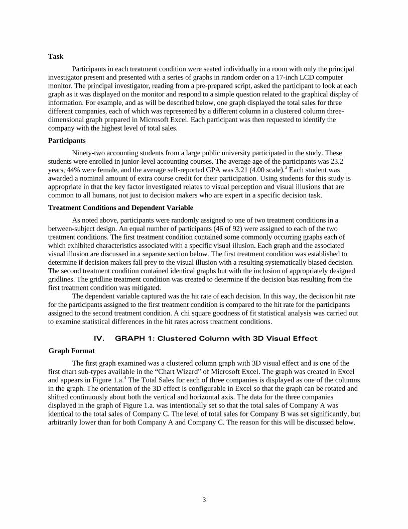
IV. GRAPH 1: Clustered Column with 3D Visual Effect
Graph Format
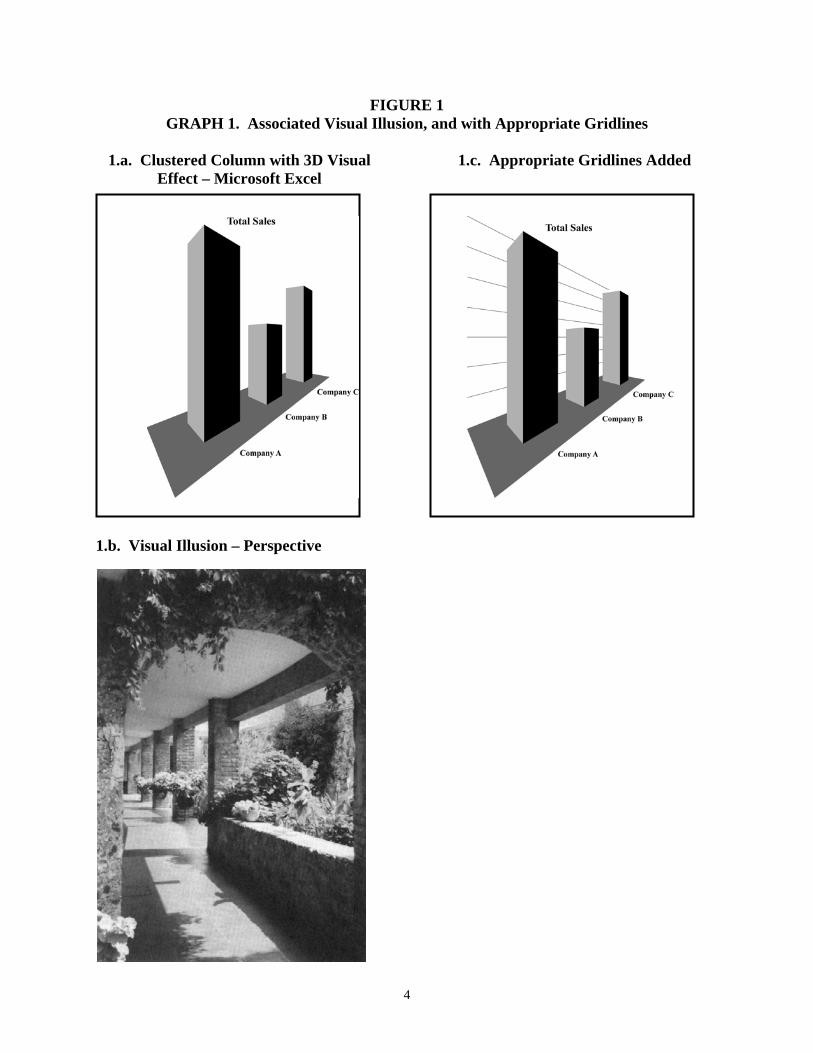
The first graph examined was a clustered column graph with 3D visual effect and is one of the first chart sub-types available in the “Chart Wizard” of Microsoft Excel. The graph was created in Excel and appears in Figure 1.a.4 The Total Sales for each of three companies is displayed as one of the columns in the graph. The orientation of the 3D effect is configurable in Excel so that the graph can be rotated and shifted continuously about both the vertical and horizontal axis. The data for the three companies displayed in the graph of Figure 1.a. was intentionally set so that the total sales of Company A was identical to the total sales of Company C. The level of total sales for Company B was set significantly, but arbitrarily lower than for both Company A and Company C. The reason for this will be discussed below.
4
FIGURE 1 GRAPH 1. Associated Visual Illusion, and with Appropriate Gridlines
1.a. Clustered Column with 3D Visual
Effect – Microsoft Excel 1.b. Visual Illusion – Perspective
1.c. Appropriate Gridlines Added
5
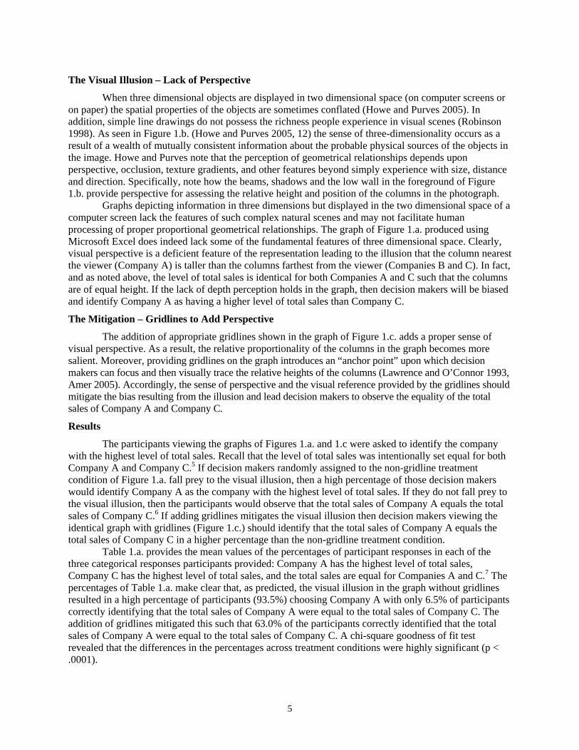
The Visual Illusion – Lack of Perspective
When three dimensional objects are displayed in two dimensional space (on computer screens or on paper) the spatial properties of the objects are sometimes conflated (Howe and Purves 2005). In addition, simple line drawings do not possess the richness people experience in visual scenes (Robinson 1998). As seen in Figure 1.b. (Howe and Purves 2005, 12) the sense of three-dimensionality occurs as a result of a wealth of mutually consistent information about the probable physical sources of the objects in the image. Howe and Purves note that the perception of geometrical relationships depends upon perspective, occlusion, texture gradients, and other features beyond simply experience with size, distance and direction. Specifically, note how the beams, shadows and the low wall in the foreground of Figure 1.b. provide perspective for assessing the relative height and position of the columns in the photograph.
Graphs depicting information in three dimensions but displayed in the two dimensional space of a computer screen lack the features of such complex natural scenes and may not facilitate human processing of proper proportional geometrical relationships. The graph of Figure 1.a. produced using Microsoft Excel does indeed lack some of the fundamental features of three dimensional space. Clearly, visual perspective is a deficient feature of the representation leading to the illusion that the column nearest the viewer (Company A) is taller than the columns farthest from the viewer (Companies B and C). In fact, and as noted above, the level of total sales is identical for both Companies A and C such that the columns are of equal height. If the lack of depth perception holds in the graph, then decision makers will be biased and identify Company A as having a higher level of total sales than Company C.
The Mitigation – Gridlines to Add Perspective
The addition of appropriate gridlines shown in the graph of Figure 1.c. adds a proper sense of visual perspective. As a result, the relative proportionality of the columns in the graph becomes more salient. Moreover, providing gridlines on the graph introduces an “anchor point” upon which decision makers can focus and then visually trace the relative heights of the columns (Lawrence and O’Connor 1993, Amer 2005). Accordingly, the sense of perspective and the visual reference provided by the gridlines should mitigate the bias resulting from the illusion and lead decision makers to observe the equality of the total sales of Company A and Company C.
Results
The participants viewing the graphs of Figures 1.a. and 1.c were asked to identify the company with the highest level of total sales. Recall that the level of total sales was intentionally set equal for both Company A and Company C.5 If decision makers randomly assigned to the non-gridline treatment condition of Figure 1.a. fall prey to the visual illusion, then a high percentage of those decision makers would identify Company A as the company with the highest level of total sales. If they do not fall prey to the visual illusion, then the participants would observe that the total sales of Company A equals the total sales of Company C.6 If adding gridlines mitigates the visual illusion then decision makers viewing the identical graph with gridlines (Figure 1.c.) should identify that the total sales of Company A equals the total sales of Company C in a higher percentage than the non-gridline treatment condition.
Table 1.a. provides the mean values of the percentages of participant responses in each of the three categorical responses participants provided: Company A has the highest level of total sales, Company C has the highest level of total sales, and the total sales are equal for Companies A and C.7 The percentages of Table 1.a. make clear that, as predicted, the visual illusion in the graph without gridlines resulted in a high percentage of participants (93.5%) choosing Company A with only 6.5% of participants correctly identifying that the total sales of Company A were equal to the total sales of Company C. The addition of gridlines mitigated this such that 63.0% of the participants correctly identified that the total sales of Company A were equal to the total sales of Company C. A chi-square goodness of fit test revealed that the differences in the percentages across treatment conditions were highly significant (p < .0001).
6
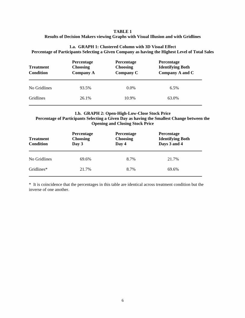
TABLE 1 Results of Decision Makers viewing Graphs with Visual Illusion and with Gridlines
1.a. GRAPH 1: Clustered Column with 3D Visual Effect
Percentage of Participants Selecting a Given Company as having the Highest Level of Total Sales Percentage Percentage Percentage Treatment Choosing Choosing Identifying Both Condition Company A Company C Company A and C No Gridlines 93.5% 0.0% 6.5% Gridlines 26.1% 10.9% 63.0%
1.b. GRAPH 2: Open-High-Low-Close Stock Price Percentage of Participants Selecting a Given Day as having the Smallest Change between the
Opening and Closing Stock Price Percentage Percentage Percentage Treatment Choosing Choosing Identifying Both Condition Day 3 Day 4 Days 3 and 4 No Gridlines 69.6% 8.7% 21.7% Gridlines* 21.7% 8.7% 69.6% * It is coincidence that the percentages in this table are identical across treatment condition but the inverse of one another.
7
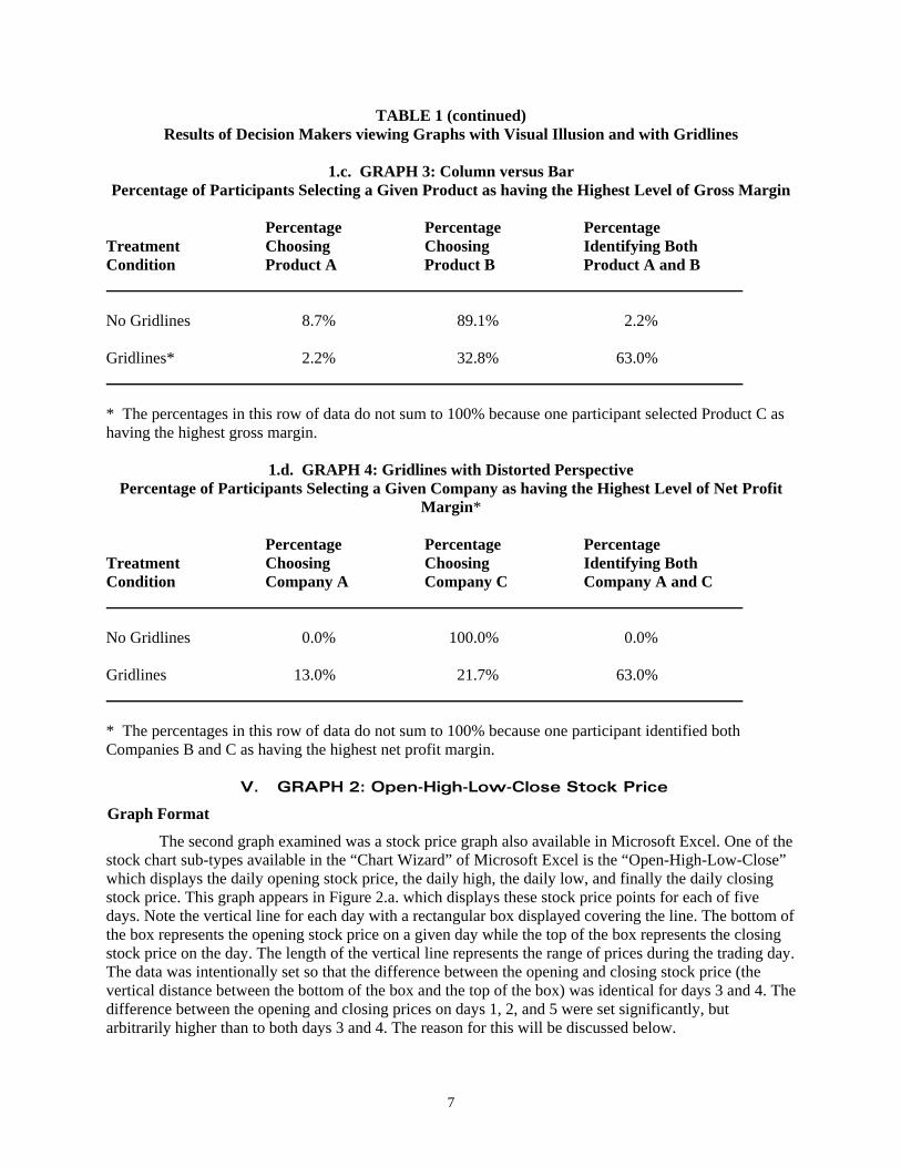
TABLE 1 (continued) Results of Decision Makers viewing Graphs with Visual Illusion and with Gridlines
1.c. GRAPH 3: Column versus Bar
Percentage of Participants Selecting a Given Product as having the Highest Level of Gross Margin Percentage Percentage Percentage Treatment Choosing Choosing Identifying Both Condition Product A Product B Product A and B No Gridlines 8.7% 89.1% 2.2% Gridlines* 2.2% 32.8% 63.0% * The percentages in this row of data do not sum to 100% because one participant selected Product C as having the highest gross margin.
1.d. GRAPH 4: Gridlines with Distorted Perspective Percentage of Participants Selecting a Given Company as having the Highest Level of Net Profit
Margin* Percentage Percentage Percentage Treatment Choosing Choosing Identifying Both Condition Company A Company C Company A and C No Gridlines 0.0% 100.0% 0.0% Gridlines 13.0% 21.7% 63.0% * The percentages in this row of data do not sum to 100% because one participant identified both Companies B and C as having the highest net profit margin.
V. GRAPH 2: Open-High-Low-Close Stock Price
Graph Format
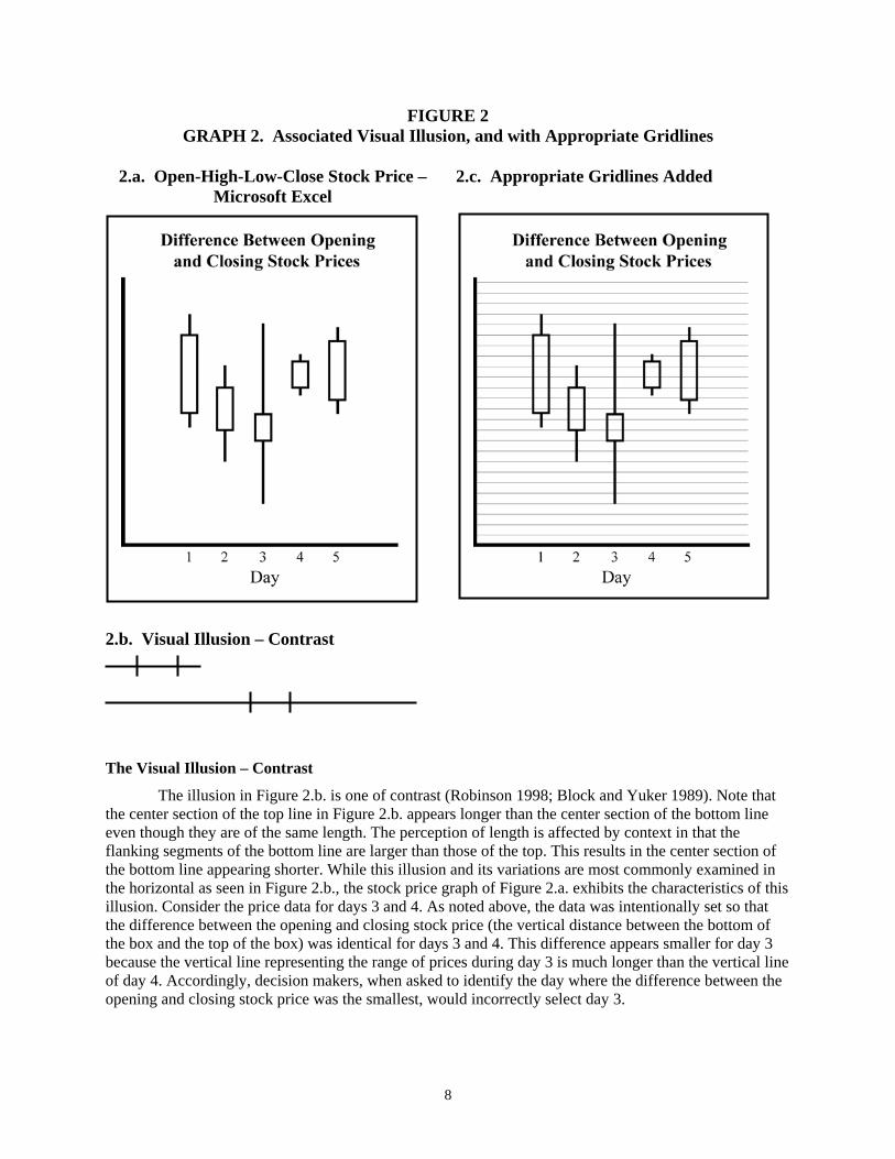
The second graph examined was a stock price graph also available in Microsoft Excel. One of the stock chart sub-types available in the “Chart Wizard” of Microsoft Excel is the “Open-High-Low-Close” which displays the daily opening stock price, the daily high, the daily low, and finally the daily closing stock price. This graph appears in Figure 2.a. which displays these stock price points for each of five days. Note the vertical line for each day with a rectangular box displayed covering the line. The bottom of the box represents the opening stock price on a given day while the top of the box represents the closing stock price on the day. The length of the vertical line represents the range of prices during the trading day. The data was intentionally set so that the difference between the opening and closing stock price (the vertical distance between the bottom of the box and the top of the box) was identical for days 3 and 4. The difference between the opening and closing prices on days 1, 2, and 5 were set significantly, but arbitrarily higher than to both days 3 and 4. The reason for this will be discussed below.
8
FIGURE 2 GRAPH 2. Associated Visual Illusion, and with Appropriate Gridlines
2.a. Open-High-Low-Close Stock Price –
Microsoft Excel 2.c. Appropriate Gridlines Added
2.b. Visual Illusion – Contrast
The Visual Illusion – Contrast
The illusion in Figure 2.b. is one of contrast (Robinson 1998; Block and Yuker 1989). Note that the center section of the top line in Figure 2.b. appears longer than the center section of the bottom line even though they are of the same length. The perception of length is affected by context in that the flanking segments of the bottom line are larger than those of the top. This results in the center section of the bottom line appearing shorter. While this illusion and its variations are most commonly examined in the horizontal as seen in Figure 2.b., the stock price graph of Figure 2.a. exhibits the characteristics of this illusion. Consider the price data for days 3 and 4. As noted above, the data was intentionally set so that the difference between the opening and closing stock price (the vertical distance between the bottom of the box and the top of the box) was identical for days 3 and 4. This difference appears smaller for day 3 because the vertical line representing the range of prices during day 3 is much longer than the vertical line of day 4. Accordingly, decision makers, when asked to identify the day where the difference between the opening and closing stock price was the smallest, would incorrectly select day 3.
9
The Mitigation – Gridlines
As noted in the discussion of the mitigation of the illusion for Graph 1, the addition of appropriate gridlines in Figure 2.c. provides an “anchor point” upon which decision makers can focus and then visually trace the relative heights of the boxes on the vertical lines (Lawrence and O’Connor 1993; Amer 2005). Accordingly, decision makers will be able to note that the difference between the opening and closing prices on days 3 and 4 are identical.
Results
The participants viewing the graphs of Figures 2.a. and 2.c. were asked to identify the day in which the difference between the opening and closing stock prices was the smallest. That is, the day in which the distance between the bottom of the box and the top of the box is shortest. Similar to the decision with Graph 1 this distance was set the same for Days 3 and 4. If decision makers randomly assigned to the non-gridline treatment condition of Figure 2.a. fall prey to the visual illusion, then a high percentage of those decision makers would identify Day 3 as the day when the difference between the opening and closing stock price was the smallest. If they do not fall prey to the visual illusion, then the participants would observe that the difference between the opening and closing stock prices were the same on Days 3 and 4. Adding gridlines should mitigate the visual illusion such that decision makers viewing the identical graph with gridlines (Figure 2.c.) should identify the correct answer.
Table 1.b. provides the mean values of the percentages of participant responses in each of the three categorical responses participants provided: Day 3, Day 4, or Day 3 is equal to Day 4. Again, and as predicted, the percentages of Table 1.b. make apparent that the visual illusion in the graph without gridlines resulted in a relatively high percentage of participants (69.6%) choosing Day 3 with only 21.7% of participants correctly identifying that the difference in the opening and closing stock prices were the same on Days 3 and 4. The addition of gridlines mitigated this such that percentages were reversed. A chi-square goodness of fit test revealed that the differences in the percentages across treatment conditions were highly significant (p < .0001).
VI. GRAPH 3: Column versus Bar
Graph Format
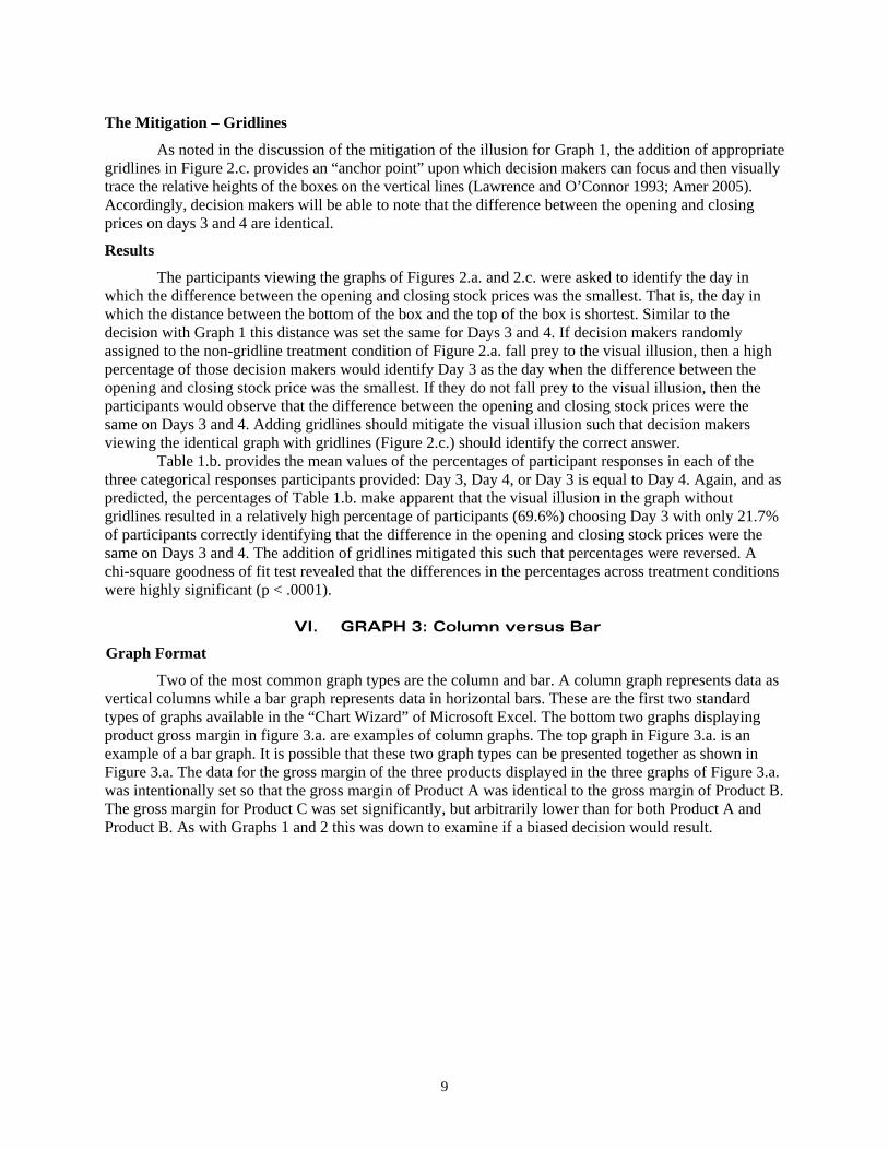
Two of the most common graph types are the column and bar. A column graph represents data as vertical columns while a bar graph represents data in horizontal bars. These are the first two standard types of graphs available in the “Chart Wizard” of Microsoft Excel. The bottom two graphs displaying product gross margin in figure 3.a. are examples of column graphs. The top graph in Figure 3.a. is an example of a bar graph. It is possible that these two graph types can be presented together as shown in Figure 3.a. The data for the gross margin of the three products displayed in the three graphs of Figure 3.a. was intentionally set so that the gross margin of Product A was identical to the gross margin of Product B. The gross margin for Product C was set significantly, but arbitrarily lower than for both Product A and Product B. As with Graphs 1 and 2 this was down to examine if a biased decision would result.
10
FIGURE 3 GRAPH 3. Associated Visual Illusion, and with Appropriate Gridlines
3.a. Column Versus Bar Graphs
3.b. Visual Illusion – “T-illusion”
3.c. Appropriate Gridlines Added
11
The Visual Illusion – “T-illusion”
The “T-illusion” (a.k.a., the “horizontal/vertical illusion”) is relatively well documented and is illustrated in Figure 3.b. (Block and Yuker 1989; Robinson 1998; Ninio 2001; Howe and Purves 2005). In this illusion, the horizontal line of the “T” clearly looks shorter than the vertical line though they are of equal length. It is known that any segment that is divided in two looks shortened. The explanation for this is variously attributed to a couple of theories. First, because the eyes move more easily from side to side rather than up and down, the additional “effort” required by the eyes to scan vertical space is interpreted by the brain to reflect greater distance (Block and Yuker 1989). Alternatively, and perhaps relatedly, is that the extent of the visual field is important in estimating lengths within it (Kunnapas 1959; Robinson 1989). The proposition is that the visual field is greater horizontally than it is vertically. Therefore, because a vertical line extends over a greater proportion of the field than a horizontal line of equal length, it appears longer.
The result of this illusion can be applied to the graphs of Figure 3.a. Consider the orientation of the graphs depicting the gross margin of Products A and B. The levels of gross margin are equal and though the orientation does not form an exact representation of the “T” of Figure 3.b., it is similar and may result in the visual illusion. Accordingly, decision makers when asked to identify the product with the highest gross margin would incorrectly identify Product B. The Mitigation – Gridlines
To overcome this illusion the anchor point provided by gridlines is once again noted (Lawrence and O’Connor 1993; Amer 2005). The reference of the gridlines should allow the decision maker to focus and visually trace the relative length of the bar in the upper graph (Product A) to the equal height of the column in the lower graph (Product B). Accordingly, decision makers should be able to note that the gross margins are identical for Products A and B. Results
The participants viewing the graphs of Figures 3.a. and 3.c were asked to identify the product with the highest level of gross margin. Again, the level of gross margin was the same for Products A and B. If decision makers randomly assigned to the non-gridline treatment condition of Figure 3.a. fall prey to the “T” visual illusion, then a high percentage of those decision makers would identify Product B. If they do not fall prey to the visual illusion, then the participants would observe that the gross margin is the same for Products A and B. Adding gridlines should mitigate the visual illusion such that decision makers viewing the identical graph with gridlines (Figure 3.c.) should identify the correct answer.
Table 1.c. provides the mean values of the percentages of participant responses in each of the three categorical responses participants provided: Product A, Product B, or the equality of Products A and B. Here again, and as predicted, the percentages of Table 1.c. make apparent that the visual illusion in the graph without gridlines resulted in a high percentage of participants (89.1%) choosing Product B. The addition of gridlines mitigated this such that 63.0% correctly noted that gross margin was equal for Products A and B. A chi-square goodness of fit test revealed that the differences in the percentages across treatment conditions were highly significant (p < .0001).
VII. GRAPH 4: Gridlines with Distorted Perspective
Graph Format To this point the mitigation of the bias resulting from the visual illusions possessed in the first
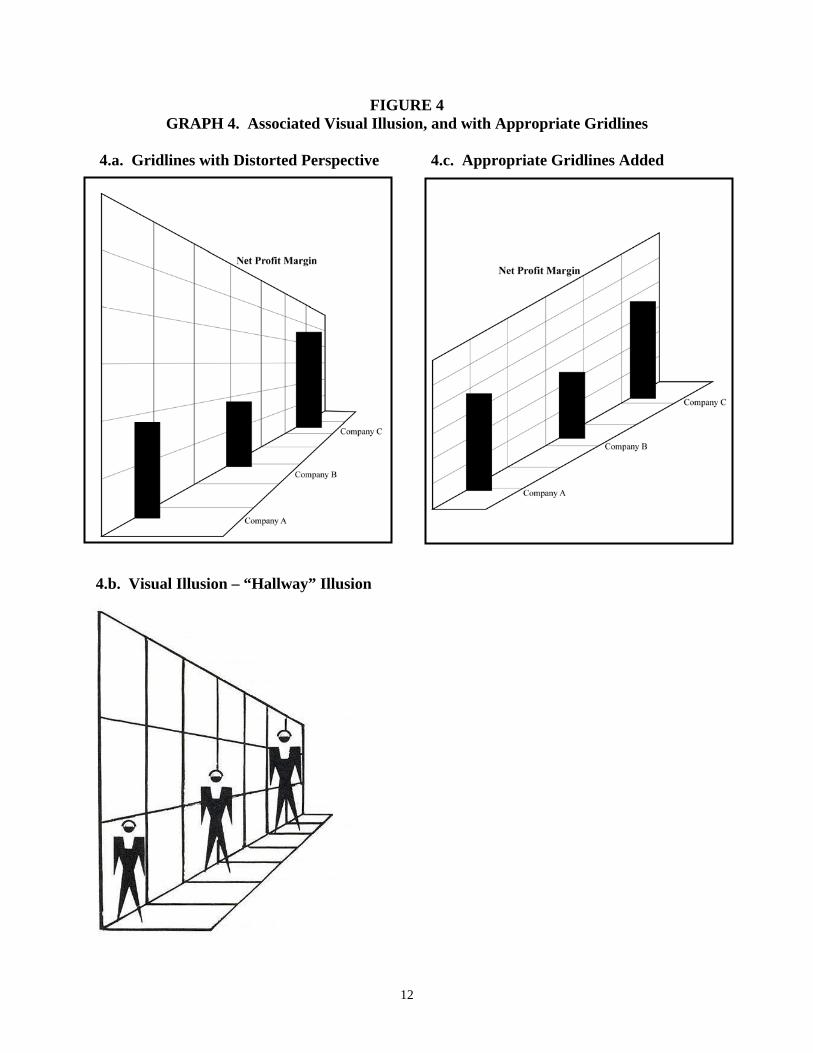
three graphs has relied upon the inclusion of gridlines in the graphs. It is possible that the format of gridlines themselves may be constructed such that a visual illusion results. Consider the graph of Figure 4.a. displaying the net profit margin for three companies. Given that the emphasis of this manuscript is on visual illusions, the reader should realize that the format of the gridlines in the graph of Figure 4.a. is unusual. As with the other graph types discussed above, the data for the three companies displayed in the graph of Figure 4.a. was intentionally set so that the net profit margin of Company A was identical to the net profit margin of Company C. The level of net profit margin for Company B was set significantly, but arbitrarily lower than for both Company A and Company C.
12
FIGURE 4 GRAPH 4. Associated Visual Illusion, and with Appropriate Gridlines
4.a. Gridlines with Distorted Perspective
4.b. Visual Illusion – “Hallway” Illusion
4.c. Appropriate Gridlines Added
13
The Visual Illusion – “Hallway” Illusion
In the real world, when objects recede into the distance on a level surface (e.g., on computer screens or paper) their visual angle gets smaller and the objects approach a visual horizon (Seckel 2006). Consider the illustration in Figure 4.b. (Block and Yuker 1989, 152). All three figures in the illustration are identical in size. The figure in the front of the illustration appears smaller since the converging gridlines create the appearance of depth. In the so-called “hallway” illusion people assume that if two objects look the same and one appears to be further away, it must be larger. In this case, the gridlines provide a strong sense of depth with the figure in the back higher in the visual plane. However, its visual angle has not correspondingly decreased. The inconsistency of the visual angle is forced by the brain to consistency.
The result of this illusion can be seen in the graph of Figure 4.a. The levels of net profit margin are equal for both Company A and Company C, but the perspective forced by the gridlines leads to the illusion shown in Figure 4.b. Accordingly, decision makers when asked to identify the company with the highest net profit margin would incorrectly identify Company C.
The Mitigation – Reoriented Gridlines
Reorienting the gridlines as shown in Figure 4.c. should alleviate the illusion by showing the columns of all three companies in proper perspective. In this case, there is a consistency in all the visual cues resulting in a proper sense of depth perception (Seckel 2006). As a result, decision makers should be able to note that the net profit margins are identical for Companies A and C.
Results
The participants viewing the graphs of Figures 4.a. and 4.c were asked to identify the company with the highest level of net profit margin. Again, the level of net profit margin was set the same for Companies A and C. If decision makers randomly assigned to the treatment condition of Figure 4.a. fall prey to the “hallway” visual illusion, then a high percentage of those decision makers would identify Company C. If they do not fall prey to the visual illusion, then the participants would observe that the gross margin is the same for Companies A and C. Reorienting the gridlines as in Figure 4.c. should mitigate the visual illusion.
Table 1.d. presents the mean values of the percentages of participant responses in each of the three categorical responses participants provided: Company A, Company C, or the equality of Companies A and C. As before, the percentages of Table 1.d. make evident that the visual illusion in the graph with the distorted gridlines biased decision making with 100% of the participants selecting Company C. The reoriented gridlines mitigated this such that 63.0% correctly noted that net profit margin was equal for Companies A and D. A chi-square goodness of fit test revealed that the differences in the percentages across treatment conditions were highly significant (p < .0001).
VIII. DISCUSSION AND CONCLUSIONS
This paper examined four graphs that exhibited characteristics associated with visual illusions. A controlled experiment was carried out to demonstrate that the visual illusions resulted in systematically biased decision making. It was also proposed and validated that the bias can be mitigated by including properly formatted gridlines when preparing the graphs.
These results have implications for both research and practice. Much of the research to date has focused on how to prepare graphs to avoid biased decision making or biased information extraction from graphs. The results of this work have supported the establishment of graph preparation guidelines such that designing graphs that correspond to these guidelines will improve communication. However, very little research has examined the role that visual illusions play in this regard (Poulton 1985; Wickens and Hollands 2000; Amer 2005). Accordingly, this research extends the general line of inquiry and not only establishes that visual illusions can result in systematically biased decision making but that mitigation of the bias is possible by including appropriately formatted gridlines in graphs. These results, along with the
14
results of Poulton (1985) and Amer (2005), indicate that an important addition to the set of generally accepted graph preparation guidelines is to include gridlines in graphs.
With respect to practice, most software programs that facilitate the preparation of graphs include the ability to add features to the format of the graphs created. Microsoft Excel for example has many such options available. The results of this research suggest that one of the features that should be readily included in all graphs, if not as a default, is gridlines. Moreover, those who prepare and read graphs should be trained in the importance of including appropriate gridlines and gain an understanding of how biased decision making may result if gridlines are not included in a graph. For example and as noted earlier, prior research has found that annual reports frequently contain graphs that are not designed in a consistent fashion with suggested guidelines (Beattie and Jones 1992; Johnson et al. 1980; Courtis 1997; Steinbart 1989). Decision makers should be aware that the visual illusions investigated in this study may be among the tactics graph preparers use to bias information extraction from graphs.
Limitations
Possible limitations of this study exist. First, the decision makers were not making decisions in a setting with real outcomes and incentives. Perhaps decision makers in such settings may attend more acutely to the graphical displays of information and not fall prey to the visual illusions. While this is possible, it does not seem a significant issue given that the visual illusions examined in the study are well documented to influence humans of many ages and even across cultures. The use of student participants is a minor limitation for the same reason.
Another possible limitation relates the graphs used in the experiment. Not every possible graph configuration and combination within each of the four graph types was displayed to each participant. For example, the first graph examined was a clustered column graph with 3D visual effect. The orientation of the 3D effect of this graph is configurable in Excel so that the graph can be rotated and shifted continuously about both the vertical and horizontal axis. Only one configuration was utilized in the experimental setting. Perhaps the visual illusion is not as strong in other configurations of the columns in this graph and therefore, the bias may not result. This possibility for all the graphs and illusions could be examined in future research. Still, this limitation should not detract from the findings reported in this manuscript because each participant viewed a total of 12 graphs, each of which was constructed with different levels of data. This was done to minimize the demand effects associated with the specific graphs prepared to examine each illusion. In addition, the order of the graphs was randomized across all participants.
15
REFERENCES Amer, T. S. 2005. Bias Due to Visual Illusion in the Graphical Presentation of Accounting Information. Journal of
Information Systems 19 (Spring): 1 – 18.
Arunachalam, V., B. K. W. Pei, and P. J. Steinbart. 2002. Impression management with graphs: Effects on choices. Journal of Information Systems 16 (Fall):183–202.
Beattie, V., and M. J. Jones. 1992. The use and abuse of graphs in annual reports: Theoretical framework and empirical study. Accounting and Business Research, 22(88): 291–303.
Bertin, J. 1983. The Semiology of Graphics, Madison, WI: University of Wisconsin Press.
Block, J. R. and H. E. Yuker. 1989. Can You Believe Your Eyes? Gardner Press, New York, NY.
Courtis, J. K. 1997. Corporate annual report graphical communication in Hong Kong: Effective or misleading? Journal of Business Communication 34(3): 269–288.
Few, S. 2005. “Data Visualization: Bad Graphs: The Stealth Virus” DM Review, (January) available at: http://www.dmreview.com/editorial/dmreview/print_action.cfm?articleId=1016296 .
Gillan, D. J., C. D. Wickens, J. G. Hollands, and C. M. Carswell. 1998. Guidelines for presenting quantitative data in HFES publications. Human Factors (40): 28–41.
Howe, C. Q. and D. Purves. 2005. Perceiving Geometry: Geometrical Illusions Explained by Natural Science Statistics. Springer Science+Business Media, Inc., New York, NY.
Jarvenpaa, S., and G. W. Dickson. 1988. Graphics and managerial decision making: research based guidelines. Communications of the ACM 31 (6): 764–774.
Johnson, J. R., R. R. Rice, and R. A. Roemmich. 1980. Pictures that lie: The abuse of graphs in annual reports. Management Accounting (October): 50–56.
Kosslyn, S. M. 1989. Understanding charts and graphs. Applied Cognitive Psychology 3(3): 185–226.
Kunnapas, T. M. 1959. The Vertical-Horizontal Illusion in Artificial Visual Fields. Journal Psychology (47): 41 – 48.
Lawrence, M., and M. O’Connor. 1993. Scale, variability, and the calibration of judgmental prediction intervals. Organizational Behavior and Human Decision Processes (56): 441–458.
Ninio, J. 2001. The Science of Illusions. Cornell University Press, Ithaca, NY.
Poulton, E. C. 1985. Geometric illusions in reading graphs. Perception and Psychophysics (37): 543–548.
Robinson, J. O. 1998. The Psychology of Visual Illusion. Dover Publications, Inc. Mineola, NY.
Seckel, A. 2006. Optical Illusions: The Science of Visual Perception. Firefly Books, Buffalo, NY.
Steinbart, P. J. 1989. The auditor’s responsibility for the accuracy of graphs in annual reports: Some evidence of the need for additional guidance. Accounting Horizons 3(3): 60–70.
Tractinsky, N., and J. Meyer. 1999. Chartjunk or goldgraph? Effects of presentation objectives and content desirability on information presentation. MIS Quarterly (23): 397–420.
Tufte, E. R. 1983. The Visual Display of Quantitative Information. Cheshire, CT: Graphics Press.
----------. 1997. Visual Explanations. Cheshire, CT: Graphics Press.
Wainer, H. 1997. Visual Revelations: Graphic Tales of Fate and Deception from Napoleon Bonaparte to Ross Perot. Copernicus Springer-Verlag, New York.
Wickens, C. D., and J. G. Hollands. 2000. Engineering Psychology and Human Performance, 3rd Ed. Prentice Hall, Upper Saddle River, NJ.
16
ENDNOTES
1 These findings are consistent with the predictions of Agency Theory where agents pursue their own self-interest to the potential detriment of principals.
2 The order of the graphs was randomized across the participants to avoid an order effect on the measures collected.
3 Statistical analysis revealed that there were no differences between the participants assigned to each of the two treatment conditions on the following variables: age, gender, and GPA. This analysis supports the homogeneity of the participants between each group.
4 The graphs in the figures of this manuscript appear small, but during the experiment each graph was displayed to the participants in near full screen on a 17inch LCD monitor.
5 Remember that each subject in a given treatment condition viewed a total of 12 graphs – three for each visual illusion. The two other graphs for each visual illusion were constructed differently (e.g., with columns of different heights and relationships). This was carried out to minimize the demand effects associated with the specific graph used to examine the illusion.
6 During the experiment, the participants were instructed simply to identify “the company with the highest level of total sales.” They were not informed in advance that two or more of the companies could have the same level of total sales. If during the administration of the experiment a participant asked if, or noted that two companies had the same level of total sales the principal investigator responded consistently across all participants with the phrase “that is an acceptable response.”
7 Because the data was set so that the total sales of Companies A and C were equal, it would be expected that participants viewing that the columns were very close to one another in height would be split in their choice such that some would choose Company A and some would choose Company C. As will be seen, this will occur for the other three graphs investigated in this study.