Embed Size (px)
Citation preview
801
C H A P T E R
21The GPLOT Procedure
Overview 801About Plots of Two Variables 802
About Plots with a Classification Variable 803
About Bubble Plots 803
About Plots with Two Vertical Axes 804
About Interpolation Methods 805Concepts 805
Parts of a Plot 805
About the Input Data Set 806
Missing Values 807
Values Out of Range 807
Sorted Data 807Logarithmic Axes 807
Procedure Syntax 807
PROC GPLOT Statement 808
BUBBLE Statement 809
BUBBLE2 Statement 815PLOT Statement 818
PLOT2 Statement 828
Examples 834
Example 1: Generating a Simple Bubble Plot 834
Example 2: Labeling and Sizing Plot Bubbles 835Example 3: Adding a Right Vertical Axis 837
Example 4: Plotting Two Variables 839
Example 5: Connecting Plot Data Points 842
Example 6: Generating an Overlay Plot 844
Example 7: Filling Areas in an Overlay Plot 846
Example 8: Plotting Three Variables 847Example 9: Plotting with Different Scales of Values 851
Example 10: Creating Plots with Drill-down for the Web 853
OverviewThe GPLOT procedure plots the values of two or more variables on a set of
coordinate axes (X and Y). The coordinates of each point on the plot correspond to twovariable values in an observation of the input data set. The procedure can also generatea separate plot for each value of a third (classification) variable. It can also generatebubble plots in which circles of varying proportions representing the values of a thirdvariable are drawn at the data points.
The procedure produces a variety of two-dimensional graphs including
802 About Plots of Two Variables 4 Chapter 21
� simple scatter plots
� overlay plots in which multiple sets of data points display on one set of axes
� plots against a second vertical axis
� bubble plots
� logarithmic plots (controlled by the AXIS statement).
In conjunction with the SYMBOL statement the GPLOT procedure can produce joinplots, high-low plots, needle plots, and plots with simple or spline-interpolated lines.The SYMBOL statement can also display regression lines on scatter plots.
The GPLOT procedure is useful for
� displaying long series of data, showing trends and patterns
� interpolating between data points
� extrapolating beyond existing data with the display of regression lines andconfidence limits.
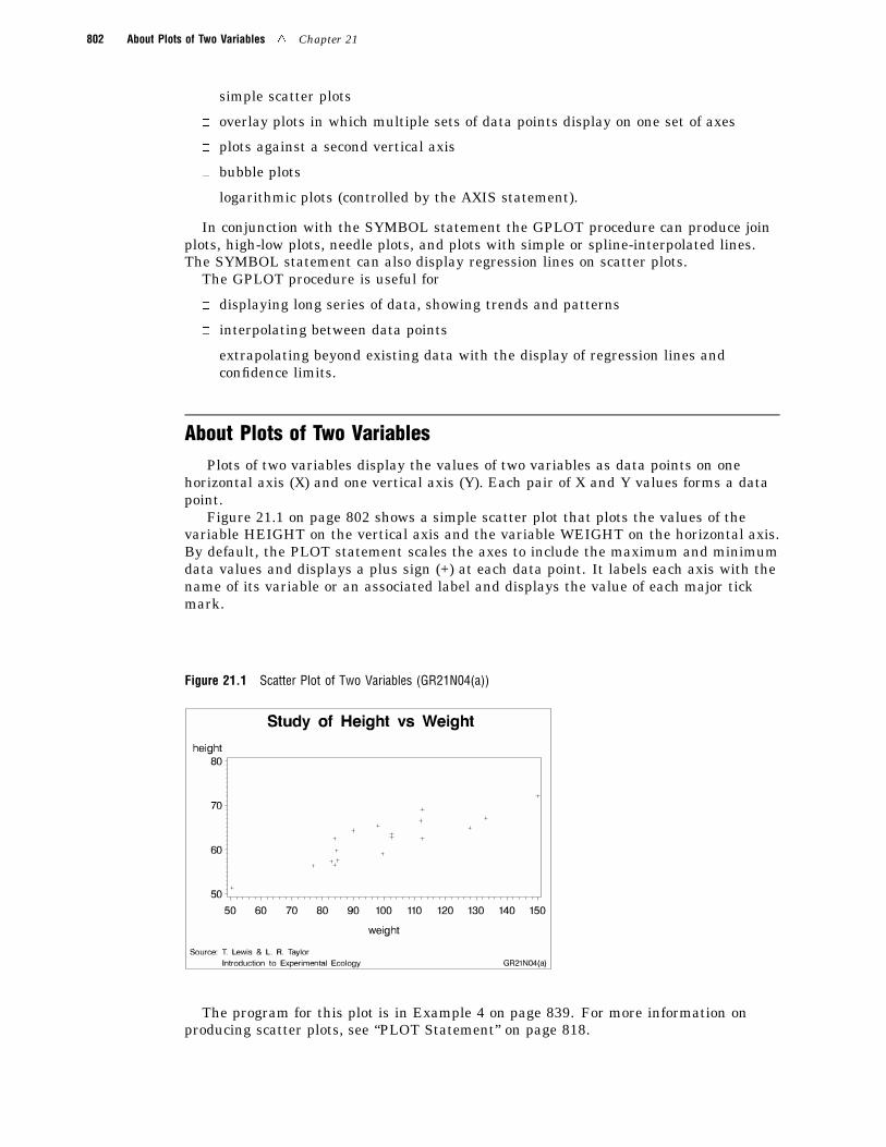
About Plots of Two VariablesPlots of two variables display the values of two variables as data points on one
horizontal axis (X) and one vertical axis (Y). Each pair of X and Y values forms a datapoint.
Figure 21.1 on page 802 shows a simple scatter plot that plots the values of thevariable HEIGHT on the vertical axis and the variable WEIGHT on the horizontal axis.By default, the PLOT statement scales the axes to include the maximum and minimumdata values and displays a plus sign (+) at each data point. It labels each axis with thename of its variable or an associated label and displays the value of each major tickmark.
Figure 21.1 Scatter Plot of Two Variables (GR21N04(a))
The program for this plot is in Example 4 on page 839. For more information onproducing scatter plots, see “PLOT Statement” on page 818.
The GPLOT Procedure 4 About Bubble Plots 803
You can also overlay two or more plots (multiple sets of data points) on a single set ofaxes and you can apply a variety of interpolation techniques to these plots. See “AboutInterpolation Methods” on page 805.
About Plots with a Classification VariablePlots that use a classification variable produce a separate set of data points for each
unique value of the classification variable and display all sets of data points on one setof axes.
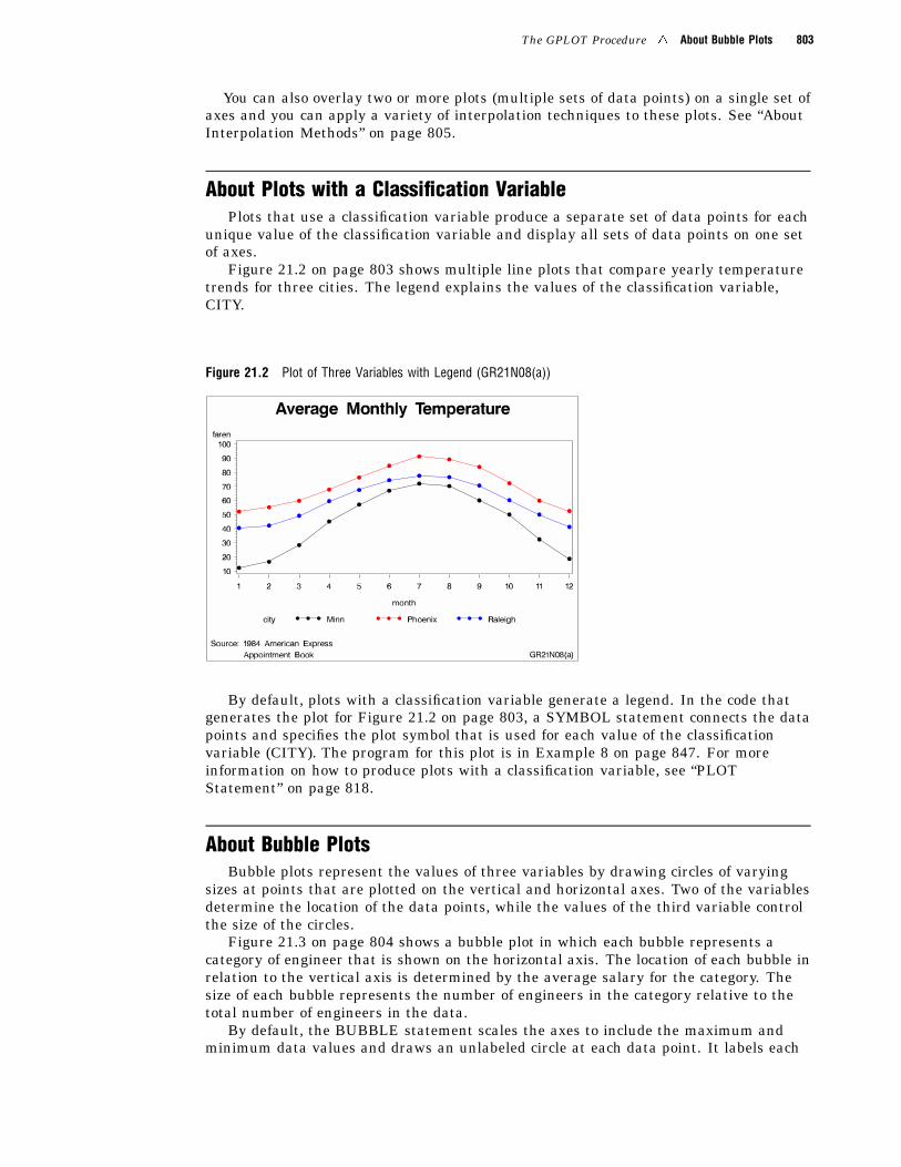
Figure 21.2 on page 803 shows multiple line plots that compare yearly temperaturetrends for three cities. The legend explains the values of the classification variable,CITY.
Figure 21.2 Plot of Three Variables with Legend (GR21N08(a))
By default, plots with a classification variable generate a legend. In the code thatgenerates the plot for Figure 21.2 on page 803, a SYMBOL statement connects the datapoints and specifies the plot symbol that is used for each value of the classificationvariable (CITY). The program for this plot is in Example 8 on page 847. For moreinformation on how to produce plots with a classification variable, see “PLOTStatement” on page 818.
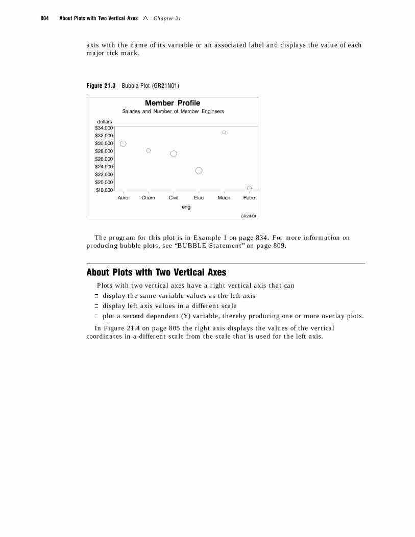
About Bubble PlotsBubble plots represent the values of three variables by drawing circles of varying
sizes at points that are plotted on the vertical and horizontal axes. Two of the variablesdetermine the location of the data points, while the values of the third variable controlthe size of the circles.
Figure 21.3 on page 804 shows a bubble plot in which each bubble represents acategory of engineer that is shown on the horizontal axis. The location of each bubble inrelation to the vertical axis is determined by the average salary for the category. Thesize of each bubble represents the number of engineers in the category relative to thetotal number of engineers in the data.
By default, the BUBBLE statement scales the axes to include the maximum andminimum data values and draws an unlabeled circle at each data point. It labels each
804 About Plots with Two Vertical Axes 4 Chapter 21
axis with the name of its variable or an associated label and displays the value of eachmajor tick mark.
Figure 21.3 Bubble Plot (GR21N01)
The program for this plot is in Example 1 on page 834. For more information onproducing bubble plots, see “BUBBLE Statement” on page 809.
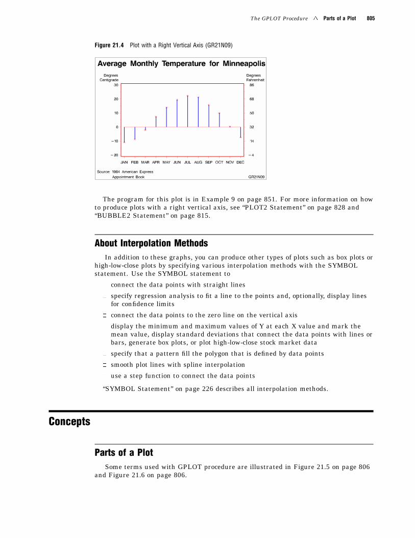
About Plots with Two Vertical AxesPlots with two vertical axes have a right vertical axis that can� display the same variable values as the left axis� display left axis values in a different scale� plot a second dependent (Y) variable, thereby producing one or more overlay plots.
In Figure 21.4 on page 805 the right axis displays the values of the verticalcoordinates in a different scale from the scale that is used for the left axis.
The GPLOT Procedure 4 Parts of a Plot 805
Figure 21.4 Plot with a Right Vertical Axis (GR21N09)
The program for this plot is in Example 9 on page 851. For more information on howto produce plots with a right vertical axis, see “PLOT2 Statement” on page 828 and“BUBBLE2 Statement” on page 815.
About Interpolation MethodsIn addition to these graphs, you can produce other types of plots such as box plots or
high-low-close plots by specifying various interpolation methods with the SYMBOLstatement. Use the SYMBOL statement to
� connect the data points with straight lines
� specify regression analysis to fit a line to the points and, optionally, display linesfor confidence limits
� connect the data points to the zero line on the vertical axis
� display the minimum and maximum values of Y at each X value and mark themean value, display standard deviations that connect the data points with lines orbars, generate box plots, or plot high-low-close stock market data
� specify that a pattern fill the polygon that is defined by data points
� smooth plot lines with spline interpolation
� use a step function to connect the data points
“SYMBOL Statement” on page 226 describes all interpolation methods.
Concepts
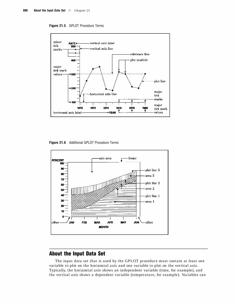
Parts of a PlotSome terms used with GPLOT procedure are illustrated in Figure 21.5 on page 806
and Figure 21.6 on page 806.
806 About the Input Data Set 4 Chapter 21
Figure 21.5 GPLOT Procedure Terms
Figure 21.6 Additional GPLOT Procedure Terms
About the Input Data SetThe input data set that is used by the GPLOT procedure must contain at least one
variable to plot on the horizontal axis and one variable to plot on the vertical axis.Typically, the horizontal axis shows an independent variable (time, for example), andthe vertical axis shows a dependent variable (temperature, for example). Variables can
The GPLOT Procedure 4 Procedure Syntax 807
be character or numeric. Graphs are automatically scaled to the values of the characterdata or to include the values of numeric data, but you can control scaling withprocedure options or with associated AXIS statements.
Missing ValuesIf the value of either of the plot variables is missing, the GPLOT procedure does not
include the observation in the plot. If you specify interpolation with a SYMBOLdefinition, the plot is not broken at the missing value. To break the plot line or area fillat the missing value, use the PLOT statement’s SKIPMISS option. SKIPMISS isavailable only with join or spline interpolations.
Values Out of RangeExclude data values from a graph by restricting the range of axis values with the
VAXIS= or HAXIS= options or with the ORDER= option in an AXIS statement. Whenan observation contains a value outside of the specified axis range, the GPLOTprocedure excludes the observation from the plot and issues a message to the log.
If you specify interpolation with a SYMBOL definition, by default values outside ofthe axis range are excluded from interpolation calculations and as a result may changeinterpolated values for the plot. Values that are omitted from interpolation calculationshave a particularly noticeable effect on the high-low interpolation methods: HILO, STD,and BOX. In addition, regression lines and confidence limits will represent only part ofthe original data.
To specify that values out of range are included in the interpolation calculations, usethe MODE= option in a SYMBOL statement. When MODE=INCLUDE, values that falloutside of the axis range are included in interpolation calculations but excluded fromthe plot. The default (MODE=EXCLUDE) omits observations that are outside of theaxis range from interpolation calculations. See the MODE= option of the SYMBOLstatement in “SYMBOL Statement” on page 226 for details.
Sorted DataData points are plotted in the order in which the observations are read from the
data set. Therefore, if you use any type of interpolation that generates a line, sort yourdata by the horizontal axis variable.
Logarithmic AxesIf your data contain logarithmic values or if the data values vary over a wide range
or contain large values, you may want to specify a logarithmic axis for the horizontal orvertical axis. Logarithmic axes can be specified with the AXIS statement optionsLOGBASE= and LOGSTYLE=. See “AXIS Statement” on page 162 for a completediscussion.
Procedure SyntaxRequirements: At least one PLOT or BUBBLE statement is required. A PLOT2 orBUBBLE2 statement can be used in conjunction with a PLOT or BUBBLE statement.Global statements: AXIS, FOOTNOTE, LEGEND, PATTERN, SYMBOL, TITLEReminder: The procedure can include BY, FORMAT, LABEL, WHERE, and NOTEstatements.Supports: RUN-group processing Output Delivery System (ODS)
808 PROC GPLOT Statement 4 Chapter 21
PROC GPLOT <DATA=input-data-set><ANNOTATE=Annotate-data-set><GOUT=< libref.>output-catalog><IMAGEMAP=output-data-set><UNIFORM>;
BUBBLE plot-request(s) </option(s)>;BUBBLE2 plot-request(s) </option(s)>;
PLOT plot-request(s) </option(s)>;PLOT2 plot-request(s) </option(s)>;
PROC GPLOT Statement
Identifies the data set that contains the plot variables. Optionally specifies uniform axis scaling forall graphs as well as annotation and an output catalog.
Requirements: An input data set is required.
Syntax
PROC GPLOT <DATA=input-data-set><ANNOTATE=Annotate-data-set><GOUT=< libref.>output-catalog><IMAGEMAP=output-data-set><UNIFORM>;
Options
ANNOTATE=Annotate-data-setANNO=Annotate-data-set
specifies a data set to annotate all graphs that are produced by the GPLOTprocedure. To annotate individual graphs, use ANNOTATE= in the action statement.See also: Chapter 10, “The Annotate Data Set,” on page 403
DATA=input-data-setspecifies the SAS data set that contains the variables to plot. By default, theprocedure uses the most recently created SAS data set.See also: “SAS Data Sets” on page 25 and “About the Input Data Set” on page 806
GOUT=< libref. >output-catalogspecifies the SAS catalog in which to save the graphics output that is produced bythe GPLOT procedure. If you omit the libref, SAS/GRAPH looks for the catalog inthe temporary library called WORK and creates the catalog if it does not exist.See also: “Storing Graphics Output in SAS Catalogs” on page 49
IMAGEMAP=output-data-setcreates a SAS data set that contains information that can be used to implement adrill-down plot. IMAGEMAP= can be used only if the PLOT or PLOT2 statementsare used, and the PLOT or PLOT2 statement must use the HTML= option or theHTML_LEGEND= option or both.
The Imagemap information is used in the HTML file that references the graph. Itdetermines where the drill-down hot zones are, and it links those hot zones to other
The GPLOT Procedure 4 BUBBLE Statement 809
files or images. If HTML= is used on the PLOT or PLOT2 statement, the plot pointsare defined as hot zones, unless AREA= is also used, in which case there are not plotpoints and the areas between plot lines are defined as hot zones. If HTML_LEGEND=is used, the legend symbols are defined as hot zones. Information for the links isstored in the variables referenced by the HTML= and HTML_LEGEND= options.See also: “Customizing Web Pages for Drill-down Graphs” on page 100
UNIFORMspecifies that the same axis scaling is used for all graphs that are produced by theprocedure. By default, the range of axis values for each axis is based on the minimumand maximum values in the data and, therefore, may vary from graph to graph andamong BY groups. Using the UNIFORM option forces the value range for each axis tobe the same for all graphs. Thus, if the procedure produces multiple graphs with bothleft and right vertical axes, the UNIFORM option scales all of the left axes the sameand all of the right axes the same, based on the minimum and maximum data values.
In addition, UNIFORM forces the assignment of SYMBOL statements for thecategory variable without regard to the BY-group variable, and, if a legend isgenerated, makes the legend the same across graphs.
BUBBLE Statement
Creates bubble plots in which a third variable is plotted against two variables represented by thehorizontal and vertical axes; the value of the third variable controls the size of the bubble.
Requirements: At least one plot request is required.Global statements: AXIS, FOOTNOTE, TITLE
Description The BUBBLE statement specifies one or more plot requests that namethe horizontal and left vertical axis variables and the variable that controls the size ofthe bubbles. This statement automatically
� centers each circle at a data point that is determined by the values of the verticaland horizontal axes variables
� scales the axes to include the maximum and minimum data values� labels each axis with the name of its variable or associated label� displays each major tick mark value� draws circles for values that are located within the axes.
You can use statement options to control axis scaling, draw reference lines, modifythe appearance of axes, control the display of the bubbles, and specify annotation.
In addition, you can use global statements to modify axes (AXIS statement), and addtext to the graph (TITLE, NOTE, and FOOTNOTE statements). You can also use theAnnotate data set to enhance the plot.
Syntax
BUBBLE plot-request(s) </option(s)>;
option(s) can be one or more options from any or all of the following categories:� bubble appearance options:
BCOLOR=bubble-color
810 BUBBLE Statement 4 Chapter 21
BFONT=font
BLABELBSCALE=AREA | RADIUSBSIZE=multiplier
� plot appearance options:
ANNOTATE=Annotate-data-set
CAXIS=axis-color
CFRAME=background-color
CTEXT=text-color
FRAME | NOFRAMEGRID
NOAXIS� horizontal axis options:
AUTOHREFCHREF=reference-line-color
HAXIS=value-list | AXIS<1...99>
HMINOR=number-of-minor-ticks
HREF=value-list
HZEROLHREF=line-type
� vertical axis options:
AUTOVREFCVREF=reference-line-color
LVREF=line-type
VAXIS=value-list | AXIS<1...99>VMINOR=number-of-minor-ticks
VREF=value-list
VREVERSEVZERO
� catalog entry description options:DESCRIPTION=’entry-description’NAME=’entry-name’
Required Arguments
plot-request(s)each specifies the variables to plot and produces a separate graph. All variables mustbe in the input data set. Multiple plot requests are separated with blanks. A plotrequest must have this form:
y-variable*x-variable=bubble-sizeplots the values of two variables and draws a circle (bubble) at each data point.The value of the third variable determines the size of the bubble.
y-variablevariable plotted on the left vertical axis.
The GPLOT Procedure 4 BUBBLE Statement 811
x-variablevariable plotted on the horizontal axis.
bubble-sizevariable that dictates the size of the bubbles. Bubble-size must be numeric. Ifthe value of bubble-size is positive, bubbles are drawn with a solid line; if it isnegative, bubbles are drawn with a dashed line.
OptionsOptions in a BUBBLE statement affect all graphs that are produced by that
statement. You can specify as many options as you want and list them in any order.
ANNOTATE=Annotate-data-setANNO=Annotate-data-set
specifies a data set to annotate plots that are produced by the BUBBLE statement.See also: Chapter 10, “The Annotate Data Set,” on page 403
AUTOHREFdraws reference lines at all major tick marks on the horizontal axis.
AUTOVREFdraws reference lines at all major tick marks on the vertical axis.
BCOLOR=bubble-colorspecifies the color for the bubbles. If you omit the BCOLOR= option, the first color inthe colors list is used for the bubble color.Featured in: Example 2 on page 835 and Example 3 on page 837
BFONT=fontspecifies the font to use for bubble labels. See Chapter 6, “SAS/GRAPH Fonts,” onpage 125 for details on how to specify font. If you omit the BFONT= option, a fontspecification is searched for in this order:
1 the FTEXT= option in a GOPTIONS statement2 the default hardware font.
See also: The BLABEL option for information on the location and color of labels.Featured in: Example 2 on page 835
BLABELlabels the bubbles with the values of the third variable. If the variable has a format,the formatted value is used. By default, bubbles are not labeled.
The procedure normally places labels directly outside of the circle at 315 degreesrotation. If a label in this position does not fit in the axis area, other 45-degreeplacements (that is, 45, 135, and 225 degrees) are attempted. If the label cannot beplaced at any of the positions (45, 135, 225, or 315 degrees) without being clipped,the label is omitted. However, labels may collide with other bubbles or previouslyplaced labels.
Labels display in the color specified by the CTEXT= option. If you omit CTEXT=,the default is the first color in the colors list.Featured in: Example 2 on page 835
BSCALE=AREA | RADIUSspecifies whether the bubble-scaling proportion is based on the area of the circles orthe radius measure. By default, BSCALE=AREA.
The value that is assigned to the BSCALE= option affects how large the bubblesappear in relation to each other. For example, suppose the third variable value istwice as big for one bubble as it is for another. If BSCALE=AREA, the area of the
812 BUBBLE Statement 4 Chapter 21
larger bubble will be twice the area of the smaller bubble. If BSCALE=RADIUS, theradius of the larger bubble will be twice the radius of the smaller bubble and thelarger bubble will have more than twice the area of the smaller bubble.
BSIZE=multiplierspecifies an overall scaling factor for the bubbles so that you can increase or decreasethe size of all bubbles by this factor. By default, BSIZE=5.
Featured in: Example 2 on page 835 and Example 3 on page 837
CAXIS=axis-colorCA=axis-color
specifies the color for the axis line and all major and minor tick marks. By default,the procedure uses the first color in the colors list.
If you use the CAXIS= option, it may be overridden by
1 the COLOR= option in an AXIS definition, which in turn is overridden by
2 the COLOR= suboption of the MAJOR= or MINOR= option in an AXISdefinition.
Featured in: Example 2 on page 835 and Example 3 on page 837
CFRAME=background-colorCFR=background-color
fills the axis area with the specified color. If the FRAME option is also in effect, theprocedure determines the color of the frame according to the precedence list given forthe FRAME option description.
CHREF=reference-line-colorCH=reference-line-color
specifies the color for reference lines that are requested by the HREF= andAUTOHREF options. By default, these reference lines display in the color of thehorizontal axis.
CTEXT=text-colorC=text-color
specifies the color for all text on the axes, including tick mark values, axis labels, andbubble labels.
If you omit the CTEXT= option, a color specification is searched for in this order:
1 the CTEXT= option in a GOPTIONS statement
2 the default, the first color in the colors list.If you use the CTEXT= option, it overrides the color specification for the axis label
and the tick mark values in the COLOR= option in an AXIS definition that isassigned to the axis.
If you use CTEXT=, the color specification is overridden in this situation: if youalso use the COLOR= suboption of a LABEL= or VALUE= option in an AXISdefinition that is assigned to the axis, that suboption determines the color of the axislabel or the color of the tick mark values, respectively.
CVREF=reference-line-colorCV=reference-line-color
specifies the color for reference lines that are requested by the VREF= andAUTOVREF options. By default, these reference lines display in the color of thevertical axis.
DESCRIPTION=’entry-description’DES=’entry-description’
specifies the description of the catalog entry for the plot. The maximum length forentry-description is 40 characters. The description does not appear on the plot. By
The GPLOT Procedure 4 BUBBLE Statement 813
default, the procedure assigns a description of the form BUBBLE OFvariable*variable=variable.
The entry-description can include the #BYLINE, #BYVAL, and #BYVARsubstitution options, which work as they do when used on TITLE, FOOTNOTE, andNOTE statements. For more information, refer to the description of the options onpage 262, and “Substituting BY Line Values in a Text String” on page 266. The40-character limit applies before the substitution takes place for these options; thus,if in the SAS program the entry-description text exceeds 40 characters, it istruncated to 40 characters, and then the substitution is performed.
The descriptive text is shown in the "description" portion of each of the following:
� in the Results window
� among the catalog-entry properties that you can view from the Explorer window
� in the Table of Contents that is generated when you use CONTENTS= on anODS HTML statement (see “Linking to Output through a Table of Contents” onpage 86), assuming the GPLOT output is generated while the contents page isopen
� in the Description field of the PROC GREPLAY window
FRAME | NOFRAMEFR | NOFR
specifies whether a frame is drawn around the axis area. The default is FRAME;however, if the V6COMP option is in effect on the GOPTIONS statement, the defaultis NOFRAME. If you also use a BUBBLE2 or PLOT2 statement and your plottingstatements have conflicting frame specifications, FRAME is used.
For the frame color, a specification is searched for in this order:
1 the CAXIS= option
2 the COLOR= option in the AXIS definition assigned to the vertical axis
3 the COLOR= option in the AXIS definition assigned to the horizontal axis
4 the default, the first color in the colors list.To fill the axis area with a background color, use the CFRAME= option.
GRIDdraws reference lines at all major tick marks on both axes. You get the same resultwhen you use all of these options in a BUBBLE statement: AUTOHREF,AUTOVREF, FRAME, LVREF=34, and LHREF=34. The line type for GRID is 34.
The line color is the color of the axis.
HAXIS=value-list | AXIS<1 . . . 99>specifies major tick mark values for the horizontal axis or assigns an AXIS definition.See the HAXIS on page 824 option for a description of value-list. If you assign anAXIS definition that does not currently exist, the option is ignored. By default, theprocedure scales the axis and provides an appropriate number of tick marks.
Note: If data values fall outside of the range that is specified by the HAXIS=option, then by default the outlying data values are not used in interpolationcalculations. 4
See also: “About the Input Data Set” on page 806 for more information on valuesout of range.
Featured in: Example 2 on page 835
HMINOR=number-of-minor-ticksHM=number-of-minor-ticks
specifies the number of minor tick marks that are drawn between each major tickmark on the horizontal axis. Minor tick marks are not labeled. The HMINOR=
814 BUBBLE Statement 4 Chapter 21
option overrides the NUMBER= suboption of the MINOR= option in an AXISdefinition. You must specify a positive number.Featured in: Example 1 on page 834
HREF=value-listdraws one or more reference lines perpendicular to the horizontal axis at points thatare specified by value-list. See the HAXIS on page 824 option for a description ofvalue-list.See also: CHREF= on page 812 for a description of color specifications for reference
lines.
HZEROspecifies that tick marks on the horizontal axis begin in the first position with avalue of zero. The HZERO request is ignored if negative values are present for thehorizontal variable or if the horizontal axis has been specified with the HAXIS=option.
LHREF=line-typeLH=line-type
specifies the line type for drawing reference lines that are requested by theAUTOHREF or HREF= option. Line-type can be 1 through 46. By default, LHREF=1,a solid line. See Figure 8.22 on page 249 for examples of available line types.
LVREF=line-typeLV=line-type
specifies the line type for drawing reference lines that are requested by theAUTOVREF or VREF= option. Line-type can be 1 through 46. By default, LVREF=1,a solid line. See Figure 8.22 on page 249 for examples of available line types.
NAME=’entry-name’specifies the name of the catalog entry for the graph. The maximum length forentry-name is eight characters. The default name is GPLOT. If the specified nameduplicates the name of an existing entry, SAS/GRAPH software adds a number to theduplicate name to create a unique entry, for example, GPLOT1.
NOAXISNOAXES
suppresses the axes, including axis lines, axis labels, all major and minor tick marks,and tick mark values.
VAXIS=value-list | AXIS<1...99>specifies the major tick mark values for the vertical axis or assigns an AXISdefinition. See the HAXIS on page 824 option for a description of value-list.Featured in: Example 2 on page 835 and Example 3 on page 837
VMINOR=number-of-minor-ticksVM=number-of-minor-ticks
specifies the number of minor tick marks that are drawn between each major tickmark on the vertical axis. Minor tick marks are not labeled. VMINOR= overrides theNUMBER= suboption of the MINOR= option in an AXIS definition. You must specifya positive number.Featured in: Example 2 on page 835
VREF=value-listdraws one or more reference lines perpendicular to the vertical axis at points thatare specified by value-list. See the HAXIS on page 824 option for a description ofvalue-list.See also: CVREF= on page 812 for a description of color specifications for reference
lines.
The GPLOT Procedure 4 BUBBLE2 Statement 815
VREVERSEspecifies that the order of the values on the vertical axis should be reversed.
VZEROspecifies that tick marks on the vertical axis begin in the first position with a zero.The VZERO request is ignored if the vertical variable either contains negative valuesor has been ordered with the VAXIS= option or the ORDER= option in an AXISstatement.
Controlling the Display of BubblesThe BUBBLE statement draws circles only for values that are located within the
axes. Observations with values that lie outside of the axis area are not plotted. If abubble size value causes a bubble to overlap the axis, the bubble is clipped against theaxis line. The bubbles for the highest axis value and lowest axis value may be clippedunless you modify the axes in either of the following ways:
� by offsetting the first and last values� by adding values to the range that is represented by the axis.
Specify the range of values on an axis with the HAXIS= or VAXIS= option, or withAXIS definitions.
To add a right vertical axis, use a BUBBLE2 statement.
BUBBLE2 Statement
Creates a second vertical axis on the right side of a graph produced by an accompanying BUBBLEor PLOT statement. A second dependent variable can be plotted against this axis.
Requirements: You cannot use the BUBBLE2 statement alone. You can use it only witha BUBBLE or PLOT statement. At least one plot request is required.Global statements: AXIS, FOOTNOTE, TITLE
Description The BUBBLE2 statement specifies one or more plot requests that namethe horizontal and right vertical axis variables and the variable that controls the size ofthe bubbles. This statement automatically
� scales the axes to include the maximum and minimum data values� labels each axis with the name of its variable or an associated label� displays each major tick mark value� draws circles for values that are located within the axes.
You can use statement options to control right vertical axis scaling, draw referencelines on the right vertical axis, control the display of the bubbles, and specify annotation.
In addition, you can use global statements to modify the axes (AXIS statement), andadd text to the graph (TITLE, NOTE, and FOOTNOTE statements). You can also usethe Annotate data set to enhance the plot.
Syntax
BUBBLE2 plot-request(s) </option(s)>;
option(s) can be one or more options from any or all of the following categories:
816 BUBBLE2 Statement 4 Chapter 21
� bubble appearance options:
BCOLOR=bubble-color
BFONT=font
BLABEL
BSCALE=AREA | RADIUS
BSIZE=multiplier
� plot appearance options:
ANNOTATE=Annotate-data-set
CAXIS=axis-color
CFRAME=background-color
CTEXT=text-color
FRAME | NOFRAME
GRID
NOAXIS
� vertical axis options:
AUTOVREF
CVREF=reference-line-color
LVREF=line-type
VAXIS=value-list | AXIS<1...99>
VMINOR=number-of-minor ticks
VREF=value-list
VREVERSE
VZERO
Required Arguments
plot-request(s)each specifies the variables to plot and produces a separate graph. All variables mustbe in the input data set. Multiple plot requests are separated with blanks. A plotrequest must have this form:
y-variable*x-variable=bubble-sizeplots the values of two variables and draws a circle (bubble) at each data point.The value of the third variable determines the size of the bubble. All variablesmust be in the input data set.
y-variablevariable plotted on the right vertical axis; typically it is different from y-variablein the accompanying BUBBLE or PLOT statement.
x-variablevariable plotted on the horizontal axis; it is the same as x-variable in theaccompanying BUBBLE or PLOT statement.
bubble-sizevariable that dictates the size of the bubbles. Bubble-size must be numeric. Ifthe value of bubble-size is positive, bubbles are drawn with a solid line; if it isnegative, bubbles are drawn with a dashed line.

The GPLOT Procedure 4 BUBBLE2 Statement 817
OptionsOptions for the BUBBLE2 statement are identical to those for the BUBBLE
statement except for these options, which are ignored if specified:
AUTOHREF
CHREF=
DESCRIPTION=
HAXIS=
HMINOR=
HREF=
HZERO=
LHREF=
NAME=
See “BUBBLE Statement” on page 809 for complete descriptions of options used withthe BUBBLE2 statement.
Coordinating BUBBLE and BUBBLE2 Plot RequestsThe BUBBLE2 statement draws circles only for values that are located within the
axes. Bubbles are not drawn for values that lie outside of the axis range. If a bubblesize value causes a bubble to overlap the axis, the bubble is clipped against the axis line.
In the BUBBLE2 statement, either y-variable or bubble-size may differ from thevariables in the BUBBLE statement. Here are some possible combinations of plotrequests for BUBBLE and BUBBLE2 statement pairs and how they affect the plot:
� The vertical axis variables Y and Y2 are different, but the bubble size variable, S,is the same in both:
bubble y*x=s;bubble2 y2*x=s;
These plot requests generate a plot in which both sets of bubbles have the samevalue (size) but different locations on the graph.
� The vertical axis variables are the same, Y, but the bubble size variables, S andS2, are different:
bubble y*x=s;bubble2 y*x=s2;
The resulting plot has two identical vertical axes and two sets of concentricbubbles of different sizes.
� Both the vertical axis variables, Y and Y2, and the bubble size variables, S and S2,are different:
bubble y*x=s;bubble2 y2*x=s2;
These plot requests produce the equivalent of an overlay plot in which twodifferent sets of bubbles plotted against different vertical axes are displayed on thesame graph.
The plot requests on the BUBBLE and BUBBLE2 statements must be evenlymatched, for example:
bubble y*x=s b*a=c;bubble2 y2*x=s b2*a=c2;
818 PLOT Statement 4 Chapter 21
These statements produce two graphs each with two vertical axes. The first pair ofplot requests (Y*X=S and Y2*X=S) produce one graph in which the variable X is plottedon the horizontal axis, the variable Y is plotted on the left axis, and the variable Y2 isplotted on the right axis. In this pair, the value of S is the same for both requests. Thesecond pair of plot requests (B*A=C and B2*A=C2) produce another graph in which thevariable A is plotted on the horizontal axis, the variable B is plotted on the left axis,and the variable B2 is plotted on the right axis.
Any modifications to horizontal axes specifications must be identical for bothstatements; if they are different, the BUBBLE2 axis specification is ignored.
If the scale of values for the left and right vertical axes is the same and you wantboth axes to represent the same range of values, specify the range with a VAXIS=option in both the BUBBLE and BUBBLE2 statements.
PLOT Statement
Creates plots in which an independent variable is plotted on the horizontal axis and a dependentvariable is plotted on the left vertical axis.
Requirements: At least one plot request is required.Global statements: AXIS, FOOTNOTE, LEGEND, PATTERN, SYMBOL, TITLESupports: Drill-down functionality
Description The PLOT statement specifies one or more plot requests that name thehorizontal and left vertical axis variables, and optionally a third classification variable.This statement automatically
� scales the axes to include the maximum and minimum data values� plots data points within the axes� labels each axis with the name of its variable and displays each major tick mark
value.
You can use statement options to manipulate the axes, modify the appearance of yourgraph, and describe catalog entries. You can use SYMBOL definitions to modify plotsymbols for the data points, join data points, draw regression lines, plot confidencelimits, or specify other types of interpolations. For more information on the SYMBOLstatement, see “About SYMBOL Definitions” on page 828.
In addition, you can use global statements to modify the axes; add titles, footnotes,and notes to the plot; or modify the legend if one is generated by the plot. You can alsouse an Annotate data set to enhance the plot.
Syntax
PLOT plot-request(s) </option(s)>;
option(s) can be one or more options from any or all of the following categories:� plot options:
AREAS=nGRIDLEGEND | LEGEND=LEGEND<1...99>NOLEGEND
The GPLOT Procedure 4 PLOT Statement 819
OVERLAYREGEQN
SKIPMISS� appearance options:
ANNOTATE=Annotate-data-set
CAXIS=axis-color
CFRAME=background-color
CTEXT=text-color
FRAME | NOFRAMENOAXIS | NOAXES
� horizontal axis options:AUTOHREF
CHREF=reference-line-color
HAXIS=value-list | AXIS<1...99>HMINOR=number-of-minor-ticks
HREF=value-list
HZERO
LHREF=line-type
� vertical axis options:
AUTOVREFCVREF=reference-line-color
LVREF=line-type
VAXIS=value-list | AXIS<1...99>
VMINOR=number-of-minor-ticks
VREF=value-list
VREVERSEVZERO
� catalog entry description options:
DESCRIPTION=’entry-description’NAME=’entry-name’
� ODS options:HTML=variable
HTML_LEGEND=variable
Required Arguments
plot-request(s)each specifies the variables to plot and produces a separate graph, unless you specifyOVERLAY. All variables must be in the input data set. Multiple plot requests areseparated with blanks. You can plot character or numeric variables. A plot requestcan be any of these:
y-variable*x-variable<=n>plots the values of two variables and, optionally, assigns a SYMBOL definition tothe plot.
820 PLOT Statement 4 Chapter 21
y-variablevariable plotted on the left vertical axis.
x-variablevariable plotted on the horizontal axis.
nnumber of the nth generated SYMBOL definition.
Note: The nth generated SYMBOL definition is not necessarily the same as thenth SYMBOL statement. Plot requests of the form y-variable*x-variable=n assignthe SYMBOL definition that is designated by n to the plot that is produced byy-variable*x-variable. See “About Plot Requests that Assign a SYMBOLDefinition” on page 828 for more information. 4
(y-variable(s))*(x-variable(s))plots the values of two or more variables and produces a separate graph for eachcombination of Y and X variables. That is, each Y*X pair is plotted on a separateset of axes, unless you specify OVERLAY.
y-variable(s)variables plotted on the left vertical axes.
x-variable(s)variables plotted on the horizontal axes.If you use only one y-variable or only one x-variable, omit the parentheses for
that variable, for example,
plot (temp rain)*month;
This plot request produces two plots, one of TEMP and MONTH and one ofRAIN and MONTH.
y-variable*x-variable=third-variableplots the values of two variables against a third classification variable
y-variablevariable plotted on the left vertical axis.
x-variablevariable plotted on the horizontal axis.
third-variableclassification variable against which y-variable and x-variable are plotted.Third-variable can be character or numeric, but numeric variables shouldcontain discrete rather than continuous values, or should be formatted toprovide discrete values.A separate plot (set of data points) is produced for each unique value of
third-variable; all plots are drawn on the same set of axes, and a legend isautomatically generated to show the plot symbol and color for each value of theclassification variable.
Note: If a BY statement is used to produce multiple plots, you can make thelegend the same across graphs by specifying the UNIFORM option in the PROCGPLOT statement. 4
The following plot request produces a graph with a plot line for eachdepartment and a legend that shows the plot symbol for each department:
plot sales*weekday=dept;
For an example of a plot that specifies a third-variable, see Example 8 on page847.
The GPLOT Procedure 4 PLOT Statement 821
You can use more than one type of plot request in a single PLOT statement (providedthat you do not specify OVERLAY), for example
plot temp*month rain*month=2;
OptionsOptions in a PLOT statement affect all graphs that are produced by that statement.
You can specify as many options as you want and list them in any order.
ANNOTATE=Annotate-data-setANNO=Annotate-data-set
specifies a data set to annotate plots that are produced by the PLOT statement.See also: Chapter 10, “The Annotate Data Set,” on page 403
AREAS=nfills all the areas below plot line n with a pattern. The value of n specifies whichareas to fill:
� AREAS=1 fills the first area.� AREAS=2 fills both the first and second areas, and so forth.If you specify a value for AREAS= that is greater than the number of bounded
areas in the plot, the area between the top plot line and the axis frame is filled.Before an area can be filled, the data points that border the area must be joined by
a line. Use a SYMBOL statement with one of these interpolation methods to join thedata points:
INTERPOL=JOININTERPOL=STEPINTERPOL=Rseries
INTERPOL=SPLINE | SM | LSee “SYMBOL Statement” on page 226 for details on interpolation methods.By default, the AREAS= option fills areas by rotating a solid pattern through the
colors list, starting with the first color in the list. If it needs more patterns, it rotateshatch patterns, beginning with the M2N0 pattern (see “PATTERN Statement” onpage 211 for more information on map/plot patterns). However, if the V6COMPgraphics option is in effect, or if color is limited to a single color with theCPATTERN= or COLORS= graphic options, the solid pattern is skipped and the firstdefault pattern is M2N0. If the COLORS= graphic option specifies a single color, useas many SYMBOL statements as you have areas to fill in the plot because theINTERPOL= setting does not automatically apply to multiple symbol definitions.
Note: If your device’s default colors list is in effect and the first color in the list isblack, color rotation begins with the second color in the list (no solid black patterns),unless the V6COMP graphics option is in effect. See “How Default Patterns andOutlines Are Generated” on page 220 for more information. 4
You can alter the default pattern behavior by specifying patterns and colors onPATTERN statements that specify map and plot patterns. A separate PATTERNdefinition is needed for each specified area.
If you specify PATTERN statements, AREAS= uses the lowest numberedPATTERN statement first. If it runs out of patterns, it uses the default behavior formap and plot patterns (see “PATTERN Statement” on page 211 for details).
Pattern definitions are assigned to the areas below the plot lines in the order theplots are drawn. The first area is that between the horizontal axis and the plot linethat is drawn first. The second area is that above the first plot line and below theplot line that is drawn second, and so forth. If the line that is drawn second liesbelow the line that is drawn first, the second area is hidden when the first is filled.

822 PLOT Statement 4 Chapter 21
The plots with the lower line values must be drawn first to prevent one area fill fromoverlaying another. If the lines cross, only the part of an area that is above theprevious line is visible.
Therefore, if you produce multiple plots by submitting multiple plot requests andusing the OVERLAY option, the plot requests must be ordered in the PLOTstatement so that the plot request that produces the lowest line values is the first(leftmost) plot request, the plot request that produces the next lowest line values isthe second plot request, and so on.
If you produce multiple plots with a y-variable*x-variable=third-variable plotrequest, the lines are plotted in order of increasing third variable values. Therefore,the data must be recoded so that the lowest value of the third variable produces thelowest plot line, the next lowest value produces the next lowest plot line, and so on.
AREAS= works only if all plot lines are generated by the same PLOT or PLOT2statement.
If you use the VALUE= option in the SYMBOL statement, some symbols may behidden. If reference lines are also specified with AREAS=, they are drawn behind thepattern fill.Featured in: Example 7 on page 846
AUTOHREFdraws reference lines at all major tick marks on the horizontal axis. If the AREAS=option is also used, the filled areas cover the reference lines. To draw lines on top ofthe filled areas, use the ANNOTATE= option in either the PROC GPLOT statementor the PLOT statement.
AUTOVREFdraws reference lines at all of the major tick marks on the vertical axis. If you alsouse the AREAS= option, the filled areas cover the reference lines. To draw lines ontop of the filled areas, use the ANNOTATE= option in either the PROC GPLOTstatement or the PLOT statement.
CAXIS=axis-colorCA=axis-color
specifies the color for the axis line and all major and minor tick marks. By default,the procedure uses the first color in the colors list.
If you use the CAXIS= option, it may be overridden by� the COLOR= option in an AXIS definition, which in turn is overridden by� the COLOR= suboption of the MAJOR= or MINOR= option in an AXIS
definition for major and minor tick marks.Featured in: Example 5 on page 842
CFRAME=background-colorCFR=background-color
fills the axis area with the specified color. If the FRAME option is also in effect, theprocedure determines the color of the frame according to the precedence list givenlater in the FRAME option description.
CHREF=reference-line-colorCH=reference-line-color
specifies the color for reference lines that are requested by the HREF= andAUTOHREF options. By default, these reference lines display in the color of thehorizontal axis.
The GPLOT Procedure 4 PLOT Statement 823
CTEXT=text-colorC=text-color
specifies the color for all text on the axes, including tick mark values and axis labels.If the PLOT request generates a legend, the CTEXT= option also colors the legendlabel and the value descriptions.
If you omit the CTEXT= option, a color specification is searched for in this order:1 the CTEXT= option in a GOPTIONS statement2 the default, the first color in the colors list.If you use the CTEXT= option, it overrides the color specification for the axis label
and the tick mark values in the COLOR= option in an AXIS definition that isassigned to the axis.
If you use the CTEXT= option, the color specification is overridden in one or moreof these situations:
� If you also use the COLOR= suboption of a LABEL= or VALUE= option in aAXIS definition that is assigned to the axis, that suboption determines the colorof the axis label or the color of the tick mark values, respectively.
� If you also use the COLOR= suboption of a LABEL= or VALUE= option in aLEGEND definition that is assigned to the legend, it determines the color of thelegend label or the color of the legend value descriptions, respectively.
Featured in: Example 5 on page 842
CVREF=reference-line-colorCV=reference-line-color
specifies the color for reference lines that are requested by the VREF= andAUTOVREF options. By default, these reference lines display in the color of thevertical axis.Featured in: Example 5 on page 842
DESCRIPTION=’entry-description’DES=’entry-description’
specifies the description of the catalog entry for the plot. The maximum length forentry-description is 40 characters. The description does not appear on the plot. Bydefault, the procedure assigns a description of the form PLOT OFy-variable*x-variable, where y-variable and x-variable are the names of the plotvariables.
The entry-description can include the #BYLINE, #BYVAL, and #BYVARsubstitution options, which work as they do when used on TITLE, FOOTNOTE, andNOTE statements. For more information, refer to the description of the options onpage 262, and “Substituting BY Line Values in a Text String” on page 266. The40-character limit applies before the substitution takes place for these options; thus,if in the SAS program the entry-description text exceeds 40 characters, it istruncated to 40 characters, and then the substitution is performed.
The descriptive text is shown in the "description" portion of each of the following:� in the Results window� among the catalog-entry properties that you can view from the Explorer window� in the Table of Contents that is generated when you use CONTENTS= on an
ODS HTML statement (see “Linking to Output through a Table of Contents” onpage 86), assuming the GPLOT output is generated while the contents page isopen
� in the Description field of the PROC GREPLAY window
FRAME | NOFRAMEFR | NOFR
specifies whether a frame is drawn around the axis area. The default is FRAME;however, if the V6COMP option is in effect on the GOPTIONS statement, the default
824 PLOT Statement 4 Chapter 21
is NOFRAME. If you also use a BUBBLE2 or PLOT2 statement and your plottingstatements have conflicting frame specifications, FRAME is used.
For the frame color, a specification is searched for in this order:1 the CAXIS= option2 the COLOR= option in the AXIS definition assigned to the vertical axis3 the COLOR= option in the AXIS definition assigned to the horizontal axis4 the default, the first color in the colors list.To fill the axis area with a background color, use the CFRAME= option.
GRIDdraws reference lines at all major tick marks on both axes. You get the same resultwhen you use all of these options in a PLOT statement: AUTOHREF, AUTOVREF,FRAME, LVREF=34, and LHREF=34. The line type for GRID is 34. The line color isthe color of the axis.
HAXIS=value-list | AXIS<1 . . . 99>specifies major tick mark values for the horizontal axis or assigns an axis definition.By default, the procedure scales the axis and provides an appropriate number of tickmarks.
The way you specify value-list depends on the type of variable:� For numeric variables, value-list is either an explicit list of values, or a starting
and an ending value with an interval increment, or a combination of both forms:n <...n>n TO n <BY increment>n <...n> TO n <BY increment > <n <...n> >If a numeric variable has an associated format, the specified values must be
the unformatted values.� For date-time values, value-list includes any SAS date, time, or datetime value
described for the SAS functions INTCK and INTNX, shown here as SAS-value:’SAS-value’i < ...’SAS-value’i>’SAS-value’i TO ’SAS-value’ i<BY interval>
� For character variables, value-list is a list of unique character values enclosed inquotation marks and separated by blanks:
’value-1’ < ...’value-n’>If a character variable has an associated format, the specified values must be
the formatted values.For a complete description of value-list, see the ORDER= on page 168 option in the
AXIS statement.
Note: If data values fall outside of the range that is specified by the HAXIS=option, then by default the outlying data values are not used in interpolationcalculations. See “About the Input Data Set” on page 806 for more information onvalues out of range. 4
Featured in: Example 4 on page 839, Example 5 on page 842, and Example 9 onpage 851
HMINOR=number-of-minor-ticksHM=number-of-minor-ticks
specifies the number of minor tick marks drawn between each major tick mark onthe horizontal axis. Minor tick marks are not labeled. The HMINOR= optionoverrides the NUMBER= suboption of the MINOR= option in an AXIS definition. Youmust specify a positive number.
The GPLOT Procedure 4 PLOT Statement 825
Featured in: Example 4 on page 839, Example 5 on page 842, and Example 9 onpage 851
HREF=value-listdraws one or more reference lines perpendicular to the horizontal axis at pointsspecified by value-list. See the HAXIS on page 824 option for a description ofvalue-list. If the AREAS= option is also used, the filled areas cover the referencelines. To draw lines on top of the filled areas, use the ANNOTATE= option on eitherthe PROC GPLOT or the PLOT statement.
See also: CHREF= on page 822 for a description of color specifications for referencelines
HTML=variableidentifies the variable in the input data set whose values create links in the HTMLfile created by the ODS HTML statement. These links are associated with the plotpoints, or if AREA= is used, with the areas between plot lines. The links point to thedata or graph that you wish to display when the user drills down on the plot point orarea.
HTML_LEGEND=variableidentifies the variable in the input data set whose values create links in the HTMLfile that is created by the ODS HTML statement. These links are associated with alegend value, and they point to the data or graph that you wish to display when theuser drills down on the value. For information on creating graphs for the OutputDelivery System, see Chapter 5, “Bringing SAS/GRAPH Output to the Web,” on page71.
HZEROspecifies that tick marks on the horizontal axis begin in the first position with avalue of zero. The HZERO request is ignored if negative values are present for thehorizontal variable or if the horizontal axis has been specified with the HAXIS=option.
LEGEND | LEGEND=LEGEND<1...99>generates a legend or specifies the legend to use for the plot.
� a PLOT statement that includes the OVERLAY option does not automaticallygenerate a legend. In these plot types, use LEGEND to produce a defaultlegend, or LEGEND=LEGENDn to assign a defined LEGEND statement to theplot. The default legend is centered below the axis frame and identifies whichcolors and plot symbols represent the y-variables that you specify for the plots.
� a plot request of the form y-variable*x-variable=third-variable automaticallygenerates a default legend that identifies which colors and plot symbolsrepresent each value of the classification variable. In these plot types, overridethe default by using LEGEND=LEGENDn to assign a defined LEGENDstatement to the plot.
If you use the SHAPE= option in a LEGEND statement, the value SYMBOL isvalid. If you use the PLOT statement’s AREAS= option, SHAPE=BAR is also valid.
See also: “LEGEND Statement” on page 187
Featured in: Example 6 on page 844
LHREF=line-typeLH=line-type
specifies the line type for drawing reference lines requested by the AUTOHREF orHREF= option. Line-type can be 1 through 46. By default, LHREF=1, a solid line.See Figure 8.22 on page 249 for examples of available line types.
826 PLOT Statement 4 Chapter 21
LVREF=line-typeLV=line-type
specifies the line type for drawing reference lines requested by the AUTOVREF orVREF= option. Line-type can be 1 through 46. By default, LVREF=1, a solid line. SeeFigure 8.22 on page 249 for examples of available line types.Featured in: Example 5 on page 842
NAME= ’entry-name’specifies the name of the catalog entry for the graph. The maximum length forentry-name is eight characters. The default name is GPLOT. If the name that youspecify duplicates the name of an existing entry, SAS/GRAPH software adds anumber to the duplicate name to create a unique entry, for example, GPLOT1.
NOAXISNOAXES
suppresses the axes, including axis lines, axis labels, all major and minor tick marks,and tick mark values.
NOLEGENDsuppresses the legend that is generated by a plot request of the typey-variable*x-variable=third-variable.
OVERLAYplaces all the plots that are generated by the PLOT statement on one set of axes.The axes are scaled to include the minimum and maximum values of all of thevariables, and the variable names or labels associated with the first pair of variableslabel the axes.
The OVERLAY option produces a legend if you include the LEGEND or theLEGEND=n option in the PLOT statement.
You cannot use OVERLAY with plot requests of the formy-variable*x-variable=third-variable. However, you can achieve an overlay effect byusing a PLOT and PLOT2 statement.Featured in: Example 6 on page 844 and Example 7 on page 846
REGEQNdisplays the regression equation that is specified in the INTERPOL= option of theSYMBOL statement in the lower left hand corner of the plot. You cannot modify theformat that is used for the equation.Featured in: Example 4 on page 839
SKIPMISSbreaks a plot line or an area fill at occurrences of missing values of the Y variable.By default, plot lines and area fills are not broken at missing values. SKIPMISS isavailable only with join or spline interpolations. If SKIPMISS is used, observationsshould be sorted by the independent (horizontal axis) variable. If the plot request isy-variable*x-variable=third-variable, observations should also be sorted by the valuesof the third variable.See also: “About the Input Data Set” on page 806 for more information about values
VAXIS=value-list | AXIS<1...99>specifies the major tick mark values for the vertical axis or assigns an AXISdefinition. See the HAXIS on page 824 option for a description of value-list.Featured in: Example 4 on page 839 and Example 5 on page 842
VMINOR=number-of-minor-ticksVM=number-of-minor-ticks
specifies the number of minor tick marks that are drawn between each major tickmark on the vertical axis. Minor tick marks are not labeled. The VMINOR= option
The GPLOT Procedure 4 PLOT Statement 827
overrides the NUMBER= suboption of the MINOR= option in an AXIS definition. Youmust specify a positive number.Featured in: Example 5 on page 842
VREF=value-listdraws one or more reference lines perpendicular to the vertical axis at points thatare specified by value-list . See the HAXIS on page 824 option for a description ofvalue-list. If the AREAS= option is also used, the filled areas cover the referencelines. To draw lines on top of the filled areas, use the ANNOTATE= option in eitherthe PROC GPLOT statement or the PLOT statement.See also: CVREF= on page 823 for a description of color specifications for reference
linesFeatured in: Example 5 on page 842
VREVERSEspecifies that the order of the values on the vertical axis be reversed.
VZEROspecifies that tick marks on the vertical axis begin in the first position with a zero.The VZERO request is ignored if the vertical variable either contains negative valuesor has been ordered with the VAXIS= option or the ORDER= option in an AXISstatement.
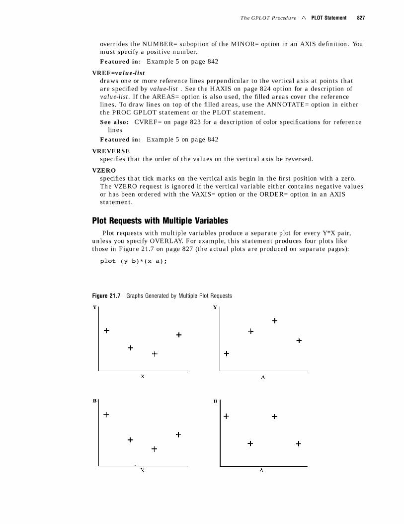
Plot Requests with Multiple VariablesPlot requests with multiple variables produce a separate plot for every Y*X pair,
unless you specify OVERLAY. For example, this statement produces four plots likethose in Figure 21.7 on page 827 (the actual plots are produced on separate pages):
plot (y b)*(x a);
Figure 21.7 Graphs Generated by Multiple Plot Requests
828 PLOT2 Statement 4 Chapter 21
About SYMBOL DefinitionsSYMBOL statements control the appearance of plot symbols and lines, and define
interpolation methods. They can specify� the shape, size, and color of the plot symbols that mark the data points
� plot line style, color, and width
� an interpolation method for plotting data� how missing values are treated in interpolation calculations.
SYMBOL definitions are assigned either by default by the GPLOT procedure orexplicitly with a plot request.
If no SYMBOL definition is currently in effect, the GPLOT procedure produces ascatter plot of the data points using the default plot symbol, the plus sign (+). If youneed more than one SYMBOL definition, the procedure rotates through the currentcolors list to produce symbols of different colors. If the current colors list contains onlyone color, or if all the colors are used, additional plot symbols are used.
If SYMBOL definitions have been defined but not explicitly assigned by a plotrequest of the form y-variable*x-variable=n, the procedure assigns them in the order inwhich they are generated. For example, this statement creates three plots:
plot y*x b*a s*r;
The procedure assigns the first generated SYMBOL definition to Y*X, the secondgenerated SYMBOL definition to B*A, and the third to S*R.
If more SYMBOL definitions are needed than have been defined, the procedure usesthe default definitions for the plots that remain.
See “SYMBOL Statement” on page 226 for a complete discussion of the features ofthe SYMBOL statement.
About Plot Requests that Assign a SYMBOL DefinitionPlot requests of the form y-variable*x-variable=n are useful when you use the
OVERLAY option to produce multiple plots on one graph and you want to assign aparticular SYMBOL definition to each plot.
With plot requests of this type it is important to remember that a single SYMBOLstatement can generate multiple SYMBOL definitions, so that the SYMBOL definitionthat is designated by n may not be the same as the SYMBOL statement of the samenumber. That is, the third SYMBOL definition is not necessarily the same as theSYMBOL3 statement. See “SYMBOL Statement” on page 226 for more information.
PLOT2 Statement
Produces one or more plots with the vertical axis on the right side of the graph against which asecond dependent variable can be plotted.
Requirements: You cannot use the PLOT2 statement alone. It can be used only with aPLOT or BUBBLE statement. At least one plot request is required.
Global statements: AXIS, FOOTNOTE, LEGEND, PATTERN, SYMBOL, TITLE
Description The PLOT2 statement specifies one or more plot requests that name thehorizontal and right vertical axis variables. This statement automatically
The GPLOT Procedure 4 PLOT2 Statement 829
� plots data points within the axes� scales the axes to include the maximum and minimum data values� labels each axis with the name of its variable and displays each major tick mark
value.
You can use statement options to manipulate the axes and modify the appearance ofyour graph. You can use SYMBOL definitions to modify plot symbols for the datapoints, join data points, draw regression lines, plot confidence limits, or specify othertypes of interpolation. For more information on the SYMBOL statement, see “AboutSYMBOL Definitions” on page 828.
In addition, you can use global statements to modify the axes; add titles, footnotes,and notes to the plot; or modify the legend if one is generated by the plot. You can alsouse an Annotate data set to enhance the plot.
Syntax
PLOT2 plot-request(s) </option(s)>;
option(s) can be one or more options from any or all of the following categories:� plot options:
AREAS=nGRIDLEGEND | LEGEND=LEGEND<1...99>NOLEGENDOVERLAYREGEQNSKIPMISS
� appearance options:ANNOTATE=Annotate-data-setCAXIS=axis-colorCFRAME=background-colorCTEXT=text-colorFRAME | NOFRAMENOAXIS | NOAXES
� vertical axis options:AUTOVREFCVREF=reference-line-colorLVREF=line-typeVAXIS=value-list | AXIS<1...99>VMINOR=nVREF=value-listVREVERSEVZERO
Required Arguments
plot-request(s)each specifies the variables to plot and produces a separate graph, unless you specifyOVERLAY. All variables must be in the input data set. Multiple plot requests areseparated with blanks. A plot request can be any of these:
830 PLOT2 Statement 4 Chapter 21
y-variable*x-variable<=n>plots the values of two variables and, optionally, assigns a SYMBOL definition tothe plot.
y-variablevariable plotted on the right vertical axis.
x-variablevariable plotted on the horizontal axis.
nnumber of the nth generated SYMBOL definition.
(y-variable(s))*(x-variable(s))plots the values of two or more variable and produces a separate graph for eachcombination of Y and X variables.
y-variable(s)variables plotted on the right vertical axes.
x-variable(s)variables plotted on the horizontal axes.
y-variable*x-variable=third-variableplots the values of two variables against a third classification variable
y-variablevariable plotted on the right vertical axis.
x-variablevariable plotted on the horizontal axis.
third-variableclassification variable against which y-variable and x-variable are plotted.Third-variable can be character or numeric, but numeric variables shouldcontain discrete rather than continuous values, or should be formatted toprovide discrete values.
For more information about plot requests, see “PLOT Statement” on page 818.In a PLOT2 plot request, the independent (X) variable for the horizontal axis must
be the same as in the accompanying PLOT or BUBBLE statement. Typically, thedependent (Y) variable for the right vertical axis is different.Use the same types of plot requests with a PLOT2 statement that you use with a
PLOT statement, but a PLOT2 statement always plots the values of y-variable on theright vertical axis.
OptionsOptions for the PLOT2 statement are identical to those for the PLOT statement
except for these options, which are ignored if you specify them:AUTOHREFCHREF=DESCRIPTION=HAXIS=HMINOR=HREF=HTML=HTML_LEGEND=HZERO=
The GPLOT Procedure 4 PLOT2 Statement 831
LHREF=
NAME=
See “PLOT Statement” on page 818 for complete descriptions of options that you canuse with the PLOT2 statement.
Matching Plot RequestsThe plot requests in both the PLOT and PLOT2 statements must be evenly matched
as in this example:
plot y*x b*a;plot2 y2*x b2*a;
These statements produce two graphs, each with two vertical axes. The first pair ofplot requests (Y*X and Y2*X) produce one graph in which X is plotted on the horizontalaxis, Y is plotted on the left axis, and Y2 is plotted on the right axis. The second pair ofplot requests (B*A and B2*A) produce another graph in which A is plotted on thehorizontal axis, B is plotted on the left axis, and B2 is plotted on the right axis.
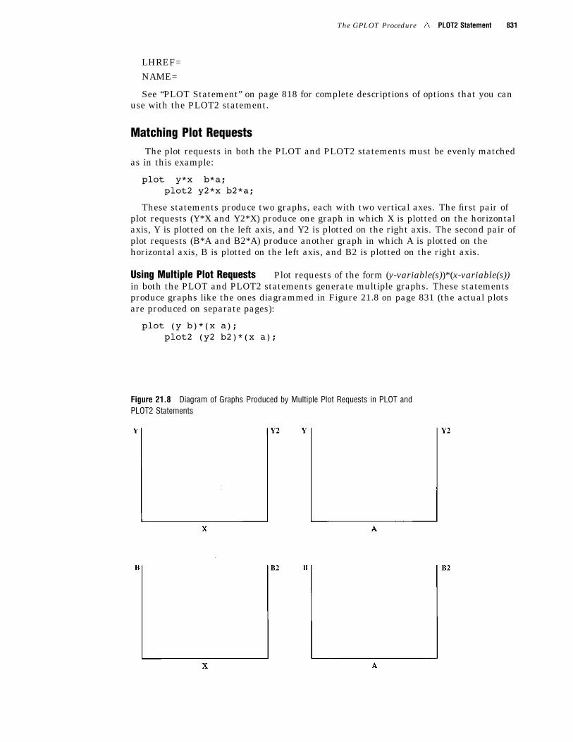
Using Multiple Plot Requests Plot requests of the form (y-variable(s))*(x-variable(s))in both the PLOT and PLOT2 statements generate multiple graphs. These statementsproduce graphs like the ones diagrammed in Figure 21.8 on page 831 (the actual plotsare produced on separate pages):
plot (y b)*(x a);plot2 (y2 b2)*(x a);
Figure 21.8 Diagram of Graphs Produced by Multiple Plot Requests in PLOT andPLOT2 Statements
832 PLOT2 Statement 4 Chapter 21
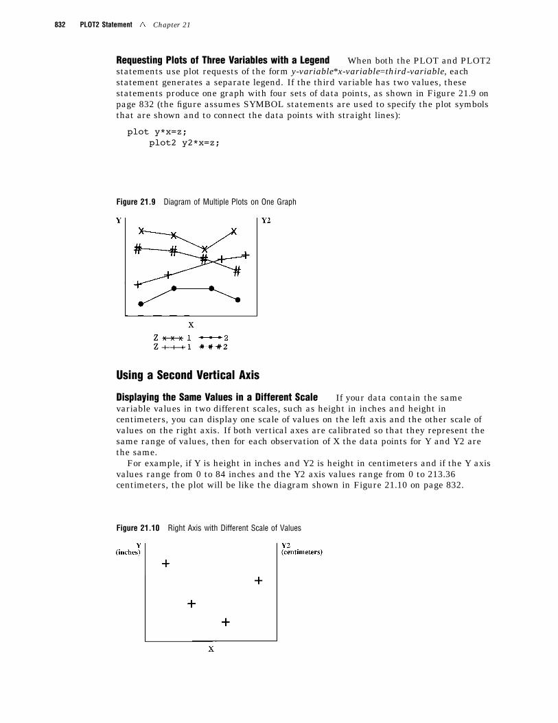
Requesting Plots of Three Variables with a Legend When both the PLOT and PLOT2statements use plot requests of the form y-variable*x-variable=third-variable, eachstatement generates a separate legend. If the third variable has two values, thesestatements produce one graph with four sets of data points, as shown in Figure 21.9 onpage 832 (the figure assumes SYMBOL statements are used to specify the plot symbolsthat are shown and to connect the data points with straight lines):
plot y*x=z;plot2 y2*x=z;
Figure 21.9 Diagram of Multiple Plots on One Graph
Using a Second Vertical Axis
Displaying the Same Values in a Different Scale If your data contain the samevariable values in two different scales, such as height in inches and height incentimeters, you can display one scale of values on the left axis and the other scale ofvalues on the right axis. If both vertical axes are calibrated so that they represent thesame range of values, then for each observation of X the data points for Y and Y2 arethe same.
For example, if Y is height in inches and Y2 is height in centimeters and if the Y axisvalues range from 0 to 84 inches and the Y2 axis values range from 0 to 213.36centimeters, the plot will be like the diagram shown in Figure 21.10 on page 832.
Figure 21.10 Right Axis with Different Scale of Values
The GPLOT Procedure 4 PLOT2 Statement 833
For plots such as these, the PLOT2 statement should use a SYMBOL statement thatspecifies INTERPOL=NONE and VALUE=NONE.
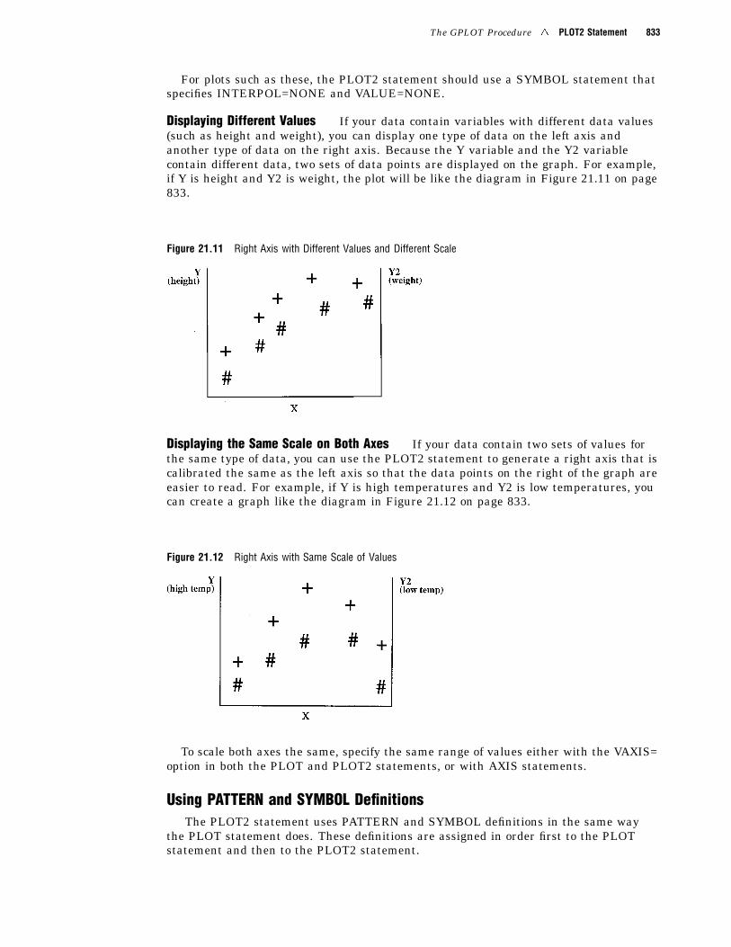
Displaying Different Values If your data contain variables with different data values(such as height and weight), you can display one type of data on the left axis andanother type of data on the right axis. Because the Y variable and the Y2 variablecontain different data, two sets of data points are displayed on the graph. For example,if Y is height and Y2 is weight, the plot will be like the diagram in Figure 21.11 on page833.
Figure 21.11 Right Axis with Different Values and Different Scale
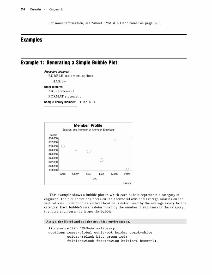
Displaying the Same Scale on Both Axes If your data contain two sets of values forthe same type of data, you can use the PLOT2 statement to generate a right axis that iscalibrated the same as the left axis so that the data points on the right of the graph areeasier to read. For example, if Y is high temperatures and Y2 is low temperatures, youcan create a graph like the diagram in Figure 21.12 on page 833.
Figure 21.12 Right Axis with Same Scale of Values
To scale both axes the same, specify the same range of values either with the VAXIS=option in both the PLOT and PLOT2 statements, or with AXIS statements.
Using PATTERN and SYMBOL DefinitionsThe PLOT2 statement uses PATTERN and SYMBOL definitions in the same way
the PLOT statement does. These definitions are assigned in order first to the PLOTstatement and then to the PLOT2 statement.
834 Examples 4 Chapter 21
For more information, see “About SYMBOL Definitions” on page 828.
Examples
Example 1: Generating a Simple Bubble Plot
Procedure features:BUBBLE statement option:
HAXIS=
Other features:AXIS statement
FORMAT statement
Sample library member: GR21N01
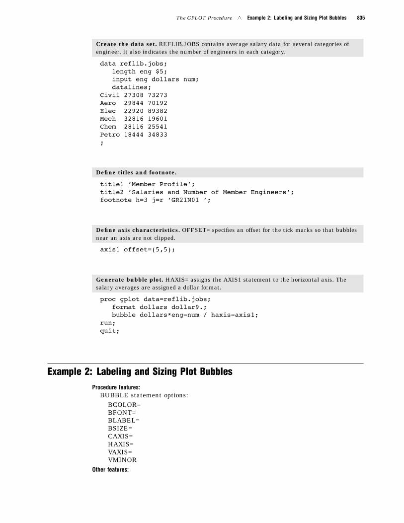
This example shows a bubble plot in which each bubble represents a category ofengineer. The plot shows engineers on the horizontal axis and average salaries on thevertical axis. Each bubble’s vertical location is determined by the average salary for thecategory. Each bubble’s size is determined by the number of engineers in the category:the more engineers, the larger the bubble.
Assign the libref and set the graphics environment.
libname reflib ’SAS-data-library’;goptions reset=global gunit=pct border cback=white
colors=(black blue green red)ftitle=swissb ftext=swiss htitle=6 htext=4;
The GPLOT Procedure 4 Example 2: Labeling and Sizing Plot Bubbles 835
Create the data set. REFLIB.JOBS contains average salary data for several categories ofengineer. It also indicates the number of engineers in each category.
data reflib.jobs;length eng $5;input eng dollars num;datalines;
Civil 27308 73273Aero 29844 70192Elec 22920 89382Mech 32816 19601Chem 28116 25541Petro 18444 34833;
Define titles and footnote.
title1 ’Member Profile’;title2 ’Salaries and Number of Member Engineers’;footnote h=3 j=r ’GR21N01 ’;
Define axis characteristics. OFFSET= specifies an offset for the tick marks so that bubblesnear an axis are not clipped.
axis1 offset=(5,5);
Generate bubble plot. HAXIS= assigns the AXIS1 statement to the horizontal axis. Thesalary averages are assigned a dollar format.
proc gplot data=reflib.jobs;format dollars dollar9.;bubble dollars*eng=num / haxis=axis1;
run;quit;
Example 2: Labeling and Sizing Plot BubblesProcedure features:
BUBBLE statement options:BCOLOR=BFONT=BLABEL=BSIZE=CAXIS=HAXIS=VAXIS=VMINOR
Other features:
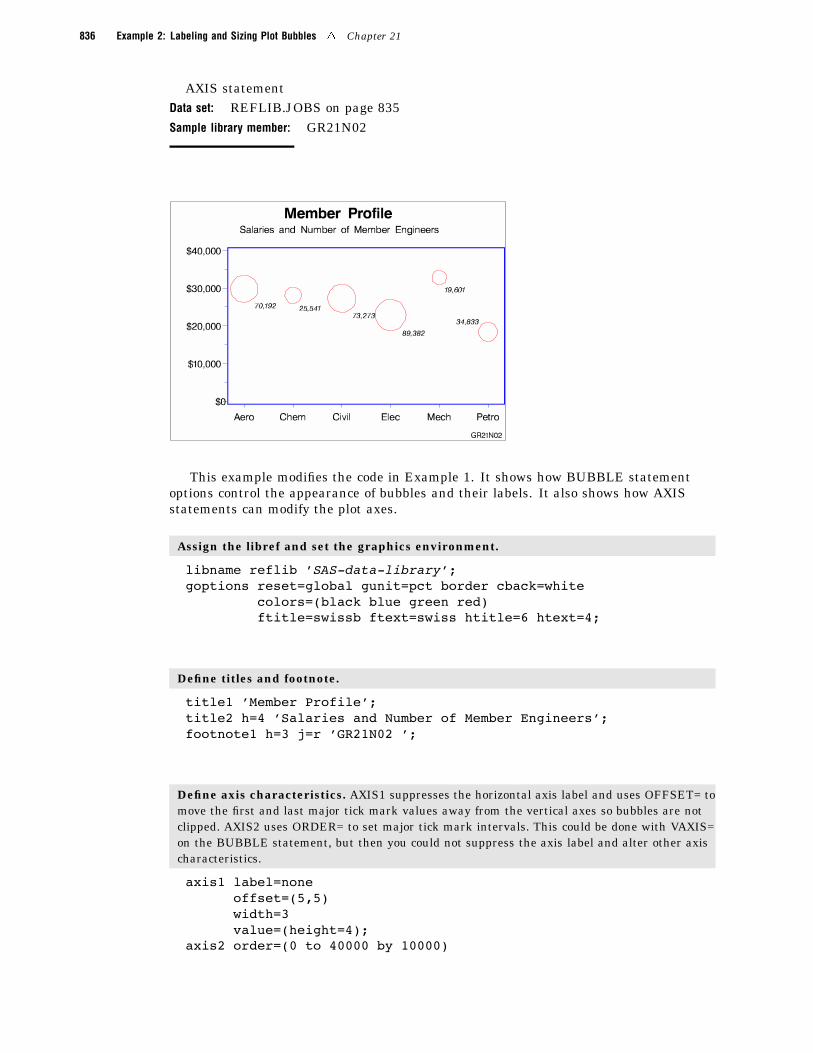
836 Example 2: Labeling and Sizing Plot Bubbles 4 Chapter 21
AXIS statementData set: REFLIB.JOBS on page 835Sample library member: GR21N02
This example modifies the code in Example 1. It shows how BUBBLE statementoptions control the appearance of bubbles and their labels. It also shows how AXISstatements can modify the plot axes.
Assign the libref and set the graphics environment.
libname reflib ’SAS-data-library’;goptions reset=global gunit=pct border cback=white
colors=(black blue green red)ftitle=swissb ftext=swiss htitle=6 htext=4;
Define titles and footnote.
title1 ’Member Profile’;title2 h=4 ’Salaries and Number of Member Engineers’;footnote1 h=3 j=r ’GR21N02 ’;
Define axis characteristics. AXIS1 suppresses the horizontal axis label and uses OFFSET= tomove the first and last major tick mark values away from the vertical axes so bubbles are notclipped. AXIS2 uses ORDER= to set major tick mark intervals. This could be done with VAXIS=on the BUBBLE statement, but then you could not suppress the axis label and alter other axischaracteristics.
axis1 label=noneoffset=(5,5)width=3value=(height=4);
axis2 order=(0 to 40000 by 10000)
The GPLOT Procedure 4 Example 3: Adding a Right Vertical Axis 837
label=nonemajor=(height=1.5)minor=(height=1)width=3value=(height=4);
Generate bubble plot. VMINOR= specifies one minor tick mark for the vertical axis.BCOLOR= colors the bubbles. BLABEL labels each bubble with the value of variable NUM, andBFONT= specifies the font for labeling text. BSIZE= increases the bubble sizes by increasingthe scaling factor size to 12. CAXIS= colors the axis lines and all major and minor tick marks.
proc gplot data=reflib.jobs;format dollars dollar9. num comma7.0;bubble dollars*eng=num / haxis=axis1
vaxis=axis2vminor=1bcolor=redblabelbfont=swissibsize=12caxis=blue;
run;quit;
Example 3: Adding a Right Vertical Axis
Procedure features:BUBBLE2 statement options:
BCOLOR=BSIZE=CAXIS=VAXIS=
Data set: REFLIB.JOBS on page 835Sample library member: GR21N03
838 Example 3: Adding a Right Vertical Axis 4 Chapter 21
This example modifies Example 2 on page 835 to show how a BUBBLE2 statementgenerates a right vertical axis that displays the values of the vertical coordinates in adifferent scale from the scale that is used for the left vertical axis. Salary values arescaled by dollars on the left vertical axis and by yen on the right vertical axis.
BUBBLE and BUBBLE2 statement options control the size and appearance of thebubbles and their labels. In particular, the VAXIS options calibrate the axes so that thedata points are identical and only one set of bubbles appears.
Note: If the data points are not identical, two sets of bubbles are displayed. 4
Assign the libref and set the graphics environment.
libname reflib ’SAS-data-library’;goptions reset=global gunit=pct border cback=white
colors=(black blue green red)ftitle=swissb ftext=swiss htitle=6 htext=3;
Create the data set REFLIB.JOBS2 and calculate variable YEN. The DATA step uses aSET statement to read the REFLIB.JOBS data set.
data reflib.jobs2;set reflib.jobs;yen=dollars*125;
run;
Define titles and footnote.
title1 ’Member Profile’;title2 h=4 ’Salaries and Number of Member Engineers’;footnote j=r ’GR21N03 ’;
Define horizontal-axis characteristics.
The GPLOT Procedure 4 Example 4: Plotting Two Variables 839
axis1 offset=(5,5)label=nonewidth=3value=(h=4);
Generate bubble plot with second vertical axis. In the BUBBLE statement, HAXIS=specifies the AXIS1 definition and VAXIS= scales the left axis. In the BUBBLE2 statement,VAXIS= scales the right axis. Both axes represent the same range of monetary values. TheBUBBLE and BUBBLE2 statements ensure that the bubbles generated by each statement areidentical by coordinating specifications on BCOLOR=, which colors the bubbles; BSIZE=, whichincreases the size of the scaling factor to 12; and CAXIS=, which colors the axis lines and allmajor and minor tick marks. Axis labels and major tick mark values use the default color, whichis the first color in the colors list.
proc gplot data=reflib.jobs2;format dollars dollar7. num yen comma9.0;bubble dollars*eng=num / haxis=axis1
vaxis=10000 to 40000 by 10000hminor=0vminor=1blabelbfont=swissibcolor=redbsize=12caxis=blue;
bubble2 yen*eng=num / vaxis=1250000 to 5000000 by 1250000vminor=1bcolor=redbsize=12caxis=blue;
run;quit;
Example 4: Plotting Two VariablesProcedure features:
PLOT statement options:HAXIS=HMINOR=REGEQNVAXIS=
Other features:RUN-group processingSYMBOL statement
Sample library member: GR21N04

840 Example 4: Plotting Two Variables 4 Chapter 21
In this example, the PLOT statement uses a plot request of the typey-variable*x-variable to plot the variable HEIGHT against the variable WEIGHT. Theplot shows that weight generally increases with size.
This example then requests the same plot with some modifications. As shown by thefollowing output, the second plot request specifies a regression analysis with confidencelimits, and scales the range of values along the vertical and horizontal axes. It alsodisplays the regression equation specified for the SYMBOL statement. Because theprocedure supports RUN-group processing, you do not have to repeat the PROC GPLOTstatement to generate the second plot.
Assign the libref and set the graphics environment.
libname reflib ’SAS-data-library’;goptions reset=global gunit=pct border cback=white
colors=(black blue green red)ftitle=swissb ftext=swiss htitle=6 htext=4;
The GPLOT Procedure 4 Example 4: Plotting Two Variables 841
Create the data set. REFLIB.STATS contains the heights and weights of numerousindividuals.
data reflib.stats;input height weight;datalines;
69.0 112.556.5 84.0...more data lines...67.0 133.057.5 85.0;
Define title and footnotes.
title ’Study of Height vs Weight’;footnote1 h=3 j=l ’ Source: T. Lewis & L. R. Taylor’;footnote2
h=3 j=l ’ Introduction to Experimental Ecology’j=r ’GR21N04(a) ’;
Generate a default scatter plot.
proc gplot data=reflib.stats;plot height*weight;
run;
Redefine footnotes to make room for the regression equation.
footnote1; /* this clears footnote1 */footnote2 h=3 j=r ’GR21N04(b) ’;
Define symbol characteristics. INTERPOL= specifies a cubic regression analysis withconfidence limits for mean predicted values. VALUE=, HEIGHT=, and CV= specify a plotsymbol, size, and color. CI=, CO=, and WIDTH= specify colors and a thickness for theinterpolation and confidence-limits lines.
symbol1 interpol=rcclm95value=diamondheight=3cv=redci=blueco=greenwidth=2;
Generate scatter plot with regression line. HAXIS= and VAXIS= define the range of axesvalues. HMINOR= specifies one minor tick mark between major tick marks. REGEQN displaysthe regression equation specified on the SYMBOL1 statement.
842 Example 5: Connecting Plot Data Points 4 Chapter 21
plot height*weight / haxis=45 to 155 by 10vaxis=48 to 78 by 6hminor=1regeqn;
run;quit;
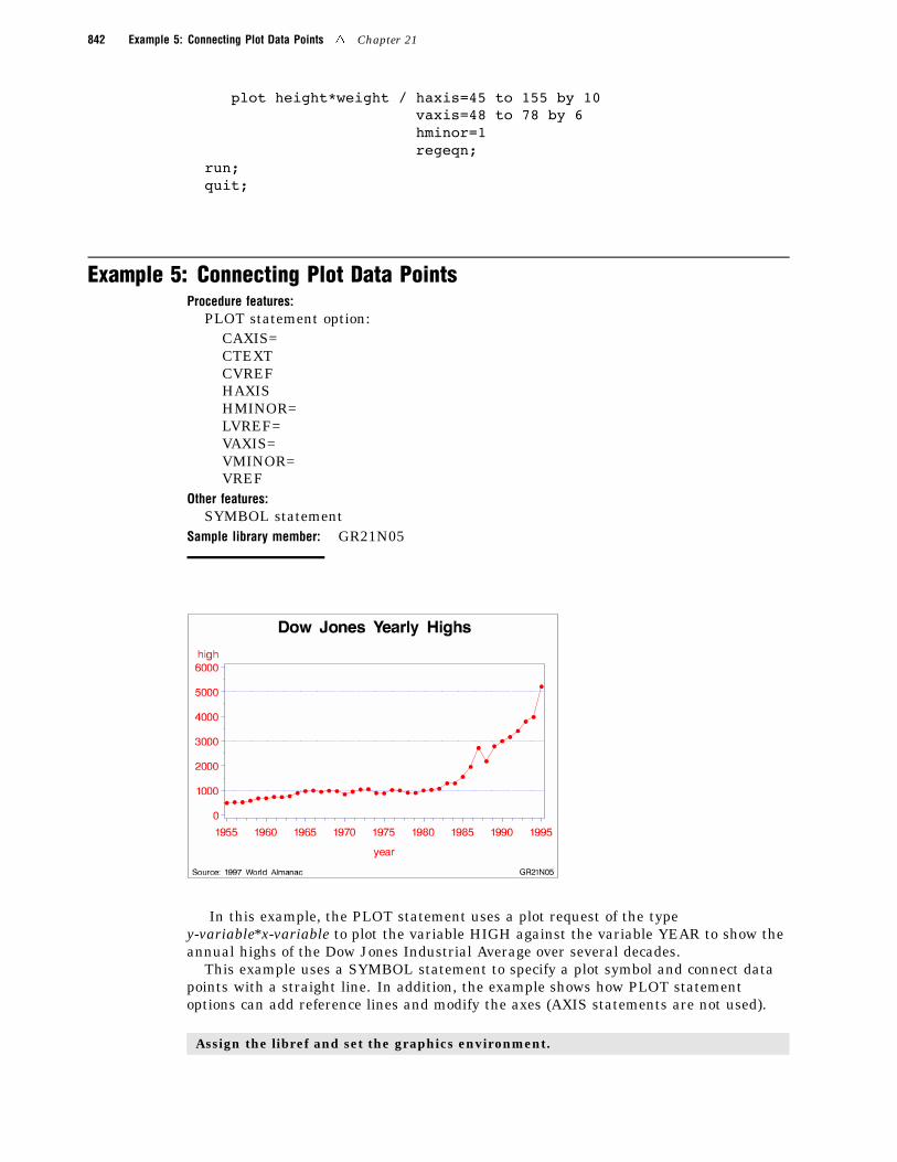
Example 5: Connecting Plot Data PointsProcedure features:
PLOT statement option:CAXIS=CTEXTCVREFHAXISHMINOR=LVREF=VAXIS=VMINOR=VREF
Other features:SYMBOL statement
Sample library member: GR21N05
In this example, the PLOT statement uses a plot request of the typey-variable*x-variable to plot the variable HIGH against the variable YEAR to show theannual highs of the Dow Jones Industrial Average over several decades.
This example uses a SYMBOL statement to specify a plot symbol and connect datapoints with a straight line. In addition, the example shows how PLOT statementoptions can add reference lines and modify the axes (AXIS statements are not used).
Assign the libref and set the graphics environment.

The GPLOT Procedure 4 Example 5: Connecting Plot Data Points 843
libname reflib ’SAS-data-library’;goptions reset=global gunit=pct border cback=white
colors=(black blue green red)ftitle=swissb ftext=swiss htitle=6 htext=4;
Create the data set. REFLIB.STOCKS contains yearly highs and lows for the Dow JonesIndustrial Average, and the dates of the high and low values each year.
data reflib.stocks;input year @7 hdate date9. @15 high
@24 ldate date9. @32 low;format hdate ldate date9.;datalines;
1955 30DEC55 488.40 17JAN55 388.201956 06APR56 521.05 23JAN56 462.35...more data lines...1994 31JAN94 3978.36 04APR94 3593.351995 13DEC95 5216.47 30JAN95 3832.08;
Define title and footnote.
title1 ’Dow Jones Yearly Highs’;footnote1 h=3 j=l ’ Source: 1997 World Almanac’
j=r ’GR21N05 ’;
Define symbol characteristics. SYMBOL1 defines the symbol that marks the data points andspecifies its height and color. INTERPOL=JOIN joins the data points with straight lines.
symbol1 color=redinterpol=joinvalue=dotheight=3;
Generate the plot and modify the axis values. HAXIS= sets major tick marks for thehorizontal axis. VAXIS= sets major tick marks for the vertical axis. HMINOR= and VMINOR=specify the number of tick marks between major tick marks.
proc gplot data=reflib.stocks;plot high*year / haxis=1955 to 1995 by 5
vaxis=0 to 6000 by 1000hminor=3vminor=1
Add reference lines and specify colors. VREF= draws reference lines on the vertical axis atthree marks. LVREF= specifies the line style (dashed) for the lines; CVREF= specifies blue asthe line color. CAXIS= colors the axis lines and all major and minor tick marks. CTEXT=specifies red for all plot text, including axis labels and major tick mark values.
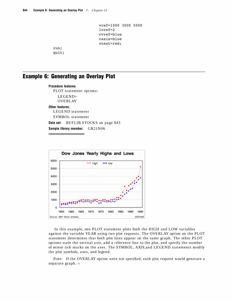
844 Example 6: Generating an Overlay Plot 4 Chapter 21
vref=1000 3000 5000lvref=2cvref=bluecaxis=bluectext=red;
run;quit;
Example 6: Generating an Overlay Plot
Procedure features:PLOT statement options:
LEGEND=OVERLAY
Other features:LEGEND statementSYMBOL statement
Data set: REFLIB.STOCKS on page 843
Sample library member: GR21N06
In this example, one PLOT statement plots both the HIGH and LOW variablesagainst the variable YEAR using two plot requests. The OVERLAY option on the PLOTstatement determines that both plot lines appear on the same graph. The other PLOToptions scale the vertical axis, add a reference line to the plot, and specify the numberof minor tick marks on the axes. The SYMBOL, AXIS,and LEGEND statements modifythe plot symbols, axes, and legend.
Note: If the OVERLAY option were not specified, each plot request would generate aseparate graph. 4
The GPLOT Procedure 4 Example 6: Generating an Overlay Plot 845
Assign the libref and set the graphics environment.
libname reflib ’SAS-data-library’;goptions reset=global gunit=pct border cback=white
colors=(black blue green red)ftitle=swissb ftext=swiss htitle=6 htext=4;
Define title and footnote.
title1 ’Dow Jones Yearly Highs and Lows’;footnote1 h=3 j=l ’ Source: 1997 World Almanac’
j=r ’GR21N06 ’;
Define symbol characteristics. Each SYMBOL statement specifies a color, symbol type, andsize for the plot symbols, and connects the data points with a straight line. SYMBOL2 specifiesa solid triangle as the plot symbol by combining FONT=MARKER with VALUE=C.
symbol1 color=redinterpol=joinvalue=dotheight=3;
symbol2 font=marker value=Ccolor=blueinterpol=joinheight=2;
Define axis characteristics.
axis1 order=(1955 to 1995 by 5) offset=(2,2)label=nonemajor=(height=2) minor=(height=1)width=3;
axis2 order=(0 to 6000 by 1000) offset=(0,0)label=nonemajor=(height=2) minor=(height=1)width=3;
Define legend characteristics. LABEL= suppresses the legend label. SHAPE= specifies awidth and height for legend values. POSITION= centers the legend inside the top of the axisframe. MODE= shares the legend area with other graphics elements.
legend1 label=noneshape=symbol(4,2)position=(top center inside)mode=share;
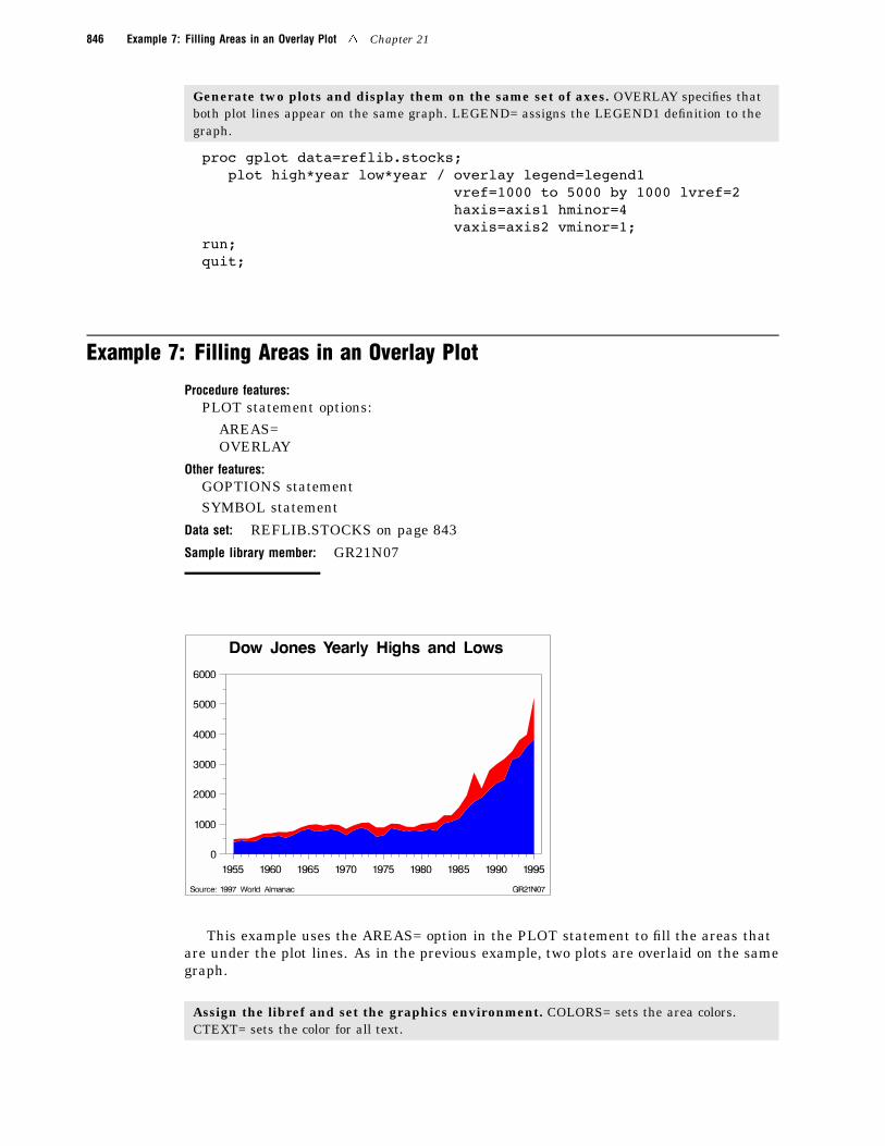
846 Example 7: Filling Areas in an Overlay Plot 4 Chapter 21
Generate two plots and display them on the same set of axes. OVERLAY specifies thatboth plot lines appear on the same graph. LEGEND= assigns the LEGEND1 definition to thegraph.
proc gplot data=reflib.stocks;plot high*year low*year / overlay legend=legend1
vref=1000 to 5000 by 1000 lvref=2haxis=axis1 hminor=4vaxis=axis2 vminor=1;
run;quit;
Example 7: Filling Areas in an Overlay Plot
Procedure features:PLOT statement options:
AREAS=OVERLAY
Other features:GOPTIONS statementSYMBOL statement
Data set: REFLIB.STOCKS on page 843
Sample library member: GR21N07
This example uses the AREAS= option in the PLOT statement to fill the areas thatare under the plot lines. As in the previous example, two plots are overlaid on the samegraph.
Assign the libref and set the graphics environment. COLORS= sets the area colors.CTEXT= sets the color for all text.
The GPLOT Procedure 4 Example 8: Plotting Three Variables 847
libname reflib ’SAS-data-library’;goptions reset=global gunit=pct border cback=white
colors=(blue red) ctext=blackftitle=swissb ftext=swiss htitle=6 htext=4;
Define title and footnote.
title1 ’Dow Jones Yearly Highs and Lows’;footnote1 h=3 j=l ’ Source: 1997 World Almanac’
j=r ’GR21N07 ’;
Define symbol characteristics. INTERPOL= specifies a line to connect data points. The linecreates the fill boundary.
symbol1 interpol=join;
Define axis characteristics.
axis1 order=(1955 to 1995 by 5) offset=(2,2)label=nonemajor=(height=2)minor=(height=1);
axis2 order=(0 to 6000 by 1000) offset=(0,0)label=nonemajor=(height=2)minor=(height=1);
Generate a plot with filled areas. The plot requests are ordered to draw the lowest plot first.Area 1 occupies the space between the lowest (first) plot line and the horizontal axis, and area 2is below the highest (second) plot line. This arrangement prevents the pattern for area 1 fromoverlaying the pattern for area 2. AREAS=2 fills all the areas below the second plot line.
proc gplot data=reflib.stocks;plot low*year high*year / overlay
haxis=axis1hminor=4vaxis=axis2vminor=1caxis=blackareas=2;
run;quit;
Example 8: Plotting Three Variables
Procedure features:
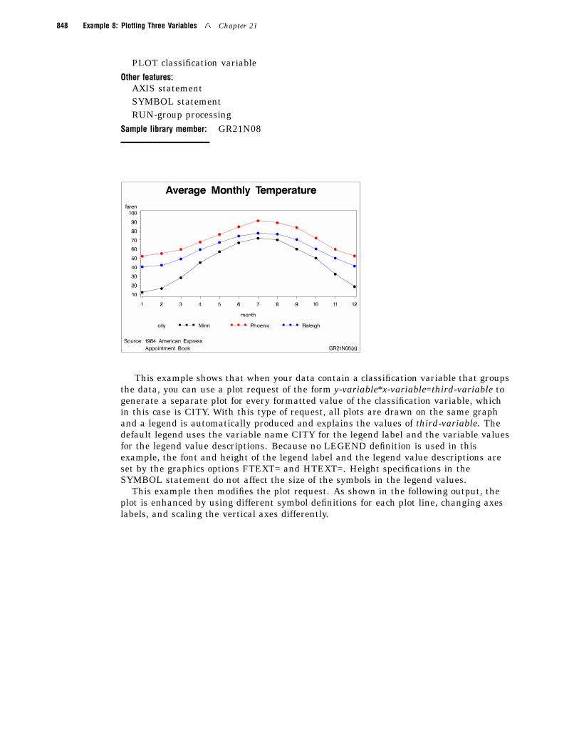
848 Example 8: Plotting Three Variables 4 Chapter 21
PLOT classification variableOther features:
AXIS statementSYMBOL statementRUN-group processing
Sample library member: GR21N08
This example shows that when your data contain a classification variable that groupsthe data, you can use a plot request of the form y-variable*x-variable=third-variable togenerate a separate plot for every formatted value of the classification variable, whichin this case is CITY. With this type of request, all plots are drawn on the same graphand a legend is automatically produced and explains the values of third-variable. Thedefault legend uses the variable name CITY for the legend label and the variable valuesfor the legend value descriptions. Because no LEGEND definition is used in thisexample, the font and height of the legend label and the legend value descriptions areset by the graphics options FTEXT= and HTEXT=. Height specifications in theSYMBOL statement do not affect the size of the symbols in the legend values.
This example then modifies the plot request. As shown in the following output, theplot is enhanced by using different symbol definitions for each plot line, changing axeslabels, and scaling the vertical axes differently.
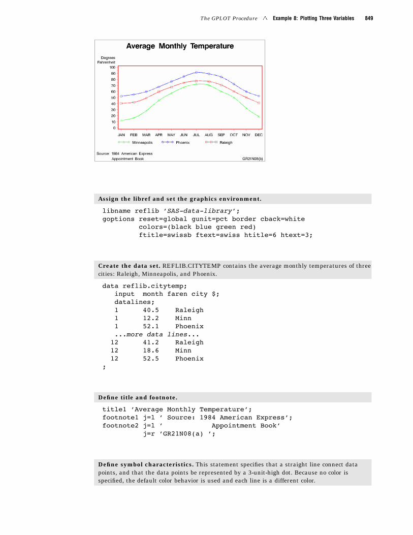
The GPLOT Procedure 4 Example 8: Plotting Three Variables 849
Assign the libref and set the graphics environment.
libname reflib ’SAS-data-library’;goptions reset=global gunit=pct border cback=white
colors=(black blue green red)ftitle=swissb ftext=swiss htitle=6 htext=3;
Create the data set. REFLIB.CITYTEMP contains the average monthly temperatures of threecities: Raleigh, Minneapolis, and Phoenix.
data reflib.citytemp;input month faren city $;datalines;1 40.5 Raleigh1 12.2 Minn1 52.1 Phoenix...more data lines...
12 41.2 Raleigh12 18.6 Minn12 52.5 Phoenix
;
Define title and footnote.
title1 ’Average Monthly Temperature’;footnote1 j=l ’ Source: 1984 American Express’;footnote2 j=l ’ Appointment Book’
j=r ’GR21N08(a) ’;
Define symbol characteristics. This statement specifies that a straight line connect datapoints, and that the data points be represented by a 3-unit-high dot. Because no color isspecified, the default color behavior is used and each line is a different color.
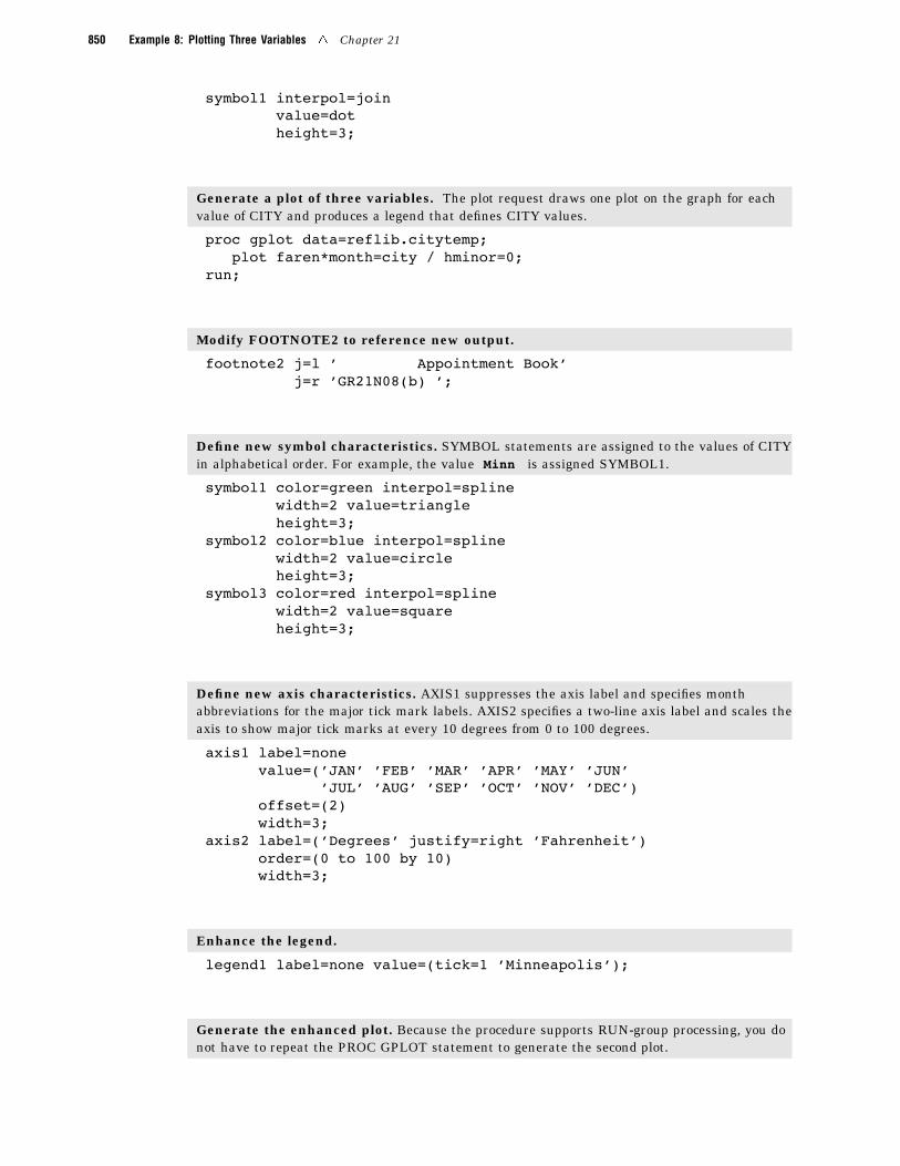
850 Example 8: Plotting Three Variables 4 Chapter 21
symbol1 interpol=joinvalue=dotheight=3;
Generate a plot of three variables. The plot request draws one plot on the graph for eachvalue of CITY and produces a legend that defines CITY values.
proc gplot data=reflib.citytemp;plot faren*month=city / hminor=0;
run;
Modify FOOTNOTE2 to reference new output.
footnote2 j=l ’ Appointment Book’j=r ’GR21N08(b) ’;
Define new symbol characteristics. SYMBOL statements are assigned to the values of CITYin alphabetical order. For example, the value Minn is assigned SYMBOL1.
symbol1 color=green interpol=splinewidth=2 value=triangleheight=3;
symbol2 color=blue interpol=splinewidth=2 value=circleheight=3;
symbol3 color=red interpol=splinewidth=2 value=squareheight=3;
Define new axis characteristics. AXIS1 suppresses the axis label and specifies monthabbreviations for the major tick mark labels. AXIS2 specifies a two-line axis label and scales theaxis to show major tick marks at every 10 degrees from 0 to 100 degrees.
axis1 label=nonevalue=(’JAN’ ’FEB’ ’MAR’ ’APR’ ’MAY’ ’JUN’
’JUL’ ’AUG’ ’SEP’ ’OCT’ ’NOV’ ’DEC’)offset=(2)width=3;
axis2 label=(’Degrees’ justify=right ’Fahrenheit’)order=(0 to 100 by 10)width=3;
Enhance the legend.
legend1 label=none value=(tick=1 ’Minneapolis’);
Generate the enhanced plot. Because the procedure supports RUN-group processing, you donot have to repeat the PROC GPLOT statement to generate the second plot.
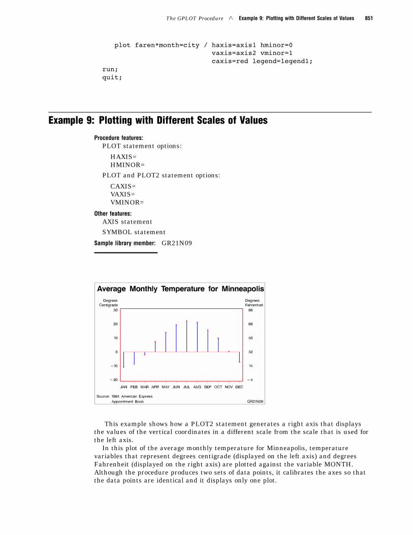
The GPLOT Procedure 4 Example 9: Plotting with Different Scales of Values 851
plot faren*month=city / haxis=axis1 hminor=0vaxis=axis2 vminor=1caxis=red legend=legend1;
run;quit;
Example 9: Plotting with Different Scales of Values
Procedure features:PLOT statement options:
HAXIS=HMINOR=
PLOT and PLOT2 statement options:
CAXIS=VAXIS=VMINOR=
Other features:AXIS statement
SYMBOL statement
Sample library member: GR21N09
This example shows how a PLOT2 statement generates a right axis that displaysthe values of the vertical coordinates in a different scale from the scale that is used forthe left axis.
In this plot of the average monthly temperature for Minneapolis, temperaturevariables that represent degrees centigrade (displayed on the left axis) and degreesFahrenheit (displayed on the right axis) are plotted against the variable MONTH.Although the procedure produces two sets of data points, it calibrates the axes so thatthe data points are identical and it displays only one plot.
852 Example 9: Plotting with Different Scales of Values 4 Chapter 21
This example uses SYMBOL statements to define symbol definitions. By default, theSYMBOL1 statement is assigned to the plot that is generated by the PLOT statement,and SYMBOL2 is assigned to the plot generated by the PLOT2 statement.
Assign the libref and set the graphics environment.
libname reflib ’SAS-data-library’;goptions reset=global gunit=pct border cback=white
colors=(black blue green red)ftitle=swissb ftext=swiss htitle=6 htext=3;
Create the data set and calculate centigrade temperatures. REFLIB.MINNTEMPcontains average monthly temperatures for Minneapolis.
data reflib.minntemp;input @10 month
@23 f2;c2=(f2-32)/1.8;output;datalines;
01JAN83 1 1 40.5 12.2 52.101FEB83 2 1 42.2 16.5 55.1
...more data lines...01NOV83 11 4 50.0 32.4 59.801DEC83 12 1 41.2 18.6 52.5;
Define title and footnote.
title1 ’Average Monthly Temperature for Minneapolis’;footnote1 j=l ’ Source: 1984 American Express’;footnote2 j=l ’ Appointment Book’
j=r ’GR21N09 ’;
Define symbol characteristics. INTERPOL=NEEDLE generates a horizontal reference lineat zero on the left axis and draws vertical lines from the data points to the reference line. CI=specifies the color of the interpolation line and CV= specifies the color of the plot symbol.
symbol1 interpol=needleci=bluecv=redwidth=3value=starheight=3;
Define symbol characteristics for PLOT2. SYMBOL2 suppresses interpolation lines andplotting symbols; otherwise, they would overlay the lines or symbols displayed by SYMBOL1.
symbol2 interpol=nonevalue=none;
The GPLOT Procedure 4 Example 10: Creating Plots with Drill-down for the Web 853
Define axis characteristics. In the AXIS2 and AXIS3 statements, ORDER= controls thescaling of the axes. Both axes represent exactly the same range of temperature, and thedistance between the major tick marks on both axes represent an equivalent quantity of degrees(10 for centigrade and 18 for Fahrenheit).
axis1 label=nonevalue=(’JAN’ ’FEB’ ’MAR’ ’APR’ ’MAY’ ’JUN’
’JUL’ ’AUG’ ’SEP’ ’OCT’ ’NOV’ ’DEC’)offset=(2)width=3;
axis2 label=(’Degrees’ justify=right ’ Centigrade’)order=(-20 to 30 by 10)width=3;
axis3 label=(h=3 ’Degrees’ justify=left ’Fahrenheit’)order=(-4 to 86 by 18)width=3;
Generate a plot with a second vertical axis. HAXIS= specifies the AXIS1 definition.VAXIS= specifies AXIS2 and AXIS3 definitions in the PLOT and PLOT2 statements. CAXIS=colors the axis lines and all major and minor tick marks. Axis labels and major tick mark valuesuse the default color. VMINOR= specifies the number of minor tick marks for each axis.
proc gplot data=reflib.minntemp;plot c2*month / caxis=red
haxis=axis1 hminor=0vaxis=axis2 vminor=1
plot2 f2*month / caxis=redvaxis=axis3vminor=1;
run;quit;
Example 10: Creating Plots with Drill-down for the Web
Procedure features:PLOT statement options:
HTML=HTML_LEGEND=
ODS features:ODS HTML statement:
BODY=NOGTITLEPATH=
Other features:BY statementGOPTIONS statement
Sample library member: GR21N10
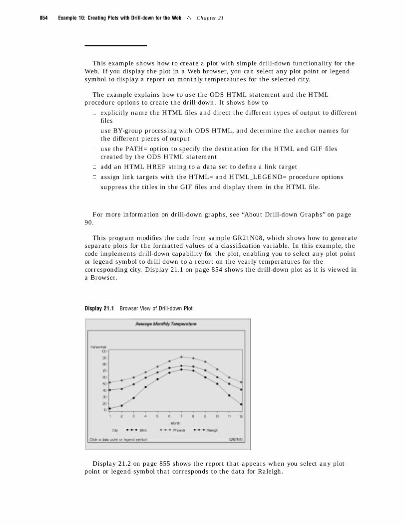
854 Example 10: Creating Plots with Drill-down for the Web 4 Chapter 21
This example shows how to create a plot with simple drill-down functionality for theWeb. If you display the plot in a Web browser, you can select any plot point or legendsymbol to display a report on monthly temperatures for the selected city.
The example explains how to use the ODS HTML statement and the HTMLprocedure options to create the drill-down. It shows how to
� explicitly name the HTML files and direct the different types of output to differentfiles
� use BY-group processing with ODS HTML, and determine the anchor names forthe different pieces of output
� use the PATH= option to specify the destination for the HTML and GIF filescreated by the ODS HTML statement
� add an HTML HREF string to a data set to define a link target
� assign link targets with the HTML= and HTML_LEGEND= procedure options� suppress the titles in the GIF files and display them in the HTML file.
For more information on drill-down graphs, see “About Drill-down Graphs” on page90.
This program modifies the code from sample GR21N08, which shows how to generateseparate plots for the formatted values of a classification variable. In this example, thecode implements drill-down capability for the plot, enabling you to select any plot pointor legend symbol to drill down to a report on the yearly temperatures for thecorresponding city. Display 21.1 on page 854 shows the drill-down plot as it is viewed ina Browser.
Display 21.1 Browser View of Drill-down Plot
Display 21.2 on page 855 shows the report that appears when you select any plotpoint or legend symbol that corresponds to the data for Raleigh.
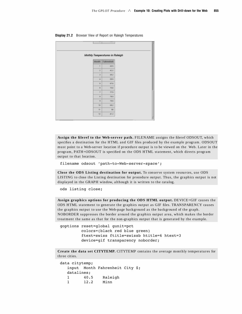
The GPLOT Procedure 4 Example 10: Creating Plots with Drill-down for the Web 855
Display 21.2 Browser View of Report on Raleigh Temperatures
Assign the fileref to the Web-server path. FILENAME assigns the fileref ODSOUT, whichspecifies a destination for the HTML and GIF files produced by the example program. ODSOUTmust point to a Web-server location if procedure output is to be viewed on the Web. Later in theprogram, PATH=ODSOUT is specified on the ODS HTML statement, which directs programoutput to that location.
filename odsout ’path-to-Web-server-space’;
Close the ODS Listing destination for output. To conserve system resources, use ODSLISTING to close the Listing destination for procedure output. Thus, the graphics output is notdisplayed in the GRAPH window, although it is written to the catalog.
ods listing close;
Assign graphics options for producing the ODS HTML output. DEVICE=GIF causes theODS HTML statement to generate the graphics output as GIF files. TRANSPARENCY causesthe graphics output to use the Web-page background as the background of the graph.NOBORDER suppresses the border around the graphics output area, which makes the bordertreatment the same as that for the non-graphics output that is generated by the example.
goptions reset=global gunit=pctcolors=(black red blue green)ftext=swiss ftitle=swissb htitle=6 htext=3device=gif transparency noborder;
Create the data set CITYTEMP. CITYTEMP contains the average monthly temperatures forthree cities.
data citytemp;input Month Fahrenheit City $;datalines;1 40.5 Raleigh1 12.2 Minn
856 Example 10: Creating Plots with Drill-down for the Web 4 Chapter 21
1 52.1 Phoenix2 42.2 Raleigh2 16.5 Minn2 55.1 Phoenix3 49.2 Raleigh3 28.3 Minn3 59.7 Phoenix4 59.5 Raleigh4 45.1 Minn4 67.7 Phoenix5 67.4 Raleigh5 57.1 Minn5 76.3 Phoenix6 74.4 Raleigh6 66.9 Minn6 84.6 Phoenix7 77.5 Raleigh7 71.9 Minn7 91.2 Phoenix8 76.5 Raleigh8 70.2 Minn8 89.1 Phoenix9 70.6 Raleigh9 60.0 Minn9 83.8 Phoenix
10 60.2 Raleigh10 50.0 Minn10 72.2 Phoenix11 50.0 Raleigh11 32.4 Minn11 59.8 Phoenix12 41.2 Raleigh12 18.6 Minn12 52.5 Phoenix
;
Add the HTML variable to CITYTEMP and create the NEWTEMP data set. The HTMLvariable CITYDRILL contains the target locations to associate with the different values of thevariable CITY. Each location for CITYDRILL references the file city_reports.html, wh ich will becreated by this program. Each location ends with the default anchor name (IDX1, IDX2, andIDX3) that ODS will assign to the target output when it creates that output in filecity_reports.html.
data newtemp;set citytemp;length citydrill $ 40;if city=’Minn’ then
citydrill=’HREF="city_reports.html#IDX1"’;else if city=’Phoenix’ then
citydrill=’HREF="city_reports.html#IDX2"’;else if city=’Raleigh’ then
citydrill=’HREF="city_reports.html#IDX3"’;
Define titles and footnotes and a symbol definition for the plots.
The GPLOT Procedure 4 Example 10: Creating Plots with Drill-down for the Web 857
title1 ’Average Monthly Temperature’;footnote1 j=l h=3 ’ Click a data point or legend symbol’
j=r ’GR21N10 ’;
symbol1 interpol=joinvalue=dotheight=3;
Open the HTML destination. PATH= specifies the ODSOUT fileref as the HTML destinationfor all the HTML and GIF files produced by the program. BODY= names the HTML file forstoring the drill-down plot. NOGTITLE suppresses the graph title from the SAS/GRAPH outputand displays it through the HTML page. ODS will automatically assign anchor names to eachpiece of output that is generated while the HTML destination is open.
ods html path=odsoutbody=’city_plots.html’nogtitle;
Generate the plot. Both HTML= and HTML_LEGEND= specify CITYDRILL as the variablethat contains the targets for the drill-down links. HTML= determines that each plot point willbe a hot zone that links to target output, and HTML_LEGEND= determines that the legendsymbols will be hot zones that link to target output. This GPLOT procedure generates the firstpiece of output in this program; thus, the plot receives the first default anchor name, which isIDX.
proc gplot data=newtemp;plot fahrenheit*month=city / hminor=0
html=citydrillhtml_legend=citydrill;
run;quit;
Change the HTML file. BODY= opens a new HTML file for storing the reports for citytemperatures. The new file is assigned the name city_reports.html, which is the file nameassigned above to variable CITYDRILL as part of its target-link locations. The rep orts that aregenerated later in this program will all be written to this one HTML file.
ods html path=odsoutbody=’city_reports.html’;
Sort data set NEWTEMP in order by city.
proc sort data=newtemp;by city month;
run;
Clear the footnotes, and suppress the default BY-line.
goptions reset=footnote;option nobyline;
Print a report of monthly temperatures for each city. The BY statement determines that aseparate report is generated for each city. Thus, the REPORT procedure generates three piecesof output. To assign anchor locations to this new output, ODS increments the last anchor namethat was used (IDX), and therefore assigns the anchor names IDX1, IDX2, and IDX3 to theoutput. These are the anchor locations that were specified above as the anchor locations forvariable CITYDRILL.
858 Example 10: Creating Plots with Drill-down for the Web 4 Chapter 21
title1 ’Monthly Temperatures in #byval(city)’;proc report data=newtemp nowindows;
by city;column city month fahrenheit;define city / noprint group;define month / display group;define Fahrenheit / display group;
run;
Close the HTML destination, and open the LISTING destination.
ods html close;ods listing;

The correct bibliographic citation for this manual is as follows: SAS Institute Inc.,SAS/GRAPH ® Software: Reference, Version 8, Cary, NC: SAS Institute Inc., 1999.
SAS/GRAPH® Software: Reference, Version 8Copyright © 1999 by SAS Institute Inc., Cary, NC, USA.ISBN 1–58025–525–6All rights reserved. Printed in the United States of America.U.S. Government Restricted Rights Notice. Use, duplication, or disclosure of thesoftware by the government is subject to restrictions as set forth in FAR 52.227–19Commercial Computer Software-Restricted Rights (June 1987).SAS Institute Inc., SAS Campus Drive, Cary, North Carolina 27513.1st printing, October 1999SAS® and all other SAS Institute Inc. product or service names are registered trademarksor trademarks of SAS Institute Inc. in the USA and other countries. ® indicates USAregistration.OS/2® , OS/390® , and IBM® are registered trademarks or trademarks of InternationalBusiness Machines Corporation.Other brand and product names are registered trademarks or trademarks of theirrespective companies.The Institute is a private company devoted to the support and further development of itssoftware and related services.