Embed Size (px)
Citation preview

�
of 1 107
The Growth Playbooks
�
Build Better Digital Products. Digital Intent is a creative technology studio helping companies build the right thing,
build it quickly, and get people using it. We're rocket fuel for your business.
DI gives clients nimble, cross-functional teams to take their businesses into the
future. DI engagements have included large multi-platform product launches for
Fortune 1000 companies, transforming mid-sized companies with new product
offerings, and helping startups find Product-Market fit. DI clients have acquired
millions of users, raised over $50 million in funding, and have had multiple exits.
of 2 107
Product Design Beautiful, human-centered design
backed by customer insight.
Software Engineering Launch faster, iterate rapidly,
find product-market fit.
Growth Marketing Get more customers, build your
brand, achieve scale.
Members of the Inc. 5000 two years in a row.
�
Playbook 1: Introduction to Growth The Four Stages of Growth Work
Growth vs Marketing
Measuring Product-Market Fit
Figuring out a model & hypothesis for how your product grows
The Importance of Growth Process Before Tactics
Prioritizing What to Test
List of Growth Tactics
Test Lots of Ideas to Validate Your Hypothesis
Why Velocity Matters for Growth
The 80:20 Rule for Doubling Down
Playbook 2: Competitive Analysis Studying Competitors and Demand Proxies
Competitive Analysis Tools and Templates
Targeting & Personas
Content Mapping
Installing the Scraper and Extracting Data
Keyword Research
Playbook 3: SEO What is SEO?
Search Algorithms
Ranking Factors and On Page vs. Off Page SEO
Websites, Webpages, Root Domains and SEO Vocabulary
Search Analysis, Tools & Templates
Traffic Overview
Organic Positions
Organic Positions Competitors
Backlinks
Playbook 4: Inbound MarketingPrinciples and Values: Why Inbound?
Content Marketing vs. Inbound Marketing
Defining Your Goals
Defining your Audience
Establishing Social Media Profiles
Content Planning
Managing Freelance Writers
Establish a Visual Language
Distribution
Monitoring and Iterating
of 3 107
�
Lead Nurturing
B2B vs B2B Content
Generating Leads with Content
Aligning Sales and Marketing Teams
Tools & Resources
Playbook 5: Paid PlacementsTypes of Advertising
Conversion Tracking
Google Keyword Selection
AdWords Alpha Beta Optimization
Facebook Campaigns
Facebook Targeting
Pinterest Campaign Types
Pinterest Exploratory Tests
Troubleshooting Campaigns
of 4 107
�
Playbook One: Introduction to Growth Digital Intent helps companies build and grow new products.
As a result, we have responsibility across the entire product
lifecycle. That means identifying what a product should be,
making sure it’s built well, and then iterating on the product in
response to customer feedback to maximize its likelihood of
success.
The term “growth” is a relatively new one, and there are
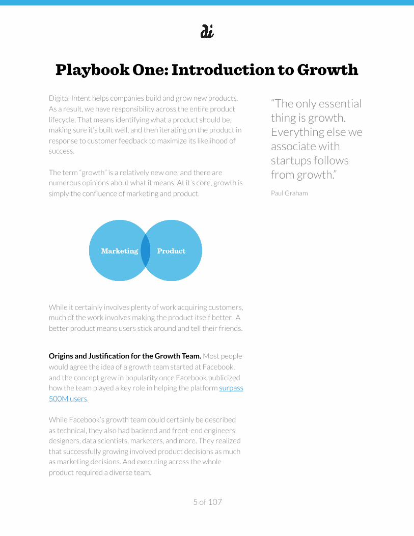
numerous opinions about what it means. At it’s core, growth is
simply the confluence of marketing and product.
While it certainly involves plenty of work acquiring customers,
much of the work involves making the product itself better. A
better product means users stick around and tell their friends.
Origins and Justification for the Growth Team. Most people
would agree the idea of a growth team started at Facebook,
and the concept grew in popularity once Facebook publicized
how the team played a key role in helping the platform surpass
500M users.
While Facebook’s growth team could certainly be described
as technical, they also had backend and front-end engineers,
designers, data scientists, marketers, and more. They realized
that successfully growing involved product decisions as much
as marketing decisions. And executing across the whole
product required a diverse team.
of 5 107
“The only essential thing is growth. Everything else we associate with startups follows from growth.”
Paul Graham
�
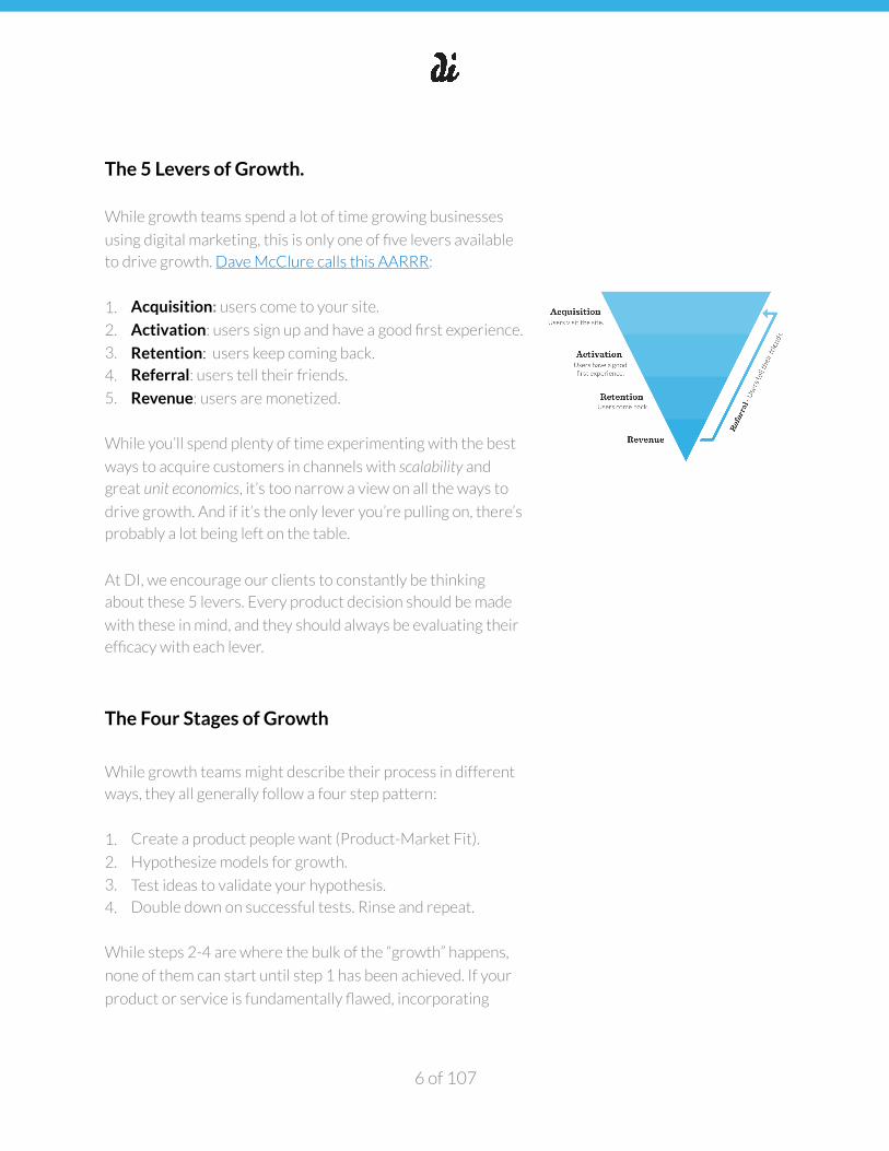
The 5 Levers of Growth.
While growth teams spend a lot of time growing businesses
using digital marketing, this is only one of five levers available
to drive growth. Dave McClure calls this AARRR:
1. Acquisition: users come to your site.
2. Activation: users sign up and have a good first experience.
3. Retention: users keep coming back.
4. Referral: users tell their friends.
5. Revenue: users are monetized.
While you’ll spend plenty of time experimenting with the best
ways to acquire customers in channels with scalability and
great unit economics, it’s too narrow a view on all the ways to
drive growth. And if it’s the only lever you’re pulling on, there’s
probably a lot being left on the table.
At DI, we encourage our clients to constantly be thinking
about these 5 levers. Every product decision should be made
with these in mind, and they should always be evaluating their
efficacy with each lever.
The Four Stages of Growth
While growth teams might describe their process in different
ways, they all generally follow a four step pattern:
1. Create a product people want (Product-Market Fit).
2. Hypothesize models for growth.
3. Test ideas to validate your hypothesis.
4. Double down on successful tests. Rinse and repeat.
While steps 2-4 are where the bulk of the “growth” happens,
none of them can start until step 1 has been achieved. If your
product or service is fundamentally flawed, incorporating
of 6 107
�
growth tactics won’t make enough of a difference to turn
failure into success. The best growth hack is a great product.
Often a growth team is stood up after the product has been in
the market for a while. The assumption is they can start at
step 2, because “obviously” the product has achieved product-
market fit. But this is often not the case. It’s usually wise to at
least validate step 1 is true before moving to step 2.
Create a product people want.
As Paul Graham notes, in order for a company to grow really
big, it must do two things:
1. Make something enough people want.
2. Reach and serve all those people.
As many as 95% of new products introduced fail. The number
one reason for failure is the inability to make something
enough people want. This is often called “Product-market fit”.
Product-market fit represents the first step of Sean Ellis’ new
product pyramid. A solid foundation here is essential before
progressing up the pyramid and achieving any sort of scale.
It’s worth saying again—most new products fail, and the
overwhelming reason for failure is not making something enough people want.
In an autopsy of 130+ startups, their reasons for failure were
things like “Lack of funding, no buyers”, “Premature scaling,”
“No market”, and “Not something people wanted.” These all
boil down to not making something enough people want.
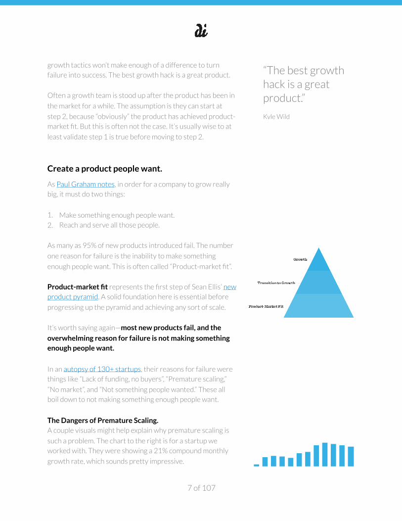
The Dangers of Premature Scaling. A couple visuals might help explain why premature scaling is
such a problem. The chart to the right is for a startup we
worked with. They were showing a 21% compound monthly
growth rate, which sounds pretty impressive.
of 7 107
“The best growth hack is a great product.”
Kyle Wild
�
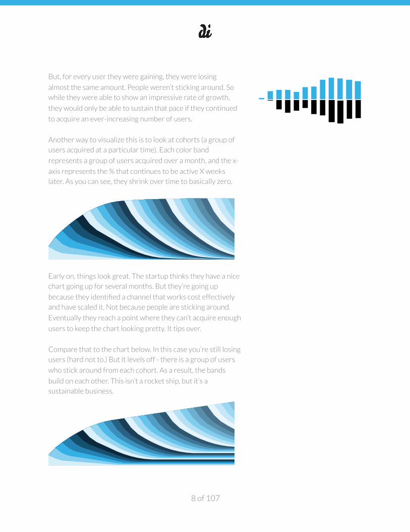
But, for every user they were gaining, they were losing
almost the same amount. People weren’t sticking around. So
while they were able to show an impressive rate of growth,
they would only be able to sustain that pace if they continued
to acquire an ever-increasing number of users.
Another way to visualize this is to look at cohorts (a group of
users acquired at a particular time). Each color band
represents a group of users acquired over a month, and the x-
axis represents the % that continues to be active X weeks
later. As you can see, they shrink over time to basically zero.
Early on, things look great. The startup thinks they have a nice
chart going up for several months. But they’re going up
because they identified a channel that works cost effectively
and have scaled it. Not because people are sticking around.
Eventually they reach a point where they can’t acquire enough
users to keep the chart looking pretty. It tips over.
Compare that to the chart below. In this case you’re still losing
users (hard not to.) But it levels off - there is a group of users
who stick around from each cohort. As a result, the bands
build on each other. This isn’t a rocket ship, but it’s a
sustainable business.
of 8 107
�
When you’re in it day after day, slogging it out so desperately
wanting to make it, it’s easy to lose sight of this true north.
But unless you can reach Product-Market Fit, eventually
you’re toast.
Measuring Product-Market Fit How do you know when you’re there? While this term is
admittedly fuzzy, severals methods have been identified for
measuring Product-Market Fit:
• Sean Ellis’ 40% test. One simple method involves asking
your customers the question “how would you feel if you
could no longer use this product?” If at least 40% of them
say “very disappointed”, odds are you’re on the right track.
It’s recommended you apply this survey in your product’s
earliest days. The disadvantage to this test is that it’s still
somewhat arbitrary because (a) it only provides a
snapshot in time and (b) people often say and do
differently.
• The Social Capital + Diligence Framework. While more
complex, this five-part approach provides far more
certainty and clarity when it comes to assessing product-
market fit and quantifying traction. We believe this
framework is one of the most honest ways to hold
ourselves accountable to progress. The biggest
disadvantage is the level of effort involved in being able to
implement and extract the analytics required. The series breaks measurement out into five areas:
1. Accounting for user growth
2. Accounting for revenue growth
3. Empirically observed cohort lifetime value
(revenue)
4. Empirically observed cohort lifetime value
(engagement)
5. Depth of engagement and quality of revenue.
of 9 107
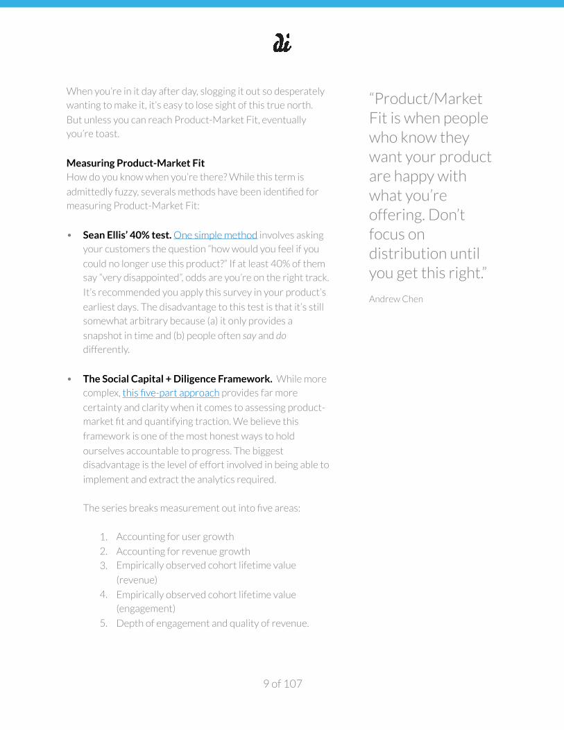
“Product/Market Fit is when people who know they want your product are happy with what you’re offering. Don’t focus on distribution until you get this right.”
Andrew Chen
�
Hypothesize models for growth.
With Product-Market Fit achieved, attention can now turn to
identifying models for growth. While there can be
One of the biggest misconceptions when it comes to growing
new products is that it’s about tactics. But process is king.
Brian Balfour makes the argument for process quite clear:
Growth is the sum of a lot of moving parts.
There is no single tactic that will make you successful. It’s a
result of keeping understanding your customer funnel and
each of the five levers that make up AARRR, running lots of
tests at each lever, and monitoring the effectiveness both on
the lever you’re testing and it’s impact on the rest of the
funnel.
For example, you might find a channel that can provide super
cheap users at scale. But the quality of those users might be
poor - they don’t stick around or turn into paying customers.
Without knowing how that acquisition test impacts the rest of
your model, you’ll waste considerable time.
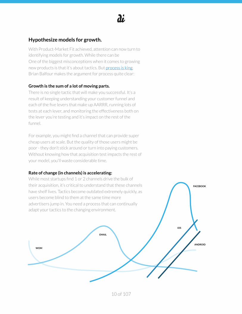
Rate of change (in channels) is accelerating: While most startups find 1 or 2 channels drive the bulk of
their acquisition, it’s critical to understand that these channels
have shelf lives. Tactics become outdated extremely quickly, as
users become blind to them at the same time more
advertisers jump in. You need a process that can continually
adapt your tactics to the changing environment.
of 10 107
WOM
iOS
ANDROID
�
What works for one product, likely won’t work for others: While it’s great to read about what other companies have
done to be successful, you must always keep in mind that they
were selling a different product to a different customer at a
different time. Take everything you read as inspiration, not
prescription.
Prioritizing What to Test
So what does a good process look like? Again we’re in debt to
Sean Ellis, who outlines the following four step process for
growth teams (for more info on the process for figuring out
what to test, watch Sean's video.)
1. Unbridled ideation: Ideas are everywhere - articles,
discussions with your team, and above all from your
customers themselves. It’s important to get all of the ideas
out on the table.
2. Prioritize backlog: We use ICE (Impact, Confidence,
Ease) scoring to determine what to work on first. Impact
means, “If the test pays off, how much will it contribute to
growth?” Confidence means, “What’s the probability of
the test paying off?” Ease means, “When it comes down to
implementation, what’s the resource requirement?” We
rate each question on a scale of 1 to 10.
3. Launch tests: Launching tests is a regular, weekly
occurrence and the backlog prioritization informs your
weekly test queue.
4. Capture learnings: Every test leads to learning.
Documenting these learnings is critical to scaling growth
operations. Team members need an easy, effective way to
knowledge share and also reference previous test
outcomes to better inform future hypotheses.
How to Track Your Experiments. Growthhackers.com
Projects is a new, but very useful tool for growth teams. The
software was designed to specifically facilitate growth
of 11 107
�
process, and is the perfect utility when applying the above
four pillars on a regular basis.
List of Growth Tactics While leading with process and using the above methodology
for coming up with, prioritizing, deploying and capturing
learning for tests is a best practice, below is a common list of
growth tactics that we might employ.
Tactics Related to Acquisition
• Persona Analysis & Testing
• Search Engine Marketing
• Retargeting
• Social & Display Advertising
• Search Engine Optimization
• Engineering as Marketing
• Affiliate Program
• Existing Platforms
• Community Building
• Viral Marketing
• App Store Optimization
• Content Marketing & Blogging
• Blog Targeting and Guest Posting
• Forum Marketing
• Email Marketing
• Engineering as Marketing
• Affiliate Program
• Existing Platforms
• Community Building
• Viral Marketing
• Unconventional PR
• ‘Like’ & ‘Follow’ Bots
• Offline Ads
• Trade Shows
• Offline Events
• Speaking Engagements
Tactics Related to Activation
• User Testing
• Price Testing
• A/B & Multivariate Testing
• Short-Form Video Testing
• Incentive to Activate Testing
• Customer Case Studies Testing
• Exit Intent Testing
• Modal & Hello Bar Testing
• Landing Page Optimization
• Product Onboarding Optimization
• Email Onboarding
• Lead Nurturing Optimization
• Calls-to-Action Experiments
• Conversion Centered Design Audits
• Site Performance Audits
• Mobile Performance Audits
• Heat & Scroll Map Analysis
• User Feedback Pareto Analysis
• Customer Support Automation
of 12 107
�
Tactics Related to Retention
• Cohort Analysis
• Growth Accounting Analysis
• Aha! Moment User Research & Testing
• Email Drip Campaign
• Content Marketing
• Contests
• Customer Support Optimization
• Exit Surveys & User Feedback Pareto
Analysis
• Feature Usage Pareto Analysis
• Feature Elimination Testing
• Push Notification Testing
• Remarketing
• Gamification
• Loyalty Programs
Tactics Related to Referral
• Referral Program Industry Audits
• One-Way In-App Referral Testing
• Two-Way In-App Referral Testing
• Referral Link Personalization
• Site & Product Share-ability Audits
• Referral Point Testing
Tactics Related to Revenue
• Discount Testing for Conversion
• Promotion Testing for Conversion
• Time-based Offers & Countdowns
• Pricing Simplification Testing (to Mitigate Friction)
• Email Drip Campaigns
• CEO/Founder Personalized Email
• Van Westendorp`s Price Sensitivity Testing
Weekly Growth Meeting Agenda A weekly meeting cadence for the growth team is key to
ensuring you’re mastering the habits and process above.
of 13 107
�
The purpose of the meeting is to sustain velocity and capture
learnings. We recommend the following growth meeting
agenda:
• 15 minutes: KPI review & update focus area
• 10 minutes: Review last week’s testing sprint
• 15 minutes: Key lessons learned from analyzed tests
• 15 minutes: Select tests for this week’s sprint
• 5 minutes: Check growth of idea backlog
Test ideas to validate your hypothesis.
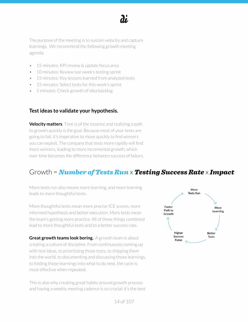
Velocity matters. Time is of the essence and realizing a path
to growth quickly is the goal. Because most of your tests are
going to fail, it’s imperative to move quickly to find winners
you can exploit. The company that tests more rapidly will find
more winners, leading to more incremental growth, which
over time becomes the difference between success of failure.
More tests run also means more learning, and more learning
leads to more thoughtful tests.
More thoughtful tests mean more precise ICE scores, more
informed hypothesis and better execution. More tests mean
the team’s getting more practice. All of these things combined
lead to more thoughtful tests and to a better success rate.
Great growth teams look boring. A growth team is about
creating a culture of discipline. From continuously coming up
with test ideas, to prioritizing those tests, to shipping them
into the world, to documenting and discussing those learnings,
to folding those learnings into what to do next, the cycle is
most effective when repeated.
This is also why creating great habits around growth process
and having a weekly meeting cadence is so crucial: it’s the best
of 14 107
Growth = Number of Tests Run x Testing Success Rate x Impact
�
way to guarantee regular testing. And when you test weekly,
tests compound quickly, thus benefitting both inputs in the
above equation.
If you remain vigilant about repeating the process vs. chasing
all of the shiny, luring ideas that come with creating new
products, you’ll find winners much faster.
Testing: A Cautionary Tale. Statistical testing for new
products, whether A/B or multivariate, gets a lot of attention
and has been widely adopted because it’s an effective tool for
growth. Still, it’s important to study the basic statistics and
understand the common, and sometimes detrimental,
mistakes made when engaging in statistical testing. Here’s a
few of our favorite reads on the matter:
• Most Winning A/B Test Results are Illusionary
• How Optimizely (Almost) Got Me Fired
• How Not To Run An A/B Test
• Evan’s Awesome A/B Tools
Double down on successful tests. Rinse and
repeat.
A common mistake at the acquisition level is finding
something that works, and then trying to replicate this
success elsewhere vs. doubling down on the hypothesis
you’ve just validated.
Peter Thiel, co-founder of Paypal, hits on this common mistake
saying this:
[You] probably won’t have a bunch of equally good distribution strategies. Engineers frequently fall victim to this because they do
not understand distribution. Since they don’t know what works,
and haven’t thought about it, they try some sales, BD, advertising,
of 15 107
�
and viral marketing — everything but the kitchen sink. That is a really bad idea. It is very likely that one channel is optimal.
Traction is one of our favorite books on growth and it too
emphasizes the importance of rapid testing and doubling
down on what works. The book outlines 19 channels you can
use to get traction, and with each channel, there are case
studies of companies who mastered the art of doubling down.
The one commonality among all the high growth companies
profiled in Traction is that they found something that worked,
and then explored it further—they ran more tests in this
direction, and continued to reap benefits.
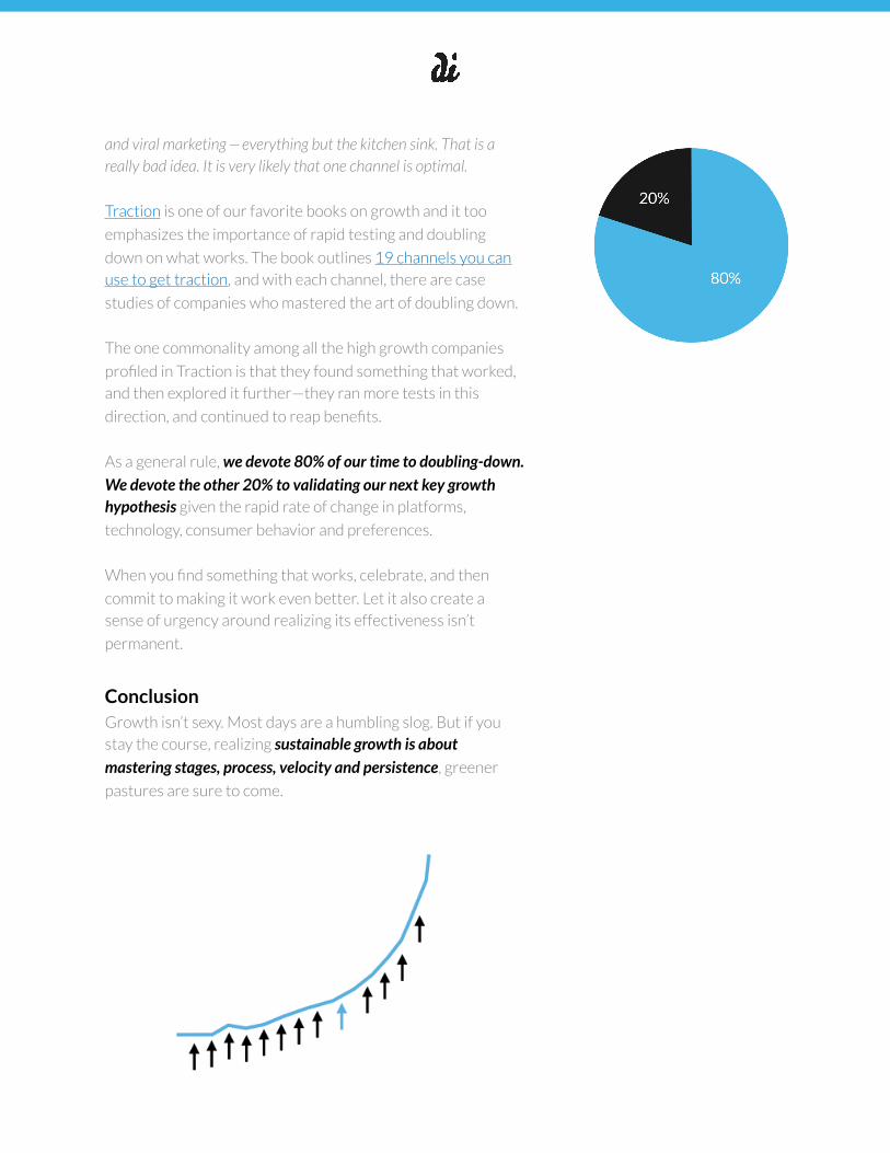
As a general rule, we devote 80% of our time to doubling-down. We devote the other 20% to validating our next key growth hypothesis given the rapid rate of change in platforms,
technology, consumer behavior and preferences.
When you find something that works, celebrate, and then
commit to making it work even better. Let it also create a
sense of urgency around realizing its effectiveness isn’t
permanent.
Conclusion Growth isn’t sexy. Most days are a humbling slog. But if you
stay the course, realizing sustainable growth is about mastering stages, process, velocity and persistence, greener
pastures are sure to come.
of 16 107
�
Playbook Two: Competitive Analysis
Studying competitors and demand proxies
One of the smartest ways to figure out a model and
hypothesis for how your product grows as quickly and cost-
effectively as possible is to study competitors and proxy
demand via third-party tools. In addition to third-party tools,
we’ve created a handful of corresponding scrapers and
templates to ensure such activities lead to rich insights for
developing your growth hypothesis.
Competitive Analysis Tools & Templates. One of the
smartest ways to figure out a model and hypothesis for how
your product grows as quickly and cost-effectively as possible
is to study competitors and proxy demand via third-party
tools. In addition to third-party tools, we’ve created a handful
of corresponding scrapers and templates to ensure such
activities lead to rich insights for developing your growth
hypothesis.
Download the competitive analysis template.
• Web and app product links: To start, determine whether a
competitor has both a web and native app presence. A quick
Google search on company name should be enough. If
you’re only finding a website via the search engine results
page (SERP), be sure to check the actual site for links to the
Google Play and App Stores to see if a native app also exists.
• Company history: In order to better make sense of growth
trends, value propositions and virtually all sections of this
template, use the company “About Us” pages, Wikipedia,
AngelList, CrunchBase and Search Operators for greater
context. One great way to figure out a viable growth
hypothesis sooner is to understand what’s worked, what
hasn’t and “the why” for competitors. Some of our favorite
search operators for better understanding the competitive
landscape include:
of 17 107
�
- site:[competitordomain.com] [competitor name]: This search
brings back all mentions of the competitor’s name, but
excludes the competitor’s domain itself; this is one of the
easiest ways to find press around the competitor.
Additionally, setting up Google Alerts is a nice automated
way to keep a pulse on “competitor mentions in the news”
as you continue work on your product.
- related:[competitordomain.com]: This search brings back
sites related to the competitor to fully exhaust the
competitive landscape.
• Value proposition: Value proposition is an explanation of
the problem a product solves as well as their
corresponding solution. It sheds light on how competitors,
as well as outsiders, such as press, describe an offering. In
order to gain insight into competitor value propositions,
consider the following elements:
- Homepage title tag: Title tags define the title of a
document and are often used on SERPs to display
preview snippets for a given page; they’re important
both for SEO and social sharing. Title tags also display via
the web page tabs, themselves, when opened in your
browser. Considering title tags are commonly thought of
as an all-encompassing way to describe the contents of a
particular web page, it often says a lot about how a
competitor thinks about their product’s value.
- Homepage main headings (i.e. H1): While not as commonly
displayed in search engines and not displayed via web
page tabs (but also very important to SEO), a quick
browser search of view-source:[competitordomain.com], and then a Find command (Command-F for Mac and Ctrl-
F for Windows) for “<H1>” will display what webmasters
have entered as their most prominent heading, which in
theory, like the title tag, doubles as an all-encompassing
way to describe the contents of a particular web page.
Both title tags and H1s are part of HTML, the markup
language used for creating web pages. It’s worth noting
of 18 107
�
that some pages will have multiple H1s due to poor
coding practices. If this is the case, it’s probably best to
ignore their contents. To learn to code HTML and CSS,
which comprise the majority of front-end web design and
development, this is by far the best free guide available.
- Homepage meta descriptions: Meta descriptions are an
HTML element that describe your page to search
engines. It’s the roughly 155 characters that show up in
your SERP listing immediately below your title tag. You
can think of a title tag paired with a meta description as a
product’s search engine “billboard.” It’s a great way to
entice click-through-rates (CTRs) and sell your product
pre-click. Like the title tag and H1, meta descriptions are
entirely within the site owner’s control, and so it
generally sheds light on how competitor’s think about
the value they’re creating. Also just like a page’s title and
headings, meta descriptions are easily searchable via the
view-source:[competitorname.com] command. Go here to
understand what you’re looking for within the view-
source command.
- Homepage “above fold” copy: “Above the fold” is just a way
of describing the portion of a page visible on a device
without having to scroll. Generally, this is the most
precious real-estate provided it’s what the user sees
immediately post-click. Since it’s a user’s first impression,
it’s often where site owners insert their most valuable
content.
- Modal copy: Though annoying, when used with a keen
understanding of conversion centered design best
practices, popups are often effective. In fact, there’s
whole GitHubs and SaaS products devoted to the tactic.
A modal is often a crucial component in getting someone
to complete a call-to-action (CTA), and since it’s often
used as a closer, any decent product’s modal is filled with
copy to consider. While you can’t be sure how well-
tested and proven this copy is, modals are for closing.
And copy for closing is always worth noting.
of 19 107
�
- App page titles and descriptions: Just like websites and
web applications, native apps all have their reserved app
pages within Google Play and the App Store (assuming
you’ve developed a native offering for both). For similar
reasons to homepage titles, headings and descriptions,
jotting down app page titles and descriptions are a great
“tell” for understanding how competitors think about the
problem they’re solving as well as their corresponding
solution.
- Press descriptions and anchor text: After employing the
“related” search operator above and selecting results
that appear to be news-related, consider how the author
describes the company’s product. Product owners are
inherently biased towards their offering, often making it
out to be more grandiose and aspirational. In contrast,
third parties tend to describe a product’s value more
explicitly and directly.
- It’s also worth noting that anchor text (the visible,
clickable text in a link to a product’s page) within news
articles sometimes disclose how outsiders perceive the
offering. While the anchor text might just be the brand
name itself, it’s not uncommon for it to also include a
brief description of the product. MOZ’s Open Site
Explorer (OSE), specifically its Anchor Text report, is a
great way to see an aggregate of the entire makeup of
anchor text pointing to a domain. More on MOZ’s
research tools like OSE later on.
• How it works: The “how it works” section or page of any
website is a more granular description of the value
proposition detailing the product’s actual mechanics.
You’ll find it in a combination of places, from the home
page and app page’s descriptions, to pages reserved
specifically for “How it works.” Often there are lots of
assumptions made about a new product’s business model,
and the how it works might provide insight into different
ways of monetization within the space.
of 20 107
�
• Audience snapshot: If you remember back to the “Intro
to Growth” playbook, there are two things that must
happen for new products to grow big: (a) Make something
enough people want (b) Reach and serve all those people.
Both tie directly back to the idea of having a keen
understanding of your user. This is why people building
products for themselves have an immense advantage. For
now, just jot down your audience hypothesis based on all
you’ve learned so far. Given this topic’s importance for
growth, we’ve reserved a full section for audience
targeting below.
• Growth trends: While the Mattermark Mindshare Score
is comprised of multiple vanity metrics, sometimes such
metrics correlate with more important metrics such as
active users and monthly reoccurring revenue—and keep
in mind, your competitive analysis template accounts for
many considerations. So long as the Mindshare Score is
used in conjunction with these other considerations, and
it’s simply used for trend/directional purposes, it’s a nice
way to gain insight into who is garnering momentum or
perhaps falling behind in your product’s space.
• Web analytics: From Alexa, to SimilarWeb, to Compete,
to many others, there’s a plethora of services claiming to
be “Your complete web analytics toolkit”, many of which
also offer free trials. While you might find one more
relevant, Alexa is by far the largest, but much of their
offerings require a paid subscription. SimilarWeb,
however, discloses more for free. Visits, time on site, page
views, bounce rate and traffic sources (share) are
important to note.
• App analytics: What the above tools are for web, App
Annie is for mobile apps. Average rating, number of
ratings, number of versions, category and rank history are
important metrics to compare among competitors.
of 21 107
�
• Swipe file: In order to extract as much value as possible
from this template, all of the above components should be
used as your product’s swipe file in the future. From
messaging and creative for landing pages, ads, app
descriptions, social content and much more, it’s always a
great idea to drop screen caps in this document as you see
fit. Don’t let this work be in vain and create a habit of
referencing the information down the road as you begin to
test your own growth levers.
Targeting & Personas
If (a) making something enough people want and (b) reaching
and serving all those people is the key to unlocking growth,
having a comprehensive understanding of your competitor’s
audience is a great way to build early momentum. Since we’ll
discuss how to use keyword research to better profile a
competitor’s audience below, we’ll focus this section on
leveraging social media, specifically Facebook, to do the same.
Facebook Graph Search Queries. This giant list of Facebook
Graph search queries and the Facebook search bar is where
we start for piecing together the most relevant audience for a
given product. It gives us a way to quickly build the bones of
probable user personas. The “Discovering What People Like”
is our go-to section, and some top queries include:
• favorite interests of people who like x
• pages liked by people who like x
• pages liked by people who live in x-city/state
• fans of x and x
Facebook Audience Insights. Facebook Audience Insights
marks our next progression for learning more about the
people that matter to your product. From collecting info about
geography, demographics, or purchase behavior, it’s an
excellent tool for figuring out who to target. We recommend
reading this Facebook Audience Insights Guide from Hubspot
before getting started.
of 22 107
�
Facebook search queries combined with Audience Insights
often yield the targeting persona(s) we present to clients.
Here’s how we’d use them together:
1. In a perfect world, the competitors we’re hoping to look
up would pop up as their name is typed into the Interest field in Audience Insights, but for small-to-medium sized
brands, this often isn’t the case. So instead, we use the
“pages liked by people who like x” search command in the
Facebook search bar to find all relevant pages liked by
people who also like the competitor’s product.
2. Let’s say then this command returns a dozen pages. We’d
then add all twelve of these pages to the Audience
Insights Interest field.
3. Together, steps one and two tell us the following about the
audience: (a) Demographics (b) Page Likes (c) Location (d)
Facebook Activity (e) Device Share (f) Household
Attributes (g) Purchase Behavior.
While nailing down a persona is step one, this info is also very
helpful for developing your queue of Facebook ad targeting
tests (assuming you’ll test FB ads). For a general Facebook ad
targeting overview, check out Jon Loomer’s 13 Audiences to
Target Using Facebook Ads.
User Sentiment. What users are saying about competitive
products will give you a great sense of the market’s strengths
and weaknesses, and perhaps how you can differentiate.
When thinking about sentiment, reviews are your foundation.
For web products, here’s 19 online review sites for collecting
business & product reviews—there’s a good chance one or
many of these sites will contain reviews for a given web
product.
If, however, your competitors are largely native mobile apps,
App Annie’s “Review” tab in the left-hand pane (after you
search for the app) is a one-stop shop for understanding user
sentiment. If the most recent version of the app only has a
of 23 107
�
handful of reviews, select the “all versions” filter on the
Review tab. While the most recent reviews are generally most
relevant, select a date range that yields at least 50 reviews.
One hundred or 200 is even better if the app has enough
popularity.
Scroll to the bottom of the page once you’ve set your filters
and select the “Show rows” drop-down as “200” (or whatever
the largest number is). This way when you download the CSV,
it exports as many rows of reviews as possible.
Export the CSV, combine the “Title” and “Review” columns
using Excel’s “combine text from two or more cells” function
and then copy the data in this newly formed column.
Aggregating and analyzing user sentiment. The goal for
both web and mobile products is to find enough reviews that it
makes sense to aggregate the data using a sentiment analysis
tool. While other more robust analyzers are available, we
prefer this sentiment analyzer provided it can process up to
1M characters and it’s free to use. The tool aggregates all
reviews and calculates both sentiment and confidence per
review, as well as sentiment and confidence per word. The
product’s overall score is then given on a scale of -100 to 100
with an algorithm confidence between 0-100. A score of -100
indicates a very negative tone and +100 indicates a very
positive one.
This particular analyzer also displays word frequency, to
better understand the most frequent language used when
describing the offering. As far as we know, the tool’s main
shortcoming is its inability to understand phrases vs.
individual words, as well as the false positives and/or
negatives that might come with it. Even still, the tool does an
impressive job at allowing one to trend user sentiment across
numerous competitive products at no cost.
Content Mapping
of 24 107
�
Looking at competitors is a great way to figure out what
content already resonates with your target audience (not to
mention dayparting analysis). That’s not to say there isn’t
plenty of room for creativity and new opportunities that
resonate with your audience, but it definitely allows for a
head-start.
We built and use two scrapers in order to extract content
posted on Facebook and Twitter ( Here’s a great resource for
learning more about web scraping).
For instructions on getting the necessary API keys to enable
the social scrapers and files for download, visit the link directly
below:
Installing the Scraper and Extracting the Data
The scrapers comprise the foundation for this section’s
templates. For simplicity, we’ll focus on Facebook, but a very
similar analysis can be replicated using the Twitter scraper if it
looks like the market has quite a bit of presence and activity
on the platform. As new social media platforms arise and
achieve scale, adapting this style of analysis to these new
channels should be top-of-mind.
COMPETITIVE ANALYSIS SHEET TEMPLATE
*Be sure to create a copy of this template and not use the original
Here’s the top questions we use the scraper data to
answer: 1. What content yields the most engagement?
2. What type of content (i.e. link, photo, video, etc.) is most
prevalent and performs best?
3. How does post engagement trend over time?
4. What days of week and times of day are best/worst for
post engagement?
In order to answer all four of these content mapping
questions, there’s a second template to leverage. This
of 25 107
�
template will also be used for all remaining sections of
competitive analysis.
Transferring the Scraper Data to the Competitive Analysis
Sheet Template
• Open up the Facebook scape CSV per competitor and do
a Find/Replace on “+000” in the “status_published”
column.
• Next, copy/paste the Facebook scrape CSV data in
columns “A” through “K” into columns “A” through “K” of
the “FB Scrape Raw Data” tab of the “Competitive Analysis
Sheet Template” (screen cap below). The below bullets all
pertain to the blue highlighted columns in the “FB Scrape
Raw Data”.
• While they should all auto-populate, info below on the
calculations in blue.
− Column L: per post month and year published
− Column M: per post day of week published
− Column N: per post hour published
− Column O: per post total number of engagements
(sums likes, comments and shares)
− Column P: cumulative share of engagement to show
the cumulative distribution function (CDF) of all
engagements (Use this style of formula)
− Column Q: cumulative share of posts to show the
cumulative distribution function (CDF) of all posts—
unlike the cum_share_engagements, this curve will be
linear
Lastly, before we dive into the specific questions, being able to
use pivot tables will be critical to many structured data
analyses. We’d recommend running through this pivot table
training video for getting started. Here’s another great
resource for learning pivot tables.
What content yields the most engagement? The table
within the “Top Content” tab of the “Competitive Analysis
of 26 107
�
Sheet” template yields insights that show not all posts are
equal, for example:
− The top 20% of posts, defined by summed engagement,
comprise 53% of engagement respectively.
− Given this insight, we’d be interested in how this content
differs from the total set.
Using this Word Cloud Generator, or Word Frequency
Counter, or both, and copy/pasting the “status_message”
column from the “FB Scrape Raw Data” tab is a great way to
figure out how top content differs from the rest of the pack.
View the “Top Content” tab for potential ways to use these
tools for such analysis.
Also, don’t be above manually browsing each post’s
“status_message” and “status_link” to more thoroughly assess
messaging and visual differences in top vs. all content shared.
We always tend to do this to gain further clarity around the
top types of content. We’d use this manual curation to then
support the example graphs, tables and images in the “Top
Content” tab.
The “Top Content” tab best captures our initial findings on
“what content yields the most engagement?”
What types of content (i.e. link, photo, video, etc.) are most
prevalent and perform best? Creating a pivot table, with the
“Rows” dimension as “status_type”, and the “Values” dimension
as “Count of num_engagements”, “Sum of num_engagements”
and “Average of num_engagements”, you’ll get the outputs in
the “Top Content (Type)” tab. See the “Pivot Table” tab for how
we get to the outputs in “Top Content (Type).”
Using a pivot table to evaluate content performance, we’re
often able to further confirm insights derived in the previous
section. For example, in this data set, the Word Frequency
data in the “Top Content” tab suggests while video posts and
words like “watch” and “YouTube” are prevalent when looking
of 27 107
�
at all content, they’re not found within the top 20% of content.
Sure enough, when you consider average engagement by type,
video is the lowest performing out of video, photo, link and
status.
The big question to consider here is the following: Is the
average engagement by type reflected in the type of post’s
frequency? In other words, if photo has nearly 2X the average
engagement of all types of posts, is it also being used the most
often? If not, that’s likely low hanging fruit to juice
engagement.
In this data set example, further analysis could be done on
photo content, specifically, provided it very clearly
outperforms the other types. What photo imagery is used and
how has it changed over time? More on this type of question
in the following section. If you revisit the initial “FB Scrape
Raw Data” tab, column F (“status_link”) provides direct links to
the content that was posted via Facebook to speed up a more
granular analysis here.
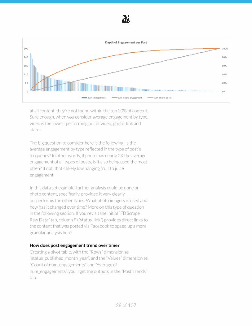
How does post engagement trend over time?
Creating a pivot table, with the “Rows” dimension as
“status_published_month_year”, and the “Values” dimension as
“Count of num_engagements” and “Average of
num_engagements”, you’ll get the outputs in the “Post Trends”
tab.
of 28 107
0%
20%
40%
60%
80%
100%
0
60
120
180
240
300
Depth&of&Engagement&per&Post
num_engagements cum_share_engagement cum_share_posts

�
This style of graph is the same as the one shown in the “Top
Content” tab—it’s one of our favorite types of combination
charts provided you can leverage a primary and secondary
axis, and thus trend two separate metrics to paint a fuller
picture. While the bars correspond to the primary axis, the
line chart runs off the secondary axis. Here’s an overview how
to create such a chart.
Not only does a graph like this do a nice job of showing post
frequency over time, it also shows post effectiveness (i.e.
average engagements per post). Some interesting questions
the chart addresses:
− Is the product’s social owner posting more or less over
time? Is there post-seasonality perhaps?
− Does post effectiveness correlate at all to post frequency?
− Which months lend themselves to top and lowest post
effectiveness? If we go back and do analysis on these months
specifically, how does this content differ from other months
Depending on the amount of time available and the trends
you’re seeing, you may even consider this same style of
analysis broken out by content type as well. In other words,
instead of considering total posts and average engagement
per month, breaking this out by photo, link, status and video
could tell a far more holistic story.
When analyzing at this level of granularity, it’s extra important
to pay attention to same size. If sample size of posts per
month is less than double digits, it’s tough to feel great about
the insights, knowing one anomaly can have a great effect on
average engagement.
What day of week and times of day are best/worst for post
engagement?
Creating a pivot table similar to the previous section, but with
the “Rows” dimension as “status_published_doy”, and then in a
second pivot table as “status_published_hour”—and holding
the “Values” dimension constant as “Count of
of 29 107
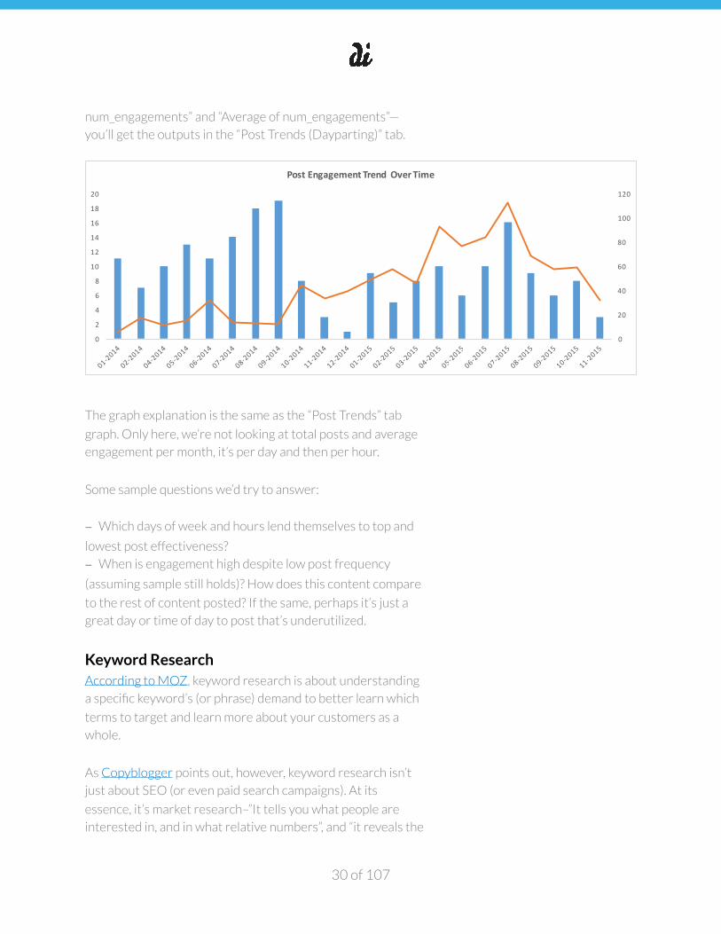
�
num_engagements” and “Average of num_engagements”—
you’ll get the outputs in the “Post Trends (Dayparting)” tab.
The graph explanation is the same as the “Post Trends” tab
graph. Only here, we’re not looking at total posts and average
engagement per month, it’s per day and then per hour.
Some sample questions we’d try to answer:
− Which days of week and hours lend themselves to top and
lowest post effectiveness?
− When is engagement high despite low post frequency
(assuming sample still holds)? How does this content compare
to the rest of content posted? If the same, perhaps it’s just a
great day or time of day to post that’s underutilized.
Keyword Research According to MOZ, keyword research is about understanding
a specific keyword’s (or phrase) demand to better learn which
terms to target and learn more about your customers as a
whole.
As Copyblogger points out, however, keyword research isn’t
just about SEO (or even paid search campaigns). At its
essence, it’s market research–”It tells you what people are
interested in, and in what relative numbers”, and “it reveals the
of 30 107
0
20
40
60
80
100
120
0
2
4
6
8
10
12
14
16
18
20
Post%Engagement%Trend% Over%Time
�
actual language people are using when they think about those
topics, which provides you with insight on how to converse
with them via your blog.” So while we definitely care about
keyword research to nail SEO and paid search, that’s a limited
view of the topic’s importance.
When researching what keywords are most relevant to your
product, there’s three things to consider per keyword:
1. Keyword Intent: someone searching “Men’s Nike running
shoes” is far more valuable to an online running business
than someone searching “shoes” (Learn more about
keyword intent—also read about keyword long-tail, a
similar topic to keyword intent)
2. Keyword Demand: the count of monthly searches per
keyword in a given geography (Learn more about keyword
demand and the Google Keyword Tool)
3. Keyword Difficulty (Competitiveness): provided level of intent and demand are there, how difficult is it to rank for a
given keyword, or how expensive is it to advertise on?
(Learn more about keyword difficulty and MOZ’s tool)
SpyFu and SEMRush are the tools we favor when it comes
to understanding a competitor’s product’s most profitable
keywords and ads. We’ll be using SEMRush for the
analysis in the associated template that’s also discussed
below. Absolutely read through SpyFu’s tutorials and
videos, as well as SEMRush’s glossary, manual and video
tutorials.
The “Keywords (Organic)” tab illustrates how we’d evaluate
top keywords on (a) level of intent (b) demand and (c)
difficulty. You can get this table’s exact output by going to
SEMRush, logging in, entering in the specific domain you’re
aiming to get keyword information on and exporting the “top
organic keywords section” to a CSV. Then, just copy/paste the
first seven columns:
• Keyword
• Position
• Search volume
• CPC
of 31 107
�
• Competition
• Traffic (%)
• Traffic Cost (%)
To learn more about these definitions, Google them or ask a
team member.
To keep things reasonable, we just copy/pasted the first 100
rows. If something looks interesting though, and you feel like
you need a larger set, copy/paste more. The three last columns
are CDF and keyword difficulty calculations around the top
100 keywords. If you’re just “copy/pasting as values” per the
first seven columns, these last three columns should
automatically populate.
The reason the CDF columns might not total 100% is b/c
we’re only considering 100 rows; if there’s more keywords in
the initial CSV, then it’s not going to be comprehensive. Still,
it’s plenty to extract the early keyword insights we set out to
find.
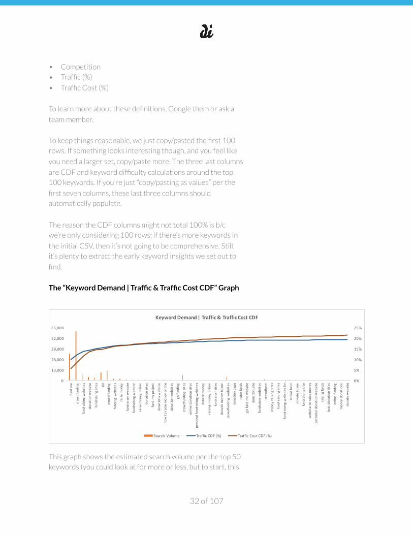
The “Keyword Demand | Traffic & Traffic Cost CDF” Graph
This graph shows the estimated search volume per the top 50
keywords (you could look at for more or less, but to start, this
of 32 107
0%
5%
10%
15%
20%
25%
0
13,000
26,000
39,000
52,000
65,000
fund.m
e
crow
dfunding
fundraising.websites
donatio
n.website
fundraising.sites
go
crow
d.funding
funding.websites
raise
.money
fundraise
r.website
fundraising.website
raise
.money.online
donatio
n.sites
fund.m
y.project
donatio
ns.website
how.to
.raise
.money.online
donatio
n.websites
go.funding
crow
dfunding.site
s
online.donatio
n.sites
personal.fundraising.websites
donate.money
raising.money.online
fundraise
r.site
s
donate.money.to
.me
crow
dfunding.w
ebsites
donatio
n.page
raise
.funds
go.fund.m
e.website
donatio
n.site
fundraise
r.websites
crow
dfund
money.ra
ising.sites
fund.raisin
g.sites
fundraising.websites.for.…
crow
d.fund
donate.to
.me
fundraising.site
website.to.ra
ise.money
personal.donation.website
raising.funds
best.donation.sites
online.funding
money.donations
donate.website
Keyword(Demand(|(Traffic(&(Traffic(Cost(CDF
Search.Volume Traffic.CDF.(%) Traffic.Cost.CDF.(%)
�
is a nice balance of showing many keywords while still being
readable) as bars on the primary axis.
The secondary axis looks at the CDF of traffic and traffic cost.
In other words, as you move left-to-right on the bars, what’s
the cumulative amount of traffic and the estimated cost of this
traffic (if one were to pay for it)? You’ll notice the table is
sorted by the “Traffic (%)” column. When constructing a CDF
(or multiple), you’ll always want to sort the primary CDF
column “Largest to Smallest” to see the most helpful curve.
A chart like this is great for addressing such questions:
− What keywords are driving the majority of organic traffic?
− What keywords have the highest search volume and thus
should be the first place to consider long-tail opportunities (If
you’ve already read the long-tail link above, Übersuggest is an
excellent tool to help generate long-tail opportunities)?
− What keywords provide the most bang for one’s buck? i.e.
Where is the Traffic CDF outpacing the Traffic Cost CDF?
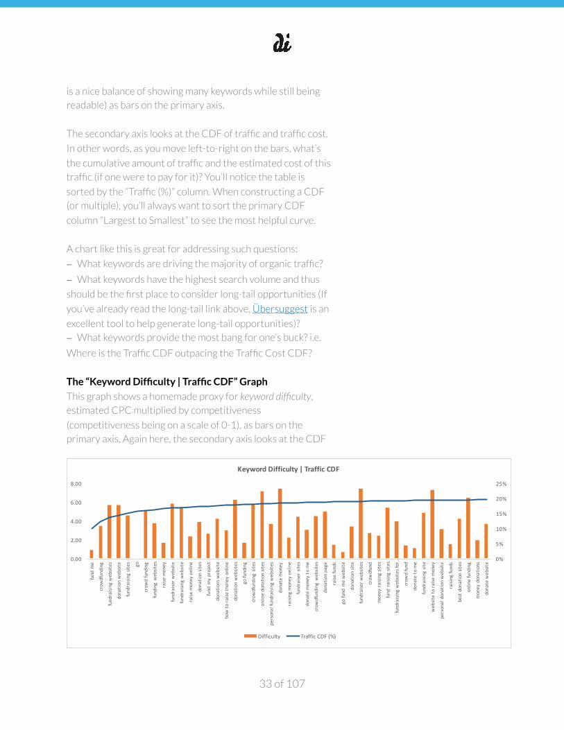
The “Keyword Difficulty | Traffic CDF” Graph
This graph shows a homemade proxy for keyword difficulty,
estimated CPC multiplied by competitiveness
(competitiveness being on a scale of 0-1), as bars on the
primary axis. Again here, the secondary axis looks at the CDF
of 33 107
0%
5%
10%
15%
20%
25%
0.00
2.00
4.00
6.00
8.00
fund.m
e
crow
dfunding
fundraising.websites
donatio
n.website
fundraising.sites go
crow
d.funding
funding.websites
raise
.money
fundraise
r.website
fundraising.website
raise
.money.online
donatio
n.sites
fund.m
y.project
donatio
ns.website
how.to
.raise
.money.online
donatio
n.websites
go.funding
crow
dfunding.site
s
online.donatio
n.sites
personal.fundraising.websites
donate.money
raising.money.online
fundraise
r.site
s
donate.money.to
.me
crow
dfunding.w
ebsites
donatio
n.page
raise
.funds
go.fund.m
e.website
donatio
n.site
fundraise
r.websites
crow
dfund
money.ra
ising.sites
fund.raisin
g.sites
fundraising.websites.for.…
crow
d.fund
donate.to
.me
fundraising.site
website.to.ra
ise.money
personal.donation.website
raising.funds
best.donation.sites
online.funding
money.donations
donate.website
Keyword(Difficulty(|(Traffic(CDF
Difficulty Traffic.CDF.(%)
�
of traffic so we can contrast cumulative traffic against our bar
metrics assessing difficulty.
A chart like this is great for addressing such questions:
− How big and effective is the brand name itself? i.e. Branded
keywords will always have less keyword difficulty than non-
branded (b/c most marketers aren’t or wouldn’t get away with
bidding on other brands’ branded keywords, thus there’s less
competition)—despite this low competitiveness what’s the
keyword volume (you’ll have to reference the previous graph
here)? The bigger the spread in competitiveness and keyword
volume per branded keyword, the more likely it’s becoming or
is a household name.
− Of top keywords driving the most traffic, which ones are
going to be the most and least difficult to compete on as a
competitor? Low bars are good, meaning the combination of
keyword cost and competitiveness are low for the amount of
traffic they’re contributing.
Optional: The “Keyword Intent | Traffic CDF” Graph If you had the time, consider a third chart that looks just like
the previous. The only difference here is that instead of
highlighting keyword difficulty as your bars on the primary axis,
you’d create an additional column and calculate keyword intent.
Intent is simply a gut check on how likely it is that this keyword
would lead to the desired product conversion? You could
create this on a scale of 0-1 or 1-10.
*IF a competitor engages in paid search, you’d want to
replicate this analysis on a separate tab, “Keywords (Paid)”.
Conclusion
We think Brian Balfour says it best: the key to harnessing the
best insights for your particular market is to “know your
product, channels, and customer better than anyone else and
take informed risks based on those learnings.” A good
of 34 107

�
competitive analysis is really an exercise in getting to know
your customer better--how they search, what types of
content they consume and engage with, and what their pain
points are relative to competitor solutions in your market.
That’s why we believe understanding your competitive
landscape isn’t just due diligence, it can actually inform a fair
amount of your growth hypotheses, providing your team a
roadmap for getting started. And once you know where you’re
going, it’s much easier to hit the ground running on designing
your growth experiments.
The tools and templates we’ve provided to help you conduct
your market research aren’t just for new businesses. If you’re
looking to optimize an existing product, a competitive analysis
can help you “kick the tires” and discover new ideas for
testing, not to mention help you better understand your
target customer. If you’re growing a new product, a
competitive analysis will help you ramp up on the market
quickly and comprehensively.
As Paul Graham states, “If you make anything good, you're
going to have competitors, so you may as well face that. You
can only avoid competition by avoiding good ideas.” Doing a
thorough competitive analysis is your first step towards not
just facing, but embracing competition, and this will almost
always allow you a faster path to growth.
of 35 107
“Know your product, channels, and customer better than anyone else and take informed risks based on those learnings.”
Brian Balfour
�
Playbook Three: SEO
What is SEO?
Search engine optimization (SEO) is a user acquisition
discipline focused on growing organic (non-paid) visibility in
search engine results pages (SERPs). SEO encompasses all
elements and tactics required to improve search rankings,
drive traffic and increase awareness for your webpage via
search engines.
Search Algorithms
You can think of search engines, such as Google and Bing, as
“the librarians of the Internet”—a dependable source for
finding the “exact book” a user needs. A search engine is a
system that collects information about every page on the web,
determines each page’s relationship to one another and
returns the best page results per the searcher’s “query” (a
fancy name for what a user types into the search bar).
Ranking Factors and On Page vs. Off Page SEO
Each search engine has its own unique recipe, also known as
its algorithm, for determining which pages best answer a
searcher’s query. Some of the most proven ranking factors for
search algorithms include:
• Words on the page. It’s not as simple as matching words
on the page to words in the search query—in the very
early days of search engines, this type of matching and
keyword frequency on the page went a long way, but it
was easily abused by webmasters (webpage owners that
control the content of a page). Today, synonyms,
document length and fancier calculations such as term
frequency–inverse document frequency (tf-idf) are just a
of 36 107
�
few of the ways search engines have gotten a lot more
sophisticated when it comes to interpreting words on the
page and their connectedness to a search query. To better
understand where keywords on the page matter most,
read The 5 Parts of Your Site You Should Keyword
Optimize.
• Titles and headings on the page. HTML is the
“programming language” behind much of the Internet, and
a way of describing how a set of text and images should be
displayed to a viewer. HTML gives content structure and
meaning by defining that content as, for example, titles,
headings, paragraphs, images, etc. HTML titles and
headings are two of the most common HTML elements
and also critical “on page” search engine signals. Just like a
book’s title, HTML titles and headings describe what the
page is about.
• Links. Words and titles/headings are entirely within the
webmaster’s control provided they’re “on the page.” Links,
however, tend to be outside of a webmaster’s control.
There’s two types of links (a) internal and (b) external.
Internal links are links from the same domain (e.g. a
homepage linking to its “about us” page). While internal
links are still within a webmaster’s control, they don’t
carry as much weight with search algorithms for precisely
this reason—if it’s within a webmaster’s control, then it
can be manipulated. Though there’s plenty of proven
internal link and architecture best practices to improve
how a search engine perceives your page, and it’s a very
good use of an SEO’s time, external links, or links pointing
to a page from a separate domain are much more powerful
signals to search engines. This is one of the biggest
reasons for why Google has been so successful—Google
was certainly not the first search engine, their algorithm
just had superb results. One of the most crucial drivers of
this was the evolution of “off page” ranking factors. You
can think of external links like votes for a page. Since
they’re very much not within a webmaster’s control, it’s a
much more authentic way of assessing the merits of
of 37 107
�
another domain’s webpage. Search engine algorithms
consider both quantity and quality of external links
pointing to a webpage (also known as backlinks), though
quality is more heavily weighted—again, because it’s much
harder to manipulate. While a person could spin up
several new domains and point links to unrelated domains
and specific webpages, a link from The New York Times is
much harder to earn.
• Anchor Text. The “words that comprise the link” are
called anchor text. So in the paragraph directly above, the
blue “internal link and architecture best practices” would
be considered that link’s anchor text. Most commonly,
anchor text is just the domain itself or the name of the
website the link is pointing to. Sometimes though, the
anchor text, like a page’s title, will actually describe the
contents of the page that the link is pointing to. This is
another helpful signal for search engines to understand
what the destination page is about.
• Reputation. Websites that continually produce fresh,
engaging, in-demand content with a growing number of
quality backlinks will do well in search rankings.
In addition to these important ranking factors, there’s at a
minimum, hundreds of other factors that materially
contribute to what webpages fire in a SERP. MOZ’s Search
Engine Ranking Factors is an excellent collection of surveys
and correlation analysis that describes many of these factors
as well as each factor’s estimated sway with search
algorithms. It considers both on-page and off-page ranking
factors.
Overall, off-page ranking factors carry much more weight in
determining if a page shows. That said, on-page SEO is still an
amazing use of time because it’s within a webmaster’s control.
You can think of on-page SEO such as ensuring the HTML is
consistent with SEO best practices, and writing about
keywords that people are actually looking for as your
“prerequisites for ranking”. Without off-page SEO, such as
of 38 107

�
quality, relevant backlinks though, you probably won’t earn
much of a search engine presence.
While it can get a bit overwhelming to take into account all of
the things algorithms consider when ranking webpages
(especially given the constant updates being made within
search algorithms), remember not all ranking factors are equal
—hence why we only lead with a few above. Much of SEO boils
down to the sentence mentioned in the “Reputation” above.
So we’ll say it again:
Websites that continually produce fresh, engaging, in-demand content with a growing number of quality backlinks will do well in search rankings.
Websites, Webpages, Root Domains and SEO
Vocabulary
In the previous section, it might look like we’re using the
words “website”, “domain” and “webpage” interchangeably, but
this isn’t the case. Whereas a website is comprised of one root
domain, it can have multiple webpages. For example,
Mixpanel.com is a website (or perhaps better described as a
web application) that has multiple pages such as:
• https://mixpanel.com/
• https://mixpanel.com/pricing/
• https://mixpanel.com/about/
• https://mixpanel.com/login/
“Mixpanel.com” is also the “root domain”—a term that
describes the overarching structure which contains the
subdomains and every URL that comprise the website. While
we’re talking about four webpages here, they’re all part of the
same root domain and website.
of 39 107
�
You might also notice we mention “website” and “web
application” above—this simply refers to whether the website
is comprised of mostly static content or also a backend.
Mixpanel is an application provided it’s a SaaS product that
allows you to measure analytics whereas a blog that’s
comprised of text, images and videos is mostly static, and thus
a website (More on websites vs. applications).
In addition to root domain, which is sometimes referred to as
just “domain” above, there’s also subdomains and
subdirectories. You can read about those here, as well as
which is better for SEO.
From backlinks, to anchor text, to root domains, and beyond,
there’s a laundry list of vocabulary around SEO and this
glossary is a great resource.
Search Analysis, Tools & Templates
There’s a reason SEO is often a person’s full time job. As
mentioned above, the amount of ranking factors is almost
limitless and the frequency of search algorithm updates are
more than daily. Still, the above provides an overview of the
basics, and this section provides a general framework as well
as a list of tools and templates we’d use when diving into SEO
for a new project or client.
In order to conduct your SEO analysis, we’ve created this
template to complete the work. Open it, as we’ll reference it
going forward, and it makes for the foundation of forming an
SEO plan and deliverable.
SEO ANALYSIS SHEET TEMPLATE
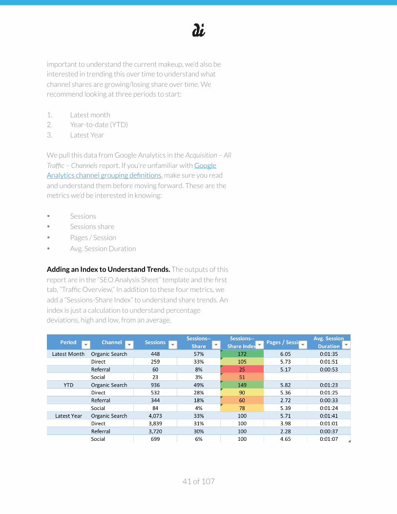
Traffic Overview
One of the first things we’d want to know when starting an
SEO project is traffic and customer share by channel: organic
search, paid search, direct, referral and social. Not only is it
of 40 107
�
important to understand the current makeup, we’d also be
interested in trending this over time to understand what
channel shares are growing/losing share over time. We
recommend looking at three periods to start:
1. Latest month
2. Year-to-date (YTD)
3. Latest Year
We pull this data from Google Analytics in the Acquisition – All
Traffic – Channels report. If you’re unfamiliar with Google
Analytics channel grouping definitions, make sure you read
and understand them before moving forward. These are the
metrics we’d be interested in knowing:
• Sessions
• Sessions share
• Pages / Session
• Avg. Session Duration
Adding an Index to Understand Trends. The outputs of this
report are in the “SEO Analysis Sheet” template and the first
tab, “Traffic Overview.” In addition to these four metrics, we
add a “Sessions-Share Index” to understand share trends. An
index is just a calculation to understand percentage
deviations, high and low, from an average.
of 41 107
�
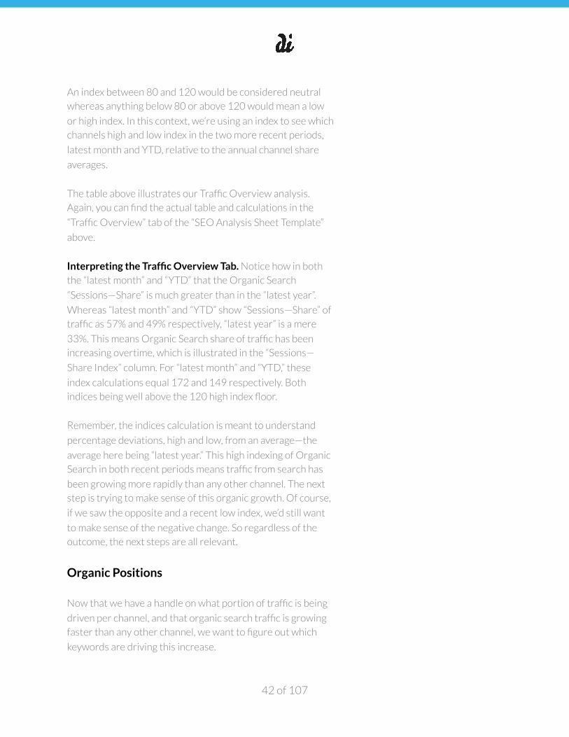
An index between 80 and 120 would be considered neutral
whereas anything below 80 or above 120 would mean a low
or high index. In this context, we’re using an index to see which
channels high and low index in the two more recent periods,
latest month and YTD, relative to the annual channel share
averages.
The table above illustrates our Traffic Overview analysis.
Again, you can find the actual table and calculations in the
“Traffic Overview” tab of the “SEO Analysis Sheet Template”
above.
Interpreting the Traffic Overview Tab. Notice how in both
the “latest month” and “YTD” that the Organic Search
“Sessions—Share” is much greater than in the “latest year”.
Whereas “latest month” and “YTD” show “Sessions—Share” of
traffic as 57% and 49% respectively, “latest year” is a mere
33%. This means Organic Search share of traffic has been
increasing overtime, which is illustrated in the “Sessions—
Share Index” column. For “latest month” and “YTD,” these
index calculations equal 172 and 149 respectively. Both
indices being well above the 120 high index floor.
Remember, the indices calculation is meant to understand
percentage deviations, high and low, from an average—the
average here being “latest year.” This high indexing of Organic
Search in both recent periods means traffic from search has
been growing more rapidly than any other channel. The next
step is trying to make sense of this organic growth. Of course,
if we saw the opposite and a recent low index, we’d still want
to make sense of the negative change. So regardless of the
outcome, the next steps are all relevant.
Organic Positions
Now that we have a handle on what portion of traffic is being
driven per channel, and that organic search traffic is growing
faster than any other channel, we want to figure out which
keywords are driving this increase.
of 42 107
�
SEMrush is our favorite tool for doing this. Login with the
company login (If you don’t have one, you can use a free,
limited version—though it’s worth noting you won’t be able to
capture this full analysis) and enter the company’s domain into
the search bar.
Exporting and Concatenating the Organic Positions Data.
If you then scroll down and select to “View full report” in the
“Top Organic Keywords” section and export this to a CSV, you
should get outputs similar to the “Organic Positions” tab in the
“SEO Analysis Sheet Template.” We’ve added two columns
indicating “device” and “keyword + device.”
Currently, you’ll have to do two exports, one per each device,
desktop and mobile, to get a full list of keywords the domain
currently holds organic positions on. The “keyword + device” is
just an Excel concatenate function. Also, within the SEMrush
UI as well as their glossary, you can learn everything you need
to know about the metrics/columns in the export, so we won’t
cover that in full here. In order to keep our tabs tidy, we also
don’t include a handful of metrics in the export.
Interpreting the Organic Positions Tab. The things we’re
most interested in within this export are the following:
• Non-branded keywords with a SERP position of < 10
• Non-branded keywords with a SERP position of < 50
• Keyword volume per all non-branded keywords
A non-branded keyword is any keyword that isn’t the brand
name or some variation and/or misspelling of it.
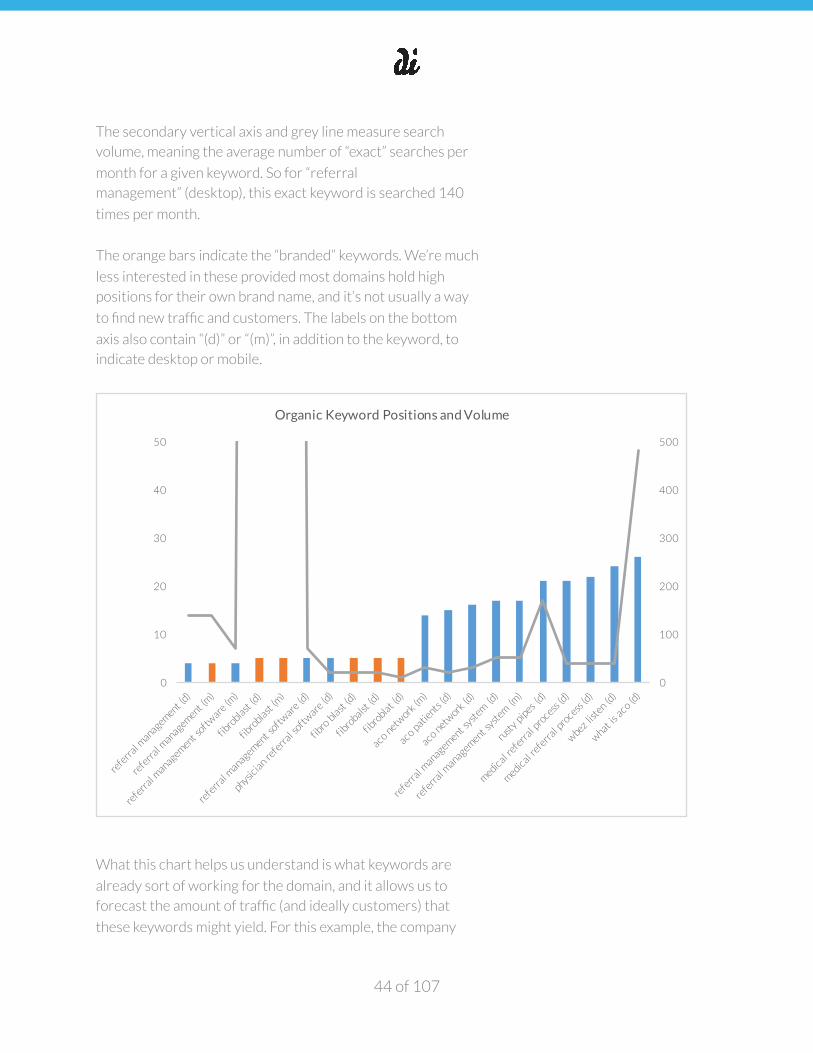
The below chart is also in the “Organic Positions” tab. The
primary vertical axis and bars measure the average keyword
position held by the domain. So you’ll notice for “referral
management” (desktop), this is 4. Meaning, on average, the
domain shows up in the fourth position of a SERP when this
particular keyword is searched on desktop.
of 43 107
�
The secondary vertical axis and grey line measure search
volume, meaning the average number of “exact” searches per
month for a given keyword. So for “referral
management” (desktop), this exact keyword is searched 140
times per month.
The orange bars indicate the “branded” keywords. We’re much
less interested in these provided most domains hold high
positions for their own brand name, and it’s not usually a way
to find new traffic and customers. The labels on the bottom
axis also contain “(d)” or “(m)”, in addition to the keyword, to
indicate desktop or mobile.
What this chart helps us understand is what keywords are
already sort of working for the domain, and it allows us to
forecast the amount of traffic (and ideally customers) that
these keywords might yield. For this example, the company
of 44 107
0
100
200
300
400
500
0
10
20
30
40
50
Organic Keyword Positions and Volume
�
analyzed is a SaaS company for healthcare systems to better
manage patient referrals between doctors and specialists.
So while monthly search volume for a term like “referral
management” is only 140, it demonstrates “high intent” for
the product (more on keyword intent in later sections). Since
we also know the average client pays $100K+ annually, this is
actually a pretty great sign that they’re holding the fourth
spot.
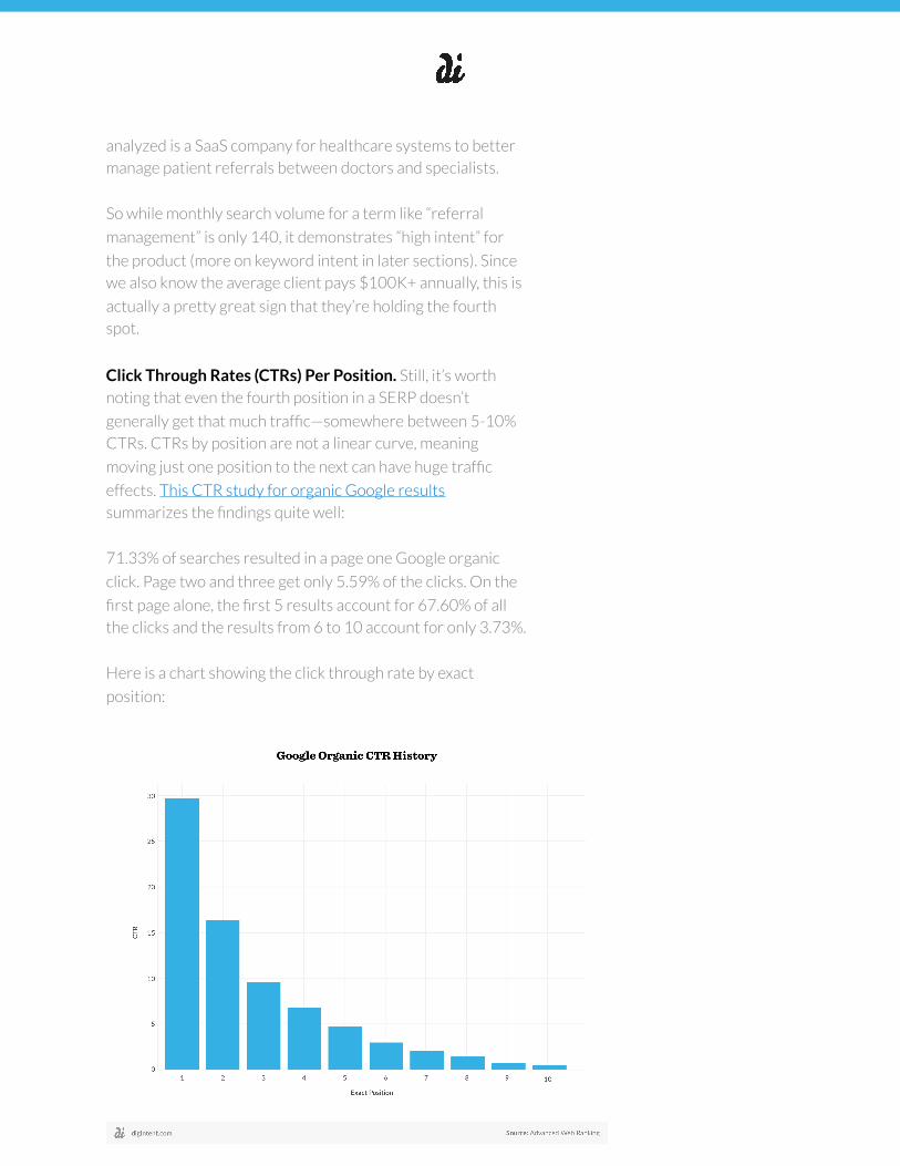
Click Through Rates (CTRs) Per Position. Still, it’s worth
noting that even the fourth position in a SERP doesn’t
generally get that much traffic—somewhere between 5-10%
CTRs. CTRs by position are not a linear curve, meaning
moving just one position to the next can have huge traffic
effects. This CTR study for organic Google results
summarizes the findings quite well:
71.33% of searches resulted in a page one Google organic
click. Page two and three get only 5.59% of the clicks. On the
first page alone, the first 5 results account for 67.60% of all
the clicks and the results from 6 to 10 account for only 3.73%.
Here is a chart showing the click through rate by exact
position:
of 45 107
�
Organic Positions Competitors
In addition to understanding the organic positions and
potential of a specific domain, we’re also interested in this
same style of analysis for top competitors. This helps us to
understand if anyone has a stronghold on the market as well
as new, but relevant keyword opportunities.
So we recommend repeating the processes described in the
immediately preceding section on 5-10 competitors, entering
their domains, exporting the CSVs for both desktop and
mobile, and then combining the data into one spreadsheet tab.
Sure enough, there’s a handful of new, highly relevant
keywords that we’re not currently ranking for. These are
keyword opportunities worth pursuing. Here’s the keywords
at least one of these five competitors hold first page positions
on (i.e. position 1-10):
• medical referral (d)
• medical referral (d)
• medical referrals (d)
• referral medical (d)
• referral management system (m)
• provider referral (d)
• referral management system (d)
• medical referral system (d)
• referral management system (d)
• what is a medical referral (d)
• physician referral software (d)
• referral management software (d)
• referral management software (m)
Backlinks
Now that we have a solid idea of our own keyword
performance as well as competitors, we’ll set it aside for
further analysis later. The next thing we need to understand is
of 46 107
�
our backlink profile. Remember, backlinks refer to the external
links pointing to the domain we’re analyzing.
When it comes to assessing backlinks, there’s three angles to
consider: (1) quality, (2) quantity, and (3) relevancy.
Quality. Quality of backlink is probably the most important
driver of backlinks that improve your SERP presence. Google
uses something called Page Rank whereas MOZ—one of our
favorite SEO toolkits—uses similar metrics called Domain
Authority (DA) and Page Authority (PA). Page Rank is scored
on a scale of 1-10 whereas DA and PA are 1-100. These scales
are logarithmic, meaning moving an increment of “10” on DA
or PA is much easier from 10 to 20 vs. 80 to 90. You can read
more about each measure with the links above. Going
forward, we’ll assume you’ve grasped these measures.
Quantity. The more links the better, assuming these links are
actually earned and relevant to your domain. So long as this is
the strategy, you’ll certainly benefit from more links. That said,
quantity has also been abused by many sites implementing
“black hat” tactics to quickly boost SEO. Just know search
algorithms are extremely sensitive to this type of abuse, and
it’s not worth the potential cost. Here’s a list of 18 Types of
Backlinks against Google’s policy.
Relevancy. Just as it’s important to earn quality links, and the
more quality you have the better, it’s important that these
links make sense for your product. Just as a piece of press or
newsletter on how technology is improving healthcare would
make sense for the SaaS company for healthcare systems
described in this analysis, a link from CNET, despite it being a
high quality link, has likely little relevance.
Open Site Explorer and Interpreting Backlinks. Now that
we know what types of links we’re looking for, we’ll use MOZ’s
Open Site Explorer (OSE) to get our backlink profile. Go to the
tool, enter your domain and then select the “Inbound Links”
section in the left-hand pane (it’s likely already selected).
Inbound links is another word for backlinks as well.
of 47 107
�
If you scroll slightly down, select the “target” dropdown as
“this root domain”—this will show you all links to the domain. If
you wanted to see links to a specific page, you’d enter in that
specific page’s URL in the search bar and then select “this
page” in the target dropdown.
Once the results come back, select to “Request CSV” to
download all the backlinks to the domain. You’ll find the CSV
for download in the “Recent Reports” section of OSE.
Once you open the CSV, you should see something very
similar to the “Backlinks” tab in the “SEO Analysis Sheet
Template”.
Two important terms in SEO that have to do with “the passing
of link equity” from one page to another are Rel= “nofollow”
and 301 redirects. You’ll notice these are columns in this
report. Read the linked article to grasp how these two terms
also affect the amount of weight a backlink carries.
Distribution of Links by Page Authority
We’re mostly interested in understanding the distribution of
links across DA and PA. That is, how strong is the backlink
profile for the domain? This, in turn, has a very direct
correlation to your own site DA and PA. Your domain will have
a higher DA and PA if their distribution of backlinks skews
more towards higher DA and PAs and vice versa.
Using the “Backlinks Pivot” and “Backlinks Output” tabs, we
get to the outputs below. When you pivot, you’ll want to find
the count of backlinks per each PA and DA. So depending on
which one you’re analyzing, drag PA or DA to the “Rows”
quadrant of the Pivot Table and do a COUNT of this same
column in the VALUES quadrant of the Pivot Table (The
difference between “Count” and “Sum”, as well as an Excel
Pivot Table summary list of functions).
of 48 107
�
You’ll then get these outputs (also in the “Backlinks Output”
tab of the “SEO Analysis Sheet Template” sheet). Together,
these charts will give you an idea of the health of your
backlinks profile.
Anchor Text We also want to understand the anchor text makeup per all of
the links passing link equity back. By creating a Pivot Table you
can quickly make sense of this. See the “Anchor Text” tab in the
“SEO Analysis Sheet Template” for how this is done. That tab’s
output is below.
Remember, anchor text is the visible words and characters a
hyperlink displays when linking to another page on the web.
As you can see here, the vast majority of the anchor text is the
brand name itself, “Fibroblast”, or the actual domain, “http://
of 49 107
0
5
10
15
20
25
30
PA 10
PA 11
PA 13
PA 14
PA 15
PA 16
PA 17
PA 18
PA 23
PA 24
PA 25
PA 26
PA 28
PA 34
PA 37
PA 40
PA 43
PA 44
PA 47
Count of Backlinks by Page Authority
0
5
10
15
20
25
30
DA 10
DA 12
DA 13
DA 17
DA 20
DA 21
DA 27
DA 28
DA 38
DA 40
DA 50
DA 52
DA 57
DA 58
DA 61
DA 63
DA 66
DA 85
DA 88
DA 92
DA 93
Count of Backlinks by Domain Authority
�
fibroblast.com.” The “(img alt)” means that the link is actually
an image.
Ideally, your anchor text isn’t just your brand or domain name;
there should also be a fair amount of links describing what the
domain is about. Just as we mentioned relevancy as one of the
keys to great backlinks, anchor text that hints at relevancy is a
great bonus and additional signal that a search engine
algorithm will pick up.
Remember how above “referral management” was a top
keyword for Fibroblast and that, on average, their domain held
a SERP position of 4? Well, having anchor text in a backlink
that’s “referral management software” would be an excellent
win for improving the domain’s position on this term.
While this domain has over 100 quality backlinks, the anchor
text diversification around keywords relevant to the business
is very poor. So a great use of time might be to go back and
analyze all 100+ links, determine if a keyword substitute per
the brand name fits with the content, and if so, do outreach to
see if you can get the link anchor text adjusted.
Backlinks Competitors
of 50 107
�
While understanding one’s own backlink profile and
opportunities to improve their link equity is an excellent use of
time, understanding competitors’ backlink profile is a way of
generating a “warm leads list” to new link building
opportunities.
Link building refers to the process of getting external pages to
link to a page on your website (i.e. getting backlinks), and while
link building is certainly one of the most powerful levers for
improving your SERP presence, it’s absolutely critical to
understand the fundamentals of quality link building.
Just like pulling your own backlink profile, we’ll use MOZ’s
Open Site Explorer (OSE) to wrap our heads around the top
domains linking to our market.
Once you pull down the “Inbound Links” section in the left-
hand pane for 5-10 key competitors, combine these files into
one Excel tab. You can do this manually via copy/paste.
Alternatively, you can download and consolidate multiple tabs
using this Worksheet Wizard or something similar. The
“Backlinks Competitors” tab in the “SEO Analysis Sheet
Template” shows what this would look like when finished.
The last step here is to use a Text to Columns function in order
to isolate the top level domain per each of the URLs listed in
column A of the “Backlinks Competitors” tab. Column P shows
the top level domain outputs of such a calculation.
Aggregating Top Level Domains. Creating a Pivot Table off of
the “Backlinks Competitors” tab in order to aggregate the
number of times each domain is linking to competitors will get
you the outputs you need. Per the Pivot Table, drag the
“Domain” column into the Pivot Table’s “Row” quadrant and
any column with numerical data, such as the “Page Authority”
column into the Pivot Table’s “Values” quadrant.
Ensure that the Pivot Table’s Values quadrant function is
“Count” vs. “Sum.” This way you’re simply counting domains vs.
summing Page Authority.
of 51 107

�
The “Backlinks Competitors Pivot” tab summarizes this work.
Then, “copy/paste special” these outputs as values and sort
“largest to smallest” like in the “Backlinks Competitors
Output.”
Column C in the “Backlinks Competitors Output” tab is a
Cumulative Distribution Function (CDF) showing how each
domain contributes to the total number of backlinks earned
by competitors. Select a cell in column C to see the CDF
calculation. It’s important you’re sorted in “Largest to
Smallest” in order to have a useful CDF. The primary vertical
axis and bars of the graph show the leading domains that have
backlinks for competitors whereas the secondary vertical axis
shows the total percentage of backlinks the collection of
domains represents, as you move right to left.
The CDF is easiest to explain by example. In the “Backlinks
Competitors Output” tab, there’s 1,096 different domains
linking to competitors, but according the CDF calculation in
column C, the top 23 domains comprise 10% of all links
despite the top 23 domains only comprising 2% of domains
listed (i.e. 23/1,096). The below chart illustrates this for the
top 50 backlinking domains. So the top 50 domains comprise
18% of backlinks despite the top 50 domains only comprising
5% of domains listed. Again, percentages correspond to the
secondary vertical axis.
of 52 107
0%
20%
40%
60%
80%
100%
0
20
40
60
80
Backlink Instances by Domain and CDF
�
Making Sense of the CDF. The reason the CDF is important
is because not all domains linking to competitors are equal.
While it’s important to weigh all the attributes of a high
quality backlink profile noted above (i.e. quantity, quality and
relevancy), the CDF is designed to find the subset of domains
driving the most links to competitors, as this often means a
higher probability that the website linking to a competitor will
also be open to linking to you.
When it comes to link building outreach, I’d start with these
domains. Full disclosure, link building is hard and it takes time.
Just like PR, a lot of it comes back to building great
relationships before earning a backlink. We’d also recommend
reading MOZ’s Beginner’s Guide to SEO and its chapter on
link building strategies and examples.
Top Organic Traffic Landing Pages. In a similar spirit to
finding the subset of domains passing the largest share of
backlinks to competitors, we also want to know the sessions/
traffic CDF of top pages on our own domain. Even more
specifically, we want to know the sessions/traffic CDF for not
just all traffic to all pages, but organic traffic to landing
pages.
Organic traffic is traffic from a search engine that you don’t
have to pay for. A landing page is the page the user finds and
initially lands on for your website. You can think of the landing
page as your website’s “front door”.
We recommend pulling the Landing Pages report via your
Google Analytics account to find the pages driving the
majority of traffic from a search engine. We’re interested in
doing this for a couple of reasons:
1. To understand the distribution of organic traffic by page
count. Is it a small or large number of pages driving the
bulk of organic sessions?
of 53 107
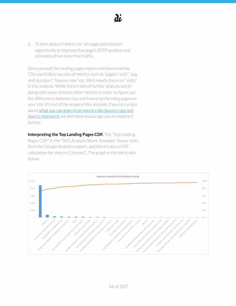
�
2. To then assess if there’s an “on-page optimization”
opportunity to improve that page’s SERP position and
ultimately drive more free traffic.
Once you pull the landing pages report and download the
CSV, you’ll likely see lots of metrics such as “pages / visit”, “avg.
visit duration”, “bounce rate” etc. We’ll mostly focus on “visits”
in this analysis. While there’s lots of further analysis worth
doing with some of these other metrics in order to figure out
the differences between top and lowest performing pages on
your site, it’s out of the scope of this analysis. If you’re curious
about what you can learn from metrics like bounce rate and
how to improve it, we definitely encourage you to explore it
further.
Interpreting the Top Landing Pages CDF. The “Top Landing
Pages CDF” in the “SEO Analysis Sheet Template” shows visits
from the Google Analytics export, and there’s also a CDF
calculation for visits in Column C. The graph is this tab is also
below:
of 54 107
0%
20%
40%
60%
80%
100%
0
2,000
4,000
6,000
8,000
10,000
Sessions Cumulative Distribution Function
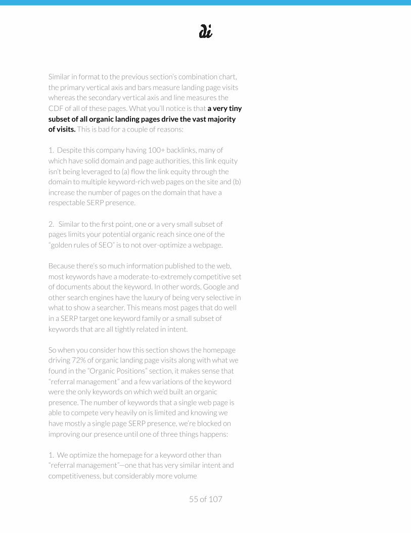
�
Similar in format to the previous section’s combination chart,
the primary vertical axis and bars measure landing page visits
whereas the secondary vertical axis and line measures the
CDF of all of these pages. What you’ll notice is that a very tiny
subset of all organic landing pages drive the vast majority of visits. This is bad for a couple of reasons:
1. Despite this company having 100+ backlinks, many of
which have solid domain and page authorities, this link equity
isn’t being leveraged to (a) flow the link equity through the
domain to multiple keyword-rich web pages on the site and (b)
increase the number of pages on the domain that have a
respectable SERP presence.
2. Similar to the first point, one or a very small subset of
pages limits your potential organic reach since one of the
“golden rules of SEO” is to not over-optimize a webpage.
Because there’s so much information published to the web,
most keywords have a moderate-to-extremely competitive set
of documents about the keyword. In other words, Google and
other search engines have the luxury of being very selective in
what to show a searcher. This means most pages that do well
in a SERP target one keyword family or a small subset of
keywords that are all tightly related in intent.
So when you consider how this section shows the homepage
driving 72% of organic landing page visits along with what we
found in the “Organic Positions” section, it makes sense that
“referral management” and a few variations of the keyword
were the only keywords on which we’d built an organic
presence. The number of keywords that a single web page is
able to compete very heavily on is limited and knowing we
have mostly a single page SERP presence, we’re blocked on
improving our presence until one of three things happens:
1. We optimize the homepage for a keyword other than
“referral management”—one that has very similar intent and
competitiveness, but considerably more volume
of 55 107
�
2. We optimize already existing pages for keywords relevant
to the business
3. We create new pages optimized for the keywords that
make the most sense for driving traffic and ultimately sales or
some type of conversion
As it turns out, “referral management” is an excellent keyword
for describing this software in that it demonstrates “purchase
intent”, and its volume is at the top of the list for keywords that
this SaaS product’s buyer might search.
The next section will cover our methodology for keyword
research. Whether you’re interested in tactics two or three
above, having a strong process for finding all keywords
relevant to your website and prioritizing them is absolutely
critical to a sound SEO strategy.
Keyword Research
Keyword research is finding and researching actual search
terms that people enter into search engines and is the
foundation for great SEO. But many people think doing
keyword research is just about finding keywords that will
drive the most visitors to your site. Instead, executing great
keyword research is about getting the right kind of visitors to your site. The kind of visitors that don’t just visit, but also
do something that you’d like them to do—from watching a
video to completing an email signup to purchasing—lots of
visitors is meaningless if it doesn’t lead to action.
There’s three things to consider when finding the best
possible keywords to go after:
• Keyword demand
• Keyword competitiveness
• Keyword intent
of 56 107
�
Keyword Analysis. Now that we have an initial set of
keywords via SEMrush to understand our current keyword
mix as well as your competitors, the next step is plugging
these into the Google Keyword Research Tool. We’ll assume
you know how to use the tool, but if you don’t, read How to
Use the Google Keyword Tool before moving forward.
This tool will tell you the monthly “exact match” search volume
per keyword, meaning the monthly number of searches. While
you technically already have this from SEMrush, the volume
estimates may be different if SEMrush and Google’s keyword
calculator are rooted in different technology. But the bigger
reason for plugging these already determined keywords into
the tool is to get a larger list of related keywords. Once you
get this list, ideally with hundreds of related keywords, export
the CSV.
In addition to this tactic for blowing out a list of keywords,
we’d definitely recommend using Übersuggest to get tons of
keyword ideas for free. We’d also be sure to ask the client how
they think customers talk about their business. Better yet, if
you can talk to those customers firsthand, that’s an extremely
valuable use of time, as these are the people you’re trying to
find through SEO.
Populating the Keyword Research tab. Once this is done,
clean the list of any obvious unrelated keywords. You should
have a list of keywords that need prioritizing. You can find our
keyword list for this healthcare SaaS company in the
“Keyword Research” tab of the “SEO Analysis Sheet Template”.
Columns such as “Avg. Monthly Searches (exact)”,
“Competition” and “Suggested Bid” are also directly from
exporting the CSV report from the Google Keyword Research
Tool. The rest of the columns in the “Keyword Research” tab
deal with calculations for prioritizing keywords that consider
keyword demand, competitiveness and relevancy. A quick list
of column definitions:
of 57 107
�
1. Avg. Monthly Searches (exact): average number of
monthly searches for the exact keyword based on the
location and Search Network targeting
2. Competition: number of advertisers that showed on each
keyword relative to all keywords across Google
3. Suggested bid: Google’s forecast on what it might cost to
advertise on this keyword
4. Percentile columns: these three columns consider each
keywords percentile rank around demand,
competitiveness and intent. In other words, if keyword
demand is simply calculated off the “Avg. Monthly
Searches (exact)” column, the keyword with the most
searches would be in the 100% percentile whereas the
keyword with the least number of searches would be in
the 0% percentile.
5. Comp Score: this column simply multiplies Google’s
estimated “Competition” calculation by its “Suggested bid.”
The more competitive and higher the bid, the higher the
“Comp Score.” Unlike keyword demand and intent, we
want this score to be low.
6. “Contains Keyword” columns: primary, secondary and
tertiary keyword families that demonstrate degrees of
intent to use the product or buy the service.
7. Intent Score: a sum of the “contains keyword” columns
8. Score: a total score taking into account keyword. demand,
competitiveness, and intent. You’ll notice in the calculation we have an extra weighting of 50% on
intent. While this weighting can be debated, we think it’s
worth weighting intent more provided we see SEO as a
tool to drive a customer to action vs. just a way to drive
traffic. You could make this more or less than 50% if you
wanted to emphasize or downplay intent’s importance
relative to demand and competitiveness.
9. Top Keyword (user): again if possible, user feedback is a
best practice for finding top keywords. Ask them how they
think about the product. This column represents the top
keywords per this SaaS service based on feedback from
the user.
of 58 107
�
Ultimately, we’d marry the final “Score” and then “Top
Keyword” column feedback from the user or client to then
dictate top keywords. From there, we’d create keyword
families (i.e. keywords similar in searcher intent). Here’s an
example of three potential keyword families we’d create pages
and prioritize content around. Search volume follows the
keyword. Other popular keyword families for this data set
could include “doctor,” “hospital,” “medical” and “patient.”
“Referral Management” (General)
• referral management 140
• referral management system 70
• referral management software 70
• referral manager 30
• referral management in healthcare 10
• referral management service 10
• referral management centre 10
• management referral 10
• effective referral management 10
“Healthcare” • referral system in healthcare 10
• referral management in healthcare 10
• referral systems in healthcare 10
• referral services in healthcare 10
• referral in health care 10
• referral health care 10
• health care referral 10
• referrals in healthcare 10
• healthcare referral 10
• health care referrals 10
• health referral system 10
• health care referral system 10
• health referrals 10
• occupational health referral 10
• health referral 10
“Physician”
of 59 107
�
• referring physician 390
• physician referral 390
• physician referral service 210
• physicians referral service 170
• physician network 170
• physician referral network 110
• physician locator 110
• physician referral form 70
• physician referrals 70
• physician relationship management 70
• physician reference 30
• physician referral line 30
• physicians referral 30
• physician referral software 20
• physician referral services 20
• physician referral patterns 20
• physicians referral network 20
• physician referral management 20
• referral physician 10
• physician reference directory 1
Conclusion
SEO is a full-time job for some digital marketers given its
importance to many products and potential for finding
customers with great ROI. Not to mention, the amount of time
and energy required to keep pace with the rapid evolution of
search engine algorithms and managing a website of the
caliber required to have a SERP presence. Still, this playbook is
meant to lay the groundwork for the most important
components of SEO, as well as the necessary templates and
tools for getting started and thinking about SEO
opportunities.
The vocabulary, tools, templates and calculations described in
this playbook are by no means limited to the activities
described in this analysis. Again, these tools are meant to set
you up with momentum and learnings to build from. We
of 60 107

�
encourage you to review all of the links mentioned in this
playbook as well as considering how such templates and
calculations might be applicable to other work beyond.
of 61 107

�
Playbook Four: Inbound Marketing
Principles and Values: Why Inbound?
Simply defined, inbound marketing is a strategy that brings
customers to your front door, attracting them by creating
useful, quality content that appeals to your target
demographic. Contrast ‘inbound’ strategy with traditional,
‘outbound’ tactics like display ads, out of home advertising,
cold outreach, and other more forceful tactics that attempt to
grab an audience’s attention while they’re looking at
something else.
The primary theory of inbound marketing is that by creating
something useful for your target audience, you’ll generate leads
organically. It’s a holistic approach that focuses on the entire
funnel: from strategically creating content that acquires new
users, to following through with a high-quality user
experience that warrants word-of mouth-referrals. Simply put,
inbound marketing reinforces a relationship of trust with the
customer.
of 62 107
Source: HubSpot
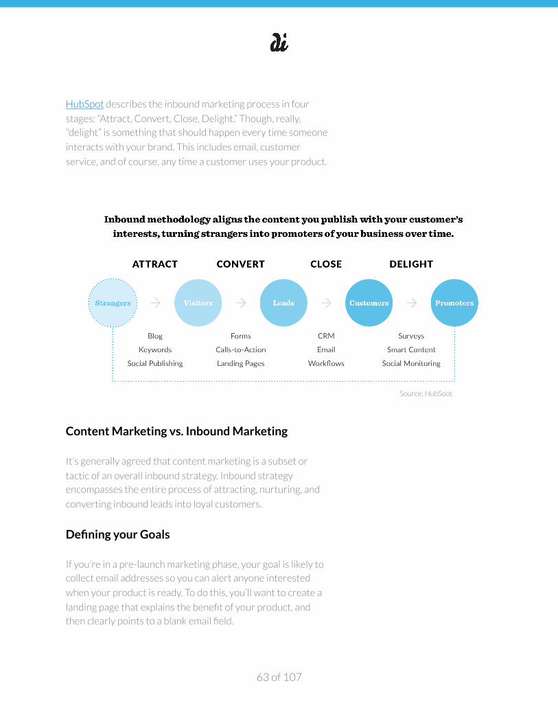
�
HubSpot describes the inbound marketing process in four
stages: “Attract, Convert, Close, Delight.” Though, really,
“delight” is something that should happen every time someone
interacts with your brand. This includes email, customer
service, and of course, any time a customer uses your product.
Content Marketing vs. Inbound Marketing
It’s generally agreed that content marketing is a subset or
tactic of an overall inbound strategy. Inbound strategy
encompasses the entire process of attracting, nurturing, and
converting inbound leads into loyal customers.
Defining your Goals
If you’re in a pre-launch marketing phase, your goal is likely to
collect email addresses so you can alert anyone interested
when your product is ready. To do this, you’ll want to create a
landing page that explains the benefit of your product, and
then clearly points to a blank email field.
of 63 107
Source: HubSpot
�
Later, when your product has launched, your goal will shift
towards activating users to download and use your app or
purchase your product.
When creating a marketing strategy that supports your
business goals, keep in mind the appropriate scale and your
target audience with respect to the goal itself. When you run
ads, write blog posts, and publish other content across the
web, check for conversion congruence - in other words, make
sure the audience most likely to click on your ad, read your
blog post, and be otherwise engaged by your content
marketing – are the same people who will also buy or
download your product.
There should also be a very clear and cohesive pre- and post-
click experience when attracting and converting potential
customers. Whether a user is interacting with a Facebook ad
or a long-form blog post on your website, the messaging and
imagery used should tell a cohesive story. For more
information on conversion congruence, read Oli Gardner’s
deck on the 7 Principles of Conversion Centered Design.
Decide which channels to participate in - don’t blindly join all
at once. We’ll dive more into this when we discuss establishing
your social media profiles in the subsequent sections.
Defining your Audience
Defining your audience is the key to learning how to create
relevant content. This is an iterative process, and may change
several times as you focus in on your core audience.
You can learn about your audience as you publish content,
distribute, and track engagement.
Some startups invest thousands of dollars on market research
studies to validate their business in the early stages.
Fortunately, you can learn a lot of the same information on
your own by running a matrix of Facebook ads. We like to
think of it as “DIY market research.”
of 64 107
�
1. Create a matrix of 3 value propositions vs. 3 target
audiences.
2. Use the same image across all 9 ads, vary the value
proposition in each using different copy, and make sure
the audience categories are mutually exclusive using the
advanced targeting tools on Facebook.
3. After each ad has gained at least 1,000 impressions,
compare the engagement metrics. You should have a
pretty good idea which audience/value proposition combo
is the most successful.
4. Try this again with a different set of creative to confirm
your findings.
We recommend these articles for more ideas on DIY market
research:
• Market Research Using Facebook Ads
• Social Media Market Research
Establishing Social Media Profiles
For new companies, claiming social media profiles is one of the
first things you should do. You may not always be able to claim
@companyname, but you can get creative by searching for
@getcompanyname, @companynameapp, etc.
Follow these steps for claiming social media profiles:
1. Identify the social channels for which you want to claim
profiles.
2. Make sure you have access to all brand assets, including
logos, profile images, cover photos (if applicable), or some
on-brand stock imagery.
3. Update your cover image, profile image, logo, bio, etc.
4. Before you start publishing on your own blog, queue
relevant content from reputable sites using a social media
scheduling tool like buffer or hootsuite.
of 65 107
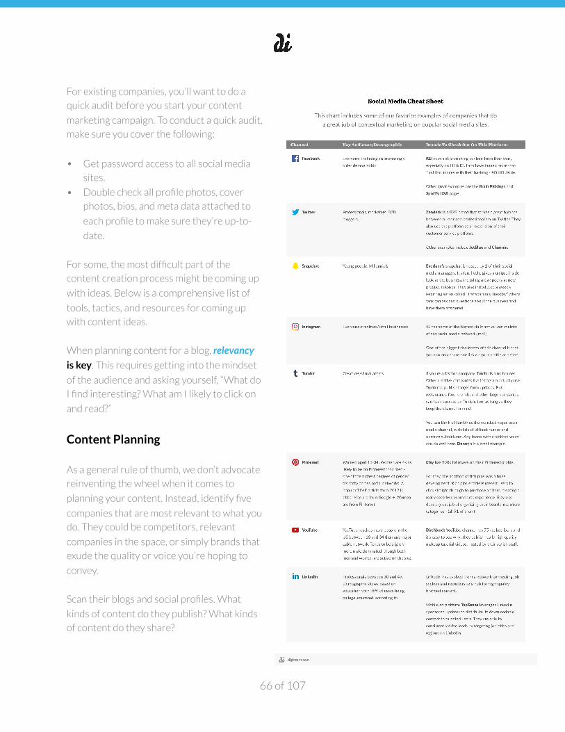
�
For existing companies, you’ll want to do a
quick audit before you start your content
marketing campaign. To conduct a quick audit,
make sure you cover the following:
• Get password access to all social media
sites.
• Double check all profile photos, cover
photos, bios, and meta data attached to
each profile to make sure they’re up-to-
date.
For some, the most difficult part of the
content creation process might be coming up
with ideas. Below is a comprehensive list of
tools, tactics, and resources for coming up
with content ideas.
When planning content for a blog, relevancy is key. This requires getting into the mindset
of the audience and asking yourself, “What do
I find interesting? What am I likely to click on
and read?”
Content Planning
As a general rule of thumb, we don’t advocate
reinventing the wheel when it comes to
planning your content. Instead, identify five
companies that are most relevant to what you
do. They could be competitors, relevant
companies in the space, or simply brands that
exude the quality or voice you’re hoping to
convey.
Scan their blogs and social profiles. What
kinds of content do they publish? What kinds
of content do they share?
of 66 107
�
Tools and Resources for Content Planning. • Social Listening is as simple as it sounds - find related
accounts from relevant businesses, competitors, and
other companies in the same space. Look at their posts,
who they retweet, who they mention and interact with.
This should get the ideas flowing.
• RSS feed readers, like Feedly, are a great way to stay on
top of relevant content in your space. We suggest creating
a Feedly account and organizing relevant blogs and
publications for different topics or clients by folder.
• Check relevant subreddits to see what types of content
are trending. Are there any polarizing topics? As long as
you communicate that the opinions of your writers don’t
necessarily reflect the opinions of the company, there’s no
need to shy away from controversial topics. Content that
inspires controversy, emotion, or awe often gets the
biggest organic lift. You can read more about creating viral
content here.
• Follow a few relevant accounts, boards, and topics and
then check your Pinterest feed. Pinterest’s algorithms for
relevant content are very accurate.
• Use Ubersuggest for suggestions of relevant keywords
with search volume.
Once you’ve developed a good list of article ideas, it’s time to
validate keyword search volume using the Google AdWords
Keyword Planner. This is a free tool created for ad buyers to
evaluate the competitiveness of Adword opportunities, but
you can also use it to find longtail keywords for blog posts.
of 67 107
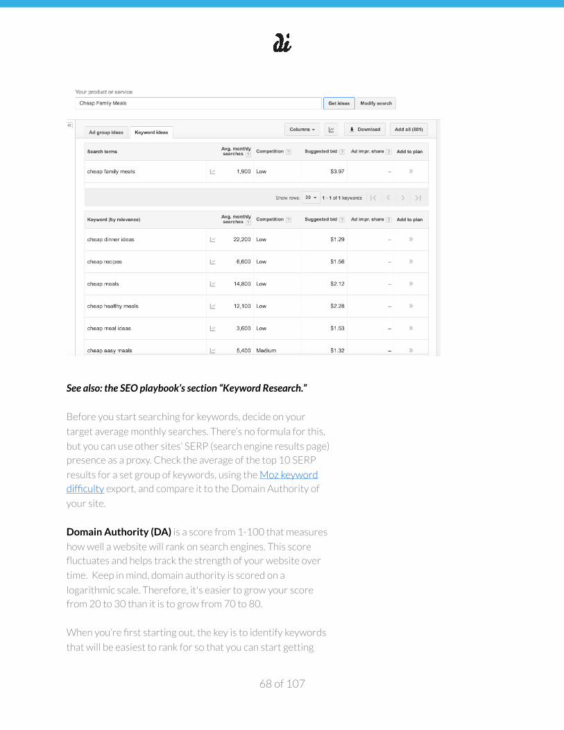
�
See also: the SEO playbook’s section “Keyword Research.”
Before you start searching for keywords, decide on your
target average monthly searches. There’s no formula for this,
but you can use other sites’ SERP (search engine results page)
presence as a proxy. Check the average of the top 10 SERP
results for a set group of keywords, using the Moz keyword
difficulty export, and compare it to the Domain Authority of
your site.
Domain Authority (DA) is a score from 1-100 that measures
how well a website will rank on search engines. This score
fluctuates and helps track the strength of your website over
time. Keep in mind, domain authority is scored on a
logarithmic scale. Therefore, it's easier to grow your score
from 20 to 30 than it is to grow from 70 to 80.
When you’re first starting out, the key is to identify keywords
that will be easiest to rank for so that you can start getting
of 68 107
�
organic traffic quickly. Identifying keywords with high search
volume is great (this validates people are interested in the
topic), however if other websites with higher DA’s are ranking
for that term, you may be out of luck for landing on the first
page of search results.
For example, if the average of top 10 results is this:
• PA: 29-35
• DA: 53-59
• Root domains linking to page: 1-2
• Root domains linking to domain: 500-3K
Generally the more "connected" your page is to the the
greater the authority the search engines will consider your
site to have. Two links from the same website are counted as
one linking root domain.
Follow a proposed schedule, but don’t let the documentation
interfere with creating and posting real content. If you see
something relevant, use the Buffer and Hootsuite plugins to
quickly queue or post that content.
Managing Freelance Writers
There are dozens of sites for hiring freelance writers. We’ve
had the best luck using problogger but will also include a list of
other sites in the Resources section.
Our content team is typically made up of remote freelancers,
but that doesn’t mean they shouldn’t be involved and
informed on the product.
When managing a team of remote freelancers, make sure
you’re communicating regularly with your team. Depending
on the project, send bi-weekly or monthly digests including
links and metrics of articles published in the last month.
This fosters a healthy sense of community, camaraderie, even
competition. If your writers are excited to be writing for your
blog, they’re more likely to share their own posts, and even
of 69 107
�
their fellow writer’s posts, on social media. When you need to
hire for ad hoc data entry projects, you may want to leverage
these writers and/or their networks.
Communicating with your team about the business/product is
also beneficial. When you need to quickly spin off a product
pitch, you can enlist the help of your editorial team.
This Grow & Convert article is a great resource on how to pay,
motivate, and manage blog writers.
Establish a Visual Language
You may already be working with a designer on a new logo and
visual identity, or you may be working with existing assets. For
content, you want to stay consistent in your use of a visual
language.
Stick with consistent and minimal branding. Keep in mind it
can always change, the most important thing is getting it out
there. It doesn’t have to be perfect but you’ll want to test
many different visuals to see what works for ads.
We suggest MailChimp’s Voice and Tone guide for more ideas
on maintaining consistency with your copywriting voice.
Frontify is another great source for documenting brand
guidelines.
Distribution
As a rule of thumb, you should spend as much time
distributing your content as you spend creating it. This is
almost every marketer’s “Achilles’ heel” because distribution is
much more of a slog that requires persistence, whereas
creating content is often exhilarating and creative.
Even still, this is no excuse not to double down on distribution.
We recommend budgeting distribution time in upfront so
you’re conscious of how much time you can spend creating
versus distributing.
of 70 107
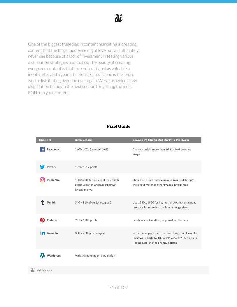
�
One of the biggest tragedies in content marketing is creating
content that the target audience might love but will ultimately
never see because of a lack of investment in testing various
distribution strategies and tactics. The beauty of creating
evergreen content is that the content is just as valuable a
month after and a year after you created it, and is therefore
worth distributing over and over again. We’ve provided a few
distribution tactics in the next section for getting the most
ROI from your content.
of 71 107
�
Create Share Images. For each blog post or piece of content,
make sure you create several alternate share images that you
can use when distributing the content. Size and layout varies
by channel, see the pixel guide.
These share images should follow your predetermined style
guide (see the section on Visual Language) with consistent
font use and logos. Once you have created those images, you
can create your first post announcing that a new piece of
content is live. This is definitely work that can be done in
advance. If you assign 6 blog posts to different writers, you
can start creating share images based on the headlines.
To decide when to share on different platforms, use the
internal insights tools on each platform (i.e. Facebook
Insights) or 3rd party tools like Tweriod for Twitter. These
sites help you post at the optimal time/day, when your post is
guaranteed to make the biggest impact.
See the Competitive Analysis section, “What day of week
and times of day are best/worst for post engagement?” for a
more calculated way of finding optimal post times.
When the post and share images are ready, queue up your
first batch of content. Schedule each piece of content several
times, using varying snippets of copy, quotes, and leading text.
Other Distribution Tactics.
• Post links on forum sites including relevant subreddits,
GrowthHackers.com, Quora, etc.
• Post your original content to Flipboard.• Reach out directly to people that write or tweet about
similar topics and ask them to share your content. Include
a simple “click to tweet link.”
• Try a syndicated content campaign like: Scoop.it, Triberr, All top.
• Re-write or post the content in a different format:
Slideshare, Medium, Tumblr.• Link Building
of 72 107
�
- Use Buzzsumo to find the top 100 most shared blog
posts about a certain topic.
- Upload list of URLS to Upwork- Ask an Upworker to find the email addresses of
the authors of each post - Send a Mail Merge to all authors asking them to
share/tweet your post
Automation and Scheduling. When scheduling relevant
content tweets and distribution for your blog, try to automate
as much as possible. These tools are useful for streamlining
the process:
• Use social media scheduling tools like Buffer or Hootsuite.
For Buffer, use bulk buffer to upload a CSV of tweets.
• Set “triggers” or “recipes” using an API tool like IFTTT. For
example, when a new blog post is published on
WordPress, you can create a trigger to automatically
tweet a link to your followers.
• If you have more than a few bloggers, send them emails
using Google Mail Merge.
• If you’re designing lots of share images, try posting a batch
to 99 Designs.
Monitoring and Iterating
Set up a dashboard in Google Analytics so you can easily track
the success of your content. Include unique visitors, users by
source, top posts/pages on your site by visitors, breakdown of
screen resolutions, top referral links, and search terms used to
find you.
There’s no need to reinvent the wheel here - ask someone
with an existing dashboard to share it with you using the
gallery tool.
Create a social media dashboard and update it weekly
(Sunday-Monday). This dashboard should include the
following metrics:
of 73 107
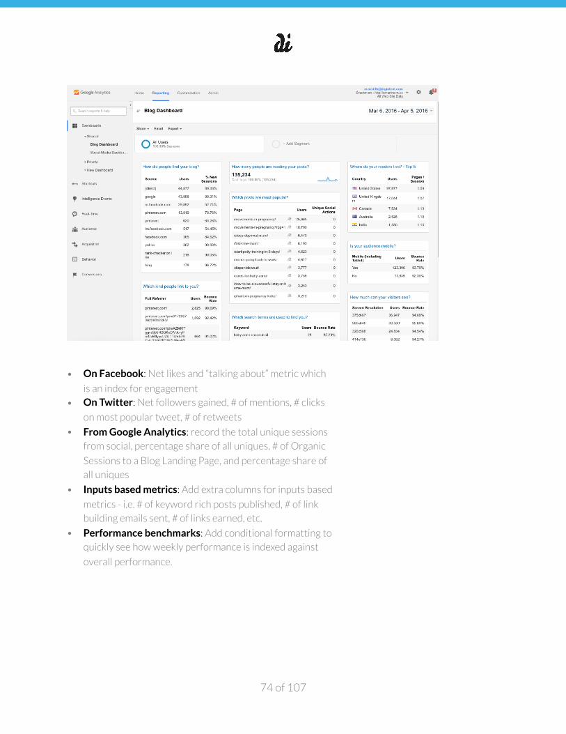
�
• On Facebook: Net likes and “talking about” metric which
is an index for engagement
• On Twitter: Net followers gained, # of mentions, # clicks
on most popular tweet, # of retweets
• From Google Analytics: record the total unique sessions
from social, percentage share of all uniques, # of Organic
Sessions to a Blog Landing Page, and percentage share of
all uniques
• Inputs based metrics: Add extra columns for inputs based
metrics - i.e. # of keyword rich posts published, # of link
building emails sent, # of links earned, etc.
• Performance benchmarks: Add conditional formatting to
quickly see how weekly performance is indexed against
overall performance.
of 74 107
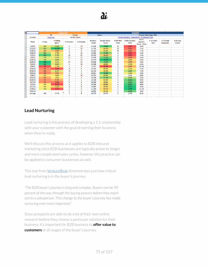
�
Lead Nurturing
Lead nurturing is the process of developing a 1:1 relationship
with your customer with the goal of earning their business
when they’re ready.
We’ll discuss this process as it applies to B2B inbound
marketing since B2B businesses are typically prone to longer
and more complicated sales cycles, however this practice can
be applied to consumer businesses as well.
This stat from VentureBeat demonstrates just how critical
lead nurturing is in the buyer’s journey:
“The B2B buyer’s journey is long and complex. Buyers can be 90
percent of the way through the buying process before they reach out to a salesperson. This change to the buyer’s journey has made
nurturing even more important.”
Since prospects are able to do a lot of their own online
research before they choose a particular solution for their
business, it’s important for B2B business to offer value to
customers at all stages of the buyer’s journey.
of 75 107
�
Examples of offering value to customers can include webinars,
product demos, ebooks and whitepapers--anything that
educates your target on your product and the space and helps
them communicate inside their organization about the value
of your offering.
This is where having a backlog of great content comes into
play. Think of content as the backbone of your lead nurturing
campaigns. Keep in mind that it’s important to consider where
prospects are in the sales cycle before reaching them with
your lead nurturing campaigns.
Creating engaging, high-quality content is not an easy task.
For every piece of content you create, make sure to repurpose it in at least two formats. For example, start with a long-form
blog post then repurpose it into an ebook or video interview -
this makes output much more efficient and can also go a long
way to help arm your sales team with the relevant content to
close.
Email Workflows. As a general general rule of thumb, it's a
good idea to create several email touch points over the course
of a lead nurturing campaign depending on the length of your
sales cycle. Consider a typical sales cycle for your business
and map your lead nurturing campaign accordingly.
For example, if your typical cycle runs 30 days, you may want
to set up your campaign for emails to be sent out the 1st,
10th, and 20th days after a conversion event. You goal is to
continue selling your value proposition to targeted lists by
solving a problem for them each step of the way.
Email workflows can be used to create interactions at every
stage of the buyer’s journey in an efficient and scalable way.
Here’s a sample workflow we’ve adapted from Seven Atoms
to help illustrate a typical lead nurturing process.
of 76 107
�
Step 1: Send an email to a targeted leads list inviting them to
download an eBook based on an action they took on your
website. Step 2: Send a follow-up thank you note to contacts that
downloaded the offer. Step 3: A few days later—send another email to the list of
contacts that downloaded the eBook offering another piece of
content on a related topic.
Step 4: When a contact downloads the content offer
(indicating that they are a qualified, more purchase-ready
lead) notify the sales team so that they can reach out and
close them into customers.
Use segmentation to sort leads. This ensures you’re
accounting for where leads are in the buying process. One
way to think about segmenting your database by stage of
interaction and readiness to convert, though there might be
other ways to segment your list that are more applicable to
your market, like position title or geographic region, or
company size.
• Mild: paid traffic on general offer in your “problem”
category. • Medium: intent-based search traffic to landing page to
specific content download. • HOT: existing email subscriber with repeated landing page
visits, multiple content downloads.
This post from Segment gives a great rundown of different
marketing automation tools for establishing workflows. As a
note, we’ll cover email marketing separately and more in-
depth in a future playbook.
Bear in mind that lead nurturing is more than just email
marketing--although email tends to be the lion’s share of
activity due to the efficacy of this channel. It’s important to
keep in mind that taking a multi-channel approach is often
most effective in nurturing leads and closing customers.
of 77 107
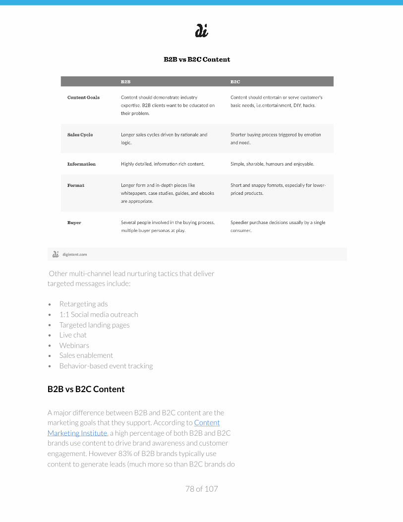
�
Other multi-channel lead nurturing tactics that deliver
targeted messages include:
• Retargeting ads
• 1:1 Social media outreach
• Targeted landing pages
• Live chat
• Webinars
• Sales enablement
• Behavior-based event tracking
B2B vs B2C Content
A major difference between B2B and B2C content are the
marketing goals that they support. According to Content
Marketing Institute, a high percentage of both B2B and B2C
brands use content to drive brand awareness and customer
engagement. However 83% of B2B brands typically use
content to generate leads (much more so than B2C brands do
of 78 107
�
at 69%). Additionally, B2C brands use content as a main driver
of retention with 88% reporting that their content marketing
goals support customer retention and loyalty.
B2B transactions tend to have a much higher “ticket value”
than B2C transactions which is why content tends to play a
vital role in the lead nurturing process. There’s also a greater
likelihood of repeat purchases since many B2B customers will
make recurring purchases.
Take, for example, a SaaS (software as a service) product that
requires an annual contract or some other recurring payment
model, a B2B customer will likely spend more time
researching various SaaS offerings that meet their needs since
they are likely to stick with that vendor over a long period of
time. B2B brands should create content that educates their
audience something valuable about the problem their product
solves and demonstrates thought leadership.
Generating leads with content
There’s no question that implementing an inbound marketing
initiative can deliver great ROI for your business. According
to HubSpot, inbound leads cost 61% less (on average) than
outbound leads, which is, in part, why inbound marketing has
received so much attention in recent years. Keep in mind, this
isn’t a silver bullet solution. Every business is different and
determining which channels and which types of content
deliver the highest ROI for your business is important.
We recommend a "rapid prototyping" approach when figuring
out which types of content resonate best with your audience.
Don’t invest too much time and effort in a bunch of lengthy
white papers until you test it, tweet it out and get feedback.
Talk to your sales team about which content formats are most
effective when they’re working with prospects.
Our team uses Facebook’s Lead Ad feature to test new types
of content. It’s a great way to get a little more information
of 79 107
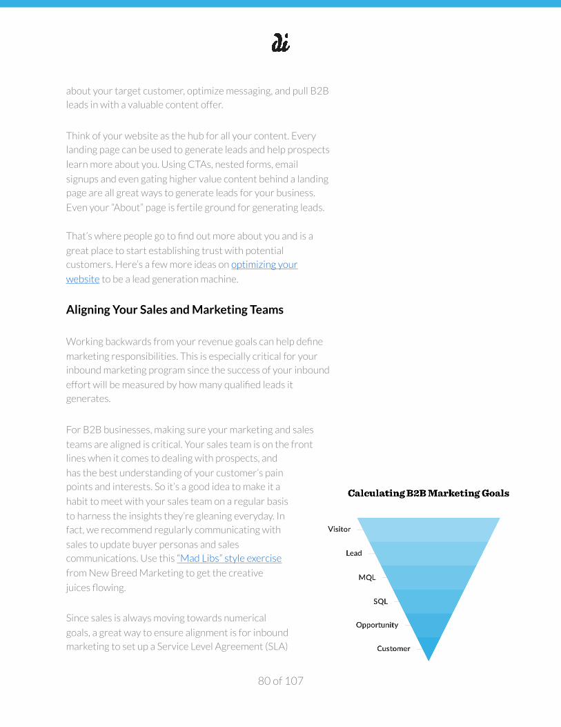
�
about your target customer, optimize messaging, and pull B2B
leads in with a valuable content offer.
Think of your website as the hub for all your content. Every
landing page can be used to generate leads and help prospects
learn more about you. Using CTAs, nested forms, email
signups and even gating higher value content behind a landing
page are all great ways to generate leads for your business.
Even your “About” page is fertile ground for generating leads.
That’s where people go to find out more about you and is a
great place to start establishing trust with potential
customers. Here’s a few more ideas on optimizing your
website to be a lead generation machine.
Aligning Your Sales and Marketing Teams
Working backwards from your revenue goals can help define
marketing responsibilities. This is especially critical for your
inbound marketing program since the success of your inbound
effort will be measured by how many qualified leads it
generates.
For B2B businesses, making sure your marketing and sales
teams are aligned is critical. Your sales team is on the front
lines when it comes to dealing with prospects, and
has the best understanding of your customer’s pain
points and interests. So it’s a good idea to make it a
habit to meet with your sales team on a regular basis
to harness the insights they’re gleaning everyday. In
fact, we recommend regularly communicating with
sales to update buyer personas and sales
communications. Use this “Mad Libs” style exercise
from New Breed Marketing to get the creative
juices flowing.
Since sales is always moving towards numerical
goals, a great way to ensure alignment is for inbound
marketing to set up a Service Level Agreement (SLA)
of 80 107
�
with your sales team. Think of this as contract or promise you
set with your sales team to deliver them qualified leads.
To project the number of leads your inbound effort will
generate, you’ll need to do some basic calculations:
1. Marketing-sourced revenue goal = Sales quota * %
revenue from marketing-generated leads
2. Marketing-sourced revenue goal / average sales deal size
= # customers needed
3. Customers / average lead to customer close % = # leads
needed
Once you have an idea of how many leads your inbound
marketing effort should generate to meet revenue goals, you
can then define what makes a qualified lead. Keep in mind, the
leads each of these teams market to are different, so it’s
important that both teams understand the characteristics that
make up each type. While marketing qualified leads (MQLs) are those that have
shown some level of interest (usually by taking an action on
your website) and are deemed by the marketing team to be
qualified for nurturing, sales qualified leads (SQLs) are those
who have been deemed qualified for turning over to the sales
team for direct follow up. Every business will define its MQLs
and SQLs differently.
The first step to defining an MQL is to create a list of all the
activities a lead can complete before becoming a customer,
such as requesting a demo of your product, visiting certain
pages of your website, or downloading certain pieces of
content. You’ll eventually want to rank each of these tactics by
close rate so that you can have a clear picture of which
activities have the highest likelihood of converting leads.
To ensure that the leads you’re passing on to Sales are actually
productive, it’s useful to set up a lead scoring to system to
of 81 107
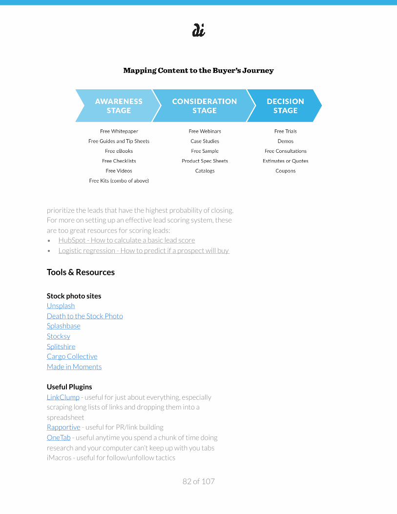
�
prioritize the leads that have the highest probability of closing.
For more on setting up an effective lead scoring system, these
are too great resources for scoring leads:
• HubSpot - How to calculate a basic lead score
• Logistic regression - How to predict if a prospect will buy
Tools & Resources
Stock photo sites Unsplash
Death to the Stock Photo
Splashbase
Stocksy
Splitshire
Cargo Collective
Made in Moments
Useful Plugins
LinkClump - useful for just about everything, especially
scraping long lists of links and dropping them into a
spreadsheet
Rapportive - useful for PR/link building
OneTab - useful anytime you spend a chunk of time doing
research and your computer can’t keep up with you tabs
iMacros - useful for follow/unfollow tactics
of 82 107
�
Moz Open Site Explorer - for checking Domain Authority on
sites in the SERP, useful for keyword planning
Other useful tools
Canva - for creating share images
Trello - Task Management
BuzzStream - PR
Stocksy - Stock Photos
Hootsuite - Social Media Management
WP Admin - Wordpress CRM
PayPal - Contractor Payroll
Google Docs - Content Calendars, other docs, etc.
ProBlogger - hiring freelance writers
MixPanel - Sending Push notifications
MailChimp - Emails
Triberr - Blogger networking
Reddit - Blog Distribution
Quora - In Depth Q&A Forum
IFTTT - social media, automation
Marketing Resources Traction
Programming for Marketers - Email Course
HubSpot - Inbound Marketing
HubSpot Inbound Marketing Certification
The Definitive Guide to B2C Content Marketing by Neil Patel
Conclusion
Inbound marketing is ultimately a process for turning leads
into brand advocates, not just customers. When customer
loyalty is your goal, it forces you to think beyond acquisition
and more about keeping customers happy so that they
continue to use your product and tell other people about it.
The internet enables this 1:1 relationship with your customer
to happen much more quickly and robustly than ever before.
Every piece of content you create should have a goal and your
customer should always be at the end of that goal.
of 83 107

�
Whether it’s driving traffic to your site, generating leads,
building a loyal community, or promoting your product or
service, every piece of content you distribute should create
value for your audience.
It’s shortsighted to think that inbound marketing is just about
creating marketing collateral. The same principles that apply
to making great products, apply to creating remarkable
content: create content that solves a problem for your
audience, and then reach and serve all those people by
doubling down on your distribution and lead nurturing
strategies.
of 84 107
�
Playbook Five: Paid Acquisition
Types of Advertising
Paid placements typically fall into two categories: native and non-native. Native ads are paid placements that appear
natively within content on the internet. They should appear to
blend seamlessly with the rest of the content on the page and
may not appear to be “ad like” at first glance.
Additionally, they should not disrupt the user experience. It’s
important to note that the nativity of the advertising platform
can play into banner blindness—a phenomenon when
website visitors consciously or subconsciously ignore banner
ads or other banner-like elements on a webpage.
That said, there are extremely native forms of advertising that
still have some degree of banner blindness. And these
channels can be very effective in driving specific groups of
users to your website and landing pages.
We should note that this Playbook isn’t meant to give a
comprehensive overview of every type of advertising available
to digital marketers—instead, it’s a deep dive into some of the
more popular platforms that we’ve found most effective for
clients when it comes to assessing both ‘platform
scalability’ (i.e. is the channel conducive to finding a target
market in sufficient quantity) and ‘unit economics’ (i.e. the cost
to acquire relative to the lifetime value of the customer).
AdWords. The Google AdWords platform contains tools to
purchase both search and display ads. Each type of ad is
eligible to be used in a remarketing capacity, that is to say that
you can purchase ads through AdWords to be displayed to
people after they have visited your website, used your mobile
app, signed up for your customer email list or interacted with
your YouTube channel. Ads are eligible to be shown as search
ads on Google or search partners or ads may be shown
of 85 107
�
several types of display ads on the Google Display Network
which covers a large portion of the available ad inventory on
the internet.
Facebook. The Facebook Ads platform allows you to
purchase ads on Facebook and Instagram. The ads appear in
both native and non-native formats on Facebook and in a
native format on Instagram. The main benefit of the Facebook
ads platform is the robust targeting capability. In addition to
remarketing tools, Facebook ads can be targeted based on
user demographics, interests & behaviors. Ads are eligible to
be shown in-feed on Facebook & Instagram and on the right
rail on Facebook. Additionally, there is limited support of
interstitial mobile ads.
Pinterest. The Pinterest Ads platform allows you to promote
content on Pinterest. Since the majority of content on
Pinterest contains links to external websites, this can be an
excellent driver of traffic for users in the discovery phase of
the purchase funnel. Pinterest promoted content is extremely
native and this coupled with the extremely busy design of
feeds and pinboards, lead to a different form of banner
blindness.
Twitter. Twitter Ads are ads that display on Twitter only.
Promoted Tweets can appear natively in timelines, search
results and the follower suggestion page. Tweets can also
appear non-natively in timelines and single tweet views.
Conversion Tracking
Regardless of the ad platform you use, you’ll need to set up
some kind of conversion tracking. This can vary depending on
the type of ad selected and the platform, but for the most part
it involves taking a piece of code and placing it on your
website. In order to save time and avoid having to ask
someone to make changes to your website over and over
again, some people find it easy to use a tag management
system. The benefit here is that you can install a piece of code
once, which links to a web app you can use to manage tags.
of 86 107
�
There are a few options though Google provides a good, free
option called Google Tag Manager. Google Tag Manager
allows you to easily add tags and set firing rules based on
event rules or page URL. This guide from LunaMetrics
provides a step-by-step process for setting up conversion
tracking via Google Tag Manger.
Google Network
As mentioned earlier, the Google Network is one of the most
powerful ad buying platforms with a broad range of ad types
and targeting options. We’ll discuss more about creating
search ad campaigns, though many of these options can be
reused for other campaign types.
Campaign Types. There are several types of campaigns
available on the Google Network. They’re roughly divided into
five categories based on the medium on which the ads appear.
Ads can be displayed on:
• Search
• Display
• Shopping
• App Store
• YouTube
Search campaigns are also available to be run as “Search
Network with Display Select” which is a blend of both Search
& Display ads. The other campaign types are pretty self-
explanatory with the exception of “Shopping.” Shopping
campaigns are the means by which Google Shopping is
populated.
Many people are unaware that Google Shopping content is
exclusively paid placements. Within each campaign type, there
are several different objectives available ranging from getting
people to call or visit your business to downloading an app.
These objectives help determine which ad types are available.
of 87 107
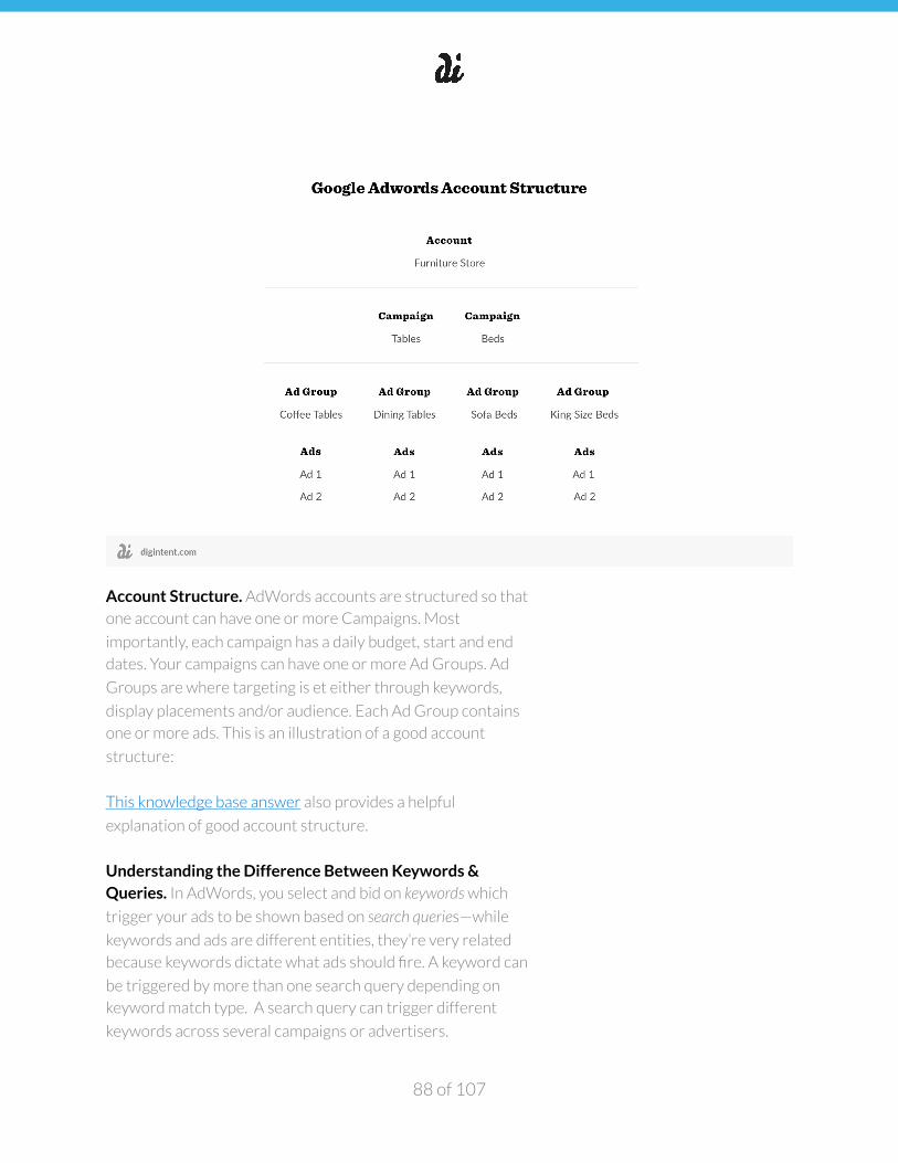
�
Account Structure. AdWords accounts are structured so that
one account can have one or more Campaigns. Most
importantly, each campaign has a daily budget, start and end
dates. Your campaigns can have one or more Ad Groups. Ad
Groups are where targeting is et either through keywords,
display placements and/or audience. Each Ad Group contains
one or more ads. This is an illustration of a good account
structure:
This knowledge base answer also provides a helpful
explanation of good account structure.
Understanding the Difference Between Keywords & Queries. In AdWords, you select and bid on keywords which
trigger your ads to be shown based on search queries—while
keywords and ads are different entities, they’re very related
because keywords dictate what ads should fire. A keyword can
be triggered by more than one search query depending on
keyword match type. A search query can trigger different
keywords across several campaigns or advertisers.
of 88 107
�
Using the example Red Nike Running Shoes can trigger the
keywords “red shoes”, “Nike running shoes”, “running shoes”
and “Nike shoes.” It’s important to remember that your
particular keyword can be triggered by numerous different
search queries.
You can influence which queries trigger your keyword by
setting the match type. Match types allow the advertiser to
dictate how rigorously queries match keywords. There are
four possible match types:
• Broad Match – The basic match type. It is eligible to show
for synonyms, close variations, misspellings, relevant
variations, plurals and stemmings.
• Broad Match Modified – This is similar to (and
sometimes used in conjunction with) broad match. By
adding a plus sign before a word you’re telling google that
the query must include this word (including misspellings,
close variations and plurals, but not synonyms).
• Phrase Match – Phrase match keywords must contain the
phrase (or close variations) of the phrase match keywords
in the same order. Phrase match keywords are added with
quotes.
• Exact Match – Exact match keywords are triggered when
they match they keywords exactly with the exception of
misspellings and plural. Exact match keywords are added
between brackets.
Quality Score. With such a large ad network and many people
competing for the same keywords with the same bids, Google
needs a way to figure out which advertisers’ keywords are
most deserving of being served. Google uses a quality score
which is calculated for each keyword in your account. Quality
scores range from 1-10 and have direct influence on both ad
rank and how much you pay per click relative to other
advertisers.
Quality score is calculated based on several factors: expected
click through rate, ad relevance and landing page relevance.
of 89 107
�
Additionally, once you advertise for a keyword, that keyword’s
past performance is included in the Quality score calculation.
Quality score directly affects how you bid on keywords. An
average score is 6, anything higher is considered above
average and will help reduce your CPC, anything lower is
considered below average and will increase your CPC
relevant to other advertisers. Quality score affects your ad
rank, or how close to the top of the page that your ad appears.
Ad rank is determined by multiplying your quality score by
your CPC bid.
Having the highest quality score possible is incredibly
important for making sure people see your ad and for
controlling spend. You can increase your quality score by
making your ads relevant to the keyword/query, making your
landing page relevant to the keyword/query and adding
negative keywords to ensure that you don’t show for
irrelevant queries.
Keyword Selection. The first task in creating an AdWords
Campaign is to perform keyword research. The process is
similar to conducting keyword research for content creation,
except that in the case of AdWords, keywords will be selected
based on different criteria. Focusing on keywords with some
sort of activation intent is essential for your AdWords
campaigns.
Before you even get to the keyword planner, figure out who
your competitors are. You’ll likely know who your competitors
are if you’ve completed the tasks in the sections on
Competitive Analysis and SEO. Keeping in mind those
competitors, go to SEMrush.com research your competitors.
In the domain report, scroll past the organic keywords section
and take a look at the paid keyword section. Some domains
won’t have any information because they do not advertise on
search engine networks that SEMrush tracks.
It’s a good idea to keep track of the keywords your
competitors are already advertising for because (1) those
of 90 107
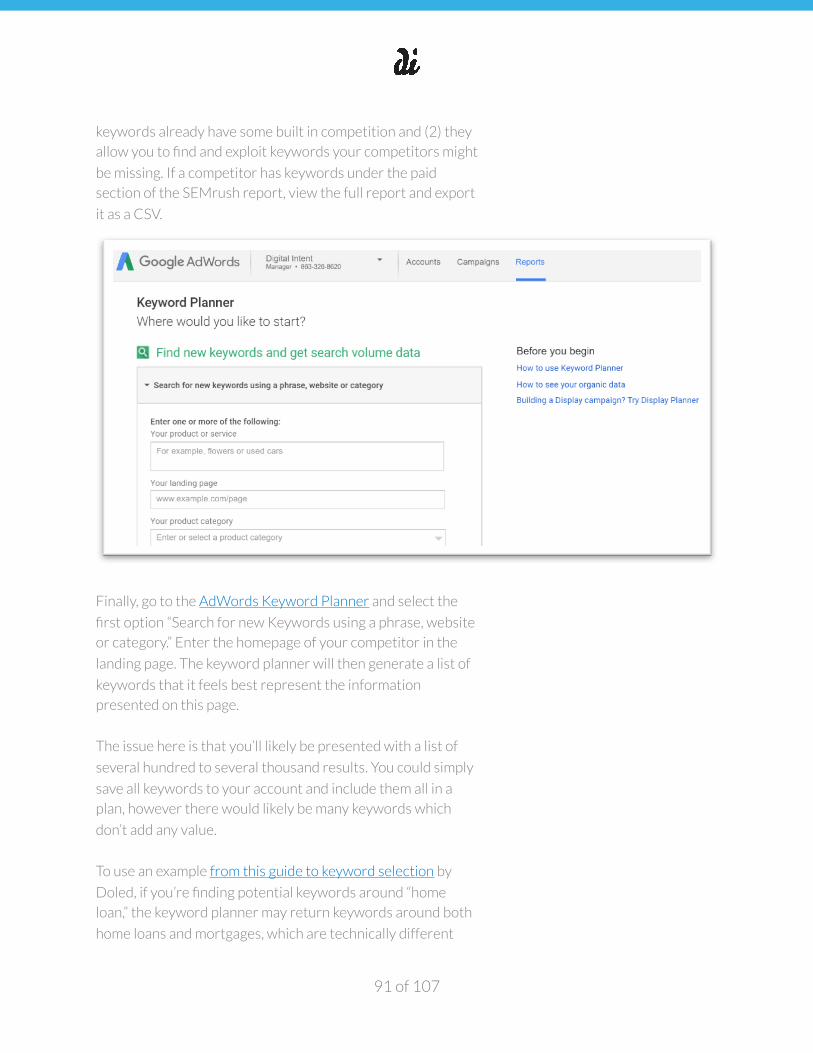
�
keywords already have some built in competition and (2) they
allow you to find and exploit keywords your competitors might
be missing. If a competitor has keywords under the paid
section of the SEMrush report, view the full report and export
it as a CSV.
Finally, go to the AdWords Keyword Planner and select the
first option “Search for new Keywords using a phrase, website
or category.” Enter the homepage of your competitor in the
landing page. The keyword planner will then generate a list of
keywords that it feels best represent the information
presented on this page.
The issue here is that you’ll likely be presented with a list of
several hundred to several thousand results. You could simply
save all keywords to your account and include them all in a
plan, however there would likely be many keywords which
don’t add any value.
To use an example from this guide to keyword selection by
Doled, if you’re finding potential keywords around “home
loan,” the keyword planner may return keywords around both
home loans and mortgages, which are technically different
of 91 107
�
products and may not help you get conversions. Therefore, it’s
essential to manually comb through the keywords returned
for each page queried. As keywords are added to your
campaigns, they are omitted from the suggestion list and are
not included in results to future searches.
Once you have a healthy list of keywords, export the list to a
CSV. Copy the list into Column A of the Keyword Checker tab.
Drag the formula that is in the first few cells of column B so
that every keyword in column A is analyzed by the formula in
Column B. Finally, copy the competitor keywords generated
by SEMrush into Column A of the Competitor Keywords Tab.
You’ll now have keywords analyzed by whether or not your
competitors are already advertising for them. In an ideal
world, you wouldn’t need to use any keywords your
competitor uses, but in reality you may need to bid on these as
they have a high purchase intent or some other reason.
In some cases, you may want to pare your list down so as not
to bid on these competitor terms. The lone exception we’ve
found is bidding on competitor’s branded terms, they’re
oftentimes a way to introduce your brand to the customer or
potential customer of a competitor.
The keyword planner can also be helpful to segment your
keyword list into Ad Groups. On the keyword planner start
page, simply use the second option “Get Search Volume Data
& Trends.”
Paste your keyword list into the keyword box. After the search
volume and bid suggestions are returned, click the “Ad
Groups” tab to have your keywords grouped into Ad Groups.
Structuring Your AdWords Campaigns. A company called
3Q Digital created a campaign structure called Alpha-Beta
that we’ve found to be particularly successful.
If you look at the name, Alpha represents strength (alpha-dog)
and beta represents a test (before a piece of software is
of 92 107
�
released to the general public, it is released as a beta first and
it is typically still being worked on).
Using this methodology, you separate your keywords into two
groups: Alpha keywords that you know are successful and
Beta keywords that you’re testing. Over time, keywords either
move to Alpha or they are discarded.
Before we get started with deeper explanation of Alpha-Beta
Campaigns, let’s review how keywords are matched using
“shoes” as an example. Say that you have a website that sells
running shoes and you want to create search ads that drive
purchasers to your site. You know that you want to be able to
reach people who are ready (or close to being ready) to
purchase. In order to do this, you might to pick the following
keywords:
• Red running shoes
• Red Women’s running shoes
• Nike running shoes
• Barefoot running shoes
• Inexpensive Women’s Running Shoes
If you’re selecting these keywords as Broad Match these
queries may show for relevant queries, but they may also
show for unrelated queries. “Barefoot running shoes” is
eligible to show for “benefits of running barefoot” and “red
women’s running shoes” is eligible to show for “red women’s
high heel shoes” through variant matching. These keywords
have potential to waste budget through clicks from unrelated
queries.
With an Alpha-Beta Campaign, all new keywords start out as
broad match modified in your Beta campaign. You’re using
them as “bait” so that Google’s Ad Algorithm matches you on
relevant queries. After a few days you’ll start to notice that
some keywords convert and some keywords don’t. You’ll need
to define your conversion objectives up front so that you can
assess which keywords are driving value for your business.
This will be different for every advertiser.
of 93 107
�
Ideally, you’ve figured out what a good general acquisition
cost is for you and hopefully, after a period of time, you’ll
determine what a good acquisition cost is for different
keywords. It’s probably going to be some mix of conversion
numbers, conversion rate, CPA, click counts, impression
counts and CTA.
With these numbers, you can figure out if people are seeing
your ad, how they’re reacting to it, whether or not your ad is
helping people convert on your offer and finally how much
you’re paying for people to convert.
After a period of time (a few days to a week) you’ll have a good
sense of which keywords are converting and which keywords
aren’t. From here, you’ll need to make a decision on every
keyword: is it working? do you need more data or is it not
working? If it’s working (converting at an acceptable CPA),
you’ll want to assign it to your Alpha Campaign.
The structure of the Alpha Campaign differs from the Beta
Campaign in that the Beta Campaign has several highly
targeted Ad Groups each with several broad match modified
keywords. Your Alpha Campaign is made up of many Single
Keyword Ad Groups (SKAG). Each SKAG contains a single
keyword set to exact match.
The benefit of having single keyword ad groups is twofold:
first, since each ad group contains one keyword only, you can
make your ad incredibly targeted towards that keyword. Since
Google bolds words in search results that match the query,
including your keyword more than once in an ad will make
your ad seem more relevant. The other benefit is that you can
create a custom landing page for each alpha keyword, which
will lead to a higher quality score (and lower CPCs and CPAs).
Once you’ve added winners to your Alpha Campaign, make
sure that these are going to be the keywords that show for
relevant queries. If you have two of the same keywords across
an account, you’re only eligible to display one ad for that
keyword.
of 94 107
�
For the most part, Google will select the keyword with the
most restrictive match (phrase over broad, exact over phrase),
though this will not always be the case. In order to make sure
that your SKAG ad shows for a query, add each of your alpha
keywords as a campaign level negative exact match to your
Beta Campaign. This will ensure that your exact match
keyword is served only in your Alpha campaign and prevents it
from being served as a broad match keyword in your Beta
campaign.
After you’ve set up your Alpha and Beta campaigns and
identified some winners, you need to make decisions about
non-winners. If you feel you need more data, simply keep
those keywords in your Beta Campaign. Finally, scrub the
losers by adding any keywords you feel will not work as
campaign level exact match negative keywords to your Beta
campaigns.
Once you’ve gotten the hang of Alpha-Beta campaigns, we
recommend the scripts referenced in this article which make
the Alpha-Beta less time-consuming to maintain. These will
help automating adding losers and negative keywords to your
Beta campaigns. We’ll discuss Adwords scripts later in this
playbook.
Google Display Network. Search ads aren’t the only type of
ads available via Google—Google also has a display network
with which to display ads. On the display network, you have
the option of creating ads with images or using text as which
google will place onto images and use on the display network.
The default campaign type “Search Network with Display
Select” includes placement on the GDN and many users
neglect to create non-text ads which means that text ads will
be automatically converted into images to use on the display
network. They look something like this:
There is more flexibility in the targeting of display network
ads. In addition to keyword targeting (which instead of search
queries, match to page content) you can target based on
of 95 107
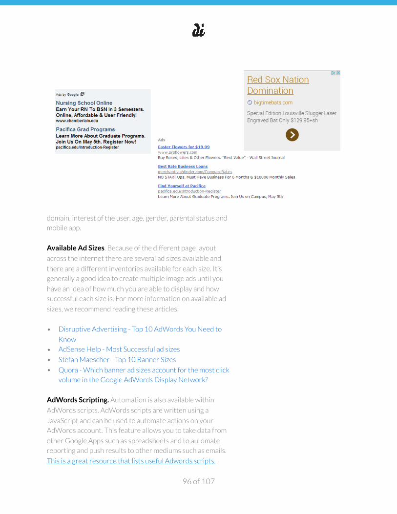
�
domain, interest of the user, age, gender, parental status and
mobile app.
Available Ad Sizes. Because of the different page layout
across the internet there are several ad sizes available and
there are a different inventories available for each size. It’s
generally a good idea to create multiple image ads until you
have an idea of how much you are able to display and how
successful each size is. For more information on available ad
sizes, we recommend reading these articles:
• Disruptive Advertising - Top 10 AdWords You Need to
Know
• AdSense Help - Most Successful ad sizes
• Stefan Maescher - Top 10 Banner Sizes
• Quora - Which banner ad sizes account for the most click
volume in the Google AdWords Display Network?
AdWords Scripting. Automation is also available within
AdWords scripts. AdWords scripts are written using a
JavaScript and can be used to automate actions on your
AdWords account. This feature allows you to take data from
other Google Apps such as spreadsheets and to automate
reporting and push results to other mediums such as emails.
This is a great resource that lists useful Adwords scripts.
of 96 107
�
AdWords scripts provide a way to programmatically control
your AdWords data using simple JavaScript. Only entry-level
familiarity with JavaScript is needed to use Adwords scripts.
This video provides an in-depth tutorial on getting started
with Adwords scripts.
The screenshot from Google Developers below shows how
you can access Scripts within your Adwords account.
AWQL. Part of AdWords Scripting is AWQL, developed to
help easily recall account data. Based on SQL, it was originally
designed to make it easier to select and recall data for
AdWords scripts, however a PPC consultant created a tool
called awql.me which allows you to query and download data
from an AdWords account.
Audiences. Through use of the Google Remarketing Pixel, you
can create remarketing audiences and serve specific ads to
people who have visited your website. Recently, Google
expanded these tools to allow advertisers to upload lists of
customer emails to be able to serve ads to customers only.
The true power of these lists lies in using them to exclude ads
from being shown to a certain group of people. Excluding
customers will prevent you from spending to have ads served
to people who have already been acquired.
For this section, we’ll use “click” as an example of a positive
interaction. Though with Facebook there can be positives
from engagement other than clicks. It’s also worth noting that
Facebook’s own reporting tool tracks clicks in several
different ways--in fact, a click that takes a user off of Facebook
to another website is reportedly separately from “clicks”
within Facebook.
Facebook’s Ad network operates similarly to Google’s
network. There are probably enough pros and con comparing
of 97 107
�
each network that there is little sense in trying to figure which
network is better. However, Facebook’s tools for finding
potential customers at the top of a purchase funnel are
probably stronger (and slightly more user friendly) than the
Google Network.
Campaign Objectives and Optimizations. When creating a
Facebook Campaign, the first thing you will need to do is
select a campaign objective. The benefit here is that ads will
be served to people who are more likely to complete a certain
action.
If you use a campaign with an objective for post engagement,
your ads will be shown to people who are more likely to
interact with a post over someone who is more likely to click a
link to a website. It’s important to think about your goals for a
campaign when selecting the campaign type.
There are several types of campaigns:
• Clicks to Website: Send people to your website.
• Website Conversions: Increase conversions on your
website. You'll need a conversion pixel for your website
before you can create this ad.
• Page Post Engagement: Boost your posts.
• Page Likes: Promote your Page and get Page likes to
connect with more of the people who matter to you.
• App Installs: Get installs of your app.
• App Engagement: Increase engagement in your app.
• Offer Claims: Create offers for people to redeem in your
store.
• Local Awareness: Reach people near your business.
• Event Responses: Raise attendance at your event.
• Video Views: Create ads that get more people to view a
video.
Each of these campaigns can then be optimized towards a
certain bidding type. Depending on the campaign objective
there are different types of optimization strategies.
of 98 107
�
For the most part, each campaign type will include the options
for optimizing towards Impressions and Daily Unique Reach.
These are similar in their bidding strategy in that you set a
cost you are willing to pay for 1000 impressions (CPM).
With Daily Unique Reach, your ad is served to as many people
as possible once per day, whereas with Impression
optimization your ad is served as many times as possible with
no frequency caps. Daily Unique Reach is a good strategy if
you have a very targeted audience that you know is very likely
to click.
You can also optimize for your campaign objective. For
example, you might run a campaign around app installs or
website conversions provided that these are your objectives.
If your campaign requires an offsite click on the ad, you can
optimize towards link clicks. The type of optimization you
choose largely depends on your confidence in your ad, the
confidence your potential audience will complete the desired
action and even confidence in your bidding strategy.
Additionally, you can select a billing interval, which is to say
you can select how you’re charged when people complete
your action. For the most part, you can be billed per 1,000
impressions (CPM) or for certain types of campaigns you can
be charged each time someone completes an action (for each
video view or for each link click). You can either set a bid or
have Facebook bid, which is known as “Automatic” bidding.
While every bidding strategy performs differently for
different audiences, here are some basic guidelines to follow
when trying to choose the optimal bidding strategy:
You can read more about bidding strategies here.
Campaign Structure. Facebook’s campaign structure is
similar to Google’s campaign structure in that there are three
levels: Campaign, Ad Set and Ad. There are slight differences
among all three that are important to understand. Campaigns,
of 99 107
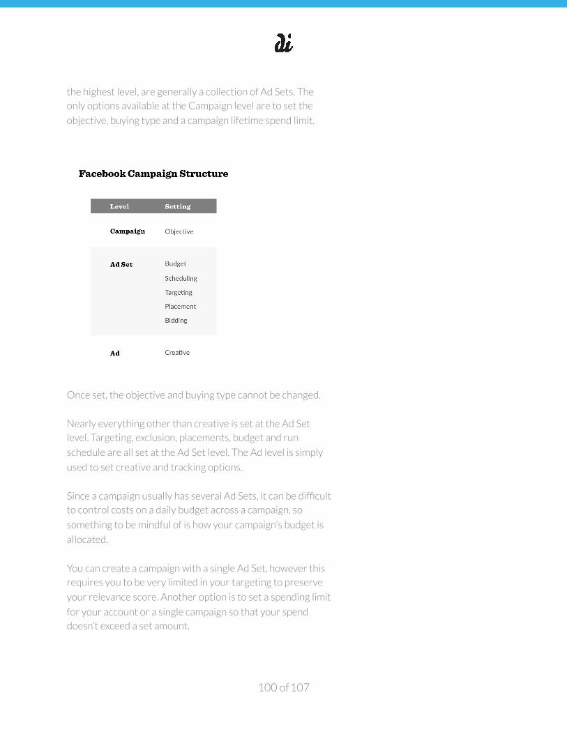
�
the highest level, are generally a collection of Ad Sets. The
only options available at the Campaign level are to set the
objective, buying type and a campaign lifetime spend limit.
Once set, the objective and buying type cannot be changed.
Nearly everything other than creative is set at the Ad Set
level. Targeting, exclusion, placements, budget and run
schedule are all set at the Ad Set level. The Ad level is simply
used to set creative and tracking options.
Since a campaign usually has several Ad Sets, it can be difficult
to control costs on a daily budget across a campaign, so
something to be mindful of is how your campaign’s budget is
allocated.
You can create a campaign with a single Ad Set, however this
requires you to be very limited in your targeting to preserve
your relevance score. Another option is to set a spending limit
for your account or a single campaign so that your spend
doesn’t exceed a set amount.
of 100 107
�
Audience Relevance. One of Facebook’s differentiators is the
amount of data the platform has about the interests and
behaviors of its users. You can leverage that data as well as of
your own to create an audience for your ads. The most
important thing to remember is that part of what controls
how your ads are displayed is something called Relevance
Score which is a blend of user feedback, both positive and
negative.
Facebook is intentionally vague about what is counted
towards feedback but positive comments, likes, shares and a
higher CTR will increase your positive feedback and people
hiding your ads, choosing not to see ads from you and having a
lower CTR will lead to higher negative feedback.
Facebook uses feedback to determine your relevance. For
example, an ad set targeted towards all male Facebook users
is less relevant than an ad set targeted towards male
Facebook users interested in hair products.
Even more relevant is an ad targeting male Facebook users
interested in hair products, between the ages of 25 and 35. A
good rule of thumb is to try to make sure your audience size is
between 50,000 and 100,000 people.
If your audience is too large, consider segmenting into smaller
groups. If your audience is too small, you may be trying to
reach an audience that is too narrowly defined. In this case, we
recommend combining segments together to broaden your
target.
Audience Research. Making sure your audience isn’t too
broad or too narrow is one of the keys to Facebook success.
You can target your ads based on interests, behavior, location,
demographic data and membership in several types of saved
audiences. Facebook has a tool called Audience Insights that is
helpful for understanding how a potential audience is
comprised. (See the Competitive Analysis Playbook section
“Targeting & Personas” for a more in depth guide to leveraging
both FB Graph Search Queries and Audience Insights).
of 101 107

�
If you’re not sure who your potential customers are and you
have no existing customers list with which to create a
lookalike audience, the best starting point is Graph Search.
Graph search is a tool that uses natural language queries to
return information from Facebook profiles.
The catch is that there are certain queries that are required to
return the correct search results. This page has a
comprehensive list of graph search commands. One command
the we use often for creating personas to advertise to is
“pages liked by people who like x.” This command returns a list
of pages based on people who like brand x. Taking this list of
pages to Audience Insights can help you construct a user
persona.
In the Audience Insights tool, enter the pages returned by
graph search into the Interests search box on the left rail.
After entering several pages (10+) you will notice that the
demographic results start to shift.
Each graph contains two bars per result. The blue bar is the
percentage of your audience that meets the criteria and the
grey bar alongside is the percentage of the Facebook
audience that meets that criteria. You’re looking for areas
where your selected audience over indexes vs the Facebook
audience as a whole.
One of the more useful sections in Audience Insights is the
“Lifestyle” section of the demographic tab. These categories
are defined by Facebook and the data used to create them
comes from external sources, but these user personas can be
very helpful in making sense of the data presented.
To understand how Facebook defines these audiences more
specifically, this is a great resource.
By default, the personas are ranked in order of how much they
over index from the Facebook audience. If you mouse over
each row, there’s an option to have each persona explained.
of 102 107
�
Taking note of these explanations can help you make decisions
about targeting.
The second useful section is the “Page Likes” section where
Facebook breaks down the top page categories (and several
examples of pages from those categories) as well the top
pages liked by your selected audience.
Again, these are ranked in order of how much they over index.
The activity tab can give you a good idea of how likely your
audience is to like pages and interact with posts. The
Household & Purchase tabs are good tools for getting an idea
about the financial situations of your selected audience.
Remarketing. While Audience Insights can help you figure out
new audiences, Facebook also has remarketing capabilities.
Like Google, you can create audiences around customer lists
as well as website traffic (as long as you have the Facebook
pixel installed) and app users.
Additionally, you can create lookalike audiences as well as
similar audiences. Unlike Google, you have a bit more control
over how lookalike audiences are created, how closely they
match the original audience and where the audience can be
used.
You also have the ability to create audiences based on
portions of URLs on your website. Say you host a blog at
“/blog” on your domain. You can target visitors who have
visited a page with /blog in the URL.
Similarly, you can target people who have added an item to a
cart in your shop by targeting URLs that contain “cart” (or
however your cart is denoted in the URL structure). Similarly,
you can create Audiences from email lists or sections of email
lists, though you will have to segment these lists prior to
uploading them to the Audience tool.
You can then create lookalike audiences from custom
audiences created from Web & Mobile traffic and Email lists.
of 103 107
�
Like the Google network, you can either target these lists for
remarketing purposes or exclude them from your targeting in
order to make sure you’re not reaching people who have
already clicked or converted.
Finally, there are tools in Ad Management sections to create
save audiences created by ads either to save targeting you
may have created at the Ad Set level or to save an audience of
people who have viewed a video as part of an ad.
Audience Targeting. When you create a campaign and define
an audience, and you have a campaign with several Ad Sets
each targeting several groups of people who may or may not
overlap. When your audiences overlap, Facebook’s Ad
Mediation service can’t decide which one of your ads serve
and one of two things can happen: you can either compete
against yourself, driving your cost up or the service simply
decides not to serve either one of your ads and you lose out
on that impression. This can end up being detrimental to your
campaigns, so it’s a good idea to exclude items that might
overlap in your ad sets.
Placements. You have several options for placements in ads
across the Facebook Network. Some are more native than
others and some have different capabilities than others. Ads
are available in the Newsfeed as promoted Items, on the right
column, on Instagram and on the “Audience Network” which is
a collection of mobile apps that serve interstitial ads.
Newsfeed and Instagram ads are eligible to receive comments
which can help increase your reach, though you do need to
keep an eye on the content of the comments. These ads also
present as more native items in a user’s feed and can be
successful. Right column ads tend to have lower CTRs as
people tend to ignore content on the right column as being ad
content.
of 104 107
�
Pinterest’s ad platform supports two types of ad campaigns—
those that drive engagement with your Pinterest content and
those that drive traffic to a website. You pay to promote any of
the pins you have created (or repinned). Creation and
management of the pins is very simple, the only real difference
is in how you are charged. Engagement campaigns are
charged per post engagement (Like, Repin or Close up) and
Traffic campaigns are charged per link click only.
You are typically only charged when someone you targeted
engages or clicks which is the benefit of Promoted Pins. To
illustrate this point further, imagine you are running a Traffic
campaign targeting people who are interested in living room
furniture. If someone you targeting repins your promoted pin,
and you get a click from someone who follows your target, you
will not be charged for that last click (since you did not target
that user).
At one point, this was one of the draws to paid placements on
social media. There was a chance to be rewarded for virality
which is to say that if you promoted content that people
interacted with and shared, you would be rewarded by free
impressions and clicks. However, many social networks have
limited the number of impressions available by people
interacting with and sharing content. Pinterest, on the other
hand, encourages advertisers to create sharable content since
“Earned Impressions” are available in the reporting tools.
Campaign Structure. Pinterest has a two-level Campaign
structure. Campaigns contain one or more ads. Run schedule
and daily budget is set at the Campaign level. Targeting, bid
and creative is set at the Ad level. Unfortunately, if you want
to run two pieces of creative on the same targeting criteria,
you need to duplicate the targeting settings across both pins.
Targeting. Pinterest’s promoted pin targeting system is
similar to AdWords in that it is keyword based with options to
restrict promoted objects to serve only to certain locations,
languages, devices and genders. Since Pinterest is primarily a
discovery platform, the keywords you’re targeting for content
of 105 107
�
can be repurposed as targeting for Promoted Pins, or you can
brainstorm new keywords. We should note that Pinterest
doesn’t have a keyword planner or audience tool and keyword
suggestions are based more on word similarity than anything
else.
As you select certain targeting options, you may notice that
your suggested bid window adjusts up and down. Generally,
there are options that will drive suggested bids up such as
choosing to display only to desktop, to men only or by
choosing high cost keywords. Pinterest does not allow you to
bid below the lowest threshold in the suggested bid window.
Pinterest’s reporting system isn’t perfect, but one of its
strengths is the ability to drill down to view a promoted
object’s performance on several different levels including by
keyword, placement or gender. This allows you a clear view of
where your ad is working, enabling you to optimize your
keywords.
Choosing Creative. Since Pinterest Promoted Pins appear
very natively in a rather busy feed, it’s important to do
everything you can to make them stand out. Pin images in the
feed are limited in their width, however you can make them as
long as you want. Using vertical aspect ratio between 1:3.5
and 1:5 on your images can make them stand out in a sea
shorter images. Additionally, using text or logo overlays can
make your image stand out.
Troubleshooting Campaigns
Paid placement campaigns require occasional maintenance
and it can be tough to make sense of the statistics to figure out
where your acquisition funnel is leaking. You can think about
campaign reporting as having two sides: the ad side and the
goal side. Values on the Ad side include Cost, Clicks and
Impressions and typically the only value on the goal side is
Conversions (or video views or app downloads or engagement
depending on your platform/goals).
of 106 107
�
There’s one metric to keep an eye on to understand how
people are reacting to your ad: click through rate (or number
of impressions divided by the number of clicks). If you notice
your CTR dropping off, then you know that what you’re
offering to users isn’t compelling enough to click. Likewise, if
your conversion rate (conversions divided by clicks) is low,
there’s likely a problem with your landing page.
Conclusion
Social and display ads are extremely powerful tools for any
stage of growth. Don’t make the mistake of thinking that ads
should come after you’ve achieved product-market fit or
achieved a certain level of growth.
Paid placements enable you to test audiences and messaging
more quickly and efficiently than most other channels. With
the vast amount of data and intelligence available to
advertisers on these platforms, you can speed up your
learnings about your market considerably by running tests,
learning, and iterating.
Even with just a small ad budget, you can use the learnings
gleaned from small advertising tests and apply them to other
parts of your business—helping you drive organic growth as
well.
Other acquisition tactics like SEO and content marketing can
take a significant amount of time before tests are successful or
conclusive.
of 107 107