Embed Size (px)
Citation preview

213
Application iconsChapter 7
We’ve developed our icon skills throughout this book, thinking about how we use icons and where they came from, then looking at designing simple favicons. We followed this up by tackling metaphors, pictograms and small colour icons. In this chapter, we'll round off the book by exploring in detail the most complex and independent icon form: application icons.


215
Until 2001, both Windows 2000 and Mac OS 9 gave you just a 32px square in which to represent an application. The release of Windows XP pushed this to 48px, but the introduction of Mac OS X marked a leap to a whopping (at the time) 128px. The larger canvas allowed more opportunity for expression, as well as detail, and application icons became more like photorealistic illustrations. I make no apologies for the heavy Mac OS X bias in this chapter — the majority of the best application icons are to be found on that platform — but the aspects covered in the examples could be applied anywhere.
The Mac OS X icons also revisited the office metaphor, but developed it further. Its main application icons were designed to have the same perspective as if viewed on a desk in front of you, while utility applications had icons that were seen as more serious, with more muted colours and a face-on perspective.
Apple’s Address Book (left) and TextEdit (right) follow the desktop perspective, while apps like Podcast Capture (centre) are utilities and are viewed face-on

216
Windows icons, in comparison, show a lower angle and from more to one side.

217
At the time of writing, the largest supported icon size is a whopping (really this time) 1,024×1,024px, on Mac OS X 10.7 (Lion). It’s believed that this size has been created in readiness for higher density screens in the future as it’s not currently used anywhere in the interface. Regardless of the use case, it can always be useful to have a large, high-res version of the icon available for other purposes. While the cost of developing a high-res icon would’ve been laughable in the past, other possible uses (such as website, merchandising and promotional material) make it a good investment.
David Lanham’s icon for TextMate 2 (left)
216
David Lanham’s icon for TextMate 2 (left)
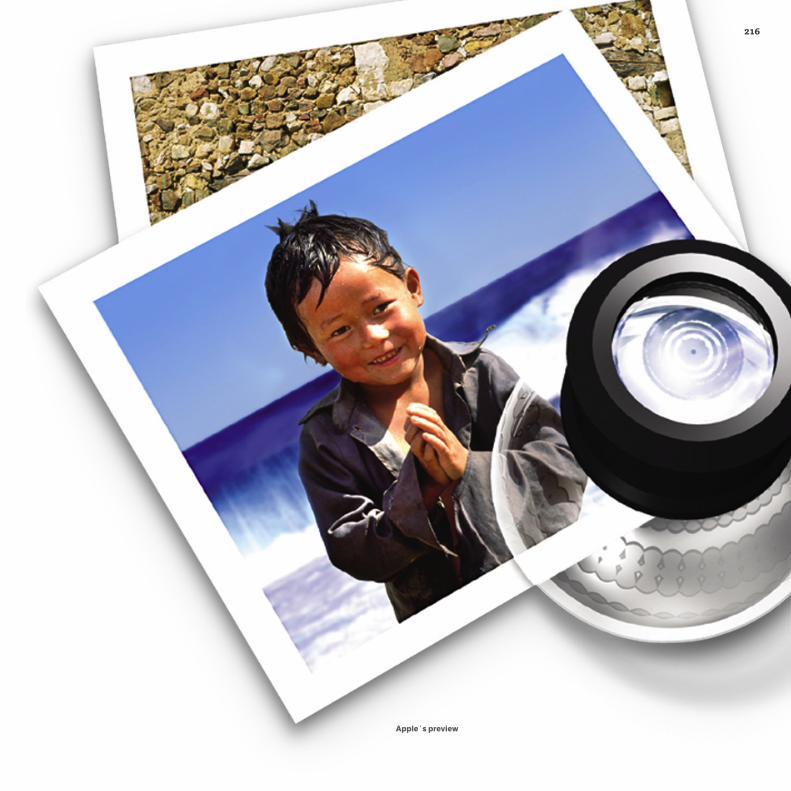
Appleʼs preview

219
While this chapter deals mostly with the desktop, the context for application icons has also grown to include mobile too: Android and iOS in particular. While Android allows and indeed encourages application icons with unique outlines, iOS restricts these to a rounded square. Some artists have found ways to make the best of this, such as the Camera Genius app designed by Artua (right) and TapDJ (below). By cleverly using the corner radius as part of the image, you’re less aware of it, and it feels more like a desktop application icon.
Many of the drawing techniques covered in chapter 5 apply to application icons as well, but there is the added complexity of realism to add to those skills. Rather than show step-by-step tutorials as I did in chapter 5, which would become rather tedious, I want to showcase icon artists’ different workflows, and how they portray different materials, lighting effects and surfaces. There are also three main areas where application icons differ to the other types of icon covered so far: resolutions, metaphor and process.

216

221
ResolutionsApplication icons usually contain multiple sizes of bitmaps (called resources) in a single container file: for Windows, this is in the form of an ICO file; for Mac OS X it’s an ICNS. On the other hand, Modern Linux distributions — such as Ubuntu — use a folder of separate SVG files for each resource.
The possible sizes required can be confusing, but not all sizes are needed, depending on the context:
Version Format
.svg
.icns10.0 - .4
10.5 - .6
10.7
95 - 2000
XP
Vista / Windows 7
.ico
16px 22px 24px 32px 48px 64px 96px 128px 256px 512px 1024px
LINUX (UBUNTU HUMANITY SET)
MAC OS X
WINDOWS
= Supported, but optional

216
The larger sizes also allow the opportunity for easter eggs — little treats for those who go looking for them, like this special message in the icon for CSS Edit:
1024px

223
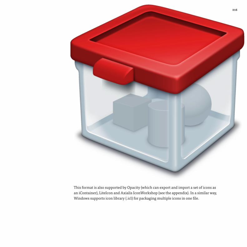
In addition to ICOand ICNS, there is a third called iContainer, developed by Panic Software, created to package sets of Mac icons. It supports icons up to 512px and includes display settings and information about each icon. It is primarily used in Panic’s CandyBar app for organising icons and customising Mac OS X system and application icons.
The iContainer format contains a set of
icons, including information like the title
and designer, and even the colour of
background they should be displayed on in
apps like CandyBar
216
This format is also supported by Opacity (which can export and import a set of icons as an iContainer), LiteIcon and Axialis IconWorkshop (see the appendix). In a similar way, Windows supports icon library (.icl) for packaging multiple icons in one file.

225225
Interview
LittleSnapper icon (Bartelme Design)I’ve been following the work of Austrian Wolfgang Bartelme for many years now. He’s created many of the icons for apps that I use every day at Hicksdesign and, in particular, RealMac Software’s Littlesnapper.

226226
What was your starting point in icon design? What turned you on to it and what were your inspirations?
“ I did my first icons more than ten years ago during my studies of information design. It was the early days of Windows XP and Mac OS X and I was excited about their fresh new look. I admired the icons of Windows XP because of their simplicity and consistency, and loved the ones from Mac OS X because of their attention to detail. However, the thing that really made me want to do icons was the fact that they’ve become much more than just simple representations of an app. Now they’ve become its face, its personality. I loved that and wanted to do similar. I started to release my own free icons on my website. People seemed to like them and I soon got my first contract work.
What tools do you use to design icons, beside sketching?
“ I use both Illustrator and Photoshop to draw icons. I tend to start in Illustrator — basic shapes and shading — and then continue in Photoshop for the finishing touches.
Can you tell me about the design process for the LittleSnapper icon? How did you get the idea and what other approaches did you try and discount?
“ I really enjoyed working on the LittleSnapper icon. Not just because I liked the concept of the app, but also because I could immediately picture the final app icon. It was clear that I wanted to incorporate some sort of camera or a lens to visualize the whole snapping aspect of the app. In order to convey that the app is about taking screenshots, I added a stylised browser window. I think it turned out pretty nice - definitely one of my favourite projects.

227
MetaphorWhile the metaphor is still important, conventions and all the criteria discussed in chapter 4 are not. An application icon’s function is to be memorable first, and describe or suggest what the tool does second, although the latter is not mandatory. In the case of LittleSnapper, following a similar convention to Apple’s iPhoto worked really well as a way of describing its function. The camera and browser window, overlaid with viewfinder display, depicts taking whole webpages or elements of them. Often a real object is used, something familiar that might also create an emotional response, such as the Espresso icon:

216
In my opinion, one of the biggest factors that I feel makes a memorable application icon is, quite simply, fun. The visual metaphor for AppZapper, the Mac OS X uninstaller tool, could’ve been a workmanlike affair but, instead of a literal depiction of an app in a wastebasket, they’ve gone for a retro-style ray gun, which is far more distinctive.

229
In the same way, Panic’s Transmit icon rejects attempting to depict the potentially dull subject of FTP transfer, choosing a transportation metaphor instead, with its familiar yellow truck. It’s been doing this since Mac OS 9, and has kept up with all the changes in icon resolution, from an original aliased 32px icon, to the current 1,024px masterpiece:

216230
The history of the Transmit icon, from early Mac OS 9 32px versions before the truck metaphor was used (top left) to very latest artwork, a whopping 2,048px!

231
Taking the concept of fun even further, there is a trend for cute mascots in icon metaphors. The icon for the multi-protocol instant messaging client Adium has three different states: asleep (when the app isn’t open); awake; and when a new message arrives, it flaps its wings:
If you have a family of applications, then you may want to use a common theme to show this. Tapbots make a series of iOS apps (or bots as they prefer to call them) which cleverly use the same robotic eyes to provide the link, sometimes including the interface of the app itself:

216
An abstract icon can work really well, if it has a distinctive and intriguing form like Realmac Software’s Analog, based on the shape of a camera shutter.

233
ProcessThe process for creating application icons will vary, but there are three stages that are prevalent in many designers’ workflows.
Sketching
I’ve already banged on about this in chapter 5, but pencil sketching is a great way to try out lots of different ideas and variations of viewing angles in a short space of time. Some like to use this stage to try colour sketches too, but generally that’s left to the next stage.It’s also a way of becoming familiar with the subject. If it’s a real object, you naturally distil it down to its important features by sketching it. If you’re creating a character, like the Adium duck, then sketching it gets you used to its form, and enables you to draw it consistently from other angles. This is something I found particularly valuable when making the Silverback icon; it required a lot of sketching before I became confident I knew how to draw a gorilla.

216
235
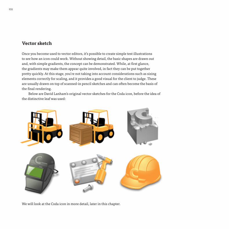
Vector sketch
Once you become used to vector editors, it’s possible to create simple test illustrations to see how an icon could work. Without showing detail, the basic shapes are drawn out and, with simple gradients, the concept can be demonstrated. While, at first glance, the gradients may make them appear quite involved, in fact they can be put together pretty quickly. At this stage, you’re not taking into account considerations such as sizing elements correctly for scaling, and it provides a good visual for the client to judge. These are usually drawn on top of scanned-in pencil sketches and can often become the basis of the final rendering.
Below are David Lanham’s original vector sketches for the Coda icon, before the idea of the distinctive leaf was used:
We will look at the Coda icon in more detail, later in this chapter.

216
Drawing and iteration
Once the client has approved the icon design direction, the detailed work begins.Whenever I create icons, it’s always with the final output method in mind and, in
the case of application icons, I use IconBuilder to create the final ICO and ICNS files. Rather than forcing you to use a drawing editor that you’re unfamiliar with, IconBuilder is a plugin for Photoshop and Fireworks that allows you to export your artwork to icon resource files, as well as multiple bitmap formats (including multipage TIFFs — see chapter 6). Even though I work predominantly in Adobe Illustrator, I always import my final .ai artwork into Photoshop to use IconBuilder for the final part of the process.
IconBuilder comes with Photoshop templates for laying out your various resources in a preset grid, so that it knows where to find them when it comes to building the icon files.
You can create your own grids and presets too: for example, ones for creating favicons and Apple Touch icons. I have one set up in Illustrator that mimics the preset Photoshop template, so that when I import the artwork the resources are in the correct place to build.
237
More on this part of the process at the end, but it’s worth mentioning now as it affects how we lay out our resources. There are other export options, too, listed in the appendix, but believe me when I say that IconBuilder is the daddy.
The exceptions to this are graphic editors such as Opacity (Mac) or Axialis IconWorkshop (Windows), which can not only create icons but also export directly to both of the required icon formats (as well as bitmaps).
So, with a grid ready, the starting point is almost always the largest icon. In fact, designers like Kenichi Yoshida from Panic Software start with a canvas twice the largest supported size. That now means a really, really whopping great big 2,048px square. By doing this, you not only have a good quality large version for other purposes, but it also helps construct the detail. For me, the added benefit is that any imperfections become invisible once reduced down, but it does, of course, mean a lot more maths when working out how it’s going to scale!
This is the stage that varies the most among artists — most prefer Photoshop, with Illustrator second, and a growing number now like to render in a 3-D modelling package such as Cinema 4D or Maya. This allows different perspectives and light sources to be explored. If a client decides they would prefer to portray the object from a different angle, it can be done without having to redraw from scratch.
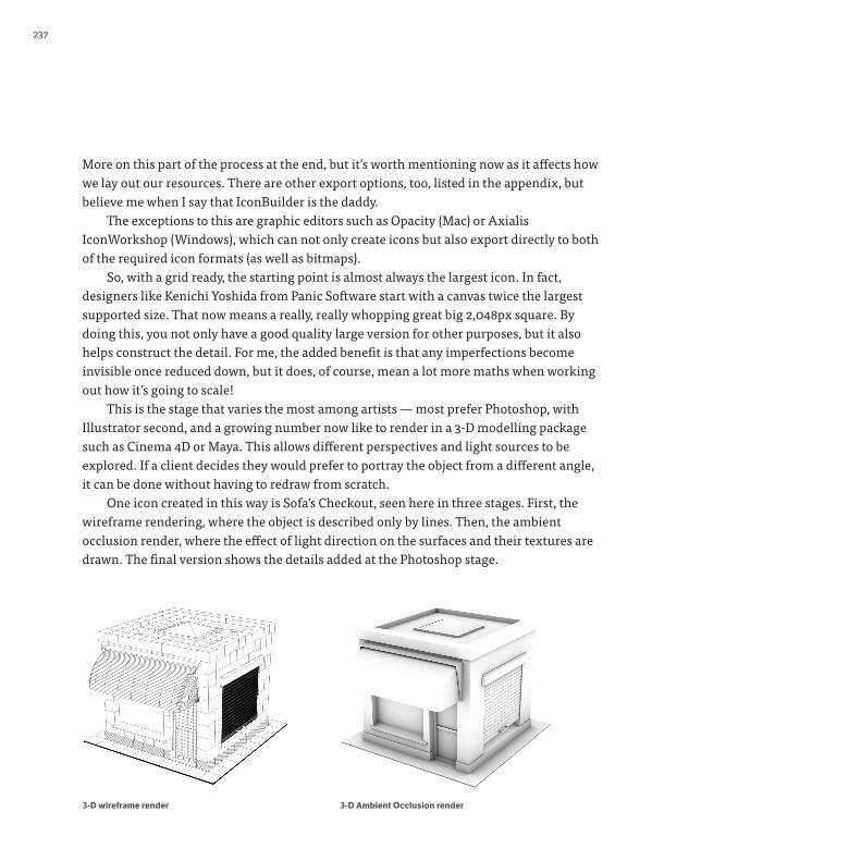
One icon created in this way is Sofa’s Checkout, seen here in three stages. First, the wireframe rendering, where the object is described only by lines. Then, the ambient occlusion render, where the effect of light direction on the surfaces and their textures are drawn. The final version shows the details added at the Photoshop stage.
3-D Ambient Occlusion render3-D wireframe render

216
Final icon resources for Checkout app

239239
Interview
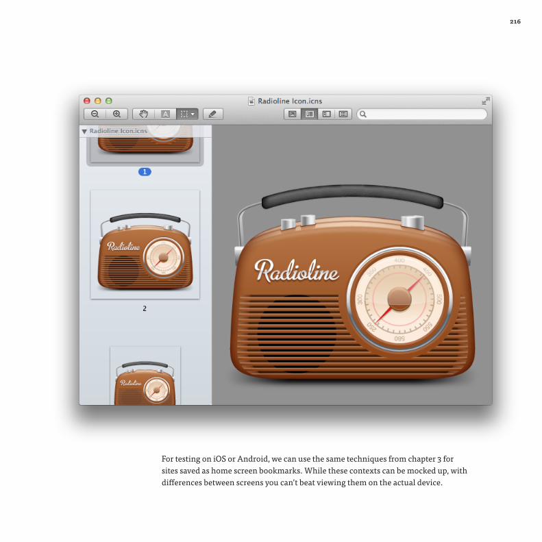
Jono Hunt (Iconaholic)To see what process other icon artists use, I talked to many other designers, including fellow Brit Jono Hunt (better known as Iconaholic), a specialist in icon and UI design. His icon for Radioline, ‘the missing radio app for the Mac’, hit all the right notes with my love for retro objects.
226240
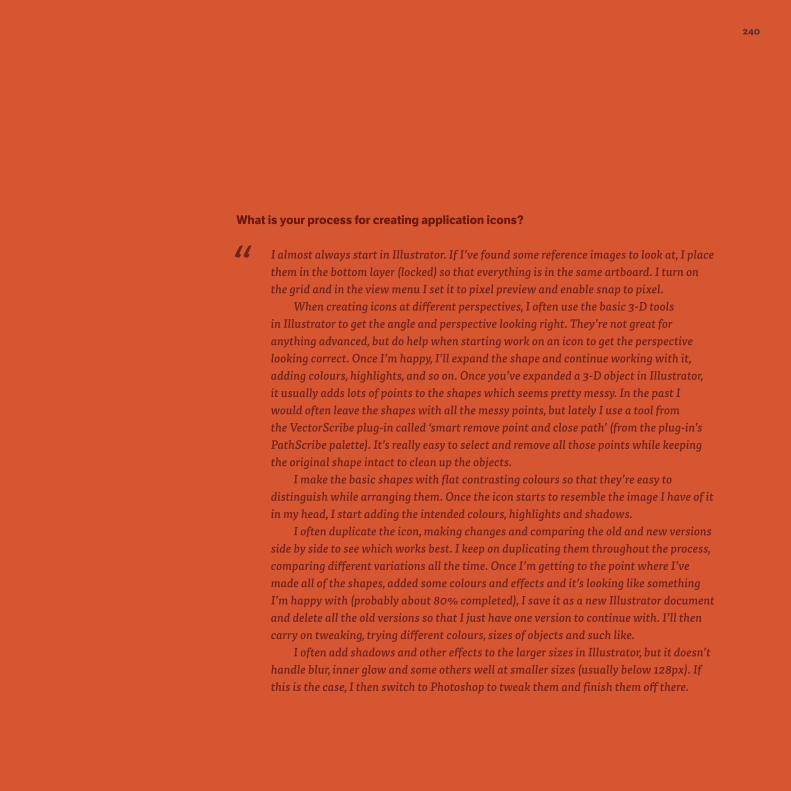
What is your process for creating application icons?
“ I almost always start in Illustrator. If I’ve found some reference images to look at, I place them in the bottom layer (locked) so that everything is in the same artboard. I turn on the grid and in the view menu I set it to pixel preview and enable snap to pixel.
When creating icons at different perspectives, I often use the basic 3-D tools in Illustrator to get the angle and perspective looking right. They’re not great for anything advanced, but do help when starting work on an icon to get the perspective looking correct. Once I’m happy, I’ll expand the shape and continue working with it, adding colours, highlights, and so on. Once you’ve expanded a 3-D object in Illustrator, it usually adds lots of points to the shapes which seems pretty messy. In the past I would often leave the shapes with all the messy points, but lately I use a tool from the VectorScribe plug-in called ‘smart remove point and close path’ (from the plug-in’s PathScribe palette). It’s really easy to select and remove all those points while keeping the original shape intact to clean up the objects.
I make the basic shapes with flat contrasting colours so that they’re easy to distinguish while arranging them. Once the icon starts to resemble the image I have of it in my head, I start adding the intended colours, highlights and shadows.
I often duplicate the icon, making changes and comparing the old and new versions side by side to see which works best. I keep on duplicating them throughout the process, comparing different variations all the time. Once I’m getting to the point where I’ve made all of the shapes, added some colours and effects and it’s looking like something I’m happy with (probably about 80% completed), I save it as a new Illustrator document and delete all the old versions so that I just have one version to continue with. I’ll then carry on tweaking, trying different colours, sizes of objects and such like.
I often add shadows and other effects to the larger sizes in Illustrator, but it doesn’t handle blur, inner glow and some others well at smaller sizes (usually below 128px). If this is the case, I then switch to Photoshop to tweak them and finish them off there.

241241
If I’m creating something quite realistic, I tend to look at a lot of photos of the objects and how the light falls on them. I sometimes sample the colours directly from example photos I’m using for reference. With the Radioline icon, I wanted the radio to be plastic but not really glossy like a lot of Mac icons. I wanted it to look quite retro and not too over the top.
How do you arrive at the final idea?
“ Sometimes the client will already have an idea of how they want it to look, but more often than not I’ll take a look at the app and what it does, and then have a look for metaphors and reference on iStockphoto, Google images and Wikipedia. After getting some ideas, I’ll send the suggestions to the client and we’ll discuss which ones they like and what ideas could work best until we’re both happy with the decision (or occasionally until the client says ‘No, go with the other idea. The one you don’t like.’ 0_o ).
Original sketch and final icon for Permute

242242
In the case of the Permute icon, once I learned what the app would do, I had an idea for some kind of box. Like a jack-in-the-box or music box, with a handle on the side to turn or wind up. Put some media in the top, turn the handle and the converted version comes out of the front. The client liked the general idea but wanted some changes. He wanted a CD or DVD in the top where I’d suggested a film strip and some musical notes. He didn’t want the handle on the side and wanted to show a screen on the front with binary.
I don’t always sketch ideas for clients, especially if the metaphor being described is easily understandable, but I do for some of the crazier ideas that aren’t easy for people to visualise. I did a quick sketch of the Permute icon and found it (unintentionally) resembled a robot’s head, with the two dials at the top (eyes) and the screen at the bottom (mouth). I quite liked it, so I sent the sketch to the client pointing out that if he didn’t like that idea then I could switch the dials to the bottom and the screen to the top to prevent that. I’d originally planned to make the box wooden so, hopefully, it wouldn’t have been a problem. He liked the idea so we went with it.
What tools do you prefer and why?
“ I mainly use Illustrator and Photoshop along with IconBuilder, the Photoshop plug-in, to build the final icon files.
Even if I’m going to work on an icon in Photoshop, I’ll often create the basic shapes in Illustrator, then copy and paste them into Photoshop to continue. I guess I feel more comfortable with it and like to use the space of the artboard and spread everything out in there.
I tend to use Photoshop for smaller icons and UI work. Also, Photoshop seems better for adding effects such as blur, inner glow and so on at smaller sizes, and when using textures.

243243
What is your strategy for creating the various sizes required for the icon file?
“ I’ll make the larger sizes first and then resize them down for the smaller sizes. I turn on the grid and in the view menu I set it to pixel preview (Illustrator) and enable snap to pixel. I check each size and make sure the pixels are aligned and snapped to the grid, tweak the layer styles (Photoshop) or effects (Illustrator), and remove some of the details for the smaller sizes. For 32px and 16px sizes, the icons are usually simpler versions of the larger sizes and I’ll remake them completely.
Is your process for other icons (such as toolbars) any different?
“ If I’m creating thirty toolbar icons, I’ll make them all in the same Illustrator document. If I’m making smaller icons in Photoshop, I tend to create one document for each icon, unless they’re variations of the same icon. I’m not too sure why I work one way with Illustrator and another way with Photoshop. I’m just comfortable working like this.

242244244

245
Realism
Just as with the colour icons covered in Chapter 5, light direction is the first point to consider, as this will affect the shading. However, there are more complications with application icons. With smaller colour icons, any shadows could be done quickly and effectively with just transparent black, but here we need to be more lifelike. Realistic shadows are either warm (hint of red) or cold (hint of blue), and this can be used to suggest temperature as well as feeling more natural.
This is something you would notice on white areas the most, and shading can change the subconscious impression made by the icon. For example, the shading on a white lab coat may look better being on the colder spectrum, as this would suggest sterility and cleanliness. Warmer shading makes sense on natural white objects such as chalk or a polar bear. The same methodology can be applied to grey colours, too. Straight grey can be dull, whereas a warm or cool grey will appear more natural.
Things (left) uses cool shading, while the Oxley letter (right) uses warm shading. Oxley letter by the Iconfactory, from Indiana Jones and the Kingdom of the Crystal Skull™ © 2008 Lucasfilm Ltd

216
Light direction, highlights and shading are also how you describe the surface of the object. I mentioned before that the light source doesn’t always come from above: in this jack-o’-lantern, the main light source comes from inside.
Jack-o’-lantern icon by the Iconfactory

247
The gloss finish of the Unison app’s magnet creates sharp highlights and reflects other elements, even in the shadows.

216
Objects with glass or transparent plastic also create a challenge with reflections. The slide ring on the icon for Carousel manages to show not only warped internal reflections but also a clear light source on top.

249
Surfaces may also have a texture that will change depending on the light. As well as making the highlights and shadows softer, it will create patterns. Going back to the Camera Genius icon, there are three main textures to highlight:
Faux-leather grip uses a pattern with both highlight and
shadow. Notice how the highlights become stronger
nearer the top
Brushed metal is suggested
with soft, slightly darker, horizontal
lines
Black plastic is a much subtler
texture, best recreated with
something like a noise filter
216
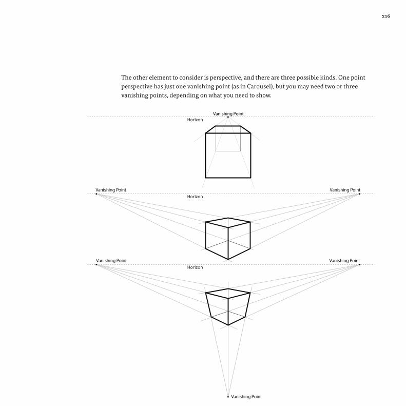
The other element to consider is perspective, and there are three possible kinds. One point perspective has just one vanishing point (as in Carousel), but you may need two or three vanishing points, depending on what you need to show.
HorizonVanishing Point
Horizon
Vanishing Point
Vanishing Point
Vanishing Point
Horizon
Vanishing Point
Vanishing Point
251
Your graphics app may contain tools for creating and drawing on a perspective grid, but you can make a basic one yourself easily enough with guides. This is another area where artists are using 3-D rendering applications instead of traditional 2-D tools because, once built, the perspective can be tweaked easily to find the view that looks right.
It takes many years of experience and observation to be able to draw realistic imagery solely from memory but, as we use metaphors for application icons (such as the leaf for Coda), it’s possible to get the best reference possible — the object itself. We can get a lot of good reference material from sources like stock libraries and Google image searches, but having the object in front of you means that you can control the lighting and perspective. You may also discover detail and nuances you might not have seen in a flat photo, elements that will be useful for creating the larger sizes of the icon.
If it’s not possible or practical to do this, another option is to make a rough model that allows us to study its form. When creating the abstract icon for Kaleidoscope, Jasper Hauser used plasticine to mock up the sketches he had made (see the Kaleidoscope case study later on).
Application icon process drawing inspiration from othersTo go into the process in more detail, I've chosen my favourite examples of application icons and talked to the designers in question to see how they made them, and what tools, methods and approaches they use generally in their icon work.

216
CSS3 Toolkit icon by Cian Walsh. View Cian's process here http://afterglow.ie/design_interface.html

253253
Interview
Coda iconWhen I first decided to write a book about icon design, I knew there was one icon in particular that I wanted to feature — my favourite application icon (and indeed a favourite application as well): David Lanham’s sumptuous work for Panic Software’s Coda. I talked to David about the process and iterations for creating the Coda icon, as well as his icon work in general.
The latest version of the Coda icon is by Kenichi Yoshida

226254
What tools do you use to design icons beside sketching?
“ The sketch pad is definitely my favourite tool, but a lot of time is also spent researching the subject matter and gathering references to do the sketches from. I’ve found that actually seeing an object in person or taking reference photos yourself immensely helps in understanding the materials and other qualities of what you’re trying to draw. I was struggling with drawing a hammer once, but one quick trip to the hardware store to check out all the various styles, materials and types of hammers, and the results instantly showed up when I went to redraw the icon. Internet searches can work, but there’s nothing like first-hand experience to help you understand what you’ll be rendering out.
You’re known as an illustrator, rather than specifically an icon designer. Do you find any difference in workflow to how you approach an illustration and an icon?
“ My approach to drawing an icon versus an illustration is pretty close to being the same. The initial steps of research, brainstorming and sketching all apply, the subtle difference being that I have to keep in mind how the final drawing will be used. Icons generally need transparent backgrounds and easily recognisable shapes and colours that work on a variety of backgrounds; illustrations need more focus on composition and colour relationships. They both need to get the message across quickly and efficiently, however, and with icon sizes getting larger and larger, they’re becoming more about illustration than ever before.

255255
Your style encompasses both highly photorealistic icons like Coda, but also a more illustrative style, especially with character designs like those in the game Ramp Champ. Do you have preference?
“ I fully enjoy both styles; they play against each other really well with one being very tight and planned, the other being very loose and freeform. Given the choice, I’d lean toward the illustrative style in a heartbeat; I absolutely love drawing characters and letting the drawing lead me to the final result rather than having to plan things beforehand. A lot of my icon design starts off very loose (it’s great for brainstorming exercises), and I try to let as much of that make its way to the final icon as I can, since I love the spontaneity in the drawings.
How did the idea of the Coda icon come about? Did you explore many other ideas, or was it always going to be a leaf from the start?
“ The icon began as a group effort among the Iconfactory employees and many of the initial sketches were based on construction and machinery metaphors. There were welding masks, construction hats, a forklift and various directions like that. However, we quickly realised that most of these directions felt terribly outdated and lacked any emotional aspects for such a fun and new piece of software. So we changed our approach to focus on the potential for creation that the software enables. Among the new ideas were, of course, the leaf, an acorn and a sprouting seed. I think this was just around the time that the drawing software Acorn was showing up, so we cut that one and ended up on the leaf for its direct simplicity and shape.

242256
There were many iterations of the icon, playing with different shading and details before the icon was finalised.

257257
Did it take many iterations to get right?
“ The overall shape and color didn’t take long at all, but the shading got tricky. I was working too large and focusing on details for the first round and lost sight of what it would look like scaled down, so the initial pass was way too bulky once we tried it out. The next iteration improved on this with redrawn veins and shadows where the top section of the leaf was darker and the bottom caught the light but, again, when scaled down it was too drastic a difference. So I knocked that back and it instantly improved the feel, but the veins seemed too prominent and the yellow tones in the veins kept the leaf from feeling fresh and lush. Once the veins were flipped to dark, everyone was very happy with the results and it was down to a matter of minor refinements like smoothing out the edges of the leaf and cleaning up the smaller sizes of the icon.
How do you approach the task of creating the various resolutions? Do you start with a particular size first?
“ If there are critical details that need to be preserved, then I try to either draw it on a proportional grid (so a 1px drop of water in the 32px size is the correct size in the 512px drawing), or draw a basic icon at 32px and use that for a template for the larger sizes. Lately, I’ve been creating icons at 2,048px and larger to future-proof everything, so figuring out those proportional requirements has been really important. Smart objects in Photoshop also help immensely with this. I create them for all the key sizes and, as I update the large master file, I can instantly see the results throughout the sizes. No matter what, there is always manual clean-up needed with the pencil tool for small sizes, but any chance to minimise that need is always helpful. Occasionally, icons just don’t scale acceptably and need complete redrawing for small sizes like the 32px and 16px resources.
242258
Which icon project have you enjoyed the most?
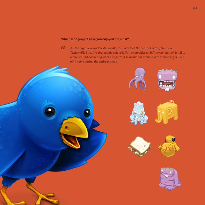
“ All the organic icons I’ve drawn like the Coda leaf, the bee for On the Job, or the Twitterrific bird, I’ve thoroughly enjoyed. Nature provides an infinite amount of detail to reference and extracting what’s important to include or exclude in the rendering is like a mini game during the entire process.

259259
Interview
Windows Vista iconsGedeon Maheux, The Iconfactory
It would be impossible to write a book about icons without featuring the Iconfactory, founded in 1996 by Corey Marion, Talos Tsui and Gedeon Maheux. While it’s a software and design company, well known for creating its own apps and games, the team has created many well-known icons, as well as giving away fun high-quality icons to beautify your desktops. It was also the work of the Iconfactory that inspired me to start creating my own icons.
They’ve worked on many different jobs, ranging from small projects to quite possibly the largest icon project imaginable: Microsoft Vista.

226260
What was your starting point in icon design? What turned you on to it and what were your inspirations?
“ My first job was actually as a multimedia designer creating educational CD-ROMs for kids. Part of that job was to design the 32px icons that were to be used on the CD-ROMs themselves in the directory structure. This was back in the days of Mac System 7 and OS 8 when we only had a limited canvas size and color palette from which to draw on.
I discovered quickly that I enjoyed pushing pixels into small works of art and took it up as a hobby. I didn’t make a living at it until quite some time later when I started doing icon design as freelance work on the side. Some of the first professional paid icon projects I worked on were Outlook Express for the Mac and the Keychain Access suite from Apple.
What tools do you use to design icons besides sketching?
“ Of course, the tools have evolved over the years from placing pixels in simple programs like ResEdit and then in Adobe Photoshop, to vector-based tools like the now defunct Macromedia Freehand. Today, I do my icon creation almost exclusively in Photoshop with vector shapes and layer effects. I still use Adobe Illustrator for some work, but I’ve been trying to keep myself from doing that when I can, since Illustrator can be somewhat imprecise. From there, I use the Iconfactory's own IconBuilder plug-in for Photoshop to build the actual resources for the desktop. I organise and sort all of my final icons in CandyBar, another Iconfactory/Panic product, for handy reference.

261261
Early sketches for the Vista icon set

242262
Creating the icon set for Windows Vista and 7 must’ve been an immense task. Did you do them all yourself or was a team involved?
“ Oh, no. I was only one member of the team and when I say team I mean that, because both of these suites of icons were a total team effort spanning months, sometimes years of work. It was a group effort of the highest order and some of the most demanding work we’ve ever done as a company.
How did you maintain consistency with the team?
“ We had reviews of all work about twice a week internally and once a week with Microsoft. There was a tight focus on a unified look that had to be maintained. Over time, we got quite good at spotting when something didn’t quite belong in the suite and correcting accordingly.
I’d love to know what the workflow was that you used with Microsoft. Did you have set stages of feedback and approval? Did they see sketches or finished icons?
“ Both Whistler (XP) and Longhorn (Vista) were broken out into milestones of several phases each. Initially, Microsoft broke the entire suites up into chunks of about fifty icons that they wanted in each chunk. These were prioritised so that the most crucial ones (the ones that were seen in the most places) fell first and were to be completed ahead of the others. These core icons would set the style for the rest of the OS and needed to be pixel-perfect in every way.
For Whistler, the sketch phases lasted three to four months and ranged from rough paper sketches to rough vector comps, and then even to tight comps while still all being considered sketches. Many of these initial tight comps never saw the light of day.For the curious, here you can see one of the near-final XP look-and-feels that was abandoned. They saw every stage of development all the way from rough sketch to final rendered icon and had input into all of it. The demands were exacting, which is what you would expect, since Windows is still, to this day, the most seen and used operating system on the planet.

263263
How do you approach the task of creating the various resolutions? Do you start with a particular size first?
“ These days, we start with the largest size and scale down. When we do so, we remove detail until it is properly simplified for the correct size it will be shown at. I personally find it much easier to take bits away than to add them, so we prefer to do the bulk of the work upfront and then the scaling portion is usually easier. This also allows the client to see the large, final art and approve that first.
Previously, Windows icons had always been drawn at a particular angle — viewed from the left. Was there a reason to change this perspective with Vista?
“ The angle of the icons themselves was dictated by the design of the operating system and throughout 90% of the time we worked on the suite they were in fact drawn from the left. Microsoft only made the perspective change right at the very, very end of Vista’s development. Needless to say, this caused a great deal of stress on our part because the entire suite hadn’t been drawn to be shown that way. You can read an interesting post about this very subject here:
http://www.istartedsomething.com/20080612/are-windows-vista-icons-facing-the-wrong-way/
How long did the project take to finish?
“ Whistler (XP) took four months of designing and four months of production on about 120 icons in total. Longhorn (Vista) took two years to complete, with long stretches of inactivity. Strangely enough, there were fewer icons on Vista to design (about 60), but the project took longer because Microsoft wanted it to be visually outstanding in every way possible. The level of detail and review on Vista was unlike anything we’ve ever done before.

242264
Early renders for the Vista icon set

265265
Interview
Kaleidoscope icon by Sofa Kaleidoscope is a file comparison app for spotting the differences in text and image files. Before the app was launched, its striking and abstract icon was published as a teaser movie — leaving the public to try and guess what the app actually did. Instead of representing an actual object, it takes a more abstract approach, while still being memorable. I talked to Jasper Hauser, a member of the Sofa team that created the Kaleidoscope icon.
With a name like Kaleidoscope, why didn’t you choose to represent that object as the icon?
“ It did cross our minds and we actually gave it a shot. But a kaleidoscope isn’t a very memorable object, it’s a long tube, which also isn’t suitable for making an icon out of, as it has to use a square canvas as well as possible. But the visuals a kaleidoscope creates are unique. And so that’s why we focused on its unique characteristics instead of the object: playful, colourful, triangular, circular.

226266

267267

242268
How did the idea for Kaleidoscope develop?
“ We started research into Kaleidoscope back in the summer of 2008 and serious development started early 2009. As you can see, there were a couple of subjects that already played an important role:
• Inspired by the colourful pieces of glass in a kaleidoscope. The overlaying circles of the RGB colour spectrum show a difference area in the middle, resulting in a rounded triangle shape. Incidentally, this became a concealed reference to the mathematic symbol for difference (delta ∆) as we later discovered :)
• I have always had an affinity with M C Escher’s infinite and impossible designs and so I thought it could perhaps be used to make the object a lot more visually interesting.
• Instead of making the logo the main object of the icon, I tried creating a tablet-like object, on which the logo was displayed. This idea was thrown out pretty early on in the process.
“ What’s interesting to me, looking back at this original sketch, is that it contains all the important concepts that ended up being present in the final icon.
Since the functionality of Kaleidoscope is quite abstract, it had no useful real life equivalent tool or object we could visually refer to, so the only two options we had were to either invent some kind of device to depict, or come up with an abstract logo-type object.
We tried for some time to come up with a kind of device that could represent the application’s functionality but, after having tried it every way that made some sort of sense, we ended up collectively deciding it wasn’t going to work. Instead, everybody seemed to be charmed by the logo shape from the original sketch. And so we set off to explore turning that abstract logo into an object that would work as an icon in our Docks.

269269
242270
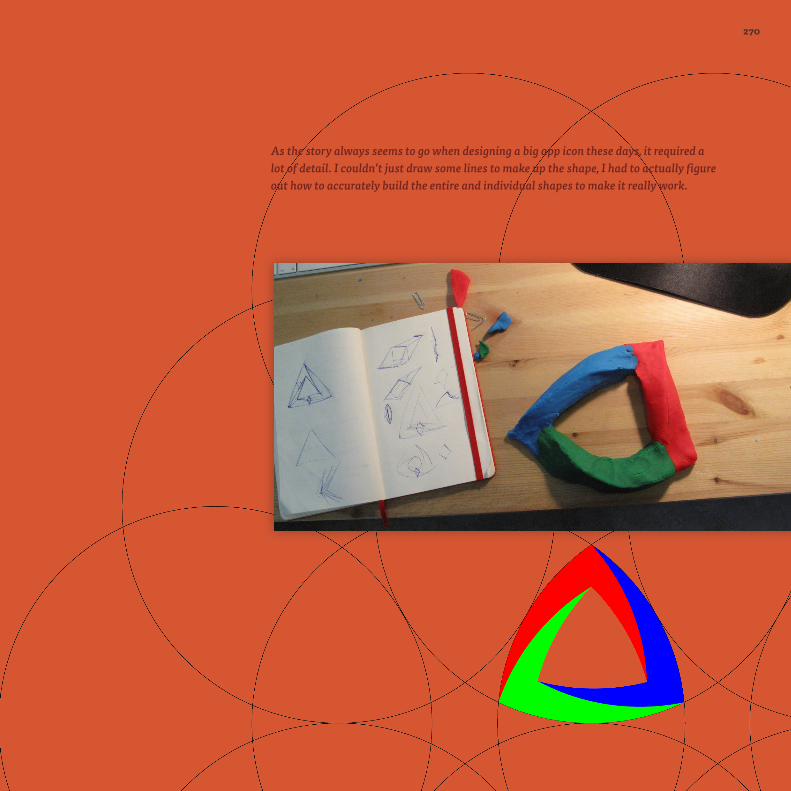
As the story always seems to go when designing a big app icon these days, it required a lot of detail. I couldn’t just draw some lines to make up the shape, I had to actually figure out how to accurately build the entire and individual shapes to make it really work.

271271
Additionally, to really get a grip on how the object was constructed and how the shading had to be applied, Hugo van Heuven created a 3-D version of the logo, while I retired to my corner of the office and had a lot of fun using plasticine to try to create my own model of the logo object. But, given the fact that the object has an infinity theme going on and is pretty much an impossible object, depending on your view angle, it wasn’t very easy to create the 3-D model.
Interestingly, the Kaleidoscope icon has two contrasting features that you see rarely in application icons. The first is its seeming simplicity: it boils down to not much more than an intricate triangle, which greatly helps its recognisability and suitability for use at any scale. Second, it uses every colour imaginable, not something you see often either.
We ended up having an icon pretty early on in the development cycle and so we had plenty of time to take a good look and reflect on it. This is something I really like, mostly because when you are in the creation process you are so deep in the subject matter it becomes progressively more difficult to discern good from bad. The pixel-pushing geeks that we are, we ended up creating several tweaked variations.
The first final iteration was somewhat soft and matte, and so we made it more glossy and aqua looking. As lickable as a Life Saver [author’s note to fellow Brits: a brand of American sweets very similar to Polos]. Finally, these changes are very hard to see: it was further cleaned up by making the strokes less heavy, saturating the colors some more, lightening some of the shadows, and simplifying the highlights.

242272

273
Exporting and testingUnless you’re using an app that can export directly to ICO and/or ICNS (Opacity or IconWorkshop — in which case you can skip this step), the artwork now needs to be made into the final icon file and tested. Normally, we would include any context (such as a toolbar background) in the drawing process, but application icons are less predictable and will be viewed on a wide variety of backgrounds. This is particularly the case on recent versions of Windows with the Aero glass theme.
The task of creating the icon formats is most often given to the IconBuilder plugin mentioned at the start of the process. Just as for creating the ICO file for favicons in chapter 3, with the final artwork on a single layer, the IconBuilder dialog is invoked via the Filters menu. Choose the correct preset for the template you’ve used, press Build and check each size looks correct in the preview window:

216
After you’ve created the icon files, the final stage is to test them. There are various methods for testing and replacing icons without requiring a developer to compile the application.
Once you’re happy that all the resources are aligned correctly and look spiffing, you can export to multiple formats (ICO, ICNS and bitmaps for each resource) at once.
Alternatively, if you have Apple Developer Tools installed on Mac OS X, you can use the Icon Composer app to import separate bitmaps for each resource, and export as either ICNS or ICO. Unfortunately, it doesn’t allow you to add resources for lower colour depths, allocate the 48px icon required for windows, nor a 1,024px for OS X. It works best for quickly creating ICNS files for Mac applications, but is limited compared with IconBuilder.

275
For testing on Windows, IconBuilder comes with a Windows app, Icontest.exe, for testing the appearance of ICO files. The Mac counterpart, Icon Examiner, will also allow you to view ICO files. Alternatively, folder icons can be changed by right-clicking the relevant folder and and choosing Properties. The Shortcut tab in the Properties window has the option to change the icon through which you can browse and select another ICO file as its replacement.
On Mac OS X, the easiest way to test is to use the icon organisation and customisation software CandyBar to apply new icons. As well as being a tool for collecting and categorising icons, CandyBar allows us to view the different resources via quick look, as well as customising any icon via drag-and-drop. I also use CandyBar as an icon scrapbook where I can study how others have created their icons.
You can also change icons by placing them directly inside the app itself. To look at the ICNS files inside Mac OS X applications, right-click the app, choose Show Package Contents from the context menu, and navigate to Content → Resources where the ICNS is normally stored. The convention is to name the ICNS file with same name as the app (for example, Automator.icns), but sometimes it can be called Appicon.icns, or named after its metaphor (Safari’s is compass.icns). These ICNS files can be double-clicked to open by default in Preview, and the individual resources can be dragged-and-dropped from the sidebar to the Finder.
216
For testing on iOS or Android, we can use the same techniques from chapter 3 for sites saved as home screen bookmarks. While these contexts can be mocked up, with differences between screens you can’t beat viewing them on the actual device.

277
SummaryI hope you’ve enjoyed this jaunt through the history, usage and process of making icons. Even if you rarely make anything other than favicons, it has hopefully given you an insight into how icons are made and when (and when not) to use them, which may aid you in other ways, such as general accessibility and usability issues.
This book covers where icon design is right now, but fashions change and the style of icons is always changing with them. At the time of writing, the trend is moving very much towards monochrome pictograms, with application icons being influenced by their simpler mobile app counterparts. I also fully expect to see a reaction against the current high level of photorealism, with more illustrative and creative icon work in the future, and style going beyond merely replicating objects in a lifelike way. I also wonder how long it will be before we start to see animation in application icons, and whether project budgets will increase to cater for the ever larger icon sizes needed.
One thing is for sure, we’ll come to a point where talk of needing to keep icons to a pixel grid will disappear. Screens will have higher resolutions and densities to the point where it simply ceases to be an issue.
Until then… keep your pixels crisp!

Chapter references
Kenichi Yoshida(http://www.kenichiyoshida.jp/)
VectorScribe Plugin for Illustratorhttp://www.astutegraphics.com/products/vectorscribe/
Further reading
History of Windows iconshttp://www.windows-icons.com/history.htm
Iconiohttp://icon.io/
An application icon showcase site
Icon Resourcehttp://www.iconresource.net/
If you want to delve further in designing application icons, I highly recommend this set of high-quality downloadable PSD and video tutorials by Sebastiaan de With, the fabulous icon designer working for doubleTwist featured in chapter 5’s case study.


![2 framestutorial.pps [Read-Only] · 2006. 6. 9. · Air7 icon and exp8 icon e. Vad3 icon and vad4 icon f. Vad4 icon and aqu5 icon g. Aqu5 icon and riv6 icon h. Aqu5 icon and exp8](https://img.pdfslide.net/doc/110x75/60e4e727c91cb445fc39a91e/2-read-only-2006-6-9-air7-icon-and-exp8-icon-e-vad3-icon-and-vad4-icon-f.jpg)


