Embed Size (px)
Citation preview
The Nature of Web Design
Learning Web Design:
Chapter 3 and Supplemental Materials
Where to Begin? What kind of content do you want to
put on the Web? Set goals for the Web site Organize your content into main
topics Decide on the general structure for
pages and topics Create a Site Navigation Plan
Ask Yourself these Questions…
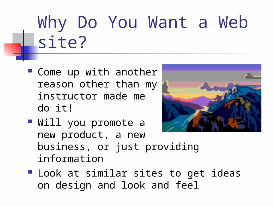
Why Do You Want a Web site?
Come up with another reason other than my instructor made me do it!
Will you promote a new product, a new business, or just providing information
Look at similar sites to get ideas on design and look and feel
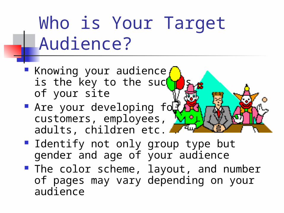
Who is Your Target Audience?
Knowing your audience is the key to the success of your site
Are your developing for customers, employees, adults, children etc. ?
Identify not only group type but gender and age of your audience
The color scheme, layout, and number of pages may vary depending on your audience
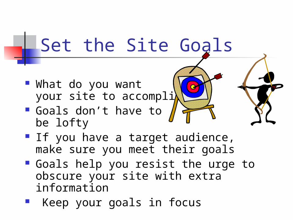
Set the Site Goals
What do you want your site to accomplish?
Goals don’t have to be lofty
If you have a target audience, make sure you meet their goals
Goals help you resist the urge to obscure your site with extra information
Keep your goals in focus
What Browser will Used?
Will they be using Internet Explorer, Firefox, Safari or some other one?
What version of browser will they use?
The answers to these questions will determine whether you can incorporate newer technologies on your site
Avoid Browser-Specific Terminology
You cannot guarantee what browser your users will use
Avoid references like: “Click here” “To save this page, pull down the File
menu and …” Use the Back button to return …”
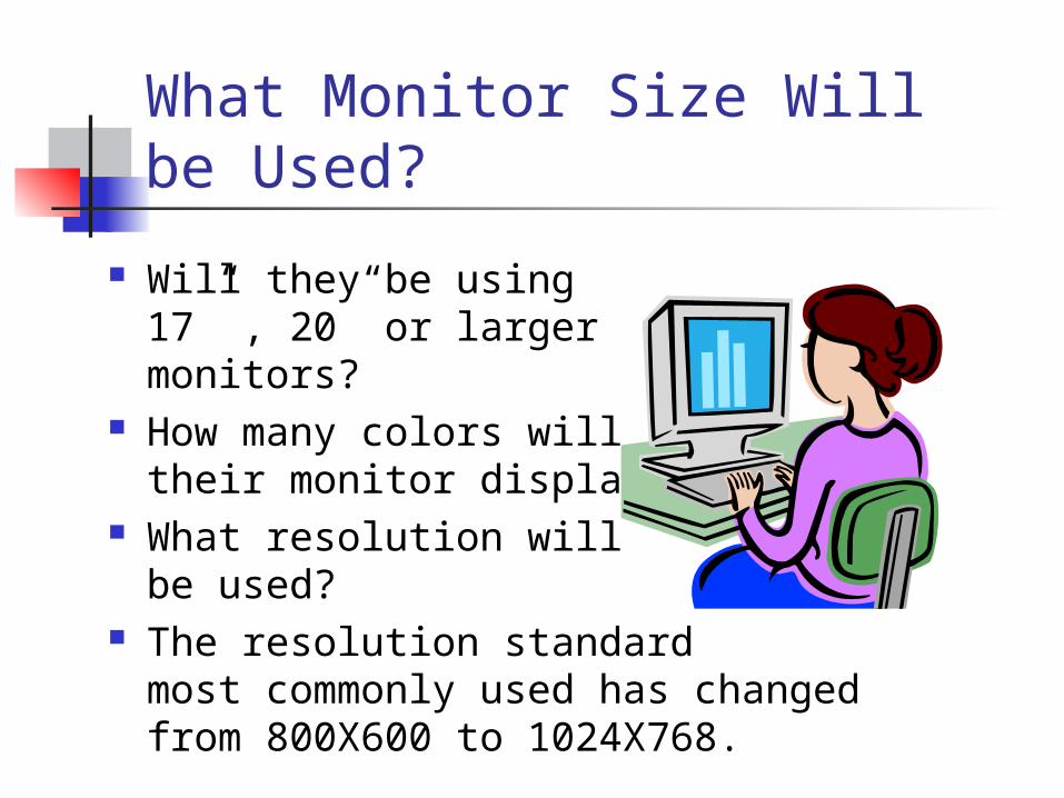
What Monitor Size Will be Used?
Will they be using 17” , 20” or largermonitors?
How many colors will their monitor display?
What resolution will be used?
The resolution standard most commonly used has changed from 800X600 to 1024X768.
How will you keep yourcontent fresh? Surfers want new
and exciting information and they want it often
If they don’t get what they want on your site, they will go elsewhere
How do I want users to respond to my site? Do I want them to
send email, fill out a form, visit me personally?
Make contact information available on the site
Creating a Usable Site Use 3 Click Rule-
it should never take more than 3 clicks to find information.
Provide Scent- Design site so there is a logical path to follow. Scent is kind of like a dog following its nose.
30 Second Rule- If it takes more than 30 seconds for your page to load you’ve probably lost them.
Use Good Titles– Search engines use these to find your site, also used when saving page in favorites. Titles should be short and sweet.
Creating a Usable Site cont. Use Navigation Menus
- Use a consistent navigation bar on every page so viewer knows how to use it. Should never have more than 8 choices.
Avoid using “Back” – If a user has to use the “Back” button, you have failed in your navigation scheme.
Creating a Usable Site cont. Consistent Look-
You should create an interface with a specific look and feel. “Brand” your site with your unique touch! Use colors, backgrounds and fonts consistently.
Usability Testing – Have friends, colleagues and family try out your site. We are not good judges of our own site’s usability because we know it so well. Have a third party try it out.
Live Space Is the actual viewing space within
a browser window Things that affect live space:
Is the window maximized? Title bar Menu and button bars Scrollbars, status bars and Windows
Controls
Basic Design PrinciplesBasic Design Principles Designing Above the Fold-
Most newspaper place their main stories in the top half of the front page so they can be seen without having to open the paper.
Viewers do judge a book by its cover
Place your most important information in the live space of your page without forcing the viewer to scroll.
Fixed Vs. Flexible Design You can structure your pages to allow for
either fixed or flexible sized pages Fixed- You set the pixel width of the image or
table and no matter the screen size of the monitor, the content will be that size.
Flexible- Use percentage widths for images and tables . Use em for font-size measurements. Then your page will expand or contract with the screen resolution. Care must be taken to make sure it looks good at any setting.
List the Site Content
Break up the content into main topics
Don’t worry about the order of the steps yet
Make a list of points that describe your site
Keep each topic short Group related topics together
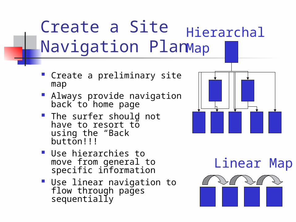
Create a SiteNavigation Plan
Create a preliminary site map
Always provide navigation back to home page
The surfer should not have to resort to using the “Back” button!!!
Use hierarchies to move from general to specific information
Use linear navigation to flow through pages sequentially
Hierarchal Map
Linear Map
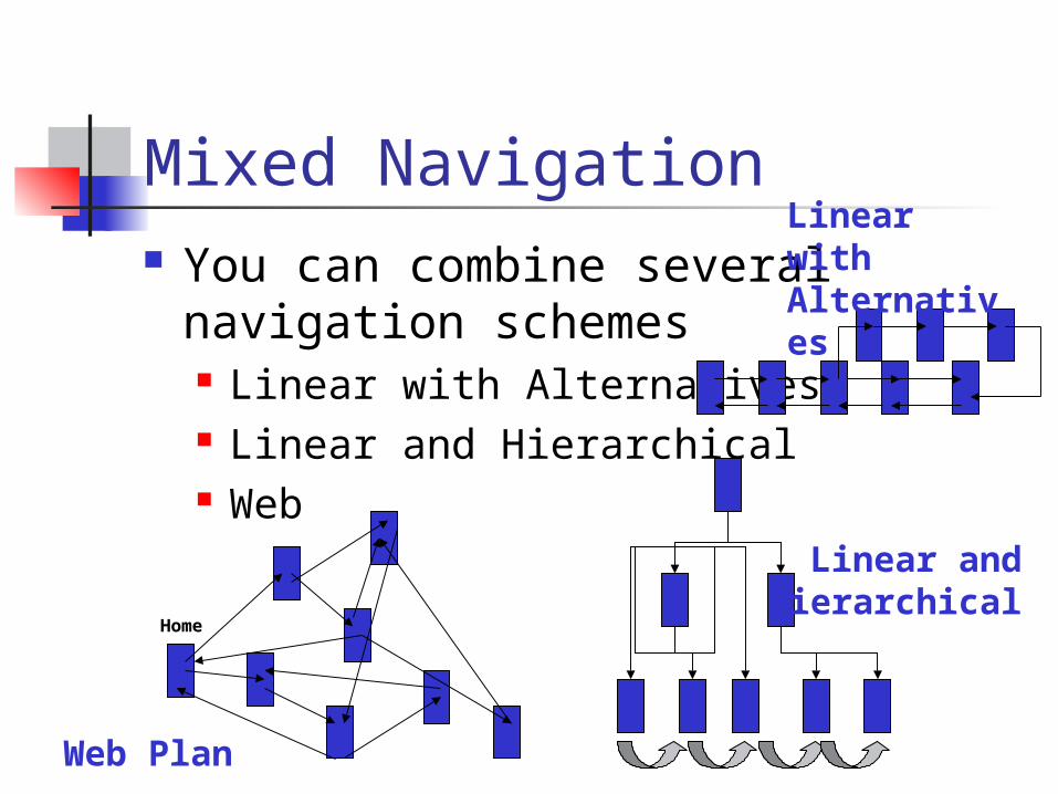
Mixed Navigation You can combine several
navigation schemes Linear with Alternatives Linear and Hierarchical Web
Home
Web Plan
Linear and Hierarchical
Linear with Alternatives
Storyboarding Your Site This process creates a rough outline
and sketch of what your site will look like
This is a plan similar to what directors use when they storyboard a movie
We will focus on this process in a later lesson
Start thinking about it now
Writing for Online Publication Write clearly and be brief Organize your pages for quick
scanning Use headings to summarize topics Use lists Don’t forget jump menus for long pages Don’t bury information in text Write short, clear paragraphs
The Page Stands Alone Write so that each page stands on its
own merits Use descriptive titles Provide navigation links to previous
pages in a sequence as well as to a home page
Avoid sentences that begin with pronoun references. Your reader might not have seen previous information.
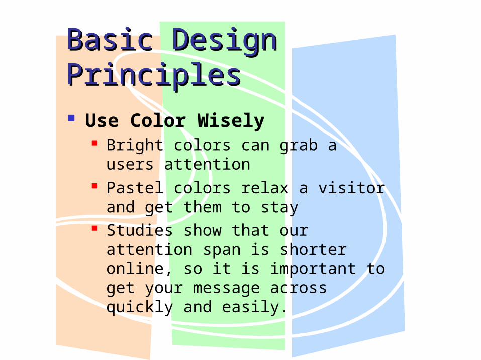
Basic Design PrinciplesBasic Design Principles Use Color Wisely
Bright colors can grab a users attention
Pastel colors relax a visitor and get them to stay
Studies show that our attention span is shorter online, so it is important to get your message across quickly and easily.
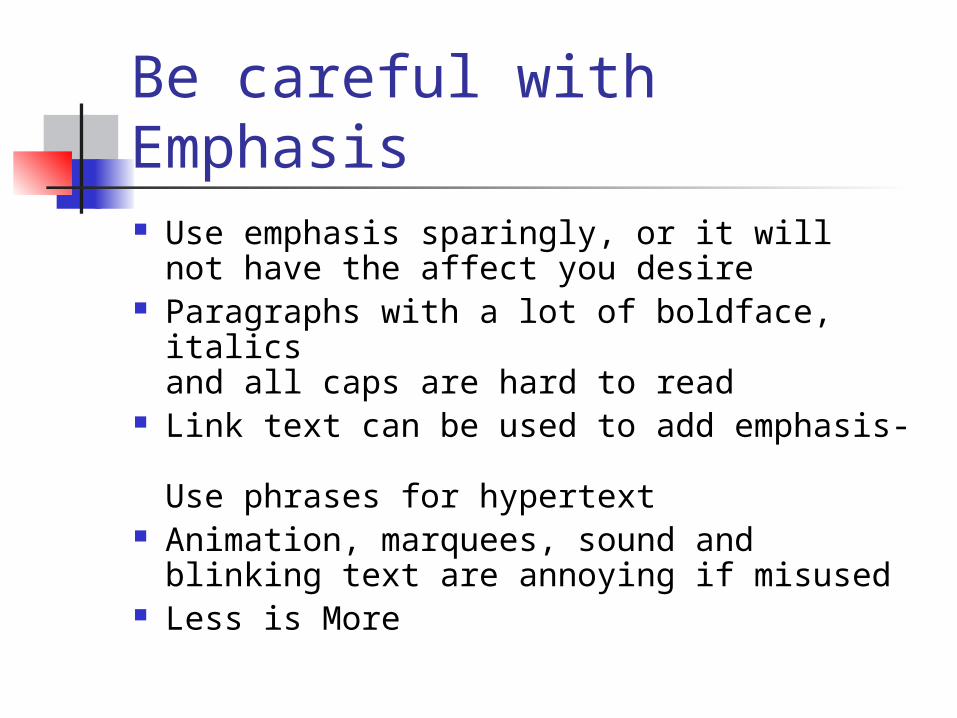
Be careful with Emphasis Use emphasis sparingly, or it will
not have the affect you desire Paragraphs with a lot of boldface, italics
and all caps are hard to read Link text can be used to add emphasis-
Use phrases for hypertext Animation, marquees, sound and
blinking text are annoying if misused Less is More
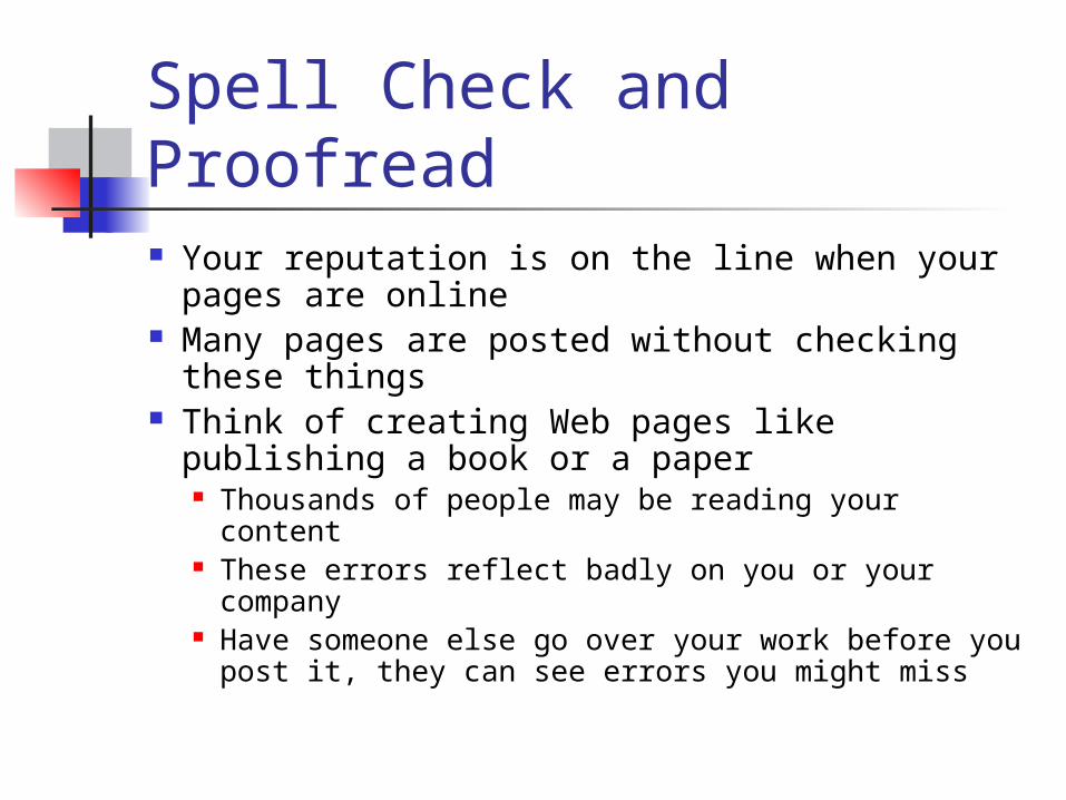
Spell Check and Proofread Your reputation is on the line when your
pages are online Many pages are posted without checking
these things Think of creating Web pages like publishing a
book or a paper Thousands of people may be reading your content These errors reflect badly on you or your
company Have someone else go over your work before you
post it, they can see errors you might miss
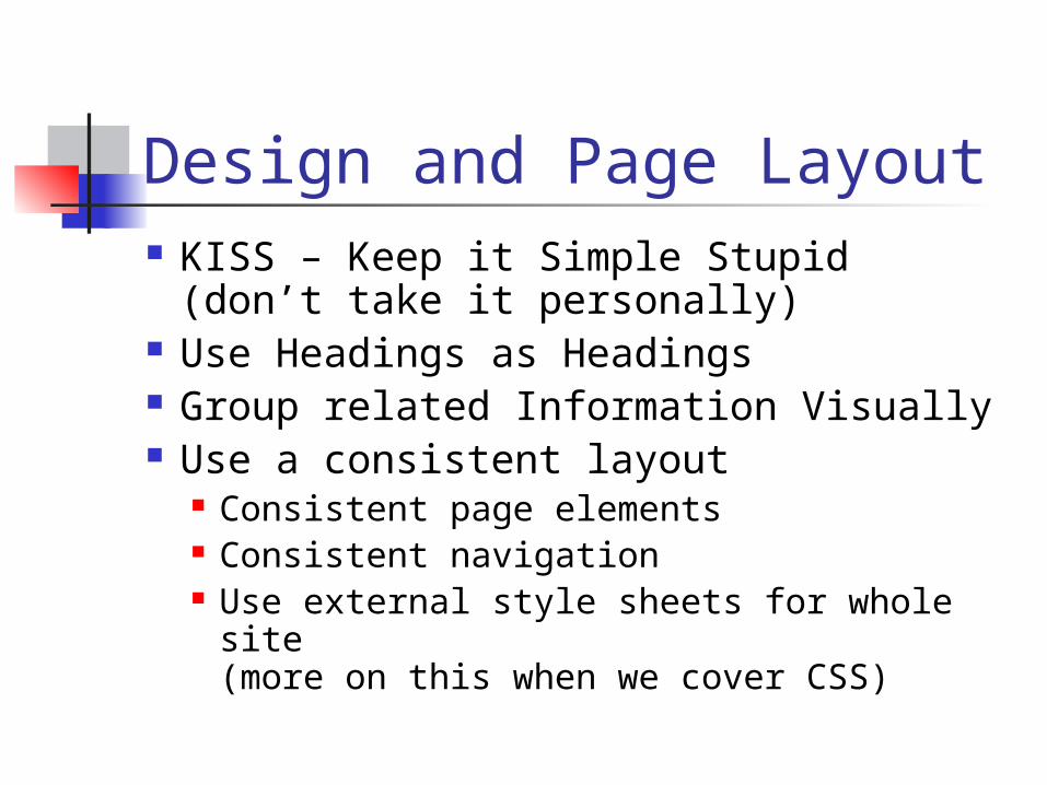
Design and Page Layout KISS – Keep it Simple Stupid
(don’t take it personally) Use Headings as Headings Group related Information Visually Use a consistent layout
Consistent page elements Consistent navigation Use external style sheets for whole
site(more on this when we cover CSS)
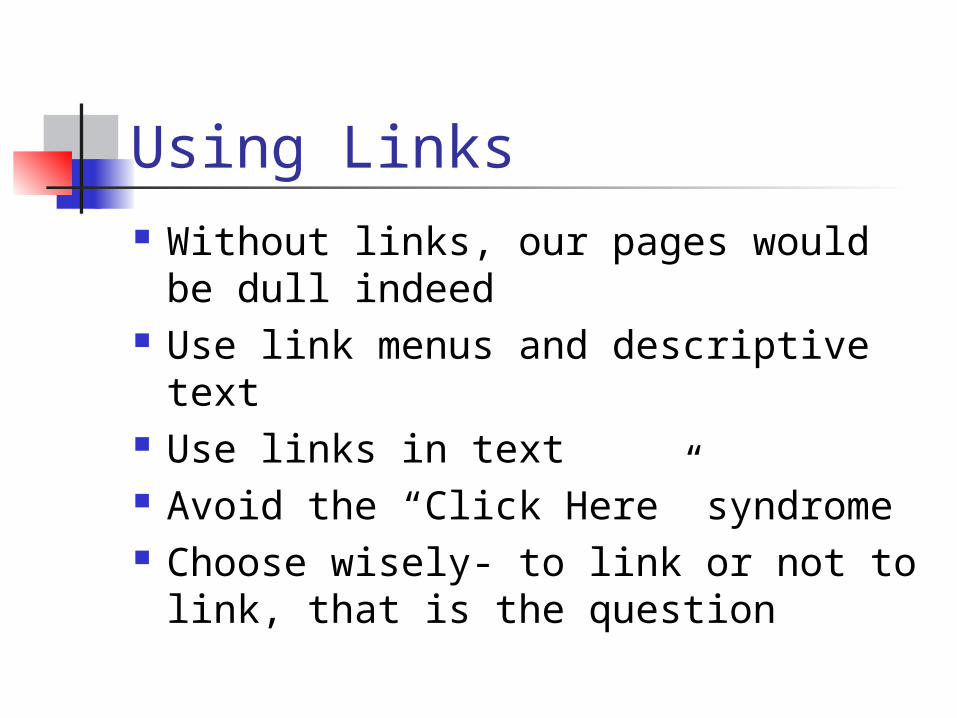
Using Links Without links, our pages would be
dull indeed Use link menus and descriptive text Use links in text Avoid the “Click Here” syndrome Choose wisely- to link or not to link,
that is the question
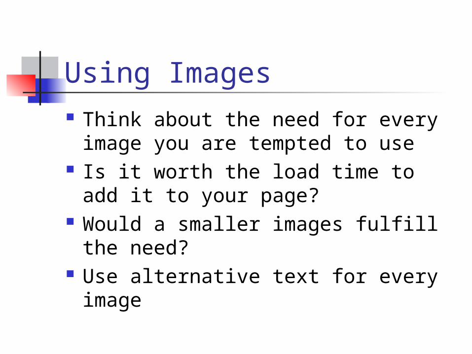
Using Images Think about the need for every
image you are tempted to use Is it worth the load time to add it to
your page? Would a smaller images fulfill the
need? Use alternative text for every image
Watch Backgrounds and Link Colors Poor use of background colors and
images can make your text or links unreadable
Make sure you have enough contrast between background and foreground
Often, increasing font size can make a world of difference
Subtle patterns and colors are best
Other Hints Every page should link back to Home Don’t split topics across pages Don’t create too many or too few
pages Sign your pages, provide contact
information Think about providing non-hypertext
versions of your pages for printability
The Good, the Bad and the Ugly of Web Design:
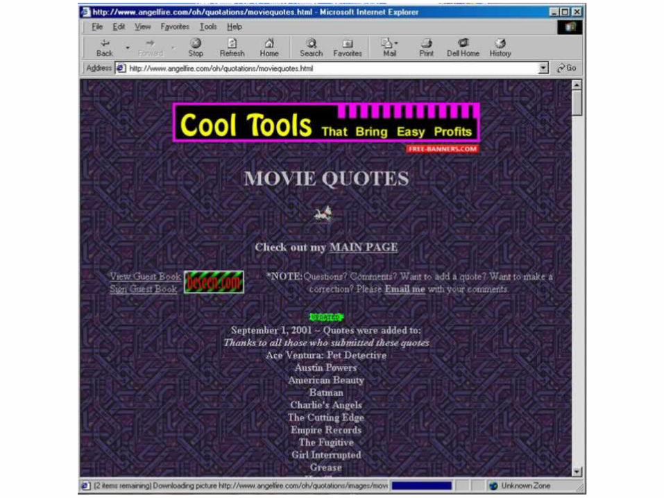
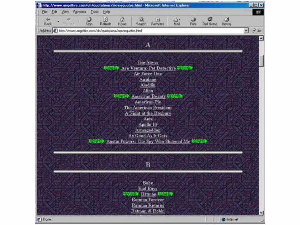
Movie Quote Site Poor background choice Annoying animations: dog and
flashing message board Poor listing of categories
Required scrolling to see alphabetical listing of movies
Poor color choice of updated symbol
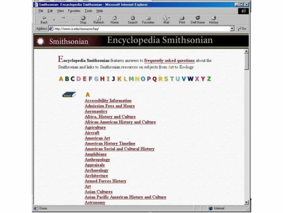
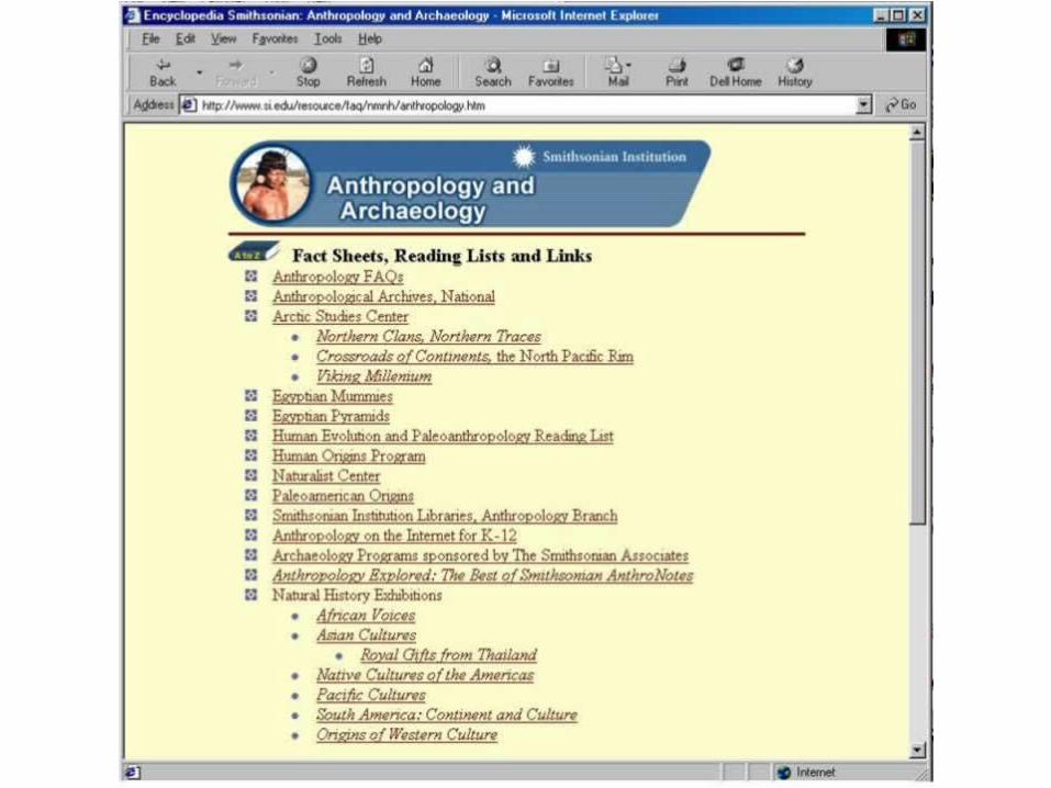
The Smithsonian Encyclopedia Good Navigation Scheme
Alphabetical organization for rapid access
Professional use of color and images Subtle background texture and colors A bit boring, but very readable and
accessible
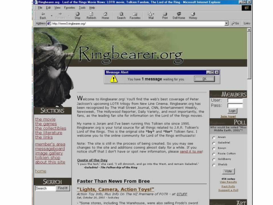
Entertainment Site Used three column format Annoying flashing Alert message Subdued gray background Used “above the fold” organization Navigation links on the left helpful
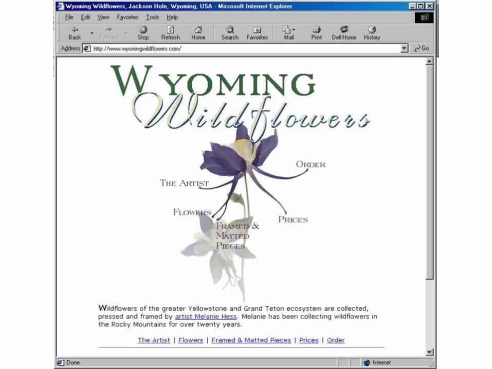
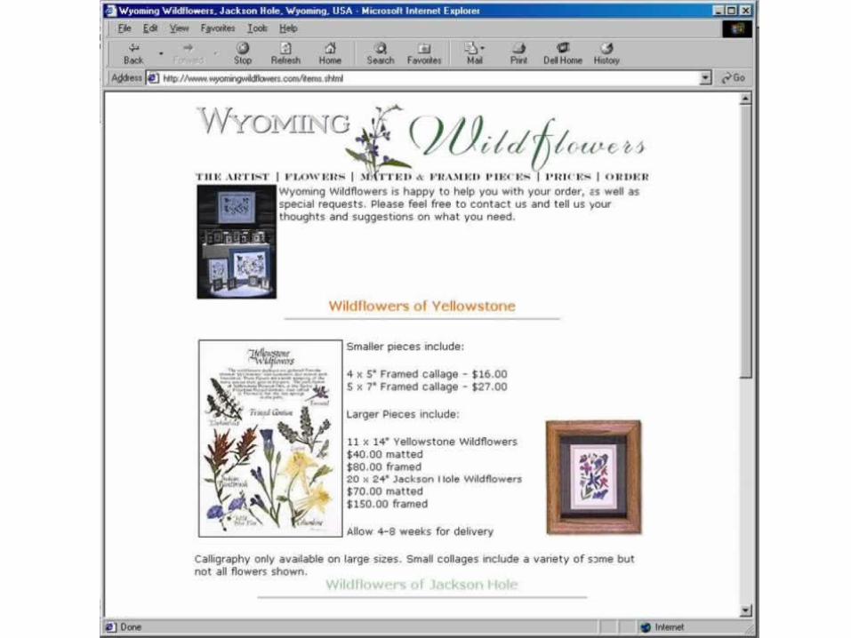
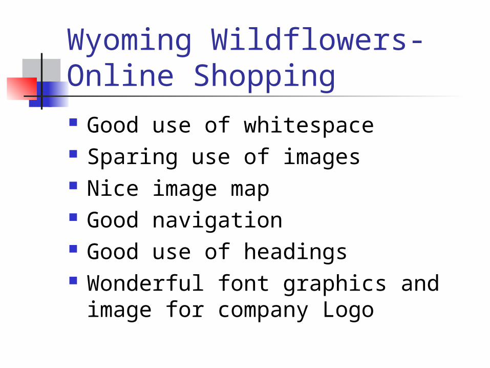
Wyoming Wildflowers- Online Shopping Good use of whitespace Sparing use of images Nice image map Good navigation Good use of headings Wonderful font graphics and image
for company Logo
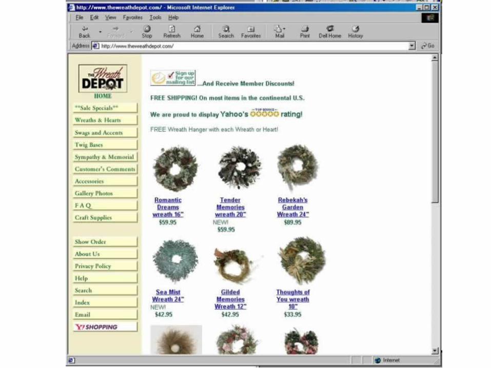
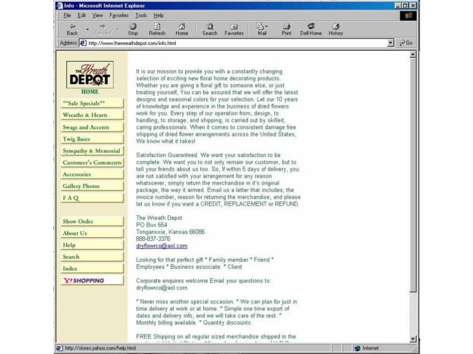
The Wreath Depot-Online Shopping Consistent site look and feel Good navigation Nothing special – boring layout Poor graphic design Green text hard to read for
long paragraphs Poor use of titles and headings
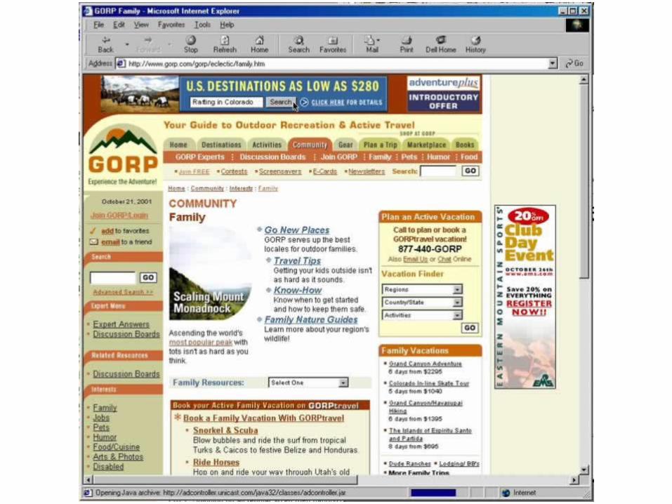
GORP Travel Site- Too Much!!!
Information Overload Seen it all before:
Tabs, Links, Navigation bars, advertising, and several search engines
Interesting color scheme Not a soothing site
Summary Designing a web site
is like designing a book outline, a building plan, or a complicated painting
Having a plan before beginning can help keep details straight
The plan helps guide the project Once the plan is in place, you can focus
on the details