Embed Size (px)
Citation preview
The Politics of Policy: The Initial Mass Political Effects of
Medicaid Expansion in the States∗
Joshua D. Clinton† Michael W. Sances‡
February 21, 2017
Abstract
Whether public policy affects electoral politics by altering the composition of the electorateis an enduring question with an elusive answer. We use variation in the implementation of thehighly contested Patient Protection and Affordable Care Act (ACA) of 2010 resulting from the2012 Supreme Court decision in National Federation of Independent Business v. Sebelius tocompare the political participation of otherwise similar counties in states that differ in termsof their decision to expand Medicaid. Using county-level data on voting and registration, weshow that counties in expansion states experience higher political participation compared tootherwise similar counties in non-expansion states. Moreover, the impact is largest in countieswith above average poverty levels. Despite the partisan politics surrounding the ACA – apolitical environment that differs markedly from social programs producing policy feedbacks inthe past – the evidence is broadly consistent with claims that social policy programs can producepolitical impacts. Participation in the election immediately following the policy implementationis higher via increased turnout among likely recipients, and the impact is larger than would beexpected based on a wealth effect alone.
∗Helpful reactions were provided by participants in the American Politics Workshop at the Department of PoliticalScience at UCLA and the Department of Politics at Princeton University. This work has been supported in part byaward # 94-16-06 from the Russell Sage Foundation. All opinions and errors are our own.†Abby and Jon Winkelried Professor, Professor of Political Science, Vanderbilt University. E-mail:
[email protected]. PMB 505, 230 Appleton Place, Nashville TN, 37203-5721.‡Assistant Professor of Political Science, University of Memphis: [email protected]. 421 Clement Hall, Mem-
phis, TN, 38152.
In addition to affecting the problems that they are designed to address, public policies can
also have important political impacts. The creation of Social Security, for example, not only
sought to address the problem of senior poverty, but it also created a powerful constituency with
a vested political interest that has arguably constrained social policy ever since (Campbell 2003).
Understanding the political effects of public policies is important not only because they may create
constituencies invested in the scope and durability of a particular program, but also because they
may alter the electoral landscape and affect policymaking more broadly as well.
The claim that new policies create a new politics is as old as Schattschneider’s (1935) study
of the tariff in the United States, but it has been taken seriously as an empirical prediction only
recently (Pierson 1993; Campbell 2003; Mettler and Soss 2004). In addition to Campbell’s (2003)
pioneering work on Social Security and senior political activism, scholars have also examined this
hypothesis using social programs involving pension reform (Pierson 1992), welfare (Soss 1999), the
G.I. Bill (Mettler 2002), and the carceral state (Weaver and Lerman 2010) to name but a few.
Despite such important and illuminating investigations, several important questions remain about
the impact and nature of so-called policy feedbacks.
First, existing work on the political impact of social welfare policies focuses on policies that
were passed with bipartisan support and whose continuing existence was not an active partisan
political issue. Consider, for example, the politics of the policies that have been the focus of some
of the most influential analyses: the GI Bill was nearly unanimously supported in Congress, and in
characterizing the politics of Social Security Derthick (1979) remarks that “it would be misleading
to write of opposition to social insurance. Not since 1936...has any important public official or
private organization urged that the program be ended” (132). Even proposals to reform the public
assistance program Aid to Families with Dependent Children in 1962, 1967, 1971, 1981, 1990, and
1996 were passed with bipartisan coalitions.
Given the importance of partisan cues for elite and mass behavior, it is an open question whether
similar effects obtain for a policy passed over the objections of a political party united in opposition
at the national level and whose continued existence has been an issue for several election cycles. Do
the partisan political conditions surrounding a policy affect its ability to produce political impacts?
Are opponents as likely as beneficiaries to become politically engaged as a consequence of the
policy? We explore both of these important questions.
1
Second, establishing causality is an enduring hurdle for those interested in the political im-
pacts of public policy (Campbell 2012). Put succinctly, do policies affect the political behavior of
beneficiaries, or is there something different about these beneficiaries that would have resulted in
the behavior even in the absence of the policy? Does the receipt of a means tested program de-
press participation, for example, or are those eligible for assistance already less likely to participate
because they also possess lower aspiration levels (Bendor 2010; Kosec and Mo 2016) or other hard-
to-observe aspects, such as feelings of deservedness (Schneider and Ingram 1993)? It is often very
difficult to account for how unobservable aspects may affect the relationship between policies and
behavior, and better understanding the connection between policy and behavior requires leveraging
circumstances that are well-suited to identifying the effect of interest whenever possible.
We tackle both of these continuing concerns using the highly salient and important case of the
Patient Protection and Affordable Care Act (ACA) of 2010. Unlike the ephemeral benefits of some
social policies (e.g., tax credits that become most salient at tax time), the policy consequences of the
ACA and the expansion of eligibility for health insurance were prominent, publicized, and a political
issue at least through the 2016 election. The conditions required to produce mass political effects
by a social policy appear to be well-satisfied given the scope, salience, and publicity surrounding
the ACA in general, and the expansion of Medicaid provided by the ACA in the states in particular.
Focusing on the ACA also contributes to our understanding of policy feedbacks because the
politics surrounding its creation and maintenance differ markedly from the policies that have been
previously studied by the policy feedback literature. Unlike policies that were enacted and amended
in situations where the partisan divisions were either muted (e.g., Social Security, AFDC) or non-
existent (e.g., the GI Bill), the politics surrounding the ACA were highly contentious; the law was
enacted along strict party lines – not a single Republican in either the House or the Senate voted
in its favor – and the intensity of the partisan conflict has persisted through several election cycles.
It is unclear whether the political impacts of the ACA are affected by this level of partisan conflict
and whether the heightened partisanship dampers or exacerbates the political effects relative to the
effects that have been found for policies enacted with bipartisan support. For example, are those
opposed to the policy as likely to be as energized as beneficiaries?
The ACA is also particularly well-suited to empirical investigation because the manner in which
it was implemented helps us avoid the confounding factors resulting from selection bias. The Medi-
2

caid expansion under the ACA that took effect starting on January 1, 2014 varies between states as
a result of the 2012 U.S. Supreme Court decision in National Federation of Independent Business v.
Sebelius. The resulting between-state variation provides us with the ability to compare otherwise
similar geographic areas and individuals with vastly different experiences with the law. For exam-
ple, whereas a lower-income individual living in Tennessee near the TN-KY border continues to be
ineligible for Medicaid, an otherwise similar individual living across the border in Kentucky became
newly eligible because of actions taken by their governor. Leveraging this variation, we are able
to identify whether the expansion of Medicaid under the ACA affected political participation at
the county level in the 2014 midterm elections and in the lead-in to the 2016 presidential elections.
Specifically, do counties in states that expanded Medicaid under the ACA experience an increase
in voter turnout and voter registration compared to demographically similar counties in states that
did not?
The identification strategy we employ is important because much of the elite-level discourse
surrounding the Affordable Care Act presumes positive participatory effects for recipients (e.g.,
Novack 2013), but existing research on means-tested programs tend to find null (Sharp 2012) or even
negative (Soss 1999; 2002) effects. Even work focusing on Medicaid itself offers conflicting findings
– Michener (2015) argues for a negative impact of Medicaid on political participation prior to the
ACA, but Haselswerdt (2016) suggests that the expansion of Medicaid under the ACA increased
participation in House races in 2014 relative to 2012. Moreover, it is unclear whether issues related
to selection bias involving means tested programs are responsible for the contradictory findings
– Schneider and Ingram (1993), for example, argue that participants in means-tested programs
may be less likely to participate than those who do not because of differences in unobservable
features that also affect political participation, such as efficacy. By using a geographic-discontinuity
design that compares the change in behavior of otherwise similar counties that experience different
policy environments because of actions take by state leaders, however, we are able to avoid these
confounding effects and identify the impact of Medicaid expansion on participation.
Beyond the more general question of how politically contested social welfare policies might affect
political behavior, examining the impact of the ACA is also important in its own right for what
it reveals about the nature of contemporary politics in the United States. Not only is the ACA
one of the most significant social welfare policies enacted in decades – if not since the 1935 Social
3
Security Act (Balz 2010) – but its continued existence in some form depends critically on its ability
to generate and maintain a supportive constituency in the face of continuing attempts at repeal
and ongoing debates over its effectiveness (Patashnik 2014).
Understanding how the ACA affects the composition of the electorate is also important because
of the well-known finding that political participation in the United States varies by socio-economic
class (e.g., Wolfinger and Rosenstone 1980; Highton and Wolfinger 2001; Schlozman, Verba, and
Brady 2012; Leighley and Nagler 2014), and the related claim that, perhaps as a consequence,
there is an upper-class bias in the the policies that are enacted (Bartels 2008; Hacker and Pierson
2010; Gilens 2012). If so, exploring whether the ACA increases participation among its beneficia-
ries – particularly low-income beneficiaries – is important for understanding how changes in the
composition of the electorate because of the ACA may affect political inequality.
Consistent with the claim that the expansion of Medicaid had detectable policy consequences,
we show the expansion of Medicaid caused a roughly 4% increase in insurance coverage in counties
located in expansion states compared to otherwise similar counties located in non-expansion states.
Further, the increase is concentrated in those counties with above average poverty levels, as would
be expected given the definition of Medicaid eligibility based on the the federal poverty limit.
Moreover, the increase in insurance coverage we detect covaries with an increase in voting behavior.
Comparing the change in the number of votes cast between 2014 and 2012 and 2014 and 2010
reveals more votes cast in counties located in expansion states than in similar counties located
in non-expansion states and the change is concentrated almost entirely in lower income counties.
Comparing the percentage of registered residents in early 2016 relative to the number of registered
voters in late 2012 also reveals an increase in political participation over a different time period
using a different measure of political participation.
While it is theoretically ambiguous whether supporters, opponents, or both would be mobilized
by the expansion of Medicaid under the ACA, our results are most consistent with program ben-
eficiaries being the most impacted. Moreover, because the increase in participation we identify is
greater than the increase we would predict based on income shock that would reflect the monetary
value of the insurance benefits alone, the size of the effect suggests that the increase we identify
is not simply a consequence of increased financial benefits, but also the connection that is created
between personal well-being and government policy.
4
1 The Politics of Medicaid Expansion in the States
The Patient Protection and Affordable Care Act of 2010 (ACA) was the most important legislative
priority of President Barack Obama, and it was a priority on which both the president and his
party were willing to use their filibuster-proof majority in the Senate to ensure passage. As efforts
to craft a bipartisan solution in Congress fell apart, the parties took divergent views about the
desirability and expected impact of the bill. Eventually, the Democrats passed the bill into law
without a single Republican vote in Congress. The partisan divide on the ACA was exceptional,
and far different from the bipartisan coalitions that had enacted earlier prominent social programs
such as the 1935 Social Security Act or the Servicemen’s Readjustment Act of 1944 (the so-called
“G.I. Bill”). Reflecting these partisan political divisions, the enactment is often referred to as
“Obamacare” and it continues to be a highly salient political issue at both the state and national
levels as of 2017.
The ACA aimed to cut health care costs by increasing the percentage of insured citizens and,
in so doing, to increase access to preventive care. To achieve this goal, the law provided for
federal subsidies to help underwrite the insurance costs of individuals making between 100% and
400% of the federal poverty limit. Importantly, those making less than 138% of the poverty limit
would also be eligible for the public Medicaid insurance program. Prior to the ACA, Medicaid
eligibility varied by state, but there were generally a significant portion of low-income, childless
adults without insurance (Brooks et al. 2015). For example, in the 28 states expanding Medicaid
as of January 2015, the median Medicaid eligibility limit was 106% of the federal poverty limit for
parents and 0% for childless adults (the federal poverty limits for 2014 were $19,790 for a family
of 3 and $11,670 for an individual); with the expansion of Medicaid, these eligibility limits were
increased to 138% of the federal poverty line for both groups. One estimate – based on data from
the American Community Survey conducted by the U.S. Census Bureau and accounting for the
varying eligibility limits between states – is that 7.8 million became newly eligible for Medicaid as
of July 2015 because of the ACA (FamiliesUSA 2015).
While the ACA presumed the federal government could compel the states to expand Medicaid
using the threat of federal aid, this provision was ruled unconstitutional by the US Supreme Court.
In its 2012 decision in National Federation of Independent Business v. Sebelius, the Court ruled that
the federal government could not force states to expand Medicaid, and the decision of whether or
5
not to expand Medicaid in a state was consequently left to the discretion of the states themselves.1
The aftermath of this ruling created a patchwork pattern of Medicaid expansion across the country
when the law took effect on January 1, 2014.
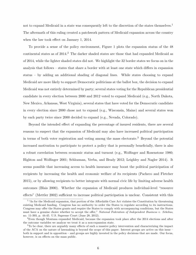
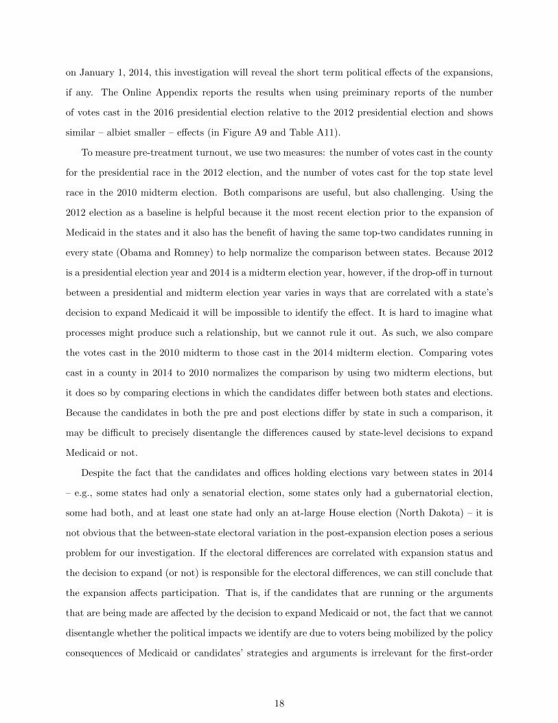
To provide a sense of the policy environment, Figure 1 plots the expansion status of the 48
continental states as of 2014.2 The darker shaded states are those that had expanded Medicaid as
of 2014, while the lighter shaded states did not. We highlight the 32 border states we focus on in the
analysis that follows – states that share a border with at least one state which differs in expansion
status – by adding an additional shading of diagonal lines. While states choosing to expand
Medicaid are more likely to support Democratic politicians at the ballot box, the decision to expand
Medicaid was not entirely determined by party; several states voting for the Republican presidential
candidate in every election between 2000 and 2012 voted to expand Medicaid (e.g., North Dakota,
New Mexico, Arkansas, West Virginia), several states that have voted for the Democratic candidate
in every election since 2000 chose not to expand (e.g., Wisconsin, Maine) and several states won
by each party twice since 2000 decided to expand (e.g., Nevada, Colorado).
Beyond the intended effect of expanding the percentage of insured residents, there are several
reasons to suspect that the expansion of Medicaid may also have increased political participation
in terms of both voter registration and voting among the mass electorate.3 Beyond the potential
increased motivation to participate to protect a policy that is personally beneficially, there is also
a robust correlation between economic status and turnout (e.g., Wolfinger and Rosenstone 1980;
Highton and Wolfinger 2001; Schlozman, Verba, and Brady 2012; Leighley and Nagler 2014). It
seems possible that increasing access to health insurance may boost the political participation of
recipients by increasing the health and economic welfare of its recipients (Pacheco and Fletcher
2015), or by allowing recipients to better integrate with normal civic life by limiting adverse health
outcomes (Blais 2000). Whether the expansion of Medicaid produces individual-level “resource
effects” (Mettler 2002) sufficient to increase political participation is unclear. Consistent with this
1“As for the Medicaid expansion, that portion of the Affordable Care Act violates the Constitution by threateningexisting Medicaid funding. Congress has no authority to order the States to regulate according to its instructions.Congress may offer the States grants and require the States to comply with accompanying conditions, but the Statesmust have a genuine choice whether to accept the offer,” National Federation of Independent Business v. Sebelius,no. 11-393, p. 44-45. U.S. Supreme Court (June 28, 2012).
2Even though Montana expanded Medicaid, because the expansion took place after the 2014 elections and afterthe outcome variables we analyze we treat it as a non-expansion state.
3To be clear, there are arguably many effects of such a massive policy intervention and characterizing the impactof the ACA on the nature of lawmaking is beyond the scope of this paper. Interest groups are active on this issue –both in support and in opposition – and groups are highly invested in the policy decisions that are made. Our focus,however, is on effects on the mass public.
6
Figure 1: Status of Medicaid Expansion in the States as of 2014. States shaded in darkgray are participating in the ACA’s Medicaid expansion as of 2014. States that border anotherstate with a different expansion status are indicated with diagonal line shading.
possibility, work by Burden et al (2016) suggests that an increase in financial (and mental) health
provides an increased ability to overcome the costs associated with political participation and the
results of a randomized controlled experiment in Oregon involving Medicaid expansion (Baicker et
al. 2013) reveal some evidence of an increase in mental and financial heath (but not physiological
health).
Increased participation by recipients of the expanded Medicaid program may also occur because
of the connection between the ACA and the 1993 National Voter Registration Act (NVRA). The
NVRA requires that departments of motor vehicles and other public assistance agencies provide
voter registration services in addition to their normal social services. Because the health exchanges
created by the Affordable Care Act are public assistance agencies according to the Department of
Health and Human Services, the process by which individuals register for health insurance must also
allow them to be able to register to vote. In fact, some individuals tasked with helping individuals
sign up for health insurance – so-called navigators – were also actively engaged in voter registration
efforts.4 Because barriers related to registration are often cited as a key reason for low turnout in the
4To date, the Department of Health and Human Services has not legally required navigators to actively registernew enrollees to vote despite lobbying efforts by some interest groups such as Project Vote (Eichelberger 2014). Whilesome states have decided to enforce voter registration requirements through the ACA (e.g., California), the practiceis not universal and it is currently left to the discretion of the states themselves (Novack 2013). The states who havepublicly announced an active enforcement of the NVRA include: CA, CT, MD, NY, RI, and VT, but the ACA islinked to the NVRA in every state.
7
U.S. relative to other advanced democracies (Powell 1986) – and some conservative commentators
have decried the ACA specifically because of its connection to voter registration efforts, claiming
that “there is obviously massive Democrat voter registration going on at these exchanges” (Roth
2014) – it seems possible that the explicit connection between the ACA and the NVRA could help
increase participation. If navigators were more likely to contact and help register Medicaid-eligible
citizens in states with Medicaid expansion relative to states in which Medicaid was not expanded
(and where citizens presumably were less likely to come into contact with the navigators and other
ACA resources that might lead them to register to vote) this could produce differential political
participation based on the expansion of Medicaid in the state.
While the existing policy feedback literature emphasizes the mobilization of policy beneficiaries,
and the preceding discussion provides reasons to suspect a positive effect on political participation
among beneficiaries, the clarity of the policy feedback involving the expansion of Medicaid under
the ACA is far more complicated than previously examined policies. Precisely because a national
debate over the continued existence of the ACA has persisted since its enactment, there is no reason
to think that mobilization occurs only, or even primarily, among policy beneficiaries (Haselswerdt
2016). If voters are motivated to participate against policies they disagree with – perhaps follow-
ing a so-called thermostatic model of behavior (Soroka and Wlezien 2010; Bendz 2015) – citizens
opposed to Medicaid expansion may be as motivated to increase their participation as policy bene-
ficiaries. It is an open question whether and how the partisan circumstances surrounding the ACA
affect the policy’s impact on political participation. For example, if opponents of the ACA and
Medicaid expansion are also mobilized by expansion, are opponents reacting to the expansion in
expansion states more motivated than opponents seeking to prevent the expansion of Medicaid in
non-expansion states? The relative mobilization of these two groups has obvious implications for
whether expansion increases or decreases participation.
The ambiguity in the expected effects of Medicaid expansion on political participation is further
heightened because of uncertainties about the ability of social welfare programs to mobilize newly
eligible recipients. While some argue that universalistic social programs are likely to produce
positive benefits (Skocpol 1991; Wilson 1987), research on the impact of means-tested programs
tends to find null (Sharp 2012) or even negative (e.g., Soss 1999; 2002; Mettler and Stonecash
2008) impacts on participation. Besides the demobilizing impact that the stigmatization related
8
to the means-testing may produce (e.g., Schneider and Ingram 1993), the fact that the policy
is so politicized may further adversely affect the ability of the program to mobilize beneficiaries.
Republican beneficiaries, for example, may follow elite cues and oppose a policy they personally
benefit from (Kliff 2016). The level of persistent partisan conflict over the issue of Medicaid
expansion presents a unique opportunity to explore the policy feedbacks of a social welfare program
on political participation, and whether the conflict affects political participation among beneficiaries
and opponents.
2 Effect of Medicaid Expansion on Insurance Coverage
We begin by exploring whether the decision to expand Medicaid produced a detectable impact on
insurance coverage. To the extent that there is a sizable policy impact, the political impacts of
resource effects that were hypothesized in the prior section are possible. Existing work has examined
randomly assigned Medicaid eligibility in Oregon to argue that Medicaid has positive health and
wealth benefits for its recipients (Finkelstein et al. 2012), as well as pre-ACA Medicaid expansions’
effect on mortality rates (e.g., Sommers et al. 2012), but we focus on the more immediate impact
of whether insurance coverage increases as a result of changes in eligibility induced by the ACA.
Insofar as the expansion of Medicaid produces a tangible increase in the percentage of residents
with health insurance coverage, it seems possible that the connection between policy consequences
and policy can be perceived and appreciated by citizens (Arnold 1990) so as to provide a reasonable
expectation of the political impacts discussed in the prior section.5
Prior work quantifying the impact of policy on politics has largely relied on cross-sectional vari-
ation in the self-reported behavior of survey respondents (e.g., Soss 1999; Mettler and Stonecash
2008). While much can be learned from such studies, it is difficult to assess whether observed
relationships are due to policy feedback or pre-existing differences in the (potentially unobservable)
characteristics of beneficiaries. There are many potential ways in which those who receive a pro-
gram may differ from those who do not, especially when considering means-tested programs with
eligibility criteria that select based on characteristics that are known to be related to decreased
5Of course, given the nature of the policy and the fact that its’ implementation varied state-to-state there are alsosignificant challenges to policy attribution. Our question is whether the expansion of Medicaid produced an increasein turnout; the related question as to whether citizens were aware of the role that the ACA played in the expansion isbeyond the scope of this project but obviously important for assessing the ability of the policy to create an investedconstituency.
9
political participation (Schlozman, Verba, and Brady 2012). In addition, unobservable character-
istics such as lower aspiration levels (Bendor 2010; Kosec and Mo 2016) or increased feelings of
stigmatization or undeservedness (Schneider and Ingram 1993) that may be more prevalent among
eligible beneficiaries can complicate efforts to identify the impact of the policy on participation.
If such unobservable differences exist, for example, it is impossible to determine whether observed
differences are due to the policy or to underlying and unobservable features that are more prevalent
in the affected population using cross-sectional variation.6
To avoid the difficult selection issues involved with characterizing the impact of expanding
Medicaid under the ACA, we leverage the spatial policy discontinuities (Holmes 1984; Card and
Krueger 1994; Dell 2010; Dube et. al 2010; Lee and Lemieux 2010; Keele and Titiunik 2015; Keele
et al. 2016) produced by the 2012 Supreme Court decision in National Federation of Independent
Business v. Sebelius. The basic idea behind our identification strategy is that while states differed in
their decision to expand Medicaid or not following the decision of the Supreme Court, the expansion
of Medicaid in each state is exogenous to the behavior of otherwise similar individuals who reside
near the border of states that differ in their decision regarding Medicaid expansion.7 Because such
border counties are presumably not pivotal for whether states expanded Medicaid, comparing how
otherwise similar individuals (living in counties) behave depending on whether their state expands
Medicaid provides an estimate of the impact of Medicaid expansion on political participation that
is unaffected by selection bias.
When the Medicaid expansion under the ACA took effect on January 1, 2014, there were 36
instances in which an expansion and non-expansion state shared a common border – including
states that shared only a small corner border (e.g. Oklahoma-New Mexico) and those sharing
longer borders (e.g., Virginia-West Virginia and Tennessee-Kentucky). To measure the relative
change in insurance status between expansion and non-expansion states to determine the policy
impact of the expansion, we use estimates of insurance coverage provided by Enroll America.8
6See Weaver and Lerman (2010) for a longitudinal analysis of the political impact of incarceration that is able toavoid such issues.
7Put differently, insofar as counties located near the border of a neighboring state were not pivotal for the expansionof Medicaid we can treat the expansion as exogenous to their decision. This assumption seems reasonable – especiallyfor comparisons involving poorer counties where low rates of turnout are unlikely to make them pivotal in statewideelections.
8See https://www.enrollamerica.org/research-maps/maps/changes-in-uninsured-rates-by-county/. The data aregenerated using a targeting model based on public and proprietary data, and while Enroll America is an advocacygroup, there is no reason to suspect their estimates are biased given their interest in properly measuring insurancecoverage so as to effectively target uninsured citizens for enrollment in health insurance.
10
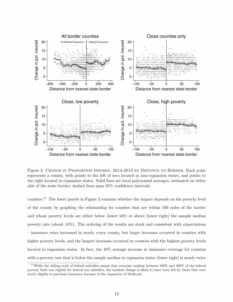
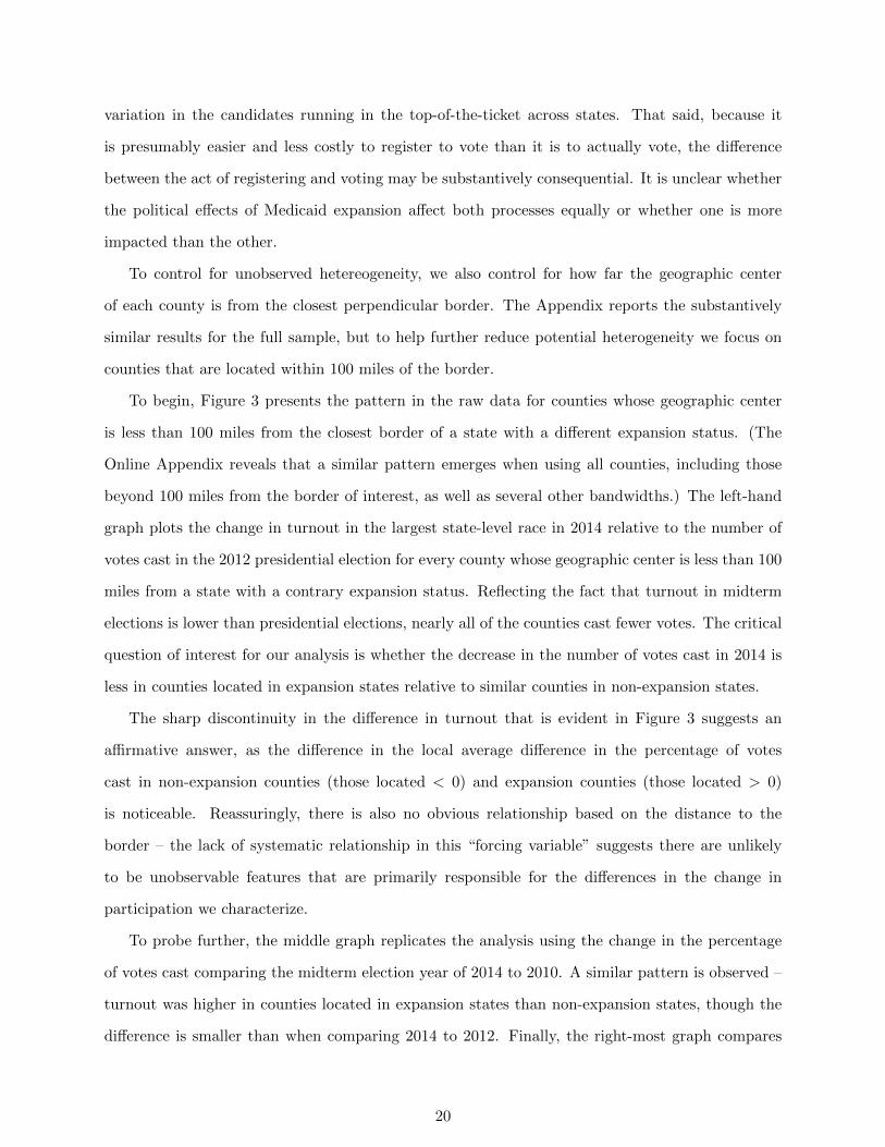
To characterize how the change in the percentage of insured residents differs between counties
in states that did and did not expand Medicaid, Figure 2 plots the county-level changes in the
percentage of insured residents between 2013 and 2014 against the distance (in miles) that the
geographic center of each county is from the closest border with a state with a different expansion
status.9 Each point in Figure 2 represents a county in a state that borders a state with a different
expansion status and negative numbers on the horizontal axis indicate being further from the border
of an expansion state, and positive numbers indicate increased distance from a state that has not
expanded Medicaid. Thus, points to the right of 0 are county-level changes in the percentage of
insured residents in states expanding Medicaid and points to the left of 0 are county level changes
in states opting not to. The solid lines represent moving averages generated by a local polynomial
smoother, which we allow to vary for either side of the threshold.
The upper-left plot in Figure 2 presents the relationship for all counties in the 32 border states.10
To account for potential hetereogeneity in the county comparisons, the upper right plot focuses the
comparison to only those counties whose geographic centers are within 100 miles of the nearest
border. Several conclusions emerge. First, the percentage of insured residents between 2013 and
2014 increases in nearly every county – presumably due to the provisions in the ACA that were
nationally applicable (e.g., the required coverage of pre-existing conditions and dependents under
the age of 26). Second, the average change in the percentage of insured residents between 2013
and 2014 increases sharply at the border. In fact, except for a few counties in non-expansion states
that are located more than 400 miles from the border of the closest bordering state that chose to
expand Medicaid, the average change in the percentage of insured residents is uniformly higher in
counties that are located in states that chose to expand Medicaid.
Although many provisions of the ACA were nationally applicable, access to insurance by the
less fortunate – and especially the less fortunate without children – depended critically on the
state’s decision to expand Medicaid. Because the means-tested benefits of Medicaid expansion
applied to those making between the state-determined eligibility income limit and 138% of the
federal poverty limit, the average change in insurance coverage should be largest in low-income
9We compare 2013 to 2014 because the expansions took effect in January 2014. For this and all other analyses ofdistance, we rely on the distance in miles measure from Holmes (1998). In cases where a county occurs in more thanone relevant border – for example, treated counties in the southeast corner of Arkansas border control counties inboth Mississippi and Louisiana – we use only the border with the shortest distance to the county. This ensures thateach county is included only once in our analyses.
10The number of states drops from 36 to 32 due to our dropping instances where a county is located in more thanone relevant border. Please see the previous footnote.
11
No Medicaid Expansion ← → Medicaid Expansion
0
5
10
15
20
Change in p
ct. insure
d
−600 −400 −200 0 200 400
Distance from nearest state border
All border counties
0
5
10
15
20
Change in p
ct. insure
d
−100 −50 0 50 100
Distance from nearest state border
Close counties only
0
5
10
15
20
Change in p
ct. insure
d
−100 −50 0 50 100
Distance from nearest state border
Close, low poverty
0
5
10
15
20
Change in p
ct. insure
d
−100 −50 0 50 100
Distance from nearest state border
Close, high poverty
Figure 2: Change in Proportion Insured, 2014-2013 by Distance to Border. Each pointrepresents a county, with points to the left of zero located in non-expansion states, and points tothe right located in expansion states. Solid lines are local polynomial averages, estimated on eitherside of the state border; dashed lines span 95% confidence intervals.
counties.11 The lower panels in Figure 2 examine whether the impact depends on the poverty level
of the county by graphing the relationship for counties that are within 100 miles of the border
and whose poverty levels are either below (lower left) or above (lower right) the sample median
poverty rate (about 14%). The ordering of the results are stark and consistent with expectations
– insurance rates increased in nearly every county, but larger increases occurred in counties with
higher poverty levels, and the largest increases occurred in counties with the highest poverty levels
located in expansion states. In fact, the 10% average increase in insurance coverage for counties
with a poverty rate that is below the sample median in expansion states (lower right) is nearly twice
11While the sliding scale of federal subsidies meant that everyone making between 100% and 400% of the federalpoverty limit was eligible for federal tax subsidies, the starkest change is likely to have been felt by those that werenewly eligible to purchase insurance because of the expansion of Medicaid.
12
as great as the 5% increase in counties with lower than median poverty levels in non-expansion
states (lower left). Moreover, the increase in insurance coverage in the less-impoverished counties in
expansion states nearly equals the increase that occurs in the more impoverished counties located
in non-expansion states. Consistent with expectations, Figure 2 reveals that the smallest increase
in insurance coverage occurs in relatively well-off counties located in non-expansion states.
Figure 2 strongly suggests that the decision to accept federal subsidies for the purposes of
expanding Medicaid to those making up to 138% of the federal poverty line increased the percentage
of insured residents in the state - especially in counties with higher poverty rates. To quantify the
impact more precisely, we estimate the following regression for ∆Icsb – the change in the percentage
of insured residents between 2014 and 2013 in county c in state s at border b:
∆Icsb = αTs + βdcsb + γ (Ts × dcsb) + Xcsbπ + ecsb (1)
where α is the average conditional effect of expansion, Ts is an indicator for whether the state
expanded Medicaid (1) or not (0), dcsb is a measure of distance (in miles) of county c from the closest
border b of a neighboring state with a different treatment status, and X is a vector of county-level
covariates that includes lagged percentage uninsured. The perpendicular distance to the closest
border is used as a “forcing variable” to control for other relevant but omitted characteristics and
allow for the possibility that closer counties are more similar.12 ecsb denotes idiosyncratic errors,
which we cluster by state using the wild bootstrap of Cameron et al. (2008) to account for the
small number of clusters.
To better compare the relative magnitude of the impact in counties based on the proportion
of residents that are living in poverty – and therefore eligible for Medicaid expansion – we extend
12Distance is in miles, and is the distance from the county’s centroid to the relevant state border and it waspreviously used by Holmes (1998). This assumes that, conditional on covariates, the impact is the same at differentpoints along the same border between states (Keele and Titiunik 2015). In our case, we believe this is a sensibleassumption given that the policy is administered at the state level. Because our measure is the distance to the closestborder – rather than the distance to a matched observation (as is the case in Keele et al. 2016) – a unidimensionalmeasure based on geographic distance is more appropriate in this particular instance. Conceptually, what matters forus is how far the county is from the border where Medicaid expansion status differs, not how far the county is froman otherwise similar county. Even so, we also use covariates and fixed-effects to control for confounding differencesalong and between borders, and we never find any indication of an impact based on distance to the closest border.Following Keele and Titiunik (2015), we also control for two-dimensional distance in Table A10 in the Appendixreveals that the results are unchanged.
13
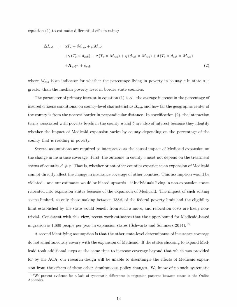
equation (1) to estimate differential effects using:
∆Icsb = αTs + βdcsb + µMcsb
+γ (Ts × dcsb) + ν (Ts ×Mcsb) + η (dcsb ×Mcsb) + δ (Ts × dcsb ×Mcsb)
+Xcsbπ + ecsb (2)
where Mcsb is an indicator for whether the percentage living in poverty in county c in state s is
greater than the median poverty level in border state counties.
The parameter of primary interest in equation (1) is α – the average increase in the percentage of
insured citizens conditional on county-level characteristics Xcsb and how far the geographic center of
the county is from the nearest border in perpendicular distance. In specification (2), the interaction
terms associated with poverty levels in the county µ and δ are also of interest because they identify
whether the impact of Medicaid expansion varies by county depending on the percentage of the
county that is residing in poverty.
Several assumptions are required to interpret α as the causal impact of Medicaid expansion on
the change in insurance coverage. First, the outcome in county c must not depend on the treatment
status of counties c′ 6= c. That is, whether or not other counties experience an expansion of Medicaid
cannot directly affect the change in insurance coverage of other counties. This assumption would be
violated – and our estimates would be biased upwards – if individuals living in non-expansion states
relocated into expansion states because of the expansion of Medicaid. The impact of such sorting
seems limited, as only those making between 138% of the federal poverty limit and the eligibility
limit established by the state would benefit from such a move, and relocation costs are likely non-
trivial. Consistent with this view, recent work estimates that the upper-bound for Medicaid-based
migration is 1,600 people per year in expansion states (Schwartz and Sommers 2014).13
A second identifying assumption is that the other state-level determinants of insurance coverage
do not simultaneously covary with the expansion of Medicaid. If the states choosing to expand Med-
icaid took additional steps at the same time to increase coverage beyond that which was provided
for by the ACA, our research design will be unable to disentangle the effects of Medicaid expan-
sion from the effects of these other simultaneous policy changes. We know of no such systematic
13We present evidence for a lack of systematic differences in migration patterns between states in the OnlineAppendix.
14
changes, and reassuringly for this assumption, in the Online Appendix we show that measurable
covariates do not change discontinuously at state borders in our sample. Even if such confounding
effects exist, α still provides an upper bound for the average effect of Medicaid expansion because
the confounding effects, if any, would only impact a subset of the states.
Finally, it must be the case that we can use the trend of insurance coverage in non-expansion
states to estimate the counterfactual of what would have occurred had the expansion states not
expanded Medicaid. The assumption that expansion and non-expansion states are on parallel paths
with respect to insurance coverage requires that the change in insurance coverage for expansion
and non-expansion states are equal, on average, conditional on the included covariates. If so, we
can use the trend we observe in non-expansion states to estimate what would be expected to occur
in the expansion states had they chosen to not expand Medicaid. The Online Appendix reports
several examinations we conduct to determine whether there is any evidence of this assumption
being violated. Using several so-called placebo tests for changes in political participation using
election results from 2004, 2006, 2008, 2010 and 2012, we find effects that are either near zero or,
in one instance, in the opposite direction of our findings.14
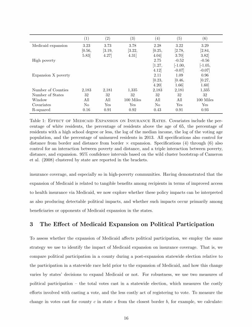
Table 1 reports the results of estimating specification (1) and reveals reassuringly stable results
regardless of whether or not covariates are included and regardless of whether all counties or only
those within 100 miles are analyzed. Specifications (1) - (3) reveal that the expansion of Medicaid
increased the proportion insured in a county, on average, by between 3.2 and 3.8 percentage points.
Specifications (4) - (6) estimate the interactive specification described by equation (2) that allows
the impact of Medicaid expansion to depend on the percentage of the county living in poverty.
This differential increase in the percentage of insured residents is roughly 1-2 percentage points
regardless of whether covariates are (4) or are not used (5), or whether we focus only on those
counties that are located within 100 miles of the border (6) the results are similar and consistent
with the pattern evident in Figure 2 – the impact of Medicaid expansion is greater in expansion
states, but especially so in the most impoverished counties.
Together, these findings suggest that the decision to expand Medicaid had a positive impact on
14We do find a positive and significant impact when we examine turnout in 2010 relative to previous elections, butthe estimate is significantly smaller than the effect we estimate for 2014 and it seems likely that the increase is due toanticipatory policy effects caused by the adoption of the ACA prior to the 2010 midterm elections. An anticipatoryeffect is still a policy feedback effect worth identifying because the effect of expectations can also be important formobilizing voters – although presumably not as important as actual policy consequences. We also show in the OnlineAppendix that this may be due to the distribution of Senate seats and the fact that expansion states had more Senateraces being held in 2010.
15
(1) (2) (3) (4) (5) (6)
Medicaid expansion 3.23 3.73 3.78 2.28 3.22 3.29[0.56, [3.19, [3.22, [0.25, [2.78, [2.84,5.83] 4.27] 4.31] 4.04] 3.70] 3.82]
High poverty 2.75 -0.52 -0.56[1.27, [-1.00, [-1.05,4.12] -0.07] -0.07]
Expansion X poverty 2.11 1.09 0.96[0.23, [0.46, [0.27,4.20] 1.66] 1.60]
Number of Counties 2,183 2,181 1,335 2,183 2,181 1,335Number of States 32 32 32 32 32 32Window All All 100 Miles All All 100 MilesCovariates No Yes Yes No Yes YesR-squared 0.16 0.91 0.92 0.43 0.91 0.93
Table 1: Effect of Medicaid Expansion on Insurance Rates. Covariates include the per-centage of white residents, the percentage of residents above the age of 65, the percentage ofresidents with a high school degree or less, the log of the median income, the log of the voting agepopulation, and the percentage of uninsured residents in 2013. All specifications also control fordistance from border and distance from border × expansion. Specifications (4) through (6) alsocontrol for an interaction between poverty and distance, and a triple interaction between poverty,distance, and expansion. 95% confidence intervals based on the wild cluster bootstrap of Cameronet al. (2008) clustered by state are reported in the brackets.
insurance coverage, and especially so in high-poverty communities. Having demonstrated that the
expansion of Medicaid is related to tangible benefits among recipients in terms of improved access
to health insurance via Medicaid, we now explore whether these policy impacts can be interpreted
as also producing detectable political impacts, and whether such impacts occur primarily among
beneficiaries or opponents of Medicaid expansion in the states.
3 The Effect of Medicaid Expansion on Political Participation
To assess whether the expansion of Medicaid affects political participation, we employ the same
strategy we use to identify the impact of Medicaid expansion on insurance coverage. That is, we
compare political participation in a county during a post-expansion statewide election relative to
the participation in a statewide race held prior to the expansion of Medicaid, and how this change
varies by states’ decisions to expand Medicaid or not. For robustness, we use two measures of
political participation – the total votes cast in a statewide election, which measures the costly
efforts involved with casting a vote, and the less costly act of registering to vote. To measure the
change in votes cast for county c in state s from the closest border b, for example, we calculate:
16
∆Ycsb =(
TotalV otescsb,postV otingAgePopulationcsb,post
)−(
TotalV otescsb,preV otingAgePopulationcsb,pre
).
We face several issues when relating Medicaid expansion to political participation. Because laws
governing who is eligible to vote – e.g., laws related to the voting eligibility of felons (Meredith and
Morse 2015) – as well as the administration of elections vary by state, both Medicaid expansion
and laws potentially related to voter participation vary between states. By examining over-time
changes in county-level turnout, however, we are able to identify the effect of Medicaid expansion as
long as the administrative differences affecting political participation do not change concurrently
with the expansion of Medicaid. That is, because we focus on the change at the county level,
stable between-state (or between-county) differences in the administration of elections cannot be
responsible for the differences we find.15
To measure the number of votes cast in a county in 2014 and 2010, we use official turnout
statistics when available. If not, we use the number of ballots cast in the largest, most competitive,
statewide race.16 To measure turnout in 2012, we use county-level presidential election results
obtained from Congressional Quarterly’s Voting and Elections Collection.17 To measure county-
level registration, we use proprietary voter files from the company TargetSmart that were current
as of Election Day in 2012, as well as those that are current as of early 2016.18 Thus, the count
of the number of registered voters in a county as of 2012 reflects mobilization efforts related to the
2012 presidential election, but the registration data for 2016 were collected prior to any general
election mobilization efforts.
To measure the change in voting and registration behavior in a county over time we use several
comparisons. There has only been one national election following the 2012 Supreme Court decision
that resulted in expansion being made on a state-by-state basis, and we therefore measure post-
treatment turnout using the top statewide race in the 2014 midterm election. Because the policy
was an issue in nearly every race and the 2014 election occurred shortly after the law taking effect
15Moreover, even if some changes in the administration of elections affecting voter participation did occur, theywould presumably occur in a subset of the counties and states we examine; the existence of time-varying confoundersin some counties (or states) would make the average effect we identify the upper bound of the political effects ofMedicaid expansion.
16As the Online Appendix explains, our coding rule is: use total ballots cast if available. If not, and if there isa Senate race but no Governor race, use the Senate race. If there is a Governor race but no Senate race, use thegubernatorial race. If both races are being held, use the more competitive race, and if there is neither, use Houseraces.
17See http://library.cqpress.com/elections/.18Note the voter files we use to construct the county-level measure of voter registration was the count based on
the voter files that were current as of 2012 – they are not simply based on the historical voting behavior of thosecurrently registered in 2016.
17
on January 1, 2014, this investigation will reveal the short term political effects of the expansions,
if any. The Online Appendix reports the results when using preiminary reports of the number
of votes cast in the 2016 presidential election relative to the 2012 presidential election and shows
similar – albiet smaller – effects (in Figure A9 and Table A11).
To measure pre-treatment turnout, we use two measures: the number of votes cast in the county
for the presidential race in the 2012 election, and the number of votes cast for the top state level
race in the 2010 midterm election. Both comparisons are useful, but also challenging. Using the
2012 election as a baseline is helpful because it the most recent election prior to the expansion of
Medicaid in the states and it also has the benefit of having the same top-two candidates running in
every state (Obama and Romney) to help normalize the comparison between states. Because 2012
is a presidential election year and 2014 is a midterm election year, however, if the drop-off in turnout
between a presidential and midterm election year varies in ways that are correlated with a state’s
decision to expand Medicaid it will be impossible to identify the effect. It is hard to imagine what
processes might produce such a relationship, but we cannot rule it out. As such, we also compare
the votes cast in the 2010 midterm to those cast in the 2014 midterm election. Comparing votes
cast in a county in 2014 to 2010 normalizes the comparison by using two midterm elections, but
it does so by comparing elections in which the candidates differ between both states and elections.
Because the candidates in both the pre and post elections differ by state in such a comparison, it
may be difficult to precisely disentangle the differences caused by state-level decisions to expand
Medicaid or not.
Despite the fact that the candidates and offices holding elections vary between states in 2014
– e.g., some states had only a senatorial election, some states only had a gubernatorial election,
some had both, and at least one state had only an at-large House election (North Dakota) – it is
not obvious that the between-state electoral variation in the post-expansion election poses a serious
problem for our investigation. If the electoral differences are correlated with expansion status and
the decision to expand (or not) is responsible for the electoral differences, we can still conclude that
the expansion affects participation. That is, if the candidates that are running or the arguments
that are being made are affected by the decision to expand Medicaid or not, the fact that we cannot
disentangle whether the political impacts we identify are due to voters being mobilized by the policy
consequences of Medicaid or candidates’ strategies and arguments is irrelevant for the first-order
18

task of identifying whether there are any political consequences from Medicaid expansion. Whether
the mechanism of the political impacts we identify are because of the direct effects of the policy
itself or because of how the decision to expand Medicaid affects the candidates and campaign being
run is of secondary importance to us. While the impact of the former is important for the extent
to which the policy is able to create an invested constituency, both are meaningful political effects
from the perspective of understanding the connections between policy and politics.
Even so, we employ several strategies to establish the robustness of our results to between-
state variation in electoral circumstances. First, we include indicator variables in our estimating
equations to control for the presence of a senate, gubernatorial or an election of both types being
held in both the baseline and the 2014 election to allow for the presence or absence of such races to
affect overall turnout in a county. While not controlling for differences in the types of candidates
in each type of contest so doing provides some ability to account for the effect of such a race being
held in the election cycle on participation. Second, we conduct a series of placebo tests in the
Online Appendix to determine whether electoral variation in states produces similar patterns of
effect sizes we identify, and whether changes in participation pre-date Medicaid expansion. Third,
we report results that include border fixed effects to identify the difference relative to systematic
differences that may result as a consequence of different candidates running in the post-expansion
2014 midterm elections across different borders.
To measure the change in registration status post-expansion, we use the number of registered
voters in voter files collected and cleaned by TargetSmart as of the end of the primary process in
2016.19 While the timing of the voter files in 2012 and 2016 differ, there is no reason to think
that the timing matters given that the timing of primary elections – and therefore presumably the
amount of voter registration occurring in each state when the voter files were pulled – is unrelated
to the state’s decision to expand Medicaid (especially since we control for swing state status in the
analyses that follow). Examining the change in the percentage of registered voters in the county
between the 2012 and 2016 presidential elections is a useful robustness check both substantively
– because registering to vote is a necessary first step to participating in the electoral process –
and also methodologically because it allows us to eliminate the potential impact of between-state
19Between 2014 and 2016, the following states expanded coverage on the following dates: Pennsylvania (1/1/2015),Indiana (2/1/2015), Alaska (9/1/2015), Montana (1/1/2016), and Louisiana (7/1/2016). Besides Louisiana – whoseexpansion occurs after the voter registration data we use – only Montana borders a state with a contrary expansionstatus.
19
variation in the candidates running in the top-of-the-ticket across states. That said, because it
is presumably easier and less costly to register to vote than it is to actually vote, the difference
between the act of registering and voting may be substantively consequential. It is unclear whether
the political effects of Medicaid expansion affect both processes equally or whether one is more
impacted than the other.
To control for unobserved hetereogeneity, we also control for how far the geographic center
of each county is from the closest perpendicular border. The Appendix reports the substantively
similar results for the full sample, but to help further reduce potential heterogeneity we focus on
counties that are located within 100 miles of the border.
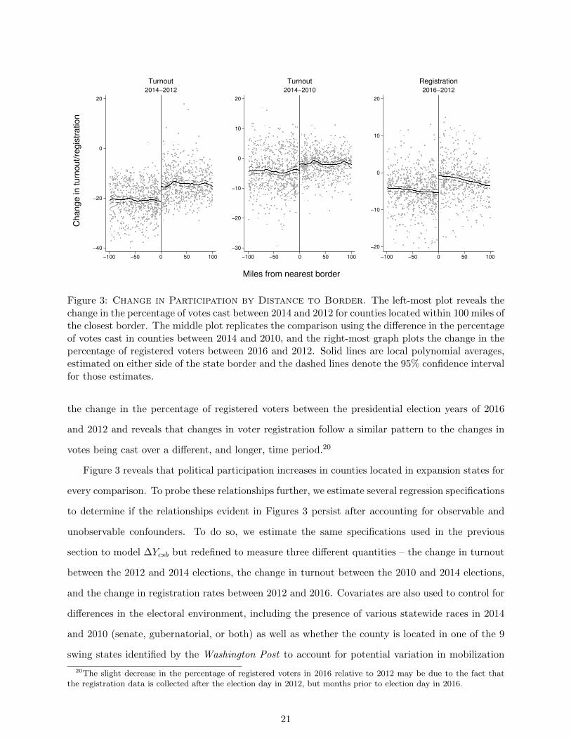
To begin, Figure 3 presents the pattern in the raw data for counties whose geographic center
is less than 100 miles from the closest border of a state with a different expansion status. (The
Online Appendix reveals that a similar pattern emerges when using all counties, including those
beyond 100 miles from the border of interest, as well as several other bandwidths.) The left-hand
graph plots the change in turnout in the largest state-level race in 2014 relative to the number of
votes cast in the 2012 presidential election for every county whose geographic center is less than 100
miles from a state with a contrary expansion status. Reflecting the fact that turnout in midterm
elections is lower than presidential elections, nearly all of the counties cast fewer votes. The critical
question of interest for our analysis is whether the decrease in the number of votes cast in 2014 is
less in counties located in expansion states relative to similar counties in non-expansion states.
The sharp discontinuity in the difference in turnout that is evident in Figure 3 suggests an
affirmative answer, as the difference in the local average difference in the percentage of votes
cast in non-expansion counties (those located < 0) and expansion counties (those located > 0)
is noticeable. Reassuringly, there is also no obvious relationship based on the distance to the
border – the lack of systematic relationship in this “forcing variable” suggests there are unlikely
to be unobservable features that are primarily responsible for the differences in the change in
participation we characterize.
To probe further, the middle graph replicates the analysis using the change in the percentage
of votes cast comparing the midterm election year of 2014 to 2010. A similar pattern is observed –
turnout was higher in counties located in expansion states than non-expansion states, though the
difference is smaller than when comparing 2014 to 2012. Finally, the right-most graph compares
20
−40
−20
0
20
−100 −50 0 50 100
2014−2012
Turnout
−30
−20
−10
0
10
20
−100 −50 0 50 100
2014−2010
Turnout
−20
−10
0
10
20
−100 −50 0 50 100
2016−2012
RegistrationC
hange in turn
out/re
gis
tration
Miles from nearest border
Figure 3: Change in Participation by Distance to Border. The left-most plot reveals thechange in the percentage of votes cast between 2014 and 2012 for counties located within 100 miles ofthe closest border. The middle plot replicates the comparison using the difference in the percentageof votes cast in counties between 2014 and 2010, and the right-most graph plots the change in thepercentage of registered voters between 2016 and 2012. Solid lines are local polynomial averages,estimated on either side of the state border and the dashed lines denote the 95% confidence intervalfor those estimates.
the change in the percentage of registered voters between the presidential election years of 2016
and 2012 and reveals that changes in voter registration follow a similar pattern to the changes in
votes being cast over a different, and longer, time period.20
Figure 3 reveals that political participation increases in counties located in expansion states for
every comparison. To probe these relationships further, we estimate several regression specifications
to determine if the relationships evident in Figures 3 persist after accounting for observable and
unobservable confounders. To do so, we estimate the same specifications used in the previous
section to model ∆Ycsb but redefined to measure three different quantities – the change in turnout
between the 2012 and 2014 elections, the change in turnout between the 2010 and 2014 elections,
and the change in registration rates between 2012 and 2016. Covariates are also used to control for
differences in the electoral environment, including the presence of various statewide races in 2014
and 2010 (senate, gubernatorial, or both) as well as whether the county is located in one of the 9
swing states identified by the Washington Post to account for potential variation in mobilization
20The slight decrease in the percentage of registered voters in 2016 relative to 2012 may be due to the fact thatthe registration data is collected after the election day in 2012, but months prior to election day in 2016.
21
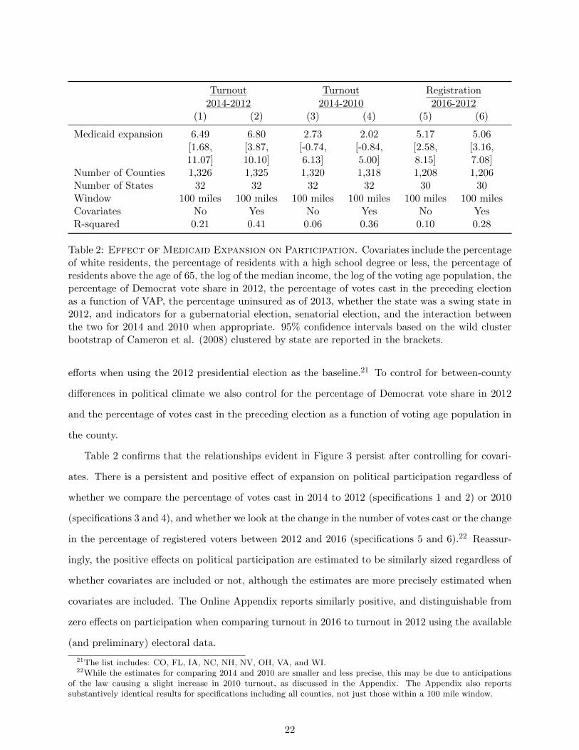
Turnout Turnout Registration
2014-2012 2014-2010 2016-2012(1) (2) (3) (4) (5) (6)
Medicaid expansion 6.49 6.80 2.73 2.02 5.17 5.06[1.68, [3.87, [-0.74, [-0.84, [2.58, [3.16,11.07] 10.10] 6.13] 5.00] 8.15] 7.08]
Number of Counties 1,326 1,325 1,320 1,318 1,208 1,206Number of States 32 32 32 32 30 30Window 100 miles 100 miles 100 miles 100 miles 100 miles 100 milesCovariates No Yes No Yes No YesR-squared 0.21 0.41 0.06 0.36 0.10 0.28
Table 2: Effect of Medicaid Expansion on Participation. Covariates include the percentageof white residents, the percentage of residents with a high school degree or less, the percentage ofresidents above the age of 65, the log of the median income, the log of the voting age population, thepercentage of Democrat vote share in 2012, the percentage of votes cast in the preceding electionas a function of VAP, the percentage uninsured as of 2013, whether the state was a swing state in2012, and indicators for a gubernatorial election, senatorial election, and the interaction betweenthe two for 2014 and 2010 when appropriate. 95% confidence intervals based on the wild clusterbootstrap of Cameron et al. (2008) clustered by state are reported in the brackets.
efforts when using the 2012 presidential election as the baseline.21 To control for between-county
differences in political climate we also control for the percentage of Democrat vote share in 2012
and the percentage of votes cast in the preceding election as a function of voting age population in
the county.
Table 2 confirms that the relationships evident in Figure 3 persist after controlling for covari-
ates. There is a persistent and positive effect of expansion on political participation regardless of
whether we compare the percentage of votes cast in 2014 to 2012 (specifications 1 and 2) or 2010
(specifications 3 and 4), and whether we look at the change in the number of votes cast or the change
in the percentage of registered voters between 2012 and 2016 (specifications 5 and 6).22 Reassur-
ingly, the positive effects on political participation are estimated to be similarly sized regardless of
whether covariates are included or not, although the estimates are more precisely estimated when
covariates are included. The Online Appendix reports similarly positive, and distinguishable from
zero effects on participation when comparing turnout in 2016 to turnout in 2012 using the available
(and preliminary) electoral data.
21The list includes: CO, FL, IA, NC, NH, NV, OH, VA, and WI.22While the estimates for comparing 2014 and 2010 are smaller and less precise, this may be due to anticipations
of the law causing a slight increase in 2010 turnout, as discussed in the Appendix. The Appendix also reportssubstantively identical results for specifications including all counties, not just those within a 100 mile window.
22
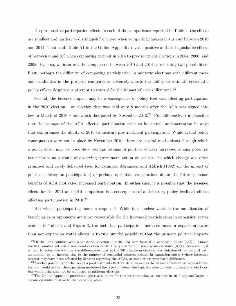
Despite positive participation effects in each of the comparisons reported in Table 2, the effects
are smallest and hardest to distinguish from zero when comparing changes in turnout between 2010
and 2014. That said, Table A1 in the Online Appendix reveals positive and distinguishable effects
of between 6 and 8% when comparing turnout in 2014 to pre-treatment elections in 2004, 2006, and
2008. Even so, we interpret the comparison between 2010 and 2014 as reflecting two possibilities.
First, perhaps the difficulty of comparing participation in midterm elections with different races
and candidates in the pre-post comparisons adversely affects the ability to estimate systematic
policy effects despite our attempt to control for the impact of such differences.23
Second, the lessened impact may be a consequence of policy feedback affecting participation
in the 2010 election – an election that was held only 8 months after the ACA was signed into
law in March of 2010 – but which dissipated by November 2012.24 Put differently, it is plausible
that the passage of the ACA affected participation prior to its actual implementation in ways
that compromise the ability of 2010 to measure pre-treatment participation. While actual policy
consequences were not in place by November 2010, there are several mechanisms through which
a policy effect may be possible – perhaps feelings of political efficacy increased among potential
beneficiaries as a result of observing government action on an issue in which change was often
promised and rarely delivered (see, for example, Abramson and Aldrich (1982) on the impact of
political efficacy on participation) or perhaps optimistic expectations about the future personal
benefits of ACA motivated increased participation. In either case, it is possible that the lessened
effects for the 2014 and 2010 comparison is a consequence of anticipatory policy feedback effects
affecting participation in 2010.25
But who is participating more in response? While it is unclear whether the mobilization of
beneficiaries or opponents are most responsible for the increased participation in expansion states
evident in Table 2 and Figure 3, the fact that participation increases more in expansion states
than non-expansion states allows us to rule out the possibility that the primary political impacts
23Of the 1031 counties with a senatorial election in 2010, 653 were located in expansion states (63%). Amongthe 874 counties without a senatorial election in 2010, only 266 were in non-expansion states (30%). As a result, itis hard to determine whether the difference evident in the 2010 midterm election is a violation of the parallel pathassumption or an increase due to the number of senatorial contests located in expansion states (whose increasedinterest may have been affected by debates regarding the ACA), or some other systematic difference.
24Another possibility for the lack of a pre-treatment effect for 2012, as well as the weaker effects for 2016 presidentialturnout, could be that the expansions mobilized the types of voters who typically already vote in presidential elections,but would otherwise not be mobilized in midterm elections.
25The Online Appendix provides suggestive support for this interpretation, as turnout in 2010 appears larger inexpansion states relative to the preceding years.
23
of Medicaid expansion was to increase mobilization in non-expansion states among prospective
beneficiaries eager to extend the law to their state, or by opponents committed to preventing its
expansion. The fact that participation increases more in states that expand Medicaid (and which
also therefore experience the largest policy consequences as we show above) suggests, but does not
prove, that there is likely a connection between the policy benefits and political behavior.
3.1 Effects on Participation by Poverty Level
The fact that there is more participation – measured using either voting or registration behavior – in
counties located in expansion states than non-expansion states across all comparisons suggests that
the expansion of Medicaid did indeed result in an increase in participation. Moreover, the increase
in participation is sizable – ranging from between 2% and 7% depending on the specification and
comparison used in Table 2.
Because the politics surrounding the ACA and the expansion of Medicaid are far more partisan
than previously examined social welfare programs, it is of interest to consider whether the partisan
environment affects whether beneficiaries or opponents are most energized by the policy. It is
difficult to know whether the increased political participation that we identify in Figure 3 and
Table 2 is a result of mobilizing beneficiaries or opponents in expansion states, but the results are
inconsistent with claims that the largest effects were among those that were opposed to Medicaid
expansion in non-expansion states – if so, we would either observe more participation in non-
expansion states (if opponents were more mobilized than beneficiaries) or else no difference (if
beneficiaries and opponents were equally mobilized).26
The fact that more participation occurs in otherwise similar counties located in expansion
states is harder to interpret because it is unclear from the results so far whether the increase in
participation we detect is occurring because of the actions of beneficiaries, opponents, or both.
Identifying the specific mechanisms behind such effects is difficult given the myriad of influences
at play (Green, Ha and Bullock 2010; Campbell 2012) and our focus on county-level data, but we
can identify whether the change is greater in some counties than others in ways consistent with
beneficiaries or opponents becoming more mobilized by the expansion of Medicaid.
We first explore the relationship between the percentage of the county residing in poverty and the
26To be clear, because we are examining the difference in the difference of participation across counties in expansionand non-expansion states we are identifying the differential effect – increases (or decreases) that are common to allcounties in all states do not affect the estimates.
24
change in political participation by expansion status. (The Online Appendix presents results that
allow the relationship to also vary by the political leanings of the county for robustness.) Given that
the greatest change in insurance coverage occurs in the most impoverished counties in expansion
states, if the impacts identified in Figure 3 and quantified in Figure 3 and Table 2 are primarily
due to the increased participation of program beneficiaries, we should observe the largest increases
in participation occurring in the poorest counties. In contrast, because those most opposed to the
expansion of Medicaid are higher-income individuals – indeed, survey researchers have consistently
found that wealthier voters oppose expanding government’s role in health care in general, as well as
the ACA in particular (Holahan et al. 2014; Henderson and Hillygus 2011; Kriner and Reeves 2014)
– we should see one of two patterns in the the largest political impacts occur among opponents: 1) if
the mobilization of recipients (concentrated in high poverty counties) and opponents (concentrated
in low poverty counties) occurs similarly, the increase in political participation among counties in
expansion states should not depend on the percentage of the county residing in poverty , or else 2) if
opponents are more energized by Medicaid expansion than beneficiaries the increased participation
effects should be concentrated in the wealthier, more Republican, counties.
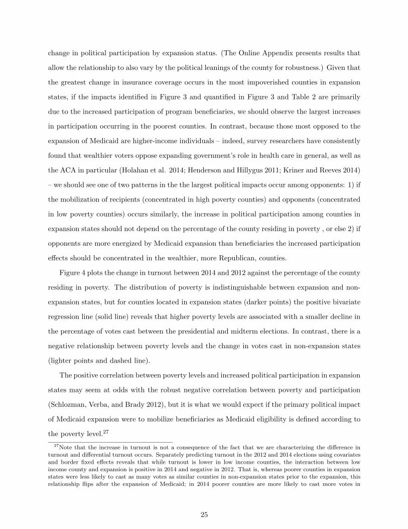
Figure 4 plots the change in turnout between 2014 and 2012 against the percentage of the county
residing in poverty. The distribution of poverty is indistinguishable between expansion and non-
expansion states, but for counties located in expansion states (darker points) the positive bivariate
regression line (solid line) reveals that higher poverty levels are associated with a smaller decline in
the percentage of votes cast between the presidential and midterm elections. In contrast, there is a
negative relationship between poverty levels and the change in votes cast in non-expansion states
(lighter points and dashed line).
The positive correlation between poverty levels and increased political participation in expansion
states may seem at odds with the robust negative correlation between poverty and participation
(Schlozman, Verba, and Brady 2012), but it is what we would expect if the primary political impact
of Medicaid expansion were to mobilize beneficiaries as Medicaid eligibility is defined according to
the poverty level.27
27Note that the increase in turnout is not a consequence of the fact that we are characterizing the difference inturnout and differential turnout occurs. Separately predicting turnout in the 2012 and 2014 elections using covariatesand border fixed effects reveals that while turnout is lower in low income counties, the interaction between lowincome county and expansion is positive in 2014 and negative in 2012. That is, whereas poorer counties in expansionstates were less likely to cast as many votes as similar counties in non-expansion states prior to the expansion, thisrelationship flips after the expansion of Medicaid; in 2014 poorer counties are more likely to cast more votes in
25
−40
−20
0
20C
ha
ng
e in
tu
rno
ut
20
14
−2
01
2
0 .2 .4 .6
Proportion in poverty
Figure 4: Change in Turnout by County Poverty Level, 2014-2012. Counties in expansionstates are represented by darker points, and counties in non-expansion states are represented bylighter points.
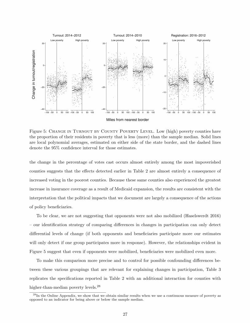
To probe this relationship further, we expand the set of comparisons and we also control for
unobservable features correlated with spatial proximity. Figure 5 replicates the investigation of
Figure 3 by estimating the local average effects for counties with above-average and below-average
poverty levels in expansion and non-expansion states. The relationships plotted in Figure 5 provides
immediate evidence that changes in the county-level voting behavior varies with the percentage of
the county residing in poverty.
Figure 5 reveals that there is almost no difference in the difference in turnout when comparing
low-poverty counties in expansion and non-expansion states regardless of whether we compare the
votes cast in 2014 to either 2012 (left) or 2010 (middle). In contrast, clear differences emerge
when looking at the relationship in counties with larger than average poverty levels. The fact that
expansion states than similarly situated counties in non-expansion states relative to wealthier counties.
26
−40
−20
0
20
−100 −50 0 50 100 −100 −50 0 50 100
Low poverty High poverty
Turnout: 2014−2012
−40
−20
0
20
−100 −50 0 50 100 −100 −50 0 50 100
Low poverty High poverty
Turnout: 2014−2010
−20
−10
0
10
20
−100 −50 0 50 100 −100 −50 0 50 100
Low poverty High poverty
Registration: 2016−2012C
hange in turn
out/re
gis
tration
Miles from nearest border
Figure 5: Change in Turnout by County Poverty Level. Low (high) poverty counties havethe proportion of their residents in poverty that is less (more) than the sample median. Solid linesare local polynomial averages, estimated on either side of the state border, and the dashed linesdenote the 95% confidence interval for those estimates.
the change in the percentage of votes cast occurs almost entirely among the most impoverished
counties suggests that the effects detected earlier in Table 2 are almost entirely a consequence of
increased voting in the poorest counties. Because these same counties also experienced the greatest
increase in insurance coverage as a result of Medicaid expansion, the results are consistent with the
interpretation that the political impacts that we document are largely a consequence of the actions
of policy beneficiaries.
To be clear, we are not suggesting that opponents were not also mobilized (Haselswerdt 2016)
– our identification strategy of comparing differences in changes in participation can only detect
differential levels of change (if both opponents and beneficiaries participate more our estimates
will only detect if one group participates more in response). However, the relationships evident in
Figure 5 suggest that even if opponents were mobilized, beneficiaries were mobilized even more.
To make this comparison more precise and to control for possible confounding differences be-
tween these various groupings that are relevant for explaining changes in participation, Table 3
replicates the specifications reported in Table 2 with an additional interaction for counties with
higher-than-median poverty levels.28
28In the Online Appendix, we show that we obtain similar results when we use a continuous measure of poverty asopposed to an indicator for being above or below the sample median.
27
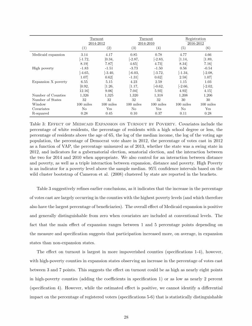
Turnout Turnout Registration
2014-2012 2014-2010 2016-2012(1) (2) (3) (4) (5) (6)
Medicaid expansion 3.14 4.17 0.85 0.78 4.77 4.66[-1.72, [0.34, [-2.87, [-2.83, [1.14, [1.89,8.19] 7.87] 4.65] 4.73] 8.34] 7.16]
High poverty -1.83 -1.51 -3.73 -1.50 0.56 -0.54[-4.65, [-3.40, [-6.03, [-3.72, [-1.34, [-2.08,1.07] 0.62] -1.31] 0.62] 2.58] 1.07]
Expansion X poverty 6.55 5.15 4.23 2.59 1.15 1.03[0.92, [1.26, [1.17, [-0.62, [-2.66, [-2.02,12.16] 9.06] 7.04] 5.93] 4.92] 4.15]
Number of Counties 1,326 1,325 1,320 1,318 1,208 1,206Number of States 32 32 32 32 30 30Window 100 miles 100 miles 100 miles 100 miles 100 miles 100 milesCovariates No Yes No Yes No YesR-squared 0.28 0.45 0.10 0.37 0.11 0.28
Table 3: Effect of Medicaid Expansion on Turnout by Poverty. Covariates include thepercentage of white residents, the percentage of residents with a high school degree or less, thepercentage of residents above the age of 65, the log of the median income, the log of the voting agepopulation, the percentage of Democrat vote share in 2012, the percentage of votes cast in 2012as a function of VAP, the percentage uninsured as of 2013, whether the state was a swing state in2012, and indicators for a gubernatorial election, senatorial election, and the interaction betweenthe two for 2014 and 2010 when appropriate. We also control for an interaction between distanceand poverty, as well as a triple interaction between expansion, distance and poverty. High Povertyis an indicator for a poverty level above the sample median. 95% confidence intervals based on thewild cluster bootstrap of Cameron et al. (2008) clustered by state are reported in the brackets.
Table 3 suggestively refines earlier conclusions, as it indicates that the increase in the percentage
of votes cast are largely occurring in the counties with the highest poverty levels (and which therefore
also have the largest percentage of beneficiaries). The overall effect of Medicaid expansion is positive
and generally distinguishable from zero when covariates are included at conventional levels. The
fact that the main effect of expansion ranges between 1 and 5 percentage points depending on
the measure and specification suggests that participation increased more, on average, in expansion
states than non-expansion states.
The effect on turnout is largest in more impoverished counties (specifications 1-4), however,
with high-poverty counties in expansion states observing an increase in the percentage of votes cast
between 3 and 7 points. This suggests the effect on turnout could be as high as nearly eight points
in high-poverty counties (adding the coefficients in specification 1) or as low as nearly 2 percent
(specification 4). However, while the estimated effect is positive, we cannot identify a differential
impact on the percentage of registered voters (specifications 5-6) that is statistically distinguishable
28
from zero. The lack of effect for registration suggests several possible interpretations.
One possibility is that the act of voting is more costly than the act of registering to vote so
the differences we observe reflect the fact those receiving the most benefits – and also therefore
those that have the most to lose – are also more likely to take more costly actions. Thus, whereas
registration uniformly increases in expansion states – perhaps as a consequence of the connection
between the ACA and the 1993 NVRA – the largest effects on the more costly form of participation
occurs in counties receiving the most benefits. Under this interpretation, the fact that poverty
affects voting (in specifications (1), (2), (3), and (4)) but not registration (specifications (5) and
(6)) is because of the difference in the type of participation being assessed.
A second, non-exclusive, potential explanation for the variable effects is that the variation may
indicate that the political effects have limited durability – perhaps because the beneficiaries of
Medicaid expansion have historically been among the least likely to vote. Comparing turnout
in 2014 to 2012 reveals the largest impact (specifications (1) and (2)), followed by the comparison
between 2014 and 2010 (specifications (3) and (4)), and finally the lack of any effect when comparing
the change in registration between 2012 and 2016 (specifications (5) and (6)). Speculatively, it is
possible that the lack of a differential effect on voter registration by poverty level is a consequence
of the fact that 2016 is two years after the expansion decision of almost all of the examined states.
3.2 Further Robustness
Despite the evidence for the relationship using two measures of political participation – voting and
registration – across several comparisons, questions may remain about the robustness of our results.
Table 4 reports a series of checks to demonstrate the robustness of the main effect and to shed further
insight into whether beneficiaries or opponents are most likely mobilized in response to Medicaid
expansion. In the first row for every comparison we reproduce the estimates and confidence intervals
from the specifications with covariates of Table 2 to assist with the interpretation. In row (2), we
add border fixed effects to control for heterogeneity across the pairs of states we compare. So doing
allows counties in, for instance, Tennessee and Kentucky to have their own baseline level of change
between the pre and post elections.
In the third row for each comparison, we interact each of these border fixed effects with the
distance between the county’s geographic center and that border to allow the impact of the forcing
29
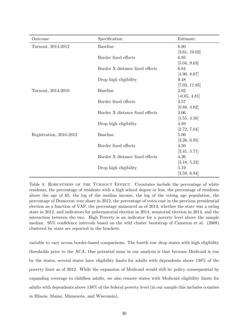
Outcome Specification Estimate
Turnout, 2014-2012 Baseline 6.80[3.61, 10.02]
Border fixed effects 6.95[5.04, 9.03]
Border X distance fixed effects 6.84[4.90, 8.67]
Drop high eligibility 9.48[7.03, 11.95]
Turnout, 2014-2010 Baseline 2.02[-0.85, 4.81]
Border fixed effects 2.57[0.88, 4.02]
Border X distance fixed effects 3.06[1.55, 4.56]
Drop high eligibility 4.89[2.72, 7.04]
Registration, 2016-2012 Baseline 5.06[3.26, 6.85]
Border fixed effects 4.50[3.41, 5.71]
Border X distance fixed effects 4.26[3.18, 5.23]
Drop high eligibility 5.19[3.59, 6.94]
Table 4: Robustness of the Turnout Effect. Covariates include the percentage of whiteresidents, the percentage of residents with a high school degree or less, the percentage of residentsabove the age of 65, the log of the median income, the log of the voting age population, thepercentage of Democrat vote share in 2012, the percentage of votes cast in the previous presidentialelection as a function of VAP, the percentage uninsured as of 2013, whether the state was a swingstate in 2012, and indicators for gubernatorial election in 2014, senatorial election in 2014, and theinteraction between the two. High Poverty is an indicator for a poverty level above the samplemedian. 95% confidence intervals based on the wild cluster bootstrap of Cameron et al. (2008)clustered by state are reported in the brackets.
variable to vary across border-based comparisons. The fourth row drop states with high eligibility
thresholds prior to the ACA. One potential issue in our analysis is that because Medicaid is run
by the states, several states have eligibility limits for adults with dependents above 138% of the
poverty limit as of 2012. While the expansion of Medicaid would still be policy consequential by
expanding coverage to childless adults, we also remove states with Medicaid eligibility limits for
adults with dependents above 138% of the federal poverty level (in our sample this includes counties
in Illinois, Maine, Minnesota, and Wisconsin).
30

While the results of the first three rows of each comparison confirm the robustness of the
specifications reported above, the results of the fourth row in each comparison is perhaps the most
informative for identifying who is most likely mobilized in response to the expansion of Medicaid
in the state. The fact that the estimated effect of Medicaid expansion increases when we drop
states with high pre-existing eligibility levels for adults with dependents is again consistent with the
political effects being caused by policy beneficiaries. The greatest increases in political participation
occur in states with the largest number of newly eligible beneficiaries measured in terms of county-
level poverty rates or differences in the pre-existing eligibility limits of states’ Medicaid policies.
3.3 Are the Results Driven by Electoral Differences?
Critical to our interpretation is that the county-level differences we identify are due to the policy
consequences of the state-level decisions that were made to expand Medicaid, rather than between
state differences unrelated to the expansion of Medicaid. Most threatening is the possibility that the
differences we detect are due to variation in the races being held in the 2014 midterm rather than
the effects of Medicaid expansion. To be clear, if the between-state elite-level electoral differences
are a consequence of the ongoing debates over Medicaid expansion the differences we detect can
still be meaningfully interpreted as identifying the political consequences of Medicaid expansion
(although it suggests that identifying the relative effect of elite level and mass level impacts may
be hard, if not impossible). Only if the between-state electoral variation is unrelated to Medicaid
expansion does our estimation of the impact of policy feedback become problematic.
We test for this possibility in two ways. First, we explore whether within state differences in
turnout in expansion and non-expansion states correlate with county poverty levels. Looking sep-
arately at expansion and non-expansion states and using state fixed effects to control for potential
within-state confounders eliminates the impact that different candidates (and, indeed any system-
atic between state differences) have on the change in voting behavior. If the political impact of
Medicaid expansion occurs through the mobilization of recipients, then we should observe a positive
relationship between county poverty levels and the change in turnout within expansion states, but
a non-positive relationship in non-expansion states.
In the Online Appendix we present the specifications for expansion states and non-expansion
states for the comparison in which we find the largest effect – the comparison between 2014 and 2012
31
– to determine if the effect persists. For non-expansion states, there is no significant relationship
between the percent in poverty in a county and the decline in the percentage of votes cast in
the 2014 midterm election relative to the percentage cast in the 2012 presidential election. The
point estimate represents a 3.5% increase, but the 95% confidence interval ranges from -1 to +8
points. Among expansion states, however, there is a clear positive relationship. The estimate
is 12%, with a confidence interval of between 7% and 16%. Thus in expansion states, the most
impoverished counties experience the smallest drop-off in voting – an effect consistent with the
interpretation that Medicaid expansion increased voting among recipients who are concentrated
in the most impoverished counties. By construction, between state differences in the electoral
environment cannot account for these within state correlations and the within state correlations
are what would be expected if the expansion of Medicaid increased voter turnout among the newly
eligible.
To further quantify whether variation in the electoral environment may be responsible for the
effects we identify, we determine whether electoral differences that are uncorrelated with the expan-
sion status of a state could produce similarly-sized effects. To do so, we assign a placebo expansion
to 28 randomly selected states, and estimate the same specification as in Table 2, column (6)
for 1,000 iterations. In the Online Appendix we show the distribution of placebo estimates for
each of our three participation outcomes. For both 2014-2012 turnout and 2016-2012 registration,
the observed point estimates presented previously are greater in absolute magnitude than any of
the placebo estimates. Using this procedure, we obtain estimates greater in (absolute) magnitude
(0.2%) 0.1% of the time for the 2016-2012 comparison, 40% (19%) of the time for the 2014-2010
comparison, and 12% (5%) of the time for the 2014-2012 comparison.
Lastly, the Online Appendix reveals that focusing on similar states sharing a substantial border
and estimating the effect separately for such state-pairs does not change the substantive conclu-
sion.29
29Despite having a similar number of state level races, turnout was higher in the expansion states of KY, WV andNM than it was in the neighboring non-expansion states of TN, VA, and TX. There was no difference in the differenceof average county level turnout for ND and SD relative to the 2012 presidential election, but this is likely becausethere was no Senate or Gubernatorial race in 2014 in North Dakota (there was only an at-large election for the singleU.S House district) whereas there were both senatorial and gubernatorial races in South Dakota. Contrary to thepatterns evident in Figure 3 and the specifications reported above, turnout actually decreased in the expansion stateof Michigan relative to Wisconsin despite having both a senatorial and a gubernatorial election, but the estimateddecrease is arguably still attributable to the politics of the ACA as the gubernatorial election in 2012 was dominatedby whether WI would extend Medicaid or not, with the winning candidate Scott Walker promising to oppose theextension. This instance therefore likely reflects an instance in which the issue of Medicaid expansion itself – ratherthan the policy consequences of Medicaid expansion — impacted political behavior by mobilizing opponents.
32
3.4 Why Does Policy Affect Politics?
We have shown that the expansion of Medicaid is linked to increased participation both in terms of
the votes cast and also in terms of voter registration – especially in counties with higher than median
poverty levels in the election immediately following its’ implementation. Despite the partisan
conflict surrounding the ACA and the negative feedback that some have found for other means-
tested programs, the effects we identify are consistent what what would be expected from positive
policy feedbacks. While it is beyond our capacity to identify the precise mechanisms for the effects
we document at the county level, we can make some informed conjectures regarding this question
(Campbell 2012).
One possibility is that Medicaid may mobilize recipients due to an increase in economic re-
sources or increased health – so called “resource effects”’ (Mettler 2002). Prior work by Finkelstein
et al. (2012) and Baicker et al. (2013) finds evidence of improved mental and financial health
among Medicaid recipients, but limited impacts on actual health, so it is possible that the increase
in participation we find could is due to increased health and wealth (Buden et al 2016). A second
possibility is that the increase could be due to recipients’ newfound politicization – before enroll-
ment, they cared little about what government does, but upon being enrolled, they realize they have
a stake in the outcome of elections. Scholars have shown, for example, that social welfare programs
can positively impact aspiration levels and increase political participation (see, for example, Kosec
and Mo 2016). If so, there may be both material as well as psychological mechanisms that result
from the policy.30
How much of the effects we see are due to material versus psychological effects? Because we
lack good measures of these mediating variables – income is available only every ten years from
the Census, and we have no survey data on recipients’ attitudes – a formal mediation analysis
(Imai et al. 2011) is not possible. However, we can provide suggestive evidence by benchmarking
our effect against the observed relationship between county-level income and county-level turnout.
With or without covariates and state fixed effects, the coefficient on median income implies that
turnout changes by about 1.7% for a one standard deviation increase (about $11,000) in median
income. Because Medicaid spending per recipient is, on average, less than $3,000 (Reinhardt 2012)
30Another psychological or “interpretive” effect is that enrollment in a social program gives recipients informationabout how government values them. While existing studies of means-tested programs conclude recipients in factreceive negative messages about their value to government – e.g. Soss (1999) – a positive effect is possible in our casedue to the widely publicized nature of the reform.
33
and the estimated average effects on participation in Table 2 range between 3% and 7%, it seems
implausible that the bulk of our effect occurs via the actual financial value of health insurance. The
results we document therefore seem more consistent with the claim that the newly insured become
mobilized by the links created between their own well-being and their government.
4 Conclusion & Implications
Does policy affect politics? This is a longstanding question with important implications for our
understanding of the extent to which policies are durable because of the impacts that they have
on the mass public and the ability to create invested constituencies. It has also been a difficult
question to answer – especially for means-tested programs – where eligibility often depends on the
very same factors that are thought to be related to political participation. Given that prior work
has focused on policies over which the political parties largely agree, it is also unclear whether the
surrounding partisan environment affects the ability of policies to create positive policy feedbacks.
We focus on the political consequences of Medicaid expansions in the states, expansions provided
for by the Affordable Care Act. The ACA is arguably the most impactful social welfare program
since the 1935 Social Security Act and it is also unprecedented in the extent to which it has been
politicized. Unlike other prominent social welfare programs that have been the subject of prior
studies of policy feedback, the ACA was enacted along strict party lines and passed without a
single Republican vote in Congress. Moreover, the salience of the issue has persisted ever since –
parties sent clear and unambiguous signals regarding the desirability of the ACA during the 2014
elections at both the federal and state levels and the political discourse has continued through
the 2016 presidential election. The variation in the implementation of the provision for Medicaid
expansion under the ACA resulting from the Supreme Court’s decision in National Federation
of Independent Business v. Sebelius also creates a unique opportunity to examine the effects in
otherwise similar counties facing very different policy environments because of the actions taken
by their state government.
Our investigation reveals that there appears to be a qualified political impact of Medicaid
expansion on political participation among beneficiaries. Consistent with expectations, counties
located in states that expand Medicaid are estimated to have a greater increase in the percentage of
insured residents following the expansion of Medicaid, and the difference is greatest in the poorest
34
counties. We also find evidence consistent with positive policy feedback effects – the counties
experiencing the largest increase in insurance coverage also experience the largest increase in the
percentage of votes cast; regardless of whether we compare the percentage of votes cast in the county
in 2014 to the 2012 presidential election or the 2010 midterm election, there were comparatively
more votes cast in the poorest counties located in expansion states. This difference persists across
specifications regardless of the inclusion of border fixed effects, county covariates, and different
bandwidths. Placebo tests also reveal no evidence of a pre-existing pattern of increasing turnout
in expansion states or similar magnitudes when comparing county differences in states sharing an
identical expansion status. Given that these are the same counties experiencing the largest policy
effect, and given also that others have found opposition to the ACA to be correlated with income,
our findings suggest that the impact is likely due to increased participation among beneficiaries.
The fact that the largest increases in turnout occur in precisely those counties that most benefit
from the expansion of Medicaid suggests that the expansion of Medicaid likely increased turnout
by either mobilizing newly eligible recipients. Examining another form of political participation
– the act of registering to vote – for a different time period reveals a similarly positive effect of
Medicaid expansion; counties expanding Medicaid have a higher percentage of registered voters in
2016 relative to 2012 than counties located in states choosing not to expand Medicaid. While the
effect on registration does not obviously depend on the poverty level in the county for reasons that
are beyond our ability to untangle, the fact that positive effects are visible using an alternative
measure of participation over a different time period suggests that expansion of Medicaid was able
to generate positive policy feedbacks even despite the high level of partisan conflict over the policy,
and the possibility that the policy would mobilize policy opponents.
While finding the existence of positive policy feedbacks for such a substantively consequential
and political divisive policy is important for understanding the interactions between politics and
policy, we are unable to definitively identify the exact mechanism that results in greater partici-
pation. Theories of policy feedbacks distinguish between resource effects – the financial and civic
resources that programs provide – and interpretive effects – the messages that participants receive
about their place in the political system. In our case, it is possible that both are occurring. Even
though public health insurance has been shown to have its strongest impacts on financial security –
stronger even than its impact on actual health – the magnitude of our effects would seem to speak
35
against a strictly resource-based interpretation. In our data, a one-standard deviation increase in
median income – about $11,000 – is associated with a 1.7 point increase in voter turnout. The fact
that the effects we estimate are much larger – as high as seven or eight points in some specifications
– suggests that interpretive effects may also be present.
Also beyond the scope of our investigation is the impact of the expansion on political opinions
and policy outcomes. That said, there is reason to suspect that the impact may not have strong and
enduring partisan consequences. Not only does existing work show that the increased participation
of lower socio-economic groups has unclear partisan consequences (e.g., Rosenstone and Wolfinger
1980), but the fact that Medicaid expansion was sometimes implemented by Republican governors
(e.g, Arkansas) or significantly re-branded by Democratic governors (e.g., Kentucky) may lessen the
partisan connections. Recent work also suggests that perceptions about the ACA’s impact differs
by individual partisanship – suggesting that partisan affinity may impact the effect of Medicaid
expansion on how votes are cast (McCabe 2016).
The relationship between policy and politics is critical for understanding not only the demand
for lawmaking action, but also the persistence of the status quo. To the extent that public policies
create invested constituencies of beneficiaries, understanding the causes and consequences of law-
making requires studying both the actions of elected officials as well the impact of the surrounding
electoral environment. Such investigations are involved, complicated, and often hard to conduct
given the pervasive connections that make identifying the impacts of each difficult. Fortunately,
we are sometimes provided with circumstances that enable us to untangle such connections, and
the expansion of Medicaid as provided for under the ACA is both a substantively important and a
methodologically exemplary case.
36
References
Abramson, Paul R., and John H. Aldrich. 1982. “The Decline of Electoral Participation in Amer-
ica,” American Political Science Review 76(3): 502-521.
Arnold R. Douglas, 1990. The Logic of Congressional Action. Yale University Press.
Baicker, Katherine, Sarah L. Taubman, Heidi L. Allen, Mira Bernstein, Jonathan Gruber, Joseph
Newhouse, Eric C. Schneider, Bill J. Wright, Alan M. Zaslavsky, and Amy N. Finkelstein.
2013. “The Oregon Experiment: Effects of Medicaid on Clinical Outcomes.” The New England
Journal of Medicine 368(18):1713-1722.
Balz, Dan. 2010. “Introduction.” In Landmark: The Inside Story of America’s New Health-Care
Law-The Affordable Care Act-and What it Means for Us All. PublicAffairs: Philadelphia: PA.
Bartels Larry. 2008. Unequal Democracy: The Political Economy of the Gilded Age. Princeton
University Press.
Bendor, Jonathan. 2010. Bounded Rationality and Politics. University of California Press.
Bendz, Anna. 2015. “Paying Attention to Politics: Public Responsiveness and Welfare Policy
Change.” Policy Studies Journal 43(3):309-332.
Blais, Andre. 2000. To Vote or Not to Vote? The Merits and Limits of Rational Choice Theory.
University of Pittsburgh Press.
Brooks, Tricia, Joe Touscher, Samantha Artiga, Jessica Stephens, and Alexandra Gross. 2015.
“Modern Era Medicaid: Findings from a 50-State Survey of Eligibility, Enrollment, Renewal,
and Cost-Sharing Policies in Medicaid and CHIP as of January 2015.” Kaiser Commission on
Medicaid and the Insured. Accessed September 8, 2016 via http://kff.org/health-reform/re
port/modern-era-medicaid-findings-from-a-50-state-survey-of-eligibility-enrollm
ent-renewal-and-cost-sharing-policies-in-medicaid-and-chip-as-of-january-2015/.
Burden, Barry C., Jason M. Fletcher, Pamela Herd, Donald P. Moynihan, and Bradley M. Jones.
2016. ”How Different Forms of Health Matter to Political Participation.” The Journal of Politics
79(1).
Cameron, Colin A., Jonah B. Gelbach, and Douglas L. Miller. 2008. “Bootstrap-Based Improve-
ments for Inference with Clustered Errors.” The Review of Economics and Statistics 90(3):414-
427.
Campbell, Andrea Louise. 2003. How Policies Make Citizens: Senior Political Activism and the
37
American Welfare State. Princeton University Press.
Campbell, Andrea Louise. 2012. “Policy Makes Mass Politics.” Annual Review of Political Science
15: 333-351.
Card, David and Alan B. Krueger. 1994. “Minimum Wages and Employment: A Case Study of
the New Jersey and Pennsylvania Fast Food Industries.” American Economic Review 84(4):
772-793.
Dell, Melissa. 2010. “The Persistent Effects of Peru’s Mining Mita.” Econometrica 78(6): 1863-
1903.
Derthick, Martha. 1979. Policymaking for Social Security. Washington, DC: The Brookings
Institution.
Dube, Arindrajit, T. William Lester, and Michael Reich. 2010. “Minimum Wage Effects Across
State Borders: Estimates Using Contiguous Counties.” Review of Economics and Statistics
92(4): 945-964.
Eichelberger, Erika. 2014. “Obamacare Could Have Turned Millions of Uninsured Americans into
Voters.” Mother Jones November 4. Accessed August 5, 2015 via http://www.motherjones.c
om/politics/2014/11/obamacare-national-voter-registration-act-minority.
FamiliesUSA. 2015. “A 50-State Look at Medicaid Expansion: 2015.” Accessed Oct 24, 2015 via
http://familiesusa.org/product/50-state-look-medicaid-expansion.
Finkelstein, Amy, Sarah Taubman, Bill Wright, Mira Bernstein, Jonathan Gruber, Joseph P. New-
house, Heidi Allen, and Katherine Baicker. 2012. “The Oregon Health Insurance Experiment:
Evidence from the First Year.” Quarterly Journal of Economics 127(3): 1057-1106.
Gilens Martin. 2012. Affluence and Influence: Economic Inequality and Political Power in Amer-
ica. Princeton University Press.
Green, Donald P., Shang E. Ha, John G. Bullock. 2010. “Enough already about ”black box”
experiments: Studying mediation is more difficult than most scholars suppose,” The Annals of
the American Academy of Political and Social Science, 628(1), 200-208.
Hacker Jacob S., and Paul Pierson. 2010. “Winner-Take-All Politics: Public Policy, Political
Organization, and the Precipitous Rise of Top Incomes in the United States,” Political Sociology
38:152?204.
Haselswerdt, Jake. 2016. “Expanding Medicaid, Expanding the Electorate: The Affordable Care
38
Act’s Short-Term Impact on Political Participation.” Working paper, Department of Political
Science, University of Missouri.
Henderson, Michael, and D. Sunshine Hillygus. 2011. “The Dynamics of Health Care Opinion,
2008-2010: Partisanship, Self-Interest, and Racial Resentment.” Journal of Health Politics,
Policy and Law 36(6): 945-960.
Highton, Benjamin and Raymond E. Wolfinger. 2001. “The Political Implications of Higher
Turnout.” British Journal of Political Science 31(1): 179-223.
Holahan, John, Genevieve M. Kenney, Michael Karpman, and Ariel Fogel. 2014. “Looking Behind
Opinion Polling on the Affordable Care Act.” Accessed August 24, 2016 via http://hrms.urb
an.org/briefs/aca-opinions.html.
Holmes, Thomas J. 1998. “The Effects of State Policies on the Location of Manufacturing: Evidence
from State Borders.” Journal of Political Economy 106(4): 667-705.
Imai, Kosuke, Luke Keele, Dustin Tingley, and Teppei Yamamoto. 2011. “Unpacking the Black
Box of Causality: Learning About Causal Mechanisms from Experimental and Observational
Studies.” American Political Science Review 105(4): 765-789.
Keele, Luke, Scott Lorch, Molly Passarella, Dylan Small, and Rocio Titiunik. 2016. “An Overview
of Geographically Discontinuous Treatment Assignments With An Application to Children’s
Health Insurance.” In Regression Discontinuity Designs: Theory and Applications, Advances in
Econometrics 38.
Keele, Luke J., and Rocio Titiunik. 2015. “Geographic Boundaries as Regression Discontinuities,”
Political Analysis 23(1): 127-155.
Kliff, Sarah. 2016. “Why Obamacare enrollees voted for Trump.” Vox.com. Accessed Dec 15,
2016 via http://www.vox.com/science-and-health/2016/12/13/13848794/kentucky-obama
care-trump.
Kosec, Katrina, and Cecilia Hyunjung Mo. 2016. “Aspirations and the Role of Social Protec-
tion: Evidence from Economic Shocks in Rural Pakistan.” International Food Policy Research
Institute Discussion Paper 01467.
Kriner, Douglas L., and Andrew Reeves. 2014. “Responsive Partisanship: Public Support for
the Clinton and Obama Health Care Plans.” Journal of Health Politics, Policy and Law 39(4):
717-749.
39
Lee, David S. and Thomas Lemieux. 2010. “Regression Discontinuity Designs in Economics.”
Journal of Economic Literature 48: 281-355.
Leighley, Jan E., and Jonathan Nagler. 2014. Who Votes Now?: Demographics, Issues, Inequality
And Turnout In The United States. Princeton University Press.
McCabe, Katherine T. 2016. “Attitude Responsiveness and Partisan Bias: Direct Experience with
the Affordable Care Act.” Political Behavior, forthcoming.
McCrary, Justin. 2008. “Manipulation of the Running Variable in the Regression Discontinuity
Design: A Density Test.” Journal of Econometrics 142(2): 698-714.
Meredith, Marc, and Michael Morse. 2015. “The Politics of the Restoration of Ex-Felon Voting
Rights: The Case of Iowa.” Quarterly Journal of Political Science 10(1): 41-100.
Mettler, Suzanne. 2002. “Bringing the State Back in to Civic Engagement: Policy Feedback
Effects of the G.I. Bill for World War II Veterans.” The American Political Science Review
96(2):351?365.
Mettler, Suzanne. 2005. Soldiers to Citizens: The G.I. Bill and the Making of the Greatest
Generation. Oxford University Press
Mettler, Suzanne and Joe Soss. 2004. “The Consequences of Public Policy for Democratic Citizen-
ship: Bridging Policy Studies and Mass Politics.” Perspectives on Politics 2(1): 55-73.
Mettler, Suzanne, and Jeffrey M. Stonecash. 2008. “Government Program Usage and Political
Voice.” Social Science Quarterly 89(2): 273-293.
Michener, Jamila. 2015. “Medicaid, Federalism, and Political Participation.” Working paper,
Department of Government, Cornell University.
Novack, Sophie. 2013. “Obamacare May Be More Political Than You Think.” National Journal
October 14. Accessed June 16, 2015 via http://www.nationaljournal.com/daily/obamacare
-may-be-more-political-than-you-think-20131014.
Pacheco, Julianna and Jason Fletcher. 2015. “Incorporating Health into Studies of Political Be-
havior: Evidence for Turnout and Partisanship.” Political Research Quarterly 68(1): 104-116.
Patashnik, Eric M. 2014. Reforms at Risk: What Happens After Major Policy Changes Are Enacted.
Princeton University Press.
Pierson, Paul. 1993. “When Effect Becomes Cause: Policy Feedback and Political Change.” World
Politics 45(4): 595-628.
40
Pierson, Paul. 1992. “Policy Feedbacks and Political Change: Contrasting Reagan and Thatcher’s
Pension Reform Initiatives.” Studies in American Political Development 6(2): 359-390.
Powell, G. Bingham. 1986. “American Voter Turnout in Comparative Perspective,” American
Political Science Review 80(1): 17-43.
Reinhardt, Uwe. 2012. “Assessing the Value of Medicaid to its Enrollees.” The Upshot October
12. Accessed January 31, 2016 via http://economix.blogs.nytimes.com/2012/10/12/assess
ing-the-value-of-medicaid-to-its-enrollees/? r=0.
Roth, Zachary. 2014. “Obamacare Helping Millions Register to Vote.” MSNBC March 3. Accessed
August 5 via http://www.msnbc.com/msnbc/obamacare-helping-millions-register-vote.
Schattschneider, E.E. 1935. Politics, Pressures, and the Tariff. New York: Prentice-Hall.
Schlozman, Kay Lehman, Sidney Verba, and Henry E. Brady. 2012. The Unheavenly Chorus:
Unequal Political Voice and the Broken Promise of American Democracy. Princeton University
Press.
Schwartz, Aaron L., and Benjamin D. Sommers. 2014. “Moving for Medicaid? Recent Eligibility
Expansions Did Not Induce Migration From Other States.” Health Affairs 33(1): 88-94.
Schneider, Anne, and Helen Ingram. 1993. “Social Construction of Target Populations: Implica-
tions for Politics and Policy.” American Political Science Review 87(2): 334-347.
Sharp, Elaine B. 2012. Does Local Government Matter? How Urban Policies Shape Civic Engage-
ment. University of Minnesota Press.
Skocpol, Theda. 1991. “Targeting Within Universalism: Politically Viable Policies to Combat
Poverty in the United States.” In Christopher Jencks and Paul E. Peterson, eds., The Urban
Underclass. Washington, DC: Brookings Institution.
Sommers, Benjamin D., Katherine Baicker, and Arnold M. Epstein. 2012. “Mortality and Access
to Care Among Adults After State Medicaid Expansions.” New England Journal of Medicine
367(11): 1025-1034.
Soroka, Stuart Neil and Christopher. Wlezien. 2010. Degrees Of Democracy: Politics, Public
Opinion, And Policy. New York: Cambridge University Press.
Soss, Joe. 1999. “Lessons of Welfare: Policy Design, Political Learning, and Political Action.”
American Political Science Review 93(2): 363-380.
Soss, Joe. 2002. Unwanted Claims: The Politics of Participation in the US Welfare System.
41
University of Michigan Press.
Wilson, William Julius. 1987. The Truly Disadvantaged: The Inner City, the Underclass, and
Public Policy. Chicago, IL: University of Chicago Press.
Weaver, Vesla M., and Lerman, Amy E. 2010. “Political Consequences of the Carceral State.”
American Political Science Review 104(4): 817-833.
Wolfinger, Raymond E. and Steven Rosenstone. 1980. Who Votes? Yale University Press.
42
Online Appendix: The Politics of Policy: The Initial Mass Political
Effects of Medicaid Expansion in the States
January 9, 2017
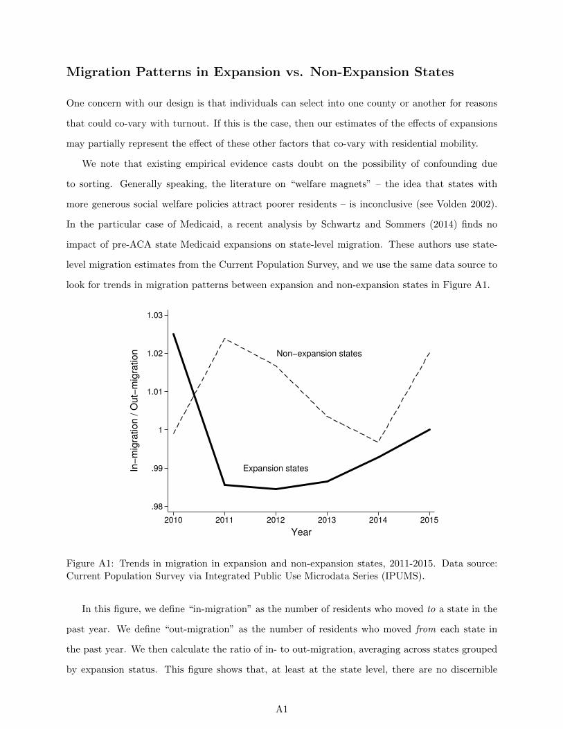
Migration Patterns in Expansion vs. Non-Expansion States
One concern with our design is that individuals can select into one county or another for reasons
that could co-vary with turnout. If this is the case, then our estimates of the effects of expansions
may partially represent the effect of these other factors that co-vary with residential mobility.
We note that existing empirical evidence casts doubt on the possibility of confounding due
to sorting. Generally speaking, the literature on “welfare magnets” – the idea that states with
more generous social welfare policies attract poorer residents – is inconclusive (see Volden 2002).
In the particular case of Medicaid, a recent analysis by Schwartz and Sommers (2014) finds no
impact of pre-ACA state Medicaid expansions on state-level migration. These authors use state-
level migration estimates from the Current Population Survey, and we use the same data source to
look for trends in migration patterns between expansion and non-expansion states in Figure A1.
Expansion states
Non−expansion states
.98
.99
1
1.01
1.02
1.03
In−
mig
ration / O
ut−
mig
ration
2010 2011 2012 2013 2014 2015
Year
Figure A1: Trends in migration in expansion and non-expansion states, 2011-2015. Data source:Current Population Survey via Integrated Public Use Microdata Series (IPUMS).
In this figure, we define “in-migration” as the number of residents who moved to a state in the
past year. We define “out-migration” as the number of residents who moved from each state in
the past year. We then calculate the ratio of in- to out-migration, averaging across states grouped
by expansion status. This figure shows that, at least at the state level, there are no discernible
A1

differences in trends in migration between expansion and non-expansion states.
A2
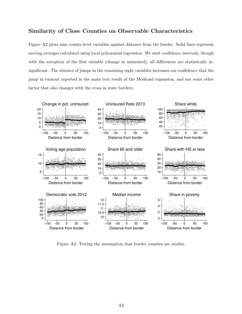
Similarity of Close Counties on Observable Characteristics
Figure A2 plots nine county-level variables against distance from the border. Solid lines represent
moving averages calculated using local polynomial regression. We omit confidence intervals, though
with the exception of the first variable (change in uninsured), all differences are statistically in-
significant. The absence of jumps in the remaining eight variables increases our confidence that the
jump in turnout reported in the main text result of the Medicaid expansion, and not some other
factor that also changes with the cross in state borders.
0
5
10
15
20
−100 −50 0 50 100
Distance from border
Change in pct. uninsured
0
10
20
30
40
−100 −50 0 50 100
Distance from border
Uninsured Rate 2013
20
40
60
80
100
−100 −50 0 50 100
Distance from border
Share white
5
10
15
−100 −50 0 50 100
Distance from border
Voting age population
0
10
20
30
40
−100 −50 0 50 100
Distance from border
Share 65 and older
10
20
30
40
50
−100 −50 0 50 100
Distance from border
Share with HS or less
020406080
100
−100 −50 0 50 100
Distance from border
Democratic vote 2012
10
10.5
11
11.5
12
−100 −50 0 50 100
Distance from border
Median income
0
.2
.4
.6
−100 −50 0 50 100
Distance from border
Share in poverty
Figure A2: Testing the assumption that border counties are similar.
A3
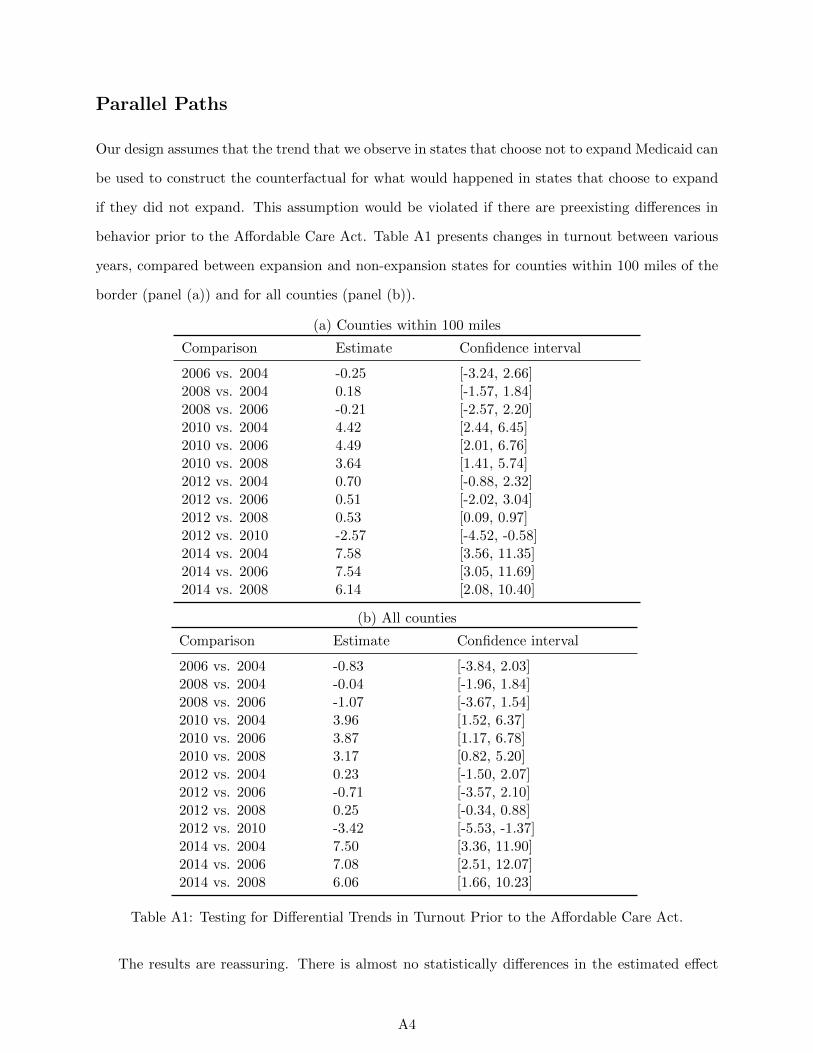
Parallel Paths
Our design assumes that the trend that we observe in states that choose not to expand Medicaid can
be used to construct the counterfactual for what would happened in states that choose to expand
if they did not expand. This assumption would be violated if there are preexisting differences in
behavior prior to the Affordable Care Act. Table A1 presents changes in turnout between various
years, compared between expansion and non-expansion states for counties within 100 miles of the
border (panel (a)) and for all counties (panel (b)).
(a) Counties within 100 miles
Comparison Estimate Confidence interval
2006 vs. 2004 -0.25 [-3.24, 2.66]2008 vs. 2004 0.18 [-1.57, 1.84]2008 vs. 2006 -0.21 [-2.57, 2.20]2010 vs. 2004 4.42 [2.44, 6.45]2010 vs. 2006 4.49 [2.01, 6.76]2010 vs. 2008 3.64 [1.41, 5.74]2012 vs. 2004 0.70 [-0.88, 2.32]2012 vs. 2006 0.51 [-2.02, 3.04]2012 vs. 2008 0.53 [0.09, 0.97]2012 vs. 2010 -2.57 [-4.52, -0.58]2014 vs. 2004 7.58 [3.56, 11.35]2014 vs. 2006 7.54 [3.05, 11.69]2014 vs. 2008 6.14 [2.08, 10.40]
(b) All counties
Comparison Estimate Confidence interval
2006 vs. 2004 -0.83 [-3.84, 2.03]2008 vs. 2004 -0.04 [-1.96, 1.84]2008 vs. 2006 -1.07 [-3.67, 1.54]2010 vs. 2004 3.96 [1.52, 6.37]2010 vs. 2006 3.87 [1.17, 6.78]2010 vs. 2008 3.17 [0.82, 5.20]2012 vs. 2004 0.23 [-1.50, 2.07]2012 vs. 2006 -0.71 [-3.57, 2.10]2012 vs. 2008 0.25 [-0.34, 0.88]2012 vs. 2010 -3.42 [-5.53, -1.37]2014 vs. 2004 7.50 [3.36, 11.90]2014 vs. 2006 7.08 [2.51, 12.07]2014 vs. 2008 6.06 [1.66, 10.23]
Table A1: Testing for Differential Trends in Turnout Prior to the Affordable Care Act.
The results are reassuring. There is almost no statistically differences in the estimated effect
A4
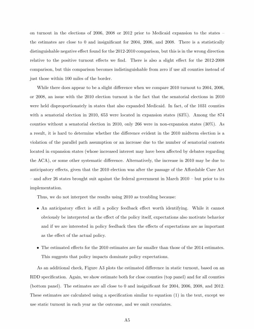
on turnout in the elections of 2006, 2008 or 2012 prior to Medicaid expansion to the states –
the estimates are close to 0 and insignificant for 2004, 2006, and 2008. There is a statistically
distinguishable negative effect found for the 2012-2010 comparison, but this is in the wrong direction
relative to the positive turnout effects we find. There is also a slight effect for the 2012-2008
comparison, but this comparison becomes indistinguishable from zero if use all counties instead of
just those within 100 miles of the border.
While there does appear to be a slight difference when we compare 2010 turnout to 2004, 2006,
or 2008, an issue with the 2010 election turnout is the fact that the senatorial elections in 2010
were held disproportionately in states that also expanded Medicaid. In fact, of the 1031 counties
with a senatorial election in 2010, 653 were located in expansion states (63%). Among the 874
counties without a senatorial election in 2010, only 266 were in non-expansion states (30%). As
a result, it is hard to determine whether the difference evident in the 2010 midterm election is a
violation of the parallel path assumption or an increase due to the number of senatorial contests
located in expansion states (whose increased interest may have been affected by debates regarding
the ACA), or some other systematic difference. Alternatively, the increase in 2010 may be due to
anticipatory effects, given that the 2010 election was after the passage of the Affordable Care Act
– and after 26 states brought suit against the federal government in March 2010 – but prior to its
implementation.
Thus, we do not interpret the results using 2010 as troubling because:
• An anticipatory effect is still a policy feedback effect worth identifying. While it cannot
obviously be interpreted as the effect of the policy itself, expectations also motivate behavior
and if we are interested in policy feedback then the effects of expectations are as important
as the effect of the actual policy.
• The estimated effects for the 2010 estimates are far smaller than those of the 2014 estimates.
This suggests that policy impacts dominate policy expectations.
As an additional check, Figure A3 plots the estimated difference in static turnout, based on an
RDD specification. Again, we show estimate both for close counties (top panel) and for all counties
(bottom panel). The estimates are all close to 0 and insignificant for 2004, 2006, 2008, and 2012.
These estimates are calculated using a specification similar to equation (1) in the text, except we
use static turnout in each year as the outcome, and we omit covariates.
A5
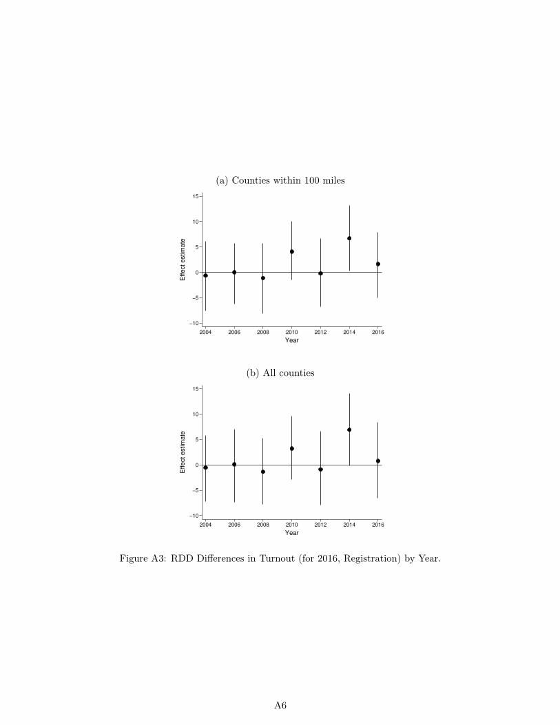
(a) Counties within 100 miles
−10
−5
0
5
10
15
Eff
ect
estim
ate
2004 2006 2008 2010 2012 2014 2016
Year
(b) All counties
−10
−5
0
5
10
15
Eff
ect
estim
ate
2004 2006 2008 2010 2012 2014 2016
Year
Figure A3: RDD Differences in Turnout (for 2016, Registration) by Year.
A6

Measuring and Coding Turnout
We obtained election results for 2014 by visiting 48 separate secretary of state web sites. While
some states report total ballots cast, some only report total votes cast by race, which means we
need to decide which race to use in measuring total votes cast. Our coding rule was to use total
ballots cast if available. If not, then there were four possible cases:
• If there was a Senate race but no Governor race, use total votes cast in the Senate race
• If there was no Senate race but there was a Governor race, use total votes cast in the Governor
race
• If there were races for both Senate and Governor, then use total votes cast in the more
competitive race
• If there was no race for either Senate or Governor, use total votes cast in House elections,
aggregated by county
Table A2 below summarizes how we coded each state for 2014.
A7
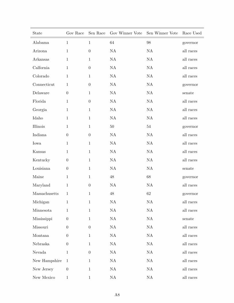
State Gov Race Sen Race Gov Winner Vote Sen Winner Vote Race Used
Alabama 1 1 64 98 governor
Arizona 1 0 NA NA all races
Arkansas 1 1 NA NA all races
Calfornia 1 0 NA NA all races
Colorado 1 1 NA NA all races
Connecticut 1 0 NA NA governor
Delaware 0 1 NA NA senate
Florida 1 0 NA NA all races
Georgia 1 1 NA NA all races
Idaho 1 1 NA NA all races
Illinois 1 1 50 54 governor
Indiana 0 0 NA NA all races
Iowa 1 1 NA NA all races
Kansas 1 1 NA NA all races
Kentucky 0 1 NA NA all races
Louisiana 0 1 NA NA senate
Maine 1 1 48 68 governor
Maryland 1 0 NA NA all races
Massachusetts 1 1 48 62 governor
Michigan 1 1 NA NA all races
Minnesota 1 1 NA NA all races
Mississippi 0 1 NA NA senate
Missouri 0 0 NA NA all races
Montana 0 1 NA NA all races
Nebraska 0 1 NA NA all races
Nevada 1 0 NA NA all races
New Hampshire 1 1 NA NA all races
New Jersey 0 1 NA NA all races
New Mexico 1 1 NA NA all races
A8
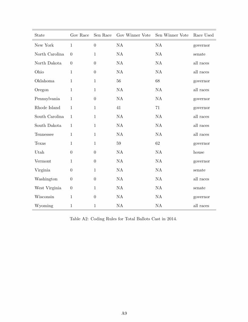
State Gov Race Sen Race Gov Winner Vote Sen Winner Vote Race Used
New York 1 0 NA NA governor
North Carolina 0 1 NA NA senate
North Dakota 0 0 NA NA all races
Ohio 1 0 NA NA all races
Oklahoma 1 1 56 68 governor
Oregon 1 1 NA NA all races
Pennsylvania 1 0 NA NA governor
Rhode Island 1 1 41 71 governor
South Carolina 1 1 NA NA all races
South Dakota 1 1 NA NA all races
Tennessee 1 1 NA NA all races
Texas 1 1 59 62 governor
Utah 0 0 NA NA house
Vermont 1 0 NA NA governor
Virginia 0 1 NA NA senate
Washington 0 0 NA NA all races
West Virginia 0 1 NA NA senate
Wisconsin 1 0 NA NA governor
Wyoming 1 1 NA NA all races
Table A2: Coding Rules for Total Ballots Cast in 2014.
A9

Alternative Participation Specifications: Using All Counties
The main text contains specifications for several baseline elections for counties located within 100
miles of the nearest border of a state with a contrary expansion status. For robustness, here we
explore the impact of using all counties – regardless of their distance from the nearest state. We
show the results in Table A3.
Turnout Turnout Registration
2014-2012 2014-2010 2016-2012
(1) (2) (3) (4) (5) (6)
Medicaid expansion 7.59 7.22 4.57 4.35 3.02 3.83
[2.83, [3.31, [0.86, [0.90, [0.08, [1.49,
12.51] 11.30] 8.45] 8.00] 5.61] 6.01]
Number of Counties 2,179 2,178 2,157 2,154 2,018 2,015
Number of States 32 32 32 32 31 31
Window All All All All All All
Covariates No Yes No Yes No Yes
R-squared 0.18 0.33 0.10 0.25 0.06 0.22
Table A3: Change in Turnout - All Counties.
Replicating the results and allowing for differences in participation to depend on the poverty
level using all counties reveals similarly consistent findings to those that obtain when looking only
at counties whose geographic center is within 100 miles of the closest border. Figure A4 graphs
the relationship of turnout and distance to the border for counties with above or below average
poverty levels, the relationship is similar to the relationship graphed in the text using counties
whose geographic center is within 100 miles of the border, but it is clear from Figure A4 that there
are some counties located far from the border that appear to have somewhat different turnout than
those that are closer to the border.
Controlling for covariates in an attempt to eliminate the potential differences reveals that while
the estimated effects on turnout are positive and similarly sized to the effects that are estimated
using counties that are close to the border, the precision of the estimates related to the change in
A10
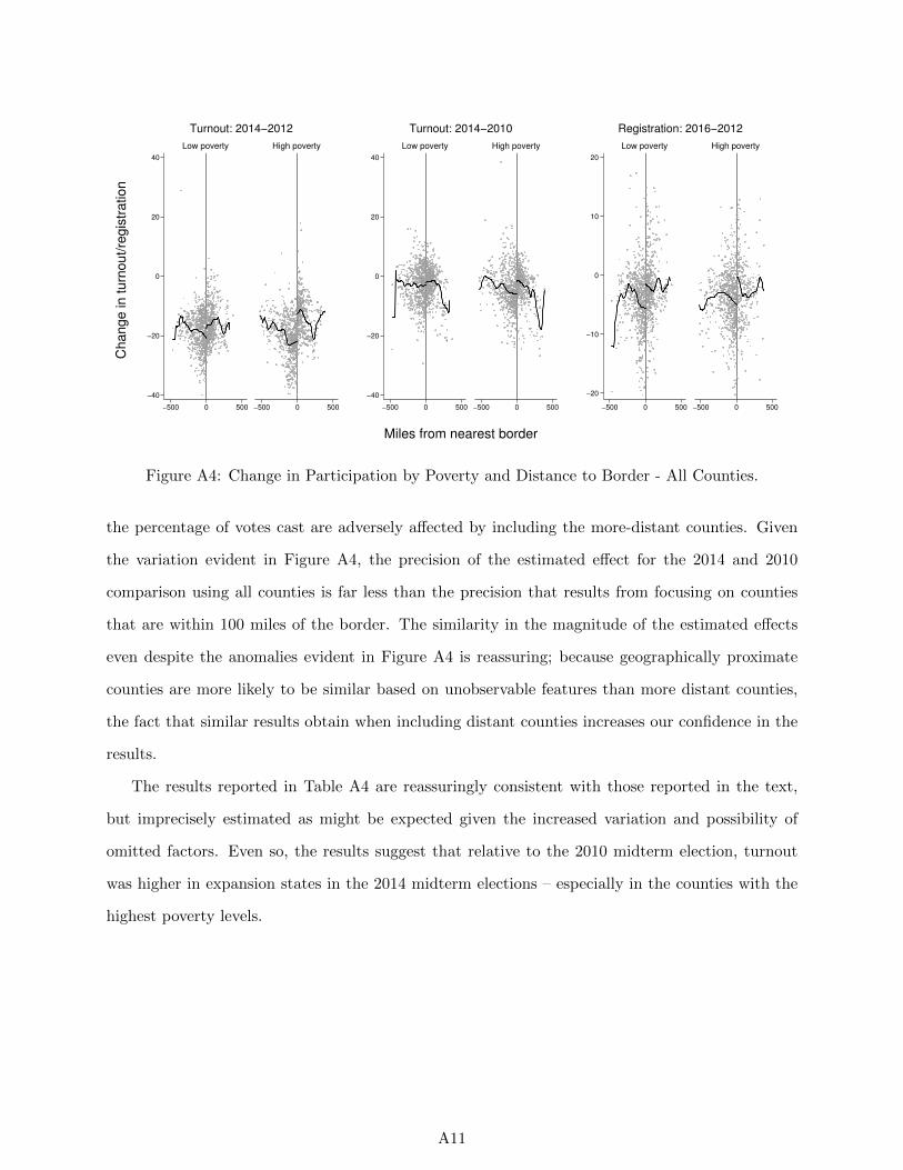
−40
−20
0
20
40
−500 0 500 −500 0 500
Low poverty High poverty
Turnout: 2014−2012
−40
−20
0
20
40
−500 0 500 −500 0 500
Low poverty High poverty
Turnout: 2014−2010
−20
−10
0
10
20
−500 0 500 −500 0 500
Low poverty High poverty
Registration: 2016−2012C
hange in turn
out/re
gis
tration
Miles from nearest border
Figure A4: Change in Participation by Poverty and Distance to Border - All Counties.
the percentage of votes cast are adversely affected by including the more-distant counties. Given
the variation evident in Figure A4, the precision of the estimated effect for the 2014 and 2010
comparison using all counties is far less than the precision that results from focusing on counties
that are within 100 miles of the border. The similarity in the magnitude of the estimated effects
even despite the anomalies evident in Figure A4 is reassuring; because geographically proximate
counties are more likely to be similar based on unobservable features than more distant counties,
the fact that similar results obtain when including distant counties increases our confidence in the
results.
The results reported in Table A4 are reassuringly consistent with those reported in the text,
but imprecisely estimated as might be expected given the increased variation and possibility of
omitted factors. Even so, the results suggest that relative to the 2010 midterm election, turnout
was higher in expansion states in the 2014 midterm elections – especially in the counties with the
highest poverty levels.
A11
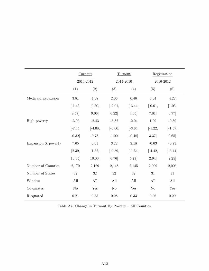
Turnout Turnout Registration
2014-2012 2014-2010 2016-2012
(1) (2) (3) (4) (5) (6)
Medicaid expansion 3.81 4.38 2.06 0.46 3.34 4.22
[-1.45, [0.50, [-2.01, [-3.44, [-0.61, [1.05,
8.57] 9.06] 6.22] 4.35] 7.01] 6.77]
High poverty -3.96 -2.43 -3.82 -2.04 1.09 -0.39
[-7.44, [-4.08, [-6.60, [-3.64, [-1.22, [-1.57,
-0.32] -0.78] -1.00] -0.48] 3.37] 0.65]
Expansion X poverty 7.65 6.01 3.22 2.18 -0.63 -0.73
[2.39, [1.52, [-0.89, [-1.54, [-4.42, [-3.44,
13.35] 10.00] 6.76] 5.77] 2.94] 2.25]
Number of Counties 2,170 2,169 2,148 2,145 2,009 2,006
Number of States 32 32 32 32 31 31
Window All All All All All All
Covariates No Yes No Yes No Yes
R-squared 0.21 0.35 0.08 0.33 0.06 0.20
Table A4: Change in Turnout By Poverty – All Counties.
A12
Alternative Participation Specifications: Interaction with Political
Environment
As a further check to the potential mechanism, we explore the extent to which the effects vary
depending on the partisanship of the county. That is, are the effects more likely to be concentrated
in Republican-leaning counties – as would be the case if the primary political impact were to
mobilize opponents – or are they more likely to be concentrated in Democratic-leaning counties?
Moreover, do the differential effects we detect in high-poverty counties persist when controlling for
partisanship?
Figure A5 replicates the results in the text by whether the county was more or less supportive
of President Obama in his 2012 re-election. The top three panels present results for counties above
the median on Obama vote share in 2012, and the bottom three panels present results for counties
below the median Obama vote share. While there are some differences in some comparisons by past
voting behavior, it is unclear whether the earlier differences by poverty level fade once partisanship
is introduced as an alternative explanation.
The results reported in Tables A5 and A6 reveal that controlling for the political leanings of the
county does not change the substantive conclusions regarding the larger impact on the percentage
of votes cast that we identify in more impoverished counties. While the estimates are sometimes
imprecise – especially in Republican leaning counties – the models indicate that Medicaid expansion
leads to a higher percentage of votes cast in more impoverished counties regardless of whether we
compare 2014 to 2012 or to 2010.
A13
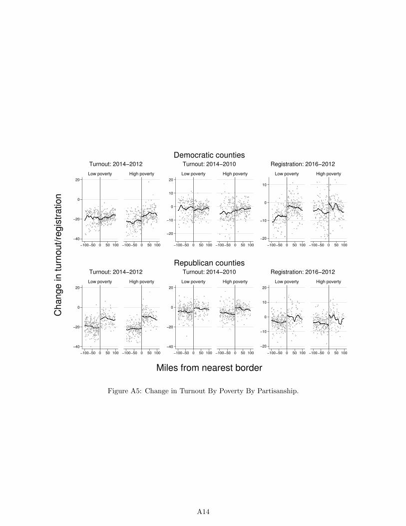
−40
−20
0
20
−100−50 0 50 100 −100−50 0 50 100
Low poverty High poverty
Turnout: 2014−2012
−20
−10
0
10
20
−100−50 0 50 100 −100−50 0 50 100
Low poverty High poverty
Turnout: 2014−2010
−20
−10
0
10
−100−50 0 50 100 −100−50 0 50 100
Low poverty High poverty
Registration: 2016−2012
Democratic counties
−40
−20
0
20
−100−50 0 50 100 −100−50 0 50 100
Low poverty High poverty
Turnout: 2014−2012
−40
−20
0
20
−100−50 0 50 100 −100−50 0 50 100
Low poverty High poverty
Turnout: 2014−2010
−20
−10
0
10
20
−100−50 0 50 100 −100−50 0 50 100
Low poverty High poverty
Registration: 2016−2012
Republican counties
Ch
an
ge
in
tu
rno
ut/
reg
istr
atio
n
Miles from nearest border
Figure A5: Change in Turnout By Poverty By Partisanship.
A14

Turnout Turnout Registration
2014-2012 2014-2010 2016-2012
(1) (2) (3) (4) (5) (6)
Medicaid expansion -0.67 0.08 -2.04 -2.00 5.65 4.63
[-5.20, [-3.42, [-6.10, [-6.35, [2.37, [1.78,
3.74] 3.63] 1.99] 2.01] 9.17] 7.62]
High poverty -2.67 -2.62 -3.54 -2.05 1.49 -1.60
[-7.12, [-5.63, [-6.78, [-5.25, [-0.64, [-3.66,
1.64] 0.55] -0.70] 0.89] 3.80] 0.42]
Expansion X poverty 5.40 4.60 3.36 3.54 -0.41 0.83
[0.67, [0.42, [-0.58, [0.50, [-4.26, [-2.79,
10.19] 8.91] 7.16] 6.48] 3.50] 4.57]
Number of Counties 644 644 648 647 601 600
Number of States 30 30 30 30 28 28
Window 100 miles 100 miles 100 miles 100 miles 100 miles 100 miles
Covariates No Yes No Yes No Yes
R-squared 0.20 0.41 0.07 0.39 0.18 0.33
Table A5: Change in Turnout By Poverty – Democrat-leaning Counties: Only counties with higherthan median vote share for Obama in 2012 are included.
A15
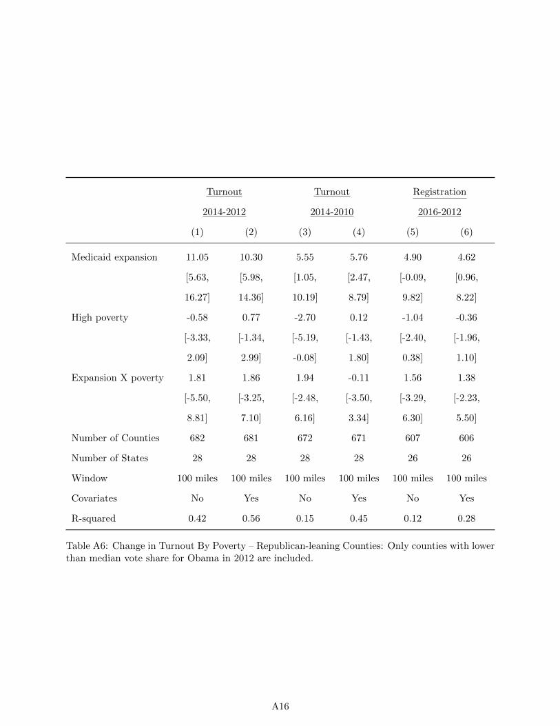
Turnout Turnout Registration
2014-2012 2014-2010 2016-2012
(1) (2) (3) (4) (5) (6)
Medicaid expansion 11.05 10.30 5.55 5.76 4.90 4.62
[5.63, [5.98, [1.05, [2.47, [-0.09, [0.96,
16.27] 14.36] 10.19] 8.79] 9.82] 8.22]
High poverty -0.58 0.77 -2.70 0.12 -1.04 -0.36
[-3.33, [-1.34, [-5.19, [-1.43, [-2.40, [-1.96,
2.09] 2.99] -0.08] 1.80] 0.38] 1.10]
Expansion X poverty 1.81 1.86 1.94 -0.11 1.56 1.38
[-5.50, [-3.25, [-2.48, [-3.50, [-3.29, [-2.23,
8.81] 7.10] 6.16] 3.34] 6.30] 5.50]
Number of Counties 682 681 672 671 607 606
Number of States 28 28 28 28 26 26
Window 100 miles 100 miles 100 miles 100 miles 100 miles 100 miles
Covariates No Yes No Yes No Yes
R-squared 0.42 0.56 0.15 0.45 0.12 0.28
Table A6: Change in Turnout By Poverty – Republican-leaning Counties: Only counties with lowerthan median vote share for Obama in 2012 are included.
A16

Alternative Participation Specifications: Continuous Poverty Level
Table A7 replicates the interaction model reported in the text using the percentage of the county
that resides in poverty according to the federal poverty limit rather than an indicator for higher-
than-median poverty levels. The results are reassuringly substantively identical to those reported in
the text – higher poverty is associated to greater changes in the percentage of votes cast regardless
of whether 2012 or 2010 is used as the base election, and the effects are larger when using 2012
relative to 2010. As was the case when using an indicator for high poverty, there is no obvious
relationship between poverty and the change in the percentage of registered voters in the county.
Turnout Turnout Registration
2014-2012 2014-2010 2016-2012
(1) (2) (3) (4) (5) (6)
Medicaid expansion -2.66 0.15 -1.02 -0.59 5.48 4.74
[-9.99, [-4.74, [-7.08, [-5.80, [-1.10, [-0.67,
5.79] 5.04] 4.96] 4.61] 11.90] 10.20]
High poverty -16.17 -0.66 -19.31 -3.26 12.90 1.47
[-43.82, [-19.61, [-47.67, [-22.11, [-1.82, [-16.11,
11.59] 18.93] 7.96] 16.35] 27.66] 20.09]
Expansion X poverty 56.19 40.70 24.68 16.73 -1.37 2.61
[15.36, [17.05, [-6.07, [-5.33, [-35.15, [-25.94,
98.06] 62.41] 56.82] 39.21] 30.90] 35.12]
Number of Counties 1,326 1,325 1,320 1,318 1,208 1,206
Number of States 32 32 32 32 30 30
Window 100 miles 100 miles 100 miles 100 miles 100 miles 100 miles
Covariates No Yes No Yes No Yes
R-squared 0.30 0.46 0.08 0.37 0.12 0.28
Table A7: Change in Turnout By Proportion Living in Poverty.
A17
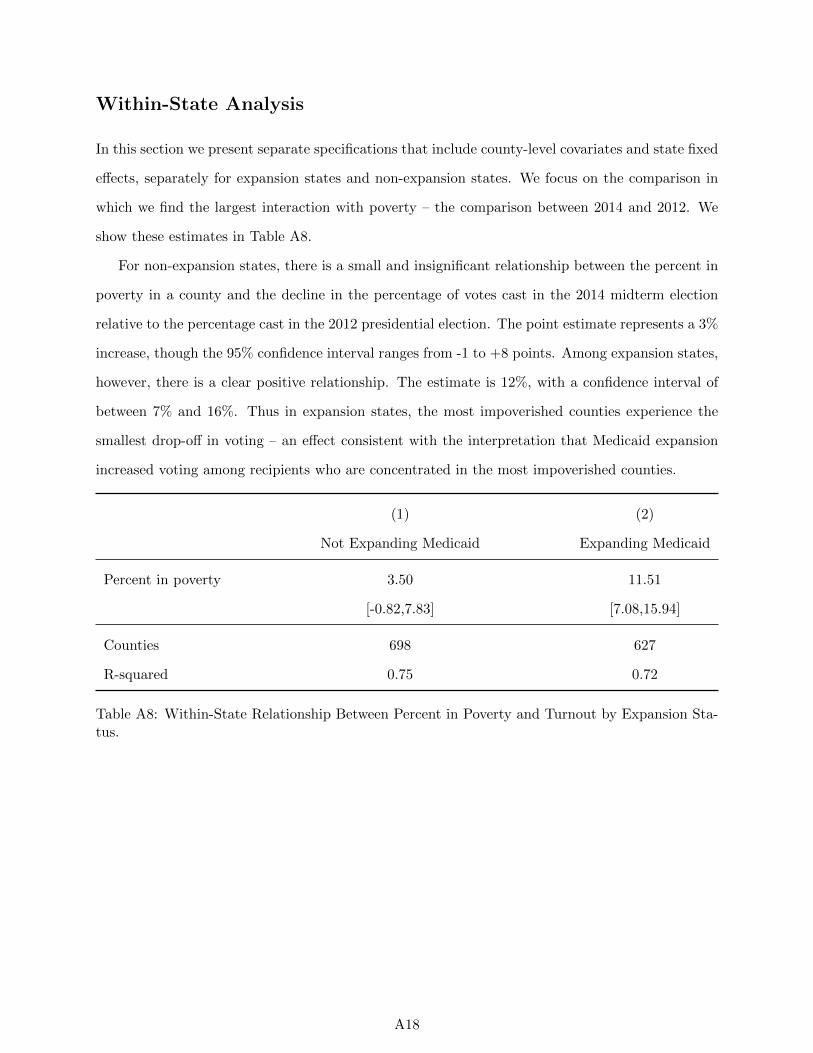
Within-State Analysis
In this section we present separate specifications that include county-level covariates and state fixed
effects, separately for expansion states and non-expansion states. We focus on the comparison in
which we find the largest interaction with poverty – the comparison between 2014 and 2012. We
show these estimates in Table A8.
For non-expansion states, there is a small and insignificant relationship between the percent in
poverty in a county and the decline in the percentage of votes cast in the 2014 midterm election
relative to the percentage cast in the 2012 presidential election. The point estimate represents a 3%
increase, though the 95% confidence interval ranges from -1 to +8 points. Among expansion states,
however, there is a clear positive relationship. The estimate is 12%, with a confidence interval of
between 7% and 16%. Thus in expansion states, the most impoverished counties experience the
smallest drop-off in voting – an effect consistent with the interpretation that Medicaid expansion
increased voting among recipients who are concentrated in the most impoverished counties.
(1) (2)
Not Expanding Medicaid Expanding Medicaid
Percent in poverty 3.50 11.51
[-0.82,7.83] [7.08,15.94]
Counties 698 627
R-squared 0.75 0.72
Table A8: Within-State Relationship Between Percent in Poverty and Turnout by Expansion Sta-tus.
A18
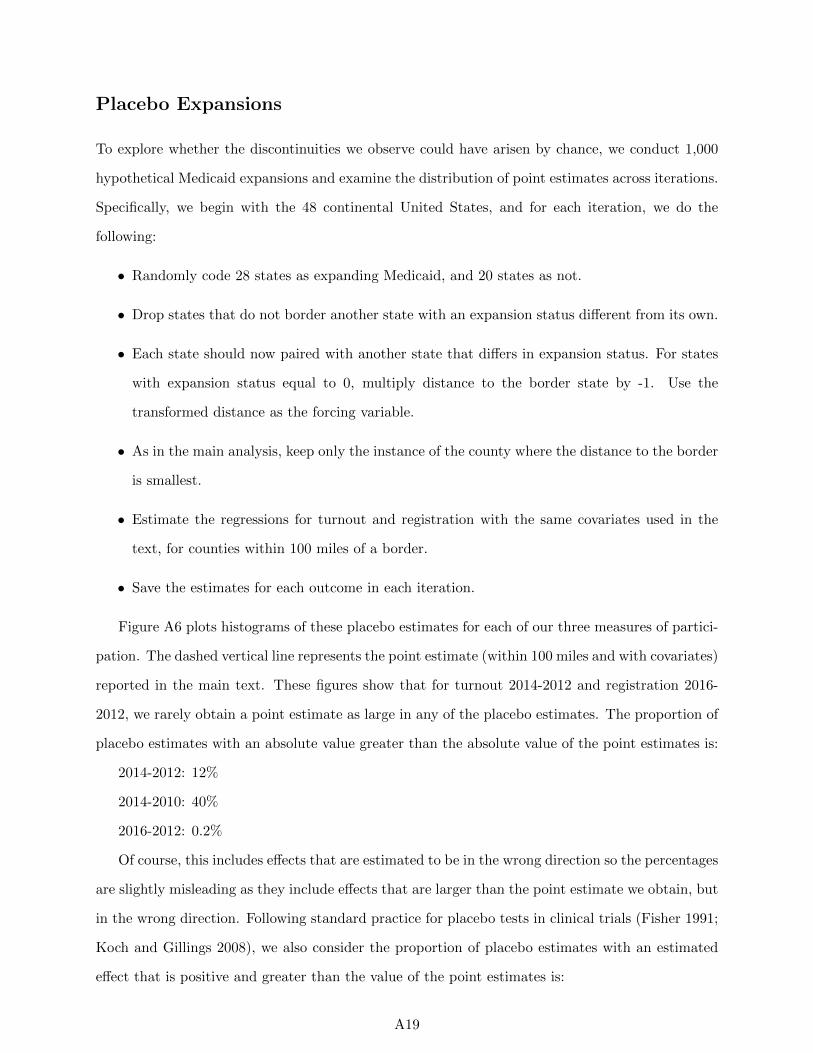
Placebo Expansions
To explore whether the discontinuities we observe could have arisen by chance, we conduct 1,000
hypothetical Medicaid expansions and examine the distribution of point estimates across iterations.
Specifically, we begin with the 48 continental United States, and for each iteration, we do the
following:
• Randomly code 28 states as expanding Medicaid, and 20 states as not.
• Drop states that do not border another state with an expansion status different from its own.
• Each state should now paired with another state that differs in expansion status. For states
with expansion status equal to 0, multiply distance to the border state by -1. Use the
transformed distance as the forcing variable.
• As in the main analysis, keep only the instance of the county where the distance to the border
is smallest.
• Estimate the regressions for turnout and registration with the same covariates used in the
text, for counties within 100 miles of a border.
• Save the estimates for each outcome in each iteration.
Figure A6 plots histograms of these placebo estimates for each of our three measures of partici-
pation. The dashed vertical line represents the point estimate (within 100 miles and with covariates)
reported in the main text. These figures show that for turnout 2014-2012 and registration 2016-
2012, we rarely obtain a point estimate as large in any of the placebo estimates. The proportion of
placebo estimates with an absolute value greater than the absolute value of the point estimates is:
2014-2012: 12%
2014-2010: 40%
2016-2012: 0.2%
Of course, this includes effects that are estimated to be in the wrong direction so the percentages
are slightly misleading as they include effects that are larger than the point estimate we obtain, but
in the wrong direction. Following standard practice for placebo tests in clinical trials (Fisher 1991;
Koch and Gillings 2008), we also consider the proportion of placebo estimates with an estimated
effect that is positive and greater than the value of the point estimates is:
A19

2014-2012: 5%
2014-2010: 19%
2016-2012: 0.1%
With the exception of the 2014-2010 comparison - a comparison we discuss in the text – the
percentages are reassuringly low.
A20
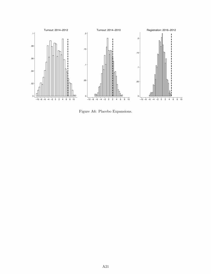
0
.02
.04
.06
.08
.1
−10 −8 −6 −4 −2 0 2 4 6 8 10
Turnout: 2014−2012
0
.05
.1
.15
.2
−10 −8 −6 −4 −2 0 2 4 6 8 10
Turnout: 2014−2010
0
.05
.1
.15
.2
−10 −8 −6 −4 −2 0 2 4 6 8 10
Registration: 2016−2012
Figure A6: Placebo Expansions.
A21
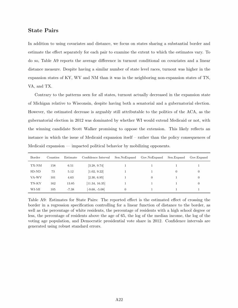
State Pairs
In addition to using covariates and distance, we focus on states sharing a substantial border and
estimate the effect separately for each pair to examine the extent to which the estimates vary. To
do so, Table A9 reports the average difference in turnout conditional on covariates and a linear
distance measure. Despite having a similar number of state level races, turnout was higher in the
expansion states of KY, WV and NM than it was in the neighboring non-expansion states of TN,
VA, and TX.
Contrary to the patterns seen for all states, turnout actually decreased in the expansion state
of Michigan relative to Wisconsin, despite having both a senatorial and a gubernatorial election.
However, the estimated decrease is arguably still attributable to the politics of the ACA, as the
gubernatorial election in 2012 was dominated by whether WI would extend Medicaid or not, with
the winning candidate Scott Walker promising to oppose the extension. This likely reflects an
instance in which the issue of Medicaid expansion itself – rather than the policy consequences of
Medicaid expansion — impacted political behavior by mobilizing opponents.
Border Counties Estimate Confidence Interval Sen.NoExpand Gov.NoExpand Sen.Expand Gov.Expand
TX-NM 158 6.51 [3.28, 9.74] 1 1 1 1
SD-ND 73 5.12 [1.02, 9.22] 1 1 0 0
VA-WV 101 4.63 [2.30, 6.95] 1 0 1 0
TN-KY 162 13.85 [11.34, 16.35] 1 1 1 0
WI-MI 105 -7.38 [-9.68, -5.08] 0 1 1 1
Table A9: Estimates for State Pairs: The reported effect is the estimated effect of crossing theborder in a regression specification controlling for a linear function of distance to the border, aswell as the percentage of white residents, the percentage of residents with a high school degree orless, the percentage of residents above the age of 65, the log of the median income, the log of thevoting age population, and Democratic presidential vote share in 2012. Confidence intervals aregenerated using robust standard errors.
A22
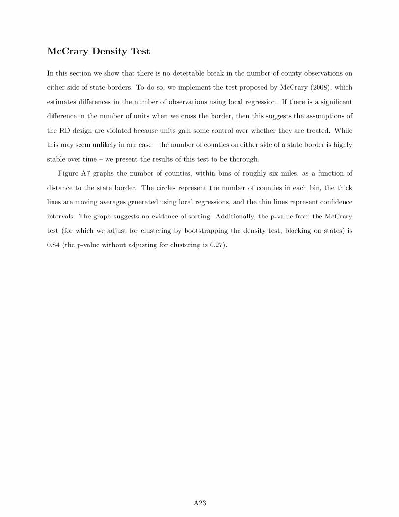
McCrary Density Test
In this section we show that there is no detectable break in the number of county observations on
either side of state borders. To do so, we implement the test proposed by McCrary (2008), which
estimates differences in the number of observations using local regression. If there is a significant
difference in the number of units when we cross the border, then this suggests the assumptions of
the RD design are violated because units gain some control over whether they are treated. While
this may seem unlikely in our case – the number of counties on either side of a state border is highly
stable over time – we present the results of this test to be thorough.
Figure A7 graphs the number of counties, within bins of roughly six miles, as a function of
distance to the state border. The circles represent the number of counties in each bin, the thick
lines are moving averages generated using local regressions, and the thin lines represent confidence
intervals. The graph suggests no evidence of sorting. Additionally, the p-value from the McCrary
test (for which we adjust for clustering by bootstrapping the density test, blocking on states) is
0.84 (the p-value without adjusting for clustering is 0.27).
A23
0
.002
.004
.006
De
nsity
−500 −400 −300 −200 −100 0 100 200 300 400 500
Distance from state border
Figure A7: McCrary Density Test.
A24
Estimates Using Two-Dimensional Distance
In the text, we use the perpendicular distance in miles to the closest border as a “forcing variable”
to control for other relevant but omitted characteristics and allow for the possibility that closer
counties are more similar. To do so, we measure distance from the county’s centroid to the relevant
state border and we use the measure of Holmes (1998). This approach assumes that, conditional on
covariates, the impact is the same at different points along the same border between states (Keele
and Titiunik 2015). We believe this is a sensible assumption given that the policy is administered at
the state level. Moreover, because our measure is the distance to the closest border – rather than the
distance to a matched observation (as is the case in Keele et al. 2016) – a unidimensional measure
based on geographic distance is more appropriate in this particular instance. Conceptually, what
matters for us is how far the county is from the border where Medicaid expansion status differs,
not how far the county is from an otherwise similar county. Even so, we also use covariates and
fixed effects to control for confounding differences along and between borders, and we never find
any indication of an impact based on distance to the closest border.
To establish the robustness of our findings, Table A10 reports the results for using both a uni-
dimensional and a two-dimension measure of distance by controlling for the lattitude and longitude
of the county centroid and the nearest border. Our two dimensional specification includes a dummy
for Medicaid expansion, linear and quadratic measures of latitude and longitude, an interaction
between latitude and longitude, and linear measures of the latitude and longitude of the nearest
border point (see Mattingly 2015 for a similar implementation of a two-dimensional geographic
RDD).1
1To measure the latter two terms, for each pair of states we used the QGIS software program to (1) convert thepair of states’ individual polygons to lines (2) found the intersection of the states’ borders, generating a line (3)divided the resulting line into equally spaced points separated by 0.25 degrees (about 17 miles) (4) assigned eachcounty to one of the border points based on Euclidean distance.
A25
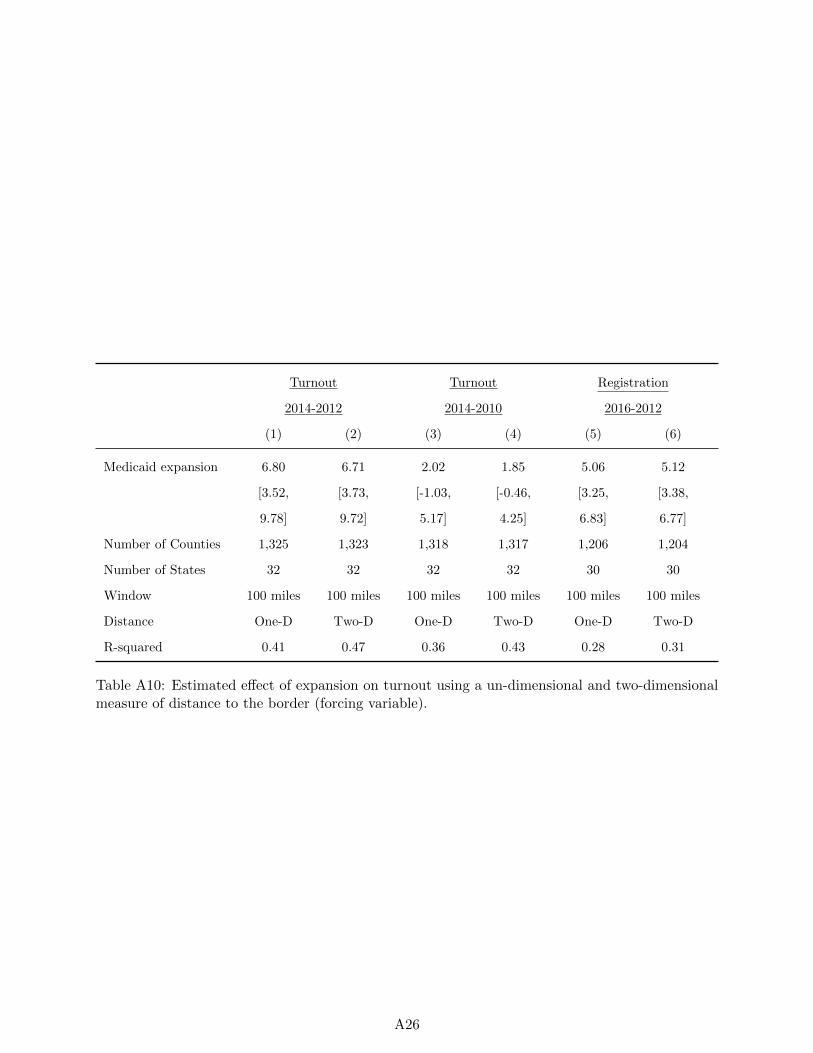
Turnout Turnout Registration
2014-2012 2014-2010 2016-2012
(1) (2) (3) (4) (5) (6)
Medicaid expansion 6.80 6.71 2.02 1.85 5.06 5.12
[3.52, [3.73, [-1.03, [-0.46, [3.25, [3.38,
9.78] 9.72] 5.17] 4.25] 6.83] 6.77]
Number of Counties 1,325 1,323 1,318 1,317 1,206 1,204
Number of States 32 32 32 32 30 30
Window 100 miles 100 miles 100 miles 100 miles 100 miles 100 miles
Distance One-D Two-D One-D Two-D One-D Two-D
R-squared 0.41 0.47 0.36 0.43 0.28 0.31
Table A10: Estimated effect of expansion on turnout using a un-dimensional and two-dimensionalmeasure of distance to the border (forcing variable).
A26
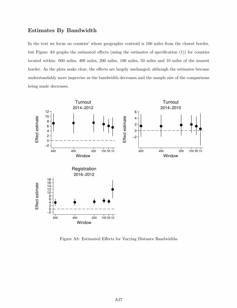
Estimates By Bandwidth
In the text we focus on counties’ whose geographic centroid is 100 miles from the closest border,
but Figure A8 graphs the estimated effects (using the estimates of specification (1)) for counties
located within: 600 miles, 400 miles, 200 miles, 100 miles, 50 miles and 10 miles of the nearest
border. As the plots make clear, the effects are largely unchanged, although the estimates become
understandably more imprecise as the bandwidth decreases and the sample size of the comparisons
being made decreases.
−2
0
2
4
6
8
10
12
Effect estim
ate
600 400 200 100 50 10
Window
2014−2012
Turnout
−2
0
2
4
6
Effect estim
ate
600 400 200 100 50 10
Window
2014−2010
Turnout
−202468
1012141618
Effect estim
ate
600 400 200 100 50 10
Window
2016−2012
Registration
Figure A8: Estimated Effects for Varying Distance Bandwidths
A27
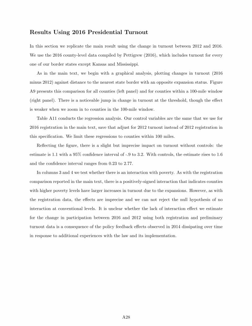
Results Using 2016 Presidential Turnout
In this section we replicate the main result using the change in turnout between 2012 and 2016.
We use the 2016 county-level data compiled by Pettigrew (2016), which includes turnout for every
one of our border states except Kansas and Mississippi.
As in the main text, we begin with a graphical analysis, plotting changes in turnout (2016
minus 2012) against distance to the nearest state border with an opposite expansion status. Figure
A9 presents this comparison for all counties (left panel) and for counties within a 100-mile window
(right panel). There is a noticeable jump in change in turnout at the threshold, though the effect
is weaker when we zoom in to counties in the 100-mile window.
Table A11 conducts the regression analysis. Our control variables are the same that we use for
2016 registration in the main text, save that adjust for 2012 turnout instead of 2012 registration in
this specification. We limit these regressions to counties within 100 miles.
Reflecting the figure, there is a slight but imprecise impact on turnout without controls: the
estimate is 1.1 with a 95% confidence interval of -.9 to 3.2. With controls, the estimate rises to 1.6
and the confidence interval ranges from 0.23 to 2.77.
In columns 3 and 4 we test whether there is an interaction with poverty. As with the registration
comparison reported in the main text, there is a positively-signed interaction that indicates counties
with higher poverty levels have larger increases in turnout due to the expansions. However, as with
the registration data, the effects are imprecise and we can not reject the null hypothesis of no
interaction at conventional levels. It is unclear whether the lack of interaction effect we estimate
for the change in participation between 2016 and 2012 using both registration and preliminary
turnout data is a consequence of the policy feedback effects observed in 2014 dissipating over time
in response to additional experiences with the law and its implementation.
A28
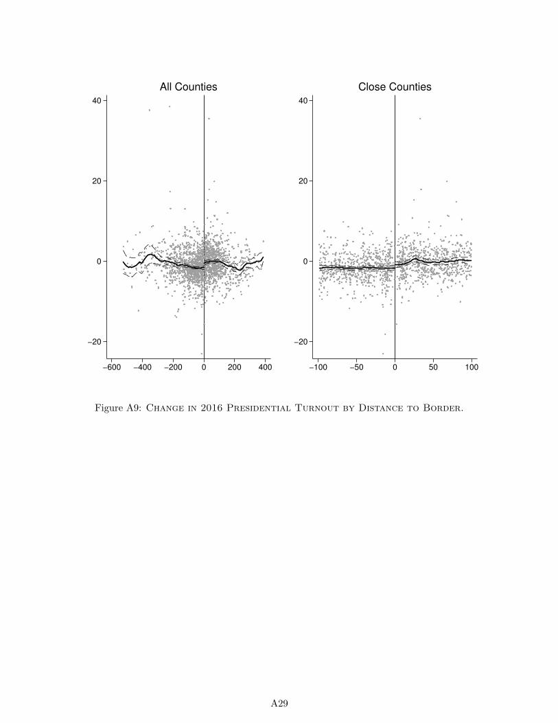
−20
0
20
40
−600 −400 −200 0 200 400
All Counties
−20
0
20
40
−100 −50 0 50 100
Close Counties
Figure A9: Change in 2016 Presidential Turnout by Distance to Border.
A29
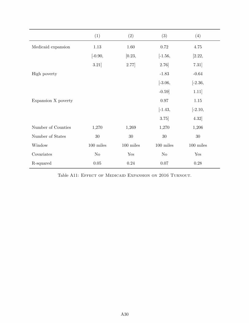
(1) (2) (3) (4)
Medicaid expansion 1.13 1.60 0.72 4.75
[-0.90, [0.23, [-1.56, [2.22,
3.21] 2.77] 2.76] 7.31]
High poverty -1.83 -0.64
[-3.06, [-2.36,
-0.59] 1.11]
Expansion X poverty 0.97 1.15
[-1.43, [-2.10,
3.75] 4.32]
Number of Counties 1,270 1,269 1,270 1,206
Number of States 30 30 30 30
Window 100 miles 100 miles 100 miles 100 miles
Covariates No Yes No Yes
R-squared 0.05 0.24 0.07 0.28
Table A11: Effect of Medicaid Expansion on 2016 Turnout.
A30
References
Fisher, LD. 1991 The use of one-sided tests in drug trials: an FDA advisory committee member’s
perspective, Journal of Biopharmaceutical Statistics 1(1): 151-6.
Holmes, Thomas J. 1998. “The Effects of State Policies on the Location of Manufacturing: Evidence
from State Borders.” Journal of Political Economy 106(4): 667-705.
Keele, Luke, Scott Lorch, Molly Passarella, Dylan Small, and Rocio Titiunik. 2016. “An Overview
of Geographically Discontinuous Treatment Assignments With An Application to Children’s
Health Insurance.” In Regression Discontinuity Designs: Theory and Applications, Advances in
Econometrics 38.
Keele, Luke J., and Rocio Titiunik. 2015. “Geographic Boundaries as Regression Discontinuities,”
Political Analysis 23(1): 127-155.
Koch, Gary G. and Dennis B. Gillings. 2008. One-Sided versus Two-Sided Tests, Wiley Encyclo-
pedia of Clinical Trials. DOI: 10.1002/9780471462422.eoct996
Mattingly, Daniel C. 2015. “Colonial Legacies and State Institutions in China: Evidence From a
Natural Experiment,” Comparative Political Studies, forthcoming.
Pettigrew, Stephen. 2016. “November 2016 general election results (county-level).” Harvard
Dataverse. Accessed January 5, 2017 via https://dataverse.harvard.edu/dataset.xhtml?
persistentId=doi:10.7910/DVN/MLLQDH&version=1.0.
Schwartz, Aaron L., and Benjamin D. Sommers. 2014. “Moving for Medicaid? Recent Eligibility
Expansions Did Not Induce Migration From Other States.” Health Affairs 33(1): 88-94.
Volden, Craig. 2002. “The politics of competitive federalism: A race to the bottom in welfare
benefits?” American Journal of Political Science 46(2): 352-363.
A31