Embed Size (px)
DESCRIPTION
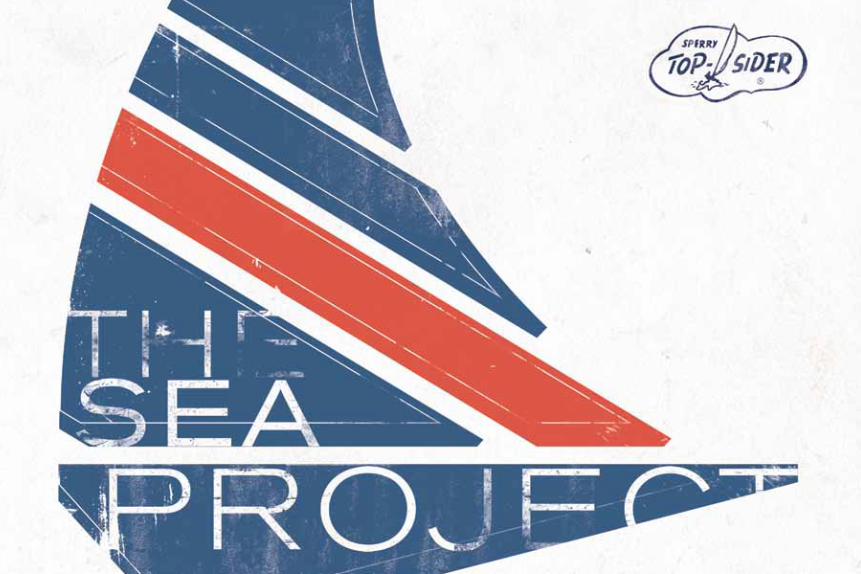
THE SEA PROJECT, by Sperry Top-Sider, is a contemporary, culture-forward project inspired by a “Passion for the Sea” and fuses leading and up-and-coming artists with fashion projects, street-level outreach, fine art exhibitions, Limited Edition collections or other ideas still being crafted.
Citation preview
1
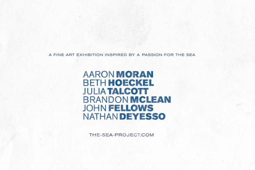
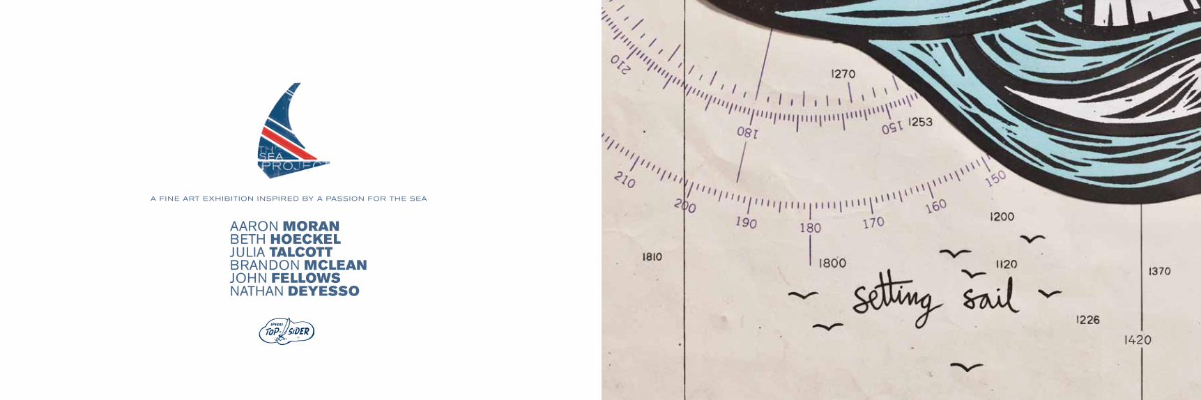
AARON MORANBETH HOECKELJULIA TALCOTTBRANDON MCLEANJOHN FELLOWSNATHAN DEYESSO
A FINE ART EXHIBITION INSPIRED BY A PASSION FOR THE SEA

2 3
THE SEA PROjEcT , by Sperry Top-Sider, is a contemporary, culture-forward project inspired by a “Passion for the Sea” and fuses
leading and up-and-coming artists with fashion projects, street-level outreach, fine art exhibitions, Limited Edition collections or other ideas still
being crafted. Each project, created and inspired by a Passion for the Sea, is aligned with a non-profit to benefit from this effort.
The inaugural Sea Project Exhibit, October 25, 2012 at The Fourth Wall Project in Boston kicks off this exciting new project for Sperry Top-Sider
and allows artists, appreciators, tastemakers, sneaker-heads, Editors, bloggers and cultural influencers to view and admire original works of art,
produced by international artists.
about this pROjECT

4 5
Sperry Top-Sider has been an American Original since 1935 when Paul Sperry invented the first boat shoe for sailors.
Inspired by the innovation of our founder, we create for performance, build with quality and design for an enduring
sense of style. Sperry Top-Sider is the leading global nautical lifestyle brand for men, women and kids that share our
Passion for the Sea.
about SpERRY TOp-SIDER // sperrytopsider.com
6 7
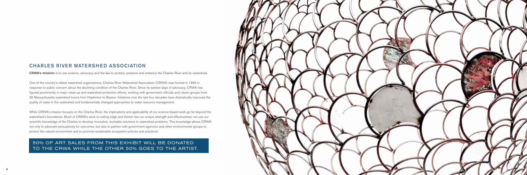
50% OF ART SAlES FROm THIS EXHIBIT wIll BE DONATED TO THE cRwA wHIlE THE OTHER 50% gOES TO THE ARTIST.
charLes riVer Watershed associatioNCRWA’s mission is to use science, advocacy and the law to protect, preserve and enhance the Charles River and its watershed.
One of the country’s oldest watershed organizations, Charles River Watershed Association (CRWA) was formed in 1965 in
response to public concern about the declining condition of the Charles River. Since its earliest days of advocacy, CRWA has
figured prominently in major clean-up and watershed protection efforts, working with government officials and citizen groups from
35 Massachusetts watershed towns from Hopkinton to Boston. Initiatives over the last four decades have dramatically improved the
quality of water in the watershed and fundamentally changed approaches to water resource management.
While CRWA’s mission focuses on the Charles River, the implications and applicability of our science-based work go far beyond the
watershed’s boundaries. Much of CRWA’s work is cutting edge and therein lies our unique strength and effectiveness: we use our
scientific knowledge of the Charles to develop innovative, workable solutions to watershed problems. This knowledge allows CRWA
not only to advocate persuasively for outcomes, but also to partner with government agencies and other environmental groups to
protect the natural environment and to promote sustainable ecosystem policies and practices.

8 9
The sea inspires all of us.
From the way it makes us feel as we watch the rhythm of its waves on a sunny summer day, to the shapes and colors it creates during its wild,
angry storms. Each ripple leads us to something else. The sea inspires something deep inside our collective souls.
Sperry Top-Sider’s THE SEA PROjEcT embraces just this: what the sea does for us and to us ~ both individually and as a collection
of people that share their love for it. As a curator, I am honored to work with Sperry Top-Sider to document how the sea inspires creativity.
It is amazing to read the history of Sperry Top-Sider and the innovation of its Founder Paul Sperry. Whether in 1935 when first launched,
or today still, Sperry Top-Sider is in constant pursuit of creating a brand that helps further one’s relationship with the sea ~ whether for work,
fun or fashion.
Sperry Top-Sider was born on the sea in 1935, when founder and avid sailor Paul Sperry created the world’s first boat shoe. Sperry Top-Sider
has had a Passion For The Sea for over seventy-five years and will always pursue strengthening our relationship with the water.
Each artist featured in this inaugural exhibit tells a story through their work of what the sea truly means to them. Each was posed a simple
question to ponder; “What is your passion for the sea?” The work you see is their answer.
It is our hope that these artists’ passion inspires your own, and allows you to connect with the sea in whatever form, color or shape.
Tyler Lauren McGinley, Curator
Letter from THE CuRATOR
10 11
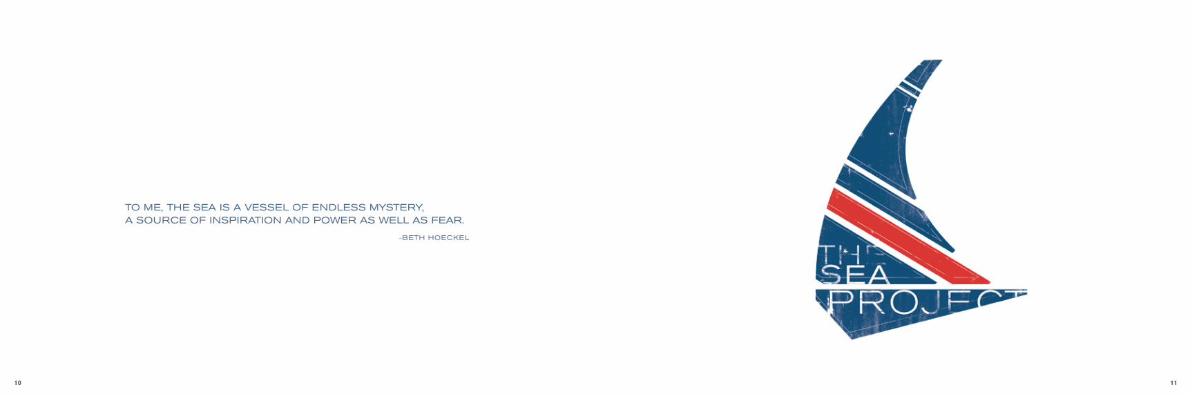
TO mE, THE SEA IS A vESSEl OF ENDlESS mYSTERY, A SOuRcE OF INSPIRATION AND POwER AS wEll AS FEAR.
-BETH HOEckEl
12 13
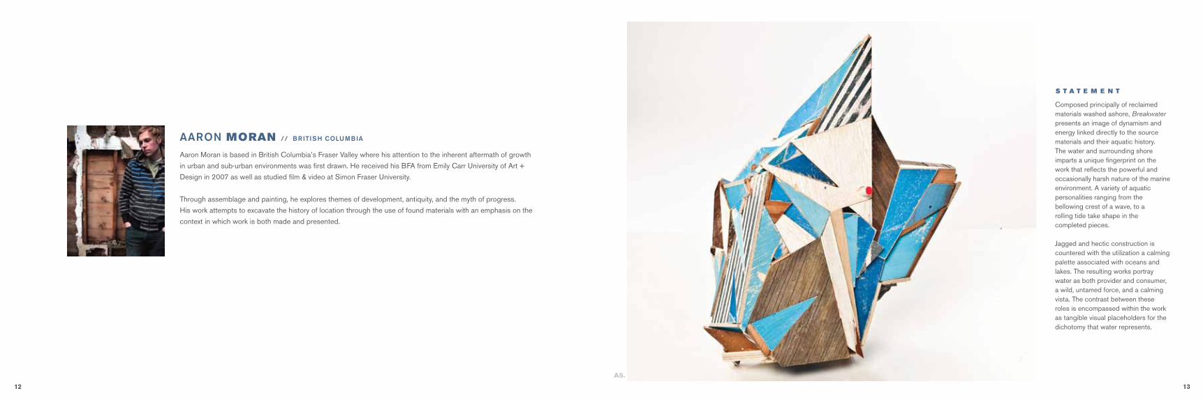
Aaron Moran is based in British Columbia’s Fraser Valley where his attention to the inherent aftermath of growth
in urban and sub-urban environments was first drawn. He received his BFA from Emily Carr University of Art +
Design in 2007 as well as studied film & video at Simon Fraser University.
Through assemblage and painting, he explores themes of development, antiquity, and the myth of progress.
His work attempts to excavate the history of location through the use of found materials with an emphasis on the
context in which work is both made and presented.
aaroN MORAN // british coLumbia
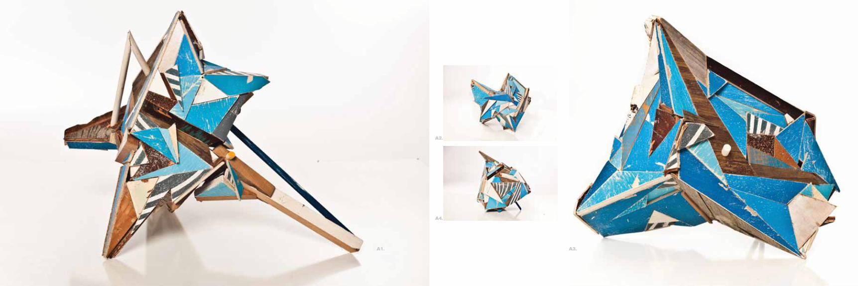
Composed principally of reclaimed materials washed ashore, Breakwaterpresents an image of dynamism and energy linked directly to the sourcematerials and their aquatic history. The water and surrounding shoreimparts a unique fingerprint on the work that reflects the powerful andoccasionally harsh nature of the marine environment. A variety of aquaticpersonalities ranging from the bellowing crest of a wave, to a rolling tide take shape in the completed pieces.
Jagged and hectic construction is countered with the utilization a calming palette associated with oceans and lakes. The resulting works portray water as both provider and consumer, a wild, untamed force, and a calming vista. The contrast between these roles is encompassed within the work as tangible visual placeholders for the dichotomy that water represents.
S T A T E M E N T
A5.
14 15
A1.
A2.
A4.
A3.
16 17
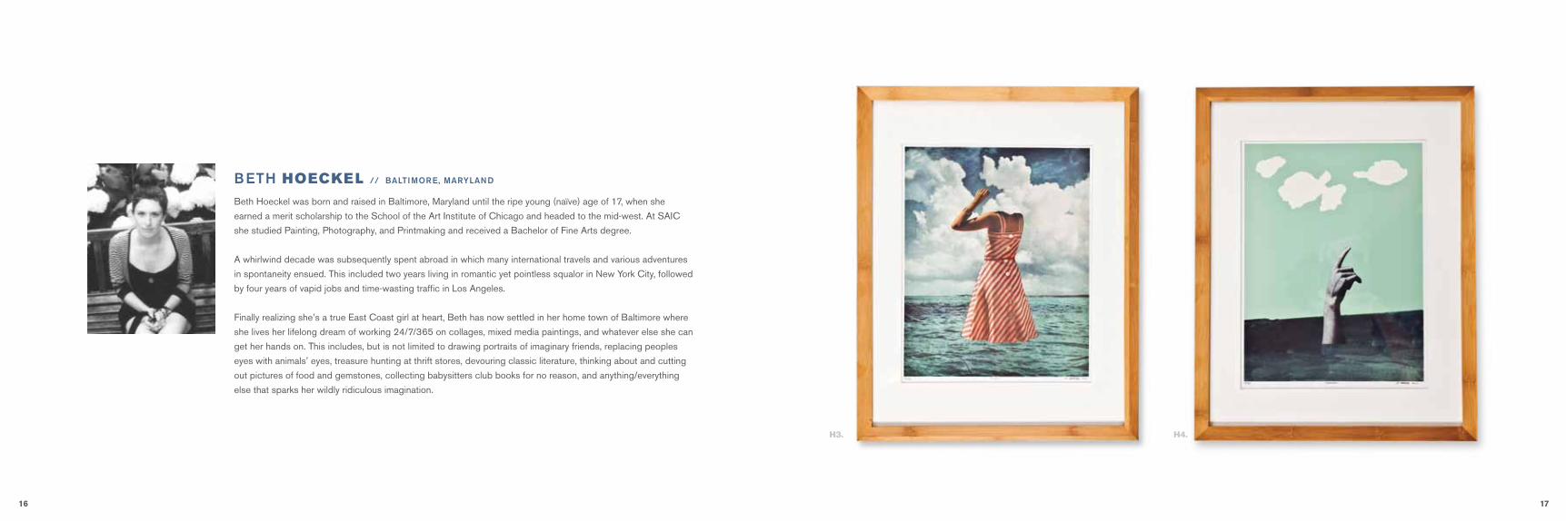
Beth Hoeckel was born and raised in Baltimore, Maryland until the ripe young (naïve) age of 17, when she
earned a merit scholarship to the School of the Art Institute of Chicago and headed to the mid-west. At SAIC
she studied Painting, Photography, and Printmaking and received a Bachelor of Fine Arts degree.
A whirlwind decade was subsequently spent abroad in which many international travels and various adventures
in spontaneity ensued. This included two years living in romantic yet pointless squalor in New York City, followed
by four years of vapid jobs and time-wasting traffic in Los Angeles.
Finally realizing she’s a true East Coast girl at heart, Beth has now settled in her home town of Baltimore where
she lives her lifelong dream of working 24/7/365 on collages, mixed media paintings, and whatever else she can
get her hands on. This includes, but is not limited to drawing portraits of imaginary friends, replacing peoples
eyes with animals’ eyes, treasure hunting at thrift stores, devouring classic literature, thinking about and cutting
out pictures of food and gemstones, collecting babysitters club books for no reason, and anything/everything
else that sparks her wildly ridiculous imagination.
beth HOECKEL // baLtimore, maryLaNd
H3. H4.
18 19
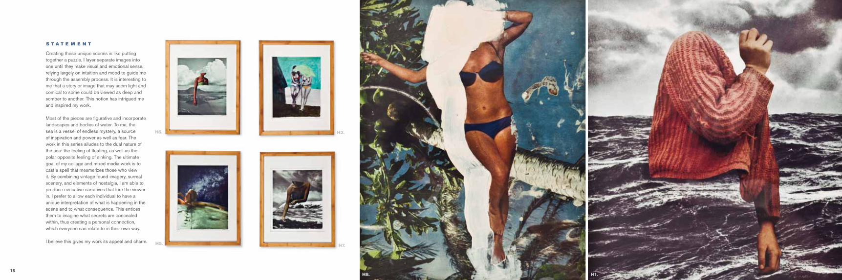
Creating these unique scenes is like putting together a puzzle. I layer separate images into one until they make visual and emotional sense, relying largely on intuition and mood to guide me through the assembly process. It is interesting to me that a story or image that may seem light and comical to some could be viewed as deep and somber to another. This notion has intrigued me and inspired my work.
Most of the pieces are figurative and incorporate landscapes and bodies of water. To me, the sea is a vessel of endless mystery, a source of inspiration and power as well as fear. The work in this series alludes to the dual nature of the sea- the feeling of floating, as well as the polar opposite feeling of sinking. The ultimate goal of my collage and mixed media work is to cast a spell that mesmerizes those who view it. By combining vintage found imagery, surreal scenery, and elements of nostalgia, I am able to produce evocative narratives that lure the viewer in. I prefer to allow each individual to have a unique interpretation of what is happening in the scene and to what consequence. This entices them to imagine what secrets are concealed within, thus creating a personal connection, which everyone can relate to in their own way.
I believe this gives my work its appeal and charm.
S T A T E M E N T
H6. H2.
H5. H7.
H8. H1.
20 21
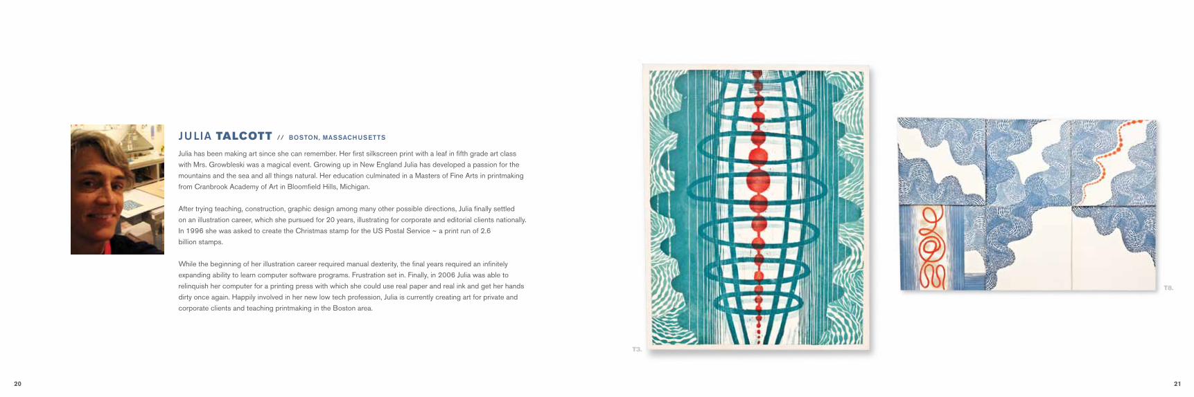
Julia has been making art since she can remember. Her first silkscreen print with a leaf in fifth grade art class
with Mrs. Growbleski was a magical event. Growing up in New England Julia has developed a passion for the
mountains and the sea and all things natural. Her education culminated in a Masters of Fine Arts in printmaking
from Cranbrook Academy of Art in Bloomfield Hills, Michigan.
After trying teaching, construction, graphic design among many other possible directions, Julia finally settled
on an illustration career, which she pursued for 20 years, illustrating for corporate and editorial clients nationally.
In 1996 she was asked to create the Christmas stamp for the US Postal Service ~ a print run of 2.6
billion stamps.
While the beginning of her illustration career required manual dexterity, the final years required an infinitely
expanding ability to learn computer software programs. Frustration set in. Finally, in 2006 Julia was able to
relinquish her computer for a printing press with which she could use real paper and real ink and get her hands
dirty once again. Happily involved in her new low tech profession, Julia is currently creating art for private and
corporate clients and teaching printmaking in the Boston area.
JuLia TALCOTT // bostoN, massachusetts
T3.
T8.

22 23
My work reflects my interest in the natural world and its intersection with the man-made world. I like to observe natural and man-made patterns, pull them apart, and then re-imagine them as printed pieces. Creating them as linoleum and woodblock prints– I produce a vocabulary of images and then work intuitively to collage them back together into new forms. I alternate between abstraction and representational images, with color and black and white pallets to weave images together that strive to express the vitality of growth and decay in a physical and spiritual world.
The sea stays on my mind. I ponder its limitlessness, the play of light on itssurface, the feeling of calm that pervades me when viewing the sea from above. I consider its depths and the unknowable things that happen below, the things that grow and live where no one can see them. I want to express the sea’s power and mystery, its undulations and shimmering expanses, its salty depths from which life was created in order to fashion a symbolic dialog between the sea and man’s effort to interact with it.
S T A T E M E N T
T7.
T4.
T1.
T6.
T2. T5.
24 25
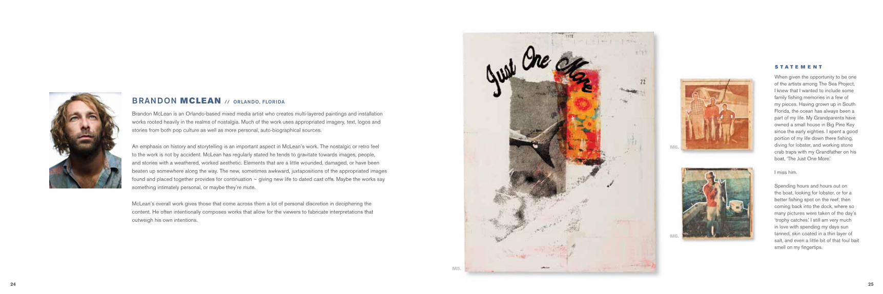
Brandon McLean is an Orlando-based mixed media artist who creates multi-layered paintings and installation
works rooted heavily in the realms of nostalgia. Much of the work uses appropriated imagery, text, logos and
stories from both pop culture as well as more personal, auto-biographical sources.
An emphasis on history and storytelling is an important aspect in McLean’s work. The nostalgic or retro feel
to the work is not by accident. McLean has regularly stated he tends to gravitate towards images, people,
and stories with a weathered, worked aesthetic. Elements that are a little wounded, damaged, or have been
beaten up somewhere along the way. The new, sometimes awkward, juxtapositions of the appropriated images
found and placed together provides for continuation ~ giving new life to dated cast offs. Maybe the works say
something intimately personal, or maybe they’re mute.
McLean’s overall work gives those that come across them a lot of personal discretion in deciphering the
content. He often intentionally composes works that allow for the viewers to fabricate interpretations that
outweigh his own intentions.
When given the opportunity to be one of the artists among The Sea Project, I knew that I wanted to include some family fishing memories in a few of my pieces. Having grown up in South Florida, the ocean has always been a part of my life. My Grandparents have owned a small house in Big Pine Key since the early eighties. I spent a good portion of my life down there fishing, diving for lobster, and working stone crab traps with my Grandfather on his boat, ‘The Just One More.’
I miss him.
Spending hours and hours out on the boat, looking for lobster, or for a better fishing spot on the reef, then coming back into the dock, where so many pictures were taken of the day’s ‘trophy catches.’ I still am very much in love with spending my days sun tanned, skin coated in a thin layer of salt, and even a little bit of that foul bait smell on my fingertips.
braNdoN MCLEAN // orLaNdo, fLorida
S T A T E M E N T
M5.
M6.
M6.

26 27
The larger sewn collage pieces I completed for this project are a homage of sorts to my childlike recollections of the way I remember ocean exploration being shown. Reminiscing on the old days of heavy rubber fins, round masks, & submarines. Reading the stories of Captain Nemo, Jacques Cousteau, and the mysteries of the sea.
I always loved the idea that you could become a naturalist, a diver by trade, somebody paid to watch the fish.
S T A T E M E N T ( C O N T I N U E D )
M6.
M2.
M6.
M3. M4.
M1.
28 29
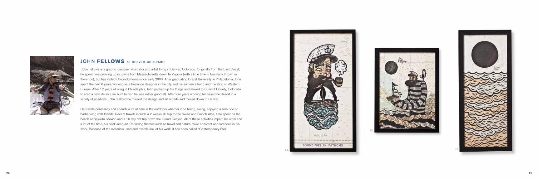
John Fellows is a graphic designer, illustrator and artist living in Denver, Colorado. Originally from the East Coast,
he spent time growing up in towns from Massachusetts down to Virginia (with a little time in Germany thrown in
there too), but has called Colorado home since early 2003. After graduating Drexel University in Philadelphia, John
spent the next 6 years working as a freelance designer in the city and his summers living and traveling in Western
Europe. After 12 years of living in Philadelphia, John packed up his things and moved to Summit County, Colorado
to start a new life as a ski bum (which he was rather good at). After four years working for Keystone Resort in a
variety of positions, John realized he missed the design and art worlds and moved down to Denver.
He travels constantly and spends a lot of time in the outdoors whether it be hiking, skiing, enjoying a bike ride or
barbecuing with friends. Recent travels include a 2 weeks ski trip to the Swiss and French Alps, time spent on the
beach of Sayulita, Mexico and a 16 day raft trip down the Grand Canyon. All of these activities impact his work and
a lot of the time, his bank account. Recurring themes such as travel and nature make constant appearances in his
work. Because of the materials used and overall look of his work, it has been called “Contemporary Folk”.
JohN FELLOWS // deNVer, coLorado
j4.
j3.
j2.
30 31
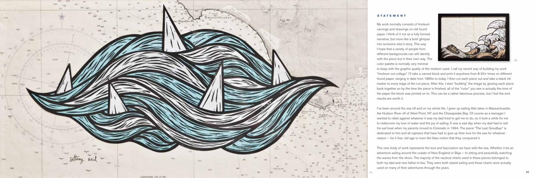
My work normally consists of linoleum
carvings and drawings on old found
paper. I think of it not as a fully formed
narrative, but more like a brief glimpse
into someone else’s story. This way
I hope that a variety of people from
different backgrounds can still identify
with the piece but in their own way. The
color palette is normally very minimal
to keep with the graphic quality of the medium used. I call my recent way of building my work
“linoleum cut collage”. I’ll take a carved block and print it anywhere from 8-20+ times on different
found paper, ranging in date from 1880s to today. I then cut each piece out and take a black ink
marker to every edge of the cut piece. After this, I start “building” the image by glueing each piece
back together so by the time the piece is finished, all of the “color” you see is actually the tone of
the paper the block was printed on to. This can be a rather laborious process, but I feel the end
results are worth it.
I’ve been around the sea off and on my whole life. I grew up sailing little lakes in Massachusetts,
the Hudson River off of West Point, NY and the Chesapeake Bay. Of course as a teenager I
wanted to rebel against whatever it was my dad tried to get me to do, so it took a while for me
to rediscover my love of water and the joy of sailing. It was a sad day when my dad had to sell
his sail boat when my parents moved to Colorado in 1994. The piece “The Last Goodbye” is
dedicated to him and all captains that have had to give up their love for the sea for whatever
reason ~ be it fear, old age or even the false notion that they conquered it.
This new body of work represents the love and fascination we have with the sea. Whether it be an
adventure sailing around the coasts of New England or Baja ~ to sitting and peacefully watching
the waves from the shore. The majority of the nautical charts used in these pieces belonged to
both my dad and new father-in-law. They were both raised sailing and these charts were actually
used on many of their adventures through the years.
S T A T E M E N T
j1.
j5.

32 33
Nate Deyesso is an artist, designer, and builder living and surfing along Maine’s southern coast. He graduated
from the University of Vermont with a Studio Art degree and quickly migrated back to the coast in 2001.
Once situated comfortably in Portland, Maine, he furthered his artistic endeavors; picking up commissioned
work painting portraits and apprenticing for local artisans and craftsmen. Although painting had been his main
focus, three dimensional art began to take hold during this time. Artist such as Patrick Plourde and John Bisbee
inspired Nate with large metal works with organic shapes using reclaimed steel parts, salvaged wood and
embracing the natural aesthetic of weathered materials, rust, and natural patinas.
Originally from the south shore of Massachusetts, his upbringing near the coast has allowed him to forge a
strong connection between the ocean and his perspective on life. Encounters above and below the sea are his
muse for creating furniture, fixtures and art.
Along with Nate’s fine art work, he runs a small custom metal and wood shop at his home studio / barn in
Scarborough, Maine called DSO Creative Fabrication, that occupies his time when not fending off his three
young children or chasing waves.
Tumble Weed incorporates flashes of shiny scales, wave like patterns, anddecay which can all be found in and around the ocean and have beenconceptually gathered by this mass as it rolled itself across the ocean floor.Emerging from the sea, it’s a fish out of water ~ waiting to return and fill itsremaining voids.
5’ in diameter Steel, stainless steel, copper, rope.
Nate DEYESSO // scarborough, maiNe
S T A T E M E N T
N1.

34 35
aaroN MORAN
A1.) B reAkwAte r V / 20” x 15” x 14” / $900
A2.) B reAkwAte r I V / 19” x 15” x 7” / $1000
A3.) B reAkwAte r I / 16” x 10” x 14” / $1000
A4.) B reAkwAte r I I I / 16” x 9” x 16” / $1000
A5.) B reAkwAte r I I / 14” x 11” x 19” / $1000
J1.) S ettI ng SA I l / 8.5” x14” / $250
J2.) B lAck Sun r I S I ng / 8” x 20” / $200
J3.) th e lASt goodBye / 11” x 14” / $400
J4.) th I n k I ng of home / 8.5” x 14” / $400
J5.) Adr I ft At S eA / 11” x 17” / $500
JohN FELLOWS
h1.) h I g h S eAS / 16” x 20” / $250
h2.) lASt Summer / 16” x 20” / $250
h3.) floAt / 16” x 20” / $250
h4.) hor Izon / 16” x 20” / $250
h5.) BAth e / 16” x 20” / $250
h6.) dAydreAm / 16” x 20” / $250
h7.) I S lAnd / 16” x 20” / $250
h8.) g et out / 16” x 20” / $250
beth HOECKEL
n1.) tumBle weed / / 60” d IAmeter / / $7,500
NathaN DEYESSO
m1.) In the defenSe of ShArkS / 16” x 20” / $395
m2.) my deep SeA workBook (gold) / 24” x 30” / $895
m3.) my deep SeA workBook (red) / 24” x 30” / $895
m4.) my deep SeA workBook (Blue) / 24” x 30” / $895
m5.) JuSt one more / 16” x 20” / $395
m6.) cAptAIn ed (collectIon) / 8” x 8” / $395
braNdoN MCLEAN
t1.) hop p e r / 12” x 12” / $650
t2.) trAnSfe r / 16” x 12” / $800
t3.) u p / 11” x 14” / $700
t4.) orAng e trAp / 12” x 12” / $850
t5.) h eArt / 18” x 12” / $800
t6.) g re e n trAp / 12” x 12” / $850
t7.) p e r I Scop e / 25” x 36” / $950
t8.) Smoke S I g nAlS / 36” x 24” / $1250
JuLia TALCOTT
THE-SEA-PROjEcT.cOm/SHOPTO PuRcHASE ARTwORk PlEASE gO TO:
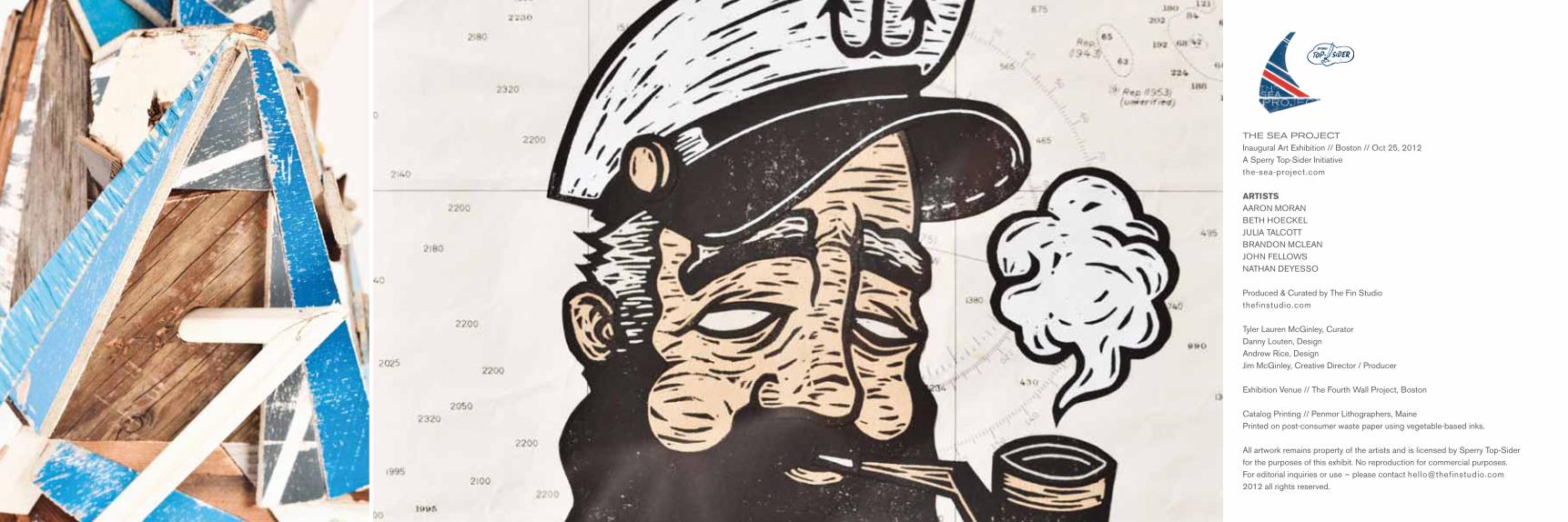
THE SEA PROjEcT Inaugural Art Exhibition // Boston // Oct 25, 2012A Sperry Top-Sider Initiativethe-sea-project.com
ARTISTSAARON MORANBETH HOECKELJULIA TALCOTTBRANDON MCLEANJOHN FELLOWSNATHAN DEYESSO
Produced & Curated by The Fin Studiothefinstudio.com
Tyler Lauren McGinley, CuratorDanny Louten, DesignAndrew Rice, DesignJim McGinley, Creative Director / Producer
Exhibition Venue // The Fourth Wall Project, Boston
Catalog Printing // Penmor Lithographers, MainePrinted on post-consumer waste paper using vegetable-based inks.
All artwork remains property of the artists and is licensed by Sperry Top-Sider for the purposes of this exhibit. No reproduction for commercial purposes.For editorial inquiries or use ~ please contact [email protected] 2012 all rights reserved.