Embed Size (px)
Citation preview
The Social Atlas of Europe: using geoinformatics to paint a picture of a continent united in diversity
Dimitris Ballas Department of Geography University of Sheffield e-mail: [email protected] twitter: @dimitris_ballas http://www.sheffield.ac.uk/geography/staff/ballas_dimitris
Outline
• A country called Europe?
• Human-scaled visualisations
• The Social Atlas of Europe: data, methods and types of maps
• Outputs
• On-going work and next steps
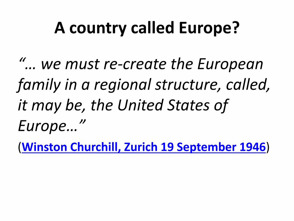
A country called Europe?
“… we must re-create the European family in a regional structure, called, it may be, the United States of Europe…” (Winston Churchill, Zurich 19 September 1946)
A country called Europe?
http://www.youtube.com/watch?v=aqBg2_rMkK0
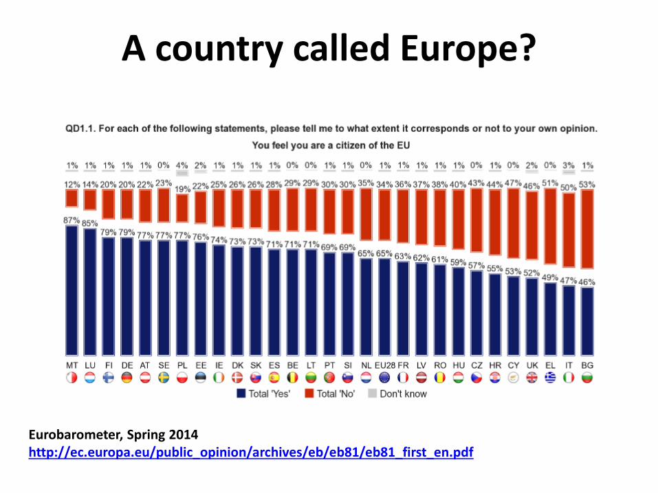
A country called Europe?
Eurobarometer, Spring 2014 http://ec.europa.eu/public_opinion/archives/eb/eb81/eb81_first_en.pdf
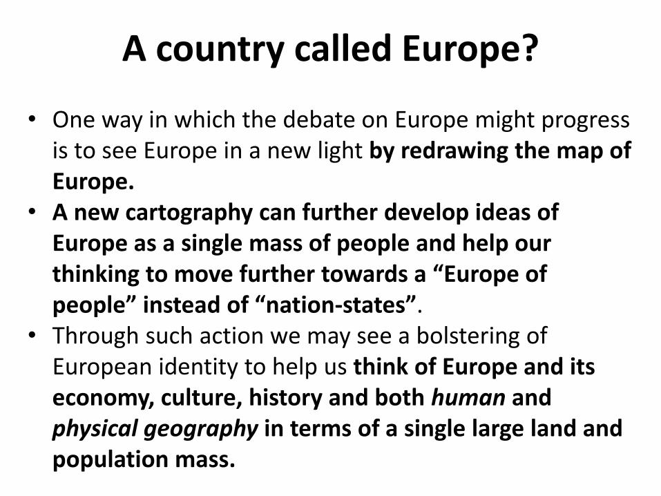
• One way in which the debate on Europe might progress is to see Europe in a new light by redrawing the map of Europe.
• A new cartography can further develop ideas of Europe as a single mass of people and help our thinking to move further towards a “Europe of people” instead of “nation-states”.
• Through such action we may see a bolstering of European identity to help us think of Europe and its economy, culture, history and both human and physical geography in terms of a single large land and population mass.
A country called Europe?
A country called Europe?
http://www.youtube.com/watch?v=_iBps5R81GE
“The world is complex, dynamic,
multidimensional; the paper is static, flat. How
are we to represent the rich visual world of
experience and measurement on mere
flatland?”
(Tufte, 1990 p.9)
We must create a new language, consider a transitory
state of new illusions and layers of validity and accept
the possibility that there may be no language to
describe ultimate reality, beyond the language of visions.
(Denes A. 1979, p.3)
How long will it take to describe all that you can see in words?
Human-scaled visualisations
Speaking visually…
• We cannot easily turn a picture on our mind into something that other people see
• Artists take days to paint a single portrait
• From cameras to computers: converting data into pictures
• Mapping
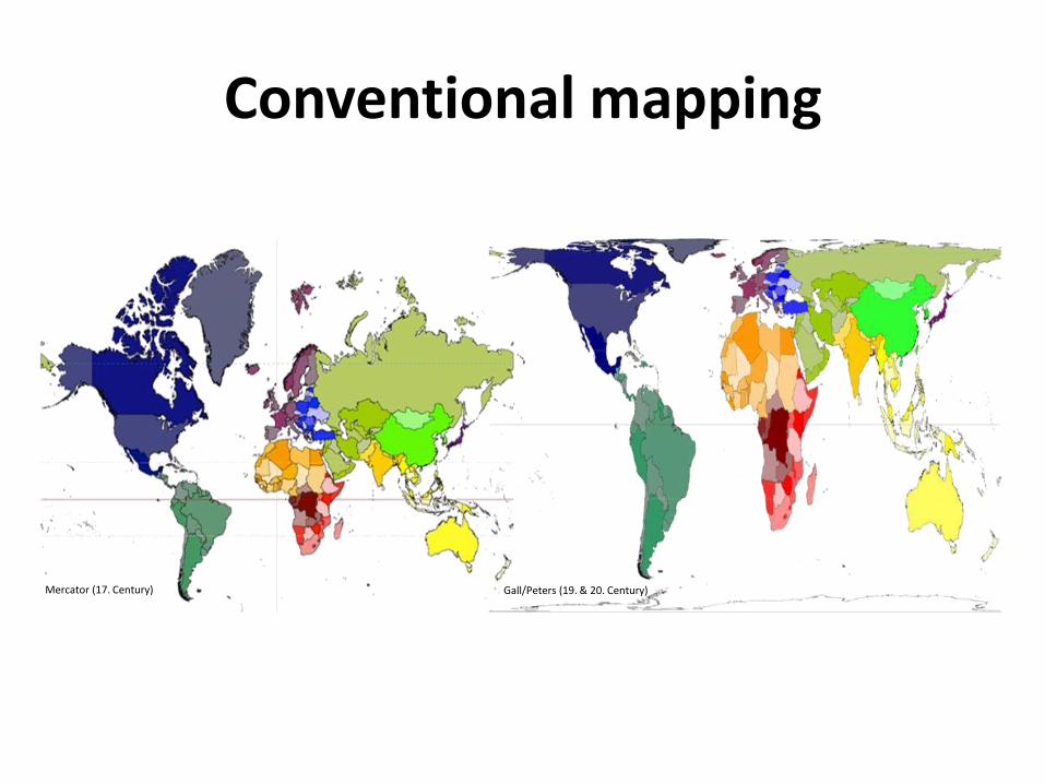
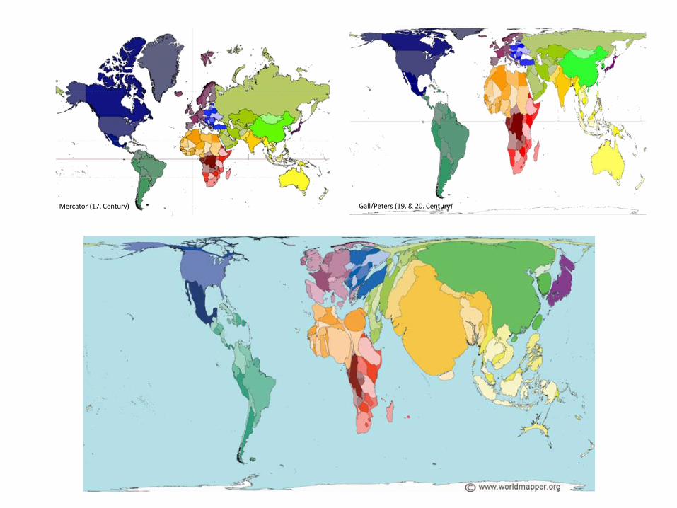
Conventional mapping
Mercator (17. Century) Gall/Peters (19. & 20. Century)
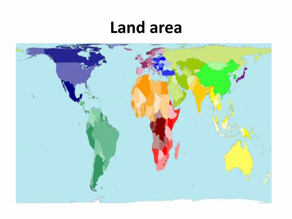
Land area
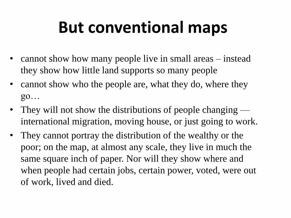
But conventional maps
• cannot show how many people live in small areas – instead
they show how little land supports so many people
• cannot show who the people are, what they do, where they
go…
• They will not show the distributions of people changing —
international migration, moving house, or just going to work.
• They cannot portray the distribution of the wealthy or the
poor; on the map, at almost any scale, they live in much the
same square inch of paper. Nor will they show where and
when people had certain jobs, certain power, voted, were out
of work, lived and died.
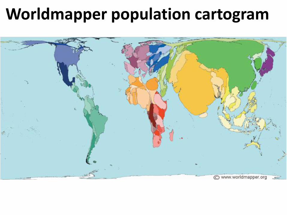
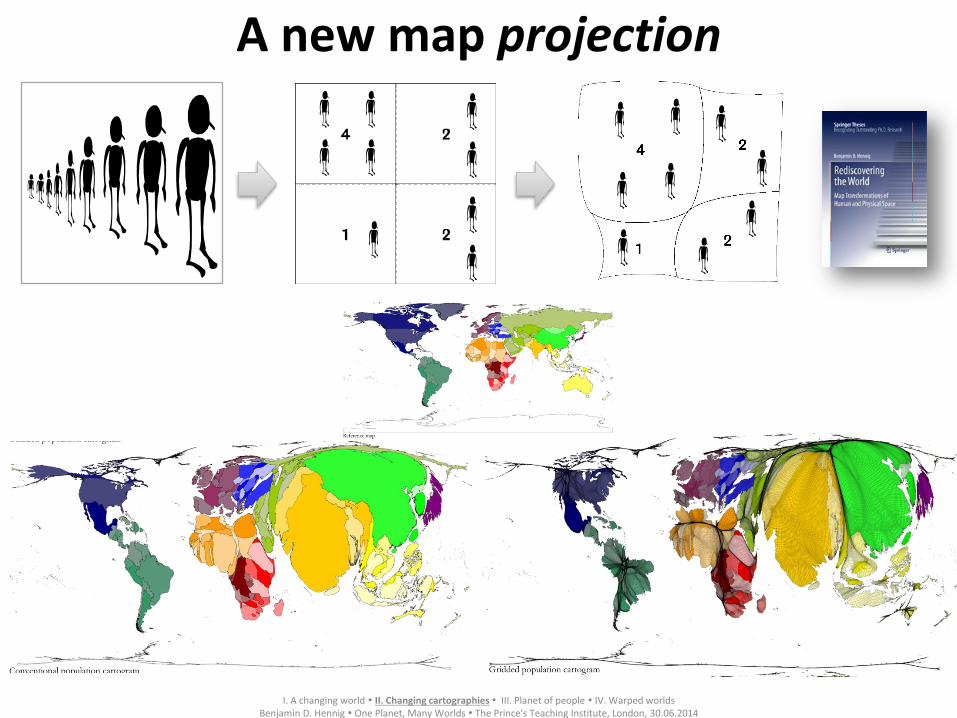
Worldmapper population cartogram
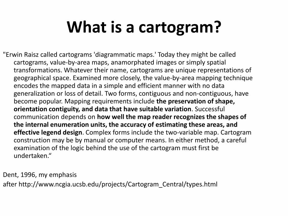
What is a cartogram?
"Erwin Raisz called cartograms 'diagrammatic maps.' Today they might be called cartograms, value-by-area maps, anamorphated images or simply spatial transformations. Whatever their name, cartograms are unique representations of geographical space. Examined more closely, the value-by-area mapping technique encodes the mapped data in a simple and efficient manner with no data generalization or loss of detail. Two forms, contiguous and non-contiguous, have become popular. Mapping requirements include the preservation of shape, orientation contiguity, and data that have suitable variation. Successful communication depends on how well the map reader recognizes the shapes of the internal enumeration units, the accuracy of estimating these areas, and effective legend design. Complex forms include the two-variable map. Cartogram construction may be by manual or computer means. In either method, a careful examination of the logic behind the use of the cartogram must first be undertaken.“
Dent, 1996, my emphasis
after http://www.ncgia.ucsb.edu/projects/Cartogram_Central/types.html
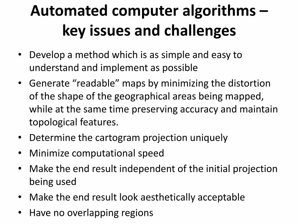
Automated computer algorithms – key issues and challenges
• Develop a method which is as simple and easy to understand and implement as possible
• Generate “readable” maps by minimizing the distortion of the shape of the geographical areas being mapped, while at the same time preserving accuracy and maintain topological features.
• Determine the cartogram projection uniquely
• Minimize computational speed
• Make the end result independent of the initial projection being used
• Make the end result look aesthetically acceptable
• Have no overlapping regions
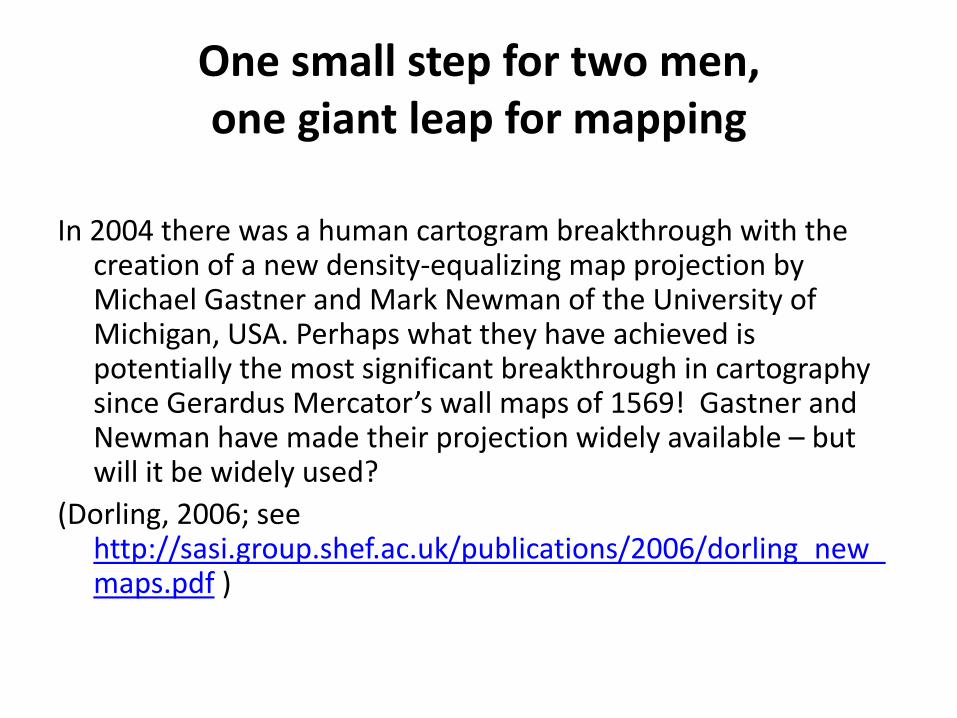
One small step for two men, one giant leap for mapping
In 2004 there was a human cartogram breakthrough with the creation of a new density-equalizing map projection by Michael Gastner and Mark Newman of the University of Michigan, USA. Perhaps what they have achieved is potentially the most significant breakthrough in cartography since Gerardus Mercator’s wall maps of 1569! Gastner and Newman have made their projection widely available – but will it be widely used?
(Dorling, 2006; see http://sasi.group.shef.ac.uk/publications/2006/dorling_new_maps.pdf )
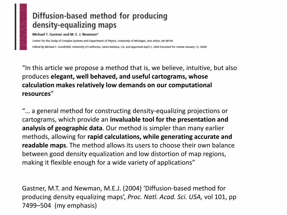
“In this article we propose a method that is, we believe, intuitive, but also produces elegant, well behaved, and useful cartograms, whose calculation makes relatively low demands on our computational resources” “… a general method for constructing density-equalizing projections or cartograms, which provide an invaluable tool for the presentation and analysis of geographic data. Our method is simpler than many earlier methods, allowing for rapid calculations, while generating accurate and readable maps. The method allows its users to choose their own balance between good density equalization and low distortion of map regions, making it flexible enough for a wide variety of applications” Gastner, M.T. and Newman, M.E.J. (2004) ‘Diffusion-based method for producing density equalizing maps’, Proc. Natl. Acad. Sci. USA, vol 101, pp 7499–504 (my emphasis)
Mercator (17. Century) Gall/Peters (19. & 20. Century)
Land area
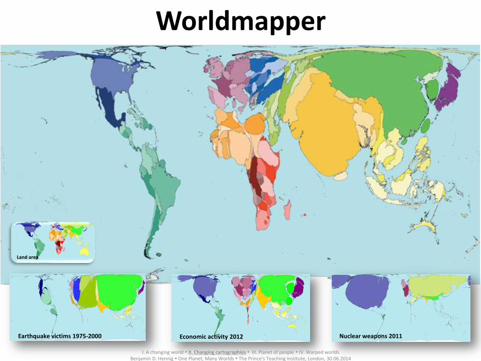
Earthquake victims 1975-2000 Economic activity 2012 Nuclear weapons 2011
Worldmapper
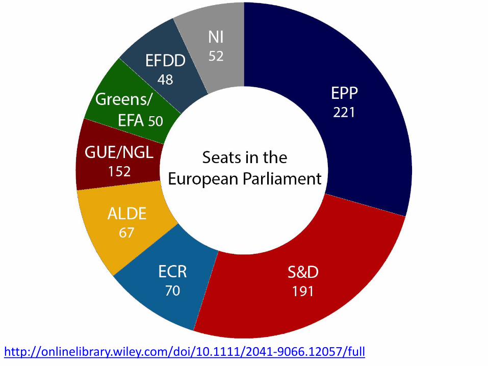
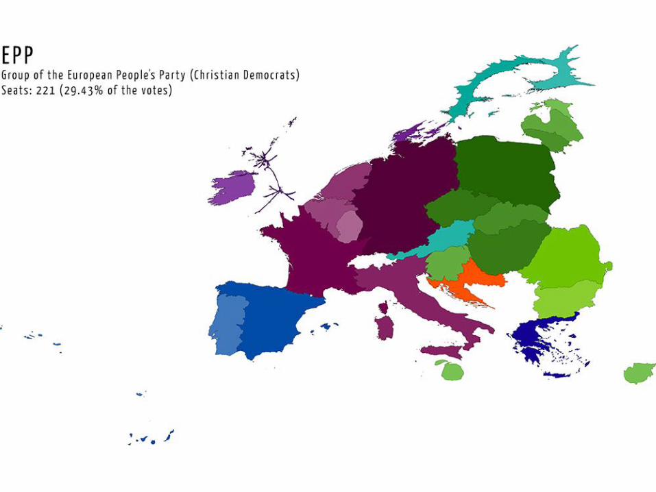
I. A changing world II. Changing cartographies III. Planet of people IV. Warped worlds
Benjamin D. Hennig One Planet, Many Worlds The Prince's Teaching Institute, London, 30.06.2014
9
A new map projection
I. A changing world II. Changing cartographies III. Planet of people IV. Warped worlds
Benjamin D. Hennig One Planet, Many Worlds The Prince's Teaching Institute, London, 30.06.2014
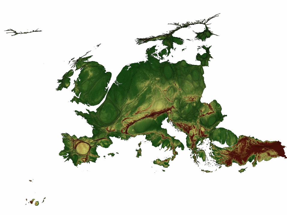
An inverse of a traditional physical geography map?
• This is a new, human geography map, depicting mountains and valleys.
• European mapping needs to change if an entity as complex and diverse as the human geography of this continent is to be shown in all its detail, in a way in which a map may be able to fire up imaginations, certainly of its younger citizens who are more used to seeing the world graphically in ways their grandparents could have hardly imagined.
A country called Europe?
http://www.youtube.com/watch?v=McKhO7wtShw
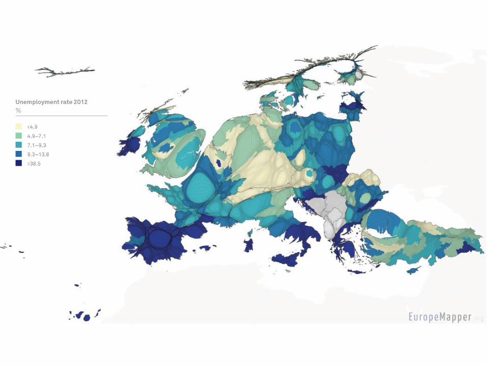
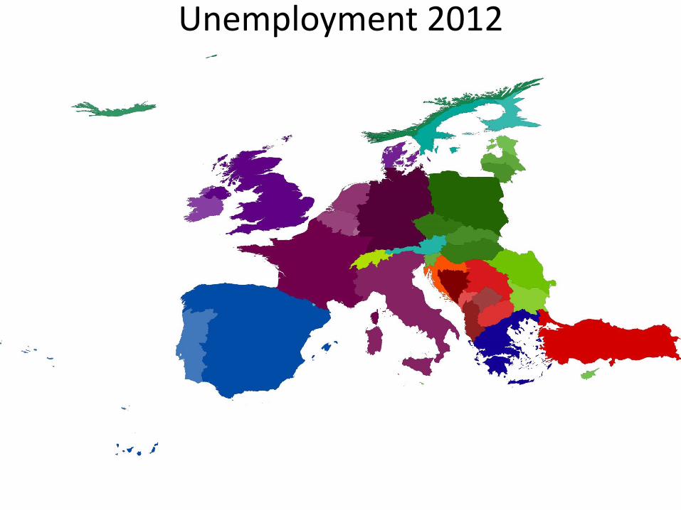
Unemployment 2012
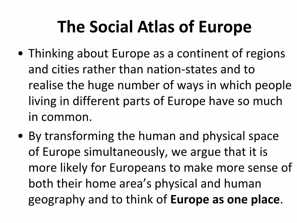
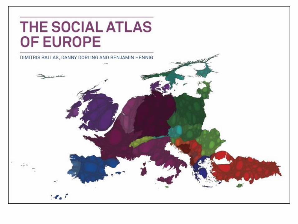
The Social Atlas of Europe
• Thinking about Europe as a continent of regions and cities rather than nation-states and to realise the huge number of ways in which people living in different parts of Europe have so much in common.
• By transforming the human and physical space of Europe simultaneously, we argue that it is more likely for Europeans to make more sense of both their home area’s physical and human geography and to think of Europe as one place.
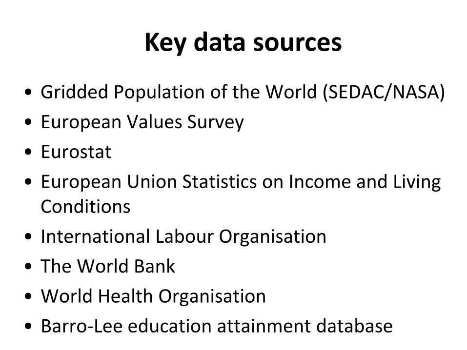
Key data sources
• Gridded Population of the World (SEDAC/NASA)
• European Values Survey
• Eurostat
• European Union Statistics on Income and Living Conditions
• International Labour Organisation
• The World Bank
• World Health Organisation
• Barro-Lee education attainment database
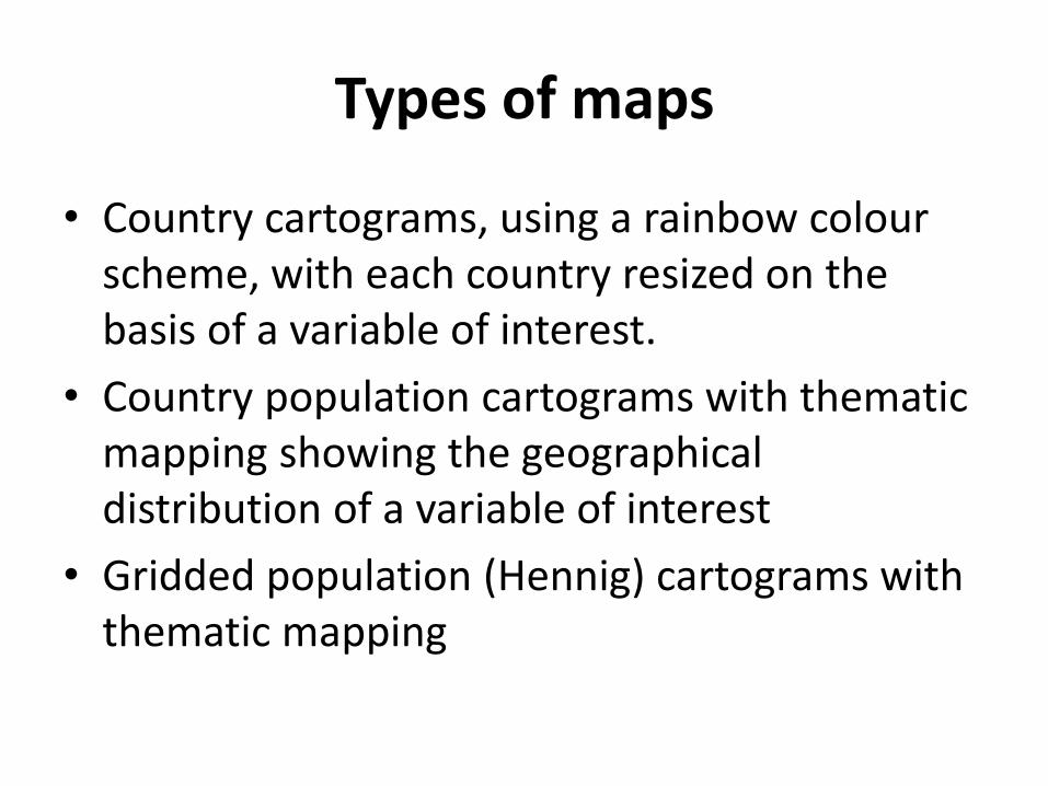
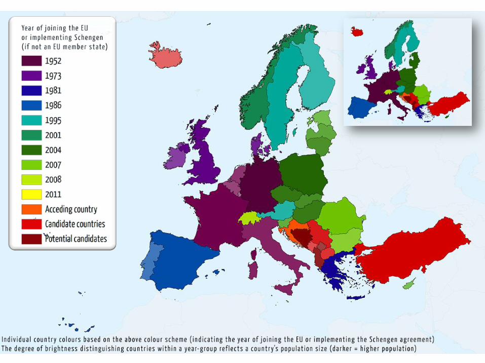
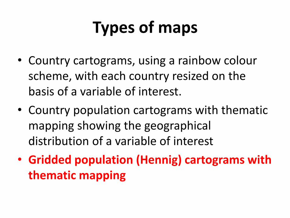
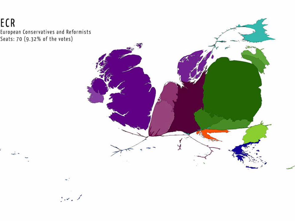
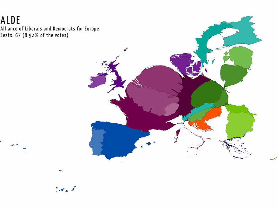
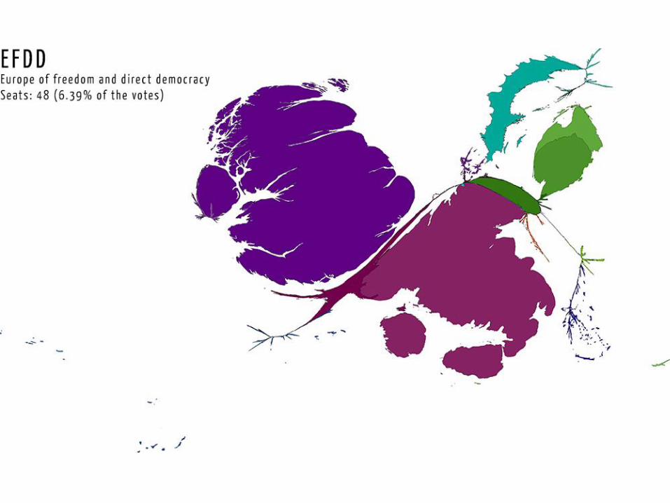
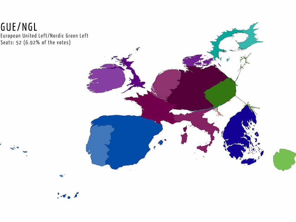
Types of maps
• Country cartograms, using a rainbow colour scheme, with each country resized on the basis of a variable of interest.
• Country population cartograms with thematic mapping showing the geographical distribution of a variable of interest
• Gridded population (Hennig) cartograms with thematic mapping
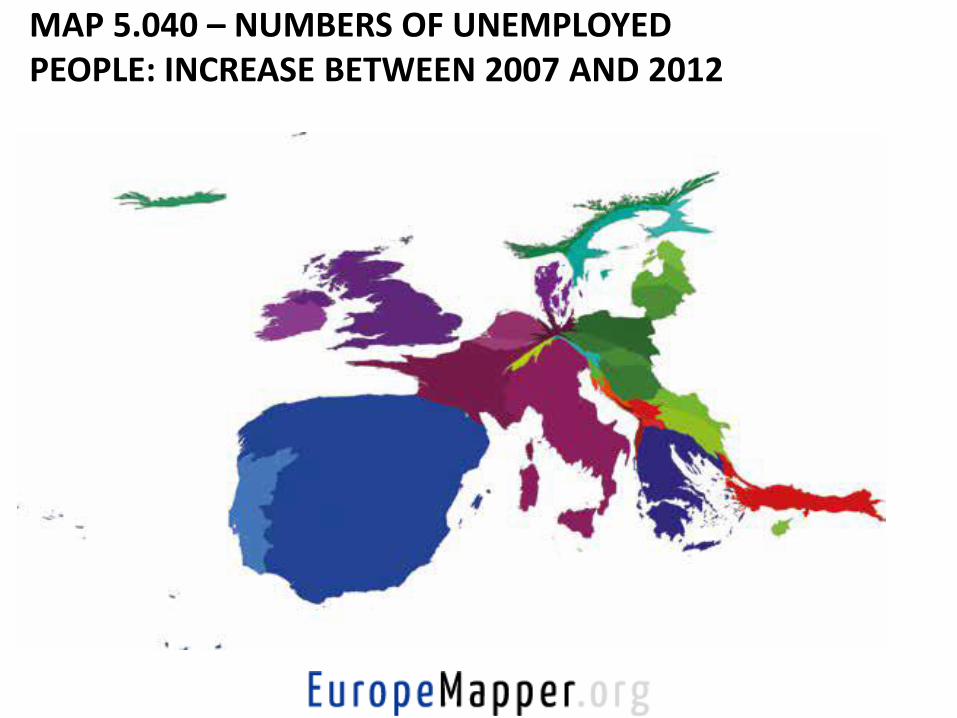
MAP 5.040 – NUMBERS OF UNEMPLOYED PEOPLE: INCREASE BETWEEN 2007 AND 2012
Types of maps
• Country cartograms, using a rainbow colour scheme, with each country resized on the basis of a variable of interest.
• Country population cartograms with thematic mapping showing the geographical distribution of a variable of interest
• Gridded population (Hennig) cartograms with thematic mapping
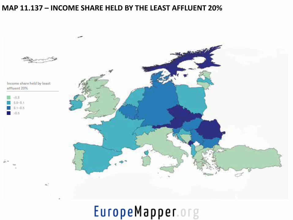
MAP 11.137 – INCOME SHARE HELD BY THE LEAST AFFLUENT 20%
Types of maps
• Country cartograms, using a rainbow colour scheme, with each country resized on the basis of a variable of interest.
• Country population cartograms with thematic mapping showing the geographical distribution of a variable of interest
• Gridded population (Hennig) cartograms with thematic mapping
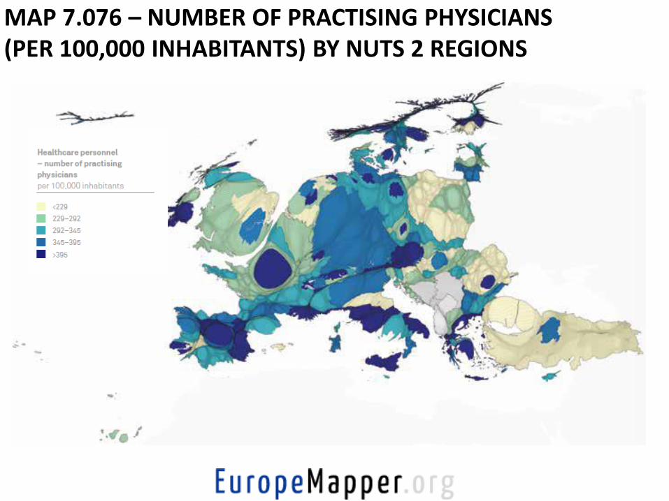
MAP 7.076 – NUMBER OF PRACTISING PHYSICIANS (PER 100,000 INHABITANTS) BY NUTS 2 REGIONS
http://onlinelibrary.wiley.com/doi/10.1111/2041-9066.12057/full
http://www.slideshare.net/worldmapper/the-social-atlas-of-europe
More Social Atlas of Europe outputs and information available from:
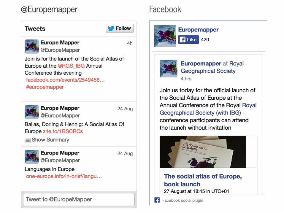
http://www.europemapper.org
http://blogs.lse.ac.uk/europpblog/2014/08/12/there-are-benefits-to-viewing-europe-as-a-collection-of-cities-and-regions-rather-than-as-a-group-of-nation-states/
http://www.discoversociety.org/2014/09/02/a-country-called-europe-a-cartographic-story-of-a-continent-united-in-diversity/ http://www.policypress.co.uk/display.asp?K=9781447313533

On-going work and next steps
• Interactive online features (to accompany the paperback version of the book, forthcoming in September 2015)
• Small area socio-economic data estimation and modelling
• SimEurope