Embed Size (px)
Citation preview

UK2020 Health Paper 1 • 1
Sponsored by
THE UK HEALTH SYSTEM An International Comparison of Health Outcomes

1 • UK2020 Health Paper 1
UK 2020 HEALTH PAPER 1
THE UK HEALTH SYSTEM – An International Comparison of Health Outcomes
Author: Dr Kristian Niemietz
Series Editor: Chris Bullivant
ISBN Number: 978-0-9934715-3-7
Published by UK 2020 Limited Copyright 2016 © UK 2020 Limited
UK 2020 55 Tufton Street London SW1P 3QL
UK 2020 Limited is a company limited by guarantee, registered at
America House, Rumford Court, Rumford Place, Liverpool L3 9DD
Company No. 09245454
ABOUT UK 2020UK 2020 is an independent think tank established by Rt Hon Owen Paterson MP to produce a conservative policy platform for the General Election of 2020.
We work with academics, practitioners and independent researchers to develop robust, common sense, and optimistic policies.
www.uk2020.org.uk

CONTENTS
CHAIRMAN’S INTRODUCTION
EXECUTIVE SUMMARY
A WORD FROM OUR SPONSOR
EDITORIAL BOARD
INTRODUCTION
CHAPTER 1 – CONTEXT
CHAPTER 2 – AMENABLE MORTALITY
CHAPTER 3 – CANCER
CHAPTER 4 – STROKE
CHAPTER 5 – RESPIRATORY DISEASE
CHAPTER 6 – WAITING TIMES
CHAPTER 7 – ADOPTION OF INNOVATIVE THERAPIES AND DIAGNOSTICS
CHAPTER 8 – SPENDING AND EFFICIENCY
CHAPTER 9 – THE COMMONWEALTH FUND STUDY
CHAPTER 10 – OTHER COUNTRIES’ UNIVERSAL HEALTHCARE COVERAGE
CHAPTER 11 – AND HOW THEY ACHIEVE IT
CHAPTER 12 – CONCLUSION
APPENDIX 1 – METHODOLOGY: HOW RELIABLE ARE INTERNATIONAL COMPARISONS?
REFERENCES
3
5
11
12
14
18
22
28
46
50
54
62
68
76
82
86
92
94
98
UK2020 Health Paper 1 • 2

3 • UK2020 Health Paper 1
CHAIRMAN’S INTRODUCTION
Policy debate often gravitates towards consensus. It stifles innovation and makes discussion stale; it immunizes policy from change. So in 2014, I established a think tank, UK 2020, to develop optimistic policies based on evidence and thorough research to challenge consensus.
The largest consensus concerns the NHS; it has become a ‘no go’ area for a politician. Perhaps with good reason. Polling shows that the majority of people are proud of the NHS. 74% of us think that we have “a healthcare system that is as good as or better than any in Europe”.1 Danny Boyle’s striking opening ceremony to the remarkable London Olympic games in 2012, celebrated the creation of the NHS as a critical event in our nation’s story. It is inconceivable that any other country in the world would so value its health service that it would place it at the centre of such a national celebration.
There is no doubt that the creation of the NHS in 1948 was a significant achievement in its day. It embodied at the time so much of the spirit of this country pulling together after the ravages of war to reconstruct a nation based on fairness for all.
Today, 70 years on, millions of people are grateful for the care they receive and for the 1.5 million people who are employed to provide it.2
However, is this still such a unique accomplishment? And is NHS care as good as it could be?
The reality is that in the 21st Century every single developed country in the world has a universal healthcare system, with the one exception of the United States. So that while in 1948 there were only a handful of countries that had a universal healthcare system, now there are over thirty that do and there is abundant data available for how they all fare.
Polls report a patriotic pride in the NHS. NHS satisfaction surveys show deep levels of gratitude among patients. This has been at odds with anecdotal evidence from constituents, parliamentary colleagues, friends and newspaper reports that express grave concerns about care. I couldn’t help but wonder if there was a mismatch between the polls and experience.
Wanting to take an objective look, I asked Dr Kristian Niemietz of the Institute of Economic Affairs to research one simple question, using only the most respected sources: ‘How do the health outcomes of the NHS compare with the health outcomes of these other countries with universal healthcare systems?’
This report is the answer. I have found the data shocking.
1 Lord Ashcroft Poll, January 2015, http://lordashcroftpolls.com/wp-content/uploads/2015/01/The-People-the-Parties-and-the-NHS-LORD- ASHCROFT-POLLS.pdf
2 http://www.nhs.uk/NHSEngland/thenhs/about/Pages/overview.aspx

The most alarming finding is that 46,413 people die each year because they were treated on the NHS, rather than by the healthcare system with the best health outcomes in the world.
I had wanted to give us at least a sporting chance, so throughout this paper we rank the UK’s performance against the 12th best performing country on any particular condition. Even this proved gravely sobering.
17,000 people would be alive this year if, rather than living in the UK, they had lived in the following 12th best performing countries depending on the condition: Australia, Belgium, Canada, Finland, France, Iceland, Israel, the Netherlands, Norway, Sweden, or Switzerland, to name just a few. Which includes countries that spend as much or less than us on health as a percentage of GDP. Yet in some areas of care we do brilliantly; we were delighted to see the UK is among the top performers in some rare cancers.
The urgent questions to be asked now are: ‘Why?’ and ‘What must we do to improve?’
I would like to see the British Government commission an urgent inquiry to discover what we can learn and adopt from the health systems of other countries that provide better care.
I would urge colleagues, the public, the media, and health professionals to recognize that the political consensus surrounding the NHS is causing people to die unnecessarily. We should learn from the many examples around us.
In this first paper we have been at pains not to draw any conclusions; it is purely an objective compendium of data.
I am a consultant to Randox, a diagnostics company, and I am grateful to them for sponsoring this paper.
In our second paper we will research other countries’ systems—their funding and delivery—and make policy recommendations for the UK from our findings.
I hope that healthcare practitioners, managers, companies, academics and experts from around the world will join us in contributing evidence and research to our second paper.
If we can break out of the consensus, and learn from other countries, we can work together to create the best healthcare system in the world.
With many thanks to the Institute of Economic Affairs for releasing Dr Kristian Niemietz to research this paper.
The author would like to thank the John Templeton Foundation and the Age Endeavour Fellowship for their generous financial support, which has made the IEA research project, on which this paper draws, possible.
4 / UK 2020
Letter from the Chairman Rt Hon Owen Paterson MP
UK 2020 is developing an optimistic, outward looking, future-focussed, and robustly conservative policy platform to be adopted by the leader of the Conservative Party contesting the General Election in 2020.
In this first year, since our launch in October 2014, we have sought to inject fresh thinking into UK energy policy, the debate around the UK’s relationship with Europe, and to defend vigorously the free market and innovation in science – especially where it has the most potential for impact: for those who are poorest on the planet.
We have attempted to combine imaginative thinking with thoroughly referenced, grounded research, and measured all our output by the question, does this contribute to the Conservative Party and intellectually challenge policy makers?
It is an easy temptation, in the hard press of running government, to accept a derived consensus in policy making. Our role at UK 2020 is to serve by poking at consensus, to question assumptions, and to consider new ways to reach an optimistic destination.
In this volume we have collected the eight editorial pieces and six speeches produced in our financial year 2014–2015.
With thanks for your support
Rt Hon Owen Paterson MPRt Hon Owen Paterson MP Chairman, UK2020
UK2020 Health Paper 1 • 4

5 • UK2020 Health Paper 15 • UK2020 Health Paper 1
EXECUTIVE SUMMARY
INTRODUCTIONThis paper compares the performance of different health systems around the world, in order to see how the United Kingdom’s health system, the National Health Service (the NHS) fares. The inescapable conclusion is that the NHS performs notably worse than the healthcare systems of comparable countries.
METHODOLOGYInternational comparisons in healthcare are fraught with difficulty. Most measures of population health tell us more about lifestyles, socio-economic factors, and demographics than they tell us about a country’s healthcare system. Even where outcomes are more easily attributable to health systems, the results do not necessarily add up to a consistent picture: Health systems are not ‘good’ or ‘bad’ across the board; rather, they often do well in some respects and poorly in others. Still, the appropriate response to these difficulties is not to give up on international comparisons altogether, but to look for patterns that keep reoccurring across a broad range of indicators from a range of sources.
One should not place too much faith in any one type of indicator or any one study, but a package of studies and indicators can still offer valid insights. Throughout the paper, we compare the UK system with the 12th best health system in the category studied. This eliminates the risk of comparison with outliers or anomalies, and avoids drawing unfair comparison with countries that, while ranked differently, are essentially performing similarly.
THE UK HEALTH SYSTEM An International Comparison of Health Outcomes
UK 2020 Health Paper I Executive Summary

UK2020 Health Paper 1 • 6 6 • UK2020 Health Paper 1
MEASURES OF PERFORMANCE
AMENABLE MORTALITYAmenable Mortality is a holistic measure of all premature deaths that could, in theory, have been avoided through better and/or timelier healthcare.
The UK has one of the highest numbers of avoidable deaths in Western Europe.
There are 1,108 deaths per million people every year that are, according to this measure, premature and avoidable.
If the NHS rose to the standards of the Danish healthcare system, there would be 95 fewer unnecessary deaths per million people every year, or 5,900 fewer deaths a year.
This is remarkable because on many other outcome measures, the Danish system is not even particularly good. It only comes as high as 12th best on Amenable Mortality because up-to-date figures are only available for European countries.
CANCERCancer survival rates, as opposed to cancer prevalence, are a reasonably good measure of the quality of healthcare.
In the section on cancer, we rank countries by their (age-adjusted) survival rates for 11 of the 20 most common types of cancer, and compare the UK to the 12th-best performer in each category (a comparison with the very top would be an unrealistically ambitious standard.) These 11 cancers have been picked on the basis of prevalence and data quality.
Patients in the UK have substantially lower chances of surviving cancer than patients in other developed countries. For example, if British:
• breast cancer patients were treated in Belgium—the country with the 12th-highest breast cancer survival rate in the world—about 2,500 lives would be saved every year
• bowel cancer patients were treated in the Netherlands, there could be 3,200 additional survivors every year
• lung cancer patients were treated in Australia or Iceland, 2,400 lives could be saved every year
• prostate cancer patients were treated in Sweden, about 2,600 lives could be saved every year
STROKEAge-adjusted stroke survival rates, as opposed to stroke prevalence, are another sensible measure of a health system’s performance.
Here, the differences in survival rates are smaller, but the UK still lags behind comparable countries.
Around 3,000 lives per year could be saved if British stroke patients were treated in Switzerland rather than on the NHS.
THE UK HEALTH SYSTEM An International Comparison of Health Outcomes
UK 2020 Health Paper I Executive Summary

7 • UK2020 Health Paper 1
UK Best country
Difference in lives lost per year
12th best country
Difference in liveslost per year
Breast cancer 18.9%10.6%
(Sweden)4,242
14% (Belgium)
2,504
Bowel cancer 43.9%29.1%
(Korea)6,195
36.1 (Netherlands)
3,265
Cervical cancer 40.5%18.8%
(Norway)661
34% (Canada)
198
Lung cancer 90.4%69.9% ( Japan)
9,12085%
(Iceland & Australia)2,402
Prostate cancer 16.8%2.8% (US)
6,08110.8%
(Sweden)2,606
Leukaemia 52.6%40.6%
(Belgium)1,038
46.4% (Norway)
536
Ovarian cancer 63.6%55.1%
(Finland)597
61% (France)
183
Stomach cancer 81.5%42.1%
(Korea)2,752
72.1% (Australia)
657
Liver cancer 90.7%73%
( Japan)833
85.6% (France)
240
Skin cancer 14.6%9.6%
(Switzerland)679
14.7% (Finland)
-4
Oral cancer 48.5%39.1% (Malta)
68853.8%
(Belgium)-388
Laryngeal cancer 38%22.5%
(Iceland)360
40.2% (Spain)
-50
Gallbladder cancer 81.4%74.2%
(Belgium)65
84.8% (Netherlands)
-30
Lymphoma (Non-Hodgkin)
43.3%25.9%
(Iceland)2,243
39.6% (Spain)
441
Ischaemic stroke 9.2%3%
( Japan)8,010
6.9% (Switzerland)
2,972
Haemorrhagic stroke 26.5%11.8% ( Japan)
2,84922%
(Israel)1,026
Amenable Mortality:
Avoidable deaths per 100,000
110.877.3%
(Switzerland)24,038
101.3 (Denmark)
5,594
Figure 1: Amenable mortality and age-adjusted cancer and stroke mortality rates: The UK compared with the best and 12th best performer in each category.
7 • UK2020 Health Paper 1
THE UK HEALTH SYSTEM An International Comparison of Health Outcomes
UK 2020 Health Paper I Executive Summary

THE UK HEALTH SYSTEM An International Comparison of Health Outcomes
UK 2020 Health Paper I Executive Summary
RESPIRATORY DISEASES With modern healthcare, for people below the age of 65, respiratory diseases should almost never be fatal. There are indeed countries where almost nobody in that age range dies of a respiratory disease. But the UK is not one of those countries. The age-standardised mortality rate for respiratory diseases is 119 per million people aged under 65; 51 more than in Croatia, which has the 12th-lowest mortality rate in this category.
WAITING TIMESThere is not much internationally comparable data on waiting times for different types of healthcare services.
Where the data is sufficiently precise, it only covers a small number of countries, and where it covers a large enough country sample, it is imprecise. Nonetheless, judging from the imperfect data that is available, it seems that British patients still face longer waiting times for healthcare than patients in most other high-income countries.
This is especially the case for Accident and Emergency departments, specialist appointments, diagnostic scans and primary care. The NHS has made considerable progress on this front since the early 2000s, especially on waiting times for surgery, but it has come nowhere near closing the gap with its European neighbours. Swift access to care is still not a forte of the NHS.
INNOVATIVE THERAPIES AND DIAGNOSTICSAlthough there are exceptions to this, British patients are less likely to have access to innovative drugs and modern diagnostics than patients in most other developed countries.
Drugs and diagnostics are inputs, not outcomes, and ‘more’ does not automatically mean ‘better’. However, given that most health systems now conduct cost-effectiveness analyses before approving new therapies (as does NICE in the UK), it seems unlikely that ‘less’ is a sign of greater efficiency.
SPENDING AND EFFICIENCYDefenders of the NHS claim that the service is merely underfunded, and that if UK health spending rose to, for example, Swiss or Dutch levels, the NHS would deliver Swiss or Dutch health outcomes.
It is true that healthcare spending in the UK is generally lower than elsewhere in North-western Europe and North America. This gap was shrinking in the years leading up to the Great Recession but it has since widened again.
However, one should not jump to the conclusion that more money would cure the service’s problems. On direct measures of health system efficiency, the NHS comes out in the bottom third of the international league tables.
In contrast, the Swiss system, one of the most expensive systems in the world, is one the world’s most efficient systems. It is possible to spend large sums of money wisely, just as it is possible to be inefficient with a relatively modest budget.
8 • UK2020 Health Paper 1

9 • UK2020 Health Paper 19 • UK2020 Health Paper 1
COMMONWEALTH FUND STUDYOne study seems to come to a completely different conclusion about the relative performance of British healthcare: the Commonwealth Fund study. It is frequently cited as proof that the NHS is the best healthcare system in the world.
But only one category in the Commonwealth Fund’s study measures health outcomes, as opposed to inputs, procedures and organisational characteristics. In that outcome category, the NHS comes out 10th out of 11.
The discrepancy between the poor performance in terms of outcomes, and the excellent overall rating, was reflected in The Guardian’s coverage of the report: “The only serious black mark against the NHS was its poor record on keeping people alive.”
The Commonwealth Fund study is a useful addition to the international literature, which highlights some underappreciated strengths of the NHS. But some parts of the study are systematically biased in favour of NHS-style health systems. For example, in one question (about access to care), patients are asked whether their health insurance has ever declined to cover the cost of a treatment, with a higher proportion of people answering this question with a ‘Yes’ leading to a worse country score. In the UK, Sweden and Norway, virtually nobody answers this question in the affirmative, which is why these three countries get top scores in this subcategory. However, this simply reflects the fact that these countries’ health systems are funded by taxation, not insurance premiums. There are no insurance companies that could decline a payment.
UNIVERSAL HEALTHCAREThe NHS does achieve universal access to a broad package of healthcare services. But this is true of nearly all developed countries, with the US being the only major exception. While it may have been a significant achievement 70 years ago, universal access to healthcare is now not a special achievement in global terms.
THE UK HEALTH SYSTEM An International Comparison of Health Outcomes
UK 2020 Health Paper I Executive Summary
THE UK HEALTH SYSTEM An International Comparison of Health Outcomes
UK 2020 Health Paper I Executive Summary
10 • UK2020 Health Paper 1
CONCLUSION Despite improvements since the early 2000s, the NHS is still lagging behind the health systems of most comparable countries on most health outcome measures for which robust data is available.
This NHS has relatively low survival rates for the common types of cancer, and although it does better on some of the rarer ones, this does not change the fact that thousands of lives are lost unnecessarily.
The same is true for measures of ‘amenable mortality’, an indicator which captures unnecessary deaths across the healthcare spectrum. Long waiting times are still an issue, even if this is a problem that the UK shares with a number of other countries. The uptake and diffusion of medical innovation is relatively slow.
The NHS does guarantee universal access to healthcare, but so do all healthcare systems in the developed world, with only the US system being an exception. Healthcare spending is lower than in some of the neighbour countries, but this does not indicate superior efficiency: In more sophisticated estimates of health system efficiency, the NHS is, once again, inferior to most other countries.
The purpose of this paper is to assess the NHS’s performance in an international comparison, not to work out exactly where its problems arise, or what should be done about them. But it is clear that the performance of the British healthcare system is inferior to that of comparable countries. It would therefore be sensible to assess what changes should be made to British healthcare to bring it up to a good international standard.
We recommend that the government should set up a commission to inquire into the best way to achieve this end. In the meantime, we intend to set up a commission including doctors and other medical professionals to investigate what works best at home and abroad and then to recommend the best way forward.
UK 202055 Tufton Street London SW1P 3QL
www.uk2020.org.uk

11 • UK2020 Health Paper 1
A WORD FROM OUR SPONSOR
Randox is a highly innovative, UK based, global healthcare diagnostics company, driven by a desire to improve patient care through earlier and more accurate diagnosis. With over 30 years of experience and our extensive R&D programme, we are world leaders in the development of both proteomic and genomic multiplex systems —conducting multiple tests simultaneously from a single, undivided, patient sample. By conducting many more, highly sensitive tests, we can increasingly predict future health issues, identify the early onset of clinical conditions and select the most appropriate therapies. Our diagnostic technology is revolutionising clinical decision making and, by implication, healthcare more broadly.
This report, which we are pleased to sponsor, is designed to enable an open and objective assessment of the outcomes of our healthcare system, relative to international comparators. The UK investment in public healthcare runs to around £130 billion per year and, within this document, you will find robust and objective data to enable a balanced assessment of comparative system effectiveness. And ‘effectiveness’ is not just an academic issue. Where there is evidence of a lower national ‘comparative table positioning’, that infers a negative health impact on our people which has real consequences—both on a personal and wider economic level.
In our own area of expertise, prompt diagnosis and early treatment is acknowledged as a key determinant in improving patient outcomes. However, you will see within the report that in the UK we currently spend less than half, per capita, in procuring laboratory diagnostics than is committed in France, Italy and Germany. As we aspire to increasingly preventative healthcare, that is something we might all usefully reflect upon.
We view ready access to universal healthcare as a sign of a civilised society and it is our hope that this work will provide the basis for a balanced and informed debate on the comparative outputs of our healthcare system. That debate should inform subsequent research and policy decisions. We have a great many talented and capable people within our Health Service, who dedicate their careers to the service of others. We owe it to them, and our people, to ensure they operate within a system where resources are optimised to achieve the best possible outcomes.
Dr S P FitzGerald CBE FREng DSc Managing Director Randox Laboratories

UK2020 Health Paper 1 • 12
AUTHOR
Dr Kristian Niemietz is Head of Health and Welfare at the Institute of Economic Affairs, and a Research Fellow at the Age Endeavour Fellowship (AEF). He studied Economics at the Humboldt Universität zu Berlin and the Universidad de Salamanca, graduating in 2007 as Diplom-Volkswirt (≈MSc in Economics). During his studies, he interned at the Central Bank of Bolivia (2004), the National Statistics Office of Paraguay (2005), and at the IEA (2006). In 2013, he completed a PhD in Political Economy at King’s College London. Kristian previously worked as a Research Fellow at the Berlin-based Institute for Free Enterprise (IUF), and at King's College London, where he taught Economics throughout his postgraduate studies. He is a regular contributor to various journals in the UK, Germany and Switzerland.
EDITORIAL BOARD
Rt Hon Owen Paterson MP UK 2020 ChairmanRt Hon Owen Paterson MP has been the Member of Parliament for North Shropshire since 1997. Owen was Secretary of State for Environment, Food and Rural Affairs (2012–2014), Secretary of State for Northern Ireland (2010–2012), Shadow Secretary of State for Northern Ireland (2007–2010), Shadow Minister for Transport (2006–2007), Shadow Minister for Environment, Food and Rural Affairs (2003–2005), PPS to the Leader of the Opposition (2001–2003), and Opposition Whip (2000–2001). As a backbencher he sat on the Agriculture, European Scrutiny, and Welsh Affairs Select Committees. He founded UK 2020 in 2014 in order to research and publish optimistic, outward-looking, electorally viable conservative policies as a vital contribution to the Conservative Party. Owen read History at the University of Cambridge, he also attended the National Leathers College, and spent twenty years in the leather industry before entering Parliament.
James Bartholomew Consultant and Author James Bartholomew is an author and journalist. In his most recent books, The Welfare State We’re In and The Welfare of Nations, he examined the record of the NHS and travelled around the world looking for, among other things, alternative methods of running a healthcare system. He has been a leader-writer for the Daily Telegraph and the Daily Mail and is currently a contributor to the Daily Telegraph and The Spectator.
Chris Bullivant UK 2020 Executive Director Chris Bullivant has been Executive Director of UK 2020 since 2014, having spent three years in Washington DC where he worked in international development. Previously Chris was a Director at the Centre for Social Justice (2006–2011) a think tank established by Rt Hon Iain Duncan Smith MP. Chris has an MSc in Political Sociology from the London School of Economics and a BA in Politics from Queen Mary, University of London.

13 • UK2020 Health Paper 1
Karol Sikora MA, MB BChir, PhD, MD, FRCR, FRCP, FFPMKarol Sikora is Chief Medical Officer of Proton Partners International. He founded Cancer Partners UK, a group which created the UK’s largest independent cancer network. He was Professor and Chairman of the Department of Cancer Medicine at Imperial College School of Medicine and is still honorary Consultant Oncologist at Hammersmith Hospital, London. He is Dean and Professor of Medicine at Britain’s first independent Medical School at the University of Buckingham and Fellow of Corpus Christi College, Cambridge. For the last three years he has Chaired the NHS East London Co-operative (PELC) which runs NHS 111 and urgent care facilities across a wide area of London.
Dr Fiona PayneDr Fiona Payne won a BMA student journalism award in 1987, qualified from St Thomas Hospital Medical School in 1990, was the medical editor for Dorling Kindersley, before resuming her medical training and 13 years as a GP partner in a large NHS practice in Putney. In 2010 Fiona moved into the independent medical sector and is now based at King Edward VII’s Hospital. She has served in the Independent Doctors Federation since 2010, on the council since 2011 and GP chair from 2012–2015. Fiona still practises as a GP in the NHS, is a GP Appraiser, and Specialist Advisor for the Care Quality Commission.
UK2020 Health Paper 1• 14

UK2020 Health Paper 1• 14
INTRODUCTION
UK2020 Health Paper 1• 14

15 • UK2020 Health Paper 1
This paper has three principle aims. First, to look at the performance of different health systems around the world, to see how the United Kingdom’s health system compares. Second, to re-introduce to the health policy debate models beyond the US health system. Third, to trigger further research should the results demand further investigation.
The aim of this comparison is not to identify the one, best model, nor to make policy recommendations as to the delivery and funding of the UK healthcare system.
Neither is the paper intended to be a criticism of the 1.3 million people who work in the National Health Service. The research was commissioned in order to take as objective and dispassionate a review of the health system as possible in order to see what the results showed.
This required the research to be objective, data driven and as comprehensive a macro view of the health system as possible. The research considers those medical conditions that affect the largest numbers of the UK population and for which data from other countries is also available in the same format.
These parameters quickly constrain the data pool for two main reasons. First, the conditions and data required need to shed light on the performance of the health system of a country, as opposed to an evaluation of population health. This is an important distinction as we are attempting to evaluate the UK’s health system against another countries health systems, rather than to compare how healthy people from different countries are. Issues of ethnicity, psychology, income, exercise, diet, geography, cultural norms and countless other factors explain cross-country variation in health status and require complex indices beyond the capacity of this paper to explore. To this end further research is required to consider how other international health systems achieve outcomes superior to that of the UK.
The second constraint is the available data that allows for fair comparison. Because of how and what data is recorded, and to choose conditions that reflect only on the care provided by the healthcare system, the number of conditions available to compare are narrowed. This constrains this paper to a comparison of cancer survival rates, strokes, and some respiratory diseases, framed by a consideration of Amenable Mortality indicators. For the sake of considering a health system in the round, the paper also reviews the data on waiting times, spending and efficiency, and take up of innovative therapies and use of diagnostics. Together these limited, but multiple indices, have a use in providing insight. Our methodology and data sources are described in Chapter 1, Chapter 9 and in Appendix 1.
Throughout the paper we compare the UK system with the 12th best health system in the world in the respective category. This is a deliberate choice. We do not compare the NHS to the very top, because we want to avoid unfair or exaggeratedly ambitious comparisons. Statistically speaking, comparing with the 12th best performing health system by category is likely to rule out comparison with outliers or anomalies, or unfair comparison with groups of countries that, while ranked differently are essentially performing similarly.
Chapter 2 considers Amenable Mortality, the number of deaths within a country that would be prevented in an ideal health system, as a baseline indicator. Chapter 3 considers cancer survival rates with alarming findings. However, it notes the NHS has significant success in rare cancers. Chapter 4 considers stroke cases, where the UK lags behind other countries. Chapter 5 considers respiratory diseases where Croatia has better mortality rate than the UK. Chapter 6 considers waiting times where, despite improvements since the 2000s, the UK has not closed the gap with its European neighbours. Chapter 7 considers take up of innovative therapies and diagnostics and shows the UK less likely to have access to innovative drugs and modern diagnostics than patients in most other developed countries.
Comparing with the 12th best performing health system by category is likely to rule out comparison with outliers or anomalies

UK2020 Health Paper 1 • 16
Chapter 8 considers spending and efficiency, especially because UK health funding is generally lower than elsewhere in north-western Europe, but it nonetheless turns out that on more direct measures of health system efficiency, the NHS comes out in the bottom third of the international league tables. Chapter 9 considers the Commonwealth Fund Study, often cited as proof that that the NHS is the best system in the world, and considers why this study’s conclusions may be at odds with this paper. Chapter 10 provides an overview of other countries that have universal healthcare and, in Chapter 11, some of the varied systems for achieving it.
The paper concludes in Chapter 12 that the NHS is lagging behind the health systems of most comparable countries on most health outcome measures for which robust data is available. In particular, relatively low survival rates for the common types of cancer mean thousands of lives are lost unnecessarily.
While the NHS guarantees universal access to healthcare, so do all healthcare systems in the developed world.
The only exception is the US, making the US system a poor source of sole comparison with the UK. UK healthcare spending is lower than in some neighbouring countries, but this does not indicate superior efficiency. In more sophisticated estimates of health system efficiency, the NHS is, once again, falling behind most other countries.
The purpose of this paper was to assess the NHS’s performance in an international comparison, not to work out exactly where its problems arise, or what should be done about them. It is also true that no single system emerges from this paper as ‘the best’, and that the ones that consistently occupy top ranks are not necessarily very similar to each other.
The paper supports a more outward-looking healthcare debate, and a greater focus in future debate and research informed by international best practice. We call for further research to be conducted.

17 • UK2020 Health Paper 1

UK2020 Health Paper 1 • 18
CHAPTER 1
CONTEXT
UK2020 Health Paper 1• 18

19 • UK2020 Health Paper 1
“NHS: UK now has one of the worst healthcare systems in the developed world, according to OECD report”, read a headline in The Independent newspaper in November 2015.3 The article summarised the report as follows: “the quality of care in the UK is “poor to mediocre” across several key health areas […] and the NHS struggles to get even the “basics” right” […] Britain was placed on a par with Chile and Poland as countries still lagging behind the best performers”. Referring to the same report, the Telegraph titled: “Quality of NHS care is ‘poor to mediocre’ compared to other developed nations, OECD warns”4, and the Financial Times wrote: “Britons are less likely to survive a heart attack, stroke and leading cancers than people in many other developed nations, according to an assessment of international health systems.”5 The report also featured in other news sources.6
The OECD’s sobering findings will have come as a surprise to many readers. Just one and a half years before the publication of the OECD report, another international comparison of health systems, by the Commonwealth Fund, had ranked the NHS as the top performer (Davis et al, 2014). This report had received extensive media coverage in the UK, and it was widely reported as the ‘proof ’ that NHS was indeed the best healthcare system in the world.7 So how can the developed world’s best healthcare system simultaneously be one of its worst?
The two reports refer to different years, but that is not the reason for the discrepancy. As far as UK health outcomes are concerned, the findings of the OECD report’s 2015 edition were very similar to the findings of previous editions (see e.g. Niemietz, 2014). It is not as if UK performance had suddenly deteriorated; if anything, the long-term trend is one of catch-up growth and relative improvement (ibid.).
So is the NHS as bad as the OECD suggests, is it as great as the Commonwealth Fund suggests, is it somewhere in between, or does it simply depend on what aspects of healthcare we are interested in? This paper aims to provide a broader account of the NHS’s performance, especially in an international comparison, by reviewing a number of international studies and datasets. Comparing health systems is, of course, notoriously difficult. Unsurprisingly, every study on this subject comes with health warnings and caveats attached, and no study on this subject could realistically claim to be conclusive.
For a start, health outcomes are determined by a myriad of different factors, most of which have little, or nothing, to do with the healthcare system. At least up to a point, the most important determinant of health outcomes is simply a country’s overall level of economic development. Economic growth per se improves health, even if the additional resources are not directly used for that purpose (French, 2015).
3 The Independent: NHS: UK now has one of the worst healthcare systems in the developed world, according to OECD report, 4 November 2015, http://www.independent.co.uk/life-style/health-and-families/health-news/nhs-uk-now-has-one-of-the-worst-healthcare-systems-in-the-developed-world-according-to-oecd-report-a6721401.html
4 The Telegraph: Quality of NHS care is ‘poor to mediocre’ compared to other developed nations, OECD warns, 4 November 2015, http://www.telegraph.co.uk/news/health/news/11974620/Quality-of-NHS-care-is-poor-to-mediocre-compared-to-other-developed-nations-OECD-warns.html
5 Financial Times: ‘OECD warns on quality of UK healthcare’, 4 November 2015, http://www.ft.com/cms/s/0/8d3cc7e8-8267-11e5-a01c-8650859a4767.html#axzz3yAZeI1Nb
6 International Business Times: UK has one of the worst healthcare systems in the developed world says OECD, 5 November 2015, http://www.ibtimes.co.uk/uk-has-one-worst-healthcare-systems-developed-world-says-oecd-1527287
7 See e.g. The Guardian: ‘NHS comes top in healthcare survey’, 17 June 2014; The Independent: NHS means British healthcare rated top out of 11 western countries, with US coming last, 17 June 2014; The Telegraph: ‘Britain’s NHS is the world’s best health-care system, says report’, 17 June 2014; Metro: ‘Hate the NHS? Well, apparently Britain now has the BEST healthcare system in the world’, 14 June 2014; Channel 4 blogs: ‘Britain’s health service: the best in the world?’, 14 June 2014; International Business Times: ‘NHS Provides the ‘Best Healthcare in World’, says Commonwealth Fund Report’, 14 June 2014; The Guardian: ‘A £10 charge to visit a GP would be just the start of a slippery slope for the NHS’, 18 June 2014; The Economist: ‘How to compare health-care systems’, 29 June 2014.
UK2020 Health Paper 1 • 20
And while this effect levels off at a certain level of development, it remains the case that North America and Western Europe are generally ahead of Eastern Europe in health outcome rankings, while most of Eastern Europe is ahead of middle income countries like Turkey and Mexico.
In high-income and upper-middle-income countries, lifestyle factors are among the most important determinants of health. Dietary habits, alcohol and tobacco consumption, physical exercise and so on may well explain more of the cross-country variation in health than the performance of health systems, but the health system has no influence over those factors, except by providing information and advice. Meanwhile, factors like road safety, education, environmental quality and genetic predispositions are completely outside of the health system’s control.
But even if two countries were identical in every respect except for their healthcare systems, it might still not be straightforward to tell which system is ‘better’. Health systems are rarely ‘good’ or ‘bad’ across the board. They usually do well in some respects, and poorly in others, and their results in different categories are not strongly correlated. Suppose Country A achieves high survival rates for complex diseases, but fails to provide good quality primary and community care. In Country B, it is the other way round. (As will become clear later, this is not such an unrealistic example.) Thus, people in Country A may attain a slightly higher life expectancy, but they may sometimes have to put up with debilitating (if not life-threatening) conditions that would be treated swiftly in Country B. Which of these countries has the ‘better’ health system? There is no obvious answer, because there is no obvious way of trading off outcomes in different categories against one another.
And even if such trade-offs were possible in principle, it would still not solve the more basic problem that what is most easily measurable is not necessarily what matters most to patients. Comparative studies tend to concentrate heavily on survival/mortality rates—not because they are the only outcomes that matter, but because they have the advantage of being relatively straightforwardly measurable (although there can be comparability issues with these as well). Yet for most of us, most interactions with the healthcare system are not about matters of life or death, but about improvements in quality of life, a much more abstract and subjective concept that is less amenable to measurement.
If the measurement of health system performance is already complicated, the interpretation of these findings adds further layers of complexity. A comparative study may at best tell us that a health system performs poorly, but it could not, in itself, tell us why it performs poorly, let alone how it could be improved. Suppose a country has unusually high death rates for a particular condition, which is mainly treated in hospitals. This could indicate poor quality of care in the respective specialty, but it could also indicate more general problems with the way hospitals are run, which just happen to affect the specialty in question more strongly than others. Alternatively, it could be that the problem arises at an altogether different level, such as primary care, in which case hospital care would be the wrong focus. Or it could be that both hospital care and primary care work fine on their own, but are poorly connected. Modern health system are vast ecosystems, and identifying successes and failures is not the same as explaining them.
Moreover, speaking of ‘the health system’ is already in itself a simplification. Health systems have different subsectors that can be organised in very different ways. For example, for historical reasons which predate the creation of the NHS (Webster, 2002), the primary care sector in the UK is organised quite differently from hospital and specialist care. It is governed by different contractual arrangements and different payment formulas (Marshall et al, 2014).
And this is without even considering the more mundane problems, such as the fact that collating health outcome data takes time, and that the data is therefore already several years old when it is published. Even OECD data, which has to be the most regularly updated source, is almost always at least three years behind, and for other indicators, the most recent data can easily be ten years old.

21 • UK2020 Health Paper 1
Last but not least, not everything that happens in a health system can be linked to how the health system is organised. Think of a British doctor who practiced medicine from before 1911 until after 1948. During their medical career, this person would have experienced profound system-level changes. They would have started under the old mutual insurance system, in which doctors were typically contracted by Friendly Societies and similar organisations. They would have witnessed the National Insurance Act of 1911, which created the National Health Insurance (NHI) system that prevailed throughout the interwar period. They would have practiced under the wartime system, and finally, they would have witnessed the creation and the early stages of the National Health Service. But when asked to describe their medical career in retrospect, would they dwell for long on system-level characteristics? Presumably, an apolitical doctor would mostly describe relationships with patients, health workers, colleagues and other medical providers. They would remember medical breakthroughs and changes in medical practice, they would remember what the major health challenges were at different times, they would remember social changes and their implications for health, and so on. System-level characteristics are of great interest to health economists, but most participants of the health system will not, on a day-to-day basis, think of healthcare in such terms. They will primarily think of people and relationships, of what ultimately makes things work on the ground. In this sense, the perspective of this paper is necessarily somewhat narrow and limited.
In short, there are numerous problems with comparisons of healthcare systems. Health league tables are not football league tables. But as the (probably misattributed) quote goes, “while it is easy to lie with statistics, it is even easier to lie without them.” While it is worth bearing the difficulties with comparative studies of health systems in mind, the appropriate response is not to stop using them altogether, but to broaden the enquiry, and to look at a health system from a lot of different angles. One aim of this paper is to look for recurring patterns that can be observed across a wide range of indicators, and that are confirmed by multiple sources and methodologies. In doing so, we build on earlier work (Niemietz, 2014; Niemietz, 2015a; Niemietz, 2015b; Niemietz 2015c), and extend it by including more indicators and more data sources. The aim of this paper is not to produce new primary data: None of the indicators presented here is novel in its own right. Rather, the aim is to present something which is novel as a package.
In selecting indicators, we have started by going through the leading causes of death in the UK (ONS, 2013). This list contains various types of cancer, which justifies dedicating a section of the paper to cancer survival rates. The same goes for stroke. For other diseases on the list, we have not been able to find age-standardised survival rates in an internationally comparable format, and some of them are only listed in a way which is too general (e.g. ‘heart disease’). The selection of indicators presented here is therefore far from exhaustive. However, we will also present figures on ‘mortality amenable to healthcare’, a more holistic measure which covers all causes of (premature) death that could, in principle, have been avoided through better and/or timelier healthcare.

UK2020 Health Paper 1 • 22
CHAPTER 2
MORTALITY AMENABLE TO HEALTHCARE
UK2020 Health Paper 1• 22

23 • UK2020 Health Paper 1
Modern health systems deal with thousands of different conditions every day. All systems do badly on some of them, and almost all systems do well on at least a few. This is one reason why different international comparisons can come to different conclusions: Health outcome indicators are not necessarily correlated, so it does matter which indicators we are looking at.
In the chapters below, we will try to mitigate this problem somewhat, by concentrating on the most widespread conditions for which comparable data is available (or at least, most widespread within a given data set). It is, of course, possible that countries which do well on the measures below fail on others, and that countries which do poorly on the below measures excel on others. But the measures included here are not just any measures: they affect so many people that it would be difficult to balance them out completely in other ways. From the data in this paper, we could not say that any one system is ‘the best’ or ‘the worst’. But as will become clear, it seems safe enough to say that the Australian, the Japanese and the Swiss systems cannot be that bad, just as others cannot be that great.
In an ideal world, we would look at a measure of life expectancy adjusted for (health-status-related) quality of life, and we would strip out the influence of all factors that lie outside of the health system’s scope. Thus, we would control for the effect of dietary habits, alcohol and tobacco consumption, exercise habits, traffic safety, occupational hazards, environmental, socio-economic, demographic, and genetic factors, etc. This would produce a holistic measure of the quality of the health system, but it would obviously require colossal amounts of information.
No measure of this kind is currently available, but estimates of amenable mortality (AM) can be considered a small step into the above direction. AM measures compare a country’s mortality profile to the profile we would observe under a hypothetical ideal health system, in which every life that could, in theory, be saved through medical treatment really is being saved (Gay et al, 2011). AM compares the actual to the ideal.
As a holistic measure of the quality of the health system, AM still has major flaws, because ‘amenable to healthcare’ does not necessarily mean ‘attributable to the health system’. Compare, for example, Norway or Sweden, where tobacco consumption per capita is relatively low, to the Czech Republic or Greece, where it is about three times as high (Tobacco Atlas, n.d.). Even if these countries were all equally good at treating smoking-related diseases (that is, if the proportion of smoking-related deaths classified as ‘avoidable’ were the same in all four countries), the resulting number of tobacco-induced avoidable deaths per 100,000 people would still be greater in the Czech Republic and Greece. AM figures reflect avoidable deaths during the treatment of a condition, but also the overall incidence of that condition, and the latter is determined by factors over which the health system has limited or no control. In other words, AM figures still fail to control for some of the most important non-healthcare factors influencing health outcomes. What they strip out are causes of death that are completely beyond the health system’s reach, such as incurable diseases or accidents leading to instant death.
So while AM figures should not be over interpreted, they still tell us a lot more about the performance of different health systems than unadjusted mortality figures. Up-to-date figures are available from Eurostat, their obvious downside being that they only cover European countries. They are shown below, expressed as avoidable deaths per 100,000 people. Unsurprisingly, no country comes even close to AM rates of zero: there are avoidable deaths in every health system, showing that no system achieves excellence across the board. The big divide in AM is clearly between the high-income countries of Western Europe and the upper/middle-income countries of Eastern Europe.

UK2020 Health Paper 1 • 24
Figure 2: Amenable mortality: standardised deaths rates per 100,000 inhabitants, (2012 or latest available year).
8 AM figures define deaths before the age of 75 as ‘premature’, and there are about 58.9m people in the UK below that age. When scaled up to that population, 9.5 avoidable deaths per 100,000 (the difference between the UK and Denmark) amount to 5594 avoidable deaths in total.
-Eurostat (2015)
Amenable mortality
Hun
gary
Lith
uani
a
Latv
ia
The fact that Switzerland, France and the Netherlands come out in the top five is not surprising, given the countries’ strong performance on a lot of individual outcome measures, as will become clear in the subsequent chapters. Spain and Italy do better than one would have expected on this basis; Austria and Germany do worse than one would have expected.
The UK comes out 17th, with 1,110 deaths per 1 million inhabitants that could have been avoided through better or timelier healthcare.
This is ten more avoidable deaths than in Denmark, the twelfth best performer on AM. If AM levels in the UK could be reduced to Danish levels, about 5,600 premature deaths could be avoided each year.8
The graphs below show some of the sub-components which make up the Amenable Mortality indicator. We focus on conditions other than cancer, stroke and respiratory diseases, since these will be dealt with more extensively in the subsequent chapters.
Cze
ch R
epub
lic
Switz
erlan
d
Fran
ce
Spain Ita
ly
Net
herla
nds
Liec
hten
stei
n
Nor
way
Luxe
mbo
urg
Swed
en
Belgi
um
Cyp
rus
Den
mar
k
Aus
tria
Ger
man
y
Port
ugal
Irelan
d
UK
Fina
lnd
Gre
ece
Slov
enia
Malt
a
Polan
d
Esto
nia
Slov
akia
0
50
100
150
200
250
300
350

25 • UK2020 Health Paper 1
SUDDEN INFANT DEATHSThe first graph shows the number of sudden infant deaths per 1,000 cases that, according to the AM methodology, could have been avoided through better healthcare. Seven countries in the sample do manage to keep this figure to zero, and another five countries keep it at 25 per 1,000 cases or less. The UK, with 35 cases performs worse than most of Western Europe, although, somewhat surprisingly, marginally ahead of Germany.
-based on AMIEHS (n.d.)
Figure 3: Amenable mortality: sudden infant deaths per 1,000, (2009).
0
10
20
30
40
50 per 1,000
Belgi
um
Fran
ce
Italy
Luxe
mbo
urg
Port
ugal
Spain
Switz
erlan
d
Gre
ece
Swed
en
Net
herla
nds
Den
mar
k
Aus
tria
Nor
way UK
Ger
man
y
Irelan
d
Fina
lnd
What must be borne in mind, though, is that these rates are based on very low absolute numbers, and must therefore be taken with a hefty pinch of salt. In the UK, there were 78 sudden infant deaths in 2009 which were deemed avoidable, and in Germany, there were 76. With absolute numbers this low, small changes could lead to huge swings in the overall ranking.

UK2020 Health Paper 1 • 26
0
5
10
15
20
25
COMPLICATIONS OF PREGNANCY, CHILDBIRTH AND THE PUERPERIUMThe graph below shows avoidable deaths per 1,000 cases due to complications of pregnancy, childbirth and the puerperium. Six countries manage to keep this rate at zero. All Western European countries manage to keep at 15 per 1,000 or below, with the exception of the UK, which records 25 cases per 1,000.
Figure 4: Amenable mortality: Complications of pregnancy, childbirth and puerperium, deaths per 1,000, (2009).
-based on AMIEHS (n.d.)
per 1,000
Belgi
um
Fran
ce
Italy
Luxe
mbo
urg
Port
ugal
Spain
Switz
erlan
d
Gre
ece
Swed
en
Net
herla
nds
Den
mar
k
Aus
tria
Nor
way UK
Ger
man
y
Fina
lnd
Again, some caution is required when reading these figures. They are based on similarly low absolute numbers, making them, potentially, unstable. Small changes in the underlying absolute numbers could lead to vastly different rates and rankings.

27 • UK2020 Health Paper 1
HEPATITISFinally, for avoidable deaths from hepatitis, the UK is about mid-table in Western Europe. The six best performers achieves rates of zero. With a rate of 25 per 1,000 cases, the UK is, unusually ahead of Sweden, Germany and Austria.
The same caveats as above apply, as illustrated by Austria’s exceptionally bad outcomes. Figures for previous years show that the Austrian system, while not a stellar performer, is generally not particularly bad at dealing with hepatitis cases. But small sample size makes the figures far more volatile than the underlying performance of the health systems probably is.
But for the indicators presented here, the UK figures do not fluctuate massively from year to year. So while it is important to keep the above-mentioned ‘health warnings’ in mind, the figures nonetheless tell us something about the NHS’s relative performance.
Figure 5: Amenable mortality: Hepatitis, deaths per 1,000, (2009).
-based on AMIEHS (n.d.)
0
50
100
150
200
Belgi
um
Fran
ce
Italy
Luxe
mbo
urg
Port
ugal
Spain
Switz
erlan
d
Gre
ece
Swed
en
Net
herla
nds
Den
mar
k
Aus
tria
Nor
wayUK
Ger
man
y
Fina
lnd
Irelan
dper 1,000

CHAPTER 3
CANCER
UK2020 Health Paper 1• 28

29 • UK2020 Health Paper 1
Cancer has become a leading cause of death in high-income and upper-middle-income countries (WHO, 2012), mostly because medically less challenging causes of death have been successfully brought under control. Cancer death rates as such do not tell us much about healthcare, because they are influenced by too many factors which are outside of the health system’s reach. Cancer survival rates, in contrast, have become standard proxy measures for the quality of healthcare. The rationale is simple: People’s chances of developing cancer have little to do with healthcare, but once they have developed it, their chance of survival depends, first and foremost, on the quality and timeliness of the care they receive.
To use an obvious example: If smoking is very common in Country A, but not in Country B, and if Country A has a much higher proportion people dying from lung cancer, we would not blame the health system of Country A (or credit the health system of Country B). However, if the survival chances among those diagnosed with lung cancer (regardless of how many of them there are) are much higher in Country B, it is not far-fetched to ascribe the difference to healthcare.
Ideally, cancer survival rates would be adjusted for patients’ prior health status, because saving a patient who was already suffering from other conditions is, of course, a greater challenge than saving a patient who was enjoying good health until they developed cancer. For within-country comparisons between different providers, such adjustments are usually made, because otherwise, the providers which come out as the ‘best-performing’ ones might simply be the ones who treat the least complicated cases. International data is not available in this format, but they are adjusted for differences in the age composition (and where applicable, the gender ratio) of the patient populations, which is a proxy. Survival rates are normally reported not in absolute terms, but relative to a randomly selected group in the same country with the same age profile.
The OECD health database, on which the above-mentioned report is based, can be seen as the gold standard, in that it is the most up to date, that it covers a large number of countries, and that the data is sufficiently disaggregated. Unfortunately, it only covers three types of cancer. A recent cancer study in the Lancet (Allemani et al, 2015) offers a second-best data source, but is less up to date, and aggregates data from overlapping periods. The Eurocare (2014) database is the third-best solution, but is also less up to date, also aggregates data from overlapping periods, and is limited to European countries. We will therefore go through these data sources in descending order, and when a type of cancer is covered by two or all three of them, we will give preference to the higher-quality data source. In the remainder of this section, we will first present the results from the OECD database, then do the same for the most common cancers from the Lancet study, and then do the same for the most common cancers from the Eurocare database. Outcomes will be presented in the form of country league tables, and the UK’s survival rates will be benchmarked against those of the twelfth best-performing health system in each category.

UK2020 Health Paper 1 • 30
BREAST CANCERBreast cancer is by far the most common type of cancer in the UK, with over 50,000 new cases diagnosed each year (Cancer Research UK, 2012). It is the tenth most common cause of death in the developed world (WHO, 2012). While a clear majority of women diagnosed with breast cancer survive it (or at least, are still alive five years after their diagnosis) in all high- and upper/middle-income countries, there is substantial international variation. The UK comes out 23rd out of 28 countries for which data is available, with a survival rate of 81.1%.
Figure 6: Breast cancer survival rates (age-standardised), (2008–2013 or latest available five-year period).
-based on OECD.Stat (2016)
0
20
40
60
80
100
Fran
ce
Italy
Net
herla
nds
Nor
way
Swed
en
Belgi
um
Den
mar
k
Aus
tria
Aus
trali
a
Ger
man
y
Port
ugal
Irelan
d
Icel
and
UK
Fina
lnd
Slov
enia
Polan
d
Esto
nia
Latv
iaUS
Israe
l
Can
ada
Japan
New
Zea
land
Kore
a
Cze
ch R
epub
lic
Sing
apor
e
Chi
le
upper bound
central estimate
lower bound
A country’s rank in the survival league tables is not per se important, especially when countries cluster closely together, or when their 95% confidence intervals overlap.9
The Netherlands, for example, ranks seven places behind Denmark, but in absolute terms, the difference in survival rates is less than one percentage point. The upper bound estimate for the Netherlands is also clearly above the lower bound estimate for Denmark, which means that the difference between the two countries could easily be due to chance.
The case of the UK is different. The survival chances of a British breast cancer patient are five percentage points or more below those of a patient treated in one of the twelve best performing countries. For a disease with over 50,000 new cases every year, a five percentage point difference in survival rates amounts to over 2,500 lives every year that could be saved with better and/or timelier healthcare.

31 • UK2020 Health Paper 1
This, we could say, is the number of British breast cancer patients who do not survive the condition, but who would survive it if they were treated in Belgium (the 12th best performer) rather than on the NHS.10
The possibility that this is merely a statistical fluke can be ruled out. Even if we take the upper bound for the UK, and the lower bound for every other country (that is, if we make an assumption that is extremely implausible, but just about mathematically possible), the UK would still only ascend four places in the ranking.
9 There is always a possibility that the survival rate for a given country in a year is uncharacteristically low, or uncharacteristically high, and that the ‘true’ survival rate is higher, or lower, than the one observed. An X% confidence interval is a data range which contains the true value with a likelihood of X%. The breast cancer survival rate for the UK is 81.1%, and the 95% confidence interval spans from a lower bound of 80.5% and an upper bound of 81.7%. This means that even though 81.1% may not be the true survival rate, we can be 95% certain that the true rate will be somewhere between 80.5% and 81.7%.
When two countries’ confidence intervals overlap, the difference between them is not statistically significant, whereby ‘not significant’ does not mean ‘not substantial’. It means that we cannot rule out the possibility that there really is no difference between them at all, or that the country which appears to be doing better is really doing worse. A wide confidence interval reflects uncertainty about the data, possibly due to small sample size. On breast cancer survival rates, the difference between Israel and Chile is substantial, but not significant: They are more than eight percentage points apart, but their confidence intervals are so wide that they overlap nonetheless. Data for these two countries is so uncertain that even an eight percentage point gap could be a statistical fluke. The difference between the US and Japan, in contrast, is significant, but not very substantial. A cancer patient in Japan is not much less likely to survive than a cancer patient in the US, but we can be reasonably certain that some difference exists—it is not a statistical fluke.
10 These figures must not be compared to recorded death rates in either Belgium or the UK, because they are based on relative, that is, age-adjusted survival rates. These represent ‘processed data’; they cannot be directly observed anywhere.

UK2020 Health Paper 1 • 32
BOWEL CANCERA similar picture is obtained for bowel cancer, which is the fourth most common type of cancer in the UK, with just under 42,000 new cases diagnosed each year (Cancer Research UK, 2012). On this measure, the UK comes out 24th out of 27 countries, with a survival rate of 56.1%. Again, the ranking is not per se important, especially in the upper range where a lot of countries are clustered closely together. Austria and New Zealand, for example, are eight places apart, but the difference in survival rates is only about one percentage point, and it is not statistically significant. The UK’s survival rate, however, is about eight percentage points, or more, below the survival rates achieved by the twelve top performers. This translates into over 3,200 lives lost per year. Put differently: The Netherlands records the 12th highest survival rate in the world. If the UK’s bowel cancer patients were treated on the Dutch system rather than on the NHS, the number of survivors would increase by over 3,200 people each year.
Figure 7: Bowel cancer survival rate (age-standardised), (2008–2013 or latest available five-year period).
-based on OECD.Stat (2016)
upper bound
central estimate
lower bound
0
10
20
30
40
50
60
80
70
Irelan
d
Fran
ce
Italy
Net
herla
nds
Nor
way
Swed
en
Belgi
um
Den
mar
k
Aus
tria
Aus
trali
a
Ger
man
y
Port
ugal
Icel
and
UK
Fina
lnd
Slov
enia
Polan
d
Esto
nia
Latv
iaUS
Israe
l
Can
ada
Japan
New
Zea
land
Cze
ch R
epub
lic
Sing
apor
e
Kore
a
The only countries that do worse than the UK on this count are countries that used to be on the ‘wrong’ side of the Iron Curtain, and that still have not fully overcome that legacy. Even if we took the upper bound for the UK, and the lower bound for every other country, the UK would still remain in 24th place, just with a smaller difference to the next best country.

33 • UK2020 Health Paper 1
CERVICAL CANCERCervical cancer is the 19th most common type of cancer in the UK (and the 13th most common among women), with over 3,000 new cases diagnosed each year (Cancer Research UK, 2012). The UK ranks 24th out of 28 high- and upper/middle-income countries, with a survival rate of 59.5%. As before, a lot of countries show similar results, so that the ranking order is not especially important. Austria, for example, is nine places below Australia, and yet the difference in survival rates is less than two percentage points. The UK’s survival rate, however, is six percentage points or more below those obtained for the twelve best-performing countries. A six percentage point difference in survival rates translates into about 200 excess deaths per year. Alternatively, one could say that if the UK’s cervical cancer patients were treated in Canada (the 12th best performer), the number of survivors would increase by about 200 people.
The only countries that do worse than the UK on this count are substantially poorer countries, which are still in the process of catching up economically with ‘the West’. This time, there is more uncertainty in the data, as can be seen from the wider confidence intervals. However, even if we take the upper bound for the UK, and the lower bound for every other country (that is, if we wanted to stretch the data in a way that is ludicrously biased in favour of the NHS), the UK would still not be among the Top 12.
Figure 8: Cervical cancer survival rate (age-standardised), (2008–2013 or latest available five-year period).
-based on OECD.Stat (2016)
0
20
40
60
80
100
Fran
ce
Italy
Net
herla
nds
Nor
way
Swed
en
Belgi
um
Den
mar
k
Aus
tria
Aus
trali
a
Ger
man
y
Port
ugal
Irelan
d
Icel
and
UK
Fina
lnd
Slov
enia
Polan
d
Esto
nia
Latv
iaUS
Israe
l
Can
ada
Japan
New
Zea
land
Kore
a
Cze
ch R
epub
lic
Sing
apor
e
Chi
le
upper bound
central estimate
lower bound

UK2020 Health Paper 1 • 34
The OECD database has the most up-to-date information on cancer survival rates, but unfortunately, it is limited to the three cancers described above. In 2015, the Lancet published a major study on cancer which covers many additional types. Unfortunately, the data is recorded in waves rather than on an annual basis, and the latest wave records 5-year survival rates for cancers diagnosed between 2005 and 2009. This means that data for some countries may have changed in the meantime, and it also means that we may be comparing one country’s 2005–2010 survival rate to another country’s 2009–2014 survival rate. On the plus side, the study covers some of the most common types of cancer, and it draws on a wealth of data, gathering a huge body of hitherto scattered information.

35 • UK2020 Health Paper 1
0
15
10
5
20
25
30
35
LUNG CANCERLung cancer is the second most common type of cancer in the UK, with about 44,500 new cases diagnosed each year (Cancer Research UK, 2012). Unlike the above cancer types, lung cancer is fatal in the vast majority of cases, and this is true in all countries. The UK comes out 30th out of the 32 countries included here, with a survival rate of 9.6%.
-based on Allemani et al (2015)
Figure 9: Lung cancer survival rate (age-standardised), (2005–2009).
Fran
ce
Italy
Net
herla
nds
Nor
way
Swed
en
Belgi
um
Den
mar
k
Aus
tria
Aus
trali
a
Ger
man
y
Port
ugal
Irelan
d
Icel
and
UK
Fina
lnd
Slov
enia
Polan
d
Esto
nia
Latv
iaUS
Israe
l
Can
ada
Japan
New
Zea
land
Cze
ch R
epub
lic
Chi
le
Sout
h Ko
rea
Switz
erlan
d
Spain
Slov
akia
Turk
ey
Lith
uani
a
upper bound
central estimate
lower bound
For lung cancer, the UK has the lowest survival rate among high-income countries, and also falls behind various upper/middle-income countries despite having one of the lowest levels of tobacco consumption in Europe, see Figure 23 on page 53. If the UK’s lung cancer patients had been treated in Iceland or Australia, where survival rates are about five percentage points higher, an additional 2,400 lives a year could have been saved.
UK2020 Health Paper 1 • 36
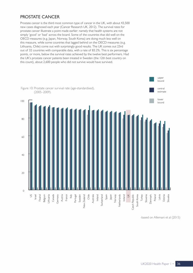
PROSTATE CANCERProstate cancer is the third most common type of cancer in the UK, with about 43,500 new cases diagnosed each year (Cancer Research UK, 2012). The survival rates for prostate cancer illustrate a point made earlier: namely that health systems are not simply ‘good’ or ‘bad’ across the board. Some of the countries that did well on the OECD measures (e.g. Japan, Norway, South Korea) are doing much less well on this measure, while some countries that lagged behind on the OECD measures (e.g. Lithuania, Chile) come out with surprisingly good results. The UK comes out 23rd out of 32 countries with comparable data, with a rate of 83.2%. This is six percentage points, or more, below the survival rates achieved by the twelve best performers. Had the UK’s prostate cancer patients been treated in Sweden (the 12th best country on this count), about 2,600 people who did not survive would have survived.
Figure 10: Prostate cancer survival rate (age-standardised), (2005–2009).
-based on Allemani et al (2015)
Fran
ce
Italy
Net
herla
nds
Nor
way
Swed
en
Belgi
um
Den
mar
k
Aus
tria
Aus
trali
a
Ger
man
y
Port
ugal
Irelan
d
Icel
and
UK
Fina
lnd
Slov
enia
Polan
d
Esto
nia
Latv
iaUS
Israe
l
Can
ada
Japan
New
Zea
land
Cze
ch R
epub
lic
Chi
le
Sout
h Ko
rea
Switz
erlan
d
Spain
Slov
akia
Turk
ey
Lith
uani
a
0
40
20
60
80
100
upper bound
central estimate
lower bound

37 • UK2020 Health Paper 1
LEUKAEMIALeukaemia is the twelfth most common type of cancer in the UK, with about 8,700 new cases each year (Cancer Research UK, 2012). There is more uncertainty in the data than for most other cancer types, as is indicated by the relatively wide confidence intervals. The results, again, drive home the point that a country’s performance on one outcome measure is not a good predictor of its performance on others. Japan and South Korea, which were among the top performers so far, are falling far behind on this count, while Austria and Italy also perform uncharacteristically poorly.
The UK comes out 20th out of 32 countries, with a survival rate of 47.4%, which is six percentage points or more behind those of the countries in the Top 12. This implies that more than 500 people could have been saved if they had been offered treatment in Norway (the 12th best) instead.
Figure 11: Leukaemia survival rate (age-standardised), (2005–2009).
-based on Allemani et al (2015)
Fran
ce
Italy
Net
herla
nds
Nor
way
Swed
en
Belgi
um
Den
mar
k
Aus
tria
Aus
trali
a
Ger
man
y
Port
ugal
Irelan
d
Icel
and
UK
Fina
lnd
Slov
enia
Polan
d
Esto
nia
Latv
ia US
Israe
l
Can
ada
Japan
New
Zea
land
Cze
ch R
epub
lic
Chi
le
Sout
h Ko
rea
Switz
erlan
d
Spain
Slov
akia
Turk
ey
Lith
uani
a
0
50
20
10
60
30
40
70
80
upper bound
central estimate
lower bound

UK2020 Health Paper 1 • 38
OVARIAN CANCEROvarian cancer, with just over 7,000 new cases each year, is the UK’s 15th most common type of cancer. Here, there is much less international variation in outcomes than for other types of cancer: Survival rates for all countries in the sample are above 30%, but below 45%. The UK comes out 25th, but the difference to the 12th best performer —France—is less than three percentage points. Still, this translates into about 180 lives lost.
Figure 12: Ovarian cancer survival rate (age-standardised), (2005–2009).
-based on Allemani et al (2015)
upper bound
central estimate
lower bound
Fran
ce
Italy
Net
herla
nds
Nor
way
Swed
en
Belgi
um
Den
mar
k
Aus
tria
Aus
trali
a
Ger
man
y
Port
ugal
Irelan
d
Icel
and
UK
Fina
lnd
Slov
enia
Polan
d
Esto
nia
Latv
iaUS
Israe
l
Can
ada
Japan
New
Zea
land
Cze
ch R
epub
lic
Chi
le
Sout
h Ko
rea
Switz
erlan
d
Spain
Slov
akia
Turk
ey
Lith
uani
a
0
20
10
30
40
50

39 • UK2020 Health Paper 1
STOMACH CANCERStomach cancer, with about 7,000 new cases each year, is the UK’s 16th most common form of cancer. There are only two countries where a majority of patients survive this condition. In most of the developed world, the share of survivors is between one in four and one in three. In the UK, which ranks 29 out of 32 countries, only 18.5% of patients survive, a rate which is more than nine percentage points below that achieved by the 12th best performer, Australia. Had the UK’s stomach cancer patients been treated in Australia, an additional 650 people would have survived it.
Figure 13: Stomach cancer survival rate (age-standardised), (2005–2009).
-based on Allemani et al (2015)
upper bound
central estimate
lower bound
Fran
ce
Italy
Net
herla
nds
Nor
way
Swed
en
Belgi
um
Den
mar
k
Aus
tria
Aus
trali
a
Ger
man
y
Port
ugal
Irelan
d
Icel
and
UK
Fina
lnd
Slov
enia
Polan
d
Esto
nia
Latv
iaUS
Israe
l
Can
ada
Japan
New
Zea
land
Cze
ch R
epub
lic
Chi
le
Sout
h Ko
rea
Switz
erlan
d
Spain
Slov
akia
Turk
ey
Lith
uani
a
0
20
10
30
40
50
60
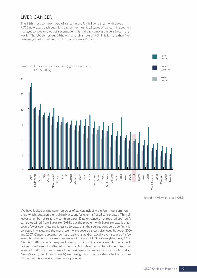
UK2020 Health Paper 1 • 40
LIVER CANCERThe 18th most common type of cancer in the UK is liver cancer, with about 4,700 new cases each year. It is one of the most fatal types of cancer: If a country manages to save one out of seven patients, it is already among the very best in the world. The UK comes out 24th, with a survival rate of 9.3. This is more than five percentage points below the 12th best country, France.
We have looked at nine common types of cancer, including the four most common ones, which, between them, already account for over half of all cancer cases. This still leaves a number of relatively common types. Data on cancers not touched upon so far can be obtained from Eurocare (2014), but the problem with Eurocare data is that it covers fewer countries, and is less up to date, than the sources considered so far. It is collected in waves, and the most recent wave covers cancers diagnosed between 2000 and 2007. Cancer outcomes do not usually change dramatically over a space of a few years, but the period covered saw several important NHS reforms (Niemietz, 2014; Niemietz, 2015a), which may well have had an impact on outcomes, but which will not yet have been fully reflected in the data. And while the number of countries is not in and of itself important, some of the most relevant comparators (such as Australia, New Zealand, the US, and Canada) are missing. Thus, Eurocare data is far from an ideal choice. But it is a useful complementary source.
Figure 14: Liver cancer survival rate (age-standardised), (2005–2009).
-based on Allemani et al (2015)
0
15
10
5
20
25
30
upper bound
central estimate
lower bound
Fran
ce
Italy
Net
herla
nds
Nor
way
Swed
en
Belgi
um
Den
mar
k
Aus
tria
Aus
trali
a
Ger
man
y
Port
ugal
Irelan
d
Icel
and
UK
Fina
lnd
Slov
enia
Polan
d
Esto
nia
Latv
iaUS
Israe
l
Can
ada
Japan
New
Zea
land
Cze
ch R
epub
lic
Chi
le
Sout
h Ko
rea
Switz
erlan
d
Spain
Slov
akia
Turk
ey
Lith
uani
a

41 • UK2020 Health Paper 1
SKIN CANCERThe fifth most common type of cancer in the UK is malignant melanoma, a form of skin cancer, with about 13,500 new cases detected every year. England (the UK as a whole is not listed) achieves a survival rate of 85.4%, which is the eleventh highest rate in this sample.11 Here, the NHS is about two percentage points or more ahead of some its Western European neighbours, namely Belgium, Austria and Portugal, whilst also being marginally ahead of Iceland and Spain, and on a par with Finland and Italy.
11 The comparison with the twelfth best performer, used above, is not meaningful in this case, because the next best performer’s survival rate is virtually identical in absolute terms.
central estimate
Figure 15: Melanoma five-year survival rates (age-standardised), (2000–2007).
-based on Eurocare (2014)
0
60
40
20
80
100
Fran
ce
Italy
Net
herla
nds
Nor
way
Swed
en
Belgi
um
Den
mar
k
Aus
tria
Ger
man
y
Port
ugal
Irelan
d
Icel
and
Fina
lnd
Slov
enia
Polan
d
Esto
nia
Latv
ia
Cze
ch R
epub
lic
Switz
erlan
d
Spain
Slov
akia
Lith
uani
a
Malt
a
Engla
nd

UK2020 Health Paper 1 • 42
LYMPHOMALymphoma (the so-called ‘Non-Hodgkin’ variety), with about 13,000 new cases per year, is the UK’s sixth most common type of cancer. England comes out 16th with a survival rate of 56.7%, which is about four percentage points or more below the rates achieved by the twelve best performers. Had English patients been treated in Spain (which comes out 12th), almost 500 more people would have survived.
Figure 16: Non-Hodgkin Lymphoma five-year survival rates (age-standardised), (2000–2007).
-based on Eurocare (2014)
Non-hodgkin
0
60
50
40
30
20
10
70
80
Fran
ce
Italy
Net
herla
nds
Nor
way
Swed
en
Belgi
um
Den
mar
k
Aus
tria
Ger
man
y
Port
ugal
Irelan
d
Icel
and
Fina
lnd
Slov
enia
Polan
d
Esto
nia
Latv
ia
Cze
ch R
epub
lic
Switz
erlan
d
Spain
Slov
akia
Lith
uani
a
Malt
a
Engla
nd

43 • UK2020 Health Paper 1
Figure 17: Oral cancer five-year survival rates (age-standardised), (2000–2007).
-based on Eurocare (2014)
Fran
ce
Italy
Net
herla
nds
Nor
way
Swed
en
Belgi
um
Den
mar
k
Aus
tria
Ger
man
y
Port
ugal
Icel
and
Irelan
d
Fina
lnd
Slov
enia
Cze
ch R
epub
lic
Switz
erlan
d
Spain
Malt
a
Engla
nd
0
60
50
40
30
20
10
70
Cro
atia
ORAL CANCEROral cancer is the 14th most common type of cancer in the UK, with just over 7,300 new cases each year. On this measure, England comes out as the 6th best in Europe, with a survival rate of 51.5%. This is more than five percentage points ahead of the twelfth best performer, Belgium (Eurocare, 2014). Had UK patients been treated in Belgium, there would have been almost 400 additional deaths.

UK2020 Health Paper 1 • 44
Figure 18: Laryngeal cancer five-year survival rates (age-standardised), (2000–2007).
-based on Eurocare (2014)
Fran
ce
Italy
Net
herla
nds
Nor
way
Swed
en
Belgi
um
Den
mar
k
Aus
tria
Ger
man
y
Irelan
d
Icel
and
Fina
lnd
Slov
enia
Switz
erlan
d
Spain
Malt
a
Engla
nd
0
60
50
40
30
20
10
70
80
LARYNGEAL CANCEREngland does similarly well on Laryngeal cancer, occupying the 6th place in Europe, with a survival rate of 62%. This means that England is more than two percentage points ahead of Spain, the twelfth best performer (Eurocare, 2014). Given that just over 2,300 cases of Laryngeal cancer are diagnosed each year, this means that if NHS patients were treated on the Spanish system, an additional 50 lives would be lost.

45 • UK2020 Health Paper 1
GALLBLADDER CANCEROn gallbladder cancer, England does even better, coming out as the 3rd best in Europe with a survival rate of 18.6%. This is more than three percentage points above the Dutch survival rate, which is the twelfth highest in the sample (Eurocare, 2014). With about 900 cases diagnosed each year, this translates into a difference of about thirty additional lives saved on the NHS.
Figure 19: Gallbladder cancer five-year survival rates (age-standardised), (2000–2007).
-Eurocare (2014)
Fran
ce
Italy
Net
herla
nds
Nor
way
Swed
en
Belgi
um
Den
mar
k
Aus
tria
Ger
man
y
Port
ugal
Irelan
d
Latv
ia
Cze
ch R
epub
lic
Switz
erlan
d
Spain
Lith
uani
a
Engla
nd
0
20
15
10
5
25
30
Cro
atia
In summary, then, Eurocare data shows a more mixed pattern than OECD and Lancet data. On the latter two sources, the NHS is generally trailing behind the rest of the developed world, ranking somewhere in the vicinity of ex-communist countries like the Czech Republic or Slovenia. This is also the case for some Eurocare indicators—but on others, the NHS is in the top half of the league table, and on some, it is even among the best performers.
Thus, it would be wrong to say that the NHS is always among the worst performers when it comes to cancer survival rates. But the cancer types on which the NHS does poorly are vastly more common than the ones on which the NHS does well. Breast, lung, prostate and bowel cancer are, by a wide margin, the most common types and, taken together, they account for over half of all cases diagnosed each year. A health system which does poorly on the high-profile cancers cannot balance this out by doing better on others.

UK2020 Health Paper 1 • 46
CHAPTER 4
STROKE
UK2020 Health Paper 1• 46

47 • UK2020 Health Paper 1
ISCHAEMIC STROKES Ischaemic strokes—caused by bloodstream blockages to the brain—are by far the most common variety, accounting for more than four out five cases (Stroke Association, 2016). The graph below shows age-standardised and sex-standardised 30-day mortality rates for stroke patients from the point of hospital admission. The long-term trend for this measure is a positive one, with mortality rates falling steadily in almost all developed countries, including—in fact, especially—the UK. As a result, there is now far less variation between high-income countries than there used to be. In Western Europe, even the very best and the very worst performer are just five percentage points apart. The UK comes out 21st out of 33 countries, although the difference between the UK and the next four countries on either side is not statistically significant. The mortality rate of the 12th best performer, Switzerland, is 2.3 percentage points below the UK’s. This does not seem like a lot, but given how common ischaemic strokes are, it still amounts to around 3,000 lives that could be saved if the NHS rose to Swiss standards.
Figure 20: Ischaemic stroke 30-day mortality rates (age/sex-standardised), (2014 or latest available year).
-based on OECD.Stat (2016)
upper bound
central estimate
lower bound
0
15
10
5
20
25
Fran
ce
Italy
Net
herla
nds
Nor
way
Swed
en
Belgi
um
Den
mar
k
Aus
tria
Aus
trali
a
Ger
man
y
Port
ugal
Irelan
d
Icel
and
UK
Fina
lnd
Slov
enia
Esto
nia
Latv
iaUS
Israe
l
Can
ada
Japan
New
Zea
land
Cze
ch R
epub
lic
Chi
le
Sout
h Ko
rea
Switz
erlan
d
Spain
Slov
akia
Sing
apor
e
Luxe
mbo
urg
Hun
gary
Malt
a
Mex
ico
Strokes are among the leading causes of death in the developed world. In the UK, over 150,000 cases are recorded each year (Stroke Association, 2016). As in the case of cancer, stroke mortality levels as such tell us little about the quality of healthcare, because the incidence of strokes is determined by a range of factors over which the health system has little or no control. However, whether or not a patient survives a stroke does have a lot to do with the quality and timeliness of the healthcare they receive.
Strokes are categorised as either ischaemic or haemorrhagic, and we consider both.

UK2020 Health Paper 1 • 48
HAEMORRHAGIC STROKESHaemorrhagic strokes—caused by bleeding in or around the brain—are less common, but still, about 23,000 cases are recorded each year. There is much greater international variation in mortality rates than for ischaemic strokes, but there is also a considerable degree of uncertainty in the data. In the lower half of the ranking, the difference in mortality rates between the Czech Republic, the UK, France, Portugal, Belgium, Canada, Slovakia, Denmark, Slovenia and New Zealand is not statistically significant. In the upper half, the same goes for the difference between Austria, Luxembourg, Italy, Switzerland and Singapore.
Figure 21: Haemorrhagic stroke 30-day mortality rate (age/sex-standardised), (2014 or latest available year).
-based on OECD.Stat (2016)
upper bound
central estimate
lower bound
Fran
ce
Italy
Net
herla
nds
Nor
way
Belgi
um
Den
mar
k
Aus
tria
Aus
trali
a
Ger
man
y
Port
ugal
Irelan
d
Icel
and
UK
Fina
lnd
Slov
enia
Esto
nia
Latv
iaUS
Israe
l
Can
ada
Japan
New
Zea
land
Cze
ch R
epub
lic
Chi
le
Sout
h Ko
rea
Switz
erlan
d
Spain
Slov
akia
Swed
en
Luxe
mbo
urg
Sing
apor
e
Hun
gary
What is statistically significant, however, is the difference between the UK and the top performers. The UK comes out 19th with a mortality rate of 26.5%, which is 4.5 percentage points above the rate recorded by 12th best performer, Israel. In absolute terms, this amounts to just over 1,000 lives.
In short, on stroke care, the NHS does relatively better than on cancer care. But it remains in the bottom half of the ranking.
0
20
30
40
50
10

49 • UK2020 Health Paper 1

UK2020 Health Paper 1 • 50
CHAPTER 5
RESPIRATORY DISEASES
UK2020 Health Paper 1• 50

51 • UK2020 Health Paper 1
Diseases of the respiratory system, which include pneumonia, asthma and chronic obstructive pulmonary disease, account for over 80,000 deaths per year in the UK (Eurostat, 2015a). This amounts to just over 14% of all deaths. Unfortunately, for this class of diseases, the contribution of the healthcare system is much harder to judge than it is for stroke and cancer. While strokes and cancers obviously differ in severity, their diagnoses are binary: people either suffer from a stroke/cancer, or they don’t. The same goes for the metric of success: people either survive a stroke/cancer, or they don’t. The situation is far less straightforward for chronic conditions which do not have to be fatal in themselves, but which can become fatal when combined with other conditions, and which can, more generally, leave patients weakened and less resistant to illness.
Standardised death rates for respiratory diseases are available, but they do not tell us much, and might be actively misleading. To see why, suppose there are only two possible causes of death, X and Y, with X being the leading cause of death among people aged under 75, and Y being the leading cause of death among people aged 75 and over. Suppose, further, that two countries are exactly identical, until Country 1 becomes vastly better at treating X while Country 2 does not. This would, of course, lead to a rising death rate for Y in Country 1, simply because people ultimately have to die of something: if X no longer kills them, Y will. But if we compared death rates for Y in isolation, we would wrongly conclude that Country 1 offers worse care for Y. Respiratory diseases have Y-elements, in that they can be a ‘default’ cause of death, and that they are more likely to be deadly in old age. And, of course, there is the already discussed issue that the main risk factors (in this case, tobacco consumption and air pollution) are outside of the health system’s control.
One way around this problem, although not a particularly elegant one, is to look at standardised death rates only among people aged under 65. The assumption here would be that for people in that age group, with adequate healthcare, respiratory diseases should almost never be fatal. If so, a cross-country comparison of standardised death rates could be meaningful, even if there are large differences in the prevalence of respiratory diseases. Simply put: If the ideal death rate in that age group is 0%, it should not matter whether we are talking about 0% of a patient population of 10,000 people, or 0% of a patient population of 20,000 people. The assumption is not unjustifiable: Some countries do manage to keep standardised death rates from respiratory diseases in that age group to around 5 people per 100,000, or less. Thus, while overall death rates are unlikely to be indicative of the quality of healthcare, death rates amongst those aged under 65 could very well be.
To describe this as a second-best solution would nonetheless be a euphemism. Looking at a disease which mainly affects the elderly, and then excluding precisely that group, is clearly far from ideal. But it is at least a plausible presumption that health systems which fail to treat e.g. 60-year-olds properly will not do an outstanding job at treating the 70-year-olds either. The results are shown in the graph opposite.

UK2020 Health Paper 1 • 52
The UK comes out behind the Czech Republic and Poland, and just before Turkey, with a death rate of 11.9 out of 100,000 people. We cannot tell how this gap between the NHS and the best-performing countries translates into different survival chances for the elderly, the group most at risk from dying from respiratory diseases. We therefore cannot tell by how much an elderly patient suffering from pneumonia or obstructive pulmonary disease would increase their survival chances by seeking treatment elsewhere.
But it is safe to say that the NHS is not delivering on this measure, not least because external conditions are actually favourable for the NHS. One of the major risk factors for the development of a respiratory condition is the prevalence of smoking (Eurostat, 2015a), and the UK has one of the lowest levels of tobacco consumption in Europe. In Switzerland, one of the best performers on respiratory diseases, the level of tobacco consumption is twice as high as in the UK.12
12 This may not be hugely relevant for older people, many of whom may have been smokers at a younger age, when the habit was still much more common. But it will be more relevant for the age group in this sample.
Figure 22: Standardised death rates per 100,000 for respiratory diseases, people aged <65 years, (2012).
-based on Eurostat (2015a)
%C
ypru
s
Italy
Slov
enia
Switz
erlan
d
Finl
and
Swed
en
Luxe
mbo
urg
Fran
ce
Aus
tria
Liec
hten
stei
n
Nor
way
Cro
atia
Irelan
d
Gre
ece
Spain
Port
ugal
Ger
man
y
Malt
a
Net
herla
nds
Belgi
um
Esto
nia
Den
mar
k
Cze
ch R
epub
lic
Polan
d
UK
Turk
ey
Serb
ia
Slov
akia
Lith
uani
a
Bulga
ria
Hun
gary
Rom
ania
Latv
ia
0
10
15
20
25
5
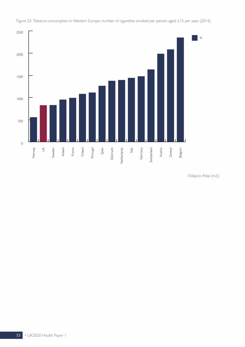
53 • UK2020 Health Paper 1
Figure 23: Tobacco consumption in Western Europe: number of cigarettes smoked per person aged ≥15 per year, (2014).
-Tobacco Atlas (n.d.)
%N
orw
ay UK
Swed
en
Irelan
d
Fran
ce
Finl
and
Port
ugal
Spain
Den
mar
k
Net
herla
nds
Italy
Ger
man
y
Switz
erlan
d
Aus
tria
Gre
ece
Belgi
um
0
1000
1500
2000
2500
500

UK2020 Health Paper 1 • 54
CHAPTER 6
WAITING TIMES
UK2020 Health Paper 1• 54
55 • UK2020 Health Paper 1
Waiting times have been a longstanding problem of the NHS. Since the early 2000s, there has been a concerted effort to cut waiting times through a carrot- and-stick approach (Niemietz, 2015a). Those efforts made a large difference, as waiting times really were cut substantially (Crisp, 2011). But they were cut from a very high base level.
For non-urgent conditions, long waiting times do not automatically have to be an impediment to achieving good health outcomes, as long as they are not excessively long, and as long as prioritisation by urgency works well enough. As we will see below, some of the countries that do well on a lot of outcome measures (notably Sweden and Norway) do not generally offer quick access to care.
Still, swift access to care contributes to patients’ quality of life, not least by reducing the stress and anxiety that can be associated with illness and with waiting for treatment, as well as the inconvenience of losing working days etc.
Unfortunately, internationally comparable data on waiting times is only available for a small number of high-income countries (Siciliani et al, 2014), and it does not help that that sample is not a representative one. Firstly, most countries in the sample have relatively similar health systems. Single-payer systems, run as either national or local/regional health services, are overrepresented. Secondly, as we will see below, the sample is biased towards countries that have historically struggled with long waiting times. Nonetheless, what little data is available will be shown below.
For seven common procedures, the graph below shows the number of days patients have to wait, on average, between the specialist assessment and the commencement of the actual procedure. The UK occupies a middling position within this group. The Netherlands is clearly the best performer, Denmark generally does better than the UK, and for coronary bypasses, the UK has the longest waiting times of all countries in the sample. But the comparison also shows that waiting times are not a uniquely British concern, and that patients can wait substantially longer elsewhere. Waiting times are generally longest in Norway and Spain, and they are also an issue in Finland, New Zealand and Portugal. Moreover, as Siciliani et al (2014) point out, the UK has shown faster rates of improvement than most other countries since the early 2000s.

UK2020 Health Paper 1 • 56
Figure 24: Mean waiting times (in days) for common procedures.
Net
herla
nds
Nor
way
Den
mar
k
Port
ugal
UK
Fina
lnd
Israe
l
New
Zea
land
Spain
0
100
150
200
250
50
Average waiting times can be affected by a small number of outliers. Under those circumstances, median waiting times—roughly, the number of days the person in the middle of the waiting list has to wait—can be a better approximation of ‘typical’ waiting periods. Median waiting times are shown below. Results for the UK remain similar.
Björnberg, A. (2015) Euro Health Consumer Index 2014 Report. Health Consumer Powerhouse.
Knee replacement
Hip replacement
Hysterectomy
Prostatectomy
Coronary bypass
Coronary angioplasty
Cataract surgery

57 • UK2020 Health Paper 1
Figure 25: Median waiting times (in days) for common procedures.
0
50
100
150
200
Aus
trali
a
Nor
way
Den
mar
k
Port
ugal
UK
Fina
lnd
Israe
l
New
Zea
land
Spain
Can
ada
The waiting time indicators contained in the Euro Health Consumer Index (EHCI), compiled by the Health Consumer Powerhouse (Björnberg, 2014), cover a lot more countries, but unfortunately, these indicators are imprecise. The EHCI does not measure how long people actually wait, rather, it presents patient associations’ assessment of how likely it is that a representative patient will be able to access a certain type of treatment within a certain timeframe. Patient associations can be assumed to be well-informed healthcare consumers, but the point remains: They are not necessarily describing their own experience, but their appraisal of what constitutes ‘typical’ waiting times, which may be quite difficult to judge without recourse to administrative data.
Responses may also be skewed by factors like ‘availability bias’, if the waiting times issue receives more frequent (positive or negative) media coverage around the time the surveys take place. Occasional erratic fluctuations in the data could well be explained by such factors. For example, in the 2012 edition of the EHCI, the overall score of the German health system suddenly dropped for no obvious reason, just to shoot back up again in the 2014 edition (ibid. p. 9 & p. 34). It is not unlikely
Björnberg, A. (2015) Euro Health Consumer Index 2014 Report. Health Consumer Powerhouse.
Knee replacement
Hip replacement
Hysterectomy
Prostatectomy
Coronary bypass
Coronary angioplasty
Cataract surgery

UK2020 Health Paper 1 • 58
that political discontent in areas unrelated to health—the handling of the Eurozone crisis being an obvious candidate—‘spilled over’ into responses about the healthcare system. If so, this would be a variant of the ‘substitution heuristic’, which is a common problem with opinion surveys.
The fact that typical waiting times may be quite difficult to assess might be somewhat mitigated by the fact that respondents are not asked for an exact number, rather, answers are grouped into three bands (‘green’, ‘yellow’ and ‘red’).
But this creates problems of its own. For example, in order to get a yellow score for elective surgery, a country has to treat most patients within 90 days. But suppose Country A treats 60% of patients after 80 days, and the other 40% after 120 days, while Country B treats 60% of patients after 100 days, and the other 40% after 40 days. Average waiting times are longer in Country A—and yet, it is Country A that gets the yellow score, while Country B gets the red score. And while this example is, of course, a bit contrived, it remains the case that EHCI scores give too much weight to arbitrary cut-off points.
Still, in the absence of internationally comparable waiting times data, the EHCI indicators are the nearest substitute. The table below presents results for GPs and Accident and Emergency departments, which we have grouped into one table because the two can, in some situations, be substitutes for one another. For the former, a green score means that patients can expect to get a GP appointment on the same day, a red score means that a same-day appointment is the exception rather than the norm, and a yellow score indicates an in-between situation. For the latter, a green score means that patients can expect to be seen within less than an hour at A&E, a red score means that waiting times of more than three hours are normal, and a yellow score indicates typical waiting times of more than one but less than three hours. England, together with Sweden and Lithuania, scores red on both counts. Fast access to both types of care is the norm in Belgium, Denmark, the Netherlands, Portugal, Switzerland, the Czech Republic and Hungary.
Same-day access to family doctor
A&E waiting times
Green Yellow Red
Green(<1 hour)
Belgium Denmark
Netherlands Portugal
Switzerland Czech Republic
Hungary
Norway Finland Iceland
Yellow
Austria Latvia
Luxembourg Slovakia
Germany Slovenia
Estonia Greece Poland Spain
Red(>3 hours)
France Italy
MaltaIreland
Lithuania Sweden England
Figure 26: Waiting times for GP appointments and at A&E departments, (2014).
Björnberg, A. (2015) Euro Health Consumer Index 2014 Report. Health Consumer Powerhouse.

59 • UK2020 Health Paper 1
Finally, the table below shows access to specialists and CT scans, as a proxy for major diagnostics. In some countries, including the UK, the GP is the point of entry, and higher tiers of (non-emergency) care can only be accessed through a GP referral. In other countries, patients can directly book appointments with specialists straight away, without any GP involvement. Then, there are countries which use gatekeeping for some but not all specialities. The EHCI gives a green score to countries which allow unrestricted access to all specialists, a red score for strict and a yellow score for partial gatekeeping.
Major elective surgery within less than 3 months
Cancer therapy within 3 weeks
Green Yellow Red
Green
Belgium Denmark Finland France
Germany Luxembourg Switzerland
Austria Estonia
Iceland Malta
Portugal Slovakia
Yellow NetherlandsHungary
Italy England
Latvia Spain
Red
Czech Republic Greece
Lithuania Norway Sweden
Ireland Poland
Slovenia
Figure 27: Waiting times for surgery and cancer therapy, (2014).
The table below is about waiting times for major surgeries (coronary bypass, coronary angioplasty, hip replacement, knee joint replacement) and for the commencement of cancer therapy (radiation and/or chemotherapy). The EHCI specifies a target time frame of three months for surgery, and three weeks for cancer therapy. A green score means that patients will almost always (>90%) be treated within that time frame, a red score means that most patients have to wait for longer than that, and a yellow score falls in between. This specification somewhat problematic: The green score is defined in a fairly precise way, but the yellow and the red score could conceal large differences within the bands.
England, together with Italy and Hungary, scores yellow on both counts, meaning that the majority but not the vast majority of patients will be treated within the reference time frame. Belgium, Denmark, Finland, France, Germany, Luxembourg and Switzerland score green on both counts.
Björnberg, A. (2015) Euro Health Consumer Index 2014 Report. Health Consumer Powerhouse.

UK2020 Health Paper 1 • 60
This classification is problematic. A theoretical right to ‘unrestricted’ access is not worth a lot if specialist appointments are hard to obtain, and even strict gatekeeping need not be much of a barrier if GPs only filter out unreasonable referral requests, and if patients can obtain appointments shortly after referral. Thus, this category tells us more about administrative arrangements than actual waiting times. The diagnostics category is more sensible.
A green score means that patients can typically get an appointment within a week, a red score means that it will typically take more than three weeks. England, together with Ireland, Malta, Spain and Sweden, scores red, reflecting strict gatekeeping and long waiting times for diagnostics.
Direct access to specialist
CT scan within a week
Green Yellow Red
GreenAustria Belgium
SwitzerlandCzech Republic Finland
Netherlands
Yellow
Germany Greece Iceland Slovakia
Denmark Estonia France
Lithuania Norway Portugal
Red Latvia Luxembourg
Hungary Italy
Poland Slovenia
Ireland Malta Spain
Sweden England
Figure 28: Access to specialist care and waiting time for diagnostics.
In short, while the EHCI data has considerable shortcomings, it is still fair to say that British patients face greater access barriers than patients in most comparable countries. The merits of the EHCI’s method of converting the scores into a ranking is, of course, debatable. But it is worth noting that while there are countries that score green four times or more (with Switzerland and Belgium always scoring green), England scores red four times, without a single green score.
Björnberg, A. (2015) Euro Health Consumer Index 2014 Report. Health Consumer Powerhouse.

61 • UK2020 Health Paper 1
Countries with ≥4 green scores Countries with ≥4 red scores
Score Score
Finland
Luxembourg
Netherlands
Austria
Denmark
Belgium
Switzerland
175
188
188
200
200
225
225
Ireland
Sweden
Lithuania
Poland
Spain
England
Malta
88
88
100
100
100
100
125
Figure 29: Countries with the highest and lowest scores.
Björnberg, A. (2015) Euro Health Consumer Index 2014 Report. Health Consumer Powerhouse.

UK2020 Health Paper 1 • 62
CHAPTER 7
ADOPTION OF INNOVATIVE THERAPIES AND DIAGNOSTICS
UK2020 Health Paper 1• 62

63 • UK2020 Health Paper 1
Defenders of the current system sometimes argue that whatever the system’s shortcomings, at least it is good at keeping costs under control. This cannot be said about every health system. Three of the systems which consistently outperform the NHS on health outcome measures—the Dutch, the German and the Swiss system (Niemietz, 2015b)—have been unsuccessful in their various attempts to contain costs. Apart from the US (which is, in this respect, in a category of its own), these are the world’s biggest healthcare spenders.
The counterargument is that the NHS’s comparatively low spending levels need not reflect superior efficiency or effective cost-control measures, but may simply be the result of crude rationing. Any country could keep health spending low by impeding the adoption and/or diffusion of innovative therapies.
We will address the efficiency issue in greater detail in the next section. For now, suffice it to take a look at the extent to which the NHS facilitates, or blocks, the diffusion of medical innovation relative to comparable countries. It should be noted that this is a problematic category, because the uptake of medical innovation is an input, not an outcome, and a faster uptake is not automatically better. There may often be good reasons for adopting a conservative approach to medical technologies that have not yet been sufficiently tried and tested. So the ‘league table’ approach used in the above sections would be inappropriate here, because while a higher survival rate is unequivocally better than a lower rate, a higher usage rate of a drug or other treatment is not. It could even indicate clinically harmful overtreatment.
On the other hand, most developed countries now use some form of Health Technology Assessment (HTA), routinely screening new therapies for cost-effectiveness. This should make it less likely that medical technologies which are expensive, but clinically ineffective, are widely adopted. Thus, while we will not speculate on what the ‘optimal’ rate of uptake should be, it is still informative to note where the NHS stands relative to other systems in this respect.
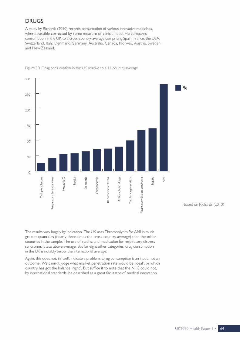
UK2020 Health Paper 1 • 64
DRUGSA study by Richards (2010) records consumption of various innovative medicines, where possible corrected by some measure of clinical need. He compares consumption in the UK to a cross-country-average comprising Spain, France, the USA, Switzerland, Italy, Denmark, Germany, Australia, Canada, Norway, Austria, Sweden and New Zealand.
Figure 30: Drug consumption in the UK relative to a 14-country average.
-based on Richards (2010)
%
Mul
tiple
scle
rosis
Resp
irato
ry S
yncy
tial v
irus
Hep
atiti
s C
Stro
ke
Dem
entia
Ost
eopo
rosis
Rheu
mat
oid
arth
ritis
Ant
ipsy
chot
ic dr
ugs
Mac
ular
deg
ener
atio
n
Resp
irato
ry d
istre
ss sy
ndro
me
Stat
ins
AM
I
0
50
200
150
100
250
300
The results vary hugely by indication. The UK uses Thrombolytics for AMI in much greater quantities (nearly three times the cross-country average) than the other countries in the sample. The use of statins, and medication for respiratory distress syndrome, is also above average. But for eight other categories, drug consumption in the UK is notably below the international average.
Again, this does not, in itself, indicate a problem. Drug consumption is an input, not an outcome. We cannot judge what market penetration rate would be ‘ideal’, or which country has got the balance ‘right’. But suffice it to note that the NHS could not, by international standards, be described as a great facilitator of medical innovation.

65 • UK2020 Health Paper 1
DIAGNOSTICSThe uptake and availability of modern diagnostic techniques varies widely across Western Europe. One category for which particularly good internationally comparable data is available (from the industry’s trade association) is In vitro diagnostics (IVDs). IVDs are tests performed on biological samples, such as a tissue or a blood sample, to either directly diagnose a disease, or a predisposition towards it.
As above, diagnostics are an input, not an outcome. ‘More’ does not automatically mean ‘better’, and we have no way of telling what the ‘optimal’ rate of market penetration would be. And while the importance of diagnosing diseases correctly, precisely and timely needs no further explaining, spending more on diagnostics is not a panacea. Even sophisticated diagnostic techniques miss some cases (‘false negatives’), whilst sometimes raising false alarm (‘false positives’).
Also, the data we have only tells us how much different health systems spend on IVD, not how well they spend that money. What matters, of course, is a health system’s ability to use the right diagnostic tool for the right patient in the right situation, and then draw the right conclusions from the results—not spending per se.
But it is still worth noting that the NHS is an outlier in Western Europe when it comes to spending on IVD diagnostics. Almost all countries spend between €18 and €34 per capita on this type of diagnostics, the UK only spends €12.30.
-based on EDMA (2014)
Figure 31: IVD expenditure: € per capita, (2013 or latest available year).
IVD
Switz
erlan
d
Icel
and
Nor
way
Belgi
um
Aus
tria
Luxe
mbo
urg
Italy
Fran
ce
Ger
man
y
Den
mar
k
Spain
Port
ugal
Gre
ece
Swed
en
Finl
and
Net
herla
nds
UK
0
30
20
10
40
50

UK2020 Health Paper 1 • 66
It is, of course, a theoretical possibility that €12.30 is the ‘right’ amount, and that all the other countries spend ‘too much’. But given the NHS’s poor results on so many outcome measures, a more likely interpretation is that low investment in diagnostics represents a ‘false economy’. A system can achieve small savings by tightly rationing diagnostics, but this is of little use if it means that diseases are then diagnosed at a more advanced stage, when costlier interventions become necessary.
In that context, we have to ask why it is that healthcare providers elsewhere are so much more willing to use IVD than NHS providers. Spending on diagnostics is only very loosely related to overall healthcare spending, and while a lot of countries spend twice as much on diagnostics than the UK, none of them spend twice as much on healthcare.

67 • UK2020 Health Paper 1

UK2020 Health Paper 1 • 68
CHAPTER 8
SPENDING AND EFFICIENCY
UK2020 Health Paper 1• 68

69 • UK2020 Health Paper 1
Defenders of the NHS often present two arguments:
• ‘The UK spends less on healthcare than many comparable countries. This proves that the NHS is more efficient than other systems.’
• ‘If the NHS falls behind other systems, it is only because it has less money to spend. As long as the NHS does not receive the same level of funding as its North-western European neighbours, of course it cannot achieve the same results.’
But while those positions cannot both be simultaneously correct, on its own, the second one could be.
First of all, it is true that by international standards, healthcare spending in the UK is not particularly high. Most of the countries that achieved top results in the above comparisons—France, Sweden, the Netherlands, Germany and Switzerland— spend around 11% of GDP on healthcare, compared to just under 9% in the UK. Two percentage points of GDP is a large difference.
It raises the difficult question to what extent the gaps in outcomes can be attributed to gaps in expenditure levels. What would happen to health outcomes in the UK if healthcare spending rose to the levels observed in France, the Netherlands and Switzerland, and what would happen to outcomes in those countries if their spending levels fell to UK levels?
Figure 32: Health expenditure in high-income countries as a % of GDP, (2014 or latest available year).
Luxe
mbo
urg
Kore
a
Israe
l
Irelan
d
UK
Finl
and
Aus
trali
a
Italy
Spain
Port
ugal
Gre
ece
Nor
way
Can
ada
Aus
tria
Japan
Belgi
um
Den
mar
k
Fran
ce
Swed
en
Net
herla
nds
Ger
man
y
Switz
erlan
d
US
total
private/ voluntary
public/ statutory
-OECDStats (2016)
New
Zea
land
20
15
10
5
0

UK2020 Health Paper 1 • 70
There is no way of knowing. Just as health outcomes are driven by a host of factors that have nothing to do with the healthcare system (demographics, lifestyles, socio-economic characteristics…), so are spending levels. The fact that Japan has relatively high healthcare spending has to be in part driven by the fact that Japan has the highest old-age dependency ratio in the world (World Bank, n.d.).
To a lesser extent, this will also play a role for Germany, which has one person aged 65 or over for every three people aged 15 to 64.

71 • UK2020 Health Paper 1
EFFICIENCY ESTIMATESThe health system efficiency estimates of Joumard et al (2010) have to be the most comprehensive attempt to disentangle the various factors at play. The authors think of health systems as production functions that turn inputs (healthcare spending, staffing levels) into outcomes (life expectancy, additional life expectancy at age 65, minimised Amenable Mortality), subject to external constraints to be controlled for (alcohol and tobacco consumption, fruit and vegetable consumption, air quality, education levels, income levels). Cross-country differences that cannot be explained in this way are ascribed to efficiency differences.
The efficiency reserves of different health systems are expressed as potential gains in life expectancy, additional life expectancy at age 65, and reductions in amenable mortality. These are improvements that could be achieved through efficiency improvements alone—without spending more money on healthcare, without people adopting healthier lifestyles, and without improvements in other factors conducive to health. The results are shown below.
What stands out is that while low spending is sometimes achieved through high efficiency (e.g. Korea), and high spending is sometimes the result of low efficiency (e.g. the USA), this connection is far from automatic. Switzerland and Japan are among the world’s ten biggest healthcare spenders, but they also receive top marks for efficiency. While it is possible to spend large sums of money wisely, it remains possible to spend small sums wastefully.

UK2020 Health Paper 1 • 72
The study also indicates considerable efficiency reserves for the NHS. Life expectancy could be increased by over three years, additional life expectancy at 65 could be increased by over 2 years, and amenable mortality could be reduced by over 4% through efficiency improvements alone. This means that we have no reason to believe that the NHS’s performance would match that of its Western European neighbours if it matched its spending level.
Figure 33: Efficiency reserves: Potential gains in health outcomes through pure efficiency improvements.
Potential gains in life expectancy Potential gains in additional life expectancy at age 65
Potential reduction in mortality amenable to healthcare
1 Australia ≤1 year Australia ≤1 year Japan 0–2%
2 Switzerland Japan France
3 Korea Switzerland Italy
4 Iceland France Iceland
5 Japan Turkey Korea
6 Mexico 1–2 years Korea 1–2 years Australia
7 France Poland Sweden 2–4%
8 Turkey Iceland New Zealand
9 Portugal Mexico Greece
10 Italy Canada Canada
11 Poland Spain Norway
12 Sweden Italy Poland
13 Spain Portugal Mexico
14 Canada 2–3 years New Zealand Spain
15 Norway Belgium Austria
16 New Zealand Sweden Netherlands
17 Netherlands Norway Finland 4–6%
18 Austria Austria Luxembourg
19 Czech Republic Germany Portugal
20 Germany USA 2–3 years Germany
21 Belgium Finland UK
22 Ireland 3–4 years Netherlands Ireland
23 Luxembourg UK Denmark 6–8%
24 UK Czech Republic Czech Republic
25 Finland Ireland USA
26 Greece Luxembourg Slovakia
27 Denmark 4–5 years Hungary
28 Slovakia Greece
29 Hungary Denmark
30 USA Slovakia 3–4 years
-based on Joumard et al (2010)

73 • UK2020 Health Paper 1
VOLUNTARY TOP-UPS AND UPGRADESMoreover, at least a small part of the difference in healthcare spending between the UK and the high-spending countries must be explained by the fact that the latter usually make it a lot easier to top up and/or upgrade statutory healthcare privately (Niemietz, 2015b, pp. 21–23). Patients can choose to pay privately, either out of pocket or via supplementary insurance, for products and services that offer convenience, but that are not deemed clinically necessary and that are therefore not covered by statutory insurance. An obvious example would be single room accommodation in a hospital. In the UK, this is usually not possible: NHS care is provided on a ‘take it or leave it’ basis. Those who seek additional services can only opt to forego NHS treatment altogether, become a private patient, and pay for the entire treatment privately. This helps to keep overall expenditure low, but only by preventing some people from purchasing goods and services that they are prepared to pay for. This must not be confused with superior efficiency.
THE ‘MEDICAL COST ENVIRONMENT’Suppose two countries produce an identical amount of widgets (of identical quality). There is only one factor in production, X. Country 1 requires 5 units of X to produce its widgets, while Country 2 requires 7 units. A unit of X costs £4 in Country 1, and £2 in Country 2, so total production costs are £20 in Country 1 and £14 in Country 2. Which country is more efficient at producing widgets?
On the one hand, the answer is obvious: Country 2 achieves the same level of output at a lower cost. But it is also true that Country 1 achieves the same level of output with fewer inputs, and that if the producers of Country 1 were to set up shop in Country 2 (assuming they can replicate their method of production there), they would quickly dominate the market. The answer to the efficiency question depends on whether we treat input prices as an external constraint, which producers cannot influence, or whether we treat them as endogenous. If the former, we could say that production is more efficient in Country 2, but that producers are more efficient in Country 1. This distinction matters for healthcare as well.
International comparisons of healthcare spending levels often express spending in Purchasing Power Parity (PPP) adjusted dollars (or ‘international dollars’). PPP converters, of course, reflect a country’s overall price level, not the price level specifically in the healthcare sector. Thus, these figures tell us something about what kind of shopping basket we could buy for that money in the respective country, but not how many doctors we could hire, or how many pieces of medical equipment we could purchase.
The study by Feacham et al (2002) is different in this respect. It compares the NHS to the Californian branch of Kaiser Permanente, a non-profit Health Maintenance Organisation (HMO), in terms of efficiency, waiting times and generosity. In comparing costs between the UK and California, they do not use a conventional PPP converter, but a measure of the price level specifically in the health sectors. This converter is very different from an overall price level adjuster, because salaries in the American healthcare sector are vastly higher than in the UK, and so are pharmaceutical prices. Thus, the authors’ figures tell us how much it would cost to run a hypothetical ‘Californian branch’ of the NHS, or an English branch of Kaiser Permanente. They control for the fact that Kaiser Permanente enjoys a number of advantages compared to the NHS. Kaiser’s patients are, on average, younger and wealthier than NHS patients, and the NHS needs to satisfy a number of statutory obligation which Kaiser Permanente does not face. They find that after these adjustments, cost levels are relatively similar, but Kaiser offers a broader range of services and quicker access. It is, in this sense, more efficient than the NHS.

UK2020 Health Paper 1 • 74
There are no obvious conclusions to be drawn from this study, because its figures are now out of date and it only compares the NHS to one single foreign provider in one single region. Even if we had similar, more up to date comparisons for other countries, the treatment of healthcare input costs as an exogenous factor is also questionable in its own right. If the NHS manages to keep input costs at affordable levels, while the American system does not, then that is, in itself, a strength of the NHS vis-à-vis the American system. It might well be that a hypothetical Kaiser Permanente subsidiary in, say, Surrey, would be more efficient than the regional NHS trusts, but that is scant comfort for Kaiser Permanente’s Californian members, who have to pay insurance premiums on the basis of what it costs to run the branch in California.
But what the study does illustrate is that ‘efficiency’ in healthcare is a multidimensional concept, and efficiency comparisons are about more than comparing a few headline figures.

75 • UK2020 Health Paper 1

UK2020 Health Paper 1 • 76
CHAPTER 9
THE COMMONWEALTH FUND STUDY
UK2020 Health Paper 1• 76

77 • UK2020 Health Paper 1
As mentioned above, defenders of the current system tend to dismiss international comparisons as biased, flawed and meaningless. The exception to this rule is the Commonwealth Fund (CF) study (Davis et al. 2014), which has been widely reported as ‘proof ’ that the NHS is ‘the world’s best healthcare system’ (see Footnote 9). Since then, the CF study, or at least its overall result, has acquired something of a ‘trump card’ status in the British healthcare debate.
We have argued above that the best way to gain an impression about a health system’s performance is to look at the system from a lot of different angles. The CF study’s methodology differs from that of most other studies, so it can certainly open a view from an additional angle. But it is necessary to look a bit beyond the study’s headline finding.
THE ‘OUTCOMES’ CATEGORYFirstly, while it may seem contradictory that the NHS, which has been a laggard on a lot of the outcome measures considered so far, should suddenly come out on top of a health system ranking, no contradiction exists. The difference is simply explained by the fact that the CF study is not primarily about health outcomes. It has five major categories, only one of which relates to outcomes. If we look at that category (entitled ‘Healthy Lives’ in the CF report) in isolation, the results do not look unfamiliar at all. Sweden does a bit better than the above results might have suggested, Germany does a bit worse, and the US does a lot worse—but there can be no surprise about France, Switzerland, Australia and the Netherlands being in the Top 5, and the UK being close to the bottom. Thus, it is not that the Commonwealth Fund comes to different conclusions than the OECD, the Lancet, Eurocare or Eurostat: It just measures different things. But insofar as the Commonwealth Fund does measure the same thing as other sources, it broadly comes to the same conclusions. In the CF report’s overall ranking, these conclusions do not matter very much, because the NHS cancels out its poor performance on outcomes by top performance in other categories. This was captured in The Guardian’s coverage of the report:
“The only serious black mark against the NHS was its poor record on keeping people alive.” 13
Figure 34: The Commonwealth Fund’s ranking for health outcomes (the ‘Healthy Lives’ category), (2014).14
Rank
1 France
2 Sweden
3 Switzerland
4 Australia
5 Netherlands
6 Norway
7 Germany
8 Canada
9 New Zealand
10 UK
11 US
13 ‘NHS Comes Top in Healthcare Survey’, The Guardian, 17 June 2014.
14 There is no aggregate absolute score for this category in the report, which is why only the rank is shown.
-Davis et al (2014)

UK2020 Health Paper 1 • 78
It would be easy to dismiss the remainder of the study on the grounds that what ultimately matters is outcomes, not inputs, procedures or administrative arrangements. But this would be premature. Other studies can tell us that some health systems must be doing something right, and some must be doing something wrong, but they cannot tell us much about what exactly that is. Rather, they treat health systems as ‘black boxes’ that somehow turn inputs into health outcomes. The CF study is different from others in that it sheds more light on what is going on inside of that black box.
THE ‘SAFE CARE’ AND ‘EFFICIENCY’ CATEGORIESThat is ambitious, and it means that the study sometimes has to rely on strong, untested assumptions. The study uses a specific protocol of how healthcare ought to be delivered, and judges health systems by the extent to which they comply with it. Deviations count as indications of poor healthcare. For example, two criteria by which the CF study evaluates safety is whether a doctor:
• ‘“routinely receives a computerized alert or prompt about a potential problem with drug dose or interaction”, and
• ‘“routinely receives reminders for guideline-based interventions and/or tests” (ibid. p.15).
On these measures, the UK performs very well, while Norway and Switzerland perform poorly. This may indicate that the latter two countries offer low standards of drug safety. But this is speculation. Norway and Switzerland may also simply handle drug safety issues in other ways, or at a different level, e.g. the pharmacy level.
Similarly, one of the CF’s measures of efficiency is the cost of administration, with higher costs leading to lower scores. But does a health system automatically become more efficient by cutting back on administration? We could easily slash administrative costs by moving to a system of block grants, where all providers are assigned a standard budget unrelated to clinical need or activity levels. This would lead to severe misallocations of resources, and produce terrible incentives, but administrative spending would be close to zero.
So the CF study contains parts which are highly speculative. However, this need not be a big problem, because there is no reason to assume that these parts of the study are systematically biased against, or in favour of, any particular health system. They are, at worst, a distraction, but not a systematic distortion. What is more problematic is that some sections of the CF study are indeed set up in such a way that fully tax-funded single payer systems are given a head start.
THE ‘ACCESS’ AND ‘EQUITY’ CATEGORIESThis is particularly true for the categories related to access and equity. For example, the CF asks patients whether their insurer has ever (fully or partially) declined a payment, whether they have ever skimped on medical care on cost grounds, or whether they have incurred cumulative out-of-pocket payments in excess of $1,000. Unsurprisingly, on the first question, Sweden, Norway and the UK do best—almost by definition, because these are not insurance-based systems, so there simply are no insurance companies that could decline a payment. But this would be like asking Swiss or Dutch patients whether they have ever been affected by the rationing decisions of a Primary Care Trust (PCT) or a Clinical Commissioning Group (CCG).
The same goes for the questions about costs and co-payments. Dentistry aside, the only real co-payment on the NHS is a flat-rate prescription charge of £8.20 so, on this basis, it would be virtually impossible to accumulate an out-of-pocket payment bill of $1,000 (≈£700). But this does not mean that British patients enjoy unlimited access to any treatment that is medically possible, it only means that access to care is limited in other, non-pecuniary ways.
Nor does it mean that systems in which payments of this magnitude are possible are punitive or unequitable. In the Swiss system, for example, user charges can be quite

79 • UK2020 Health Paper 1
substantial: There is an annual deductible of at least CHF300 (≈£215) per adult, which people can raise to up to CHF2,500 (≈£1,800) in return for a premium rebate. Above the deductible, health insurance only covers 90% of treatment costs, until co-payments reach a ceiling. Thus, accumulating medical bills of $1,000 per annum is not particularly difficult in this system, and according to the CF study, a quarter of Swiss patients report having done so over the past year (Davis et al, 2014, p. 21). It is easy to see why this type of system would not be popular in the UK. And yet, the Swiss system also offers generous subsidies for low-earners, and exemptions from user charges. Healthcare can be effectively free at the point of use in Switzerland—just not for everybody: Those who can afford to pay a part of their healthcare costs are expected to do so. Moreover, since people choose their own level of deductible, those who have incurred the highest out-of-pocket bills will be people who have voluntarily opted for a riskier insurance plan, and who have benefited from a premium rebate. This system will still not be to everyone’s liking, but the point remains that the situation of Swiss people on high-deductible insurance plans cannot be compared to the situation of the American uninsured. The CF does precisely that.
This relates to a wider issue with access to healthcare. All health systems limit medical consumption in some way, normally through a combination of explicit means such as co-payments and deductibles, and more subtle forms of rationing. The latter include restrictive prescribing and referral patterns, low staffing levels, low levels of investment in expensive health technologies, and slower uptake (or no uptake) of some innovative treatments and drugs. A few systems, the NHS included, rely almost exclusively on these less visible forms of rationing. There is room for legitimate disagreement over which type of access barrier is fairer and/or more efficient, but the CF study allows no such distinction. It does not pick up the subtle rationing mechanisms at all. Unless money changes hands, or insurers explicitly refuse coverage for particular treatments, the CF detects no barriers to access at all.
To illustrate the difference, suppose that both on the NHS and in the Swiss system, patients with condition X are entitled to drug Y, which costs £1,000 in both countries. Now a new, improved alternative, Y+, is launched at a cost of £1,300. The new drug is scrutinised for cost-effectiveness in both countries, and rejected, on the grounds that the incremental clinical benefits are too small to justify the incremental costs.
This rejection would have different implications in both health systems. In the UK, Y+ would simply not be prescribed. From the perspective of a British patient, it is as if the drug had never been invented. In Switzerland, the drug would be available, and doctors could recommend them to their patients, but insurers would not refund more than the cost of the standard medication (£1,000). Patients would still have the option of choosing Y+, and paying the remaining £300 out of pocket. British patients would not have this option. They would, of course, be able to purchase Y+ privately (Y+ is perfectly safe and legal), but they would then have to forego £1,000 ‘in kind’ (the value of Y which they are entitled to), and pay the full £1,300. In other words, in Switzerland, entitlement to a drug is fungible, its monetary value can be carried over and counted towards the price of a therapeutically equivalent drug. In the UK, this is not possible.
This leads to differences in the CF accessibility score. If some Swiss patients decide to take the new drug and pay the excess cost out of pocket, the CF study will register it (or at least if they cross the $1,000 threshold for medical co-payments). If some Swiss patients ponder taking the new drug, and then decide against it on the grounds of cost, the CF study will also register it. In contrast, if British patients in the same situation are never told that the drug even exists, the CF study will register nothing. As far as the CF fund is concerned, it is also as if the drug had never been invented. If anything, this inflexibility works in favour of the NHS, because it helps to keep healthcare spending down, and lower spending leads to higher scores in the efficiency category.
There are also problems with the categories ‘Patient-Centred Care’ and ‘Coordinated Care’. They rely heavily on patient surveys, which can be a good thing, because patients’ views are arguably underrepresented in more outcome-based studies. But some questions leave a lot of room for interpretation,

UK2020 Health Paper 1 • 80
and have no obvious benchmarks. Take questions like:
• ‘“Doctor always or often explains things in a way that is easy to understand”
• ‘“Specialist always or often involves patient as much as they want in decisions about care and treatment”
• ‘“Doctor or health care professional gives clear instructions about symptoms, when to seek further care” (p. 19).
Patients will probably evaluate such questions relative to their expectations, not relative to some common international standard. Expectations are country-specific, so the answers cannot easily be compared across countries. It would be almost like presenting a statement like “Last year, we had a particularly hot summer”: It is quite conceivable that the share of people answering “Yes” would be higher in the UK than in, for example, Spain, but we would not conclude that the UK has hotter summers than Spain.
Not all questions are as open to interpretation as the ones quoted above. Some of them are much more specific, for example:
• ‘“Patients reporting always or often getting telephone answer from doctor the same day” (p. 19), or
• ‘“Primary care physicians receive the information needed to manage a patient's care within 2 days after they were discharged from the hospital” (p. 17)
There is not much ambiguity here, so it should not matter whether that question is asked in the UK or in the Netherlands. But it is fair to say that on questions of this type, the NHS does much less well. Broadly speaking, the more abstract the question, the more favourable the responses tend to be. This could also indicate a degree of ‘social desirability bias’.15 In the UK, criticism of the NHS is heavily socially discouraged, so UK responses are probably not easily comparable with those of countries where people feel free to speak more frankly about their health system’s shortcomings.
Patients’ answers are nonetheless relevant. Whatever ambiguities or biases there may be, positive answers could still indicate improvements in recent years, or a positive trend that is still ongoing. But whether they form a good basis for international rankings is a different matter.
In short, there are problems with a number of categories in the CF study. None of this means that the study is not useful. The CF study shows that there are areas in which the NHS excels. Primary care is well-developed, patient satisfaction is very high, the coordination of different layers of care works well, and drug safety standards are high. These are not high-profile areas, so arguably, the strong performance of the NHS in these areas is often underappreciated. On the whole, the CF study provides a useful counterweight to the more outcome-focused studies of the OECD, the Lancet and other sources.
But then, it must also be pointed out that the CF study is not quite the unequivocal endorsement of NHS-type systems as which it is usually interpreted. There have so far been five editions of the study. The NHS came out on top on two occasions, and the relatively similar New Zealand system on another. Yet the Dutch system, which has only been included twice, has also come out on top once, as has the relatively similar German system, making it a 3:2 for single-payer vs multi-payer systems. The Swiss multi-payer system, which has only been included once, came out in second place, and could easily swap places with the NHS if a higher weight were given to outcomes and timeliness of care.
15 ‘Social desirability bias’ is a common problem in opinion surveys about controversial issues, when certain views are considered unfashionable or low-status. Broadly speaking, it describes a tendency of respondents to say what they think they are socially expected to say, rather than what they really think. Social desirability bias is probably the main reason why the polls failed to predict the 2015 General Election result, and why alcohol and tobacco consumption are heavily underreported in consumer expenditure surveys.

81 • UK2020 Health Paper 1
Rank 2004 2006 2007 2010 2014
1 New Zealand Germany UK Netherlands UK
2 Australia New Zealand Germany UK Switzerland
3 UK UK Australia & New Zealand
Australia Sweden
4 Canada Australia — Germany Australia
5 US Canada Canada New Zealand Germany & Netherlands
6 — US US Canada —
7 — — — US New Zealand & Norway
8 — — — — —
9 — — — — France
10 — — — — Canada
11 — — — — US
Figure 35: The Commonwealth Fund study’s overall ranking after last five reports, (2004–2014).
-based on Davis et al (2014)

UK2020 Health Paper 1 • 82
CHAPTER 10
UNIVERSALITY
UK2020 Health Paper 1• 82

83 • UK2020 Health Paper 1
The most popular aspect of the NHS is that it offers universal access to care, regardless of ability to pay. In this respect, the NHS was clearly an improvement over the system that preceded it. The old NHI system also had safety net features that protected those unable to afford insurance, but it was possible to fall through the cracks.
But what may have been a special achievement in the 1940s can no longer be seen as one today. The OECD compiles an indicator of healthcare coverage, estimating the share of the population with access to a (loosely defined, broadly internationally comparable) basket of healthcare services, including primary, specialist and hospital care, pharmaceuticals and diagnostics (OECD, 2012). This indicator shows that in high-income and even middle-income countries, universal access to healthcare is the norm, not an outstanding achievement. The US, with their long-standing problem of substantial numbers of people lacking health insurance, is the international outlier.16
Figure 36: OECD Indicator of Healthcare Coverage.
-based on OECD (2012) and *US Census Bureau (2013)17
0
20
40
60
80
100
Bulga
riaC
roat
iaC
zech
Rep
ublic
Den
mar
kFi
nlan
dG
erm
any
Gre
ece
Hun
gary
Icel
and
Irelan
dIta
lyLa
tvia
Lith
uani
aM
aced
onia
Malt
aM
onte
negr
oN
orw
ayPo
rtug
alRo
man
iaSe
rbia
Slov
enia
Swed
enSw
itzer
land
UK
Fran
ceA
ustr
iaSp
ainBe
lgium
Net
herla
nds
Luxe
mbo
urg
Polan
dU
SA: M
assa
chus
etts
*Sl
ovak
Rep
ublic
Esto
nia
US*
Cyp
rus
Turk
ey
16 There is, however, wide variation between US states. The state which comes closest to universal coverage, especially since the ‘Romneycare’ reforms, is Massachusetts.
17 Since the US figures come from a different source, they may not be truly comparable to the figures for the other countries. For international comparisons to be insightful, it is not enough to record the share of the population that have some health insurance, rather, we need to have an idea of what that insurance policy actually covers. A country could, in theory, easily reach a coverage rate of 100%, but then leave many with a patchy insurance policy that fails to protect them when push comes to shove. An insurance policy that does not cover the cost of drugs, for example, cannot be compared to a policy that does.When comparing coverage rates across countries, it is impossible to fully compare like with like: There are probably no two countries in the world where the ‘healthcare baskets’ covered by basic insurance are exactly identical. The OECD, however, at least tries to define a minimum common denominator. It may still compare apples with oranges, but at least, it does not compare apples with eggs.
In high-income and even middle-income countries, universal access to healthcare is the norm.
%

UK2020 Health Paper 1 • 84
There are a few high-income countries—the Low Countries in particular—where the share of the population with health insurance stops just short of 100%, but where the gap is probably explained by temporary residents and/or by cross-border workers. It is unlikely that this indicates genuine impediments to accessing healthcare.
Such statistical flukes aside, though, it is fair to say that apart from the US, all high-income countries have achieved universal access to healthcare. Countries differ in how exactly they achieve it (more on this in the next section), but the result is ultimately the same. Thus, universality is not an argument for or against any particular system. It is a feature which virtually all developed countries have in common.

85 • UK2020 Health Paper 1

UK2020 Health Paper 1 • 86
CHAPTER 11
AND HOW THEY ACHIEVE IT
UK2020 Health Paper 1• 86

87 • UK2020 Health Paper 1
The purpose of this paper is to examine how the NHS compares internationally, not to speculate about what explains cross-country differences in performance, to spell out policy implications for the UK, or to advocate an alternative system. But an international overview would be incomplete without a brief note on how some of those other systems work. In other policy areas, such as education, it has become common to look abroad for examples of international best practice. English ‘free schools’, for example, have been modelled on the Swedish friskolar. In healthcare, there has been no comparable development. Nor do we usually have much exposure to health systems elsewhere, except maybe for emergency care, so it is unsurprising that alternative systems do not feature prominently in healthcare debates.
There is no standard way to classify healthcare systems. Health systems are not picked off a shelf, they evolve in idiosyncratic ways, and are often created in layers rather than in one go. For example, the fact that British GPs are self-employed contractors rather than NHS employees is an historical artefact. It is a legacy of the pre-war system, and a reflection of the fact that at the time the NHS was created, family doctors tended to be more protective of their independence than other healthcare professionals. This does not mean that there is anything wrong with this arrangement. But if the NHS had been created in a vacuum, i.e. in a space without politics and without a pre-existing health system, it is very unlikely that such a separate contractual arrangement would have been created. And in this way, all health systems have their oddities, and some systems defy categorisation. But the example also shows that classifications are nonetheless useful. It is still fair to say that within a tax-funded national, regional or local health service, the ‘normal’ arrangement is that healthcare professionals are directly employed by that health service.
This section will describe two types of health systems: social insurance and public insurance systems.
SOCIAL HEALTH INSURANCE SYSTEMS18
The systems of Switzerland, the Netherlands, Germany, Belgium, Slovakia, and to a lesser extent, Israel, can be described as relatively ‘pure’ social health insurance (SHI) systems. SHI is, in principle, similar to conventional private insurance: people take out insurance against the risk of sickness and ill-health, seek treatment when they fall ill, and their insurer then reimburses the providers of that treatment for the costs incurred. There are, however, some important differences:
• Open enrolment: While conventional private insurers can usually reject applicants, social health insurers are obliged to accept everybody, irrespective of health status or any other characteristics. They cannot terminate contracts either.
• Community rating: Conventional private insurance companies charge actuarial, risk-related premiums. Flood insurance, for example, is more expensive in areas prone to flooding. Social insurers cannot vary premiums in accordance with individual health risk, or any other individual characteristic. They can only charge one standard premium for any given insurance product.
• No disclaimers: Social health insurers cannot rule out coverage for pre-existing conditions. They are, so to speak, like a fire insurance that one can take out while the house is already burning.
• Risk-structure compensation: On its own, a system in which insurers can neither reject people in poor health, nor charge them actuarial premiums, would quickly bankrupt insurers with a disproportionate number of those ‘bad risks’. SHI systems remedy this through a system called ‘risk-structure compensation’ (RSC) or ‘risk-structure equalisation’, under which insurers with a healthier client base compensate insurers with a sicker client base. This happens through a formula
18 Unless otherwise indicated, this section is based on Niemietz (2015b).

UK2020 Health Paper 1 • 88
which attaches monetary values to specific health risks. An example with actual numbers, from the Dutch system, is shown below. It shows the sum insurers receive for a 19-year old man with no chronic conditions, who is in work, and lives in an urban area, as well as a 67-year old woman with thyroid disorder who is retired and lives in a rural area. Without the adjustment, the former would be vastly more attractive to the insurer than the latter. The adjustment then levels the playing field (assuming that the risk adjustment payments accurately reflect cost differences). In this particular example, most of the adjustment occurs through the basic rate, which is two and a half times as high for the elderly woman than for the young man. Another sizeable adjustment is made to reflect the fact that the woman suffers from a chronic condition, while the man does not. In other examples, chronic conditions will account for the bulk of the RSC payment. There are also minor adjustments for area of residence and employment status.
Since the insurer will pay more than €199 into the RSC fund on behalf of the young man, and less than €1,016 on behalf of the elderly woman, the former is a net contributor to the RSC fund, and the latter a net recipient.
The exact formula for RSC differs between countries, but the common aim is to create a situation in which the insurer is, ex ante, indifferent between applicants with vast differences in health status. Risk selection (‘cream-skimming’) is rendered economically pointless.
• Individual mandate: Conventional insurance products are products like any other, and it is up to individual households (or employers) whether they want to purchase them or not. In SHI systems, people are obliged to purchase a basic health insurance package for themselves and their dependents, and are signed up automatically if they do not actively do so. Nobody can opt out of the system altogether, and remain uninsured. This obligation to buy, on the side of individuals, can be seen as the mirror image of the obligation to accept, on the side of the insurers.
• Premium subsidies: The correlate of the statutory obligation to buy insurance is financial assistance for those who cannot afford to do so. This can take various forms. In the Swiss system, it is done through a means-tested subsidy, which covers the full cost of a standard insurance package for a household with no income of their own, and which is then withdrawn with income. In the German system, premiums are income-dependent to begin with, so low-earners are automatically subsidised. The Dutch system uses a mix of both methods. Whatever the exact mechanism, the result is that in SHI systems, healthcare is affordable to everybody.19
19 One could, of course, argue that the term ‘social insurance’ is rather arbitrary, and that the above simply describes a system of private insurance subject to specific regulations. There are many examples from other sectors where companies are obliged to extend their services to customer groups they might not voluntarily service (e.g. remote areas), and/or to offer cross-subsidised discounted tariffs to low-income groups. But when this happens in the energy or in telecommunication sector, we do not therefore call this a ‘social energy’ or a ‘social telecom’ system.
Figure 37: Risk structure compensation: An example from the Netherlands.
Man, 19 Woman, 67
Basic rate €389 €970
Chronic conditions None -€109 Thyroid disorder +€174
Hospitalisations in previous year None -€97 None -€97
Area of residence Urban +€36 Rural -€31
Employment status Employed -€20 Retired ±€0
TOTAL €199 €1,016
-Schäfer et al (2010, pp. 81–83)

89 • UK2020 Health Paper 1
In the Netherlands, social insurers can operate on a for-profit basis. In Switzerland, profits are barred in the basic insurance sector, and can only be earned in supplementary insurance. The provider side tends to be pluralistic, with a mix of municipal, regional, private non-profit and private for-profit hospitals. While there are multiple forms of cooperation, hospitals are in competition with one another. They can, in theory, go bankrupt, and be taken over by other providers.
GPs and specialists are usually either self-employed, or employees of a clinic or a health centre. In the more market-oriented SHI systems, especially the Dutch system, individual insurers can negotiate contracts with individual health providers. In the more regulated systems, especially the German system, collective contracts between all insurers and all providers are the default setting, although deviations from this are possible.
When taking out insurance, people can choose between different healthcare plans. Freedom of choice is, in this respect, perhaps greatest in Switzerland, where people can opt for various forms of cost-sharing and/or restrictions on provider choice, in return for premium rebates. The default option is a contract which offers unrestricted choice of provider and direct access to specialists. But people can, for example, opt into a British-style model under which the GP acts as a gatekeeper. Those who opt into this Hausarztmodell waive the right of accessing specialists without a GP referral, in return for a premium rebate of about 15–20% (Comparis, n.d.). The most restrictive option, in terms of provider choice, is the HMO model, under which people limit themselves to a multi-specialty health centre, and cannot seek treatment from other providers unless they get a referral. But this health plan also comes with the largest reductions in premiums.
SHI systems are beset with a number of problems, the most apparent one being their inability to keep a lid on costs. There is relatively little political control in SHI systems. This may sound attractive to many people working in the NHS, disgruntled with targets, reorganisations and other forms of political interference. But it is a flipside of the same coin that policymakers have little direct control over costs. They can change some incentives, and hope that this will have a cost-dampening effect, but this is not comparable to the British system, in which the government can directly determine the NHS budget. Consequently, in all of the European SHI systems, healthcare spending is above 10% of GDP.
Further, risk-structure compensation may be a simple idea in principle, but in reality, RSC schemes are permanent work in progress. Morbidity profiles, treatments and relative prices within the medical sector change all the time, and as a result RSC schemes always overcompensate for some groups and undercompensate for others.
More generally, SHI systems are just as badly prepared for the challenges of an ageing population as the NHS and similar systems. An NHS doctor who spends some time working in Switzerland or the Netherlands will probably encounter many problems that will feel familiar from back home, such as the difficulties of achieving integrated, coordinated care, and of shifting care from the hospital to the community setting.
And yet Switzerland, the Netherlands, Germany, and Belgium are almost always in the Top 20 on outcome measures, waiting times tend to be short, and their efficiency scores are ahead of the NHS (as well as the systems most similar to the NHS).
PUBLIC HEALTH INSURANCE SYSTEMSSHI systems form a ‘family’ of health systems. There are important differences between them, but a Dutchman moving to Germany, or a German moving to Switzerland, would immediately have an intuitive grasp of how their new home country’s health system works. The same cannot be said about public health insurance systems, which is a more problematic category, comprising systems that may have little else in common. It essentially describes an arrangement in which the state commissions and funds most healthcare, but does not necessarily provide it. An analogy might be military procurement: virtually all military spending is government spending, but there are no state-owned enterprises producing military

UK2020 Health Paper 1 • 90
equipment. The military buys that equipment from a range of competing providers in a market, via a procurement process.
This does not mean that there are no publicly owned providers in public insurance systems—there are, and they may even be majority—but that public ownership is not essential to this model. Public providers are contractual partners of the state insurance company on the same terms as independent sector providers, and market shares can shift between them. The Australian system can be described as a public insurance system, and so can the French and the Canadian systems.
The table below shows the composition of the hospital sector in a number of developed countries. Unfortunately, such a sectoral breakdown is only available for a small number of countries. But it does show that Australia and France, two public insurance systems, have a relatively diversified provider mix. The independent sector, which contains non-profit and for-profit providers, accounts for about one third of all hospital beds. This is a much larger share than in New Zealand and Denmark, countries whose health systems are more similar to the NHS. It is also noteworthy that France, a country which is often associated with hostile attitudes towards private enterprise, is apparently comfortable with one in four hospital beds being provided by private for-profit providers.
Figure 38: Composition of the hospital sector: % of hospital beds.
-OECD.Stats (2016)
private for-profit
private non-profit
public
Kore
a
Israe
l
Aus
trali
a
Italy
Port
ugal
Aus
tria
Den
mar
k
Fran
ce
Net
herla
nds
Ger
man
y
New
Zea
land
100
80
60
40
20
0
91 • UK2020 Health Paper 1
Unsurprisingly, the social insurance systems are also characterised by large independent sectors. As so often in healthcare, there are, however, no hard and fast rules. The Italian system is a system of tax-funded regional health services, which one could think of as a decentralised NHS. The Israeli system, meanwhile, is a social insurance system of sorts. And yet, the size of the independent sector is nearly identical in both countries. This shows the fluidity of health system categories. A national health service, which is comfortable with outsourcing provider functions to the independent sector, and an insurance system, in which the state insists on playing a large role in the provider market, might be indistinguishable in practice.
Public insurance systems achieve universal access in the same way as national (or local/regional) health services do. One could compare it to a village fare which is funded by the local government, but organised and run by a mix of municipal organisations, charities and private businesses, and open to everybody. Where these systems are financed by insurance contributions, as is the case in France, the contribution does not vary with individual health risk, and those who are unable to pay it are nonetheless entitled to the same standard of healthcare as everybody else. The contribution, then, is more like an earmarked tax than a conventional insurance premium.
There is no clear pattern with regard to total spending among public insurance systems. The French system is in the same league as the SHI systems, whereas Australia spends less on healthcare than the UK, as a proportion of GDP. The Canadian system falls in between. In terms of outcomes and efficiency, France and Australia are among the best in the world, while Canada is also a solid performer.
When it comes to comparing social insurance to public insurance models, neither type of system enjoys an obvious lead over the other. What is clear, however, is that both systems can deliver high-quality healthcare in an efficient manner.

UK2020 Health Paper 1 • 92
CHAPTER 12
CONCLUSION
UK2020 Health Paper 1• 92

93 • UK2020 Health Paper 1
While many other government programmes are battling with legitimacy issues, the health service retains almost universal popular support (Niemietz, 2015c, pp. 13–14). This goes beyond the support one would expect for, say, a public transport system that is perceived to be well-functioning and to provide good value for money. The NHS is not just approved of; it is regarded by many with affection, and it is a source of national pride.
But if we see the NHS primarily as a health system rather than a national icon, the results seem much more sobering. Despite improvements since the early 2000s, the NHS is still lagging behind the health systems of most comparable countries on most health outcome measures for which robust data is available. Comparing health systems is notoriously difficult for lots of reasons, but this finding is confirmed by a wide range of different indicators from a variety of different sources.
This NHS has relatively low survival rates for the common types of cancer, and although it does better on some of the rarer ones, this does not change the fact that thousands of lives are lost unnecessarily. While the differences are smaller, the NHS also has relatively low survival rates for stroke. The same is true for measures of ‘amenable mortality’, an indicator which captures unnecessary deaths across the healthcare spectrum. Long waiting times are still an issue, even if this is a problem that the UK shares with a number of other countries, and the uptake and diffusion of medical innovation is relatively slow.
The one study which appears to show the NHS in a very favourable light—the Commonwealth Fund study—does not show what the NHS’s defenders think it shows. Even the Commonwealth Fund study confirms that the NHS performs poorly in terms of health outcomes. The NHS does best in those categories of the study which either favour NHS-type systems by design, or which are framed in a more speculative way.
The NHS does guarantee universal access to healthcare, but so do all healthcare systems in the developed world, with only the US system being an exception.
Healthcare spending is lower than in some neighbouring countries, but this does not indicate superior efficiency: In more sophisticated estimates of health system efficiency, the NHS is, once again, falling behind most other countries. Thus, there is no reason to expect that more money would solve the NHS’s problems on its own.
The purpose of this paper was to assess the NHS’s performance in an international comparison, not to work out exactly where its problems arise, or what should be done about them. It is also true that no single system emerges from this paper as ‘the best’, and that the ones that consistently occupy top ranks are not necessarily very similar to each other. But it is safe to say that Switzerland, the Netherlands, Germany, Australia, France, Japan and South Korea (and potentially others) must be doing something right.
Thus, we will not advocate a specific alternative to the NHS at this point, or a particular health reform—but what we would strongly support is a more outward—looking healthcare debate, and a greater focus on learning from international best practice. In the UK, this debate is often tokenistic, limited to a comparison with one of the least favourable and least popular alternatives—the USA—simply because this alternative is very easy to dismiss. But this comes at the expense of a comparison with alternatives that are more relevant, and that might have genuine lessons to offer (see Niemietz, 2015b, pp. 12–13). If there is any clear conclusion to be drawn from this paper, it is that many paths lead to Rome. An open-minded debate on healthcare should reflect that fact.
The challenge now is to establish what works at home and abroad, and it is hoped that this paper can pave the way for a larger study aimed at establishing an 'international best practice' to serve as a fitting birthday present for the NHS at 70.

UK2020 Health Paper 1 • 94
APPENDIX 1
METHODOLOGY: HOW RELIABLE ARE INTERNATIONAL COMPARISONS?
UK2020 Health Paper 1• 94

95 • UK2020 Health Paper 1
When presented with international comparisons of health outcomes, defenders of the UK’s current model of healthcare provision respond by pointing out that such data is neither perfectly accurate nor perfectly comparable (e.g. Gerada, 2015; Appleby, 2011). Measuring survival rates may seem like a straightforward exercise (count the number of people diagnosed, then count the number of survivors five years on), but there are some differences in data gathering methods and definitions.
This is a fair point. But the implicit assumption always seems to be that if those measurement issues could be sorted out, the NHS would appear in a relatively better light, and other systems would appear in a relatively worse light. This assumption is never substantiated. Why should this be the case? The data may not be perfect, but ‘not perfect’ does not mean ‘systematically biased against the NHS’. Measurement issues could make the NHS look worse than it really is—but they could just as well make it look better than it really is; or they could just introduce random errors, which increase variability, without being biased against or in favour of any particular system.
Appleby (2011), for example, points out that while the UK’s cancer registries cover all patients, some countries, such as France, only cover a sample. That would indeed be a problem if we had reason to believe that the French registry is not a random sample of patients, but a sample which is biased in favour of relatively uncomplicated, easier-to-treat cases. It would also be a problem if we had reason to believe that the French sample was so small that it could be dominated by a few atypical cases. But Appleby provides no such reasons. He merely points out that the difference in sample size exists, implying that this somehow gives the French system an ‘unfair’ advantage.
There is no reason why it should. All a smaller sample size should do is widen the confidence interval around a country’s survival rate. In the above graphs, larger countries tend to have narrower confidence intervals (up to a point). Statistically, it should not matter whether the sample is smaller because of incomplete cancer registries, or simply because of a smaller population size.
The extreme example here is Iceland, which has about the same population size as the London borough of Enfield, and which therefore has exceptionally wide confidence intervals in the above graphs. But whether this makes Iceland’s look better or worse than they really are is not clear at all. Most likely, it does neither: it just makes the country’s performance in the rankings more erratic. At any rate, we have also seen that for the case of the UK, the confidence intervals are not that important. The upper bound of the UK’s confidence interval is normally still below the lower bound of the top performers’ intervals, which means that the difference between them cannot be explained by random variation. Even if the data systematically understated the UK’s survival rates, whilst overstating the survival rates of every other country (within the respective confidence intervals)—an extremely implausible assumption—this would still not make the UK a top performer.
Alternatively, defenders of the current model also sometimes question the validity of the indicators altogether. For example, during a panel discussion on the NHS hosted by the Institute of Ideas, a member of the audience raised the issue of the UK’s low cancer survival rates. One of the panellists, the former Chair of the Council of the Royal College of General Practitioners Dr Clare Gerada, answered:
“It’s just lies, damn lies and lies. The cancer issue is very complicated. It depends where you start to count. Whether you start at the screening, or whether you start at five years survival, i.e. at the same point, it is very complicated. And it’s actually not that we are the worst.”20
It is, of course, true that measuring survival rates in the way they are currently measured is an arbitrary convention. There is no scientific basis for a cut-off point of five years, i.e. no reason why a four-year period should be too short, or why a six-year period should be too long. Nor is there a scientific rationale for choosing the date of diagnosis as the starting point—backdating it by, say, three months, could be just as justifiable.
20 Institute of Ideas: ‘The NHS: still worth defending?’, Panel discussion, Battle of Ideas Festival, Barbican Centre. Available at https://www.youtube.com/watch?v=EPndlSccyAE

UK2020 Health Paper 1 • 96
-based on Eurocare (2014)
However, while the conventional measures may be arbitrary, there is no reason to believe that they are, in any way, biased against the NHS. “It is very complicated” is not a synonym for “it’s just lies, damn lies and lies”. It does not matter that much how exactly an outcome measure is defined, as long as the definition is consistent and non-discriminatory: The same definition must be applied consistently to all countries in the sample, and it must not systematically favour particular countries or systems. Survival rates, whether for cancer or other diseases, fulfil these conditions. Therefore, they do not have to be perfect in order to be useful.
To put it bluntly: We could also measure survival rates over a period of three years, seven months and eight days, whilst limiting the sample to people who have blue eyes, whose surname begins with a letter between D and S, and who were born between February and September. While this measure would be wholly arbitrary, the resulting data would still be informative about the relative performance of different health systems. Changing details like the measurement period should not generally affect the ranking of the countries, and where it does, it should do so in an unpredictable, random way.
To illustrate this point, the graph below shows the correlation between 2-year survival rates and 5-year survival rates for breast cancer. For some countries, changing the measurement period does make some difference. A patient in Malta is almost as likely to survive the first two years of breast cancer as a patient in Switzerland, the Netherlands and Norway. A Maltese patient is, however, notably less likely to survive the full five-year period than Swiss, Dutch or Norwegian patients. At some point, the countries diverge, as Switzerland, the Netherlands and Norway keep up their good initial performance, while Malta does not. Generally speaking, however, what stands out most clearly is that the correlation between two-year and five-year survival rates is extremely high, which shows that it does not really matter that much what time period is chosen.
Figure A: 2-year survival rates vs 5-year survival rates for breast cancer in Europe.
100
95
90
85
80
6075 80 9085 95 100
75
70
65
5-ye
ar su
rviva
l rat
es
5-year survival rates

97 • UK2020 Health Paper 1
In short, there are indeed issues with measurement and data gathering, but it does not follow that the NHS is therefore better, and other systems worse, than the data suggests. There is no reason to believe that there is any systematic ‘anti-NHS bias’ in the data. There are random inaccuracies and there is random arbitrariness in the indicators we use, which is a good reason for not reading too much into small differences in outcomes between countries. We cannot say with certainty whether cancer care is better in e.g. Austria or in the Netherlands. Nor should we put too much faith in any one indicator in isolation. But with all that in mind, the data is still vastly more robust than its critics acknowledge. If a country’s outcomes are consistently among the worst, it is safe to say that this indicates a real underlying problem. Those who dismiss international comparisons as meaningless, on the basis that the data is not perfect, should ask themselves whether they would apply the same perfectionist standards if the evidence showed the NHS in a more favourable light.

UK2020 Health Paper 1 • 98
REFERENCES
UK2020 Health Paper 1• 98
99 • UK2020 Health Paper 1
• Appleby, J. (2011) Does poor health justify NHS reform?, British Medical Journal 342:d566. doi: http://dx.doi.org/10.1136/bmj.d566
• Cancer Research UK (2012) ‘Cancer incidence for common cancers’, Cancer incidence statistics, dataset, available at http://www.cancerresearchuk.org/sites/default/files/cstream-node/inc_20common_mf_1.xls
• Charlesworth, A., Davies, A. and Dixon, J. (2012) Reforming payment for health care in Europe to achieve better value, Nuffield Trust.
• Comparis (n.d.) ‘Krankenkassen vergleichen und Geld sparen’, available at https://www.comparis.ch/krankenkassen/default.aspx
• Crisp, N. (2011) ‘24 hours to save the NHS. The Chief Executive’s account of reform 2000–2006’, Oxford: Oxford University Press.
• EDMA (2014) European IVD Market Statistics. Report 2013, European Diagnostic Manufacturers Association.
• Eurocare (2014) Survival of Cancer Patients in Europe The EUROCARE-5 Study Section 1:Survival Analysis 2000–2007, available at https://w3.iss.it/site/EU5Results/forms/SA0007.aspx, accessed January 2016.
• Eurostat (2015a) Respiratory diseases statistics, available at http://ec.europa.eu/eurostat/statistics-explained/index.php/Respiratory_diseases_statistics
• Eurostat (2015b) ‘Amenable and preventable deaths statistics’, available at http://ec.europa.eu/eurostat/statistics-explained/index.php/Amenable_and_preventable_deaths_statistics
• Gay, J., Paris, V., Devaux, M., de Looper, M. (2011) Mortality Amenable to Health Care in 31 OECD countries: Estimates and methodological issues. OECD Health Working Papers No. 55. Paris: OECD.
• Gerada, C. (2015) contribution to the panel discussion ‘The NHS: still worth defending?’, Battle of Ideas Festival, Barbican Centre, hosted by the Institute of Ideas. Available at https://www.youtube.com/watch?v=EPndlSccyAE
• Joumard, I., André, C. and Nicq, C. (2010) Health care systems: Efficiency and institutions. OECD Economics Department Working Papers 769. Paris: OECD.
• Marshall, L., A. Charlesworth and Jeremy Hurst (2014) ‘The NHS payment system: evolving policy and emerging evidence’, Research report, London: Nuffield trust.
• Niemietz, K. (2014) Health check: the NHS and market reforms. Discussion Paper 54. London: Institute of Economic Affairs.
• Niemietz, K. (2015a) Internal markets, management by targets, and quasimarkets: An analysis of health care Reforms in the English NHS. Economic Affairs 35(1): 93–108
• Niemietz, K. (2015b) What are we afraid of ? Universal healthcare in market-orientated health systems. Current Controversies Paper 50. London: Institute of Economic Affairs.
• Niemietz, K. (2015c) A patient approach. Putting the consumer at the heart of UK healthcare. Discussion Paper 64. London: Institute of Economic Affairs.
• Niemietz, K. (2015d) Diagnosis: Overrated. An analysis of the structural flaws in the NHS, Discussion Paper 66. London: Institute of Economic Affairs.

UK2020 Health Paper 1 • 100
• OECD (2015) Health at a Glance 2015: OECD Indicators, Paris: Organization for Economic Cooperation and Development.
• OECD (2012) “Coverage for health care”, in Health at a Glance: Europe 2012, OECD Publishing.
• ONS (2013) ‘Mortality Statistics: Deaths Registered in England and Wales’, available at http://webarchive.nationalarchives.gov.uk/20160105160709/http://www.ons.gov.uk/ons/rel/vsob1/mortality-statistics--deaths-registered-in-england-and-wales--series-dr-/2012/index.html
• Schäfer, W., Kroneman, M., Boerma, W., van den Berg, M., Westert, G., Deville, W. and van Ginneken, E. (2010) The Netherlands: Health system review. Health systems in Transition 12(1): 1–229.
• Siciliani, L.; V. Moran, M. Borowitz (2014) ‘Measuring and comparing health care waiting times in OECD countries’, Health Policy 118 (2014) 292–303.
• Stroke Association (2016) ‘State of the nation. Stroke statistics’, London: Stroke Association.
• French, D. (2015) Did the Millennium Development Goals Change Trends in Child Mortality?, Health Economics,
• Richards (2010) ‘Extent and causes of international variations in drug usage. A report for the Secretary of State for Health by Professor Sir Mike Richards CBE’, UK Government.
• Tobacco Atlas (n.d.) CIGARETTE CONSUMPTION. Number of cigarettes smoked per person per year: age ≥ 15, 2014, available at http://www.tobaccoatlas.org/topic/cigarette-use-globally/
• US Census Bureau (2013) Table HIB-4. Health Insurance Coverage Status and Type of Coverage by State All People: 1999 to 2012, available at https://www.census.gov/hhes/www/hlthins/data/historical/files/hihistt1B.xls
• Webster, C. (2002) The National Health Service: A Political History. Oxford University Press.
• WHO (2012) The 10 leading causes of death by country income group (2012), Media Center

101 • UK2020 Health Paper 1
NOTES

UK2020 Health Paper 1 • 102

103 • UK2020 Health Paper 1
UK 2020 55 Tufton Street
London SW1P 3QL
www.uk2020.org.uk
UK 2020 Limited is a company limited by guarantee, registered at America House, Rumford Court,
Rumford Place, Liverpool L3 9DD
Company No. 09245454