Embed Size (px)
Citation preview
Finding Needles in Haystacks:
Tools for Finding Structure in Large Datasets
Brian D. Ripley
Workshop 24–26 June 2000; MSRI, Berkeley‘Mathematics and Computational Biology of Genome Analysis’
http://www.stats.ox.ac.uk/∼ripley
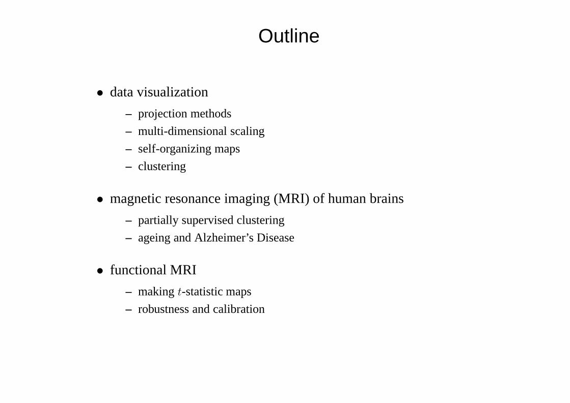
Outline
• data visualization
– projection methods
– multi-dimensional scaling
– self-organizing maps
– clustering
• magnetic resonance imaging (MRI) of human brains
– partially supervised clustering
– ageing and Alzheimer’s Disease
• functional MRI
– makingt-statistic maps
– robustness and calibration
Visualization
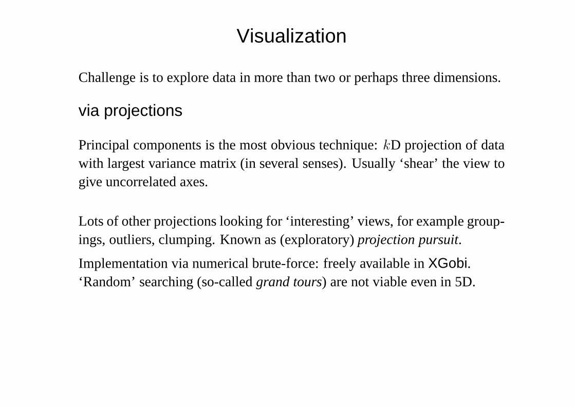
Challenge is to explore data in more than two or perhaps three dimensions.
via projections
Principal components is the most obvious technique:kD projection of datawith largest variance matrix (in several senses). Usually ‘shear’ the view togive uncorrelated axes.
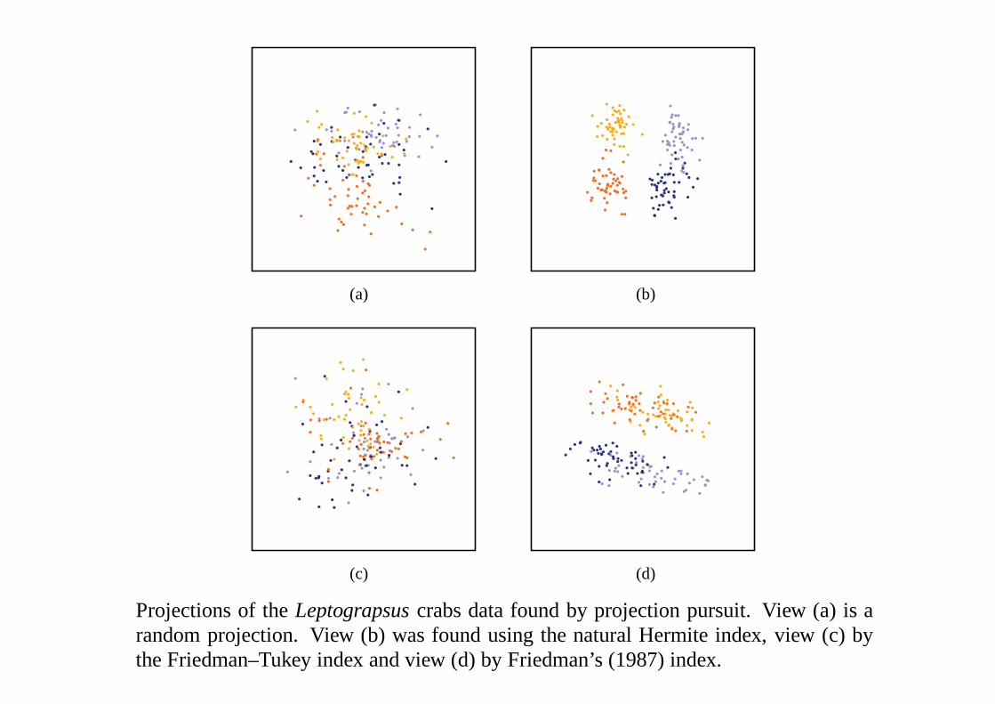
Lots of other projections looking for ‘interesting’ views, for example group-ings, outliers, clumping. Known as (exploratory)projection pursuit.
Implementation via numerical brute-force: freely available inXGobi.‘Random’ searching (so-calledgrand tours) are not viable even in 5D.
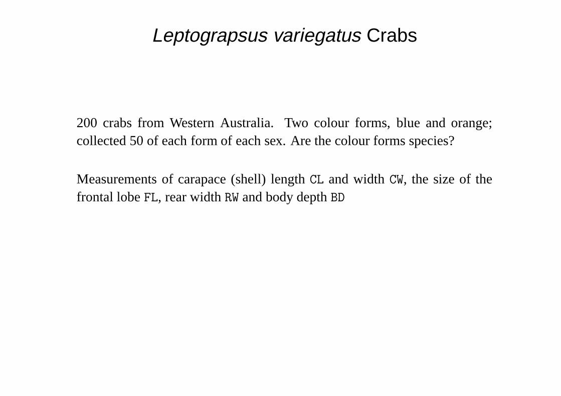
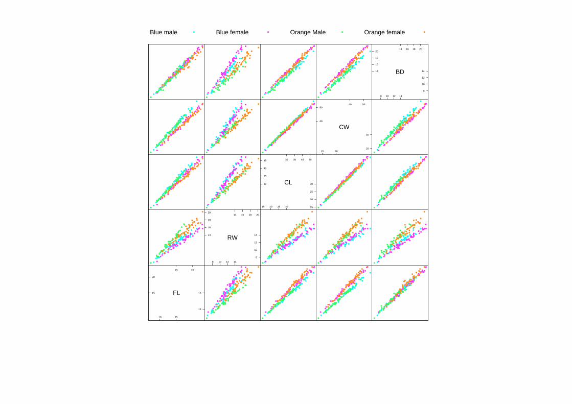
Leptograpsus variegatus Crabs
200 crabs from Western Australia. Two colour forms, blue and orange;collected 50 of each form of each sex. Are the colour forms species?
Measurements of carapace (shell) lengthCL and widthCW, the size of thefrontal lobeFL, rear widthRW and body depthBD
10 15
15 20
15
20
10
15FL
8 10 12 14
14 16 18 20
14
16
18
20
8
10
12
14
RW
15 20 25 30
30 35 40 45
30
35
40
45
15
20
25
30CL
20 30
40 50
40
50
20
30
CW
8 10 12 14
14 16 18 20
14
16
18
20
8
10
12
14BD
Blue male Blue female Orange Male Orange female
-1.5 -1.0 -0.5
-0.5 0.0 0.5
-0.5
0.0
0.5
-1.5
-1.0
-0.5Comp. 1
-0.15 -0.10 -0.05
0.00 0.05 0.10
0.00
0.05
0.10
-0.15
-0.10
-0.05
Comp. 2
-0.10 -0.05 0.00
0.00 0.05 0.10
0.00
0.05
0.10
-0.10
-0.05
0.00Comp. 3
Blue male Blue female Orange Male Orange female
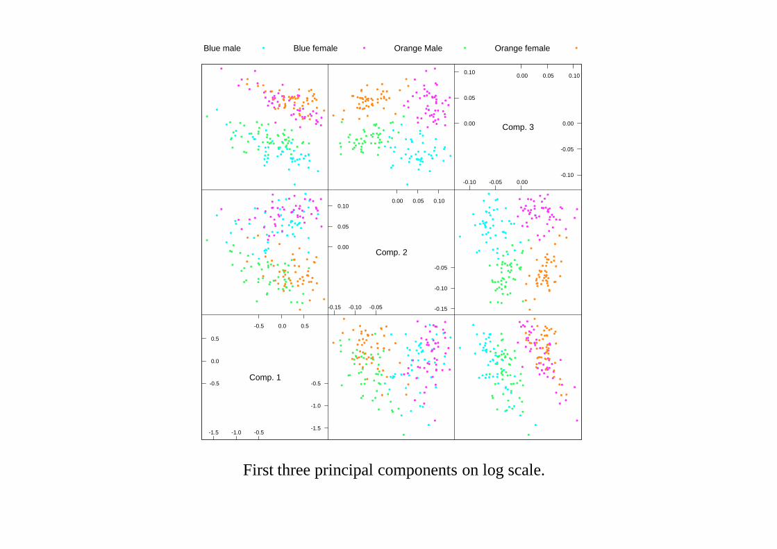
First three principal components on log scale.
(a) (b)
(c) (d)
Projections of theLeptograpsuscrabs data found by projection pursuit. View (a) is arandom projection. View (b) was found using the natural Hermite index, view (c) bythe Friedman–Tukey index and view (d) by Friedman’s (1987) index.
Independent Components Analysis
A ‘hot topic’ that has moved from field to field over the last decade.Originally(?) used for blind source signal separation in geophysics.
A projection pursuit technique in which the objective is to findk indepen-dent linear combinations. So minimize entropy difference between jointkDprojection distributions and the product of their marginals.
Many local minima. No guarantee that you will findk signals notk noisesources. Choice ofk may be crucial.
Many impressive results: but often every other visualization technique findsthem. ‘In the land of the blind . . . .’
A close relative offactor analysisand other latent variable methods.
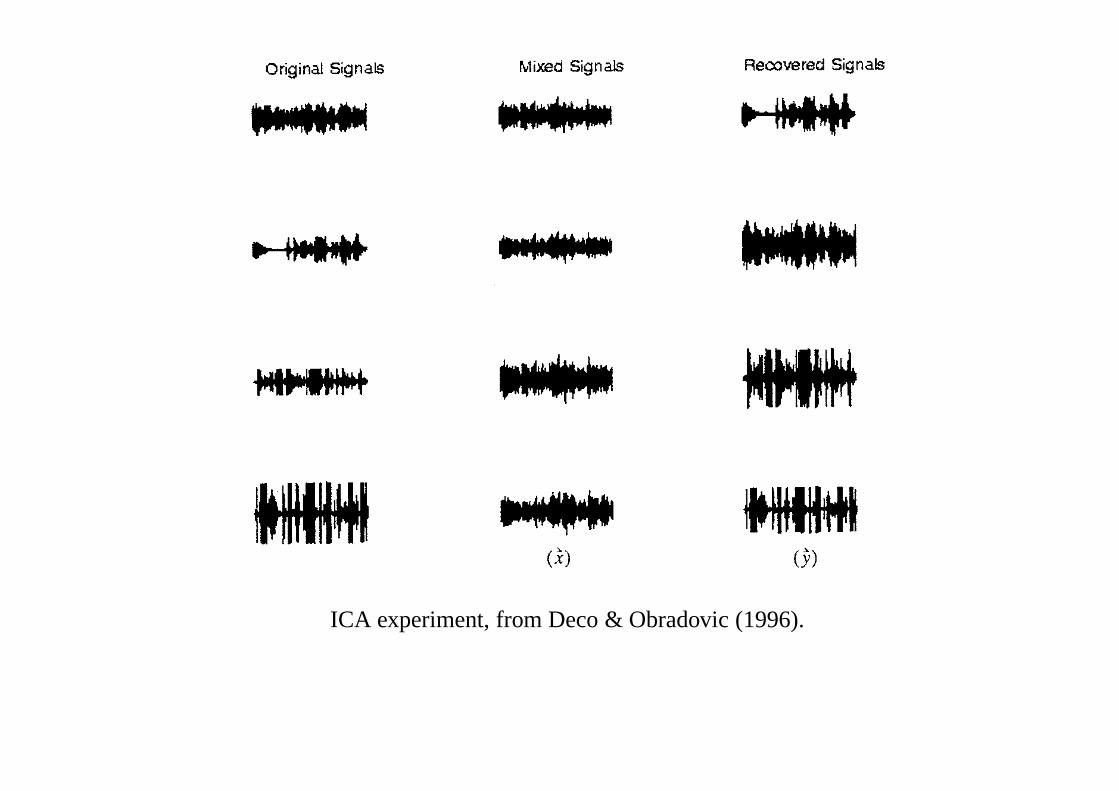
ICA experiment, from Deco & Obradovic (1996).
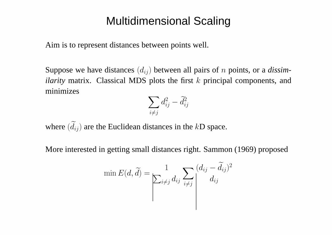
Multidimensional Scaling
Aim is to represent distances between points well.
Suppose we have distances(dij) between all pairs ofn points, or adissim-ilarity matrix. Classical MDS plots the firstk principal components, andminimizes ∑
i 6=j
d2ij − d2
ij
where(dij) are the Euclidean distances in thekD space.
More interested in getting small distances right. Sammon (1969) proposed
min E(d, d) =1∑
i 6=j dij
∑i 6=j
(dij − dij)2
dij

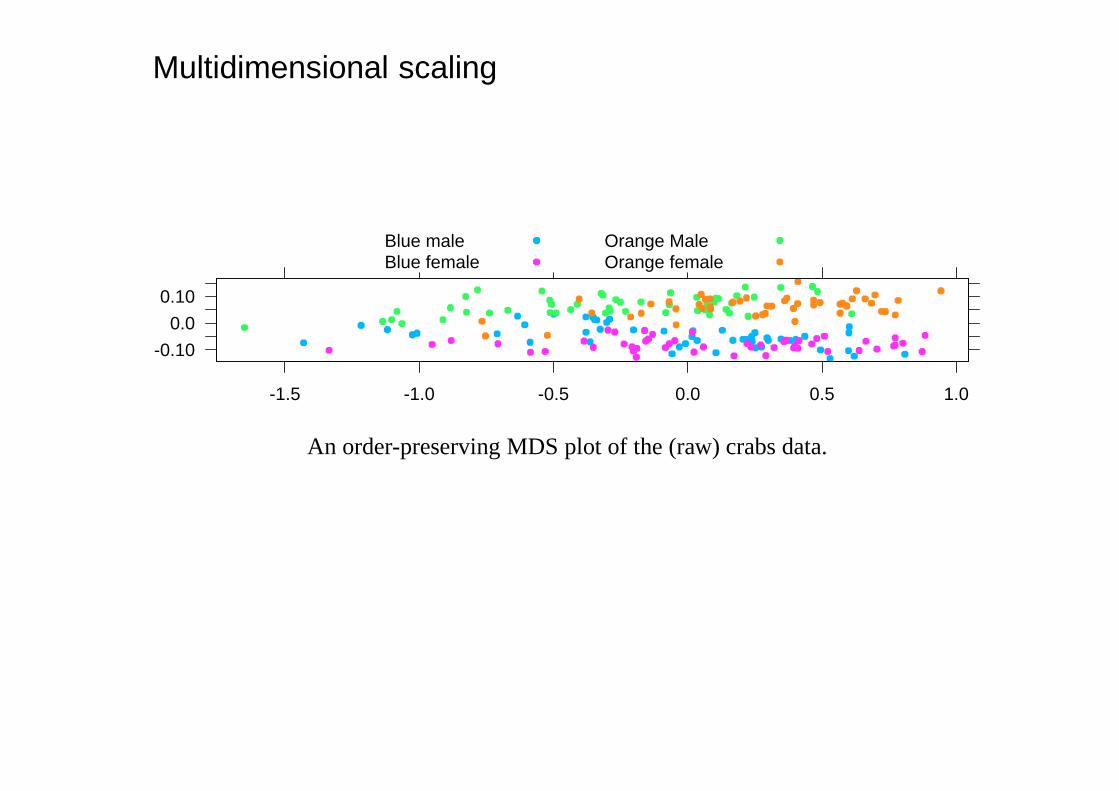
Shepard and Kruskal (1962–4) proposed only to preserve the ordering ofdistances, minimizing
STRESS2 =
∑i 6=j
[θ(dij)− dij
]2
∑i 6=j d2
ij
over both the configuration of points and an increasing functionθ.
The optimization task is quite difficult and this can be slow.
Multidimensional scaling
-0.10
0.0
0.10
-1.5 -1.0 -0.5 0.0 0.5 1.0
Blue maleBlue female
Orange MaleOrange female
An order-preserving MDS plot of the (raw) crabs data.
-0.15
-0.10
-0.05
0.0
0.05
0.10
-0.1 0.0 0.1 0.2
Blue maleBlue female
Orange MaleOrange female
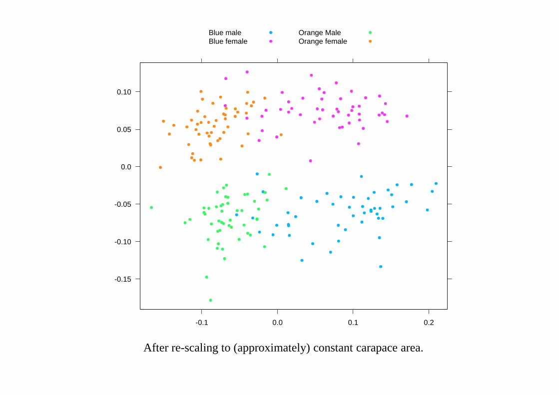
After re-scaling to (approximately) constant carapace area.
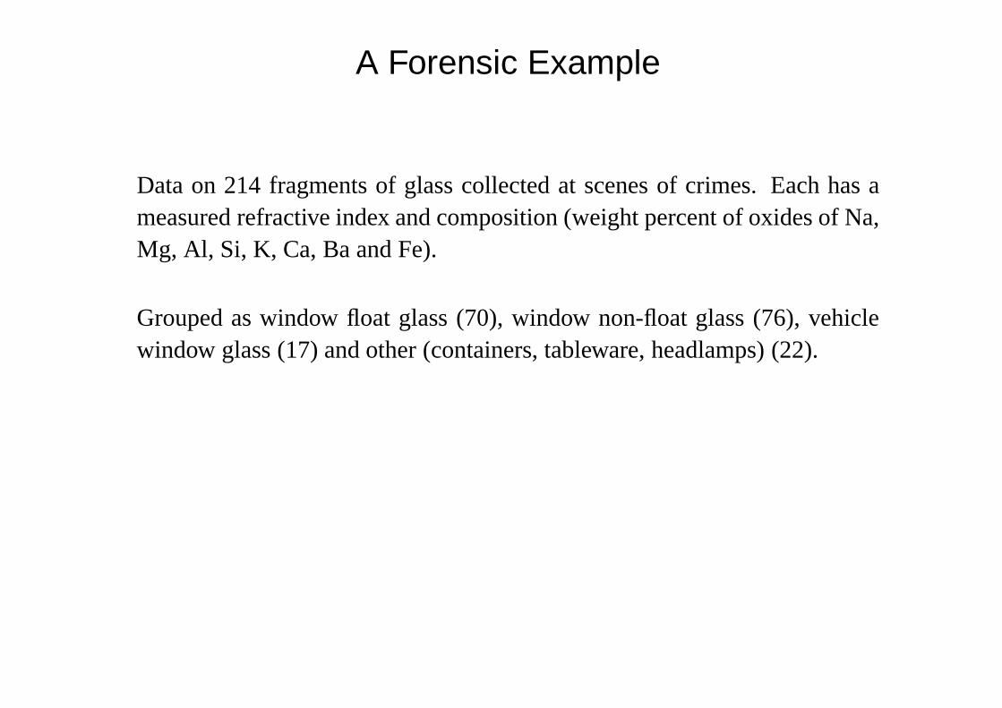
A Forensic Example
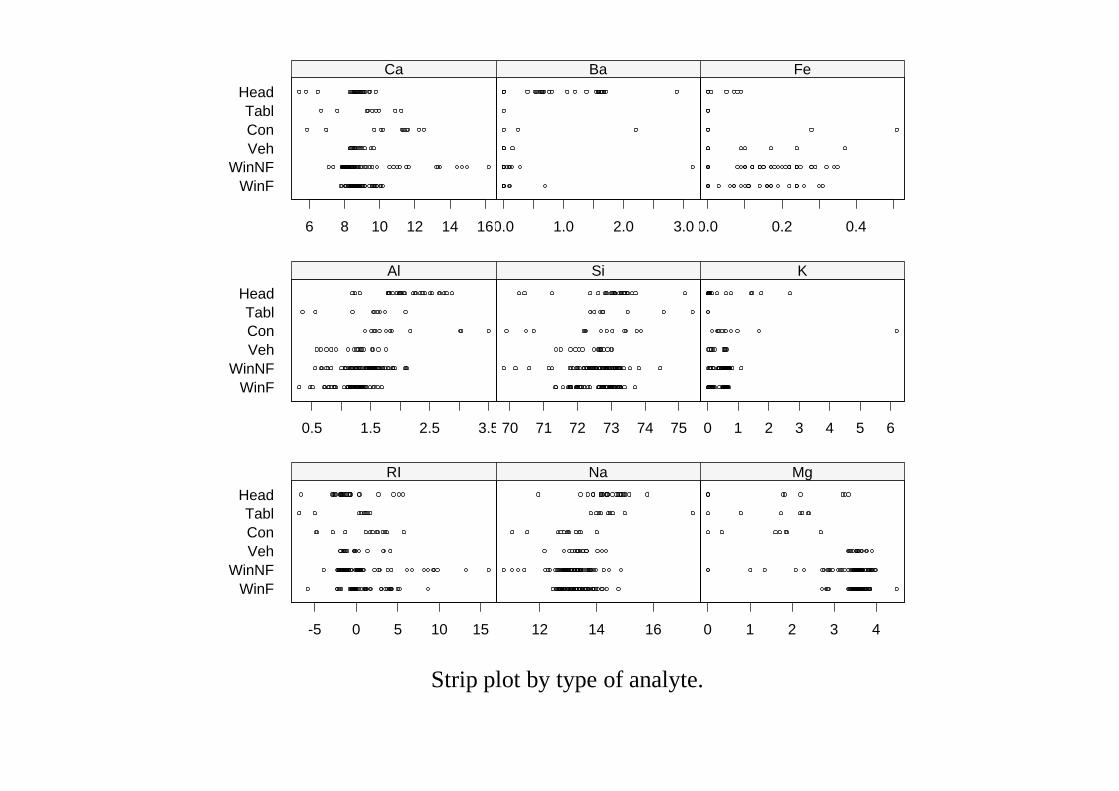
Data on 214 fragments of glass collected at scenes of crimes. Each has ameasured refractive index and composition (weight percent of oxides of Na,Mg, Al, Si, K, Ca, Ba and Fe).
Grouped as window float glass (70), window non-float glass (76), vehiclewindow glass (17) and other (containers, tableware, headlamps) (22).
RI
Na
Mg
Al
Si
K
Ca
Ba
Fe
WinF
-4 -2 0 2 4 6 8
WinNF Veh
-4 -2 0 2 4 6 8
RI
Na
Mg
Al
Si
K
Ca
Ba
Fe
Con Tabl
-4 -2 0 2 4 6 8
Head
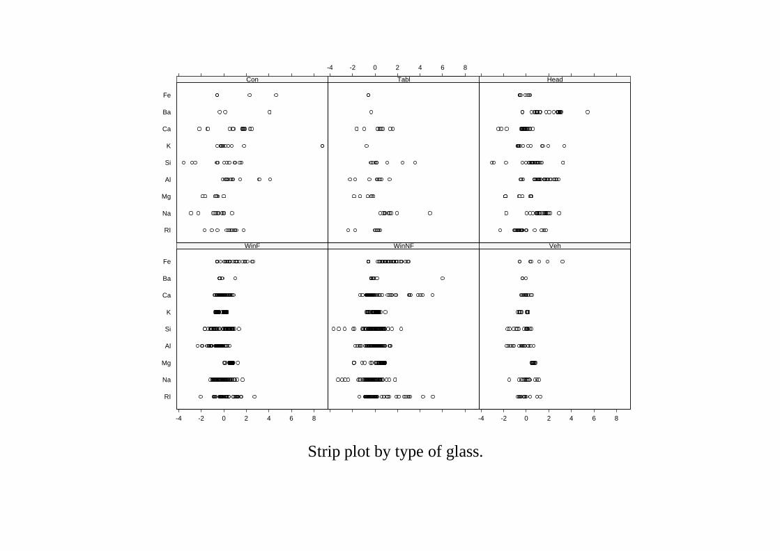
Strip plot by type of glass.
WinFWinNF
VehConTabl
Head
RI
-5 0 5 10 15
Na
12 14 16
Mg
0 1 2 3 4
WinFWinNF
VehConTabl
Head
Al
0.5 1.5 2.5 3.5
Si
70 71 72 73 74 75
K
0 1 2 3 4 5 6
WinFWinNF
VehConTabl
Head
Ca
6 8 10 12 14 16
Ba
0.0 1.0 2.0 3.0
Fe
0.0 0.2 0.4
Strip plot by type of analyte.
WinFWinNFVehConTablHead
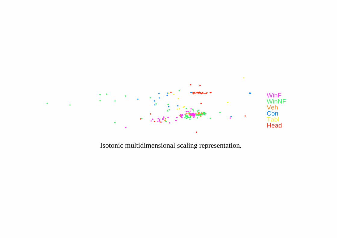
Isotonic multidimensional scaling representation.
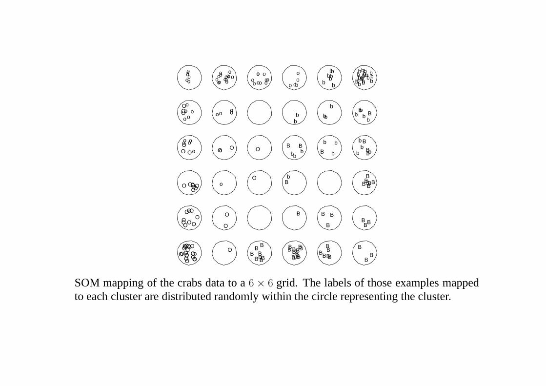
Kohonen’s Self-Organizing Maps
Kohonen describes his own motivation as:
‘I just wanted an algorithm that would effectively map similarpatterns (pattern vectors close to each other in the input signalspace) onto contiguous locations in the output space.’
Kohonen (1995, p. VI)
He interpreted ‘contiguous’ via a rectangular or hexagonal 2-D lattice.
In K-means clusteringthe data are split intoK groups, and each exampleis assigned to the cluster whose representativemj is nearest to the example.The cluster representatives (‘centre’) are then adjusted to be the centroid ofthe group, and iteration gives a simple, finite, algorithm.
In SOM (self-organizing mapping) the representatives(mj) are arranged ona regular grid, with representatives at nearby points on the grid are moresimilar that those which are widely separated.
Examples are presented in turn until convergence. Themj are initiallyassigned at random. Whenever an examplex is presented, the closestrepresentativemj is found. Then
mi←mi + α[x−mi] for all neighboursi .
Both the constantα and the definition of ‘neighbour’ change with time.
A cruder form of MDS, but one that scales to 100,000+ examples.
B
B
B
BBB
B
B
B
B
B
B
B
B
B
B
BB
B
B
BB
B
BB
B
BB
B
BB
BB
B
B
BBB
BB
BBBB
BB B
BB
B
bb
bb
b
b
b
bb
b
b
b
bbb
b
b
b
b b
b
bb
bb
b
b
bb
b
b
b
b
b
b
b
b
b
bb
b
b
b
b
b
b
bbb
b
OOO
OO
O
OO
O
O O
O
O
O
O
OOO
O OO
O
O
OO O
O
O
O
O
O O
OOO
O
O
O
O O
OOO
O
OOOO
OO
oo
o
oo
o
oo oo
o
oo
o oo
o
ooo
o
o
o
o
o ooo
o
o
o
o
oo
o
o
oo
o
o
o
o
oo o
o
oo o
o
SOM mapping of the crabs data to a6 × 6 grid. The labels of those examples mappedto each cluster are distributed randomly within the circle representing the cluster.
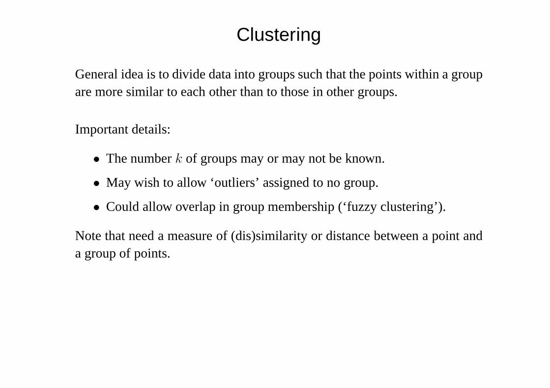
Clustering
General idea is to divide data into groups such that the points within a groupare more similar to each other than to those in other groups.
Important details:
• The numberk of groups may or may not be known.
• May wish to allow ‘outliers’ assigned to no group.
• Could allow overlap in group membership (‘fuzzy clustering’).
Note that need a measure of (dis)similarity or distance between a point anda group of points.
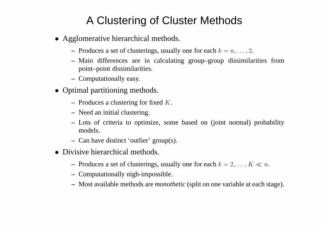
A Clustering of Cluster Methods
• Agglomerative hierarchical methods.
– Produces a set of clusterings, usually one for eachk = n, . . . , 2.
– Main differences are in calculating group–group dissimilarities frompoint–point dissimilarities.
– Computationally easy.
• Optimal partitioning methods.
– Produces a clustering for fixedK.
– Need an initial clustering.
– Lots of criteria to optimize, some based on (joint normal) probabilitymodels.
– Can have distinct ‘outlier’ group(s).
• Divisive hierarchical methods.
– Produces a set of clusterings, usually one for eachk = 2, . . . , K � n.
– Computationally nigh-impossible.
– Most available methods aremonothetic(split on one variable at each stage).
References
Comprehensive reference:Gordon, A. D. (1999)Classification.Second Edition.
Good introduction:Kaufman, L. and Rousseeuw, P. J. (1990)Finding Groups in Data.
An example
TheLeptograpsuscrabs data, with 4 groups (known in advance here). Sameinformation as available to projection pursuit and MDS.
-0.2 -0.1 0.0 0.1 0.2
-0.1
5-0
.05
0.05
•
• • •••• •••
••
•••
•
••• •
•• •••
•••
• ••
• ••
••• •
•••••• ••
•••
•
•
•
•
• •
••
•
• •
•
•••
••
•
••••
•• •
•
• ••• •
•
•• ••
••• ••
••••
•
••
•
• •
•
••
•
•••
• •• • ••••••
•
• ••
•• ••
• •
•••
•••
••• •
••
• ••• •••
•••
•
• • •• ••• •• •
•••
• • ••• •••••••
•
• ••
•
••
• ••••
• •
••
••••
• •• ••
-0.2 -0.1 0.0 0.1 0.2
-0.1
5-0
.05
0.05 •
• ••••••• •
••• •
•
• •
•••
•••
••• •
••
• ••• •••
•••
•• •
•
••
•
••
• • •
• • •• ••• •• •
•••
• • ••• •••••••
•
• ••
•
••••
••• •
••
••••
• •• ••
• ••••
••
• ••••
••
• ••
• ••
••• •
•••••• ••
•••
•
•
• • •••••
•••
•
••
•
•
•
• •
••
•
• •
•
•••
••
•
••••
•• •
•
• ••• •
•
•• ••
••• ••
••••
••
•
• •
•
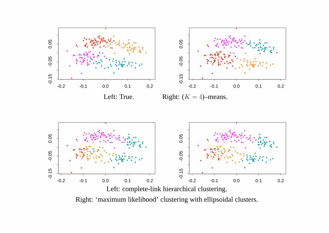
Left: True. Right: (K = 4)–means.
-0.2 -0.1 0.0 0.1 0.2
-0.1
5-0
.05
0.05
•••
• ••• ••
••
• ••
••• •
•••••• ••
•••
•
••••
•
• •
•••
•••
••• •
••
• ••• •••
•••
•
•
••
•
•••
• •• • ••••
•
• ••
•• • •• ••• •• •
•••
• • ••• •••••••• •
••
••••
••• •
••
••••
• •• ••
•
• • ••••
••••
••
•
••• • ••• •
•
•
• •
•
•• •
• ••
•• ••
• •••• ••••
•• ••
•
• •
•
•
•
••
•
•
•
••
••• ••
•
••
•
-0.2 -0.1 0.0 0.1 0.2-0
.15
-0.0
50.
05
••
• ••• ••
••
• ••
••• •
•••••• ••
•••
•
••• ••
• •
•••
•••
••• •
••
• ••• •••
•••
•
•
••
•
•••
• •• • •••
•
• ••
•• • •• ••• •• •
•••
• • ••• •••••••• •
••
••••
••• •
••
••••
• •• ••
•
• • ••••
••••
••
•
••• •
••••
•
•
• •
•
•• •
• ••
•• ••
• •••• ••••
•• ••
•
• •
•
•
•
•
••
•
• •
•
••
••• ••
•
••
•
Left: complete-link hierarchical clustering.
Right: ‘maximum likelihood’ clustering with ellipsoidal clusters.
-0.2 -0.1 0.0 0.1 0.2
-0.1
5-0
.05
0.05
• •
•
••
• •• • •• ••• •• •
•••
• • ••• •••••••
•
• ••
••
• ••••
• •
••
••••
••
• • ••••
•••••
•
•••
•
•
•
• •
••
•
• •
•
•••
••
•
••••
•• •
•
• ••• •
•
•• ••
••• ••
••••
••
•
• ••••
••
• ••••
••
• ••
• ••
••• •
•••••• ••
•••
•
•
•
••••• ••••••• •
••• •
•
• •
•••
•••
••• •
••
• ••• •••
•••
••
•• •
-0.2 -0.1 0.0 0.1 0.2
-0.1
5-0
.05
0.05
• •
•
••
•
••
• •• • •• ••
•••
•• • ••• •••••••
•
• ••
••••
•••
••
••••
• •••
• ••
•••••
•
••
•
•
•
• •
••
•
• •
•
•••
••
•
••••
•• •
•
• ••• •
•
•• ••
••• ••
••••
••
•
•
•••• •
•••
••
••
••
•
•
•
••
•
•
••
• ••• ••
••
• •• •• ••••
•• •••
•••
•• ••••••• •
••• •
•
• •
•••
•••
••• •
••
• ••• •••
•••
•
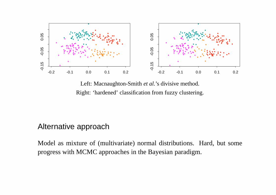
Left: Macnaughton-Smithet al.’s divisive method.
Right: ‘hardened’ classification from fuzzy clustering.
Alternative approach
Model as mixture of (multivariate) normal distributions. Hard, but someprogress with MCMC approaches in the Bayesian paradigm.

Case Study:
Magnetic Resonance Imaging
of Brain Structure
Joint work with Jonathan Marchini (EPSRC-funded D.Phil student).
Data, background and advice provided by Peter Styles (MRC Biochemicaland Clinical Magnetic Resonance Spectroscopy Unit, Oxford)

Neurological Change
Interest is in the change of tissue state and neurological function aftertraumatic events such as a stroke or tumour growth and removal. The aimhere is to identify tissue as normal, impaired or dead, and to compare imagesfrom a patient taken over a period of several months.
In MRI can trade temporal, spatial and spectral resolution. In MR spec-troscopy the aim is a more detailed chemical analysis at a fairly low spatialresolution. In principle chemical shift imaging provides a spectroscopicview at each of a limited number of voxels: in practice certain aspects ofthe chemical composition are concentrated on.
Pilot Study
Our initial work has been exploring ‘T1’ and ‘T2’ images (the conventionalMRI measurements) to classify brain tissue automatically, with the aimof developing ideas to be applied to spectroscopic measurements at lowerresolutions.
Consider image to be made up of ‘white matter’, ‘grey matter’, ‘CSF’(cerebro–spinal fluid) and ‘skull’.
Initial aim is reliable automatic segmentation.
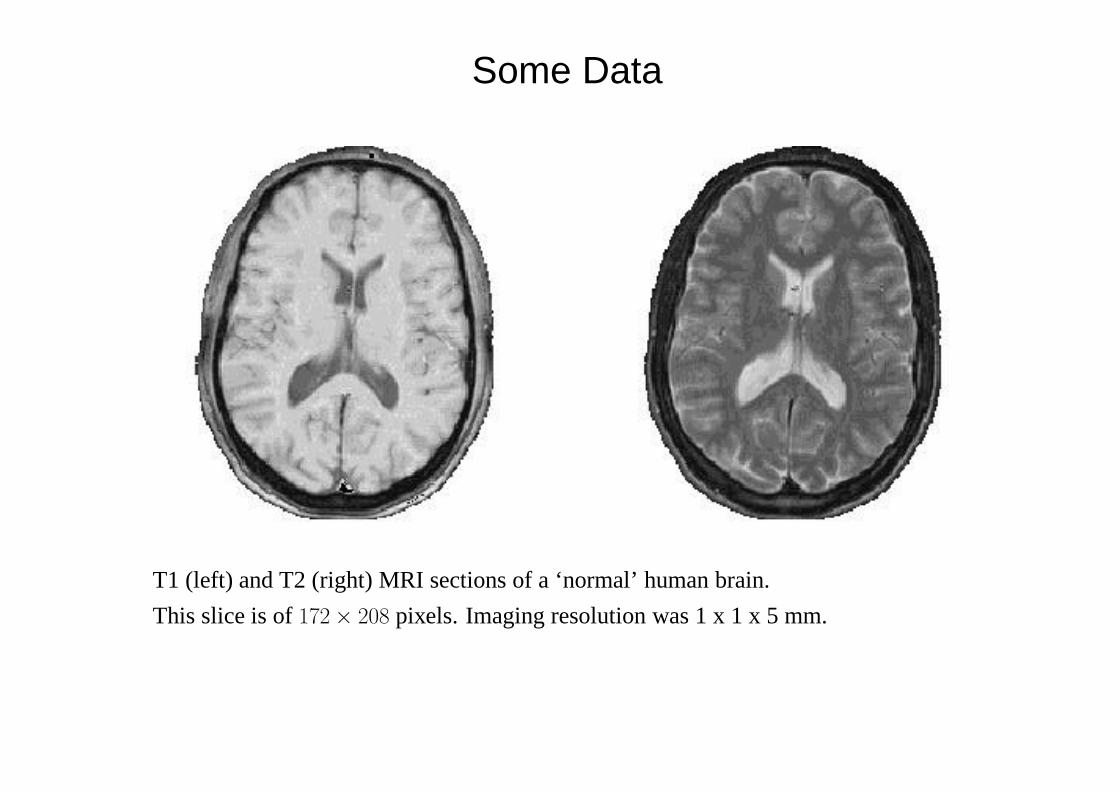
Some Data
T1 (left) and T2 (right) MRI sections of a ‘normal’ human brain.
This slice is of172× 208 pixels. Imaging resolution was 1 x 1 x 5 mm.
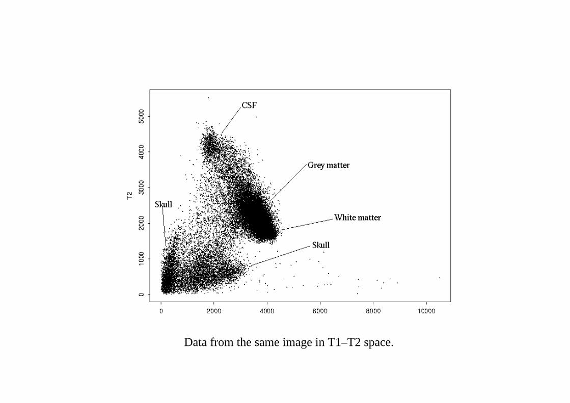
Data from the same image in T1–T2 space.
Imaging Imperfections
The clusters in the T1–T2 plot were surprising diffuse. Known imperfec-tions were:
(a) ‘Mixed voxel’ / ‘partial volume’ effects. The tissue within a voxel maynot be all of one class.
(b) A ‘bias field’ in which the mean intensity from a tissue type varies acrossthe image; mainly caused by inhomogeneity in the magnetic field.
(c) The ‘point spread function’. Because of bandwidth limitations in theFourier domain in which the image is acquired, the true observed imageis convolved with a spatial point spread function of ‘sinc’ (sin x/x) form.The effect can sometimes be seen at sharp interfaces (most often theskull / tissue interface) as a rippling effect, but is thought to be small.
Modelling the data
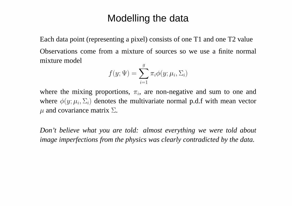
Each data point (representing a pixel) consists of one T1 and one T2 value
Observations come from a mixture of sources so we use a finite normalmixture model
f (y; Ψ) =
g∑i=1
πiφ(y; µi, Σi)
where the mixing proportions,πi, are non-negative and sum to one andwhereφ(y; µi, Σi) denotes the multivariate normal p.d.f with mean vectorµ and covariance matrixΣ.
Don’t believe what you are told: almost everything we were told aboutimage imperfections from the physics was clearly contradicted by the data.
Application/Results
6 component model
• CSF
• White matter
• Grey matter
• Skull type 1
• Skull type 2
• Outlier component (fixed mean and large variance)
Initial estimates chosen manually from one image and used in the classifi-cation of other images.
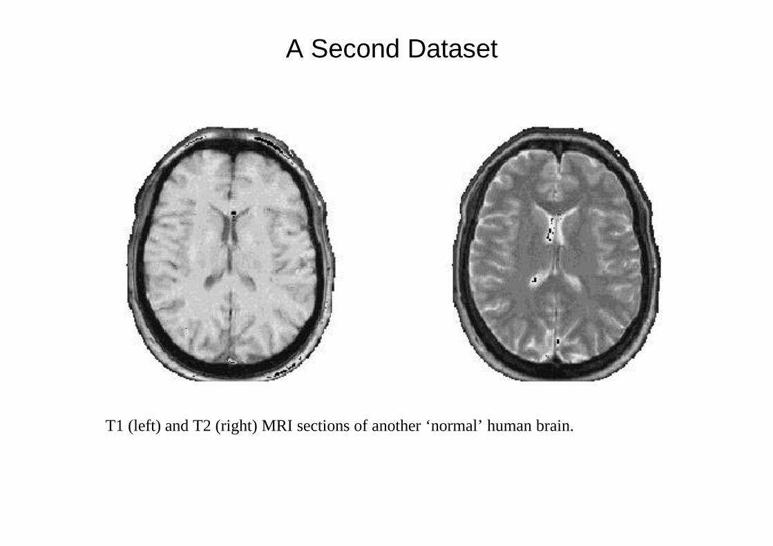
A Second Dataset
T1 (left) and T2 (right) MRI sections of another ‘normal’ human brain.
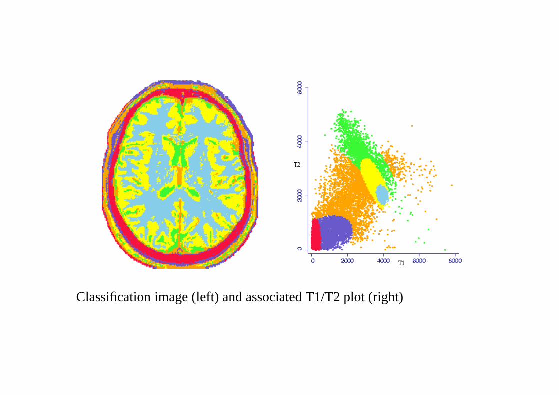
Classification image (left) and associated T1/T2 plot (right)

Case Study:
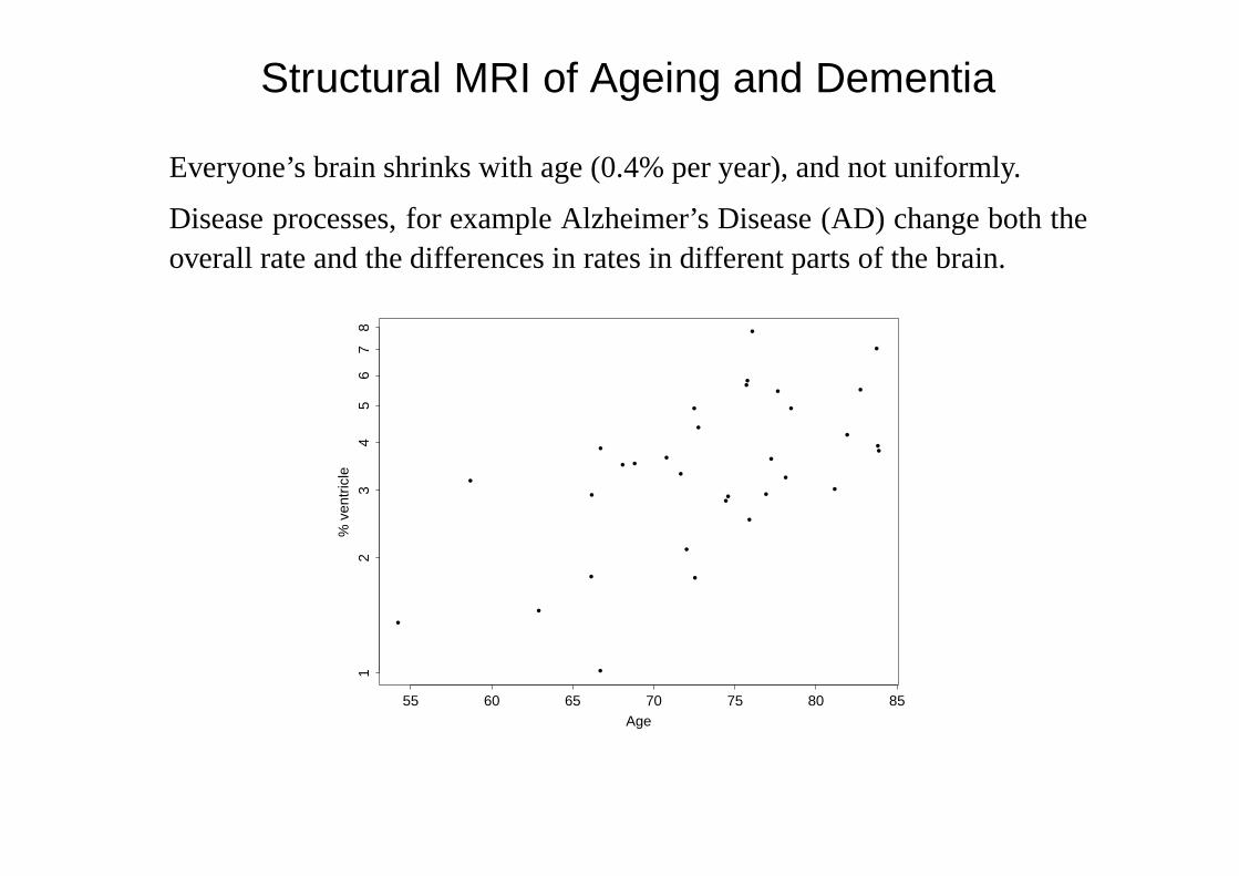
Structural MRI of Ageing and Dementia
Joint work with Kevin Bradley, Radiologist at OPTIMA (Oxford Project toInvestigate Memory and Ageing).
Structural MRI of Ageing and Dementia
Everyone’s brain shrinks with age (0.4% per year), and not uniformly.
Disease processes, for example Alzheimer’s Disease (AD) change both theoverall rate and the differences in rates in different parts of the brain.
•
••
•
•
•
•
•
•
•
•
•
•
•
•
•
•
•
•
•
•
••
•
•
••
•
•
••
•
Age
% v
entr
icle
55 60 65 70 75 80 85
12
34
56
78

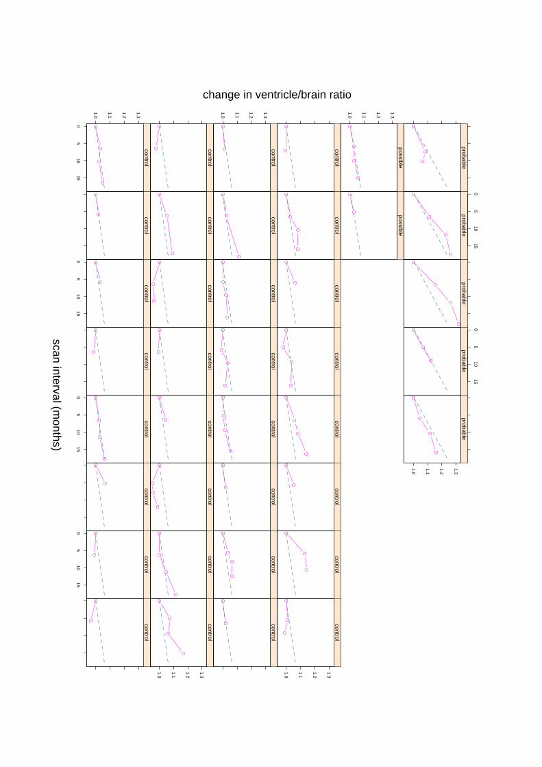
Use serial structural MRI, probably of two measurementsn months apart.
How large shouldn be?
How many patients are needed? (Parallel study by Foxet al, 2000,Archivesof Neurology.)
Study with 39 subjects, most imaged 3 or 4 times over up to 15 months.
Three groups, ‘normal’ (32), ‘possible’ (2) and ‘probable (5).
Given the ages, expect a substantial fraction of ‘normals’ to have pre-clinicalAD.
1.0
1.1
1.2
1.3
control
05
1015
controlcontrol
05
1015
controlcontrol
05
1015
controlcontrol
05
1015
control
controlcontrol
controlcontrol
controlcontrol
control
1.0
1.1
1.2
1.3
control
1.0
1.1
1.2
1.3
controlcontrol
controlcontrol
controlcontrol
controlcontrol
controlcontrol
controlcontrol
controlcontrol
control
1.0
1.1
1.2
1.3
control
1.0
1.1
1.2
1.3
possiblepossible
probableprobable
05
1015
probableprobable
05
1015
1.0
1.1
1.2
1.3
probable
scan interval (months)
change in ventricle/brain ratio
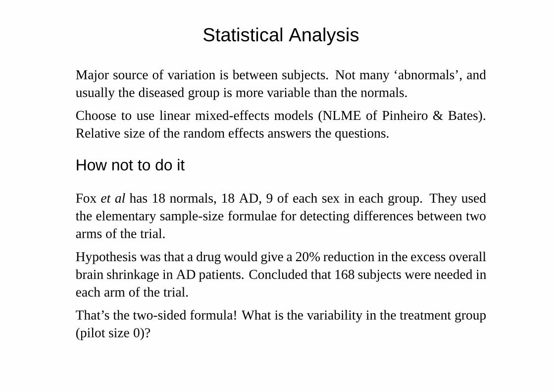
Statistical Analysis
Major source of variation is between subjects. Not many ‘abnormals’, andusually the diseased group is more variable than the normals.
Choose to use linear mixed-effects models (NLME of Pinheiro & Bates).Relative size of the random effects answers the questions.
How not to do it
Fox et al has 18 normals, 18 AD, 9 of each sex in each group. They usedthe elementary sample-size formulae for detecting differences between twoarms of the trial.
Hypothesis was that a drug would give a 20% reduction in the excess overallbrain shrinkage in AD patients. Concluded that 168 subjects were needed ineach arm of the trial.
That’s the two-sided formula! What is the variability in the treatment group(pilot size 0)?

Case Study:
Magnetic Resonance Imaging
of Brain Function
Joint work with Jonathan Marchini.
Data, background and advice provided by Stephen Smith (Oxford Centrefor Functional Magnetic Resonance Imaging of the Brain).
‘Functional’ Imaging
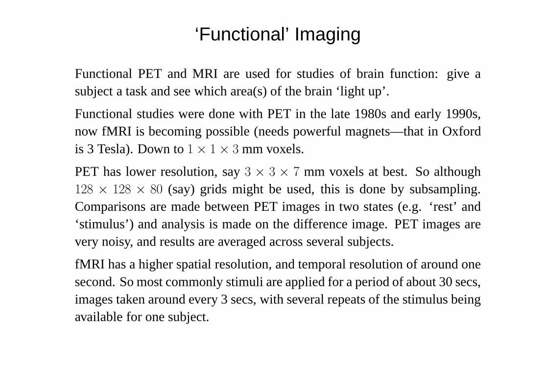
Functional PET and MRI are used for studies of brain function: give asubject a task and see which area(s) of the brain ‘light up’.
Functional studies were done with PET in the late 1980s and early 1990s,now fMRI is becoming possible (needs powerful magnets—that in Oxfordis 3 Tesla). Down to1× 1× 3 mm voxels.
PET has lower resolution, say3 × 3 × 7 mm voxels at best. So although128 × 128 × 80 (say) grids might be used, this is done by subsampling.Comparisons are made between PET images in two states (e.g. ‘rest’ and‘stimulus’) and analysis is made on the difference image. PET images arevery noisy, and results are averaged across several subjects.
fMRI has a higher spatial resolution, and temporal resolution of around onesecond. So most commonly stimuli are applied for a period of about 30 secs,images taken around every 3 secs, with several repeats of the stimulus beingavailable for one subject.
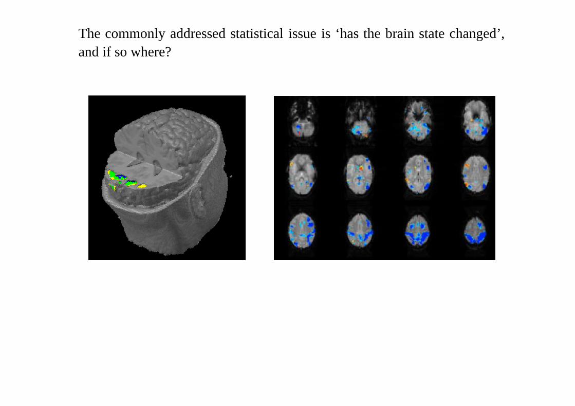
The commonly addressed statistical issue is ‘has the brain state changed’,and if so where?
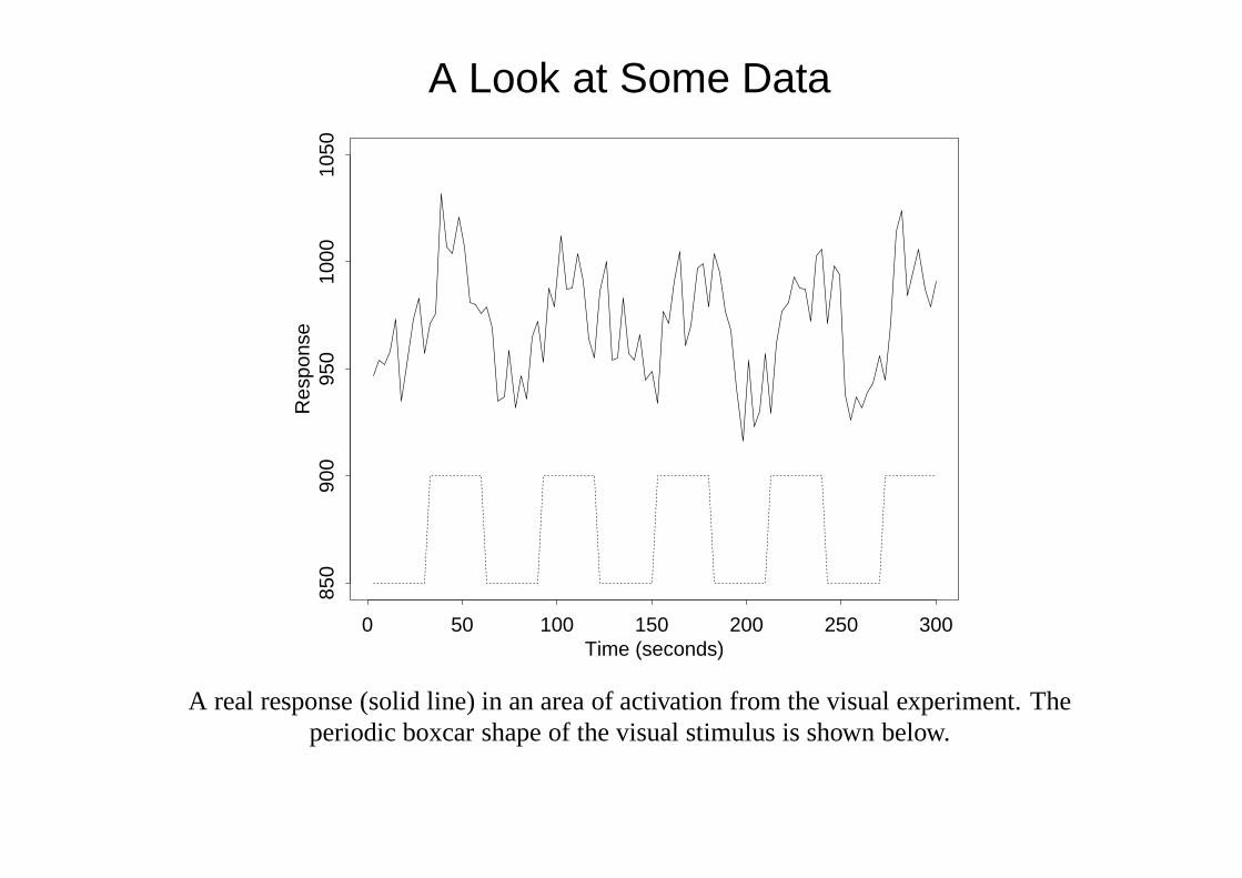
A Look at Some Data
Time (seconds)
Res
pons
e
0 50 100 150 200 250 300
850
900
950
1000
1050
A real response (solid line) in an area of activation from the visual experiment. Theperiodic boxcar shape of the visual stimulus is shown below.
SPM
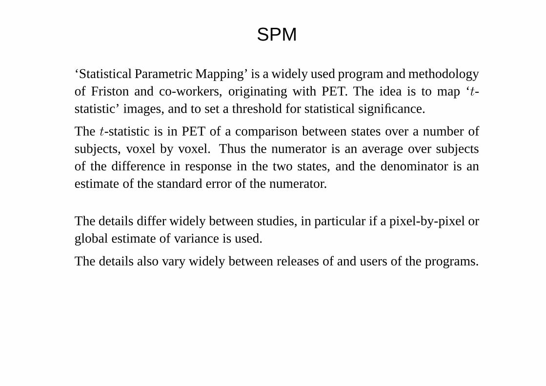
‘Statistical Parametric Mapping’ is a widely used program and methodologyof Friston and co-workers, originating with PET. The idea is to map ‘t-statistic’ images, and to set a threshold for statistical significance.
The t-statistic is in PET of a comparison between states over a number ofsubjects, voxel by voxel. Thus the numerator is an average over subjectsof the difference in response in the two states, and the denominator is anestimate of the standard error of the numerator.
The details differ widely between studies, in particular if a pixel-by-pixel orglobal estimate of variance is used.
The details also vary widely between releases of and users of the programs.
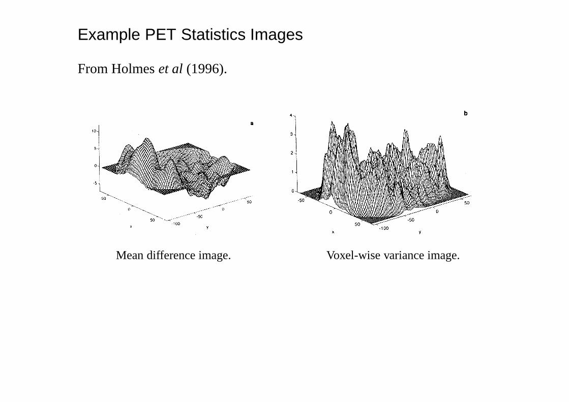
Example PET Statistics Images
From Holmeset al (1996).
Mean difference image. Voxel-wise variance image.
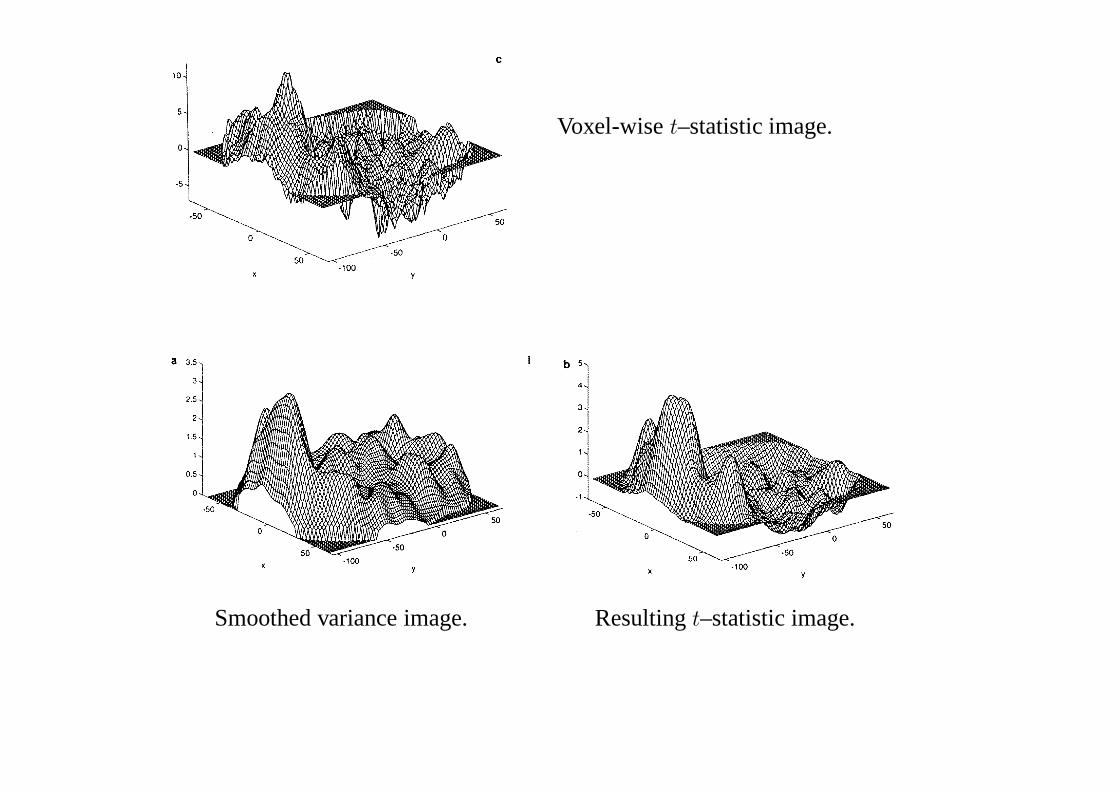
Voxel-wiset–statistic image.
Smoothed variance image. Resultingt–statistic image.
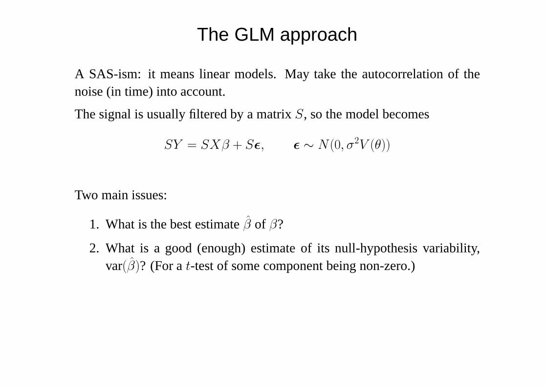
The GLM approach
A SAS-ism: it means linear models. May take the autocorrelation of thenoise (in time) into account.
The signal is usually filtered by a matrixS, so the model becomes
SY = SXβ + Sε, ε ∼ N (0, σ2V (θ))
Two main issues:
1. What is the best estimateβ of β?
2. What is a good (enough) estimate of its null-hypothesis variability,var(β)? (For at-test of some component being non-zero.)
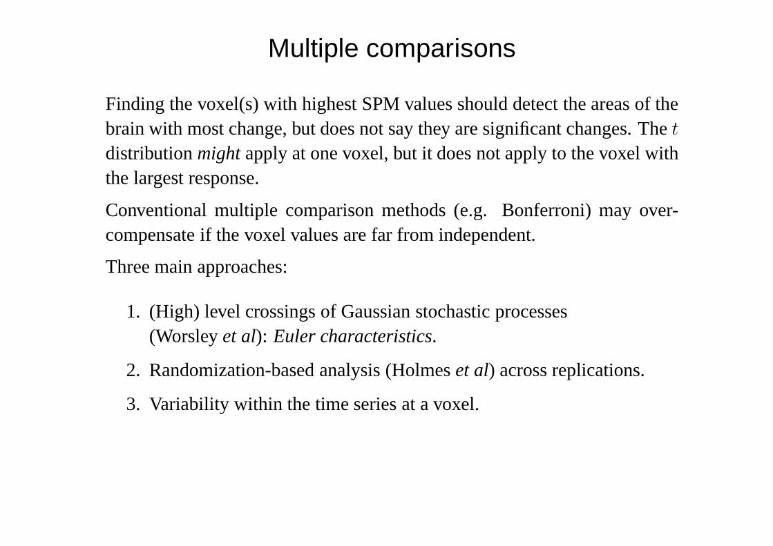
Multiple comparisons
Finding the voxel(s) with highest SPM values should detect the areas of thebrain with most change, but does not say they are significant changes. Thet
distributionmightapply at one voxel, but it does not apply to the voxel withthe largest response.
Conventional multiple comparison methods (e.g. Bonferroni) may over-compensate if the voxel values are far from independent.
Three main approaches:
1. (High) level crossings of Gaussian stochastic processes(Worsleyet al): Euler characteristics.
2. Randomization-based analysis (Holmeset al) across replications.
3. Variability within the time series at a voxel.
fMRI Example
Data on64 × 64 × 14 grid of voxels. (Illustrations omit top and bottomslices and areas outside the brain, all of which show considerable activity,probably due to registration effects.)
A series of 100 images at 3 sec intervals: a visual stimulus (a striped pattern)was applied after 30 secs for 30 secs, and the A–B pattern repeated 5 times.In addition, an auditory stimulus was applied with 39 sec ‘bursts’.
Conventionally the images are filtered in both space and time, both high-pass time filtering to remove trends and low-pass spatial filtering to reducenoise (and make the Euler characteristic results valid). The resultingt–statistics images are shown on the next slide. These have variances estimatedfor each voxel based on the time series at that voxel.
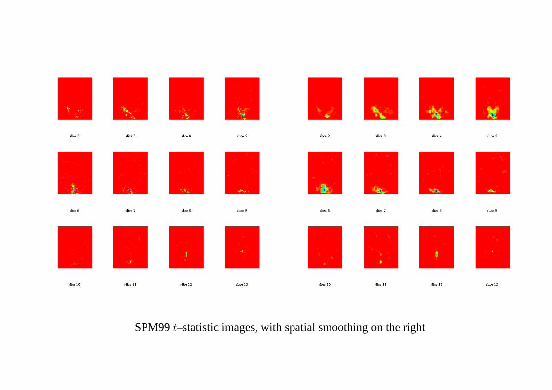
SPM99t–statistic images, with spatial smoothing on the right
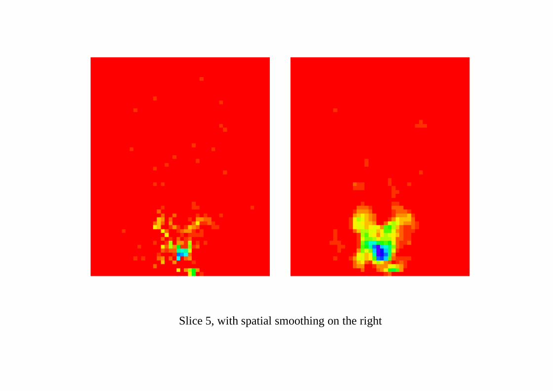
Slice 5, with spatial smoothing on the right
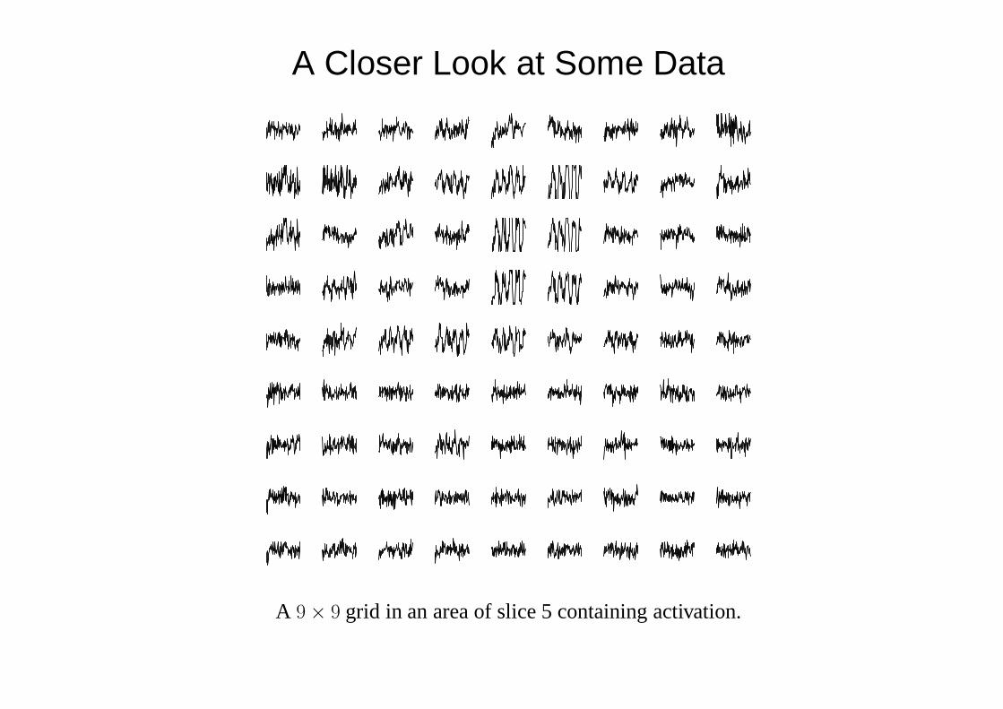
A Closer Look at Some Data
A 9× 9 grid in an area of slice 5 containing activation.
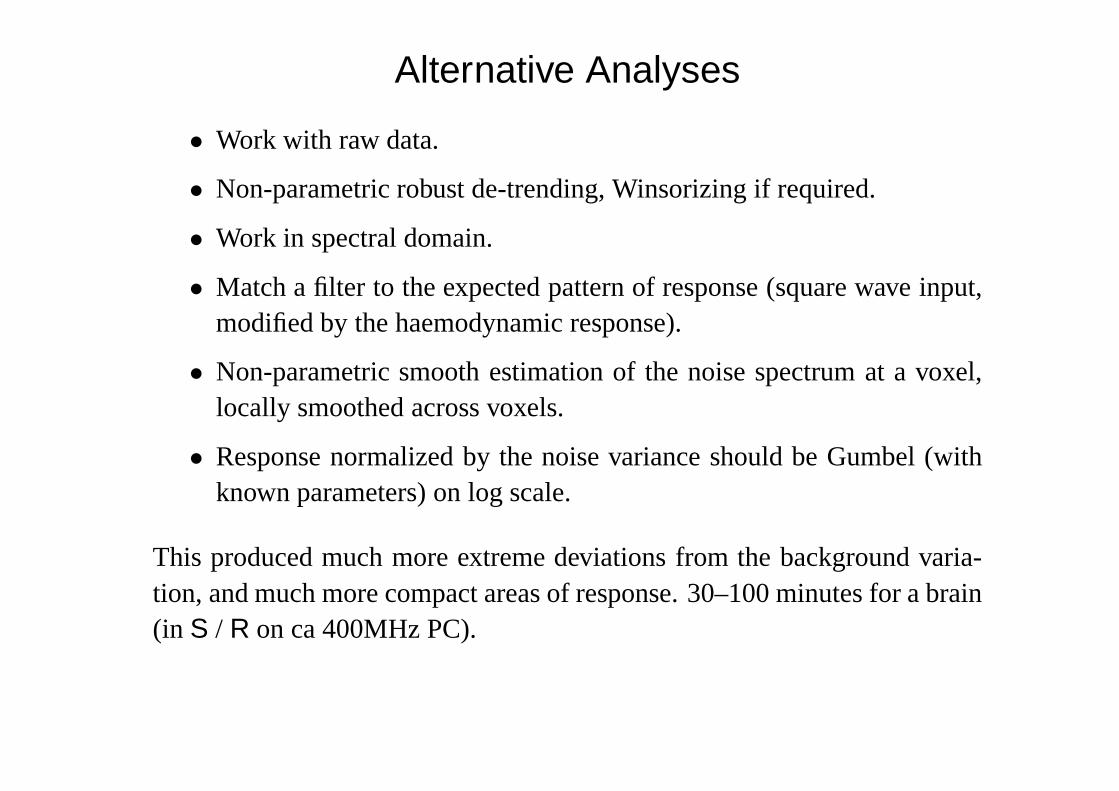
Alternative Analyses
• Work with raw data.
• Non-parametric robust de-trending, Winsorizing if required.
• Work in spectral domain.
• Match a filter to the expected pattern of response (square wave input,modified by the haemodynamic response).
• Non-parametric smooth estimation of the noise spectrum at a voxel,locally smoothed across voxels.
• Response normalized by the noise variance should be Gumbel (withknown parameters) on log scale.
This produced much more extreme deviations from the background varia-tion, and much more compact areas of response. 30–100 minutes for a brain(in S / R on ca 400MHz PC).
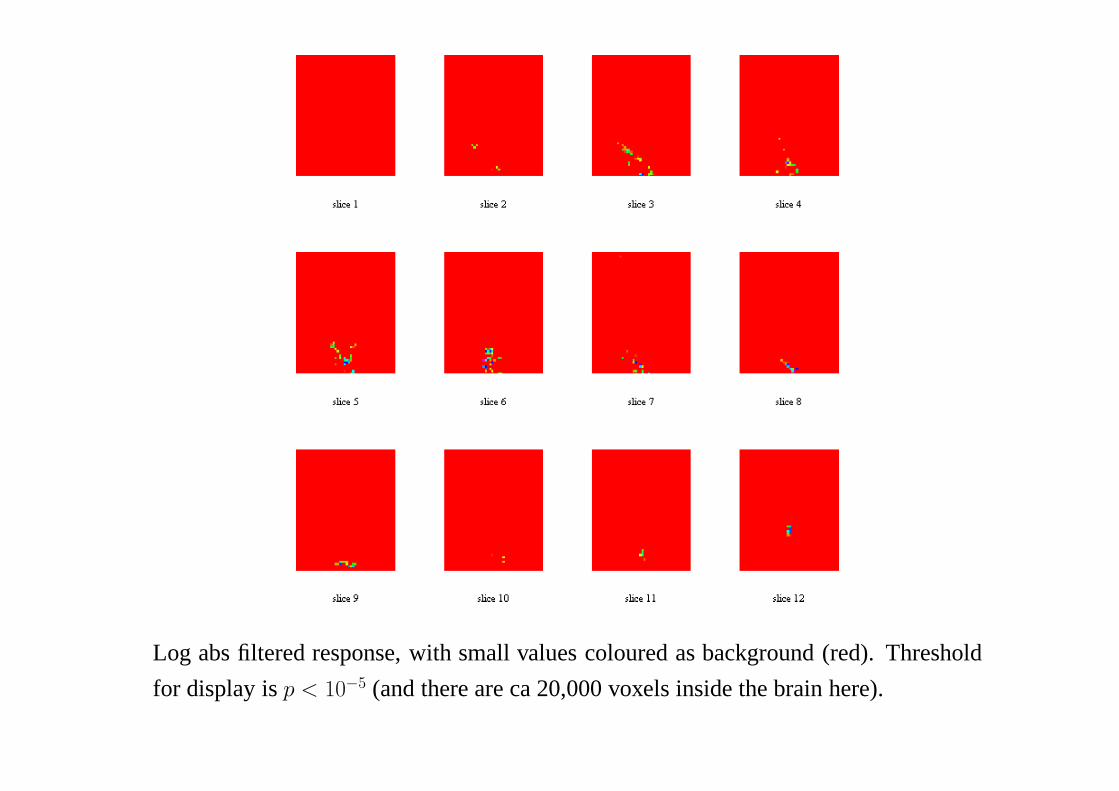
Log abs filtered response, with small values coloured as background (red). Threshold
for display isp < 10−5 (and there are ca 20,000 voxels inside the brain here).
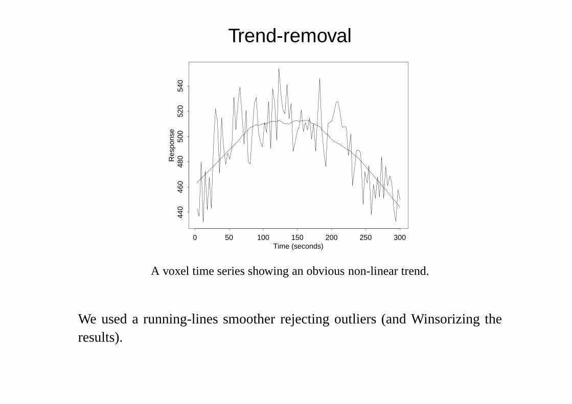
Trend-removal
Time (seconds)
Res
pons
e
0 50 100 150 200 250 300
440
460
480
500
520
540
A voxel time series showing an obvious non-linear trend.
We used a running-lines smoother rejecting outliers (and Winsorizing theresults).
−4 −3 −2 −1 0 1 2
0.0
0.2
0.4
0.6
0.8
log10(response)
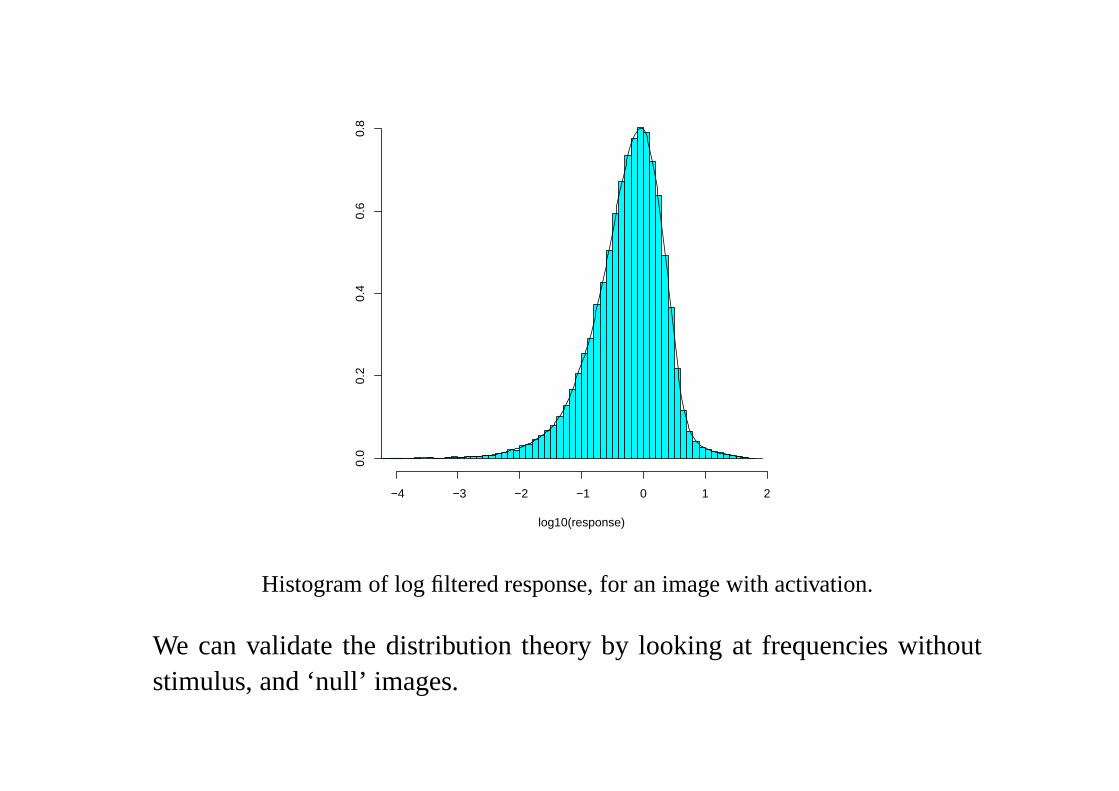
Histogram of log filtered response, for an image with activation.
We can validate the distribution theory by looking at frequencies withoutstimulus, and ‘null’ images.
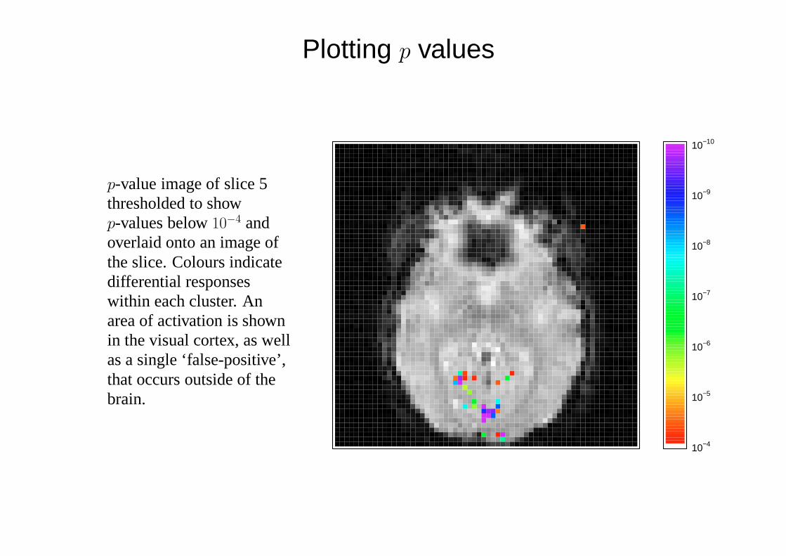
Plotting p values
p-value image of slice 5thresholded to showp-values below10−4 andoverlaid onto an image ofthe slice. Colours indicatedifferential responseswithin each cluster. Anarea of activation is shownin the visual cortex, as wellas a single ‘false-positive’,that occurs outside of thebrain.
10−4
10−5
10−6
10−7
10−8
10−9
10−10
Calibration
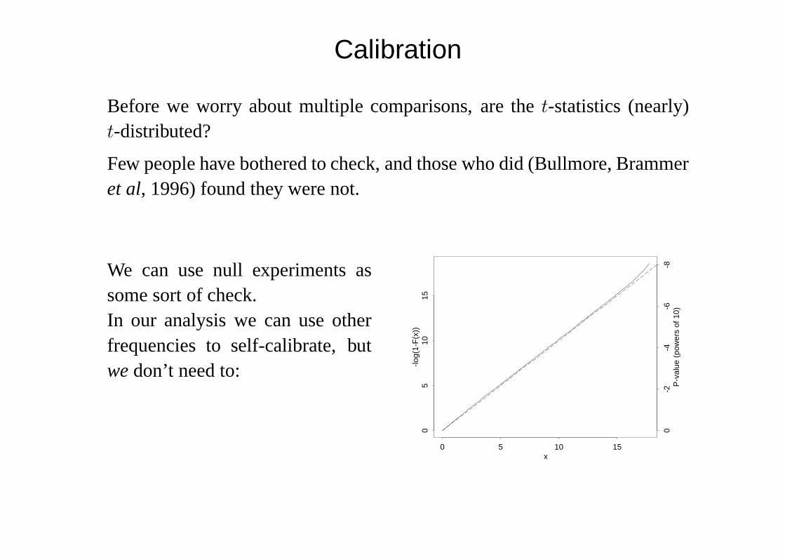
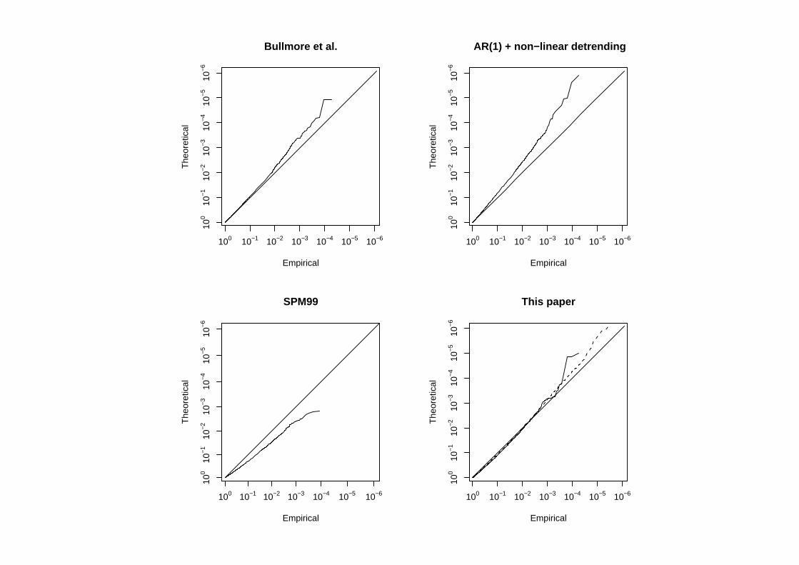
Before we worry about multiple comparisons, are thet-statistics (nearly)t-distributed?
Few people have bothered to check, and those who did (Bullmore, Brammeret al, 1996) found they were not.
We can use null experiments assome sort of check.In our analysis we can use otherfrequencies to self-calibrate, butwedon’t need to:
x
-log(
1-F
(x))
0 5 10 15
05
1015
0-2
-4-6
-8P
-val
ue (
pow
ers
of 1
0)
Bullmore et al.
Empirical
The
oret
ical
100 10−1 10−2 10−3 10−4 10−5 10−6
100
10−1
10−2
10−3
10−4
10−5
10−6
AR(1) + non−linear detrending
Empirical
The
oret
ical
100 10−1 10−2 10−3 10−4 10−5 10−6
100
10−1
10−2
10−3
10−4
10−5
10−6
SPM99
Empirical
The
oret
ical
100 10−1 10−2 10−3 10−4 10−5 10−6
100
10−1
10−2
10−3
10−4
10−5
10−6
This paper
Empirical
The
oret
ical
100 10−1 10−2 10−3 10−4 10−5 10−6
100
10−1
10−2
10−3
10−4
10−5
10−6