Embed Size (px)
Citation preview

1
NZQANew Zealand Qualifications AuthorityMana Tohu Matauranga O Aotearoa
Home > Qualifications and standards > Qualifications > NCEA > Subjects > Top Art Exhibition > 2013 > Top ArtExhibition - Design
Top Art Exhibition - DesignShow: Topart Homepage | Visual Arts Homepage
Click any thumbnail to view a larger version:
Billie Harris, St Matthew’sCollegiate
My plans for 2013:Massey University to do a Bachelor of Designwith Honours, focussing on spatial design andvisual communications.
Information about my work: ‘Focus’
Ideas / Concepts / ThemesI started off with choosing the issue of thepartially blind. From there I developed ideasaround the cause. I found a range of artistmodels to base my ideas around, some ofthese more successful than others. After I hadformed my overall theme, I designed differentways of promoting my cause.
Techniques / Processes / MaterialsI did quite a few of the pieces by hand, oraspects of them. Indian ink, water colour andpen were all techniques I used. The piecesI did on the computer were designed usingPhotoshop. Some of the works merge all ofthese techniques together. The brochure Idesigned has a cut out pattern on the frontcover that I did by hand.
Highs and lows that arose during theproduction of my work:Getting all the pieces to flow and worktogether took a while; I changed the coloursa lot and re-designed my logo over and over.There were a lot of pieces I did early on thatnever ended up on my board. Also, learninghow to use Photoshop took time as I’d neverused it before.

2
Click any thumbnail to view a larger version:
Billy Ridgway, MarlboroughBoys’ College
My plans for 2013:In 2013 I will be studying at MAINZ for audioengineering and music production. But thisdoes not mean I will stop designing, as mydesign work will be used through my music,such as album artwork and website designs.
Information about my work: ‘TheUndefined’
Ideas / Concepts / ThemesI wanted my artwork to express who I am,and what better way to do that than throughmusic. Everything you see on the board ishow I see what my music looks like. It’s verycolourful, because I see my music as positiveoutlets of energy. When I’m listening to themusic I produce, and close my eyes, those arethe colours I see.
Techniques / Processes / MaterialsI used a lot of layer masks in Photoshop tocreate the fade in of the water brushes andink brushes. My most used tool would havehad to be the pen tool and the featheringeffect, because I had to do a lot of cutting outof photos.
Highs and lows that arose during theproduction of my work:A high point would be looking at the finalproduct.
Click any thumbnail to view a larger version:
Danielle Forde, St Peter’sSchool
My plans for 2013:In 2013 I’ll be attending the VictoriaUniversity of Wellington studying a Bachelorof Commerce, majoring in marketing, aswell as culture and context from the designinnovation degree.
Information about my work: ‘TheBlind Project’
Ideas / Concepts / ThemesFirstly I wanted an awareness campaign, butafter not being able to choose one idea, I
3
chose four. I had to do a lot of research onthe blueprints before creating my packagingdesign, trying to keep similar elements frommy other work but relating it to 3D packaging.
Techniques / Processes / MaterialsI used and experimented with manipulatedphoto graphics, collage and typography. I liketo think that I pushed my use of typographythrough the boards.
Highs and lows that arose during theproduction of my work:I felt that I really captured the colour schemeon my third board, but the colours on allboards still work well. Another thing I findinteresting is my attraction to pushing circlesthrough my work. In the end, the work wasthe result of a lot of experimentation and timefinishing with a poster that can work for allthemes.
Click any thumbnail to view a larger version:
Harrison Sarsfield, HowickCollege
My plans for 2013:Study fine arts at Whitecliffe College.
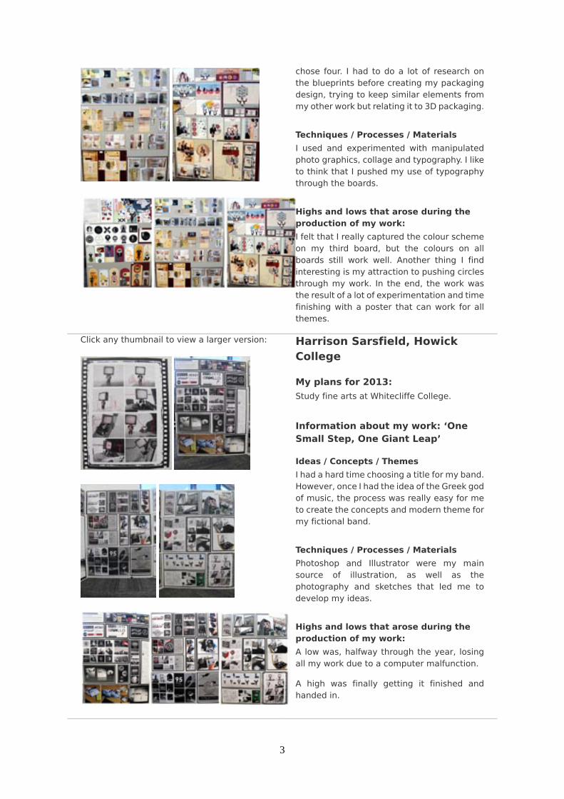
Information about my work: ‘OneSmall Step, One Giant Leap’
Ideas / Concepts / ThemesI had a hard time choosing a title for my band.However, once I had the idea of the Greek godof music, the process was really easy for meto create the concepts and modern theme formy fictional band.
Techniques / Processes / MaterialsPhotoshop and Illustrator were my mainsource of illustration, as well as thephotography and sketches that led me todevelop my ideas.
Highs and lows that arose during theproduction of my work:A low was, halfway through the year, losingall my work due to a computer malfunction.
A high was finally getting it finished andhanded in.

4
Click any thumbnail to view a larger version:
Jae Woo Park, WesternHeights High School
My plans for 2013:In 2013 I intend to continue studying art.I plan to study either graphic design orindustrial design at university. I would liketo extend my ideas, skills and designunderstanding so that I can create my ownunique style.
Information about my work:‘Members (Design Team)’
Ideas / Concepts / ThemesAt first I didn’t have a clear idea of whatI wanted to do. I just wanted to relate tomyself, and what I might be doing in a fewyears’ time. I found that I probably would bedoing design within a team, where it wouldhopefully influence today’s society.
I was mostly influenced by the artists NonFormat and Charles Wilkin. I liked their sharpand simple design methods using manylayers.
Techniques / Processes / MaterialsAs my situation was about a design team,I could link it with all the arts. I tookpersonal photographs, textures from paintand different media. By trying to incorporatelots of different methods and media, I foundwhat works well and what doesn’t. Mythoughts of development and processes werethen focussed on simplifying my designs tosuit my logo.
Highs and lows that arose during theproduction of my work:I found that I was limited with time, as I waspreparing my portfolio for several differentuniversities and two art folio boards for NCEA,and also trying to obtain the best schoolgrades I could. At times I would feel quitetired and stressed as progress would be quiteslow. However, I realised it’s a normal thing toovercome in these periods. It was challengingbut fun to finish the journey of completingmy boards and after looking back at whatI have done, it is quite surprising and alsointeresting.

5
Click any thumbnail to view a larger version:
Maddison Cheesman,Mahurangi College
My plans for 2013:This year I will be attending AUT University,where I will be doing a Bachelor of Design,majoring in graphic design.
Information about my work:‘Paperact Circus’
Ideas / Concepts / ThemesFor my Level 3 folio I wanted to base mytheme on a concept that is usually presentedin a traditional form. I found that circusesstill to this day tend to use traditional fontsand imagery when advertising. Therefore, Iwanted to create a unique and modern styleof design that does not relate to traditionalcircus advertisements.
Techniques / Processes / MaterialsCreating my pieces through Photoshop andIllustrator, I was able to include many forms ofimagery, with the dominant use of paper. Thisenabled me to cut and paste, creating collageeffects, scan in a wide range of differentpapers and textures, and take photographs ofvarious paper objects.
Highs and lows that arose during theproduction of my work:At times I struggled to maintain the circustheme as I found myself developing themesthat did not relate to my brief. Although overall I felt that each brief complemented theothers well.
Click any thumbnail to view a larger version:
Sam Coventry, Nelson College
My plans for 2013:To study a Bachelor of Design at MasseyUniversity in Wellington
Information about my work: ‘TygaHair Products’
Ideas / Concepts / ThemesI got ideas from a variety of different designartists who helped me generate my folio thisyear, ranging from vector artists to moresurreal artists. I enjoy using surrealism. Themain theme that flowed through my board

6
was that of a tiger. Tigers represent manlyattributes (for example, roaring, which is usedon my second board) and warm, dangerouscolours.
Techniques / Processes / MaterialsMy work includes a lot of wet media, whichI think is the reason it stands out so much. Icreated my own textures using paint and ink.
Highs and lows that arose during theproduction of my work:I didn’t come across any low points duringthe production of my work. I loved designingthe surreal images, that was definitely a highpoint this year.
Click any thumbnail to view a larger version:
Sarah Wood, Wakatipu HighSchool
My plans for 2013:Studying Design Communication at OtagoPolytechnic.
Information about my work: ‘ToWrite Love on Her Arms’
Ideas / Concepts / ThemesI firstly brainstormed ideas relating to mybrief, which was positive imagery thatreflected the organisation in an enthusiasticmanner. I continued to brainstorm more andmore ideas that would somehow influenceand inspire girls with the sense that they arebeautiful and life is worth living. This broughtme to photography and inspiring quotes thatnot only advertised my organisation, but alsohad the intention of making girls feel specialand happy.
Techniques / Processes / MaterialsMy whole portfolio was created on Photoshopwith paint brushes, photo filters and drawingutensils. In a lot of my work I usedphotography of my own.
Highs and lows that arose during theproduction of my work:Low point - staying up until 5am to completemy work.
7
High point – completing the work, finally, andbeing proud of it.
Click any thumbnail to view a larger version:
Sophia Smolenski, SpotswoodCollege
My plans for 2013:For 2013 I am working at the local museumas an exhibition host.
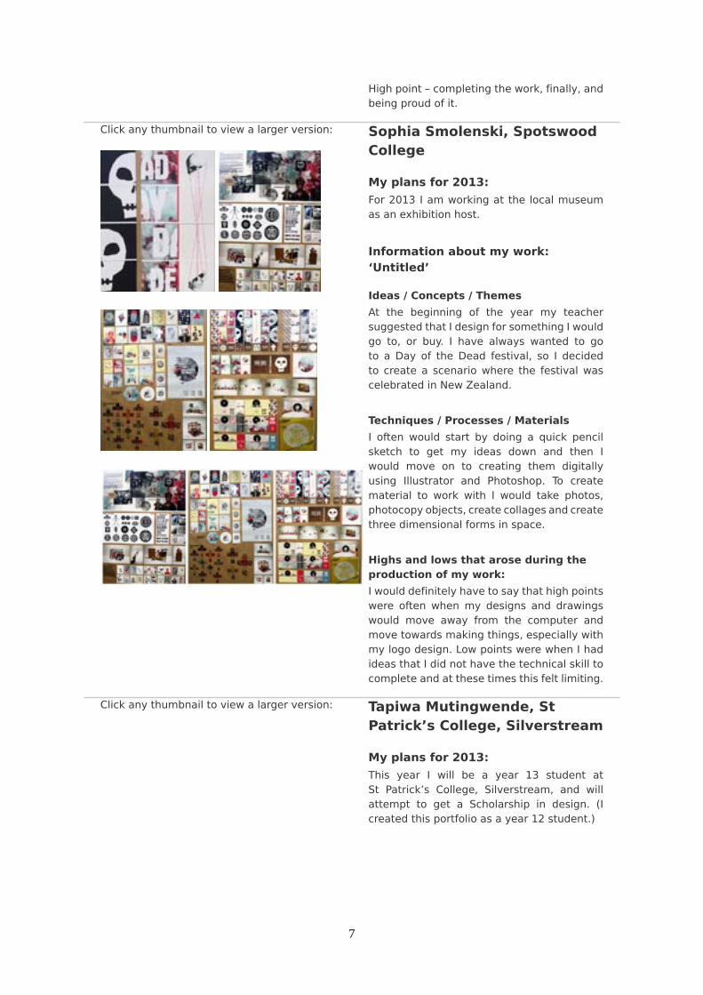
Information about my work:‘Untitled’
Ideas / Concepts / ThemesAt the beginning of the year my teachersuggested that I design for something I wouldgo to, or buy. I have always wanted to goto a Day of the Dead festival, so I decidedto create a scenario where the festival wascelebrated in New Zealand.
Techniques / Processes / MaterialsI often would start by doing a quick pencilsketch to get my ideas down and then Iwould move on to creating them digitallyusing Illustrator and Photoshop. To creatematerial to work with I would take photos,photocopy objects, create collages and createthree dimensional forms in space.
Highs and lows that arose during theproduction of my work:I would definitely have to say that high pointswere often when my designs and drawingswould move away from the computer andmove towards making things, especially withmy logo design. Low points were when I hadideas that I did not have the technical skill tocomplete and at these times this felt limiting.
Click any thumbnail to view a larger version: Tapiwa Mutingwende, StPatrick’s College, Silverstream
My plans for 2013:This year I will be a year 13 student atSt Patrick’s College, Silverstream, and willattempt to get a Scholarship in design. (Icreated this portfolio as a year 12 student.)
8
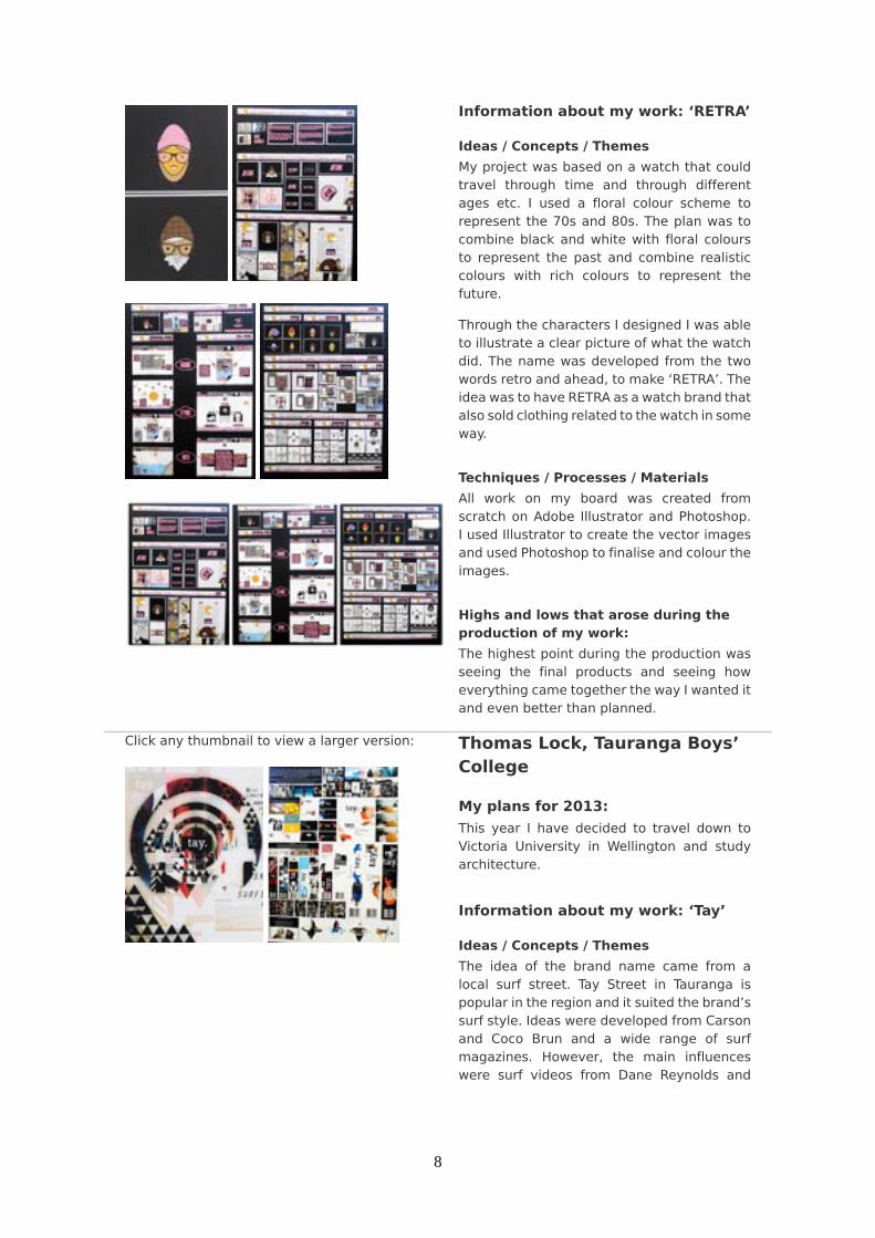
Information about my work: ‘RETRA’
Ideas / Concepts / ThemesMy project was based on a watch that couldtravel through time and through differentages etc. I used a floral colour scheme torepresent the 70s and 80s. The plan was tocombine black and white with floral coloursto represent the past and combine realisticcolours with rich colours to represent thefuture.
Through the characters I designed I was ableto illustrate a clear picture of what the watchdid. The name was developed from the twowords retro and ahead, to make ‘RETRA’. Theidea was to have RETRA as a watch brand thatalso sold clothing related to the watch in someway.
Techniques / Processes / MaterialsAll work on my board was created fromscratch on Adobe Illustrator and Photoshop.I used Illustrator to create the vector imagesand used Photoshop to finalise and colour theimages.
Highs and lows that arose during theproduction of my work:The highest point during the production wasseeing the final products and seeing howeverything came together the way I wanted itand even better than planned.
Click any thumbnail to view a larger version:
Thomas Lock, Tauranga Boys’College
My plans for 2013:This year I have decided to travel down toVictoria University in Wellington and studyarchitecture.
Information about my work: ‘Tay’
Ideas / Concepts / ThemesThe idea of the brand name came from alocal surf street. Tay Street in Tauranga ispopular in the region and it suited the brand’ssurf style. Ideas were developed from Carsonand Coco Brun and a wide range of surfmagazines. However, the main influenceswere surf videos from Dane Reynolds and
9
Craig Anderson, their easy style and bright,contrasted imagery.
Techniques / Processes / MaterialsLoads of Photoshop, camera work and a fewweeks of my life spent on beaches around thecountry. Hand drawings, Illustrator, paintingsand textures of rough surroundings alsofeatured as overlays etc. I used a lot ofdifferent modes and media and from there Iracked up a lot of un-used work.
I will say one thing, I enjoyed having zero planand a camera with me at all times of the dayto capture the necessary to the obscure. Younever know how much of it may help.
Highs and lows that arose during theproduction of my work:High points: seeing the final board, makingthe in situ pieces, magazine cover etc. Thescholarship application was the highlight ofthe year, however, as you had to write aboutyour ideas, methods and techniques, whatmade your work special. This was the bestmemory, along with the many laughs withteachers and students along the way.
Low lights: having no sleep, having 60GB ofwork and using only 2-3 GB of it. Design,however, is such a sick subject and the yearwas amazing. It’s been awesome now to seemy work heading away around the country.Cool beans!
Click any thumbnail to view a larger version:
Tom Pringle, Wanganui HighSchool
My plans for 2013:Study at Massey University, Wellington fora Bachelor of Design majoring in visualcommunication.
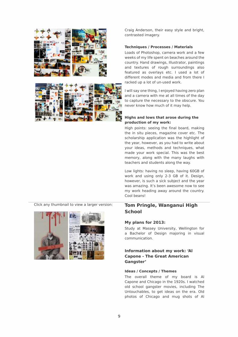
Information about my work: ‘AlCapone - The Great AmericanGangster’
Ideas / Concepts / ThemesThe overall theme of my board is AlCapone and Chicago in the 1920s. I watchedold school gangster movies, including TheUntouchables, to get ideas on the era. Oldphotos of Chicago and mug shots of Al

10
Capone’s associates helped me to developmy overall look.
I came up with a security company calledChicago Boss. The idea behind Chicago Bosswas that they would offer the same protectionas Al Capone and the mafia would providetheir friends and associates. The 1920s wereall about prohibition and organised crime. Iused a lot of images of the time mixed withsome newer security icons, such as CCTVcameras.
Techniques / Processes / MaterialsThe first board is in keeping with the 1920slook and helped me generate ideas. I set upan installation on an old notice board andcreated a police criminal map of Al Capone,which I photographed and used on my board.This gave me ideas for the logo and thebusiness card. I started off drawing and thenmoved into Photoshop. When designing theposter and the website I tried to incorporatethe 1920s Chicago style with a more modern,cutting edge look to it.
Highs and lows that arose during theproduction of my work:I really enjoyed researching my topic andfinding out all about the old school lingo thatthe gangsters used. Plus it gave me an excuseto watch more American gangster movies.
I was lucky enough to be head of social atWanganui High School for 2012, which meantI had to help organise the school ball. Thetheme we chose for the ball was Chicago inthe 1920s. This meant I could use a lot of mywork and ideas when it came to designing theposters and the tickets for the ball.
Copyright © New Zealand Qualifications Authority