Embed Size (px)
Citation preview
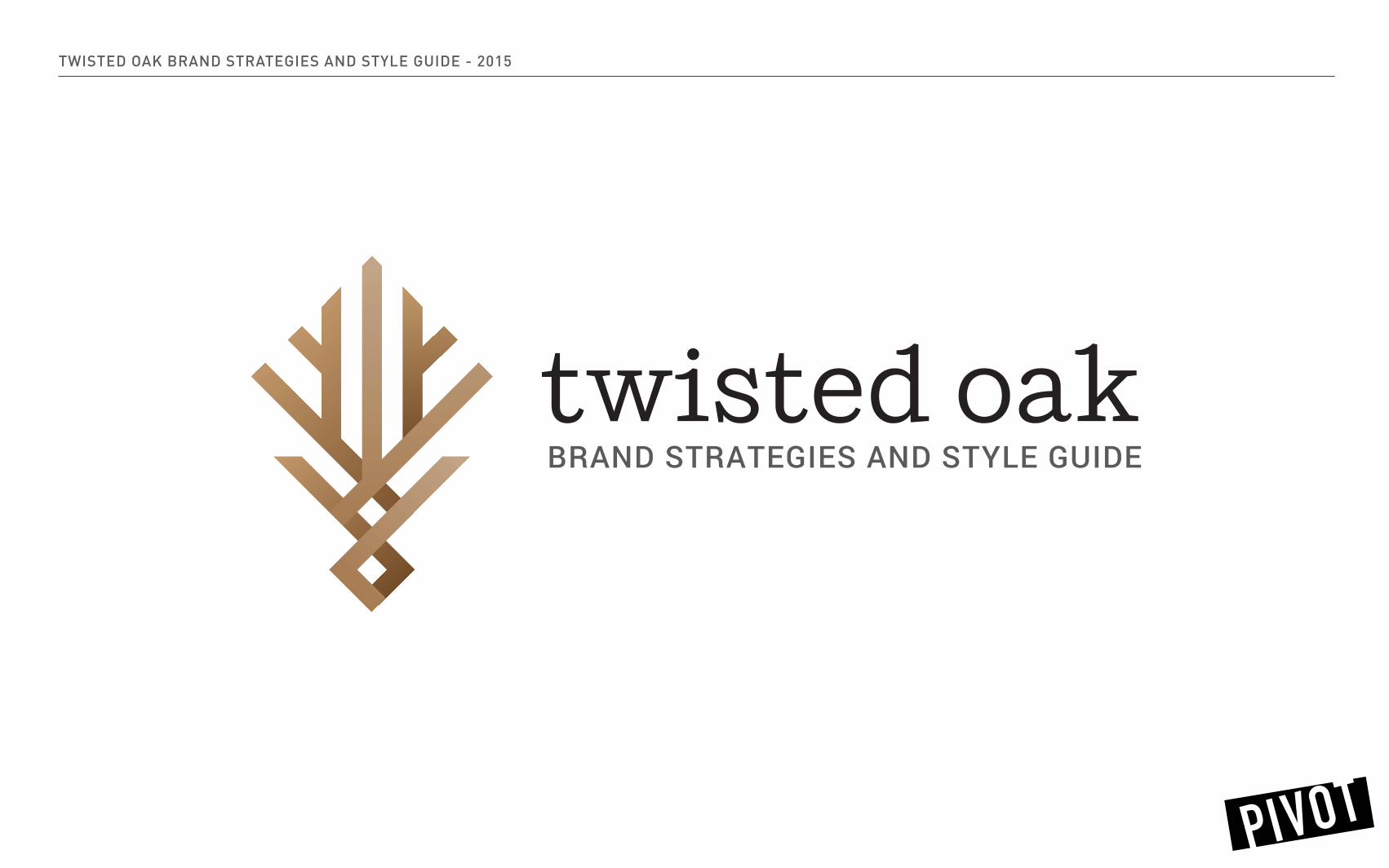
TWISTED OAK BRAND STRATEGIES AND STYLE GUIDE - 2015
BRAND STRATEGIES AND STYLE GUIDE

TWISTED OAK BRAND STRATEGIES AND STYLE GUIDE - 2015
CONTENTSdesign elements
placement
geometrical alignment
variations
use
colour palette
type
mockup

TWISTED OAK BRAND STRATEGIES AND STYLE GUIDE - 2015
Oak Grain Twisting Oak Clean and Simple
LOGO DESIGN ELEMENTS

TWISTED OAK BRAND STRATEGIES AND STYLE GUIDE - 2015 FINAL LOGO

TWISTED OAK BRAND STRATEGIES AND STYLE GUIDE - 2015
EXCLUSION ZONE
The Exclusion Zone is the minimum clear area for the logo to be placed within. This helps avoid visual confusion and maintain the logo as the cornerstone of the Twisted Oak brand.
When placing the Twisted Oak logo, allow for one-third of the length of the logo on the left and the right hand side. Allow for one-third of the logo height on both the top and the bottom of the logo.
LOGO PLACEMENT
1/3
1/3

TWISTED OAK BRAND STRATEGIES AND STYLE GUIDE - 2015 GEOMETRICAL ALIGNMENT
GEOMETRY
The purpose of a logo is to communicate with your target audience quickly and comprehensively. Basic elements such as the diamond shape, interweaving rectangles and sharp angles communicate power, teamwork, solidarity and trustworthiness.

TWISTED OAK BRAND STRATEGIES AND STYLE GUIDE - 2015 LOGO VARIATIONS
gradient duo tone single tone
gradient greyscale duo tone greyscale single tone greyscale

TWISTED OAK BRAND STRATEGIES AND STYLE GUIDE - 2015 LOGO VARIATIONS
gradient single toneduo tone
gradient greyscale single tone greyscaleduo tone greyscale

TWISTED OAK BRAND STRATEGIES AND STYLE GUIDE - 2015 LOGO VARIATIONS

TWISTED OAK BRAND STRATEGIES AND STYLE GUIDE - 2015 PHOTOGRAPHY OVERLAY
CHOOSING PHOTOGRAPHY
When overlaying the logo on a photo you should select landscape photography with vertical elements.

TWISTED OAK BRAND STRATEGIES AND STYLE GUIDE - 2015 PHOTOGRAPHY OVERLAY
FILTER APPLICATION
Open the chosen photo in Photoshop and do the following three steps: 1. Filter > Pixelate > Fragment 2. Filter > Pixelate > Facet 3. Add a layer over the photo, fill with hex #1b8140, lighten to 25% opacity.

TWISTED OAK BRAND STRATEGIES AND STYLE GUIDE - 2015 LOGO USE
DON’T ALTER THE LOGO
We have provided the strongest variations of your logo that are versatile and suitable for a multitude of contexts. This is to ensure that your brand is being represented consistently in every environment. This is crucial to create a strong, timeless visual identity.
Please refrain from using the logo outside of the formats we supply. The logo should not appear outlined, incorrectly coloured, warped or altered in any way.

TWISTED OAK BRAND STRATEGIES AND STYLE GUIDE - 2015 COLOUR PALETTE
R: 194
G: 153
B: 107
C: 24%
M: 39%
Y: 64%
K: 2%
HEX: C1996B
R: 166
G: 125
B: 84
C: 32%
M: 49%
Y: 73%
K: 10%
HEX: A57C54
R: 241
G: 241
B: 241
C: 4%
M: 3%
Y: 3%
K: 0%
HEX: F1F1F1
R: 64
G: 64
B: 65
C: 68%
M: 61%
Y: 59%
K: 46%
HEX: 404041
R: 117
G: 77
B: 41
C: 39%
M: 64%
Y: 89%
K: 35%
HEX: 754C28
R: 199
G: 168
B: 138
C: 23%
M: 32%
Y: 47%
K: 0%
HEX: C6A889
R: 255
G: 255
B: 255
C: 0%
M: 0%
Y: 0%
K: 0%
HEX: FFF

TWISTED OAK BRAND STRATEGIES AND STYLE GUIDE - 2015
HEX: C6A889
HEX: A57C54
HEX: C1996B
HEX: 754C28
GRADIENT USE
HEX: 585A5C HEX: 353231

TWISTED OAK BRAND STRATEGIES AND STYLE GUIDE - 2015 TYPE
SHIFT FONT BY THE FONT FOUNDRY VILLAGE
Shift is inspired by American slab-serifs from the late 19th century. In its lighter weights, it takes on the personality of a typewriter face, with flared terminals and prominent serifs. In the heavier weights, it acts as a titling Egyptian, with thin spaces between characters and small counters. Designed as a display face, it also works well for text.

TWISTED OAK BRAND STRATEGIES AND STYLE GUIDE - 2015 TYPE
H1: ROBOTO MEDIUM, 28/33, +50 TRACKING, HEX#260E00H2: ROBOTO MEDIUM, 16/19, +50 TRACKING, HEX #000
Roboto has a dual nature. It has a mechanical skeleton and the forms are largely geometric. At the same time, the font features friendly and open curves. While some grotesks distort their letterforms to force a rigid rhythm, Roboto doesn’t compromise, allowing letters to be settled into their natural width. This makes for a more natural reading rhythm more commonly found in humanist and serif types.

TWISTED OAK BRAND STRATEGIES AND STYLE GUIDE - 2015 BUSINESS CARD SAMPLE