Embed Size (px)
Citation preview
Type Expression
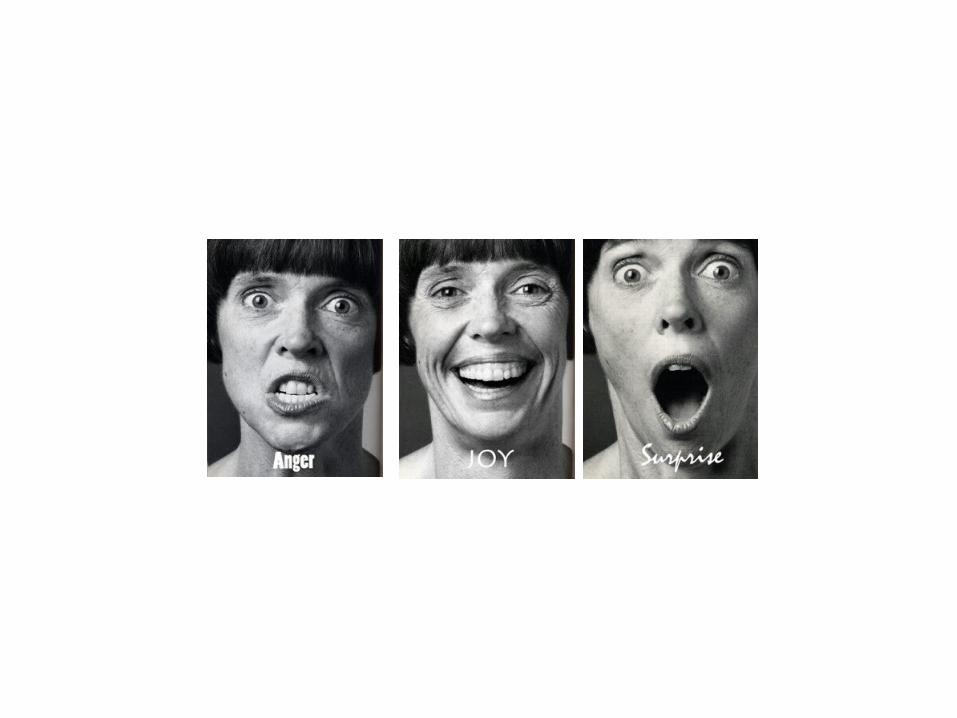
1. Emotion
Typography never occurs in isolation.
Good typography demands not only a knowledge of type itself, but an understanding of the relationship between letterforms and the other things that humans make and do. Typographic history is just that: the study of the relationships between type designs and the rest of human activity - politics, philosophy, the arts and the history of ideas.
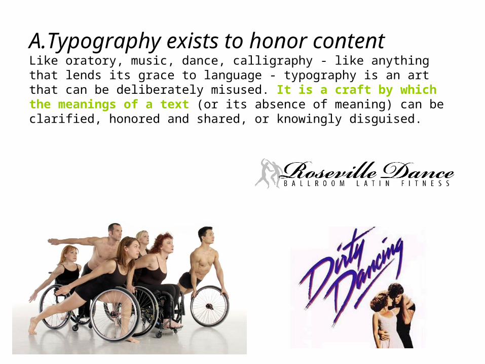
A.Typography exists to honor contentLike oratory, music, dance, calligraphy - like anything that lends its grace to language - typography is an art that can be deliberately misused. It is a craft by which the meanings of a text (or its absence of meaning) can be clarified, honored and shared, or knowingly disguised.
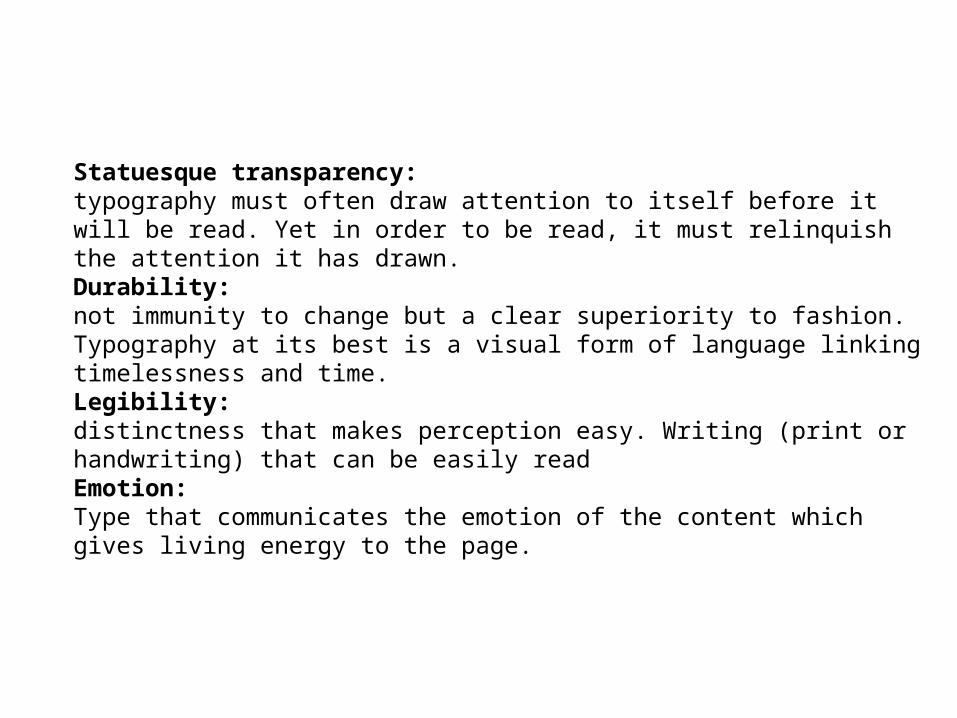
Statuesque transparency: typography must often draw attention to itself before it will be read. Yet in order to be read, it must relinquish the attention it has drawn.Durability:not immunity to change but a clear superiority to fashion. Typography at its best is a visual form of language linking timelessness and time. Legibility: distinctness that makes perception easy. Writing (print or handwriting) that can be easily readEmotion:Type that communicates the emotion of the content which gives living energy to the page.
b. Letters have a life and dignity of their own.Letterforms that honor and elucidate what humans see and say deserve to be honored in their turn. Well-chosen words deserve well-chosen letters; these in turn deserve to be set with affection, intelligence, knowledge and skill. typography is a link, and it out as a matter of honor, courtesy and pure delight, to be as strong as the others in the chain. The typographers task has always been to add a protective shell of artificial order, to the power of the writing hand.
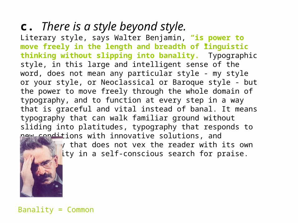
c. There is a style beyond style. Literary style, says Walter Benjamin, “is power to move freely in the length and breadth of linguistic thinking without slipping into banality.” Typographic style, in this large and intelligent sense of the word, does not mean any particular style - my style or your style, or Neoclassical or Baroque style - but the power to move freely through the whole domain of typography, and to function at every step in a way that is graceful and vital instead of banal. It means typography that can walk familiar ground without sliding into platitudes, typography that responds to new conditions with innovative solutions, and typography that does not vex the reader with its own originiality in a self-conscious search for praise.
Banality = Common
d. Read the text before designing it.Each distinct piece requires its own distinct typographic identity and form. Every layer and level of the text must be consistent, distinct, yet (usually) harmonious in form.
The first task of the typographer is therefore to read and understand the text; the second task is to analyze and map it. Only then can typographic interpretation begin.
If the text has many layers or sections, it may need not only head and subheads but running heads as well, reappearing on every page or two-page spread, to remind readers which intellectual neighborhood they happen to be visiting. The typographer must analyze and reveal the inner order of the text, as a musician must reveal the inner order of the music he performs.


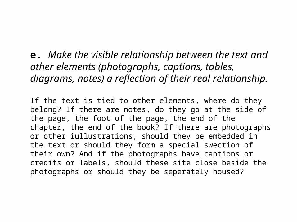
e. Make the visible relationship between the text and other elements (photographs, captions, tables, diagrams, notes) a reflection of their real relationship.
If the text is tied to other elements, where do they belong? If there are notes, do they go at the side of the page, the foot of the page, the end of the chapter, the end of the book? If there are photographs or other iullustrations, should they be embedded in the text or should they form a special swection of their own? And if the photographs have captions or credits or labels, should these site close beside the photographs or should they be seperately housed?
f. Shape the page and frame the text block so that it honors and reveals every element, every relationship between elements, and every logical nuance of the text.
g. Give full typographic attention especially to incidental details. “God is in the details”Some of what a typographer must set is simply passage work. There is a certain amount of routine text: page numbers, scene numbers, textual notes, the copyright claim, the publisher's name and address, and the hyperbole on the jacket, not to mention the passage work or background writing that is implicit in the text istels. However, the typographer can make poignant and lovely typography from bibliographical paraphernalia and textual chaff, The ability to do so rests on respect for the text as a whole, and on respect for the letters themselves.


![Typography · 3. Stanley Morison [English] 1889-1967 • Typographer, type designer • 1923–67: typography consultant to Monotype Corporation*. • 1929–60: typography consultant](https://img.pdfslide.net/doc/110x75/5f0324b57e708231d407c0c3/typography-3-stanley-morison-english-1889-1967-a-typographer-type-designer.jpg)