Embed Size (px)
Citation preview
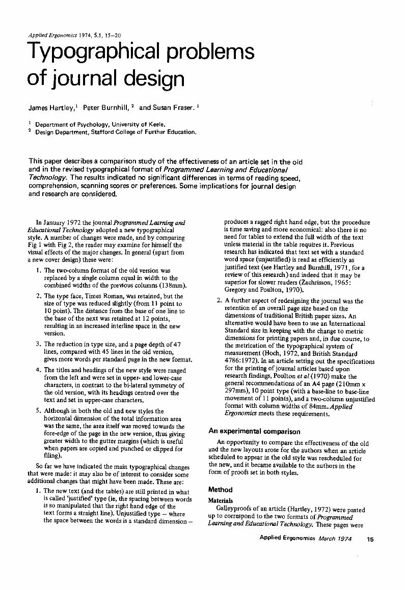
Applied Ergonomics 1974, 5.1, 15-20
Typographical problems of journal design James Hartley, 1 Peter Burnhill, 2 and Susan Fraser.
Department of Psychology, University of Keele. 2 Design Department, Stafford College of Further Education.
This paper describes a comparison study of the effectiveness of an article set in the old and in the revised typographical format of Programmed Learning and Educational Technology. The results indicated no significant differences in terms of reading speed, comprehension, scanning scores or preferences. Some implications for journal design and research are considered.
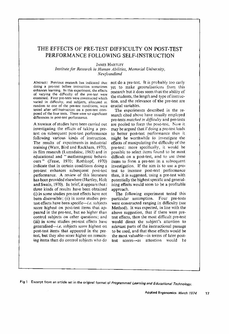
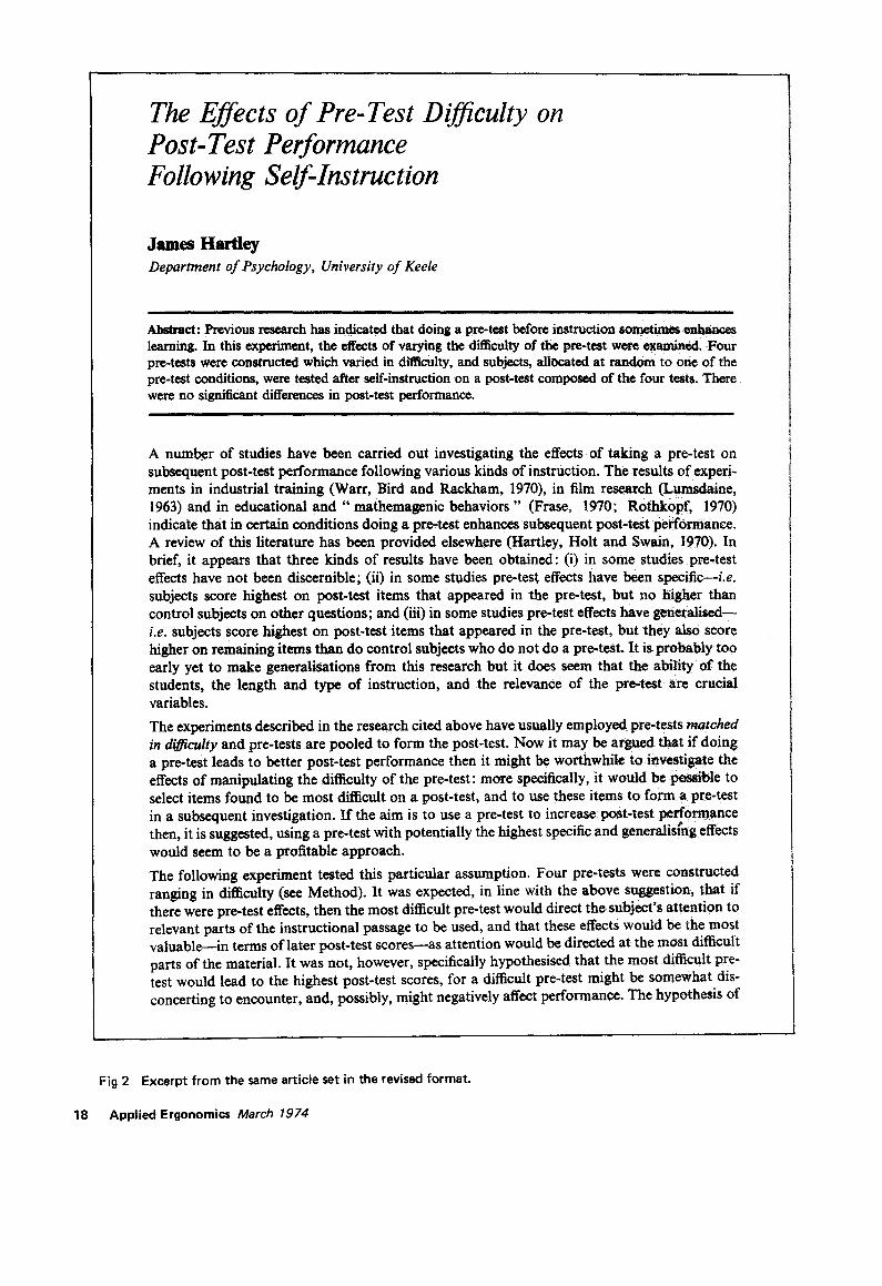
In January 1972 the journal Programmed Learning and Educational Technology adopted a new typographical style. A number of changes were made, and by comparing Fig 1 with Fig 2, the reader may examine for himself the visual effects of the major changes. In general (apart from a new cover design) these were:
1. The two-column format of the old version was replaced by a single column equal in width to the combined widths of the previous columns (138mm).
2. The type face, Times Roman, was retained, but the size of type was reduced slightly (from 11 point to 10 point). The distance from the base of one line to the base of the next was retained at 12 points, resulting in an increased interline space in the new version.
3. The reduction in type size, and a page depth of 47 lines, compared with 45 lines in the old version, gives more words per standard page in the new format.
4. The titles and headings of the new style were ranged from the left and were set in upper- and lower-case characters, in contrast to the bi-lateral symmetry of the old version, with its headings centred over the text and set in upper-case characters.
5. Although in both the old and new styles the horizontal dimension of the total information area was the same, the area itself was moved towards the fore-edge of the page in the new version, thus giving greater width to the gutter margins (which is useful when papers are copied and punched or clipped for rmng).
So far we have indicated the main typographical changes that were made: it may also be of interest to consider some additional changes that might have been made. These are:
1. The new text (and the tables) are still printed in what is called 'justified' type (ie, the spacing between words is so manipulated that the right hand edge of the text forms a straight line). Unjustified type - where the space between the words is a standard dimension -
.
produces a ragged fight hand edge, but the procedure is time saving and more economical: also there is no need for tables to extend the full width of the text unless material in the table requires it. Previous research has indicated that text set with a standard word space (unjustified) is read as efficiently as justified text (see Hartley and Burnhill, 1971, for a review of this research) and indeed that it may be superior for slower readers (Zachfisson, 1965: Gregory and Poulton, 1970).
A further aspect of redesigning the journal was the retention of an overall page size based on the dimensions of traditional British paper sizes. An alternative would have been to use an International Standard size in keeping with the change to metric dimensions for printing papers and, in due course, to the metfication of the typographical system of measurement (Hoch, 1972, and British Standard 4786:1972). In an article setting out the specifications for the printing of journal articles based upon research f'mdings, Poulton et al (1970) make the general recommendations of an A4 page (210mm x 297mm), 10 point type (with a base.line to base-line movement of 11 points), and a two-column unjustified format with column widths of 84mm. Applied Ergonomics meets these requirements.
An experimental comparison
An opportunity to compare the effectiveness of the old and the new layouts arose for the authors when an article scheduled to appear in the old style was rescheduled for the new, and it became available to the authors in the form of proofs set in both styles.
Method Materials
Galleyproofs of an article (Hartley, 1972) were pasted up to correspond to the two formats of Programmed Learning and Educational Technology. These pages were
Applied Ergonomics March 1974 15
then Xeroxed, and Xeroxed copies of the articles formed the main materials for the experiment.
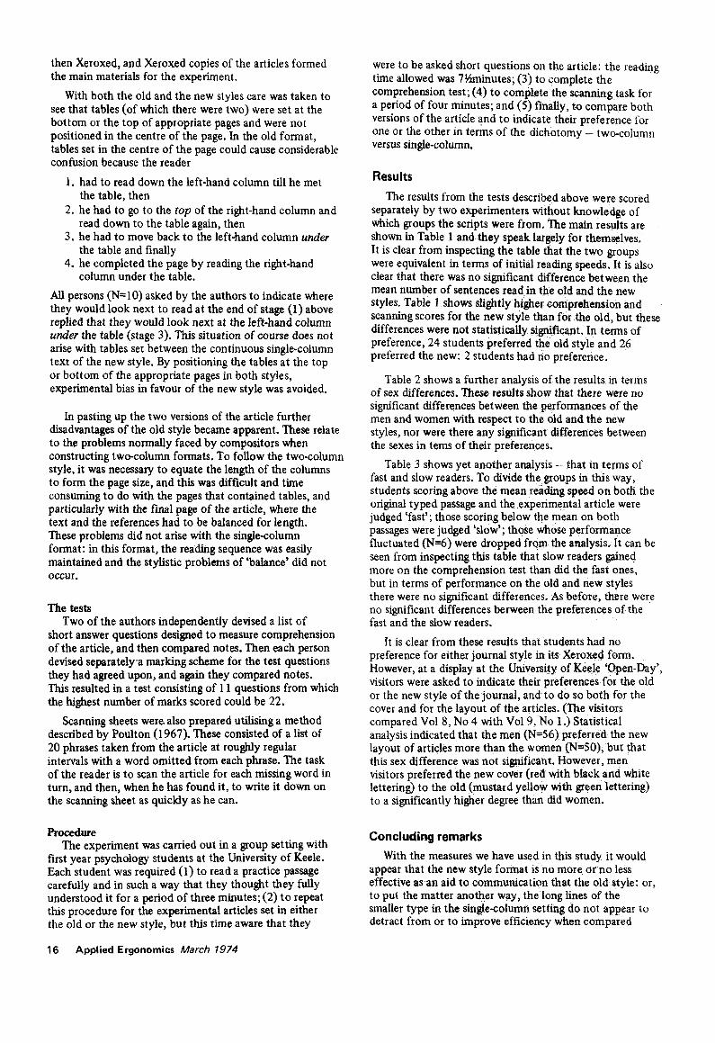
With both the old and the new styles care was taken to see that tables (of which there were two) were set at the bottom or the top of appropriate pages and were not positioned in the centre of the page. In the old format, tables set in the centre of the page could cause considerable confusion because the reader
1. had to read down the left-hand column till he met the table, then
2. he had to go to the top of the right-hand column and read down to the table again, then
3. he had to move back to the left-hand column under the table and finally
4. he completed the page by reading the right-hand column under the table.
All persons (N=I0) asked by the authors to indicate where they would look next to read at the end of stage (1) above replied that they would look next at the left-hand column under the table (stage 3). This situation of course does not arise with tables set between the continuous single-column text of the new style. By positioning the tables at the top or bottom of the appropriate pages in both styles, experimental bias in favour of the new style was avoided.
In pasting up the two versions of the article further disadvantages of the old style became apparent. These relate to the problems normally faced by compositors when constructing two-column formats. To follow the two-column style, it was necessary to equate the length of the columns to form the page size, and this was difficult and time consuming to do with the pages that contained tables, and particularly with the final page of the article, where the text and the references had to be balanced for length. These problems did not arise with the single-column format: in this format, the reading sequence was easily maintained and the stylistic problems of 'balance' did not OCCUr.
The tests Two of the authors independently devised a list of
short answer questions designed to measure comprehension of the article, and then compared notes. Then each person devised separatelya marking scheme for the test questions they had agreed upon, and again they compared notes. This resulted in a test consisting of 11 questions from which the highest number of marks scored could be 22.
Scanning sheets were- also prepared utflising a method described by Poulton (1967). These consisted of a list of 20 phrases taken from the article at roughly regular intervals with a word omitted from each phrase. The task of the reader is to scan the article for each missing word in turn, and then, when he has found it, to write it down on the scanning sheet as quickly as he can.
Procedure The experiment was carried out in a group setting with
first year psychology students at the University of Keele. Each student was required (1) to read a practice passage carefully and in such a way that they thought they fully understood it for a period of three minutes; (2) to repeat this procedure for the experimental articles set in either the old or the new style, but this time aware that they
16 Applied Ergonomics March 1974
were to be asked short questions on the article: the reading time allowed was 7~zrninutes; (3) to complete the comprehension test; (4) to complete the scanning task for a period of four minutes; and (5) finally, to compare both versions of the article and to indicate their preference for one or the other in terms of the dichotomy - two-column versus single-column.
Results
The results from the tests described above were scored separately by two experimenters without knowledge of which groups the scripts were from. The main results are shown in Table 1 and they speak largely for themselves. It is clear from inspecting the table that the two groups were equivalent in terms of initial reading speeds. It is also clear that there was no significant difference between the mean number of sentences read in the old and the new styles. Table 1 shows slightly higher comprehension and scanning scores for the new style than for the old, but these differences were not statistically significant. In terms of preference, 24 students preferred the old style and 26 preferred the new: 2 students had no preference.
Table 2 shows a further analysis of the results in terms of sex differences. These results show that there were no significant differences between the performances of the men and women with respect to the old and the new styles, nor were there any significant differences between the sexes in tems of their preferences.
Table 3 shows yet another analysis - that in terms of fast and slow readers. To divide the groups in this way, students scoring above the mean reading speed on both the original typed passage and the experimental article were judged 'fast'; those scoring below the mean on both passages were judged 'slow'; those whose performance fluctuated (N=6) were dropped from the analysis. It can be seen from inspecting this table that slow readers gained more on the comprehension test than did the fast ones, but in terms of performance on the old and new styles there were no significant differences. As before, there were no significant differences between the preferences of the fast and the slow readers.
It is clear from these results that students had no preference for either journal style in its Xeroxed form. However, at a display at the University of Keele 'Open-Day', visitors were asked to indicate their preferences for the old or the new style of the journal, and to do so both for the cover and for the layout of the articles. (The visitors compared Vol 8, No 4 with Vol 9, No 1 .) Statistical analysis indicated that the men (N=56) preferred the new layout of articles more than the women (N=50), but that this sex difference was not s i~f icant . However, men visitors preferred the new cover (red with black and white lettering) to the old (mustard yellow with green lettering) to a significantly higher degree than did women.
Concluding remarks With the measures we have used in this study it would
appear that the new style format isno more or no less effective as an aid to communication that the old style: or, to put the matter another way, the long lines of the smaller type in the single-column setting do not appear to detract from or to improve efficiency when compared
THE EFFECTS OF PRE-TEST DIFFICULTY ON POST-TEST PERFORMANCE FOLLOWING SELF-INSTRUCTION
JAMES HARTLEY Institute for Research in Human Abilities, Memorial University,
Newfoundland
Abstract: Previous research has indicated that doing a pre-test before instruction sometimes enhances learning. In this experinaent, the effects of varying the difficulty of the pre-test were examined. Four pre-tests were constructed which varied in difficulty, and subjects, allocated at random to one of the pre-test conditions, were tested after self-instruction on a post-test com- posed of the four tests. There were no significant differences in post-test performance.
A NUMBER of studies have been carried out investigating the effects of taking a pre- test on subsequent post-test performance following various kinds of instruction. The results of experiments in industrial training (Warr, Bird and Rackham, 1970), in film research (Lumsdaine, 1963) and in educational and " mathemagenic behavi- o u r s " (Frase, 1970; Rothkopf, 1970) indicate that in certain conditions doing a pre-test enhances subsequent post-test performance. A review of this literature has been provided elsewhere (Hartley, Holt and Swain, 1970). In brief, it appears that: three kinds of results have been obtained (i) in some studies pre-test effects have not been discernible; (ii) in some studies pre- test effects have been specific--i.e, subjects score highest on post-test items that ap- peared in the pre-test, but no higher than control subjects on other questions; and (iii) in some studies pre-test effects have generalised--i.e, subjects score highest on post-test items that appeared in the pre- test, but they also score higher on remain- ing items than do control subjects who de
not do a pre-test. It is probably too early yet to make generalisations from this research but it does seem th at the ability of the students, the length and type of instruc- tion, and the relevance of the pre-test are crucial variables.
The experiments described in the re- search cited above have usually employed pre-tests matched in difficulty and pre-tests are pooled to form the post-test. Now it may be argued that if doing a pre-test leads to better post-test performance then it might be worthwhile to investigate the effects of manipulating the difficulty of the pre-test: more specifically, it would be possible to select items found to be most difficult on a post-test, and to use these items to form a pre-test in a subsequent investigation. If the aim is to use a pre- test to increase post-test performance then, it is suggested, using a pre-test with potentially the highest specific and general- ising effects would seem to be a profitable approach.
The following experiment tested this particular assumption. Four pre-tests were constructed ranging in difficulty (see Method). It was expected, in line with the above suggestion, that if there were pre- test effects, then the most difficult pre-test would direct the subject's attention to relevant parts of the instructional passage to be used, and that these effects would be the most valuable--in terms of later post- test scores--as attention would lze
Fig 1 Excerpt from an article set in the original format of Programmed Learning and Educational Technology.
Applied Ergonomics March 1974 17
The Effects of Pre-Test Difficulty on Post-Test Performance Following Self-Instruction
James Hartley Department of Psychology, University of Keele
i , i i r l
Al~tract: Previous research has indicated that doing a pre-test before instruction s o m e t ~ enhances learning. In this experiment, the effects of varying the difficulty of the pre-test were ~ . Four pre-tests were constructed which varied in ditt~culty, and subjects, allocated at r a n ~ to one of the pre-test conditions, were tested after self-instruction on a post-test composed of the four ~ . There were no significant differences in post-test performance.
, i i i i i
A number of studies have been carried out investigating the effects of taking a pre-test on subsequent post-test performance following various kinds of instruction. The results of experi- ments in industrial training (Warr, Bird and Rackham, 1970), in film research ( L u m ~ i n e , 1963) and in educational and "' mathemagenic behaviors" (Frase, 1970; Rothkopf, 1970) indicate that in certain conditions doing a pre-test enhances subsequent post-test :performance. A review of this literature has been provided elsewhere (Hartley, Holt and Swain, I970), In brief, it appears that three kinds of results have been obtained: (i) in some studiespre,test effects have not been discernible; (ii) in some studies pre-test effects have been specific--i.e. subjects score highest on post-test items that appeared in the pre-test, but no higher than control subjects on other questions; and (iii) in some studies pre-test effects have ~,,neralised~ i.e. subjects score highest on post-test items that appeared in the pre-test, but they also score higher on remaining items than do control subjects who do not do a pre-test. It is probably too early yet to make generalisations from this research but it does seem that the ability of the students, the length and type of instruction, and the relevance of the pre-test are crucial variables.
The experiments described in the research cited above have usually employed pre-tests matched in di~iculty and pre-tests are pooled to form the post-test. Now it may be argued ~ t if doing a pre-test leads to better post-test performance then it might be worthwhile to investigate the effects of manipulating the difficulty of the pre-test: more specifically, it would be ~ b l e to select items found to be most difficult on a post-test, and to use these items to form a pre-test in a subsequent investigation. If the aim is to use a pre-test to increase post'test performance then, it is suggested, using a pre-test with potentially the highest specific and generaiis;ng effects would seem to be a profitable approach.
The following experiment tested this particular assumption. Four pre.tests were constructed ranging in difficulty (see Method). It was expected, in line with the above s ~ e s t i o n , that if there were pre-test effects, then the most difficult pre-test would direct the subject's attention to relevant parts of the instructional passage to be used, and that these effects would be the most valuable--in terms of later post-test scores--as attention would be directed at the most difficult parts of the material. It was not, however, specifically hypothesised that the most difficult pre- test would lead to the highest post-test scores, for a difficult pre-test might be somewhat dis- concerting to encounter, and, possibly, might negatively affect performance. The hypothesis of
Fig 2 Excerpt from the same article set in the revised format.
18 Applied Ergonomics March 1974
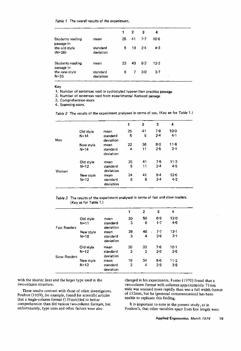
Table 1 The overall results of the experiment.
1 2 3 4
Students reading mean 25 41 7.7 10.6 passage in the old style standard 5 10 2-4 4.3 (N--26) deviation
Students reading mean 23 40 8"2 12.2 passage in the new style standard 5 7 3.0 3.7 N=26 deviation
Key 1, Number of sentences read in cyclostyled typewritten practice passage 2. Number of sentences read from experimental Xeroxed passage 3, Comprehension score 4, Scanning score.
Table 2 The results of the experiment analysed in terms of sex. (Key as for Table 1.)
Men
Women
Old style mean N= 14 standard
deviation New style mean N--14 standard
deviation
1 2 3 4
25 41 7-8 10"0 5 9 2.4 4.1
22 36 8.0 11 "8 4 11 2.5 3"1
Old style mean 25 41 7.5 11 "3 N=12 standard 5 11 2-4 4"5
deviation New style mean 24 41 8.4 12-6 N= 12 standard 6 8 3.4 4.2
deviation
Table 3 The results of the experiment analysed in terms of fast and slow readers. (Key as for Table 1.)
Fast Readers
Slow Readers
Old style mean N=I 1 standard
deviation New style mean N=10 standard
deviation
Old style mean N =12 standard
deviation New style mean N=13 standard
deviation
1 2 3 4
30 50 6"9 12"0 3 6 1 "7 4"6
28 46 7"7 13"1 3 4 3"6 3"1
20 33 7"6 10"1 3 3 2"6 3"5
19 34 8-6 11 "2 2 4 2"8 3'8
with the shorter lines and the larger type used in the two-column structure.
These results contrast with those of other investigators. Poulton (1959), for example, found for scientific articles that a single-column format (131 mm) led to better comprehension than did various two-column formats, but unfortunately, type sizes and other factors were also
changed in his experiments. Foster (1970) found that a two-column format with columns approximately 71 mm wide was scanned more rapidly than was a full width format of 152mm, but he (personal communication) has been unable to replicate this finding.
It is important to note in the present study, as in Poulton's, that other variables apart from line length were
Applied Ergonomics March 1974 19
also changed. The conclusions reached here, therefore, are specific only to those particular layouts of Programrned Learning and Educational Technology.
The decision of whether or not to use single-, two-, three- or even four-column formats for a journal page is of course based on many factors - readability and comprehension perhaps playing a less important role than stylistic and economic arguments. Clearly one can make recommendations on the basis of research (eg, see Poulton, 1972) and one can produce journals such as Applied Ergonomics "where the principles of ergonomics and aesthetic design are balanced against the principles of good management, practicability, and cost" (Poulton et al, 1970). However, such recommendations should be tested in the context to which they are applied.
In our view, research in journal design should now be focussed on assessing formats which do not inhibit the rational disposition in space of the component parts of technical and scientific texts, in preference to the piece- meal testing of features of printed matter in isolation from the kinds of information in which such features actually occur. For instance, concern for line-length (or column width) may be relevant in the context of material which is limited to strings of sentences grouped in paragraphs, but it may not be so relevant when the matter contains not only information in sentence form but also complex components such as tables, matrices, lists, mathematical statements and diagrams - all of which are constrained by dimensional factors of a different order from that which pertains to words arranged line upon line. If the function of the typographer is to specify for production the structure of an author's work in a manner which allows the reader to move about within it without undue confusion, then it is reasonable to assume that concern for the author's requirements are in the best interests of the reader. From this point of view, interest in the logical order of the parts of a whole must come before the testing of parts.
Important in the design of journal formats which have respect for the changing content and function of written language is the development of computer programs for the" control of typographical composition. The present tendency is to design systems tied to the conventions used by renaissance printers, and thus to impose a straight-jacket on the structure of printed information which - in content and usage - is quite unlike that of half a millenium ago. The dangers inherent in the freezing of the conventions in this way will be recognised by creative writers and by designers, editors and printers who are sensible of changing needs. By asking the right sort of questions, research in typography could further the rational use of technology and, by implication, help authors to develop written language in a manner which is fit for human consumption. We believe this will require an approach by research workers which is qualitatively different from that which accepts uncritically the form of anything which happens
to be printed, and which seeks to test the response of the reader to it in the hope that what is significant will pop up of its own volition. We also believe it will require an approach by designers which is not directed by interest in fashionable styles.
Acknowledgement
This research was supported by the Social Science Research Council to whom we are indebted.
References
British Standards: "BS 4786:1972" and "BS 2961:1958", London: British Standards Institution.
Foster, J. J. 1970 Bulletin of the British Psychological Society,
23. 113-114. A study of the legibility of one and two-column layouts for B.P.S. publications.
Gregory, M., and Poulton, E. C. 1970 Ergonomics, 13.4,427-434. Even versus uneven right
hand margins and the rate of comprehension in reading.
Hartley, J. 1972 Programmed Learning and Educational Technology,
9.2, 108-112. The effects of pretest difficulty on post-test performance following self instruction.
Hartley, J., and Burnhill, P. 1971 Visible Language, 5.3,265-277. Experiments with
unjustified text.
Hoch, E. 1972 Ieographic No 3, London: International Council of
Graphic Design Associations. ~ e demise of the point.
Poulton, E.C. 1959 'Effects of printing types and formats on the
comprehension of scientific journals,' M R C Applied Psychology Research Unit Report No 346.
Poulton, E.C. 1967 Ergonomics, 10.6, 713-716. Skimming (scanning)
news items printed in 8 point and 9 point letters.
Poulton, E.C. 1972 How efficient is print? Contributions to an
Educational Technology, ( Davies, I.K. and Hartley, J. (Eds.)) Butterworths, London.
Poulton, E.C., Warren, T.R., and Bond, J. 1970 Applied Ergonomics, 1.4,207-209: Ergonomics in
journal design.
Zachrisson, B. 1965 Legibility of Printed Text, Stockholm: Almqvist &
Wisell.
20 Applied Ergonomics March 1974