Embed Size (px)
Citation preview

UFCEKR-20-1
Media Technologies
Web GUI design
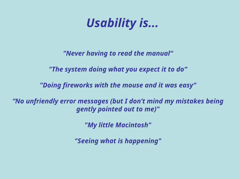
"Never having to read the manual“
"The system doing what you expect it to do“
"Doing fireworks with the mouse and it was easy“
“No unfriendly error messages (but I don’t mind my mistakes being gently pointed out to me)"
"My little Macintosh"
"Seeing what is happening"
Usability is...
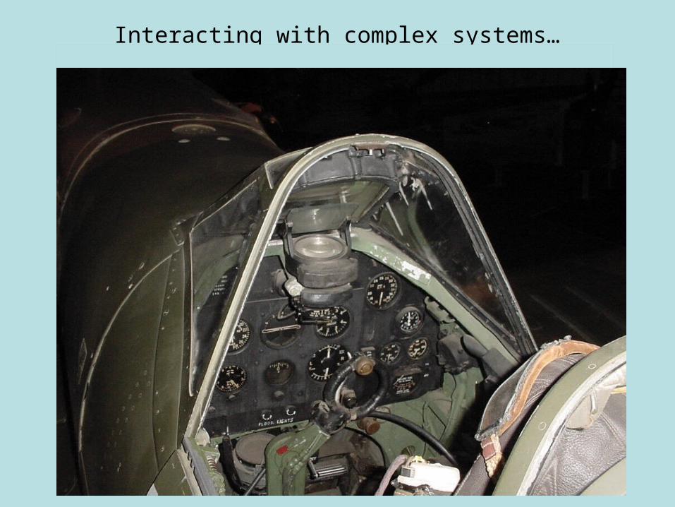
Interacting with complex systems…
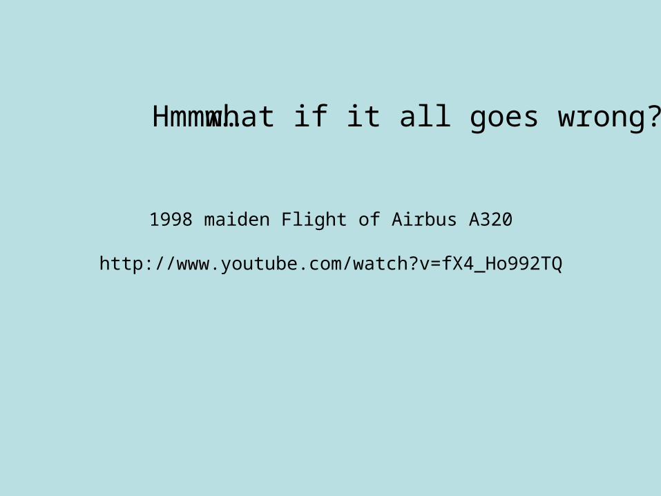
Hmmm…
1998 maiden Flight of Airbus A320
http://www.youtube.com/watch?v=fX4_Ho992TQ
what if it all goes wrong?
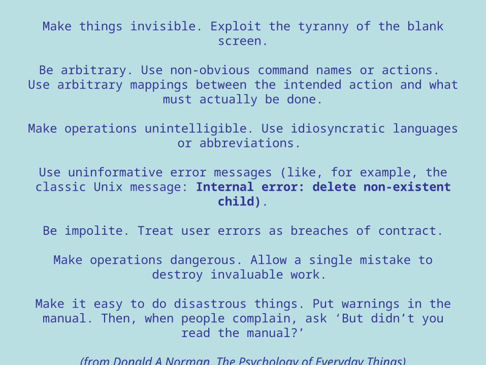
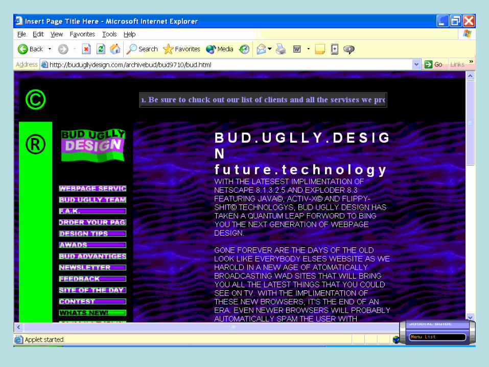
Guidelines for making systems user-hostile
Make things invisible. Exploit the tyranny of the blank screen.
Be arbitrary. Use non-obvious command names or actions. Use arbitrary mappings between the intended action and what must actually be
done.
Make operations unintelligible. Use idiosyncratic languages or abbreviations.
Use uninformative error messages (like, for example, the classic Unix message: Internal error: delete non-existent child).
Be impolite. Treat user errors as breaches of contract.
Make operations dangerous. Allow a single mistake to destroy invaluable work.
Make it easy to do disastrous things. Put warnings in the manual. Then, when people complain, ask ‘But didn’t you read the manual?’
(from Donald A Norman, The Psychology of Everyday Things)
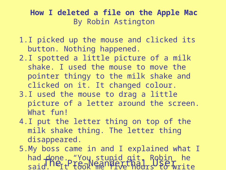
The Pre-Neanderthal User
How I deleted a file on the Apple MacBy Robin Astington
1. I picked up the mouse and clicked its button. Nothing happened.
2. I spotted a little picture of a milk shake. I used the mouse to move the pointer thingy to the milk shake and clicked on it. It changed colour.
3. I used the mouse to drag a little picture of a letter around the screen. What fun!
4. I put the letter thing on top of the milk shake thing. The letter thing disappeared.
5. My boss came in and I explained what I had done. “You stupid git, Robin” he said. “It took me five hours to write that document, and I haven’t even got a printout”
6. It was really easy.
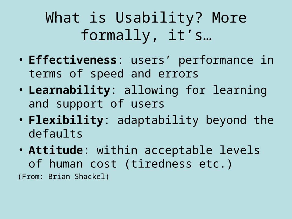
What is Usability? More formally, it’s…
• Effectiveness: users’ performance in terms of speed and errors
• Learnability: allowing for learning and support of users
• Flexibility: adaptability beyond the defaults• Attitude: within acceptable levels of human cost
(tiredness etc.)(From: Brian Shackel)
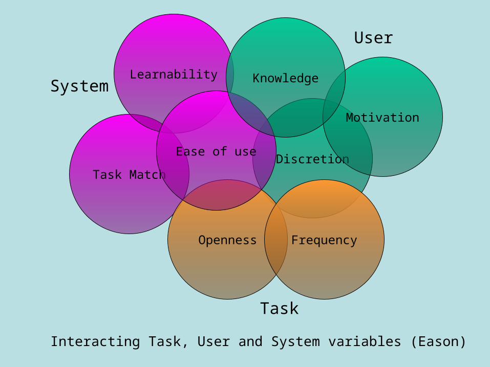
Task MatchDiscretion
Learnability
Openness
Ease of use
Frequency
Motivation
Knowledge
Interacting Task, User and System variables (Eason)
System
Task
User
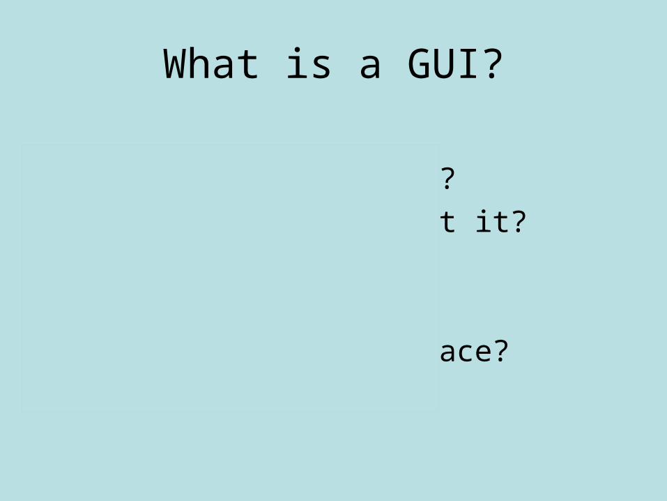
What is a GUI?
• Good User Interaction?
• Gosh, it’s Ugly, Isn’t it?
• Gummed Up by Idiocy?
• Grrr.. U Irritate me!
• Graphical User Interface?
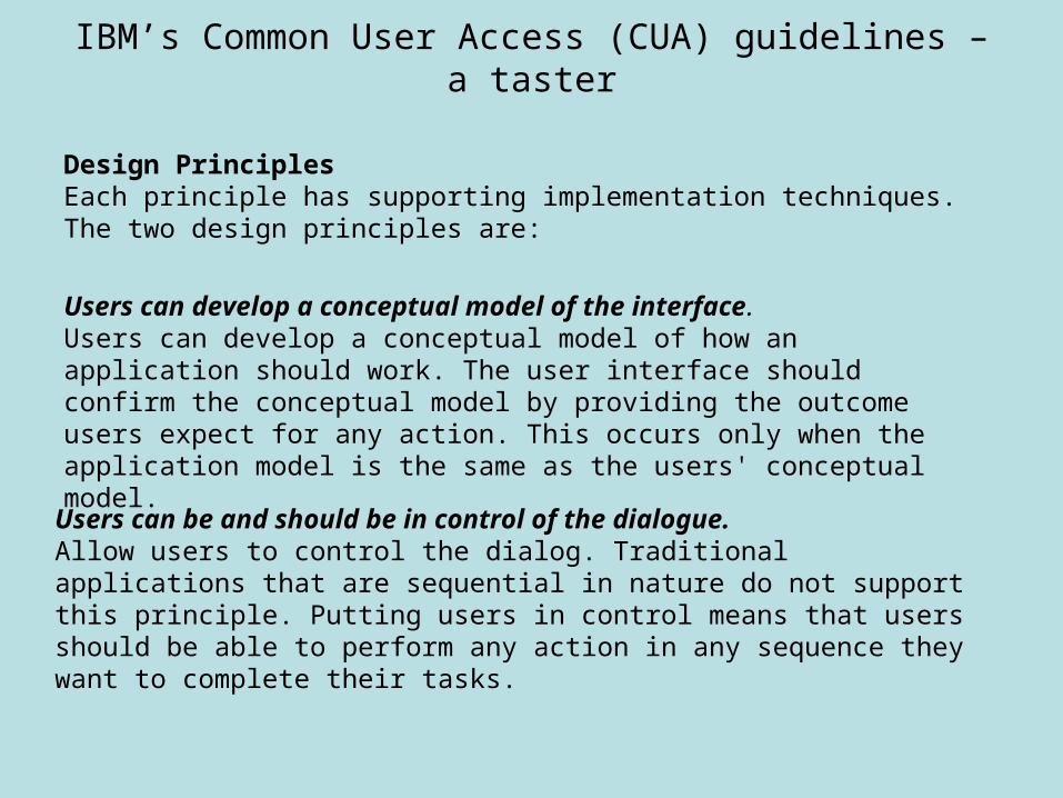
IBM’s Common User Access (CUA) guidelines – a taster
Design PrinciplesEach principle has supporting implementation techniques. The two design principles are:
Users can develop a conceptual model of the interface.Users can develop a conceptual model of how an application should work. The user interface should confirm the conceptual model by providing the outcome users expect for any action. This occurs only when the application model is the same as the users' conceptual model.
Users can be and should be in control of the dialogue.Allow users to control the dialog. Traditional applications that are sequential in nature do not support this principle. Putting users in control means that users should be able to perform any action in any sequence they want to complete their tasks.
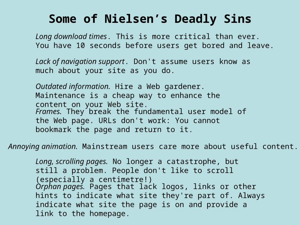
Some of Nielsen’s Deadly SinsLong download times. This is more critical than ever. You have 10 seconds before users get bored and leave.
Lack of navigation support. Don't assume users know as much about your site as you do.
Outdated information. Hire a Web gardener. Maintenance is a cheap way to enhance the content on your Web site.
Frames. They break the fundamental user model of the Web page. URLs don't work: You cannot bookmark the page and return to it.
Annoying animation. Mainstream users care more about useful content.
Long, scrolling pages. No longer a catastrophe, but still a problem. People don't like to scroll (especially a centimetre!)
Orphan pages. Pages that lack logos, links or other hints to indicate what site they're part of. Always indicate what site the page is on and provide a link to the homepage.
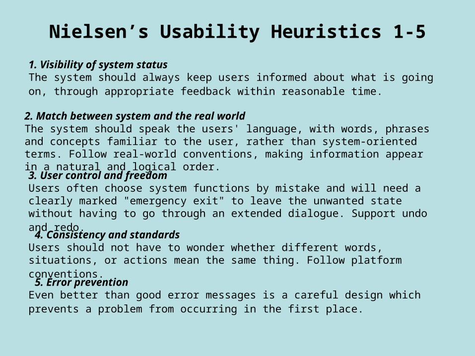
Nielsen’s Usability Heuristics 1-5
1. Visibility of system statusThe system should always keep users informed about what is going on, through appropriate feedback within reasonable time.
2. Match between system and the real worldThe system should speak the users' language, with words, phrases and concepts familiar to the user, rather than system-oriented terms. Follow real-world conventions, making information appear in a natural and logical order.
3. User control and freedomUsers often choose system functions by mistake and will need a clearly marked "emergency exit" to leave the unwanted state without having to go through an extended dialogue. Support undo and redo.
4. Consistency and standardsUsers should not have to wonder whether different words, situations, or actions mean the same thing. Follow platform conventions.
5. Error preventionEven better than good error messages is a careful design which prevents a problem from occurring in the first place.
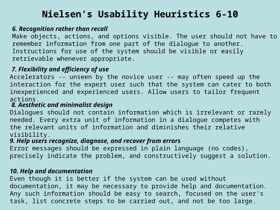
Nielsen’s Usability Heuristics 6-10
6. Recognition rather than recallMake objects, actions, and options visible. The user should not have to remember information from one part of the dialogue to another. Instructions for use of the system should be visible or easily retrievable whenever appropriate.
7. Flexibility and efficiency of useAccelerators -- unseen by the novice user -- may often speed up the interaction for the expert user such that the system can cater to both inexperienced and experienced users. Allow users to tailor frequent actions.
8. Aesthetic and minimalist designDialogues should not contain information which is irrelevant or rarely needed. Every extra unit of information in a dialogue competes with the relevant units of information and diminishes their relative visibility.
9. Help users recognize, diagnose, and recover from errorsError messages should be expressed in plain language (no codes), precisely indicate the problem, and constructively suggest a solution.
10. Help and documentationEven though it is better if the system can be used without documentation, it may be necessary to provide help and documentation. Any such information should be easy to search, focused on the user's task, list concrete steps to be carried out, and not be too large.
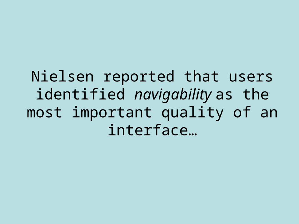
Nielsen reported that users identified navigability as the most important
quality of an interface…
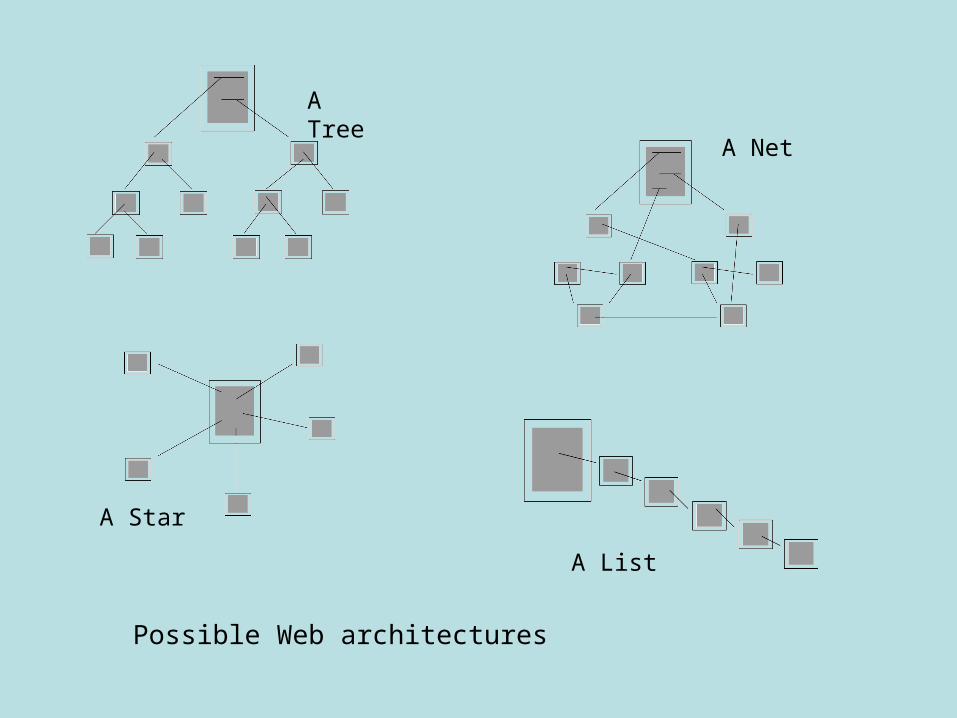
A Tree
A Star
A Net
A List
Possible Web architectures
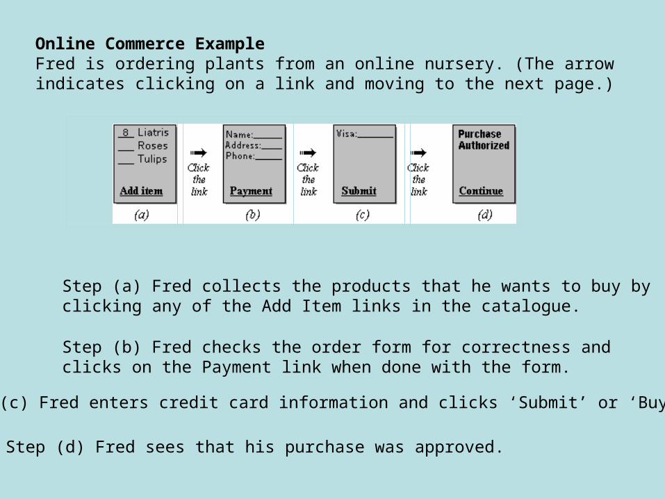
Online Commerce ExampleFred is ordering plants from an online nursery. (The arrow indicates clicking on a link and moving to the next page.)
Step (a) Fred collects the products that he wants to buy by clicking any of the Add Item links in the catalogue.
Step (b) Fred checks the order form for correctness and clicks on the Payment link when done with the form.
Step (c) Fred enters credit card information and clicks ‘Submit’ or ‘Buy’.
Step (d) Fred sees that his purchase was approved.
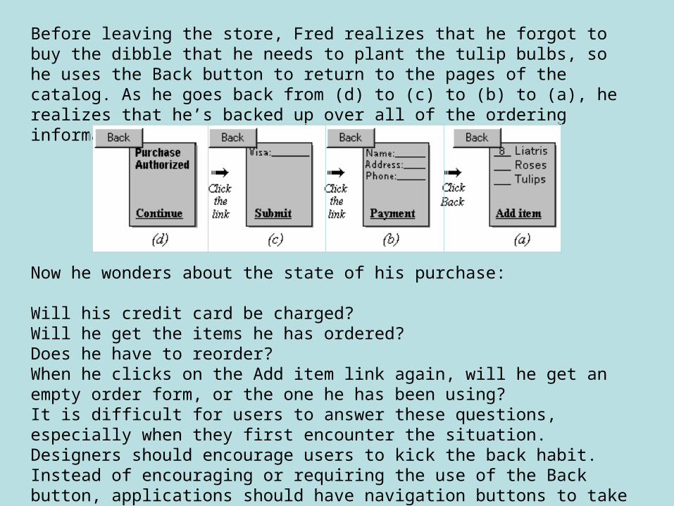
Before leaving the store, Fred realizes that he forgot to buy the dibble that he needs to plant the tulip bulbs, so he uses the Back button to return to the pages of the catalog. As he goes back from (d) to (c) to (b) to (a), he realizes that he’s backed up over all of the ordering information.
Now he wonders about the state of his purchase:
Will his credit card be charged? Will he get the items he has ordered? Does he have to reorder? When he clicks on the Add item link again, will he get an empty order form, or the one he has been using?It is difficult for users to answer these questions, especially when they first encounter the situation. Designers should encourage users to kick the back habit. Instead of encouraging or requiring the use of the Back button, applications should have navigation buttons to take users directly to where they need to go.
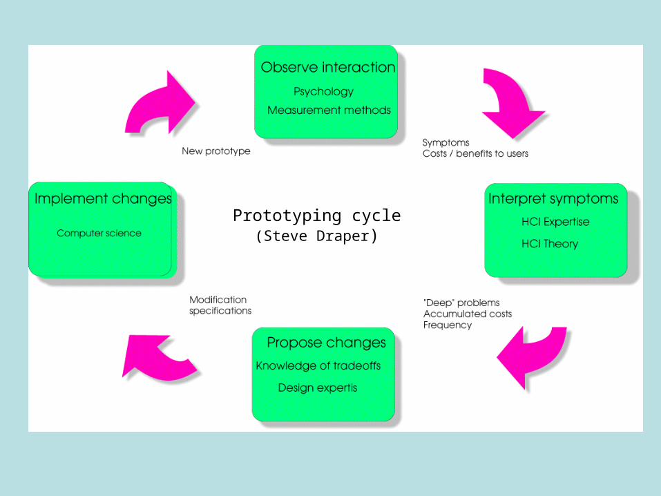
Prototyping cycle(Steve Draper)
And finally…
Please read this paper by Nigel Bevan.
Thank you.