Embed Size (px)
Citation preview

UNIT 7
MO
BILE A
PPL ICAT IO
NS

OBJECTIVES
CO3 Create a website that is optimized for viewing on a mobile device.
2

LEARNING OUTCOMES
LO35 Explain the use of progressive enhancement.
LO36 Create an application plan.LO37 Use media queries to support
various devices.LO38 Use mobile meta tags to optimize a
Web page for mobile.LO39 Describe guidelines for creating a
mobile website.LO40 Use a validator to test a Web page.LO41 Use emulators to test a Web page.LO42 Describe the characteristics of
various mobile design patterns.3

MOBILE APPLICATION DESIGN GUIDELINES Make sure that the content
displayed to mobile devices has the same meaning (if not the exact wording) as that displayed to non-mobile devices.
Add enhancements to your pages that reflect the capabilities of the user agents.
Use graceful degradation to help older and less capable browsers view your content.
Test all your pages on as many devices and browsers as you can find.
4
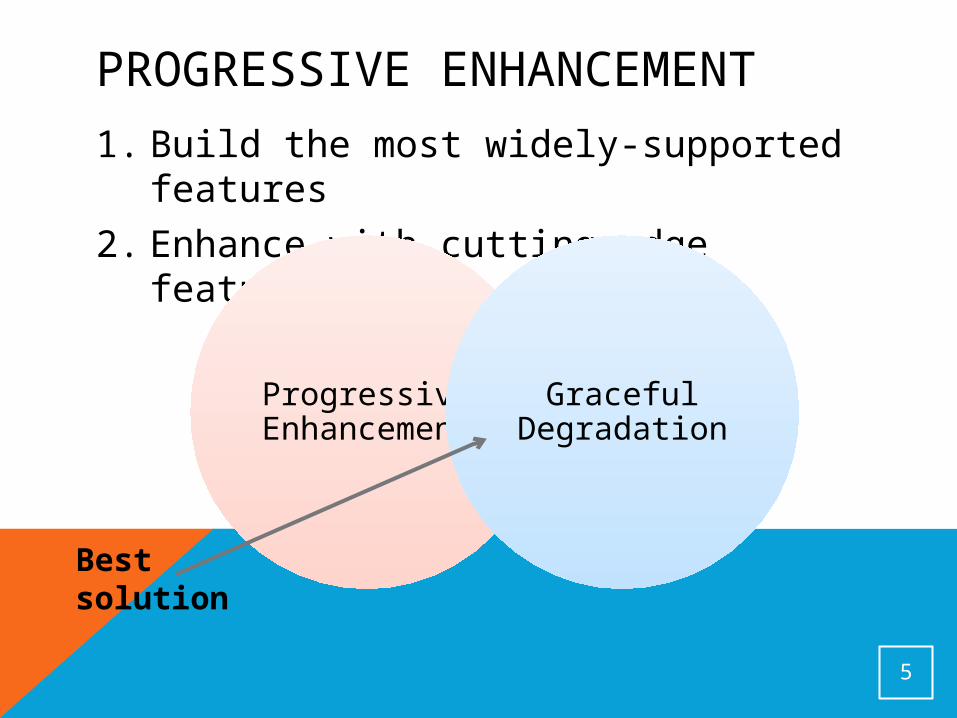
PROGRESSIVE ENHANCEMENT
1. Build the most widely-supported features
2. Enhance with cutting-edge features
5
Progressive Enhanceme
nt
Graceful Degradation
Best solution
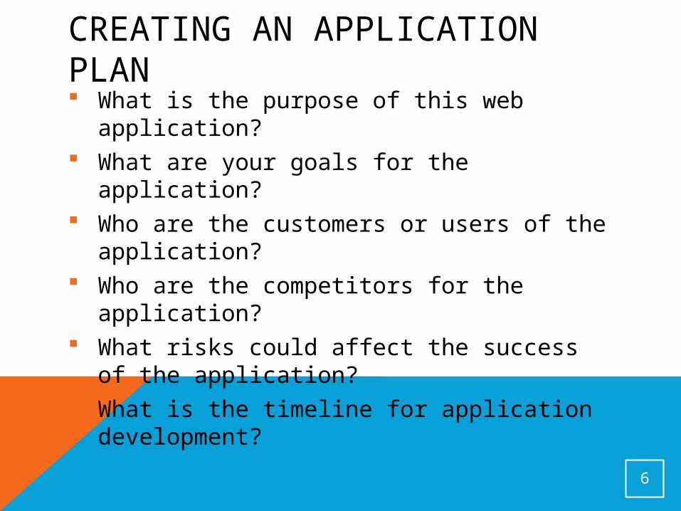
CREATING AN APPLICATION PLAN What is the purpose of this web
application? What are your goals for the application? Who are the customers or users of the
application? Who are the competitors for the
application? What risks could affect the success of
the application? What is the timeline for application
development?
6
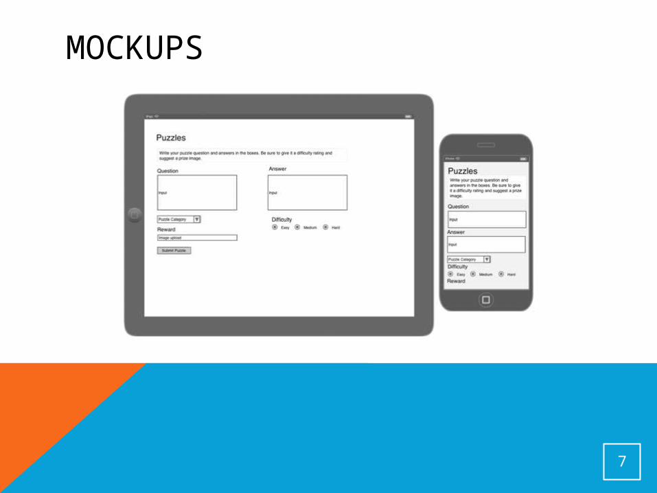
MOCKUPS
7
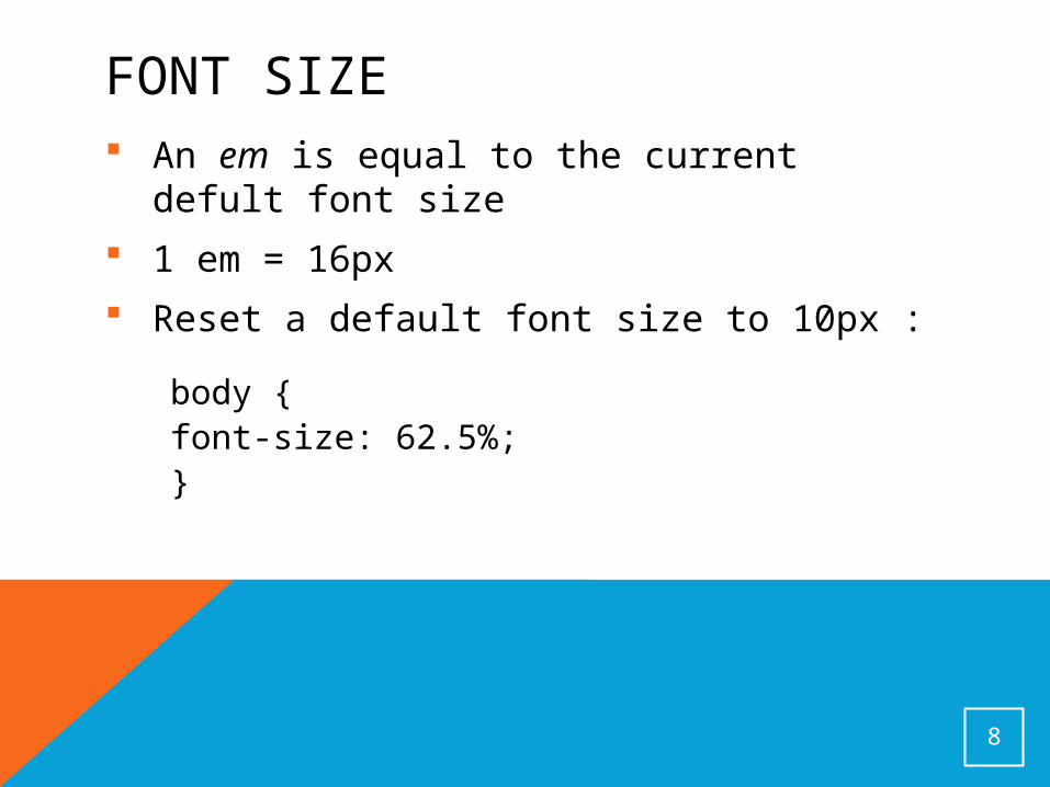
FONT SIZE An em is equal to the current defult
font size
1 em = 16px
Reset a default font size to 10px :
body {font-size: 62.5%;}
8

FORMATTING <P> ELEMENT Set font size to 14px
Specify line height to widen the space between lines
p {font-size: 1.4em;line-height: 1.8em;}
9

SMARTPHONE FONT SUPPORT Most smartphones and tables only
have a few fonts
Android comes with three• Droid Sans
• Droid Mono
• Droid Serif
iOS comes with more than three, but fewer than desktop computers
10

FONT GUIDELINES
Limit page to two or three typefaces
Body text and headlines
• Use serif or sans serif fonts
11
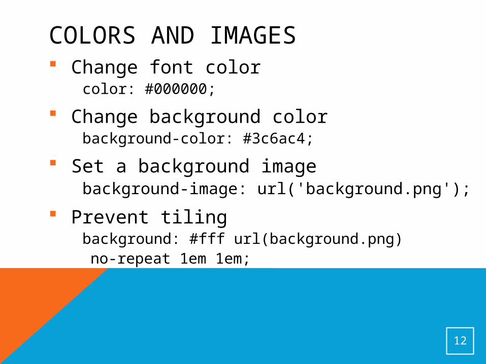
COLORS AND IMAGES Change font color
color: #000000;
Change background colorbackground-color: #3c6ac4;
Set a background imagebackground-image: url('background.png');
Prevent tilingbackground: #fff url(background.png) no-repeat 1em 1em;
12
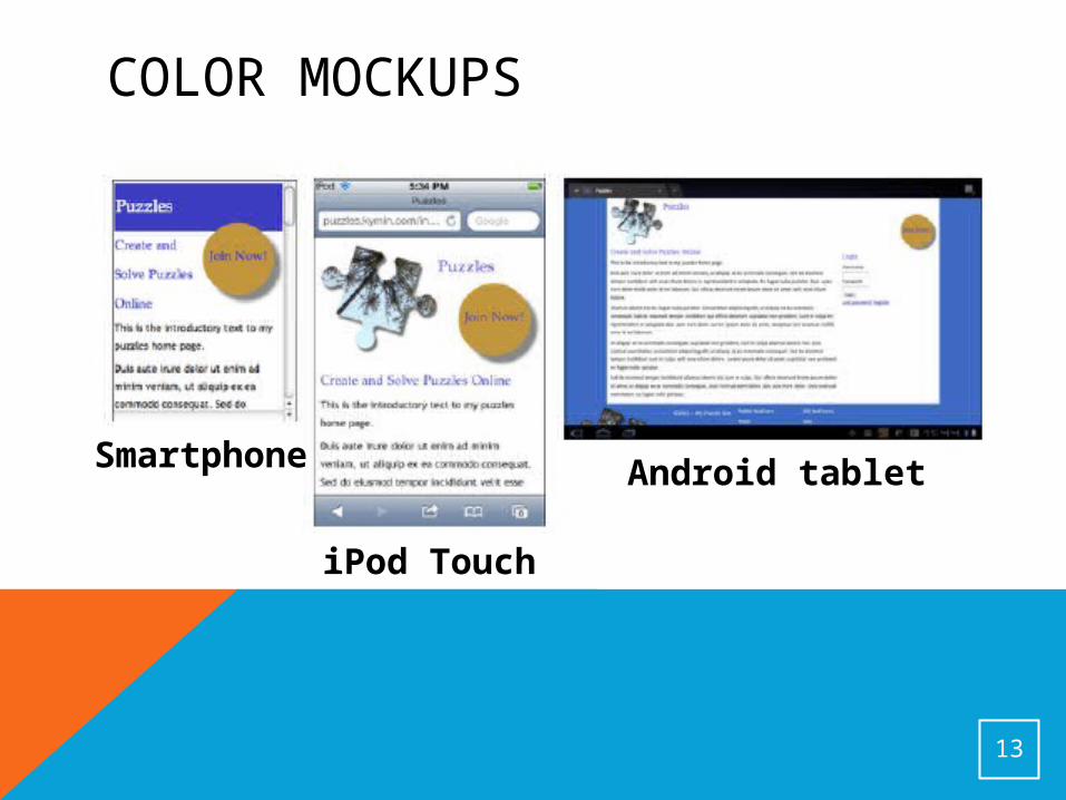
COLOR MOCKUPS
13
Smartphone
iPod Touch
Android tablet
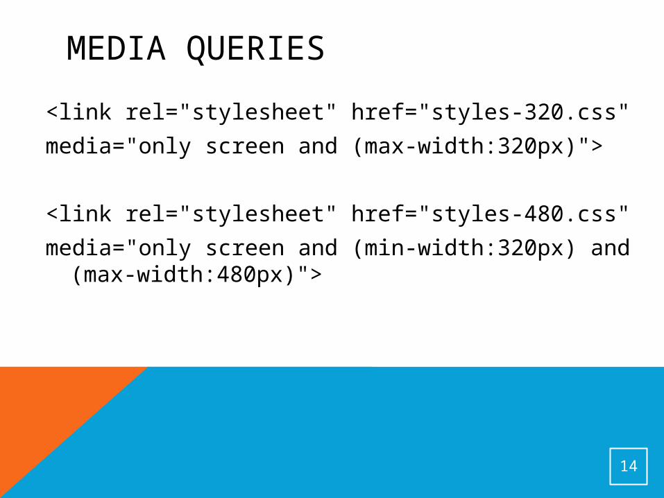
MEDIA QUERIES
<link rel="stylesheet" href="styles-320.css"
media="only screen and (max-width:320px)">
<link rel="stylesheet" href="styles-480.css"
media="only screen and (min-width:320px) and (max-width:480px)">
14

VIEWPORT META TAG<meta name="viewport" content="width=device-width">
Properties: Width Height initial-scale minimum-scale maximum-scale user-scalable
15
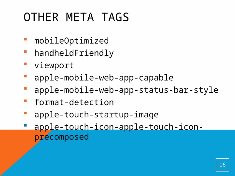
OTHER META TAGS
mobileOptimized handheldFriendly viewport apple-mobile-web-app-capable apple-mobile-web-app-status-bar-style format-detection apple-touch-startup-image apple-touch-icon-apple-touch-icon-
precomposed
16
OPTIMIZING FOR MOBILE Keep the design simple
Never use horizontal scrolling
Use big buttons
Always offer a choice of how to view the site
Remember user preference
Make data input as painless as possible
Keep your applications small Add mobile-specific functions Reduce perception of wait times
17
OPTIMIZING FOR MOBILE Optimize all images Use colors that are readable Do not use pixel measurements Keep your content as clear as possible Be careful of technology that might
break on some devices Avoid technology that is known to
break on mobile devices
18
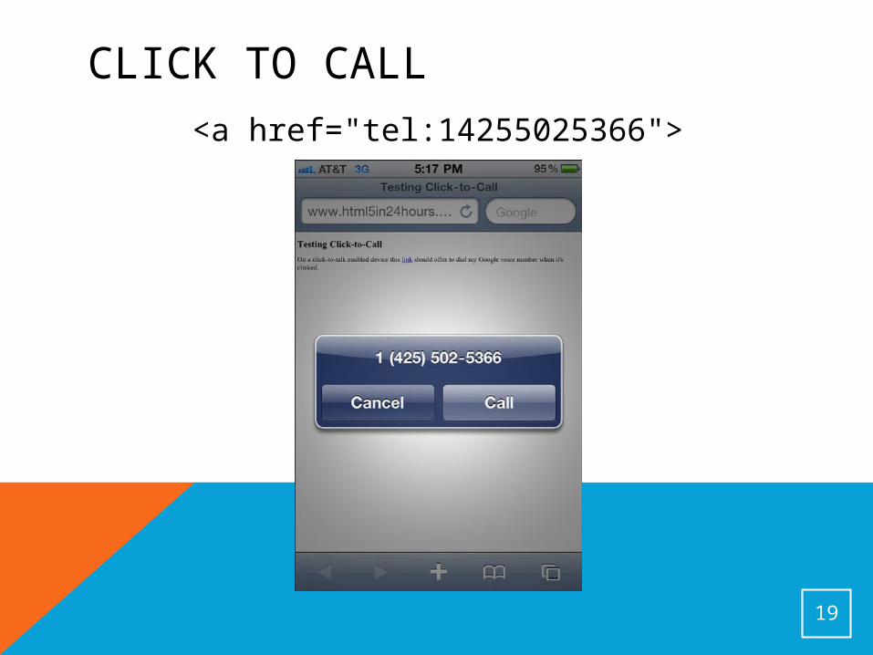
CLICK TO CALL<a href="tel:14255025366">
19
MOBILE CONTENT GUIDELINES
Mobile content should be: Short Direct Easy to use What the customer wants
20
SOME THINGS TO ADD
Back to top links
Email links
Extra services
21

ELEMENTS OF DESIGN
Color
Direction
Lines
Shapes
Texture
22

TOP HEADLINE BLOCK
<style>
h1 {
background-color: #c16f5b;
color: #000;
}
</style>
<h1>Mobile Site</h1>
23
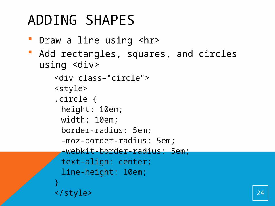
ADDING SHAPES Draw a line using <hr> Add rectangles, squares, and circles using
<div><div class="circle"><style>.circle {height: 10em;width: 10em;border-radius: 5em;-moz-border-radius: 5em;-webkit-border-radius: 5em;text-align: center;line-height: 10em;
}</style>
24

MOBILE DESIGN PATTERNS
Simple designs• Keep number of images to a minimum• Provide material in a single column• Show enough content that the user
doesn't have to click often to go to a new page
Buttons• Place at top
Lists• Easier to read than paragraphs• Keep them short
25
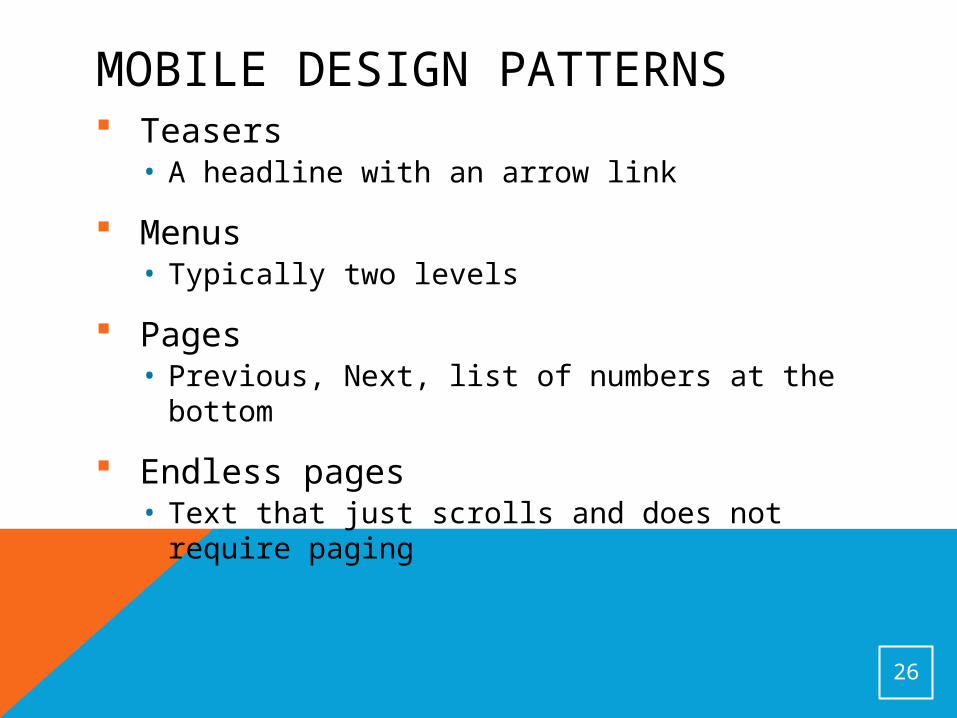
MOBILE DESIGN PATTERNS Teasers
• A headline with an arrow link
Menus• Typically two levels
Pages• Previous, Next, list of numbers at the bottom
Endless pages• Text that just scrolls and does not require
paging
26
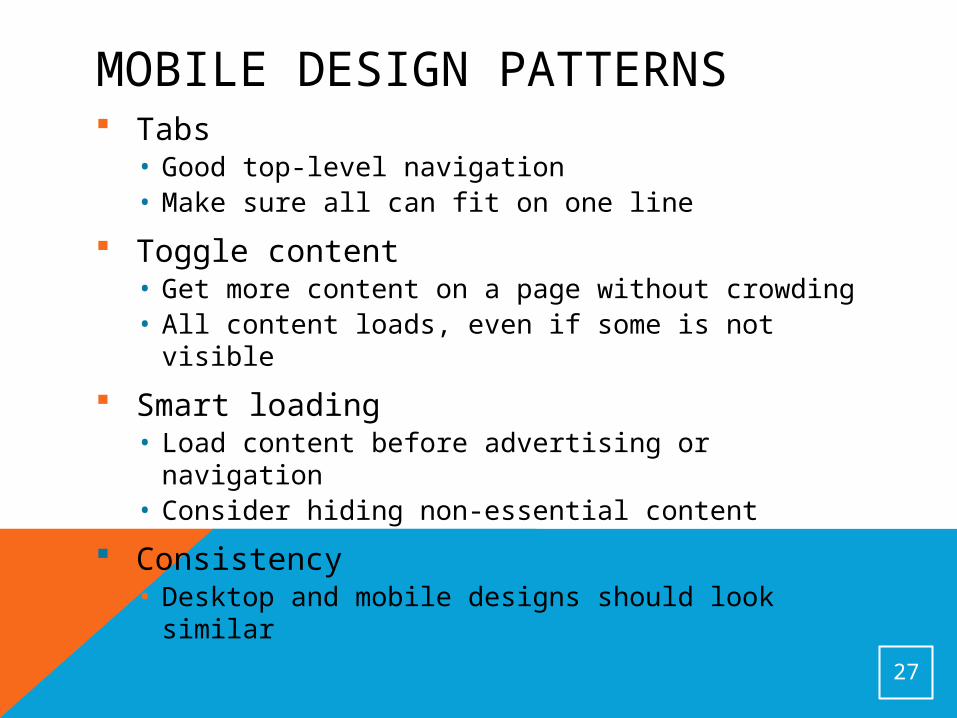
MOBILE DESIGN PATTERNS Tabs
• Good top-level navigation • Make sure all can fit on one line
Toggle content• Get more content on a page without crowding• All content loads, even if some is not visible
Smart loading• Load content before advertising or navigation• Consider hiding non-essential content
Consistency• Desktop and mobile designs should look similar
27
TYPES OF VALIDATORS
HTML validators
Accessibility validators
Code validators
Mobile validators
28

THINGS VALIDATORS WARN ABOUT Page size
Graphic size
Scripts and style sheets
Forms • Text fields are hard on a phone• Radio buttons and checkboxes are better
Access keys• Access keys make buttons and links easier
to click
29
MODERNIZR
Loads and tests the availability of 40 CSS3 and HTML5 functions
Allows you to add your own tests
Enables HTML5 tags in IE 6, 7, and 8
30

WHAT MODERNIZR DOES NOT DETECT Date and color pickers Inability to edit using contenteditable
attribute Support for the preload attribute in
audio and video Support for soft hyphens and the <wbr>
tag Consistent rendering of HTML entities PNG alpha transparency
31
HTML5 MOBILE FRAMEWORKS
Sencha Touch
jQuery Mobile
Jo
PhoneGap
32
TESTING AN APPLICATION
Purchase or rent a device
Ask someone to test it for you
Use an emulator
33

DESKTOP EMULATORS
34
Browser Emulator
Android http://developer.android.com/sdk/index.html
iOS http://developer.android.com/sdk/index.html
WebOS http://developer.palm.com/index.php?option=com_content&view=article&id=1788&Itemid=55
Blackberry http://us.blackberry.com/developers/resources/simulators.jsp
Windows Phone
www.microsoft.com/downloads/en/details.aspx?FamilyID=04704acf-a63a-4f97-952c-8b51b34b00ce
Opera Mobile www.opera.com/developer/tools/
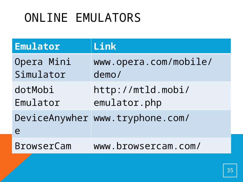
ONLINE EMULATORS
35
Emulator LinkOpera Mini Simulator
www.opera.com/mobile/demo/
dotMobi Emulator
http://mtld.mobi/emulator.php
DeviceAnywhere
www.tryphone.com/
BrowserCam www.browsercam.com/
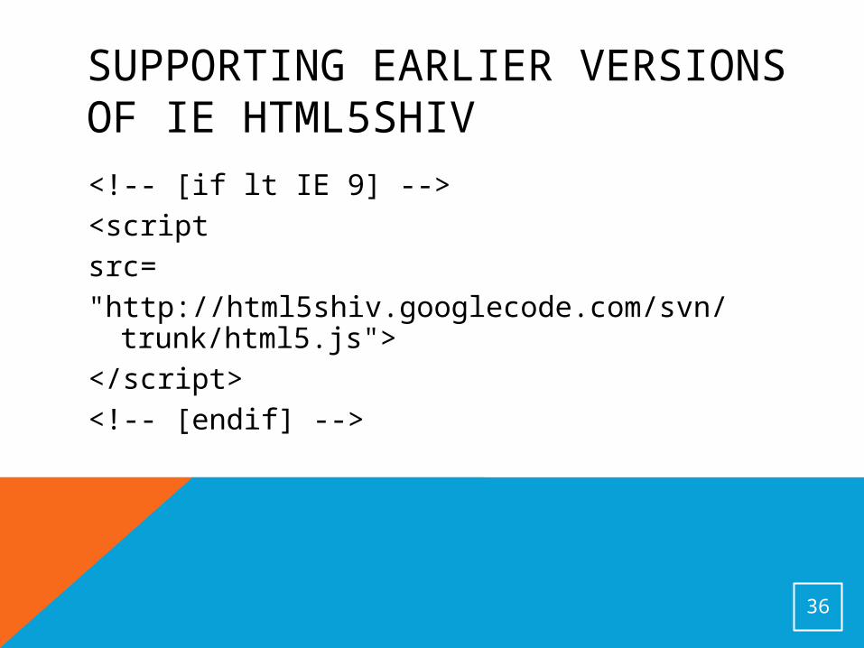
SUPPORTING EARLIER VERSIONS OF IE HTML5SHIV<!-- [if lt IE 9] --><scriptsrc="http://html5shiv.googlecode.com/svn/trunk/html5.js">
</script><!-- [endif] -->
36
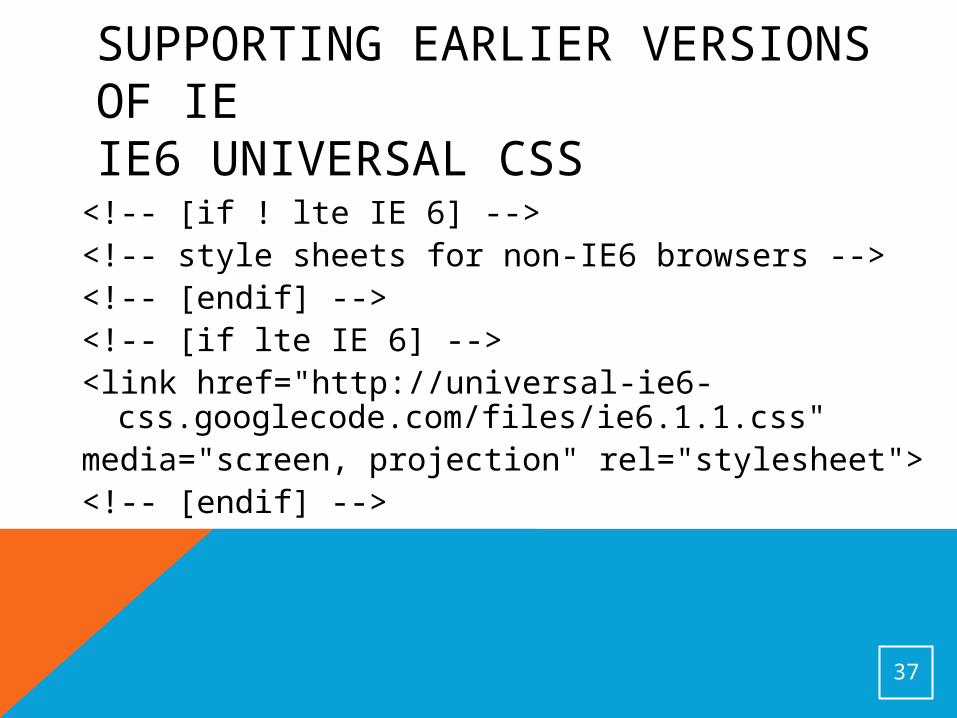
SUPPORTING EARLIER VERSIONS OF IE IE6 UNIVERSAL CSS<!-- [if ! lte IE 6] --><!-- style sheets for non-IE6 browsers --><!-- [endif] --><!-- [if lte IE 6] --><link href="http://universal-ie6-css.googlecode.com/files/ie6.1.1.css"
media="screen, projection" rel="stylesheet"><!-- [endif] -->
37
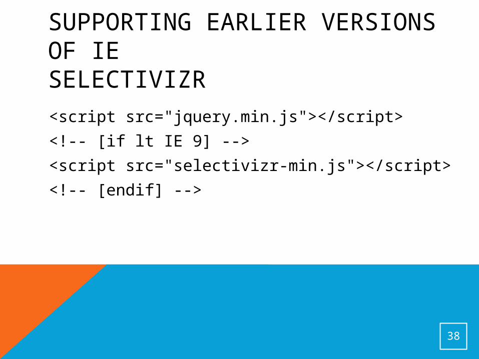
SUPPORTING EARLIER VERSIONS OF IESELECTIVIZR<script src="jquery.min.js"></script>
<!-- [if lt IE 9] -->
<script src="selectivizr-min.js"></script>
<!-- [endif] -->
38