Embed Size (px)
Citation preview
8/13/2019 Upper & lower case: Volume 11—Issue 2
http://slidepdf.com/reader/full/upper-lower-case-volume-11issue-2 1/80
9 O K/E (ES 5 []
Qg kikkANYv Zz 1234567d Bb CcDdEeFfGgHhIiJjKkLIMmNn O0Pp
TYPOGRAPHICS PUBLISHED BY INTERNATIONAL TYPEFACE CORPORATION, VOLUME ELEVEN, NUMBER TWO, AUGUST 1984
8/13/2019 Upper & lower case: Volume 11—Issue 2
http://slidepdf.com/reader/full/upper-lower-case-volume-11issue-2 2/80
2
VOLUME ELEVEN, NUMBER TWO, AUGUST, 1984
EDITOR: EDWARD GOTTSCHALL
ART DIRECTOR: BOB FARBER
EDITORIAL DIRECTORS: AARON BURNS, EDWARD RONDTHALER
ASSOCIATE EDITOR: MARION MULLER
ASSISTANT EDITOR: JULIET TRAVISON
CONTRIBUTING EDITOR: ALLAN HALEY
RESEARCH DIRECTOR: RHODA SPARBER LUBALIN
BUSINESS MANAGER: JOHN PRENTKI
ADVERTISING/PRODUCTION MANAGER: HELENA WALLSCHLAG
ASSISTANT ART DIRECTOR: ILENE MEHL
ART/PRODUCTION: TERRI BOGAARDS, SID TIMM
SUBSCRIPTIONS: ELOISE COLEMAN
C INTERNATIONAL TYPEFACE CORPORATION 1984
U&LC (ISSN 0362 6245) IS PUBLISHED QUARTERLY BY INTERNATIONAL TYPE-
FACE CORPORATION, 2 DAG HAMMARSKJOLD PLAZA, NEW YORK, N.Y. 10017.
A JOINTLY OWNED SUBSIDIARY OF LUBALIN, BURNS & CO.. INC. AND PHOTO-
LETTERING, INC. U.S SUBSCRIPTION RATES S10 ONE YEAR: FOREIGN SUBSCRIP-
TIONS. S15 ONE YEAR: U.S. FUNDS DRAWN ON U.S. BANK. FOREIGN AIR MAIL
SUBSCRIPTIONS-PLEASE INQUIRE. SECOND-CLASS POSTAGE PAID AT NEW YORK,
N.Y. AND ADDITIONAL MAILING OFFICES. POSTMASTER: SEND ADDRESSCHANGES TO U&LC. SUBSCRIPTION DEPARTMENT, 866 SECOND AVENUE,
NEW YORK, N.Y. 10017.
ITC FOUNDERS:
AARON BURNS. PRESIDENT
EDWARD RONDTHALER, CHAIRMAN EMERITUS
HERB LUBALIN, EXECUTIVE VICE PRESIDENT 1970-1981
ITC OFFICERS 1984:
GEORGE SOHN, CHAIRMAN
AARON BURNS, PRESIDENT
EDWARD GOTTSCHALL, EXECUTIVE VICE PRESIDENT
BOB FARBER. SENIOR VICE PRESIDENT
JOHN PRENTKI, SENIOR VICE PRESIDENT AND GENERAL MANAGER
EDWARD BENGUIAT, VICE PRESIDENT
ALLAN HALEY. VICE PRESIDENT
MICROFILM COPIES OF U&LC MAY BE OBTAINED FROM MICRO PHOTO DIVISION.
BELL & HOWELL, OLD MANSFIELD ROAD, WOOSTER, OH 44691
In this issue:
Editorial
A preview of U&Ic fu ture p lans to he lp novice and exper ienceddesigners embrace the new technologies w ithout sacr i f ic ingesthetics. Page 2
Thoughts
Some sage observations about Youth and Age. Page 3
The Genie in the Tiffany Lamp
One m ore look at the fabulous lamps, with special attention totheir luminous, multi-faceted creator, Louis Comfort Tiffany.Page 4
Lampshades to Wear
A contemporary jewelry designer makes wearable ar t insp iredbyTiffany lamps. Page 8
Saul Mandel
This to ta l ad-man charges in to h is four th decade in the businesswith youthful vigor, irrepressible good humor and a crop of newimages. Page 10
Quon & Quon
Father and son il lustrators shrink the generation gap. Page 14
Tom ChristopherThe fast, fascinating career of a courtroom artist. Page 16
Man Bi tes Man
...but this time it's a woman. Caricaturist Irma Selz' l ife andcontr ibutions are docum ented in a detai led and perceptive bio-graphical sketch by Steven Heller. Page 18
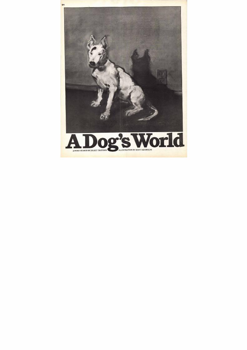
Puzzle: A Dog's World
A word search to keep you occupied through the dog days ofsummer. Page 24
Report from Technopolis -
From out in computer w onder land, David Henry Goodste inrepor ts on improved techniques in co lor graphics and new prod-ucts like video jukeboxes, video camera/recorders, and more.Page 26
Two Alphabets
Elfabet and Action Alphabet are two com pletely di fferentapproaches to alphabet design — typical of the variety of ideassubmitted by our readers. Page 28, 29
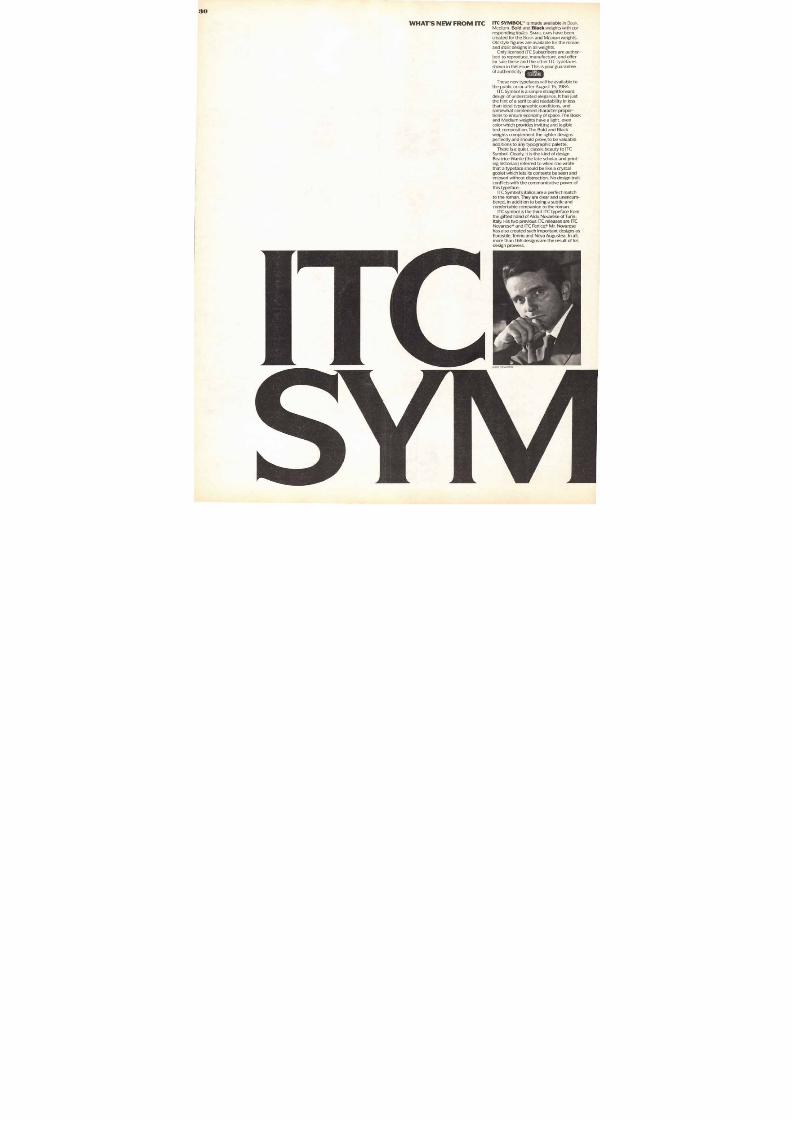
What's Ne w from ITC: ITC Symbol""
This third design created by Aldo Novares e for ITC is a simplestra ightforward design of understated e legance. Page 30
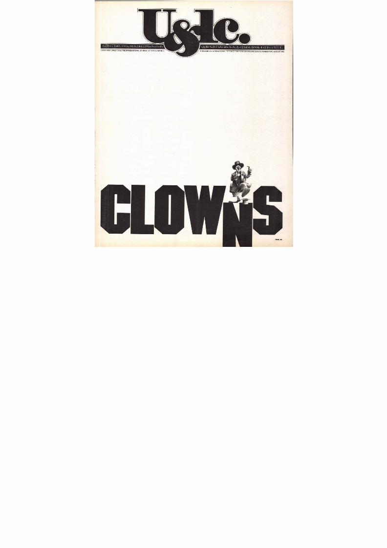
Clowns
Behind the greasepaint, baggy pants and fr ight wigs of real peo-ple engaged in the serious and historic art form, clowning.Page 36
Book Shel f
A browse through the new publ ications re la t ing to ar t , graphics,technology and communicat ions in genera l . Page 45
B. Mar t in Pedersen designed th is issue of U&Ic whi le U&Ic Ar tDirector Bob Farber was on a leave of absence. Readers mayrecall the Flight story and cover of U&Ic in March, 1982. It wasdesigned by Mr. Pedersen and won m any awards throughoutthe industry. His biography appears on page 36 of that issue.
The do do is an extinct, flight-less, unga inly bird. Its foolishappearance gave rise to the
Portuguese word doudo, or fool.Legend also would have us
believe that the dodo flew back-wards because i t was more inter-ested in where it came from thanin where it was going.
Today there is a bit of reversedodo in all of us. We are so in love
with the new techn ologies, bitsand b ytes, lasers, fiber optics,biogenetic discoveries, man inspace, etc., that we overlook thelessons of the past. We are sopreoccupied with where we aregoing that we forget that thosewho ignore history are doomed torepeat errors of the past.
Thousands, hundreds of thou-sands, and s oon m illions ofpeople with no knowledge of, norsensitivity for, typography orgraphic design wi l l be makingtypographic and design decisions.
We w ould remind them, and
the bottomline-minded people towhom they report, that communi-cation effectiveness is their goaland that the lessons learned bytypographers and designers,when ap pl ied to today's commu-nications, make their messagenot only more p leasing butmore effective—m ore likely to be
COLOPHON
ITC AMERICAN TYPEWRITER* 6 , 17, 39
ITC A V A N T GA RDE GO THIC° 4, 15, 26, 27, 44
ITC BENGUIAT CONDENSED. 4
ITC BERKELEY OLOSTYLE" 8, 19, 20.23
I T C B O O K M A N • 8, 29
I T C C H E L T E N H A M . C O N D E N S E D 1
ITC CUSHING' 4, 25
ITC FRANKLIN GOTHIC. . 12, 18, 19, 36, 37, BA C K C OV ER
ITC GALLIARD" 8
noticed, read, understood,remembered, acted upon.
U&lc plans to do its share ininforming and sens itizing thosenew to the w orld of typograph ics.Our present 'Typog raphic Mi le-stones series is one small step inthis direction. Soon the FY(t)I (ForYour T ypographic Information)series will commence an d, in thenear future, T ypography Today
will, we hope, inform, sensitize andst imulate both experienced andnovice designers. This series ofarticles w ill focus on the art,design and typographic develop-ments of the tw entieth century,and their significance as the cen-tury nears its end. Of course, ourReports from TechnopolisTm andcoverage of com puter graphicswill blend with them to give abalanced picture of where w eare, and where we are going.
We at U&lc hope these serieswill help all our reade rs to betterunderstand how typographic
design developed through the1900s, and thus to have a keenersense and warmer feeling of howto practice it today and tomorrow.
We ll do our best to help pre-vent the explosively expandinguniverse of design decision mak-ers from becoming either dodosor reverse dodos.
I T C M A C H I N E * FRONT COVER, 36, 37
ITC NEWTEXT• 2
ITC SOUVENIR* 43
ITC SYMBOL' 2 3 30-35
ITC TIFFA N Y 5-7 , 9
I T C U S H E R W O O D " 10, 1_1, 45
ITC VELJOVIC" 40, 41
ITC ZAPF BOOK* 26, 27
EDITORIAL
ONCE AGAIN
W H A T ' SP A S T I SPROLOGUE.R OLOG OS I (_ ,R EEK) IN TR OD t C L ION TO A P LA Y OR S P EECH
MASTHEAD: ITCNEWTEXT REGULAR TABLE OF CONTENTS: ITC SYMBOL BOOK BOLD
HEADLINE/INITIAL: MEDIUMSUPRAHEADS: BLACK TEXT: MEDIUMITALIC
COLOPHON: ITC FRANKLIN GOTHICBOOK FOOTNOTE: HEAVY, HEAVY ITALIC
Please note: The date of this issue of Ualc,Vol.11, No. 2,Is August 1984. It Is being distributed at the
usual time for the June Issue which it replaces. U&Ic will continue to reach you on the customary date,
but issues will be labeled February, May, August, November.
8/13/2019 Upper & lower case: Volume 11—Issue 2
http://slidepdf.com/reader/full/upper-lower-case-volume-11issue-2 3/80
3
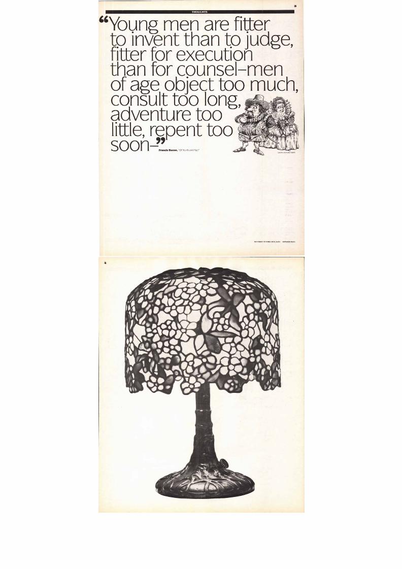
T H O U G H T S
Y ou n g m en ar e fitte r
to in ven t th an to ju d ge ,fitter for ex ecu tionth a n fo r c Q u n se l-m e n
o f a g e o bje c t t o o u c h ,co n su lt to o lo n g , \or
a d v e n tu r e to o 4 7 1 p b
lit tle , rep en t toosoon Francis Bacon, "Of Youth and Age"
I LLU ST R A T IO N B Y WA LK NE I B A R T
TEXT 'CREDIT: ac SYMBOL BOOK. BLACK SUPRAHEAD: BLACK
8/13/2019 Upper & lower case: Volume 11—Issue 2
http://slidepdf.com/reader/full/upper-lower-case-volume-11issue-2 4/80
8/13/2019 Upper & lower case: Volume 11—Issue 2
http://slidepdf.com/reader/full/upper-lower-case-volume-11issue-2 5/80
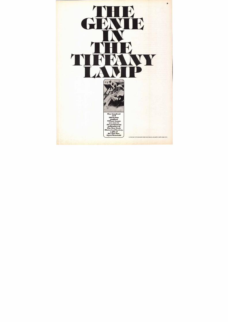
5
GE 1EIli
'r1i EIFIfi lkAW
LAMI'
One hundred
and
thirty-two
magical
Tiffany lamps
are now in
the permanent
collection of
The New-YorkHistorical Society,
agiftof
Dr. and Mrs.Egon Neustadt
COURTESY OF THE NEW-YORK HISTORICAL SOCIETY, NEW YORK CITY.
8/13/2019 Upper & lower case: Volume 11—Issue 2
http://slidepdf.com/reader/full/upper-lower-case-volume-11issue-2 6/80
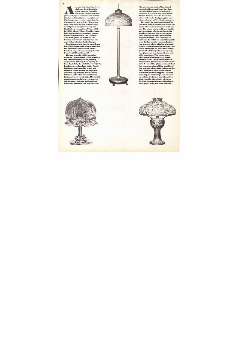
Anyone who had the fore-
sight, or just the plain
good luck, to invest in
even one Tiffany leaded-
glass lamp (not to mention a collec-
tion) is entitled to feel complacent.
The lamps are treasures today. So
it's ironic to learn that, fifty years
ago, they were so out of favor you
could pick one up for a song at a
thrift shop or auction. Worse still,
in 1932, when Tiffany Studios went
into bankruptcy, countless lamps
were slaughtered at the Corona,
New York plant, to retrieve the
bronze which was considered the
only thing of value in the lamps.
In a strange and poetic way, those
jewel-like lamps are a metaphor for
the luminous, iridescent, multi-
faceted, super human being, Louis
Comfort Tiffany, himself.
He was born in 1848, into thatwealthy Tiffany family that founded
the esteemed silver and jewelry
emporium, Tiffany & Company, in
New York City. To his father's regret,
Louis rejected a place in the family
business and opted to study art
instead. After a number of years
devoted to painting, his esthetic
interest shifted to decorative ob-
jects and interior design. His social
position opened doors to some of
the most prominent and opulent
homes in America. He had no trou-
ble attracting such affluent and
notable clients as Cornelius Van-
derbilt, Lily Langtry, President
Chester A. Arthur and even Mark
Twain. He also received commis-
sions to help in designing the inte-
riors of several New York theaters.
The more he involved himself in
interior design and decoration, the
more obsessed he became with the
need to control the entire esthetic
environment of a home; from the
smallest lamp to the large cathe-
dral windows which were all the
rage in the late 19th century. To
that end, in 1885, he established his
own design studio to manufacture
the stained-glass windows, lamps,
jewelry, mosaics and bronze art ob-
jects. Althoughhecalled his enter-
prise The Tiffany Glass Company,
the glass was purchased from out-
side suppliers. The innocuouscharacter of commercial glass,
however, and the prevailing taste
for painted glass were anathema to
him. None of the glass available had
the luminous, jewel-like quality of
the stained-glass used in true cathe-
dral windows. That was what he
was after, and with typical Tiffany
tenacity, he took steps to solve the
problem. He immersed himself in
studying the chemistry of glass.
He also imported specialists from
Europe to help him and, in 1893,
8/13/2019 Upper & lower case: Volume 11—Issue 2
http://slidepdf.com/reader/full/upper-lower-case-volume-11issue-2 7/80
• 110Poirier 4& a r i• ‘. . 4 , 4 4 4 , A 44 0-Frit* -
‘4 ‘%4114% . ' * 1 - 4 - a .4 i i e . . . . .°4.4-4•4..
16 lb • • • • 1 0 0• 411. „ .
, y1 t._ NA . . . A ;mr. kip, .it,41- *4g .
I 6IP IIII
1 Ii h ‘ v o . 0 4 0 : 4 - 4 004
$3, V*Ar iAlt ‘f li r a t .t ik i l M f ati,404010-4101.10hPel;
4;1" Vwit*05V 4 S
7
perimentation
under his direction,
and variegated colors and tex-
lightbehind them, they
It was with such
Pyrite, that he cre-
amps that were a
in every fashionable home.
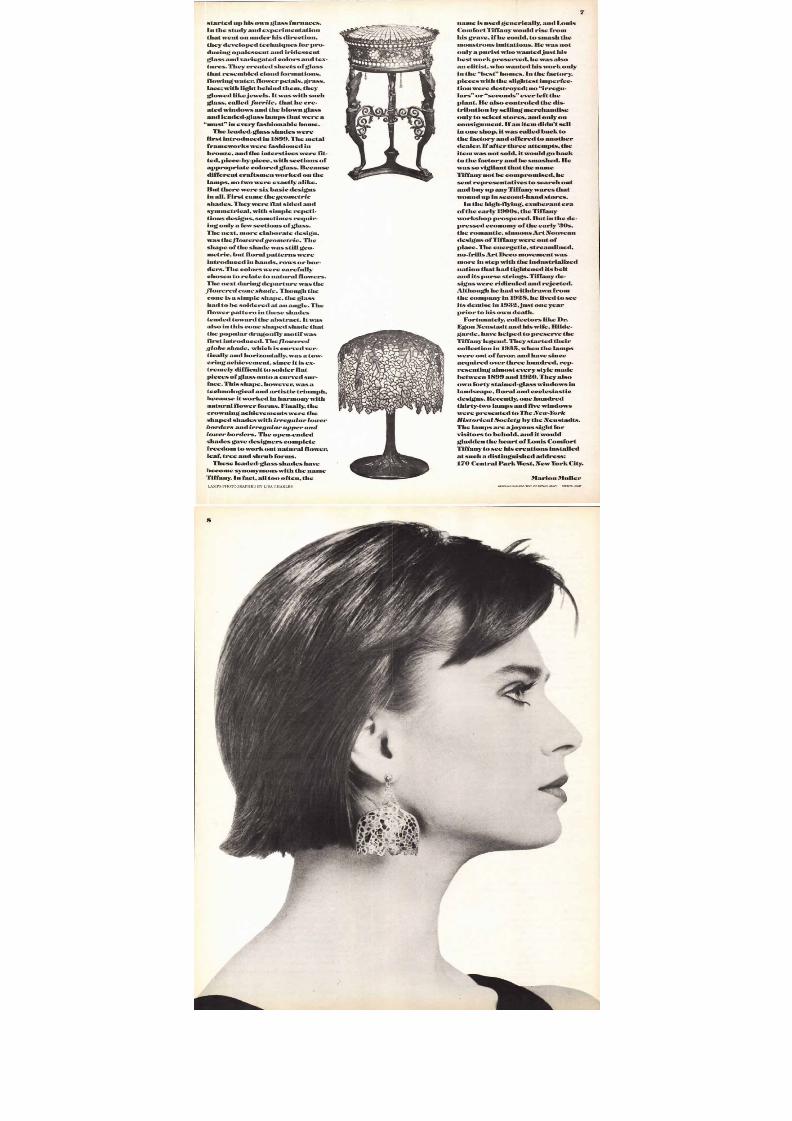
The leaded-glass shades were
introduced in 1899. The metal
erent craftsmen worked on the
re exactly alike.ut there were six basic designs
First came thegeometric
ided and
etrical, with simple repeti-
t, more elaborate design,
theflowered geometric. The
s still geo-
tural flowers.
Though the
The
n these shades
the abstract. It was
his cone shaped shade that
Theflowered
which iscurved ver-
and horizontally, was a tow-
ent, since it is ex-
glass onto a curved sur-
ical and artistic triumph,
worked in harmony with
s. Finally, the
ts were the
irregular lower
andirregular upper and
ers. The open-ended
t natural flower,
tree and shrub forms.
These leaded-glass shades have
s with the name
too often, the
name is used generically, and Louis
Comfort Tiffany would rise from
his grave, if he could, to smash the
monstrous imitations. He was not
only a purist who wanted just his
best work preserved, hewas also
an elitist, who wanted his work only
in the best homes. In the factory,
pieces with the slightest imperfec-
tion were destroyed; no irregu-
lars or seconds ever left the
plant. He also controled the dis-
tribution by selling merchandise
only to select stores, and only on
consignment. If an item didn't sell
in one shop, it was called back to
the factory and offered to another
dealer. If after three attempts, the
item was not sold, it would goback
to the factory and be smashed. He
was so vigilant that the name
Tiffany not be compromised, he
sent representatives to search outand buy up any Tiffany wares that
wound up in second-hand stores.
In the high-flying, exuberant era
of the early 1900s, the Tiffany
workshop prospered. But in the de-
pressed economy of the early '30s,
the romantic, sinuous Art Nouveau
designs of Tiffany were out of
place. The energetic, streamlined,
no-frills Art Deco movement was
more in step with the industrialized
nation that had tightened its belt
and its purse strings. Tiffany de-signs were ridiculed and rejected.
Although he had withdrawn from
the company in 1928, he lived to see
its demise in 1932, just one year
prior to his own death.
Fortunately, collectors like Dr.
Egon Neustadt and his wife, Hilde-
garde, have helped to preserve the
Tiffany legend. They started their
collection in 1935, when the lamps
were out of favor, and have since
acquired over three hundred, rep-
resenting almostevery style made
between 1899 and 1920. They also
own forty stained-glass windows in
landscape, floral and ecclesiastic
designs. Recently, one hundred
thirty-two lamps and five windows
were presented to The New-York
Historical Society by the Neustadts.
The lamps are a joyous sight for
visitors to behold, and it would
gladden the heart of Louis Comfort
Tiffany to see his creations installed
at such a distinguished address:
170 Central Park West, New York City.
Marion Muller
HEADLINE/SUBHEAD/TEXT: ITC TIFFANY HEAVY CREDITS: LIGHT
8/13/2019 Upper & lower case: Volume 11—Issue 2
http://slidepdf.com/reader/full/upper-lower-case-volume-11issue-2 8/80
8/13/2019 Upper & lower case: Volume 11—Issue 2
http://slidepdf.com/reader/full/upper-lower-case-volume-11issue-2 9/80
9
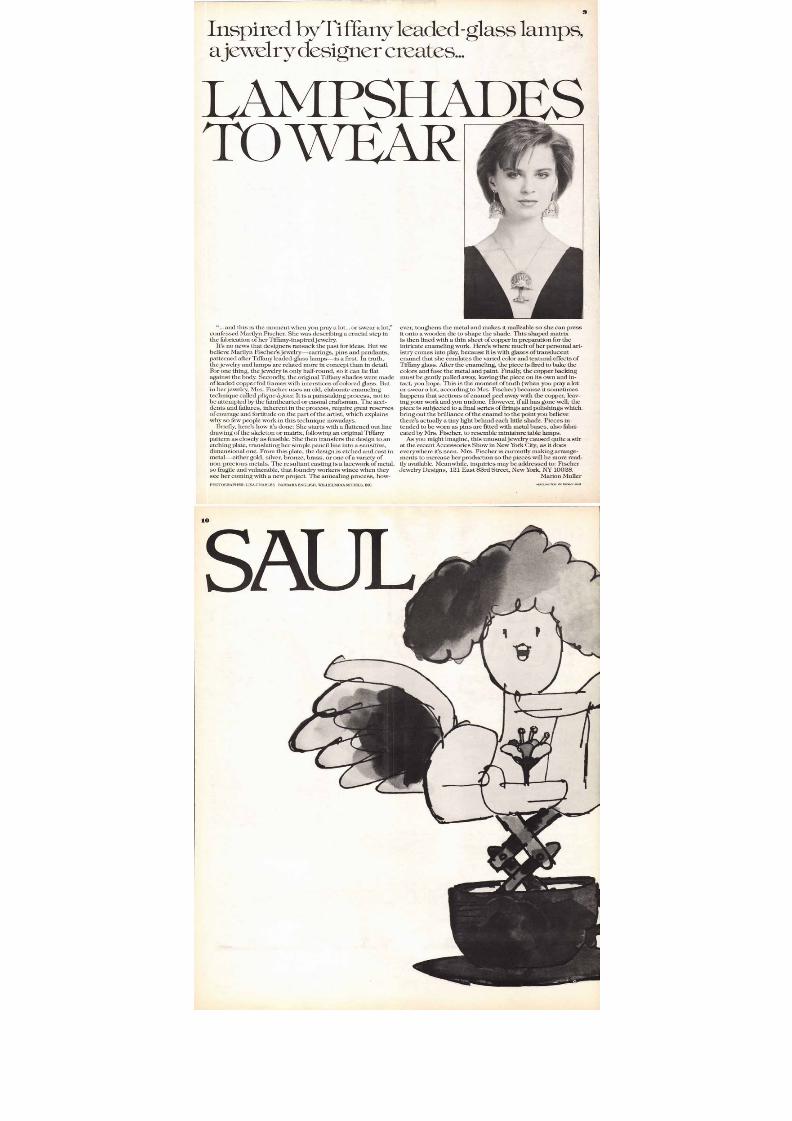
elry designer creates...
A M PSI 'A D E SO W E A R
"... and this is the moment when you pray a lot... or swear a lot,"fessed Marilyn Fischer. She was describing a crucial step in
It's no news that designers ransack the past for ideas. But we
ing, the jewelry is only half-round, so it can lie flat
r jewelry, Mrs. Fischer uses an old, elaborate enamelingplique-ajoun It is a painstaking process, not to
attempted by the fainthearted or casual craftsman. The acci-nts and failures, inherent in the process, require great reserves
few people work in this technique nowadays.Briefly, here's how it's done: She starts with a flattened out line
ensional one. From this plate, the design is etched and cast in
-precious metals. The resultant casting is a lacework of metal,
r coming with a new project. The annealing process, how-
A C H A R L E S B A R B A R A E N G L I SH , W I L H E L M I N A M O D E L S , I N C .
ever, toughens the metal and makes it malleable so she can pressit onto a wooden die to shape the shade. This shaped matrixis then lined with a thin sheet of copper in preparation for theintricate enameling work. Here's where much of her personal art-istry comes into play, because it is with glazes of translucentenamel that she emulates the varied color and textural effects ofTiffany glass. After the enameling, the piece is fired to bake the
colors and fuse the metal and paint Finally, the copper backingmust be gently pulled away, leaving the piece on its own and in-tact, you hope. This is the moment of truth (when you pray a lotor swear a lot, according to Mrs. Fischer) because it sometimeshappens that sections of enamel peel away with the copper, leav-ing your work and you undone. However, if all has gone well, the
piece is subjected to a final series of firings and polishings whichbring out the brilliance of the enamel to the point you believe
there's actually a tiny light behind each little shade. Pieces in-tended to be worn as pins are fitted with metal bases, also fabri-
cated by Mrs. Fischer, to resemble miniature table lamps.As you might imagine, this unusual jewelry caused quite a stir
at the recent Accessories Show in New York City; as it doeseverywhere it's seen. Mrs. Fischer is currently making arrange-ments to increase her production so the pieces will be more read-
ily available. Meanwhile, inquiries may be addressed to: FischerJewelry Designs, 121 East 83rd Street, New York, NY 10028.
Marion Muller
HEADLINE/TEXT: ITC TIFFANY LIGHT
8/13/2019 Upper & lower case: Volume 11—Issue 2
http://slidepdf.com/reader/full/upper-lower-case-volume-11issue-2 10/80
8/13/2019 Upper & lower case: Volume 11—Issue 2
http://slidepdf.com/reader/full/upper-lower-case-volume-11issue-2 11/80
11
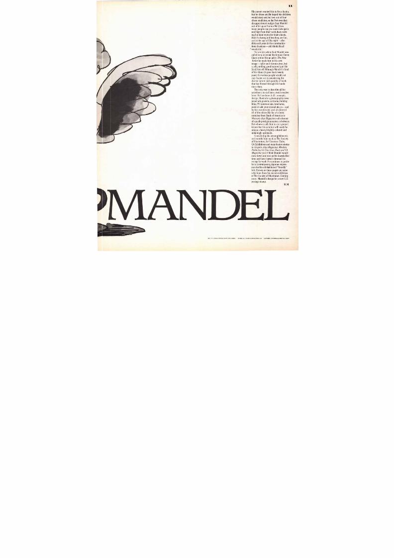
His parents wanted him to be a do ctor,
but h e chose art. He hop ed his children
would study art, but two ou t of fo ur
cho se medicine, so far. Not even that
disappointment nudges Saul Mandelout of h is good hu mo r. Well, how
many peo ple can you name who get areal high from their work, have noth-
ing bu t kind words for th eir clients,think lecturing and teaching are fun,and at the age of fifty-eight—afterthirty-odd years in the communica-
tions bu siness— still think it's all"wonderful."
No wo nder, when S aul Mandel was
called in to re-create the fam ou s Green
Giant symb ol for an ad in T h e N e w
Y o r k e r he m ade him in his ownimage — taller and skinnier, true, but
a jolly, smiling, good-natured guy likeSaul, himself.Although Mandel is fond
of his Giant (it goes back twentyyears) he wishes peop le would notstay fixated on it, considering thediverse nature and quantity of workthat has flowed through his handssince then.
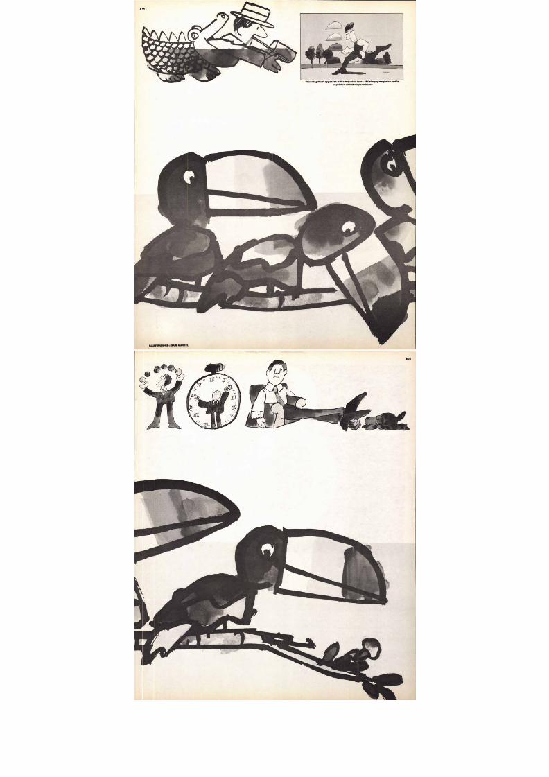
The only way to describe all his
activities is to call him a to tal creativeforce. He has done it all: concepts,design, illustration, ph otograp hy, news-
pap er ads, posters, cartoons, trainingfilms, TV commercials, brochures,
po int-of-sale prom otional pieces— and
he has coordinated and art-directedall of the abo ve. His list of clients
stretches from Bank of Am erica to
W o m a n s D a y M a g a z i n e , with dozensof equally prestigious nam es in between.
But whoev er calls him in on a project
knows that h is solution will surely beunique, cheery, brightly colored andunfailingly optimistic.
Considering his accom plishments
and awards from such as The So cietyof Illustrators,Art Directors Clubs,CA Exh ibitions and many feature stories
in G r a p h i s , I d e a M a g a z i n e , M o d e r n
P u b l i c it y A r t D i r e c ti o n , P r i n t a n d C A
M a g a z i n e , you'd think Mandel would
slow down and rest on his laurels. Buttime and fame haven't dimm ed hisenergy for work. He continues to probe
for a contemp orary, vigorous exp res-
sion for his old-fashioned "friendly"folk. Sho wn on these pages are someselections from his recent exhibitionat The Society of Illustrators. Coming
soon: Mandel's design for a new U.S.postage stamp.
M . M .
1 V I A I N D E LTEXT: ITC CHELTENHAM LIGHT CONDENSED HEADLINE: ITC USHERWOOD MEDIUM CAPTION: ITC FRANKLIN GOTHIC HEAVY
8/13/2019 Upper & lower case: Volume 11—Issue 2
http://slidepdf.com/reader/full/upper-lower-case-volume-11issue-2 12/80ILLUSTRATIONSCSAULMANDEL
ZTh
"Running Man" appeared In the July 1982 Issue of Colloquy magazine and Is
reprinted with their permission.
8/13/2019 Upper & lower case: Volume 11—Issue 2
http://slidepdf.com/reader/full/upper-lower-case-volume-11issue-2 13/80
* * * C
8/13/2019 Upper & lower case: Volume 11—Issue 2
http://slidepdf.com/reader/full/upper-lower-case-volume-11issue-2 14/80
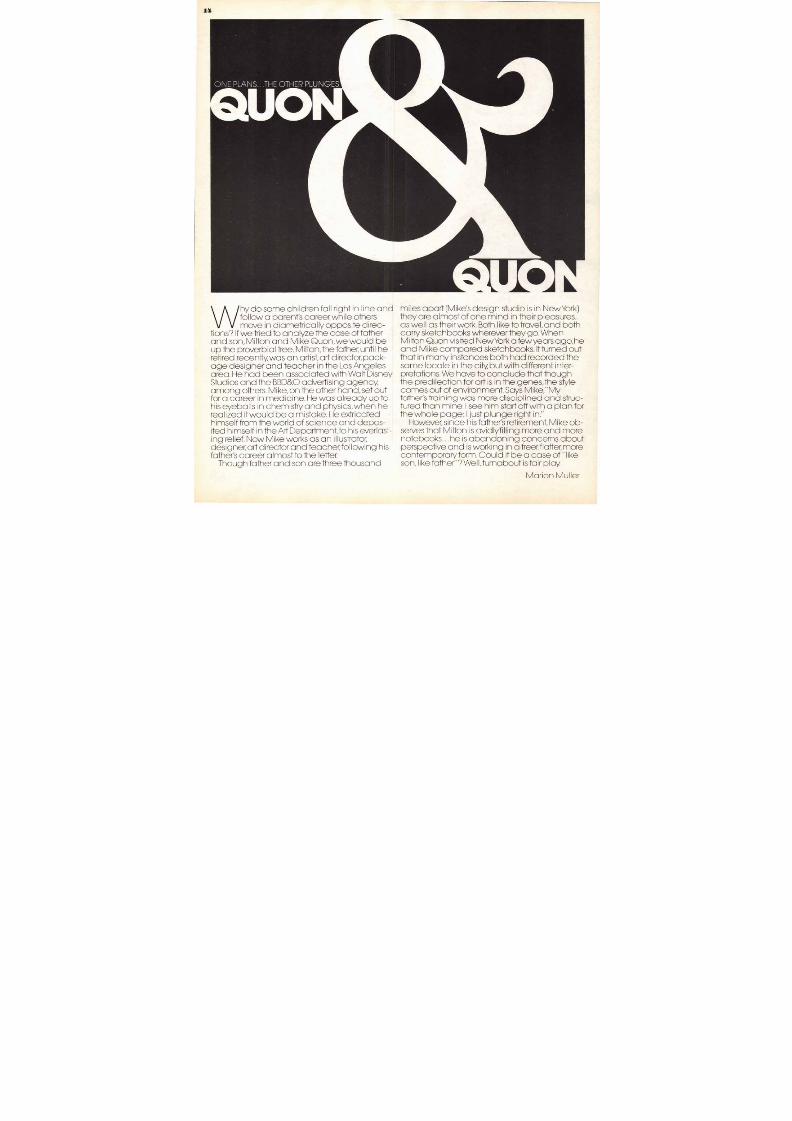
ONE PLANS T H E OTHER PLUNGES
Why do som e ch i ldren fa l l r ight in l ine a ndfol low a paren t's career, while othersm ove in d iame trica ll y oppos i te d i rec-
t ions? I f we tr ied to ana lyze the ca se of fatherand son , M ilton and M ike Quon,we w ou ld beup the proverb ial tree. Milton, the father, unti l heret ired rece ntly, was a n a rt ist, art director, pack-
age des igner and teacher in the Los Ang e lesarea. He h ad been assoc ia ted w i th W al t D isneyStudios and the BB D& O adve rtis ing agency ,am onc others. Vike, on the other han d, set outfor a career in m edicine. He wa s a lready up tohis eyebal ls in chem is -ry and phys ics, when hereal ized i t would be a m istake. H e ext r icatedh imse l f from the wor ld o f sc ience an d depo s-i ted h imself in the Art Dep artmen t, to his eve rlast-ing relief. Now Mike works as an i l lustrator,des igner, art director and teach er, fol lowing h isfather's career almost to the letter.
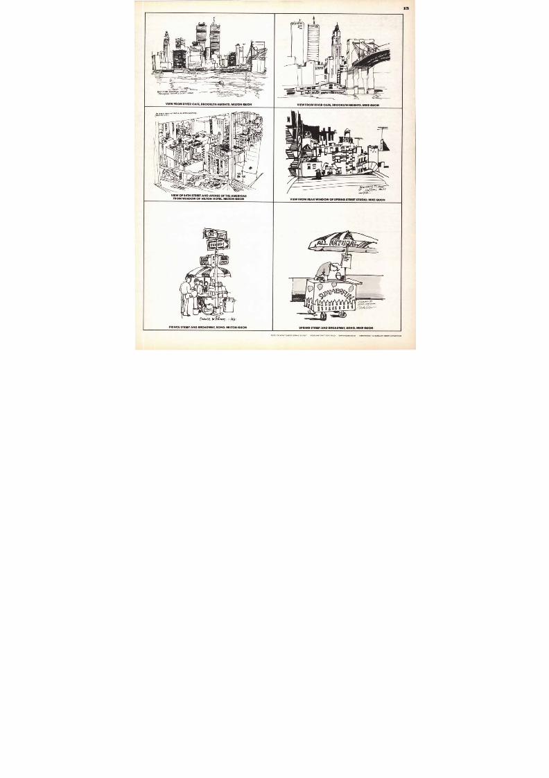
Though fa ther and son are three thousand
m iles apart (Mike's design studio is in Ne wY ork)they are alm ost of one m ind in their p leasures,as w el l as their work. Bo th l ike to travel, and bothcarry sketchbooks wh erever they go. W henMilton Quon vis ited New Yo rk a few yea rs ago, heand M ike comp ared sketchbooks. It tu rned outthat in m any ins tances both had recorde d the
sam e locale in the city, but w ith dif ferent inter-pretat ions. W e have to conc lude that thoughthe pred i lection for art is in the g enes, the s tylecom es out of environmen t . Sa ys Mike / 1\Nfather 's tra in ing w as m ore disc ipl ined and st ruc-tured than m ine. I see him start off with a plan forthe w hole pa ge; I just p lung e r ight in."
H owe ver, since his father's ret irem ent, Mike ob-serves that V I ton is avidlyfi ll ing m ore an d m orenotebooks . .. he i s abandon ing con cerns abou tperspective and is working in a freer,flalter, morecontem porary fo rm. Cou ld i t be a case o f " like
son, l ike father"? W el I,turnab out is fair play.
M ar ion M ul le r
8/13/2019 Upper & lower case: Volume 11—Issue 2
http://slidepdf.com/reader/full/upper-lower-case-volume-11issue-2 15/80
15
, . . . . . . - - , , 1"-,
i i i i i t h i
4IN
• .. .1
- - . .- - - - -
...
7 - - - - - - - . ---'- - .- ,_=...... Jig
-
, a< - ; - - - -, , i . . . . ,...:......,-
0
4 , 1 . -- -- .7 - -. - -..4-„.„ .. i „„til , , , , ,_.... .
,
a-Arl
.. . - - - - - , . ., . „ . . .„ , - , . _
' 4.. . . 4 - - - - , . . :
I
_
„ . . _
r---,_ _
. . i r 2
' /i
'
'I
;40
- '
S. ----------
I
au•
l a r ' ' ' ' " X I I111
4I
I P -I-4 1I•
• e . . _-=----s---- -: ... 2 4 '
_ _ . 3 / 4 _ , . _
EA.IT RnAiR.- 13(400 40 MR4DGE-
Mel CACCS SIDE - - l0
VIEW FROM RIVER
— 4---, -
.e-vdTolii. . . . 7 . -r-. -,...
7.. ;- 17'rl-1
..--—----, r"------,.._ __-___- .... .. .
/6 8 - - -"i_ -‘• •• 0 IIM Elk._ . . ._-- ___3.--a,
.s--
CAFE, BROOKLYN HEIGHTS. MILTON QUON
-----
VIEW FROM RIVER CAFE, BROOKLYN HEIGHTS. MIKE QUON
1 , , 0 ..4 , , , , , , , . , , , ,ea0RO NA )
5.1 S&AA orivE AMU AS
...
E 1
a
-
FI
i
•
41'if10
.0
d
. ...
i
- - . . .
III_
I I p
t..- .."
VIEWFROM
O
. 9 .
•tO 3•a i r
0 o f1 1
4, / 4 .
t o
r .„
0
an4..•et."...4
/1
: : , I I I P I r t
OF54TH
X VI
....
WINDOW
i , '
ii , ; -.
- - - .
••
a1 1 , - - - e y - 1
- . . .. „ , _ . . . . .. . sf. .
nir a. . . 0 .-
STREET
OF
: 1
t i l.1
-,..
„„4/
AND
HILTON
-
X.
. . . . . -
1 1 4
. 0 0 1 1 0 „ „ ..W.•A5
- . . . . . _ _ _ _
.Er
0 11 iWi
A V E N U EH O T E L .
' . . . .-
F r
I
P e
••a;
1
O F
-,-;
MILTON
,.. . :
o v .. 7 . . .
4
o i le, q
.
THE
...IPA _
E i l l1
booLM O Ve
AMERICASQUON
-
QUQ
.,/
04.0_
4 1 .
-1.1111
L. . )
PPOf4
A
------
' - - - - - - - - - - - -I
.1
.
"Tgt." . .ilats...—
....
, g1are iitta,
' _'7 5 -,: - 1 1 Ai
r .=1 ) 1 1 IN. Ion. - 1 - - : - - - = - - - - t i
7 ati4i
ollgi ; mel
Th: III4V P . . . . . . 1 1- ..•...11
1 1 E\-il
7. •- - - - -
.
,
-
1 1 Fp A
mre¢
40 . 4 _ -
VIEW FROM REAR WINDOW OF SPRING STREET STUDIO. MIKE QUON
,
1 IV I1 1 1 ) : t . ....
y g r O 404lit
/ / ,1
-1.lk
O A
-—j. . . .4*--
lb
1 1 1 .iiiiiiimmra
C 7I I P
P R I N C E S T R E E T
, im,
•
rtu.. . .cc. ki3 4•fri. ,, , i f f r A N D B R O A D W A Y , S O H O . M I L T O N Q U O N
=
SPRING STREET
„c.v.,. 3 3"04/o,
A N D B R O A D W A Y , S O H O . M I K E Q U O N
TEXT: ITCAVANT GARDE GOTHCX -L I G H T HEADLINE/CAPTIONS: BOLD SUPRAHEAD: BOOK AMPERSAND: ITC BENGUIAT BOOK CONDENSED
8/13/2019 Upper & lower case: Volume 11—Issue 2
http://slidepdf.com/reader/full/upper-lower-case-volume-11issue-2 16/80
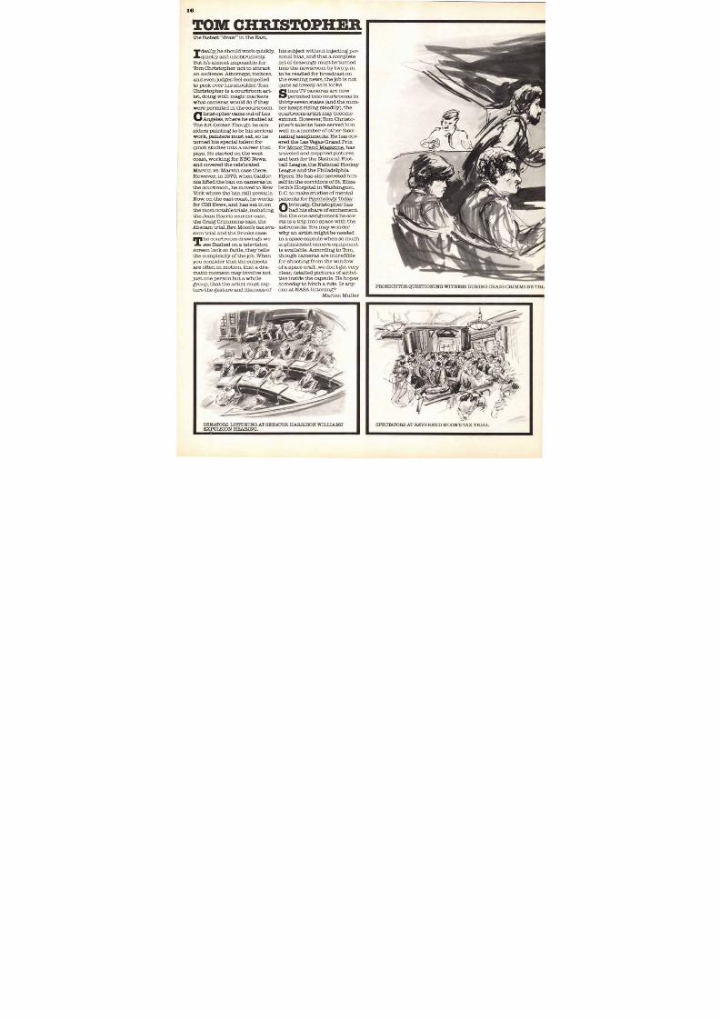
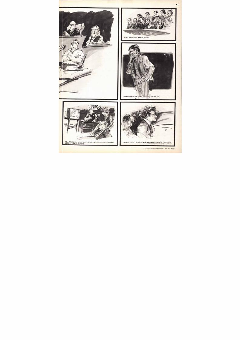
PROSECUTOR QUES TIONING WITNESS DURING CRAIG CRIMMONS TRL
SE NATORS LISTENING AT SENATOR HARRISON WILLIAMS'EXPULSION HEARING.
TOM CHRISTOPHERthe fastest "draw" in the East.
Ideally, he should work quickly,
quietly and unobtrusively.
But it's almost impossible for
rIbm Christopher not to attract
an audience. Attorneys, visitors,
and even judges feel compelled
to peek over his shoulder. 'IbmChristopher is a courtroom art-ist, doing with magic markers
what cameras would do if they
were permited in the courtroom.
C hristopher came out of Los
Angeles, where he studied at
The Art Center. Though he con-
siders painting to be his serious
work, painters must eat, so he
turned his special talent for
quick studies into a career that
pays. He started on the west
coast, working for NBC News,
and covered the celebrated
Marvin vs. Marvin case there.
However, in 1979, when Califor-
nia lifted the ban on cameras in
the courtroom, he moved to New
York where the ban still prevails
Now, on the east coast, he works
for CBS News, and has sat in on
the most notable trials, including
the Jean Harris murder case,
the Craig Crimmons case, the
Abscam trial, Rev. Moon's tax eva-
sion trial and the Brinks case.
The courtroom drawings we
see flashed on a television
screen look so facile, they beliethe complexity of the job. When
you consider that the subjects
are often in motion, that a dra-
matic moment may involve not
just one person but a whole
group, that the artist must cap-
ture the gesture and likeness of
his subject without injecting per-
sonal bias, and that a complete
set of drawings must be turned
into the newsroom by two p.m.
to be readied for broadcast on
the evening news, the job is not
quite as breezy as it looks.
Sin.ce TV cameras are now
permited into courtrooms in
thirty-seven states (and the num-
ber keeps rising steadily), the
courtroom artist may become
extinct. However, 'Ibm Christo-
pher's talents have served him
well in a number of other fasci-
nating assignments. He has cov-
ered the T.a-s Vegas Grand Prix
for Motor Trend Magazine, has
traveled and supplied pictures
and text for the National Foot-
ball League, the National Hockey
League and the Philadelphia
Flyers. He has also secreted him-
self in the corridors of St. Eliza-
beth's Hospita l in Washington,
D.C. to make studies of mental
patients for Psychology Thday.
Obviously, Christopher has
had his share of excitement.
But the one assignment he cov-
ets is a trip into space with the
astronauts. You may wonder
why an artist might be needed
in a space capsule when so much
sophisticated camera equipment
is available. According to rIbm,though cameras are incredible
for shooting from the window
of a space craft, we don't get very
clear, detailed pictures of activi-
ties inside the capsule. He hopes
someday to hitch a ride. Is any-
one at NASA listening?
Marion Muller
8/13/2019 Upper & lower case: Volume 11—Issue 2
http://slidepdf.com/reader/full/upper-lower-case-volume-11issue-2 17/80
TEXT/CAPTIONS: ITC AMERICAN TYPEWRITER MEDIUM HEADLINE/INITIALS: BOLD
17
8/13/2019 Upper & lower case: Volume 11—Issue 2
http://slidepdf.com/reader/full/upper-lower-case-volume-11issue-2 18/80
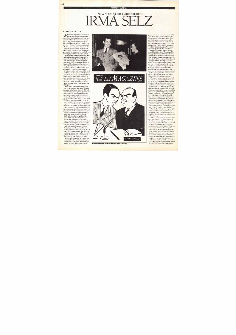
The artist takes liberties with Milton Berle, 1939
NEW YORK POST
fr iek-Lnd M A G A Z I N E
Ime
1 0
Selz' conception of Roy Cohn and
See fAcCerthy of the heorinqt More
drowtnqs by Selz oppeor <'^ Poae6M
MAN BITES MAN
NEW YORK'S GIRL CARICATURIS T:
IRM A SELZBY STEVEN HELLER
W ho are the impor tan t women car ica-
turists and cartoonists of the past?
Actually , only a han dful seriously practiced
the ar t , and even f ewer are remembered
for i t . Only four exemplars f rom the '30s
and '40s immed ia te l y come to m ind: they
are M ary Pet ty and Helen Hokinson , bo th
o f whom urbanely satirized their epoch in
The New Yorker, a n d E v a H er m a n a n dPeggy Bacon, known for their unique ap-
proaches to caricature. Al l have added muchto the legacy of American visual humor.
I f a woman pursuing a career , o ther thanhomemaking, was virtual ly a social out-
cas t in the decades be fore World War II,
then those engaged in car toon ing were
involved in a mo st demeaning , taboo occu-
pat ion . A l though t imes and mores have
changed , and today many more women are
successful ly working in the cartoon trade
(notab ly Roz Chast , Nicole Hol lander ,
Trina Robbins, Claire Bretecher, M.G. Lord
and M imi Pond), only t ime will definit ively
te l l how impor tan t they are to th i s genera-
tion and, more importantly, to the art in
general . But neither t ime nor the historianswho record i t s events are good enough
measures. For the latter have failed to be
f a i r o r generous to the wom en car toon i s tsof the past.
I rma Se lz i s one such i l l -treated artistwho, by all measures, was one of the most
prol i f ic graphic humorists of the '30s, '40s
and '50s. Today she is ignored by h is tor ians
and af ic ionados a l ike . Regardless o f the
fact that she contr ibuted m ult itudinoustheatrical and pol i tical caricatures to over
f i f ty publications, including The New York
Times , The Herald Tribune, The NewYork Post, The Daily News, The Broo klyn
Eagle, The New Yorker, Vogue, Glamo ur,
Stage and Cue, to name but a few—produced
scores of signed i l lustrations or influential
advertising agencies; i l lustrated and wrote
f ive children's books and illustrated an equa lnumber of adul t books— her c i ta tion does
n o t a p p ea r in the recently published
Chelsea House Encyclopedia of Car-toons o r Masters of Caricature. In fact,she gets only scant mention in Stephen
Becher's excellent Com ic Art in America,publ i shed in 19594not for her own ex ten-
sive collection of clips and photostats, and
a ha l f scr ib ed autobiography in i t ia ted
shor t l y be fore her dea th in 197Z I rma
Selz might never have existed for us. Thanks
to her son , Tom Enge lhardt , who recent ly
d iscovered boxes contain ing her work o f a
lifet ime, the oeuvre of this consummate
caricaturist is now available for study.
Known affectionately to her male counter-par ts as Ne w York's girl caricaturist, a
title she proudly accepted, Irma Selz 's life
story is, no doubt, shared by many other Roy Cohen and Senator Joseph McCarthy, The New York Post, 1955
pioneer career women in numerous f i e lds
who, in the face of sexual and social ob-
stacles, blazed independent paths. Selz's
part icular pass ion was cartooning. H o w -
ever, in the '30s, when her work came o f
age, cartooning was a men's club, as it was
i n the cen tury be fore and fo r years after-
ward. For the dauntless Selz however, it
was a lso a profess ion that beckoned.
A native of Chicago, I llinois, Selz at-
tended the Universi ty of Chicago and the
Chicago Art Institute. While in school she
toyed with the plastic arts, but caricaturesoon became a passion and compulsion thelikes o f which her c ronies could no t fa thom.
Upon g raduat ion she sough t an act i ve
career , ra ther than d i l e t tan t i sh dabbl ing in
t he arts. Two local journals with impres-
sive followings, The Chicagoan a n d TheChicago Tribune, commiss ioned her to
do theatrical caricatures, sketches and
cartoons—an exce llent proving ground , bu t
the Windy Ci ty proved to be too provincial
for the aspir ing satirist. Fo r Selz, l ine so
m any others, New Yo rk was Mecca.
Of course everyone to ld me that a girlcouldn't make a l iving doing caricatures,
she wrote in her u nfinished autobiography .
Bes ides , the G reat Depress ion wasn ' t thebest t ime to start out." However, in spite of
the breadl ines, soup ki tchens and hungermarches endemic to the e ra , Se lz be l ieved
that a new way of life for women was taking
form. "A lot of interesting things were hap-
pening, she wrote. G irls started to earn
their own money. A lso, while the early
'30s was a t ime of general disaster, by some
odd paradox , i t was a peak o f en ter ta in -
men t by w it and humor . The be l eaguered
populace took refuge in theaters and mov ie
ho uses. It was the heyday o f the grea t
Broadway com ed ians: The M arx Bro thers ,
W.C. Fields, Fanny Brice and A l Jo lson;
and N ew York was the theater capita l o f the
world. Since theatrical caricature wasSelz's forte, it was logical that the prestig-
ious New York Times drama section would
be her first stop.
What lunacy caused me to think I couldearn m y l i v ing as a car icatur i s t in N e w
York? I 'm not certain, Selz wrote about her
ini tial tr ial . Whatever the impetus, she had
the temerity to walk bo ld l y and wi thou t
an appointment in to the o f f ice o f the Times'
drama cri tic. Perhaps, she thought, he
would l ike her work and of fer an assign-
ment . When I arrived, the proverbia l big
city office boy, seated at the large reception
desk , looked down h is nose at me wh en I
asked to see the drama crit ic . He said that it
was John Byram, the drama ed i tor, whohandled such matters, and that he was busy.
`That 's okay' I said withou t skipping a beat,
`I ' l l wait . ' An d so she did—patiently ,for
8/13/2019 Upper & lower case: Volume 11—Issue 2
http://slidepdf.com/reader/full/upper-lower-case-volume-11issue-2 19/80
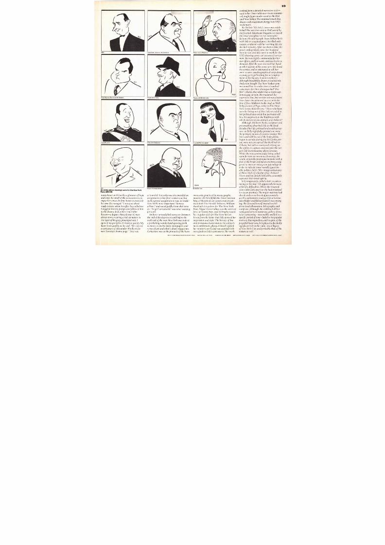
Sa
SENATOR JOSEPH MCCARTHY R A N C I S C O F R A N C O
D E A N A C H E S O N
J . E D G A R H O O V E R
NIKITA KHRUSHCHEV
T A L L U L A H B A N K H E A D
C L A U D E T T E C O L B E R T
E z R A P O U N D
19
any hours with hardly a glimmer of hope
new s room t o e n -
her se nse s . In t ime howe ve r , e ve n S e l z
c o u r a g e d : I w a s just about
n t he o f f i c e b oy c a l l e d me .
p u m p s a n d f o l l o w e d h im
desk, where I m e t J o h n
a d a p p e r , sharp featured, m a n -
in
his grey, pinstriped suit, I
y p o r t f o l io . H e l o o k e d q u i e t l y . M y
use
— Selz was
astounded. Not only was she awarded an
assignment on her f irst venture out , but
such a grand assignment it was: to render
N e w York's most important "literary
arbiter, and social gadfly. From that time
o n , t h e g i r l car icatur is t was never wantingfor w o rk .
I n t h o s e curiously h a l c y o n y e a r s b e t w e e n
t h e e n d o f t h e depression and b e f o r e t h e
outbreak of the war, New York was indeed
a publishing wonderland spewingforth
as many as twelve daily newspapers and
scores of art and other culture magazines.
Caricature was at the pinnacle of h e h u m-
orous arts, practiced by many graphic
m a s t e r s : A l H i r s c h f e ld , t h e T i m e s ' v e t e r a n
king of theatrical caricature, was on con-
tract with The Herald Tribune; William
Auerbach-Levy drew for The New York
Post; Miguel Covarrubias was the satirical
force at Vanity Fair; and Al Frueh created
his singular s t y le fo r The New Yo rker.
I t was from the latter that Selz derived her
inspiration and style. The brevity of line
and pronounced attention to the subject's
most emblema tic,physicaldetail typified
her m entor's work, and was applied with-
ou t a fault to Selz's caricatures. Herwork
e vo lve d from a detailed narrative style—
use d in her T i m e s t a b l e a u x— t o a n e c o n o m i -
cal , single figure m o d e — u s e d in t h e Po s t
and New Yorker. The minimal brush line,
drawn with max imum energy was S e l z ' s
trademark.
By the late '30s Selz's career was estab-
l i s h ed . Sh e w as ev en sent t o H o l l y w o o d b y
theJournal American Magazine to record
t h e tinsel and glitter in her inimitable
fashion (the photograph shows M i l to n B e r l e
with Selz in a typical pose). Instilled with
suc c e ss ; c on f ide n t with her working life, shed ec id ed t o m arry. A f t e r t o o short a t i m e , t h e
great conflagration came, her husband
went t o w a r , a n d S e l z w e n t t o work for the
U S O , d r a w i n g c o m i c c a r i c a tu r e s o f s e r v i c e -
m e n . S h e was highly commended for her
w ar e f fo r t s , an d her work c o n t i n u e d t o b e i n
demand. After the war she tried her hand
at o th er as pec t s o f t h e co mic ar t s . Se l z lo v ed
t h e c o m i c s , a n d s o a t t e m p t e d t o sell her
own—a semi-autobiographical strip about
a young, pert girl looking for art employ-
men t in t h e b ig c i t y . I t went nowhere—
although beautifully drawn, it lacked wit.
A n d , e v e n t hough Th e New Yorker c o m -
missioned her to render over a hundred
caricatures for their distinguished P r o -f i l e s c o l u m n , t h e y didn't buy a single cap-
t i o n e d , g a g c a r t o o n . S h e m a s t e r e d the
expressive l in e , but written wit was elusive.
Years later she a c h i e v e d success with t h e
first of f ive children's bo o ks . An d , as Wal t
K e l l y , c r e a t or o f P ogo , wr o t e in The New
York Times B o o k R e v i e w : T h o s e w h o h a v e
seen the biting wit of Miss S e l z r e v e a l e d in
her political and social line portraits will
b e a b i t surprised at the kindliness with
which she here treats anim als and children."
Although children's b o o k s , s c u l p t u r e a n d
printmaking absorbed Selz in the final
d e c a d e o f her l i f e ,po l i t ica l an d s o c ia l car ica-
t u r e , a s K e l l y r i g h t f u l l y p o i n t e d o u t , w e r e
th e primary means of creative output. Herbites and nibbles out of the body politic,
b e g u n in earnest during t h e M c C a r t h y p e r -
i o d , w e r e n o t c o n c e p t u a l l i k e H e r b l o c k o r
Osborn, but rather emotional, relying o n
the ability to capture and interpret the tar-
get 's self-incriminating idiosyncrasies.
While s h e w a s cont inuously b e i n g c a l l e d
upon for non-acrimonious drawings, she
w o u l d , a t just the p r o p i t i o u s m o m e n t , with a
flick of t he brush e x t e n d a n e y e b r o w , e x a g -
gerate a sneer, or enlarge an appendage n
order to ridicule some morally question-
able po l i t ico . Se l z ' s ' 5 0s v in tag e car icatures
o f t h o s e birds o f a f e a t h e r , R e p . R i c h a r d
N i x o n a n d S e n . J o s e p h M c C a r t h y a c c u r a te l y
capturedtheir inner spirits.Selz temporarily called a halt to carica-
turing in the mid-'50s apparently because
o f f a m i l y difficulties. When sh e resumed
years later, caricature s she had practiced
it was an anomaly. The major m arkets had
closed, and a new breed of passionately
acerbic cartoonists (such as D a v i d L e v i n e ,
J u l e s F e i f f e r a n d E d w a r d S o r e l ) w a s e m e r g -
i n g . S h e d e v o t e d herself instead to chil-
dren's book illustration, lithography and
sculpture. Although she exhibited all her
variegated arts in num erous gallery shows,
Selz's cartooning—inexorably wedded to a
spe c i f i c pe r iod o f t ime — fade d in the popular
m e m o r y . B u t r e g a r d l e s s , and in spite, o f t h e
forgetful historians, S e l z p l a y e d a d e c i d e d l y
significant r o le in the c omic v i sua l l e gac y
o f N e w York City, and probably that of the
nation as well.
TEXT: ITC BERKELEY OLDSTVLE BOOKITALIC NITIAL: MEDIUM ITALIC EADLINE. BYLINE: BOOKSUPRAHEADS: BOOK BOLD APTIONS: ITC FRANKLIN GOTHC B OOK HEAVY
8/13/2019 Upper & lower case: Volume 11—Issue 2
http://slidepdf.com/reader/full/upper-lower-case-volume-11issue-2 20/80
REDEJUDY
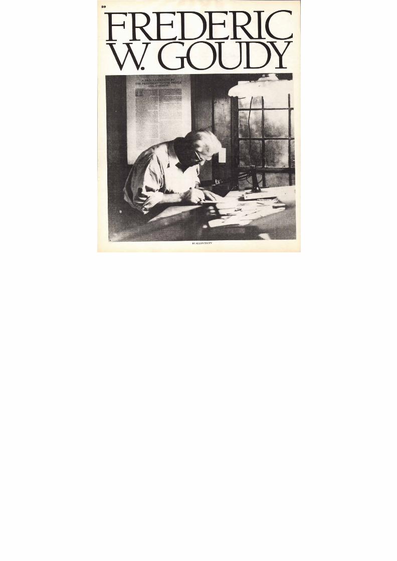
BY ALLAN HALEY
8/13/2019 Upper & lower case: Volume 11—Issue 2
http://slidepdf.com/reader/full/upper-lower-case-volume-11issue-2 21/80
Goudy Oldstyle4A 6a
RICSpir i t s
M O D EHighest48Point A9 a
N O T I C EBr ig h t la dle a ds c la s s
DANCEDCelebratedb ig ho liday
36 Point A10 a
HOMEQuaint90 Point A 14a
FOUND
Musiciandelighted24 Point BA 16a
NOTICESUnfinishedframework
18Pogat 2A 23a
MECHANIC
GIVES experts
usual warning
14Point 7A 34a
EXPERIMENTSBRIGHT m agicianspent much time
unraveling tr icks
12P oint 1A 40 a
GRAND PICTURERECENTphotographs
inspire many leading
theatrical promoters
10 Point 4A 48a
PERFECT SPECIMEN
SIMPLE design exhibited
considered very art istic
for modern typography
8 Point 7A54a
CUT-COST EQUIPMENT
MODERNcabinets containing
leads and quads reduce labor
costs considerably. Efficiency
material creates large profits
6 Point 9A 58a
STIMULATINGPRODUCTION
PROOIMSIVII printers recognisethe
fact that economy lies In equipping
theirplants withmodernmaterials
andmachinery. Nowis the time..
every mnutelost swells thepay roll
Characters InCompleteFont
ABCDEFGHIJKLM
NOPQRSTUVWX
YZ&$1234567890
abc de f ghijklmnopq
rstuvwxyzfffiflffiffi
Sm.,. Can from 6 to 18P oint, and OldsrvI• Figure.
L1306289° in all rises, areput up Inseparatefontsandfurnished
onlywhensp ecially ordered
AseiBCDEFGHIJKLMNOPQ
RRSSTCLIVWXYZE7.,%:!?-
aabcdeEfghijklmnopqrstu
vwxyzfiffffiflffl$1234567890
S pe ak i n g o f e a r l i e r t ype s ,G o u d y says: The old fellows
stole all of our best ideas.E
ABCDEFGHIJKLMNOP
QRSTUVWXYZEIACECI
abcdefghijklmnopqrstuvwxyz
cefiffffiflffletst.;;: ?-$1234567890
S p e a k i n g o f e a r l i e r ty p e s ,
Goudy says: The old fellows
s t o l e a l l o f o u r b e s t i d e a s .
F
TYPOGRAPHR NM IONLS
21
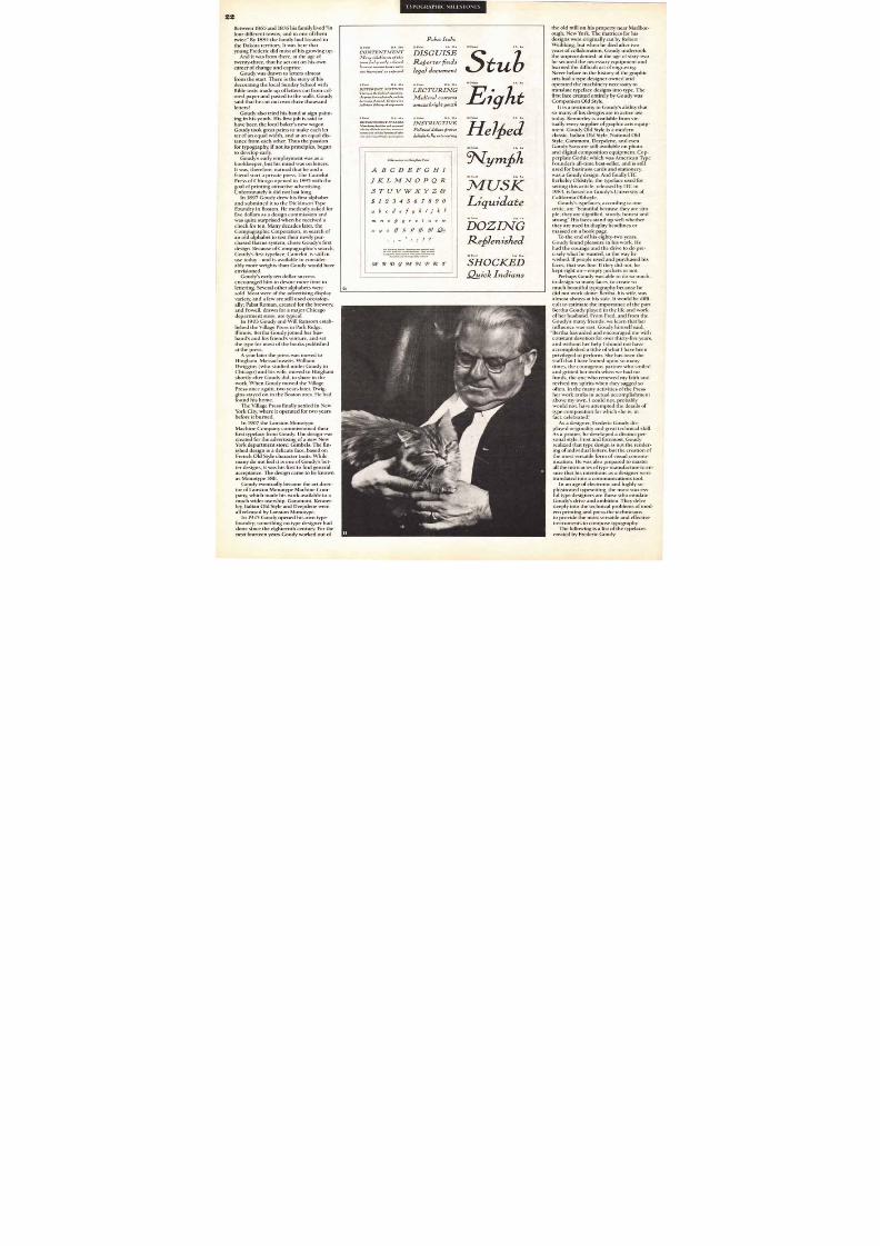
or som e, success com es easily;fo r others it is a long and diff i-cult process. Frederic Goudy'ssuccess falls into th e latter cate-gory. At a time when m ost are
firmly established in th eir careers, Gou dywas "just getting by" In fact, there werem any times when he and his wife, Bertha,were not even "getting by"
The story is told that once, after work-ing all day and early into the ev ening atthe Village Press, the Go udys were treatedto a late dinner by a custom er who pu r-
chased a $15 boo k. The prospect of thefood that the money wou ld buy was sowelcome that the Go udys ran down thetwelve flights of stairs from their offices—and reached the street ahead of the cu s-tom er who h ad waited for the elevator
Undaunted, is perhaps th e best singleword to describe Fred Goudy. He came tohis position of em inence in the typo-graphic wo rld only after years dogged bym isfortune and lack of su ccess. His careerwas marked by unp rofitable work as aboo kkeeper, cashier, private secretary andcop ywriter. Goudy h ad unrewarded spellsas a free-lance graph ic designer, printer,teacher and typograph er. He started twom agazines, both o f which failed; and var-ious printing b usinesses, which also failed.It wasn't until Goudy was past the h alfwaypoint in his life that he go t his first bigbreak and began to receive the recogni-tion he deserved.
Twice, virtually everything Goudy pro-duced: his preciou s matrices, his m asterdrawings and prelim inary sketches, wereall destroyed b y fires. The first was in theearly part of 1908.
The Gou dys had finally begun to sellsom e work from the Village Press—itlooked like they were abou t to turn thecorner of success. They had reached apoint where wo rk long into the eveningwas no longer necessary to m ake endsm eet. On January 10th the Gou dys werespending the evening at hom e. Bertha wassewing and Fred was reading. At 8:30 thetelephone rang; Bertha answered. After a
conv ersation wh ich lasted only seconds,she calm ly repo rted, "Th e Parker Buildingis on fire, you'd b etter hurry do wn."
Gou dy dressed rapidly and too k thedowntown sub way from near their apart-m ent to the bu i lding which housed theVillage Press. He em erged from an exitwithin the firelines and the police wereforced to usher h im to safety. The "fire-proo f" Parker Building was a veritable fu r-nace. Its brick walls effectively trapp ed thewhite hot interior. Gou dy stood on thecorner and watch ed the Village Press dis-app ear. All the bo oks, the equipm ent, hisdrawings and sketches were gone.
In 1939, fire once again devastated theGou dys' life wo rk. It was on a frostym orning, again in January, that their m ill
(the focal po int of the Deepdene Press)which co ntained their m achinery, thepress, Goudy's matrices and many price-less drawings, burned. Everything settledinto the m ill stream— leaving intact, ironi-cally, only an unu sed brick vault whichhad been bu i lt to p ro tect m any o f thethings that were destroyed. Once again,Goudy was forced to stand by and watchfire ruthlessly destroy the produ cts ofhis labo rs.
Undaunted— it was characteristic ofGou dy that he turned the adv ersities lifeimp osed upon h im into a benef i t: h isdesign ability and lov e of the boo k arts
the earlysiness failures in his mo re pedestrian
endeavors. Goudy tu rned to type designand typefou nding when the 1908 firedeprived him of h is printing plant. Thefinal, and mo re disastrous, fire whichdestroyed the workshop where he laboredfor m any years, enabled Goudy to devo te
A. GOUDY AT WORK IN HIS S TUDIO. B. YOUNG FREDERIC AT AGE EIGHT. C. A DASHINGGOUDY AT TWENTY-SEVEN. D . GOUDY OLD STYLE. E. SANS S ERIF LIGHT— GOUDY'SONLY SANS. F. KENNERLEY— GOUDY'S FIRST BIG BREAK.
m o r e o f h i s t i m e t o w r i t in g a n d t e a c h i n g .I t w a s n ' t u n t i l h e w a s f o r t y - t h r e e t h a t
G o u d y ' s t yp e d e s i g n s b e g a n t o s h o w t h em a r k o f h i s g e n i u s . H i s e a r l i e r t y p e f a c e ss u c h a s C a m e l o t , P a b s t a n d P o w e l l w e r egood designs, b u t n o n e a c h i e v ed t h e p o p -u l a r i t y o f h i s l a t e r w o r k . H i s f i r s t w o r ka f t e r t h e 1908 fire was the No. 38E seriesfor the Lanston Monotype Mach ineCompany. It was the first d e s i g n w h i c hb e g a n to reflect Goudy's capability as atype designer.
In 1910 an incident occurred that
brought Goudy international recognitionalmo st overnight. Late in the winter ofthat year he was asked by M itchell Ken-nerley, the pub lisher, to design a vo lum eof short stories by H.G. Wells. Goudym ade layouts for the pages and haddum m y copies set in 18 point Caslon.When he received the dumm y pages ,Gou dy was disappointed. They just didn'tlook q uite the way he wanted. There was afeeling of "op enness" which disturbedhim . Goudy exp lained to Kennerley thathe wanted, "the app earance of solidity andcom pactness, but o f the sam e co lor asCaslon:' Neither he nor Kennerley knewof such a type. Existing typefaces wereeither too " form al or too refined, or toofree and undignified," for use in a bo ok ofthe kind Go udy was designing.
No o ther so lut ion to the p rob lem beingat hand, Gou dy suggested to Kennerleythat he create a new face which wouldmeet his requirements. Kennerley agreedand work was begun im m ediately onKennerley Old Style.
It took o nly a week to draw the com -plete alphab et: lowercase, capitals andpunctuation. The italic was com pletedshortly after, and a com plete font of 16point type had b een cut and cast by lateMarch of the fo llowing year. It had takenless than five m onths from start to finish.
Wh en Kennerley Old Style was offeredto printers, it was met with su ch enthu si-asm that Goudy soon b ecame the premierAm erican type designer. The release ofthis type style marked the turning po int in
Go udy's career. It was the start of a grow-ing fame for the m an whose wife-to-behad been warned that he would "nev eramo unt to anything"
Goudy's achievem ents are even mo reremarkable in that h e was self-taught,m aking his first designs at the age ofthirty, and m anufacturing his own typeafter sixty.
The work m ethod which Goudy devel-oped was designed for speed. He ruled offthe page to be filled, and sketched charac-ters swiftly with a p encil. Then with a penhe began the f inal version, mo difying thepencil sketch when necessary as he wentalong. Only the letter form s were pennedin at first. Wh en a line of letters was fin-ished, the sheet was turned o n its side
and the serifs were drawn in qu icklyalong the ruled lines. So m e say this speedof ex ecution gave h is letters vigor, life andmo vem ent which would have b een lack-ing with a m ore studied technique.
Unfo rtunately, later in Gou dy's career,not all printers were equ ally imp ressedwith the vigor and life in his work. Withthe advent of the p ost-World War II
"m odern" style of typo graphy, type facesf rom Europe seem ed m ore at tract ive thanthe work of Am erican designers. So m econsidered Goudy's work old-fashioned.But, fortunately for the design com m unitythose "o ld-fashioned" Gou dy designs arenow described as "classic" and are usedm ore today than at any previou s time.
Frederic W. Gou dy was born in Bloom -ington, Illinois, on March 8th, 1865, into afamily of Scottish origin. His father was atone tim e a teacher, a real-estate broker,and a Judge of the Probate Cou rt.
The Goudys m oved abou t a good deal.
8/13/2019 Upper & lower case: Volume 11—Issue 2
http://slidepdf.com/reader/full/upper-lower-case-volume-11issue-2 22/80
T Y P O G R A P H I C M I L E S T O N E S
10 Point 6A 38 •
CONTENTMENT
Many inhabitants of this
town feel greatly relieved
because income taxes were
not increased as erected
Pabst Italic
18P oint A 16a
DISGUISE
Refiorter finds
legal document tu 72Point A 4
8P oint 1A 42 •
DIFFERENT MOTIVES
Poetry is the frolic of invention.
the yreatrlanct of words. anddu
harmony of sound. Oratory is a
judicious ddintry of arguments
14Point 2A 26a
LECTURING
Medieval customs
amaze bri ght youth
Characters in Con:Pets Font
ABCDEFGH
JKLMNOPQR
STUVWXYZ
1 2 3 4 5 6 7 8 9 0
bcdefghjk
mnofi g rstuvu
xyz l ffilliZ
V. fallow/in. Spann Mamma aro outiMMl silM
all fonts from II to II mint ineimimo. nine. mid
in moms. font. from III t.72 mint inolusim and
to...gonad oar anon appall>..anal
gt 13DG3INPRT
el f ied42 Point
4y _ f i f t
141 .74USk
Liq uidate
'i5tozr.7 6
R e p e n i d i e d24Point A 10a
SHOCKED
Quick Indians
G
60 P ant Aas
6 Point 2A 48•
ENVIRONMENT PLEASED
Mel...d.rity kraal?... sad autumnal
color:no .illur. It. tra..7., mountan
*mum"ond smoaml limtatmade offer
rest sad o•••• •774lio.b1ils.••••7•
12Point 6A 36•
INSTRUCTIVE
Political debate jiroves
delightfully interesting
48 P.m
B e t w e e n 1 8 6 5 a n d 1 8 7 6 h i s fa m i l y li v e d " i nf o u r d i f f e r e n t to w n s , a n d i n o n e o f t h e mt w ic e ' B y 1 8 8 4 t h e f a m i ly h a d l o c a t e d i nt h e D a k o t a t e r r i t o r y . It w a s h e r e t h a ty o u n g F r e d e r i c d i d m o s t o f h i s g r o w in g u p .
A n d i t w a s f r o m t h e r e , a t th e a g e o ft w e n t y -t h r e e , t h a t h e s e t o u t o n h i s o w nc a r e e r o f c h a n g e a n d c a p r i c e .
G o u d y w a s d r a w n t o l e t te r s a l m o s tf r o m t h e s t a r t . T h e r e i s t h e s t o r y o f h i sd e c o r a t i n g t h e l o c a l S u n d a y S c h o o l w it hB i bl e t e x t s m a d e u p o f l e t te r s c u t f r o m c o l -o r e d p a p e r a n d p a s t e d t o t h e w a ll s . G o u d y
s a i d t h a t h e c u t o u t o v e r t h r e e t h o u s a n dl e t t e r s
G o u d y a l s o t r i e d h i s h a n d a t s i g n p a i n t -i n g i n h i s y o u t h . H i s f i r s t jo b i s s a i d t oh a v e b e e n t h e l o c a l b a k e r 's n e w w a g o n .G o u d y t o o k g r e a t p a i n s t o m a k e e a c h l e t -t e r o f a n e q u a l w id t h , a n d a t a n e q u a l d i s -t a n c e f r o m e a c h o t h e r . Th u s t h e p a s s i o nf o r t y p o g r a p h y , if n o t i t s p r i n c i p l e s , be g a nt o d e v e l o p e a r l y .
G o u d y ' s e a r ly e m p l o y m e n t w a s a s ab o o k k e e p e r , b u t h i s m i n d w a s o n l e t t e r s .I t w a s , t h e r e f o r e , n a t u r a l t h a t h e a n d af r i e n d s t a r t a p r i v a t e p r e s s . T h e C a m e l o tP r e s s o f C h i c a g o o p e n e d i n 1 8 9 5 w it h t h eg o a l o f p r i n t i n g a t t r a c t i v e a d v e r t i s i n g .U n f o r t u n a t e l y i t d i d n o t l a s t l o n g .
I n 1 8 9 7 G o u d y d r e w h i s f i r s t a l p h a b e t
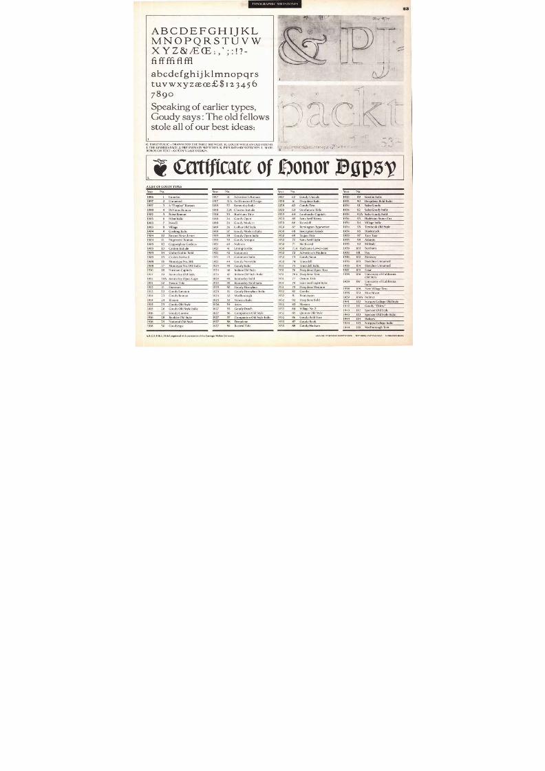
a n d s u b m i t t e d i t to t h e D i c k i n s o n T y p eF o u n d r y i n B o s t o n . H e m o d e s t l y a sk e d f o rf iv e d o l l a r s a s a d e s i g n c o m m i s si o n a n dw a s q u i te s u r p r i s e d w h e n h e r e c e i v e d ac h e c k f o r t e n . M a n y d e c a d e s l a t e r , t h eC o m p u g r a p h i c C o r p o r a t i o n , in s e a r c h o fa n o l d a l p h a b e t t o t e s t t h e ir n e w l y p u r -c h a s e d I k a r u s s y s t e m , c h o s e G o u d y ' s f ir s td e s i g n . B e c a u s e o f C o m p u g r a p h i c 's s e a r c h ,G o u d y ' s f i r s t t y p e f a c e , C a m e l o t , i s s t il l i nu s e t o d a y — a n d i s a v a i l a b le i n c o n s i d e r -a b l y m o r e w e i g h t s th a n G o u d y w o u l d h a v ee n v i s i o n e d .
G o u d y ' s e a r l y t e n d o l l a r s u c c e s se n c o u r a g e d h i m t o d e v o t e m o r e t i m e t ol e t t e r i n g . Se v e r a l o t h e r a l p h a b e t s w e r es o l d . M o s t w e r e o f t h e a d v e r t i s i n g d i s p l a yv a r i e t y , a n d a f e w a r e s t i l l u s e d o c c a s i o n -a l l y ; P a b s t R o m a n , c r e a t e d f o r t h e b r e w e r y ,a n d P o w e l l , d r a w n f o r a m a j o r C h i c a g od e p a r t m e n t s t o r e , a r e ty p i c a l .
I n 1 9 03 G o u d y a n d W i l l R a n s o m e s t a b -l i s h e d t h e V i l l a g e P r e s s i n P a r k R i d g e ,I l li n o i s . B e r t h a G o u d y j o i n e d h e r h u s -b a n d ' s a n d h i s f r i e n d ' s v e n t u r e , a n d s e tt h e t y p e f o r m o s t o f t h e b o o k s p u b l is h e da t t h e p r e s s .
A y e a r l a t e r t h e p r e s s w a s m o v e d t oH i n g h a m , M a s s a c h u s e t t s . W i l l ia mD w i g g i n s (w h o s t u d i e d u n d e r G o u d y i nC h i c a g o ) a n d h i s w if e , m o v e d t o H i n g h a ms h o r t l y a f t e r G o u d y d i d , t o s h a r e i n t h ew o r k . W h e n G o u d y m o v e d t h e V i l la g eP r e s s o n c e a g a i n , t wo y e a r s l a t e r , D w i g -g i n s s t a y e d o n i n t h e B o s t o n a r e a . H e h a df o u n d h i s h o m e .
T h e V i l l a g e P r e s s f i n a l l y s e t t le d i n N e w
Y o r k C i t y , w h e r e i t o p e r a t e d f o r t w o y e a r sb e f o r e i t b u r n e d .
I n 1 9 07 th e L a n s t o n M o n o t y p eM a c h i n e C o m p a n y c o m m i ss io n e d t h e i rf i r s t ty p e f a c e f r o m G o u d y . T h e d e s i g n w a sc r e a t e d f o r t h e a d v e r t i s i n g o f a n e w N e wY o r k d e p a r t m e n t s t o r e : G i m b e l s . T h e f i n -i s h e d d e s i g n i s a d e l i c a t e f a c e , b a s e d o nF r e n c h O l d S t y le c h a r a c t e r t r a i t s . W h i l em a n y d o n o t f e e l it i s o n e o f G o u d y ' s b e t -t e r d e s i g n s , i t w a s h i s f ir s t t o f i n d g e n e r a la c c e p t a n c e . Th e d e s i g n c a m e t o b e k n o w na s M o n o t y p e 3 8 E .
G o u d y e v e n t u a l l y b e c a m e t h e a r t d i r e c -t o r o f L a n s to n M o n o t yp e M a c h i n e C o m -p a n y , w h i c h m a d e h i s w o r k a v a i l a b le t o am u c h w i d e r u s e r sh i p . G a r a m o n t , K e n n e r -l e y , I t a l ia n O l d S t yl e a n d D e e p d e n e w e r e
a l l r e le a s e d b y L a n s t o n M o n o t y p e .I n 1 9 25 G o u d y o p e n e d h i s o w n t y p e -f o u n d r y ; s o m e t h i n g n o t y p e d e s i g n e r h a dd o n e s i n c e t h e e i g h t e e n t h c e n t u r y . F o r t h en e x t f o u r t e e n y e a r s G o u d y w o r k e d o u t o f
t h e o l d m i l l o n h i s p r o p e r t y n e a r M a r l b o r -o u g h , New York. The m atrices for hisdesigns were originally cut by Ro bertWeibking; but when h e died after twoyears of collaboration, Goudy undertookthe unp recedented: at the age o f sixty-twohe secured the necessary equipm ent andlearned the difficult art of engraving.Never befo re in the history of the graphicarts had a type designer owned andop erated the m achinery necessary totranslate typef ace designs into type. Thefirst face created entirely by Go udy was
Com panion Old Style.It is a testimony to Goudy's ability thatso m any of his designs are in active u setoday. Kennerley is available from vir-tually every s u p p l i e r o f g r a p h i c a r t s e q u i p -m e n t . Go u d y O l d S t y le i s a m o d e r nc l a s s i c . I t a l ia n O l d S t y l e , N a t i o n a l O l dS ty l e , G a r a m o n t , D e e p d e n e , a n d evenGoudy S ans are still available on pho toand digital comp osi tion equipm ent . Cop-perplate Gothic which was Am erican TypeFou nder's all-tim e best-seller, and is stillused fo r bu siness cards and stationery,was a Gou dy design. And finally ITCBerkeley Oldstyle, the typeface u sed fo rsetting this article, released by ITC in1983, is based on Goudy's University ofCalifornia O ldstyle.
Goudy's typefaces, according to onecritic, are "beautiful because they are sim-ple; they are dignified, sturdy, ho nest andstrong:' His faces stand up well whetherthey are used in display h eadlines ormassed on a bo ok page.
To the end o f his eighty-two years,Gou dy found p leasure in his work. Hehad the cou rage and the drive to do pre-cisely what he wanted, in the way hewished. If people used and purch ased hisfaces, that was fine. If they did not, hekept r igh t on— emp ty pockets o r no t .
Perhaps Goudy was able to do so m uch.to design so m any faces, to create som uch b eaut iful typography because hedid not work alone: Bertha, his wife, wasalm ost always at his side. It would b e diffi-cult to estim ate the im po rtance of the p artBertha Goudy p layed in the life and workof h er husband. From Fred, and f rom theGou dy's many friends, we learn that herinfluence was vast. Goudy him self said,
"Bertha has aided and encouraged m e withconstant devotion fo r ov er thirty-five years,and withou t her help I should no t haveaccom plished a tithe of what I have b eenprivileged to perform . She has been thestaff that I have leaned upon so m anytimes, the courageous partner who smiledand gritted her teeth when we had nofunds, the one who renewed m y faith andrevived m y spirits when they sagged sooften. In the m any activities of the Pressher work ranks in actual accomplishmentabov e my own. I could not, probablywou ld not, hav e attem pted the details of
type com po sition for which sh e is, infact. celeb rated:'
As a designer, Frederic Goudy dis-played o riginality and great tech nical skill.As a p rinter, he develop ed a distinct per-sonal style. First and fo remo st, Goudyrealized that type design is not the render-ing of individual letters, but the creation ofthe most versat ile fo rm o f visual com m u-nication. He was also prepared to m asterall the intricacies of type m anufacture to en-sure that h is intentions as a designer weretranslated into a com m unications tool.
In an age of electronic and highly so-ph isticated typesetting, the m ost success-ful type designers are those who em ulateGoudy's drive and amb ition. They delvedeeply into the technical prob lems of m od-
ern printing and press the techniciansto p rovide the m ost versatile and effectiveinstruments to compose typography.
The fo llowing is a list of the typefacescreated by Frederic Goudy.
8/13/2019 Upper & lower case: Volume 11—Issue 2
http://slidepdf.com/reader/full/upper-lower-case-volume-11issue-2 23/80
TYPOGRAPHIC \III I S IONA S
23
ABCDEFGH I JKL
MNOPQRSTUVW
fiffffiflfflabcdefghijklmnopqrstuvwxyzaeoeE$123456
7890
Sp e a k in g o f e a r l ie r t y p e s ,Goudy says: The old fellows
s t o l e a l l o f o u r b e s t id e a s :
G. PABST ITALIC—DRAWN FOR THE PABST BREWERY. H. GOUDY WITH AN OLD FRIEND.
I. THE GIMBELS FACE. J. PRELIMINARY SKETCHES. K . PRELIMINARY SKETCHES. L. MA RL-BOROUGH TEXT—GOUDY'S LAST DESIGN.
a r a f t c a t e o f o o n o r N p 5 vA LIST OF GOUDY TYPES
Year No. Year No. Year No. Year No.
1896 1 Camelot 1917 31 Advertiser's Roman 1927 60 Goudy Uncials 1933 89 Goethe Italic
1897 2 Unnamed 1917 31A An Unnam ed Design 1928 61 Deepdene Italic 1933 90 Deepdene Bo ld Italic
1897 3 A "Display" Rom an 1918 32 Kennerley Italic 1928 62 Goudy Text 1934 91 Saks Goudy
1898 4 DeVinne Rom an 1918 32A Cloister Initials 1929 63 Strathmo re Title 1934 92 Saks Goudy Italic
1902 5 Pabst Roman 1918 33 Hadriano Title 1929 64 Lom bardic Capitals 1934 92A Saks Goudy Bold
1903 6 Pabst Italic 1918 34 Goudy Open 1929 65 Sans Serif Heavy 1934 93 Hadriano Stone Cut
1903 7 Powell 1918 35 Goudy M odern 1929 66 Kaatskill 1934 94 Village Italic
1903 8 Village 1919 36 Collier Old Style 1929 67 Remington Typewriter 1934 95 Textboo k Old Style
1904 9 Cush ing Italic 1919 37 Goudy Modern Italic 1930 68 Inscription Greek 1934 96 Hasbrouck
1904 10 Boston News Letter 1919 38 Goudy Open Italic 1930 69 Trajan Title 1935 97 Tory Text
1904 1 1 Engravers ' Rom an 1919 39 Goudy Antique 1930 70 Sans S erif Light 1935 98 Atlantis
1905 12 Copperplate Gothics 1 9 2 1 40 Nabisco 1930 7 1 Mediaeval 1935 99 Millvale
1905 13 Caxton Initials 1 9 2 1 41 Lining Gothic 1930 71A H adriano Lo wer-case 1936 100 Bertham
1905 14 Globe Gothic Bold 1 9 2 1 42 Garam ont 1930 72 Advertiser's Modern 19361 0 1
Pax1905 15 Caslon Revised 1 9 2 1 43 Garam ont Italic 1930 7 3 Goudy S tout 1936 102 Mercury
1908 16 Monotype No. 38E 1 9 2 1 44 Goudy Newstyle 1930 74 Truesdell 1936 103 Sketches Unnamed
1908 1 7 Monotype No.38E I talic 1924 45 Goudy Italic 1 9 3 1 75 Truesdell Italic 1936 104 Sketches Unnamed
1910 18 Norm an Capitals 1924 46 Italian Old S tyle 1 9 3 1 76 Deepdene Open Text 1937 105 Friar
1 9 1 1 19 Kennerley Old Style 1924 47 Italian Old Style Italic 1 9 3 1 76A Deepdene Text 1938 106 University of CaliforniaOld Style
1 9 1 1 19A Kennerley Open Caps 1924 48 Kennerley Bold 1 9 3 1 77 Ornate Title107 University of California
Italic9 1 1 2 0 Forum Title 1924 49 Kennerley Bo ld Italic 1 9 3 1 78 Sans S erif Light Italic 1938
1912 2 1 She rman 1925 50 Goudy Heavyface 1 9 3 1 79 Deepdene Medium1938 108 New Village Text
1912 2 2 Goudy Lanston 1925 51 Gou dy Heavyface Italic 1932 80 Goethe1938 109 Murchison
1914 2 3 Goudy Roman 1925 52 Marlbo rough 1932 8 1 Franciscan1939 109A Bulmer
1914 24 Klaxon 1925 53 Venezia Italic 1932 82 Deepdene Bold1941 1 1 0 Scripp s College Old Style
1915 25 Goudy Old Style 1926 54 Aries 1932 83 Mostert1942 111 Goudy "Th irty"
1915 2 6 Gou dy Old Style Italic 1927 55 Goudy Dutch 1932 84 Village No.21943 112 Spencer Old Style
1916 27 Goudy Cursive 1927 56 Com panion Old Style 1932 85 Quinan Old Style1943 113 Sp encer Old Style Italic
1916 2 8 Boo klet Old Style 1927 57 Com panion Old Style Italic 1932 86 Goudy Bold Face 1944 114 Hebrew1916 2 9 National Old Style 1927 58 Deepdene 1933 87 Goudy Book
1944 115 Scripp s College Italic1916 30 Goudytype 1927 59 Record Title 1933 88 Goudy Hudson
1944 116 Marlborough Text
A B ,C, E, F, H I, J, K & L reprinted with permission of the Carnegie Mellon University. EADLINE: ITC BERKELEY OLDSTYLE BOOK TEXTANITIAL/CAPTIONS: BOLD SUPRAHEADS: BLACK
8/13/2019 Upper & lower case: Volume 11—Issue 2
http://slidepdf.com/reader/full/upper-lower-case-volume-11issue-2 24/80
WORD S EARCH BY JULIET TRAVISON LLUSTRATION BY SCOTT REYNOLDS
8/13/2019 Upper & lower case: Volume 11—Issue 2
http://slidepdf.com/reader/full/upper-lower-case-volume-11issue-2 25/80
25
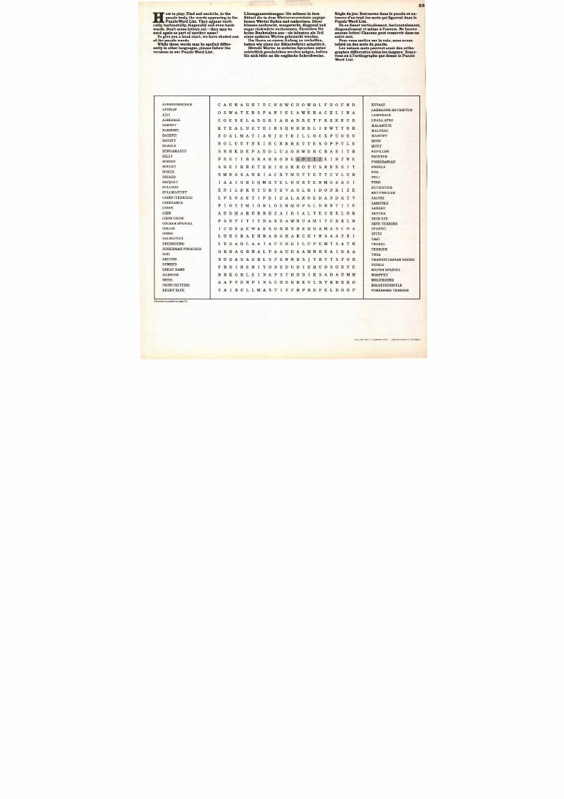
Ho w t o p l a y : F in d a n d e n c i r c l e , in t h ep u z z l e bo d y , t h e w o r d s a p p e a r i n g i n t h eP u z z le W o r d L i s t . Th e y a p p e a r v e r t i -
c a l l y, h o r i z o n t a l ly , d i a g o n a l l y a n d e v e n b a c k -w a r d s . D o n ' t c r o s s l e t te r s o u t — t h e y m a y b eu s e d a g a i n a s p a r t o f a n o t h e r n a m e
T o g i v e y o u a h e a d s t a r t , w e h a v e s h a d e d o n eo f t h e p uz z l e wo r d s .
W h i le t h e s e w o r d s m a y b e s p e l l e d d i f fe r -e n t l y i n o t h e r l a n g u a g e s , p l e a s e f o l l o w th ev e r s i o n s i n o u r P u z z le W o r d L i s t .
L o s u n g s a n w e i su n g e n : S i e m f is s e n i n d e mR i ts e l d ie i n d e m W o r t e r v e r z e ic h n i s a n g e g e -b e n e n W o r t e r fi n d e n a n d u m k r e i s e n . D i e s ek o n n e n s e n k r e c h t , w a a g e r e c h t , d ia g o n a l a n ds o g a r r i i c k w a r t s v o r k o m m e n . S tr e i c h e n S i ek e i ne B uc h s t a b e n a u s — s i e k ii nn t e n a l s Te i le i n e s a n d e r e n W o r t e s g e b r a u c h t we r d e n .
U m I h n e n z u e i n e m A n f a n g z n v e r h e l f e n ,h a b e n w i r e i n e s d e r R a t s e l w o r t e r s c h a t t i e r t .
O b w o h l W o r t e r i n a n d e r e n S p r a c h e n u n t e r -s c h i e d li c h g e s c h r i e be n w e r d e n m o g e n , h a l t e nS ie s i c h b i t t e a n d i e e n g l i s c h e S c h r e i b w e i s e .
R e g l e d u j e n : R e t r o n v e z d a n s l e p u z z le e t e n -t o u r e z d ' u n t r a i t le s m o t s qu i f i g m e n t d a n s l eP u z z l e W or d L i s t .
I ls s e li s e n t v e r t i c a l e m e n t , h o r i z o n t a l e m e n t ,d i a g o n a l e m e n t e t m e m e a l' e n v e r s . N e b a r r e za u c n n e l e tt r e C h a c n n e p e n t r e s se r v i r d a n s n na u t r e m o t .
P o u r v o n s m e t t r e s n r l a v o i e, n o u s a v o n st e i n t e u n d e s m o t s d u p u z zl e .
L e s m e m e s m o t s p e n v e n t a v o i r d e s o r t h o -g r a p h e s d i f f e r e n t e s s e l o n l e s la n g u e s . T e n e z -v o u s e n a l 'o r t h o g r a p h e q u e d o n n e l e P u z z leW o r d L i s t .
AFFENPINSCHER
AFGHAN
AIDI
AIREDALE
B AR B ET
BARBONEBASENJI
BASSET
BEAGLE
BERGAMASCO
BILLY
BORZOI
BOULET
BOXER
BRIARD
BRIQUET
BULLDOG
BULLMASTIFF
CAIRN (TERRIER)
CHIHUAHUA
CHIEN
CHIN
CHOW CHOW
C OC K ER S PANI EL
COLLIE
CORGI
DALMATIAN
DEERHOUND
DOBERMAN PINSCHER
DOG
DR EVER
DUNKER
GREAT DANE
HARRIER
HUND
IRISH (SETTER)
KERRY BLUE
Solution to puzzle on page 74.
KUVASZ
LABRADOR RETRIEVER
LAWERACK
L HAS A APS O
MALAMUTE
MALTESEMASTIFF
MUDI
MUT T
PAPILLON
POINTER
POMER ANI AN
POODL E
PUG
PULI
PUMI
RETRIEVER
ROTTWEILER
SALUKI
SAMOYED
S ANS HU
SETTER
SHIH-TZU
SKYE TERRIER
SPANIEL
SPITZ
TAZI
TECKEL
TERRIER
T OS A
TRAN S YLVANIAN HOUND
VI Z S L A
WATER SPANIEL
WHIPPET
WOLFHOUND
XOLOITZCUINTLE
YORKSHIRE TERRIER
CAUHAUHI HCHOWCHOWOLFHOUND
O SWATERSPANI ELAWERACKLINA
COESELADERI ABARBETFREKNUD
K TEALUZTHI HSQURRELI EWTTOR
E DALMATIANJDTEILLOCXPUGEU
R 0 L U U T N E I H C N R R E T T E S 0 P P•V L E
S BRKDEPANDLUAORWERCBAEI TR
P EST BSBARBONESPI TZEI RZNE
AREI RRETERI HSKROYUSREESI T
N MNSSANRI ACRYMUTTETTCVLUR
IAAIGBCQMHTELUOBTENMGEACI
E NI LDKUTUBTEVAULRI DONRI ZE
L PEOAEYI PEI DALAROEDANDATV
P IGTTMORLOENMOPSLDRRTI I E
ANDMARURBHZA ALTECKELORR
P SNTITI THAREAWNUAM TCBXLN
I COSAEWAESORNSBERGAMASCOA
L HHCRAEHBABGHARCHI NSAAZXI
L ESAOLAAIAUUOGLUPEMTSATN
O RRAGRNALPAAUDAAMNOEAIEAA
N NEASAGBLSPENNRSJ YRVTSFGR
FRETHENI YODEDUDI ERUDSOEFE
B BKGRLEI NAPSTHODI KSADAHMM
AAFFENPINSCHERREULBYRREKO
CAI BULLMASTI FFRPREFELDOOP
HEADLINE/TEXT ITC CUSHINGHEAVY SUBHEAD/PUZZLE/CLUES: BOLD
8/13/2019 Upper & lower case: Volume 11—Issue 2
http://slidepdf.com/reader/full/upper-lower-case-volume-11issue-2 26/80
Text can beexpanded
Ord can be condensedO, ne Main can be changed wen a Veal can is
ABCDEN34111KLMNOPQRSTUVV/XYZ
ABCDEPGIIIIKLMNOPQRSTUVWXYZ
AbCDr:PGIuJKLMNOPQRSTUVWXY7.
ARC ur r(i I 1 IJKLMNOPoR yr( wxyz
."
0 01.Y DAVID HENRY GOODSTEIN & THE STAFF OF INTER/CONSULT
NG OUR MINDSET
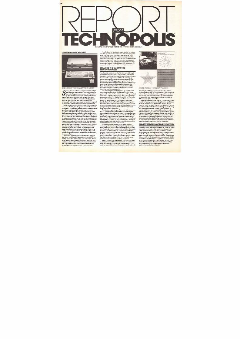
urely the most amazing development of
the last few months for Dchnopolists is
the stirring announcement of the exist-
Business
it really made our year. Mindset, an
ld-startup, could be on the verge of
the artist/illustrator world on its ear.
the company
on, high-performance color
anddone by the pro-
mers who worked on high-priced graphic
all is thefact that according to
is Berg the Mindset
tentially at least,since at this
s the likes of
m tofeel that Mindset may be
's background at Intel
totype machine was ever constructed.
Predictions by industry experts that as many
as 40% ofall microcomputers will be equipped
with color and/or graphics software by 1986undoubtedlyfueled the investmentfever. If the
Mndset machine is as good as the paper spec-
cation suggests it may become the de rigueur
accessoryfor well-equipped designer desktops.
Our hope is that it hastens the day when we all
speak in pictures as well as we do in words.
BREAKING THE E LECTRONICPRINTING IMPASSE
Availability offonts and of device specific soft-
ware control programs (or drivers) have long
been the bottlenecks to widespread use of elec-
tronic or laser printers (ELPs).A scarcity of
fonts, limitations on the number ofsizes and
faces and mind-boggling complexities in the
formatting of mixed type and pictures into ready-
to-record raster data formats kept even the
best-intentioned printer manufacturers like
Canon dealing with a trickle of users rather
than the anticipated gush.
Now the artificial intelligence of computers
and the real smarts of some of the best com-
puter scientists in the USA are providing a set of
solutions which will unleash the ELP's tremen-
dous potential. The digital font side of the solu-
tion will come from master-makers such as
those at Bitstream, Inc. In conjunction with
Symbolics, the Artificial Intelligence computer
builders, they have developed a program which
creates font bit-maps from outline masters. The
program operates on the Symbolics 3600 or
Lisp language computer.
Production of a single character bit-map now
takes seconds rather than the three to eighthours it did when done by expert human hands.
The program was developed with Symbolics by
Bitstream, Inc. under the supervision of Mike
Parker. The thinkware and machinery cost about
$160,000,a bargain by anyfont library develop-
ment budget standards. Font outlines are then
separately licensed to end users.
A more comprehensive approach is pre-
sented by the Postscript' page image descrip-
tion language from Adobe Systems of Palo Alto,
CA. Postscript is the brainchild ofJohn Warnock,
former Chief Scientist at Xerox's Palo Alto Re-
search Center. What he and his team have built
is the kind of smartware program that com-
puter pros call a Virtual Machine. This is a mite
hard to understand at first. Its revolutionary
potential soon becomes clear, however.
Imagine that you speak only English. You have
a desperate need to communicate to someone
who only speaks Etruscan. This problem can
only be solved by a translator who understands
ADOBE SYSTEMS POSTSCRIPT' OUTPUT
not only both languages but also the limita-
tions of each. The Virtual Machine (VM) is such
a translator.Adobe has developed it in such a
way that it can link any color or monochrome
screen with any output recorderfrom ELP to
35mm colorfilm recorder.
Most importantly, the Adobe VIII produces the
required type, processes the pictures and deals
with all specifics of the output device. It can
even be used to drive the screen display. Pricing
for the Adobe will almost certainly be built in by
the system or output device supplier and is
reasonable at a level unanticipated even a few
short months ago. Because of the nature of theVirtual Machine, all systems which can speak to
Adobe will be able to speak to each other. This
is the aspect which could make Postscript an
industry standard,allowing even the humblest
of micros to have a common language with the
mightiest of image processing systems.
IMAGITEX FLATBED COLOR PREVIEWED
Imagitex, who now have almost 40 units of their
monochrome scanning systems placed with
OEM customers, wowed the audience at the
fourth annual Seybold seminar in California, in
mid-March, by showing a prototype of a one-
pass 4-color flatbed scanner which took about
30 seconds to do its contone input work. While
President Paul Schmitz says that no immediate
price or delivery dates arefirm, the demo gives
an indication that they are seriously moving
towards bringing a low-cost Eikonix-like
system to market posthaste.
8/13/2019 Upper & lower case: Volume 11—Issue 2
http://slidepdf.com/reader/full/upper-lower-case-volume-11issue-2 27/80
COMPUGRAPHIC PERSONAL COMPOSITION SYSTEM
27
$300,000 Dicomed or Genigraphics output
recorders, al for 9,850. Throughput of 30full-
color slides per minute makes it appear to be a
tremendously cost-effective device. Hooked to
some of the hot new IBM PC softwarefor cre-
ation of business graphics images and typogra-
phy programs, it could put a lot of small type-
setting shops into the Information Repackaging
business we've been touting for some years.
JU KE FOR THE EYES
Video jukeboxes are on the way. While UK pub
owners will have to get a cinema license in orderto install the devices, Japanese and American
companies have already got the VCR machines
installed. The Japanese version allows pub pa-
trons to sing along on microphones, providing
the first automated piano bar in the world.
American ingenuity rears its head here, with
video jukes that play commercials continuously
until patrons deposit their 50 cents to call
out one of the 40 music segments on the tape
carousel. As an unpleasant footnote on rock &
roll video, a recent study by the Canadian Coali-
tion Against Violent Entertainment indicates that
they contain 18 acts of violence per hour and
that 35% of the videos contain sexual violence.
KODAK TO INTRO VIDEOCAMCORDER FOR XMAS
In what may be the final death-knell for silver
film as the home movie recording medium of
preference,Kodak will introduce a video cam-
era/ recorder with a distinctive newformat for
sale in U.S. retail stores thisfall. Matsushita will
provide the equipment and tape in the new
8mmformat.The 1,500 price tag should not
scare off the generation who are now paying
three to ten times that muchforhomecomputers.
Moreover, thefirst camera at 5.3 pounds is
light enough to be usefully portable, with later
camera hardware rumored to be even lighter.
Many advantages make this unit a highly desir-
able alternative for the family moving picture
album. There is no development delay, the tapes
are the size ofa standard audio cassette, tape
costs about 5% of what silverfilm does and
perhaps most importantly, the cassette allows
one hour of uninterrupted exposure, a far cry
from the three minutes contained on the old
Kodak 8mm loops.
As a final consumer costjushfication, the
Camcorder's mechanism will double as a stan-
dard VCR, i.e. allow recording and playback of
broadcast TV signals. The U.S. Supreme Court
recently upheld the constitutional rights of all
Americans to copy signals in the air onto tape
in the privacy of our own homes. The installed
number of VCRs in U.S. homes is expected to
zoom from 4.5 million at the end of 1983 to
over 13 million by the end of1984.All we need
now is an interface to our IBM PC and Apple
Macintosh,and we're in the business of gather-
ing source art digitally.
PERSONAL IMAGE COM POSITIONFROM COMPU GRAPHIC
Although the system has been in the wind (and
the press) for some time, ourfirst good look at
the CG Personal Composition System, in which
the Apple Lisa and 8400 typesetter are married,
was at the Imprinta '84 show in Diisseldorf.The
PCS seems to us to have been rather carefully
positioned and priced so as not to get in the
way of the regular MCS text system.
The PCS links Lisa to the 8400 CRT typesetter
directly. Product salesnien were careful to point
out that the type handling capabilities of the
Lisa are not the reason to buy the system. Rather,
this is being billed as thefirst micro-based
system for digital production of charts, view-
graphs and overhead transparencies. As such,the user concentrates on a singleframe at a
time, using standard LisaDraw and Lisa Graph
programs to create images on the screen. A
CG-developed driver program translates these
into typeset output using some standard fonts
and some special picture-setting graphic li-
brary characters.
What is lacking for the present (and may be
solved in the nearfuture) is the standard CG
font master with its superb quality. Text setting
is not accentuated in the demonstrations and
when text is output it appears in a font which
apparently emulates the low-resolution dot
matrix appearance of the Lisa screen represen-
tation. On the other hand, there appear to be a
fair number of people who can cost just the
unit's $39,000 price since private sources indi-
cate that over 100 PCS units have been shipped
since its introduction in latefall of last year.
The CG PCS appears to have all the makings of
a product which will grow with time. It could
well establish a position of dominance in the
low-range market segments where typograph-
ies and reprographics overlap. It only remainsto see what specific strategy they take in terms
of expanding the product's configuration and
capabilities over the nextfew years.
COLOR HARD COPY PROGRESS
One of the most tenacious obstacles to wide-
spread acceptance of color imagery, especially
utility-grade information generated by com-
puters, is the dculty in getting cheap, quick,
reliable hard copy. Linked to this is the cost
and/or poor quality of available color repro-
graphics techniques.7ivo recent announce-
ments may help to ease the color output crunch.
Mead Corporation announced a new paper
coating which seems to be most revolutionary
indeed. Ordinary paper or mylar are coated
with a special resin and 3 jackets' of colorless
dyes which turn magenta, cyan or yellow when
exposed to acid contained in the resin. Multiple
exposures determine intensity and saturation
for each primary color, after which the paper
is passed through a pressure rollerfor
development.
The roller's pressure pops micro-encapsu-
lated developer particles, giving instant half-
tone or contone results at resolutions of 1400
lines per inch. Best of all is the price, about 15
to 25 cents per A4 sheet, a fraction of present
photographic color output materials from
Kodak or Polaroid.
Image Resources (partly owned by Polaroid)
has introduced a 35mm high-quality digital film
recorder. The system features 4096 element
bi-directional add essability and IBM PC inter-facing. It has built-in anti-aliasing and image
enhancement software which yield output re-
puted to be as good as any ever produced on
COMPUTER QUOTAS
For the last few years, we'vejokingly told ourfriends that by 1990 everyone would have a sili-
con quota,a certain number of computers which
would have to be consumed per year. Now some-
one agrees with us.JeffreyHallett, President of
the Naisbitt ( Megatrends) Group believes that
within the next 18 months companies like AT&T
may already be giving free computers with the
purchase of the software that runs on it.AT&T
would probably be most interested in getting
the computer in its manifestation as super-
smart phone into the consumer's home.As an
attachment to the TV and phone line, it would
probably support programming, chart and
graph production and perhaps play some
games (Monopoly, maybe?)
TECHNOPOUS,As ofApril I, 1984, thefirst steps have been
taken towards the creation ofa real Technopolis.
A non-profit corporation has been founded to
help develop a public-access computer graph-
ics facilityfor working artists, art educators
and art students. While thefacility will be small,
it will, we hope, be an environment where seri-
ous work in the new digital art forms can begin
to be done.
Technopolis will be member and donor sup-
ported,and will help itself out with publica-
tions and seminars.Thefirst scheduled prod-
ucts will be a monthly newsletter and a hand-
book on image-making computer technologies
and systems. The newsletter, which with the kind
permission of U&le editors will also be called
REPORT FROM TECHNOPOLIS7 will appear in
June, with The Technographees Handbook due
later in the summer.
This column will continue as it has, with the
monthly version bringing more timely news,
especially related to systems, equipment,shows
and supplier news. Information on Technopolis
Electronic Graphics Studio program or publica-
tions can be had from the Technology Center
address below.
ABOUT THEAUTHOR: David Henry
Goodstein is Director of Inter/
Consult and of Technopolis
Incorporated. He is also Research
Affiliate at the Visible Language
1,4/orkshop at MITComments or
inquiries can be directed to himat:
Technology Center, 21 Notre Dame
Avenue, Cambridge, MA02140, USA.
David Henry Goodstein
TEXT: ITC ZAPF BOOKDEM ITALIC NITIAL: MEDIUM ITALIC CAPTIONS/BIOGRAPHY: LIGHT HEADLINE: ITC AVANT GARDE GOTHIC BOOK, BOOK OBLIQUE, BOLD BYLINE: MEDIUM SUBHEADS: BOLD
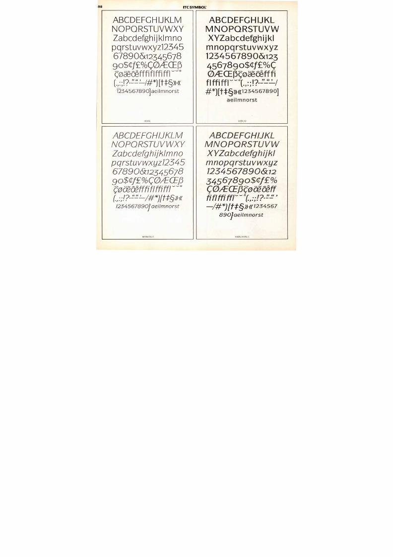
8/13/2019 Upper & lower case: Volume 11—Issue 2
http://slidepdf.com/reader/full/upper-lower-case-volume-11issue-2 28/80
ELFABETby Jack
iams of Richmond.
one of a num-
f elf-inspired alpha-
o come our way.
robots—we
comes froman
een
tions of his own, career-
wise. Froma stint in the
US. Marine Corps he
went on to the Maryland
Institute College of Art,
to jobs in ad agencies,graphic studios, a bank,and finally his own free-
lance business. His latest
venture is a partnership
in a rubber stamp busi-
ness called Elbow GreaseManual Printing. (No, the
elves do not come out atnight to do the work.)
TEXT: ITC BOOKMAN LIGHT LEAD-IN: MEDIUM
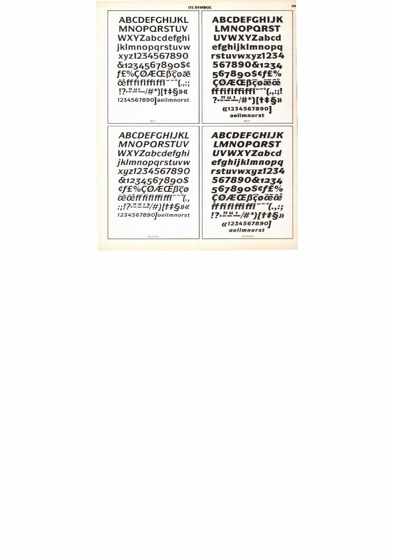
8/13/2019 Upper & lower case: Volume 11—Issue 2
http://slidepdf.com/reader/full/upper-lower-case-volume-11issue-2 29/80
Gg : Gift Hh : Hang Ii : Ice Skate Jj : Jump
Cc:Crack Ee : Eatd Drip
Am......
1: Ol ive Pp : Piano Qq : Quick
Vv : Vampire
41
V V
Ss : Sm al l
S SIt : Twist T U u : Up
rstInon.
Xx : X-rayw : Walk
c N E UM E IE R DE SIGN T E AM
Zz : Zigzag
TEXT: ITC BOOKMAN LIGHT LEAD-IN: MEDIUM
29
Aa : Acrobat
T H E A C T I O N A L P H A B E T ,as anyone can see, is a
giant step beyond yourusual A-is-for-Apple ABC.The design team thatcreated it had in mind an
alphabet in which the let-terforms themselves — not
extraneous objects — were
the illustrations. Theyalso had in mind to mar-ket their alphabet as achildren's book. From
where we sit, it would
take a four-year-old, going
on forty, to appreciatethe subtleties and sophis-ticated nuances theybrought to their project.But we admire the dar-
ing and the inventivenessof this original concept.
The alphabet book was
created by Byron Glazer,
designer, and MartyNeumeier, art director,
of The Neumeier DesignRam of Santa Barbaraand Palo Alto, California
MM
Kk : Kite LI : Letter Mm : Mistake Nn : Nothing
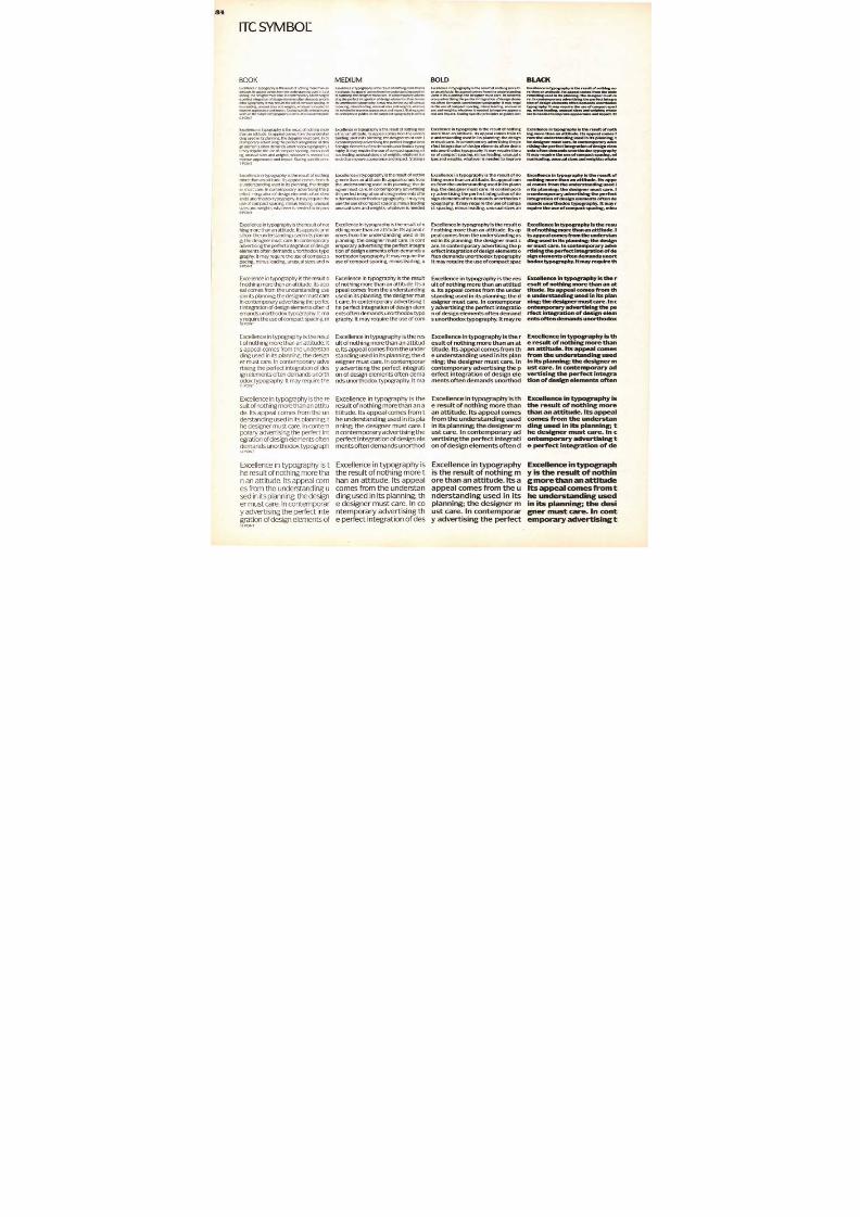
8/13/2019 Upper & lower case: Volume 11—Issue 2
http://slidepdf.com/reader/full/upper-lower-case-volume-11issue-2 30/80
ALDO NOVARESE
ITC SYMBOL is made available in Book,
Medium, Bold and Blackweights with cor-
responding italics. SMALL CAPS have been
created for the BOOK and MEDIUMweights.
Oldstyle figures are available for the roman
and italic designs in all weights.
Only licensed ITC Subscribers are author-
ized to reproduce, manufacture, and offer
for sale these and the other ITC typefaces
shown in this issue. This is your guarantee
of authenticity: C _1 . 1 C u i s E D
These new typefaces will be available to
the public on or after August 15, 1984.
ITC Symbol is a simple straightforwarddesign of understated elegance. It has just
the hint of a serif to aid readability in less
than ideal typographic conditions, and
somewhat condensed character propor-
tions to ensure economy of space. The Book
and Medium weights have a light, even
color which provides inviting and legible
text composition. The Bold and Black
weights complement the lighter designs
perfectly and should prove, to be valuable
additions to any typographic palette.
There is a quiet, classic beauty to ITC
Symbol. Clearly, it is the kind of design
Beatrice Warde (the late scholar and print-
ing historian) referred to when she wrote
that a typeface should be like a crystal
goblet which lets its contents be seen and
enjoyed without distraction. No design trait
conflicts with the communicative power ofthis typeface.
ITC Symbol's italics are a perfect match
to the roman. They are clear and unencum-
bered, in addition to being a subtle and
comfortable companion to the roman.
ITC symbol is the third ITC typeface from
the gifted hand of Aldo Novarese of Turin,
Italy. His two previous ITC releases are ITC
Novarese® and ITC Fenice® Mr. Novarese
has also created such important designs as
Eurostile, Torino and Nova Augustea. In all,
more than 166 designs are the result of his
design prowess.
WHAT'S NEW FROM ITC
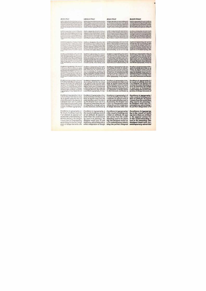
8/13/2019 Upper & lower case: Volume 11—Issue 2
http://slidepdf.com/reader/full/upper-lower-case-volume-11issue-2 31/80
31
HEADLINE: ITC SYM BOL BOLD TEXT: MEDIUM ITLE/LEAD-IN . BLACKCAPTION: ITC FRANKLIN GOTH C BOOK SMALL CAPS
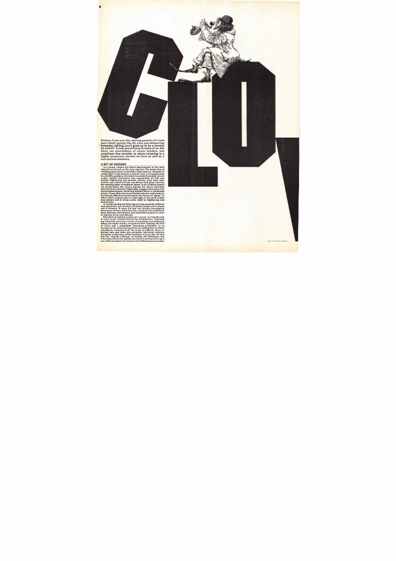
8/13/2019 Upper & lower case: Volume 11—Issue 2
http://slidepdf.com/reader/full/upper-lower-case-volume-11issue-2 32/80
ABCDEFGHIJKLMNOPORSTUVWXYZabcdefghijklmno
pqrstuvwxyz12345678906o2345678
go$CfEKOVECE3
^^^cefffiflffififl v°
12345678901aeilmnorst
B OOK
ABCDEFGHIJKLMNOPORSTUVWXYZabcdefghijklmno
pqrstuvwxyz72345
67890&12345678
goUff %(0/2E C E f 3
0 C 6 O e s'fififlififfr -°
1234567890] aeilmnorst
BOOK ITAL IC
A B C D E F G H IJKLM N O P Q R S T U V WX Y Z a b c d e f g h i j k l
mnopqrstuvwxyz1234567890&i23
4567890$Cfg/oc0 4 / E C E f 3 0 $ 5 e f f f ifliffiffl'(.,:; ? , 22= 1
#*llt •§D (0234567891aeilmnorst
\ IFD IUN 1
ABCDEFGHIJKLMNOPQRSTUVW
XYZabcdefghijkl
mnopqrstuvwxyz
1234567890&1 2
3456789oWf(01ECEj3(0ee -defffi fl ffi
/-# Vg)) 12345678901aeilmnorst
MEDIUM ITAL IC
ITC SYMBOL
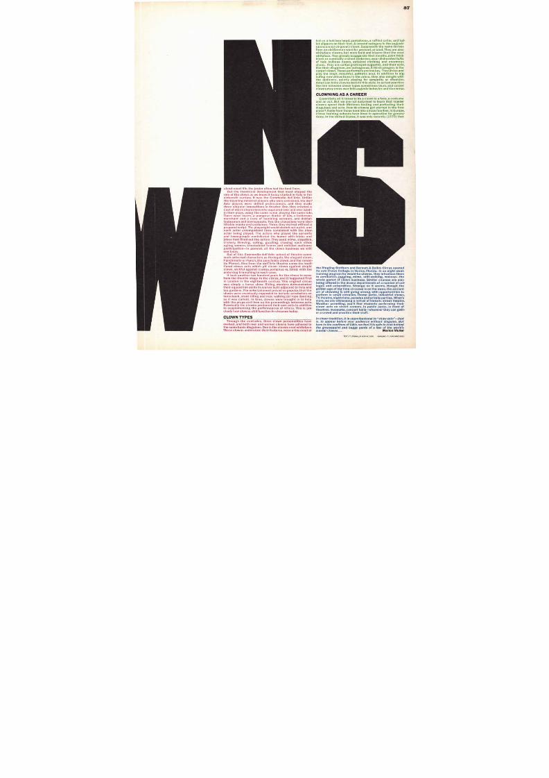
8/13/2019 Upper & lower case: Volume 11—Issue 2
http://slidepdf.com/reader/full/upper-lower-case-volume-11issue-2 33/80
ABCDEFGHIJKLMNOPQRSTUV
WXYZabcdefghi
jklmnopqrstuvwxyz1234567890&123456789o$4$
f0/0c(NECEE3(0
tefffififfiff1"°(.,:,
? • 2 ̀-/#1[11:§»«1234567890peilmnorst
BOLD
ABCDEFGHIJKLMNOPQRSTUVWXYZabcdefghijklmnopqrstuvw
xyz1234567890
6z1234567890$Cff %c0/ECEI3(0eetig•iffififfiffl"T.,
:; ?• 1 2 -- 1 Y#l l tt§» «1234567890peilmnorst
BOLD ITALIC
ABCDEFGH1JK
LMNOPQRST
UVWXYZabcd
efghijklmnopqrstuvwxyz1234
5678906/1234
5671390$4fV/0c O l E C E P O M a e
fffifIffiff1"1.,:;? • 1 1 2-1/#111i*§D
C1234567890
aeilmnorstBLACK
ABCDEFGHIJKLMNOPORSTUVWXYZabcdefghijklmnopqrstuvwxyz1234
567890&123456789o$4ff%
COIECEIJOigaifffiflffiffl Y.,:;
?•volfiLitt*MtrAt§Dg1 2 34 5 678 9 Oil
aeilmnorstBLACK ITALIC
ITC SYMBOL
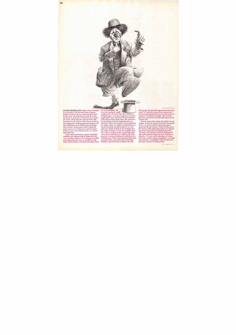
8/13/2019 Upper & lower case: Volume 11—Issue 2
http://slidepdf.com/reader/full/upper-lower-case-volume-11issue-2 34/80
I T C S Y M B O L
B O O KExcellence in typography is the result of nothing more than an
attitude. Its appeal comes from the understanding used in its pl
anning; the designer must care. In contemporary advertising th
e perfect integration of design elements often demands unorthodox typography It may require the use of compact spacing. m
inus leading, unusual sizes and weights; whatever is needed to
improve appearance and impact. Stating specific principles or guides on the subect of typography is difficult because the princ
6 POINT
Excellence in typography is the result of nothing morethan an attitude. Its appeal comes from the understanding used in i ts planning; the designer must care. In co
ntemporary advertising the perfect integration of desi
gn elements often demands unorthodox typography. It m ay requ i re the use o f com pact spac ing , m inus l ead i
ng, unusual sizes and weights; whatever is needed to i
mprove appearance and impact. Stating specific princ7 POINT
Excel lence in t ypography i s the resul t o f noth ing
more than an att i tude. I ts appeal comes from the understanding use d in i t s p lanning; the design
er must care. In contemporary advert ising the per fec t in tegra t ion o f des ign e lements o f ten dem
ands unor thodox typography . I t may requ i re theuse of compa ct spacing, minus leading, unusuals izes and weights; whatever i s needed to improv8 POINT
Excel lence in typography is the resu l t o f noth ing more than an at t itude. I ts appeal come
s f rom the un derstanding used in i ts p lann in
g; the designer must care. In contemporary
advert ising the perfect in tegrat ion o f design
e lements o f ten demands unor thodox t ypography. I t may requi re the use of compact s
pacing, minus lead ing, unusual sizes and w9 P O I N T
Excel lence in typography is the resul t of noth ing more than an at t i tude. I ts appeal comes f rom the unders tanding used in i ts planning; the designer must care
In contempo rary adver t is ing the per fect integration of design elements often demand s unor thodox typography . I t may require the use of compact spacing, m10 POINT
Excellence in typography is the result of nothing more than an atti tude. Its appeal comes from the understanding used in i ts planning; the designer must care. In contemporary advertising the perfect integration of design e lements of ten demands unorthodox typography. It may require the11 POINT
Excel lence in typography is the resuit of nothing more than a n at t i tu
de. I ts appeal comes from the understanding used in i ts planning; the designer must care. In contemporary advert is ing the perfect in tegrat ion of design elements of ten
demands unor thodox typograph12 POINT
Excellence in typography is the result of nothing more than an att itude. I ts appe al comes f rom the understanding used in i ts planning; the designer must care. In contemp orary advert ising the perfect integrat ion of design elements of
M E D I U M
Excellence in typography is the result of nothing more than a
n attitude. Its appeal comes from the understanding used in i
ts planning; the designer must care. In contemporary adverti
sing the perfect integration of design elements often demands unorthodox typography It may require the use of compac
t spacing, minus leading, unusual sizes and weights: whateve
r is needed to improve appearance and impact.Stating spec i
fic principles or guides on the subject of typography is difficul
Excellence in typography is the result of nothing mor
e than an attitude. Its appeal comes from the unders
tanding used in its planning; the designer must care. I
n contemporary advertising the perfect integration o
f design elements often demands unorthodox typog
raphy. It may require the use of compact spacing, mi
nus leading, unusual sizes and weights; whatever is needed to improve appearance and impact. Stating s
Exce l lence in typography is the resu l t o f no th ing more than an a t t itude. I ts appea l comes f romthe understanding used in its planning; the de
signer must care. In contemporary advertising
the perfect integration of design elements ofte
n demands unorthodox typography. It may requ i re the use o f compact spac ing , m inus lead ing
unusual s i zes and weights; whatever is needed
Excel lence in typography is the resul t of nothing more than an attitude. Its appeal comes from the understanding used in its
planning; the designer must care. In contemporary advertising the perfect integra
tion of design elements often demands u
northodox typography. It may require theuse o f compa c t spac ing , m inus l ead ing , u
Excel lence in typography is the resu l to f noth ing more than an a t t itude. I ts appeal comes from the understandingused in i ts p lanning; the des igner m us
t care. In contemporary advertising the perfect integration of design elements often demands unorthodox typography. I t may requ i re the use o f corn
Excel lence in typography is the resul t of nothing m ore than an at t i tude. I ts appeal com es f rom the understanding used in i ts planning; the des igner must care . I n contemp orary advertising the perfect integrati
on o f des ign e lements o f ten dem ands unor thodox t ypography . I t ma
Excellence in typography is theresu l t o f no th ing more than an attitude. Its appeal comes from t
he unde rs tand ing used in i ts p lanning; the designer must care. I
n contemporary advertising the
perfect integration of design elements often demands unorthod
Excel lence in typography isthe resu l t o f noth ing m ore than an attitude. Its appeal
comes from the understan
ding use d in i ts p lanning; the des igner m ust care . In contemporary advertising th
e perfect integration of des
BOLD
Excellence in typograp hy is the result o f nothing more th
an an at titude. Its a ppeal comes from the understanding
used in its planning; the designer must care. In contemp
orary advertising the perfect integration of design elements often demands unorthodox ty pography. It may requi
re the use of compact spacing, minus leading, unusual si
zes and weights; whatever is needed to improve appeara
nce and impact. Stating specific principles or guides on t
Excellence in typography is the result of nothing
more than an attitude. Its appeal comes from th
e understanding used in its planning; the design
er must care. In contemporary advertising the pe
rfect integration of design elements often dema
nds unorthodox typography. It may require the u
se of compact spacing, minus leading, unusual s
izes and weights; whatever is needed to improve
Excellence in typography is the result of no
thing more than an attitude. Its appeal corn
es from the understanding used in its pla nn
ing; the designer must care. In contempora
ry advertising the perfect integration of de
sign elements often demands unorthodox typography. It may require the use of compa
ct spacing, minus leading, unusual sizes an
Excellence in typography is the result o
f nothing more than an attitude. Its ap
peal comes from the understanding us
ed in its planning; the designer must c
are. In contemporary advertising the p
erfect integration of design elements o
ften demands unorthodox typography
It may require the use of compact spac
Excellence in typography is the res
ult of nothing more than an attitud
e. Its appeal comes from the under
standing used in its planning; the d
esigner must care. In contemporar
y advertising the perfect integratio
n of design elements often demand
s unorthodox typography. It may re
Excellence in typography is the r
esult of nothing more than an at
titude. Its appeal comes from th
e understanding used in its plan
ning; the designer must care. In
contemporary advertising the p
erfect integration of design ele
ments often demands unorthod
Excellence in typography is the result of nothing more than
an attitude. Its appeal comes
from the understanding used
in its planning; the designer m
ust care. In contemporary ad
vertising the perfect integrati
on of design elements often d
Excel lence in typographyis the resu l t o f noth ing more than an attitude. Its aappeal comes from the understanding used in its
planning; the des igne r must care. In contemporar
y advertising the perfect
BLACK
Excellence in typography is the result of nothing mo
re than an attitude. Its appeal comes from the unde
rstanding used in its planning; the designer must ca
re. In contemporary advertising the perfect integration of design elements often demands unorthodox
typography. It may require the use of compact spaci
ng, minus leading, unusual sizes and weights; whate
ver is needed to improve appearance and impact. St
Excellence in typography is the result of noth
ing more than an attitude. Its appeal comes f
rem the understanding used in its planning; t
he designer must care. In contemporary adve
rtising the perfect integration of design elem
ents often demands unorthodox typography
It may require the use of compact spacing, mi
nus leading, unusual sizes and weights; whate
Excellence in typography is the result of
nothing more than an attitude. Its appe
al comes from the understanding used i
n its planning; the designer must care. 1
n contemporary advertising the perfect
integration of design elements often demands unorthodox typography. It may r
equire the use of compact spacing, minu
Excellence in typography is the resu
It of nothing more than an attitude. I
ts appeal comes from the understan
ding used in its planning; the design
er must care. In contemporary adve
rtising the perfect integration of de
sign elements often demands unort
hodox typography. It may require th
Excellence in typography is the r
esult of nothing more than an at
titude. Its appeal comes from th
e understanding used in its plan
ning; the designer must care. In c
ontemporary advertising the pe
rfect integration of design elem
ents often demands unorthodox
Excellence in typography is th
e result of nothing more than
an attitude. Its appeal comes
from the understanding usedin its planning; the designer m
ust care. In contemporary ad
vertising the perfect integra
tion of design elements often
Excellence in typography isthe result of nothing morethan an attitude. Its appeal
comes from the understanding used in its planning; the designer must care. In c
ontemporary advertising te perfect integration of de
Excellence in typograph
y is the result of nothin
g more than an attitudeIts appeal comes from t
he understanding usedin its planning; the desi
gner must care. In cont
emporary advertising t14 POINT
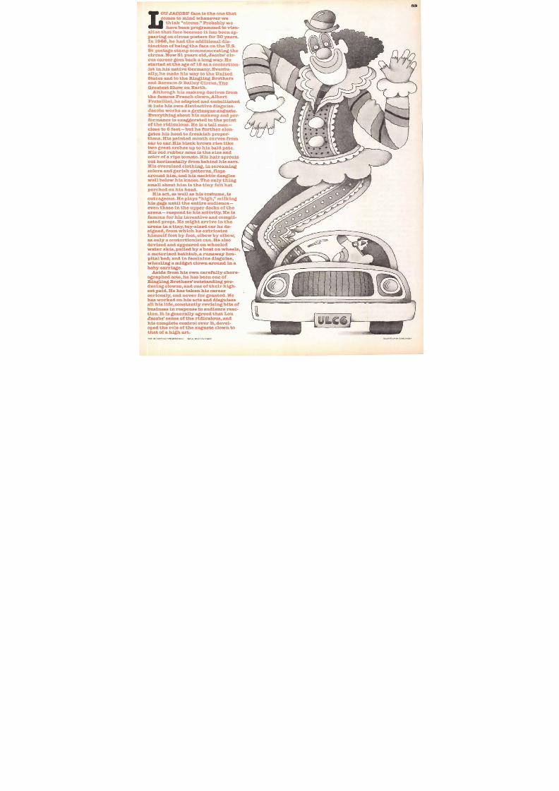
8/13/2019 Upper & lower case: Volume 11—Issue 2
http://slidepdf.com/reader/full/upper-lower-case-volume-11issue-2 35/80
BOOK ITALIC
Excellence in typography is the result of nothing more than an attitude. Its appeal comes from the understanding used in its pianning; the designer must care. In contemporary advertising the
perfect integration of design elements often demands unorthodox typography. It may require the use of compact spacing, minus leading, unusual sizes and weights; whatever is needed to improve appearance and impact. Stating specific principles or gui
des on the subject of typography is difficult because the principl
6 POINT
Excellence in typography is the result of nothing more than an attitude Its appeal comes from the understand
ing used in its planning; the designer must care. In cantemporary advertising the perfect integration of design
elements often demands unorthodox typography. I t ma
y require the use of compact spacing, minus leading. u
nusual sizes and weights; whatever is needed to impro
veappearance and impact. Stat ing specif ic pr inciPleso7 POINT
Excellence in typograph y is the result of nothing
more than an attitude. Its appeal comes from the understanding used in its planning; the design
er must care. In contemporary advertising the perfect integration of design elements often demo
nds unorthodox typography. It may require the use of compact spacing, minus leading, unusual sizes and weights; whatever is needed to improve8 POINT
Excellence in typography is the result of nothing more than an attitude. Its appeal comes from the understanding used in its planning; the designer must care. In contemporaryadvertising the perfect integration of designelements often demands unorthodox typography. It may require the use of compac t spacing, minus leading, unusual sizes and wei9 POINT
Excellence in typography is the result ofnothing more than an a ttitude. Its appea
I comes from the understanding used inits planning; the designer must care. In c
ontemporary advertising the perfect integration of design elements often demands unorthodox typography. It may require the use of compa ct spacing, minus I10 POINT
Excellence in typography is the result of nothing more than an attitude. Itsappeal comes from the understanding used in its planning; the designermust care. In contemporary advertising the perfect integration of designelements often demands unorthodox typography. It may require the useI I POINT
Excellence in typography is the resuit of nothing more than an attitude. Its appeal comes from the anderstanding used in its planning, the designer must care. In contemporary advertising the perfect integration of design elements often demands uno rthodox typography. I12 POINT
Excellence in typography is the result of nothing more than an attitude. Its appeal cornes from the understanding used in its planning; the designer must care. In contemporaryadvertising the perfect integration of design elements ofte
MEDIUM ITALIC
Excellence in typography is the result of nothing more than anattitude. Its appeal comes from the understanding used in its p
lanning; the designer must care. In contem porary advertising t
he perfect integration of design elements often demands unorthodax typography. It may require the use of compact spacingminus leading, unusual sizes and weights; whatever is neededto improve appearan ce and impact. Stating specific principlesor guides on the subje ct of typography is difficult because the
Excellence in typography is the result of nothing mor
e than an attitude. Its appeal comes from the underst
onding used in its planning; the designer must care. I
n contemporary advertising the perfect integration o
f design elements often demands unorthodox typogr
aphy. It may require the use of compact spacing, min
us leading unusual sizes and weights; whatever is ne
eded to improve appearance and impact. Stating sp
Excellence in typography is the result of nothing more than an attitude. Its appeal comes fromthe understanding used in its planning; the designer must care. In contemporary advertising t
he perfect integration of design elements often
demands unorthodox typography. It may require the use of compact spacing, minus leading
unusual sizes and weights; whatever is needed
Excellence in typography is the result of nothing more than an attitude. Its appeal comes from the understanding used in its pfanning; the designer must care. In contemporary advertising the perfect integrationof design elements often demands u northodox typography. It may require the use of compact spacing, minus leading, unusu
Excellence in typography is the msultof nothing more than an att itude. Its appeal comes from the understanding used in its planning; the designer must
care. In contempo rary advertis ing theperfect integration of de sign elementsoften demands unorthodox typography. It may require the use of compact s
Excellence in typography is the result of nothing more than an a tt itude. Its appeal comes from the understanding used in its planning; the designer must care. In contemporary ad vertising the perfect integration of design elements often demands un orthodox typography. It may r
Excellence in typography is the result of nothing more than an attitude. Its appeal comes from theunderstanding used in its planning; the designer must care. In contemporary advertising the perf
ect integration of design e l e m e nts of ten demands unorthodox ty
Excellence in typography isthe result of nothing more than an attitude. Its appeal comes from the unde rstanding used in its planning; thedesigner mu st care. In contemporary ad vertising the peffect integration of des ign
BOLD ITALIC
Excellence in typography is the result of nothing more tha
n an attitude. Its appeal comes from the understanding u
sed in its planning; the designer must care. In contempor
ary advertising the perfect integration of design elementsoften demands unorthodox typography. It may require th
e use of compact spacing, minus leading, unusual sizes a
nd weights; whatever is needed to improve appearance a
nd impact. Stating specific principles or guides on the sub
Excellence in typography is the result of nothing m
ore than an attitude. Its appeal comes from the un
derstanding used in its planning; the designer mu
st care. In contemporary advertising the perfect i
ntegration of design elements often demands uno
rthodox typography. It may require the use of com
pact spacing, minus leading, unusual sizes and w
eights; whatever is needed to improve appearanc
Excellence in typography is the result of noth
ing more than an attitude. Its appeal comes
from the understanding used in its planning
the designer must care. In contemporary a dvertising the perfect integration of design el
ements often demands unorthodox typography. Itmay require the use of compact spac
ing, minus leading, unusual sizes and weigh
Exce l l ence in typography i s the res u l t o
(noth ing more than an a t t i tude . I ts appe a l c o m e s f r om t h e u n d e r s t a n d i n g u s e din i ts p lanning; the des igne r m ust care . In c o n t e m p o r a r y a d v e r t i s i n g t h e p e r f e c tintegrat ion of des ign e lemen ts of ten de
mands unorthodox typography. It mayreq ui re the use o f compact spac ing , min
Excellence in typography is t he r e suIt of nothing m ore than an a t t i tude. It s appe a l co me s f ro m t he un de rs t anding used in i ts p lann ing; the des ign
e r mu st care . In co n t e mpo rary adver t i s ing th e pe r fect i n t eg ra t ion o f des ign e l e me n t s o f t e n de man ds un o r th odox t ypog rap h y . It may requ i re t
Exce l lence in typography is the resu l t of noth ing more than an a t ti tude . I ts appe al come s f rom theunderstanding used in i ts p lann ing; the designer mu st care. In contem porr i fy advert is ing the perfect in tegrat ion of design e lem ents o f te n d e m an d s u n or th od ox ty
Excel lence in typography is the resul t of noth ing more than an a t ti tu de . I ts ap pea l com es f rom t h e u nders t and ing u sed ini ts p l a nn ing ; the des ig ne r m ust ca re . In con t em pora ry adve rr t is ing t h e per fec t in t egra t iono f d e s ig n e l e m e n t s o ft e n d e m
Excel lence in typography is t he r es u l t o f n oth in g more than an a t t itude . Its appe a l c o m e s f r o m t h e u nd e rs tand ing used in i ts p lanni n g ; t he des ig n e r m us t ca re . In con tem pora ry adv er ti s ing the p e r fec t in tegra t i
BLACK ITALIC
Excellence in typography is the result of nothing mo
re than an attitude. its appeal comes from the unde
rstanding used In its planning; the designer must ca
re. In contemporary advertising the perfect Integraflan of design elements often demands unorthodox
typography. It may require the use of compact spat
ing, minus leading, unusual sizes and weights; what
ever is needed to improve appearance and impact. S
Excellence in typography is the result of noth
Ing more than an attitude. I ts appeal comes f
rom the understanding used in its planning; t
he designer must care. In contemporary adve
rtising the perfect integration of design elem
ents often demands unorthodox typography
It may require the use of comprct spacing, m
inus leading, unusual sizes and weights; wha
Excellence in typography is the result of
nothing more than an attitude. Its appe
al comes from the understanding used i
n its planning; the designer must care. I
n contemporary advertising the perfect
integration of design elements often demands unorthodox typography. It may r
equire the use of compact spacing, minu
Excellence in typography is the result of nothing more than an attitud
e. Its appeal comes from the unders
tanding used in its planning; the de
signer must care. In contemporary
advertising the perfect integration
of design elements often demands
unorthodox typography. It may req
Excellence in typography is the r
esult of nothing more than an at
titude. Its appeal comes from th
e understanding used in its plan
ning; the designer must care. In c
ontemporary advertising the perfect integration of design elem
ents often demands unorthodox
Excellence in typography is t
he result of nothing more tha
n an attitude. Its appeal corn
es from the understanding us
ed in its planning; the design
er must care. In contemporary advertising the perfect inte
gration of design elements of
Excellence in typography is the result of nothing more
than an attitude. Its appeaI comes from the understan
ding used in its planning; the designer must care. In contemporary advertising the perfect integration of d
Excellence in typograp
by is the result of nothi
ng more than an attitud
e. Its appeal comes fro
m the understanding u
sed in its planning; the
designer must care. In c
ontemporary advertisi
a
14 POINT
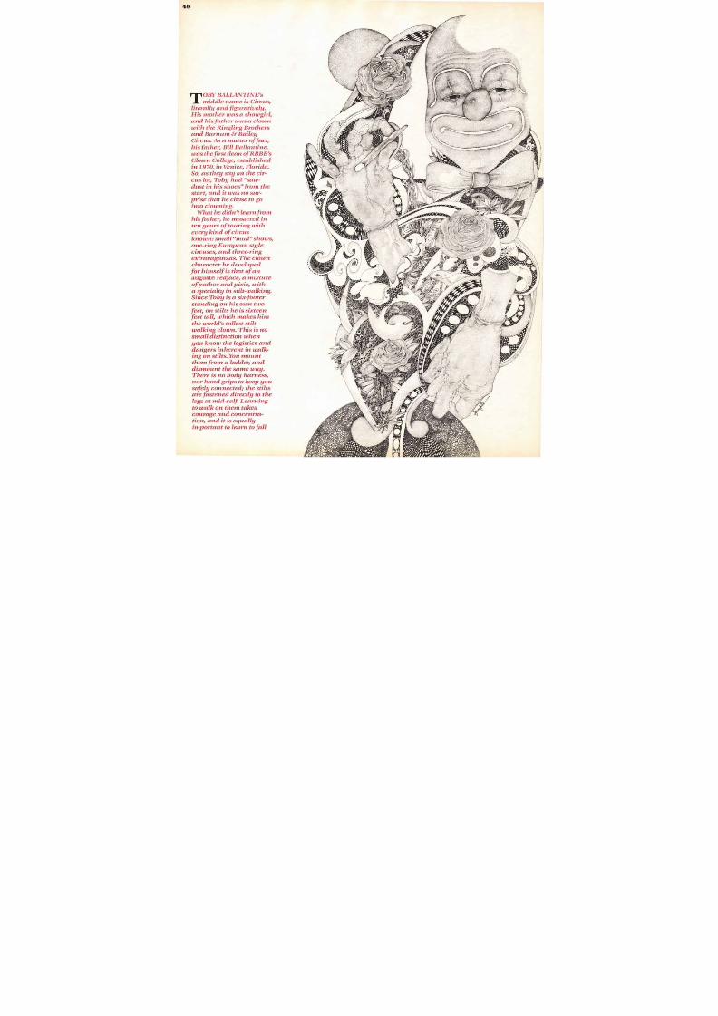
8/13/2019 Upper & lower case: Volume 11—Issue 2
http://slidepdf.com/reader/full/upper-lower-case-volume-11issue-2 36/80
" It may sound funny to some of us, but
and
T O R Y
self, as the case may be). The whole idea of
ration of the harvest, a plea for rain, or in supplication
bly included several
uish characters who represented all that was
rightening and devilish. Similar roles were later
ancient Greek and Roman folk plays and into
lays of medieval times. In all of these theatri-s, the actors playing the devil's disciples
ical costumes,fright wigs, exaggerated noses and
l appendages, menacing painted faces or grotesque
nd bested by the forces of "good." Inose was to make light of the devil's nefar-
arves, hunchbacks and demented people at court
hat benighted custom, it's easy to see how the role
ctors, weary of traveling around Europe
t was a potentially rewarding profession. In ex-his entertaining skills, his willingness to affect
ourt life. He alsolar privilege of tossing off witticisms and
I L L U ST RAT IO N BY W AL L Y NE I BART
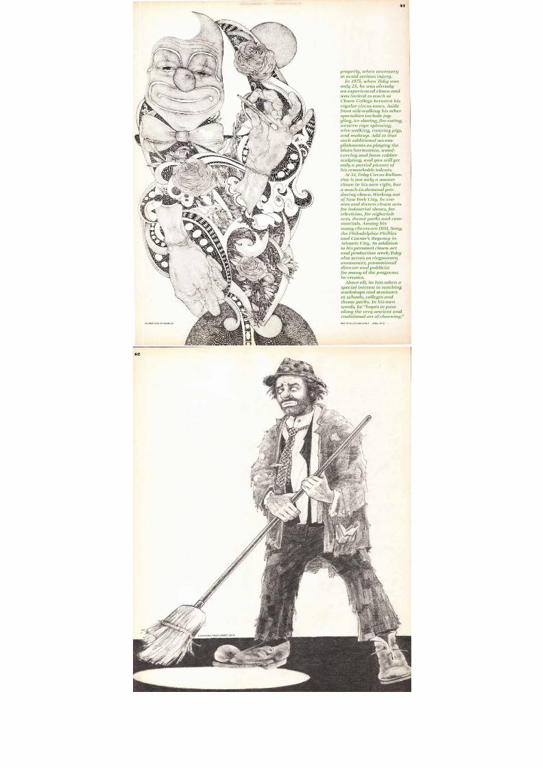
8/13/2019 Upper & lower case: Volume 11—Issue 2
http://slidepdf.com/reader/full/upper-lower-case-volume-11issue-2 37/80
8/13/2019 Upper & lower case: Volume 11—Issue 2
http://slidepdf.com/reader/full/upper-lower-case-volume-11issue-2 38/80
ILLUSTRATION BY WALLY NEIBART
ANNIE FRATELLINI b e l i e v e s t h a t cl o w n i n gi s i n t h e g e n e s . S h e d e s c e n d s f r o m a f a m o u sf a m i l y o f c l o w n s ; s h e i s a r e s p e c t e d p e r f o r m e ri n t h e c i r c u s w o r l d o f F r a n c e , a n d s h e i s a l s othe director of the Ecole Nationale du Cirque,the circus school that she runs in Paris. But
i n a s m u ch a s s h e b e l i e v e s t h a t c lo w n s a r e b o r n ,not taught, her training program includes all
t h e t ra d i t i o n a l c i r cu s s k i l ls e x c e p t c l o w n i n g .Most master clowns agree that a clown dis-guise and act are things you work out intui-
t i v e ly , o n y o u r o w n , a n d s p e n d t h e r e s t o f y o u rl i fe per fec t ing .
In her awn performance, Annie Fratellinic o m b i n e s t h e auguste t y p e o f c l o w n w i t h t h e
street urchin character. Her makeup is soulfuland endearing. She wears a scruffi , r e d w i g ,h e a v y b l a c k e y e b r o w s , t w o b l a c k t e a r d r o p s u n d e r
her eyes ,y e s , a b u l b o u s r e dnose and a painted, sadlys o u l f u l s m i le a b o u t h e r l i p s . H e r co s t u m e i sC h a p l i n e s q u e — a d e r b y , a l o n g , l o o s e o v e r c o a t ,baggy pants that stop short of her wrinkled
s o c k s a n d o v e r s i z e d h o b o s h o e s . S h e w o r k s h e ract in tandem with her husband who is a
w h i t e fa c e c l o w n a n d c o n j u r e r . A s h e p e r f o r m s
his magic tricks, she appears behind him in ac h e e k y , m o c k i n g w a y , p a r r o t in g h i s a c t . S h epicks up a bottle of milk he has brought intothe arena and pours it into an invisible tum-
bler. (She is working with a trick bottle thatc o n c e a l s th e m i l k w h e n i t i s t il t e d . ) S h e t h e nproceeds to mime drinking the milk from the
i n v i s ib k g l a s s . W h e n t h e co n j u r i n g c l o w n d e m -onstrates a few rope tricks,Annie intrudes,
holding a dog lead with no dog at the end.
She parades the invisible dog around the arenauntil "it" pulls her toward the ringmaster's
t o p h a t ly i n g u p s i d e d o w n o n t h e g r o u n d . T o t h eaudience's anticipated delight, the invisible
d o g t h e n d e p o s i t s a n i n v i s i b l e o f fe r i n g i n t o t h eelegant hat.
Female clowns like Annie Fratellini are not
u n i q u e . I n f a c t t h e c i r cu s w o r l d w a s w a y a h e a do f t h e r e s t o f th e w o r l d i n b e s t o w i n g e q u a lo p p o r t u n i t i e s f o r w o m e n . F e m a l e c l o w n s g o a s
f a r b a ck a s 1 86 0 , a n d t o d a y w o m e n a re a p p e a r -ing quite frequently in training programs.Y o u m a y n o t , h o w e v e r , b e a b l e t o d i s t in g u i s hm a l e f r o m f e m a l e c l o w n s b y t h e i r m a k e u p o rd i s g u i s e s . I t i s p a r t o f t h e m y s t i q u e o f c l o w n s
t h a t t h e y r e m a i n s e x l e s s , a n o n y m o u s — a c t u a l lynon-human—so audiences relate to their per-formance and not to their person.
TEXT: ITC GALLIARD BLACK ITALIC
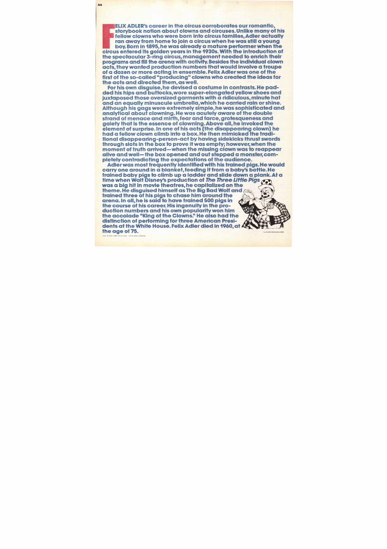
8/13/2019 Upper & lower case: Volume 11—Issue 2
http://slidepdf.com/reader/full/upper-lower-case-volume-11issue-2 39/80
39
OU JACOBS' face is the one thatcomes to mind whenever we
think "circus." Probably wehave been programmed to visu-
C postage stamp commemorating the
d to the Ringling Brothers. Barnum & Bailey Circus, The
Show on Earth.Although his makeup derives from
His act, as well as his costume, is
Aside from his own carefully chore-
ingling Brothers' outstanding pro-
NITIAL: BOLD CONDENSED I LLUS T R A T IO N B Y L IO N EL KA LIS H
8/13/2019 Upper & lower case: Volume 11—Issue 2
http://slidepdf.com/reader/full/upper-lower-case-volume-11issue-2 40/80
O R Y BALLANTINE's
middle name is Circus,
literally and figuratively.
His mother was a showgirl,
and his father was a clown
with the Ringling Brothers
and Barnum & Bailey
Circus. As a matter of fact,
his father, Bill Ballantine,
was the first dean of RBBB's
Clown College, established
in 1970, in Venice, Florida.So, as they say on the cir-
cus lot, Toby had saw-
dust in his shoes from the
start, and it was no sur-
rise that he chose to go
into clowning.
What he didn't learn from
his father, he mastered in
ten years of touring with
every kind of circus
known: small mud shows,
one-ring European style
circuses, and three-ringextravaganzas. The clown
character he developed
for himself is that of an
auguste redface, a mixture
of pathos and pixie, with
a specialty in stilt-walking.
Since Toby is a six-footer
standing on his own two
feet, on stilts he is sixteen
feet tall, which makes him
the world's tallest stilt-
walking clown. This is no
small distinction when
you know the logistics and
dangers inherent in walk-
ing on stilts. You mount
them from a ladder, and
dismount the same way.
There is no body harness,
nor hand grips to keep you
safely connected; the stilts
are fastened directly to the
legs at mid-calf. Learning
to walk on them takes
courage and concentra-
tion, and it is equally
important to learn to fall
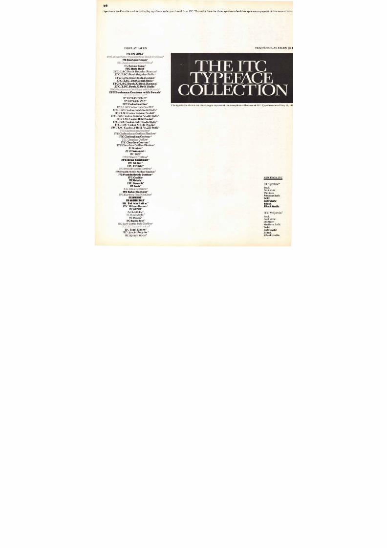
8/13/2019 Upper & lower case: Volume 11—Issue 2
http://slidepdf.com/reader/full/upper-lower-case-volume-11issue-2 41/80
ILLUSTRATION BY JIM SPANFELLERSA
EXT: ITC VEUOVIC BOLD ITALIC INITIAL: BOLD
4 1 , 1 4 41"V •
41
properly, when necessary
to avoid serious injury.
In 1975, when Toby was
only 25, he was already
an experienced clown and
was invited to teach at
Clown College between his
regular circus tours. Aside
from stilt-walking his other
specialties include jug-
gling, ice skating, fire eating,
western rope spinning,wire walking, training pigs,
and makeup. Add to that
such additional accom-
plishments as playing the
blues harmonica, wood-
carving and foam rubber
sculpting, and you still get
only a partial picture of
his remarkable talents.
At 34,119by Circus Ballan-
tine is not only a master
clown in his own right, but
a much-in-demand pro-ducing clown. Working out
of New York City, he cre-
ates and directs clown acts
for industrial shows, for
television, for nightclub
acts, theme parks and com-
mercials. Among his
many clients are IBM, Sony,
the Philadelphia Phillies
and Caesar's Regency in
Atlantic City. In addition
to his personal clown act
and production work,'Ibbyalso serves as ringmaster,
announcer, promotional
director and publicist
for many of the programs
he creates.
Above all, he has taken a
special interest in teaching
workshops and seminars
at schools, colleges and
theme parks. In his own
words, he hopes to pass
along the very ancient and
traditional art of clowning.
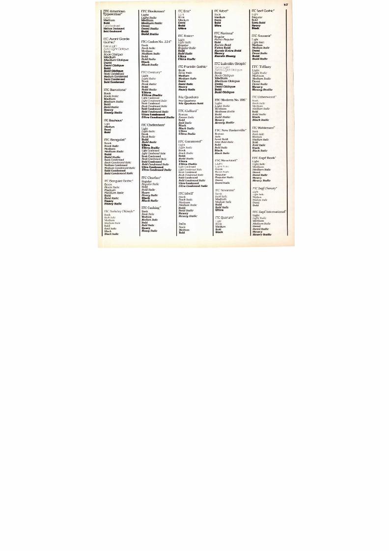
8/13/2019 Upper & lower case: Volume 11—Issue 2
http://slidepdf.com/reader/full/upper-lower-case-volume-11issue-2 42/80
8/13/2019 Upper & lower case: Volume 11—Issue 2
http://slidepdf.com/reader/full/upper-lower-case-volume-11issue-2 43/80
43
EM M E T T KELLY was a midwestern farm boy who had
a talent for cartooning, but a penchant for showbusiness.At the age of 19, he left the farm for Kansas
City, where he found work in a vaudeville show, executinglightning-quick caricatures and cartoons. To add color tohis act, he performed in a silly, country bumpkin costume—white wig, white shirt and short,baggy pants. Butvaudeville was not steady work, and he supplementedhis show business earnings doing artwork for advertis-ing agencies. While working on a cartoon film, he con-cocted the character of a forlorn, melancholy tramp whofailed at everything he did, but never lost hope. It wasan image that Kelly filed away in his memory bank, butnot for very long.
Still drawn to show business, he worked up a trapezeact and found a place in a small circus company, wherehe also met and married one of the trapeze artists.Together they produced a double trapeze act. Kelly alsoperformed as a whiteface clown. But, unfortunately, per-sonal differences and a clash of careers broke up the
marriage. In the aftermath of his shattered domestic life —the separation from his wife and children—Kelly stronglyidentified with the forlorn sad-sack hobo character hehad dreamed up, years before, at the drawing table.
Emmett Kelly's hobo clown, Weary Willie, was contraryto everyone's conception of the zany, fun-loving, prank-ster clown. He was dirty, unshaven, ragged and inept. Incontrast to the auguste clowns who played "high,' reach-ing out to the entire audience for laughs, Kelly was acarpet clown. He played "low," addressing himself to theaudience in the first few rows, wandering disconsolatelyamong them and chewing on leaves from a wilted cab-bage. His acts were simple, but touching. He would try tosaw a board in half, diligently consulting a blueprint ashe worked. He tried to crack a peanut with his teeth, butfailing in that, he'd grab a sledge hammer and smash itto :smithereens. Every move he made produced compas-sionate laughter, because everyone in the audience hadexperienced failure at one time or another.
His "spotlight" routine was probably his most mem-orable and endearing. Dressed in his usual tramp outfit,he would amble into the arena with a broom and startsweeping the floor. Before long, a spotlight would appear
at his feet. Perplexed, he would contemplate it, then deter-minedly try to sweep it away. To no avail. He would approachfrom another direction. No go. Finally, he would give up,lean on the broom and gaze mournfully at the crowd.
But the inept Weary Willie was no whimp in real life.He worked on his acts and his career assiduously, hireda publicist to promote him, and eventually landed a placewith the Ringling Brothers and Barnum & Bailey Circus.Not only did he become a star clown, commanding a topsalary of $1500 a week, but he was excused from themulti-clown production numbers, so as not to destroy
the image of his solitary sad-sack role. Emmett Kellydied in 1979 at the age of 81, but he remains, to this day,the quintessential hobo clown.
8/13/2019 Upper & lower case: Volume 11—Issue 2
http://slidepdf.com/reader/full/upper-lower-case-volume-11issue-2 44/80
ELIX AD LER's career in the c i rcus corroborates our rom ant ic ,storybook notion about clowns and circuses. Unlike many of hisfellow clowns who were born into circus families, Adler actuallyran away from home to join a circus when he was still a young
boy. Born in 1895, he was already a mature performer when thercus entered its golden years in the 1930s. With the introduction of
m s an d f ill the arena w i th act iv i ty . Bes ides the indiv idual c lownts, they wanted production numbers that would involve a troupea dozen or more acting in ensemble. Felix Adler was one of the
rst of the so-called "producing" clowns who created the ideas forand directed them, as well.
For his own disguise, he devised a costume in contrasts. He pad-xtaposed those oversized garments with a ridiculous, minute hatd an equally minuscule umbrella,which he carried rain or shine.
lthough his gags were extremely simple, he was sophisticated andalytical about clowning. He was acutely aware of the double
d of menace and mirth, fear and farce, grotesqueness andiety that is the essence of clowning.Above all, he invoked the
ent of surprise. In one of his acts (the disappearing clown) he
d a fellow clown climb into a box. He then mimicked the tradi-l disappearing-person-act by having sidekicks thrust swordsough slots in the box to prove it was empty; however,when the
oment of truth arrived—when the missing clown was to reappear
Adler was most frequently identified with his trained pigs. He wouldrry one around in a blanket, feedingit from a baby's bottle. He
Walt Disney's production of The Three L it tl e P igs
of his pigs to chase him around theena. In all, he is said to have trained 500 pigs in
ction numbers and his own popularity won him
tinction of performing for three American Presi-
RDE GOTH C BOLD INITIAL: BOLD CONDENSED
ILLUSTRATION BY BILL BALLANTINE
8/13/2019 Upper & lower case: Volume 11—Issue 2
http://slidepdf.com/reader/full/upper-lower-case-volume-11issue-2 45/80
The U&Ic Book Shelf reviews new
books believed to be of interest to
U&Ic readers and lists the pub-
lisher, with address, and the priceof the book so that the books maybe ordered directly. All prices are
for delivery within the U.S.A. or
Canada. Prices listed are based on
payment accompanying order. If
payment is not included, you will
be billed for handling and shipping
charges. Please add your local and
state sales tax wherever appli-
cable. For books to be deliveredoutside the U.S.A. or Canada,please request the price and ship-
ping charges from the publisher.
Pease note: U&Ic does not sell books.rders should be placed directly with the publisher(s) concerned.
Ilt.SX tl. it (ll u.i.i , 11(110R:N
TwEvry F l F i 11 ANNUA L OF1\11:RICAN ILLUSTRATION,
ILLUSTRYPORS
tl l 1 1 1 1 1
GRAPHICARTISTS
GUILDH A N DkoK
P R ICINoiTHIC A L
5THEDITION
MNMO
1.1111111011 1111
45
use, quick reference source for
roduction technical working informa-
completely updated
on mask, metric tables, paper
velope sizes,and more.
1984
x.
314, Brooklyn, NY 11205.
Volume 7
top
raphers. Scores of a rticles by art
with phone numbers and ad-
19.533 pages. 914 x 113/4" . Two
spaper Layout and Design
tful. up-to-date, easy-to-read, well
ted presentation of the whys and hows
f
uts, working in modules, using
y, redesign. and more.
Fine Print
Vol.10, No.1,1984
Type lovers will enjoy the learned and well-
illustrated article on the history of Janson-
Antigua types in this issue of Fine Print.
Written by Horst Heiderhoff it explains that
the designer was not the Dutch Anton Janson
but a Hungarian, Miklos Kis. Also of interest to
typophiles, the report on the Fifth WorkingSeminar of Association Typographique Inter-
nationale on "The Computer and the Hand in
Type Design."
Fine Print, P.O. Box 3394,San Francisco, CA
94119. Single issue $9.00, add $2.00 for first
class mail.
The TEXbook
byDonald E. Knuth
TEX is,a software system that facilitates page
and area composition of typeset matter. It was
developed to aid in the creation of beautiful
books, especially those that contain a lot of
mathematics. It enables one to tell a computer
exactly how the manuscript is to be trans-
formed into book pages. This is a manual for
people who have never before used TEX, as
well as for experienced TEX hackers.
Addison Wesley Publishing Company. Inc.,
Reading, MA 01867.483 pages. 7 1 / 2 x 91/4Plastic bound. $14.95.
Ames Compendium of Practical
Ornamental Penmanshipby Daniel T. Ames
Originally published in 1883. this paperback
version should appeal to those intrigued by
calligraphy, penmanship, flourishes, engross-
ing and the graphic flavor of 100 years ago.
ST Publications, 407 Gilbert Avenue.Cincin-
nati3OH 45202.64 Pages.81/2 x I r Paper. $7.95.
Illustrators 25
Edited by Art Weithas and designed by
Robert Anthony
A truly beautiful book worthy of representing
the Silver Anniversary of the Society of Illus-
trators Annuals. Examples of over 500 current
works in the editorial, book, advertising and
institutional categories. Completely captioned
and indexed. The first Annual to be printed
entirely in color.
Distributed in USA by.Robert Silver Associ-
ates, 95 Madison Avenue. New York, NY 10016.
For distribution outside of the USA. contact
Fleetbooks, S.A., c/o Feffer and Simmons. Inc..
100 Park Avenue, New York, NY 10017.9 x 12
$49.95.
Handbook of Graphic Presentation
2nd Editionby Calvin F.Schmid & Stanton E. Schmid
A working manual for all concerned with clear
presentation and interpretation of statistical
data in graphic form. Covers basic principles
and techniques of chart design, drafting
techniques, rectilinear coordinate charts, bar
and column charts.semi-logarithmic or ratio
charts, statistical maps, pictorial charts, projec-
tion, the role of the computer.and more.
John Wiley & Sons, Inc., One Wiley Drive,
Somerset, NJ 08873.308 pages. 81/2 x 11 Paper.
$33.00.
Pricing & Ethical Guidelines5th Edition
The Graphic Artists Guild offers this compila-
tion of information, such as: How artwork is
priced, professional practices, business andlegal p ractices for commissioned artwork,
ethical standards, professional is sues, prices
and trade customs, contracts and business
management.
Robert Silver Associates,95 Madison Avenue,
New York. NY 10016.7 x 12 193 pages. Glos-
sary and Index. Paper. $16.95.
Treasury of Japanese Designs and Motifs
by Carol Belanger Grafton
This versatile collection of traditional Japanese
designs and motifs presents the working artis t
with a treasury of 360 copyright-free designs.
All have been especially adapted for ready
use while painstaking effort has been made
to preserve the original spiritsubtlety of detail.
and to be in keeping with the aesthetic beauty
that is so a part of the Japanese culture.
Dover Publications, Inc., 31 East Second
Street. Mineola. NY 11501. 96 pages. 360 b/w
illustrations. 81/4 x 11' Paperbound. $3.95.
Graphis Posters 84Edited by Walter Herdeg
Beyond its commercial value, today's poster is
often valued for its artistic dimension as shown
by the proliferation of poster museums, sa les
outlets and exhibitions. This new annual
showing, often in full color, the best of the
years posters from 33 countries, is evidence
of the posters maturing as an art form.
Watson-G uptill Publ ications,Inc.1515 Broad-
way, New York. NY 10036.204 pages. 91/2 x 12'
$59.50.
Visual Awareness and Designby Philip Thiel
This is an introductory program in concep-
tual awareness, perceptual sensitivity, and
basic design skills. It uses an integrated
sequence of exercises and readings that exam-
ine -various aspects of the visual environment,
emphasizing the sensuous , emotional, and
intellectual levels on which it can be experi-
enced. The aim is to develop visual literacy.
University of Washington Press, Seattle, WA
98105.288 pages. 81/2 x IrCloth $35.00. Paper.
19.50.
GRAPHICDESIGN
Graphic Designby Elizabeth Resnick
Letterform collage. the relationship of letters.
word action progression, self-promotion typ-
ography and word play typography are just
a few of the design concepts touched upon.
By featuring ten challenging exercises that
develop, step by step. specific design concepts
you are offered not just theory but practice
as well.
Prentice-Hall. Inc. Englewood Cliffs. NJ
07632.148 pages. 7 x 9". B/w illustrations by
design students. Bibliography and index.Cloth
$15.95. Paper $8.95.
Microcomputer Graphics andProgramming Techniquesby Harry Katzan, Jr.
In easy-to-understand terms Mr. Katzan gives
you a guided tour through the mysteries ofthe graphic opportunities of computer graph-
ics in both personal and home computers .
Offered to you are the essentials you need to
know: basic computer concepts, computer
programming fundamentals and applications.
the BASIC computer language: all in sufficient
detail for you to do graphics programming.
More than 20 practical and ready-to-use
graphics programs are included.
Van Nostrand Reinhold Company, Inc.. 135
WeSt 50th Street, New York, NY 10020. 229
pages. 6 x 9' Indexed. $22.50.
Typos 6
Every issue of Typos is a collectors item.A
wonderful blend of thoughts, applications,
graphics. This issue includes a discussion of
free drawn, non-typographic lettering and its
role in architecture and other fields of lettering;the approach to graphic design of Rolf Muller;
a review of the career of Hendrik Nicolaas
Werkman; The Polish Poster: Allen Hutt's
influence on newspaper design; the story of
His Nibs (Mr. Poole's Pen Shop in London); a
review of subway maps around the world;
The Art of The Book in India: and an article on
typefaces for Videotex. Color pages. Variety of
stocks used. Die-cut cover. Limited supply.
The Joumeyman Press. 97 Ferme Park Road,
Crouch End, London N8 9SA, England. 54
pages. 9 x 12 $10.00.
Optical Color & Simultaneity
by Ellen Marx
Every aspect of color theory is open to inter-
pretation and the investigations outlined by
the author are the result of a painstaking and
systematic series of experiments. The reader
is invited to enter into a dialogue with the
demonstrations and to observe first-hand the
relationship of optical color to the phenome-
non of simultaneity.The studies. though
logical and based on scientific understanding,
do not slight the importance of intuition.You
can discover both accurate and precise inter-
actions of primary colors while at the same
time delving into your hidden personal world.
Van Nostrand Reinhold Company.135 West
50th Street. New York, NY 10020.152 pages.8 x 8 References.six screens for the projec-
tion of successive images. $32.50.
TEXT: ITCUSHERWOODBOOK BLACK
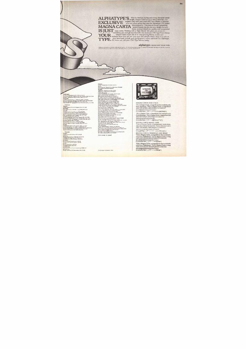
8/13/2019 Upper & lower case: Volume 11—Issue 2
http://slidepdf.com/reader/full/upper-lower-case-volume-11issue-2 46/80
46
Specimen booklets for each text/display typeface can be purchased from ITC. The order form for these specimen booklets appears on page 82 of this issue of U&lc.
D I SP L A Y F A C E S
I T C A K I L IN E S ®
giff0 ne wr it or E 3 C 2 C a Qom
ITC Bauhaus Hoary®1 1 0 3 Li3aubwo Do[dua®
tic Be r na s e R o m a n®
ITC Bolt Bald'ITC/LSC Book Regular RomanITC/LSC BookReguktr Italic
ITC/LSC Book Bold Roman'
ITC/LSC Book Bold ItalicITC/LSC Book X-Bold Roman'ITC/LSC BookX-Bold Italic'
B 0 o na m , s m . © T a E f i f f ig u f i q l g 3 ®ITC Bookman Contour with Swash®
I L l o K , P o W J I + 1 a
I T C D US O R A M A M E D IU M ®
I T C B U S O R A M A B O L D ®
IT C C as l on He ad l i n e ®
I TC / 1 ,SC Ca s lo n L ig h t No 223 ®
aslonLightNb.223
I T C /L S C C a s l o n R e g u l a r N o . 2 23 ® 'ITC/LSC Caslon Regula r No . 2 2 . 3 I ta l ic®
I T C / L S C C a s l o n B o l d N o . 22 3 *ITC/LSC Caslon Bold No.223 Italic®
ITC/LSC Caslon X-old No.223 ®
I T Caslon X-Bold No.223 Italic®
TEZ Cheltenham °table ®NMCheltenhamandine Shadow'
I TC C h e l t e n h a m C o n t o u r ®
I I T C Clearface altheaI TC C l e a r f a c e C o n t o u r ®
IITC Ceram OWN= S k d u l o w e
I f f L S Camel®
IS f f o s i d a t t a I t a l i e *
ITC Did i®
C r a g I I m o afraraG®ITC Eras Contour®
F I T F M F a c e ®
I T C F i r e n z e ®[ l am Frankl in
an mud&Gothic Outline Shadow ®
IT C F r a nk l in G o t h i c C o n t o u r ®
IT C Gor i l la®
ITC Grizzly 8ITC Grouch'
ITCTM
gooll6m ®I T C K o b e l C o n t o u r ®natritEM 1 3 okl Oahe
I T C M A C H I N E
R C M A C H IN E
lit /1St 44I TC M i l a n o R o m a n ®
ITC NEON ®
ftl L l FI iH ;®ITC Rondo Light"
ITC Rondd"
ITC Ronda Bo ld
1 1 4 0 g G e o g &A(*Bold outorwITC/L&C Stymie Ha ir line®
I TC T o m ' s R o m a n ®I TC U p r i g h t R e g u l a r ®
I TC U p r i g h t n e o n ®
TEXT/DISPLAY FACES
TH E ITCT Y P E F A C E
CO T A EC TIO NThe typefaces shown on these pages represent the c o m p l e t e collection of ITC Typefaces as of May 14, 19
NEWFROMITC
ITC Symbol'
B o o kBook ItalicMediumMedium Italic
B o l dBold Italic
Black
Black Italic
ITC Veljovie
Book
Book ItalicMedium
Medium ItalicBoldBold Italic
BlackBlack Italic
Gothic
8/13/2019 Upper & lower case: Volume 11—Issue 2
http://slidepdf.com/reader/full/upper-lower-case-volume-11issue-2 47/80
47
C A m e r i c a n
LightMediumBoldLight CondensedMedium CondensedB o l d C o n d e n s e d
ITC Avant GardeGothic®
Extra LightExtra Light ObliqueBookB o o k ObliqueM e d i u mMedium ObliqueD e m iDemi ObliqueBoldBold ObliqueBook CondensedMedium CondensedDem i C o n den s edB o l d C o n d e n s e d
I T C B a r c e l o n a 'BookBook ItalicMediumMedium I ta l icBoldBold ItalicHeavyHeavy Italic
I TC Bau h aus"LightM e d i u mD e m iBold
I TC B e n g u i a t "BookBook ItalicMediumMedium ItalicBoldBold ItalicBoo k CondensedB o o k C o n d e n s e d I t a l icM e d i u m C o n d e n s e dM e d i um C o n d e n s e d I t a l i cBold CondensedBold Condensed Italic
ITC Benguiat Gothic'BookBook ItalicM e d iumMedium I ta l icBoldBold ItalicHeavyHeavy Italic
ITC Berkeley Olds le-
BookBook ItalicMedium
M edium I ta lic
BoldBold ItalicBlack
Black Italic
ITC BookmanLightLight ItalicMediumMedium ItalicDemiDemi ItalicBoldBold Italic
ITC Caslon No. 224-
B o o kB o o k I t a l icMediumMedium Italic
BoldBold ItalicBlackBlack Italic
ITC Century"LightLight ItalicBo o kBook ItalicBold
Bold ItalicUltraUltra ItalicLight CondensedL igh t Cond ens ed I ta l icBook CondensedB o o k C o n d e n s e d I ta l icB o l d C o n d e n s e dBold Co n d en sed Italic
Ultra CondensedUltra Condensed Italic
IT C C he l t e n ha m 'LightLigh t I ta licBookBook Italic
BoldBold ItalicUltraUltra Italic
Light Co ndensedLight Condensed ItalicBook CondensedB ook C ondens ed I ta l icB o l d C o n d e n s e dBold Condensed Italic
Ultra CondensedUltra Condensed Italic
ITC Clearface"
RegularRegular ItalicBoldB o l d Italic
HeavyHeavy ItalicBlackBlack Italic
ITC Cushing-
BookB ook I t a li cM e d i u mM edium I t a l icBold
Bold ItalicHeavyHeavy Italic
ITC Eras*L ght
BookMediumDemi
BoldUltra
ITC Fenice®
LightLight Italic
RegularRe gular ItalicBoldBold I tal icUltraUltra Italic
ITC Franklin Gothic'
B o o kB o o k I t a li cMediumMedium ItalicDemi
Dem i Ital icHeavy
Heavy Italic
Friz Quadrata
Friz QuadrataFriz Quadrata Bold
ITC Galliard-
RomanR o m a n I t a l icBoldB o l d I t a l i cBlackBlack ItalicUltraUltra Italic
I T C G a r a r n o n d 'LightLight ItalicBookBook ItalicBoldBold ItalicUltra
Ultra Italic
Light Co ndensedLight Condensed I ta l icBook CondensedBo o k C o n d en sed I t a l i cB o l d Condensed
B o ld Co n d e n s e d I t a l icU lt r a C o n d e n s e dUltra Condensed Italic
ITC Isbe l l"BookBook ItalicMediumMedium ItalicBoldBold ItalicHeavyHeavy Italic
ItaliaBookMediumBold
ITC Kabel®
BookMediumD e m iBold
U l t r a
ITC K o r i n n a 'RegularKursiv RegularBold
Kursiv BoldExtra BoldKursiv Extra BoldHeavyKursw Heavy
ITC Lubalin Graph'
Extra LightE x t r a L i g h t ObIlqueB o o kB o o k ObliqueMediumMedium ObliqueDemiDemi Oblique
BoldBold Oblique
I T C M o d e r n N o . 21 6 '"LightLight ItalicMediumMedium ItalicBoldBold ItalicHeavyHeavy Italic
ITC New Baskerville'"
Roman
I tal icSemi BoldS em i B o ld I ta l icBoldB o l d I t a l icBlackBlack Italic
ITC Newtext
Light
Light Italic
Book
Book Italic
Regular
Regular Italic
DemiDemi Italic
ITC Novarese'
B o o kBook I ta l icM e d i u mM e d i u m I t a l icBoldBold ItalicUltra
ITC Quorum
LightB o o k
Medi umB o l dBlack
ITC Ser i f Gothic"LightRegularBoldExtra BoldHeavyB l a c k
ITC Souvenir'
LightLight I ta l ic
MediumMedium ItalicDemiDemi Italic
BoldBold Italic
ITC TiffanyLightLight ItalicMediumMedium ItalicDemiD e m i ItalicHeavy
Heavy Italic
ITC Usherwood-
BookB oo k I ta l icMediumMedium ItalicBoldBold ItalicBlackBlack Italic
ITC Weidemann-
BookBoo k I ta l icMediumM e d i u m I t a l icBoldBold Italic
Black
Black Italic
I TC Z a p f B o o k 'LightLight I ta l icMediumMedium Italic
DemiDemi Italic
Heavy
Heavy Italic
Y T C Z a p f C h a n c e r y '
Light
Light_7talic
MediumMedium 9talicDemiBad
ITC Zapf International"
LightLight ItalicMediumMedium Italic
DemiDemi ItalicHeavy
Heavy Italic
8/13/2019 Upper & lower case: Volume 11—Issue 2
http://slidepdf.com/reader/full/upper-lower-case-volume-11issue-2 48/80
8
O N L Y T HE F O L L O W I NGS UB S C R IB E R C O M P A N I E S A R E
L I C E N SE D T O M A N U F A C T U R E A N D S E L L
IICY P E F A C E S
AM International, Inc.V a r i t y p e r D h i s i o n
Digital Visions, Inc. International type F o n t s A p S Offlcine Simoncini s. p. a. D . S te m p e l A G454 West 46 St.New York, N.Y. 10036
(212) 581-7760
Interactive Computer Graphics
Software
Filmotype
c/o Cooper & Beatty, Limited
401 Wellington Street West
Toronto M5V 1E8
(416) 364-7272
Type Discs for Harris 600,
1200, 4000,TXT Typesetters
itek CompositionSystems Division
Casella Postale 776
40100 Bologna
Italy
(051) 744246
Hot Metal Composing Matrices
and Phototypesetting Systems
P h o t o V i s i o n O f C a l i f o r n i a , I n c .
Hedderichstrasse 106-114Frankfurt am Main-70
West Germany
(0611) 6068-1
Dry Transfer Letters
Tactype, Inc.
11 Mt. Pleasant Avenue
East Hanover, NJ. 07936
(201) 887-8000
Phototypesetters and Photo-
lettering Systems
Adobe Systems, Inc. 7711 N. Merrimac Avenue
Niles, Illinois 60648
(312) 965-8800
Film Fonts
Fonts
12 West 26th Street
New York, N.Y. 10001
( 2 1 2 ) 924-1800
Dry Transfer Letters
Technographics/FlimFonts
1870 Embarcadero
Palo Alto, Calif. 94303
(415) 852-0271
Interactive Software Tools forGraphic Arts
A l p h a t y p e C o r p o r a t i o n
P.O. Box 552
Culver City, Calif. 90230
(213) 870-4828
Toll Free: 800-421-4106Spectra Setter 1200, Visual
Display Setter, and 2' Film Fonts
Pressure Graphics, Inc.
34 Cellu Drive
Nashua, N.H. 03060
(603) 889-1400Phototypesetting Systems and
Equipment, Film Strips,
Standard and Segmented Discs,
and Digitized Fonts
Esselte LetrasetLetraset Limited
Hardy/Williams (Design) Ltd.
300A High St.
Sutton, Surrey
SM1 PQ England
01-636-0474Font Manufacturer
Fundicion TipogridicaNeufville, S.A.
P.O. Box 552
Culver City, Calif. 90230
( 2 13 ) 870-4828
Toll Free: 800-421-4106
Film Fonts, Studio Film Kits,
and Alphabet Designers
URWUntemehmensberatung
7711 N. Merrimac Avenue
Niles, Illinois 60648
(312) 965-8800
AlphaSette and AlphaComp
Phototypesetting Systems
CRS Digital Phototypesetter
A r t y p e , I n c .
1725 Armitage Court
Addison, Illinois 60101
(312 ) 620-6900
Dry Transfer Letters
Prestype, Inc.
St. Georges House
195/203 Waterloo Road
London SE1 84J
England
(01) 930-8161
Dry Transfer Letters
Letraset USA Inc.
Karow Rubo Weber GmbH
Harksheider Strasse 102
2000 Hamburg 65
West Germany
(040) 602 1071
IKARUS—Digital Type Production
SIGNUS—Type Setting With Foils
V i s i - G r a p h i c s
Puigmarti, 22
Barcelona-12
Spain
219 50 00
Poster Types
Geographics, Inc.
194 Veterans Blvd.
Carlstadt, NJ. 07072
(201) 933-6011
Dry Transfer Letters
Pump Electronics
3530 Work Drive
P.O. Box 7151
Fort Myers, Fla. 33901
(813) 332-1174
800-237-4474
Dry Transfer Letters
Cut Out Letters
Autologic, Inc.
40 Eisenhower Drive
Paramus, N.J. 07652
(201) 845-6100
Dry Transfer Letters
Linographics
28 Jens Juuls Vej
DK 8260 VIBYJ
Denmark
Tel: 456-28 22 11
Laser Forms Printer
Q u a n t e L t d .
P0. Box R-1
Blaine, WA 98230
(206) 332-6711
Dry Transfer Letters
Graphic Products Corporation
8119 Central Avenue
Washington, D.C. 20027
(301) 366-1144
Dry Transfer Letters
V i s u a l G r a p h i c s C o r p o r a t i o n
1050 Rancho Conejo Blvd.
Newbury Park, Calif. 91320
(213) 889-7400APS-4/APS-5 CRT Phototype-
setter Composition and
Typesetting Systems
Autologic SA
770 N. Main Street
Orange, California 92668(714) 639-0511Display Typesetters,
2' Film Fonts
Mecanorma
3601 Edison Place
Rolling Meadows, 111. 60008
(312) 392-1476Formatt Cut-out Acetate Letters
and Graphic Art Aids
Graphics, Inc.
Kenley House
Kenley Lane
Kenley, Surrey
CR2 5Yr
England
01-668-4151
Designers and Manufacturers
of Digital Television Broadcasting
Equipment; the Paint Box.
R y o b i L i m i t e d
5701 N.W. 94th Avenue
Tamarac, Florida 33321
(305) 722-3000
Manufacturer of Photo Typositor
and Original Typositor
Film Fonts
X e r o x C o r p o r a t i o nCorporate Font Center
1030 Bussigny Pres Lausanne
Switzerland
021/89.29.71
Bobst Graphic Products and
Phototypesetting Systems
H . B e r t h o l d A G
78610 LePerray-en-Yvelines
Paris, France
483.90.90
Dry Transfer Letters
MegaCom, Inc.
16001 Industrial Drive
Gaithersburg, Maryland 20877
(301) 948-7790Manufacturer of Dry Transfer
Systems
H a r r i s C o r p o r a t i o nHarris Composition Systems
D i v i s i o n
701 South Aviation Blvd.
El Segundo, Calif. 90245
Mail Stop A3-23
(213) 536-9721
Zipatone, Inc.
3925 Coconut Palm Drive
Suite 115
Tampa, Florida 33619
(813) 626-6167
Non-Impact Page Printing Systems
Mergenthaler Linotype
Company
762 Mesaki-Cho
Fuchu-Shi
Hiroshima-Ken 726
Japan
Text/Display Phototypesetters
S c a n g r a p h i c D r . B o g e r G m b H
Teltowkanalstrasse 1-4
D-1000 Berlin 46
West Germany
(030) 7795-1
Diatronic, ADS 3000, Diatext,
Diatype, Staromatic,
Staromat, Starograph
Berthold of North America
P.O. Box 2080
Melbourne, Florida 32901
(305) 259-2900
Fototronic 4000,TXT, 1200, 600
CRT 7400, 7450
D c - i n g R u d o l f H e ll G m b H
150 Fencl Lane
Hillside, Illinois 60162
(312) 449-5500
Dry Transfer Letters
AUTHORIZED DISTRIBUTORSO F IT C T YP EFA C ES
Rissener Strasse 112-114
West Germany
(04103) 6021-25
Manufacturer of the Scantext
Phototypesetting System,
Frontend, Typesetter, Graphic
Page, Logoscanner, Interfaces
and Digital Fonts
Simulation Excel A.S.
Dag Hammarskjolds vei 15
Oslo 5
Norway
Tel: 47-2-15 66 90
PAGEscan Digital Typesetter
PAGEcomp Interactive Ad
and Page Make-up Terminal
Southern Systems, Inc.
201 Old Country Road
Melville, NY.11747
(516) 673-4197
Linoterm,V-I-P Linotron, Omni-
tech CRTronic, Phototypesetti- 'gEquipment and Systems
MetagraphicsD i v i s i o n o f in t r a n C o r p .
610 Winters Avenue
Paramus, N.J. 07652
(201) 262-8700
Diatronic, ADS, Diatype,
Staromat, Diasetter,
Repromatic
C e l l o - T a k M f g . , I n c .
Grenzstrasse 1-5D2300 Kiel 14
West Germany
(0431) 2001-1
Digiset Phototypesetting
Equipments and Systems,
Digiset-Fonts
information international
4555 W. 77th St.
Edina, Minn. 55435
(612) 835-5422
Digital Fonts for Xerox 9700
Microtype
8 Faubourg St. Jean
21200 Beaune
France
Film Fonts Manufacturer
Alphabet Designers
T h e M o n o t y p e C o r p o r a t i o n L t d .
Salfords, Redhill, Surrey,
England
Redhill 6 5959
Visual Communications
Equipment
35 Alabama Avenue
Island Park, L.I., N.Y. 11558
( 516) 431-7733
Dry Transfer Letters
C h a r t p a k
5933 Slauson AvenueCulver City, Calif. 90230
(213) 390-8611
Phototypesetting Systems
international BusinessMachines Corporation
AGFA-GEVAERT N.V.
BITSTREAM, INC.
DATALOGICS INCORPORATED
DELPHAX SYSTEMS
DICOMED CORPORATION
DIGITAL EQUIPMENT CORPORATION
DIGITIZED INFORMATION SYSTEMSCORPORATION (GHENT, BELGIUM)
EOCOM
GENERAL OPTRONICS
CORPORATION
KANEMATSU ELECTRONICS
LIMITEDSCITEX CORPORATION LTD.
One River Road
Leeds, Mass. 01053(413) 584-5446
Dry Transfer Letters
Compugraphic Corporation
2841 Cypress Creek Road
Ft. Lauderdale, Fla. 33309
(305) 979-1000
Electronic Printing Systems
Old Orchard Road
Armonk, N.Y. 10504
Electronic Printing Systems00 Ballardvale Street
Wilmington, Mass. 01887
(617) 944-6555
EditWriters, CornpuWriters,
Text Editing Systems,
MCS 8200, 8400, 8600,Accessories and Supplies
FOR FURT HER INFORMA T ION WRIT E OR C A LL: INTERNATIONALTYPEFACECORPORATION2 HAMMARSIUOLDPLAZA, NEWYORK, NEWYORK W017 (212 ) 371-0699 TELEX: 669204
8/13/2019 Upper & lower case: Volume 11—Issue 2
http://slidepdf.com/reader/full/upper-lower-case-volume-11issue-2 49/80
O n e s h o w , m a n y t a l e n t sY o u r P o r t fo l i o R e v i e w s a r e a g r e a t w a y t o
see a lot of talent in a short time."
Arch Unruh, Manager of Creative RecruitingHallmark C ards Inc., Kansas City
G ood w or k e th i c"I have found your grads dependable and
sensitive. They have a good work ethic."
Frances Heaney, Art DirectorCNN Headline News
Turner Broadcasting System , Atlanta
Se n d m e m o r eI have four of them working now, and in
nine years I have hired about 20. -
Don Weston, PresidentWeston Gano ff M arini Inc. , Fort Lauderdale
G o o d c o n c e p t s, c o m m o n s e n s e"Your grads have good design concepts and
common sense. They know what works."
Barbara Pratt , Produ ction S up ervisorLivingston & Com pany, Seatt le
G r a d u a t e s k n o w r e a l w o r ldThe good thing about your schools is they
prepare grads to deal with the work world. -
Rob ert Cunningham , National Creative DirectorTho m pso n Recruitment Advertising
Su bsidiary of J. Walter Tho m pson, Baltimo re
W o r k w e ll o n t h e i r o w nWe like your graduates because they tackle
problems with minimum supervision. -
Jim Lauteri, Production ManagerGenigraph ics Corpo ration, Pittsburgh
rF o r i m m e d i a t e a t t e n t io n t o y o u r s t a f f in g n e e d s , c a l l
Tol l fr ee (800) 245-0660(In Pennsylvania. call collect 412-263-6600.)
P l e a s e c o n t a c t m e — I h a v e a c u r r e n t( o r f u t u r e ) j o b o p e n i n g .
P l e a s e s e n d t h e f r e e b u l l e ti n a b o u tT h e D e s i g n S c h o o l s g r a d u a t e s a n d y o u r t a l e n t p o o l .
N A M E
CO M P AN Y
A D D R ESS
BU S. PH O N E
CITY TATE IP
Send to: Edward A. Ham ilton, Design DirectorT h e D e s i g n S c h o o l s101 Park Avenue, New York, NY 10178 7
49
Q U E S TI O N # 3
W h o c a n t e l l y o u
th e s tr a ig h t s to r y a b o u te n tr y -le v e l a r t ta le n t a tTh e D e s ig n Sc h o o ls ?
A n s w e r : T h e s e e m p l o y e r s, a m o n g h u n d r e d s o f o t h e r s ...
W e te a c h o u r s tu d e n t s m o r e t h a n d e s ig n a n d a r t .W e te a c h w o r k.
More than eight out of ten o f o u r g ra du a t e s l a n d a j o b i n t he i r f i e l d i ft hey a r e a v a i l a b l e f o r emp l o yme n t . O n e r ea so n : They s t a r t w i t h r e a l i s ti ce x p e c t a t i o n s , k n o w i n g t h a t t h e n e x t s t e p i s a n e n t r y - le v e l j o b w h e r e t f - e ym u s t b e p r o d u c t i v e f r o m t h e v e r y f i r s t d a y .
S t u d e n t s r e c e i v e i n t e n s i v e c l a s s r o o m i n s t r u c t io n , p r o f e s s io n a l - l e v e la s s i g n m e n t s , a n d w o r k u n d e r d e a d l i n e p r e s s u r e s . E x a c t ly a s t h e y m u s t i n
t he r e a l w o r l d . F i v e da y s a w eek , a l l y ea r r o u n d .T h e D e s i g n S c h o o l s E m p l o y m e n t A s s i st a n c e O f f i c e s i n s e v e n c i t i e s a r e
r ea d y t o he l p yo u f i l l y o u r s t a f f i n g n e e ds . Fa s t . C a l l t h e t o l l - f r e e n u m bera t t h e r i g h t o r m a i l t h e c o u p o n t o d a y .
1111e Art Institute o f At lantaArt Inst i tute o f Fort Lauder dale
gzArt Inst i tute o f HoustonArt Inst i tute o f Phi ladelphiaArt Inst i tute of Pi t tsburgh
Art Institute o f Sea t t l eCo lo ra do In s t i tu t e o f Art
The la rges t s ing le source for en t ry - leve l a r t ta len t in Amer ica today .
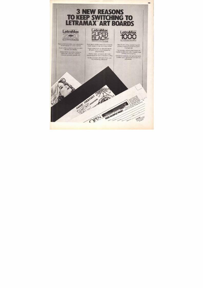
8/13/2019 Upper & lower case: Volume 11—Issue 2
http://slidepdf.com/reader/full/upper-lower-case-volume-11issue-2 50/80
0
W A N T A
W A Y TOM A K ETHOUGHTSR ISE TON E W
HEIGHTS?
IN THE UNITED STATES
ArizonaArizona Typographers, Inc./Phoenix (602) 263-1166Morneau Typographers/Phoenix (602) 258-5741Progress Litho Service/Phoenix (602) 258-6001
ArkansasPrestige Composition Inc./Little Rock (501) 375-5395
CaliforniaAldus Type Studio Ltd./Los Angeles (213) 933-7371Alfa Type Studio/San Francisco (415) 885-0553Arrowgraphics Inc./San Francisco (415) 543-5700A.T. Composition/Berkeley (415) 548-3192Blakeley Graphics/Santa Clara (408) 739-8202Bold Faces/Los Angeles (213) 938-9160Brekas Typesetting, Inc./Berkeley (415) 849-4900Cass Montgomery Typography/San Francisco (415) 398-2395
Context/Sunnyvale (408) 747-1055D & J Typographers, Inc./Santa Clara (408) 727-0991Display Lettering And Copy/San Francisco (415) 777-0831Future Studio/Los Angeles (213) 660-0620Headliners/Identicolor/San Francisco (415) 781-0463Hester Typography/San Francisco (415) 861-4538Koala-T Typesetting/Lafayette (415) 283-5360Lance Graphics/Oakland (415) 653-1758Linda Graphics/Santa Barbara (805) 962-2142Nicholas Composition/Los Angeles (213) 385-3258
Omnicomp/San Francisco (415) 398-3377PM Graphics/Costa Mesa (714) 556-2890Rapid Typographers/San Francisco (415) 982-6071Reardon & Krebs Typography/San Francisco (415) 986-1725Repro Typographers/San Francisco (415) 362-3971
Santa Barbara Typography, Inc./Santa Barbara (805) 962-9128Taurus Phototypograp hy/Los Angeles (213) 382-8244Typografx/Chico (916) 895-3280Waldo Graphics/Redwood City (415) 365-8700
ColoradoPhotocomp Phototypographers/Colorado Springs (303) 475-1122
ConnecticutFairfield County Typograp hers Inc./Westport (203) 226-9338Production Typographers Inc. (Pro Type)/Greenwich (203) 531-4600Professional Type Service/Greenwich (203) 629-4365
Type Source Inc./South Norwalk (203) 852-9262
District of ColumbiaGraftec Corporat ion/D.C. (202) 337-1555
FloridaCommercial ArtType, Inc./West Palm Beach (305) 684-8752etCETRA/Stuart (305) 628-2476International Typography Service/Ft. Lauderdale (305) 563-7667Typographical Service/Ft. Lauderdale (305) 772-4710
GeorgiaAction Graphics, Inc./Atlanta (404) 351-1753Phototype/Atlanta (404) 873-1209Swift Tom & His Electric Type Shop Ltd./Atlanta (404) 874-1634Type Designs, Inc./Atlanta (404) 355-2135
Illinois
A-I Composition Co., Inc./Chicago (312) 236-8733Alpha Design Ltd./Springfield (217) 544-2400
Character Composition, Inc./Chicago (312) 648-9896Decatur Typesetting/Decatur (217) 429-9740House of Typography/Chicago (312) 263-1532
J . M Bundscho Inc./Chicago (312) 726-7292Master Typographers, Inc./Chicago (312) 661-1733
Mobi Graphics/Chicago (312) 944-5585
N & F Typographers, Inc./Elk Grove Village (312) 364-0722Publishers Typesetters Inc./Chicago (312) 283-3340RyderTypes, Inc./Chicago (312) 467-7117
Shore Typographers, Inc./Chicago (312) 676-3600Superior Typesetting/Champaign (217) 352-4226The Typesmiths/Chicago (312) 787-8200The Typographers/Chicago (312) 644-7768Total Typography, Inc./Chicago (312) 421-4313
Typeworks, Inc./River Grove (312) 625-2551
IndianaJackson-Zender Studios/Indianapolis (317) 639-5124
KentuckyAction Print, Inc./Louisville (502) 585-3727
LouisianaForstall Typographers/New Orleans (504) 524-0822Martin/Greater Film Graphics, Inc./New Orleans (504) 524-1741
MarylandHarlowe Typography, Inc./Brentwood (301) 277-8311
Hodges Typographers, Inc./Silver Springs (301) 585-3601MassachusettsFenway Photocomposition, Inc./Revere (617) 286-1314
MichiganAcra Forms, Inc./Grand Rapids (616) 458-1161Alpha 21/Detroit (313) 532-9114A-Type, Inc./Dearborn (313) 336-2466Rudy Carr Co./Detroit (313) 535-2960The Thos. P. Henry Co./Detroit (313) 875-1950Marino & Marino Typographers/Detroit (313) 962-1777
MinnesotaGraph-Tronics/Minneapolis (612) 338-7171
Great Faces, Inc./Minneapolis (612) 339-2933P & H Photo Composition/Minneapolis (612) 374-3213Type Tronics, Inc./Minneapolis (612) 339-5563
MississippiPrestige Typography/Jackson (601) 982-5525
MissouriCommerce Litho Services Inc./St. Louis (314) 781-7702Master Typographers, Inc./St. Louis (314) 645-2878National Typographers, Inc./St. Louis (314) 241-8297Type House, Inc./St. Louis (314) 644-1404
NevadaAlpha Typographers/Reno (702) 825-8677
The Advertising Factory, Ltd./Las Vegas (702)733-7294
NewHampshirePhototype N.E./Pelham (603) 898-7440
NewJerseyComputype Co./Garfield (201) 546-9267
Tristin Typ ographers/Monmouth Junction (201) 329-8855
NewYorkAble Phototype Systems/White Plains (914) 946-5207M J. Baumwell Typography, Inc./New York (212) 661-8787Boro Typographers, Inc./New York (212) 475-7850
Centers Composition/Pine Bush (914) 733-1063City Typograp hic Service, Inc./New York (212) 686-2760
Composition Corpora tion/Albany (518) 465-7575Cresset, Baxter & Spence; Inc./New York (212) 766-9432Euramerica/New York (212) 777-7878
Farrington & Favia, Inc./New York (212) 431-9700Fototype Factory, Inc./New York (212) 889-7995Gryphon Typographers/New York (212) 697-2259
Lincoln Typographers/New York (212) 679-7933
Marvin Kommel Productions, Inc./New York (212) 682-3498Primar Typographers, Inc./New York (212) 269-7916
Sheridan Associates/The Slide Center/Ossining (914) 941-4981Thorner-Sidney Press, Inc./Buffalo (716) 856-4500
Total Typographers Inc./Mamaroneck (914) 381-2659Tri-Arts Press, Inc./New York (212) 686-4242Tribeca Typographers, Inc./New York (212) 925-8080
Type/Graphics/Syracuse (315) 437-1101
Typographix/Albany (518) 462-2923Unicomp/Albany (518) 463-2972
M A. White Typographers/Larchmont (914) 834-7389Word Management Corp./Typography Services/Albany (518) 482-8650
North CarolinaTypEsthetics/Raleigh (919) 832-1042
OhioBohme & B l i n k m a n n , Inc./Cleveland (216) 621-5388
Mid East Color Graphics/Marietta (800) 848-9752PhotoComp 2/Toledo (419) 243-6196Typo-Set/Cincinnati (513) 751-5116
OklahomaAlphasource, Inc./Oklahoma City (405) 521-0310ED-BE Incorporated/Oklahoma City (405) 943-2391
PennsylvaniaADVenture Inc./Allentown (215) 435-3233
Armstrong Inc./Philadelphia (215) 574-8600Composing Room Inc./Philadelphia (215) 563-3440Davis & Warde/Pittsburgh (412) 261-1904
Estelle Bair/Blue Bell (215) 542-7790Headliners of Pittsburgh/Pittsburgh (412) 391-3778Leon Segal Typesetting/Philadelphia (215) 236-5585Stallone Typography Service Inc./Philadelphia (215) 568-6310UniComp/Wynnewood (215) 642-6355
South CarolinaD G & F Typography/Columbia (803) 799-9140
TennesseeGraphic Arts Associates, Inc./Memphis (901) 345-8973House of Typography, Inc./Memphis (901) 726-6961
Lettergraphics Memphis/Memphis (901) 458-4584
TexasCandlelight Type Print Corp./Austin (512) 476-0732Piz Graphic Arts/Beaumont (713) 842-2122
Robert J. Hilton Co., Inc./Dallas (214) 637-2000
VirginiaRiddick Advertising Art/Richmond (804) 270-1811
8/13/2019 Upper & lower case: Volume 11—Issue 2
http://slidepdf.com/reader/full/upper-lower-case-volume-11issue-2 51/80
MAGNA CARTA AND I T A L I C
This is Magna Carta, a magnificent face available onlyfrom Alphatype. This is Magna Carta, a magnificent
ABCDEFGHIJKLMNOPQRSTUVWXYZ
abcdefghijklmnopqrstuvwxyz
0123456789 (.,;: ?-"—/ 0 -1-=©•@#$%4&*)
This i s Mag na Car ta , a magni f i cent face av ai lab le only
f rom A l pha ty pe . T h i s is M agna C ar ta , a m agn i f i ce n t face
A B C D E F G H I J K L M N O P Q R S T U V W X Y Za b c d e f g h i j k l m n o p q r s t u v w x y z
0123456789 (.,;: ?-" — §$±110 $'" 6 ® )
MAGNA CARTA SMALL CAPS
THIS IS MAGNACARTA, AMAGNIFICENTFACEAVAIL-
ABLEONLYFROMALPHATYPE. THISISMAGNACARTA
ABCDEFGHIJKLMNOPQRSTUVWXYZ
ABCDEFGHIJKLMNOPQRSTUVWXYZ
0123456789 (•,;: ?-"—/ ±±/10/32h$/5/6406)
M A G N A C A R T A D E M I B O L D A N D B O L DT h i s is M a g n a C a r t a , a m a g n i f i c e n t f a c e a v a i l a b leo n l y f r o m A l p h a t y p e . T h i s is M a g n a C a r t a , a m a gA B C D E F G H I J K L M N O P Q R S T U V W X Y Zabcdefghijklmnopqrstuvwxyz0123456789 (.,;:!?-"—+•$%(P&*)
T h i s is M a g n a C a r t a , a m a g n i f i c e n t f a c e a v a i l a b l eo n l y f r o m A l p h a t y p e . T h i s i s M a g n a C a r t a , a m a gA B C D E F G H I J K L M N O P Q R S T U V W X Y Zabcdefghijklmnopqrstuvwxyz0123456789 (.,;: ?-"— +. $%&*)
A L P H A T Y P E ' S With its time less styling and strong ch aracter strokeweight, M agna Carta is truly a wo rld-class face. It 's
E X C L U S I V Eavai lable only f rom your local CRS Type M aster , a m em ber
of a v ery select grou p that uses the Alphatyp e CRS digital
M A G NA C A R T A
phototypesetter. This state-of-the-art typesettingsystem bo asts size-for-size type design that pro -
duces optimal letterform quality and unequalled
IS JUST type clarity. Working with a Type Master also gives you access tosom ething you can ' t get anywhere else: the enorm ou s CRS Type Font Library.
T Y P EYOUR
Magna Carta is just one o f an ever-grow ing l ibrary of n ew andexclusive
tfaces that are just your type. For sample sheets, drop us a note on
you r let terhead, include yo ur typo graph er 's nam e, and mail i t to Alph atype.• Or better yet, call your CRS Type Master today.
alphatype. WERE JUST YOUR TYPE.
Alphatype Corporation, a member of the Berthold group, 7711 N. Merrimac Avenue, Niles, IL 60648, 312/965-8800. Alphatype Canada, Inc., a memberof the Berthold group, 190 Amber Street, Markham Ontario L3R 318, 416/475-8570.
Typography/Seattle (206) 622-0218
Service Ltd./Winnipeg (204) 947-0538
Graphics Ltd./Toronto (416) 961-5600
Composition/Toronto (416) 863-0742
Typographers Inc./Toronto (416) 465-7541Typographers Ltd./Toronto (416) 532-2818
to (416) 274-6395
to (416) 482-2599
osit ion Quebec Inc./Quebec (418) 529-4927
H Typography, Ltd. (Mont.)/Montreal (514) 866-6736
ontreal PAT. (514) 642-2710
GesmbH/Wien 222-55-4628
0-80-80
russels 640-25-53
Alfabet/Copenhagen 1-116320
N o r w a yNorske Typografen AIS/Oslo 420230
SpainFotocomposici Tharrats S. L./Barcelona 2543990Ormograph/Barcelona 2252500
S w e d e nTypografen AB/Malmoe 040-112650
Typografen 2/Stockholm 08-349255
U n i t e d K in g d o mApex Photosetting Ltd./London 01-837-9369
Apt PhotoSet/London 01-701-0477
Baird Harris Ltd./London 01-437-6373
Billington Press Ltd./London 01-987-8118
Composite Graphics Ltd./London 01-242-9586
Film Fount Services Ltd./Southampton 0703-332686Focus Photoset Ltd./London 01-251 -4911
H & P Graphics, Ltd./London 01-639-2828Headliners (UK) Ltd./London 01-580-7045Heavyweight Graphics/London 01-388-5451
Image Communications Ltd./London 01-580-7017Image Services (Edinburgh) Ltd./Edinburgh 031-229-6345lnline Graphics Ltd./London 01-251-4341
KAB Ltd./London 01-600-4391
Libra Press/London 01-928-7081
Modern Text Typesetting/Prittlewell/Essex 0702-45195
Montage Filmsetting Co./London 01-251-3771
Nova Graphics Ltd./London 01-251-3591
Premlux Reproductions Ltd./London 01-236-6991
Pressdata Ltd./London 01-251-6562Progress Filmsetting Ltd./London 01-729-5000
PRT Offset/London 01-607-7535
Sabrebrook Ltd./London 01-658.7336
Sans Serif Ltd., Deritend/Birmingham 021-773-8466Sellars Phototype/Macclesfield 0625-612075Studio Press (Birmingham) Ltd./Birmingham 021-359-3151
Text Typographics Ltd./London 01-251-3771
The Setting Room/Tunbridge Wells, Kent 0892-39625
Verbatim/London 01-837-2176
Word Machine Ltd./London 01-609-1140
W e s t G e r m a n yRudolf Eimannsberger/Munich 089-555765
Frankische Landeszeitung GmbH/Ansbach 0981-5711
Klaus Grimm-Fotosatz/Grafing near Munich 08092-6748Hans-Soldan-Stiftung/Essen 0201-231140
Kreuzer/Munich 089-6372771Schmidt + Co./Weinstadt-Grossheppach 07151-64058Schmidt & Klaunig/Kiel 0431-62095
AND MORE TO COME
Alphatype Corporation 1984
8/13/2019 Upper & lower case: Volume 11—Issue 2
http://slidepdf.com/reader/full/upper-lower-case-volume-11issue-2 52/80
2
Ready for gr
Comp/Edit and Varityper are registered trademarks andSpirascan and "type" are tradem arks of AM International. Inc.
81 9 8 4 ANOnternat ional, Inc.
8/13/2019 Upper & lower case: Volume 11—Issue 2
http://slidepdf.com/reader/full/upper-lower-case-volume-11issue-2 53/80
53
There is a unique reaso n why V arityper digital type
trys the highest qua lity in the world.
The reason is the Spirascan technology. Thispatented process is based on the innovat ive Purdy &McIntosh spiral development. I t assures the creation of
aiiigh-precision images that are essen tial to perfectly
liformed characters in every size and style.
And w ith Varityper digital, there are a lot of sizes
aL711‘nd styles to choose from: 163 standard on-l ine sizes
kNrrom 4 to 85 p oint (characters without descenders can
AL
V
be set as large as 99 point). Today, the growing Varityperdigital l ibrary is one o f the largest in the wo rld.
litli
You g et tremendous design versati li ty, too. You
0 an expa nd or cond ense type, an d slant i t to the left or
r ight in one-degree increments up to 4 5 degrees.With Varityper digital, the possibilities for outstanding
work go to the very l imits of your creative imagination.
‘1rcoupon or ca l l to l l- f ree 80 0-526-0709 or 800 -526-0767;
We'd l ike you to see for yourself just how outstand-ing Varityper digital is. For an actual sample, return the
. M i l l M . .M M i ll M 1 1 I M M i l l 1 1 1in New Jersey, 800-452-9763; Canada, 416-298-2700.
M7coupon
I Varityper, 11 Mount Pleasant Ave. East Hanover, NJ 07936.
lease send m e an actual sam ple of Vari typer digi ta l type.
1 lease send me more informat ion on Vari typer digi ta l typesetters. I
I0 I 'd l ike a demonstrat ion on the V ar i typer d ig i ta l typesetters.
I
I Name I
I Company II Address II City/State/Zip I
I Phone ( & I c 8 84
J= 11 MM MII 11=
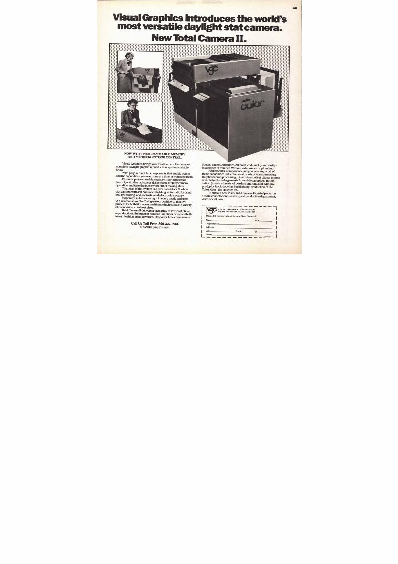
8/13/2019 Upper & lower case: Volume 11—Issue 2
http://slidepdf.com/reader/full/upper-lower-case-volume-11issue-2 54/80
Co m p u g r a p h i c C o r p o r a t io n ' st yp e l ib ra ry j u s t k eep s g row -
ing a nd g row ing . In the p a s tf e w m o n t h s , w e ' v e a d d e dsevera l des igns t o ou rl ibra ry , i nc lu d ing t heserecen t ITC fami l i es .. .
ITC
UsherwondTM
B o o k oo k I tal icM e d i u mB o l dBlack
M e d iu m Italic
BoldItalicBlack Italic
ITC
New BaskervilleRoman talicSe m i B o l d e mi Bold Ital ic
Bold old Italic
Black lack Italic
ITC
WeidemannTMBook Bo ok Italic
M e d i u m M e diu m I ta l icB o l d old Ital ic
B l a c k lack Italic
Cg compugraphic"Compugraphic Corporation, Type Division, 66 Concord Street, Wilmington, MA01887
T here w ere ma n y new t yp e fa mi l ie s a dded t h i s yea r .S o m e y o u m a y h a v e se e n a n d s o m e y o u m a y h a v e m i s se d —
s u c h a s CG B o don i , F e i nen , CG T r i u mv i ra te E x t ended a nd C om p u gra p h i c 'sexc lusive N ovus ser i es o f d ig i ta l type .
To l e ar n ab o u t t h e s e d e s i g n s an d m an y m o r e r e ce n tre l ea ses , con t a c t you r l oc a l Co m p u g ra p h ic t yp e su p p l ie r
or wr i te to the ad dress be low.FEINENPANOVUSTM AND CG TRIUMVIRATETM ARE TRADEMARKS OF COMPUGRAPHC CORPORATION. ITC USHERWOOD, IT C NEW BASKERVILLE AND ITC WEIDEMANN ARE TRADEMARKS OF INTERNATIONAL TYPEFACE CORPORATION.
8/13/2019 Upper & lower case: Volume 11—Issue 2
http://slidepdf.com/reader/full/upper-lower-case-volume-11issue-2 55/80
ce ss
(3°' -66 ,\&e(P°x ,0 4 4sep
N o 0 cst,, , a ,,,
? " - ‘.V 6
\• 10 \-e‘ a
ids.
55
3 N E W R E A S O N ST O K E E P S W I T C H I N G T O
LETRAMArART BOARDSL e t r a M a x
( Ac_)O L D P R E S S
I L LU ST RA T ION BOA R D
Rag con ten t p rov ides even ab sorp t ionof wet media for better contro l
Super w h i te su r face enhances co lo rin tensity and f ide l i ty
Designed for gouache, tempera,watercolor, a irbrush, markers,charcoal, paste ls, penci ls , e tc
L e t r a M a xcit.1 incur%VILA-1 1 - 1 1-1
PR E S E N T A T IO N M O U N T IN G BO A R D
Sol id black middle means black bevels,black edge s to heighten v isual ef fect
Super deep black surface enhancesal l types of ar t and photographic
presentations
Toothy, matte surface to el iminatedistracting sheen and minimize scuff ing
Surface accepts al l types of wet anddry moun t ing adhe s ives
L e t r a M a xi s i t 1 f 1 i %rholaw
A L L PURPOSE HOT PRESS
Ideal for al l cutt ing, posi t ioning an dpas t ing needed to produce good
mechanica ls
The du rable, whi te surface keeps i tsoriginal qual i ty even a fter erasure, tape
pick ing and sc raping
Designed especial ly for technical pens,transfer type, penci ls and al l types of
adhesives.
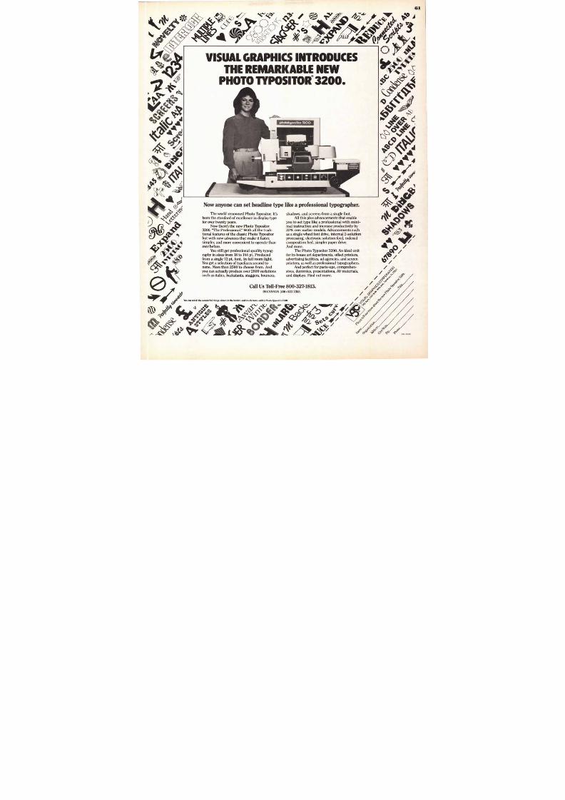
8/13/2019 Upper & lower case: Volume 11—Issue 2
http://slidepdf.com/reader/full/upper-lower-case-volume-11issue-2 56/80
6
Some people seem to th inki t 's sti l l the N ineteen-S iKies. Sothey're stil l using the sametypefaces that were styl ish backthen. Type faces like BikiniBeach Bold. Goudy A G o-Go.And Psyche delic I tal ic.
At the mem ber shops of theATA , we'll set your ad in any styleof type you choose. (Including
the styles mentioned abov e.)And naturally, we'll set itexactly the way you want it.Dow n to the letter.
But we're also will ing to
do one thing m ore. If you ask,we 're will ing to suggesttypefaces that we consider themost appropriate. The mostaesthetically pleasing. And the
least l ikely to becom e"dated:
At the ATA, you see, webelieve your print work reflectsupon us as w ell as yourself.
And w e don' t want anyone—tomorrow or tweny years fromtomorrow — to treat your ads l ikerelics from another era, se t inBikini Beach Bold.
Atlanta, Georgia Action Graphics, Inc. Bloomfield, Connecticut New England Typographic Service, Inc.
Boston, Massachusetts Berkeley Typographers, Inc.; Composing Room of New England; Typographic
House, Inc. Cedar Rapids, Iowa Type 2, Inc. Chicago, Ill inois J.M Bundscho, Inc.; RyderTypes, Inc.; Total
Typography, Inc. Cincinnati, Ohio Typo-Set, Inc. Cleveland, Ohio Bohme & Blinkmann, Inc. Columbia,
South Carolina DG&FTypography Dallas, Texas Jaggars-Chiles-Stovall, Inc.; Southwestern
Typographics, Inc.; Typography Plus, Inc. Detroit, Michigan The Thos. P. Henry Company;
Willens + Michigan Corp. Fort Worth, Texas Fort Worth Linotyping Co. Grand Rapids, Michigan
Acraforms, Inc. Houston, Texas Typografiks, Inc. Indianapolis, Indiana Typoservice Corporation
Kansas City, Missouri Uppercase, Inc Los Angeles, California Andresen Typographics; Typographic
Service Co., Inc. Memphis, Tennessee Graphic Arts , Inc. Miami, Florida Wrightson Typographics, Inc.
Minneapolis, Minnesota Dahl & Curry, Inc.; Type House + Duragraph, Inc. Newark, NewJersey
Arrow Typographers, Inc. New Orleans, Louisiana Film-A-Graphics New York, New York Advertising
Agencies/Headliners; Royal Composing Room, Inc. Philadelphia, Pennsylvania Armstrong, Inc. Phoenix
Arizona Morneau Typogra phers, Inc. Pittsburgh, Pennsylva nia Davis & Warde, Inc.; Headliners c
Pittsburgh, Inc. Portland, Oregon Paul 0. Giesey/Adcrafters, Inc. Rochester, New York RochestE
Mono/Headliners San Francisco, California Headliners/Identicolor, Inc.; Mercury Typograp hy, Inc_ Seattle
Washington Thomas & Kennedy; Typographers, Inc.; The Type Gall ery, Inc. St. Joseph, Michigan Typ
House, Inc. St. Louis, Missouri Master Typographers. Inc. Syracuse, NewYork Dix Typesetting Co., IncTampa, Florida Century Typographers Montreal, Canada McLean Brothers, Ltd. Toronto, Canad
Cooper & Beatty, Ltd. Winnipeg, Canada B/W Type Service, Ltd. Brisbane, Australia Savage & Ct
Brussels, Belgium Graphiservice London, England Filmcomposition Paris, France Societe D
Creations Gaphiques Gothenburg, Sweden Fototext/Typografen ABStockholm, Swede
Typografen AB Frankfurt, West Germany Typo-Gartner GmbH Stuttgart, West German
Layout-Setzerei Stulle GmbH
Advertising Typographers Association5 Penn P laza, New York, New Y ork 10001 . Wal ter A. Dew, J r ., Execut ive Secretary
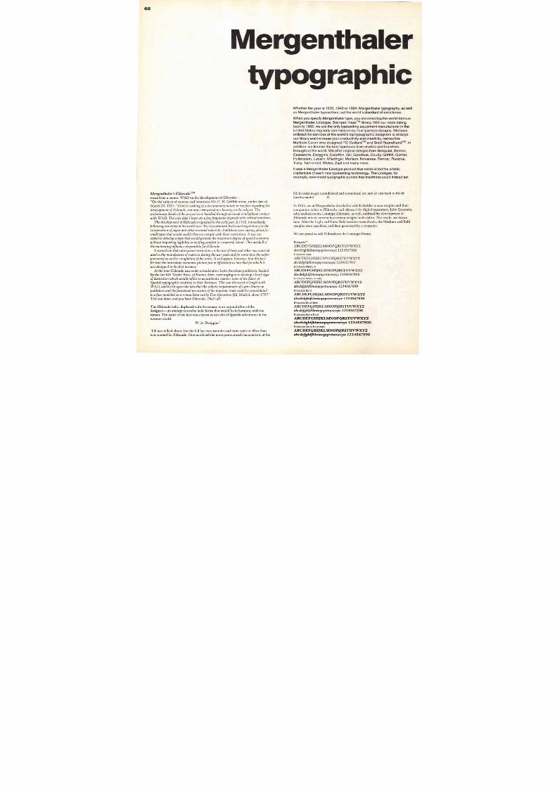
8/13/2019 Upper & lower case: Volume 11—Issue 2
http://slidepdf.com/reader/full/upper-lower-case-volume-11issue-2 57/80
57
r t h o ld s qu ic k
r o wn f o xu m p s o v e r th e
a zy d o g a seemso h e a r h i s o w n
u d a t io n o w.
After the fox became our
beloved champion of typogra-
phical display, we decided to
name a whole new generation of
machines in its honor: Berthold
Fox is a new multi-computer-
integrated-system.
Berthold Exclusive Typefaces are a range ofd e s i g n s f o r p h o t o s e t t i n g w h i c h y o u w i l l f i n d n o w h e r ee l se . O u r u n i qu e p r o g r a m n o w c o m p r i s e s 25 t y p e f a m i l ie sw i t h t o ta l o f 1 2 5 f o n t s , a n d P o p p l - L a u d a t i o i s a m o n g t h e m .A f r e e s p e c i m e n i s a s n e a r a s y o u r n e a r e s t m a i lb o x .
P l e a s e w r i t e t o : H. B e r t h o l d A G ,
T e l to w k a n a l s t r a B e 1 - 4 , D - 1 0 00 B e r l i n 4 6 , W e s t - G e r m a n yO r f r o m o v e r s e a s t o :A l p h a t y p e C o r p o r a t i o n , — A m e m b e r o f t h e B e r t h o l d g r o u p —7711 N . Merrimac Avenue, Niles, Illinois 60648
Poppl-Laudat io i ta l ic
abcdefgh i jk lmnopqrs tuvwxyza
ABCDEFGHIJKLMNOPQRSTUV
1234567890%(.,-;li ?/-).1"„""
Poppl-Laudatio medium
a bcdefghijklmnopqrstuvwx
ABCDEFGHIJKLMNOPQRST
1234567890%(.,-; I ?/-)1"„"".“
Poppl-Laudatio medium italic
abcdefghijklmnopqrstuvwxyABCDEFGHIJKLMNOPQRSTU
1234567890%(.,-; 0/41"„"") ,, e
Poppl-Laudatio bold
abcdefghijklmnopqrstuvw
ABCDEFGHIJKLMNOPQRS
1234567890%(.,-;Ii ?/-).["„""0
Poppl-Laudatio bold italic
abcdefghijklmnopqrstuvw
ABCDEFGHIJKLMNOPQRST
1234567890%(.,-;10/-).1"„""
Poppl-Laudatio light condense d
abcdefghijklmnopqrstuvwxyzUROABCDEFGHIJKLMNOPQRSTUVWXY
12345678 90% (., - ; I i ?/- ).["„"".«1+-
Poppl-Laudatio condense d
a bcdefgh ijklmnopq rstuvwxyzaa
ABCDEFGHIJKLMNOPQRSTUVW
12345678 90% (. , - ;I i ? / - - ) •1"„""H+
Poppl-Laudat io medium cond.
abcdefghi jk lmnopqrstuvwxyzaa
ABC DE FGH IJKLM NOPQRSTUV
1234567890 0/0( . , - ; I i
Poppl -Laudat io bold conden sed
abcdefghijklmnopqrstuvwxyziaABCDEFGHIJKLMNOPQRSTUV
1234567890 0/(.,-;Ii ?/—).1"„""»01
POPPL
L A UD
Pcppl-laudatio
eine neue Schrift
herb,t ioll Esprit
and Pragnanz
I 0r="MI1 1 1 7 . 1 = 1 1 1 1
Name
A d d r e s s
8/13/2019 Upper & lower case: Volume 11—Issue 2
http://slidepdf.com/reader/full/upper-lower-case-volume-11issue-2 58/80
Drawl ng Boards & P apas
o rS o m p ler
Crescent Cardboard Company. P.O. Box XD 100 W. Willow Road. Wheeling. Illinois 60090
8/13/2019 Upper & lower case: Volume 11—Issue 2
http://slidepdf.com/reader/full/upper-lower-case-volume-11issue-2 59/80
• • •
•..0 ." 0 ' '4 1 .. 0 • • • • • • 41 ' 0 41 * .0 ,41 4 ,0 4
•* : * •4, 0* : * 1111- . --
1 1 1 1 1 1 VISU L GR PHICS CORPOR TION
v G Park. 5701 N.W. 94th Ave, Tamarac, FL 33321
Please tell me more about the new Total Camera II.
Name itle
Organization
Address
City tate ZipLPhoneU&Ic 8 84
59
Visual Graphics introduces the world'smost versatile daylight stat camera.
N e w T o t a l C a m e r a II .
N O W W I T H PROGRAMMABLE MEMORY
AND MICROPROCESSOR CONTROL.
Visual Graphics brings you Total Camera the most
com plete daylight graph ic reproduct ion system avai labletoday.
With plug-in m odu lar com po nents that enable you toadd the capab ilities you need, one at a tim e, as you need them .
Plus new pr og ramm abl e mem ory , m i cr opr ocessorcont rol , and other advances designed to s im pl i fy cam era
op eration and take the gu esswork ou t of m aking s lats .The h ear t of t he system is a precis ion black & wh i te
stat cam era with self-contained lighting, auto m atic fo cusingand p rocessing, and so ph isticated electronic circuitry.
I t operates in ful l roo m l ight in every m ode and usesVGC's famo us Pos One® single-step, positive-to-po sitiveprocess for bo th RC papers and f i lm s ,which co m e in a var ie tyof econom ical cut -sheet s i zes .
Total Cam era II delivers a vast array of l ow -cost pho toreprodu ctions. Enlarged or reduced l ine sho ts. S creened half-tones. Posit ion stats. Reverses. Drop ou ts. Line conv ersions.
Ca l l Us Tol l -Free 800-327-1813 .IN CANADA (416) 533-2305.
Sp ecial effects. And m ore. All produced q uickly and easily—in a mat ter of m inutes . Without a darkroo m or plum bing.
Add m odular com po nents and you gain any or all ofthese cap abil i ties: ful l colo r sized prints or transparencies;RC photocomp processing; photo direct offset plates; photosof 3-D o bjects; enlargem ents from slides; graph ics m odifi-cation (create all sorts of borders and unusual typogra-
ph y) ; p lus boo k cop ying, backlight ing, product ion o f 3MColor Keys— the list goes on.
To find out h ow VGC's Total Camera II can help you runa m ore co st-efficient, creative, and pro ductive departm ent,write or call now
8/13/2019 Upper & lower case: Volume 11—Issue 2
http://slidepdf.com/reader/full/upper-lower-case-volume-11issue-2 60/80
Exclusive Chicago area agents forHeadliners® and Identicolor' processes
Member. Advertising Typographers Association
" I m is s o r d e r i n g p izza f r o m U n o 's a n d t yp ef r o m R y d e r ."
Dav e Kennedy worked in Chicago f o r 10 years. During th attim e, h e wo n every award an art director wo uld want to w in.
"I t 's been three years s ince I m o v ed from Ch icago, and Instill not used to the p ace.
" ' there isrit the sam e call fo r rush jo b s here. But I guess that 'swh y I m o v ed ou t here in th e f irst p lace.
"I enjoyed th e p ersonal co ntact." I rem em berTom Gray and Al Garzo t to .They 'd s to p by and
p ick u p jo b s at the end of th e day If anyth ing requ irecan exp lanation, they'd be th ere to h ear it and tell thenight crew
"E v ery art director h as a style p reference.Th esalesman got to know your style and know how youwanted the job do ne.
"Giv e m y b est to tho se guys.Tell th em I reallym iss their faces
RyderTypes Inc. , 500 No rth Dearbo rn StreetCaicago, Illinois 60610. Teleph one (312 ) 467 -7117
8/13/2019 Upper & lower case: Volume 11—Issue 2
http://slidepdf.com/reader/full/upper-lower-case-volume-11issue-2 61/80
V I S U A L G R A P H I C S I N T R O D U C E ST H E R E M A R K A B L E N E W
PHO TO TY PO SITOlt 3200.
•
Now an yon e c an s e t h e ad l in e type
The wor ld-renowne d Photo Tjpo s i tor . I t' sbe e n t he s t andar d o f e x ce l l ence in d i s p l ay t ypefor over twenty years .
Now there ' s the new Photo Typos i tor3200. " T he P r o f e s s i on a l . " Wi th a l l t h e trad i -t ional f eatur es of the c las s ic Photo '57pos i torbut w i th n e w adv ance s t ha t m a k e i t f a s t e r,s i m p l e r , a n d m o r e c o n v e n i e n t t o o p e r a t e th a never before .
Yo u s t i ll ge t p r o f e s s i ona l -qua l i t y t ypog -r aphy in s i z e s f r om 18 t o 144 p t . Pr oduce df r om a s ing l e 72 p t . f on t . In f u l l r oom l i gh t .
Y o u g e t a s e l e c ti o n o f t ype f a ce s s e cond t onon e . Mor e t han 2 5 00 to choo s e f r om . Andyou can a c t ua l l y pr odu ce ov e r 2 8 00 v ar i a t ionss uch a s i t a l i c s , back s l an t s , s t agge r s , bounc e s ,
l ike a pro fe s s i ona l typo grap her .
s hadow s , and s cr e e ns f r om a s ing l e f on t .A l l t h i s p l us adv ance m e nt s t ha t e nab l e
y o u t o s e t t y p e l i k e a p r o f e s s io n a l w i t h m i n i -m a l ins t r uc t i on an d incr e a s e pr odu c t i v i ty by3 3 % o v e r e a r l ie r m o d e l s . A d v a n c e m e n t s s u c ha s a s ing l e w he e l f on t d r iv e , i n t e r na l 2 - s o lu t i onpr oce s s ing , e l e c t r on i c s o l u t i on f e e d , i nde x e dcom pos i t i on be d , s im p l e r pape r dr iv e .A n d m o r e .
T he Pho t o T ypos i t o r 3200. An ide a l un i tf o r i n -hous e a r t d e par t m e nt s , o f f se t pr in t e r s ,adv e r t i s ing f a c i l it i e s , ad age nc i e s , and s cr e e n
pr in t e r s , a s w e l l a s pr o f e s s i ona l t ypogr ap he r s .A n d p e r f ec t f o r p a s t e - u p s , c o m p r e h e n -
s i v e s , dum m ie s , p r e s e n t a t i ons , AV m a t e r i a l s,and d i s p l ay s . Find out m or e .
Y o u c a n s e t a l l t h e wo nd e r f u l t h i ng s sh o w n i n t h e b o r d e r — a nd m uch m o r e — w i t h a P h o t o T y p o s i t o r 3 20 0 .
Ca ll Us Toll -Free 800-327-1813.IN CANA DA (416) 533-2305.
/_„ocrs
60„ .0-
o re
r°
1
O ra
C.
U&Ic 8 84
61
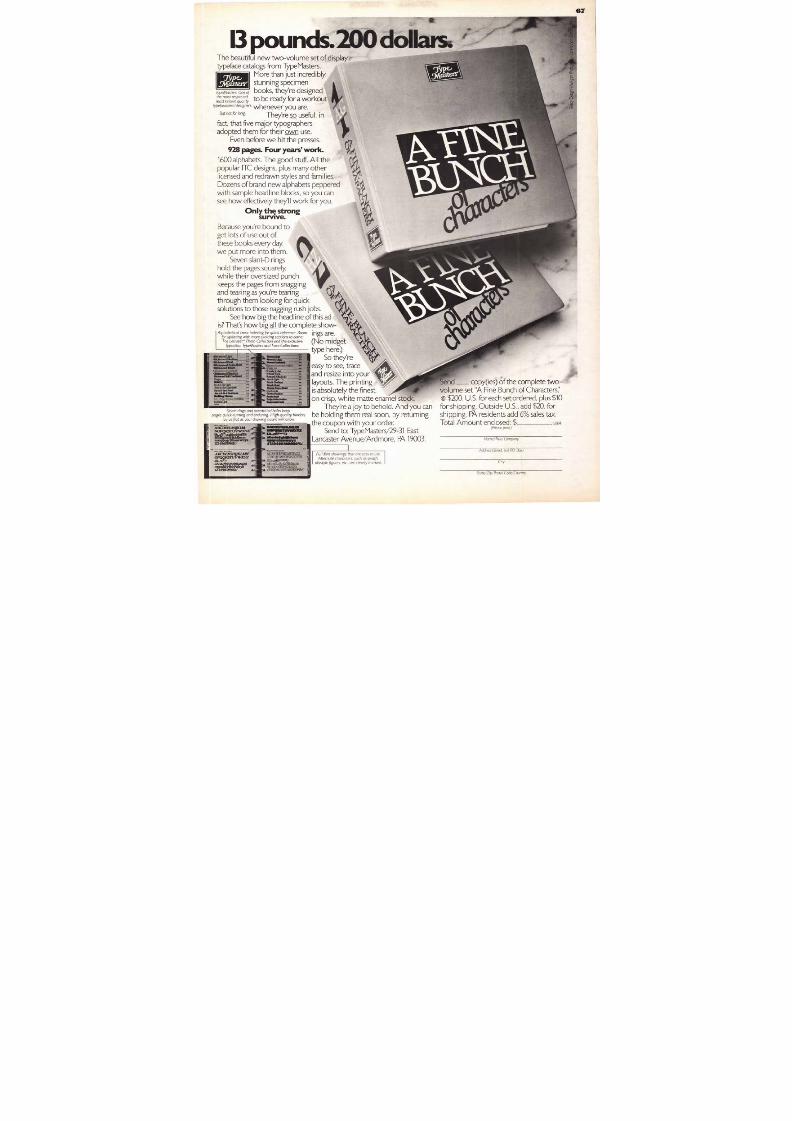
8/13/2019 Upper & lower case: Volume 11—Issue 2
http://slidepdf.com/reader/full/upper-lower-case-volume-11issue-2 62/80
Mergenthaler
typographic
M e r g e n t h ale r ' s E ld o r a d o 'no t es f r o m a m e mo : W A D o n t h e de v e lo p m e nt o f E l do rado —
"On th e subject of so urces and intentions Mr. C. H. Grif f i th wrote, under date of
March 24, 1951: 'T he re i s no th i ng o f a docum e n tary na ture in my f i les regarding the
de ve l opm e n t o f E l dorado , nor any corre sponde nce b e ar i ng on the sub je ct . T he
pre l i m i nary de ta i l s o f the pro je ct we re hand l e d th rough pe rsona l o r t e l e phone con tact
wi th WA D. T he o n l y da ta I have are a f e w f ragm e n ts o f p roo f s wi th cr i t i ca l no ta t i ons .
T he de ve l opm e n t o f E l dorado or i g i na te d i n the e ar l y par t o f 1942, i m m e d i a te l y
f o l l owi ng our e n t ry i n the wor l d war . T he G ove rnm e n t had i s sue d re gu l a t i ons f o r the
conse rva t i on o f pape r an d o the r e sse n t i a l m ate r i a l s . Pub l ishe rs we re cas t i ng ab o u t f o r
sm al l t y pe s tha t wou l d e nab l e the m to com pl y w i th the se re s t r i c ti ons . I t was our
ob je ct to de ve l op a t y pe tha t wou l d prov i de the m a x i m u m de gre e o f spaci a l e conom y
wi thou t i m pa i r i ng l e g i b i l i ty o r re ad i ng com f or t to a m ate r i a l e x te n t . T h i s nu tshe l l is
the m ot i va t i ng i n f l ue nce re spons i b l e f o r E l dorad o .
I t tu rne d ou t tha t sub se que n t re s t r i c t ions on the use o f b rass and o the r raw m ate r i a l
use d i n the m anu f acture o f m atr i ce s dur i ng the war y e ars and f o r som e t i m e the re a f te r
pre ve n te d an e ar l i e r com pl e t i on o f the se r i e s . I t so happe ns , how e ve r , tha t th i s f acef i ts i n to the i m m e d i a te e conom i c p i c ture jus t as e f f e c t ive l y as i n to tha t f o r wh i ch i t
was de s i gne d i n the f i r s t i n s tance .
A t the t i m e E l dorado was unde r cons i de ra t i on La t i n A m e r i can pub l i she rs , he ade d
b y the l a te Mr . T e odor B e cu , o f B ue nos A i re s , we re urg i ng us to de ve l op a b oob ty pe
o f d i s t inct i on wh i ch w ou l d re f l e c t in an au the n t i c m ann e r som e o f the f lavor o f
Span i sh t y pog raph i c t rad i t i on i n the i r l i t e ra ture . T h i s was d i scusse d a t l e ng th wi th
WA D , and he h i t upon the idea that the es the t i c r equi r ements o f Lat in American
pub l i she rs and the f unct i ona l ne ce ss i t i e s o f the dom e s t i c t rade cou l d b e co nso l i da te d
i n a f a c e m o d e l e d o n a r o m a n l e t t e r cu t b y D o n G e r o n i m o G i l , M a d r i d , a b o u t 1 7 87 . 1
The E ldorado i talic, duplexed with the rom an, is an original ef fort of the
designer— an attem pt to evolve i talic form s that wou ld be in harmo ny with the
rom an. The name of the face was chosen as an echo of S panish adventures in the
western world.
W. A. Dwiggins"
'Gil was talked about, but the Gil face was rounder and m ore op en in ef fect than
was wanted for Eldorado. One sacrif iced the m ore pro noun ced characterist ic of the
Whether the year is 1900 , 1940 or 1984, M ergenthaler typography, as wel l
as Mergenthaler typesetters, set the world's standard of excellence.
When you specify Mergenthaler type, you are selecting the world-famousMergenth aler, Linotype, Stempe l, Haas T M library. With our roots dating
back to 188 6, we are the only typesetting equ ipment man ufacturer in the
U nited States regularly commissioning new typeface designs. We hav eenlisted the services of the world's top typographic designers to enlarge
our l ibrary and increase your productivity and creativity, names like
Matthew Carter who designed ITC Galliard T M and Snell Roundhand T M . In
addit ion, we l icense the best typefaces from s tudios and foundries
throughout the world. We offer original designs from Be nguiat , Benton,
Cassandre, Dwiggins, Excoffon, Gill, Goodhue, Goudy, Griffith, &idler,
Hollenstein, Lubalin, Miedinger, M orison, Novarese, Renn er, Ruzicka,
Tracy, Tschichold, Weiss, Z apf and many m ore.
It was a Mergenthaler Linotype product that established the art istic
credentials of each new typese tt ing technology. The Linotype, for
example, convinced typographic purists that machines could indeed set
Gil in order to get a condensed and econo m ical set , and so cast back to the deSancha m odel . .
In 1983, we at Mergenthaler decided to add the b older rom an weights and their
com panion i talics to Eldorado, and release i t for digital typesetters. John Quaranta,
who worked on the Linotype Eldorado , as wel l, ou t l ined the deve lopm ent o f
Eldorado into i ts current four ro m an weights with i talics. The results are shown
here. After the Light and Ex tra Bold versions were drawn, the Medium and Bold
weights were specif ied, and then generated by a com puter.
We are proud to add E ldorado to the Linotype l ibrary.
EldoradoT M
ABCDEFGHIJKLMNOPQRSTUVWXYZ
abcdefghi jklmnopqrs tuvwxyz 1234567890
Eldorado Italic
ABCDEFGHIJKLMNOPQRSTUVWXYZa b c d e f g h i j k lm n o p q r s t u v w x y z 1 2 3 4 5 6 7 89 0
Eldorado Medium
ABCDEFGHIJKLMNOPQRSTUVWXYZ
a b c d e f g h i j k l m n o p q r s t u v w x y z 1234567890
Eldorado Medium Italic
A B C D E F G H I J K L M N O P Q R S T U V W X Y Z
abcdefghijklmnopqrstuvwxyz 1234567890
Eldorado Bold
ABCDEFGHIJKLMNOPQRSTUVWXYZ
abcdefghijklmnopqrstuvwxyz 1234567890
Eldorado Bold Italic
A B C D E F G H I J K L M N O P Q R S T U V W X Y Zabcdefghi jk lmnopqrstuvw xyz 1234567890Eldorado Extra Bold
ABCDEFGHIJKLMNOPQRSTUVWXYZ
abcdefghijklmnopqrstuvwxyz 1234567890Eldorado Extra Bold Italic
A B C D E F G H I J K L M N O P Q R S T U V W X Y Zabcdefghijklmnopqrstuvwxyz 1234567890
8/13/2019 Upper & lower case: Volume 11—Issue 2
http://slidepdf.com/reader/full/upper-lower-case-volume-11issue-2 63/80
63
Mergenthaler's Eldorado, Joseph Treacy's Bryn Mawr,
awrT M
a fresh, new serif typeface led designer Joseph Treacy back
gh studies of 19th Century European letterforms. He blended
forms together with completely new design ideas to create Byrn
awr: an exciting, original typeface as perfectly suited to contemporary
it is to period work. There's a rhythm and gracefulness in both
TM Light
nopqrstuvwxyz 1234567890
cdefghijklmnopqrstuvwxyz 1234567890
awr Book Italic
Medium
1234567890
Mawr Bold Italic
mnopqrstuvwxyz 123456789
was set on a Mergenthaler typesetter. Mergenthaler, Linotype, Stempel, Haas, Linotron,
on.
ITC Symbol
Mergenthaler Linotype manufactures each new ITC typeface for its line of
digital typesetters. ITC Symbol is the latest ITC release. ITC Symbol is the
third ITC typeface release designed by Ado Novarese of Turin, Italy. The
other two are ITC Novarese and ITC Fenice, each is available from
Mergenthaler. ITC Symbol is slightly condensed, thus giving economy of
space. The semi-serifed desigh treatment of the letterforms helps
readibility, even under the most difficuly printing situations. Mergenthaler
is glad to add ITC Symbol to the Mergenthaler, Linotype, Stempel, Haas
type l ib rary .
ITC Symbol, is shown in an earlier section of this edition of U&Ic.
Mergenthaler Linotype Company
201 Old Country Road
Melville, New York 11747
^WED M e r g e n t h a l e rLinotype
8/13/2019 Upper & lower case: Volume 11—Issue 2
http://slidepdf.com/reader/full/upper-lower-case-volume-11issue-2 64/80
TheOri final
And
m ill The
•hen we introduced Identicolor back in 1964 our optimism
blazed. But if someone had said that plateless color proofing would be
an industry byword 20 years later, we'd have arched our collective
eyebrow.
Well, here we are in 1984, no longer doubtful but enormously
delighted. Our creation has become the state of the art.
Yet in the early years we were far from overnight sensations. How
to make people understand what we were all about was a major task.We had to field the same relentless questions again and again: "What is
it for?" and "Where do I use it?"
And answering those questions was sometimes not enough. We
had to hand-hold some early customers through every operation. We
produced jobs on spec. We gave money-back guarantees.
And of course we all grew up together.
Today, art directors, designers and graphic arts people of every
stripe know what a revolutionary tool color proofing is. And few can
live without it. But no one rea lly has to.
Identicolor operations are available in every major market in the
wor ld . Each is an exclusive f ranch ise, a t tached to a top serv ice organ ization .
Each is a self-contained sub-division with techniques and modalities
that are uniquely Identicolor. And each is squired and fussed over by
trained professionals.
And behind everything, always there and quietly reassuring, are
those 20 years of color proofing expertise.Which reminds us of some new "systems" that keep springing up
every now and then. They claim to have "re-invented" the art. Some
say they're "the ultimate".
In point of fact, that "re-invented ultimate" is just slogan-ese for
an imitation of Identicolor. And without the 20 years of experience
to go with it. Well, it's flattering to be copied, as someone said a mil lenium
ago. But in color proofing, Identicolor is the dynamic original.
And still the best.
Identkolor/IdenticalAmsterdam • Atlanta • Auckland • Baltimore • Berlin • Boston • Chicago • Cologne • Dallas • Dayton • Denver
Dublin • Dusseldorf • Essen • Hamburg • Houston • Indianapolis • London • Los Angeles • Louisville • Melbourne • Minneapolis • Montreal
New York • Omaha • Paris • Philadelphia • Pittsburgh • Rochester • San Diego • San Francisco • Seattle • Stockholm • Stuttgart
Sydney • Toronto • Washington D.C. • Wiesbaden • Zurich
DISPLAYTYPE WAS SET IN HEADLINERS' neo.GILL SANS BLACK
8/13/2019 Upper & lower case: Volume 11—Issue 2
http://slidepdf.com/reader/full/upper-lower-case-volume-11issue-2 65/80
HEALTH CARE O FFI CE s u m E w EllTEPTAIrlMerlT
.1 4 (
io l
aata ,L 8419
A C U P B O C K F LNE M T A OS ROOF WIC OF LINE ART A CS BOO<
•• llik• C F L I N E A R T A CY BOCK IA& LNE MT
E x c l u s i v e w i t h V o l k
Costly photo-conversions in an inexpensive camera-ready art service
GRAFIKLINES are made to
withstand substantial
enlargement or reduction.
emovs„s41:lAni
kVOLK CUP ART, BOX 72 LP L E A S A N T V I L L E , N J 08232YES Rush the 12 bonus "C l ipBooks" shown above for only
five cents and include the first
issue of our limited 5-month
trial subscription. No furtherobligation—nothing more to
buy. Invoice us for $79.95which inc ludes shipping.
0 - We' l l save our f ive percentCheck for $75.95 in full is en-
closed. (Outside USA: pay-
ment in US funds, with order. In
N.J., include 6% sales tax.)
Firm Na me
Authorized by
Street Address Please for UPS
65
K E 5 A N D G E T 1 2 F O R O N L Y 5 °OUTDOORSI G $ 4 5 V A L U E - Y O U R S W I T H A T R I A L S U B S C R I P T I O N C O N R A D Z I L C H II OLIDAYS
I F S E R V I C E 1 1 cci
vf& qt. 1 1 1AZ
s right All 12 of the brand
e cam era-ready ar t serv ice.
ons, design devices an d spar-
ur exclusive
USED BY TOP FIRMS
banking, in-
man shop all the way up to thosein the lofty "Fortune 500." We'll
help you cut corners without cut-
ting quality. In fact, you'll improveyour graphics
You'll clip and paste an art proofjust like an original illustration(which it is) for each is pureblack-and-white line. Ready for a
simple camera shot—no hard-to-handle halftones. Reduce, en-
large, use same size. Print hand-somely by offset, letterpress, silk
screen, e lectrostat ic , e tc.
G R A F I K L IN E S O U R S A L O N EPease note the examples of our
exclusive photo-conversion pro-
cess below. These were continu-
ous tone photographs which we
conve rted to foolproof l ine pr int ingmater ia l wi thout using a mezzot intor ha l f tone sc reen . Each examp lewas c l ipped f rom the or ig ina l bookand used here same size.
But our strong point is our hand-
som e real ist ic il lust rat ion drawn bytop artists in the field. And the art
ref lects today's fashions , hai r , etc.since it's drawn for each month's
brand new bo oks . P lus use fu l de -sign, decorative and humorous
spots. Al the current art styles—
pen & ink, dry brush, scratch-board, litho crayon, photoconver-sion, etc.
L O W C O S T - T O P Q U A L I T Y
But please don't let the low pricemislead you The art is used in
many ways by America's topfirms—some for more than 31years. They'd willingly spendmore, but there is no betterready-to-use art at any price.
Our 31 years of leadership in thef ield assure you of top creativity,
taste and quality. Many artstudios, ad agencies, creative
pr in ters, e tc. use the a r t prof i tab lyon a custom basis for individual
clients. (The art may not beresyndicated.)
CLIP, PASTE, PRINTYours without extra reproduction
fees with a limited trial subscrip-
tion to the original Clip Books ata low introductory rate. A wholenew wor ld of wonder fu l ly good ar tat about $3.50 per week And,
you'll use the art effectively incompany publications, news-
papers, ma gazines, booklets, bu l-letins, circulars, direct mail, TV,
AV, etc.
The a r t is fa i th fu lly reproduced on"Kromekote" repro stock with the
5x8 pages printed one side only.Two 12-page and two eight-page
books eac h mon th for f ive mon ths.And, for quick look-up or as a
quick source o f smal ler art proofs,there's an index folder to match
each book with al l art in half size.
32 BOOKS, 32 INDEXESThe cost? Only $79.90 for five
months— less than we spen d fo r asingle illustration. Ten eight-pagebooks, ten 12-page books, 20miniature indexes. Pus your 12bonus books, above, and theirmatching indexes for only five
cents . Save even more Enc lose a
check with order and deduct five
percent—only $75.95, postpaid
Order today and put our creative
crew to work for you
O R D E R F O R M M A I L T O D A Y
iLty, State. Zip Code
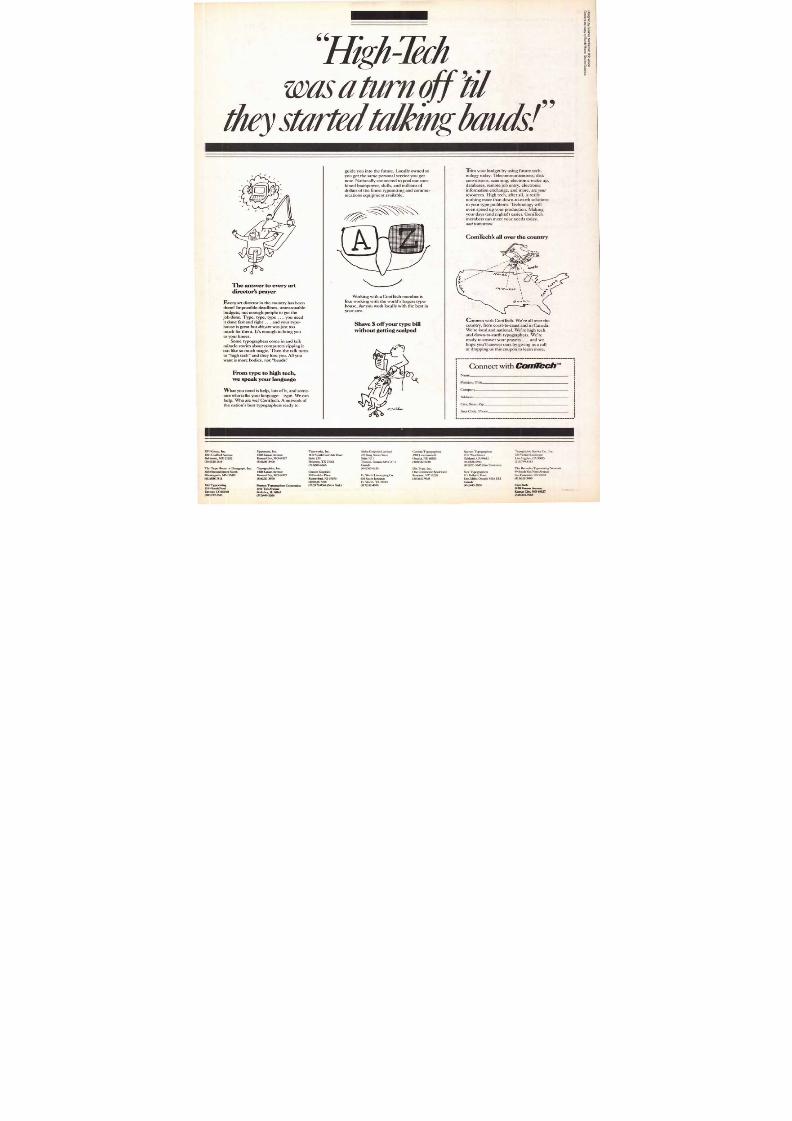
8/13/2019 Upper & lower case: Volume 11—Issue 2
http://slidepdf.com/reader/full/upper-lower-case-volume-11issue-2 66/80
When you've dreamed up a layout thatrequires an unusual typographic treatment, the first
How to tu rn a t h i n g y o u s h o u l d d ois call a TIA profession al
Min a re in to t y p o g r a p h e rth eecaus he las t
thing you ne ed i s for your project to
a team.turn into a n i g h t m a r e o f m i s - f i t s ,
mistakes and missed deadlines.A nd if you're wo rking with a T IA member, it never will.
We have the expertise, the e x p e r i e n c e , t h e t e c h n o l o g yand t h e c a p a b i l i t i e s y o u c a n r e ly o n o m ailer wh at thechallenge. Th at means you w on't have to lose any sleep overa com plicated job. E v e n i f i t s a m o n . 5 1 e r .
Typo graphe rs International A ssociation. We turn dream s into reality.
This ad is sponsored by the following TI A mem bers: California: Castro Valley, VeraA l l e n C o m p o s i t i o n . I n g l e w o o d , B U M S T y p e s e t t i n g Service. Los A ngeles, A ndresenT y p o g r a p h i e s , P h o t o t y p e H o u s e , I n c . , T y p o g r a p h i c S e r v ic e C o . , I n c . M o u n t a i n V i e wFrank's Type. N ewport Beach, The Finn of C h r i s to p h e r W r e n . O r a n g e , D e l i n e - O - T y p e ,I n c . P a l o A l t o , Atherton's T y p o g r a p h y . S a c r a m e n t o , A d T y p e G r a p h i c s . S a n Francisco,M e r c u r y T y p o g r a p h y , I n c . , O m n i c o m p , R a p i d T y p o g r a p h e r s . C o l o r a d o : D e n v e r . E r n i e B r a m eT ype crafter C o. C onne cticut: Stamford. Stamford T ype setting. Districtof C olumbia: Ge ne ralT y p o g r a p h e r s . F l o r i d a O r l a n d o , e t C E T E R A T y p o g r a p h y . I l l i n o i s : B e r k e l e y , P e a r s o n T y p o g r a -p h e r s C o r p . C h i c a g o . . P i c a T y p e I n c . . S h o r e T y p o g r a p h e r s . I n c . , T o t a l T y p o g r a p h y , I n c . N o r t h b r o o k ,
J & L G r a p h i c s . I n d i a n a : I n d i a n a p o l i s . W e i m e r T y p e s e t t i n g C o . , I n c . M a r y l a n d : H y a t t s v i l l e . V a l l e yTypesetting. Massachusetts: Boston. Composing Room of New England. Jefferson, CountyPhoto C ompositing. New ton, Wr ightson T ypographers. Minn esota: Minn eapolis, The T ypeHouse + Du r a g r a p h . M i s s o u r i : K a n s a s City, Connell Typesetting Co., sharpgraphics. St. Louis,Typotronics I n c . N e w Jersey: Kenilworth. Elizabeth Typesetting. Newark, Arrow Typographers. Ruther-ford, Granite Graphics. New York: Ne w York, Artintype -Metro, , = rum Composition Services.Rochester, Rochester Mono/Head line rs. Syracuse, Dix T ype, lac orth Carolina: Raleigh,Typo/Graphic S e r v i c e s . Ohio: C leve land, T ypesetting Service, -Pen nsylvania: Blue Bell,E s t e l l e Bair C omposition. Philade lphia: Ruttle S haw & Wethe hode Island: Providence,Typesetting Ser vice C orp. South C arolina: C olumbia, DG + F ypography & CommercialA rt. Texas: Dallas C hiles & C hiles, Inc., Typ ography Plus. Washington: We , The T ype Gallery, Inc.
Wisconsin: Men asha, Graphic Composition, Inc. Canad a: Pron to, Ontario, T hchni-Pr ocess Ltd. Vancouver ,British C olumbia, POLA/graphics. For more inf ormation and a comple te li sting of 77A p rofessional typog-raphers, contact T M He adquarters, 2262 Hall Place N.W., Washington, D.C. 20 007 . (202) 965 -3400.
8/13/2019 Upper & lower case: Volume 11—Issue 2
http://slidepdf.com/reader/full/upper-lower-case-volume-11issue-2 67/80
o• qrstuvwxyz67890Sc°
Address (Street not P0. Box)Full-font showings that are easy to use.
Alternate characters, such as swash,oldstyle figures, etc., are clearly marked. City
State/Zip/Postal Code/Country
67
1 3 p o u n d s . 2 0 0 d o l l a r &
Seven rings and overdrilled holes keep
pages quick-turning and enduring. High-quality binders
lay as flat as your drawing board will allow
TypeMasters. One ofthe most respected,
least known quality
typefounders/designers
But not for long.
• RictimarlI4ht
tRicianorftl
Rktraord &id
•Ricluiond Extra
RichmondBlacA
NCR
The beautiful new two-volume set of display
typeface catalogs fro m TypeMasters.
More than just incredibly
stunning specimen
books, they're designedto be ready fora workout
whenever you are.
Th ey're so u seful , in
fact , that five m ajor typo graph ers
adopted them for their own use.
Ev en befo re we hit the presses.
928 pages. Four years ' work.
1600 alphabets. The good stuff All the
popular ITC designs, plus many other
licensed and redrawn styles and fam ilies.
Dozens of brand new alphabets peppered
with sample headline blocks, so you can
see how effect ively they' ll work fo r you .
Only the s trongsurvive .
Because you're bound to
get lots of use out of
these boo ks every day,
we put more into them.
S even slant-D rings
ho ld the p ages squ arely,
while their oversized punchkeeps the pages from snagging
and tearing as you 're tearing
through them looking for quick
solut ions to tho se nagging rush job s.
S ee ho w b ig the h eadline o f t h i s ad
is? That 's ho w big al l the com plete sho w-
ings are.
(No midget
typehere)
S o they 're
easy to see, traceand resize into your
layouts. The printing
is absolu tely th e finest,
on crisp, white matte enamel stoc
They're a joy to behold. And you can
be holding them real soon, by returning
the coupon with your order.
S end to: TypeM asters/29-31 East
Lan aster Avenue/Ardm ore, PA 19003 .
Alphabetical cross-indexing for quick reference. Roomfor updating with more exciting sections to come:
The Letraset* Photo Collection and the exclusive
Typsettra, TypeM asters and Face Collections.
tem
tti
Ilmounkoell
Send opy(ies) of the complete two-
vo lum e se t "A Fine Bunch o f Characters' :
@ $2 00. U.S. fo r each set ordered, plus $10
for shipping. Outside U.S., add $20. for
shipping. PA residents add 6% sales tax.
Total Amount enclosed: $ 684
(Please print)
Name/Title/Company
8/13/2019 Upper & lower case: Volume 11—Issue 2
http://slidepdf.com/reader/full/upper-lower-case-volume-11issue-2 68/80
• •T h e b e s t c r e a t iv e s o l u t i o n s o f t h e 80s .. .d e l i v e r e d
t o y o u r - _d o o r e a c h
,.. 4
12 times a year, Clipper
Creative Art Service' brings youa fresh supply of camera-ready
art and ideas that will save you
time, energy, and money—while maintaining your high
standards of professional
quality.
I C l i p p e r ® brings a new level of sophistication to camera-ready art. It's always contemporary, constantly up -dated and consistently original.
• lbp-quality art that's unparalleled. "Average"just isn't good enough for C l i p p e r . The art we offer
you has to be the very best . So we've scoured thenation to find today's most dynamic artists. These
top illustrators contribute toC l i p p e r ,
giv ing you awide variety of artistic styles to choose from—
i l lus t rat ions, graphics , symb ols . headings an d borders instyles from stipple and crosshatch to bold silhouettes
and a i rbrush render ings. Clipper ar t can be mo di f ied eas i lyto fit your specific needs. Enlarge it, reduce it. crop it, flop it,
reverse it, add color to it—use it to its fullest potential
• Contemporary, original suggestions to give you ideas.
C l i p p e r is the only art service that provides top-qualityart, then suggests creative ways you can use it. Eightpages o f Clipper s how y ou c lea r ex amp les o f how y ou c anuse the ar t in each issue. You' l l see exam ples of ads, bro-chures, newslet ters . logos, le tterheads, AV s l ides, menus,b i l lboards, T -shi r ts . package de s igns and m uch m ore—complete with professionally written copy, so you may
use them jus t as they are. These idea pages are des ignedto eliminate creative blocks so productivity can flow
U Make Clipper your complete creative SYSTEM. Withyour subscription to C l i p p e r . you' l l receive:
12 issues of the 24-page (121/2" x 19") Clipper filled
with contemporary, professional camera-ready art and
ideas.12 issues of "Clip Bits"—your indispensable "how-to"
magazine filled with tips, shortcuts, and informational
articles for artists, production people, copywriters. and
creative managers. (20 pages. 8 /2" x 11")
Unlimited access to our 10-year. 8.000-subject Master
Art Library and its 64-page Cross Reference Index—
available exclusively to Clipper subscr ibers.Monthly pictorial indexes to help you locate art quickly
and easily.Sturdy vinyl-clad binders—one to protect your valuable
Clipper issues and the other for your "Clip Bits"
magazines.
Send for your FREE Thal Issue of ClipperCreative Art Service today
CiDynamic Graphics. Inc.
6000 N. Forest Park DriveP.O. Box 1901Peoria, IL 61656-1901
E l
UNote: Coupon must be completely f i l led out and payment option checked before we can send your Trial Issue.OTE: Offer app l ies in North America on ly . In
Europe. contact Dynamic Graph ics. U.K. Ltd ..17 Rodney W ay, Widford Industr ia l Estate,Chelmsford , Essex, CM1 3 BY. Eng land. fo r
complete detai ls. Al l other areas, contactDynamic Graphics. Inc. (U.S.)
I ly C l ip p e rF R E E o f c h a r g e
SE N D NO M O N E Y N O WYES I 'd li ke a FREE Tr ia l Issue o f Clippeff. Please enter my order fo r a TTEN TIO N please print or type)
one -year. 12 - issue subscription to Cipper Creative Art Service ® at$29.50 per month. plus $2.15 postage and handling ($3.90 per monthpostage and hand l ing in Cana da, payab le in U.S. funds). beg inn ing w i th thecurrent issue. After the fi rst 12 issues. continue to ship monthly, subjectto my written cancellation notice 30 days prior to publication (20th of OMPANY Of appl icable)
every month) .
STREET
T ITLE
When you complete and mail
in the coupon, we'll send youa FREE trial Issue of Clipper.
Use its $14,000 worth oforiginal art, and adapt the
application ideas to your ownprojects.
• •
Howeve r. f i rst send me the Trial issue of Clipper, which I may review anduse. If I decide Clipper i s no t fo r m e . I m ay cance l m y o rde r w i th i n 15days. keep the FREE ISSUE and owe noth ing.
I agree to complete the order as fol lows (please check one ):
I prefer to save 3 % of the subs cription price by prepaying. Please bi l lm e now. N e t 10 days.
I=1 P lease b i l l me m onth ly as the year 's issues are sh ipped. Terms arenet 10 days.
CITY STA TE Z IP
TYPE O F BUSIN ESS BUSIN ESS PHO N E (a rea code)
A UTHO RIZED BY (Signature and title)
FOR OFFICE USE 7 B A R -8 00C 0
MAIL TO: Dynamic Graphics , Inc . . 6000 N. Fores t Park D r i ve. P .O. Box 1901, Peona. IL 61656-19 01
m o n t h
•
8/13/2019 Upper & lower case: Volume 11—Issue 2
http://slidepdf.com/reader/full/upper-lower-case-volume-11issue-2 69/80
Mir
MINOLTA
W H A T T H I SPRINTER'S CAM ERA
U S E D T O D O F O R $ 9 3 9 ,T H E M I N O L T A
B E T A C O P I E R D O E SF O R 4 4 .
The copier is the Beta 450Z from Minolta.And it'srevo lutionizing th e way printers all o v er th e cou ntrysize type and artwork for layouts, paste-ups, mechan-icals and more. Because they don't have to go to thecamera nearly as often.
The reason is Minolta's exclusive Beta zoom lens.It can reduce and enlarge to a virtually limitless
range o f co py s izes . From alm ost 50% larger than theo riginal to 50% sm aller.
The dramatic cost saving isn't the only reasonwhy more and more printers are choosing the Beta450Z .There's also the t im e saved. At m any printers,up t o an hou r o r two a day .
And M inolta cop y qu ality is , as always, sup erior.Whether the 450Z is doing the office copying jobsother copiers do. Or the special sizing jobs it alonecan do.
For more on how the Beta 450Z can make yourl ife easier, see you r Mino lta dealer. Loo k in the
Yellow P ages under the Mino lta tradem ark. Or calltoll-free 800-526-52 56.In New Jersey, 201-342-67 07 .
Th e Mino lta Beta 450Z.The f irst cop ier in th eworld that sizes like a camera.
r
I
IName
Title
ll ompany
I Address ity
I tate Zip elephone
I ail to Minolta Corporation, Business Equipment
•o r f r ivision, 101 Williams Drive, Ramsey, NJ. 07446.
•B E T A . T H E R E ' S NO O T H E R PIE RO N EARTH LIKE IT.
Please have my dealer contact me for a demonstration of the Minolta Beta 450Z'ssizing capabilities.
Please send me more information.
1
© 1984 Minolta Corporation
8/13/2019 Upper & lower case: Volume 11—Issue 2
http://slidepdf.com/reader/full/upper-lower-case-volume-11issue-2 70/80
0491004101
An Exclusive Offer From Print Magazine —
A Special Pre-Publication Discount On
P R I N T C A SE B O O K S 6A SixVolume Library of Great Design Solutions
0
Take Advantage of SPECIAL INTRODUCTORY Subscription Offer to
America's Graphic Design Magazine
Read by: illustrators • art directors • graphic artists • typographic designers • art production managers• commercial photographers • electronic graphic designers • advertising and sales promotion managers
PRINT,the magazine that keeps you current on how ideas and concepts are given
visual expression ... lavishly illustrated and superbly edited, PRINT is easily the
most original, candid and readable design magazine. You will find in PRINT up-to-
date coverage of the constantly changing graphic design field. You will see what is
taking place in advertising and promotion, corporate identity, illustration and
photography, typographic design, television, film, computer-aided design and more.
• DEPEND ON PRINT to showcase the finest graphic design currently beingproduced
• RELY ON PRINT as a rich source of ideas, inspiration and information
• VALUE PRINT's INSIGHT into current graphic trends and future directions• B E NE F IT F RO M PRIN'rs 45 years of building editorial sources in America and
around the world.
Subscribe now and you will automaticallyreceive Print's Regional Design Annual 1984
yiou will find this large Annual a dependable "idea stimulator." It
is the most comprehensive Graphic Design Annual ever pub-
lished. Now in full color throughout and enlarged to 256 pages it is
the only Annual ever to survey American graphic design strictly
from a regional standpoint.
256 pages, 9"x12", over 1,400illustrations, all in full color.
Newsstand Price $24.00
Presents in six separate sections the major regions of the country:
The Far West • The Southwest • The Midwest • The South • The
East • New York City.
Subscribe now Take advantage of PRINTs Special Introductory
Offer. As a PRINT subscriber you will receive PRINTs REGIONAL
DESIGN ANNUAL 1984 ( list price $24.00) as part of your regularsubscription.
PR 1 N 7 ' C AS F_BOOKS 6 • A S ix -Vo lu m e S et • 2 7 6award-winning design projects • Over 600pages with over 1000 illustrations, many infidl color - Special designed slipcase housingthem:A - volumes • Publication date: August 198
• Pre-Publication Price ;94.50 (List $115.0
All-New 1984-85 Edition. Published by PRINT, America's Graphic Design Magazine,
the all-new PRINT CASEBOOKS 6 consists of six separate hard cover volumes...
each covering a major category of design . . . each providing in-depth case history
coverage of the best current work done in Advertising, Annual Reports, Covers &
Posters, Environmental Graphics, Exhibition Design, and Packaging.
100% devoted to award winning graphic design projects PRINT CASEBOOKS 6 are
unique among design annuals. You not only see the winning projects illustrated
and read the details, you are given the
creative thinking and the problem-solving approaches used by the designer.
All the designs are shown large and in
detail — many in full color. More than
20,000 design professionals, in all phases of visual communication, have come
to rely on the PRINT CASEBOOKS as an indispensable working tool.
Clip and snail today mmimemmmmmmimmimemmemmemuummmmoomemmolm======mommemomommememmimmememionmi
Save on these outstanding Offers Special Introductory Subscription Offer includingPRINT's REGIONAL DESIGN ANNUAL 1984 and
Pre-Publication Offer on the all-new, six volume PRINT CASEBOOKS 6.
Mail to: PRINT
I 6400 Goldsboro Road, Bethesda, MD 20817
Please send me PRINT at your special introductory subscription rate. 1 year at $32.00 (newsstand price $49.00). Includes PRINT's REGIONAL DESIGN ANNUAL
1984. Maryland residents add 5% sales tax.
Canada, Mexico and other foreign countries add $8.00 for currency exchange and postage.
Please send me PRINT CASEBOOK 6 at your Special Pre-Publication Discountopy(ies) of the six volume set at $94.50 (list-price $115.00). Includes hardcover
slipcase for all six volumes.
Enclosed is my check for $ PRINT PAYS SHIPPING). Maryland residents add
5% s tate sales tax. Canadian residents add 20% for currency exchange. All other countriespayable in US funds only.
Name(please print)
Title
Company
Address
City tate ip
Phone(area code)
Charge my credit card plus postage and handling
American Express V ISA M a s t e r C a r d
Credit Card Number ood through
IIIIIIIIIIIII IMonth Year
Signature(All credit c a r d o r d e r s m u s t b e s i g n e d )
Lesummi===========monsimmansoms111===inowommenonsommommimammommminsowasounimmonmimmmamimiewimewimmismimmay N I
8/13/2019 Upper & lower case: Volume 11—Issue 2
http://slidepdf.com/reader/full/upper-lower-case-volume-11issue-2 71/80
The answer to every art
director's prayer
Every art director in the country has been
there Impossible deadlines, unreasonable
budgets, not enough people to get the
job done. Type, type, type... you need
it done fast and right ... and your type-
house is great but this _one was just too
much for them. It's enough to bring you
to your knees.
Some typographers come in and talk
miracle stories about computers zipping it
out like so much magic. Then the talk turns
to "high tech" and they lose you. Al l you
want is more bodies, not "bauds:'
From type to high tech,
we speak your language
What you need is help, lots of it, and some-
one who talks your language—type. We can
help. Who are we? ComTech. A network of
the nation's best typographers ready to
guide you into the future. Locally owned so
you get the same personal service you get
now. Nationally connected to pool our com-
bined brainpower, skills, and millions of
dollars of the finest typesetting and commu-
nications equipment a vailable.
Working with a ComTech member is
like working with the world's largest type-
house, but you work locally with the best in
your area.
Shave $ off your type bill
without getting scalped
Trim your budget by using future tech-
nology today. Telecommunications, disk
conversions, scanning, electronic make up,
databases, remote job entry, electronic
information exchange, and more, are your
resources. High tech, after all, is really
nothing more than down-to-earth so lutions
to your type problems. Technology will
even speed up your production. Making
your days (a nd nights ) easier. ComTech
members can meet your needs today,
and tomorrow.
ComTech's all over the country
Connect with ComTech. We're all over the
country, from coast-to-coast and in Canada.
We're local and national. We're high tech
and down-to-earth typographers. We're
ready to answer your prayers ... and we
hope you'll answer ours by giving us a call
or dropping us this coupon to learn more.
r
Connect with COMTecirName
Position Title
Company
Address
City, State Zip
Area Code, Phone
" H i g h l i c h
w a s a t u r n o f f ' a lt h e y s t a r t e d t a l k i n g b a w d s
Group, Inc. Uppercase, Inc. Typeworks, Inc. Alpha Graphics Limited CustomTypographers Spartan Typographers Typograp hic Service Co., Inc.
1420 Kansas Avenue 1110 North Post Oak Road 720 King Street West 3901 Leavenworth 2112 West Street 934 Venice Boulevard
, MD21202 Kansas City, MO64127 Suite 250 Suite 1011 Omaha, NE 68105 Oakland, CA 94612 Los Angeles, CA 90015
(816)241-8400 Houston, TX 77055 Toronto, Ontario M5V 21'3 (402)422-0240 (415)836-0933 (213)749-8383
(713)683-6666 Canada (415)781-5645 (San Francisco)
Typographies, Inc. (416)365-0150 Dix Type, Inc. The Recorder Typesetting Network
1400 Kansas Avenue Granite Graphics One Commerce Boulevard York Typographers 99 South Van Ness Avenue
MN 55411 Kansas City, MO64127 19 Franklin Place Ft. Worth Linoryping Co. Syracuse, NY 13220 Ill Railside Road San Francisco, CA 94103
(816)231-8590 Rutherfor d, NJ 07070 610 South Jennings (315)437 -9925 Don Ml ls, Ontario M3A 182 (415)621-5400
(201)438-73% Ft. Worth, TX 76104 Canada
Pearson Typographers Corporation (212)772-0364 (New York) (817)332-4070 (416)445-3830 ComTech
1101 Taft Avenue 1420 Kansas Avenue
80210 Berkeley, IL 60163 Kansas City, MO 64127
312)449-5200 816)241.4918
8/13/2019 Upper & lower case: Volume 11—Issue 2
http://slidepdf.com/reader/full/upper-lower-case-volume-11issue-2 72/80
2
I like it, really like it. You wrote o n CLAS S IC®Linen. But I do n't th ink this head line,subhead andfirst p aragraph ,qu ite wo rk in ,L
m y layout .
Stop p a ying $ 200for $120 wor th o f typ e
Ishould've
used
8
Type bi l l s are dr iv ing everyone crazy . Up, up they go— wi th no cei l ing insight. But you don't want to know abou t tha t. You w an t to k now why you rcata log costs so much. And why type for a s imple brochure costs a lmost asmuch as the pr int ing. You' re caught in the m iddle t ry ing to keep costs dow nbut get t ing your socks knocked o f f w i th type b i l ls .
But Arno ld & Debel can he lp . Wi th adver t is ing qua l i ty type a t pr ices that
remind you of the goo d old days. Pr ices the big shops can't even remem ber.And we operate around the c lock . Ca l l Ivan Debel today a t (212) 889 -3711or (800) 232-3312. You h ave noth ing to lose except outrageous type b i ll s
ADRNOLD & DEBEL INC.
TYPOGRAPHERS
270 MADISON AVENUE
NEW YORK, N.Y. 10016
(212) 889-3711
N e e n a h P a p e r1984 KC.C.
n Registered Trademark
of Kimberly-Clark Corporation
As an easy point of agreement, start withCLASSIC Linen and Cover. 4 colors and2 whites.
Kimberly-Clark Neenah P aper Div is ion
THE TECHNOLOGY OF
TOMORROW, TODAYFinally, a calculator that operates in the four
different units you work with every day:1. inches . points
2. picas and points . millimeters
The Arttec Graphic Art Calculator instantly
and accurately:
1. converts
2. fits
3. scales
4. proportions
Now a machine that fits in the palm of your hand and reduces a ll
your calculations at the touch of a button.
Send your order to: Arttec 3 Pearl Court
Allendale, NJ 07401
Gentlemen:
Please rush me alculator(s).
I have enclosed a check or money order made payable to Arttec in the amount
of S Thank you
New Jersey residents please add 6% tax.
Name:
Company:
Address:
City: State: Zip:
My Art Supply Store Is:
The Arttec Calculator comes complete with an easy-to-use
instruction manual and carries a full one-year warranty honored at
any of the 176 Ar ttec stores located throughout the United States
and Canada.
Throw away your slide rule, your proportion wheel and your old
calculator.
There's no more guessing. No more errors. No more time wasted.
Step into the 21st Century for only 579.95
AritMc ATIONAL ART INDUSTRIES, INC. Allendale, NJ 07401
8/13/2019 Upper & lower case: Volume 11—Issue 2
http://slidepdf.com/reader/full/upper-lower-case-volume-11issue-2 73/80
73
A T T E N T I O N :D E S IG N E R S & I C E Y L I N E R S
D O T HE J O B R I G HT W I THTHE RI GHT PRO D UC TS:
CUT-OUT, SE LF-ADHES IVE, ACETATES HEETS OF LETTERING, RULES , BORDERS ,ORNAME NTS, SHAPE S , AND SHADING ME DIUMS.
CHARTING AND GRAPHIC ART TAPESINCLUDING SOLID COLORS , PATTERNS, POINTS IZE RULES, BEN DAY, AND BORDER TAPES.
S ELF-ADHESIVE CLIP ART BOOKS FE ATURING12 ORIGINAL TITLES . EACH 32 PAGE BO OKCONTAINS AT LE AST 130 DRAW INGS IN 2 S IZE S .
FEATURING 32 ORIGINALBORDE R DE S IGNS PRINTE D ON HIGHQUALITY STOCK W ITH AN 81/2 x 11 INCH, NON-PHOTO BLUE, INCH PASTE-UP GRID.
THE GRAPHIC PRODUCTSCORPORATION CATALOGWILL GIVE YOU THE RIGHTPRODUCTS TO DO THE JOBRIGHT REQUEST YOUR FREECOPY TODAY.
Company
Street
City
State ip
Mail to: Graphic Products Corporation
3601 Edison Pl., Rolling Meadows, IL 60008
Wh y keep your ta lentsa secre t?
You've spent years developing
they can't use you r talentsthey don't know who you are.
They of co urse are your fu ture clients.
spots, annual repo rts, maga-ks. Your vision brings clarity to
Creative Access puts you in touch. Withses, phone num bers and job
es of nearly every potential buyer in the b usi-untry. In advertising agencies.
rate America. In graphic design firms.fashion, food and bev er-
they are, where they are and whether or
We can supp ly those names o n galleys,m ailing labels, 3x5 Ro lodex cards and soo n onflop py discs. All within ten days. All with a 100%satisfaction-guaranteed guarantee.
We'll even help you turn our information
into knowledge. Knowledge that can lead to effec-tive direct marketing. Knowledge that can breakthe chains of secrecy and let your talents soar.
For specific information on how our ser-vice works, ho w it can be tailored to your needs,and ho w little it costs, call us at 1-800-422-237 7(in Illinois 1-312 -440-1140).
n o v e M e t r o u n le a s h e so n s te r wit h o v e r
500 Fa c e sThe Monster, weighing in at
We ye put our 60 years of
moth undertaking and it makes
The "Text Volume" has com-
The "Headline Volume" shows all characters in each of over 5.000 lettering faces and isplemented by both a comparison index and an alphabetical index.
Anyone who buys typography, specifies typography or just p lain loves typography will
onster" close at hand. Now, you can have this indispensable two volume setom ArtintypeMetro, at this special introductory price offer. Dont let "The
Yes, ArtintypeMetro, I want "T he Monster" at the special introductory price
Please send me "Text Faces" — $79.95 "Display Faces" —$59.95
"The Monster," Two Volume Set—$125.00.
I enclose a check for
Name Title
Company Name
Address ity
State Zip
srt intypeMetroNote: All orders payable in advance within
USA. All orders shipped postpaid. No 52 Park Avenue SouthCO.D 's. In N.Y. State: Add local sal es tax. ew York, New York 10010Outside US.: Add $20.00. Please allow
delivery. 212) 532-4000 I
8/13/2019 Upper & lower case: Volume 11—Issue 2
http://slidepdf.com/reader/full/upper-lower-case-volume-11issue-2 74/80
li Both Arttec and Letraset' offer a l ease send me a sheet of 36 pt.
wide var iety of type faces. elvet ica Medium s o that I can
2Both are avai lab le in 10" x 15" Arttec ee the Let raset" ' a lternat ive. I am
ful l size sheets. transferenclosing $3 . 0 0 to cover postage
3Both t ransfer easi ly and nd hand l ing . A lso inc lude the name
4 Both uti l ize a plastic carr ier letteing a type face listing.leave no residue. 1 killialk f my nearest Ar t tec dealer and
5 Both are he at resistant sells for upDDRESS _
shee t for easier visibi l i ty. AME
and will go through any
s tandard D iazo machine.o50I T Y --
STATE
MY ART MATERIALS STORE ISless!hat's t he real
di f ference?
ZIP
MMIMEc c w Letraset'
r
L
I
4 . II 12 I
MEL VETICA MEDIUM
AAAAAAAAAAAAAAAAAABBBBE3BCCCCCCCCCODDI
VDDDDEEEEEEEEEEEEEEEEEEEEEEEEEEEEFFFFFFGGGG
!
KKKKKKKLA.LL.LLLI.LLLLLLMMINAMM!NNNNN
NNNNNNNNNNNNNnn".%,..——Letrasetualla
l k i k i k A l k A ik i k A A A 1
CCC
E E . E . E E E EFFFP
G V 4 1 4 % 4 1 - 1 141-04104. e it KKAA.A. 1).
A Ir l f 1 L CThe Letraset*Alternative!
Send coupon to: Arttec, 3 Pearl Court
Allendale, NJ 07401
Arttec is an approved distributor of ITC Typefaces.
•Letraset Is a registered trademark of Letraset USA
DESIGN
ILLUSTRATION
SI G N P A I N T I N G
SCREEN PRINTING
D R A F T I N G
QUCK SHPPING
Q U A N T I T Y D I SC O U N T S
W I D E S E L E C T I O N
T O L L - F R E E O R D E R I N G
FREE CAT ALOG
One catalog source for graphic ar t ma ter ia ls
I • 1 1 NM INN a m e
I Title
Bus iness
IAddress
Ci ty
Dick Blick, Dept. UL, Box 1267, Galesburg, IL 61401
MI M I I I I I
III State ip
Solution to puzzle on page 25.
CAUHAITH IHCHOWCHOWOL
O SWATERSPANELAWERA
COESELADERIABARBETF
K TELRIZTHIHSQURRELI
E D A I ANDTE1LLOC
ROL yEIHCNRRETTEa0PP
S BR ANDLUAORWE
P ES IFA -RBONESPI
AREIRRETERIHSKROY
FHO
CKL
REK
EWT
XP_
UND
INA
N MO
T
ACRYMUTT
HTELUOBT
LR
REDAND
DRRTI I E
LTECKELOR
UAM TCBXL
R G A M
ARCHINS
GLUPEMT
AAITDAAMNOEAIEA
SPENNRSJYRyTSG
ODEDUDIER FEAPSTHO HMM
SCHER ; YRREKO
STI F REFELDOOP
N MNSSANRI
IAAIG
E NL
AASI
ORNAA.
SAGB
FREIHENY
B KRLEIN
A P IN
CIBULLMA
8/13/2019 Upper & lower case: Volume 11—Issue 2
http://slidepdf.com/reader/full/upper-lower-case-volume-11issue-2 75/80
This ad was typeset, then m ade up, in o ne piece on VISION.
W OULDN'T ITBE GREAT
IF ONE
'TYPOGRAPHERHAD
EVERYTHINGY O U N EE D ?
Photo-Let ter ing, Inc . is your Fu l l Serv ice t ypographic s tudiowi th headl ine and tex t t ypesett ing (over 10 ,000 d isp lay facesand over700 tex t faces , manyexc lus ive I , comple te ad m akeup,spec ia l e f fec ts , Spect rakrome co lor pr in ts , and over 30 otherservices under our roof to meet your graphic requirements.
216 EAST 45 STREET • NEW YORK CITY 10017 . 212-490 -2345
SET IN O t t U SIV E PH070- LETTER ING FA C ES O LIV E GR A PHIC BO LD 8736 (HEA DLINE I A ND O LIV E GR A PHIC BO O K 8740 (TEX T)
that out allthat cutting up
Bored with the board? Do you sp end som uch tim e cutting and pasting down typethat you f eel like using the Exacto knife...on you rself? Don't. You were born to designOur VISION computer-make-up frees youfrom all that manual labor.
Here's what yo u g e t wi thVISION. Cameraready, com puter accurate, one-piece typesetrepros. For ads, brochures, catalogs, mono-graphs, m anuals. For contou rs, wraps, rules,charts, graphs.VISION is faster, m ore exact,m ore efficient than paste-up s. We elim inatem anual labor, glue, stripping and camerawork so m ake-up is also cheaper than ever.
GRANITE GRAPHICSFine Typography
19 Frankl in PlaceRutherford, N.J. 0 7070
201-438-7398.212-772-0364
Here's what you won't get with V ISION.Long galleys, production b ottlenecks, bigpaste-up b ills . And...big headaches wh enyou can't find the freelancers and yourbo ard people just skipped to Tahiti.
Howgreat is our VISION? Use yourExacto o ne last time. Cut out this coupo n.We'll show you how to get off the boardand back to your VISION-ary work.
PYes, I need some VISION.Call me quick
Name, Title
Company
Address
City, State, Zip
Phone
75
WATERCOLOR r Char tpak in t roduces New Aqua Dye Wate rco lor Ma rke rs a nd Dyes
Aqua Dye Watercolor Markers
Aqua Dye markers are professional
watercolor markers in 66 brilliant and
vivid colors which include a selection of
warm and cool grays for complete colorcontrol. Watercolor markers are odorless.
They are great for layouts and will not
smudge when combined with AD Per-manent Markers.
Each marker is fitted with a convenient
wedge style nib, and has a "snap-tight"
cap insuring an excellent shelf life. They
are available individually or in sets of 12
with a handy tray for organization and
storage.
Aqua Dye Watercolor Dyes
Aqua Dye watercolor dyes are com-pletely homogenized for optimum color
consistency, with no residue to clog
technical pens or airbrushes. Dyes are
available in 60 colors and can be diluted
with distilled water to produce graduated
tones. Each dye is fitted with a conve-nient dropper cap to eliminate mess and
provide quick and easy usage. The new
clear package allows for ease in select-
ing the colors of your choice. Dyes aresold individually in 1 oz. bottles..
•
E E
Pc0a Ole MacKevend for youc
ot Gtoft today
aid Got
0100 •0•0•0041
e MatKec,v
cpeswav., p .0
tame
10.0••• hartpakA TIMES MIRROR COMPANY
ONE RIVER ROAD
LEEDS, MA 01053
800-628-1910
In MA 1-800-882-2009
00
•r
v „ . c , , , s w a%P :c l ua
‘6 :co,,,90 , , ,o,s oe,oB ‘., . , deed s 0 P '0 ,0 53
19a
ol
F ooteSS
c
Allow 4-6 weeks for
delivery. Offer expires
October 31, 1984
11
skate

8/13/2019 Upper & lower case: Volume 11—Issue 2
http://slidepdf.com/reader/full/upper-lower-case-volume-11issue-2 76/80
BREWERTEXT..Especially
digitized.for
o u r system .
LIGHT Fine typo graph y is the result of nothing more than an attitude. Its app eal com es from the understanding used in its planning ; the designer must careIn contemporary advertising the perfect integration ofdesign elements often dem ands uno rtho dox typography. It m ay requ ire using wrong fo nts, cutting hyp hen
FINE TYPOGRAPHY IS THE RES ULT OF NOTH
ME DIUM Fine typo graph y is the result of nothing m ore than an attitude. Its app eal com es from theunderstanding used in its planning ; the designer m ust care. In contem p o rary advertising th e p erfect integration o f design elem ents of ten dem ands unortho dox typograph y. It m ay requ ire using wrong fo nts inFINE TYPOGRAPHY IS THE RES ULT OF NOT
DEMIBOLD Fine typography is the result of not
hing more than an attitude. Its appeal comes fromthe understanding used in its planning; the design
e r m u s t c a r e . I n c o n t e m p o r a r y a d v e r t is in g t h e p e r f e
ct integration of design elements often demands un
orthodox typography. It may require using wrong f
FINE TYPOGRAPHY IS THE RESULT OF NOT
BOLD Fine typography is the result of nothing
more than an attitude. Its appeal comes from the u
nderstanding used in its planning; the designer m
ust care. In contemporary advertising the perfect in
tegration of design elements often demands unort
hodox typography. It may require using wrong fon
FINE TYPOGRAPHY IS THE RESULT OF NOTH
MDJ BAUMW ELL IYFCGR4FHY352 PARK AA \UE SOUTH
NEW YORK NY 10010( 2 1 2 ) 6 9 6 - 4 7 1 1
(704) 375-6805 /2132 Chesterfield Ave. /Charlotte, N.C. 28205
6
L o o k g r e a t w i t h o u rF a s h i o n C l i p A r t .
B e a u t i f u l il lu s t r a t i o n s o ff a c e s , f ig u r e s , c l o t h i n g a n dh a i r t h a t s e l l , . . . a n d
c u s t o m t y p e h e a d l in e s a d d f l a ir a n d p u n c ht o a n y a d . Gr e a t q u a l i t y a n d c l i p a r t p r i c e s . S e n d u s y o u rn a m e a n d a d d r e s s a n d w e 'l l s e n d y o u f r e e s a m p l e s a n di n f o r m a t i o n . . . Q u e s t i o n s ? C a l l o u r a r t d i r e c t o r , P a u l B e c k ,
at (704) 375-6805.
U n i v e r s it y a n d College D e s i g n e r sA s s o c i a t i o n gives designers from coastto coast the op portunity to exchange in-form ation and ideas about their professionand their po sition in h igher educationthrough an annual conference, a juriedcom petition, and a qu arterly pub lication.
If you've attended past UCDA conferences,you 've m et Milton Glaser, Herb Lub alin,Heather Coop er, and m any others.
U Join us in B o s t o n S e p t e m b e r 2 3 -2 71984 for UCDA's 14th annual conference.Sp eakers to date include A r n o l d S a k s ,M u r r a y T in k e l m a n , a n d R i c h a r d H e s s.
Nam e & Title
Address
City, State, Zip
Telephone
University /College /Com pany
UIc
For information on mem-
bership, the conference,
and the competition fil l out
and send the information
form to U C D A , 2 8 1 1
Mishawaka Avenue,South Bend, IN 46615,or call 219-288-UCDA.

8/13/2019 Upper & lower case: Volume 11—Issue 2
http://slidepdf.com/reader/full/upper-lower-case-volume-11issue-2 77/80
Visa Mastercard
)
I nave enclosed. Check
Amt. Enclosed $
Charge my
Name
0551 Number
Fop Date_
Center was established to introduce new and exciting
nts and professionals.
International Calligraphy lbday
Japanese 'typography
Lubalin in ParisLubalin's design studio. $50.00 rental and
'Hype and lbchnology
Design and Typography. $25.00 rental
' H y p o t oslides of the work of nine Czechoslovakian typographic designers.
to the rental
agreement, contact
marsljold Plaza, New York, NY 10017.212-371-0699.
NowAPIDOGRAPH•
50%0FF
IRV
S
Money Order
Signature
Ship to,
Name
Aodress
City
State
Irn,rnurn cinnor ipARTHOUSEBOSTONP. O. BOX 407CAMBRIDGE, MA.02139
K O H - M O O R
3165 S P • 7Technical Pen Set
Contents: Seven compete pens
stainless steel points: 3 x 0, 00,
0. 1. 2, 3 and 4, nib keys; 34 07.
eater-proof black ink; a hinged
case w th a push-button release.
Suggested Lst Price: $78.50
Now, $39.25per set
INEIZE askintll ill.3 =1
• 11111=1 1• imp
Castel TG Professional4•pen set S1184/4.Contains 4 complete pens00.0 1.2 one cone extractor.a bottle of ink. a hinged box& instruction manual
l ist Price $4 8 00
Now, $ 24.00per ,et
STAEDTLERmarsmatic 700 S7 pen setContains 7 pens oneeach of 030 thru 100,plus one bottle of ink.
Lst Price $68.00Now, $34.00per set
A'RTFONTST R A N S F E RLETTERINGSIZE:10 X 15PRICE:S1.99PER SHEET,W R I T E F O RY O U R FR E ECATALOGUE& SAMPLES
1 1Faber CaSiell
Castell TO Professiona l7•pen set S1167/8.Contains 7complete pens000.00.0.1.2.2.5.3 a bottle ofink. a cone extractor.a hingedbox 8 instruction manual.
Lst Price, $75.00
Now, $37.30 per set
Pyramid Electric Nandi-WaxerPus the followng free items
PYRAMID 11.11.01 , W AX YRAMID1.1.1.1111.V.
List Price: $ 44.95
Now, $31 .50
anlassi an MC1 =M=AN31 AMDI o
11M7 11.7 aber-Castell
Castell TO Professonal9•pen set 51169.Contains 9 complete pens000.00.0.1.2.2.5.3.4.5. a bottleof mica cone extractor, hingedbox 8 instruction manual.
Lst Price $88.00
Now, $4 4 .00 per set
PLEASE SEND ME:
T ORDER,: Please include a postage-handling fee of 2.50 per item and N. y tax ( if any). Include your
names and addresses for UPS. shipping. For fast delivery use MasterCard, Visa, or money order. NO C. O. D.
77
Pa4Z' -for the weekend
Picasso or pro. Make your drawingscome alive. Draws on almost any
surface ... anywhere ... anytime.
Instant ink flow-quick drying. In
3 point widths . . . in india ink
density black. lnkredibly priced.
Write for literature.
for Dafting, Engineering
and Gaphic Arts Supplies
See"Penstix"at your f.Norite art supp ly st ore
Alvin & Company. Inc.. P.O. Box 188.uL. Windsor. CT 06095. 203/243-8991. 1 -800-243-0197
MONTON o 1 4 9"DIPLOMAT'14K gold nib.
The magnificent piston-fill fountain pen,
Exclusive extra large gold nib with etched
facing. unique in all the world
No. 032864 Fine Nib 032873 Medium Nib
Mfg. $250.00 $ 175.00each
B L A N C

8/13/2019 Upper & lower case: Volume 11—Issue 2
http://slidepdf.com/reader/full/upper-lower-case-volume-11issue-2 78/80
Now You can order theseITC Type Specimen Booklets
Name Nom
Company ume irma
Title onchon eruf
Street Address ue et n° trasse
City ille ostleitzahl und Orf
Country ays and Code Postal ip Code
Quantity Unit Price otal
Quantite Prix uni tai re otal
Anzahl Einzelpreis Gesamtpreis
ITC BOOKLETS:ITC American Typewriter• $1.00
ITC Avant Garde Gothic' with Oblique 1.00
Avant Garde Gothic ' CondensedITC 1.00
Barcelona'ITC 1.00
Bauhaus"ITC 1.00
Benguiat"ITC 1.00
Benguiat* CondensedITC 1.00Benguiat Gothic'ITC 1.00
Berkeley Oldstyle"'ITC 1.00
Bookman'ITC 1.00
Caslon No. 224'ITC 1.00
Century' with Condensed.ITC 1.00
Cheltenham' with CondensedITC 1.00
Clearface*ITC 1.00
Cushing'ITC 1.00
Eras'ITC 1.00
Fenice"ITC 1.00
Franklin Gothic"ITC 1.00
QuadrataFriz 1.00
Gaillard'ITC 1.00
Garamond• withCondensedITC 1.00
ITC Isbell' 1.00
Italia 1.00
Kabel"ITC 1.00
Korinna" with KursivITC 1.00
ITC Lubalin Graph' with Oblique 1.00
Modern No.216'ITC 1.00
New Baskerville"ITC 1.00
Newtext"ITC 1.00
Novarese'ITC 1.00
Quorum'ITC 1.00Serif Gothic'ITC 1.00
ITC Souvenir' 1.00
ITC Symbol" .1.00
ITC Tiffany with Italic 1.00
UsherwoodITC 1.00
ITC Vel jovic" 1.00
ITC Weidemann' 1.00
Zapf Book•ITC 1.00
ITC Zapf Chancery• 1.00
_ITC Zapf Dingbats• 1.00
ITC Zapf International• 1.00
U&Ic BACK COPIES: ore ign U.S. Price
_U&Ic,Vol.3,No.4 $2.50 $1.50
_U&Ic,Vol.4,No.4 4.00 1.50
_U&Ic,Vol.5, No.4 2.50 1.50
_U&Ic,Vol.6,No.1 2.50 1.50
_U&Ic,Vol.6,No.3 2.50 1.50
U&Ic,Vol.6,No.4 2.50 1.50
_U&Ic,Vol. 7, No.2 5.00 2.50
_Ll&lc,Vol. 7, No.3 2.50 1.50
_Lalc,Vol.8, No.3 2.50 1.50_U&Ic,Vol.8,No.4 2.50 1.50
U&Ic,Vol.9, No.1 2.50 1.50
_U&Ic,Vol.9,No.2 2.50 1.50
_th&lc,Vol.9,No.4 2.50 1.50
_U&Ic,Vol.10,No.1 2.50 1.50
_U&Ic,Vol.10, No.2 . . . . . . . ............. 2.50 1.50
U&Ic,Vol.10,No.3 2.50 1.50
_USilc,Vol.10, No.4 . . . . . . . . . . 2.50 1.50
U&Ic,Vol.11,No.1 2.50 1.50
_U&Ic,Vol.11, No.2 2.50 1.50
Total Order, in US. funds $
Add postage, 104 per booklet $
N.Y. Residents add state sales tax $
Remittance in U .S. funds enclosed $
Montant de la commande $
Aoutez $.10 Americains De Timbres par Livret $
Paiement ci-joint (en $ americains), total $
Gesamtprels (in U.S.-Wahrung) $
ZuzUglich Porto, lOrt pro Heft $
Belgefugte Zahlanweisung (in U.S-Wahrung) $
To obtain these handsomely designed, colorful ITC type specimen book-
lets, just complete this order form and mail it to us. All orders must be
accompanied by a remittance. Pease make checks payable , in U .S . funds ,t o ITC at : 2 Hamma rsk jo ld P laza, New York, N .Y . 10017 , USA
En vente Ces brochures-specimensITC sont livrables de stock
Pour obtenir ces jolies brochures-specimens ITC, it suffit de remplir ce bon
de commande et de nous le retourner. Toute commande doit etre accom-
pagnee d'un avis de paiement acquitte. Priere de payer en $ americains
au nom de ITC: 2 Hammarskjold Plaza, NewYork, NY.10017,USA
Nunmehr konnen Sie dieseITC-Schriftmusterhefte bestellen
Wenn Sie diese attraktiv entworfenen, farbvollen ITC-Schriftmusterhefte
erhalten mochten,fulIen Sie bitte den Bestellschein aus.Ale Bestellungen
mussen vorbezahlt werden. Senden Sie Ihre Zahlanweisung (in U.S.-
INahrung und zahlbar an ITC) zusammen mit dem Bestellschein an:
2 Ham marsk jo ld P laza , New York , N.Y . 10017, USA
Notice to typo graphers: for pu rchases of 50 or more ITC specimen booklets.contact Mr. John Prentki for special typograp her's price.C
8

8/13/2019 Upper & lower case: Volume 11—Issue 2
http://slidepdf.com/reader/full/upper-lower-case-volume-11issue-2 79/80
Ihre kostenlose Ausgabe von U&Ic wird
mit normaler Post versan dt . Fal ls Sie Zu-stellung per Luttpost wUnschen, senden
Sie bitte den entsprechenden Betrag zur
Deckung der Luftversandkosten fUr ein
Jahr, Men Sie bitte diesen Coupon aus
und senden ihn an:
U&IC Subscr ipt ion DepT.International Typeface Corporation
2 Dag Hammarskjold Plaza
New York , NY 100 17 , U .S .A .
Europa 20.00 Ferner Osten . $24.00Sudamerika . . 20.00 K omodo . 0 0Afri ka 4.00 Mexiko 0 . 0 0
I ch mechte U&Ic bez iehen.
ANMERKUNG: U&Ic wird v ier tel jdhr l ich verOffent-licht. Bitte erlauben Sie 4 Monate, ehe Sie die
erste Nummer erhalten.
Bitte In Druckschrift schreiben
ZUN A ME VORNAME
BERUF
FIRMA
UEFERUNG AN_ IRMA_ RIVAT
S T R A S S E
POSTLERZAHL UND ORT
LA N D
UNTERSCHRIFT
DATUM
Meine Frma und/oder ich sind auf dem Gebiet c
Kommunikation ta tig a ein.
Ich bin Student _ a ein.
er visuellen
F IR M E N K L A SSIF IZ IE R U N G
(Bitte eine ankreuzen)(a) ruckerei (Akzidenzdruck, Schnelldruck, usw).
(b ) chriftsetzerei (Werk- oder Layoutsa tz).
(c) erbeagentur Grafikdesignatelier,
Freischaffender
(d) 7eitungs-. Zeitschriften- oder Buchvei ag.
(e) irmeneigene Schriftsetzerei, Repro( uktion oder
Druckerei.
ildungsanstalt oder Bibliothek.
(g) eharde.
(h ) erbe-,VerkaufsfOrderungs- oder De signab-
teilung von Industne- oder Handelsfirma.
(I) _Kommunikation und Datenverarbeitung.
- Sonstiges.
MEINE HAUPTBERUFSTATIGKEIT:(Bitte eine ankreuzen)
(k) Unstler, Illustrator .
(I) rafiker, Art-Direktor, Kreativ-Direktor.
(m ) ntwurf von Verpackungen oder Auslagen.
(n) einzeichner, Schriftsetzer
(o )
ypograf,Type-Direktor, Einkdufer von Schrittsatz.(p ) Werbe- oder VerkaufsfOrderungsleiter
(q ) -- Produktionsleiter, BUrovorsteher
(r) _Drucksacheneinkaufer.
(s) - edakteur, Texter
(t) _Lehrer, Ausbilder.
(u ) - Audio-visuell.
(v ) _ FirmeneigentUmer, leitender Angestellter
(w ) - Sekreidrin, Stenotypistin, usw.
(x ) - Sonstiges.
Z A HL D E R B E SC HA F T IGT E N M E IN E R
FI R M A O DE R B E H o R DE :(1) 1-9
(2 ) 10-19
(3 ) 20-49
(4 ) 0-99
(5 ) 00-249
(6 ) ber 250
U&Ic 8/84
79
Free subscriptions to U&Ic are shipped
by surface mail. If you wish to receive
copies by airmail, please forward the
following appropriate amount to cover
airmail costs for one year in US funds,complete this form and mail to:
U&lc Subscription Dept.
International Typeface Corporation
2 Dag Hammarskjold Plaza
New York , NY 10017 , U .S .A.
Europe 20.00 ar East 24.00
South America . . . 20.00 anada 00
Africa 4.00 exico 0 . 0 0
I want to receive U&Ic
Note: U&Ic is published quarterly. Please al low
four months before anticipating first copy.
Please Print
suRNAmE IV EN N A ME
TIRE
C O M P A N Y
DEW TO USINESS _HOME
ADDRESS
CITY
S T A T E IP C OD E
SIGNATURE
DAN
My organization and/or I am involved in the visual communica-
t ions f ield o._yes
I am a student es o.
BUSINESS CLASSIFICATION:
(Check One Only)(a ) _ _ rinting (Commercial. Instant. etc )
(b ) _ ypesetting (Commercial).
(c ) _ . dvertising Agency, Art Studio, Design, Freelance
(d ) _ ewspaper. Magazine, Book Publishing.
(e ) _ In-plant or corporate typesetting and other
reproduction services
(f ) Education and or Lbraries.
(g ) _ Government
(h ) - orporation Advertising, Design, Promotion
(i) - ommunication and information processing.
(j) Other
M Y P R I M A R Y J O B F U N C T I O N IS :
(Check One Only)
(k) IllustratorAtist
(I) raphic Mst. M Drector Creative Drector
(m ) and Package Design.Dspay
(n ) Artist,Typographer KeyboarderPasteup
(o ) Type Director Type Buyer
(p ) Advertising Manager Sales Promotion Manager
(q ) Manager Office ManagerProduction(r) Buyer Purchasing Agent.rinting
(s ) Editor %Atter
(t) Teacher Instructor
(u ) Visua l.Audo
(v ) - _Principal Officer
(w ) - Secretary, Typist. etc .
(x) _ ther
N U M B E R O F P E R S O N S E M P L O Y E D
I N Y O U R O R G A N I Z A T I O N
(1 ) _ _ _ -9
(2 ) _ 10-19
(3 ) 20-49
(4 ) 50-99
(5 ) 100-249
(6) 250 and over
u&ic 8;84
Tousles abonnements a U&Ic sont
expedies gratuitement par courrier
ordinaire. Si vous souhaitez recevoir le
votre par avion, veuillez consulter le tarif,
reinplir le formulaire et addresser le
montant correspondant aux frais de port
annuels a I'adresse suivante:
U&Ic Subscription Dept.
International Typeface Corporation
2 Dag Hammarskjold Plaza
New York , NY 10017 , U .S .A .
Europe 20.00 xtreme
Amerique du rient 24 . 0 0Sud 0.00 anada .00
Afrique 4.00 exique 0 . 0 0
J'aimerais recevoir U&Ic.
N.B.: U&Ic est une publication trimestrielle.
Considerez 4 mois avant de recevoir le premier
numero.
Imprimez S'il vous Plai t
N O M REN O M
FONCTION
FIRME
DEUVREZ A__ ESIDENCE PRIVEETRAVAIL-
A DDR ES S E
MLLE ODE POSTAL
P A Y S
SIGNATURE
D A T E
Mon organization et/ou je fais partit de communications visuelles
ui on.
Je suis etudiant ui on.
CLASSIFICATION PAR PROFESSIONS
(Ne cocher qu'une seule fonction)(a ) Impression (Commerciale, Instantanee, etc.).
(b ) Composition (Commerciale).
(c ) de publicite, Studio d'art, Conception,Agence
Independant.
(d ) Journal, R evue , Ed ition de liv res .
(e ) Composition faite sur place ou par une societe
etautres services de reproduction.
(f) Enseignement et/ou bibliotheques.
(g ) Governement.
(h ) Public lie de societe, Conception, Promotion.
(I) raitement de communications et d'informations
(j) Autres.
M O N A C T I V I T t P R I N C I P A L E EST:
(Ne cocher qu'une seule fonction)
(k ) Il lustrateur.Artiste,
(I) rtiste graphique, Directeur artistique, Directeur
de creation.
(m ) Conception de ('exposition et de rempaquetage.
(n ) Metteur en pages,Typographe, Claviste.
(o ) Directeur de composition, Acquereur decaracteres d'imprimerie.
(p ) Directeur de publicite, Directeur de la promotion
des ven tes .
(q ) Directeur de production, Directeur de bureau.
(r) de produits d'imprimerie, AgentAcquereur
prepose 6 l'achat.
(s ) Redacteur, Auteur
(t) ProfesseuE Instructeur
(u ) _Audio-visuel.
(v ) Agent principal.
(w ) Secretaire, Dactylographe, etc.
(x ) _Autres.
N O M B R E D E P E R S O N N E S E M P L O Y E E S
D A N S V O T R E F I R M E
(1) — -9(2 ) — 0-19
(3 ) 20-49
(4 ) 50-99
(5 ) 1 0 0 - 2 4 9
(6 ) 25 0 etplus
U&Ic 8/84

8/13/2019 Upper & lower case: Volume 11—Issue 2
http://slidepdf.com/reader/full/upper-lower-case-volume-11issue-2 80/80
0
ITC Center Calendar Of Even ts
The ITC Center was established to introduce new and exciting typographic
arts experiences. It is a growing resource for students and professionals.
September 12—November 16
Typ o g r a p h i c Tr e a s u r e sFifty years o f typography and g raph ic des ign by
A retrospective exhibition of one of the world's foremost
graphic designers. Considered by international design
authorities to be America's leading pioneer in graphic
design and typography. The exhibition covers the work of
Paul Rand from 1934 to 1984.
America's contribution to genius in the field of advertising
design and publishing, the "man who made graphic design
happen, who fathered an entire school of thought:'
Louis Dorfsman,U&Ic, March 1977
The man whose "ideas have shaped contemporary design:'
Jerome Snyder,
U&Ic, March 1977
December 5—January 25, 1985
The Calligraphy ofFriedrich N eugebauer—a Retrospective Exhibition
The work of Austrian calligrapher and teacher, Friedrich
Neugebauer, is documented in this exhibition of one
hundred paper and vellum broadsides and manuscripts.
Continuing Through August 31
TDC 5:the 30th Annual Type Directors Club Exhibition
More than 200 examples, representing some of the
best typographic work of 1983, include outstanding
typographic and calligraphic work by leading designers
artists and type directors throughout the world.
•
I T C Center
2 Hammarskjold Plaza(866 Second Avenue, between 46th and 47th Streets), 3rd Floor,
New York, New York 10017.
Hours: 12:00 Noon - 5:00 PM.
Admission: Free
Open Monday—Friday (Closed September 3, 27, and October 8).
For more information or group reservations call (212) 371-0699.