Embed Size (px)
Citation preview
An Hai Ta
USER-CENTERED DESIGN OF A PERSONAL FINANCE APPLICATION: LOCALIZATION FOR YOUNG MILLENNIALS IN
VIETNAM
Computing and Electrical Engineering
Bachelor’s Thesis May 2019
i
ABSTRACT
An Hai Ta Bachelor’s Thesis Tampere University International Bachelor’s degree programme in Science and Engineering Examiner: Kaisa Väänänen May 2019 Finance technology, or abbreviated as fintech, has emerged as an industry ever since people
understood that technology can be radically utilized to provide value to the general public in the finance sector. Since then, many initiatives have been taken to improve financial services to us-ers, via ways such as budgeting, investing or cryptocurrency. Although the fintech industry has come a long way, it still has a particular problem when it
comes to younger user segment, typically under 25 years old, known as millennials. The reason may come from the stigma that youngsters have against banking and finance being complex. This bachelor’s thesis studies how improved user experience of a fintech mobile application named Blinky, can increase its appeal to this demographic. It does so in mainly two ways, namely user-centered design and product localization. With the user-centered design approach, the thesis explores the definition of user experience, the making of good usability in an application and the principles of user-centered design. When turning to localization, the thesis explains localization and culture. This lay the foundation for applying cross-cultural design to the research process. The research approach can be described as iterative cycles of weekly interviews and user
tests. Some number of suitable participants each week provide quantitative and qualitative feed-back for improvements by the end of the cycle. After the research is conducted, there are insightful findings deducted from the data. Several differences are shown in the way Vietnamese testers behave, in contrast to the home market, Finland. They can be interpreted from the culture theo-ries. Aside from that, the quantitative data from the user tests give a direction to improve the current version of Blinky. The goal is to help millennials in Vietnam find an effective application to assist them in their
personal finance. They could better manage the flow of money between friends that occurred during social activities. Furthermore, with Blinky, they could keep an intuitive log of their saving goals to help them achieve these targets.
Keywords: User experience, User-centered design, Human-centered design, Finance,
Finance technology, Mobile application, Millennials, Localization The originality of this thesis has been checked using the Turnitin OriginalityCheck service.
PREFACE
This document template conforms to the Guide to Writing a Thesis in Technical Fields at
Tampere University (2019).
I would like to thank my thesis supervisor Kaisa Väänänen for her valuable feedback. I
would like to also thank my employers and colleagues in Bankify for providing me a great
working environment and experience, and especially for the opportunity to make this
thesis.
Tampere, 14th May 2019
An Hai Ta
CONTENTS
1. INTRODUCTION ................................................................................................................. 1 2. THEORETICAL BACKGROUND ......................................................................................... 3
2.1 Human Centered Design Approach ......................................................................... 3 2.1.1 Definition of User Experience (UX) ........................................................... 3 2.1.2 Nielsen’s Usability Heuristics .................................................................... 6 2.1.3 Definition and Principles of Human-centered Design (HCD) .................... 8
2.2 Product Localization ............................................................................................... 10 2.2.1 Definition of Localization ......................................................................... 10 2.2.2 Culture .................................................................................................... 10 2.2.3 Hofstede’s Cultural Dimensions .............................................................. 11
2.3 Applying Cross-cultural Design to Research Process ............................................ 13 3. RESEARCH METHODS AND PROCESS ......................................................................... 15
3.1 Overall Research Process ...................................................................................... 15 3.2 Participants’ Profile ................................................................................................. 16 3.3 Interview ................................................................................................................. 17 3.4 User Testing ........................................................................................................... 17
4. DEVELOPMENT OF CASE COMPANY APPLICATION: BLINKY .................................... 20 4.1 Product Vision ........................................................................................................ 20 4.2 User’s Goals and Tasks ......................................................................................... 20
4.2.1 Cost Split ................................................................................................. 20 4.2.2 Goal Saving ............................................................................................ 21
4.3 Functionalities in Detail .......................................................................................... 21 4.3.1 Cost Split ................................................................................................. 21 4.3.2 Goal Saving ............................................................................................ 27
5. FINDINGS OF INTERVIEWS AND USER TESTS ............................................................ 30 5.1 Findings from Interviews ........................................................................................ 30 5.2 Score Results from User Testing ........................................................................... 31
6. CONCLUSION ................................................................................................................... 34 6.1 Thesis Summary .................................................................................................... 34 6.2 Research Reflection and Limitation ........................................................................ 34 6.3 Conclusion and Future Work .................................................................................. 35
7. BIBLIOGRAPHY ................................................................................................................ 36 APPENDIX A: INTERVIEW QUESTIONS ............................................................................. 38 APPENDIX B: USER TEST QUESTIONS ............................................................................. 39
LIST OF FIGURES
Figure 1. The interaction between human and product through interface (Rogers et al., 2011) ................................................................................................................... 4
Figure 2. Country comparison of Hofstede's cultural dimensions between Finland and Vietnam (Hofstede, 2019) ................................................................................. 11
Figure 3. The “lean” research process conducted by the case company ................................... 15 Figure 4. Number of testers each week (N=70) .......................................................................... 16 Figure 6. Home screen of the Activities (Empty state) ................................................................ 22 Figure 7. Creating a group for the Activity .................................................................................. 23 Figure 8. Adding expenses manually (left) and selecting participants (right) ............................. 24 Figure 9. Adding expenses by Scanning receipt (left) and Calculator (right) ............................. 24 Figure 10. Activity Main screen ................................................................................................... 25 Figure 11. Sending the payment link to a participant .................................................................. 26 Figure 12. The process of a participant paying the user ............................................................. 26 Figure 13. Home screen of the Goal (Empty states) .................................................................. 27 Figure 14. The steps to Goal creation ........................................................................................ 28 Figure 15. Goal main screen ..................................................................................................... 29 Figure 16. Make a deposit .......................................................................................................... 29 Figure 17. Weekly user test scores ............................................................................................ 32 Figure 18. Comparisons between the design before and after the research .............................. 32

LIST OF SYMBOLS AND ABBREVIATIONS
Fintech Finance technology ISO International Standard of Organization UCD User-Centered Design HCD Human-Centered Design UX User experience TAU Tampere University URL Uniform Resource Locator
1
1. INTRODUCTION
Personal finance is well-known to be a difficult subject, especially for the younger gen-
eration. It is usually not included in the curriculum of academic schools. Even in higher
education, only certain bachelor’s degrees in business would include such course.
Therefore, many have viewed finance as a tough and boring area, despite its ubiquitous
presence in everyone’s everyday lives.
“Finance” is the management of a supply of money (Cambridge Dictionary, 2019;
Cambridge Dictionary, 2019; Cambridge Dictionary, 2019; Cambridge Dictionary, 2019;
Cambridge Dictionary, 2019). By definition, it revolves around everyone, ranging from a
bank giving transnational corporate loans down to a young child buying himself a water-
melon-flavored popsicle. Since finance is plays such a fundamental role in people’s lives,
it is important for everyone to understand that it is not only reserved for bankers.
As technology development continues to rise, so does the digitalization of the finance
sector. This gave birth to a new industry known as Finance Technology, or commonly
abbreviated as Fintech. It is characterized as the new applications, processes, products,
or business models in the financial services industry, composed of one or more comple-
mentary financial services and provided as an end-to-end process via the Internet
(Kagan, 2019). Numerous companies have emerged that now became internationally
recognized, for example Visa, Paypal, etc. In one way or the other, such organizations
have radically improved the way money is managed. People no longer have to queue at
banks for hours on end to perform financial actions.
Millennials, known as individuals who were born in 1980s, 1990s, or early 2000s
(Cambridge Dictionary, 2019), are a very distinct generation. They are the first genera-
tion who grew up with the internet. Due to an innate understanding of how to use tech-
nologies, millennials can quickly familiarize themselves with Fintech. According to
KPMG, 67% of millennials prefer digital banks for the convenience, real-time access and
lower banking fees (Dodini et al., 2016). This shows the opportunity in the market seg-
ment for the personal finance applications.
2
This thesis work is based on an application development project, in which the main fo-cus is about the localization of the application called Blinky, to the millennials in Vietnam. The case company is Bankify1, a Finnish Fintech company.
Vietnam is a major market opportunity for Fintech, as it is projected to reach $8 billion by
2020, almost doubling just from $4.4 billion in 2017 (Sieburg et al., 2018). On the other
hand, the millennials make up for about 30% of the Vietnam’s population, with rapid
access to new technologies. Realizing such potential, the case company decides to lo-
calize its mobile application. The goal is to tailor the user experience according to the
behavior of Vietnamese millennials.
The execution is based on the human-centered design process, which will be explained
in the next chapter, alongside other terminologies. Then, Chapter 3 describes the re-
search methods carried out to achieve results. In Chapter 4, the case company’s product
will be demonstrated for better understanding of the evaluation analysis conducted in
Chapter 5. In the 6th Chapter, results of the research are revealed. Finally, comes the
discussion regarding the overall topic and planning for future work.
1 www.bankify.io
3
2. THEORETICAL BACKGROUND
This chapter is dedicated to explaining the theories on which the research process is
based on, or should be based on. It starts with clarifying the human-centered approach,
the product localization and how it is applied to the research work.
2.1 Human-Centered Design Approach
The method chosen by the case company to develop its mobile application is user-cen-
tered design. Therefore, to understand better the topic, it is important to clearly state
some definitions relating to user-centered design (UCD), otherwise known as human-
centered design (HCD) (ISO 9241-210, 2010). The essence of this method is putting the
user at the core of the development process, thereby emphasizing the User experience
(UX) and the Usability of the application. In order to evaluate the aforementioned char-
acteristics, there must be ways to gather data, which will also be explained in this section.
The case company’s primary product is a mobile application, which targets the millenni-
als demographic. As mentioned above, this age group consists of digital natives, thereby
having a high expectation on digital products/services. As a result, UX, Usability and
HCD need to be adopted into the development phase to ensure the satisfaction of the
demand.
2.1.1 Definition of User Experience (UX) In defining the term User Experience (UX), many attempts have been made. Several
definitions will be listed to express the variety of approach in this field. One of the earliest
definitions comes from the Nielsen Norman Group, who had given UX a broad interpre-
tation. “UX encompasses all aspects of the end-user’s interaction with the company, its
services, and its products” (Norman et al., 1998). Meanwhile, for The International Stand-
ard Organization (ISO) 9241-210, UX is about “a person’s perceptions and responses
that result from the use or anticipated use of a product, system or service” (ISO). Another
more descriptive version from Hassenzahl and Tractinsky characterizes UX as “[…] a
consequence of a user’s internal state (predispositions, expectations, needs, motivation,
mood, etc.), the characteristics of the designed system (e.g. complexity, purpose, usa-
bility, functionality, etc.) and the context (or the environment) within which the interaction
occurs (e.g. organizational/social setting, meaningfulness of the activity, voluntariness of
use, etc.)” (Hassenzahl et al., 2006).
4
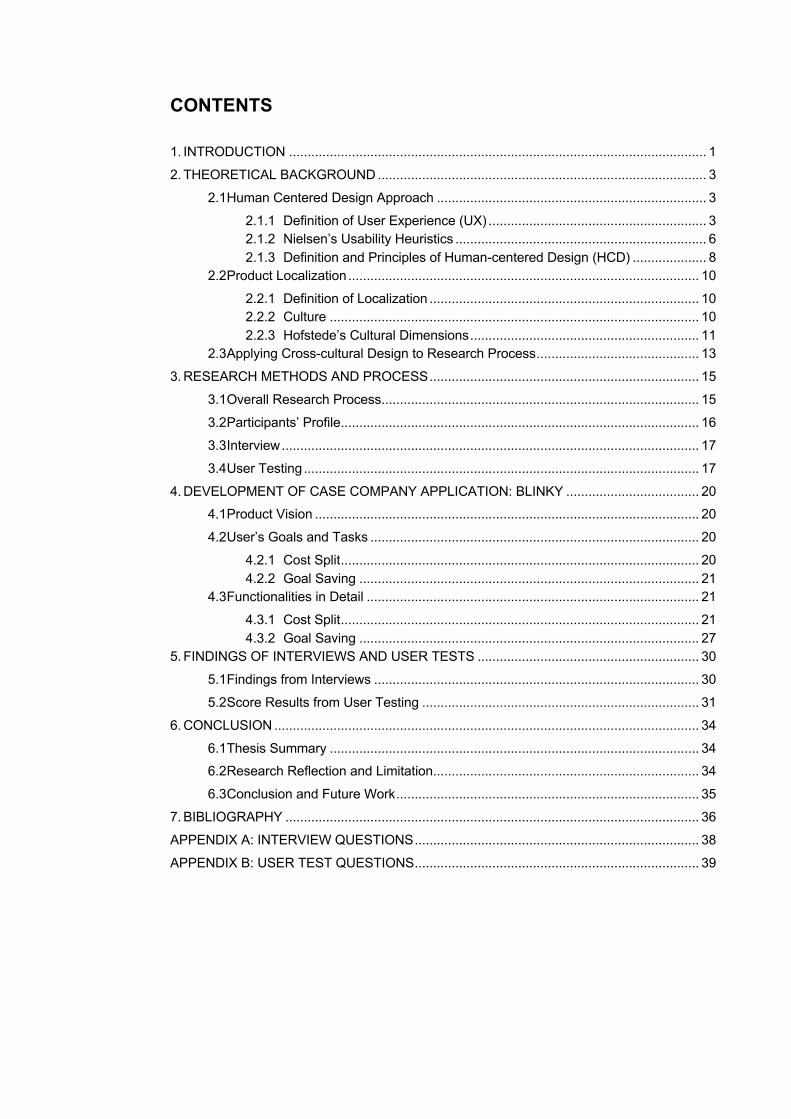
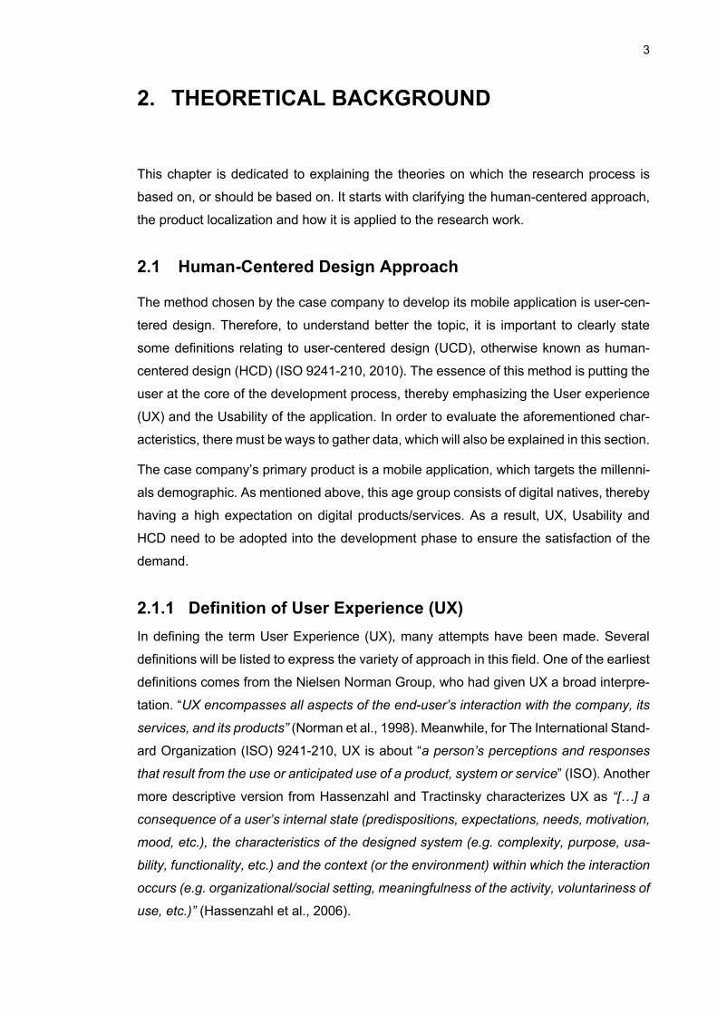
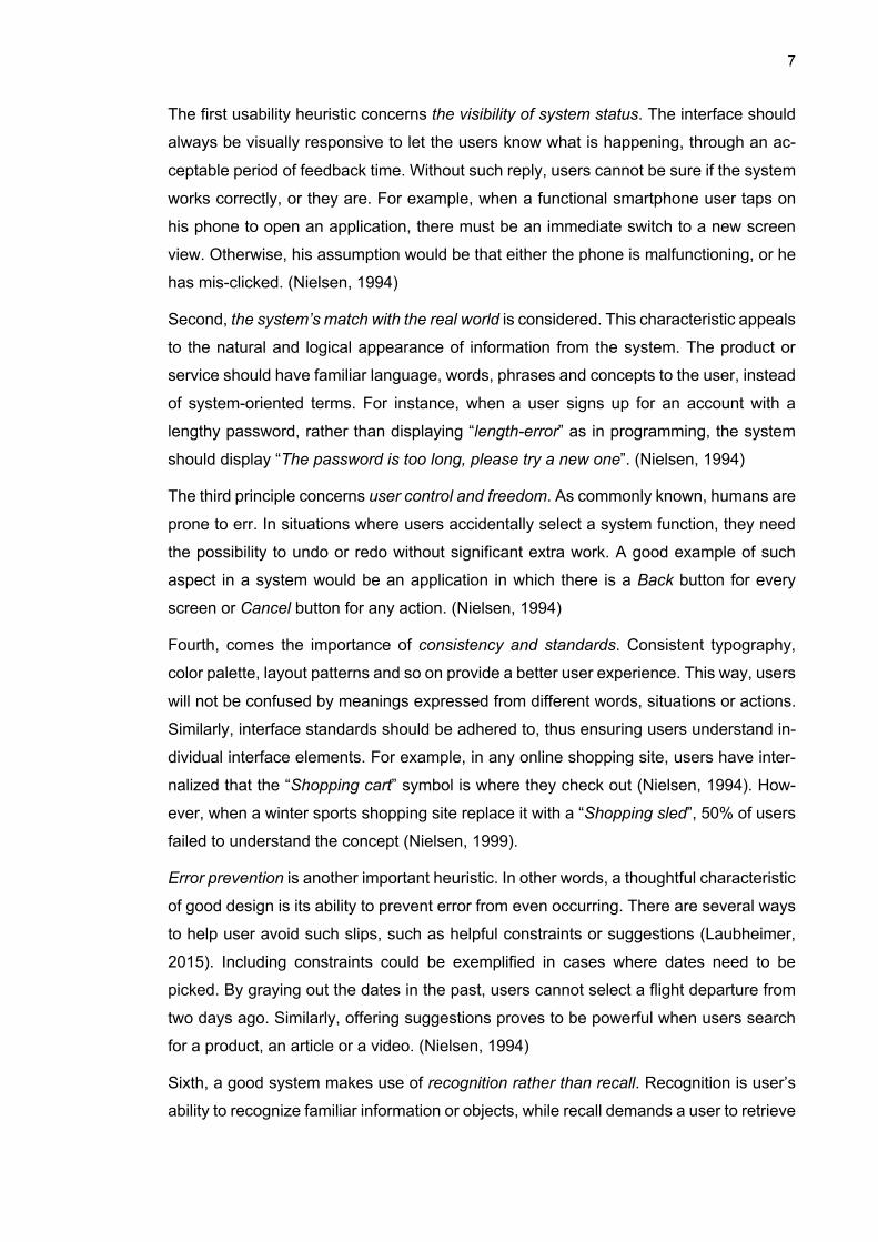
Deriving from the above definitions, it can be seen that User Experience (UX) is created
in the interaction between human and technology, within several different contexts. The
relationship is described in the Figure 1.
Figure 1. The interaction between human and product through interface (Roto, 2007, p1 – p4)
As human beings approach a product or service, they usually have clear intentions,
needs, motivations, expectations and values to extract from it. All these factors ought to
be considered when the product design phase begins. In general, there are needs or
goals in using a product such as entertainment, safety, efficiency or communication.
However, the challenging part is the diversity in people, such as age, gender, culture,
physical and psychological attributes. For example, a deaf person would not be a good
fit to use phone calls, but rather video calls since they respond to sign language and
visual cues. According to Nielsen, there are three dimensions on which users differ that
would result to the disparity in experience, namely the knowledge about domain, the
5
expertise of user of the system, and the depth of the users’ computer experience (Niel-
sen, 1993). When the user is knowledgeable about the domain of the product, an expert
in the product’s system, or experienced with computer devices, the learning curve is
much faster. Thus, the effort to familiarize oneself with the product reduces, allowing the
user to enjoy it more easily. This is clearly illustrated by the demographic of smartphone
usage. To exemplify, teenagers use phones much more often than elderly people. They
are also able to reap more benefits from such devices compared to the latter group.
Another important differential cause is culture. This can be the distinct way people per-
ceive meaning from visuals or behaviors. For example, although many languages read
text scriptures from left to right, Arabic or Urdu do the opposite direction. Acknowledging
this cultural difference is fundamental when designing interfaces for them.
A product or service is shaped by its design, user interface, functionality, performance,
brand, privacy and security. Firstly, the design is decided with the user’s goals and pref-
erences in mind. This means that the same object can have different designs to suit a
wide array of demands. For example, in the automobile industries, there are cars that
are designed to be more family friendly, placing emphasis on seat space and luggage;
whereas some are more expensive, paying attention on style and luxury. Next, it is the
product’s user interface that facilitates interaction to create the user experience. A user
interface (UI) is defined as “any system, either physical or software based, that allows a
user to connect with a given technology” (Techopedia). When the user controls the prod-
uct, it gives feedback about the functionality. From the feedback, the user can measure
the performance of the product or service. The relationship between the UI, functionality
and performance constructs the usability of a product or service, which will be more thor-
oughly discussed in the next section. Another aspect of a product or service is its brand,
which publicly distinguished itself from other products or services so as to ease commu-
nication and marketing (Rouse, 2016). To exemplify, Apple’s smartphones are branded
as iPhone, and cost significantly more than other similar devices. Finally, privacy and
security also have major impact on user experience. When a person chooses a com-
puter, for example, they will want to know that it can sufficiently safeguard their personal
information.
When the interaction occurs between the product and the user, it prompts an experience
for the user. One of the most important elements that is often discussed in product design
is emotional response. Since the user’s incentive to consume a product is usually asso-
ciated with positive emotions, product designers often aim to evoke pleasantness. Aes-
thetics, for example, is about creating visually pleasant products. Therefore, fashionable
clothes by brand designers or sleek devices from Apple cost tremendously more than
6
the average similar products. Next, a good product impacts a person’s attitude construc-
tively. Many mobile applications, for example, aim to help users to foster a positive mind-
set like Thought Diary, Happify or MindShift (Scott, 2018). By the same token, a product
can influence their behavior as well. To illustrate, fitness trackers such as Fitbit Charge
or Xiaomi Band help users analyze their health while they exercise, resulting in a more
efficient workout (Conelly, 2019).
Another important aspect of user experience is the environment in which the interaction
takes place. It could be via physical, temporal, technical, social, cultural or task-specific
context, though it is more often a mixture of these. Physical context is meant by the
tangible aspects such as lighting, temperature, clothing, humidity, noise, space and
safety factors. For example, smartphones are designed to operate best in room temper-
ature, not in extreme cold weather. In such a scenario, the user would feel cold in the
fingers if using a smartphone. Similarly, its battery also drains faster in low temperature.
The next context to consider is the technical, referring to the infrastructure, compatible
devices and software. This could be understood as the availability of network. Numerous
applications or software on smartphones require Internet access to work, so a lack of
such connection would hinder their performance. Another context is social, meaning to
the people around the user, the people who are connected on the Internet, the public
use and shared use. A telling example to highlight the significance of social context would
be the social media application Facebook. The more Facebook friends the user has, the
more engaged one is to the application. Similarly, cultural context refers to the product’s
adaptation to the locale’s customs and behaviors. Finally, task context involves the tasks
user does simultaneously or related to the mentioned product. When designing footwear,
for example, the task context is placed at the center of consideration. Brands such as
Nike and Adidas focus on sports shoes, whereas, Vans manufactures skateboard sneak-
ers.
2.1.2 Nielsen’s Usability Heuristics In the process of user-centered design, it is vital that one understands the characteristics
of good usability, often presented as Usability Heuristics. There are ten Usability Heuris-
tics that underline good design, which are based on Nielsen’s Heuristics (Nielsen, 1994).
The term “heuristics” was given because their purpose is to outline board rules of
thumbs, not to be treated as specific guidance to best-guaranteed designs. Therefore,
knowing these fundamentals allows researchers to build a strong foundation for the prod-
uct development, as well as prevents them from reinventing the wheel.
7
The first usability heuristic concerns the visibility of system status. The interface should
always be visually responsive to let the users know what is happening, through an ac-
ceptable period of feedback time. Without such reply, users cannot be sure if the system
works correctly, or they are. For example, when a functional smartphone user taps on
his phone to open an application, there must be an immediate switch to a new screen
view. Otherwise, his assumption would be that either the phone is malfunctioning, or he
has mis-clicked. (Nielsen, 1994)
Second, the system’s match with the real world is considered. This characteristic appeals
to the natural and logical appearance of information from the system. The product or
service should have familiar language, words, phrases and concepts to the user, instead
of system-oriented terms. For instance, when a user signs up for an account with a
lengthy password, rather than displaying “length-error” as in programming, the system
should display “The password is too long, please try a new one”. (Nielsen, 1994)
The third principle concerns user control and freedom. As commonly known, humans are
prone to err. In situations where users accidentally select a system function, they need
the possibility to undo or redo without significant extra work. A good example of such
aspect in a system would be an application in which there is a Back button for every
screen or Cancel button for any action. (Nielsen, 1994)
Fourth, comes the importance of consistency and standards. Consistent typography,
color palette, layout patterns and so on provide a better user experience. This way, users
will not be confused by meanings expressed from different words, situations or actions.
Similarly, interface standards should be adhered to, thus ensuring users understand in-
dividual interface elements. For example, in any online shopping site, users have inter-
nalized that the “Shopping cart” symbol is where they check out (Nielsen, 1994). How-
ever, when a winter sports shopping site replace it with a “Shopping sled”, 50% of users
failed to understand the concept (Nielsen, 1999).
Error prevention is another important heuristic. In other words, a thoughtful characteristic
of good design is its ability to prevent error from even occurring. There are several ways
to help user avoid such slips, such as helpful constraints or suggestions (Laubheimer,
2015). Including constraints could be exemplified in cases where dates need to be
picked. By graying out the dates in the past, users cannot select a flight departure from
two days ago. Similarly, offering suggestions proves to be powerful when users search
for a product, an article or a video. (Nielsen, 1994)
Sixth, a good system makes use of recognition rather than recall. Recognition is user’s
ability to recognize familiar information or objects, while recall demands a user to retrieve
8
details from memory (Budiu, 2014). The reason why recognition is preferable can be
illustrated with the example of meeting an acquaintance on the street. It is easy to tell if
the person has been met before but recalling his/her name would be significantly harder.
Good interfaces reduce users’ effort to remember, such as how search engines display
their search history to remind them the recent activities. (Nielsen, 1994)
The next desirable characteristic is flexibility and efficiency of use. As there are different
levels of skills and familiarity of users regarding a product, it should provide flexibility and
efficiency in the way it operates. Adobe Photoshop, a graphic and photo editor software,
for example, provides different techniques to edit an image. If the users want to enhance
a picture, they can either apply “Camera Raw filter” or use “Adjustments”. Furthermore,
for experienced Photoshop users, the software provides many shortcut buttons, making
it faster to use the program. (Nielsen, 1994)
Eighth, aesthetics and minimalist design play a vital role in good usability. Since humans
are attracted by novelty and aesthetics, products that possess these features tend to
gain user’s attention. Therefore, they should strive to adopt sleek design that resonates
with user’s taste. On the other hand, such aesthetics should not come at the expense of
unnecessary details. This could lead to irrelevant information, competing against rele-
vant material, thereby diminishing the overall appearance. (Nielsen, 1994)
Ninth, error recovery is essential to help user return to normal functions of the product.
This characteristic is often sufficiently addressed as long as error messages are clearly
expressed, indicative of the problem and constructive toward a solution. (Nielsen, 1994)
Finally, documentation is necessary for more complex systems. While it is preferable
that systems are usable without documentation, it is worthwhile to have help. Such infor-
mation should be easily found, concrete and focused on the user’s task. For example,
all Adobe software have a massive documentation available online to assist users with
its complicated programs like Photoshop or Illustrator. (Nielsen, 1994)
2.1.3 Definition and Principles of Human-centered Design (HCD)
According to the International Standard of Organization (ISO) 9241-210, Human-Cen-
tered Design (HCD) is “an approach to interactive systems development that aims to
make systems usable and useful by focusing on the users, their needs and requirements,
and by applying human factors/ergonomics, and usability knowledge and techniques”
(ISO 9241-210, 2010). Although User-Centered Design (UCD) is an acceptable equiva-
lent, it is recommended to use HCD. UCD focuses on the users first and foremost, while
9
HCD indicates that not just the users are important, but all stakeholders involved in the
process, such as designers, marketers.
There are six principles of human-centered design. They establish a good set of rules of
thumbs to produce a quality human-centered product. By following these principles, com-
panies can benefit vastly in the long run.
First, designers’ work should base closely on explicit understanding of users, tasks and environments. Early in the process, they should identify all the relevant user and stakeholder groups. In other words, the people who will use the products, systems
or service; and the people who might be affected by the use of such. Tasks and environ-
ments involve the contexts of use, which are already analyzed in section 2.1.1.
Next, users are actively engaged in the design and development of the products. As the product revolves around the end-users, they need to be in close interaction
throughout the course to give feedback, suggestions and criticisms to designers. These
valuable inputs allow designers to gain deeper understanding of their behavior and
thought process. In reality, this can be done by recruiting a representative group of users
of the suitable demographic.
Third, the design is driven and refined by a user-centered evaluation. After receiving feedback from users, it is crucial to apply the precious source of information appropri-
ately. It minimizes the risk of failure to meet the users’ needs. It also reduces the likeli-
hood of addressing the wrong problems. Additionally, it can reveal hidden requirements
that initially were not specified. Furthermore, the feedback is useful as well during the
operation of the product for diagnosing long-term issues. Then, the product can be re-
fined for future design.
The fourth principle emphasizes that the process should be iterative. The involvement of users and gathering of their feedback should occur in various phases. It allows for
improvements to be built on top of the previous sample. This entails an emphasis on the
early stage, in which the iterative changes made can be more cost-effective. Then, the
iteration is done on the preliminary designs and prototypes.
Fifth, the design ought to focus on the whole user experience. As defined above, this includes all the interactions that occur with the company, its products and services.
They should be continuously polished for better user experience. By the same token, the
ten heuristics of good usability should be addressed throughout the process. This in-
creases user’s retention due to further satisfaction, thus benefiting the company tremen-
dously.
10
Finally, human-centered design requires multidisciplinary skills and perspectives. This stresses the importance of diversity in a human-centered design team, regarding
extended knowledge in professionals such as user studies, user interface design, mar-
keting and technology. The additional advantage is the creativity and ideation arising
from teamwork. Such collaboration helps the team to tackle unique challenges in the
field of human-centered design.
2.2 Product Localization
This section explores the prerequisite knowledge to successfully localize a product. It
begins with defining the terms localization and culture. As these are described, the next
step is to study the cultural differences between the original market where the case com-
pany operates, Finland, and Vietnam. The characteristic distinctions shall be examined
based on a popular metric, known as Hofstede’s cultural dimensions.
2.2.1 Definition of Localization Localization refers to the adaptation of a product or service to a specific location or mar-
ket (Ishida & K. Miller, 2015). Aside from the language translation, the localization pro-
cess may also consist of the modification of content to suit the tastes and habits of con-
sumption of other markets, the graphical and design adaptation, or the conversion to
local requirements and regulations. In an organizational context, localization means
adapting and transcreating content of the products and services to the local language
and culture to be responsive to customers there (Ferreira, 2017). A stark example of
localization of a mobile application is Airbnb2, a platform where locals can host travelers
in their own home, available in 65,000 cities across 191 countries. In any of the thou-
sands of cities that have Airbnb accommodation listings, the app also offers “Experi-
ence”. These are packages that allow travelers to participate in cultural activities and
have a deeper understanding of their travel destination. Furthermore, Airbnb offers cus-
tomer service in local language and local payment options. This adds to the ease of using
the application for users as well.
2.2.2 Culture To properly localize a product or service, organizations ought to consider first and fore-
most the culture of the targeted locale. However, the term “culture” has had several var-
iations in meaning throughout history. The first definition was given by pioneer English
2 Airbnb.com
11
anthropologist Edward Tylor in his book Primitive Culture. According to him, culture is
“that complex whole which includes knowledge, belief, art, low, morals, custom, and any
other capabilities and habits acquired by man as a member of society” (Tylor, 1871).
Hofstede gave a more recent definition of culture as “[…] the collective programming of
the human mind that distinguishes the members of one human group from those of an-
other. Culture, in this sense, is a system of collective held values” (Hofstede, 1980).
While Tylor’s definition illustrates the intricacy of culture, Hofstede’s expands it to multiple
societies. In reality, culture can be vastly different from one society to another, thereby
making the localization a challenging process. Nonetheless, Hofstede’s model of cultural
dimensions offers a way to analyze different cultures (Hofstede, 2019).
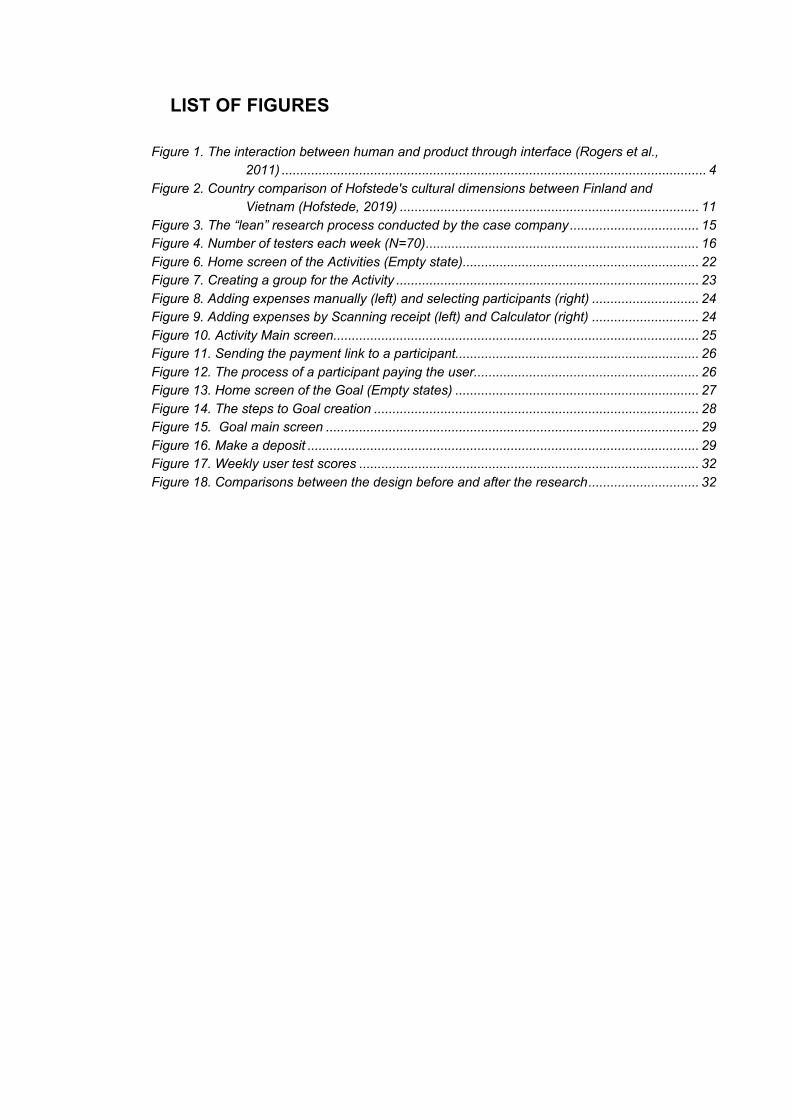
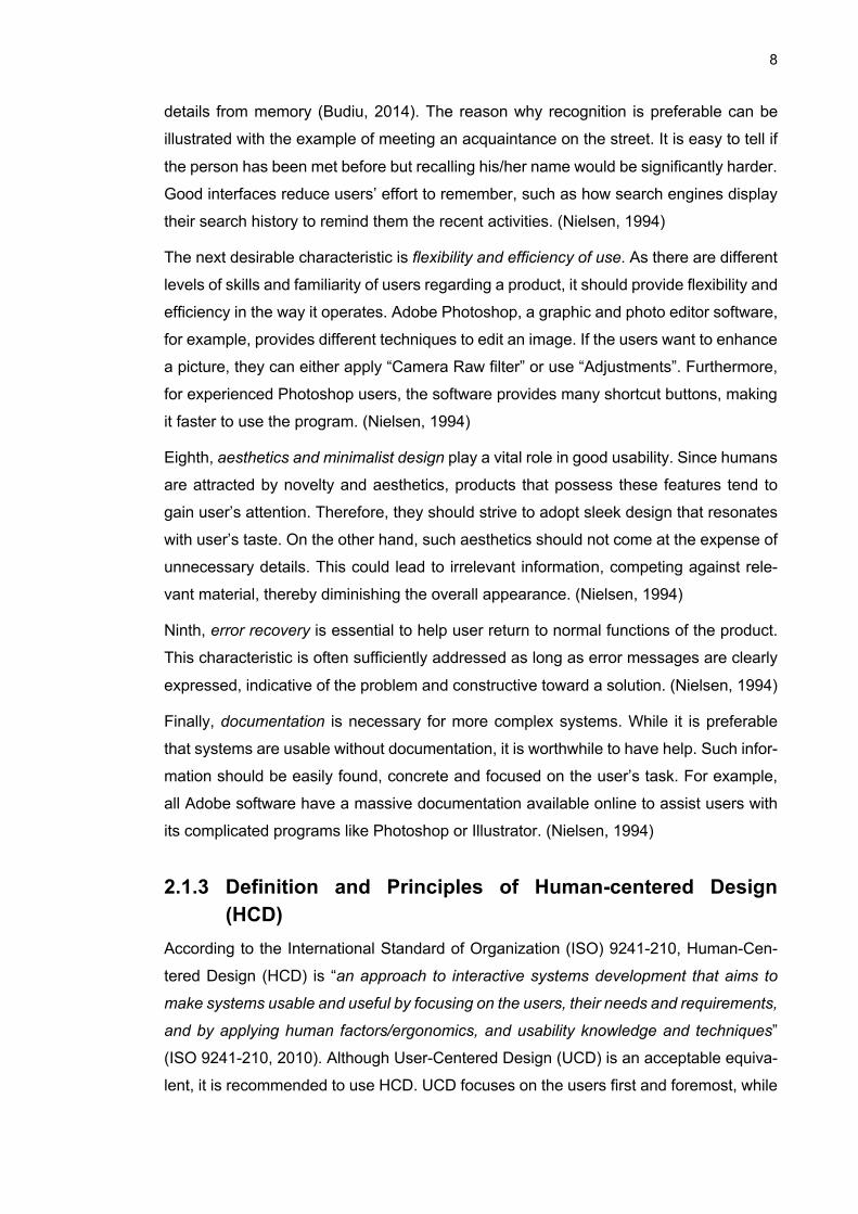
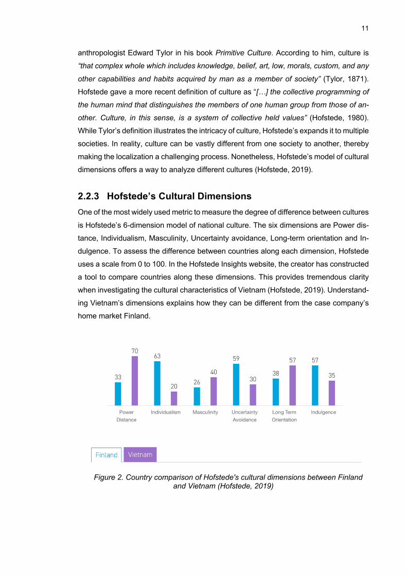
2.2.3 Hofstede’s Cultural Dimensions One of the most widely used metric to measure the degree of difference between cultures
is Hofstede’s 6-dimension model of national culture. The six dimensions are Power dis-
tance, Individualism, Masculinity, Uncertainty avoidance, Long-term orientation and In-
dulgence. To assess the difference between countries along each dimension, Hofstede
uses a scale from 0 to 100. In the Hofstede Insights website, the creator has constructed
a tool to compare countries along these dimensions. This provides tremendous clarity
when investigating the cultural characteristics of Vietnam (Hofstede, 2019). Understand-
ing Vietnam’s dimensions explains how they can be different from the case company’s
home market Finland.
Figure 2. Country comparison of Hofstede's cultural dimensions between Finland and Vietnam (Hofstede, 2019)
12
First, the power distance dimension explains the degree to which the less powerful mem-
bers of institutions and organizations within a country expect and accept the unequal
distribution of power (Hofstede, 2019). Along this dimension, Finland scores a low of 33,
demonstrating its hierarchical flatness and decentralization of power. The relationship
between employee and employer manifests in direct communication. Meanwhile, Vi-
etnam is situated on the higher end of the rating (score of 70). This means that organi-
zational hierarchy and centralization are prominent. Leadership is not to be challenged.
As a result, Vietnamese people incline toward the role of subordinates when a suitable
figure of authority is present.
Second, the individualism dimension addresses the magnitude of interdependence a so-
ciety maintain among its citizens. While an Individualist society promotes its members to
only care about themselves and their direct family, a Collectivist society emphasizes the
importance of groups. As commonly seen in Confucianist countries, Vietnam is collec-
tivistic, further proven by a low score of 20. Such a country heavily advocates loyalty
toward family and communities (Nguyen, 2016). This echoes in Vietnamese’s priority of
one’s reputation, as they do not want to bring shame to their family and lineage. There-
fore, people only act when aligned with the groups’ values (Hays, 2008). This can be
vastly different from Finland, whose Individualism score is 63. In an individualistic coun-
try, each member focuses more on their own well-being and values.
The third dimension is masculinity, on which the other polar refers to Femininity. If a
country ranks high as a masculine nation, it endorses competition, achievement and
meritocracy. In the case of Finland and Vietnam, both countries’ scores reside on the
Feminine side, with a respective score of 26 and 40. In the Global Competitiveness Re-
port by World Economic Forum, Vietnam ranks 77th out of 140 countries in 2018 in terms
of competitiveness (World Economic Forum, 2018). This means the people are oriented
toward caring for others and improving life quality. Instead of fixating on winning, the
members of feminine societies strive for mutual agreement. They are more likely to com-
promise for the common benefits.
Next, the dimension of uncertainty avoidance is considered. This dimension describes
the extent to which a country is comfortable with ambiguous situations. Finland scores
59, showing its conservatism, resistance to uncertainties but high regard for precision
and punctuality. On the other hand, Vietnam’s score is half of Finland’s, revealing its
positive attitude towards changes and innovation. When a society is low on uncertainty
avoidance, its members are open to new ideas. Ever since the Vietnam war ended in
1975, the country witnessed an explosive economic growth, with its GDP skyrocketing
from less than $100 in 1989 to $2300 in 2017 (World Bank, 2018). This is largely due to
13
its free-trade policy and massive reform in many frontiers. In more recent years, Vietnam
has proactively embraced the fourth industrial revolution, placing heavy emphasis on
technology innovation (Vu & Nguyen, 2017).
In the fifth dimension, Hofstede discusses long term orientation. This refers to a country’s
attitude towards its linkage to the past and challenges of the present and futures. A nor-
mative country, whose score occupies the lower half of the dimension like Finland (39),
tends to follow traditions and norms. It also treats future changes with cynicism. How-
ever, Vietnam is seen as a pragmatic country, scoring a high of 57. This further explains
its propensity for changes and innovation, as the score indicates Vietnam’s ability to
adapt. In the context of technology, the pragmatism is illustrated by the country’s open-
ness to rapid innovation. In the span of 15 years from 2000, Vietnam grew to 14000 IT
businesses (Marvin, 2015). In terms of foreign co-operations, the Vietnamese govern-
ment welcomes investments and collaboration. For example, it partnered with the Finn-
ish government to launch the Innovation Partnership Programme in 2014 (Innovation
Partnership Programme, 2018).
The final dimension, indulgence, portrays the extent to which people control desires and
impulses. Finland achieved a relatively high score of 57, expressing its proclivity towards
indulgence. On the other hand, Vietnam’s score is a low of 35, downplaying the im-
portance leisure time. In such a restrained society, people tend to work more. According
to the data in Global Database’s Vietnam, in 2017, the average work hour was 45 per
week (General Statistics Office, 2017). Meanwhile, in Finland, workers averaged 38
hours a week for full-time work, 15% lower than those in Vietnam (Tarkoma, 2017). Fur-
thermore, it indicates that the social norm pressured its members into thinking that in-
dulging themselves is unjustified. As Buddhism remains the most prevalent religion in
Vietnam, people follow its practice of self-control and overcoming desires.
2.3 Applying Cross-cultural Design to Research Process
A large portion of Chapter 2 is dedicated to study the cultural differences and thinking
model of Vietnamese people. With such information, researchers can adjust their usual
approach toward conducting research accordingly. This entails concrete changes that
are implemented in the research process for this thesis.
One of the notable distinctions in the Vietnamese thinking model is the power distance.
As mentioned previously, people have a strong regard for hierarchy. In the context of an
interview, this means they tend to be highly receptive toward the interviewer, since they
are more inclined to assume authority in the one who asks questions. In other words,
14
they try to say the right things and please the interviewer. This may cause misleading
information, as the honest feedback of the interviewee is what is most valued during the
session. Consequently, it is crucial to communicate to Vietnamese interviewee the im-
portance of complete transparency, even when the feedback might be deemed negative.
Secondly, individualism ranks predictably low in Vietnamese society. People often put
community and group benefits ahead of their own. Researchers should take this into
consideration when performing group interviews. It is likely that the majority of the inter-
viewees will follow collective assumptions and disregard their own personal taste. In such
scenarios, it is advisable to prepare the content of the questions. Otherwise, the result
can be compromised with one-sided opinions.
15
3. RESEARCH METHODS AND PROCESS
This chapter explains how the research is conducted. It first draws an overall picture of
the process, then details the research methods used in the process. It also presents the
metric that was used to evaluate the feedback over the period of time the research was
conducted.
3.1 Overall Research Process
Since the scope of the project was research in Vietnam for millennials, the chosen testers
needed to fulfil the basic background criteria. They were all students of both genders.
Their age ranged from 16 to 25. Testers were expected to have basic knowledge of
mobile application.
To build a reliable product, it is paramount that reliable information is gathered. For ex-
ample, what the users find important, their motivation behind the task or the context of
use, are all relevant as building blocks toward a successful product. Such information is
a powerful force that influences the user experience.
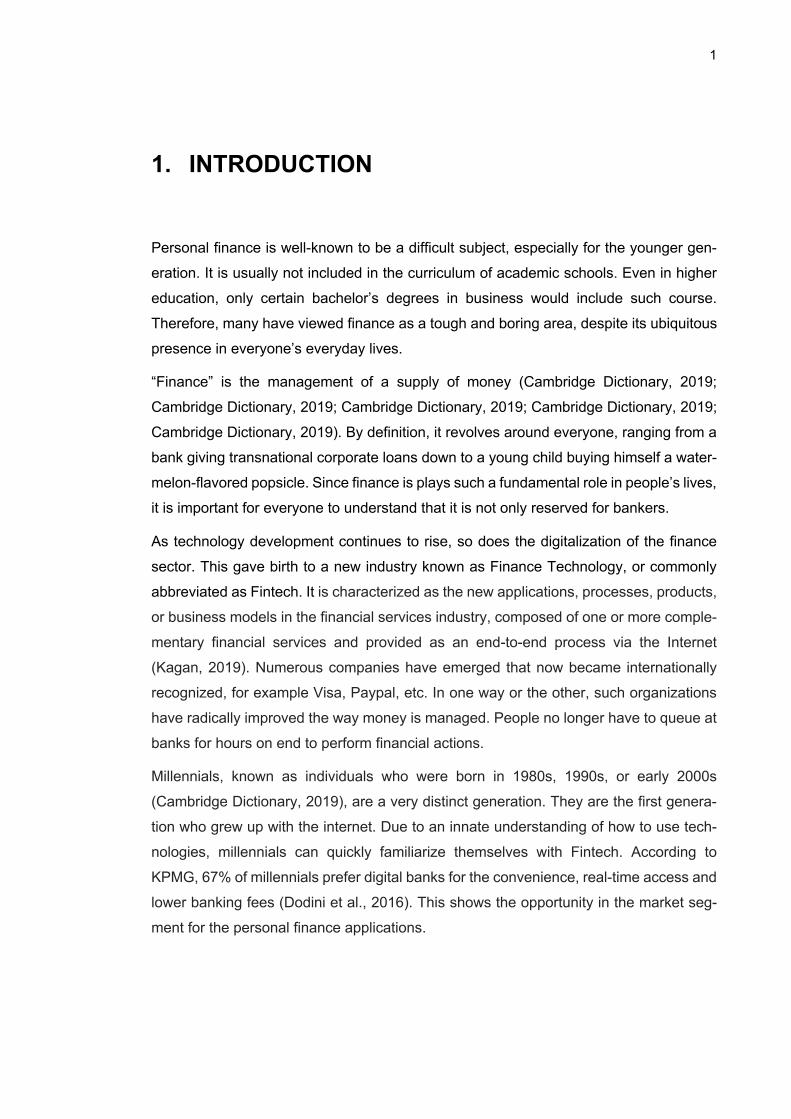
During this research process, a lean testing method was implemented to gather data. It
incorporates two standard research methods, interviewing and user testing. This combi-
nation was due to the time, location and resource constraints of the research period. The
process was conducted in-person in Vietnam for eight weeks. In the case company
Bankify, I worked as an UX researcher who participated in the process. It was decided
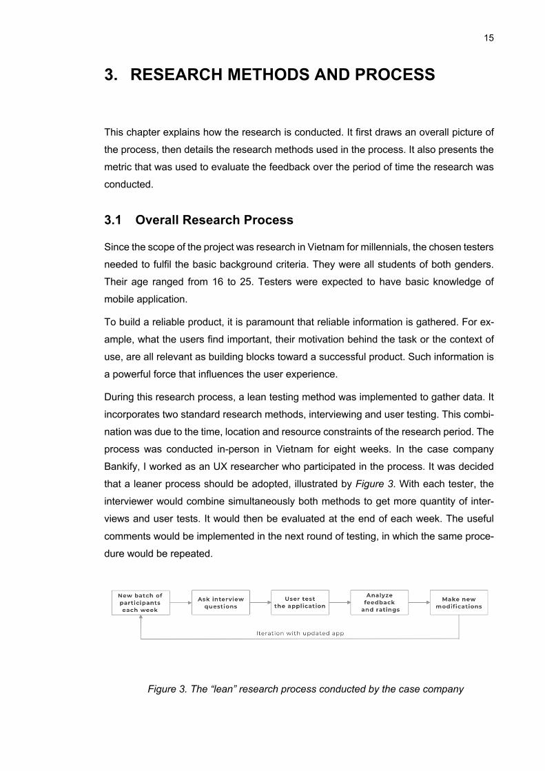
that a leaner process should be adopted, illustrated by Figure 3. With each tester, the
interviewer would combine simultaneously both methods to get more quantity of inter-
views and user tests. It would then be evaluated at the end of each week. The useful
comments would be implemented in the next round of testing, in which the same proce-
dure would be repeated.
Figure 3. The “lean” research process conducted by the case company
16
As a result, 70 testers were interviewed and tested individually. The default language
was in Vietnamese. All the interviews were guaranteed anonymity so that users feel free
to critique the application.
The interview fell into the category of a structured interview. This means that the ques-
tions had already been preplanned. Interviewer proceeded throughout the interview in
the order that had been specified in the question form. As the sample group was quite
large (N=70), the structured format was selected to reduce possibility for variety. This
helped narrowing down the influx of data. Subsequently, the analysis of data can be
performed with more ease and fewer variables. As the case company’s application had
already been soft launched, the focus was to emphasize on producing comparable re-
sults.
The outline of the interview questionnaire can be found in APPENDIX A. In a nutshell, it
consisted of questions related to background information, user’s current usage of mobile
applications, followed by evaluating the company’s application by testing it.
3.2 Participants’ Profile
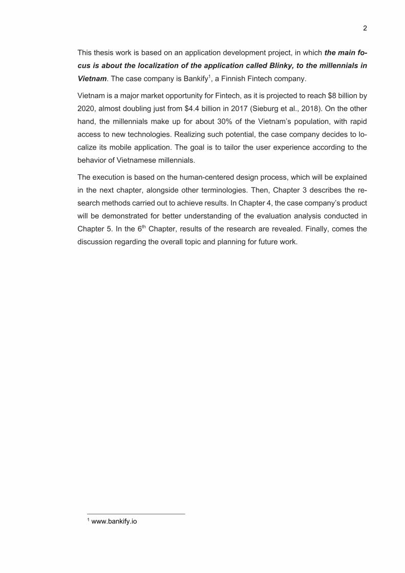
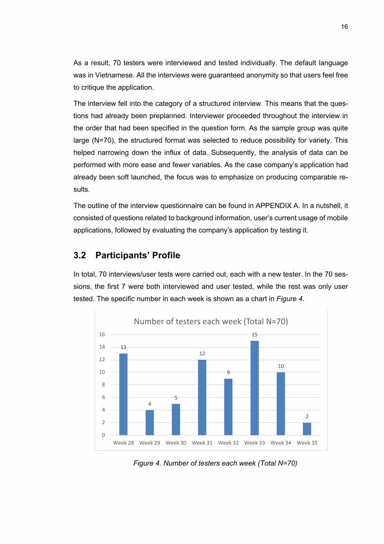
In total, 70 interviews/user tests were carried out, each with a new tester. In the 70 ses-
sions, the first 7 were both interviewed and user tested, while the rest was only user
tested. The specific number in each week is shown as a chart in Figure 4.
Figure 4. Number of testers each week (Total N=70)
13
45
12
9
15
10
2
0
2
4
6
8
10
12
14
16
Week 28 Week 29 Week 30 Week 31 Week 32 Week 33 Week 34 Week 35
Number of testers each week (Total N=70)
17
Their age ranged from 16 to 26 years, with the average of 18.7, and a standard deviation
of 1.58. Almost all of them were students, studying either in high schools or universities,
with the exception of one working adult of age 25.
All of the participants were new users to the application. This was important since the
goal was to receive unfiltered feedback. In other words, the testers should not have seen
the functionalities beforehand so as to prepare for answers, but rather give immediate
thoughts upon seeing them.
3.3 Interview
The interview is structured, meaning that there are a set number of questions to be asked
(Rogers et al., 2011). The first four questions are related to interviewee’s background.
The first one is about the person’s age. The purpose of this is to make sure that the
interviewee belongs to the correct demographic, which is a young student in the age
range of 17 to 25. In the next three questions, the interviewer proceeds to ask about
mobile related usage. This includes the user’s phone operating system, the top most
used mobile applications in general and finance applications in specific. These questions
help build a better user persona.
The interview questions are presented in Appendix A. They revolve around testers’ rou-
tines in everyday life. The aim is to paint a better picture of the user’s life, and to see if
there are any potential pain points to address. Furthermore, they directly ask financial
activities in the interviewee’s everyday life. The interviewer attempts to see if there are
any dissatisfactions with the person’s way of handling money between friends, or while
saving up money for something.
It should be noted that the two latter questions were only asked to the first 7 interviewees.
Since they are open-ended questions, it would be time-consuming to repeatedly include
them in all the sessions. It would be sufficient to get such a sample size. Otherwise, the
first four questions which can be answered shortly are included in all 70 interviews.
3.4 User Testing
The second method used for quantitative data is user testing (Rogers et al., 2011). After
the background questions presented in Appendix B are asked, the tester is then given
access to the application for testing the two main functionalities: Goal Saving and Cost
Split. To start using the functionalities, the user is given a scenario to contextualize where
and when the application is used. For Cost Split, the user imagines themselves going
out with their friends, together doing activities that cost a certain amount. The user then
18
uses the application to split costs and get the money back from others. For Goal Saving,
the user is given a target that is personal to themselves. The next task is to create the
goal inside the application and log savings.
While testing, the user is always asked to “think out loud”. This means that they are
encouraged to say whatever that comes to their mind during interaction with the applica-
tion. The interviewer then writes down these thoughts for further analysis later.
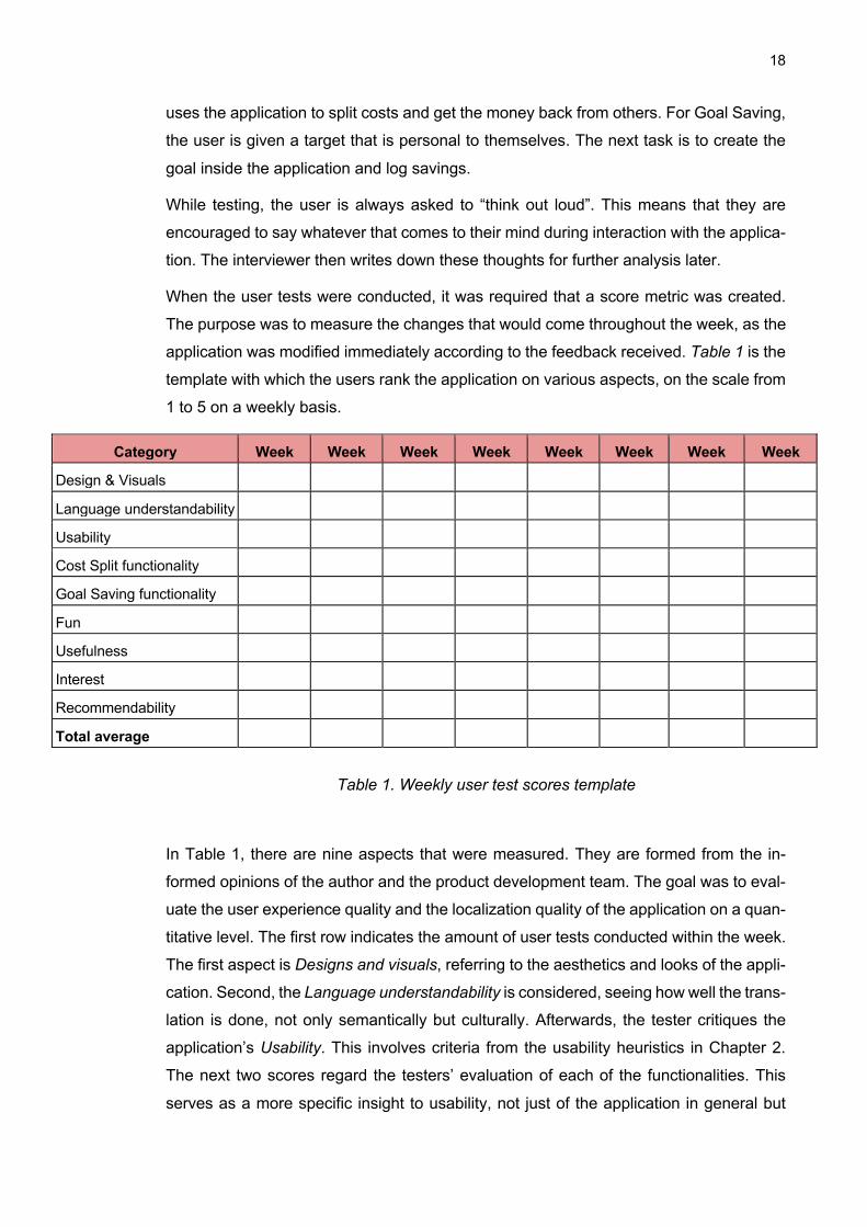
When the user tests were conducted, it was required that a score metric was created.
The purpose was to measure the changes that would come throughout the week, as the
application was modified immediately according to the feedback received. Table 1 is the
template with which the users rank the application on various aspects, on the scale from
1 to 5 on a weekly basis.
Category Week Week Week Week Week Week Week Week
Design & Visuals
Language understandability
Usability
Cost Split functionality
Goal Saving functionality
Fun
Usefulness
Interest
Recommendability
Total average
Table 1. Weekly user test scores template
In Table 1, there are nine aspects that were measured. They are formed from the in-
formed opinions of the author and the product development team. The goal was to eval-
uate the user experience quality and the localization quality of the application on a quan-
titative level. The first row indicates the amount of user tests conducted within the week.
The first aspect is Designs and visuals, referring to the aesthetics and looks of the appli-
cation. Second, the Language understandability is considered, seeing how well the trans-
lation is done, not only semantically but culturally. Afterwards, the tester critiques the
application’s Usability. This involves criteria from the usability heuristics in Chapter 2.
The next two scores regard the testers’ evaluation of each of the functionalities. This
serves as a more specific insight to usability, not just of the application in general but
19
each functionality individually. Then comes the Fun element, one of the core values the
case company holds. Sixth, the Usefulness of the application is evaluated. This suggests
how applicable it is to the tester’s everyday life. The two final ratings, Interest and Rec-
ommendability, express tester’s willingness to download the application or recommend
it to their friends. These nine scores have equal weight, which are then calculated into a
Total average as a mean of comparing amongst other weekly scores. It is computed by
adding all the scores together and then dividing the result by the number of metrics
measured in the week.
20
4. DEVELOPMENT OF CASE COMPANY APPLICATION: BLINKY
In this chapter, the application is explained in detail. It starts with the vision that brought
the application to life, then its core functionalities which are being developed in this the-
sis.
4.1 Product Vision
Bankify3’s slogan was “Make finance fun”. The company was convinced that the reason
why millennials pay little attention to the finance section was due to its dullness and
complexity. Therefore, to attract this segment, the company wanted its product to em-
body its slogan. To do so, the product was developed based on the human-centered
design process.
4.2 User’s Goals and Tasks
The application Blinky had two main functionalities, Cost Split and Goal Saving.
4.2.1 Cost Split The concept of cost-splitting arose from a real-life problem that the company’s founders
encountered during their dinner together with friends back in 2015. As they finished their
meal, they had trouble trying to split the costs between themselves. A calculator was too
complicated, while pen and paper also seemed inconvenient. Realizing the lack of an
effective tool for this particular problem, the founders came up with the idea for an appli-
cation that would solve the math in an easy and fun manner.
Similarly, the user’s goals of using the application is to get back the money that was
owed to him/her by others, who participated in an event that was paid in advance by the
user. To do so, the user will conduct a series of steps in the suitable context. During an
event, the user will be the one paying in advance for all the related costs. He/she then
uses the application to record all expenses and those who participated in each expense.
Afterwards, the user can base on the calculation to request the money back from the
participants.
3 Bankify.io
21
4.2.2 Goal Saving As young adults, one of the big hurdles they ought to overcome is learning how to save
money. At this age, they begin to lead an independent life. This newly found freedom
can easily cause irresponsible purchases, especially in the era of consumerism. Though
new items bring short-term gratifications, it is problematic in the long run. Despite know-
ing that they should save up for more long-term goals, young adults find it hard to stick
with the savings. As a result, the case company wanted to create a tool to make such
endeavor easier and more fun.
The user’s goal in this case is to reach the saving goal with the assistance of the appli-
cation. Throughout the user’s journey of saving for the goal, he/she will log in each time
the user sets aside money for the goal. In this case, the application functions as a digital
diary of sort, that tastefully displays the user’s saving logs. Additionally, the application
allows the user to send donation request to others to help raise money for the goal.
4.3 Functionalities in Detail
It should be noted that the screens used as figures are from the updated version after
the localization research process was conducted. The purpose was to bring overall clarity
regarding the functionalities of the application. Furthermore, due to technical complica-
tions, it was difficult to fully recover the old version that was before the research.
4.3.1 Cost Split This sub-section describes in detail the user interfaces of the Cost Split functionality us-
ing screenshots from the application.
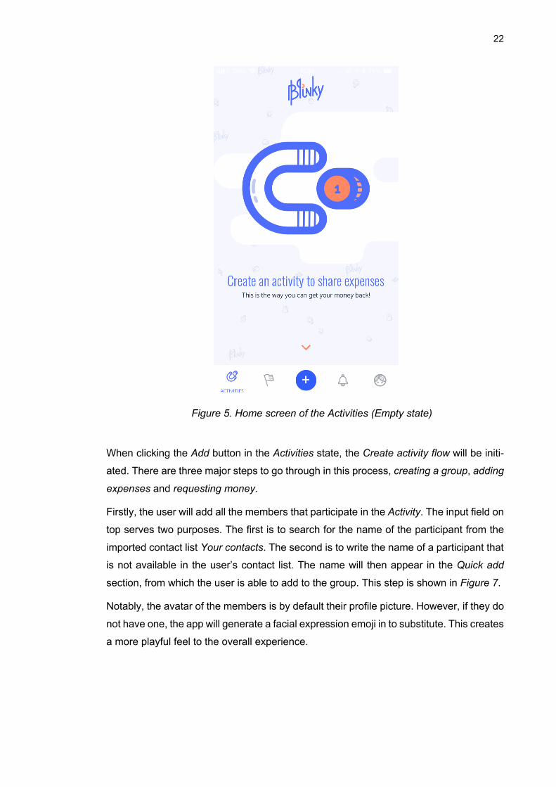
Figure 6 shows the home screen of the Cost Split functionality. It is referred to in the
application as Activities. The main element in the screen is the image of a magnet at-
tracting a coin. This signifies that users can get their money back using the application.
The Navigation bar in the bottom consists of five icons. The left most icon is for Activity,
which is the current state of the application. The next icon is for Goal functionality, which
will be further elaborated in the next section. The only blue icon in the middle of the
Navigation bar is the Add button. Depending on the state of the application, tapping the
Add button either adds a new Activity or new Goal. The Notification icon is represented
by a bell. The right most icon is dedicated for the Profile section.
22
Figure 5. Home screen of the Activities (Empty state)
When clicking the Add button in the Activities state, the Create activity flow will be initi-
ated. There are three major steps to go through in this process, creating a group, adding
expenses and requesting money.
Firstly, the user will add all the members that participate in the Activity. The input field on
top serves two purposes. The first is to search for the name of the participant from the
imported contact list Your contacts. The second is to write the name of a participant that
is not available in the user’s contact list. The name will then appear in the Quick add
section, from which the user is able to add to the group. This step is shown in Figure 7.
Notably, the avatar of the members is by default their profile picture. However, if they do
not have one, the app will generate a facial expression emoji in to substitute. This creates
a more playful feel to the overall experience.
23
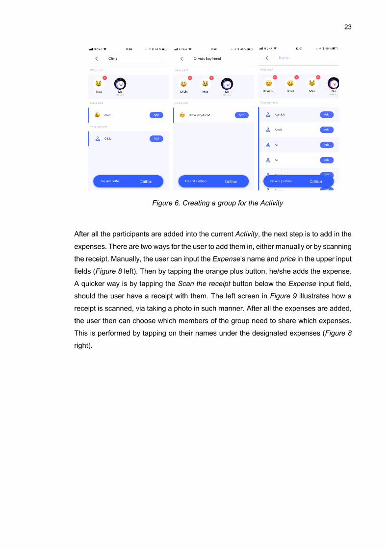
Figure 6. Creating a group for the Activity
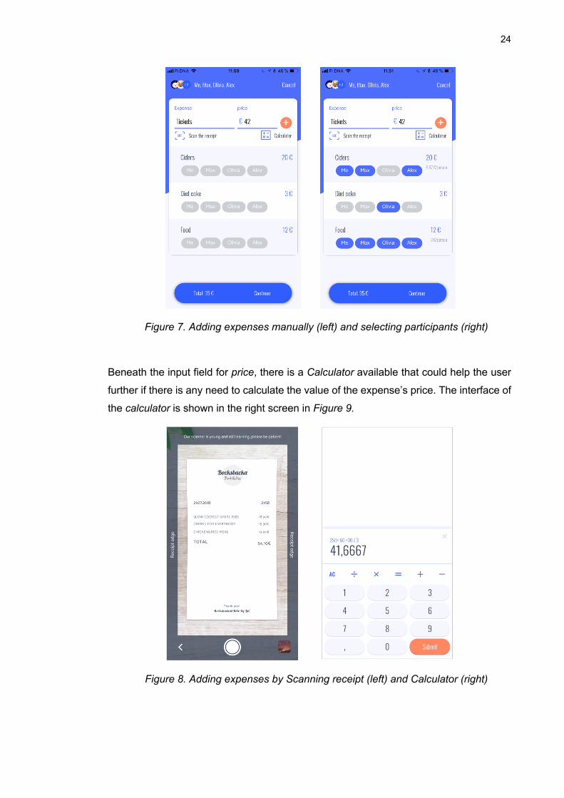
After all the participants are added into the current Activity, the next step is to add in the
expenses. There are two ways for the user to add them in, either manually or by scanning
the receipt. Manually, the user can input the Expense’s name and price in the upper input
fields (Figure 8 left). Then by tapping the orange plus button, he/she adds the expense.
A quicker way is by tapping the Scan the receipt button below the Expense input field,
should the user have a receipt with them. The left screen in Figure 9 illustrates how a
receipt is scanned, via taking a photo in such manner. After all the expenses are added,
the user then can choose which members of the group need to share which expenses.
This is performed by tapping on their names under the designated expenses (Figure 8
right).
24
Screen b Screen c
Figure 7. Adding expenses manually (left) and selecting participants (right)
Beneath the input field for price, there is a Calculator available that could help the user
further if there is any need to calculate the value of the expense’s price. The interface of
the calculator is shown in the right screen in Figure 9.
Figure 8. Adding expenses by Scanning receipt (left) and Calculator (right)

25
Finally, after the members and expenses are added, the Activity is created. Figure 10
shows how the Activity Main screen looks like. The main component in the middle of the
screen contains an image placeholder, where users can upload a suitable photo for the
Activity. Furthermore, under it is the name of the Activity and its Total cost, along with
several profile pictures and relevant information. The second component encloses the
two buttons Send Payment Link and Edit that together shape into a blue pill. The Edit
button sends user back to the screen where he/she can modify the members and ex-
penses. Meanwhile, Send Payment Link creates a link with which the user can send to
the participants (Figure 10). The last component in the main screen consists of Pending
payments and Payment responses, telling user which participants still owes money or
have already paid.
Figure 9. Activity Main screen
When the user taps the Send Payment Link button, he/she will be given a link, as illus-
trated in the left screen in Figure 9. At the same time, the user can use quick access to
popular messaging platforms by tapping their representative icons below the link. This
opens the selected application with which they can find the participant’s chat to post the
link (right screen in Figure 11). The participant can click on this link to see the payment
information regarding the Activity and then pays the user.
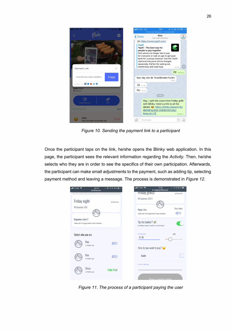
26
Figure 10. Sending the payment link to a participant
Once the participant taps on the link, he/she opens the Blinky web application. In this
page, the participant sees the relevant information regarding the Activity. Then, he/she
selects who they are in order to see the specifics of their own participation. Afterwards,
the participant can make small adjustments to the payment, such as adding tip, selecting
payment method and leaving a message. The process is demonstrated in Figure 12.
Figure 11. The process of a participant paying the user
27
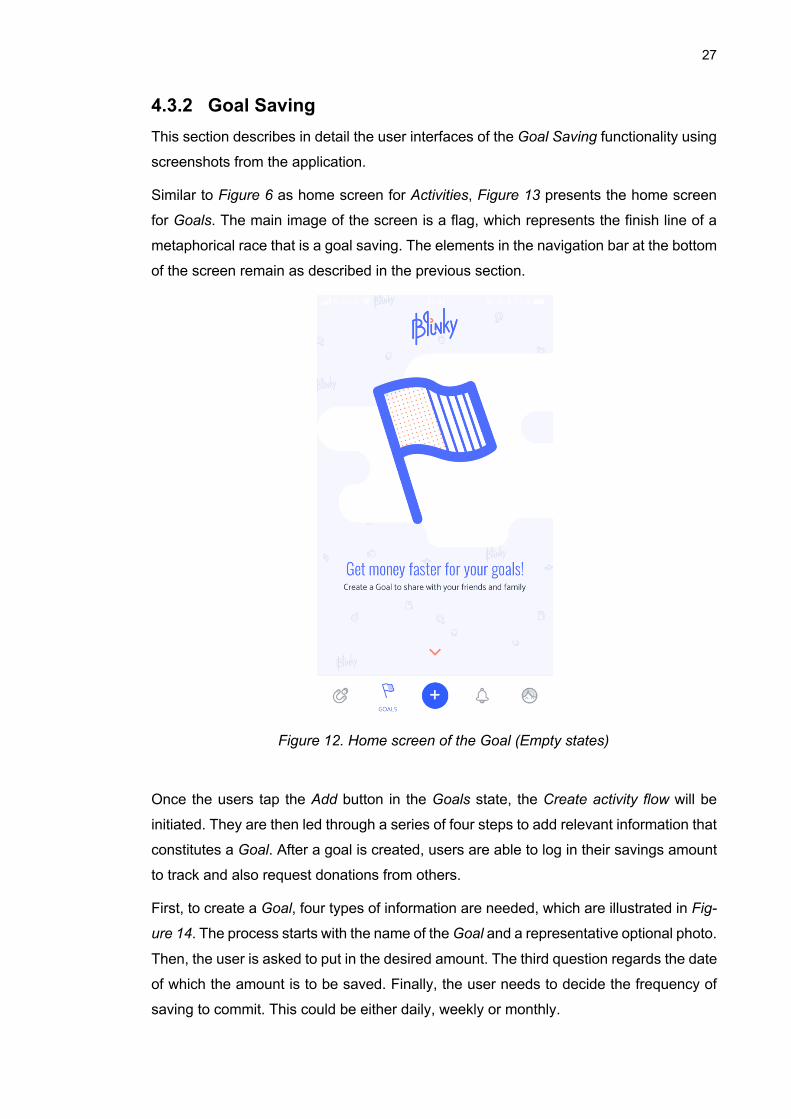
4.3.2 Goal Saving This section describes in detail the user interfaces of the Goal Saving functionality using
screenshots from the application.
Similar to Figure 6 as home screen for Activities, Figure 13 presents the home screen
for Goals. The main image of the screen is a flag, which represents the finish line of a
metaphorical race that is a goal saving. The elements in the navigation bar at the bottom
of the screen remain as described in the previous section.
Figure 12. Home screen of the Goal (Empty states)
Once the users tap the Add button in the Goals state, the Create activity flow will be
initiated. They are then led through a series of four steps to add relevant information that
constitutes a Goal. After a goal is created, users are able to log in their savings amount
to track and also request donations from others.
First, to create a Goal, four types of information are needed, which are illustrated in Fig-
ure 14. The process starts with the name of the Goal and a representative optional photo.
Then, the user is asked to put in the desired amount. The third question regards the date
of which the amount is to be saved. Finally, the user needs to decide the frequency of
saving to commit. This could be either daily, weekly or monthly.
28
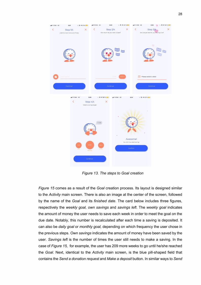
Figure 13. The steps to Goal creation
Figure 15 comes as a result of the Goal creation process. Its layout is designed similar
to the Activity main screen. There is also an image at the center of the screen, followed
by the name of the Goal and its finished date. The card below includes three figures,
respectively the weekly goal, own savings and savings left. The weekly goal indicates
the amount of money the user needs to save each week in order to meet the goal on the
due date. Notably, this number is recalculated after each time a saving is deposited. It
can also be daily goal or monthly goal, depending on which frequency the user chose in
the previous steps. Own savings indicates the amount of money have been saved by the
user. Savings left is the number of times the user still needs to make a saving. In the
case of Figure 15, for example, the user has 209 more weeks to go until he/she reached
the Goal. Next, identical to the Activity main screen, is the blue pill-shaped field that
contains the Send a donation request and Make a deposit button. In similar ways to Send
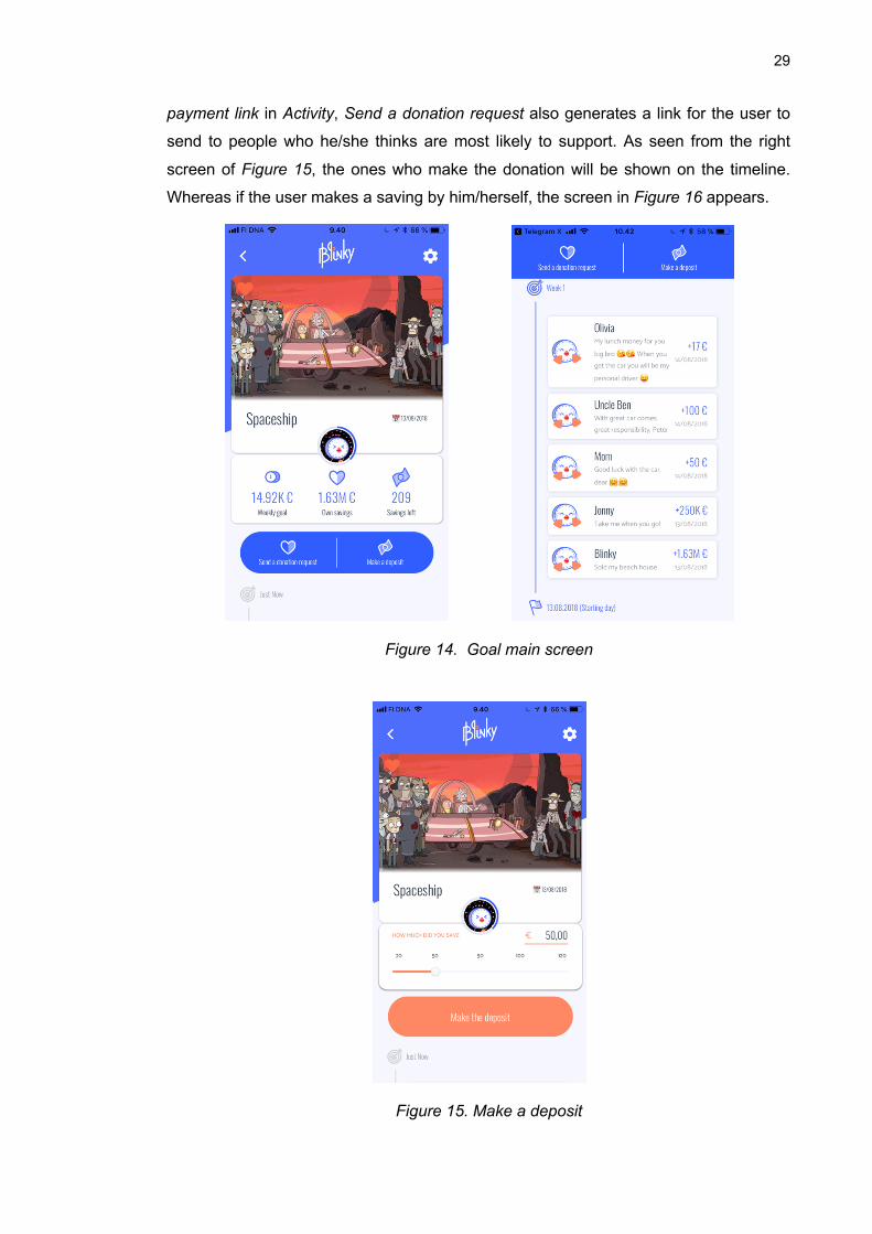
29
payment link in Activity, Send a donation request also generates a link for the user to
send to people who he/she thinks are most likely to support. As seen from the right
screen of Figure 15, the ones who make the donation will be shown on the timeline.
Whereas if the user makes a saving by him/herself, the screen in Figure 16 appears.
Figure 14. Goal main screen
Figure 15. Make a deposit
30
5. FINDINGS OF INTERVIEWS AND USER TESTS
In this chapter, the findings from the interviews are analysed. Next, the results of the user
test scores are presented.
5.1 Findings from Interviews
After the first seven interviews and immediate feedback from the user tests, some in-
sights were made. Unfortunately, the interviews were not recorded, but instead para-
phrased. Nonetheless, they still provided valuable information for the future work.
First, it confirmed that the need to get money back from peers are still of high demand.
5 out of 7 interviewers stated that they need a better tool for reminding friends to pay
back the money they owed. This corresponds to Vietnamese people’s non-confronta-
tional nature, which may stem from the collectivism mindset. The updates of the appli-
cation should, therefore, aim to perfect the payment reminder function so as to minimize
the discomfort of the action.
Second, this demographic strongly believes that presenting saving goals in a better way
will help with getting the money assistance. To clarify, young people agree that if parents
or relatives see the effort they put in to save for a car, for example, the odds of receiving
donations from them will increase significantly. This may indicate that visual and design
quality should be improved to capitalize this aspect.
Third, a significant number of testers asked if there were any more functionalities inside
the application, other than the two they tested. Meanwhile in Finland, the home market,
the case company has raised the question of whether to separate the application into
two separate applications with only one functionality each. The purpose was to simplify
the application, due to mounting feedback by testers in Finland that it was slightly too
complex to follow. This reveals an interesting difference between the two markets. This
is backed up by popular examples in Asia such as Alipay4 in China, or Momo5 in Vietnam
that house over 30 functionalities in their application. This suggests that in this region,
people may prefer an application with an ecosystem of functionalities, instead of a single-
purpose application.
4 Intl.alipay.com 5 Momo.vn
31
Fourth, it was found that there is a high degree of cynicism towards fintech applications.
The interviewers expressed their concerns over security and transparency when it came
to cashless payment. This agrees with the current state of digital payment in the entire
country (Nguyen, 2019). According to the interviewers, however, this doubt would dimin-
ish if the application is backed by trusted financial institutions.
Fifth, there was a noticeable difference between the Northern and Southern of Vietnam.
The interviewers in Hanoi, which resides in the north, showed a lower overall interest
and recommendability in the application. In a research conducted by The Nielsen Com-
pany in Vietnam, it was shown that the capital Hanoi has contrasting consumer behavior
compared to Ho Chi Minh city in the south (Cross, Ryan, & Mai, 2009). People in Ho Chi
Minh are characterized as “living in the moment”, while the Hanoians are frugal. They
are twice as likely to try a new product and service in comparison to people in Hanoi. A
deeper analysis showed that one significant reason is that Hanoians are heavily influ-
enced by others’ opinions. This could explain why they are more hesitated to buy or use
something new. This could be linked to Nielsen’s indulgence, collectivism and uncer-
tainty avoidance dimensions. In a nutshell, this is useful knowledge to determine the
marketing strategy of the case company when penetrating Vietnamese market.
5.2 Score Results from User Testing
Figure 17 summarizes the average scores given on the scale from 1 to 5 by users every
week from week 28 to week 35. Each average score is calculated by dividing the sum of
scores given by testers by the number of testers that rated. The number of testers each
week can be seen from Figure 4 in Section 3.2. It should be noted that in the first week,
the ratings of Cost Split functionality, Goal Saving functionality and Recommendability
were not asked.
32
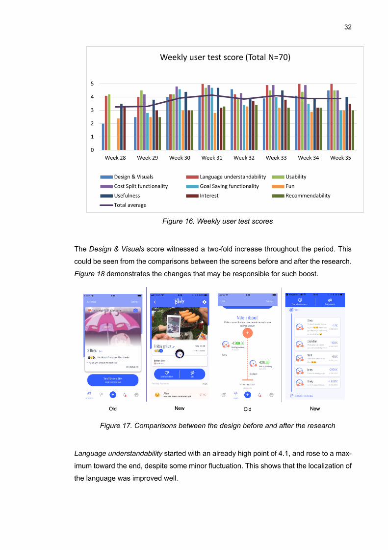
Figure 16. Weekly user test scores
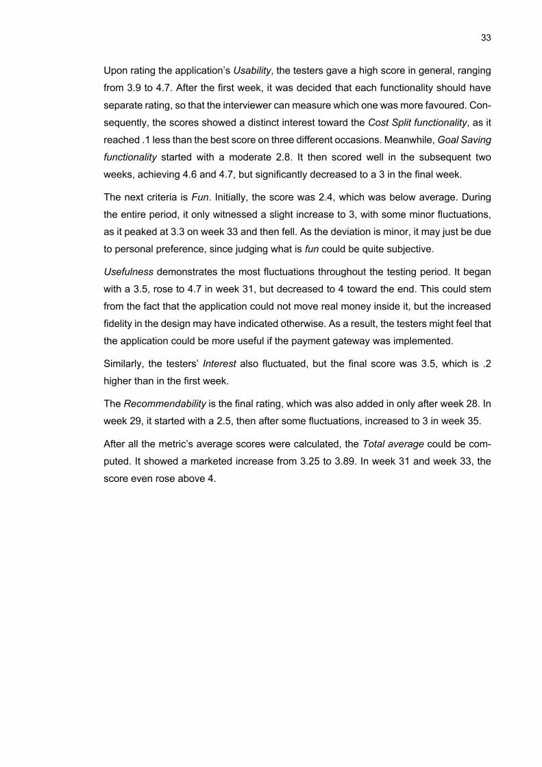
The Design & Visuals score witnessed a two-fold increase throughout the period. This
could be seen from the comparisons between the screens before and after the research.
Figure 18 demonstrates the changes that may be responsible for such boost.
Figure 17. Comparisons between the design before and after the research
Language understandability started with an already high point of 4.1, and rose to a max-
imum toward the end, despite some minor fluctuation. This shows that the localization of
the language was improved well.
0
1
2
3
4
5
6
Week 28 Week 29 Week 30 Week 31 Week 32 Week 33 Week 34 Week 35
Weekly user test score (Total N=70)
Design & Visuals Language understandability UsabilityCost Split functionality Goal Saving functionality FunUsefulness Interest RecommendabilityTotal average
33
Upon rating the application’s Usability, the testers gave a high score in general, ranging
from 3.9 to 4.7. After the first week, it was decided that each functionality should have
separate rating, so that the interviewer can measure which one was more favoured. Con-
sequently, the scores showed a distinct interest toward the Cost Split functionality, as it
reached .1 less than the best score on three different occasions. Meanwhile, Goal Saving
functionality started with a moderate 2.8. It then scored well in the subsequent two
weeks, achieving 4.6 and 4.7, but significantly decreased to a 3 in the final week.
The next criteria is Fun. Initially, the score was 2.4, which was below average. During
the entire period, it only witnessed a slight increase to 3, with some minor fluctuations,
as it peaked at 3.3 on week 33 and then fell. As the deviation is minor, it may just be due
to personal preference, since judging what is fun could be quite subjective.
Usefulness demonstrates the most fluctuations throughout the testing period. It began
with a 3.5, rose to 4.7 in week 31, but decreased to 4 toward the end. This could stem
from the fact that the application could not move real money inside it, but the increased
fidelity in the design may have indicated otherwise. As a result, the testers might feel that
the application could be more useful if the payment gateway was implemented.
Similarly, the testers’ Interest also fluctuated, but the final score was 3.5, which is .2
higher than in the first week.
The Recommendability is the final rating, which was also added in only after week 28. In
week 29, it started with a 2.5, then after some fluctuations, increased to 3 in week 35.
After all the metric’s average scores were calculated, the Total average could be com-
puted. It showed a marketed increase from 3.25 to 3.89. In week 31 and week 33, the
score even rose above 4.
34
6. CONCLUSION
This chapter summarizes the whole thesis. It then reflects on the current limitations of
the methodologies. Finally, there will be ideas for the future work in improving localization
for the case company’s application in Vietnam.
6.1 Thesis Summary
The main goal of the thesis is to study the behavior of millennials in Vietnam to adapt the
personal finance application so that it addresses their needs. . The user-centered design
process was applied, along with the study of product localization in Chapter 2. The third
chapter introduced the data gathering methods, which were structured interview and user
testing. The interviews helped collect information regarding the user behavior, while the
user tests revealed how the targeted users evaluate the current product. Then in Chapter
4, case company’s application was demonstrated in detail of the two functionalities,
namely Cost Split and Goal Saving. In Chapter 5, the results of the research were pre-
sented.
With the data collected from the interviews and user tests, interesting findings were dis-
covered. Not only are there multiple cultural differences between Finland, the home mar-
ket, and Vietnam, but also between regions in the country itself. Furthermore, the result
indicates that there is clearly a viable market in Vietnam. The product also showed a
remarkable growth in quality by the end of the research progress.
6.2 Research Reflection and Limitation
Hofstede’s cultural dimensions framework provided correlations to the findings, but not
strongly. There were only several interpretations that seem legitimate, although the con-
nection needs to be further supported by empirical evidence.
An inadequacy in experience and preparation led to inconsistent data collecting method-
ologies and substandard results. The structured interviews should have been recorded
for better analysis. As a result, there might be information loss and potentially biased
findings. Meanwhile, the user tests had added in more metrics later on in the process.
Furthermore, the number of user testers each week varied tremendously, ranging from
2 to 15 testers. These factors could decrease the quality of the average score.
35
Regarding the application, there was a significant functional limitation that might have
hindered the user testing. Even though the application deals with money related issues,
the application itself does not have payment gateways. In other words, money cannot
flow through the application. To pay back money that someone owes from an Activity,
one still needs to go to their online banking application or a payment application. It is
similar when one wants to donate for another’s Saving Goal. This drawback increases
the steps user testers have to take to finish the journey. It is also sometimes confusing
to the testers when they try to use this functionality.
Although the fun aspect was a key value proposition of the case company, the application
has not yet succeeded in doing so. This was shown by the score collected from user
testing. This may have to do with the nature of finance technology application, as money
is a serious subject in people’s lives.
6.3 Conclusion and Future Work
From this thesis, it can be concluded that there is a need for an application that assists
young people in Vietnam in activities that include joint payments and saving for goals.
Throughout the research period, the application Blinky witnessed significant improve-
ment, which can be observed from the quantitative data.
In terms of research methodologies, the subsequent studies must recognize the practical
shortcomings and learn from them. It is crucial that the interview questions are con-
structed thoughtfully and empirically. Interviews and user tests should be recorded in
order to collect qualitative data.
Currently, the design serves all the basic functionalities, except for allowing actual money
transactions inside the application. It is important to develop such capabilities for the
users. The next step is to seek partnership with a reputable bank in Vietnam to acquire
trust. Once that is accomplished, the application should be tested again to gather more
evidence.
Another important work is improving the user experience relating to the fun aspect of the
application. This needs to be further researched by human-centered design approach
and cross-cultural design. Thematic interviews are recommended to discover ways to
develop the application that reside with user psychology.
36
7. BIBLIOGRAPHY
Aamodt, M. (2018). Why Scandinavian modern design is so popular. Retrieved from Aamodt Plumb: https://aamodtplumb.com/why-scandinavian-modern-design-is-so-popular/
Aykin, N. (2016). Usability and Internationalization of Information Technology. CRC press. Cambridge Dictionary. (2019). Retrieved from
https://dictionary.cambridge.org/dictionary/english/finance Cambridge Dictionary. (2019). Retrieved from
https://dictionary.cambridge.org/vi/dictionary/english/millennial Conelly, C. (2019). How to make wearables more effective for fitness clients. Retrieved from
Team Exos: https://www.teamexos.com/idea-list/how-to-make-wearables-more-effective-for-fitness-clients/
Cross, A., Ryan, V., & Mai, T. T. (2009). Hochiminh versus Hanoi: Differences between consumers of two regions. Retrieved from https://www.nielsen.com/content/dam/corporate/t3/vietnam/reports/Nielsen%20Vietnam_%20HCMC%20v%20HanoiRegionalConsumerDifferences_June%202009-VIETNAMESE%20Copyright(NXPowerLite).pdf
Dodini, S., Lopez-Fernandini, A., Merry, E., & Thomas, L. (2016). Consumers' Use of Mobile Financial Services. Retrieved from Federal Reserve: https://www.federalreserve.gov/consumerscommunities/mobile_finance.htm
Eyþórsdóttir, K. S. (2011). The Story Of Scandinavian Design: Combining Function and Aesthetics. Retrieved from Smashing Magazine: https://www.smashingmagazine.com/2011/06/the-story-of-scandinavian-design-combining-function-and-aesthetics/
Ferreira, A. (2017). Universal UX Design: Building multicultural User Experience. General Statistics Office. (2017). Vietnam Average Working Hour Per Week. Retrieved from CEIC
data: https://www.ceicdata.com/en/vietnam/average-working-hour-per-week/average-working-hour-per-week
Hassenzahl, M., & Tractinsky, N. (2006). User experience - a reaserch agenda. Behavior & information technology, 91-97.
Hays, J. (2008). SOCIETY IN VIETNAM: CONFUCIANISM, HISTORY, SOCIAL STRUCTURES AND COMMUNISM. Retrieved from Facts and Details: http://factsanddetails.com/southeast-asia/Vietnam/sub5_9c/entry-3404.html
Hofstede, G. (1980). Culture and Organizations. International Studies of Management & Organization.
Hofstede, G. (2019). Hofstede Insight. Retrieved from Country comparison: https://www.hofstede-insights.com/country-comparison/finland,vietnam/
Hofstede, G. (2019). Hofstede Insights. Retrieved from Country comparison: https://www.hofstede-insights.com/country-comparison/finland,vietnam/
Hofstede, G. (2019). The 6-D model of national culture. Retrieved from Geert Hofstede: https://geerthofstede.com/culture-geert-hofstede-gert-jan-hofstede/6d-model-of-national-culture/
Innovation Partnership Programme. (2018). Portfolio. Ishida, R., & K. Miller, S. (2015). Localization vs. Internationalization. Retrieved from W3C:
https://www.w3.org/International/questions/qa-i18n ISO 9241-210. (2010). Ergonomics of human system interaction - part 210: Human-centred
design for interactive systems. International Organization for Standardization.
37
Kagan, J. (2019). Fintech. Retrieved from Investopedia: https://www.investopedia.com/terms/f/fintech.asp
Karina, R. (2018). Characteristics of an Oriental Design Style. Retrieved from Hunker: https://www.hunker.com/13411188/characteristics-of-an-oriental-design-style
Marvin, R. (2015). Vietnam's Tech Boom: A Look Inside Southeast Asia's Silicon Valley. Retrieved from PCmag: https://www.pcmag.com/article/337436/vietnams-tech-boom-a-look-inside-southeast-asias-silicon
Murphie, A., & Potts, J. (2003). Culture and Technology. Nguyen, D. (2019). Businesses have long wait to cash in on cashless Vietnam. Retrieved from
Vnexpress: https://e.vnexpress.net/news/business/data-speaks/businesses-have-long-wait-to-cash-in-on-cashless-vietnam-3868565.html
Nielsen, J. (1994). 10 Usability Heuristics for User Interface Design. Retrieved from Nielsen Norman Group: https://www.nngroup.com/articles/ten-usability-heuristics/
Norman, D., & Nielsen, J. (1998). The Definition of User Experience (UX). Retrieved from Nielsen Norman Group: https://www.nngroup.com/articles/definition-user-experience/
Rogers, Y., Sharp, H., & Preece, J. (2011). Interaction Design - Beyond Human-Computer Interaction. Wiley.
Roto, V. (2007). User Experience from Product Creation Perspective . pp. 1-4. Scott, E. (2018). Positive Thinking Apps Apps That Can Change Your Outlook . Retrieved from
Verywell mind: https://www.verywellmind.com/positive-thinking-apps-4171906 Sieburg, M., & Tran, T. (2018). Unlocking Vietnam's Fintech growth potential. Retrieved from
Solidiance: https://solidiance.com/insights/others/white-papers/unlocking-vietnams-fintech-growth-potential
Tarkoma, J. (2017). Labour force survey. Retrieved from Statistics Finland: https://www.stat.fi/til/tyti/2017/13/tyti_2017_13_2018-04-12_kat_003_en.html
Tylor, E. (1871). Primitive Culture. Vu, T.-M., & Nguyen, V. N. (2017). The Fourth Industrial Revolution: A Vietnamese Discourse.
Quality Management Journal. World Bank. (2018). Public data. Retrieved from Google:
https://www.google.com.vn/publicdata/explore?ds=d5bncppjof8f9_&met_y=ny_gdp_pcap_cd&hl=en&dl=en#!ctype=l&strail=false&bcs=d&nselm=h&met_y=ny_gdp_pcap_cd&scale_y=lin&ind_y=false&rdim=region&idim=country:VNM&ifdim=region&tdim=true&tstart=-309837600000&tend=
World Economic Forum. (2018). Vietnam Competitiveness Rank. Retrieved from Trading Economics: https://tradingeconomics.com/vietnam/competitiveness-rank
38
APPENDIX A: INTERVIEW QUESTIONS
1. Background information: Email, age
2. Phone’s operating system: Android/iOS
3. Top 5 most used mobile application
4. Current testers’ finance applications
5. Describe your day-to-day life
6. Have you had problems with events that require money?
• What kind of problems?
• Have you thought of solutions?
39
APPENDIX B: USER TEST QUESTIONS
1. Background information: Email, age
2. Phone’s operating system: Android/iOS
3. Top 5 most used mobile application
4. Current testers’ finance applications
5. Describe the user’s day-to-day life (not included in template)
6. Does the user have trouble when it comes to money? (not included in template)
• When splitting bills with friends
• When saving up for something
7. Application’s usefulness of the Cost Split and Reminder functionality (rating from
1-5)
8. Application’s usefulness of the Goal Saving functionality (rating from 1-5)
9. Problems encountered while using Cost Split functionality
10. Problems encountered while using Goal Saving functionality
11. Application’s fun aspect (rating 1-5)
12. Application’s design (rating 1-5)
13. Application’s language understandability (rating 1-5)
14. Application’s usability (rating 1-5)
15. Application’s overall usefulness (rating 1-5)
16. Tester’s interest of the application (rating 1-5)
17. Tester’s likeliness to recommend the application to a friend (rating 1-5)
18. Biggest problem while using the application:
• Application is complicated
• Application is buggy
• Inappropriate language
• Application does not have expected functionalities
40
• Issues with design
• None
19. Tester’s favourite element of the application