Embed Size (px)
Citation preview
BRANDGUIDELINES
VERSION 1.1

BRAND OVERVIEW ...................... 05
BRAND.POSIT IONING
BRAND.P ILLARS
RATIONALE
BRAND VOICE ....................................... 09
BRAND.VOICE
BRAND.TONE
AUDIENCES
HEADLINES
COLOR .................................................................. 14
COLOR.PALETTE
LOGO SYSTEM ........................................17
INST ITUT IONAL .SYSTEM
ATHLET ICS .SYSTEM
TYPOGRAPHY ....................................... 30
TYPEFACES
APPL ICAT ION
DESIGN ELEMENTS .......................36
GRAPHIC .TOOLKIT
DES IGN.ELEMENTS
PHOTOGRAPHY .................................. 41
PHOTOGRAPHY.STYLE
PHOTOGRAPHY.TREATMENTS
SEC . 1
SEC . 2
SEC . 3
SEC . 4
SEC . 5
SEC . 6
SEC . 7

03.UVA’S COLLEGE AT WISE INTRODUCTION
Our brand is much more than a logo or our history. Our brand is what students, parents, faculty,
alumni, partners, peers and outside observers think, feel and respond to when they encounter
anything and everything “UVA Wise.” Since 1954, our college has been a center for higher learning
in Southwest Virginia. We have become a catalyst for intellectual growth, individual progress
and economic development for our region and beyond. We are proud and practical, hopeful and
hardworking. We are connected to one of the top public universities in the nation, while also
uniquely rooted in the ethos of our Appalachian home. All these elements influence the look, feel
and tone reflected in our brand standards.
WELCOME TO THE UVA WISE BRAND

04.UVA’S COLLEGE AT WISE INTRODUCTION
Great brands build strong bonds with their audiences by being consistent. They are instantly
recognizable and always stand for something. They communicate a consistent message, despite
the fact that they may be speaking to very different people from very different places.
This document is intended for those responsible for creating marketing and communication
materials for UVA Wise. Our brand will live in many spaces, flexing naturally across digital, print,
social and video. Following these guidelines will not only ensure quality and consistency, but
will also help to clarify, inspire, define, unify and serve as a platform for building the brand and
making it real.
BRAND STANDARDS
DISCLAIMER // Some photos in this guide may be part of the conceptual work and are not owned by UVA Wise.

BRAND OVERVIEW
SEC . 1

06.BRAND OVERVIEWUVA’S COLLEGE AT WISE
Our positioning statement is a brief articulation of what we stand for. It is a concise, internally-facing idea intended to reflect our
unique purpose. This phrase is not a tagline, instead, it is used to shape and guide brand communications. The Brand Positioning
statement is influenced and formed by the four brand pillars, which are used to guide content strategy.
BRAND POSITIONING
Igniting Possible
BRAND POSITIONING STATEMENT
BRAND PILLARS
BUILDERS FOR THE GREATER GOOD
EMPATHETIC AMBITION
SHARED TRAJECTORY
ELEVATING APPALACHIAAND BEYOND

07.BRAND OVERVIEWUVA’S COLLEGE AT WISE
BRAND PILLARS
The pillars are values unique to UVA Wise and serve to influence the work on the following
pages. Brand pillars are generally not referenced outside the organization, but they may be
used as a framework for message development and serve to influence all creative work.
BUILDERS FOR THE GREATER GOOD
Rooted in service and guided by a deep and lasting sense of place, the University of
Virginia’s College at Wise was born out of a commitment to building community and
perpetuating growth in Southwest Virginia. The College nurtures intellect through
a welcoming, familial, and collegial atmosphere, helping individuals and entire
communities identify new and existing opportunities, providing tools to capitalize on
them, and ultimately realizing their full potential. Our students, faculty, staff, alumni
and industry partners are active participants and change agents driven to build better
lives and partnerships together. They are committed to achieving success and shaping
healthy and productive communities in and around Appalachia, the nation, and the
world.
EMPATHETIC AMBITION
The Appalachian temperament informs the UVA Wise identity and way of life. Traits
like empathy, ambition and resilience are reflected in the College’s people, programs
and pedagogy, which are consistently evolving to best serve the social and economic
needs, desires and aspirations of the time. UVA Wise’s faculty find joy in nurturing
effective leaders who pursue ideas and translate them into action. A challenging
yet supportive environment with hands-on, applied learning experiences cultivates
students who are creative, confident and critical thinkers and effective problem-
solvers, ready to shape their world.
SHARED TRAJECTORY
UVA Wise graduates are ready for what’s next. Carefully built over decades to serve
evolving student and regional needs, an array of program offerings is designed
to foster critical thinking above all else, as well as adaptability for whatever the
future holds. The College is filled with passionate people who are a reflection of
the institution and the region: self-reliant, inventive, and determined. Students are
academically and socially driven, and hungry to make a change. With 30+ majors and
minors, the Peake Honors Program, and a host of events, activities, travel abroad, and
research opportunities, internships, and service programs, UVA Wise helps students
build social and intellectual capital, and delivers outsized impact on both a personal
and professional level.
ELEVATING APPALACHIA AND BEYOND
UVA Wise is a beacon of hope and unity in the region. Built upon the Jeffersonian
values it still holds strong today, the College has worked hard to educate leaders,
advance knowledge and cultivate an informed citizenry. A nexus for the exchange
of ideas and attitudes, UVA Wise serves as a great social and cultural convener,
hosting more than 200 public events annually in an effort to promote awareness and
understanding and develop a global mindset. Partnerships formed across campus and
beyond serve as a symbiotic strength: UVA Wise is a major contributor to the local
region, University of Virginia and the Commonwealth through its economic impact,
education programs, research discoveries and public health efforts.
08.BRAND OVERVIEWUVA’S COLLEGE AT WISE
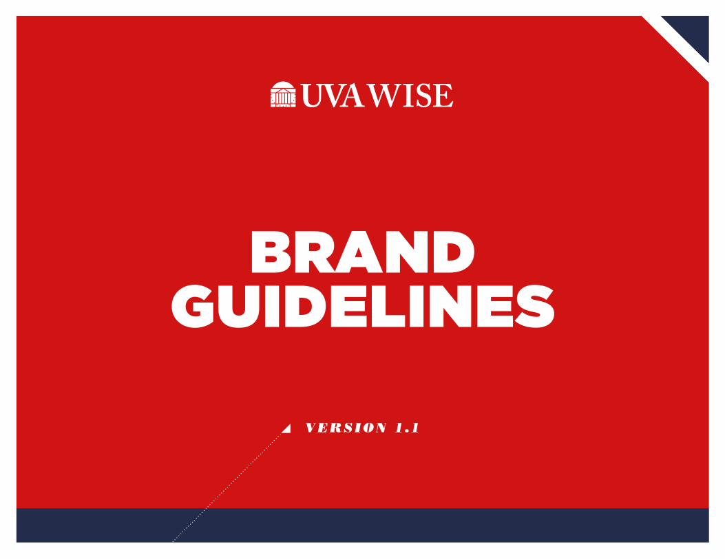
This rationale is intended to further guide concept
development and execution, set a baseline tone, and
function as a springboard for the entire brand expression.
RATIONALE
At the University of Virginia, the pursuit of a greater tomorrow is considered a
duty and held as a sacred belief. Here at UVA Wise, that belief is strengthened
with a clarity of vision, and realized with pragmatism and a dedication to
building our own brighter future. Because here, high on the Appalachian
Plateau, we can see all that’s possible: an emerging role in a highly-connected,
technology-fueled world that never stops moving. We are our region’s greatest
natural resource and our vision is our mission: the exchange of ideas that light
the way for opportunity, progress and a clear path forward.

BRAND VOICE
SEC . 2

10.UVA’S COLLEGE AT WISE BRAND.VOICE
The UVA Wise brand is honorable, approachable, elevated by idealism and
grounded in pragmatism. The brand voice echoes these sentiments. Our
language is both hopeful and practical, inspiring our audience to elevate their
ambitions and build a better tomorrow. We speak plainly, but with pride and
purpose, confident in our ability to spark progress.
With the Positioning Statement and supporting pillars, and using our tone
words as our guide, the copy that we develop should echo the spirit found
at UVA Wise. Language should be smart, compelling and engaging, enticing
the reader to accompany us on our journey and igniting possibility across
Southwest Virginia and beyond.
BRAND VOICE

UVA’S COLLEGE AT WISE 11.
The positioning statement is complemented by tone words that reflect the personality of the brand.
The tone may adapt depending on the audience, but all communications — from social media posts
to printed materials to web — should use the following words as a guide.
WELCOMING
Rooted in the supportive culture of our region, our brand is clearly
welcoming to all who pass through our orbit. We are host to our region.
ENTERPRISING
Guided by our clear vision, we are driven to build for the greater good. Our
plans for the future of our college can only come to fruition through our
own work.
RESILIENT
We have the grit and determination to find our way through a challenge,
and to always bounce back when we encounter a setback.
NURTURING
Our mission is to encourage the development of our greatest natural
resource our students, our town, and our region.
DEDICATED
Founded in 1954 to be in service to the region of Southwest Virginia
(and beyond), we stand by this mission and will always be dedicated
to this pursuit.
BRAND TONE
HONORABLE
Always be mindful, not just of what we’re doing, but how we’re doing it.
Our character is important to us — we share the University of Virginia’s
mission to produce citizen-leaders and to be both great and good in all
that we do.
PROVEN
For decades we have been a source of knowledge, inspiration and
economic development for the people of our region. We’ve been
recognized as one of the top public liberal arts colleges in the nation, as
well as an established partner for companies in Southwest Virginia and
beyond. We’re ready for our next challenge.
PROUD
We are proud of where we’re from and where we’re going. We know our
strengths and we welcome opportunities to share our story.
BRAND.VOICE

UVA’S COLLEGE AT WISE 12.
While our brand has one clear voice, the groups of people we speak to are wide and varied. The brand should contain the characteristics of the tone words,
yet the degree to which the audiences feel them should vary. Putting these tone words on an equalizer allows us to illustrate dialing them up or down (these
depictions are not meant to be exact settings, but rather rough guidelines). Much like a human personality, the brand voice should adapt to the audience to
whom it is speaking.
PROSPECTIVE INDUSTRY PARTNERSPROSPECTIVE STUDENTS
COLLEGE + WISE COMMUNITY ALUMNI + DONORS
AUDIENCES
WELCOMING
WELCOMING
WELCOMING WELCOMING
PROUD
PROUD
PROUD PROUD
ENTERPRISING
ENTERPRISING
ENTERPRISING ENTERPRISING
DEDICATED
DEDICATED
DEDICATED DEDICATED
RESILIENT
RESILIENT
RESILIENT RESILIENT
HONORABLEHONORABLE
HONORABLE
HONORABLE
NURTURING
NURTURING
NURTURING
NURTURING
PROVENPROVEN
PROVEN
PROVEN
BRAND.VOICE

13.UVA’S COLLEGE AT WISE
HEADLINES
For branding work, your headline is your first and best opportunity
to grab the reader’s undivided attention and get them to commit to
the rest of the story. Headlines should be intriguing, interesting, smart
and simple. It’s important not to pack too much information into the
headline or make it obtuse or confusing. If a headline takes more than
a second or two to comprehend, it has failed to do its job.
Headline word choice can be unconventional and multifaceted,
providing a double meaning to engage the reader. Headlines can
also innovate through context, pairing straightforward language
with unexpected photography to make a more powerful statement.
As a general rule, UVA Wise’s headline style should be inspiring,
empowering and instantly recognizable.
DOWN TO EARTH,UP TO THE MOMENT
BUILD YOUR TOMORROW
CREATE YOUR POSSIBLE
IGNITE A NEW DREAM
EXAMPLES
BRAND.VOICE

COLORSEC . 3

15.COLORUVA’S COLLEGE AT WISE
COLOR PALETTE
HIGHLAND BLACKCMYK: C-30 M-20 Y-10 K-100
RGB: R-0 G-0 B-0
HEX: #000000
DARK GRAYCMYK: C-0 M-0 Y-0 K-85
RGB: R-64 G-64 B-64
HEX: #404040
LIGHT GRAYCMYK: C-0 M-0 Y-0 K-15
RGB: R-229 G-229 B-229
HEX: #E5E5E5
NeutralsBlack and gray play an important
supporting role as neutrals.
Primary
The lead color for UVA Wise
branding is an updated red called
Highland Red. Supporting this is
UVA’s Jefferson Blue.
HIGHLAND REDPANTONE 186
CMYK COATED: C-2 M-100 Y-85 K-6
CMYK UNCOATED: C-1 M-91 Y-72 K-3
RGB: R-210 G-20 B-20
HEX: #D21414
JEFFERSON BLUEPMS COATED INK MIXTURE:
PANTONE PROCESS BLUE–19.80
PANTONE MEDIUM PURPLE–14.50
PANTONE BLACK–15.70
PANTONE TRANS. WHITE–50.00
PMS UNCOATED INK MIXTURE:
PANTONE PROCESS BLUE–58.90
PANTONE MEDIUM PURPLE–27.90
PANTONE BLACK–13.20
CMYK COATED: C-87 M-70 Y-22 K-44
CMYK UNCOATED: C-98 M-83 Y-12 K-46
RGB: R-35 G-45 B-75
HEX: #232D4B
All colors below are RGB representations and are not accurate color values for print.

16.COLORUVA’S COLLEGE AT WISE
All colors below are RGB representations and are not accurate color values for print.COLOR PALETTE
UVA ROTUNDA ORANGEPMS COATED INK MIXTURE:
PANTONE YELLOW 012–28.50
PANTONE RUBINE RED–18.75
PANTONE PROCESS BLUE–0.50
PANTONE TRANS. WHITE–52.25
PMS UNCOATED INK MIXTURE:
PANTONE YELLOW 012–54.60
PANTONE RUBINE RED–16.00
PANTONE BLACK–0.40
PANTONE TRANS. WHITE–29.00
CMYK COATED: C-0 M-64 Y-81 K-0
CMYK UNCOATED: C-0 M-68 Y-100 K-0
RGB: R-229 G-114 B-0
HEX: #E57200
UVA CYANCMYK: C-100 M-0 Y-0 K-0
RGB: R-0 G-159 B-223
HEX: #009FDF
AccentsUVA’s Rotunda Orange and UVA
Cyan can be used for small accents.
Avoid using floods of these.
NOTE: these should never be used
in place of our primary colors.
UVA ROTUNDA ORANGETINT: 10%
UVA CYANTINT: 10%
HIGHLAND REDTINT: 10%
TintsMany of these colors can be used
as very light tints for additional
functionality when building layouts.
NOTE: these should never be used
in place of our primary colors.

LOGO SYSTEM
SEC . 4

18.UVA’S COLLEGE AT WISE LOGO SYSTEM
ABOUT OUR LOGO
L O G O E L E M E N T S
1. THE HIGHLAND RED ROTUNDA
The rotunda is an icon shared across the University of
Virginia family. The symbol is based on Thomas Jefferson’s
own rendering for the design of the University of Virginia’s
Rotunda. The Rotunda was patterned after the Pantheon
in Rome, and like the Pantheon, it is based on a perfect
sphere. Jefferson dotted in an invisible globe on his sketch.
This adaptation replaces the dots with the 13 stars from the
original American flag to signify Jefferson’s intention to create
a national University to cultivate an educated citizenry and
generations of leaders.
2. THE COLLEGE LOGOTYPE
This logotype is based on Adobe Caslon, a 20th-century
adaptation of a typeface originally designed by William
Caslon in the eighteenth century. It is the typeface used
throughout the larger University of Virginia identity system.
1 2

19.UVA’S COLLEGE AT WISE LOGO SYSTEM
INSTITUTIONAL LOGOS
ABOUT THE SYSTEM
Our logo is the most important and recognizable element of our brand’s
identity. It is an icon that represents our organization to the outside
world and acts as an identifying and unifying mark.
There are three variations of the logo that serve specific purposes. The
primary logo is the preferred mark. The longform version is available
for formal applications. The stacked logo can be used when a vertical
orientation is required.
Further details on the appropriate use of institutional logos are provided
in the sections that follow.
P R I M A R Y
L O N G F O R M
S TA C K E D
Do not alter, redraw or add any additional words or graphic elements to the logo.

20.UVA’S COLLEGE AT WISE LOGO SYSTEM
COLOR VARIATIONS F U L L - C O L O R ( P R E F E R R E D )
O N E - C O L O R L O G O ( A S N E E D E D )
R E V E R S E L O G O
Our logos are available in multiple color variations. Here is an explanation
of when and where to use each one.
FULL-COLOR LOGO
The Pantone, CMYK or RGB full-color logo is always preferred. Use
Pantone or CMYK for any print applications such as collateral or business
materials. Use RGB for digital applications such as for web, presentations
or video.
REVERSE LOGO
Use the reverse logos for applications on color or photographic
backgrounds. Always ensure that the background you choose provides
sufficient contrast for the logo.
ONE-COLOR LOGO
When full-color printing is not an option, use the black version of the
logo. This is also helpful for applications such as embossing, debossing,
die-cutting or extrusion.
21.UVA’S COLLEGE AT WISE LOGO SYSTEM
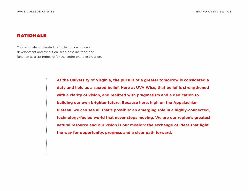
OFFICES & UNITS
The University’s primary logo represents the organization as a whole and
forms the basis of our visual identity system. In contrast, logo lock-ups show
the relationship between the University and its administrative units.
These lock-ups are available in both horizontal and vertical versions, and with
one or two lines of text (as shown below).
Contact the marketing office to have a logo lockup created for your office
or unit. Do not attempt to recreate these lockups on your own.
H O R I Z O N TA L L O C K- U P S ( M A X 2 8 C H A R A C T E R S P E R L I N E )
S TA C K E D L O C K- U P S ( M A X 2 8 C H A R A C T E R S P E R L I N E )

22.UVA’S COLLEGE AT WISE LOGO SYSTEM
INSTITUTIONAL LOGOS: MINIMUM SIZES & CLEAR SPACE
To ensure visibility and legibility, the logos should never be presented
in sizes smaller than the requirements shown on this page. To maintain
visual integrity, applications using alternative reproduction techniques
such as embroidery and silkscreen may require presenting the logos at
larger sizes than indicated here.
These are only minimum sizes. Logos should be sized appropriately for
the piece being designed. Consult your print vendor for specifics on
minimum sizes based on the piece you are creating. Whenever you use
the logo, it should be surrounded with clear space to ensure its visibility
and impact. No graphic elements of any kind should invade this zone.
M I N I M U M W I D T H S
C L E A R S PA C E
Print 1.5” / Digital 150px
Clear space should be height of UVA WISE wordmark.
Print 2” / Digital 200px

23.UVA’S COLLEGE AT WISE LOGO SYSTEM
PUTT-PUTT COURSE
Do not add a drop shadow or any other effects to the logo.
Do not place the primary logo in a container shape of any type.
Do not add additional information or elements to the logo.
Do not use unapproved color combinations for the logo.
Do not crop or remove any parts of the logo.
Do not place the logo on a color that does not provide sufficient contrast.
Do not crop or remove any parts of the logo.
Do not rearrange the elements of the logo.
Do not place the logo on visually distracting backgrounds.
INCORRECT USAGE
Correct and consistent use of our logo is an
essential part of building brand equity. While
flexibility has been built into the visual identity
system, the use of each element has been carefully
defined. Here are a few examples of things that
should not be done.
All examples shown here use the primary version
of our logo, but all rules also apply to the entire
system of logo variations.

24.UVA’S COLLEGE AT WISE LOGO SYSTEM
ATHLETICS LOGO:THE POWER V
The primary logo for UVA Wise Athletics is the Power V. It has
represented us for decades as the program brings together students,
faculty, staff, parents, alumni and the wider community. Freshly updated
in 2019, it is designed to capture our strength, energy, forward motion
and the pride of our athletics programs.
As our Athletics logo, this mark is intended for any and all items that
need to represent UVA Wise athletics, and only athletics. The Power
V is also available in outlined variations for use when needed. See the
following page for more guidelines for color variations.
O N E - C O L O R
O U T L I N E D
Red on white. White on red.
Red with white on gray.
Black with white on red.White with black on red.
White with red on black.
ATHLETICS COLORS
In order to maintain a strong link with the heritage of the athletics
brand, we are using Highland Red and Highland Black as the primary
palette for Athletics only. This will aid in the transition to a refreshed
brand.

25.UVA’S COLLEGE AT WISE LOGO SYSTEM
COLOR VARIATIONS
M E R C H A N D I S I N G O N LY
There are many color variations of the Power V needed for use on signage, uniforms, print and digital materials and
internal communications. Here are the usage guidelines and approved versions for use on white, red, black, gray and
photo backgrounds.
Merchandising usage is a little broader and specifically allows for several black, white, and gray color combinations, as
well as the use of other institutional and promotional colors. Shown below is Jefferson blue as a special-use background.

26.UVA’S COLLEGE AT WISE LOGO SYSTEM
ATHLETICS WORDMARK:SPECIAL-USE ONLY
H O R I Z O N TA L W O R D M A R K
V E R T I C A L W O R D M A R K
Red & Black (on white background)
White & Black (on red background)
Red & White (on black background)
Red & Black (on white background)
White & Black (on red background)
Red & White (on black background)
For special usage such as uniforms, stadium signage, and other
merchandising and fanwear, this UVA Wise wordmark makes use of
a custom type treatment designed in the style of the Power V. There
are horizontal and vertical versions. This mark is not intended to be
an official logo for UVA Wise Athletics, and its use is required to be
approved by the UVA Wise Marketing Department.

27.UVA’S COLLEGE AT WISE LOGO SYSTEM
SOFTBALLWOMEN’SLACROSSE
BASEBALL
FOOTBALL MEN’SBASKETBALL
WOMEN’SBASKETBALL
ATHLETICS LOCK-UPS
ATHLETICS PROGRAM LOGO
This version of our wordmark adds the “Athletics” identifier and is
intended for use where there is a need to specify the program
name. For example: office signage, recruiting materials, internal
communications and merchandise.
SPORTS-SPECIFIC LOGOS
This system of wordmarks creates an official logo for each sports
program within UVA Wise athletics. Some examples are shown to
the right.
AT H L E T I C S P R O G R A M L O C K- U P
S P O R T S L O C K- U P S
ATHLETICS

28.UVA’S COLLEGE AT WISE LOGO SYSTEM
MINIMUM SIZES & CLEAR SPACE
To ensure visibility and legibility, the logos should never be presented
in sizes smaller than the requirements shown on this page. To maintain
visual integrity, applications using alternative reproduction techniques
such as embroidery and silkscreen may require presenting the logos at
larger sizes than indicated here.
These are only minimum sizes. Logos should be sized appropriately for
the piece being designed. Consult your print vendor for specifics on
minimum sizes based on the piece you are creating. Whenever you use
the logo, it should be surrounded with clear space to ensure its visibility
and impact. No graphic elements of any kind should invade this zone.
M I N I M U M W I D T H S
C L E A R S PA C E
X
Print 3/8”
Digital 35px
Print 1”
Digital 100px
Clear space should be the width of the vertical stroke of the V or the height of the wordmark.
Print 1”
Digital 85px
ATHLETICS

29.UVA’S COLLEGE AT WISE LOGO SYSTEM
Do not add a drop shadow or any other effects to the primary logo.
Do not place the primary logo in a container shape of any type.
Do not add the wordmark or other elements to the primary logo.
Do not use unapproved colors for the primary logo.
Do not skew or stretch the logo.
Do not place the primary logo on a color that does not provide sufficient contrast.
Do not use unapproved color configurations of the primary logo.
Do not add an additional outline to the outlined version of the logo.
Do not place the primary logo on visually distracting backgrounds.
INCORRECT USAGE
Correct and consistent use of the Athletics logo is
an essential part of building brand equity. While
flexibility has been built into the visual identity
system, the use of each element has been carefully
defined.

TYPOGRAPHYSEC . 5

31.TYPOGRAPHYUVA’S COLLEGE AT WISE
TYPEFACES
B O DY . C O P Y . F O N T . .| G O T H A M B O O K
AT H L E T I C S . H E A D L I N E . F O N T . | G O T H A M U LT R A I TA L I C
OV E R S I Z E D . B O DY . C O P Y . F O N T . | B O D O N I B O L D
H E A D L I N E . F O N T . | G O T H A M B L A C K
S U B H E A D . F O N T . | B O D O N I P O S T E R I TA L I C
GOTHAM BLACKwith Bodoni Poster Italic
Bodoni bold can be used on occasion for large running text. It is an unconventional move with more impact.
All body copy should be set in Gotham Book. A modern-day classic,
Gotham is a sans-serif typeface that is both highly functional and
beautifully crafted. In body copy, it’s easy to read and includes a full
range of weights and italics and pairs well with Bodoni.
HEADLINES FOR ATHLETICS ARE SET IN GOTHAM ULTRA ITALIC.

32.TYPOGRAPHYUVA’S COLLEGE AT WISE
HEADLINE STYLES
ALL GOTHAM BOLD OR BLACK
USING
TOGETHER
Just Bodoni
them
There are a variety of headline styles that offer flexibility and bring
interest to a design. Having several headline styles and spacing options
to choose from gives communication pieces more flexibility and ensures
the design doesn’t feel repetitive from page to page. The format,
available space and layout pacing will often determine what treatments
work best within the design.
1 / GOTHAM BOLD OR BLACK
At its simplest, a headline can be set in Gotham Bold or Black and offer
enough branded personality. It’s best to set headlines in ALL CAPS and
keep tracking set to 0pt, optical for a strong presentation.
2 / BODONI POSTER ITALIC
As a secondary type style for supporting headlines in longer documents,
Bodoni Poster Italic may be used on its own. Bodoni Poster Italic should
always be set in all lowercase, with tracking set to 0pt.
3 / MIXED TYPE
Our preferred headline style is a graphic and expressive variation that
combines both brand typefaces for maximum impact. Use Gotham Bold
or Black, set in all caps, to highlight your headline’s action words or most
important ideas. Then use Bodoni Poster Italic, set in all lowercase, for all
other wording to complete your headline. The resulting contrast is at the
core of the UVA Wise branding system, and efforts should be made to
incorporate this type style in all major branded communications.
4 / GOTHAM ULTRA ITALIC
For materials in the UVA Wise Athletics brand, Gotham Ultra Italic may
be used on its own, set in all caps, to signify action and speed. Tracking
should be set to 30pt for optimal readability.
A L L C A P S
S E N T E N C E C A S E
M I X E D
AT H L E T I C S
ALL IN GOTHAM ULTRA ITALIC.

33.TYPOGRAPHYUVA’S COLLEGE AT WISE
HEADLINE APPLICATION
Here are some examples that illustrate the various headline styles and
how they are used in layout.

34.TYPOGRAPHYUVA’S COLLEGE AT WISE
ATHLETICS TYPOGRAPHY
This ready-made, textured treatment is commonly used for Athletics
headlines and is included in the toolkit. For all other Athletics
headlines, use standard Gotham Ultra Italic.

35.TYPOGRAPHYUVA’S COLLEGE AT WISE
Setting type is a subtle art. It is important to
have guidelines in place to ensure legibility and
continuity of the brand. Here are some general
rules to keep in mind when laying out type for
headlines or body copy.
Headlines are always set larger than the body
copy and in the bold weight, which provides the
most contrast from body copy.
Body copy should be set between 7-11pts for
print, and 12-16px for web.
T H I N G S T O AV O I D W H E N S E T T I N G H E A D L I N E S
T H I N G S T O AV O I D W H E N S E T T I N G B O DY C O P Y
Do not create your own modifications to the font. Use only the typefaces provided.
Do not use the outline headline style in a size smaller than 30pts.
Do not place the headline over a photo in such a way that the legibility is compromised.
Do not vary the size of a specific weight or style within a headline treatment.
Do not track out the body copy more than 5pts as it becomes difficult to read.
Do not set body copy in all bold; it will become too dense to read at small sizes.
Do not place the copy over a photo in such a way that the legibility is compromised.
Do not set body copy in a weight other than light, regular or medium for call-outs.
1 /
1 /
2 /
2 /
3 /
3 /
4 /
4 /
BEST PRACTICES

DESIGN ELEMENTS
SEC . 6

37.DESIGN ELEMENTSUVA’S COLLEGE AT WISE
CORNERS
DOTTED LINES TRIANGLE
BULLETS
NOTCHES
BORDER WITH NOTCH
ANGLE PATTERN
ANGLE ELEMENT
2 pt
1 pt
Angled
45°
Vertical
GRAPHIC TOOLKIT
The elements in the graphic toolkit are part of our visual design system. When used in conjunction
with photography, type and color, they assist in creating a sophisticated and energetic visual brand
that reflects the culture of forward progress and ambition at UVA Wise.

38.DESIGN ELEMENTSUVA’S COLLEGE AT WISE
DESIGN ELEMENTS
DOTTED + ANGLED LINEWORK
A dynamic system for organizing space and making connections. These tools can be used to energize and
provide structure in a layout, directing the eye to key moments and information.

39.DESIGN ELEMENTSUVA’S COLLEGE AT WISE
DESIGN ELEMENTS
NOTCHES, ANGLES AND TRIANGLE BULLETS
A simple and consistent way to create layout systems that reflect the larger UVA brand.
40.DESIGN ELEMENTSUVA’S COLLEGE AT WISE
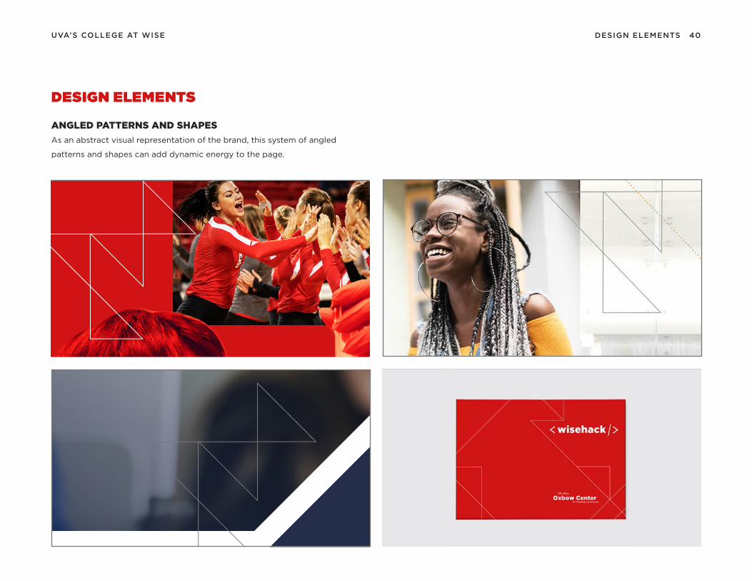
DESIGN ELEMENTS
ANGLED PATTERNS AND SHAPES
As an abstract visual representation of the brand, this system of angled
patterns and shapes can add dynamic energy to the page.

PHOTOGRAPHYSEC . 7

42.PHOTOGRAPHYUVA’S COLLEGE AT WISE
PHOTOGRAPHY STYLE
Our brand photography should reflect our story. We are a welcoming,
enterprising, resilient and proud community that knows how to embrace a
challenge, spark new ideas and pursue exciting new opportunities.

43.UVA’S COLLEGE AT WISE PHOTOGRAPHY
PHOTOGRAPHY TREATMENTS
COLOR TREATED PHOTOS
UVA Wise brand photography has the option of using four different types of
color effects. They are used to distinguish certain photos and bring a branded
feel to a photo that might have too much color variation.
These photo treatments are created with a gradient map in Photoshop.
Photo Gradient Map / Red 1
Photo Gradient Map / Blue 1
Photo Gradient Map / Red 2
Photo Gradient Map / Blue 2
Photo Gradient Map / Red 1
HIGHLAND RED
Photo Gradient Map / Red 2
HIGHLAND RED
Photo Gradient Map / Blue 1
JEFFERSON BLUE
Photo Gradient Map / Blue 2
JEFFERSON BLUE

44.PHOTOGRAPHYUVA’S COLLEGE AT WISE
1 / TONE AND COLOR
Color and tone correction to ensure accurate reproduction of the original
photograph.
2 / RETOUCHING AND EDITING
Technical touch-ups such as balancing or removal of flaws (dust spots,
scratches, digital noise, artifacts, etc.) to achieve better reproduction.
3 / CROPPING
Cutting into a photograph to remove distracting elements and creating a more
interesting composition.
4 / BLACK AND WHITE
Conversion of a color image to black and white if context calls for it.
5 / COLOR OVERLAY
Conversion of an image to a tinted color, giving a more graphic quality.
1 / CONTENT ALTERATION
Avoid content alteration—moving, adding, deleting, combining, stretching,
flipping, shrinking, etc.
2 / OVER CROPPING
Avoid cropping an image so severely that the subject and emotion of the photo
are compromised.
3 / OVER EDITING
Avoid combining multiple overlays or editing in a way that the subject matter
becomes hard to discern or looks out of brand.
4/ ULTERIOR COLOR OVERLAYS
Avoid applying color overlays that do not reflect the hierarchy of the UVA Wise
color palette. Only use the gradient map photo treatments provided in the
photo treatment section. Neutral, accent and tint colors are not to be used on
their own to create gradient map variations.
PHOTOGRAPHY TREATMENTS
AC C E P TA B L E P H O T O A D J U S T M E N T S U N AC C E P TA B L E P H O T O A D J U S T M E N T S

45.UVA’S COLLEGE AT WISE
PHOTOGRAPHY TREATMENTS
WHAT NOT TO DO
OV E R C R O P P I N G
C O N T E N T A LT E R AT I O NOV E R E D I T I N G
U LT E R I O R C O L O R OV E R L AY S
PHOTOGRAPHY

QUESTIONS?
If you have any questions about how to use the brand guidelines, where to find
elements, or any other concerns regarding the new UVA Wise brand, please contact
the communications department.
GENNA WELSH KASUN
Marketing Director
(276) 328-0301
CONTACT INFO