Embed Size (px)
Citation preview

VISIT CARSON CITYLOGO AND BRAND
THE RESEARCH THAT INFORMED OUR LOGO AND BRAND

TARGET AUDIENCEOLDER WEEKDAY TRAVELERS• Retirees are on the road and they’re avid travelers
• They like to take their time, avoid the crowds
• Value relaxation and rejuvenation
• Interested in multi-generational travel and
family-friendly destinations
• 60% travel by car to their destination
Source: https://www.aarp.org/research/topics/life/info-2017/2018-travel-trends.html

TARGET AUDIENCEOLDER WEEKDAY TRAVELERS
BRANDS THAT APPEAL TO THIS AUDIENCE
Their favorite brands speak to the glory days of their ‘Woodstock-Summer of Love’ youth,
but don’t remind them of how long ago that was. This audience find ads with concepts of
family, love, and togetherness highly relatable and likeable.
Source: https://www.considerable.com/entertainment/trivia/the-brands-boomers-love-in-2019/ https://www.acemetrix.com/insights/blog/best-practices-creative-success-among-baby-boomers/

TARGET AUDIENCEMILLENNIAL FAMILIES
• More than half (58%) of U.S. Millennials who
traveled overnight last year have children under
the age of 18 in the household
• They value quality time, relaxation, safety and
convenience
• Less interested in metropolitan areas
• Prefer destinations that are easy to get to
Source: https://www.travelagentcentral.com/running-your-business/stats-44-millennials-travel-kids

TARGET AUDIENCEMILLENNIAL FAMILIES
BRANDS THAT APPEAL TO THIS AUDIENCE
Millennials are fast-paced, so they value a brand that is easy to understand. They
gravitate toward design that is simple, yet creative: they want to understand your
message in a matter of seconds.

SURVEYS & INTERVIEWSSURVEY
INTERVIEWS
Stakeholders who participated felt the current logo did not represent Carson City:
• “Star reminds me of Texas”
• “Very basic and looks too political”
• “Not sure what it signifies”
• “I can’t picture the logo right now. It doesn’t speak to the younger audience.”
• “Logo doesn’t work. We don’t have those mountains. (Those are in Minden /
Gardnerville). That’s not us.”

SURVEYS & INTERVIEWSDESTINATION ANALYSTSIn the Destination Analysts research,
people described Carson City as:
• Historic (68%)
• Affordable (43%)
• Welcoming (40%)
• Uncrowded (38%)
• Easy to Get to (37%)
The most highly rated aspects of Carson
City as a place to visit were:
• Scenic Beauty (75%)
• Historical Attributes (74%)
• Ambiance & Atmosphere (71%)
• Affordability (66%)
• Safety (65%)

DESIGN PRINCIPLESLOGO DESIGNWhile there are many design theories that tout simplicity and ensuring
reapplication, what they are really talking about (and where we focus) are
honing in on these design principles:
• Appropriate for our audiences
• Easy to describe
• Timeless
• Simple
• Scalable

DESIGN PRINCIPLESDESTINATION LOGOS

OUR BRAND AND LOGO

RICH HISTORY
HERITAGE AND CULTURAL INFLUENCE
AN INCLUSIVE COMMUNITY
FAMILY FRIENDLY
ROOM TO DISCOVER AND WANDER

14
OUR BRAND PROMISE
CARSON CITY IS THE HEART OF NEVADAWe deliver on this promise through our warm greetings, our rich history, and our diverse, majestic landscapes. Carson City is a place you want to stay. It holds the heartbeat of Nevada and is where our western history was forged.
We are the centerpoint of the Nevada experience.


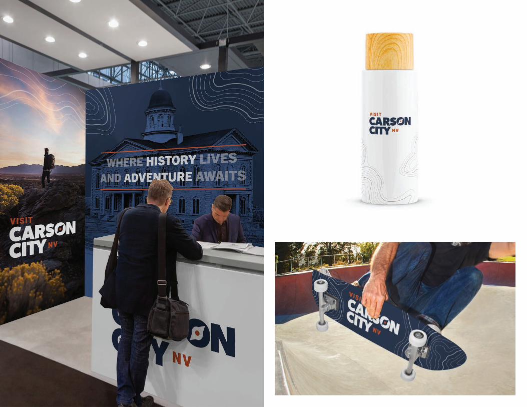
OUR LOGOJust like we are the heart of Nevada, our logo
is the heart of our brand. But it doesn’t stand
alone. It gets meaning from the design but more
importantly from everything that surrounds it. Our
words, our images, our website, and our voice and
tone all add context and meaning to our logo and
one doesn’t live without the other.
As we embarked on this logo design we, like our
great city, evolved. We became bolder, simpler
and more focused on our pioneering spirit. Here,
travelers can dig deeper, and explore further.
Because in the end, our history has merged with our
forward-thinking community. No matter what the
future holds, Carson City is ready to lead the way.
BOLD
SIMPLE
PIONEERING
OLD MEETS NEW
RELIABLE
WELCOMING

RECHARGE YOUR WESTERN SPIRIT

WHERE HISTORY LIVES AND ADVENTURE AWAITS

CARSON CITY IS THE HEART AND HISTORY OF NEVADA

COLOR PALETTE
The colors that make up our
palette are the ones that we see
every day in our surroundings.
From the beauty of a Nevada
sunset to the canopy of trees
surrounding our historic
neighborhood.
A natural color palette made of
contrasting colors gives our brand
a sense of adventure and the calm
of being somewhere welcoming
and real.
FALL LEAVES + NEVADA SUNSETS
FULL-GROWN TREES + SAGE
LAKE TAHOE WATERS + TURQUOISE
BLUE BIRD SKIES + NEVADA PRIDE

THE COMPASSTYPE TREATMENTThe compass positions Carson City as a destination to be explored. It reinforces that we are a guide—to adventure, history, or any other type of experience. It’s modeled after a pocket compass. The same simple design explorers throughout history have relied on to explore the western frontier.
The logo uses a type treatment with a compass icon embedded in the “O” of Carson. The simplicity makes it easy to replicate in a wide range of materials from billboards to business cards.
Its simplicity is what makes it timeless, and also ensures we’re not speaking to one single interest.
NVThe NV brings balance to the design, and ensures that our potential visitors know we are in Nevada. It also appeals to local Nevada pride.

EVER EXPANDINGAs we look at the proposed logo, we can imagine our compass moving and morphing to represent other brand pillars, causes, events and more. But always returning back to our roots.


NEXT STEPSREFINE, REFINE
With our direction solidified, we will continue the final polish of the logo mark and build
upon the brand we have created as our foundation.

VISITCARSONCITY.BIZVISITCARSONCITY.COM