Embed Size (px)
Citation preview
Visual Data Comm: A Tool for Visualizing Data Communication in the Multi Sector Planner Study
Hwasoo Eric Lee San Jose State University / NASA Ames Research Center
Moffett Field, CA 94035, USA [email protected]
ABSTRACT Data comm is a new technology proposed in future air transport system as a potential tool to provide comprehensive data connectivity. It is a key enabler to manage 4D trajectory digitally, potentially resulting in improved flight times and increased throughput. Future concepts with data comm integration have been tested in a number of humanintheloop studies but analyzing the results has proven to be particularly challenging because future traffic environment in which data comm is fully enabled has assumed high traffic density, resulting in data set with large amount of information. This paper describes the motivation, design, current and potential future application of Visual Data Comm (VDC), a tool for visualizing data developed in Java using Processing library which is a tool package designed for interactive visualization programming. This paper includes an example of an application of VDC on data pertaining to the most recent Multi Sector Planner study, conducted at NASA’s Airspace Operations Laboratory in 2009, in which VDC was used to visualize and interpret data comm activities.
Keywords Data Visualization, Data Comm, Multi Sector Planner
INTRODUCTION With the FAA’s prediction of a threefold increase in air traffic demand by 2025 [1], there is an increasing need for a reorganization of the current system as well as the creation of support tools. As a result, the Joint Planning and Development Office (JPDO) defined a set of concepts known as The Next Generation Air Transportation System (NextGen) that was derived to mitigate this forecasted challenge [2]. One of the key enablers of various NextGen concepts is groundtoground and groundtoair digital data communication (data comm), especially if they can be coupled with 4D trajectorybased traffic management. The ability to create and exchange graphical representations of aircraft trajectories between air traffic service providers would significantly enhance traffic assessment and coordination tasks [3]. A number of prototype concepts that utilize data comm in this manner have been explored in humanintheloop experiments. For example, a midterm FAA concept called Multi Sector Planner (MSP) [4,5] has been recently prototyped at NASA Airspace Operations Laboratory [6] as a collaborative project between San Jose State University Research Foundation and
NASA Ames Research Center, and has yielded positive results that demonstrate the usefulness of the MSP concept [7,8]. In short, the MSP concept proposes a new staffed position whose functions would lie between the tactical operations of controllers and the strategic operations of traffic management, augmented by the aforementioned 4D trajectory based management tools. One of many focal points of the most recent MSP study was to examine the implications of adding this new position to the existing team, more specifically how it would impact the team dynamics. It was hypothesized that coordination would be an integral part in the feasibility of such a position. Of particular interest was the role of data comm in the team coordination and resulting performance. The analyses took the simplest approach by running statistical tests on categorical counts of various attributes of data comm messages such as locations, times, senders, and recipients. However, this approach proved to be inefficient in trying to see the dynamics of the communication at a macrolevel because each attribute only offered a slice of the whole picture. Undoubtedly, data comm messages are both contextually and spatially organized. As a result, a visualization tool was deemed necessary to understand the data comm interactions between players. If successful, one would be able to infer insights as to how these data communication channels were used. The current paper describes the design, implementation, and application of Visual Data Comm (VDC), a visualization tool specifically conceived for the latest MSP study [7] in trying to help build a story around data comm activities.
MULTI SECTOR PLANNER (MSP) STUDY Although an extensive description of the MSP concept and its humanintheloop study of 2009 are beyond the scope of this paper, this section includes a brief explanation of the main points.
Airspace The experiment was conducted in two sessions of two weeks each. Each session had a different team of seventeen currently certified (participants) and retired (confederates) FAA air traffic radar controller, area supervisor, and traffic manager that staffed the following positions: 4 Multi Sector planner (MSP) positions: Four participants played the role of MSPs whose areas of responsibility are represented by the four colors in Figure 1, including three in the Kansas City ARTCC (ZKC) and one in the Memphis
https://ntrs.nasa.gov/search.jsp?R=20110008156 2018-07-24T09:33:02+00:00Z
ARTCC (ZME): ZKC_MSP_North (Green), ZKC_MSP_South (Orange), ZKC_MSP_West (Yellow), and ZME_MSP (Pink).
2 Traffic Management Coordinator (TMC) positions: One participant played the role of a TMC for the ZKC while a confederate acted as multiple TMCs for the surrounding centers (mainly ZME, ZID, ZAU, and ZMP) and the Command Center.
2 Area Supervisor positions: In a similar pattern as the TMCs, one participant played the role of an Area Supervisor for the eastern half of ZKC (area represented by Green and Orange in the figure) while a confederate acted as multiple Area Supervisors for the surrounding regions.
9 Radar Controller positions: A combination of four participants and three confederates played the roles of radar controllers for the seven sectors in the eastern half of the ZKC (area represented by Green and Orange in the figure) while two other confederates each controlled the eastern and western halves of the entire test airspace that is outside of the seven test sectors controlled by participants.
F igure 1: T est airspace used in the MSP condition.
Simulation Environment Each run was 75 minutes long and had more than 3000 aircraft operated by automation agents and a dozen of general aviation and commercial pilots. Runs were simulated using Multi Aircraft Control System (MACS) [3], a Javabased software package developed to emulate current ATC system and quickly prototype NextGen concepts to conduct humanintheloop experiments.
Experiment conditions and scenarios The two test conditions represented two different air navigation service provider (ANSP) team configurations: the NoMSP condition included traffic management, area supervisors, and radar controllers; whereas the MSP condition added four MSP positions to the team. There were eight different traffic scenarios: four Traffic Load scenarios with 1.5x current day traffic levels and traffic load imbalances between sectors; and four Weather scenarios included developing convective weather situations at current day traffic levels. All eight scenarios were run once in each condition, for a total of sixteen test runs.
Experiment task The TMCs, Area Supervisors, and MSPs were provided with various interactive support tools that are based on 4D
trajectories and allow for the filtering of traffic by flows, individual aircraft, conflict and weather penetration predictions, future positions of aircraft, etc. The tools were used to monitor the traffic situation and to aid in the development and execution of plans and initiatives in response to traffic disturbances and complexity issues. However, the TMC and MSPs were responsible for managing different prediction time horizons. In the NoMSP condition, the TMC was asked to manage the predicted aircraft count and/or complexity from 30 to 75 minutes into the future. In the MSP condition, the MSPs were asked to manage the 30 to 60 minute predictions while TMC managed the 45 to 75 minute predictions. In both conditions, area supervisor was responsible for managing the traffic below the 30 minute time horizon. Once the problems (and aircraft involved in them) are identified, solutions could be coordinated and implemented by the team using three types of data comm messages: Coordinated Plan (CP) is a message containing the details of proposed solutions (i.e., trajectory adjustments) that can be amended, sent, and received between the TMCs and MSPs. These CP messages can be exchanged further and refined until sent as coordinated clearances.
Coordinated Clearance (CC) is a message containing the details of requested trajectory adjustments that is sent to the radar controller with track control of the subject aircraft. These messages could be sent by either the TMCs or MSPs. The receiving radar controller could accept or reject the message at his or her discretion by assessing its viability given the traffic situation.
If the radar controller decides to accept the request, he or she can uplink the trajectory adjustments as an Uplink Clearance (UC) message from ground to aircraft. Only the radar controllers had the authority to send these messages unless the requested trajectory adjustments occurred more than 30 minutes in the future, in which case the TMC and MSPs had the option of bypassing the radar controller and sending the UC message directly to the aircraft. Also, in this study, all pilots were instructed to comply with the trajectory adjustments as requested in UC messages. Additionally, two subcategories of data comm messages were implemented to be used to relay back responses to CP and CC messages: Coordination Yes/Accept (CY) and Coordination No/Reject (CN).
RATIONALE FOR VISUAL DATA COMM Data visualization is one of many approaches in trying to infer structure from data and is particularly useful when dealing with huge amounts of information [9]. There already are existing visualization tools in the ATM realm. One prime example is TCSim Route Analyzer/Constructor (TRAC), which is a graphical tool with a vast set of functions such as performing fast-time agent-based simulations, prototyping airspace and route structures, as well as offering a wide range of sophisticated visualization features [10].
Although TRAC was used to analyze parts of the MSP data, VDC was created as a visualization tool to explore the team interactions in the MSP study in both temporal and spatial dimensions. An important distinction between TRAC and VDC is that while TRAC features a full set of functions and analyses tools that are designed to accommodate a wide range of ATC related simulations, VDC is lightweight, MSP studyspecific, and primarily tailored for data visualization.
VISUAL DATA COMM
Processing Library VDC is entirely developed in Java using the Processing graphics library. Processing was chosen because it is an open source language and platformindependent development environment and is specifically designed for interactive visualization programming [11]. There are many advantages in using Processing, including: As a language based in Java, it is translated to Java at runtime and executed as a Java program. Javabased programs usually run faster than programs based on scripting languages such as Flash/ActionScript, which is important for interactive graphics applications.
Its programming style is simplified in such a way that it lets the user bypass advanced programming and graphics concepts such as classes, objects, animation and doublebuffering, while still making them accessible for advanced users. This feature is especially important and vital for
people without a formal background in computer programming.
As an extension to the previous point, it can also trivialize the lowlevel and complex nature of OpenGL to take advantage of the optimized processing and rendering speed of the graphics card.
Processing can also easily export applets for the Web or standalone applications for Mac, Windows, and GNU/Linux operating systems. Although a full overview of simple implementations of drawing functions is out of the scope of this paper, the Processing library is undoubtedly well suited for the rapid prototyping of visualization tools by non programmingsavvy analysts.
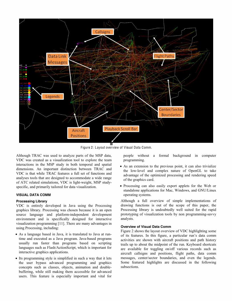
Overview of Visual Data Comm Figure 2 shows the layout overview of VDC highlighting some of its features. In this figure, a particular run’s data comm activities are shown with aircraft positions and path history trails up to about the midpoint of the run. Keyboard shortcuts are available for toggling on/off various records such as aircraft callsigns and positions, flight paths, data comm messages, center/sector boundaries, and even the legends. Some featured highlights are discussed in the following subsections.
F igure 2: Layout overview of Visual Data Comm.
Input data The input data to VDC are generated using Python that pulls in only relevant information (e.g., time, sender, recipient, and content of data comm messages) from different output files from MACS (the simulation platform used for MSP) that are rather large. Although feeding in the original output files to VDC was possible, a decision was made to create much simpler and smaller files for VDC to handle to make data processing much faster.
Center/sector boundaries The Center/sector boundaries depict the Kansas City ARTCC (ZKC) and its surrounding centers and sectors and are congruent with the map shown in Figure 2. However, VDC’s environment can be adapted to any center to include any number of sectors as long as it is provided with the appropriate set of latitude and longitude vertices for the area of interest.
Playback scroll bar VDC is able to replay a particular run from the experiment and allow the user to view the data comm interactions in the test airspace on one screen. This feature is attractive in that one can see the “big picture” of how data comm messages are exchanged between all positions in the simulation. The tool has a horizontal scroll bar at the bottom of the screen that represents the whole duration of a run. It can be manipulated to jump to anywhere in the run and fast forward, play or rewind the development in a similar fashion as a VCR.
Data comm message types and senders As outlined previously in Experiment task, the MSP study included various types of data comm messages and they are represented by dots of varying sizes and colors. Similarly, senders of these data comm messages are also visualized by “bubbles” around the messages (Figure 2). A legend of all ten possible senders (i.e., noncontroller positions) is also shown in the figure. The colorscheme used in the legends is congruent with the map used throughout the experiment.
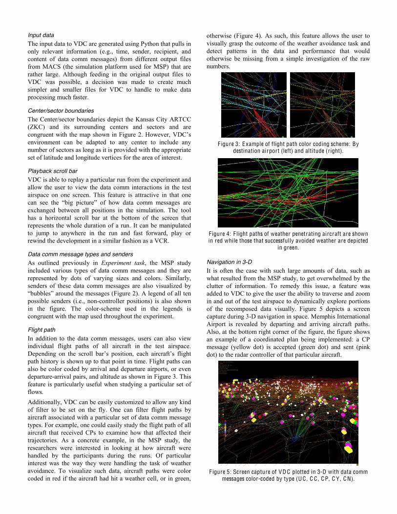
Flight path In addition to the data comm messages, users can also view individual flight paths of all aircraft in the test airspace. Depending on the scroll bar’s position, each aircraft’s flight path history is shown up to that point in time. Flight paths can also be color coded by arrival and departure airports, or even departurearrival pairs, and altitude as shown in Figure 3. This feature is particularly useful when studying a particular set of flows. Additionally, VDC can be easily customized to allow any kind of filter to be set on the fly. One can filter flight paths by aircraft associated with a particular set of data comm message types. For example, one could easily study the flight path of all aircraft that received CPs to examine how that affected their trajectories. As a concrete example, in the MSP study, the researchers were interested in looking at how aircraft were handled by the participants during the runs. Of particular interest was the way they were handling the task of weather avoidance. To visualize such data, aircraft paths were color coded in red if the aircraft had hit a weather cell, or in green,
otherwise (Figure 4). As such, this feature allows the user to visually grasp the outcome of the weather avoidance task and detect patterns in the data and performance that would otherwise be missing from a simple investigation of the raw numbers.
F igure 3: Example of flight path color coding scheme: By
destination airport (left) and altitude (right).
F igure 4: F light paths of weather penetrating aircraft are shown in red while those that successfully avoided weather are depicted
in green.
Navigation in 3-D It is often the case with such large amounts of data, such as what resulted from the MSP study, to get overwhelmed by the clutter of information. To remedy this issue, a feature was added to VDC to give the user the ability to traverse and zoom in and out of the test airspace to dynamically explore portions of the recomposed data visually. Figure 5 depicts a screen capture during 3D navigation in space. Memphis International Airport is revealed by departing and arriving aircraft paths. Also, at the bottom right corner of the figure, the figure shows an example of a coordinated plan being implemented: a CP message (yellow dot) is accepted (green dot) and sent (pink dot) to the radar controller of that particular aircraft.
F igure 5: Screen capture of VD C plotted in 3-D with data comm
messages color-coded by type (U C , C C , CP, C Y , C N).
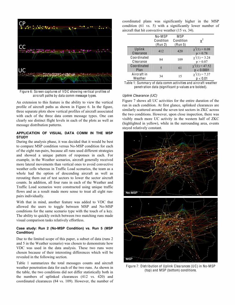
F igure 6: Screen captures of VD C showing vertical profiles of
aircraft paths by data comm message types.
An extension to this feature is the ability to view the vertical profile of aircraft paths as shown in Figure 6. In the figure, three separate plots show vertical profiles of aircraft associated with each of the three data comm message types. One can clearly see distinct flight levels in each of the plots as well as message distribution patterns.
APPLICATION OF VISUAL DATA COMM IN THE MSP STUDY During the analysis phase, it was decided that it would be best to compare MSP condition versus NoMSP condition for each of the eight runpairs, because all runs used different strategies and showed a unique pattern of responses in each. For example, in the Weather scenarios, aircraft generally received more lateral movements than vertical ones to avoid convective weather cells whereas in Traffic Load scenarios, the team as a whole had the option of descending aircraft as well as rerouting them out of test sectors to lower the sector aircraft counts. In addition, all four runs in each of the Weather and Traffic Load scenarios were constructed using unique traffic flows and as a result made more sense to treat all eight runpairs individually. With that in mind, another feature was added to VDC that allowed the users to toggle between MSP and NoMSP conditions for the same scenario type with the touch of a key. The ability to quickly switch between two matching runs made visual comparison tasks relatively effortless.
Case study: Run 2 (No-MSP Condition) vs. Run 5 (MSP Condition)
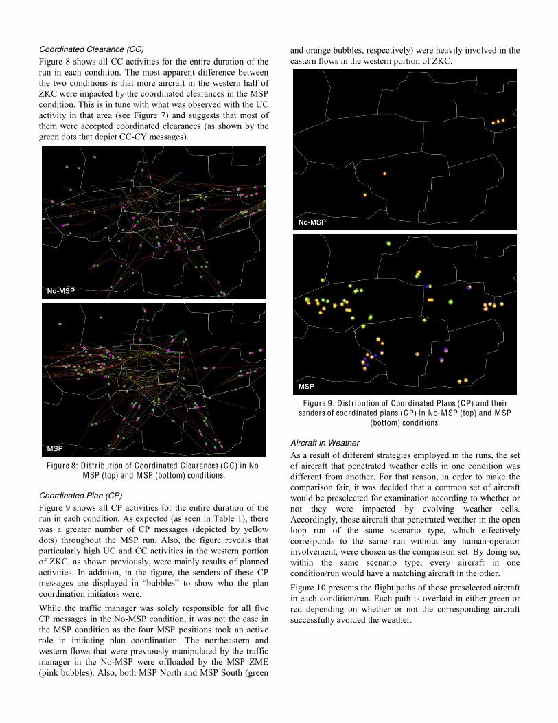
Due to the limited scope of this paper, a subset of data (runs 2 and 5 in the Weather scenario) was chosen to demonstrate how VDC was used in the data analysis. These two runs were chosen because of their interesting differences which will be revealed in the following section. Table 1 summarizes the total messages counts and aircraft weather penetration data for each of the two runs. As shown in the table, the two conditions did not differ statistically both in the numbers of uplinked clearances (412 vs. 420) and coordinated clearances (84 vs. 109). However, the number of
coordinated plans was significantly higher in the MSP condition (61 vs. 5) with a significantly lower number of aircraft that hit convective weather (15 vs. 34).
No-MSP
Condition (Run 2)
MSP Condition (Run 5)
2
Uplink C learance 412 420 2(1) = 0.08
p > 0.78 Coordinated
C learance 84 109 2(1) = 3.24 p > 0.07
Coordinated Plan 5 61 2(1) = 47.52
p < 0.0001 Aircraft in Weather 34 15 2(1) = 7.37
p < 0.01 Table 1: Summary of data comm activities and aircraft weather
penetration data (significant p-values are bolded).
Uplink Clearance (UC) Figure 7 shows all UC activities for the entire duration of the run in each condition. At first glance, uplinked clearances are similarly scattered around the seven test sectors in ZKC across the two conditions. However, upon close inspection, there was visibly much more UC activity in the western half of ZKC (highlighted in yellow), while in the surrounding area, events stayed relatively constant.
F igure 7: Distribution of Uplink C learances (U C) in No-MSP
(top) and MSP (bottom) conditions.
Coordinated Clearance (CC) Figure 8 shows all CC activities for the entire duration of the run in each condition. The most apparent difference between the two conditions is that more aircraft in the western half of ZKC were impacted by the coordinated clearances in the MSP condition. This is in tune with what was observed with the UC activity in that area (see Figure 7) and suggests that most of them were accepted coordinated clearances (as shown by the green dots that depict CCCY messages).
F igure 8: Distribution of Coordinated C learances (C C) in No-
MSP (top) and MSP (bottom) conditions.
Coordinated Plan (CP) Figure 9 shows all CP activities for the entire duration of the run in each condition. As expected (as seen in Table 1), there was a greater number of CP messages (depicted by yellow dots) throughout the MSP run. Also, the figure reveals that particularly high UC and CC activities in the western portion of ZKC, as shown previously, were mainly results of planned activities. In addition, in the figure, the senders of these CP messages are displayed in “bubbles” to show who the plan coordination initiators were. While the traffic manager was solely responsible for all five CP messages in the NoMSP condition, it was not the case in the MSP condition as the four MSP positions took an active role in initiating plan coordination. The northeastern and western flows that were previously manipulated by the traffic manager in the NoMSP were offloaded by the MSP ZME (pink bubbles). Also, both MSP North and MSP South (green
and orange bubbles, respectively) were heavily involved in the eastern flows in the western portion of ZKC.
F igure 9: Distribution of Coordinated Plans (CP) and thei r
senders of coordinated plans (CP) in No-MSP (top) and MSP (bottom) conditions.
Aircraft in Weather As a result of different strategies employed in the runs, the set of aircraft that penetrated weather cells in one condition was different from another. For that reason, in order to make the comparison fair, it was decided that a common set of aircraft would be preselected for examination according to whether or not they were impacted by evolving weather cells. Accordingly, those aircraft that penetrated weather in the open loop run of the same scenario type, which effectively corresponds to the same run without any humanoperator involvement, were chosen as the comparison set. By doing so, within the same scenario type, every aircraft in one condition/run would have a matching aircraft in the other. Figure 10 presents the flight paths of those preselected aircraft in each condition/run. Each path is overlaid in either green or red depending on whether or not the corresponding aircraft successfully avoided the weather.
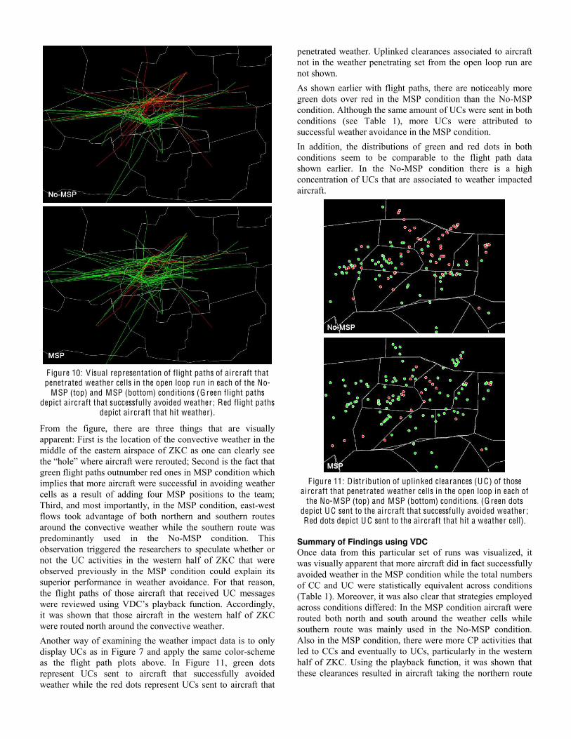
F igure 10: Visual representation of flight paths of aircraft that penetrated weather cells in the open loop run in each of the No-
MSP (top) and MSP (bottom) conditions (G reen flight paths depict aircraft that successfully avoided weather ; Red flight paths
depict aircraft that hit weather).
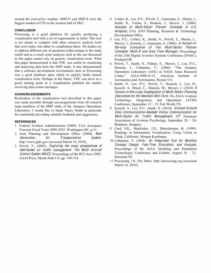
From the figure, there are three things that are visually apparent: First is the location of the convective weather in the middle of the eastern airspace of ZKC as one can clearly see the “hole” where aircraft were rerouted; Second is the fact that green flight paths outnumber red ones in MSP condition which implies that more aircraft were successful in avoiding weather cells as a result of adding four MSP positions to the team; Third, and most importantly, in the MSP condition, eastwest flows took advantage of both northern and southern routes around the convective weather while the southern route was predominantly used in the NoMSP condition. This observation triggered the researchers to speculate whether or not the UC activities in the western half of ZKC that were observed previously in the MSP condition could explain its superior performance in weather avoidance. For that reason, the flight paths of those aircraft that received UC messages were reviewed using VDC’s playback function. Accordingly, it was shown that those aircraft in the western half of ZKC were routed north around the convective weather. Another way of examining the weather impact data is to only display UCs as in Figure 7 and apply the same colorscheme as the flight path plots above. In Figure 11, green dots represent UCs sent to aircraft that successfully avoided weather while the red dots represent UCs sent to aircraft that
penetrated weather. Uplinked clearances associated to aircraft not in the weather penetrating set from the open loop run are not shown. As shown earlier with flight paths, there are noticeably more green dots over red in the MSP condition than the NoMSP condition. Although the same amount of UCs were sent in both conditions (see Table 1), more UCs were attributed to successful weather avoidance in the MSP condition. In addition, the distributions of green and red dots in both conditions seem to be comparable to the flight path data shown earlier. In the NoMSP condition there is a high concentration of UCs that are associated to weather impacted aircraft.
F igure 11: Distribution of uplinked clearances (U C) of those
aircraft that penetrated weather cells in the open loop in each of the No-MSP (top) and MSP (bottom) conditions. (G reen dots
depict U C sent to the aircraft that successfully avoided weather ; Red dots depict U C sent to the aircraft that hit a weather cell).
Summary of Findings using VDC Once data from this particular set of runs was visualized, it was visually apparent that more aircraft did in fact successfully avoided weather in the MSP condition while the total numbers of CC and UC were statistically equivalent across conditions (Table 1). Moreover, it was also clear that strategies employed across conditions differed: In the MSP condition aircraft were routed both north and south around the weather cells while southern route was mainly used in the NoMSP condition. Also in the MSP condition, there were more CP activities that led to CCs and eventually to UCs, particularly in the western half of ZKC. Using the playback function, it was shown that these clearances resulted in aircraft taking the northern route
around the convective weather. MSPN and MSPS were the biggest senders of CPs in the western half of ZKC.
CONCLUSION Processing is a good platform for quickly producing a visualization tool with a set of requirements in mind. This tool is not meant to compete with other extensive analysis tools that exist today, but rather to complement them. All studies try to address different sets of questions (often unique to the study itself) and as a result some analyses such as the one discussed in this paper cannot rely on generic visualization tools. What this paper demonstrated is that VDC was useful in visualizing and analyzing data from the MSP study. It also demonstrated that a software development environment such as Processing was a good platform upon which to quickly build custom visualization tools. Perhaps in the future, VDC can serve as a good starting point as a visualization platform for studies involving data comm messages.
ACKNOWLEDGEMENTS Realization of the visualization tool described in this paper was made possible through encouragements from all research team members of the MSP study of the Airspace Operations Laboratory. I would like to thank Nancy Smith in particular for continually providing valuable feedback and suggestions.
REFERENCES 1. Federal Aviation Administration (2009). FAA Aerospace
Forecast Fiscal Years 2009-2025. Washington DC, p.31. 2. Joint Planning and Development Office (2004). Next
Generation Air Transportation System. http://www.jpdo.gov (accessed March 16, 2010).
3. Prévôt, T., (2002). Exploring the many perspectives of distributed air traffic management: The Multi Aircraft Control System MACS, Proceedings of the HCI-Aero 2002, AAAI Press, Menlo Park CA, pp. 149-154.
4. Corker, K., Lee, P.U., Prévôt, T., Guneratne, E., Martin, L., Smith, N., Verma, S., Homola, J., Mercer, J. (2006). Analysis of Multi-Sector Planner Concepts in U .S. Airspace, FAA ATO Planning, Research & Technology Development Office.
5. Lee, P.U., Corker, K., Smith, N., Prévôt, T., Martin, L., Mercer, J., Homola, J., Guneratne, E. (2006). A Human-in-the-loop Evaluation of Two Multi-Sector Planner Concepts: Multi-D and Area F low Manager, Proceedings of the 25th Digital Avionics Systems Conference (DASC), Portland OR.
6. Prévôt, T., Smith, N., Palmer, E., Mercer, J., Lee, P.U., Homola, J., Callantine, T., (2006). “The Airspace Operations Laboratory (AOL) at NASA Ames Research Center,” AIAA-2006-6112, American Institute of Aeronautics and Astronautics, Reston VA.
7. Smith, N., Lee, P.U., Prévôt, T., Homola, J., Lee, H., Kessell, A., Brasil, C., Mainini, M., Mercer, J. (2010) A Human-in-the-Loop Investigation of Multi-Sector Planning Operations for the NextGen Mid-Term, 10th AIAA Aviation Technology, Integration, and Operations (ATIO) Conference, September 13 – 15, Fort Worth TX.
8. Kessell, A., Lee, P.U., Smith, N. (2010). Ground-Ground Data Communication-Assisted Verbal Communication for Multi-Sector Air Traffic Management, 29th European Association of Aviation Psychology, September 20 – 24, Budapest, Hungary.
9. Card, S.K., Mackinlay, J.D., Shneiderman, B. (1999). Readings in Information Visualization: Using Vision to Think, California: Morgan Kaufmann.
10. Callantine, T. (2008). An Integrated Tool for NextGen Concept Design, Fast-Time Simulation, and Analysis, Proceedings of the AIAA Modeling and Simulation Technologies Conference and Exhibit, August 18 – 21, Honolulu HI.
11. Processing 1.0. (No Date). http://processing.org (accessed March 16, 2010).