Embed Size (px)
Citation preview

Outline
⚫ Visualization: What, Why, and How?
⚫ Examples and goals
⚫ Guidelines and Techniques

What role does Visualization play?
Recap: Data Science Pipeline

[The American Heritage Dictionary]
Image © [Channel4]
vi∙su∙al∙ize
1. To form a mental image
2. To make visible

What is Data Visualization?

www.wordle.net
Visualization: To convey information through
visual representations
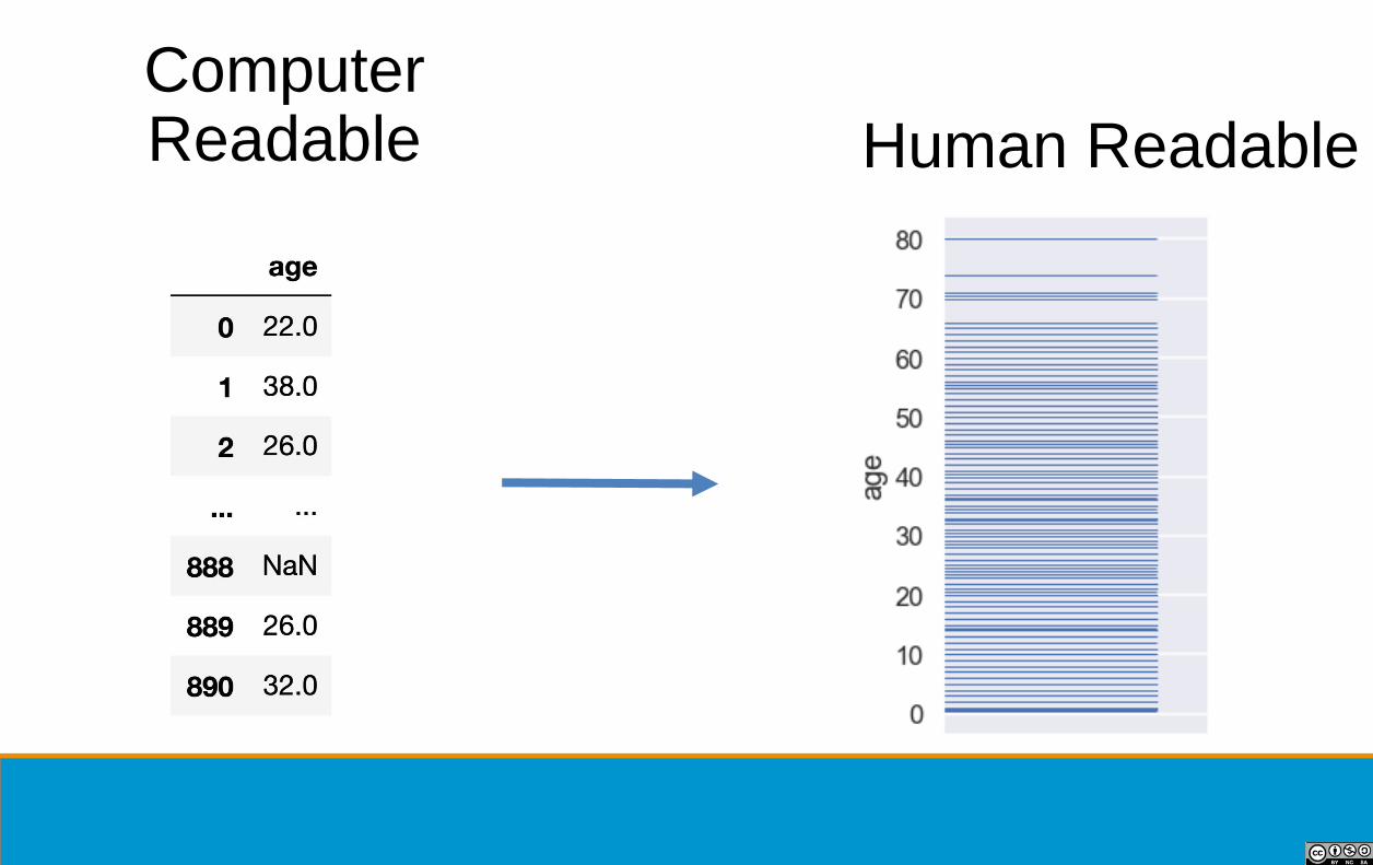
Human Readable
Computer Readable

...
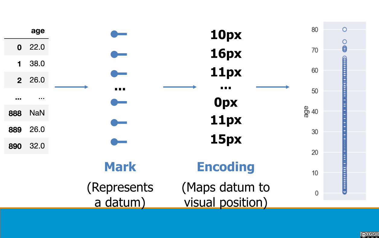
Mark
(Represents a datum)
...
10px
16px
11px
0px
15px
Encoding
(Maps datum to visual position)
...
Mark
(Represents a datum)
...
10px
16px
11px
0px
15px
Encoding
(Maps datum to visual position)

...
Mark
...
(10px, 7px)
Encoding
(70px, 60px)
(45px, 9px)
(5px, 24px)
(45px, 37px)
(66px, 8px)
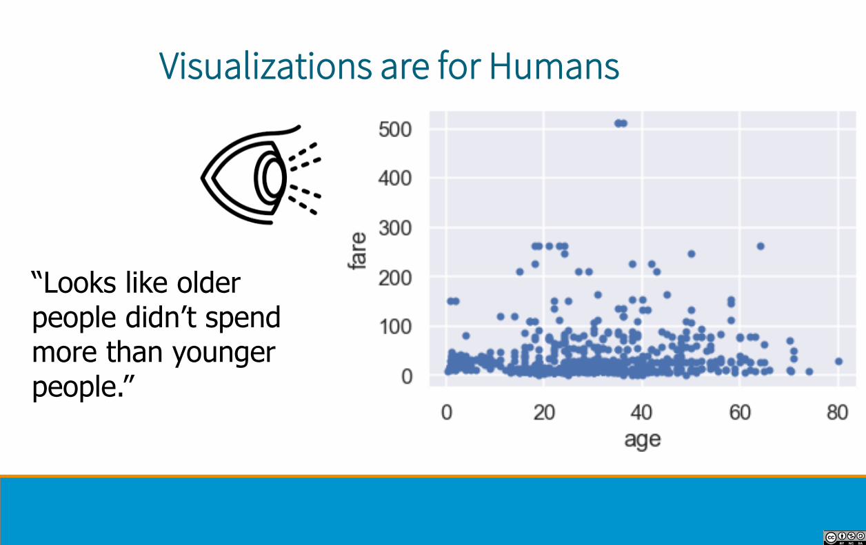
Visualizations are for Humans
“Looks like older people didn’t spend more than younger people.”

Visualizations are for Humans
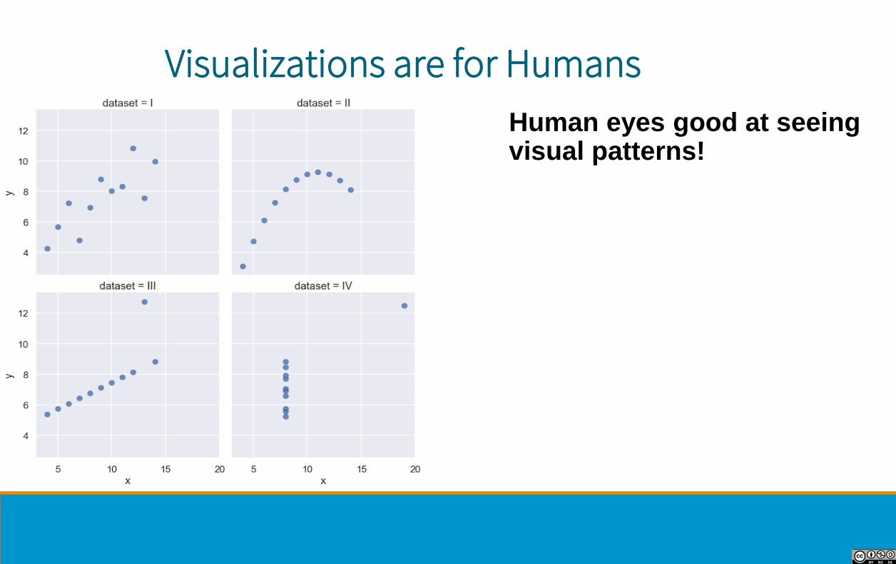
Visualizations are for Humans
Human eyes good at seeing visual patterns!

Visualizations are for Humans
Human eyes good at seeing visual patterns!...
Sometimes.

• One goal of data science is to inform human decisions• Excellent plots directly address this goal
• Sometimes the most useful results from data analysis are the
visualizations!
• Data viz is not as simple as calling plot()• Many plots possible, but only a few are useful
• Every visualization has tradeoffs
Why Data Visualization?

Python example: seaborn
(Demo)

Best used with tidy (aka long-form) data.
• Seaborn will perform groupby automatically
Typical usage:
sns.someplot(x='...', y='...', data=...)
seaborn

Plot types
⚫ Dot plot, Rug plot
⚫ Jitter plot
⚫ Error bar plot
⚫ Box plot
⚫ Histogram
⚫ Kernel density estimate
⚫ Cumulative distribution function
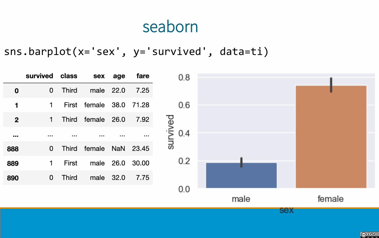
seaborn
sns.barplot(x='sex', y='survived', data=ti)

seaborn
sns.lmplot(x="total_bill", y="tip",col="day", hue="day", data=tips)

Customizing Plots using matplotlib
(Demo)

• Underlying library for seaborn, pandas, and most other Python
plotting libraries
• A Figure contains several Axes. Each Axes contains a plot.
• When creating a plot, a new figure + axes is created if not
already initialized.• Matplotlib remembers that axes for the duration of the cell (hidden
state!)
• Note: Axes = one chart within a larger Figure• Axis = x or y-axis within a chart (sorry!)
matplotlib

1. Figure
2. Axes
3. Line
4. Title
5. YAxis
6. XAxis
matplotlib

• Start with seaborn plot• Get as close to desired result as possible
• Fine-tune with matplotlib, e.g:• Changing title, axis labels
• Annotating interesting points
• Publication-ready plots take lots of fine-tuning!
Typical Workflow

Common Visualizations for One Quantitative Variable

Always have proportion per unit on y-axis
• Total area = 1
• Deciding on number of
bins is hard! Trial-and-
error process.
Histograms

Density Plots
Density plots similar to a “smoothed” histogram
• More on smoothing tomorrow
Rug plots put a tick at each data point
• Used to show all points

Common Visualizations for Two Quantitative Variables

Used to reveal relationships
between pair of variables
• Susceptible to overplotting• Points overlap!
Scatter Plots

Used to inform model
choices
• E.g. simple linear
model requires linear
trend and equal
spread.
Scatter Plots
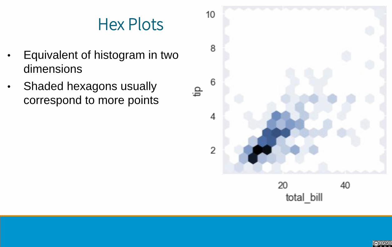
• Equivalent of histogram in two
dimensions
• Shaded hexagons usually
correspond to more points
Hex Plots

• Density plots also work in two
dimensions!
2D Density Plots
Common Visualizations for Qualitative + Quantitative Variable

• Typically use horizontal bars to
avoid label overlap
• Can also plot confidence intervals
on bars if appropriate
Bar Plots
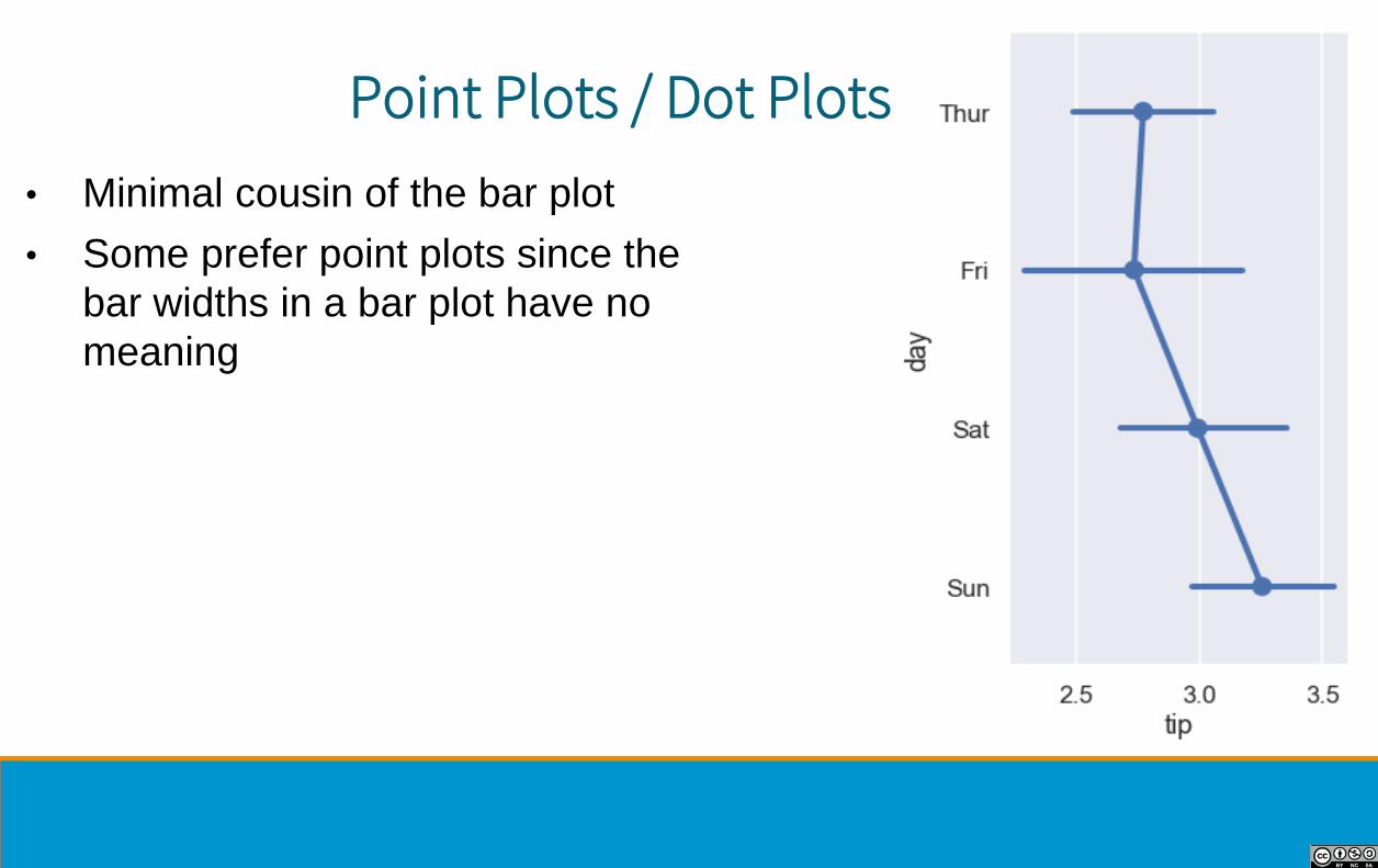
• Minimal cousin of the bar plot
• Some prefer point plots since the
bar widths in a bar plot have no
meaning
Point Plots / Dot Plots

• Used to compare distributions
• Uses quartiles• Q1: 25th percentile
• Q2 (median): 50th
• Q3: 75th
• Middle line = median
• Box shows 1st and 3rd quartile
• Whiskers show rest of data
• Outliers = 1.5 * (Q3 - Q1) past Q1 or Q3
Box Plots

• Outliers plotted beyond whiskers
• Interquartile range IQR = Q3 - Q1
• Outliers are defined as:• 1.5 * IQR beyond Q1 or Q3
• Example for male ages:• Q1 = 21; Q2 = 29; Q3 = 39
• IQR = 18; 1.5*IQR = 27
• Outliers are:• Above Q3 + 1.5*IQR = 66
• Below Q1 - 1.5*IQR = -6
Box Plots
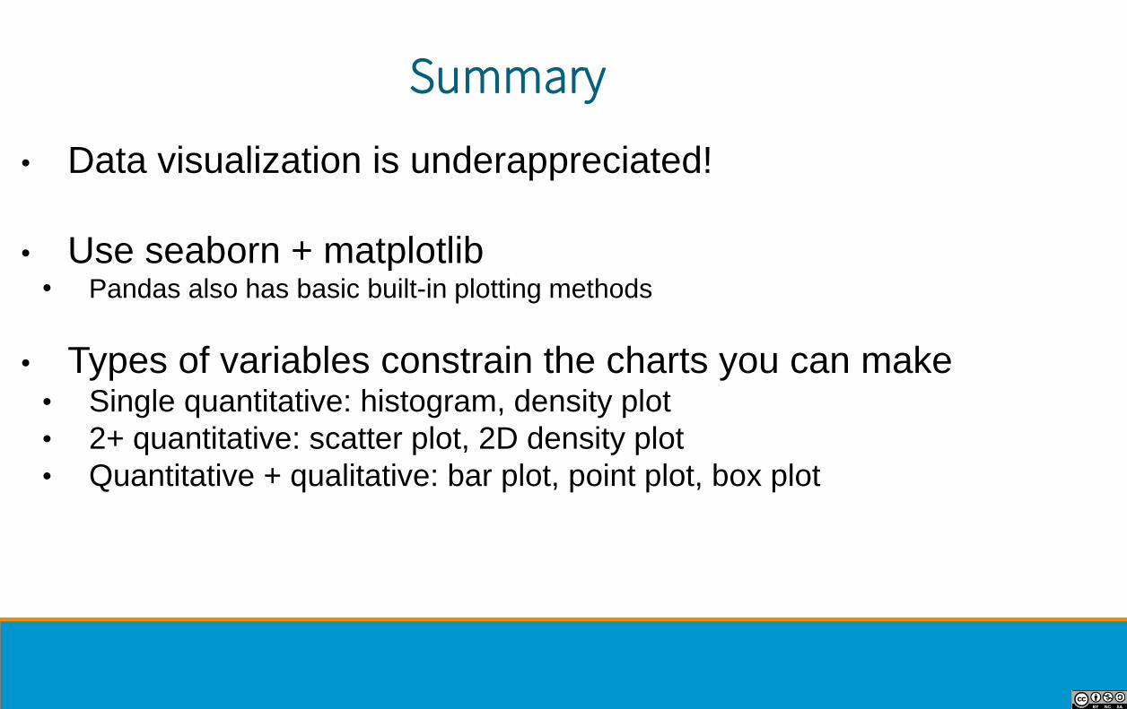
• Data visualization is underappreciated!
• Use seaborn + matplotlib• Pandas also has basic built-in plotting methods
• Types of variables constrain the charts you can make• Single quantitative: histogram, density plot
• 2+ quantitative: scatter plot, 2D density plot
• Quantitative + qualitative: bar plot, point plot, box plot
Summary

Visualization Goals
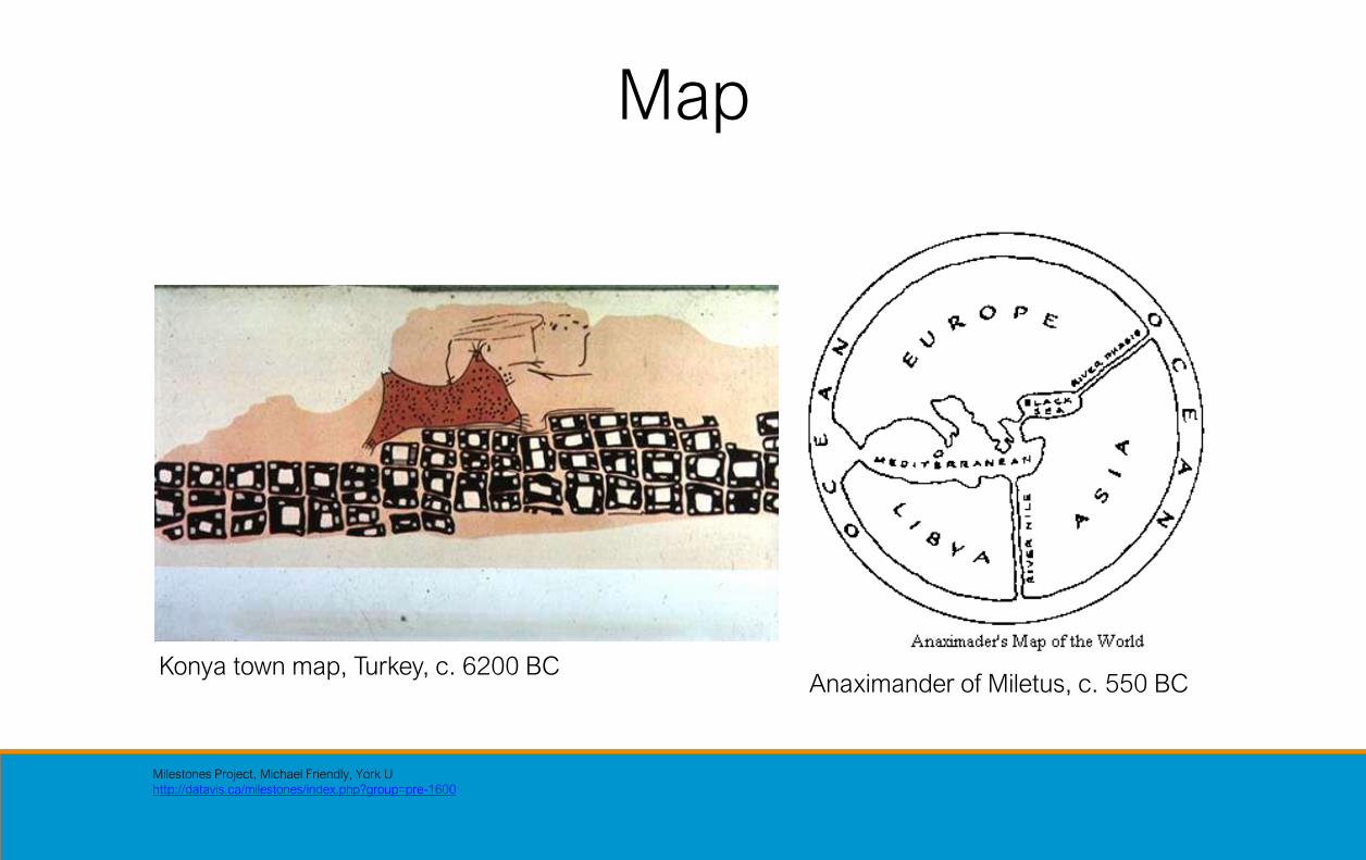
Map
Milestones Project, Michael Friendly, York U
http://datavis.ca/milestones/index.php?group=pre-1600
Anaximander of Miletus, c. 550 BCKonya town map, Turkey, c. 6200 BC

Map
Halley’s Wind Map, 1686Planetary Movement Diagram, c. 950

Record
The Galileo Project, Rice University
Galileo Galilei, 1616
Leonardo Da Vinci, ca. 1500
The History of Visual Communication
William Curtis (1746-1799)

Record
E. J. Muybridge, 1878

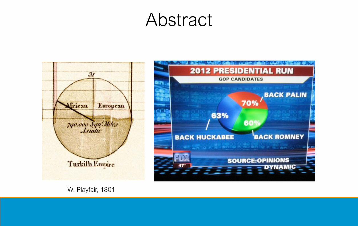
Abstract
wikipedia.org
W. Playfair, 1786
F. Nightingale, 1856
Abstract
W. Playfair, 1801

Abstract
Source wikipedia.org
Code available at https://github.com/tylerecouture/wikiplot/blob/master/canadian-federal-polls-pre43rd.R
W. Playfair, 1801
Canadian pre-campaign voting intentions for the federal election 2019

Discover
E. Tufte, Visual Explanations, 1997John Snow, 1854
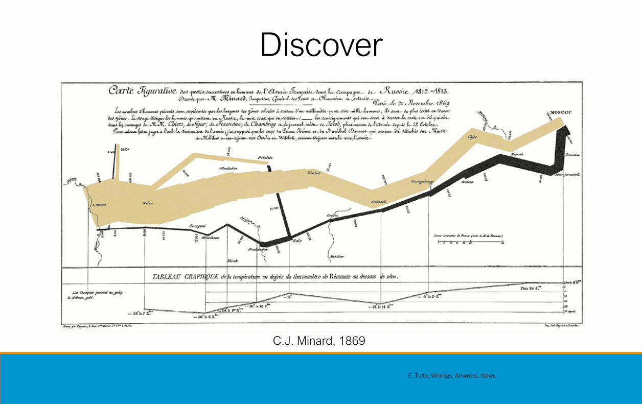
Discover
E. Tufte, Writings, Artworks, News
C.J. Minard, 1869

Clarify
London Subway Map, 1927

Clarify
Harry Beck, 1933

Interact
Ivan Sutherland, Sketchpad, 1963
Doug Engelbart, 1968
[play Engelbart.mov]
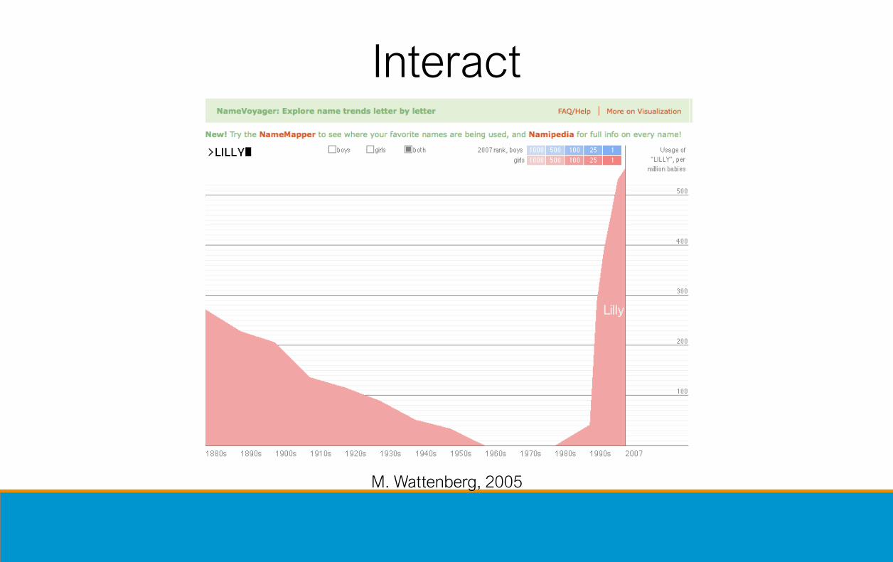
Interact
M. Wattenberg, 2005

Interact
NY Times

Communicate
“Many Eyes”, M. Wattenberg 2007

NY Times
Communicate
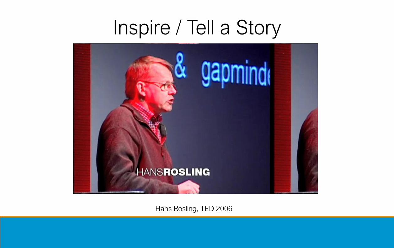
Inspire / Tell a Story
Hans Rosling, TED 2006

Visualization
• To convey information through visual representations
Map
Record
Abstract
Discover
Clarify
Interact
Communicate
Inspire

Goals• Insight and analysis
− Extract the information content
− Make things and relationships visible
− Analyze the data by means of the visual representation
• Communication− Allow the non–expert to understand
− Guide the expert into the right direction
• Exploration− Interactive control
− Use visual representation to understand the phenomena
• “The purpose of computing is insight not numbers”(Hamming 1962)
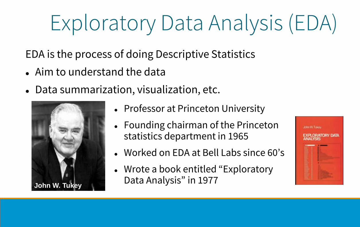
Exploratory Data Analysis (EDA)
⚫ Professor at Princeton University
⚫ Founding chairman of the Princeton statistics department in 1965
⚫ Worked on EDA at Bell Labs since 60’s
⚫ Wrote a book entitled “Exploratory Data Analysis” in 1977
John W. Tukey
EDA is the process of doing Descriptive Statistics
⚫ Aim to understand the data
⚫ Data summarization, visualization, etc.

EDA is like detective work
John Tukey:
“Exploratory data analysis is an attitude, a state of flexibility, a willingness to look for those things that we believe are not there, as well as those that we believe to be there.”

Why Data Visualization?
• What?
• Why?
• Who?
• How?
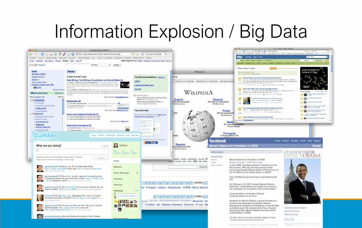
Information Explosion / Big Data

Instrument Data Explosion
Sloan Digital Sky Survey ATLUM / Connectome Project
Maximilien Brice, © CERN

“The Industrial Revolution of Data”
Joe Hellerstein, UC Berkeley

Limits of Cognition
Daniel J. Simons and Daniel T. Levin, Failure to detect changes to people
during a real world interaction, 1998

The History of Visual Communication
“It is things that make us
smart.”
Donald Norman

“It is things that make us smart.”
Donald Norman
The History of Visual Communication

Idea Maps, by Jamie NastVisual Thinking Collection, Dave Grey
“It is things that make us
smart.”
Donald Norman

Mental Queries
Males Females
Income Group Under 65 65 or Over Under 65 65 or Over
0-$24,999 250 200 375 550
$25,000+ 430 300 700 500
Which gender or income level group shows
different effects of age on triglyceride levels?
Slide after Stephen Kosslyn, Clear and to the Point

Visual Queries
0
175
350
525
700
875
Under 65 65 or Over
0-$24,999 $25,000+ 0-$24,999 $25,000+
Males Females
Slide after Stephen Kosslyn, Clear and to the Point
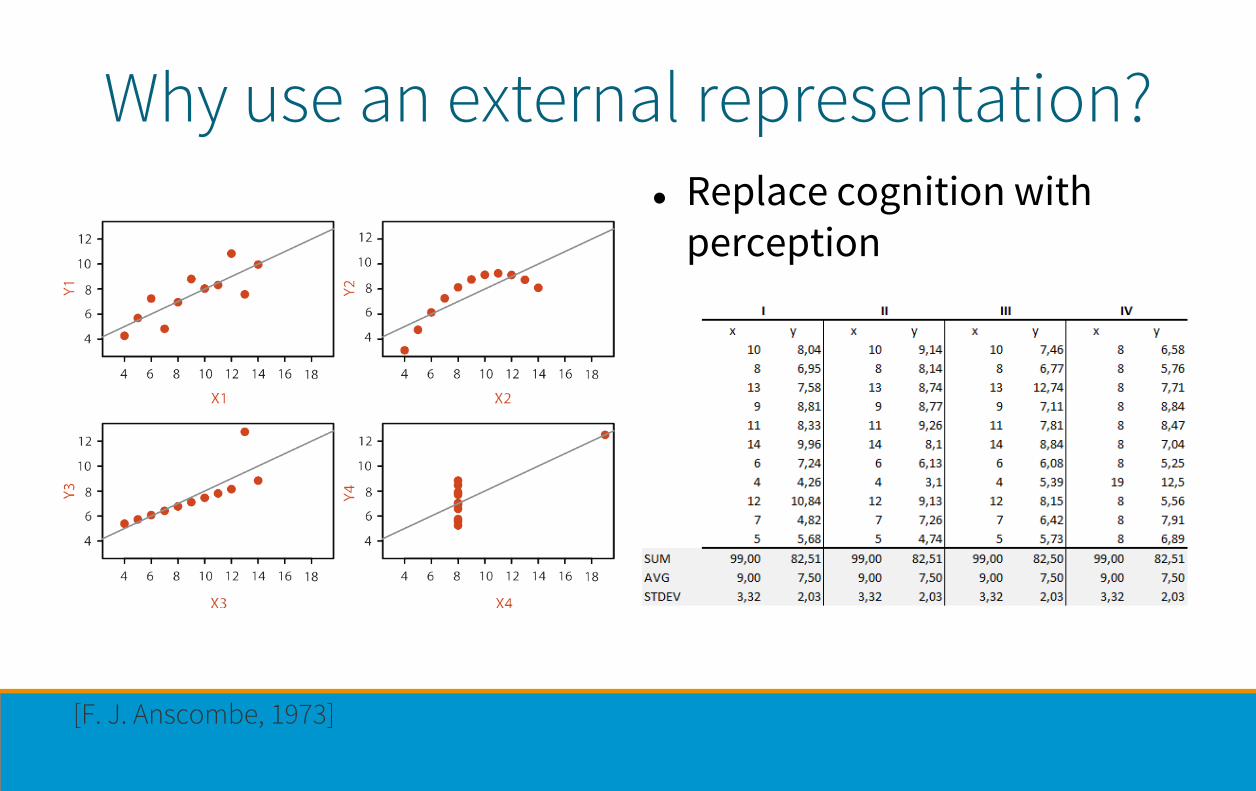
Why use an external representation?⚫ Replace cognition with
perception
[F. J. Anscombe, 1973]

Why represent all the data?⚫ Summaries lose information,
details matter
− Confirm expected and find unexpected patterns
− Assess validity of statistical model

Visualization
• Helps us think
• Reduces load on working memory
• Offloads cognition
• Uses the power of human perception

Defining Visualization (Vis)Computer-based visualization systems provide visual representations of datasets designed to help people carry out tasks more effectively.
Why have a human in the loop?
⚫ Not needed when automatic solution is trusted
⚫ Good for ill-specified anlaysis problems
− Common setting: “What questions can we ask?”
[“Visualization Analysis and Design” by T. Munzner, 2014]

Why have a human in the loop?Computer-based visualization systems provide visual representations of datasets designed to help people carry out tasks more effectively.
⚫ Exploratory analysis of scientific data
⚫ Presentation of known results
⚫ For developers of automatic solutions:
− Understand requirements for model development
− Refine/debug and determine parameters
⚫ For end users of automatic solutions: verify, build trust
Long-term use
Short-term use
Munzner, T. (2014)

⚫ Domain situation: Who are the target users?
⚫ Abstraction: Translate from specifics of domain to vocabulary of vis
⚫ What is shown? Data abstraction
− Don’t just draw what you’re given: transform to new form
⚫ Why is the user looking at it? Task abstraction
⚫ How is it shown? Idiom
− Visual encoding idiom: How to draw
− Interaction idiom: How to manipulate
⚫ Algorithm: efficient computation
Analysis framework: four levels
[A Nested Model of Visualization Design and Validation.Munzner. IEEE TVCG 15(6):921-928, 2009 (Proc. InfoVis 2009). ]
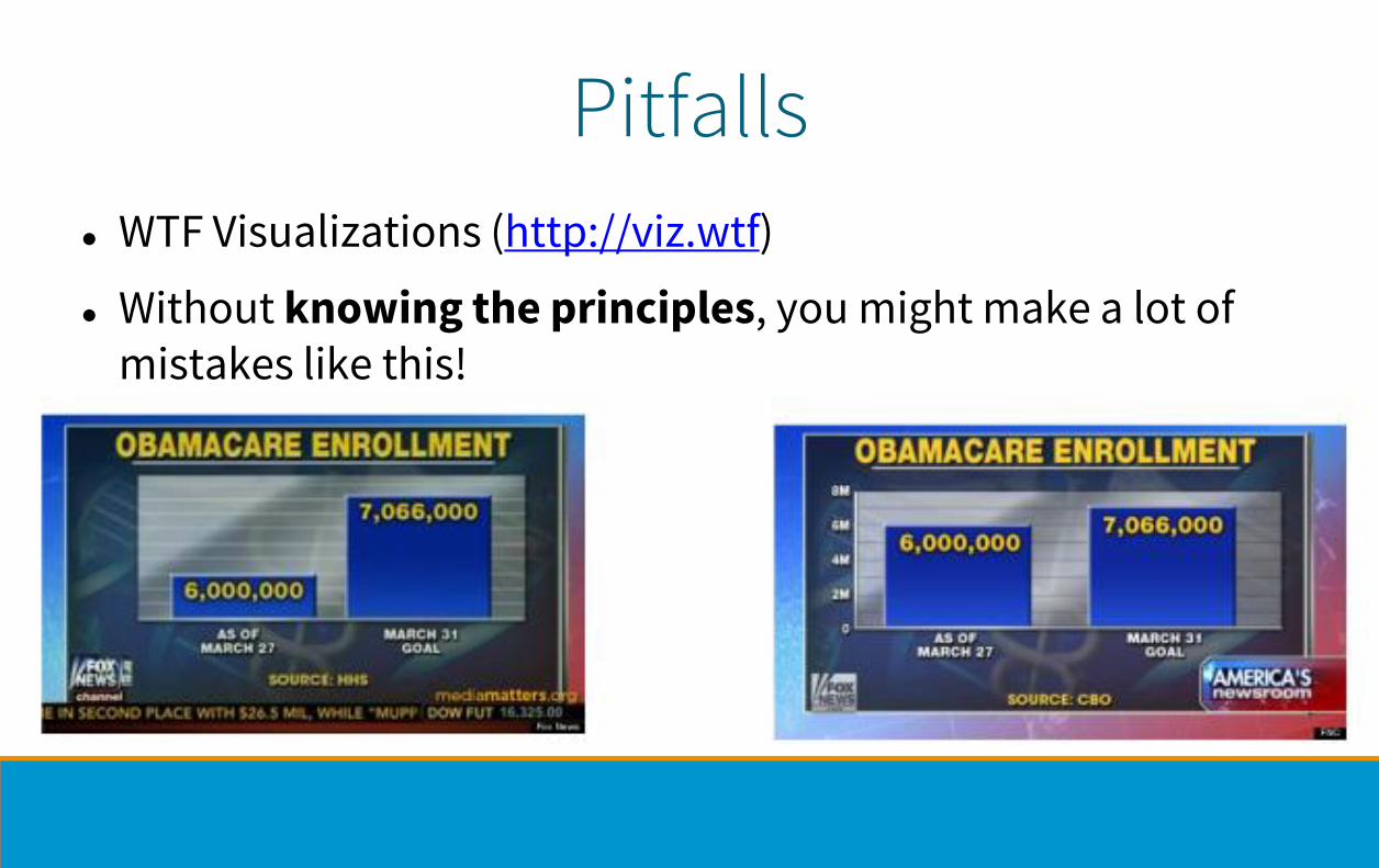
Pitfalls
⚫ WTF Visualizations (http://viz.wtf)
⚫ Without knowing the principles, you might make a lot of mistakes like this!

Resource limitations⚫ Computational limits
− Processing time and system memory
⚫ Human limits
− Human attention and memory
− Understanding abstractions
⚫ Display limits
− Pixels are precious
− Information density tradeoff: Info encoding vs unused whitespace

UnderstandData, Task, and Encoding

[T. Munzner, 2014]
⚫ Items and attributes as rows and columns of tables
⚫ Position and time are special attributes
⚫ Spatial data on grids makes computation easier
Data Types

⚫ Actions
− Analyze
− Search
− Query
⚫ Targets
− Item & Attributes
− Topology & Shape
[T. Munzner, 2014]
Tasks

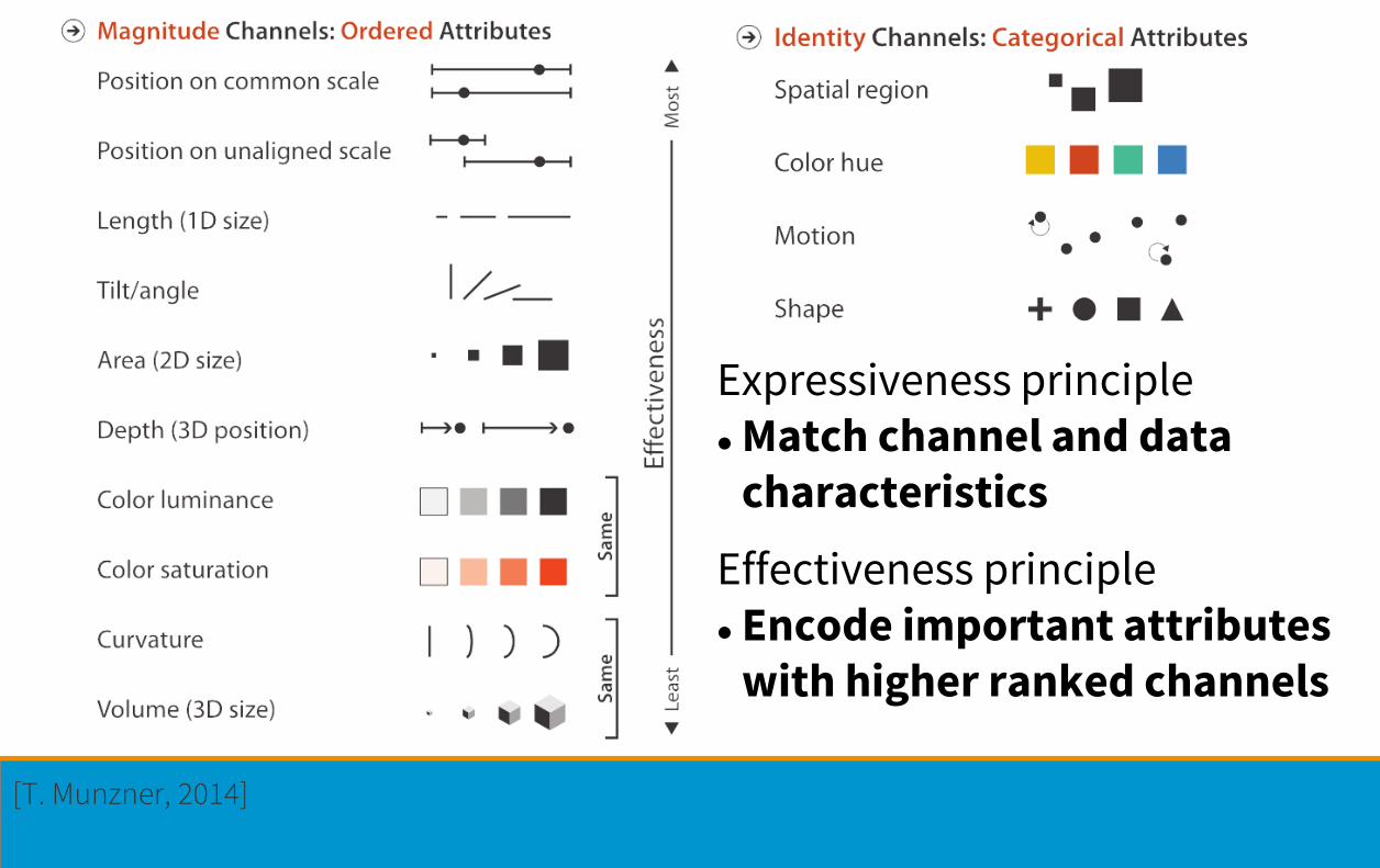
Visual Encoding – How?⚫ Marks
− Geometric primitives
⚫ Channels
− Appearance of marks
− Redundant coding with multiple channels possible
[T. Munzner, 2014]

Design Principlesfor Task Effective Visualization
[T. Munzner, 2014]
Expressiveness principle⚫ Match channel and data
characteristics
Effectiveness principle⚫ Encode important attributes
with higher ranked channels


⚫ Chart chooser: http://labs.juiceanalytics.com
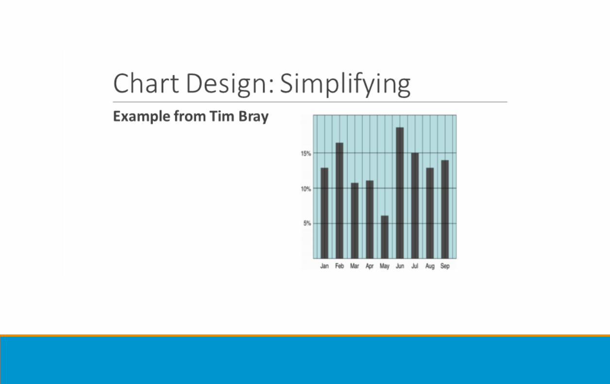
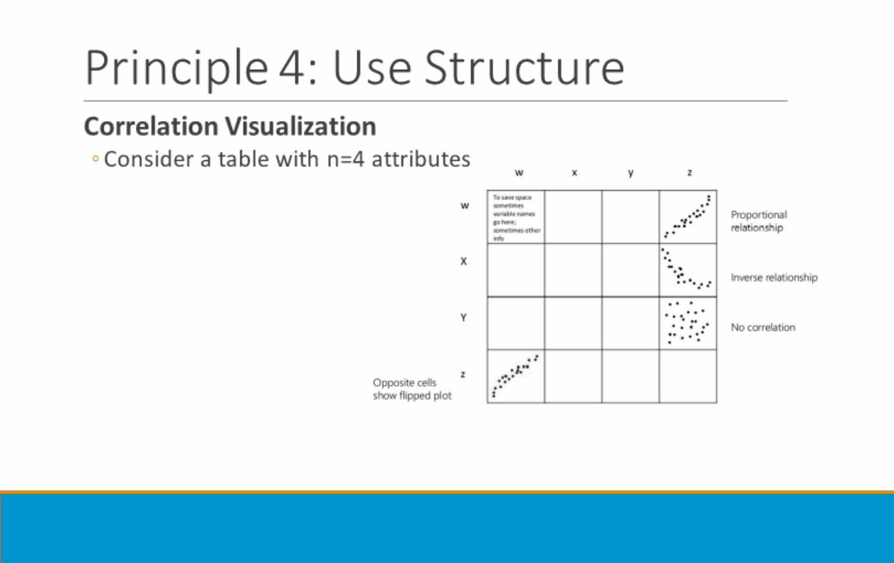
Principle 4: Use Structure

Recap: Data Lifecycle
Related ProcessesBig Data Journey
• Business transformations as a company becomes more data-centric
Data Visualization Process
• Acquire, Parse, Filter, Mine, Represent, Refine, Interact [Ben Fry ‘07, Visualizing Data]
Data Visualization Pipeline
• Analyse (Wrangling), Filter, Map to visual properties, Render geometry
Vis is part of all these steps!

SourcesBooks
⚫ Tamara Munzner ”Visualization Analysis and Design”, 2014
⚫ Lau, Gonzalez, Nolan: “Principles and Techniques of Data Science”
Slides
⚫ Jiannan Wang’s CMPT 733 slides, Spring 2017
⚫ Torsten Möller’s Visualization course, Spring 2018
⚫ UC Berkley Data 100 (Lau, Nolan, Dudoit, Perez)


![Arrange Networks and Trees - stevenbergner.github.io · Arrange Networks and Trees. Cmpt 767 - Visualization. Steven Bergner. sbergner@sfu.ca [incl. sides from Moeller/ Munzner/Eades/Sedlmair]](https://img.pdfslide.net/doc/110x75/5f09567f7e708231d4265b24/arrange-networks-and-trees-arrange-networks-and-trees-cmpt-767-visualization.jpg)