Embed Size (px)
Citation preview

Visualization of Graphs with Associated Timeseries Data Purvi Saraiya, Peter Lee, Chris North
Department of Computer Science Virginia Polytechnic Institute and State University
Blacksburg, VA 24061 USA {psaraiya, pelee, north}@vt.edu
http://infovis.cs.vt.edu/ ABSTRACT The most common approach to support analysis of graphs with associated time series data include: overlay of data on graph vertices for one timepoint at a time by manipulating a visual property (e.g. color) of the vertex, along with sliders or some such mechanism to animate the graph for other timepoints. Alternatively, data from all the timepoints can be overlaid simultaneously by embedding small charts into graph vertices. These graph visualizations may also be linked to other visualizations (e.g., parallel co-ordinates) using brushing and linking. This paper describes a study performed to evaluate and rank graph+timeseries visualization options based on users’ performance time and accuracy of responses on predefined tasks. The results suggest that overlaying data on graph vertices one timepoint at a time may lead to more accurate performance for tasks involving analysis of a graph at a single timepoint, and comparisons between graph vertices for two distinct timepoints. Overlaying data simultaneously for all the timepoints on graph vertices may lead to more accurate and faster performance for tasks involving searching for outlier vertices displaying different behavior than the rest of the graph vertices for all timepoints. Single views have advantage over multiple views on tasks that require topological information. Also, the number of attributes displayed on nodes has a non trivial influence on accuracy of responses, whereas the number of visualizations affect the performance time. CR Categories: H.5.2 [Information Interfaces and Presentation]: User Interfaces – Evaluation/Methodology Keywords: Graph visualization, data overlay, timeseries data analysis, usability experiments. 1 INTRODUCTION Graphs are used to represent entities and relationships between them, in several fields such as bioinformatics and computer networks. Multidimensional data is often associated with graph vertices, representing various attributes of the entities. The entity represented by a vertex and the interactions represented by the edges are dependent on the domain for which a graph is created. It is often necessary to analyze the multidimensional data in the context of the graph. For example, data may be collected for the graph vertices for multiple time points, which is then analyzed to infer how each vertex is changing with respect to other vertices that have direct or indirect influence on it.
Figure 1: An example of linking timeseries data to graphs. In bioinformatics, graphs are often used to show how bio-molecules (genes and proteins) interact with each other, called pathways. Data from high throughput experiments such as gene expression microarrays [6] measure quantity levels of the molecules, and are often analyzed in context of biological graphs. Usually, data is collected for several experimental treatments. An example data set could be expression values for a viral infection over time. The biological graphs represent complex biological phenomenon and provide a biological context to otherwise numerical data analysis [21]. In a separate evaluation study, it was found that the lack of graph context severely hampered scientists’ ability to derive biologically meaningful insight from microarray data [22]. Figure 1 shows overlay of time series data (as an example of multidimensional data) on a graph. Each vertex in the graph corresponds to a tuple row in the dataset, and each experiment treatment is an attribute column. Some common tasks for analyzing multidimensional data in graph context for bioinformatics are: What are the values of a specific graph vertex in a particular experimental treatment? How do different graph vertices change over different conditions? Which vertex displays a particular pattern of behavior across different experimental treatments? How does the behavior of a particular graph vertex affect other vertices connected directly or indirectly to it? A wide variety of graph visualizations have been created to support analysis of multidimensional data in graph context [4, 10, 12, 15, 16]. For this discussion we are focused on graph visualizations that use node-link representations for vertices and edges. These visualizations use different approaches to overlay data on graphs. Often the graph visualizations are linked to other additional visualizations such as parallel co-ordinates and heat maps. The goal of this paper is to present a design space for overlaying multidimensional data on graphs, and to comparatively evaluate instances of visualizations within the design space on the common data analysis tasks to provide guidance to designers on the tradeoffs within the primary design dimensions.

2 LITERATURE REVIEW A large variety of tools that allow analysis of multidimensional data in context of graphs have been created. A survey of different graph visualization tools is presented in [9]. In bioinformatics, a variety of tools use different visualizations to support graph data analysis. GenMapp [5] and PathwayAssist [18] allow overlay of data on graphs using one attribute at a time. The nodes are colored on a user defined scale to represent their values in a particular attribute. Though data is overlaid one attribute at a time in GeneSpring [7], users can link graph visualization to other visualizations such as heat maps, parallel co-ordinate, etc., using brushing and linking. The tools that lay data one attribute at a time on graph vertices usually provide sliders or similar mechanisms to let users iterate over other attributes. In another approach, more complex glyphs or miniature charts can be embedded in graph vertices. This enables the simultaneous display of values for multiple conditions on the vertex. For example, GScope [23] embeds heatmaps and line charts on graph vertices. The graph visualizations are linked to a parallel co-ordinate display in GScope. Cytoscape has explored the use of radial bars of different lengths around a node [13] to represent multiple attribute values simultaneously. Visual elements such as images or renderable geometry is used in MoireGraphs[11] to represent various physical entities (e.g., Protein structure, web page, etc). A new focus+context radial layout algorithm along with other interaction techniques assist in exploration of the graphs. Besides bioinformatics, graph visualizations have been created for other domains too. SeeNet [1] uses static display for spatial information, animation and manipulates different visual properties of vertices and links to represent network data. GraphViz [17] allows users to represent structural information in large number of domains. A few visual properties of nodes can be manipulated to represent different attributes of the nodes. Munzner et al. [14] use arc height, grouping and thresholding to visualize topology and properties of Internet’s Multicasting Backbone (MBone). A number of studies have been performed to evaluate different graph layout algorithms. E.g., a study to measure cognitive cost of graph aesthetics for the task of finding shortest paths in spring layout algorithm is described in [25]. An evaluation to access readability of two graph representations: matrix based and node-link based is described in [20]. The evaluation was based on seven generic tasks and provides recommendations regarding graph representation based on their size and density. A framework for defining and validating metrics to measure difference between two drawings of the same graph is presented in [8]. The paper also presents experimental analysis on several simple metrics. Several ideas to define similarity for comparisons between two graph drawings are presented in [2] and evaluated in a user study. A formal metrics based on seven common aesthetics criteria, applicable to any graph drawing of any size are presented in [3]. An analysis of graph drawings produced by some common layout algorithms (e.g., spring layout algorithm, DAG, etc.) based on the seven metric formulae is also presented to demonstrate the application of the metrics. A comparison of hyperbolic tree browser and conventional browser is described in [19]. The users finished their tasks faster with the hyperbolic tree browser in presence of strong information scent. Thus, though a wide range of studies have been performed to analyze graph drawings and layouts, little work has been conducted to evaluate visualization of multidimensional data associated with graph vertices. The rise of bioinformatics
pathways and gene expression analysis has brought this need to the forefront. 3 DESIGN SPACE Based on literature review, the design space to visualize multidimensional data on graphs is summarized into the following two dimensions.
Dimension 1 is based on graph vertex representation and the method to overlay multidimensional information on the vertices. The three common alternatives are: 1. Animation (using Simple Glyphs): In this approach a
visual property of vertex nodes is manipulated (usually color) to overlay a single data attribute (Figure 2). Cycling through several views for other attributes enables visualization of multidimensional data. Sliders or other controls are often used to directly navigate the animation loop. This design strategy focuses on the display of 1 data attribute at a time, using simple node glyphs, with interactive access to other attributes.
Figure 2: An example of overlaying data one condition at a time
using color encoding. 2. Small Multiples (using Simple Glyphs): For this
visualization design, layout multiple repeated views of the graph in miniature form, one view for each attribute [24]. Each view is a miniaturized version of the Animation design, but without the need to animate. This design strategy focuses on separating each data attribute into multiple views of the graph, still using simple node glyphs.
Figure 3: An example of laying out multiple graph views in a grid
of conditions or treatments in data. 3. Nested Visualization (using Complex Glyphs): While
colored graphs supports only one value per node, embedding small visualizations of multidimensional data attributes within each node enables the simultaneous display of values for all the attributes. E.g., Gscope [23] uses a heatmap and line graphs [Figure 4] to display attribute values of vertices. This design strategy focuses on simultaneously combining all data attributes into a single graph view, using complex node glyphs.
Figure 4: An example of embedding multiple data attributes simultaneously within each node.

Dimension 2: determines if other linked multidimensional data views are used in addition to the graph visualization for data analysis. Each of the graph visualizations mentioned in Dimension 1 can be linked with other multidimensional visualizations of the data. For example, graph visualizations in GeneSpring [Figure 5] are linked with different types of data visualizations such as parallel co-ordinates, heat maps, etc. By brushing-and-linking, users can select vertices in the graph to highlight the corresponding data in the multidimensional view, and vice versa. Figure 5: Pathway visualizations in GeneSpring™ [7] are linked
to multidimensional visualizations such as timeseries charts.
Since our main focus is on visualizations used in the bioinformatics domain, we selected the option to overlay data using the simple glyph with animation and the nested visualization approach, as these are the two most widely used methods. Most often in bioinformatics, green color is used to show down regulation or negative values, yellow to display values around zero and red for positive values. We preserved this standard color scale for the visualizations in the study. We linked the graph visualizations to parallel co-ordinate displays for multiple view visualizations. 4 PILOT STUDY Common options were developed for overlaying all timeseries data attributes simultaneously on graph vertices (Figure 6). These were evaluated in a pilot study, to select the final version for the main experiment. The alternatives used line graph (A), color (B), and both color + line graph (C) to display values of node in different conditions. We used different intensities of green color to display negative values, yellow for values around zero, and different intensities of orange color for positive values. (A) (B) (C)
Figure 6: Nested visualization alternatives to overlay multidimensional timeseries data simultaneously on graph nodes. Time series data for 10 time points was overlaid on a 50 node directed graph for the study. The visualizations were evaluated between subjects. We had a total of 15 participants, five for each representation. The participants performed predefined tasks described in section 4, table 3. The tasks were in the form of multiple choice questions. Participants’ answers to each task, and the response times were measured. We ranked the visualizations based on the number of correct user responses and shortest time taken to answer.
We observed that participants using color and color + line graphs had more correct responses to the tasks. On an average, participants using just the line graphs had 5.8/11, color had 6.8/11 and color + line graph had 7.2/11 correct answers. On performing ANOVA analysis on performance times we found that participants using color + line graph displays performed significantly faster (p<0.05) than participants using line graphs and color only. The average times for all the 11 tasks for the participants were, for line graph: 64.51 sec, color: 54.95 sec, and color + line graph 47.6 sec. Based on these results, we selected color + line graph for the main study. 5 EXPERIMENT DESIGN The aim of this study is to evaluate alternate visualizations in the design space that support analysis of multidimensional data in context of a graph. A 2x2 between-subjects design examines these two independent variables: 1 Two methods to overlay data on graph vertices: single
attribute (simple glyphs with animation), and multiple attributes (complex glyphs in nested visualization).
2 Two choices for use of additional multidimensional view: single view (graph visualization only), vs. multiple views (graph visualization + linked parallel coordinates visualization).
5.1 Visualization Tools We used four visualizations in the study. Table 1 lists design space and the interaction features for the visualization tools used in the experiment. Confirming to the general trend in bioinformatics, we used a color scale from yellow to green for displaying negative values, and yellow to red for displaying positive values. The tools were custom developed for this study to ensure consistency between conditions. For all the visualizations, moving the mouse over a node displayed numerical values corresponding to the color. For both the single attribute visualizations a slider was provided to let users iterate over all the attributes in the data.
Table 1: Design space and interaction features for visualization
tools in the experiment
Single View Multiple Views Single Attribute
Slider Mouse over
Slider Brushing Mouse over
Multiple Attributes
Mouse Over Brushing Mouse over
1 Single Attribute + Single View (SS): This visualization
overlaid values for one attribute on a node at a time. It was same as in Figure 7, but did not have parallel co-ordinates view linked to it.
2 Single Attribute + Multiple Views (SM): This visualization is shown in Figure 7. It was similar to Single Attribute + Single View but was linked to a parallel co-ordinate view using brushing and linking.
3 Multiple Attribute + Single View (MS): This visualization overlays data from all the attributes on a node using both a heat map and a line graph. It was similar to visualization in Figure 8, but did not have a parallel co-ordinate view linked to it.
4 Multiple Attribute + Multiple Views (MM): Figure 8 shows this visualization. It was similar to Multiple Attributes + Single View but was linked to a parallel co-ordinate visualization using brushing and linking

Figure 7: Overlay of a single attribute on graph vertices by color, and using multiple views. The graph visualization is linked with parallel co-ordinate visualization using brushing and linking. A slider enables user to select which attribute to visually overlay on the graph.
Figure 8: Overlay of multiple attributes on graph vertices by heat maps and line charts, and using multiple views. The graph visualization is linked with parallel co-ordinate visualization using brushing and linking.
5.2 Data A directed graph having 50 vertices and time series data with 10 time point attributes was used. Some of the nodes in the graph were grouped together and named by displaying textual information next to them, as shown in Figures 7 and 8, as is common in bioinformatics pathways. The sizes of the graph and dataset are based on typical needs in bioinformatics. The average size of graphs in the STKE library (www.stke.org) is under 50 vertices. Table 2 summarizes the data used for the experiment. 5.3 Task List Participants performed 11 tasks listed in Table 3. Tasks are based on common needs in bioinformatics pathway analysis, but abstracted to general graph tasks. Since a time-series data was used for the study, the tasks are more relevant to such type of data.
Table 2: Data used for the experiment
5.4 Experiment Protocol 40 participants, 10 for each visualization participated in the experiment. All the participants in the study were freshman or sophomore undergraduate students and business majors. The graph visualizations in the study used node-link representation. None of the data analysis tasks required specific biological knowledge. So we did not require participants to have biological background. The participants were given a brief introduction to the visualization and explanation of some basic graph terminology
Data Type Description Graph A directed graph having 50 vertices and 56
edges. Each node had an out degree of 0 to 3. Multi-Dimensional
Time series data, having values for 10 time points for each vertex.
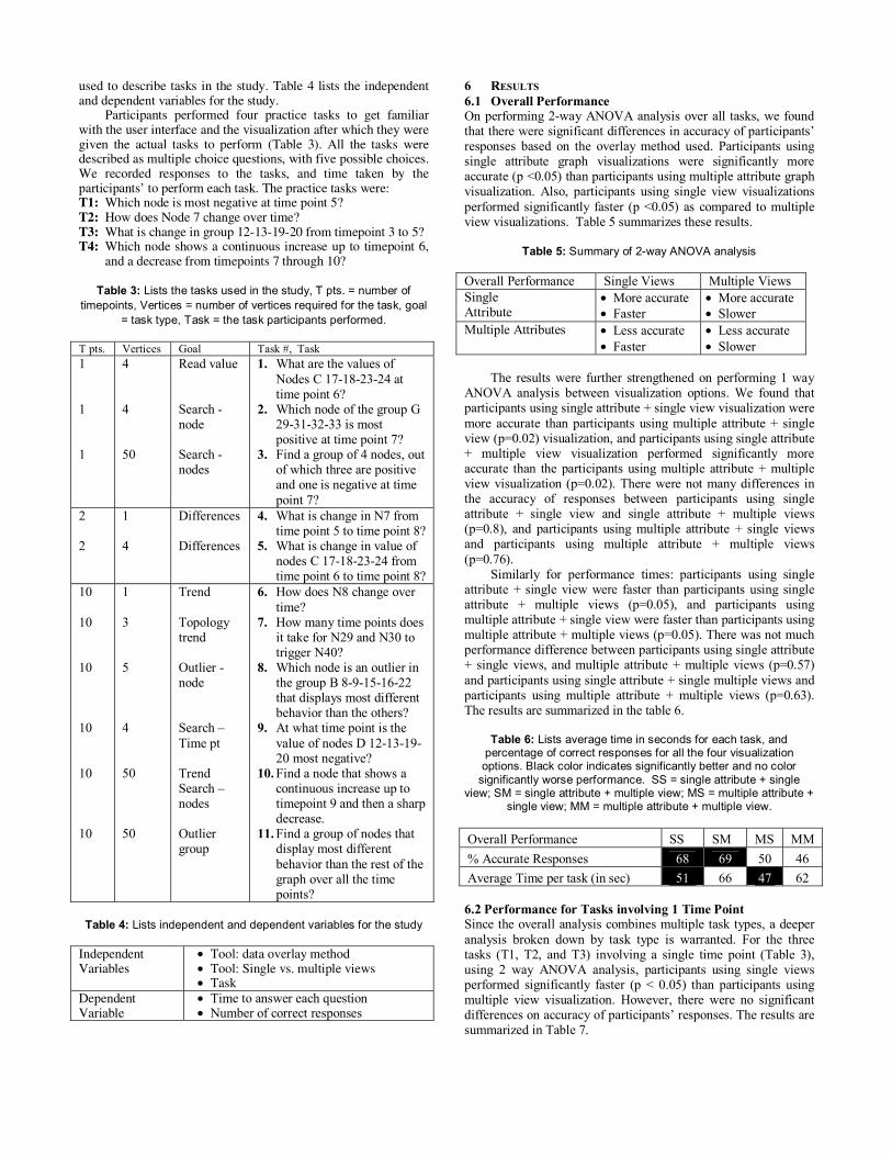
used to describe tasks in the study. Table 4 lists the independent and dependent variables for the study. Participants performed four practice tasks to get familiar with the user interface and the visualization after which they were given the actual tasks to perform (Table 3). All the tasks were described as multiple choice questions, with five possible choices. We recorded responses to the tasks, and time taken by the participants’ to perform each task. The practice tasks were: T1: Which node is most negative at time point 5? T2: How does Node 7 change over time? T3: What is change in group 12-13-19-20 from timepoint 3 to 5? T4: Which node shows a continuous increase up to timepoint 6,
and a decrease from timepoints 7 through 10?
Table 3: Lists the tasks used in the study, T pts. = number of timepoints, Vertices = number of vertices required for the task, goal
= task type, Task = the task participants performed.
Table 4: Lists independent and dependent variables for the study
6 RESULTS 6.1 Overall Performance On performing 2-way ANOVA analysis over all tasks, we found that there were significant differences in accuracy of participants’ responses based on the overlay method used. Participants using single attribute graph visualizations were significantly more accurate (p <0.05) than participants using multiple attribute graph visualization. Also, participants using single view visualizations performed significantly faster (p <0.05) as compared to multiple view visualizations. Table 5 summarizes these results.
Table 5: Summary of 2-way ANOVA analysis Overall Performance Single Views Multiple Views Single Attribute
• More accurate • Faster
• More accurate • Slower
Multiple Attributes • Less accurate • Faster
• Less accurate • Slower
The results were further strengthened on performing 1 way ANOVA analysis between visualization options. We found that participants using single attribute + single view visualization were more accurate than participants using multiple attribute + single view (p=0.02) visualization, and participants using single attribute + multiple view visualization performed significantly more accurate than the participants using multiple attribute + multiple view visualization (p=0.02). There were not many differences in the accuracy of responses between participants using single attribute + single view and single attribute + multiple views (p=0.8), and participants using multiple attribute + single views and participants using multiple attribute + multiple views (p=0.76). Similarly for performance times: participants using single attribute + single view were faster than participants using single attribute + multiple views (p=0.05), and participants using multiple attribute + single view were faster than participants using multiple attribute + multiple views (p=0.05). There was not much performance difference between participants using single attribute + single views, and multiple attribute + multiple views (p=0.57) and participants using single attribute + single multiple views and participants using multiple attribute + multiple views (p=0.63). The results are summarized in the table 6.
Table 6: Lists average time in seconds for each task, and percentage of correct responses for all the four visualization options. Black color indicates significantly better and no color
significantly worse performance. SS = single attribute + single view; SM = single attribute + multiple view; MS = multiple attribute +
single view; MM = multiple attribute + multiple view.
6.2 Performance for Tasks involving 1 Time Point Since the overall analysis combines multiple task types, a deeper analysis broken down by task type is warranted. For the three tasks (T1, T2, and T3) involving a single time point (Table 3), using 2 way ANOVA analysis, participants using single views performed significantly faster (p < 0.05) than participants using multiple view visualization. However, there were no significant differences on accuracy of participants’ responses. The results are summarized in Table 7.
T pts. Vertices Goal Task #, Task 1 1 1
4 4 50
Read value Search -node Search - nodes
1. What are the values of Nodes C 17-18-23-24 at time point 6?
2. Which node of the group G 29-31-32-33 is most positive at time point 7?
3. Find a group of 4 nodes, out of which three are positive and one is negative at time point 7?
2 2
1 4
Differences Differences
4. What is change in N7 from time point 5 to time point 8?
5. What is change in value of nodes C 17-18-23-24 from time point 6 to time point 8?
10 10 10 10 10 10
1 3 5 4 50 50
Trend Topology trend Outlier - node Search –Time pt Trend Search – nodes Outlier group
6. How does N8 change over time?
7. How many time points does it take for N29 and N30 to trigger N40?
8. Which node is an outlier in the group B 8-9-15-16-22 that displays most different behavior than the others?
9. At what time point is the value of nodes D 12-13-19-20 most negative?
10. Find a node that shows a continuous increase up to timepoint 9 and then a sharp decrease.
11. Find a group of nodes that display most different behavior than the rest of the graph over all the time points?
Independent Variables
• Tool: data overlay method • Tool: Single vs. multiple views • Task
Dependent Variable
• Time to answer each question • Number of correct responses
Overall Performance SS SM MS MM % Accurate Responses 68 69 50 46 Average Time per task (in sec) 51 66 47 62

Table 7: Summary of 2-way ANOVA analysis for T1 – T3 involving analysis at a single timepoint
On performing 1 way ANOVAs between treatments, we found, participants using single attribute + single view were more accurate than participants using multiple attribute + single view (p=0.057). Participants using single attribute + single view were faster than participants using single attribute + multiple views (p = 0.002), and participants using multiple attribute + single views were faster than participants using multiple attribute + multiple views (p=0.054). There was not much difference in performance time between participants using single attribute + single view and multiple attribute + single view (p=0.46), and participants using single attribute + multiple views and multiple attribute + multiple views (p=0.3). These results are summarized in Table 8. Table 8: Lists average time in seconds for T1 – T3, and percentage
of correct responses for all the four visualization options. Black color in the table indicates significantly better, white color
significantly worse and grey color no statistically significant performance differences, on performing 1 way ANOVAS between
four visualization options.
6.3 Performance for Tasks involving 2 Time Points For both the tasks T4 and T5 (Table 3), on performing 2 way ANOVA, participants using single attribute performed significantly better than participants using multiple attribute visualizations on accuracy (p <0.05), where as on both the tasks, participants using multiple attribute visualizations performed significantly faster than single attribute displays. Table 9 summarizes these results. Table 9: Summary of 2-way ANOVA analysis for T4 – T5 involving
analysis at two timepoints
On performing 1 way ANOVAs participants using single attribute + single view were significantly more accurate than participants using multiple attribute + single views (p=0.05), participants using single attribute + multiple views were significantly more accurate than participants using multiple attribute + multiple views (p=0.02). There was not much difference in accuracy between participants using single attribute + single view and participants using single attribute + multiple views (p=0.73), and participants using multiple attribute + single view and participants using multiple attribute + multiple views. Participants using multiple attribute + single views were faster than participants using single attribute + single views (p=0.06), and participants using multiple attribute + multiple views were faster than participants using single attribute + multiple views (p=0.09). Table 10 summarizes these results.
Table 10: Lists average time in seconds for T4 – T5, and percentage of correct responses for all the four visualization
options. Black color in the table indicates significantly better, white color significantly worse and grey color no statistically significant
performance differences. T4 – T5 SS SM MS MM % Accurate Responses 85 90 60 50 Average Time per task (in sec) 56 64 45 50 6.4 Performance for Tasks involving all 10 Time Points For tasks (T6 – T11) involving all the 10 time points, on performing 2 way ANOVA analysis, participants using single attribute graph visualizations were more accurate than participants using multiple attribute visualizations. Table 11 summarizes these results.
Table 11: Summary of 2-way ANOVA analysis for T6 – T11 involving analysis at all the 10 timepoints
Both T6 and T10 (Table 3) required analyzing a node behavior over 10 time points. Though there were no significant performance differences, there are trends that should be further investigated. Participants using multiple views performed somewhat faster than participants using single views. Also, participants using single attribute displays were somewhat more accurate than participants using multiple attribute displays. Table 12 summarizes these results.
Table 12: Percentage of correct responses and Average time in seconds for participants for all the four visualizations for T6 and
T10, no statistically significant results were found as indicated by the grey color.
On T7, that required searching for the number of time points involving topological information, we found that single attribute displays were better than multiple attribute displays both in terms of accuracy (p = 0.03), participants using single attribute + single view were faster than the other participants (p=0.049). These results are summarized in Table 13. Table 13: Percentage of correct responses and average time in sec
for participants for all the four visualizations for T7, Black color in the table indicates significantly better and white color significantly
worse performance.
T7 SS SM MS MM % Accurate Responses 90 80 50 60 Average Time per task (in sec) 32 56 45 55
On the most complex tasks, T8 and T11 (Table 14), that required searching for a vertex showing different behavior than
T1 – T3 Single Views Multiple Views Single Attribute • Faster • Slower Multiple Attributes • Faster • Slower
T1 – T3 SS SM MS MM % Accurate Responses 73 60 46 53 Average Time per task (in sec) 45 81 42 69
T4 – T5 Single Views Multiple Views Single Attribute • More accurate
• Slower • More accurate • Slower
Multiple Attributes • Less accurate • Faster
• Less accurate • Faster
T6 – T11 Single Views Multiple Views Single Attribute • More accurate • More accurate Multiple Attributes • Less accurate • Less accurate
SS SM MS MM T6 % of correct responses 80 100 80 70 Average time per task (in sec) 43 36 59 48 T10 % of correct responses 80 80 40 50 Average time per task (in sec) 38 32 64 53

the rest of the graph, participants using multiple attribute views were faster (p = 0.035) and more accurate (p = 0.07) than the participants using single attribute views.
Table 14: Percentage of correct responses and average time in seconds for participants for all the four visualizations for T8 and
T11, Black color in the table indicates significantly better and white color significantly worse performance. grey color indicates no
performance differences.
SS SM MS MM T8 % Accurate Responses 40 40 75 70 Average Time per task (in sec) 67 81 54 67 T11 % Accurate Responses 35 40 60 65 Average Time per task (in sec) 47 65 38 46
For Task 9 (Table 15), though participants using single attribute display were more accurate than participants using multiple attribute displays (p=0.04), participants using multiple attribute displays were faster than the participants using single attribute display (p=0.1).
Table 15: Percentage of correct responses and average time in seconds for participants for all the four visualizations for T9, Black
color in the table indicates significantly better, white color significantly worse, grey color indicates no performance
differences.
7 SUMMARY Tables 16 and 17 summarize design guidelines for graph visualizations, for the two dimensional design space tested for time-series data analysis. From the tables it becomes apparent that the number of attributes displayed on nodes has a non trivial influence on accuracy, whereas the number of visualizations affects performance time.
Table 16: Tasks for single vs. multiple attribute (Dimension 1) graph visualizations
Single Attribute Multiple Attribute + More accurate for single
time point analysis. + More accurate for
comparisons between two time points.
+ More accurate for analyzing behavior of a single node for all the time points.
+ More accurate for searching graph requiring topological information
+ More accurate for searching a timepoint for which a vertex shows a particular behavior.
+ Faster results for comparisons between two timepoints.
+ More accurate and faster performance for searching graph for outlier vertices i.e. vertices or group of vertices that display different behavior than the other vertices
+ Faster performance for searching a timepoint at which a vertex shows a particular behavior.
Table 17: Tasks for which single vs. multiple views (Dimension 2) are better
Single View Multiple Views + Faster graph analysis at a
single time point + Faster for searching a
vertex requiring topological information.
+ Faster performance for searching graph for outlier vertices i.e. vertices or group of vertices that display different behavior than the other vertices
+ Faster performance for analyzing behavior of a single node for all the time points.
+ Faster performance on searching for a node/group of nodes that displays a particular behavior
+ Faster performance for analyzing values for multiple vertices at one or more time points.
7 DISCUSSION We conducted a study to measure performance of participants on predefined tasks for graph visualizations that used different options to overlay data on the vertices. Perhaps the most interesting finding of the study is that the number of attributes displayed on the nodes has more influence on accuracy of user responses, whereas the number of visualizations affects the performance time. However, as can be inferred from the results, visualizations should be designed based on which data analysis tasks need to be supported. Most participants in the study were non-technical (freshman or sophomore business majors) and unfamiliar with graph terminology. Though, once given an explanation they understood the visualizations and graph terms used in the tasks. The participants were given a more thorough explanation of the graph than the parallel co-ordinate visualization. Since the participants were novice users, they were also not experienced with performing data analysis on multiple views simultaneously. Also, the data used for analysis in the study was fairly straightforward, wherein almost all the vertices in the graph followed a regular pattern except a few. Many of the tasks for the study could be performed using just the graph visualization, eliminating the necessity for using parallel co-ordinates. Due to these reasons, it is likely that the experimental design biased the overall results towards single views. We also noticed that the participants using multiple views performed most of the tasks in the graph visualization, and used the additional parallel coordinate view for confirming their results. Perhaps having more noisy data where graph vertices did not follow a regular pattern would have required participants to utilize both the visualizations. Also, giving participants a longer training period on brushing and linking might have been helpful for them to better utilize the reverse brushing direction in which the parallel coordinate view is used to query the graph view. Despite these concerns, we noticed that multiple views were utilized by participants to analyze behavior of nodes over all the time points, mainly as a read-only view. It also helped participants to compare behavior of a group of nodes simultaneously. Graph visualizations that overlaid data by a single attribute at a time were most helpful to analyze graphs at a particular time point. The reason being this visualization technique lets users focus just on a particular timepoint of interest. These views are also helpful on search tasks that require topological information. The graph visualization using multiple attributes can get cluttered due to the amount of information being visualized simultaneously. This may make interpretation of topology of a graph more difficult. We found that the graph visualization with multiple
T9 SS SM MS MM % Accurate Responses 70 90 60 40 Average Time per task (in sec) 82 71 49 48

attributes needs an interaction mechanism to select and highlight a single timepoint across all the vertices, somewhat analogous to the slider’s behavior in the single-attribute version. Displaying multiple attributes on vertices leads to better performance for tasks that requires searching graphs for outlier vertices, i.e., vertices that display most different behavior than most other vertices in the graph. This option lets users visualize behavior of vertices at all the time points simultaneously, making it easier to pick the vertices that are outliers. For tasks that involved comparing graph vertices between two time points we found that graph visualization that overlaid data for multiple attributes simultaneously on vertices were faster than visualizations that overlaid data just one time point at a time. However single time point displays were more accurate. This may be due to the fact that though mousing-over vertices in both the graph visualizations displayed values, they didn’t display the time point’s label (attribute name). More accurate results may have been possible if the mouse-over tooltip in multiple attributes displayed both the value and the timepoint label. The study under discussion was influenced for the data analysis needs in the bioinformatics domain. The choice of color scale (green – yellow – red), number of graph nodes, visual representations were based on the data representation typically used by the life scientists. But the need to associate time series data with graph representations is common in other domains (computer networks, communications, etc). The data analysis tasks though influenced by pathway analysis requirements [21, 22], were generalized enough to be applicable for other types of graph analysis too. However, more niche visualization representations (the color scale, number of nodes used) for a particular domain may cause different results. The users were not tested for green – red color blindness. The data used for this study was time series. In an earlier study [22], we found that life scientists view different data sets in different ways. The data analysis requirements for time series data are different than for categorical data or multi-categorical data. Hence, though we can use the results as an initial guide to design visualizations for other data sets for similar tasks to time series data, unless a study is conducted for tasks with respect to a particular data set we cannot accurately generalize these results to other datasets. Also, the participants for the study were non experienced data analysts. It is possible that a different trend of results is observed with more experienced users. 8 CONCLUSIONS This study identifies an initial design space for visualizing graphs with associated timeseries data. The study analyzes 4 visualization design instances within two key dimensions of the design space. The results suggest that overlaying data on graph vertices one timepoint at a time may lead to more accurate and faster performance for tasks involving analysis of a graph at a single timepoint, and comparisons between graph vertices for two distinct timepoints. Overlaying data simultaneously for all the timepoints on graph vertices may lead to faster performance for tasks involving searching for outlier vertices that show different behavior than the rest of the graph vertices for all timepoints. Single views have advantages over multiple views on tasks that require topological information while searching a graph. Multiple views are advantageous when analyzing complex behaviors for groups of vertices over time. Further work is needed to consider other portions of the design space, alternate visual representations for embedded data and multidimensional data views, larger multidimensional data that is not timeseries, and data associated with graph edges.
REFERENCES [ 1] Becker, R. A., Eick, S. G., and Wilks, A. R. Visualizing network
data. IEEE Transactions on Visualization and Computer Graphics, 1(1):16-28, 1995.
[ 2] Bridgeman, S., Tamassia, R., Difference Metrics for Interactive Orthogonal Graph Drawing Algorithms, Journal of Graph Algorithms and Applications, vol. 4, no. 3, pp. 47-74, 2000.
[ 3] Bridgeman, S., Tamassia, R., A User Study in Similarity Measures for Graph Drawing, Journal of Graph Algorithms and Applications, vol. 6, no. 3, pp. 225-254, 2002.
[ 4] Bolshakova, N., Microarray Software Catalogue (2005), http://www.cs.tcd.ie/Nadia.Bolshakova/softwaretotal.html.
[ 5] Dahlquist, K. D, Salomonis, N., Vranizan, K., Lawlor, S. C., Conklin, B. R., GenMAPP, a new tool for viewing and analyzing microarray data on biological pathways, Nature Genetics., Vol 31., pp. 19-20. 2002.
[ 6] Duggan, D., Bittner, B., Chen, Y., Meltzer, P., and Trent, J. Expression profiling using cDNA microarrays, Nature Genetics, vol 21, 11-19, 1999.
[ 7] Genespring, Silicon Genetics, www.silicongenetics.com. [ 8] Ghoniem, M. Fekete, J.-D. Castagliola, P, A Comparison of the
Readability of Graphs Using Node-Link and Matrix-Based Representations, IEEE Symposium on Information Visualization, 2004.
[ 9] Herman, I., Melancon, G., Marshall, M. S., Graph Visualization and Navigation in Information Visualization, IEEE Transactions on Visualization and Computer Graphics, Vol. No.1, 2000.
[ 10] Information Visualization Resources on Web (2005), http://graphics.stanford.edu/courses/cs348c-96-fall/resources.html#network.
[ 11] Jankun-Kelly, T. J., and Ma, K., MoireGraphs: Radial focus+context visualization and interaction for graphs with visual nodes, pp. 59-65 In proceedings of IEEE Symposium on Information Visualization 2003.
[ 12] Leung, Y. (2005), Functional Genomics, http://ihome.cuhk.edu.hk/%7Eb400559/arraysoft_pathway.html.
[ 13] Markiel, A., “Cytoscape: A Network Modeling Environment with Applications to Biomolecular Interaction Networks”, The IEEE Symposium on Information Visualization, Interactive Demo, 2003.
[ 14] Munzner, T., Hoffman, E., Claffy, K., and Fenner, B., Visualizing the Global Topology of the MBone, In Proceedings of the IEEE Symposium on Information Visualization, pp. 85-92, October 28-29, San Francisco, CA, 1996.
[ 15] Network Visualization Tools (2005), http://linkanalysis.wlv.ac.uk/23.htm.
[ 16] Network Visualization Tools (2005), http://www.caida.org/projects/internetatlas/viz/viztools.html.
[ 17] North, S., GraphViz,, http://www.graphviz.org/. [ 18] PathwayAssist, Ariadne Genomics,
http://www.ariadnegenomics.com/products/pathway.html. [ 19] Pirolli, P., Card, S., and Van Der Wege, M. M., Visual information
foraging in a focus + context visualization, CHI 2001, Seattle. [ 20] Purchase, H.C., Metrics for Graph Drawing Aesthetics, Journal of
Visual Languages and Computing, 13 (5), pp501-516, 2002. [ 21] Saraiya, P., North, C., and Duca, K., Visualization for Biological
Pathways: Requirements Analysis, Systems Evaluation and Research Agenda, Information Visualization, vol. 4, no. 3, 2005.
[ 22] Saraiya, P., North, C., and Duca, K., An insight-based methodology for evaluating bioinformatics visualization, IEEE Transactions on Visualization and Computer Graphics, Vol 11, No.4, 2005.
[ 23] Toyoda, T., Mochizuki, Y., Konagaya, A., GSCOPE: A Clipped Fisheye Viewer for Biomolecular Network Graphs, Bioinformatics, 19, pp. 437-438, 2003.
[ 24] Tufte, E., The Visual Display of Quantitative Information, ASIN: 096139210X, 1983.
[ 25] Ware, C., Purchase, H., Colpoys, L., and McGill, M., Cognitive Measurements of Graphic Aesthetics, Information Visualization, Vol 1(2), 103 -110, 2002.


![Information Visualization chapter combinedinfovis.cs.vt.edu/oldsite/papers/HHFE-infovis.pdf · al., 1998], new human-computer interaction issues related to these two challenging characteristics](https://img.pdfslide.net/doc/110x75/5b0cf63d7f8b9a952f8cd648/information-visualization-chapter-1998-new-human-computer-interaction-issues-related.jpg)