Embed Size (px)
Citation preview

Published by the IEEE Computer Society 0272-1716/07/$25.00 © 2007 IEEE IEEE Computer Graphics and Applications 35
Discovering the Unexpected
I n many domains, the user is interested notonly in including objects with particular
desired values, but also in the distribution of values inthe set. We refer to the former preference as the user’sdepth preference, and the latter as the diversity prefer-ence. For example, in college admissions, students withgood grades and extracurricular achievements arepreferable (depth), but it’s also desirable to have anincoming class with a diversity of personal interests andsocioeconomic backgrounds (diversity). In Web search-es, a user only wants to see documents relevant to herquery (depth), but would ideally like documents froma variety of sources (diversity).
Our research aims to provide avisualization that enables a user tounderstand both the attributes of individual members of the set(depth) and the distribution ofattribute values across the set(diversity). Our approach combinesglyph-based multivariate visualiza-tion techniques with barycentricmultidimensional layout methods.We let users select specific attribut-es of interest to emphasize the infor-mation that’s most relevant for theirapplication. For each application,we expect to be able to identify thedepth of elements in a manageableset, but also be able to comparethose elements with the diversity of
a larger, less-manageable set. We expect to provide theuser with a view of the set and additionally provide aview into the set’s individual members without losingthe set’s context.
Many existing techniques for visualizing sets result ina loss of information about individual members. Com-monly used visual techniques for this problem includebar graphs and parallel coordinates. Although a bargraph adequately conveys information about the collec-tion as a whole, it doesn’t show the diversity of set mem-bers, nor does it show dependencies between attributes.Conversely, parallel coordinate representations can beeffective at showing diversity and some pairwise
attribute dependencies, but the user can’t easily distin-guish individual instances in the display.
We can apply our set of visualization methods (seeFigure 1) to a variety of data sets containing objects withmultiple attributes. In our preference-modeling project,we’ve been working with several different data sets,including music playlists, scientific image data, andmovie recommendation data.
In this article, we apply our techniques to three appli-cation domains: graduate admission pools, fantasy foot-ball teams, and computer networks. Understanding thechanging nature of graduate admissions pools is impor-tant for the continued success of computer sciencedepartments in the face of changing global conditions.We define the depth (or academic quality) of the admis-sion pool by attributes such as Graduate Record Exam-ination (GRE) scores, country of origin, and genderwhile the diversity will represent how diverse the entireset is among those attributes.
Fantasy football is an ideal domain because it’simpossible to configure a winning team without con-sidering both the team’s depth (quality and experienceof the individual players) and diversity (coverage of dif-ferent skills).
Analysis of a computer network allows administra-tors to monitor the amount and types of traffic and usethis analysis to determine the network’s security impli-cations. The depth here is the network user’s traffic
Our approach for visualizing aset of objects uses glyphsoverlaid on a compositerepresentation of the entire setto convey objects’ depth andthe set’s diversity. We test andapply this technique to threeapplication domains: analyzingstudent applicant pools of aparticular school or department,building an effective fantasyfootball team, and analyzingtraffic activity on a network.
Jason Pearlman, Penny Rheingans, and Marie des Jardins University of Maryland, Baltimore County
Visualizing Diversityand Depth over aSet of Objects
1 Visualization of our techniques applied to a fantasyfootball team that won a fantasy football league. Posi-tion and color represents quality of the player by num-ber of touchdowns scored.
Discovering the Unexpected
36 September/October 2007
while the diversity discusses the different types of usagefor this network. Furthermore, these data sets representinformation where the properties of an individual in theset are important against the distribution of propertiesacross the entire set.
Three application domainsWe’re interested in the rather abstract problem of
understanding the multivariate characteristics of poten-tial sample sets constructed from a much larger popu-lation of possibilities. The driving problem here is thedevelopment of techniques to construct sets that exem-plify both the quality of individual members (depth) anda spread of other attribute characteristics (diversity).The role of visualization in the larger project is to helpunderstand the differing nature of sets produced by dif-ferent approaches.
Applicant poolsIn the past several years, applications to graduate pro-
grams in computer science in the US have declined dra-matically. This decline is easy to see from the rawnumber of applications. Less easy to understand ispotential changes to the composition of the applicantpool in the face of decreasing size. We are interested inissues of applicant quality (depth), as well as the distri-bution of other characteristics of interest (diversity). Inconstructing an entering graduate class, we are alsointerested in diversity in terms of gender, country of ori-gin, and degree sought (MS or PhD).
For the purpose of this investigation, we use GREscores as a crude measure of applicant quality. Althoughan undergraduate grade point average would be a muchbetter indicator of quality, lack of a consistent scaleacross institutions and countries makes this problemat-ic. For instance, US universities tend to use a 4.0 scale,Chinese universities tend to use a 100-point scale, andIndian universities might use either. Worse yet, the samescore at even two universities that use the same scalemay mean something very different, making it difficultto automatically compare grades.
Specific questions we would like to answer include
■ Is the pool of those admitted more or less diverse thanthose applying?
■ How does the student’s country of origin impact theapplicant’s attributes in this study?
■ Does an applicant’s diversity differ by country? ■ As the applicant pool has decreased, has the quality of
those admitted gone down? ■ How has the geographic distribution of the applicant
pool changed over time? ■ Has the diversity of the applicant pool changed?■ Has the diversity of admitted students changed?
Fantasy football Fantasy football is a game that’s based on player sta-
tistics gathered from actual football games. A fantasyfootball league consists of a certain number of teams,usually around 10 or 12. Each team might have a cer-tain number of actual football players on the team, buta player may only belong to one team in the league. Each
team’s performance is based on the aggregate perfor-mance of the team members in real football games. Fan-tasy football teams accumulate points, following leaguerules, where a player’s actual performance is translatedinto a certain number of points. For example, a passingtouchdown might be worth four points to the fantasyteam that includes the player who threw the passingtouchdown. Fantasy teams in the league compete witheach other to see which team accumulates the mostpoints over the actual football season.
The goal of the fantasy football visualization for a usermight be to determine the team’s strengths and weak-nesses. These insights would be useful during a fantasydraft, when team owners select players for their fanta-sy team. The visualizations in this article use US Nation-al Football League data for the 2004–2005 season,collected from a fantasy football Web site hosted byYahoo (see http://sports.yahoo.com/nfl). Fantasy foot-ball players often use the previous season to build theirteam for a new season, since the previous year is gener-ally a good predictor of how well a player will performthe following year.
Attributes of interest about each player include thenumber of passing touchdowns, receiving touchdowns,rushing touchdowns, skill position, height, age, andname. Passing touchdowns are passes a player throwsthat resulted in a touchdown. For each passing touch-down, another player must also receive that touch-down, known as a receiving touchdown. A rushingtouchdown is awarded to a player who scores a touch-down without catching a pass before scoring. The skillposition refers to which role the player plays in the foot-ball game—in this application, we include only quar-terbacks, wide receivers, tight ends, and running backs.Because performance is the primary attribute of con-cern, it’s mapped to the strongest visual cues—locationand color. Also, the different types of touchdowns arethe biggest factor in determining if a team is diverse inits performance.
The specific questions we look to answer are
■ Is a fantasy football team diverse in its players? ■ Does a fantasy football team have more diversity than
the general set of players? ■ How likely is a team to have a player that performs
well in each touchdown category? ■ What is the amount of diversity on teams that per-
form well in the fantasy league versus teams thatdon’t?
■ Does depth in a particular performance area over-come the lack of diversity?
Network trafficNetwork administrators monitor computer networks
for various reasons, including security, limitations, sta-bility, and connectivity. Understanding the networkaids the administrator in any form of monitoring. Onceagain, a depth and diversity relationship exists. Under-standing the type and amount of traffic throughout thenetwork is a diversity problem while understandingthe reasons that traffic exists in the network is a depthproblem (because all of the traffic is produced from a
IEEE Computer Graphics and Applications 37
single computer on the network). A computer net-work’s specific attributes that are of interest includethe amount of traffic, the type of traffic, and the timethat the traffic was present in the network. The type oftraffic is the key attribute in this application domainand includes Web browsing, file sharing, chat/messag-ing, and email traffic.
The goal of this visualization is to aid in understand-ing a network to diagnose problems or security con-cerns. Because of this, we chose three different types ofnetwork traffic to serve as this application domain’s keyattributes. The visualization will identify the diversityof the types of traffic occurring on the network, whichwill identify what the network is primarily used for.Knowledge of the network’s primary usage can influ-ence decisions made to optimize the network. For exam-ple, if there are large amounts of Web browsing traffic,a Web caching solution could limit the amount of traf-fic that leaves the local network. Furthermore, theamount and type of traffic that each node produces willbe apparent, so we could identify a particular user thatproduced significantly more traffic than others and whatthat user is doing. Our example data set includes a col-lege’s student network use (simulated to create a largerscale visualization). Some of the questions we attemptto answer include the following:
■ What type of traffic is this network most used for andleast used for?
■ What type of activity do the users with the largestamount of traffic participate in?
■ Are there particular users who have a large amountof activity associated with them who might be impos-ing on bandwidth limitations?
■ How different is each user in the network in terms ofwhat type of traffic they produce?
ApproachIn considering the best approach for successful, accu-
rate visualizations, we reviewed a number of previousefforts (see the “Related Work” sidebar for more infor-mation). For our research, we determined that the visu-alization must be able to display both the depth and thediversity of the set of objects. The visualization shouldalso let the user easily identify and understand the indi-vidual objects in the set. For instance, it should be appar-ent to a viewer if a set being visualized has severalobjects with a high value of one attribute, but no objectswith a high value for a second attribute.
We used glyphs to represent each object. The glyph’sattributes include size, opacity, color, and location. Wedesigned the glyphs with the application tasks in mind,mapping the most important variables to the most visu-
Related WorkMany researchers have used glyph-based visualizations
for multivariate visualization. Healey and Enns1 describeseveral types of glyph alterations that can be used for thispurpose. They describe an approach for mapping multipleattributes using a color scale. They find that shape and colorcan interact, that too many visual cues can lead tointerference and reduced understanding, and that varyingheight and density has no effect on a user’s ability toidentify the colors in a glyph. We used these findings toselect our mappings, specifically combining height andcolor together to map multiple attributes.
Ebert et al.2 describe 3D glyph drawing techniques thatcan represent up to eight different scalar values. Thesetechniques include altering the glyph’s location, size, color,and opacity. Altering the glyph’s shape, color, andtransparency in combination was shown to be an effectivetechnique for visualizing multivariate data.3 In a moregeneralized sense, Bertin provides analysis of each of thetechniques we apply to the glyphs.4
Parallel coordinates are a commonly used method formultidimensional visualization.5 As we mentioned, thesetechniques aren’t appropriate for our goal of visualizing bothdiversity and depth. In particular, although parallelcoordinates can effectively convey the set’s diversity, it’sdifficult to see the individual objects’ attributes, so depth isnot easily understood. Furthermore, parallel coordinatesdon’t offer a technique to highlight the data’s key attributes.
VisDB6 demonstrates another multidimensionalvisualization technique, but it is too generalized for ourapproach. VisDB is an interactive application that combinesmultiple techniques to let users find a visualizationtechnique that works for their data set.
Kandogan7 introduces a technique for visualizing trendsand outliers. Kandogan uses a star coordinate system,which aligns an axis with each attribute of the dataelements, to visualize multivariate data. This techniqueprovides an effective way to find trends, outliers, and overallset diversity. However, like the similar parallel coordinatestechnique, it’s difficult to see the depth of a particularmember of the set.
References1. C. Healey and J. Enns, “Large Datasets at a Glance: Combining
Textures and Colors in Scientific Visualization,” IEEE Trans. Visual-ization and Computer Graphics, vol. 5, no. 2, 1999, pp. 145-167.
2. D. Ebert et al., “Procedural Shape Generation for Multidimen-sional Data Visualization,” Proc. Data Visualization 1999, Springer-Verlag, 1999, pp. 1-2.
3. C. Shaw et al., “Using Shape to Visualize Multivariate Data,” Proc.Conf. Information and Knowledge Management, 1999 Workshopon New Paradigms in Information Visualization and Manipulation,ACM Press, 1999.
4. J. Bertin, Semiology of Graphics, Univ. of Wisconsin Press, 1983. 5. Y. Fua, M. Ward, and I. Rundensteiner, “Hierarchical Parallel Coor-
dinates for Exploration of Large Datasets,” Proc. IEEE Visualization,IEEE CS Press, 1999, pp. 43-50.
6. D.A. Keim and H.-P. Kriegel, “VisDB: Database Exploration UsingMultidimensional Visualization,” IEEE Computer Graphics and Appli-cations, vol. 14, no. 5, 1994, pp. 40-49.
7. E. Kandogan, “Visualizing Multi-Dimensional Clusters, Trends,and Outliers Using Star Coordinates,” Proc. 7th ACM SIGKDD Int’lConf. Knowledge Discovery and Data Mining, ACM Press, 2001,pp. 107-116.
Discovering the Unexpected
38 September/October 2007
ally reliable attributes. We primarily selected glyphattributes that would be separable, such as those thatdidn’t interfere with each other. For example, the visu-al system processed size and color attributes indepen-dently using different subsystems, so values of one havea limited impact on the perceptions of the other.
Also, whenever possible, we leveraged the naturalconnotations of words. For example, we used glyphheight to represent a player’s height or glyph color tomatch the glyphs according to a team’s flag colors. Incases where we used integral dimensions, it was gener-ally for item attributes that logically mixed. For example,we used three color components to represent differentaspects of football scoring and network traffic, with thethree variables mixing together to form an intuitivelysingle property. In both cases, we redundantly mappedthose variables to position to preserve the univariateinformation. Colin Ware provides a more detailed analy-sis of choosing appropriate glyphs in his book.1
In addition to glyphs for individual set members, wepresent a composite view of the set’s population. Thisview shows fewer attributes, but gives an overview of apopulation in a much more scalable way. We choosesolid icon glyphs that relate to the data set being visual-ized so that they stand out from the composite view. Weuse the glyph and composite views together to show thedepth and diversity of a small selected set in the contextof a much larger population.
Glyph attributes Users have the capability to alter several of the
glyph’s properties, which helps them more easily iden-tify the object that the glyph represents. In ourapproach, we modified four glyph properties to suit ourneeds: scale, opacity, color mapping, and location. Wethen normalized each technique to the data set, so thatthe visualization can handle the largest variation ofeach glyph’s property.
Scale. The first glyph mapping technique used is scal-ing. A glyph can be scaled according to one or two attrib-utes of the visualized object. Because scaling can occuron both axes, it’s possible to map two attributes to scale—one attribute to x-axis scaling and another attribute to
y-axis scaling. Furthermore, if it’s important to keep theglyph’s dimensions to its original scale, one attribute canbe mapped to scaling the glyph equally along both axes.The formula used to scale the glyph along the y-axis is y scalei � (vi � (vmin � 1))/2, where vi is the value of theattribute for element i and vmin is the minimum value ofthe attribute across all the set’s elements.
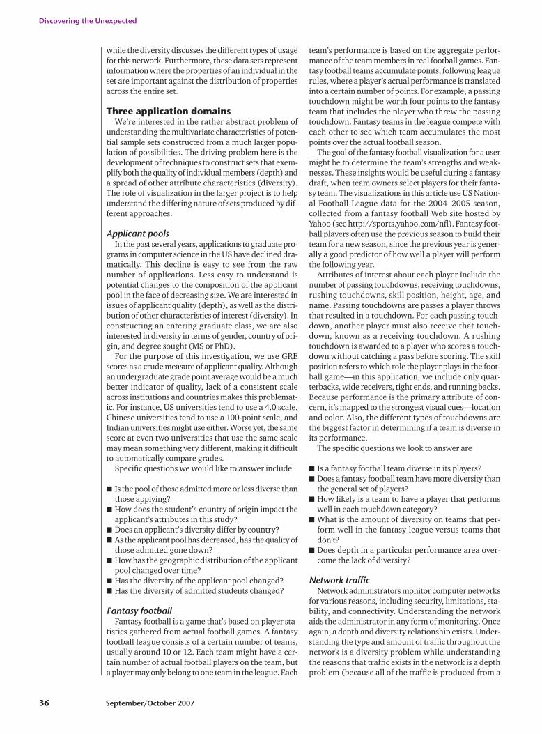
The most intuitive and direct scale application is inthe football example visualization where we map theplayer’s height to the glyph’s y-axis scaling. In this way,a player’s height is mapped to the glyph’s height. Weselected the value 5.0 as the minimum attribute value,because there’s no player in the National FootballLeague who’s less than five feet tall. A five-foot-tall play-er will have a scale factor of 0.5; a six-foot player will berepresented by an unscaled glyph (y scalei � 1.0).
Figure 2 shows glyphs with height mapped to the y-axis scale for several players in the NFL, with a legendbelow. The three players that the glyphs represent arePeyton Manning (with a height of 6’5”), Roy Williams(with a height of 6’2”), and Jamal Lewis (with a heightof 5’11”). It’s straightforward to interpret the glyphheight to see the player’s height.
Opacity. Another attribute value is mapped to theglyph’s opacity. To achieve this mapping, a glyph’s alphavalue is altered according to the represented object’sattribute value. The lower the alpha value, the lighterthe glyph will appear. When using this technique, it’simportant to adjust minimum values in the formula sothat relevant attribute values are still noticeable in thevisualization. If an alpha value of zero is applied to aglyph, the glyph will no longer be visible. The generalformula used to calculate the opacity is opacityi � 1 �(vi � vmin)/P, where P is the largest value that keeps theopacity scale factor above zero for the entire data set.
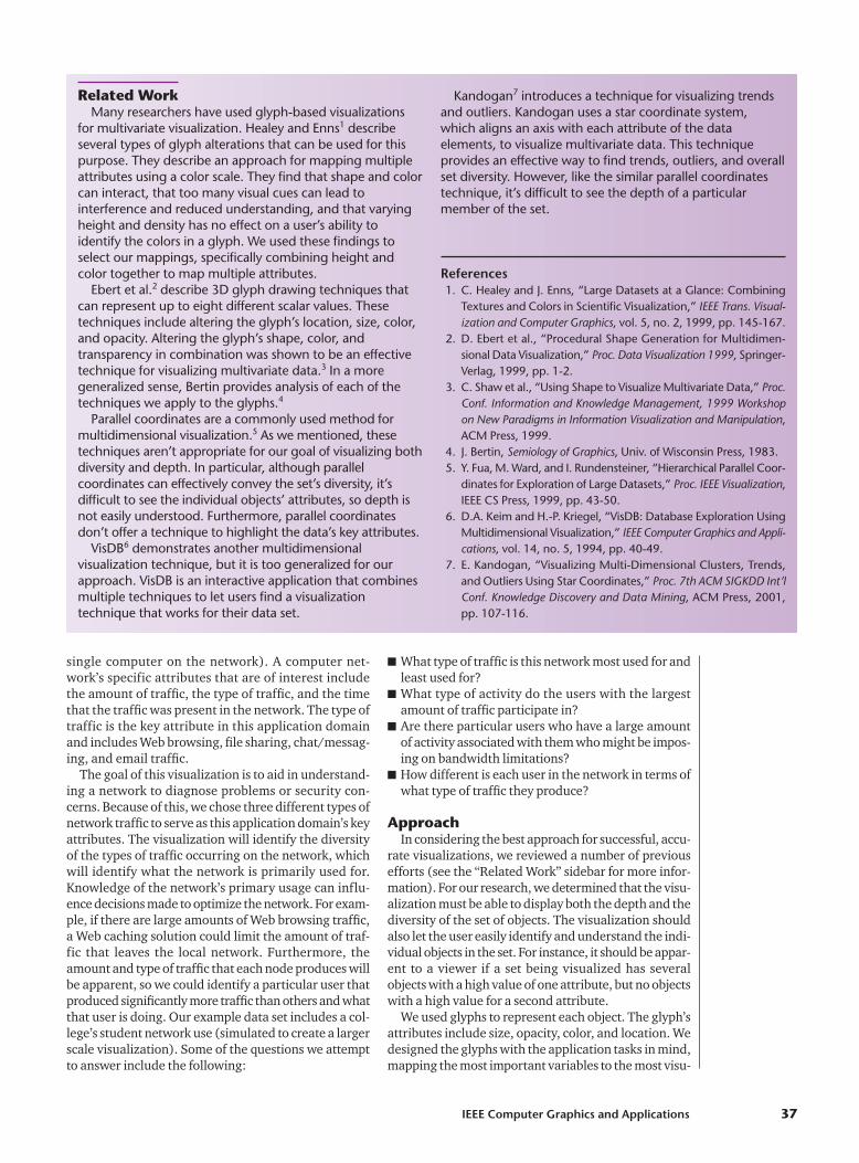
For the football data set, age is mapped to the glyph’sopacity. As the player gets older, the glyph loses opaci-ty, giving the effect of older players fading out. Youngerplayers will have large alpha values. By mapping age toopacity, a scale factor of one or greater will show theglyph with full opacity so that any player of age 20 (theminimum value, or vmin, for this data set) or less will bedisplayed with full opacity. For the football visualiza-tion, P was set to 28, meaning that any player less than48 years will be shown with some opacity. A player aged48 or older will be too old to be seen in the visualization,but there has never yet been a player that old in the NFL.
Figure 3 shows examples of three different players withtheir ages mapped to opacity. Peyton Manning was bornin 1976. Drew Bledsoe, the oldest player in this example,was born in 1972. Finally, Roy Williams was born in 1981and is the youngest player in this example. Roy Williams’glyph representation is rendered with a full opacity.
Color mapping. Color mapping represents threedifferent attributes. Each of the three attributes altersthe value of one of the color values: red, green, or blue.A large attribute value creates a strong value of therespective color. Color and position are the most visu-ally obvious techniques in this article so they should bemapped to important attributes. We normalize the
2 Three players with varying heights.
3 Three different players showing the age to opacity mapping.
IEEE Computer Graphics and Applications 39
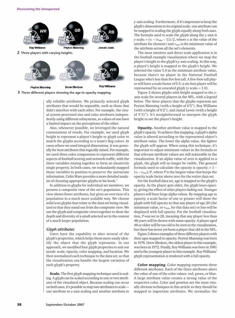
general formula for mapping eachcolor value to the largest value in theset as colori�glyph color � (vi /vmax).The formula is additive in that itdoesn’t take color away from a pixelvalue, so a strongly colored glyphwould produce poor results. In fact,a base glyph with low color valuesproduces the best results because itallows for a wider range of values tobe mapped to it.
One of the key attributes in the fantasy football visu-alization is the number of touchdowns. Three types oftouchdowns are possible (passing, rushing, and receiv-ing), so we map these to three different colors. Passingtouchdowns are mapped to green, receiving touch-downs to blue, and rushing touchdowns to red. Forexample, the intensity of green in the glyph will increaseas the player that the glyph represents gets more pass-ing touchdowns.
Figure 4 shows three different players who each par-ticipate primarily in a different touchdown category.Roy Williams, who is represented by a blue glyph,caught eight receiving touchdowns in the 2004–2005season. Since he got nearly half of the receiving touch-downs of the player who got the maximum number ofreceiving touchdowns, his glyph representation hasbeen increased by around half of the total blue valueavailable for each pixel. Peyton Manning, representedby the green glyph, receives a maximum green colorvalue for each pixel in the glyph because Manning’s 49touchdown passes in the 2004–2005 season was themost by any player. Jamal Lewis got seven rushingtouchdowns in the 2004–2005 season, which is less thanhalf of the maximum number of rushing touchdowns.His glyph representation has a noticeably weaker color-ing than Manning’s.
We chose a multivariate color scale to represent thedifferent methods of scoring touchdowns to allow forplayers who score touchdowns using multiple methods.Generally, a quarterback only produces passing touch-downs, a running back rushing touchdowns, and widereceivers and tight ends receiving touchdowns. Howev-er, sometimes a quarterback not only throws for touch-downs, but also rushes for touchdowns. Although rare,this information is valuable for a fantasy team owner,as the fantasy team will receive points for both passingand rushing touchdowns from that player. By using themultivariate RGB scale, it’s possible to see a player thatreceives touchdowns in multiple categories. In anextreme (and very unlikely) case, a glyph that’s com-pletely white would indicate maximum color values ineach touchdown category because every value of theRGB scale would be maximized. Figure 4 includes a play-er (Michael Vick) who had both passing and rushingtouchdowns in the 2004–2005 season, although he hadmore passing touchdowns than receiving touchdowns.The brownish tint of the glyph indicates that there issome red value in the glyph, but the overall color stillappears more on the green side, indicating that thisplayer’s primary method of scoring touchdowns isthrough the air.
Location. Location is another strong visual cue. Wedesigned this project to produce a 2D visualization, butit has three key attributes to visualize. These key attrib-utes are mapped to the RGB color scale. However, toemphasize these attributes more, and to aid in showingdiversity among different object sets, these key attrib-utes are redundantly mapped to location and color.
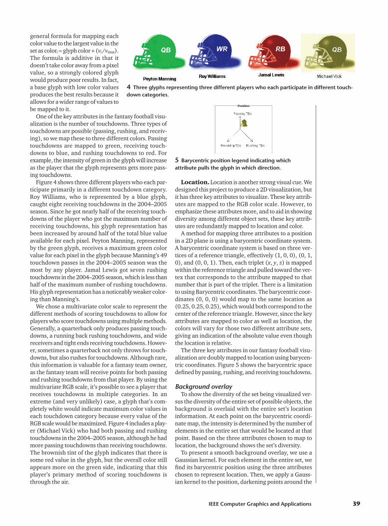
A method for mapping three attributes to a positionin a 2D plane is using a barycentric coordinate system.A barycentric coordinate system is based on three ver-tices of a reference triangle, effectively (1, 0, 0), (0, 1,0), and (0, 0, 1). Then, each triplet (x, y, z) is mappedwithin the reference triangle and pulled toward the ver-tex that corresponds to the attribute mapped to thatnumber that is part of the triplet. There is a limitationto using Barycentric coordinates. The barycentric coor-dinates (0, 0, 0) would map to the same location as(0.25, 0.25, 0.25), which would both correspond to thecenter of the reference triangle. However, since the keyattributes are mapped to color as well as location, thecolors will vary for those two different attribute sets,giving an indication of the absolute value even thoughthe location is relative.
The three key attributes in our fantasy football visu-alization are doubly mapped to location using barycen-tric coordinates. Figure 5 shows the barycentric spacedefined by passing, rushing, and receiving touchdowns.
Background overlayTo show the diversity of the set being visualized ver-
sus the diversity of the entire set of possible objects, thebackground is overlaid with the entire set’s locationinformation. At each point on the barycentric coordi-nate map, the intensity is determined by the number ofelements in the entire set that would be located at thatpoint. Based on the three attributes chosen to map tolocation, the background shows the set’s diversity.
To present a smooth background overlay, we use aGaussian kernel. For each element in the entire set, wefind its barycentric position using the three attributeschosen to represent location. Then, we apply a Gauss-ian kernel to the position, darkening points around the
4 Three glyphs representing three different players who each participate in different touch-down categories.
5 Barycentric position legend indicating whichattribute pulls the glyph in which direction.
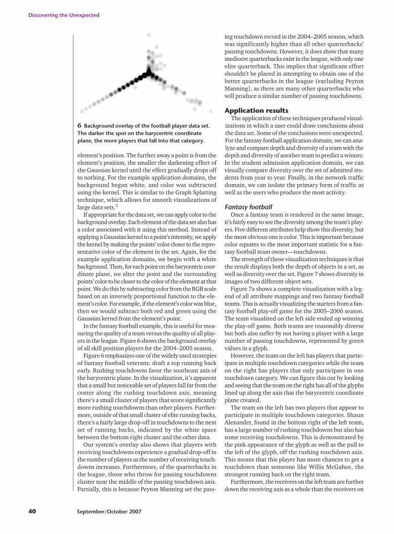
element’s position. The further away a point is from theelement’s position, the smaller the darkening effect ofthe Gaussian kernel until the effect gradually drops offto nothing. For the example application domains, thebackground began white, and color was subtractedusing the kernel. This is similar to the Graph Splattingtechnique, which allows for smooth visualizations oflarge data sets.2
If appropriate for the data set, we can apply color to thebackground overlay. Each element of the data set also hasa color associated with it using this method. Instead ofapplying a Gaussian kernel to a point’s intensity, we applythe kernel by making the points’ color closer to the repre-sentative color of the element in the set. Again, for theexample application domains, we begin with a whitebackground. Then, for each point on the barycentric coor-dinate plane, we alter the point and the surroundingpoints’ color to be closer to the color of the element at thatpoint. We do this by subtracting color from the RGB scalebased on an inversely proportional function to the ele-ment’s color. For example, if the element’s color was blue,then we would subtract both red and green using theGaussian kernel from the element’s point.
In the fantasy football example, this is useful for mea-suring the quality of a team versus the quality of all play-ers in the league. Figure 6 shows the background overlayof all skill position players for the 2004–2005 season.
Figure 6 emphasizes one of the widely used strategiesof fantasy football veterans: draft a top running backearly. Rushing touchdowns favor the southeast axis ofthe barycentric plane. In the visualization, it’s apparentthat a small but noticeable set of players fall far from thecenter along the rushing touchdown axis, meaningthere’s a small cluster of players that score significantlymore rushing touchdowns than other players. Further-more, outside of that small cluster of elite running backs,there’s a fairly large drop-off in touchdowns to the nextset of running backs, indicated by the white spacebetween the bottom right cluster and the other data.
Our system’s overlay also shows that players withreceiving touchdowns experience a gradual drop-off inthe number of players as the number of receiving touch-downs increases. Furthermore, of the quarterbacks inthe league, those who throw for passing touchdownscluster near the middle of the passing touchdown axis.Partially, this is because Peyton Manning set the pass-
ing touchdown record in the 2004–2005 season, whichwas significantly higher than all other quarterbacks’passing touchdowns. However, it does show that manymediocre quarterbacks exist in the league, with only oneelite quarterback. This implies that significant effortshouldn’t be placed in attempting to obtain one of thebetter quarterbacks in the league (excluding PeytonManning), as there are many other quarterbacks whowill produce a similar number of passing touchdowns.
Application resultsThe application of these techniques produced visual-
izations in which a user could draw conclusions aboutthe data set. Some of the conclusions were unexpected.For the fantasy football application domain, we can ana-lyze and compare depth and diversity of a team with thedepth and diversity of another team to predict a winner.In the student admission application domain, we canvisually compare diversity over the set of admitted stu-dents from year to year. Finally, in the network trafficdomain, we can isolate the primary form of traffic aswell as the users who produce the most activity.
Fantasy footballOnce a fantasy team is rendered in the same image,
it’s fairly easy to see the diversity among the team’s play-ers. Five different attributes help show this diversity, butthe most obvious one is color. This is important becausecolor equates to the most important statistic for a fan-tasy football team owner—touchdowns.
The strength of these visualization techniques is thatthe result displays both the depth of objects in a set, aswell as diversity over the set. Figure 7 shows diversity inimages of two different object sets.
Figure 7a shows a complete visualization with a leg-end of all attribute mappings and two fantasy footballteams. This is actually visualizing the starters from a fan-tasy football play-off game for the 2005–2006 season.The team visualized on the left side ended up winningthe play-off game. Both teams are reasonably diversebut both also suffer by not having a player with a largenumber of passing touchdowns, represented by greenvalues in a glyph.
However, the team on the left has players that partic-ipate in multiple touchdown categories while the teamon the right has players that only participate in onetouchdown category. We can figure this out by lookingand seeing that the team on the right has all of the glyphslined up along the axis that the barycentric coordinateplane created.
The team on the left has two players that appear toparticipate in multiple touchdown categories. ShaunAlexander, found in the bottom right of the left team,has a large number of rushing touchdowns but also hassome receiving touchdowns. This is demonstrated bythe pink appearance of the glyph as well as the pull tothe left of the glyph, off the rushing touchdown axis.This means that this player has more chances to get atouchdown than someone like Willis McGahee, thestrongest running back on the right team.
Furthermore, the receivers on the left team are furtherdown the receiving axis as a whole than the receivers on
Discovering the Unexpected
40 September/October 2007
6 Background overlay of the football player data set.The darker the spot on the barycentric coordinateplane, the more players that fall into that category.

the right team, meaning the teamon the left also has advantagewhen comparing receivers. Oddlyenough, neither championshipteam has a player who performsrelatively well in the passing touch-down category, implying that hav-ing a good quarterback isn’t soimportant to field a winning team.This unexpected discovery hasimplications for standard fantasyfootball drafting strategies that pri-marily focus on getting a runningback, but also have quarterbacksbeing taken in the first round.
The left set of Figure 7b showsan example of a set which isn’t verydiverse, as there are no glyphs nearthe right of the triangle or any redcolor in the image. For the footballdata set example, this means theteam is lacking rushing touch-downs. Furthermore, it’s easy tosee depth of an individual object.For example, in Figure 7a, the leftimage has one glyph that standsout among the other glyphs in thebottom left corner. Because thisglyph is in the bottom left of theimage and has a high blue value, itindicates that this player scores a large number of receiving touch-downs.
Figure 7b shows another com-plete visualization of two fantasyteams. The left team represents afantasy football team in last place.Notice the lack of diversity thatthe left team has, that could havepredicted the team’s performance.
In fact, the left team has a lackof rushing touchdowns, repre-sented by no red values in theimage and no glyphs movedtoward the right triangle’s vertex.The left team has a stronger set ofplayers who have larger values ofreceiving touchdowns but thiswasn’t enough to keep the teamout of last place.
This team would have done well to make some rostermoves to find a player with some rushing touchdowns,possibly at the expense of trading some of its receivers(for example, gaining some red and losing some blue).In fact, good running backs are commonly consideredthe key to a successful fantasy football team, thanks totheir consistence and rarity.
The right team represents a more diverse team, butyou’ll notice it has only a few deep players, who havelarge numbers in a particular touchdown area. Theteam also has a good example of an older player(Jerome Bettis) who still performed well; see the bot-
tom right corner of Figure 7b. In fact, Bettis is thedeepest player on this team, but his age is catching upwith him, and he’s currently not performing as well inthe 2005–2006 season as he did in the 2004–2005 sea-son, which this visualization shows. The team on theright did outperform the team on the left over the sea-son, and they’re looking at a finish somewhere in themiddle of the league. Perhaps recognizing that thedeepest player on the team is getting old by looking atthis visualization could alert this team to look to thefuture by finding younger players who could eventu-ally perform well.
IEEE Computer Graphics and Applications 41
7 (a) Complete visualization showing a legend of all attribute mappings of two fantasy teams.The team on the left ended up winning first place in a fantasy football league. (b) Completevisualization of two other fantasy teams. The team on the left represents a fantasy football teamin last place.
(a)
(b)

Applicant poolsThe glyph and overlay views help answer questions
about changing depth and diversity in the applicantpool. Figure 8a shows all students admitted in Fall1999. The system represents each admitted studentwith a glyph: squares for men and triangles for women.Glyphs for PhD students are larger than those for MSstudents. Each student glyph is colored by the students’country of origin: blue for the US, red for China, greenfor India, and yellow for all others. Applicants’ GREscores are mapped to barycentric coordinates: south-east for quantitative, southwest for verbal, and northfor analytic. Students with higher composite GREscores are more opaque.
The glyph cluster in the center of the display repre-sents a group of domestic applicants with balancedscores on the three parts of the GRE. Students fromChina (red), India (green), and especially other coun-tries (yellow) are more likely to have higher quantita-tive GRE scores. Male students predominate throughthis group, particularly among domestic students. Fig-ure 8b shows that same group of admitted studentsagainst the backdrop of all applicants. The characteris-tics of this group generally mirror those of the admit-
ted group, but applicants with extremely unbalancedscores seem less likely to be admitted.
Figure 9 shows differing depth and diversity charac-teristics of applications from different countries of ori-gin. Applicants from the US (blue) are mostly men, butthey’re a mix of MS and PhD applicants. Applicants fromChina (red) almost invariably apply to the PhD program(big glyphs). Applicants from India (green) include alarger percentage of women and almost always applyto the MS program. Applicants from other countries(yellow) vary widely in depth (composite GRE scoresare mapped to opacity).
Figure 10 shows the changing nature of the applicantpool during the 1999–2004 period. In the first year,applicants from China (red) are well represented. In themiddle years, applicants from India (green) predomi-nate. Toward the end of this window, applicants fromthe US (blue) become more numerous.
Figure 11 on page 44 shows the changing nature ofthe set of admitted students from the period of1999–2004. The set of admitted students tips fromChina, to India, to the US. During the years India dom-inates, students were comparatively more likely to beMS-seeking and more likely to be women.
Discovering the Unexpected
42 September/October 2007
8 Students admitted in Fall 1999. (a) Glyphs for admitted students. (b) Background shows the entire applicantpool.
(a) (b)
9 Characteristics of applicants by country of origin (same mappings as in Figure 8). (a) Applicants originatingfrom the US, (b) China, (c) India, and (d) other countries.
(a) (b)
(c) (d)
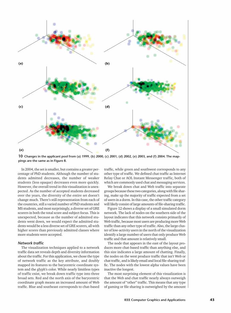
In 2004, the set is smaller, but contains a greater per-centage of PhD students. Although the number of stu-dents admitted decreases, the number of weakerstudents (less opaque) decreases even more quickly.However, the overall trend in this visualization is unex-pected. As the number of accepted students decreasedover the years, the diversity of the entire set doesn’tchange much. There’s still representation from each ofthe countries, still a varied number of PhD students andMS students, and most surprisingly, a diverse set of GREscorers in both the total score and subject focus. This isunexpected, because as the number of admitted stu-dents went down, we would expect the admitted stu-dents would be a less diverse set of GRE scorers, all withhigher scores than previously admitted classes wheremore students were accepted.
Network trafficThe visualization techniques applied to a network
traffic data set reveals depth and diversity informationabout the traffic. For this application, we chose the typeof network traffic as the key attribute, and doublymapped its features to the barycentric coordinate sys-tem and the glyph’s color. While nearly limitless typesof traffic exist, we break down traffic type into threebroad sets. Red and the north axis of the barycentriccoordinate graph means an increased amount of Webtraffic. Blue and southeast corresponds to chat-based
traffic, while green and southwest corresponds to anyother type of traffic. We defined chat traffic as InternetRelay Chat or AOL Instant Messenger traffic, both ofwhich are commonly used chat and messaging services.
We break down chat and Web traffic into separategroups because these two categories, along with file shar-ing, make up the majority of traffic expected from a setof users in a dorm. In this case, the other traffic categorywill likely consist of large amounts of file-sharing traffic.
Figure 12 shows a display of a small simulated dormnetwork. The lack of nodes on the southern side of thelayout indicates that this network consists primarily ofWeb traffic, because most users are producing more Webtraffic than any other type of traffic. Also, the large clus-ter of low-activity users in the north of the visualizationidentify a large number of users that only produce Webtraffic and that amount is relatively small.
The node that appears in the east of the layout pro-duces more chat-based traffic than anything else, andthis size indicates a large amount of chatting. Finally,the nodes on the west produce traffic that isn’t Web orchat traffic, and is likely email and local file-sharing traf-fic. The nodes with the lowest alpha values have beeninactive the longest.
The most surprising element of this visualization isthat the Web and chat traffic nearly always outweighthe amount of “other” traffic. This means that any typeof gaming or file sharing is outweighed by the amount
IEEE Computer Graphics and Applications 43
10 Changes in the applicant pool from (a) 1999, (b) 2000, (c) 2001, (d) 2002, (e) 2003, and (f) 2004. The map-pings are the same as in Figure 8.
(a) (b)
(c) (d)
(e) (f)

of chatting and Web browsing that most users do. Thefew nodes that are dominated by other traffic do pro-duce a high amount of activity, which is common whenusers are sharing larger files (such as audio or video).With peer-to-peer file sharing lawsuits making nation-al news in the past few years, we would expect to seelarger amounts of file sharing, which will push morenodes into the other traffic section.
Conclusions and future work Because each data set was of interest to at least one
of the authors, we self-evaluated the results of each
application domain. While we were able to draw con-clusions and identify unexpected results in our data sets,a formal evaluation would be more effective in showingthe usefulness of our techniques.
What we did succeed in doing with this project isvisualize both depth and diversity in each applicationdomain. In the fantasy football application, we wereable to infer a team’s quality based on the depth ofindividual players and the diversity of the set of play-ers in the league. Furthermore, viewing both the win-ning and losing teams’ results revealed trends thatcould help a fantasy football owner determine the beststrategy.
The student application visualization showed trendsover time. This helped us visualize data in multiple areas,including diversity by country, gender, the applicants’scores, and the quality of admitted applicant’s scores.
The network traffic application gave insight into whata network is being used for and what particular usersare doing. Finally, in each application, we found unex-pected discoveries by visualizing both the depth anddiversity of a set, which someone probably wouldn’t seeor notice using standard methods.
The limitations of this visualization are scalability,occlusion, and technique interference. In Figure 7b,some glyphs occlude the others. While the occlusiondoesn’t affect seeing the set’s diversity, it’s difficult tosee an occluded glyph’s depth. Also, if glyphs are occlud-
Discovering the Unexpected
44 September/October 2007
11 Changes in the admitted class from (a) 1999, (b) 2000, (c) 2001, (d) 2002, (e) 2003, and (f) 2004. The map-pings are the same as in Figure 8.
(a) (b)
(c) (d)
(e) (f)
12 Network visualization of depth and diversity. Com-puter glyphs represent each node. The color and loca-tion of the glyph describe the types of traffic producedby the node. The glyph size is the amount of traffic; theopacity represents how recently activity occurred.

ed, the importance of their depth is less relevant,because whichever glyph occluded it has nearly thesame properties. Occlusion is related to scalabilitybecause as the object set grows, so will the amount ofocclusion.
We should also note that we found that techniquessuch as color and opacity can interfere with each other.The lower the glyph’s alpha value, the more difficult itis to see varying color values.
A future extension is to apply focus � context tech-niques to improve the result’s scalability and reduceocclusion. Yang et al.3 saw similar scalability and occlu-sion issues in their value and relations work and usedvarious strategies to address those concerns. We couldapply their interactive navigation and selection tools tothis work to address the same concerns.3 Finally, webelieve that producing interactivity in the glyphs couldgive users access to more information.4 ■
References1. C. Ware, Information Visualization: Perception for Design,
Morgan Kaufmann, 2000. 2. R. Van Lier and W. De Leeuw, “Graphsplatting: Visualiz-
ing Graphs as Continuous Fields,” IEEE Trans. Visualiza-tion and Computer Graphics, vol. 9, no. 2, pp. 206-212.
3. J. Yang et al., “Value and Relation Display for InteractiveExploration of High-Dimensional Datasets,” Proc. IEEESymp. Information Visualization, IEEE CS Press, 2004, pp.73-80.
4. H. Siirtola, “The Effect of Data-Relatedness in InteractiveGlyphs,” Proc. 9th Int’l Conf. Information Visualization, IEEECS Press, 2005, pp. 869-876.
Jason Pearlman is a graduate stu-dent at the University of Maryland,Baltimore County (UMBC), where herecently received an MS. His currentresearch interests include multivari-ate and network security visualiza-tions. Contact Pearlman at [email protected].
Penny Rheingans is an associateprofessor of computer science atUMBC. Her current research interestsinclude volume rendering, informa-tion visualization, perceptual andillustration issues in visualization,and nonphotorealistic rendering.Rheingans received a PhD from the
University of North Carolina, Chapel Hill. Contact her [email protected].
Marie des Jardins is an associateprofessor of computer science atUMBC. Her research is in artificialintelligence, focusing on the areas ofmachine learning, multiagent sys-tems, planning, interactive artificialintelligence techniques, informationmanagement, reasoning with uncer-
tainty, and decision theory. Des Jardins has a PhD fromthe University of California, Berkeley. Contact her [email protected].
For further information on this or any other computingtopic, please visit our Digital Library at http://www.computer.org/publications/dlib.
IEEE Computer Graphics and Applications 45
■ Monthly updates highlight the latest additions to the digital library from all 23 peer-reviewed Computer Society periodicals.
■ New links access recent Computer Society conference publications.
■ Sponsors offer readers special deals on products and events.
Available for FREE to members, students, and computing professionals.
Visit http://www.computer.org/services/csdl_subscribe
For the IEEEComputer Society Digital Library E-Mail Newsletter
Sign
Up
Toda
y