Embed Size (px)
Citation preview

Visualizing the “Pulse” of World Cities on Twitter
Miguel Rios and Jimmy LinTwitter, Inc.
@miguelrios @lintool
Abstract
We present a large-scale analysis of activity on Twit-ter in 50 major cities around the world throughout allof 2012. Our study consists of two parts: First, we cre-ated heatmap visualizations, through which periods ofcomparatively intense and sparse activity are readilyapparent—these visual patterns reflect diurnal cycles,cultural norms, and even religious practices. Second,we performed a cluster analysis of these activity pat-terns to identify groupings of cities that are similar inthe ways their inhabitants use Twitter. Not surprisingly,cities cluster geographically, although we are able toidentify cross-cultural similarities as well.
Introduction
Twitter has become an indispensable communications plat-form through which hundreds of millions of users aroundthe world keep up with breaking news, share their thoughts,and connect with like-minded individuals, 140 charactersat a time. Aggregate patterns of user behavior on Twittertell us a lot about the “pulse” of the global conversation.In this paper, we present a case study examining tweet cre-ation activity for 50 cities around the world throughout all of2012. The analysis proceeds in two parts: First, we createdheatmap visualizations that show the intensity of Twitter ac-tivity in terms of time of day and day of year. From thesevisualizations, the “rhythm” of activities in major cities be-comes apparent: we see diurnal cycles of waking and sleep-ing, weekly cycles of work and play, large seasonal shiftsin behavior, and even activity patterns that stem from reli-gious practices. Not surprisingly, we see large differences inthese patterns in different parts of the world, reflecting cul-tural differences and the myriad ways that Twitter is used.In the second part of our analysis, we treated these activ-ity patterns as “fingerprints” of each city and performed aclustering analysis to quantify the similarities between indi-vidual cities and groups of cities; these results are visualizedin a dendrogram.
There are two reasons for presenting this work. First, webelieve that our results are intrinsically interesting, and wehave not seen large-scale analyses along these lines before.
Copyright c© 2013, Association for the Advancement of ArtificialIntelligence (www.aaai.org). All rights reserved.
Such analyses are very difficult to accomplish without ac-cess to all the data, since any sampled stream becomes toosparse when focusing only on specific geographic locations.In contrast, we have access to all tweets, and thus we areconfident that our findings are not artifacts introduced bydata sampling. Second, this work presents a case study illus-trating the role of visualization in data science. “Big data”and data science have gained prominence in both industryand academia, but most of the discussion revolves aroundefficient algorithms for analyzing terabytes to petabytes ofdata—for example, better join algorithms. We feel that visu-alization deserves a more prominent role in the discourse—after all, analyses on big data must eventually be presentedto humans for interpretation. Our case study serves as an ex-ample of transforming terabytes on disk to pixels on screen.
The Role of Visualizations
Let us first elaborate on the second point, the role of visual-izations in data science. Ultimately, the data scientist’s jobis to analyze massive amounts of data, interpret “what thedata say”, and distill the bits into actionable insights: whatweb site elements to refine, what features to develop, whatmarkets to pursue, etc. To accomplish this, data visualiza-tion is an indispensable tool. At a mundane level, this in-volves dashboards to enable stakeholders to browse throughlarge amounts of multi-dimensional data, including interac-tive “drill downs” and “roll ups”, overlaid with projectionsand other derived data.
Beyond simple dashboards, data scientists often buildone-off visualizations that are the result of a specific task,usually a business question. For example, in 2010 whenTwitter was outgrowing its datacenter footprint, we created acustom visualization that let engineers interactively examineserver utilization statistics along with network bandwidthusage in order to better optimize resource allocation.
Finally, we occasionally produce visualizations intendedfor public consumption, which are presented on Twitter’sblog. These are less intended to generate insights for thebusiness; rather, their primary purpose is to highlight the“pulse” of the global conversation on Twitter, often in re-action to major news events around the world.
Our study serves a combination of the second and thirdpurposes. User growth is an important priority for Twitter,and understanding patterns of activity is a pre-requisite to fa-
Proceedings of the Seventh International AAAI Conference on Weblogs and Social Media
717
cilitating growth. The visualizations and analyses we presenthere were part of efforts to better understand how Twitterusers behave in different parts of the world. Along the way,we discovered that many of our findings were intrinsicallyinteresting, and thus we have taken the additional step ofsharing our results with the community.
Data Preparation and Analysis
Data preparation consisted of analyzing all public tweetsposted in 2012 in our Hadoop-based data warehouse usingPig (Olston et al. 2008). A more detailed description of Twit-ter’s analytics infrastructure can be found in (Lin and Kolcz2012). Our analysis focused on the top 50 cities in terms ofTwitter users. We divided each day into 10 minute chunksand computed the number of tweets that were posted duringeach interval as a way of quantifying activity. The valueswere normalized between zero and one on a per day ba-sis. This is an important design decision because the totalnumber of tweets changes day to day and grows over time,but this treatment also results in a few artifacts in the visu-alizations, as we shall discuss. For each city, this gives us365× 24× 6 = 53560 data points.
City by City Observations
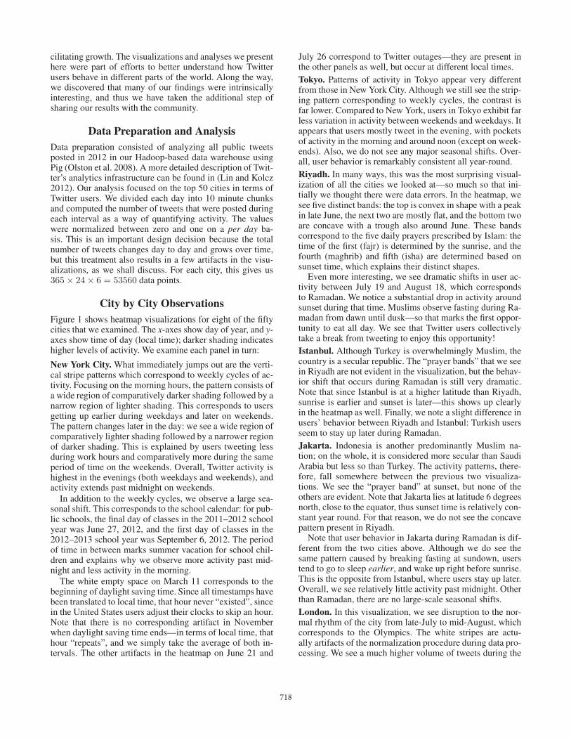
Figure 1 shows heatmap visualizations for eight of the fiftycities that we examined. The x-axes show day of year, and y-axes show time of day (local time); darker shading indicateshigher levels of activity. We examine each panel in turn:
New York City. What immediately jumps out are the verti-cal stripe patterns which correspond to weekly cycles of ac-tivity. Focusing on the morning hours, the pattern consists ofa wide region of comparatively darker shading followed by anarrow region of lighter shading. This corresponds to usersgetting up earlier during weekdays and later on weekends.The pattern changes later in the day: we see a wide region ofcomparatively lighter shading followed by a narrower regionof darker shading. This is explained by users tweeting lessduring work hours and comparatively more during the sameperiod of time on the weekends. Overall, Twitter activity ishighest in the evenings (both weekdays and weekends), andactivity extends past midnight on weekends.
In addition to the weekly cycles, we observe a large sea-sonal shift. This corresponds to the school calendar: for pub-lic schools, the final day of classes in the 2011–2012 schoolyear was June 27, 2012, and the first day of classes in the2012–2013 school year was September 6, 2012. The periodof time in between marks summer vacation for school chil-dren and explains why we observe more activity past mid-night and less activity in the morning.
The white empty space on March 11 corresponds to thebeginning of daylight saving time. Since all timestamps havebeen translated to local time, that hour never “existed”, sincein the United States users adjust their clocks to skip an hour.Note that there is no corresponding artifact in Novemberwhen daylight saving time ends—in terms of local time, thathour “repeats”, and we simply take the average of both in-tervals. The other artifacts in the heatmap on June 21 and
July 26 correspond to Twitter outages—they are present inthe other panels as well, but occur at different local times.Tokyo. Patterns of activity in Tokyo appear very differentfrom those in New York City. Although we still see the strip-ing pattern corresponding to weekly cycles, the contrast isfar lower. Compared to New York, users in Tokyo exhibit farless variation in activity between weekends and weekdays. Itappears that users mostly tweet in the evening, with pocketsof activity in the morning and around noon (except on week-ends). Also, we do not see any major seasonal shifts. Over-all, user behavior is remarkably consistent all year-round.Riyadh. In many ways, this was the most surprising visual-ization of all the cities we looked at—so much so that ini-tially we thought there were data errors. In the heatmap, wesee five distinct bands: the top is convex in shape with a peakin late June, the next two are mostly flat, and the bottom twoare concave with a trough also around June. These bandscorrespond to the five daily prayers prescribed by Islam: thetime of the first (fajr) is determined by the sunrise, and thefourth (maghrib) and fifth (isha) are determined based onsunset time, which explains their distinct shapes.
Even more interesting, we see dramatic shifts in user ac-tivity between July 19 and August 18, which correspondsto Ramadan. We notice a substantial drop in activity aroundsunset during that time. Muslims observe fasting during Ra-madan from dawn until dusk—so that marks the first oppor-tunity to eat all day. We see that Twitter users collectivelytake a break from tweeting to enjoy this opportunity!Istanbul. Although Turkey is overwhelmingly Muslim, thecountry is a secular republic. The “prayer bands” that we seein Riyadh are not evident in the visualization, but the behav-ior shift that occurs during Ramadan is still very dramatic.Note that since Istanbul is at a higher latitude than Riyadh,sunrise is earlier and sunset is later—this shows up clearlyin the heatmap as well. Finally, we note a slight difference inusers’ behavior between Riyadh and Istanbul: Turkish usersseem to stay up later during Ramadan.Jakarta. Indonesia is another predominantly Muslim na-tion; on the whole, it is considered more secular than SaudiArabia but less so than Turkey. The activity patterns, there-fore, fall somewhere between the previous two visualiza-tions. We see the “prayer band” at sunset, but none of theothers are evident. Note that Jakarta lies at latitude 6 degreesnorth, close to the equator, thus sunset time is relatively con-stant year round. For that reason, we do not see the concavepattern present in Riyadh.
Note that user behavior in Jakarta during Ramadan is dif-ferent from the two cities above. Although we do see thesame pattern caused by breaking fasting at sundown, userstend to go to sleep earlier, and wake up right before sunrise.This is the opposite from Istanbul, where users stay up later.Overall, we see relatively little activity past midnight. Otherthan Ramadan, there are no large-scale seasonal shifts.London. In this visualization, we see disruption to the nor-mal rhythm of the city from late-July to mid-August, whichcorresponds to the Olympics. The white stripes are actu-ally artifacts of the normalization procedure during data pro-cessing. We see a much higher volume of tweets during the
718

Figure 1: Heatmap visualizations of Twitter activity in eight cities around the world. The x-axes show day of year, and they-axes show time of day (local time); darker shading indicates higher levels of activity.
719

Figure 2: Hierarchical clustering of Twitter activity in 50 cities around the world.
Olympic events such that after normalization, all other timeblocks receive lighter shading in the heatmap.Buenos Aires. Here, we see two distinct periods, betweenend of February and mid-July, and between end of July andmid-December, where there is substantially more activity inthe mornings. This corresponds to the school schedule in thesouthern hemisphere, which, naturally, has opposite seasonscompared to the northern hemisphere. Correspondingly, thetime between those periods, we see greater activity later inthe evenings—in fact, extending far later into the early hoursof the morning. We see substantial activity until 3am andbeyond, local time.Rio de Janeiro. Just like for Buenos Aires, we see patternsof activity that reflect the school schedule in the southernhemisphere. Quite naturally, the two South American citieshave more similar activity patterns to each other than toother cities around the world.
Clustering Analysis
The heatmap visualizations allow us to manually examinethe activity “fingerprint” of each city. We followed up ourobservations with a more quantitative cluster analysis. Wetreated each temporal cell in the heatmap as a feature andperformed hierarchical clustering on the cities, using thecomplete linkage approach. The results are shown as a den-drogram in Figure 2.
The results confirm our visual analysis. We see nice clus-terings of cities in the same country: for example, Surabaya,Bandung, and Jakarta in Indonesia; Rio de Janeiro and SaoPaulo in Brazil; etc. What’s even more remarkable is thatfor cities in the United States, we see regional groupings—for example, the east coast cities Boston, New York, andPhiladelphia cluster together, as do the west coast cities SanFrancisco, Los Angeles, and Seattle. Based on visual obser-vation, all American cities basically look the same, so theclustering algorithm is picking up features that the eyes can-not detect. There are a few oddities in the cluster analysis—for example, the placement of Houston with other European
cities such as Madrid and Moscow and the placement ofLondon near Mexico City, Caracas, and Lima. Interestingly,the clustering tells us that Rio de Janeiro, Sao Paulo, BuenosAires, and Santiago, which are similar to each other, exhibitquite different activity patterns from Caracas, Lima, and Bo-gota, even though they are all South American cities.
Conclusions and Future WorkIn this paper, we present a case study where terabytes ofraw data (in this case, tweet creation times) are transformedinto visualizations that reveal a great deal about differencesin user behavior on Twitter in different cities. We see diur-nal cycles, weekly cycles, seasonal shifts, and other large-scale behavior pattern changes. These activity fingerprintsare then further analyzed by clustering. We note that none ofthese techniques are particularly sophisticated—heatmapsand dendrograms are well-known visualization tools. Thisgoes to show that insightful visualizations do not need to befancy: a data scientist simply needs to apply the right toolfor the job.
One area of future work is streamlining processes for cre-ating visualizations from big data. Currently, it is a very la-borious and error prone process, starting with Pig scripts thatrun on our Hadoop data warehouse to distill terabytes of rawdata into megabytes of refined features. From there, we needto move the data into a separate tool for the visualization.The clustering was performed with R, and final preparationof the image panels required Photoshop. All told, aroundhalf a dozen different tools must be brought to bear frombeginning to end. This is too complex and slow, and we as acommunity need to develop better integrated workflows forinsight generation.
ReferencesLin, J., and Kolcz, A. 2012. Large-scale machine learning at Twit-ter. SIGMOD.Olston, C.; Reed, B.; Srivastava, U.; Kumar, R.; and Tomkins, A.2008. Pig Latin: A not-so-foreign language for data processing.SIGMOD.
720