Embed Size (px)
Citation preview
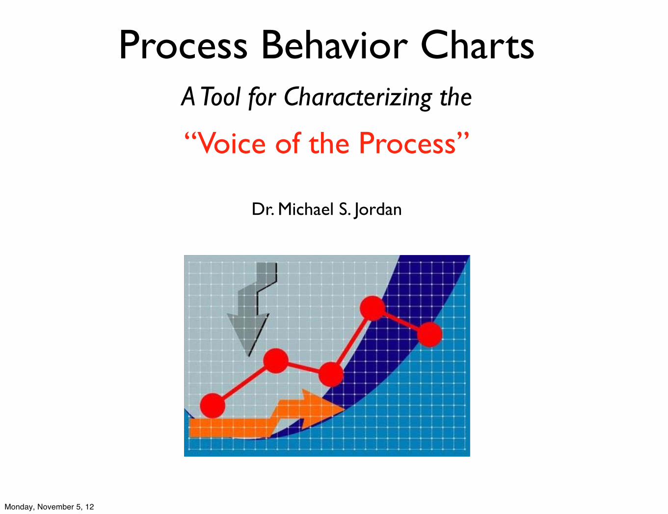
Process Behavior ChartsA Tool for Characterizing the
“Voice of the Process”
Dr. Michael S. Jordan
Monday, November 5, 12
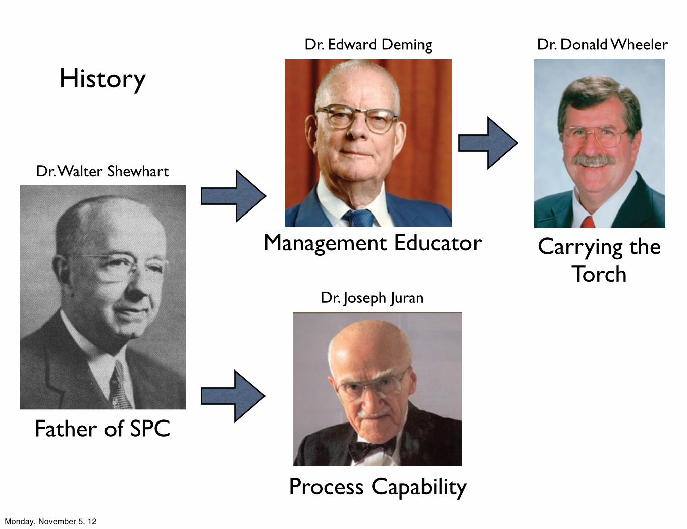
History
Father of SPC
Process Capability
Carrying the Torch
Management Educator
Dr. Walter Shewhart
Dr. Edward Deming Dr. Donald Wheeler
Dr. Joseph Juran
Monday, November 5, 12
Statistical Process Control is a way of thinking with a few tools attached. The computations are part of the techniques, but the real objective is insight, not numbers.
Monday, November 5, 12
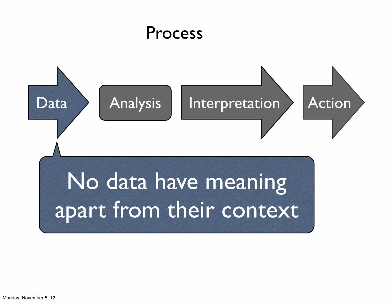
Data Analysis Interpretation
No data have meaning apart from their context
Action
Process
Monday, November 5, 12
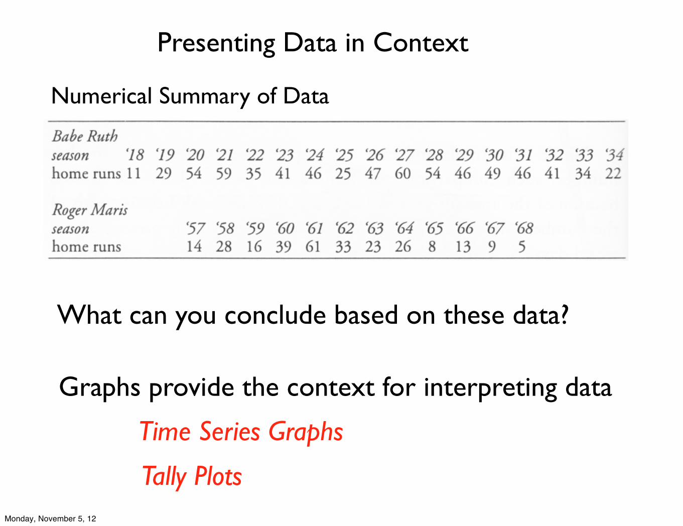
Presenting Data in Context
Numerical Summary of Data
What can you conclude based on these data?
Graphs provide the context for interpreting data
Time Series Graphs
Tally PlotsMonday, November 5, 12
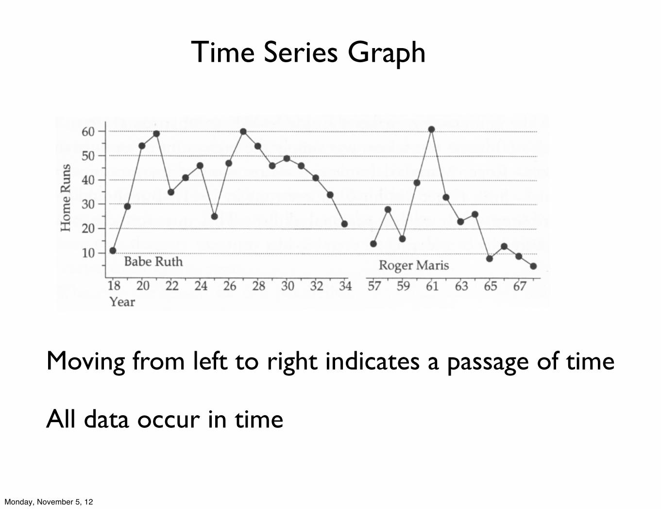
Time Series Graph
Moving from left to right indicates a passage of time
All data occur in time
Monday, November 5, 12
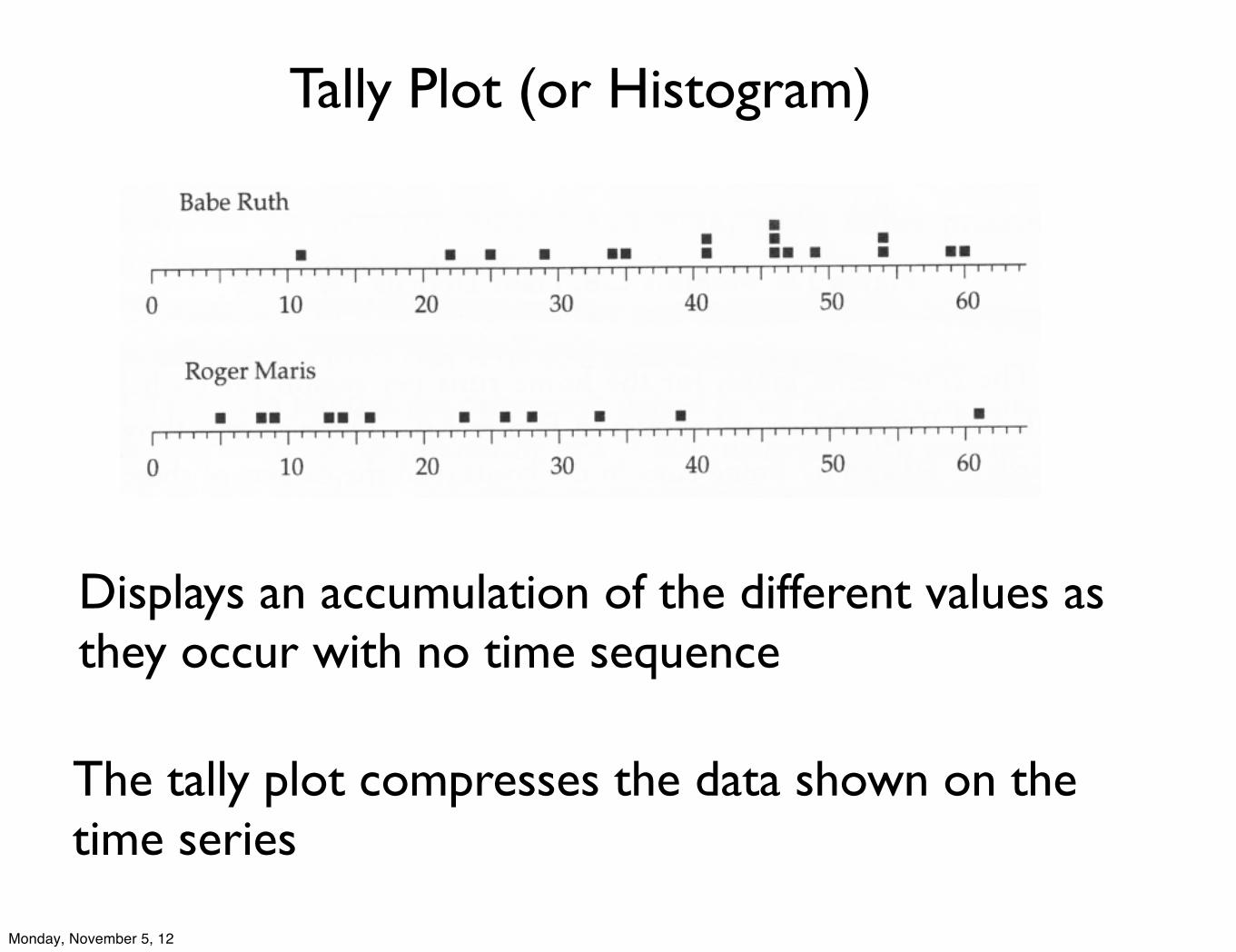
Tally Plot (or Histogram)
The tally plot compresses the data shown on the time series
Displays an accumulation of the different values as they occur with no time sequence
Monday, November 5, 12
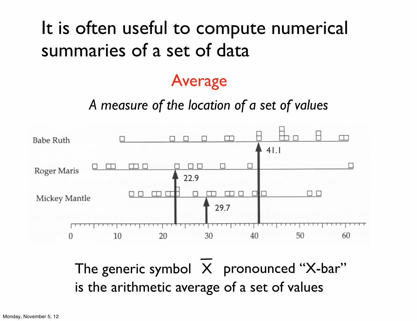
It is often useful to compute numerical summaries of a set of data
AverageA measure of the location of a set of values
XThe generic symbol “X-bar”pronouncedis the arithmetic average of a set of values
41.1
22.9
29.7
Analysis
Monday, November 5, 12
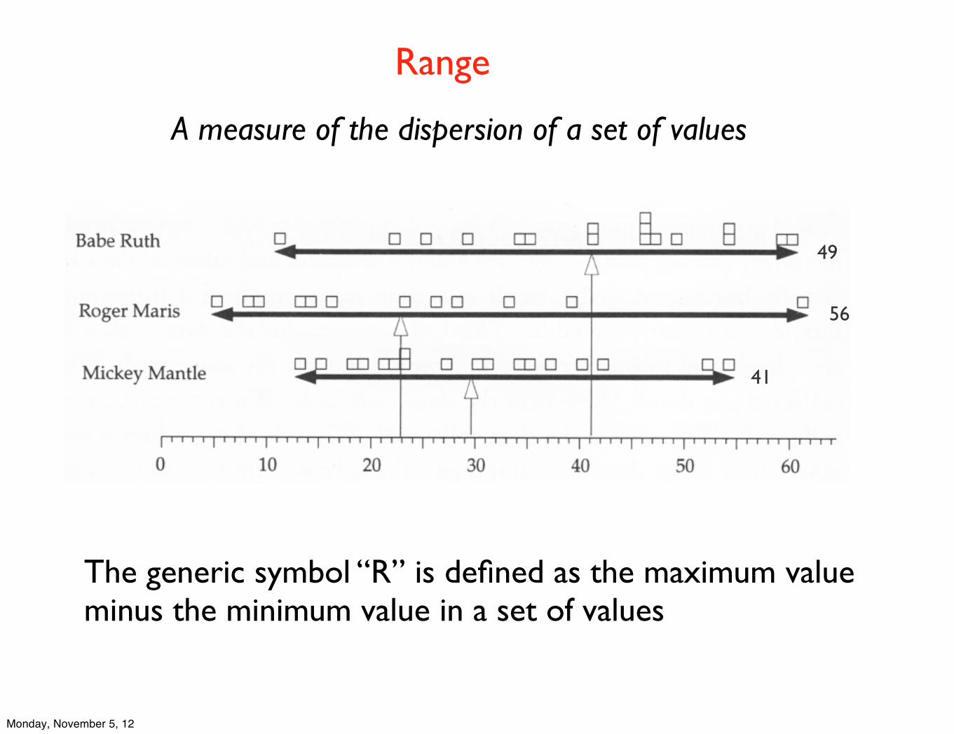
Range
A measure of the dispersion of a set of values
The generic symbol “R” is defined as the maximum value minus the minimum value in a set of values
49
56
41
Monday, November 5, 12
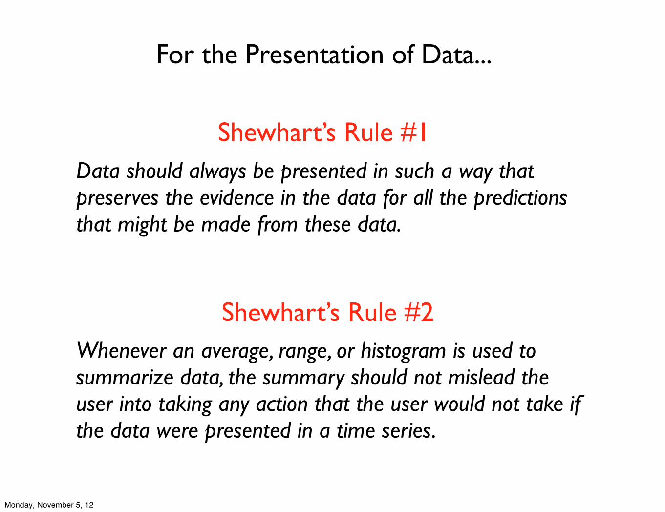
Shewhart’s Rule #1Data should always be presented in such a way that preserves the evidence in the data for all the predictions that might be made from these data.
Shewhart’s Rule #2
For the Presentation of Data...
Whenever an average, range, or histogram is used to summarize data, the summary should not mislead the user into taking any action that the user would not take if the data were presented in a time series.
Monday, November 5, 12
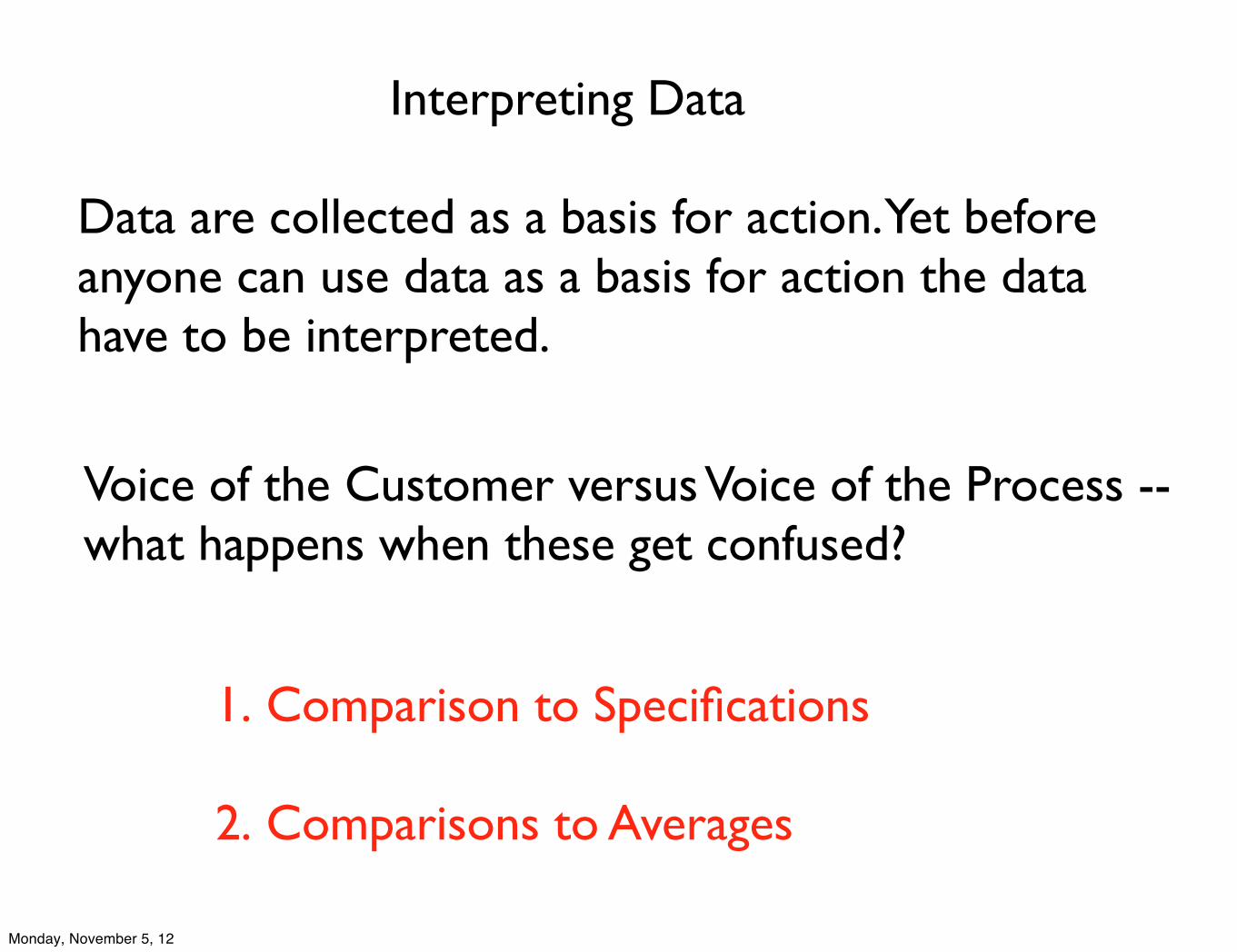
Interpreting Data
1. Comparison to Specifications
2. Comparisons to Averages
Data are collected as a basis for action. Yet before anyone can use data as a basis for action the data have to be interpreted.
Voice of the Customer versus Voice of the Process -- what happens when these get confused?
Monday, November 5, 12
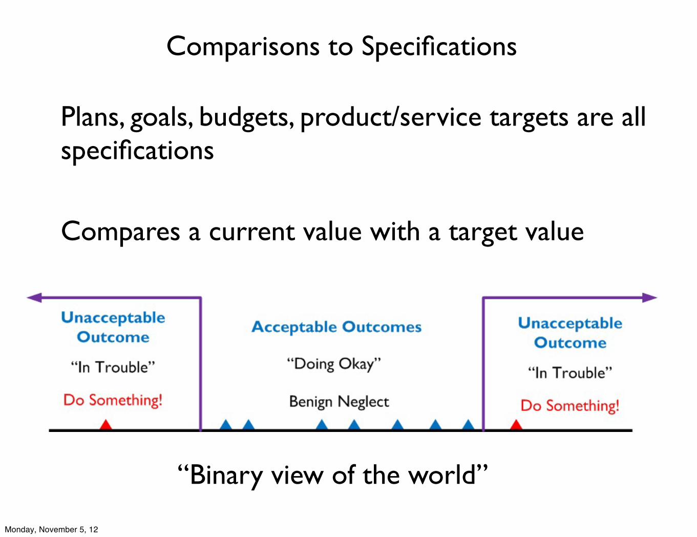
Comparisons to Specifications
Plans, goals, budgets, product/service targets are all specifications
Compares a current value with a target value
“Binary view of the world”
Monday, November 5, 12
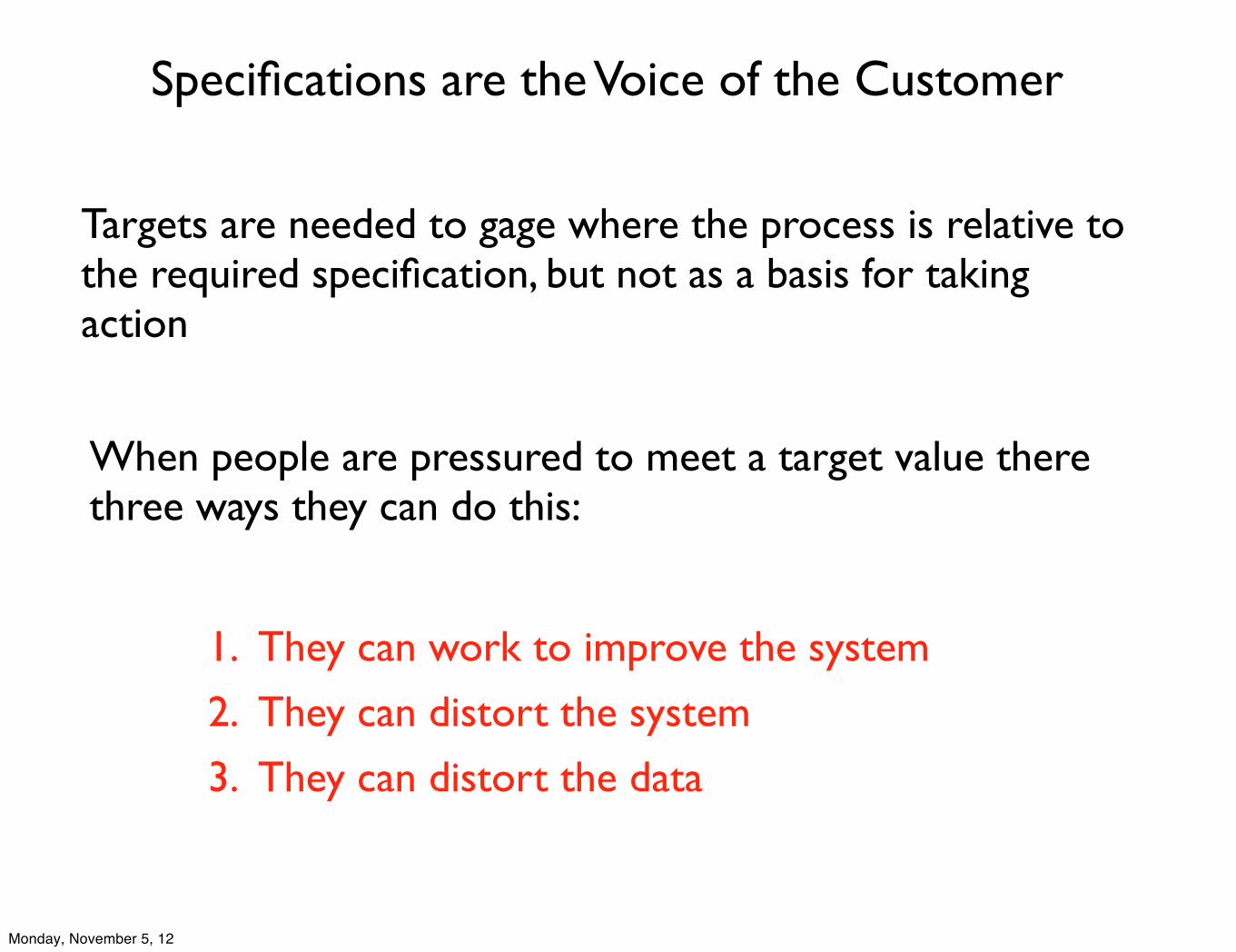
Specifications are the Voice of the Customer
Targets are needed to gage where the process is relative to the required specification, but not as a basis for taking action
When people are pressured to meet a target value there three ways they can do this:
1. They can work to improve the system
2. They can distort the system
3. They can distort the data
Monday, November 5, 12
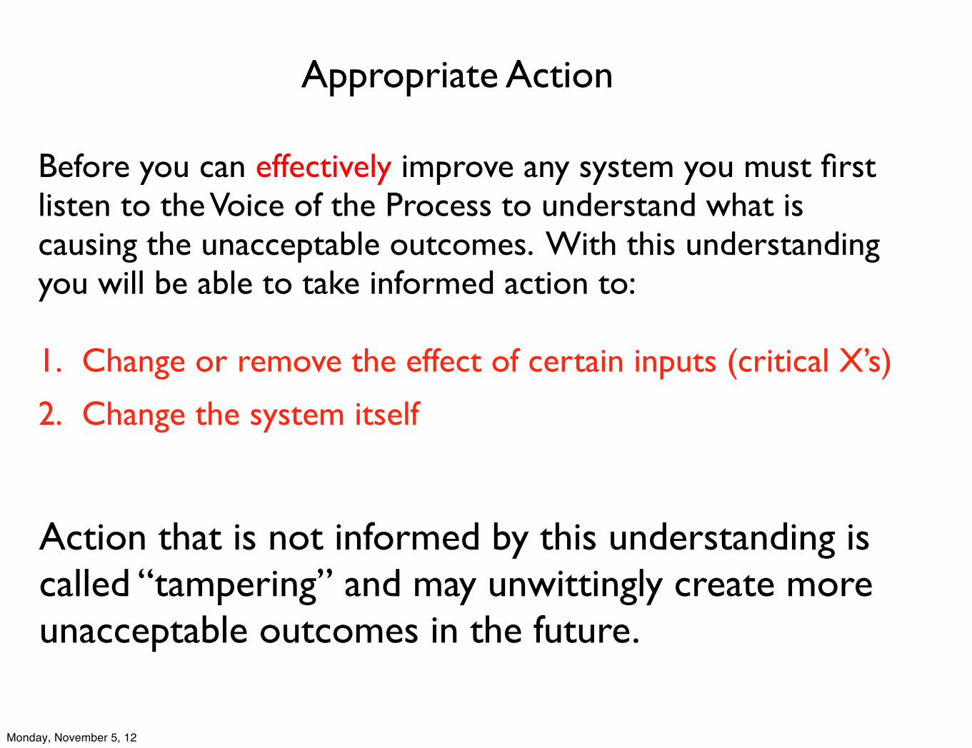
Before you can effectively improve any system you must first listen to the Voice of the Process to understand what is causing the unacceptable outcomes. With this understanding you will be able to take informed action to:
1. Change or remove the effect of certain inputs (critical X’s)
2. Change the system itself
Action that is not informed by this understanding is called “tampering” and may unwittingly create more unacceptable outcomes in the future.
Appropriate Action
Monday, November 5, 12
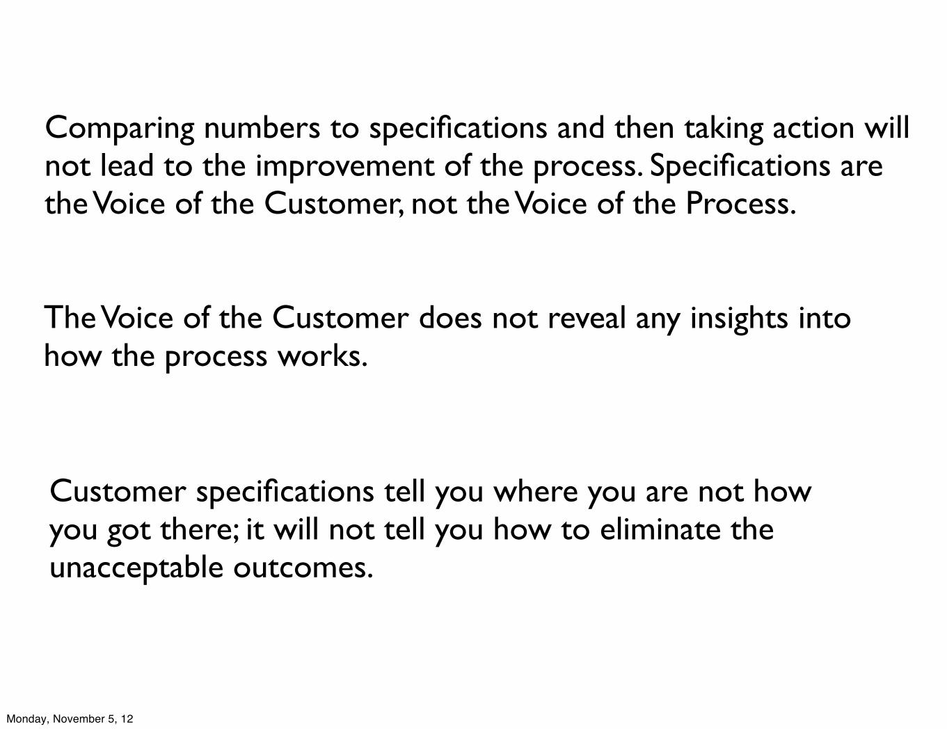
Comparing numbers to specifications and then taking action will not lead to the improvement of the process. Specifications are the Voice of the Customer, not the Voice of the Process.
The Voice of the Customer does not reveal any insights into how the process works.
Customer specifications tell you where you are not how you got there; it will not tell you how to eliminate the unacceptable outcomes.
Monday, November 5, 12
Comparisons to Averages
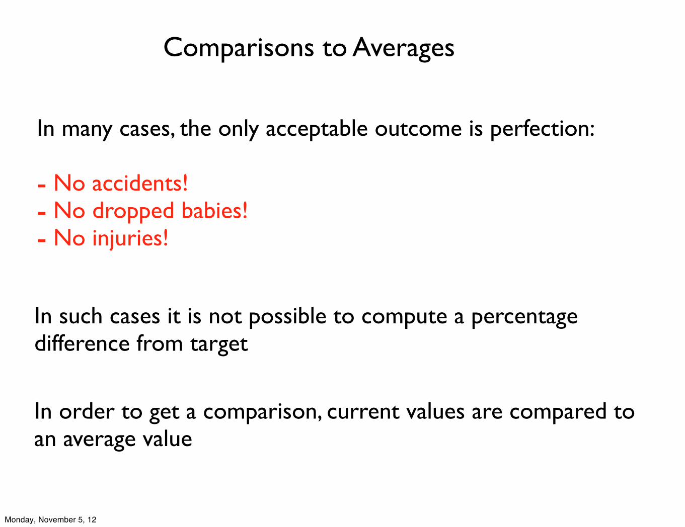
In many cases, the only acceptable outcome is perfection:
- No accidents!- No dropped babies!- No injuries!
In such cases it is not possible to compute a percentage difference from target
In order to get a comparison, current values are compared to an average value
Monday, November 5, 12
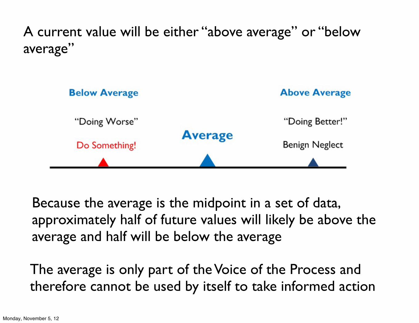
A current value will be either “above average” or “below average”
The average is only part of the Voice of the Process and therefore cannot be used by itself to take informed action
Because the average is the midpoint in a set of data, approximately half of future values will likely be above the average and half will be below the average
Monday, November 5, 12
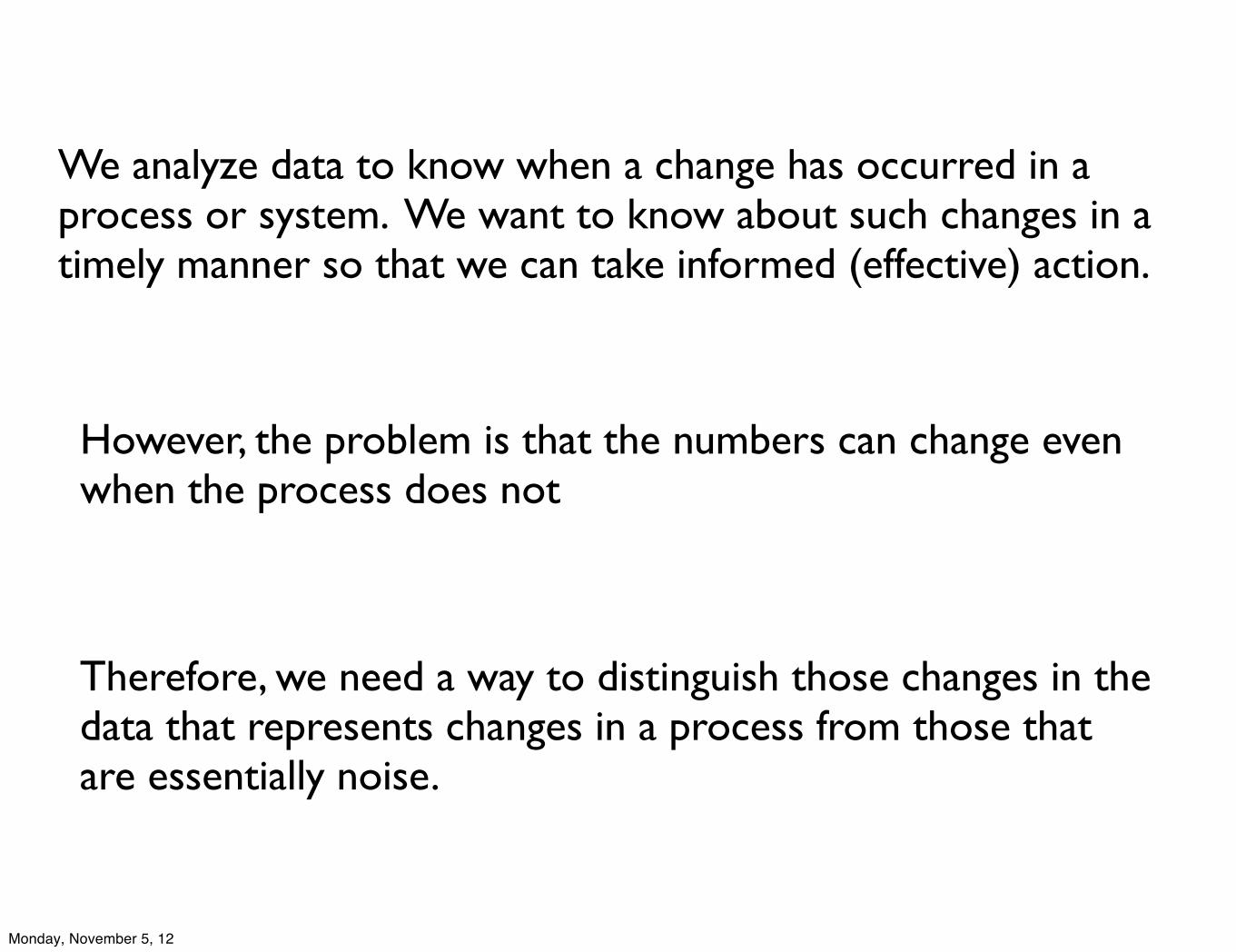
We analyze data to know when a change has occurred in a process or system. We want to know about such changes in a timely manner so that we can take informed (effective) action.
However, the problem is that the numbers can change even when the process does not
Therefore, we need a way to distinguish those changes in the data that represents changes in a process from those that are essentially noise.
Monday, November 5, 12
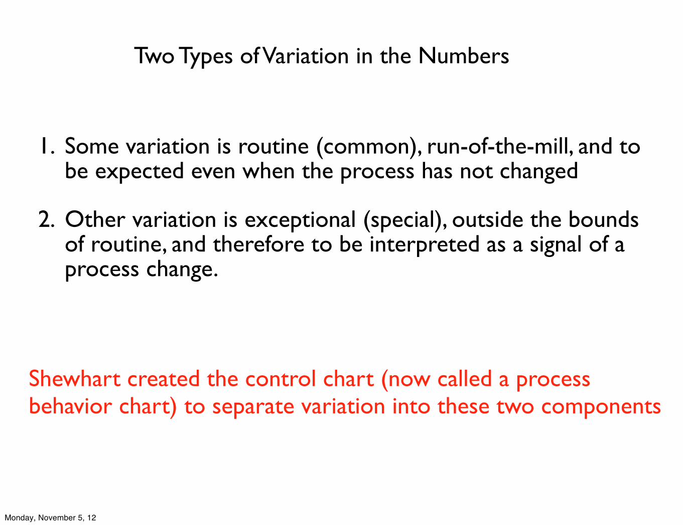
Two Types of Variation in the Numbers
1. Some variation is routine (common), run-of-the-mill, and to be expected even when the process has not changed
2. Other variation is exceptional (special), outside the bounds of routine, and therefore to be interpreted as a signal of a process change.
Shewhart created the control chart (now called a process behavior chart) to separate variation into these two components
Monday, November 5, 12
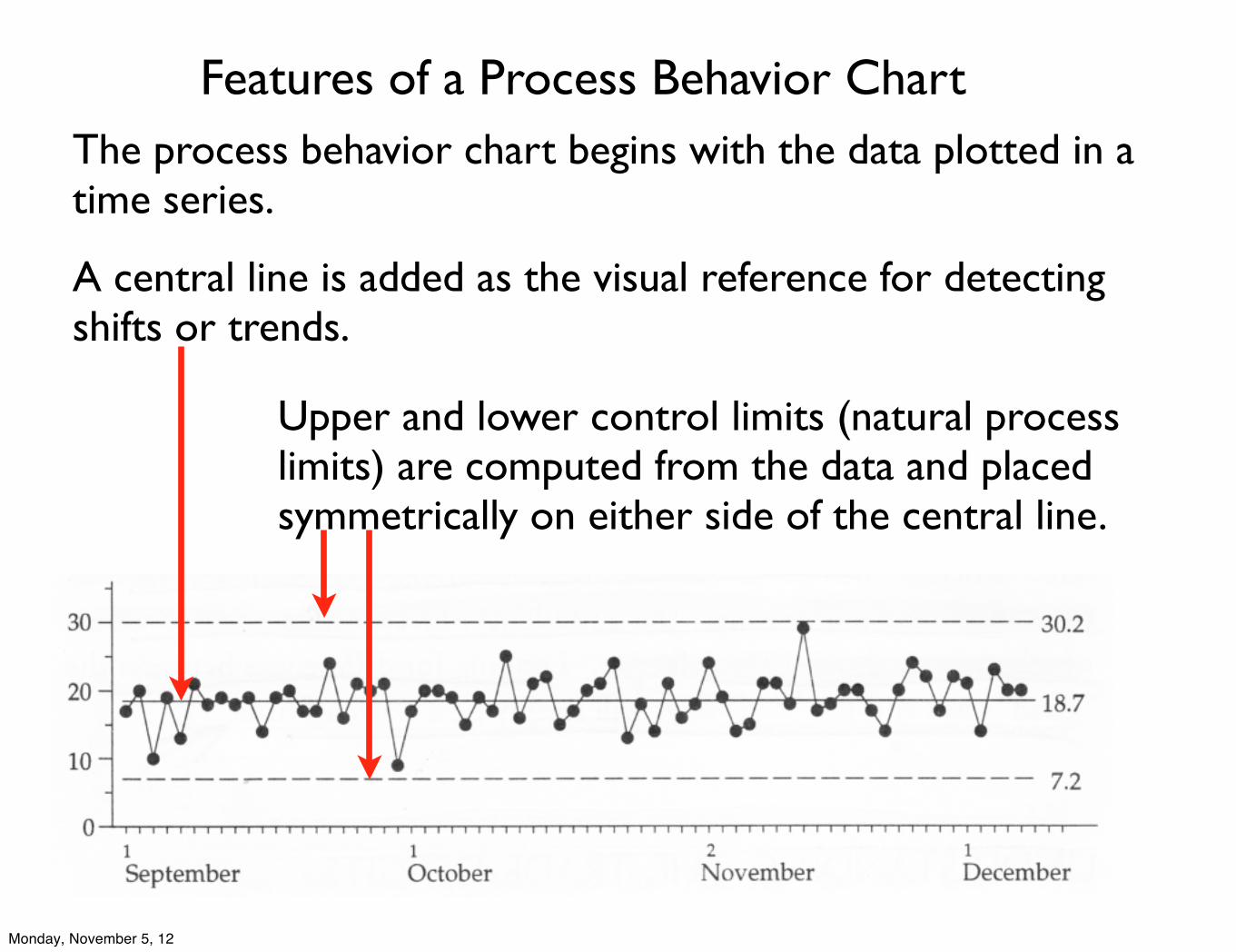
The process behavior chart begins with the data plotted in a time series.
A central line is added as the visual reference for detecting shifts or trends.
Upper and lower control limits (natural process limits) are computed from the data and placed symmetrically on either side of the central line.
Features of a Process Behavior Chart
Monday, November 5, 12
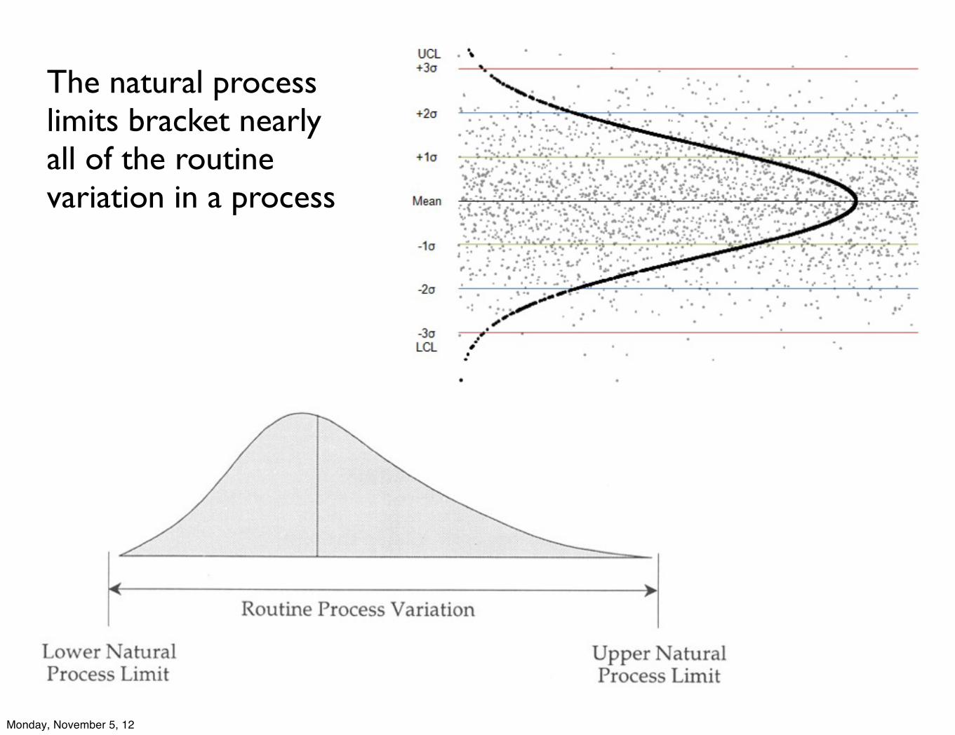
The natural process limits bracket nearly all of the routine variation in a process
Monday, November 5, 12
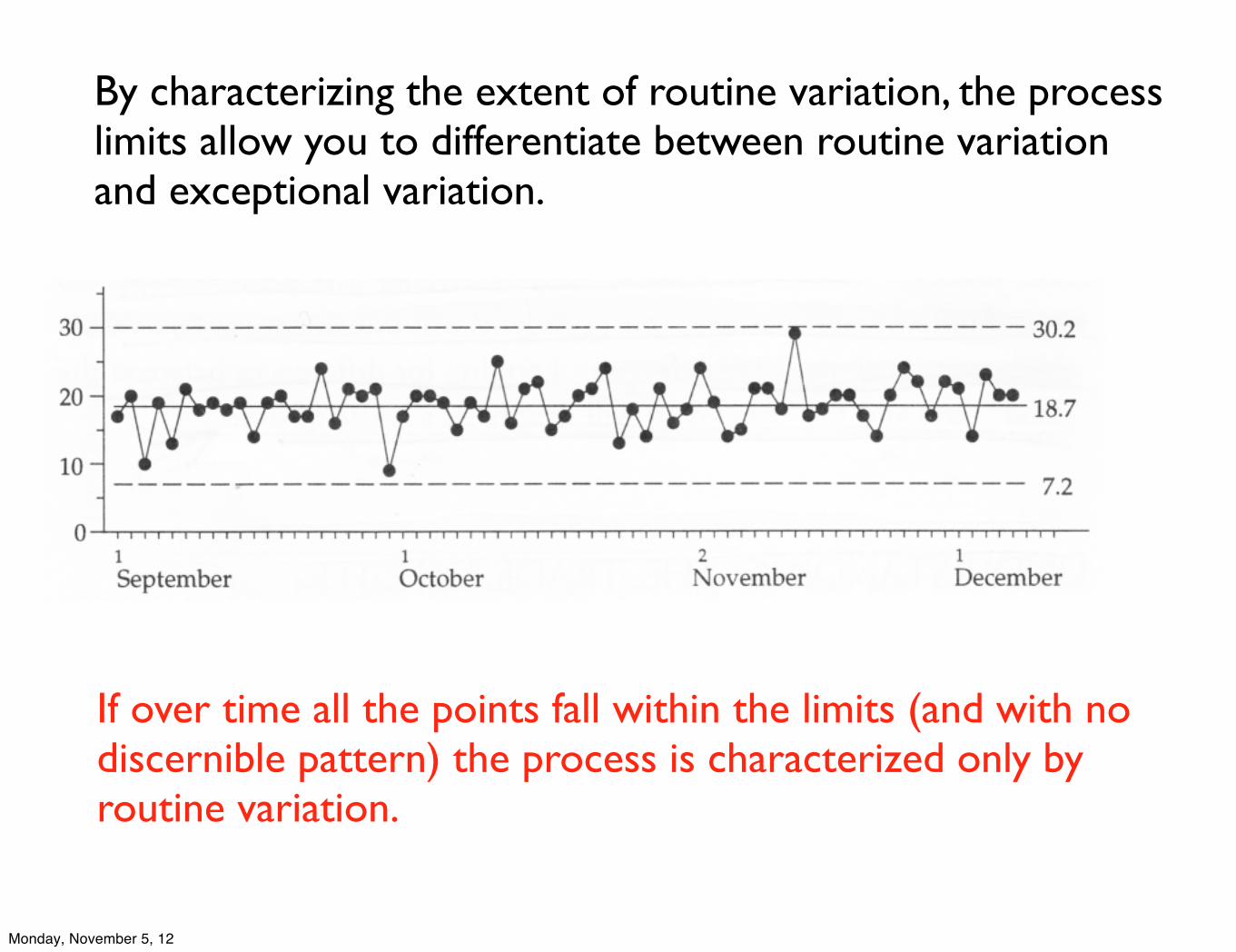
By characterizing the extent of routine variation, the process limits allow you to differentiate between routine variation and exceptional variation.
If over time all the points fall within the limits (and with no discernible pattern) the process is characterized only by routine variation.
Monday, November 5, 12
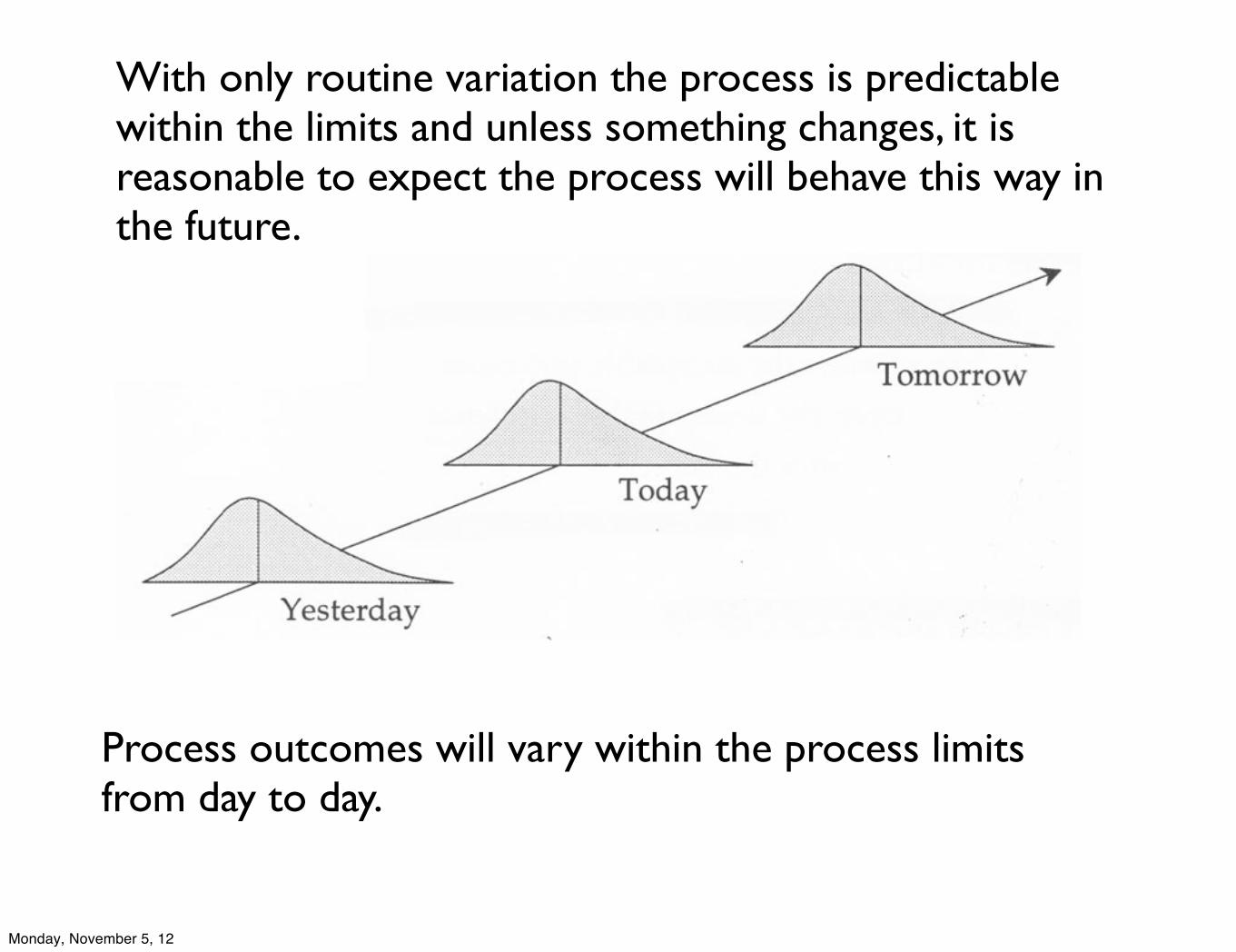
With only routine variation the process is predictable within the limits and unless something changes, it is reasonable to expect the process will behave this way in the future.
Process outcomes will vary within the process limits from day to day.
Monday, November 5, 12
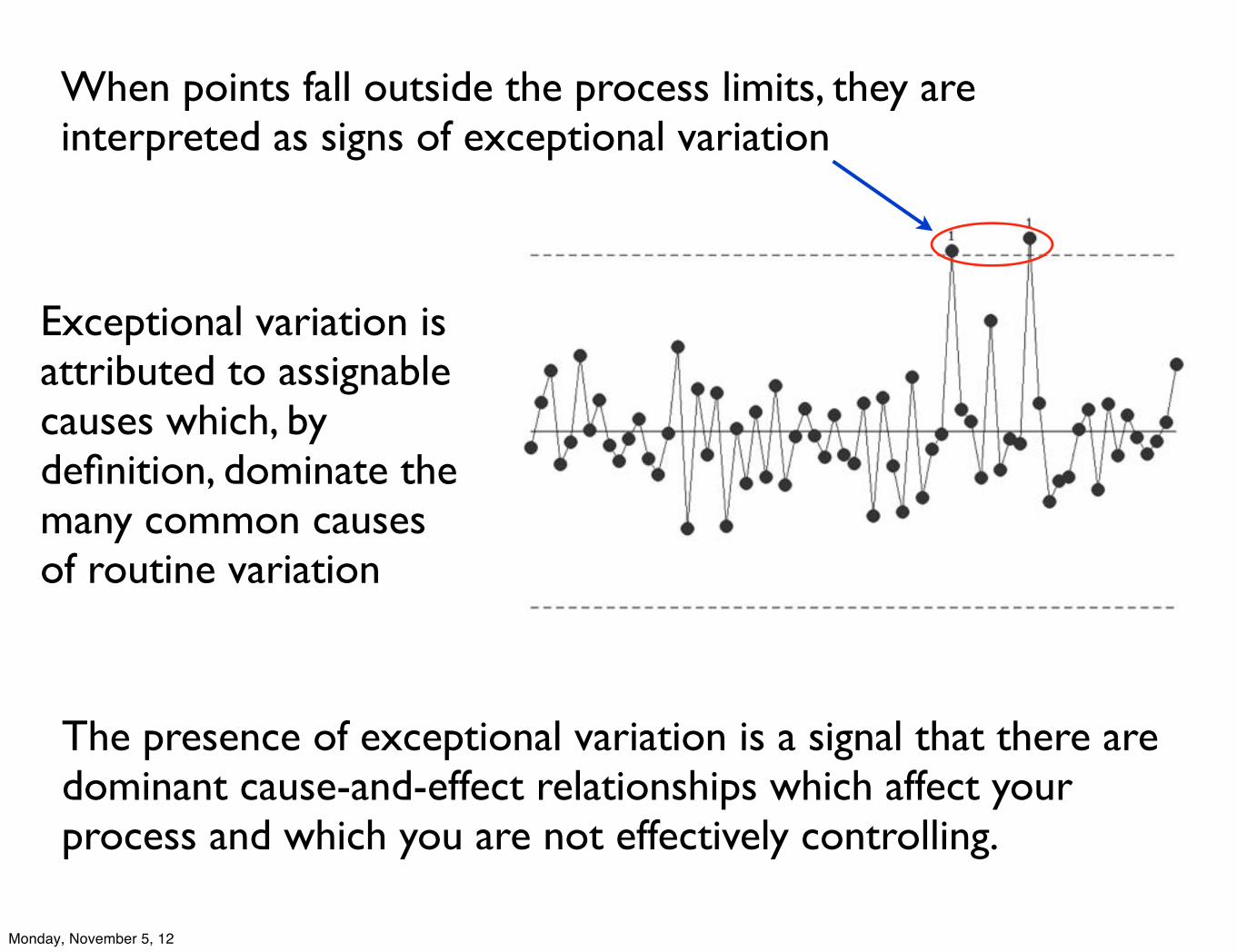
When points fall outside the process limits, they are interpreted as signs of exceptional variation
Exceptional variation is attributed to assignable causes which, by definition, dominate the many common causes of routine variation
The presence of exceptional variation is a signal that there are dominant cause-and-effect relationships which affect your process and which you are not effectively controlling.
Monday, November 5, 12
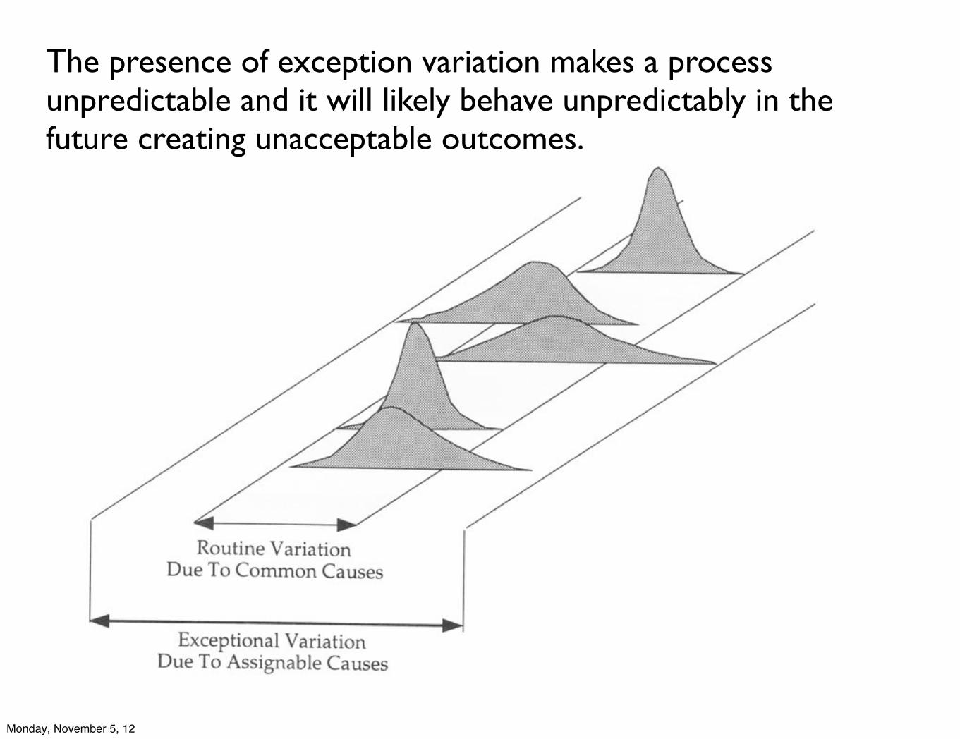
The presence of exception variation makes a process unpredictable and it will likely behave unpredictably in the future creating unacceptable outcomes.
Monday, November 5, 12
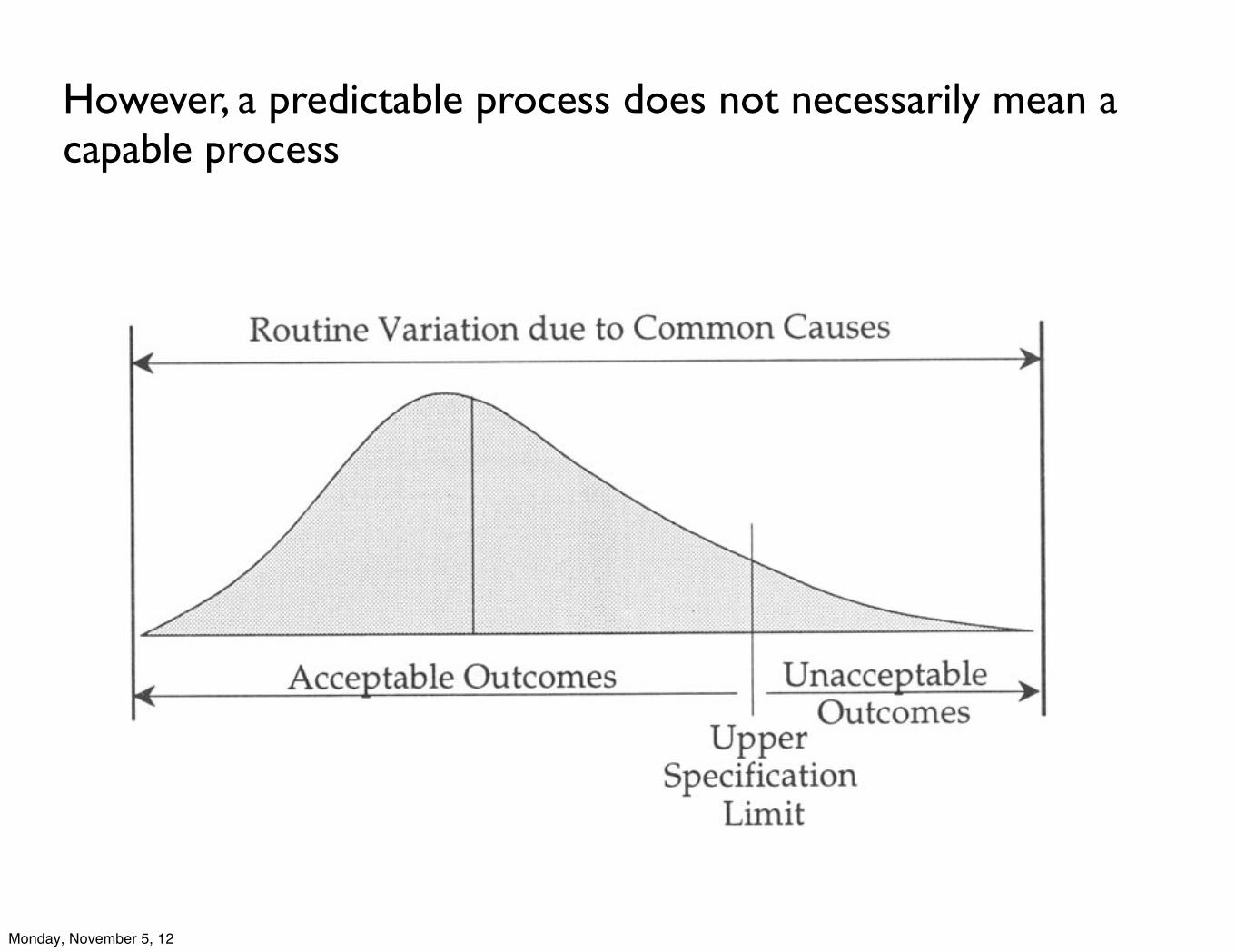
However, a predictable process does not necessarily mean a capable process
Monday, November 5, 12
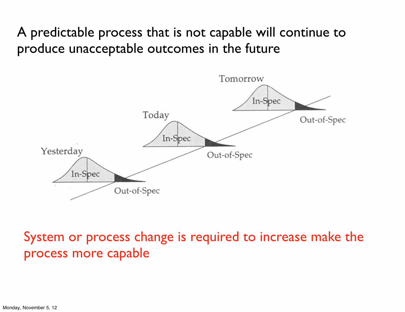
A predictable process that is not capable will continue to produce unacceptable outcomes in the future
System or process change is required to increase make the process more capable
Monday, November 5, 12
Variation is the random and miscellaneous component that undermines the simple and limited comparison to a specification or average.
The “noise” introduced by routine variation is what confuses and clouds all comparisons between single values.
Until you can allow for the noise in a time series, you cannot fully understand what might be indicated by a single value for the purpose of taking effective action on a process delivering unacceptable outcomes.
Monday, November 5, 12
While every data set contains noise, some data sets may contain signals. Therefore, before you can detect a signal within any given data set, you must first filter out the noise.
Two mistakes that can be made:
1. Interpreting routine variation as if it were a signal. Action taken is reactive and ineffective in the long run.
2. Failing to detect a signal when it is present. Thwarts actions to improve the process.
Monday, November 5, 12
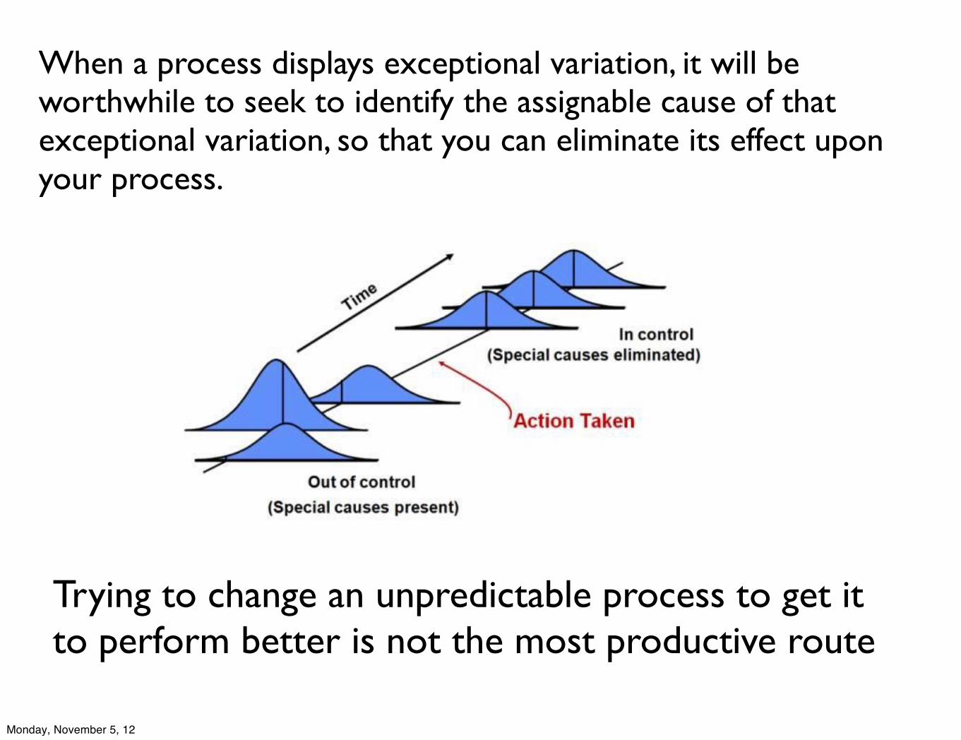
When a process displays exceptional variation, it will be worthwhile to seek to identify the assignable cause of that exceptional variation, so that you can eliminate its effect upon your process.
Trying to change an unpredictable process to get it to perform better is not the most productive route
Monday, November 5, 12
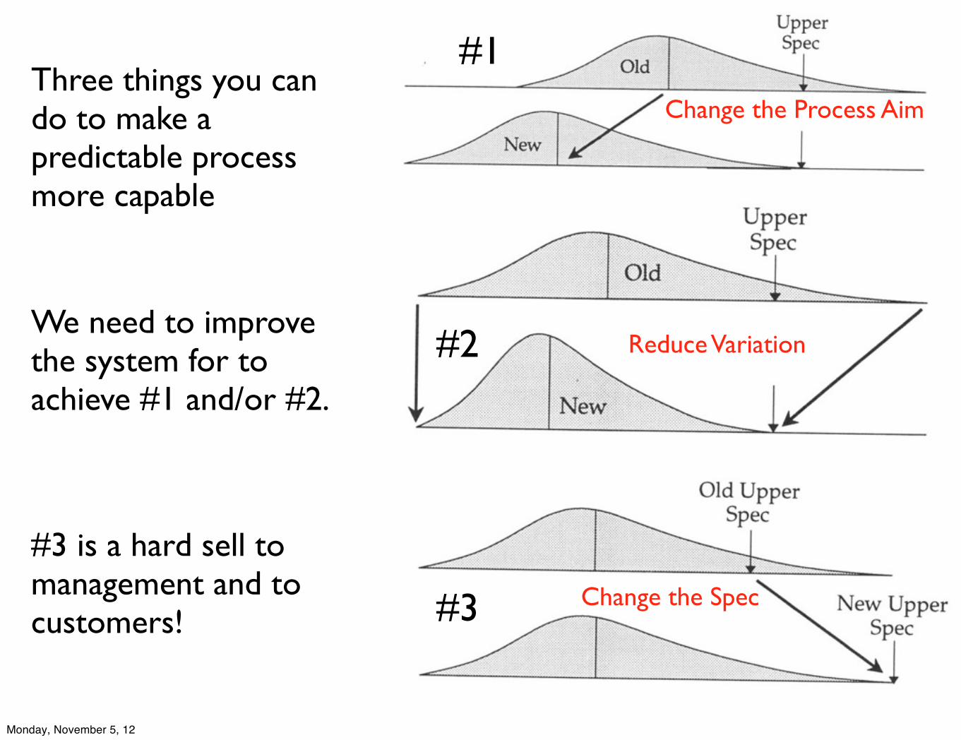
Change the Spec
Reduce Variation
Change the Process AimThree things you can do to make a predictable process more capable
#1
#2
#3
We need to improve the system for to achieve #1 and/or #2.
#3 is a hard sell to management and to customers!
Monday, November 5, 12
The Voice of the Customer defines what you want from a system.
The Voice of the Process defines what you will get from a system.
It is management’s job to work to bring the Voice of the Process into alignment with the Voice of the Customer.
The key to successful use of process behavior charts is the practice of the way of thinking which goes with them.
Monday, November 5, 12
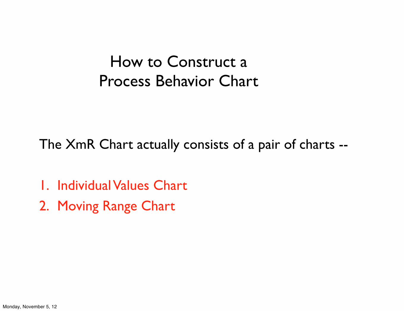
How to Construct a Process Behavior Chart
The XmR Chart actually consists of a pair of charts --
1. Individual Values Chart2. Moving Range Chart
Monday, November 5, 12
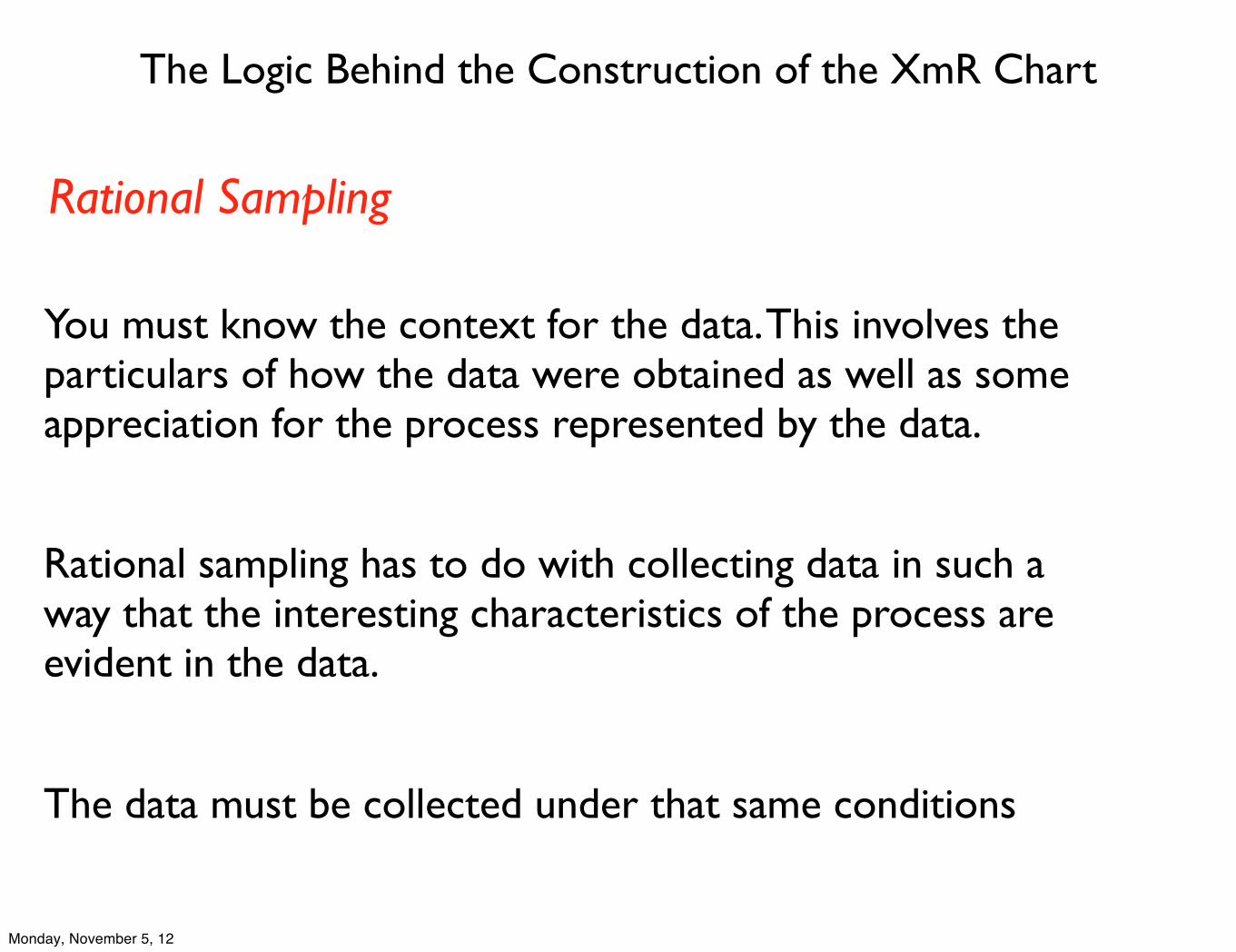
The Logic Behind the Construction of the XmR Chart
Rational sampling has to do with collecting data in such a way that the interesting characteristics of the process are evident in the data.
Rational Sampling
You must know the context for the data. This involves the particulars of how the data were obtained as well as some appreciation for the process represented by the data.
The data must be collected under that same conditions
Monday, November 5, 12
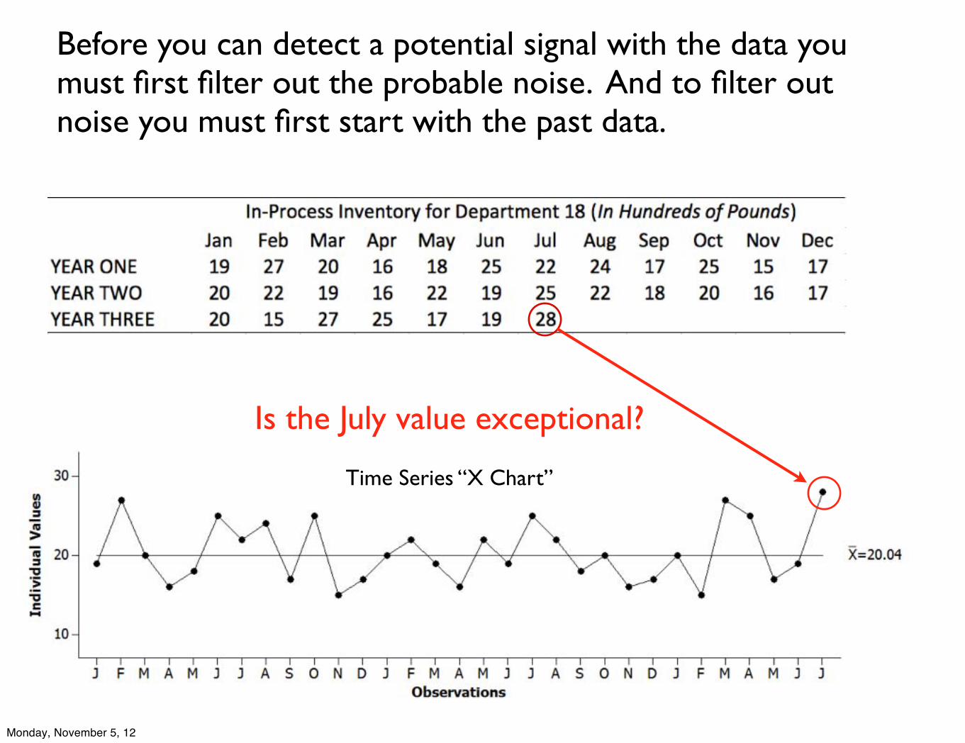
Before you can detect a potential signal with the data you must first filter out the probable noise. And to filter out noise you must first start with the past data.
Is the July value exceptional?
Time Series “X Chart”
Monday, November 5, 12
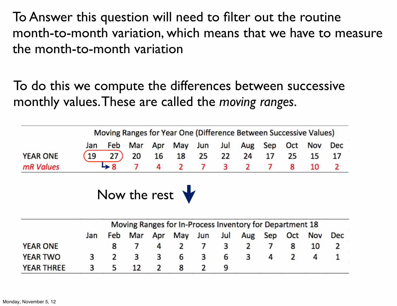
To Answer this question will need to filter out the routine month-to-month variation, which means that we have to measure the month-to-month variation
To do this we compute the differences between successive monthly values. These are called the moving ranges.
Now the rest
Monday, November 5, 12
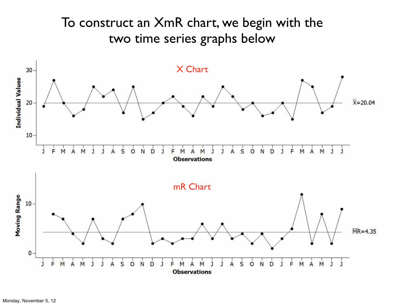
X Chart
mR Chart
To construct an XmR chart, we begin with the two time series graphs below
Monday, November 5, 12
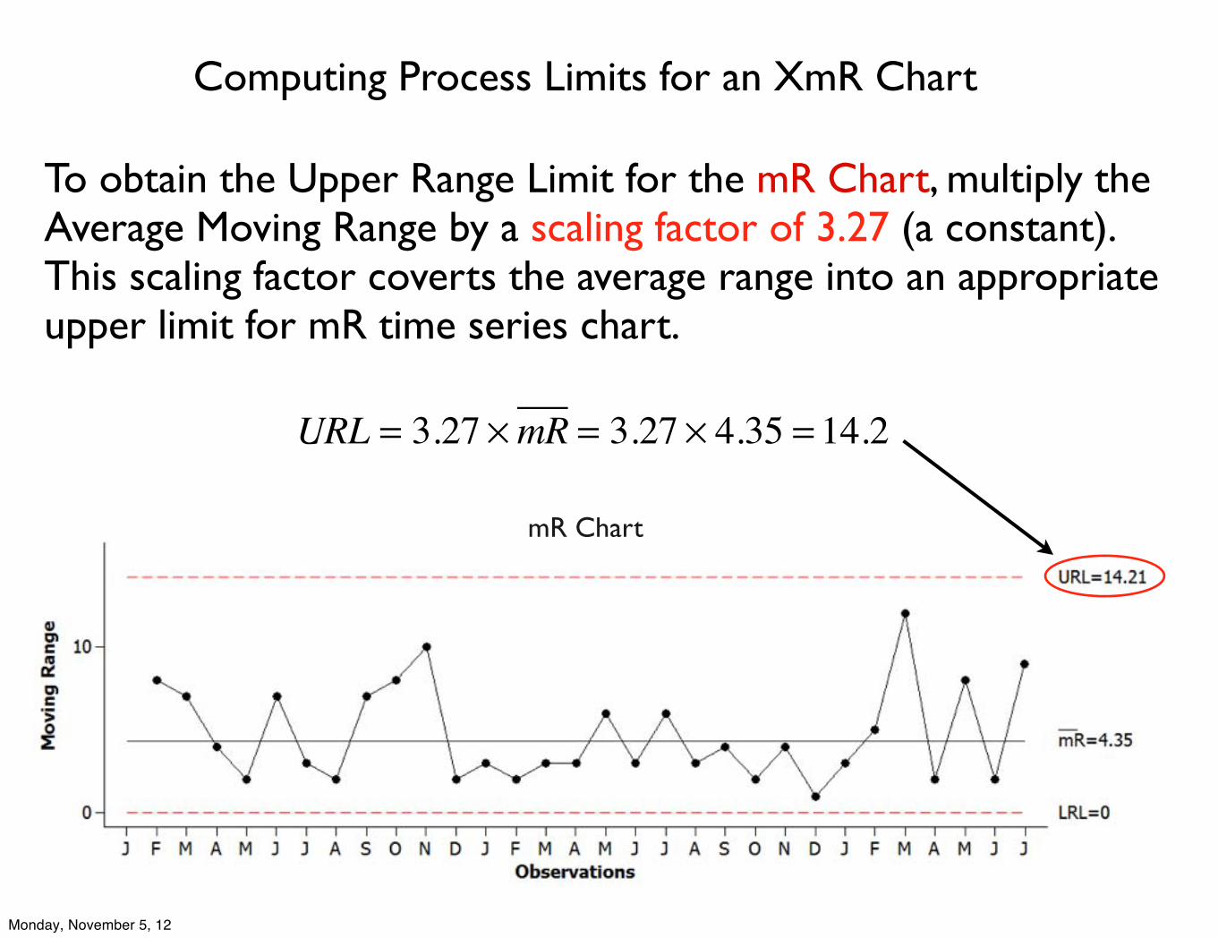
Computing Process Limits for an XmR Chart
To obtain the Upper Range Limit for the mR Chart, multiply the Average Moving Range by a scaling factor of 3.27 (a constant). This scaling factor coverts the average range into an appropriate upper limit for mR time series chart.
URL = 3.27 ×mR = 3.27 × 4.35 = 14.2
mR Chart
Monday, November 5, 12
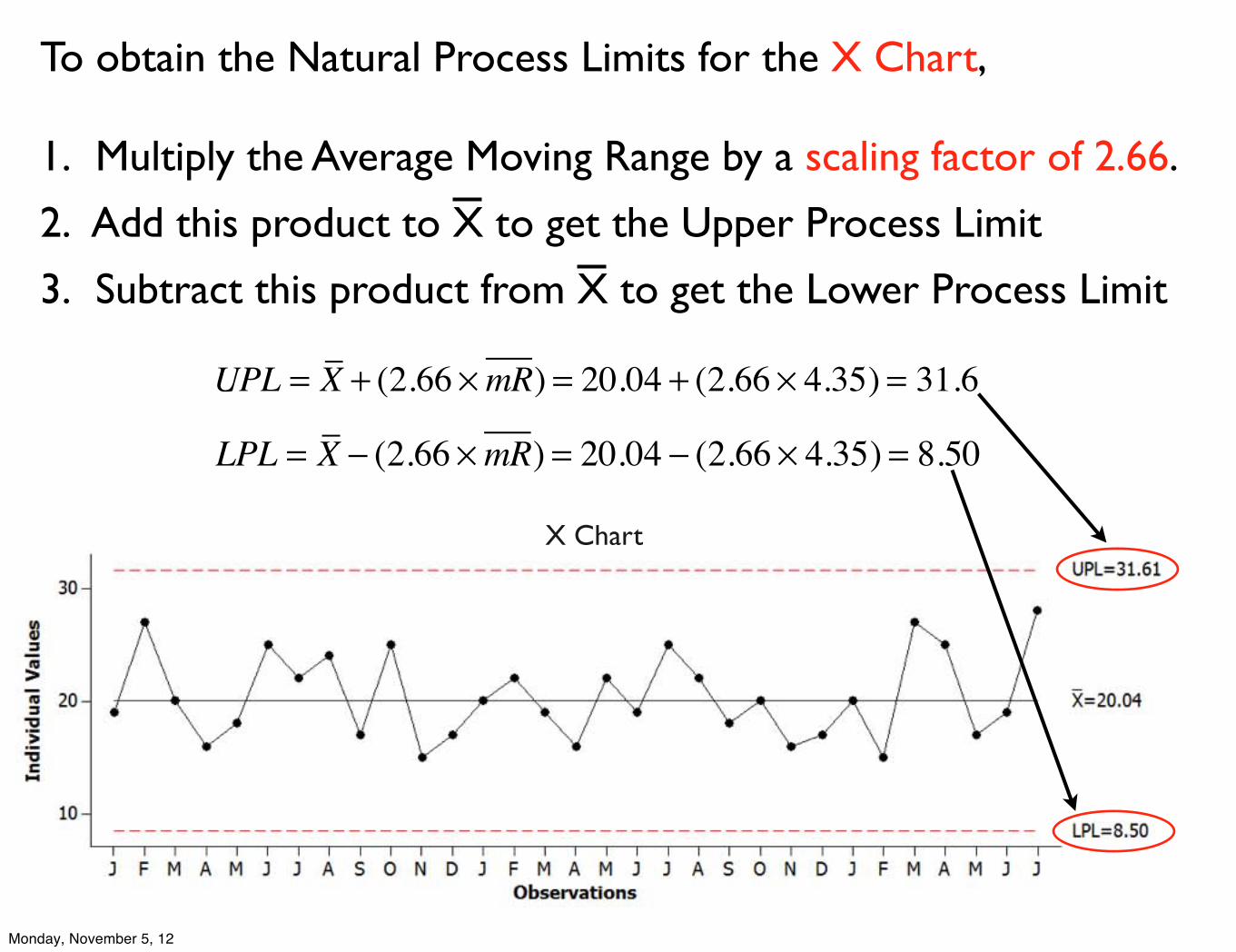
To obtain the Natural Process Limits for the X Chart,
1. Multiply the Average Moving Range by a scaling factor of 2.66.
2. Add this product to X to get the Upper Process Limit
3. Subtract this product from X to get the Lower Process Limit
X Chart
UPL = X + (2.66 ×mR) = 20.04 + (2.66 × 4.35) = 31.6
LPL = X − (2.66 ×mR) = 20.04 − (2.66 × 4.35) = 8.50
Monday, November 5, 12
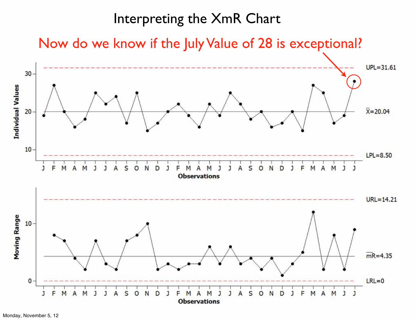
Interpreting the XmR Chart
Now do we know if the July Value of 28 is exceptional?
Monday, November 5, 12
Interpreting the XmR Chart as a Basis for Action
You may feel that variation of in-process inventory from 8.5 to 31.6 is still too excessive -- that perhaps the company can do better than this! But this is precisely what cannot be done.
Natural process limits are the Voice of the Process. They define what the process will deliver as long the process is predictable (it is operating as consistently as possible)
If you are not pleased with the amount of routine variation in a process, then you must go to work on the system, to change the underlying process rather than setting arbitrary goals.
Monday, November 5, 12
X
+3σ
−3σ
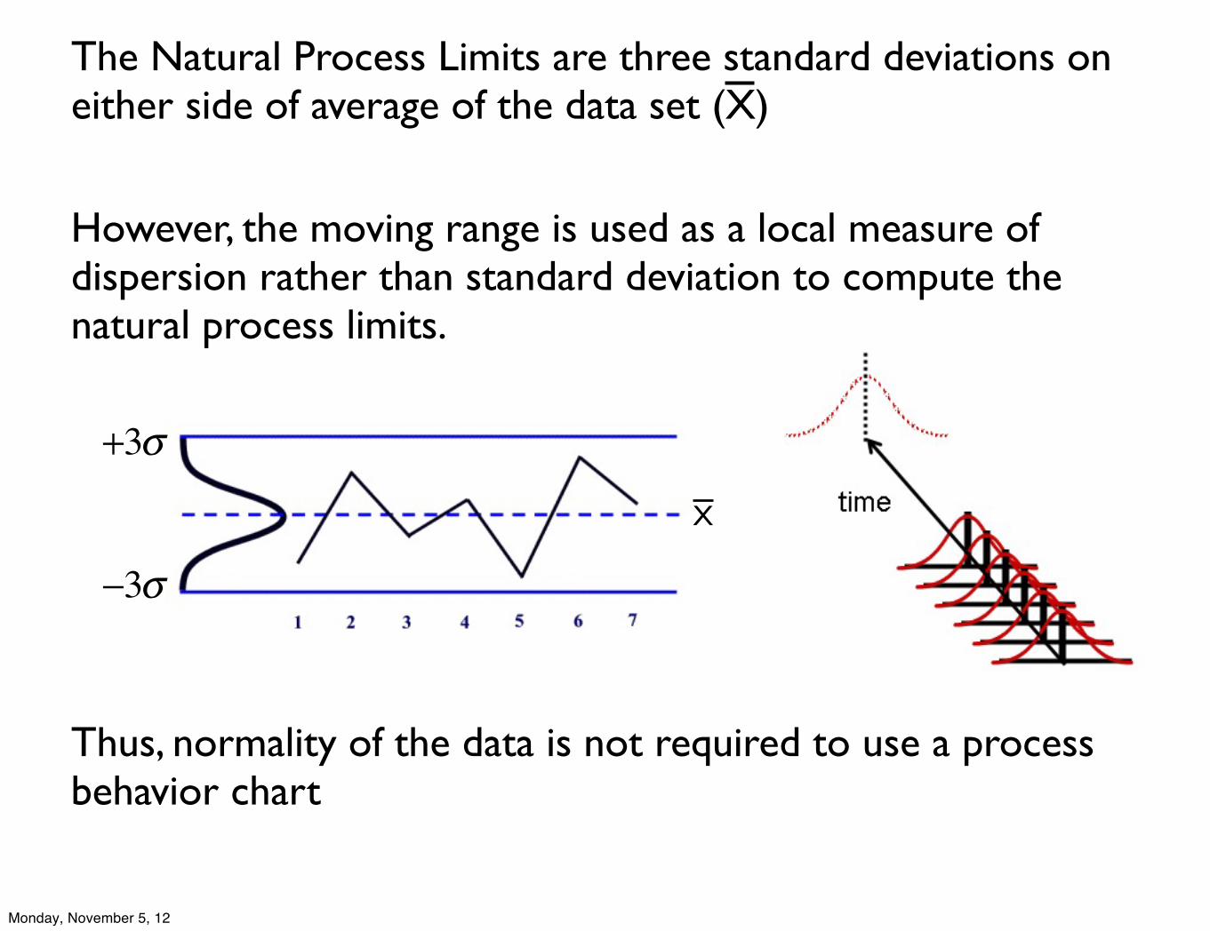
However, the moving range is used as a local measure of dispersion rather than standard deviation to compute the natural process limits.
Thus, normality of the data is not required to use a process behavior chart
The Natural Process Limits are three standard deviations on either side of average of the data set (X)
Monday, November 5, 12
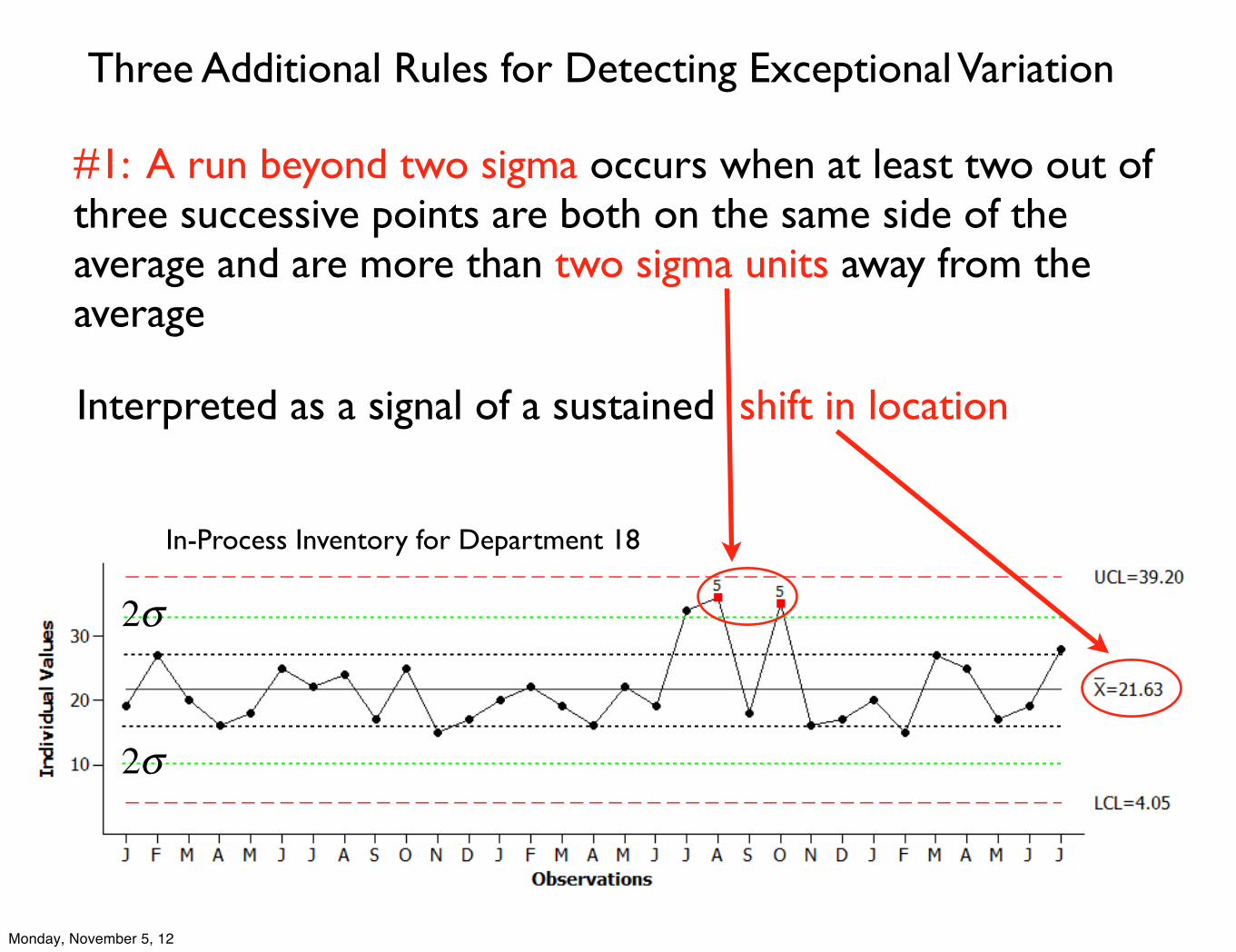
Three Additional Rules for Detecting Exceptional Variation
#1: A run beyond two sigma occurs when at least two out of three successive points are both on the same side of the average and are more than two sigma units away from the average
Interpreted as a signal of a sustained shift in location
In-Process Inventory for Department 18
2σ
2σ
Monday, November 5, 12
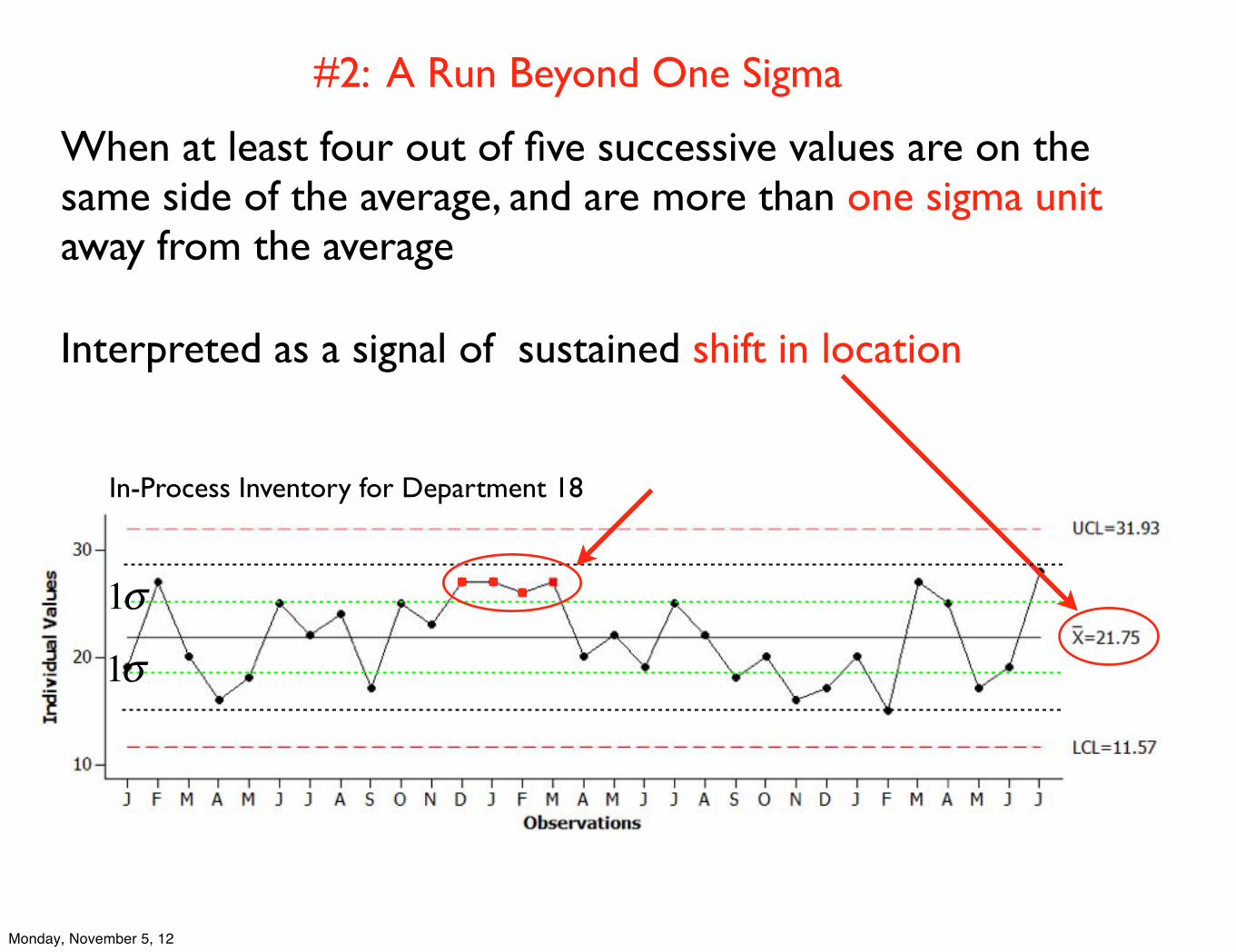
#2: A Run Beyond One Sigma
When at least four out of five successive values are on the same side of the average, and are more than one sigma unit away from the average
Interpreted as a signal of sustained shift in location
1σ
1σ
In-Process Inventory for Department 18
Monday, November 5, 12
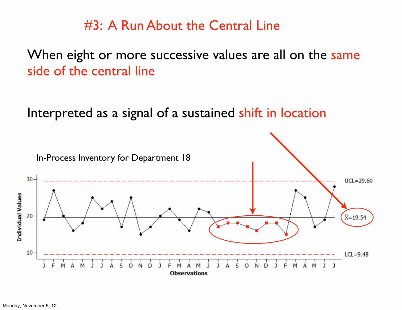
#3: A Run About the Central Line
In-Process Inventory for Department 18
When eight or more successive values are all on the same side of the central line
Interpreted as a signal of a sustained shift in location
Monday, November 5, 12
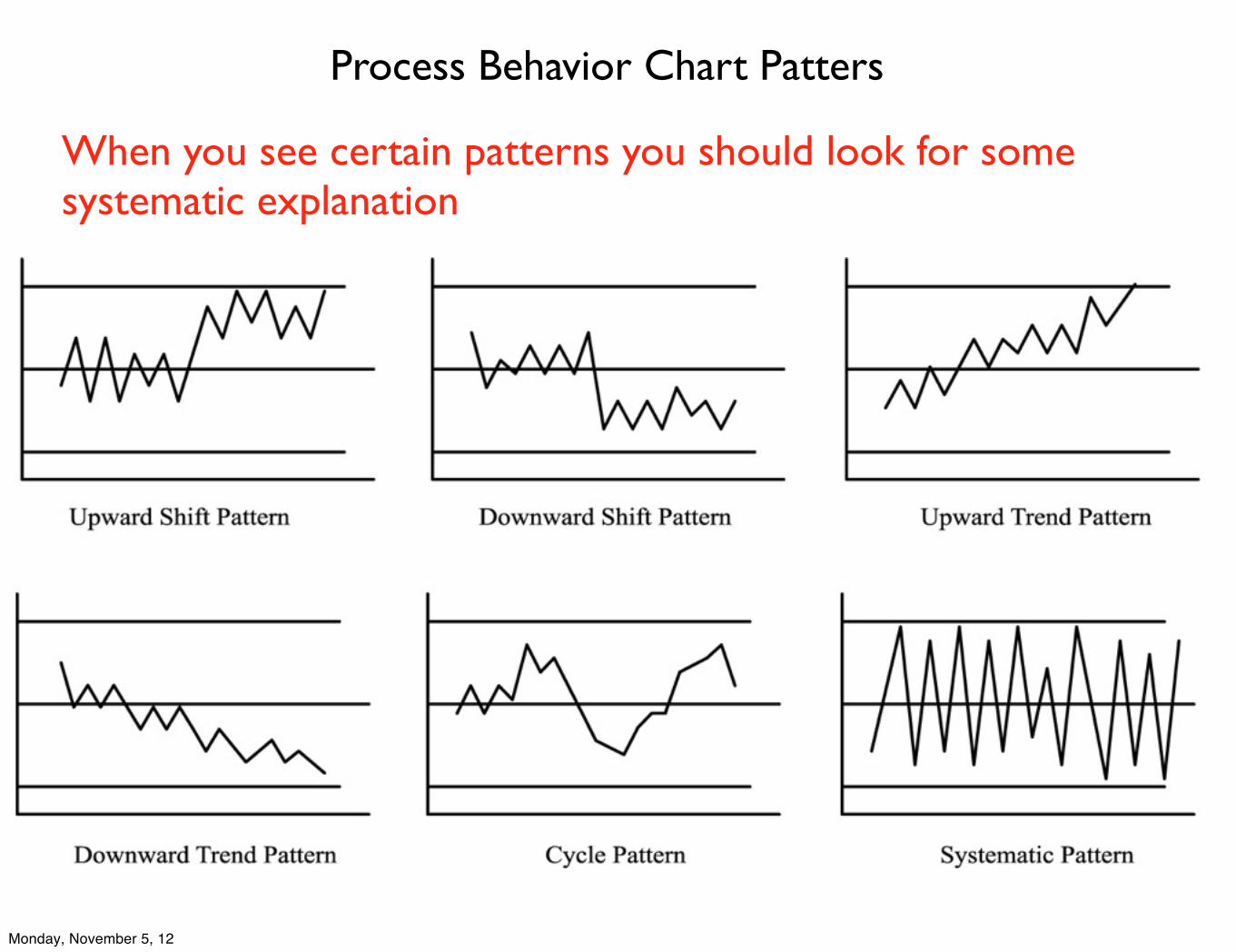
Process Behavior Chart Patters
When you see certain patterns you should look for some systematic explanation
Monday, November 5, 12
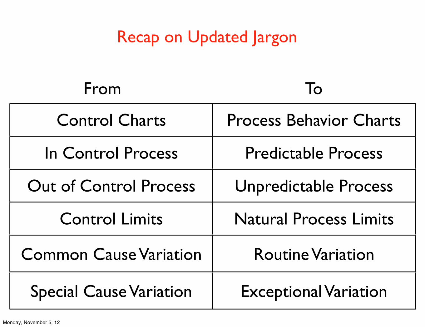
Control Charts Process Behavior Charts
In Control Process Predictable Process
Out of Control Process Unpredictable Process
Control Limits Natural Process Limits
Common Cause Variation Routine Variation
Special Cause Variation Exceptional Variation
From To
Recap on Updated Jargon
Monday, November 5, 12