Embed Size (px)
DESCRIPTION
Learn to find measures of variability.
Citation preview
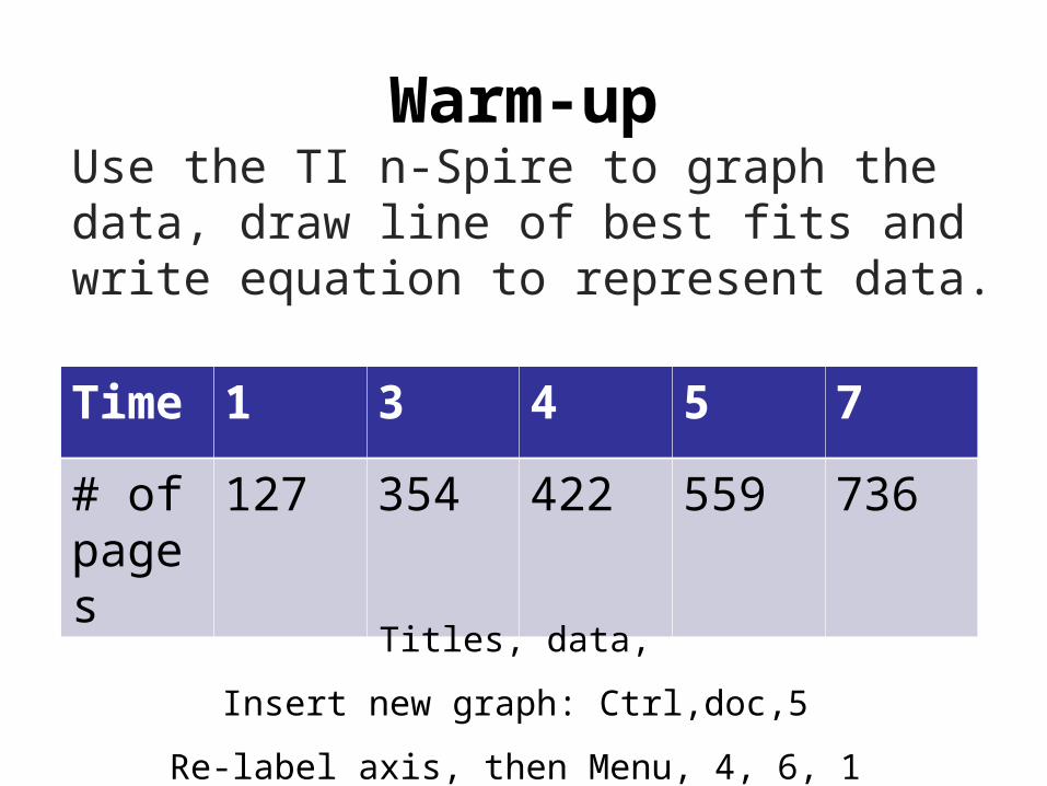
Warm-upUse the TI n-Spire to graph the data, draw line of best fits and write equation to represent data.
Time 1 3 4 5 7
# of pages
127 354 422 559 736
Titles, data,Insert new graph: Ctrl,doc,5
Re-label axis, then Menu, 4, 6, 1

Warm Up – Copy down the notes
Learn to find measures of variability.

Vocabularyvariabilityquartilebox-and-whisker plot
Insert Lesson Title Here

Litter Size 2 3 4 5 6Number of
Litters 1 6 8 11 1
The table below summarizes a veterinarian’s records for kitten litters born in a given year.
While central tendency describes the middle of a data set, variability describes how spread out the data is. Quartiles divide a data set into four equal parts. The third quartile minus the first quartile is the range for the middle half of the data.

Litter Size 2 3 4 5 6
Number of Litters
1 6 8 11 1
The range of a data set is the largest value minus the smallest value. For the kitten data, the range is 6 — 2 = 4.
The range is affected by outliers, so another measure is often used. Quartiles divide a data set into four equal parts. The third quartile minus the first quartile is the range for the middle half of the data.
Kitten Data
2 3 3 3 3 3 3 4 4 4 4 4 4 4 4 5 5 5 5 5 5 5 5 5 5 5 6Lower half Upper half
First quartile: 3 median of lower half
Third quartile: 5 median of upper half
Median: 4 (second quartile)


Write the five point summary for the following data.
15, 83, 75, 12, 19, 74, 21

Find the first and third quartiles for the data set.
16, 82, 70, 13, 20, 74, 20

Write the five point summary for the following data.
75, 61, 88, 79, 79, 99, 63, 77

Find the first and third quartiles for the data set.
74, 62, 89, 78, 78, 95, 60, 70

1 2 3 4 5 6 7 8 9
A box-and-whisker plot shows the distribution of data. The middle half of the data is represented by a “box” with a vertical line at the median. The lower fourth and upper fourth quarters are represented by “whiskers” that extend to the smallest and largest values.
First quartile Third quartileMedian

Use the given data to make a box-and-whisker plot: 21, 25, 15, 13, 17, 19, 19, 21
12 14 16 18 20 22 24 26 28

91, 87, 98, 93, 89, 78, 94
Make a box-and-whisker plot
What is the mean?
Insert Lesson Title Here
Course 3
Variability
90
78 87 91 94 98

Use the given data to make a box-and-whisker plot. 31, 23, 33, 35, 26, 24, 31, 29
22 24 26 28 30 32 34 36 38

These box-and-whisker plots compare the ages of the first ten U.S. presidents with the ages of the last ten presidents (through George W. Bush) when they took office.
Note: 57 is the first quartile and the median.

Additional Example 3 Continued
A. Compare the medians and ranges.
Note: 57 is the first quartile and the median.
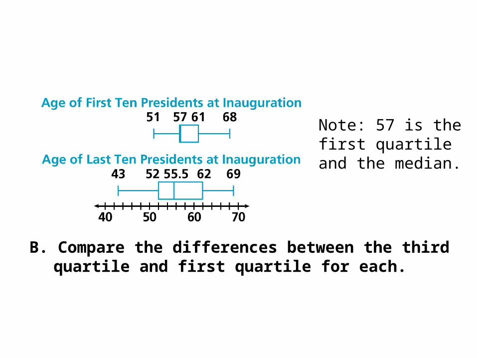
B. Compare the differences between the third quartile and first quartile for each.
Note: 57 is the first quartile and the median.

Check It Out: Example 3Final 1 2 3 4 TOakland 3 0 6 12 21Tampa Bay 3 17 14 14 48
These box-and-whisker plots compare the scores per quarter at Super Bowl XXXVII. The data in the T column is left out because it is a total of all the quarters.
Oakland
0 3 6 9 12 15 18Tampa Bay
0 3 6 9 12 15 18
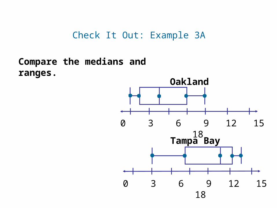
Compare the medians and ranges.
Check It Out: Example 3A
Oakland
0 3 6 9 12 15 18Tampa Bay
0 3 6 9 12 15 18

Compare the differences between the third quartile and first quartile for each.
Check It Out: Example 3B
Oakland
0 3 6 9 12 15 18Tampa Bay
0 3 6 9 12 15 18

Use the two box-and-whisker plots shown below to determine which of the following statements is true.
a.
The lower quartiles are equal.
b.
The upper quartiles are equal.
c.
They both have the same median.
d.
The range is the same for both sets of data.

Ms. Alison drew a box-and-whisker plot to represent her students’ scores on a mid-term test.
Josh received 72 on the test. Describe how his score compared to those of his classmates.
a. About 25% scored higher; about 75% scored lower.b. Everyone scored higher.c. No one scored higher.d. About 50% scored higher; about 50% scored lower.

Lesson Quiz: Part I
Find the first and third quartile for each data set.
1. 48, 52, 68, 32, 53, 47, 51
2. 3, 18, 11, 2, 7, 5, 9, 6, 13, 1, 17, 8, 0Q1 = 2.5; Q3 = 12
Q1 = 47; Q3 = 53
Insert Lesson Title Here
Course 3
9-4 Variability