Embed Size (px)
Citation preview

Proc. HCI in the 21st Century, Graz, Austria,Austrian Computer Society, Jan. 2001, pages 83–95. ISBN 3854031513 .
Web Usability on the Cheap
Keith Andrews
Institute for Information Processing and Computer Supported New Media (IICM),Graz University of Technology
A-8010 Graz, Austria
Abstract
As increasingly larger sections of the population migrate to the net, there are increasinglybroader spectra of both web users and web content authors. A web site which is difficult to usewill do little to encourage first-time visitors to return, regardless of the quality of its content.However, a small investment in the usability of a web site can produce large returns in termsof ease of use and return visits. This paper looks at the application of quick and dirty usabilitytechniques to web site design and gives an example of a real world web site evaluation.
1 Introduction
Usability refers to “the extent to which a product can be used by specified users to achieve specified goalswith effectiveness, efficiency and satisfaction in a specified context of use.”[ISO, 1998]. Usability engi-neering is a relatively recent field[Nielsen, 1993; Mayhew, 1999] which involves the formulation of aniterative process to improve usability of a system. More formal approaches to usability engineering followan 11-stage lifecycle:
1. Know the User
2. Competitive Analysis
3. Set Usability Goals
4. Parallel Design
5. Participatory Design
6. Coordinated Design of Total Interface
7. Follow Platform Conventions
8. Prototyping
9. Usability Evaluation (Inspection and Testing)
10. Iterative Design
11. Follow-up Studies
However, such a formal approach can sometimes seem intimidating. Following the principle that anykind of user data is better than no user data, Jakob Nielsen extolled the virtues of “discount usability tech-niques” [Nielsen, 1994b] using simplified, scaled-down versions of usability engineering techniques.
2 Web Usability
When asked by Forrester Research in February 1999, the top four reasons users gave why they would returnto a web site were: high quality content (75%), ease of use (66%), quick to download (58%), and updatedfrequently (54%). Other factors came in at less 15%. Web usability techniques can be used to improvefactors two and three.
A streamlined version of the usability engineering lifecycle for web site design, web site usability onthe cheap, might look something like this:
1. Know your users and their tasks
• web users in general
• your own target user population.
2. Competitive analysis
• look at similar sites.
3. Iterative design
• design - evaluate - redesign
These steps are considered in turn in the following sections. For fuller treatment see Krug’s excellentbook[Krug, 2000] or [Nielsen, 1999].
3 Know Your Users and Their Tasks
Several demographics and statistics regarding web users as a whole are publicly available. Severalsites[MyComputer.com, 2001; Upsdell, 2001] provide aggregate browser statistics, such as the browserversion, colour resolution, and screen resolution. For the web population as a whole, statistics now show(Jan. 2001):
• Browser family: 80 to 90% of users are using a version of Microsoft Internet Explorer, around 10 to15% a version of Netscape.
• Screen colours: most users (70 to 80%) now have 16-bit or higher colour resolution, only around10% are still limited to 8-bit (256 colours). However, this may change again as users migrate to smallportable web browsing devices.
• Screen resolution: Around 50% of users have 800×600 resolution. Around 30% have 1024×768 orhigher. Only around 10% currently have 640×480. Again, these proportions may change as someusers move to lower resolution portable devices.
When asked about the main problems in using the web, users repeatedly cite slow speed and brokenlinks as their top two concerns[GVU, 1998]:
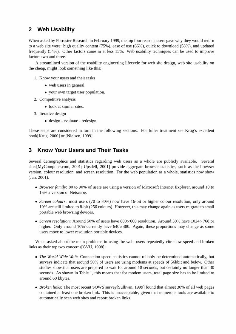
• The World Wide Wait: Connection speed statistics cannot reliably be determined automatically, butsurveys indicate that around 50% of users are using modems at speeds of 56kbit and below. Otherstudies show that users are prepared to wait for around 10 seconds, but certainly no longer than 30seconds. As shown in Table 1, this means that for modem users, total page size has to be limited toaround 60 kbytes.
• Broken links: The most recent SOWS survey[Sullivan, 1999] found that almost 30% of all web pagescontained at least one broken link. This is unacceptable, given that numerous tools are available toautomatically scan web sites and report broken links.
Response TimeAccess 1 Sec. 10 Secs.Slow Modem (28.8 kbit) 2 kb 34 kbFast Modem (56 kbit) 4 kb 67 kbT-1 (2 Mbit) 125 kb 2.4 MB
Table 1 : Maximum acceptable page sizes for a total response time of 1 and 10 sec-onds, assuming 0.5 seconds latency before the server starts responding.
Knowledge about general trends and demographics provide a good starting point, but cannot replacedetailed knowledge about the demographics and characteristics of the users of the particular web site inquestion. The following sources can be used to gather information about users of a particular web site:
• Server logs: Server log files can provide three very interesting sets of statistical data about the usersof a web site:
– Browser demographics: browser type and version, colour resolution, screen resolution, installedplug-ins, etc.
– Page view statistics: which pages are most frequently accessed, which paths of links are mostfrequently traversed.
– Search statistics: assuming the site has a local search engine, the search logs will reveal whichterms users are most frequently searching for, and perhaps even more interesting terms users aresearching but result in no matching pages.
• Bug reports, feedback: Email feedback and bug reports from the technical helpline can be used togain an impression of problems users are having with a site.
• Online survey: Users of the site can be enticed into filling out a short survey by giving away somethinguseful to them. This is a good way to gather information which cannot be gained from the techniquesabove: such as their sex, age, education, and connection speed.
Knowledge of users’ tasks for a particular web site can be garnered from server log files, but is perhapsbest gathered by direct observation and contextual analysis[Beyer and Holtzblatt, 1997]. That said, studiesof users’ navigational behaviour in general have shown that given the choice of searching (typing words intoa search box) or browsing (following links towards their goal), users:
• prefer to search
50% are search dominant, 30% link dominant and 20% exhibit mixed behaviour[Nielsen, 1997b].
• but are more successful when browsing
When browsing 53% of users find what they are looking for, when searching only 30%[UIE, 1998].
This suggests that a good information hierarchy should be designed to support browsing users (supple-mented with a table of contents) and a local search engine with sensible defaults to support searching users(supplemented with an alphabetical index). Adobe’s web site (www.adobe.com) is a good example of sucha web site.
4 Competitive Analysis
If you have enough time and resources, a great deal can be learned from some evaluation of competitor’sweb sites. If you are responsible for an airline’s web site, for example, testing two or three competingairlines’ web sites can reveal a number of things which work well, and many things which do not work wellat all for that particular kind of web site.
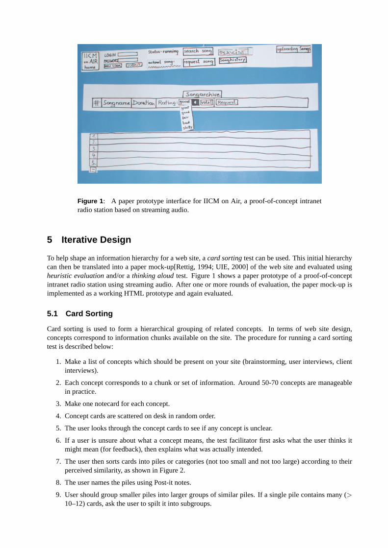
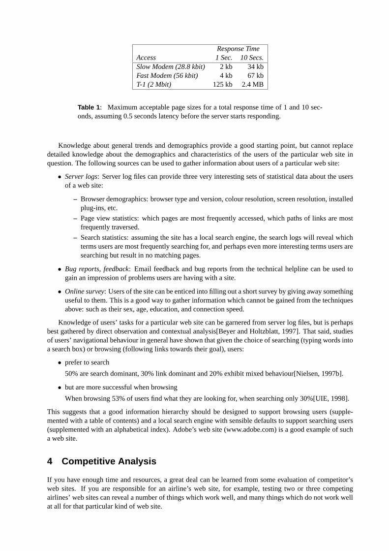
Figure 1 : A paper prototype interface for IICM on Air, a proof-of-concept intranetradio station based on streaming audio.
5 Iterative Design
To help shape an information hierarchy for a web site, acard sortingtest can be used. This initial hierarchycan then be translated into a paper mock-up[Rettig, 1994; UIE, 2000] of the web site and evaluated usingheuristic evaluationand/or athinking aloudtest. Figure 1 shows a paper prototype of a proof-of-conceptintranet radio station using streaming audio. After one or more rounds of evaluation, the paper mock-up isimplemented as a working HTML prototype and again evaluated.
5.1 Card Sorting
Card sorting is used to form a hierarchical grouping of related concepts. In terms of web site design,concepts correspond to information chunks available on the site. The procedure for running a card sortingtest is described below:
1. Make a list of concepts which should be present on your site (brainstorming, user interviews, clientinterviews).
2. Each concept corresponds to a chunk or set of information. Around 50-70 concepts are manageablein practice.
3. Make one notecard for each concept.
4. Concept cards are scattered on desk in random order.
5. The user looks through the concept cards to see if any concept is unclear.
6. If a user is unsure about what a concept means, the test facilitator first asks what the user thinks itmight mean (for feedback), then explains what was actually intended.
7. The user then sorts cards into piles or categories (not too small and not too large) according to theirperceived similarity, as shown in Figure 2.
8. The user names the piles using Post-it notes.
9. User should group smaller piles into larger groups of similar piles. If a single pile contains many (>10–12) cards, ask the user to spilt it into subgroups.
Figure 2 : A card sorting test. The test user is in the process of grouping the conceptcards into categories.
10. The user names the groups of piles using (different coloured) Post-its.
11. Ask the user to think aloud while they are working (the test facilitator should encourage them) andrecord the entire proceedings on videotape.
12. Each user typically works for about 30-40 minutes.
13. Capture the contents of each pile and group on paper (corresponding to this user’s two-level hierar-chical structure).
14. Repeat with 3 to 5 users.
After performing card sorting with 3 to 5 test users, the users’ individual hierarchical structures areaggregated into a single hierarchy. This then forms the basis for an initial two-level hierarchy of information,organised the way users would expect. Depending on the size of the web site, card sorting can be repeatedat higher or lower level of granularity.
5.2 Heuristic Evaluation (Expert Review)
A heuristic evaluation involves 3 to 5 usability specialists examining an interface and using their experienceand judgement to suggest potential problems. A small set of 10 or so guiding principles (the heuristics) suchas those shown in Table 2 are used by the evaluators as a checklist, giving the technique its name[Nielsen,1997a].
The procedure for performing a heuristic evaluation can be summarised as below:
• Design may be verbal description, paper mock-up, working prototype, or running system.
• Optionally provide evaluators with some domain-specific training.
• Each evaluator works alone (≈1–2 hours).
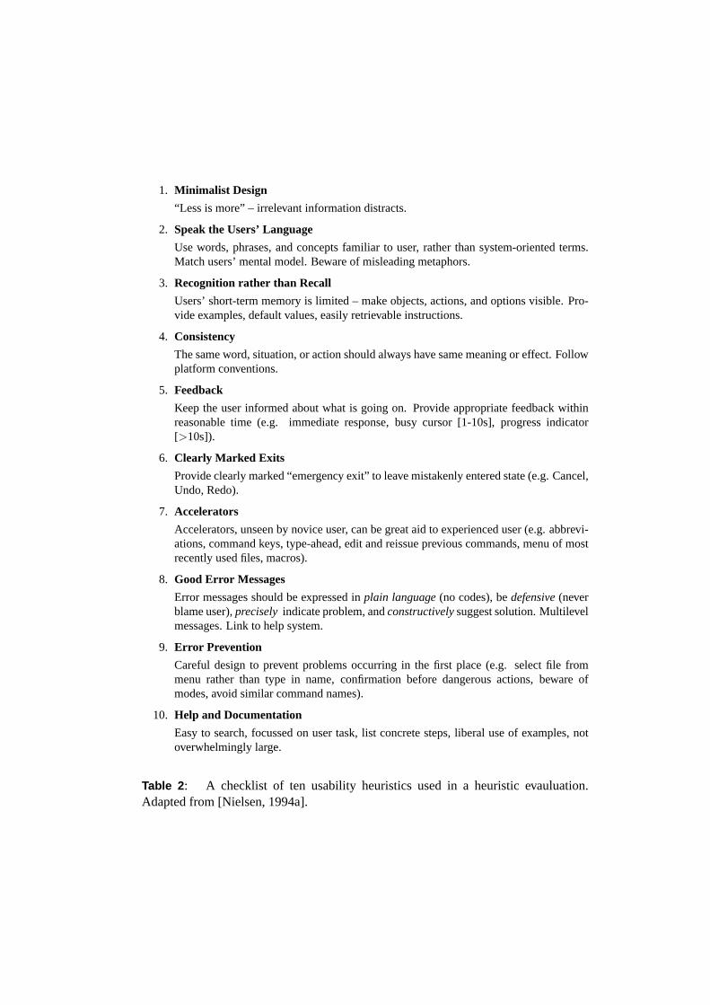
1. Minimalist Design
“Less is more” – irrelevant information distracts.
2. Speak the Users’ Language
Use words, phrases, and concepts familiar to user, rather than system-oriented terms.Match users’ mental model. Beware of misleading metaphors.
3. Recognition rather than Recall
Users’ short-term memory is limited – make objects, actions, and options visible. Pro-vide examples, default values, easily retrievable instructions.
4. Consistency
The same word, situation, or action should always have same meaning or effect. Followplatform conventions.
5. Feedback
Keep the user informed about what is going on. Provide appropriate feedback withinreasonable time (e.g. immediate response, busy cursor [1-10s], progress indicator[>10s]).
6. Clearly Marked Exits
Provide clearly marked “emergency exit” to leave mistakenly entered state (e.g. Cancel,Undo, Redo).
7. Accelerators
Accelerators, unseen by novice user, can be great aid to experienced user (e.g. abbrevi-ations, command keys, type-ahead, edit and reissue previous commands, menu of mostrecently used files, macros).
8. Good Error Messages
Error messages should be expressed inplain language(no codes), bedefensive(neverblame user),precisely indicate problem, andconstructivelysuggest solution. Multilevelmessages. Link to help system.
9. Error Prevention
Careful design to prevent problems occurring in the first place (e.g. select file frommenu rather than type in name, confirmation before dangerous actions, beware ofmodes, avoid similar command names).
10. Help and Documentation
Easy to search, focussed on user task, list concrete steps, liberal use of examples, notoverwhelmingly large.
Table 2 : A checklist of ten usability heuristics used in a heuristic evauluation.Adapted from [Nielsen, 1994a].

• Interface examined in two passes: first pass focuses on general flow, second on individual dialogueelements.
• Notes taken either by evaluator or evaluation manager.
• Independent findings are aggregated (by evaluators or evaluation manager) into a single long list ofproblems.
• Severity ratings are assigned by each evaluator individually and are then averaged.
• Group debriefing session to suggest possible redesigns.
5.3 Thinking Aloud Test
Whereas a heuristic evaluation is based on the options and judgements of evaluators, a thinking aloud test isbased on the observation of representative test users (from the target population) working with the web sitedesign to accomplish real tasks. The name thinking aloud refers to the fact that users are asked to verbalisetheir thoughts, or “think aloud”, as they work.
Although the act of thinking aloud has been shown to slow users down and possible slightly alter theirworking behaviour[Ericsson and Simon, 1993], the purpose here is not to conduct a formal psychologicalexperiment, but rather to gain an insight into users’ thought processes as they work through a web site, andhence garner insights intowhycertain facets of a web site do not work well.
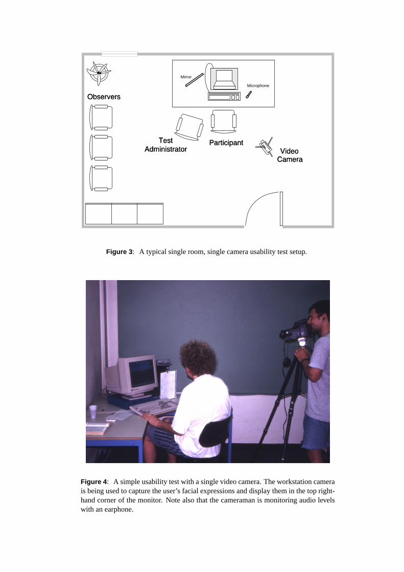
A quiet room is prepared with a test PC (or table space in the case of a paper mock-up) and a videocamera, as shown in Figure 3. A mirror placed to one side of the monitor is used to capture the user’sfacial expressions and the happenings on screen onto a single videotape. Members of the test team takeon one or more of the following roles:test facilitator in overall charge of the test and responsible forallinteraction with test user,data loggerrecording activities and events of interest,video operatorresponsiblefor recording the test proceedings, andcomputer operatordealing with technical setup and problems.
In brief, a thinking aloud test is organised like this: the test user welcomed by the test facilitator, briefedwith a so-called orientation script and asked to fill out a background questionnaire and to sign a videoconsent and non-disclosure form. A demo of thinking aloud and any predetermined training is provided,and then the user is presented with the prespecified task scenarios one at a time. After working through eachtask, a short debriefing interview is conducted, and the user is thanked and shown out.
The orientation script puts the user at ease, by introducing members of the test team (first names only,no titles or job descriptions!), emphasising that the system is being tested and not user, that the system isnew and has many bugs and rough edges, explaining any recording, and reassuring the user that they maystop at any time should they feel uncomfortable.
Many users find thinking aloud somewhat unnatural and start to dry up after a few minutes. I have foundthat showing a short video clip of a talkative test user from a previous test illustrates what you are lookingfor. Alternatively, the test facilitator can surf to an unrelated web site, state a goal (such as finding the localcinema listings), and proceed towards achieving that goal whilst thinking aloud. The test facilitator mustalso possess the interpersonal skills to keep test users talking whilst taking care not to prompt or bias themin any way.
Typically, five test users from any particular user category are enough at each iteration of testing todiscover dozens of problems. It is also advisable to run the first test user as a pilot test at least two daysbefore the remaining users. That way, any bugs in the test design, technical problems, or ambiguous taskinstructions can be ironed out before the main test itself.
ParticipantTestAdministrator
Observers
VideoCamera
Mirror
Microphone
Figure 3 : A typical single room, single camera usability test setup.
Figure 4 : A simple usability test with a single video camera. The workstation camerais being used to capture the user’s facial expressions and display them in the top right-hand corner of the monitor. Note also that the cameraman is monitoring audio levelswith an earphone.
6 Case Study - Evaluating the Austrian Airlines Web Site
In May and June 2000, I had eight groups of four students each evaluate the Austrian Airlines web site(www.aua.com). shown in Figure 5 using the discount techniques outlined above. A heuristic evaluation bythe four group members was followed by a thinking aloud usability test with five test users (the first being apilot test). A whole range of problems in the site were unearthed, including:
• Given the task of booking a flight to a particular destination, many of the test users were confusedby the Flightinfo and Booking page shown in Figure 6. The difference between the four subsystemsAirManager, AirNet, Flight Planner, and Timetable is not immediately clear.
• Worse, the bottom two subsystems only allow you to look up flight information. If you then want tobook the flights you have found, you have to go back to the Flightinfo and Booking page and startover again with one of the top two subsystems! Leading to some very frustrated users.
• Clicking on Search leads to a real gem, shown in Figure 7. The text explains that search functionalityis currently not available. However, many of our test users stubbornly ignored the text (or did notconsciously see it) and blithely typed a query into the inviting search box at the bottom of the page,not even noticing that this in fact is a banner ad.
• The result is shown in Figure 8. Users expecting to find information on flights to Madrid were pre-sented with music CDs and became rather confused.
• The site has since been changed, and the search button now (February 2001) leads users to the Sitemappage shown in Figure 9. Certainly a step in the right direction, but there is still nosearchfunctionalityin sight.
An example of a report from the Austrian Airlines test can be found here:
http://www2.iicm.edu/hci/practicals/examples .
7 Concluding Remarks
In summary, I hope to have demonstrated the usefulness of web usability techniques for building usable websites. A recipe for web usability on the cheap might be formulated as:
1. Know your users and their tasks
2. Design an information architecture (card sorting).
3. Build a paper mock-up (heuristic evaluation and thinking aloud).
4. Build a working prototype (heuristic evaluation and thinking aloud).
5. Iterate as necessary until time and/or resources run out.
For a comprehensive treatment of human-computer interaction, usability engineering, and web site de-sign, readers are referred to the course notes of my course on Human-Computer Interaction which areavailable online[Andrews, 2001].

Figure 5 : The Austrian Airlines home page (June 2000).
Figure 6 : The Austrian Airlines flight info and booking page. Two of the four options(the red headings) allow you to look up flight information only, the other two to alsothen book what you have found.
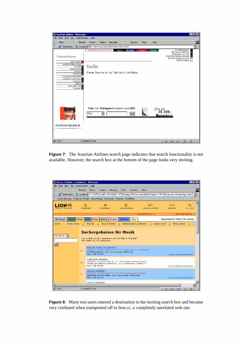
Figure 7 : The Austrian Airlines search page indicates that search functionality is notavailable. However, the search box at the bottom of the page looks very inviting.
Figure 8 : Many test users entered a destination in the inviting search box and becamevery confused when transported off to lion.cc, a completely unrelated web site.
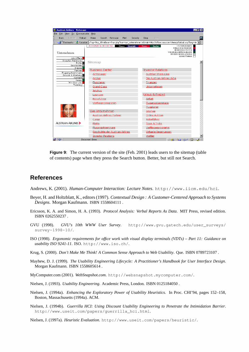
Figure 9 : The current version of the site (Feb. 2001) leads users to the sitemap (tableof contents) page when they press the Search button. Better, but still not Search.
References
Andrews, K. (2001).Human-Computer Interaction: Lecture Notes. http://www.iicm.edu/hci .
Beyer, H. and Holtzblatt, K., editors (1997).Contextual Design : A Customer-Centered Approach to SystemsDesigns. Morgan Kaufmann.ISBN 1558604111 .
Ericsson, K. A. and Simon, H. A. (1993).Protocol Analysis: Verbal Reports As Data. MIT Press, revised edition.ISBN 0262550237 .
GVU (1998). GVU’s 10th WWW User Survey. http://www.gvu.gatech.edu/user_surveys/survey-1998-10/ .
ISO (1998). Ergonomic requirements for office work with visual display terminals (VDTs) – Part 11: Guidance onusability ISO 9241-11. ISO. http://www.iso.ch/ .
Krug, S. (2000).Don’t Make Me Think! A Common Sense Approach to Web Usability. Que. ISBN 0789723107 .
Mayhew, D. J. (1999).The Usability Engineering Lifecycle: A Practitioner’s Handbook for User Interface Design.Morgan Kaufmann. ISBN 1558605614 .
MyComputer.com (2001).WebSnapshot.com. http://websnapshot.mycomputer.com/ .
Nielsen, J. (1993).Usability Engineering. Academic Press, London. ISBN 0125184050 .
Nielsen, J. (1994a).Enhancing the Exploratory Power of Usability Heuristics. In Proc. CHI’94, pages 152–158,Boston, Massachusetts (1994a). ACM.
Nielsen, J. (1994b).Guerrilla HCI: Using Discount Usability Engineering to Penetrate the Intimidation Barrier.http://www.useit.com/papers/guerrilla_hci.html .
Nielsen, J. (1997a).Heuristic Evaluation. http://www.useit.com/papers/heuristic/ .

Nielsen, J. (1997b).Search and You May Find, The Alertbox.http://www.useit.com/alertbox/9707b.html .
Nielsen, J. (1999).Designing Web Usability: The Practice of Simplicity. New Riders. ISBN 156205810X .
Rettig, M. (1994). Prototyping for Tiny Fingers. Communications of the ACM, 37(4):21–27.http://www.enteract.com/˜marc/writings/prototyping.zip .
Sullivan, T. (1999).How Much Is Too Much?, All Things Web.http://www.pantos.org/atw/35654.html .
UIE (1998).Why On-Site Searching Stinks. http://world.std.com/˜uieweb/searchar.htm .
UIE (2000). Paper Prototypes: Still Our Favorite, User Interface Engineering.http://www.uie.com/prototyp.htm .
Upsdell, C. A. (2001).BrowserNews: Statistics. http://www.upsdell.com/BrowserNews/stat.htm .