Embed Size (px)
Citation preview
Worth 1,000 Words How to use information graphics to make data meaningful
National Association for Career and Technical Education InformationMay 17, 2012
Rhonda [email protected]
Visualization
Using graphic images to tell a story with data
Goal of information graphics
Readable
Understandable
Usable
Every artistic decision made with the needs of readers in mind.
“Graphical excellence is that which gives to the viewer the greatest number of ideas in the shortest time, with the least amount of ink in the smallest amount of space.”
Edward TufteThe Visual Display of Quantitative Information
Why use information graphics?
Helps the reader see patterns and relationships
Reinforces information
Efficient use of reader time
Communicates complex information clearly
Getting started
Ask what story you want to tell
Think character development
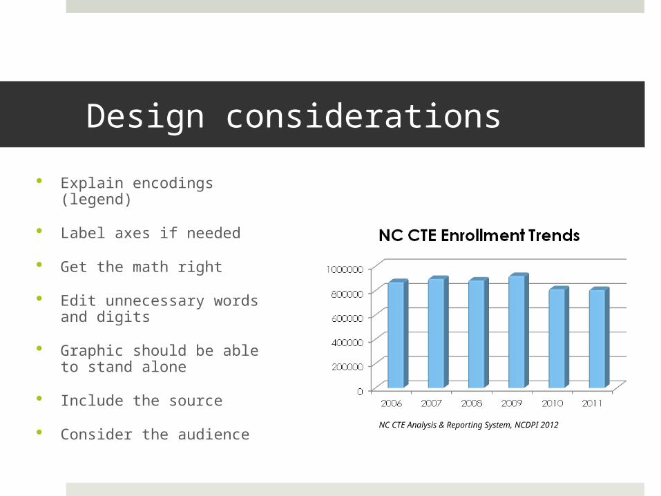
Design considerations
Explain encodings (legend)
Label axes if needed
Get the math right
Edit unnecessary words and digits
Graphic should be able to stand alone
Include the source
Consider the audience NC CTE Analysis & Reporting System, NCDPI 2012

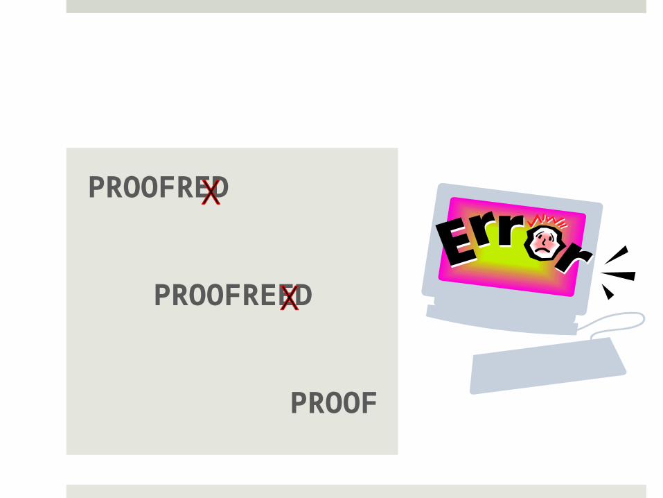
PROOFRED
PROOFREED
PROOF
Organize data
Spreadsheet
Assign record number
Use unique identifier
Find problems with data Relevant Accurate Realistically reported Check for missing data Not misleading Identify projections vs.
real data Identify contributing
factors
What software to use?
WHATEVER WORKS FOR
YOU
Examples Out of the box
Excel Google Spreadsheets
Some assembly required Java Apex R
Illustration tools Adobe Illustrator Freehand
Types of graphics
Text driven Timeline
Can be tied to a series of historic events Tables
When numbers themselves are important Fact boxes
To emphasize
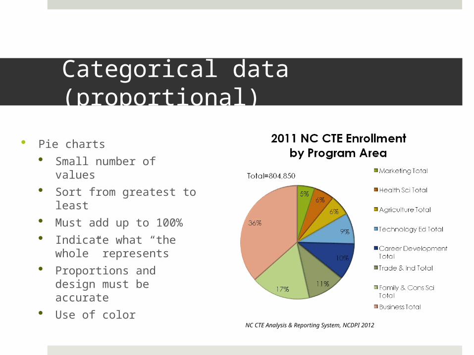
Categorical data (proportional)
Pie charts Small number of
values Sort from greatest to
least Must add up to 100% Indicate what “the
whole” represents Proportions and design
must be accurate Use of color
NC CTE Analysis & Reporting System, NCDPI 2012
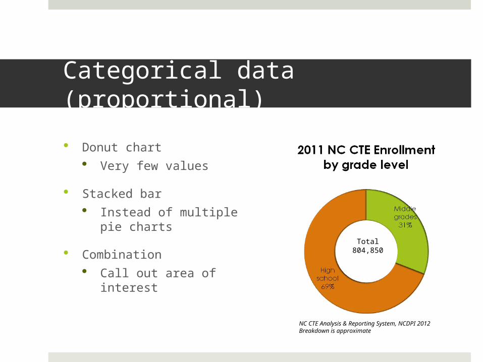
Categorical data (proportional)
Donut chart Very few values
Stacked bar Instead of multiple pie
charts
Combination Call out area of
interest
Total804,850
NC CTE Analysis & Reporting System, NCDPI 2012Breakdown is approximate
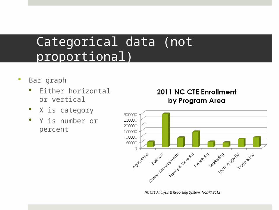
Categorical data (not proportional)
Bar graph Either horizontal or
vertical X is category Y is number or percent
NC CTE Analysis & Reporting System, NCDPI 2012
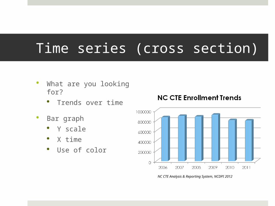
Time series (cross section)
What are you looking for? Trends over time
Bar graph Y scale X time Use of color
NC CTE Analysis & Reporting System, NCDPI 2012
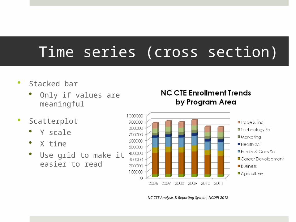
Time series (cross section)
Stacked bar Only if values are
meaningful
Scatterplot Y scale X time Use grid to make it
easier to read
NC CTE Analysis & Reporting System, NCDPI 2012
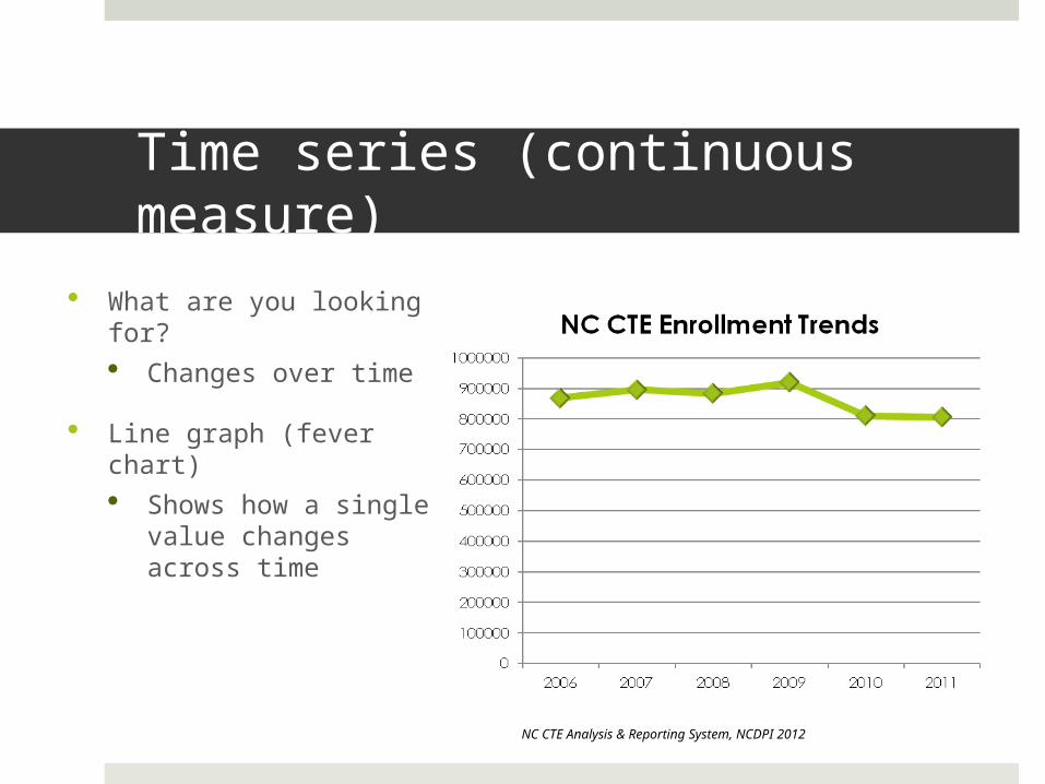
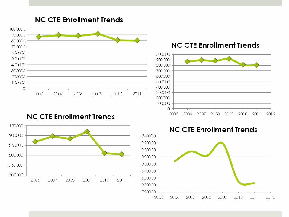
Time series (continuous measure)
What are you looking for? Changes over time
Line graph (fever chart) Shows how a single
value changes across time
NC CTE Analysis & Reporting System, NCDPI 2012
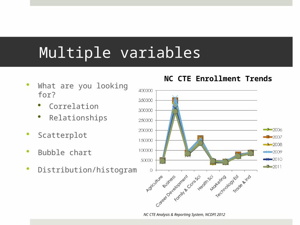
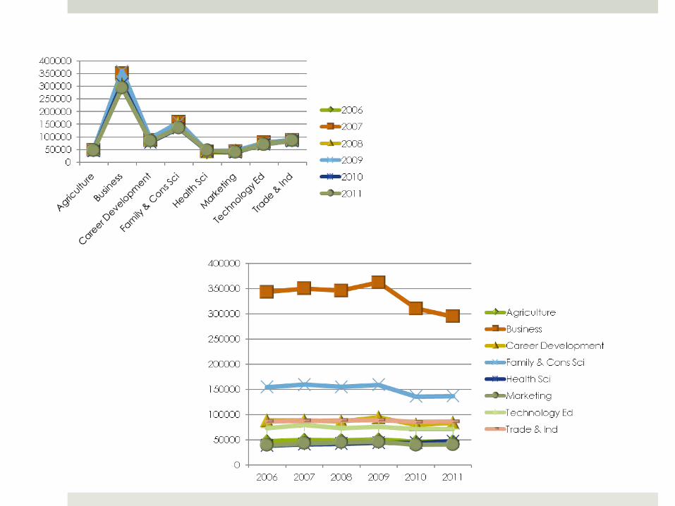
Multiple variables
What are you looking for? Correlation Relationships
Scatterplot
Bubble chart
Distribution/histogram
NC CTE Analysis & Reporting System, NCDPI 2012
NC CTE Enrollment Trends
Design considerations
Label each data point
Sans serif font Legend and labels 10 pt (print), 14 pt (presentation) Headlines 18 pt (print), 24 pt bold (presentation)
When should you hire someone to do it for you? When you don’t have time to do it right When your ideas are greater than your skills When you don’t have any ideas

PROOFRED
PROOFREED
PROOF
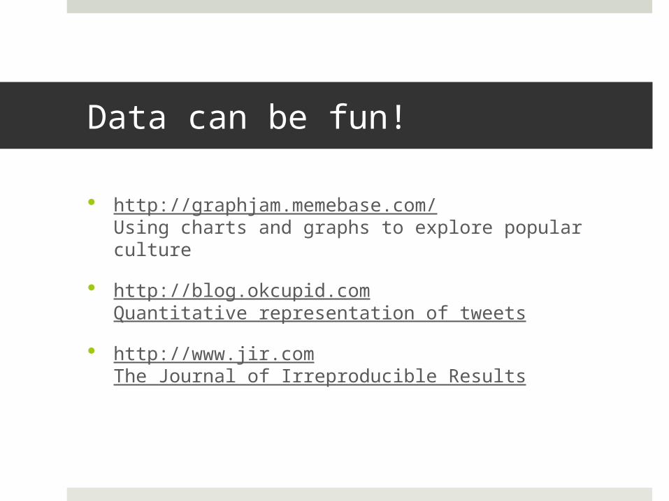
Data can be fun!
http://graphjam.memebase.com/Using charts and graphs to explore popular culture
http://blog.okcupid.comQuantitative representation of tweets
http://www.jir.comThe Journal of Irreproducible Results
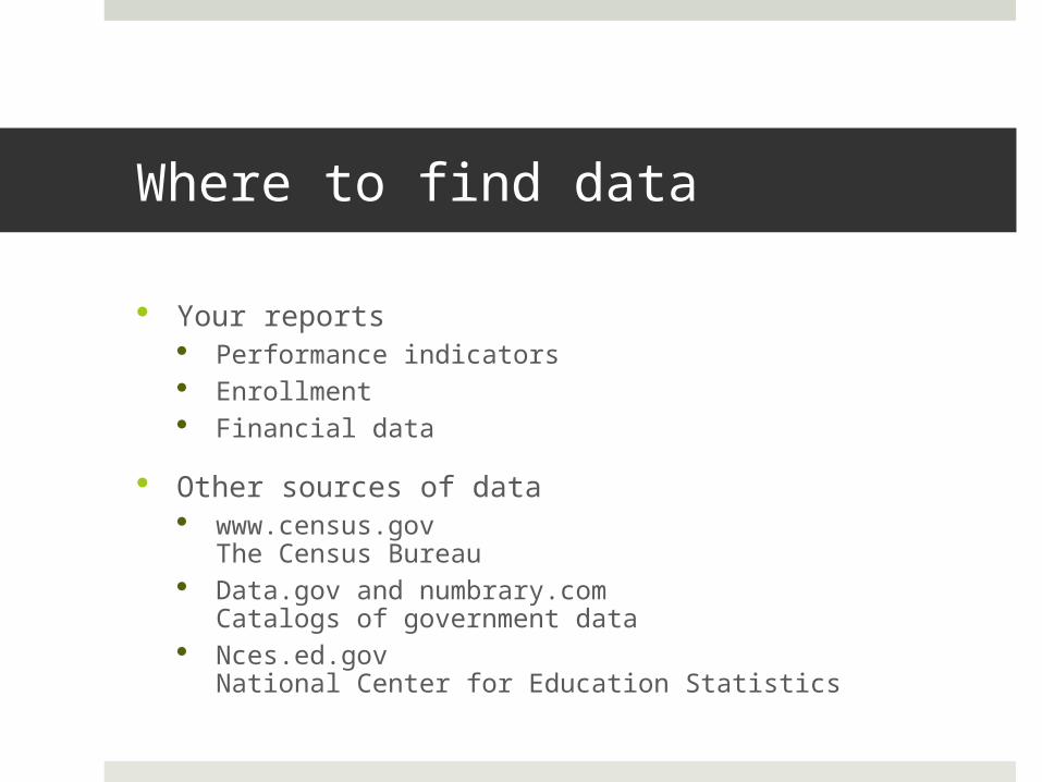
Where to find data
Your reports Performance indicators Enrollment Financial data
Other sources of data www.census.gov
The Census Bureau Data.gov and numbrary.com
Catalogs of government data Nces.ed.gov
National Center for Education Statistics
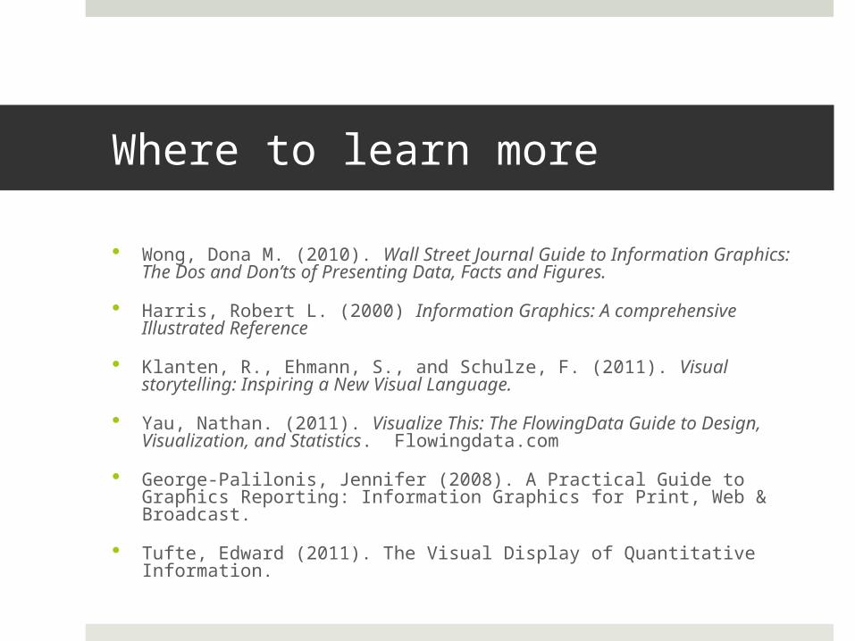
Where to learn more
Wong, Dona M. (2010). Wall Street Journal Guide to Information Graphics: The Dos and Don’ts of Presenting Data, Facts and Figures.
Harris, Robert L. (2000) Information Graphics: A comprehensive Illustrated Reference
Klanten, R., Ehmann, S., and Schulze, F. (2011). Visual storytelling: Inspiring a New Visual Language.
Yau, Nathan. (2011). Visualize This: The FlowingData Guide to Design, Visualization, and Statistics. Flowingdata.com
George-Palilonis, Jennifer (2008). A Practical Guide to Graphics Reporting: Information Graphics for Print, Web & Broadcast.
Tufte, Edward (2011). The Visual Display of Quantitative Information.
PROOFRED
PROOFREED
PROOF