Embed Size (px)
Citation preview
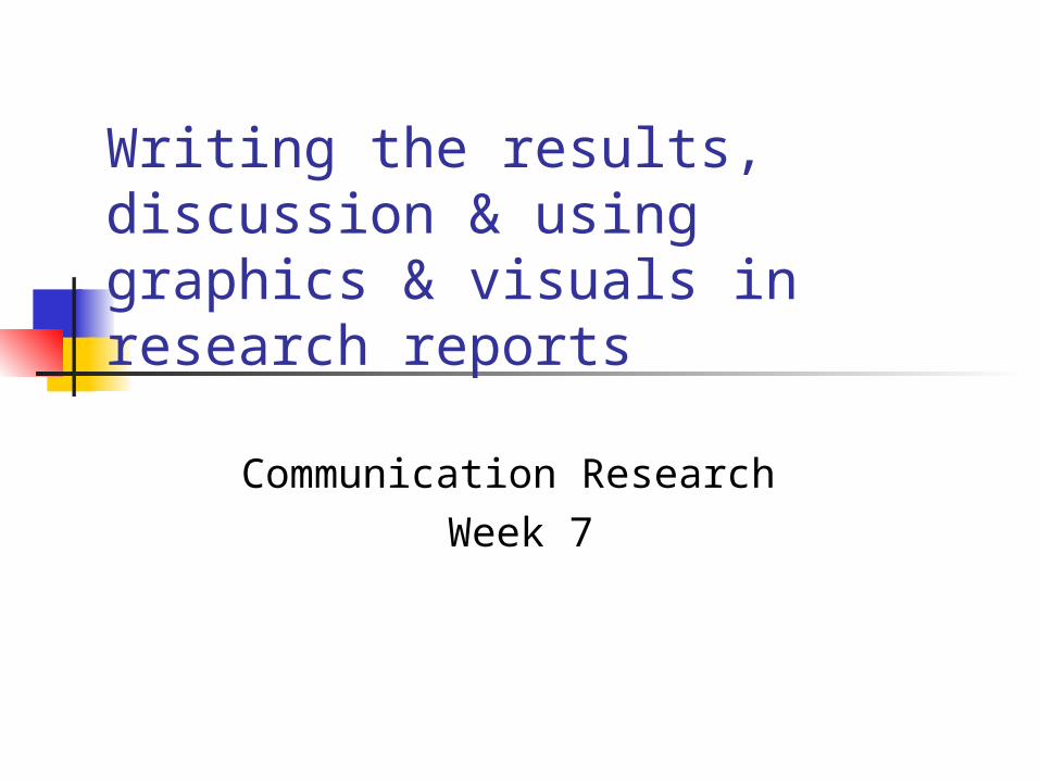
Writing the results, discussion & using graphics & visuals in research reports
Communication Research
Week 7

2
Results
Purpose of this section is to present a summary of the results and comment on the significance of the data
Graphics are used in this section to present the full findings
Text should highlight the most important results and help the reader interpret them

3
Results
For each piece of important information, a three (3) step process is useful: A statement which locates the figures or
findings eg as shown in Fig 1, the trend … Statements which present the most important
findings Comments by the author on these findings

4
Results/comments
May do the following Generalise from specific results to general trends
in populations Explain the possible reasons or causes of such
results Compare the results with results of other studies

5
Discussion section
Makes reference to the main purpose and/or hypothesis Reviews the most significant findings and whether or not
they agree or disagree with the original hypothesis Explains/speculates about findings outlined or described
in “Results” section Compares findings/outcomes with related studies
already cited in literature review Outlines limitations of the study and the extent to which
findings can really be generalised Makes recommendations for further research
6
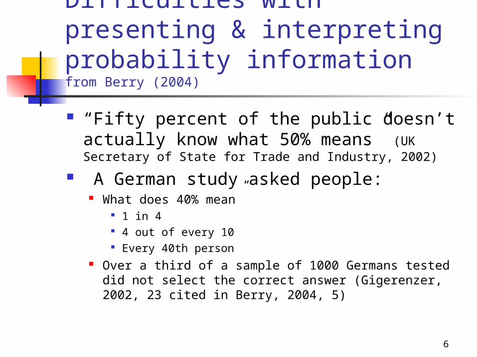
Difficulties with presenting & interpreting probability informationfrom Berry (2004)
“Fifty percent of the public doesn’t actually know what 50% means” (UK Secretary of State for Trade and Industry, 2002)
A German study asked people: What does 40% mean”
1 in 4 4 out of every 10 Every 40th person
Over a third of a sample of 1000 Germans tested did not select the correct answer (Gigerenzer, 2002, 23 cited in Berry, 2004, 5)

7
Presenting probabilities as frequencies
Gigerenzer (2002) argues that some of the misinterpretation by even experienced and educated readers can be overcome by using frequencies eg
The probability that a woman of age 40 has breast cancer is about 1 percent. If she has breast cancer, the probability that she tests positive on a screening mammogram is 90 percent. If she does not have breast cancer, the probability that she nevertheless tests positive is 9 percent. What are the chances that a woman who tests positive actually has breast cancer? (Gigerenzer, 2002, 41 cited in Berry, 2004, 32)
8
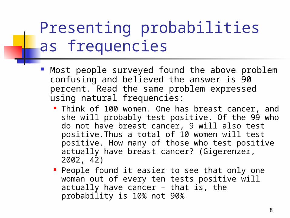
Presenting probabilities as frequencies Most people surveyed found the above problem
confusing and believed the answer is 90 percent. Read the same problem expressed using natural frequencies:
Think of 100 women. One has breast cancer, and she will probably test positive. Of the 99 who do not have breast cancer, 9 will also test positive.Thus a total of 10 women will test positive. How many of those who test positive actually have breast cancer? (Gigerenzer, 2002, 42)
People found it easier to see that only one woman out of every ten tests positive will actually have cancer – that is, the probability is 10% not 90%

9
Interpretation can be affected by
Verbal expressions used eg ‘likely’, ‘rare’ Context – knowledge, experience, framing of info Different numerical formats eg
Yamagishi (1997) presented people with two different statements about a certain type of cancer and asked them which they judged to be more risky
Kills 1286 out of 10,000 people Kills 24.14 out of 100 people.
The first statement was judged more risky even though the level of risk described in the second is twice as high

10
Why is understanding how visuals communicate important?
Our culture places much emphasis on the visual – seeing is believing
Visual communication is faster and more easily processed
Visuals and graphics add another layer of meaning and another way of communicating
Visuals actively engage the brain in interpretation, making it more likely that readers will rememberthe information

11
How do graphics & visuals enhance & supplement a report?
Make points vivid and help readers “see” data Present information more compactly than
words Convey/ simplify complex data Demonstrate contrasts/ comparisons Suggest movements/ trends over time Emphasise physical appearance

12
How do graphics & visuals enhance & supplement a report?
Analyse concepts/ processes/ abstract relationships
Should not replace text Should be properly incorporated and
referenced eg ‘ … as shown in figure 1 …’ Different graphics serve different purposes –
choose the right visual for the story and the data
Ensure each visual is accurate and ethical

13
All visuals share certain conventions
Identify an analytic perspective for the data with an interpretative title
Clearly describe the type of data (survey or projection)
Label the units (e.g. slices in a pie chart) Label the axes and use a legend List the source of the data or acknowledge the
source of the visual (if copied) Integrate into text with table/ figure numbers

14
What’s wrong with this graphic?
Has there been a growth in the number of bananas between 1960 and 1980?
Or have the bananas grown increased in size?
Source: Sadler & Tucker, 1981, 116

15
Line graphs Indicate movements over
time, compare frequency, identify correlations
Inappropriate labels and scales can make them difficult to interpret
Q :What is the difference between these two graphs?
Source: Sadler & Tucker, 1981, 116

16
Line graphs Put time on the
horizontal axis Avoid more than 3 or 4
lines Use only 2 lines if they
cross a lot Use different colours
and a legend Label the axes Avoid perspective
Extra Staff in East Increased Sales in 3rd Q
0
10
20
30
40
50
60
70
80
90
100
1st Qtr 2nd Qtr 3rd Qtr 4th Qtr
Millions
EastWestNorth
Source: Gould www.rpi.edu/~goulde/co_su02/viscom.ppt

17
Poor example
0
20
40
60
80
100
1st Qtr 2nd Qtr 3rd Qtr 4th Qtr
EastWest
North
EastWestNorth
Source: Gould www.rpi.edu/~goulde/co_su02/viscom.ppt

18
Column or vertical bar graph Compare items, show distributions or
highlight correlations Different bar charts for different
purposes Grouped (compare aspects of
each item across time Segmented, subdivided or stacked
(helps compare totals but cannot compare segments
Deviation (identify opposites) Paired (show correlation between
two items) Difficult for the eye to interpret size
and proportionsSource: Eunson, 1995, 79

19
Grouped bar charts allow comparison
Extra Staff in East Increased Sales in 3rd Q
0102030405060708090
100
East West North
Millions
1st Qtr2nd Qtr3rd Qtr4th Qtr
Source: Gould www.rpi.edu/~goulde/co_su02/viscom.ppt
20
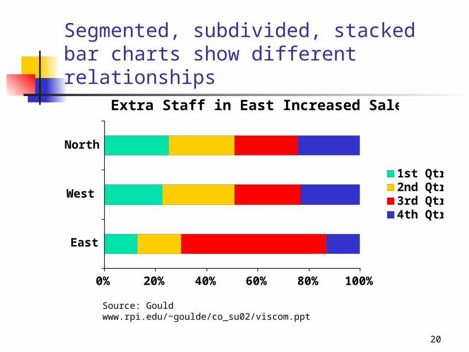
Segmented, subdivided, stacked bar charts show different relationships
Extra Staff in East Increased Sales in 3rd Q
0% 20% 40% 60% 80% 100%
East
West
North
1st Qtr2nd Qtr3rd Qtr4th Qtr
Source: Gould www.rpi.edu/~goulde/co_su02/viscom.ppt

21
Deviation bar charts show exceptions1998 Sales Relative to 1997
-8
-6
-4
-2
0
2
4
6
8
10
12
1st Qtr 2nd Qtr 3rd Qtr 4th Qtr
Percent Increase/ Decrease
EastWestNorth
Source: Gould www.rpi.edu/~goulde/co_su02/viscom.ppt

22
Bar chart design Use a logical order
Chronological By region
Put bars close enough for comparison Label both axes and make increments
consistent Make all bars the same width Use colours for coding (not just “to look good”) Avoid “chart junk” – especially 3D views

23
Chart junk
Source: Gould www.rpi.edu/~goulde/co_su02/viscom.ppt
020406080
100
1stQtr
2ndQtr
3rdQtr
4thQtr
East
North
EastWestNorth

24
Pie charts Show relative proportions and
the importance of each part to the whole
Label segments and proportions outside the pie
Limit segments to 5-7 Can be difficult to judge area
and size differences therefore should not be used to exactly compare segments
Source: Eunson, 1995, 78

25
Good exampleNorth Region Leads 1st Q Sales
45.9million
30. 6 miliion
20.4 million
EastWestNorth
Source: www.rpi.edu/~goulde/co_su02/viscom.ppt]

26
Poor exampleNorth Region Leads 1st Q Sales
10.2
12.6
25.3
15.6
20.415.7
EastNortheastNorthCentral
WestIsland
Source: Gould www.rpi.edu/~goulde/co_su02/viscom.ppt

27
Tables
Offer clear comprehensive detail Allow comparison between large amounts of
data Make readers focus on the raw data not your
interpretation of the data How you set out the table can affect
interpretation Difficult to read quickly Hard to recognise relationships
28
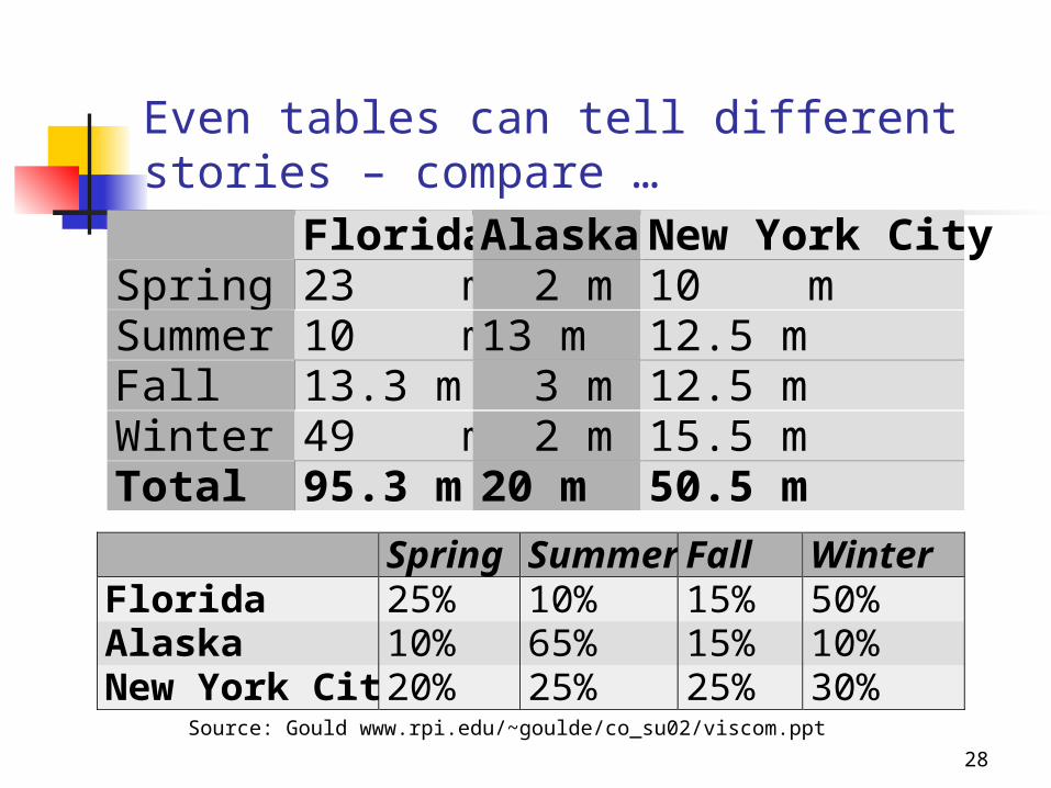
Even tables can tell different stories – compare …
Florida Alaska New York CitySpring 23 m 2 m 10 mSummer 10 m 13 m 12.5 mFall 13.3 m 3 m 12.5 mWinter 49 m 2 m 15.5 mTotal 95.3 m 20 m 50.5 m
Spring Summer Fall WinterFlorida 25% 10% 15% 50%Alaska 10% 65% 15% 10%New York City 20% 25% 25% 30%
Source: Gould www.rpi.edu/~goulde/co_su02/viscom.ppt

29
Summary of charts
Use charts to simplify data Pick an appropriate style – bar charts are most
common for business audiences Provide an interpretative title – you want your
readers to understand the data in a way that supports your arguments, not theirs
Avoid “chart junk”

30
Visual Ethics in Accident Reporting
(from Dragga & Voss, 2003)

31

32

33

34
Bibliography & further readingBerry, D.(2004) Risk, Communication and Health Psychology UK, Open
University Press
Dragga, S. & Voss, D. (2003) Hiding Humanity: Verbal and Visual Ethics in Accident Reports Technical Communication Vol 50, No 1, Feb 2003 pp.61-82
Dragga, S. & Voss, D. (2001) Cruel Pies: The Inhumanity of Technical Illustrations Technical Communication Vol 48, No 3, Aug 2001 pp.265-274
Eunson, B. (1995) Writing and Presenting Reports Melbourne, John Wiley
Gould, E (2002) www.rpi.edu/~goulde/co_su02/viscom.ppt [accessed May 20, 2003]
Mohan, T., McGregor, H., Saunders, S., & Archee, R. (2004) Communicating as Professionals Melbourne, Thomson
Sadler, R.K & Tucker, K (1981) Common Ground: A Course in Communication Melbourne, Macmillan