Embed Size (px)
Citation preview

WWW: Writing for the Wired World
September 25, 2002
Darlene Fichter, PresidentNorthern Lights Internet Solutions Ltd.
www.lights.com
Outline
1. Reading & Writing2. Research
Do’s and Don’ts Format, typography, style, ...
3. Document Conversion & Standards

Outline
4. Writing for:” Search Engines Error Messages
5. Usability Testing Quick and easy techniques
6. Strategies to encourage good writing
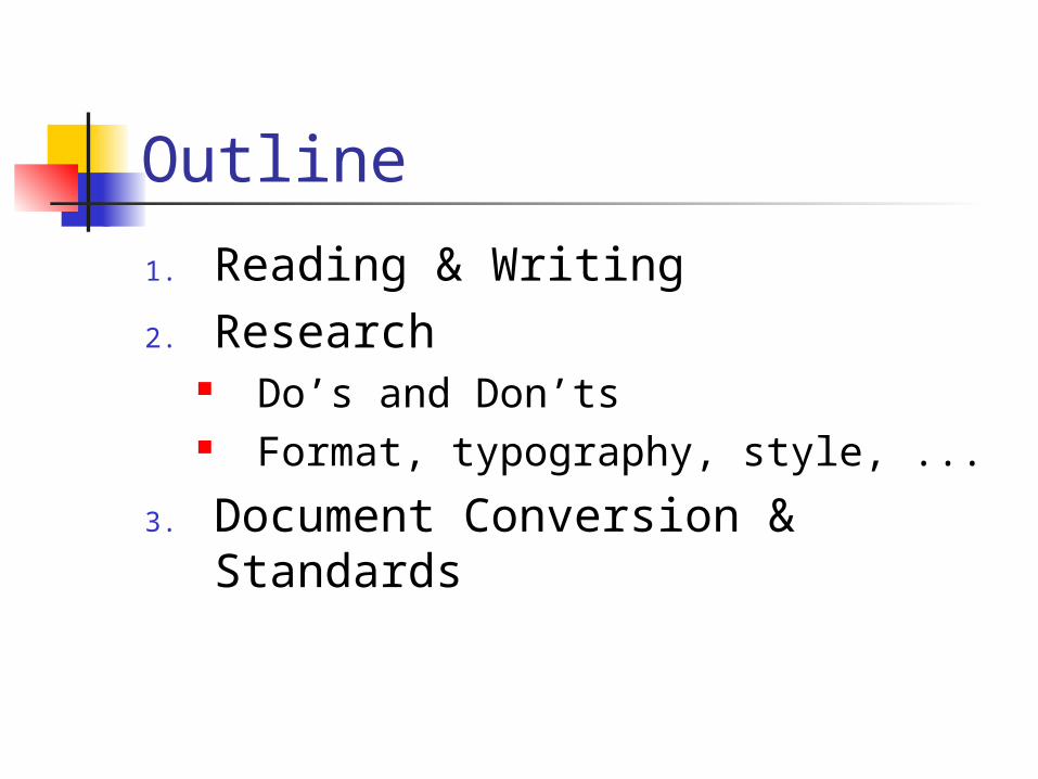
Challenges Focus on IT – the technology Often key Intranet developers do not
have writing experience Programmer, Information architect, Content
experts, Intranet manager, Designers As a result:
Writing ignored Time spent on top level pages only Time spent on menus/graphics Site vs. Page
The Reality Micro-content is as important as
the navigation, side menus, design

Focus of the Presentation: Research
Usability studies Watch and observe 1000’s of users
using the web and intranet
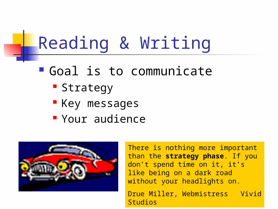
Reading & Writing Goal is to communicate
Strategy Key messages Your audience
There is nothing more important than the strategy phase. If you don’t spend time on it, it’s like being on a dark road without your headlights on.
Drue Miller, Webmistress Vivid Studios

Intranet Audience Focused on getting the job done Diverse
Experience Usage patterns Nature of their work – Engineers,
Financial analysts, Marketers
Novice / Occasional Users* Intimidated by complex menus Like unambiguous structure
Apples or Oranges Easy access to overviews that
illustrate how information is arranged, maps, FAQs
Glossary of technical terms, acronyms, abbreviations
Visual layouts & graphics that trigger their memory
* Adapted from Patrick Lynch Sarah Horton, Web Style Guide. Yale University Press, 1999.
Expert/Frequent Users* Depend on you for speed and accuracy Impatient with low-density graphics that
offer only a few choices Prefer stripped down fast loading text
menus Specific goals Appreciate detailed text menus, site
structure outlines, comprehensive site indexes, well designed search engines
Accelerators – ways to bypass the fluff
* Adapted from Patrick Lynch Sarah Horton, Web Style Guide. Yale University Press, 1999.
International Users Don’t abbreviate dates 3/4/99
March 4 or April 3? Avoid idiosyncratic professional
jargon or obscure technical terms on your intro pages
Avoid situational metaphors

Users Want to KnowWho? Tell them WHO is speaking – what
department or person created the page.
What? WHAT is the page about? Have a title.
When? WHEN – time is important in evaluating the worth. Date every page. Especially important in long and complex documents that may be updated.
Where? Ideally, WHERE are they – what intranet site or sub-site?
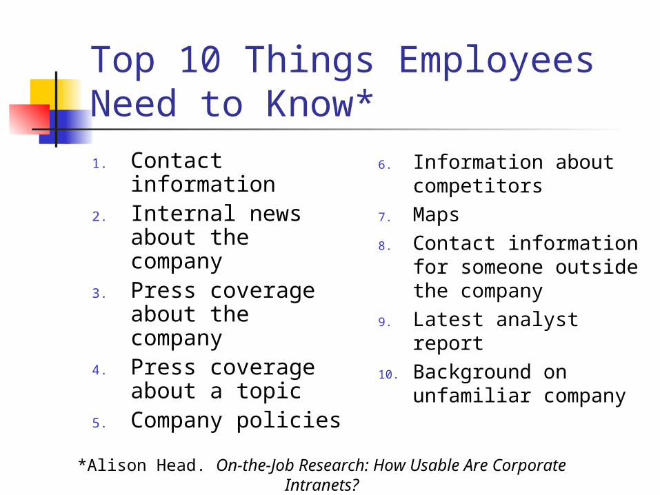
Top 10 Things Employees Need to Know*1. Contact information2. Internal news about
the company3. Press coverage
about the company4. Press coverage
about a topic 5. Company policies
6. Information about competitors
7. Maps8. Contact information
for someone outside the company
9. Latest analyst report10. Background on
unfamiliar company
*Alison Head. On-the-Job Research: How Usable Are Corporate Intranets?
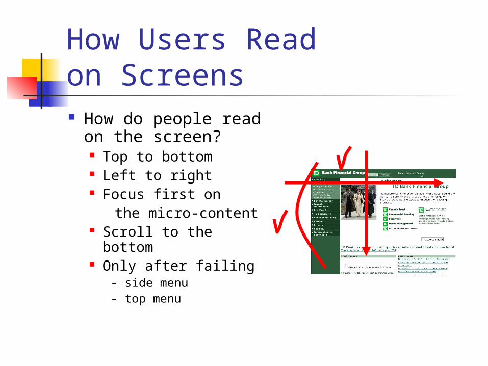
How Users Read on Screens How do people
read on the screen? Top to bottom Left to right Focus first on the micro-content Scroll to the bottom Only after failing
- side menu- top menu
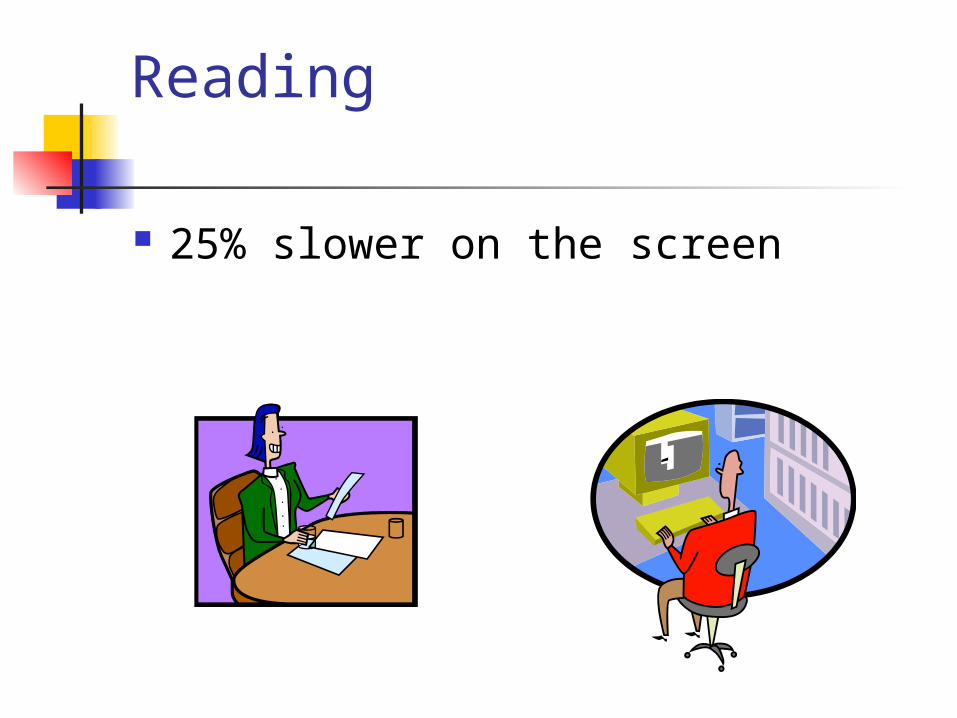
Reading
25% slower on the screen
Research shows: DON’T READ People who are looking for
information don't read, they scan. If they have to read instructions or
help page, most people will not. Readers understand more when
reading less.

“Scanability” Create page titles, headings and
subheadings Be consistent in how you design
the headings Use font and/or color to offset
headings
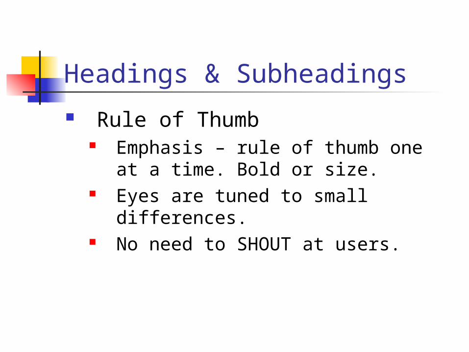
Headings & Subheadings
Rule of Thumb Emphasis – rule of thumb one at a
time. Bold or size. Eyes are tuned to small differences. No need to SHOUT at users.
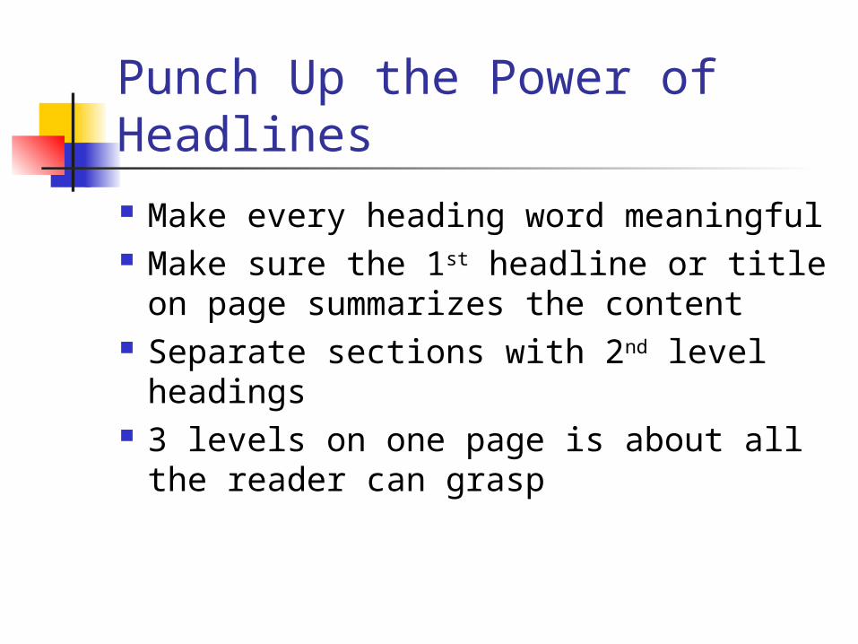
Punch Up the Power of Headlines
Make every heading word meaningful
Make sure the 1st headline or title on page summarizes the content
Separate sections with 2nd level headings
3 levels on one page is about all the reader can grasp
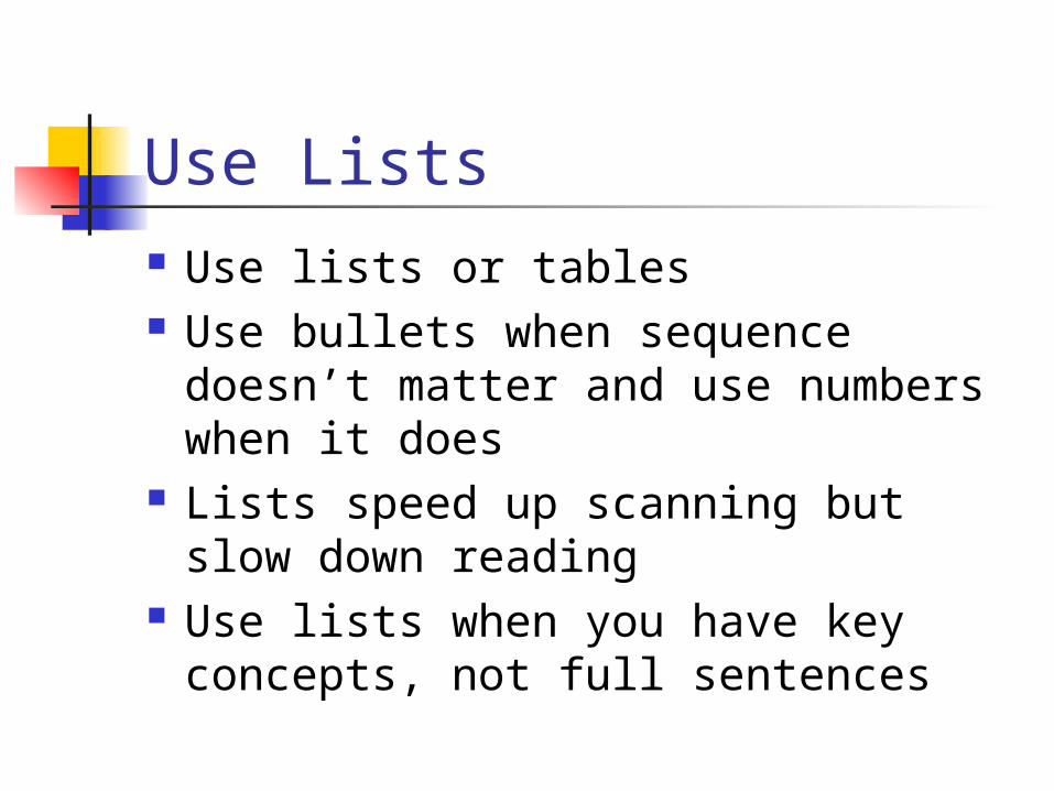
Use Lists Use lists or tables Use bullets when sequence doesn’t
matter and use numbers when it does
Lists speed up scanning but slow down reading
Use lists when you have key concepts, not full sentences
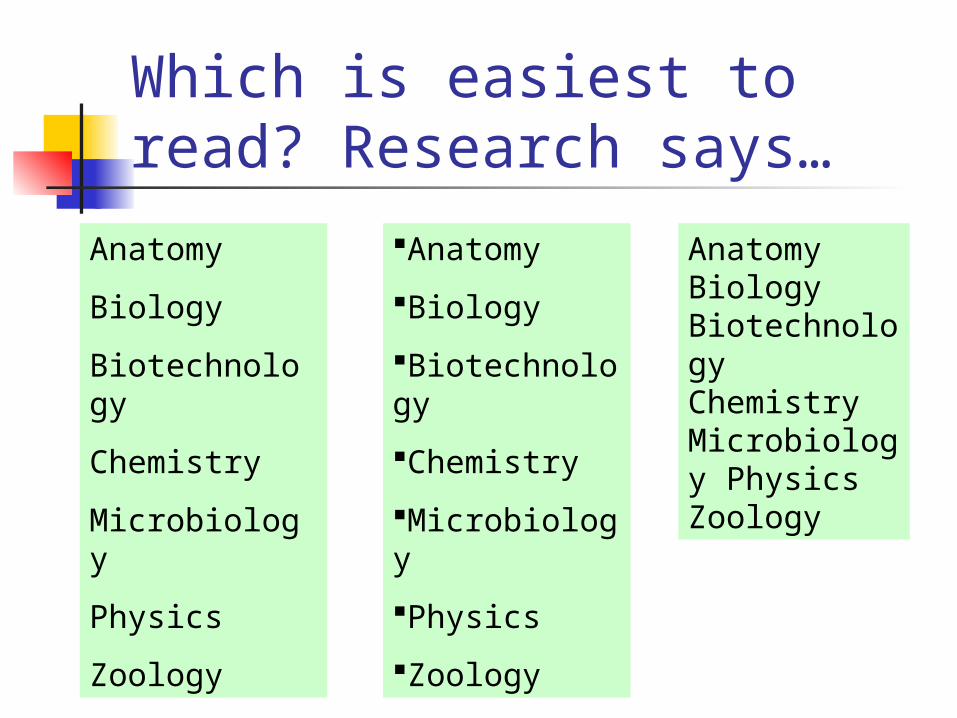
Which is easiest to read? Research says…
Anatomy
Biology
Biotechnology
Chemistry
Microbiology
Physics
Zoology
Anatomy
Biology
Biotechnology
Chemistry
Microbiology
Physics
Zoology
Anatomy Biology Biotechnology Chemistry Microbiology Physics Zoology
Tables Can help organize content for
easier viewing
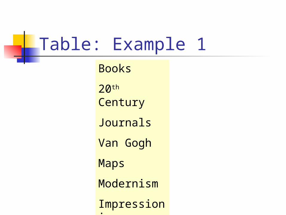
Table: Example 1Books
20th Century
Journals
Van Gogh
Maps
Modernism
Impressionism
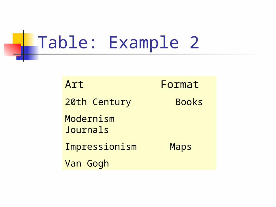
Table: Example 2
Art Format
20th Century Books
Modernism Journals
Impressionism Maps
Van Gogh
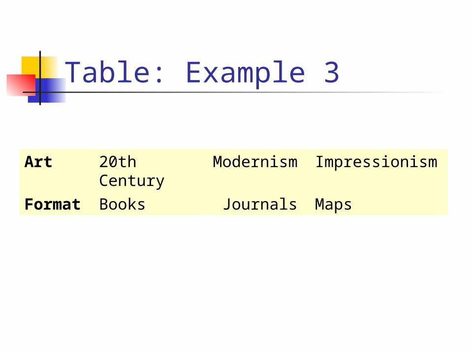
Table: Example 3
Art 20th Century Modernism Impressionism
Format Books Journals Maps
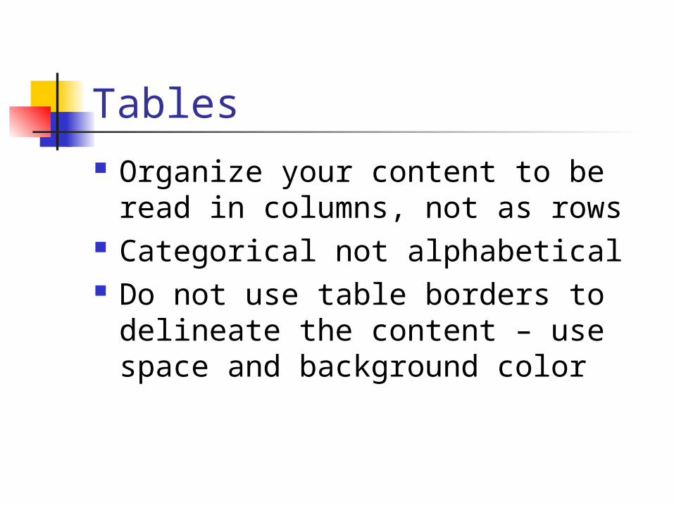
Tables Organize your content to be read
in columns, not as rows Categorical not alphabetical Do not use table borders to
delineate the content – use space and background color
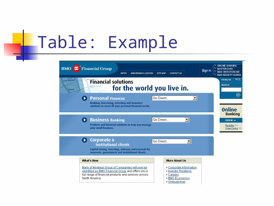
Table: Example
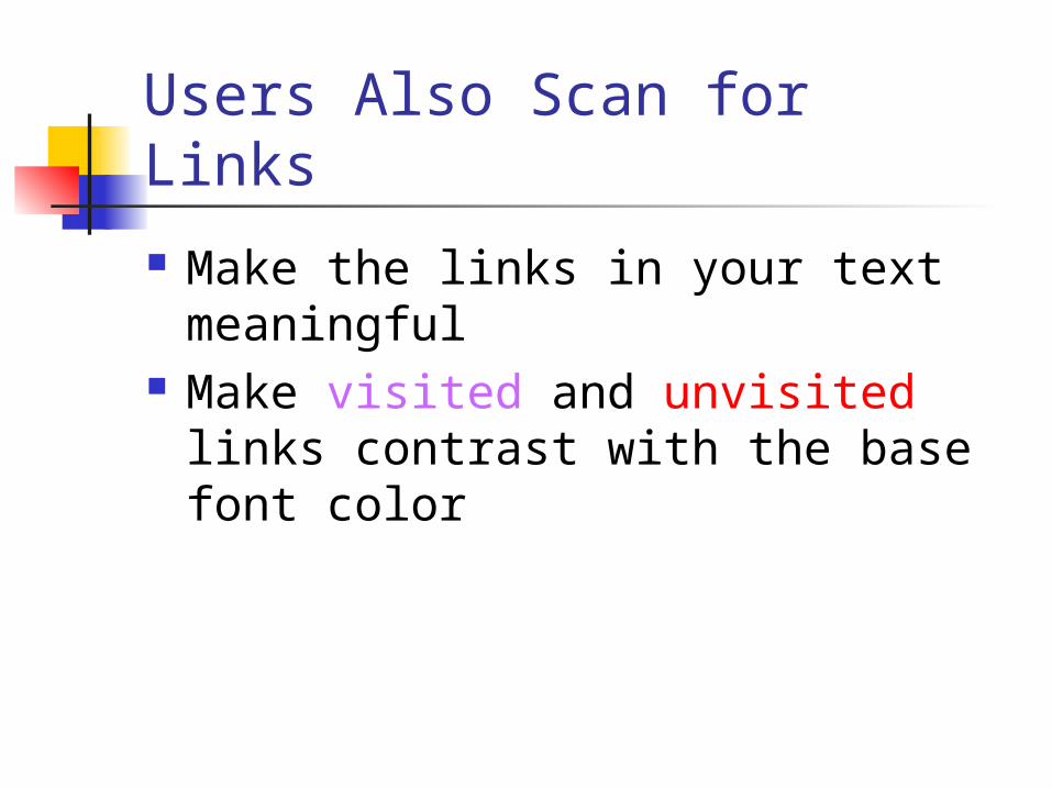
Users Also Scan for Links
Make the links in your text meaningful
Make visited and unvisited links contrast with the base font color
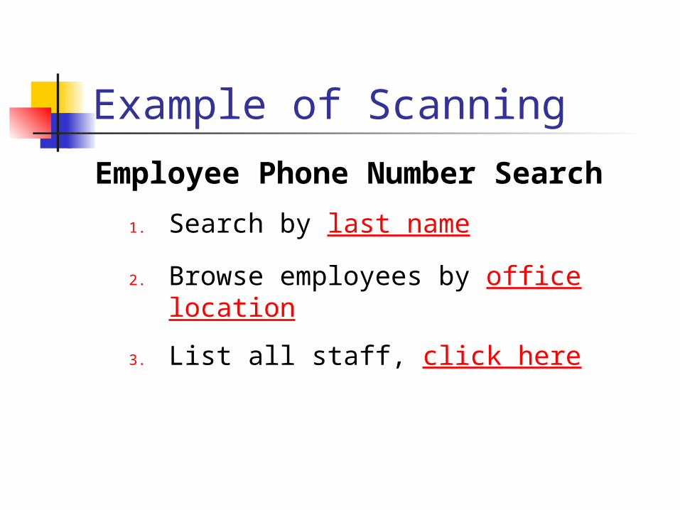
Example of Scanning
Employee Phone Number Search
1. Search by last name
2. Browse employees by office location
3. List all staff, click here
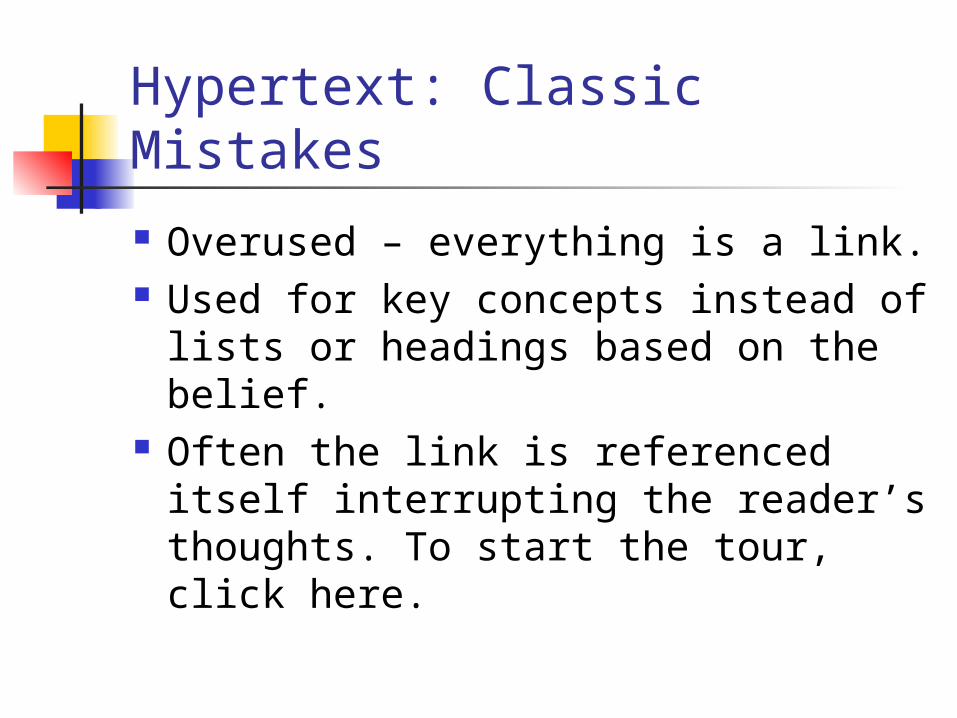
Hypertext: Classic Mistakes
Overused – everything is a link. Used for key concepts instead of
lists or headings based on the belief.
Often the link is referenced itself interrupting the reader’s thoughts. To start the tour, click here.
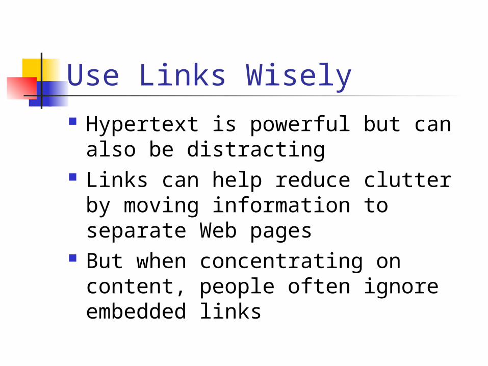
Use Links Wisely Hypertext is powerful but can also
be distracting Links can help reduce clutter by
moving information to separate Web pages
But when concentrating on content, people often ignore embedded links
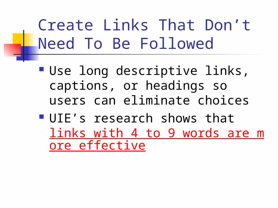
Create Links That Don’t Need To Be Followed
Use long descriptive links, captions, or headings so users can eliminate choices
UIE’s research shows that links with 4 to 9 words are more effective
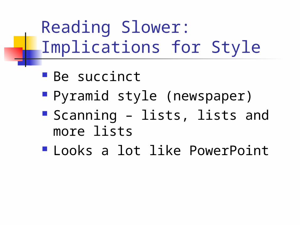
Reading Slower: Implications for Style
Be succinct Pyramid style (newspaper) Scanning – lists, lists and more lists Looks a lot like PowerPoint

Be Succinct Simplify for understanding Use fewer words, smaller words,
and simpler words Place words into simple sentence
structures Examples:
utilize=use construct=build
Rule of Thumb: 50% ½ the word count of
conventional writing
Invert the Pyramid
Newspaper style writing State your conclusion first Summarize most important
items first Then get to the details
One Idea Per Paragraph Stanford/Poynter study showed
that many web visitors will read only the first or second sentences of paragraph
Use a strong lead sentence that summarizes content Aka blogs
Fragments or Sentences
Some debate Poynter seems to imply sentences Imperative style sentences starting
with a verb can be very effective

Harness Verbs Verbs get your visitors energized Using active verbs also helps
improve your credibility Examples:
Download Marketing XYZ presentation.
Register for XYZ workshop.
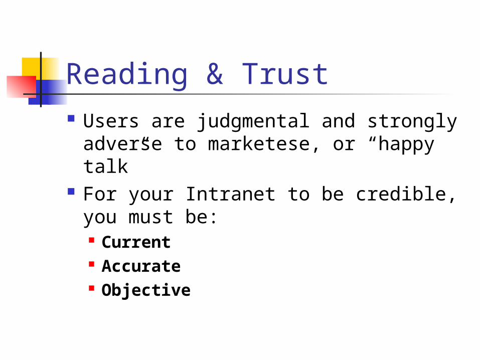
Reading & Trust Users are judgmental and strongly
adverse to marketese, or “happy talk” For your Intranet to be credible, you
must be: Current Accurate Objective
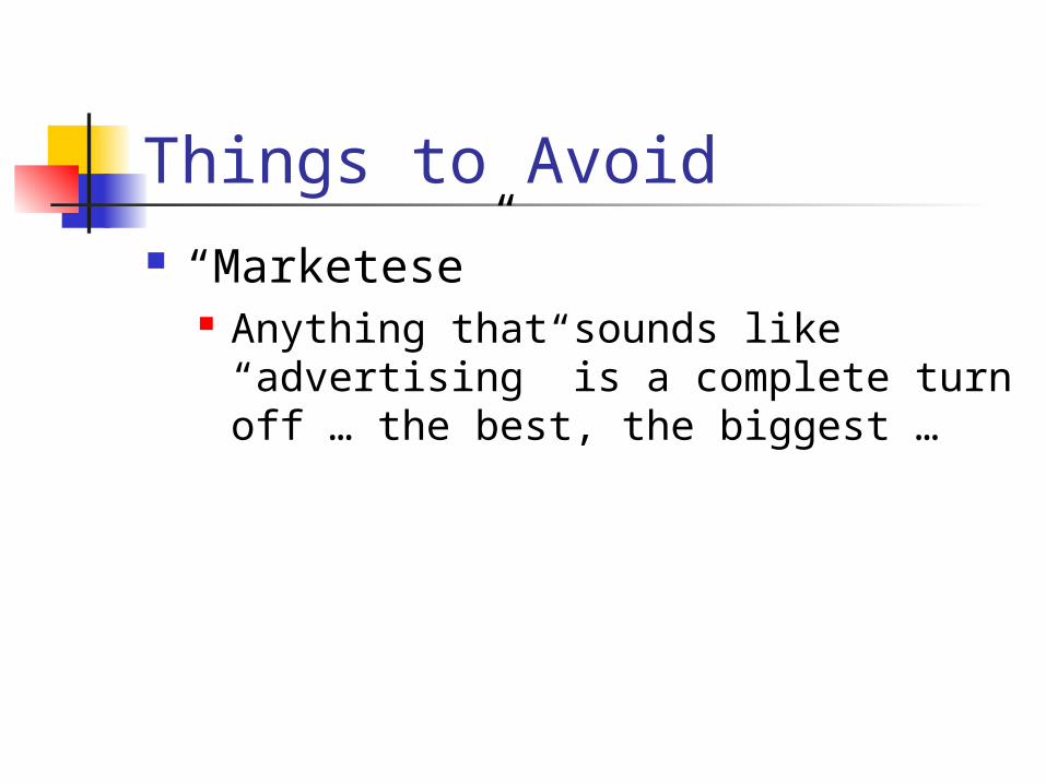
Things to Avoid “Marketese”
Anything that sounds like “advertising” is a complete turn off … the best, the biggest …
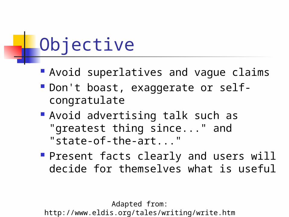
Objective Avoid superlatives and vague claims Don't boast, exaggerate or self-
congratulate Avoid advertising talk such as
"greatest thing since..." and "state-of-the-art..."
Present facts clearly and users will decide for themselves what is useful Adapted from: http://www.eldis.org/tales/writing/write.htm
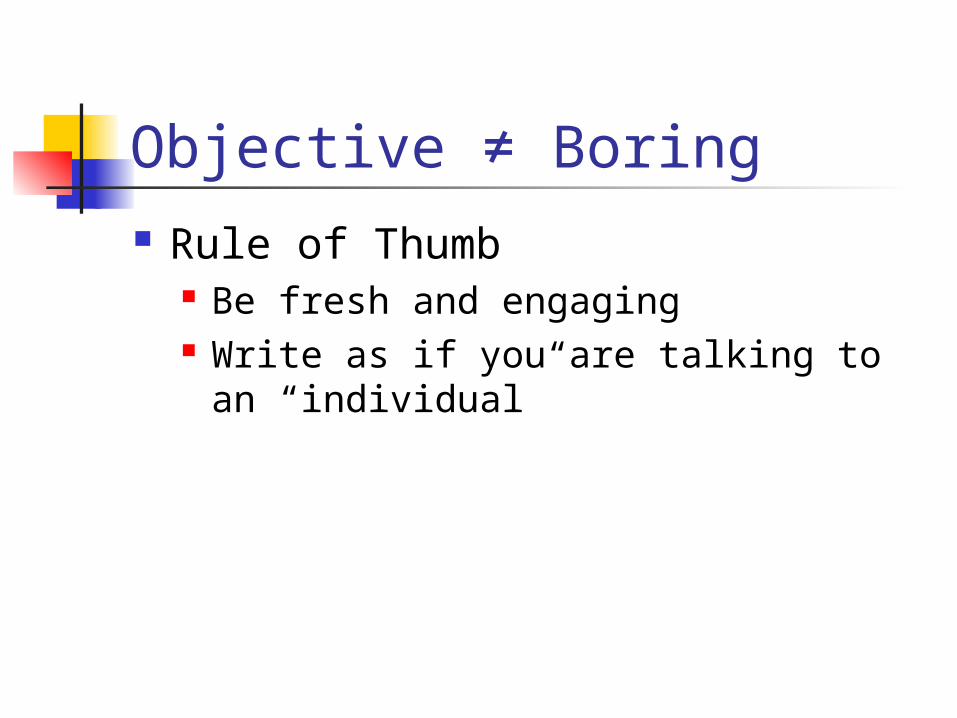
Objective ≠ Boring Rule of Thumb
Be fresh and engaging Write as if you are talking to an
“individual”
Be Concrete Use concrete words: nouns and
verbs Avoid adjectives and adverbs
Accurate Make sure your facts are correct
and timely. Are your statistics from this year, this quarter?
Make sure your links work! If they don’t, it’s sure to annoy users.
Date your content.
Reading, Scanning & Typography Our eyes look for patterns Control the words, control the layout
and the look Make it very easy to see repeating
patterns
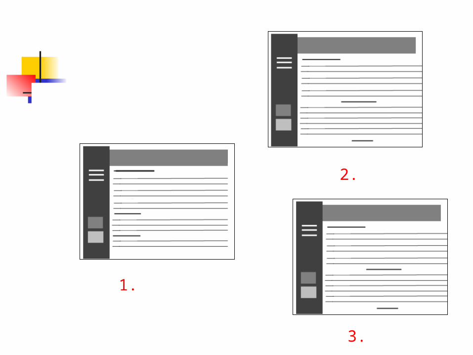
1.
2.
3.

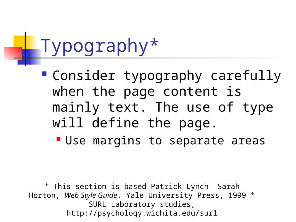
Typography* Consider typography carefully
when the page content is mainly text. The use of type will define the page. Use margins to separate areas
* This section is based Patrick Lynch Sarah Horton, Web Style Guide. Yale University Press, 1999 * SURL Laboratory studies,
http://psychology.wichita.edu/surl

Clutter
Clutter and confusion are failures of
design, not attributes of information.
Edward Tufte, 1997 interview
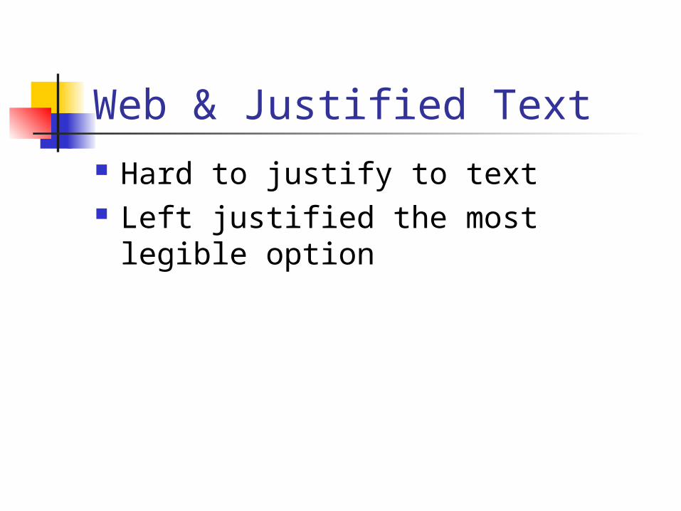
Web & Justified Text Hard to justify to text Left justified the most legible
option
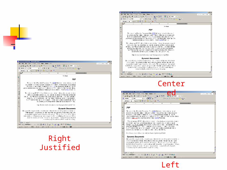
Centered
Left Justified
Right Justified
Headlines & Justification
Left aligned is best Right aligned is okay Centered works well when you can
justify text (not recommended on the web) and pairs poorly with a jagged left edge
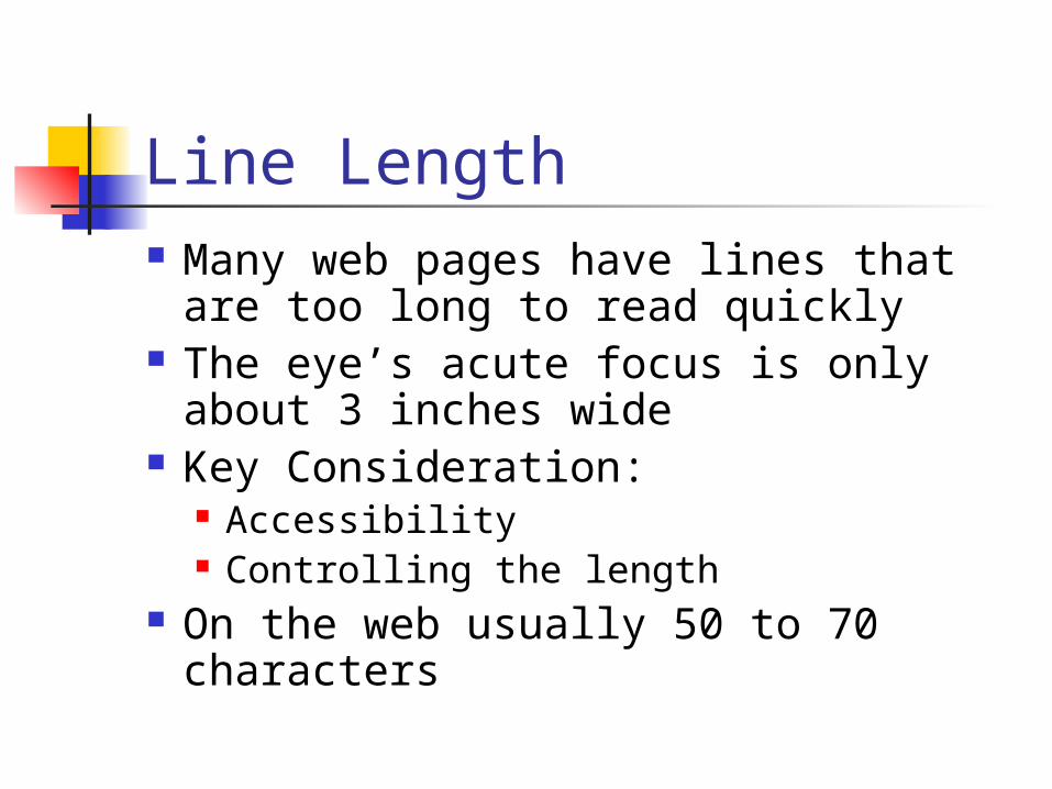
Line Length Many web pages have lines that are
too long to read quickly The eye’s acute focus is only about
3 inches wide Key Consideration:
Accessibility Controlling the length
On the web usually 50 to 70 characters
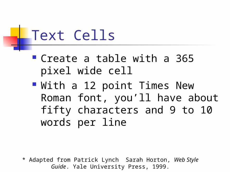
Text Cells Create a table with a 365 pixel
wide cell With a 12 point Times New Roman
font, you’ll have about fifty characters and 9 to 10 words per line
* Adapted from Patrick Lynch Sarah Horton, Web Style Guide. Yale University Press, 1999.

Capital & Lower Case Letters UPPERCASE is harder to read We read by recognizing the overall
shape of words, rather than parsing letter by letter
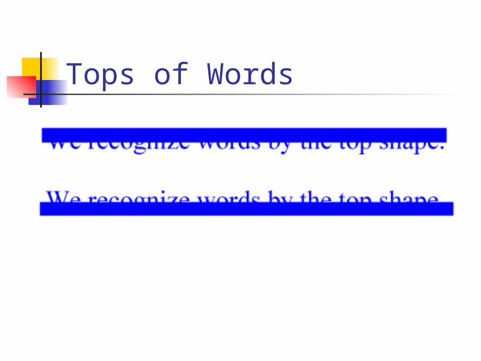
Tops of Words

Best Practices Title case or downstyle typing
where you capitalize only the first word
Typefaces You need to consider:
1. Legibility on the screen2. How well it prints if the page or
document is lengthy3. Visitor may override your font
choices
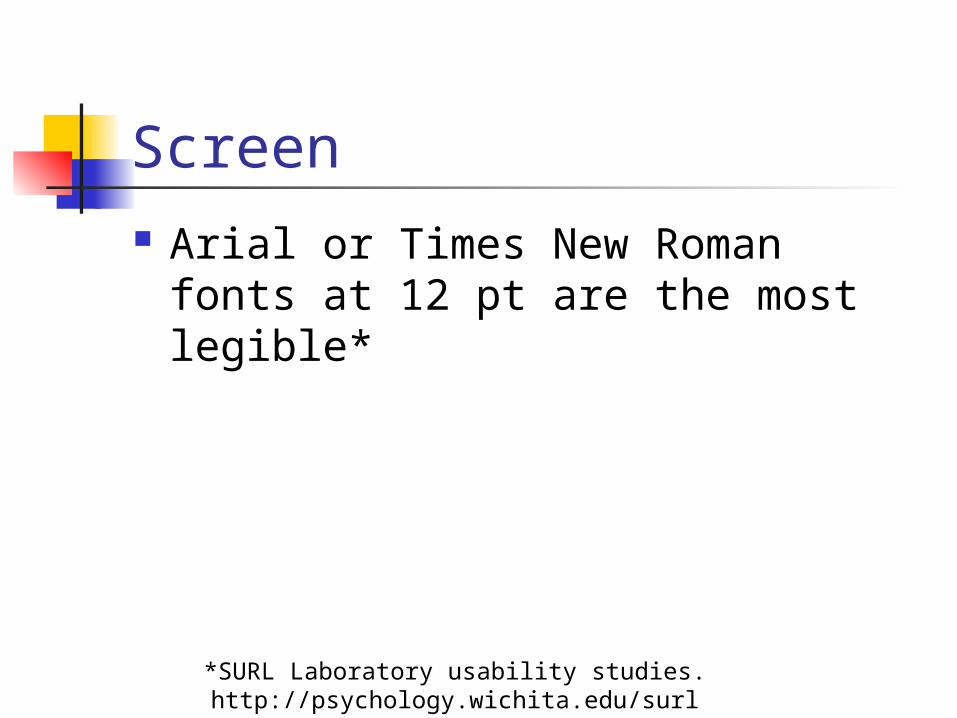
Screen Arial or Times New Roman fonts at
12 pt are the most legible*
*SURL Laboratory usability studies. http://psychology.wichita.edu/surl
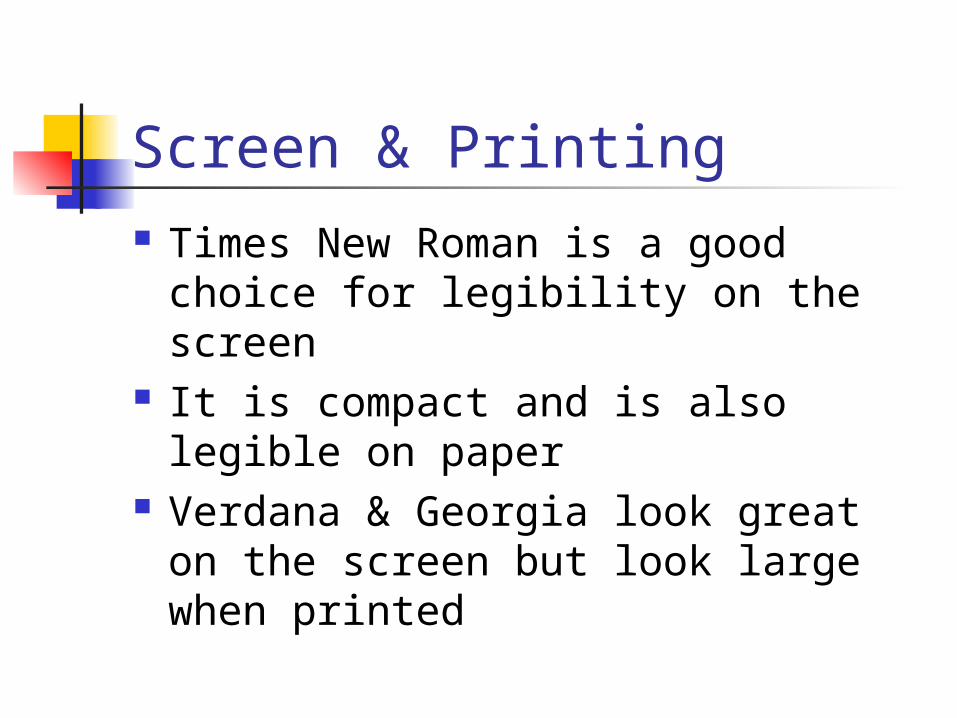
Screen & Printing Times New Roman is a good choice
for legibility on the screen It is compact and is also legible on
paper Verdana & Georgia look great on
the screen but look large when printed
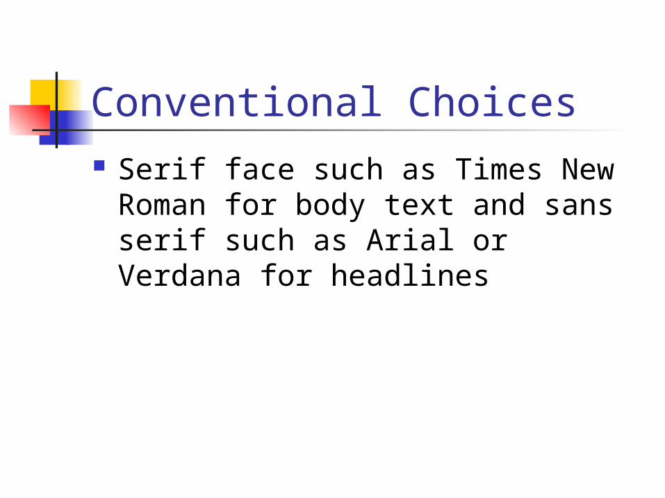
Conventional Choices Serif face such as Times New
Roman for body text and sans serif such as Arial or Verdana for headlines
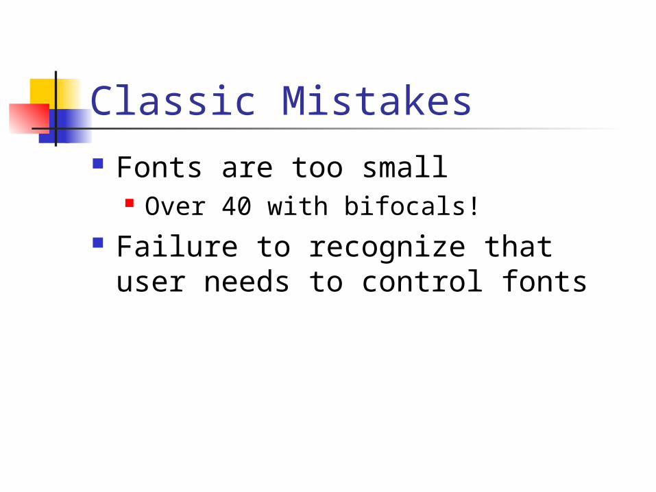
Classic Mistakes Fonts are too small
Over 40 with bifocals! Failure to recognize that user
needs to control fonts
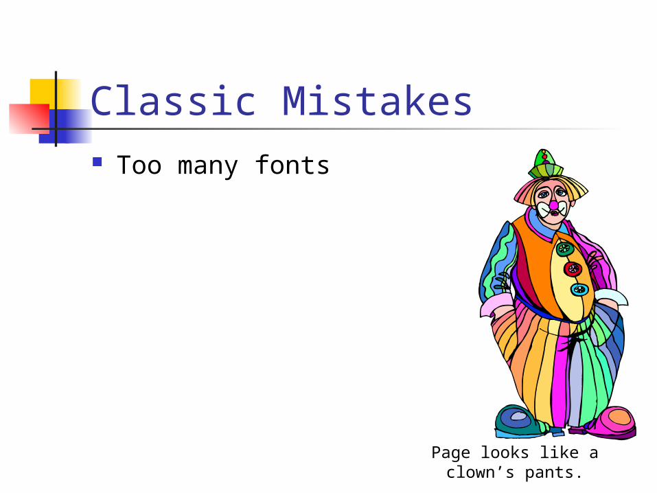
Classic Mistakes Too many fonts
Page looks like a clown’s pants.
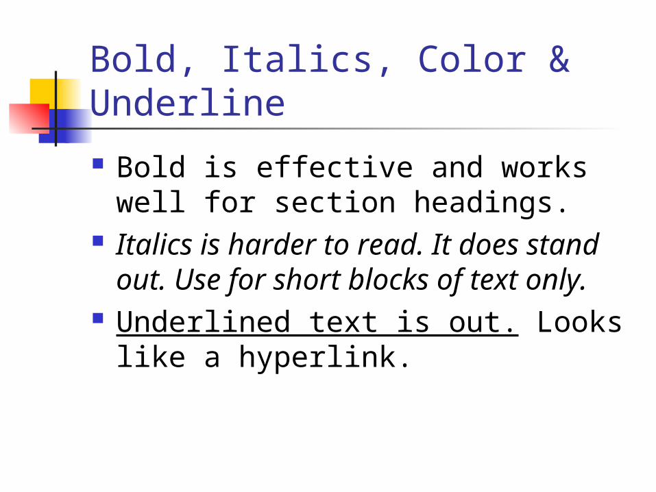
Bold, Italics, Color & Underline
Bold is effective and works well for section headings.
Italics is harder to read. It does stand out. Use for short blocks of text only.
Underlined text is out. Looks like a hyperlink.
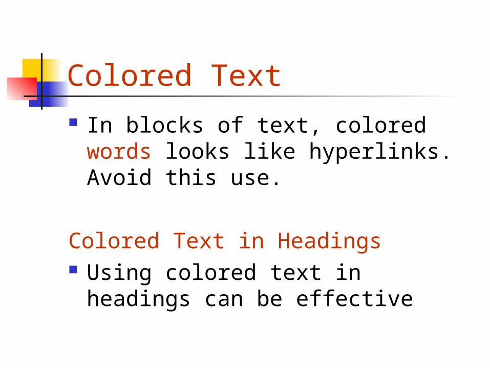
Colored Text In blocks of text, colored words
looks like hyperlinks. Avoid this use.
Colored Text in Headings Using colored text in headings can
be effective

What about longer documents? To convert or not convert
How will it be used? Chunks or all at once Printing
How will your search engine index it? How is it produced?
All at once, revised in bits Nature of the content
Prescription drug tables
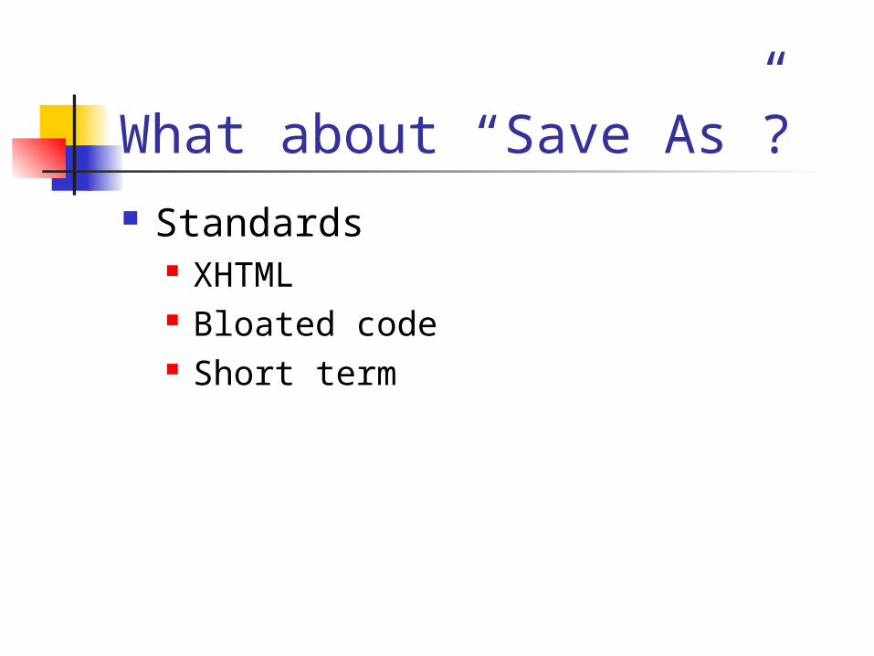
What about “Save As”? Standards
XHTML Bloated code Short term
What if users need to read a long document? Provide a good headline and summary Consider rewriting it (50%) Provide an outline Provide navigation within the
document to anywhere else in the document
Make it easy to print any section or the whole document
Long Documents as HTML Chunk it Present a “model” that the users
grasp Offer Internal navigation
Next, Previous Back to section Back to T of C
To Scroll or Not to Scroll?
Early days, scrolling caused fatal errors
Scrolling works now provided that the page looks like it continues

Above The Fold Hierarchy of Importance
Make sure the most important items are above the fold
To enhance navigation, link density should be the greatest above the fold
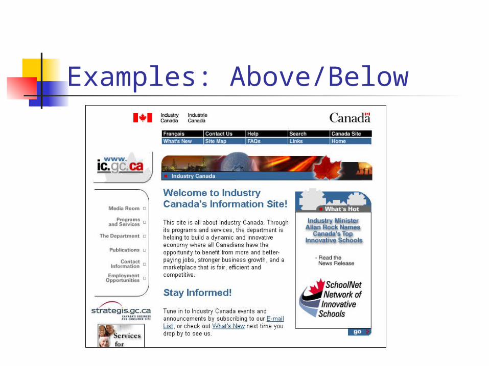
Examples: Above/Below

Examples: Above/Below
Language, Metaphors, Puns and Fun
Use the language of your users Ambiguity is often a problem Provide context
Classic Mistakes Web sites are full of jargon Organized by internal departments
and use internal names Works fine for those that are within
the unit Main Intranet site should try to use
general terms or use “jargon” followed by an explanation

Puns & Fun Humor is tricky. Puns and
metaphors often don’t work quite like you expect. If you have an international audience they often don’t translate well.
Other Important Writing Tasks
1. Error Messages2. Search Engines

Error Messages Who writes the error messages? Predict points of failure and
suggest solutions: 404 Not Found No search results
Should stand out from other text Should be comprehensible!

Search Engines Crucial audience, often overlooked, is
search engines Find out how your search engine
ranks: <title>, <h1>, metatags, keyword
frequency, date Write to satisfy the engine Increase “findability” – consider how
users will search for this page

Make Your Web Pages Free Standing Many users will arrive at a page from a
search result list The page may be the 22 page in the
long document or the home page The user needs to know – where they
are, what’s up and what’s below
Writing
How good is it?
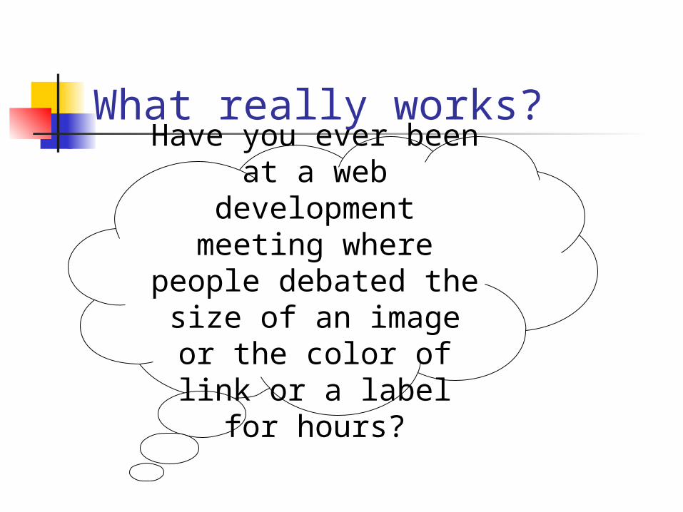
What really works?
Have you ever been at a web development meeting where people debated the
size of an image or the color of link or a label for
hours?

“Cookie” Test Preference or “cookie” testing
My Account Your Account Status Chequing Account Login

Paper Mockups Take out pages and ask where would
you click to do X, Y and Z?
Imitation is the sincerest form of flattery!
Thinking of changing your site See a good idea Test their page/site with task
based testing

Task Based Testing Real users doing typical tasks Observers Analysis
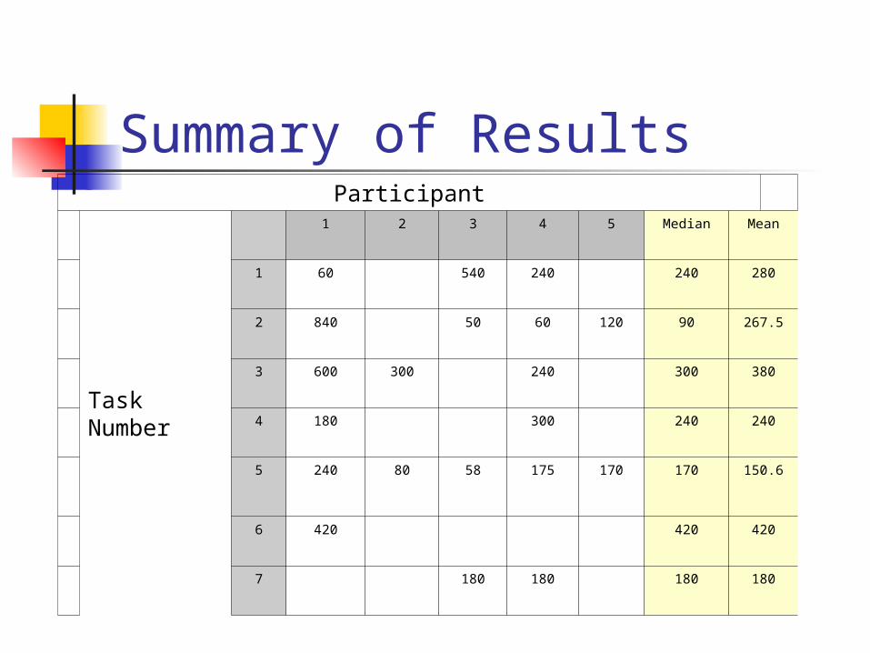
Summary of ResultsParticipant
TaskNumber
1 2 3 4 5 Median Mean
1 60 540 240 240 280
2 840 50 60 120 90 267.5
3 600 300 240 300 380
4 180 300 240 240
5 240 80 58 175 170 170 150.6
6 420 420 420
7 180 180 180 180
10 Strategies to Encourage Good Writing
1. Have an editorial style guide for acronyms, names, etc.
2. Mandate site wide look & feel using CSS
3. Lead by example4. Recognize good writing5. Encourage key content providers to
be observers in usability testing

6. Educate & market Tips, newsletters
7. Reward with “search engine” placement those that “play nice”
8. Set up quality checklists9. Train new authors10. Educate manager’s that one of
the “W”s in WWW is writing!
Secret to Good Wired Writing Observe, test, and learn Test some more Write often and write a lot

Thank you! Questions?
Darlene Fichter Northern Lights Internet Solutions Ltd.
Web Sites Usability & Writing
http://www.lights.com/talks/