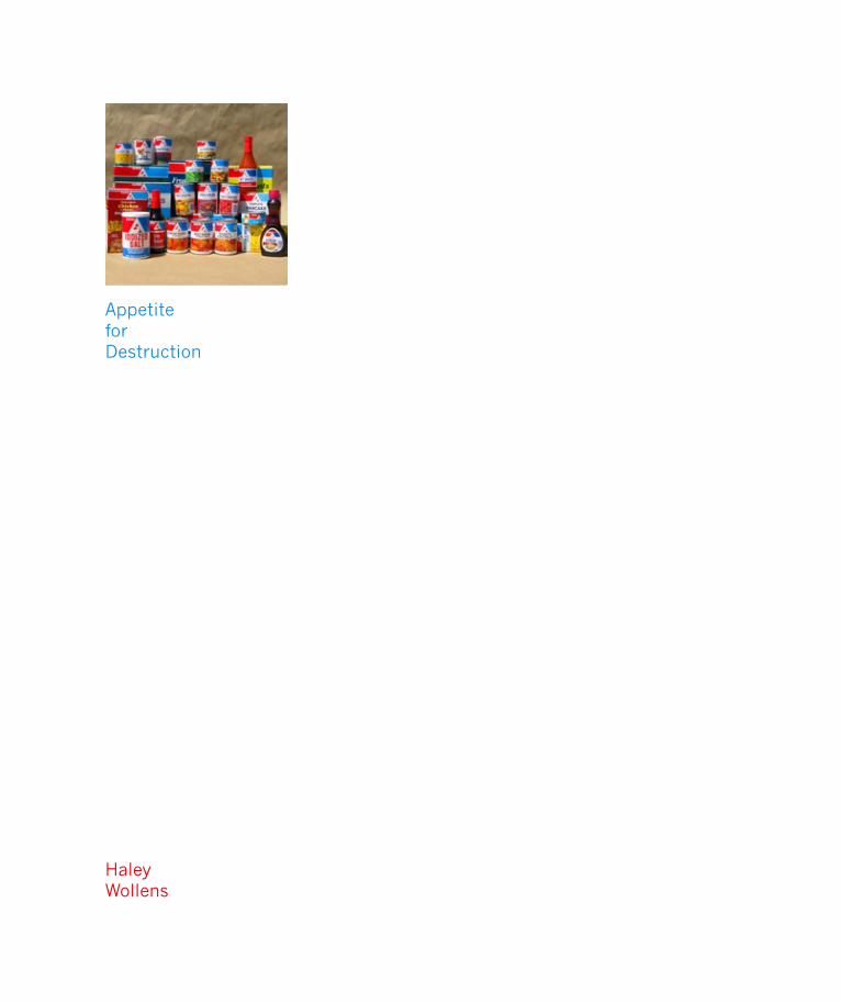
AppetiteforDestruction
HaleyWollens
Appetite for Destruction
I cannot explain the excitement I felt upon discovering the Associated Supermarket’s Super A brand of food. An escapist fantasy from the bourgeois world of Manhattan meals, I found myself unhealthily drawn to this produce. It had nothing to do with the hunger of my belly, and everything to do with my hungry eyes. The bold impact of the red, white, & blue logo, the simplistic title type treatments, and the hyperbolic food photography pictured on the packaging gave the impression of, “this is so wrong, its right.”
While it is hard to stomach that these foods are a real option for many people, from a graphic stand point I find them very stimulating. They represent a disgusting essence of Americana that I have always been attracted to, rooted in my love of kitsch. The design makes me nostalgic for a time before 3-D shaded gradients and photoshop re-touching on everything from chicken’s legs to women’s thighs.
The food might be fake (chemically altered ingredients), but the representation is real. At least this food does not create the illusion that it is something its not, and hopefully that prevents enough people from actually eating it.
My stomach may be turned off, but my eyes are turned on, with a saturated satisfaction that can only be found in American packaged food.
– Haley Wollens
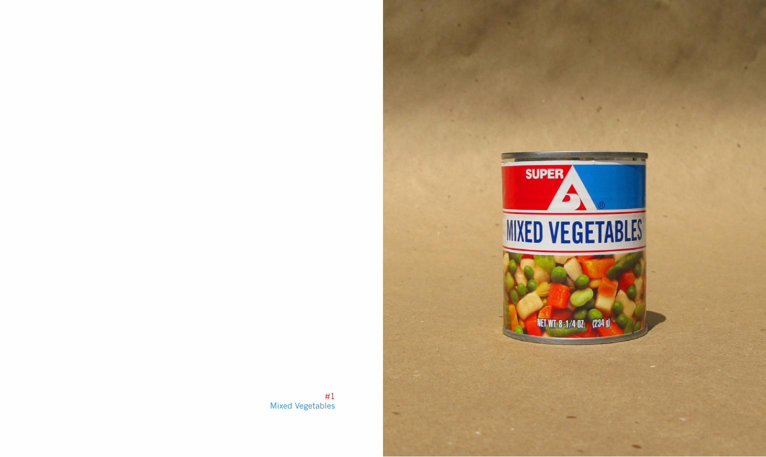
#1Mixed Vegetables
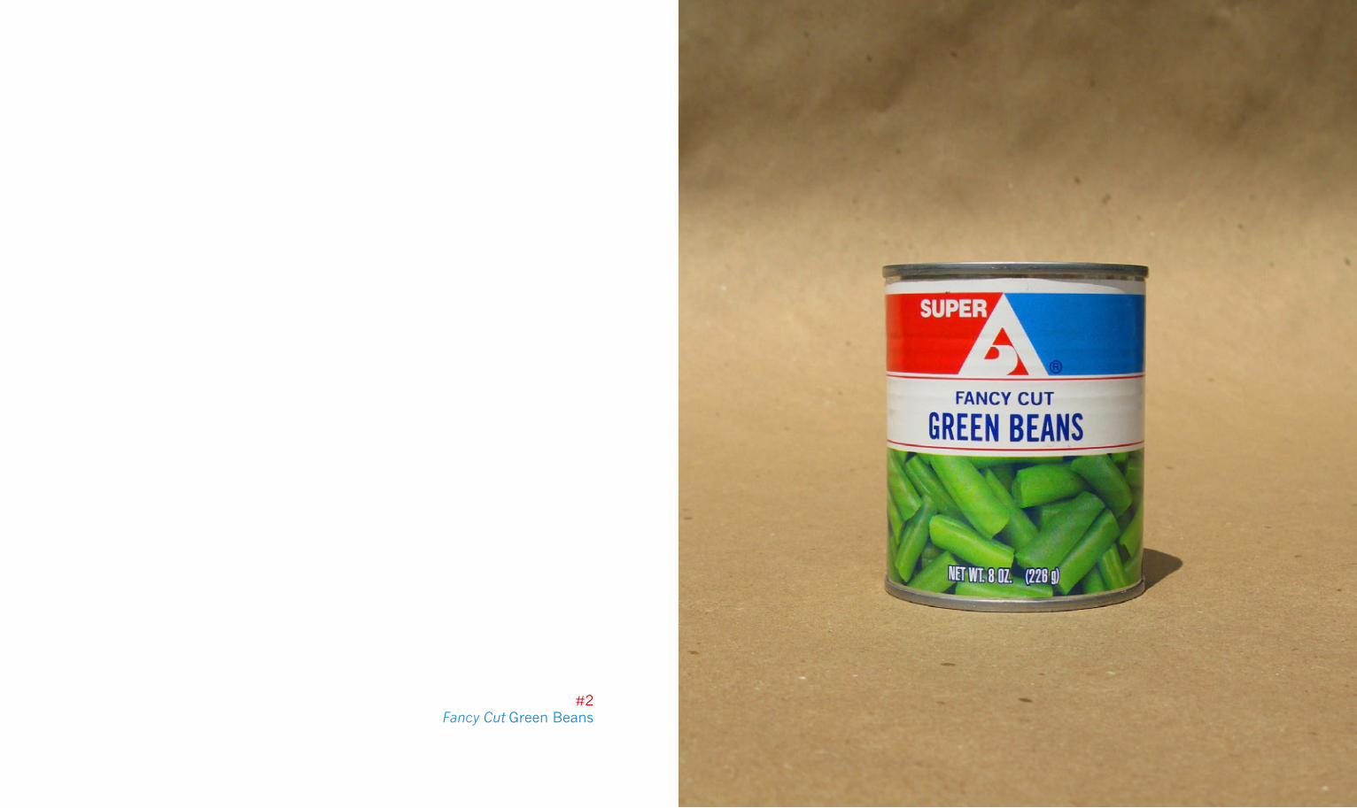
#2Fancy Cut Green Beans
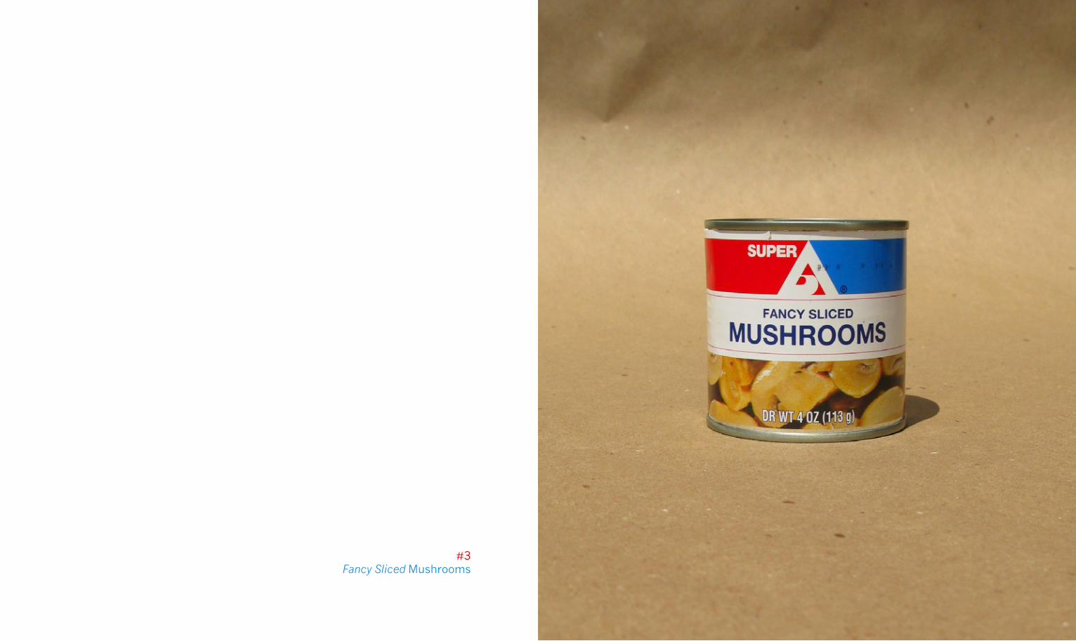
#3Fancy Sliced Mushrooms
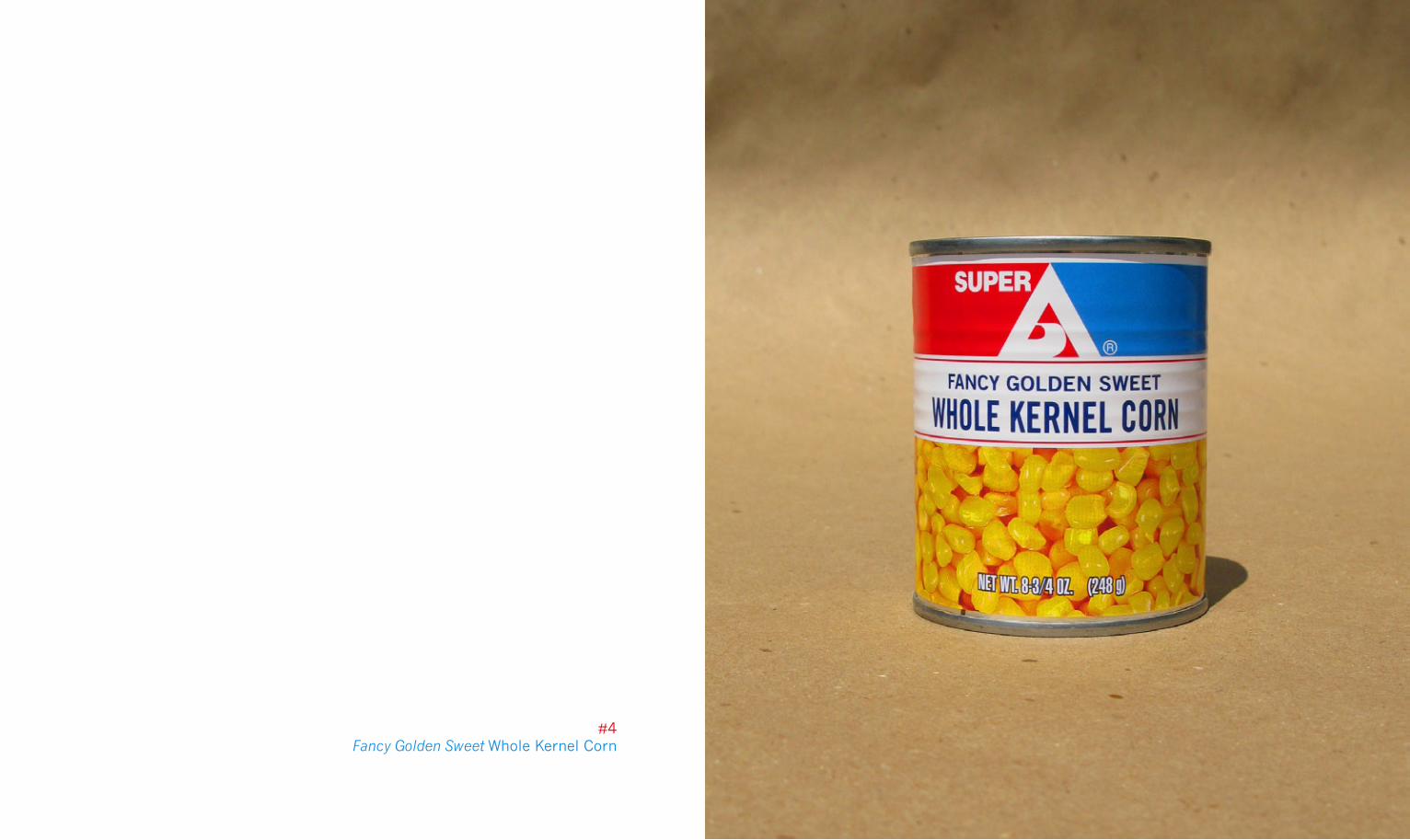
#4Fancy Golden Sweet Whole Kernel Corn
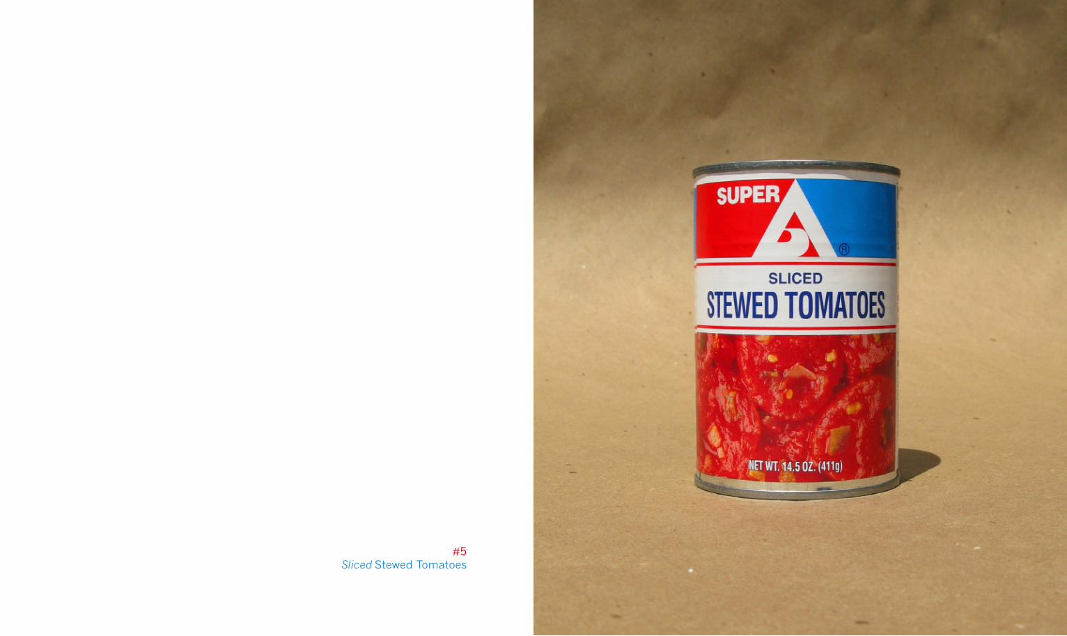
#5Sliced Stewed Tomatoes
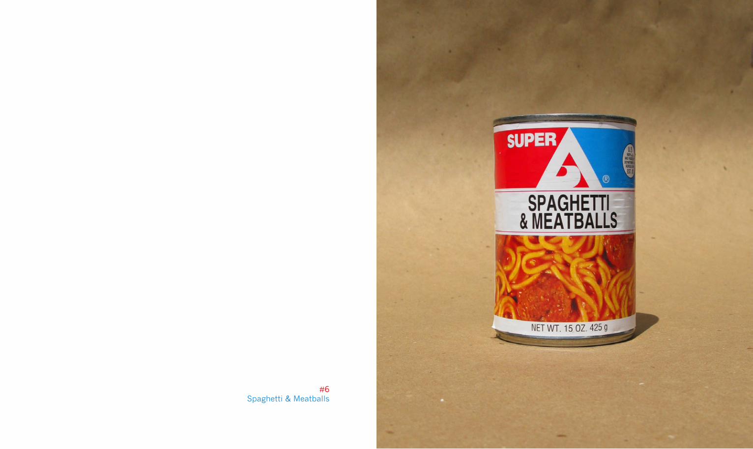
#6Spaghetti & Meatballs
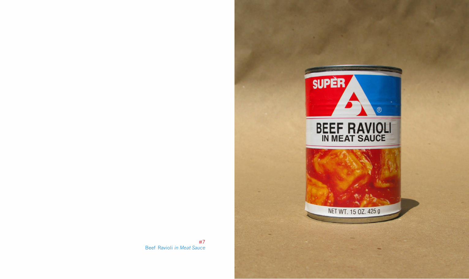
#7Beef Ravioli in Meat Sauce
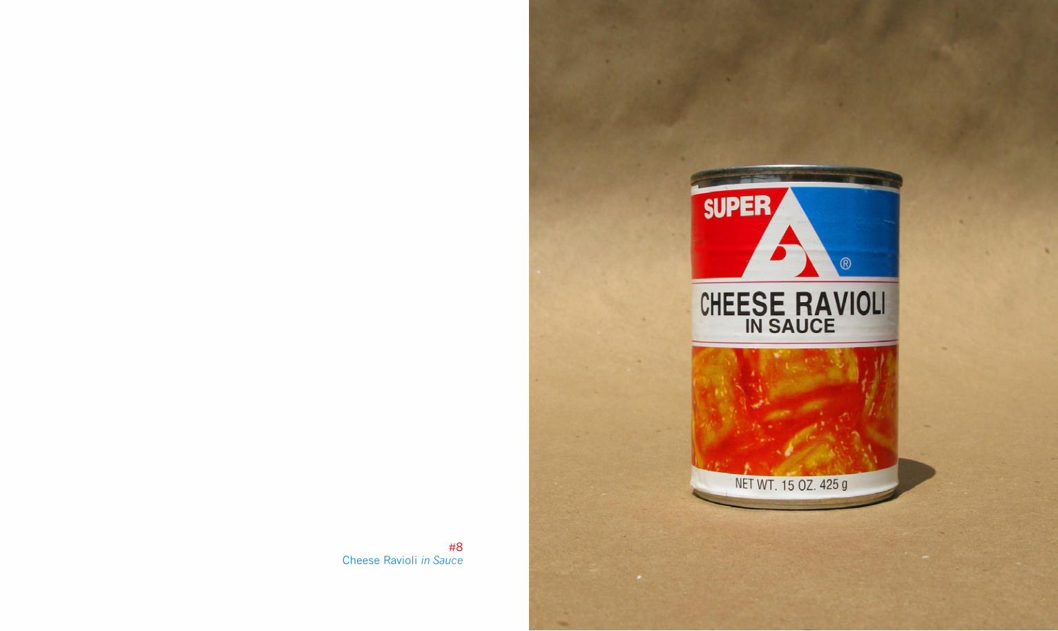
#8Cheese Ravioli in Sauce
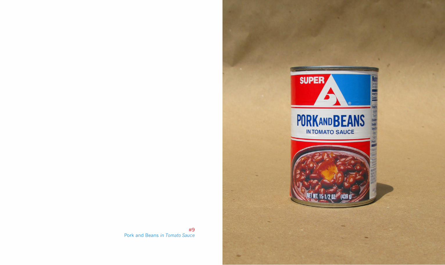
#9Pork and Beans in Tomato Sauce
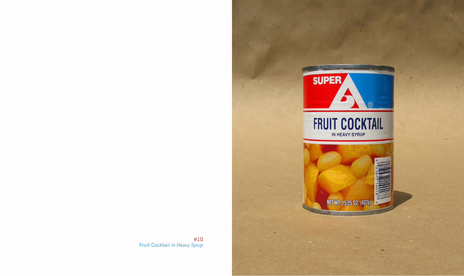
#10Fruit Cocktail in Heavy Syrup
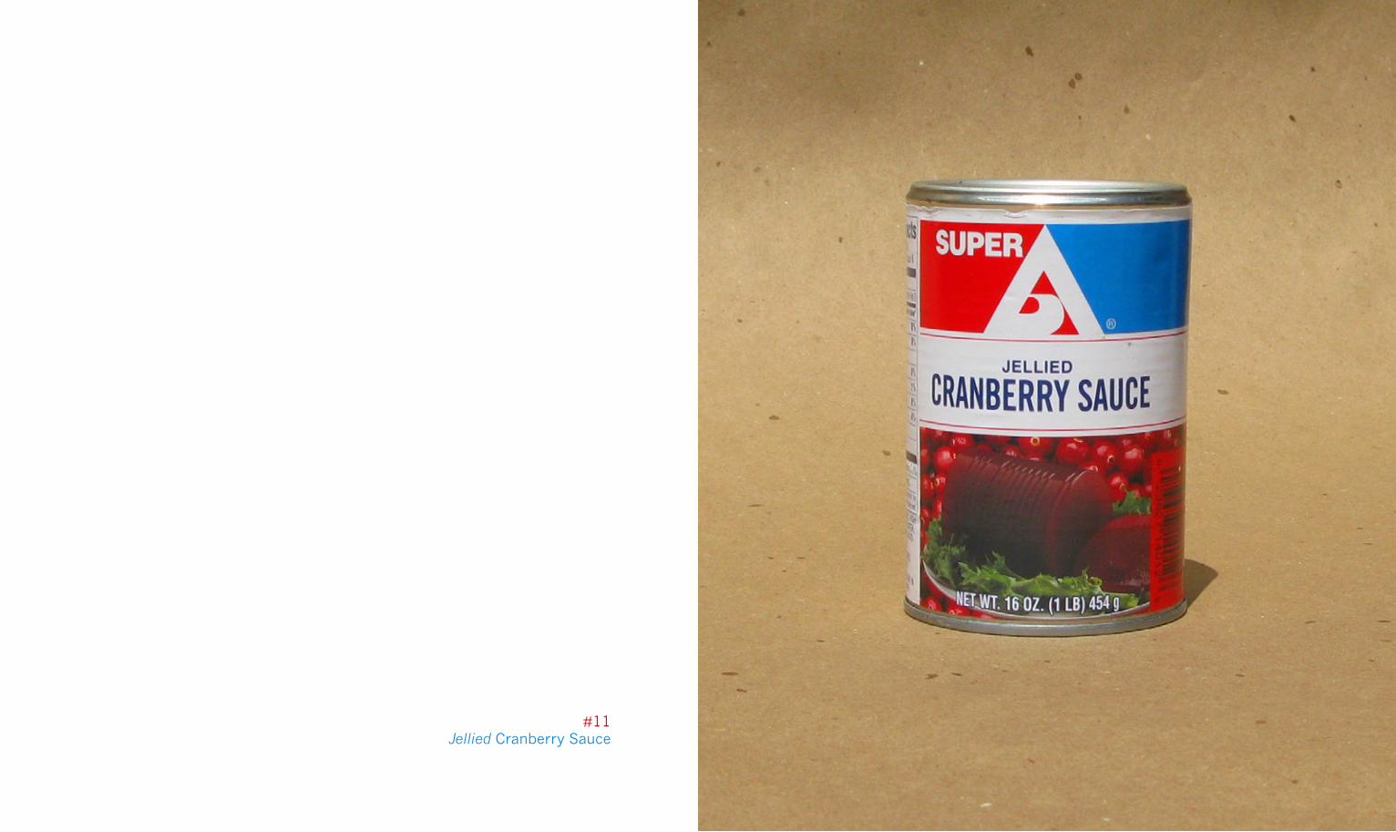
#11Jellied Cranberry Sauce
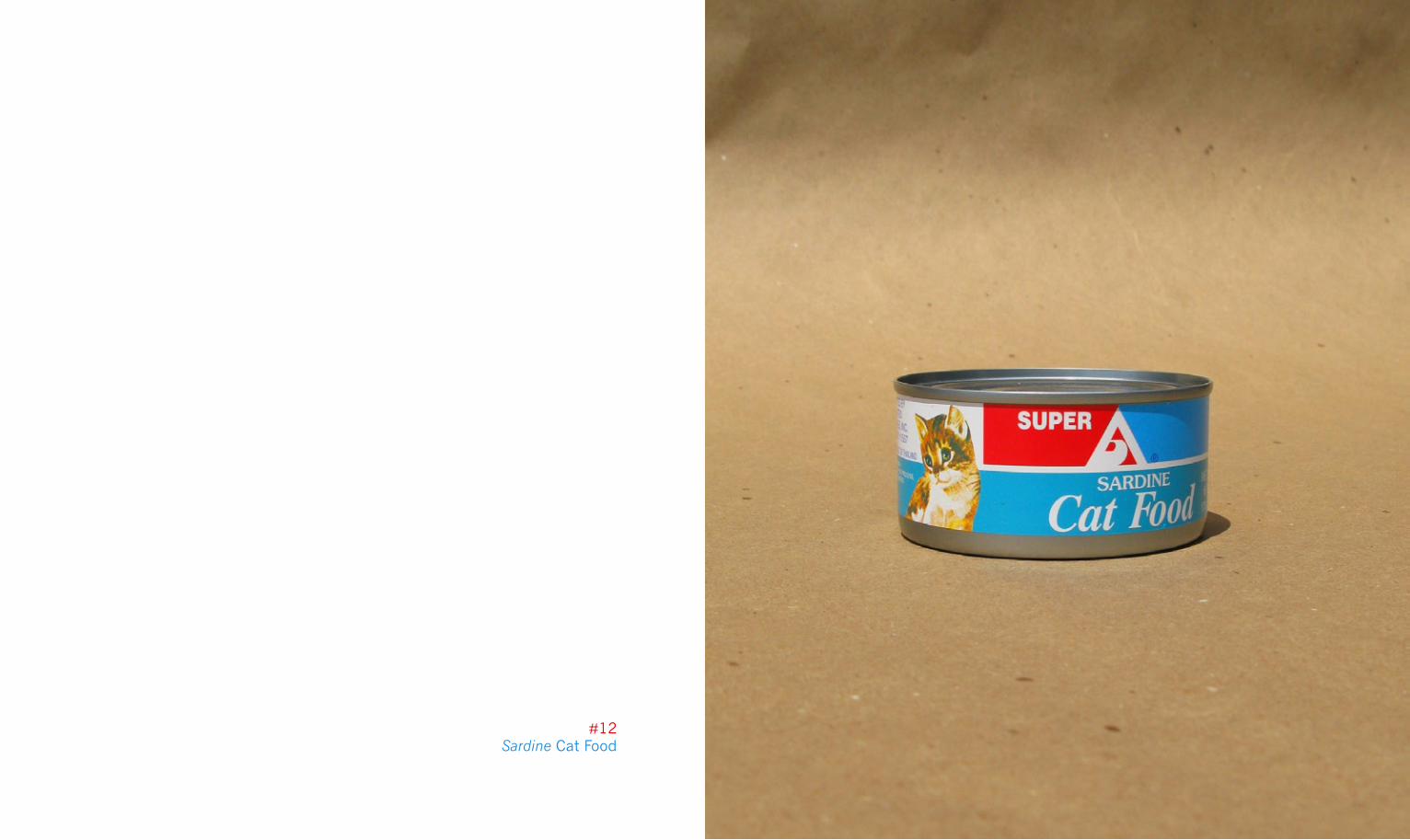
#12Sardine Cat Food
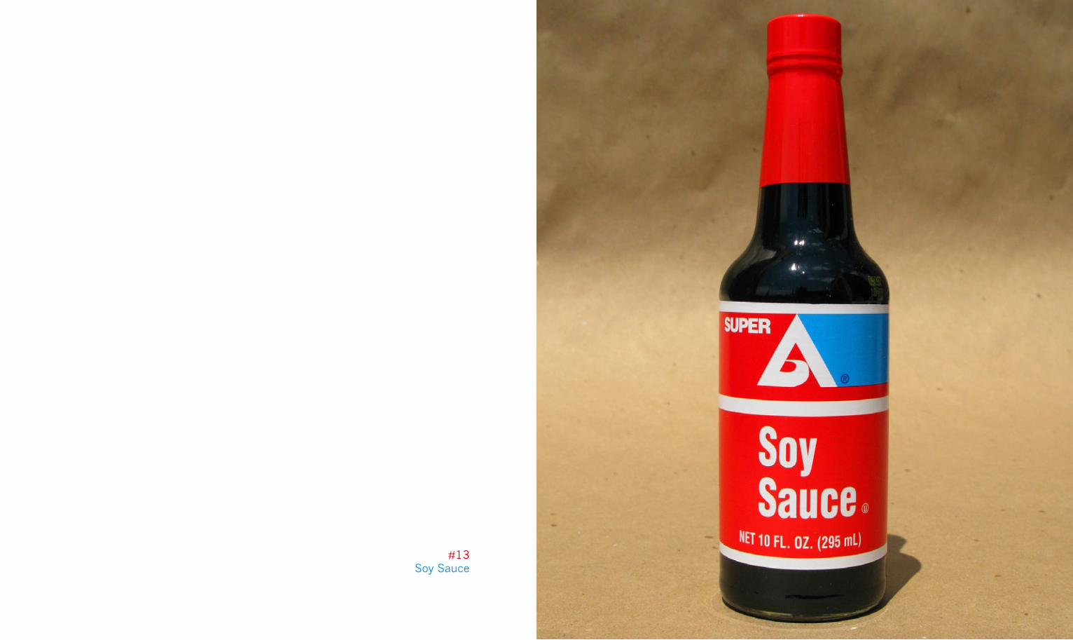
#13Soy Sauce
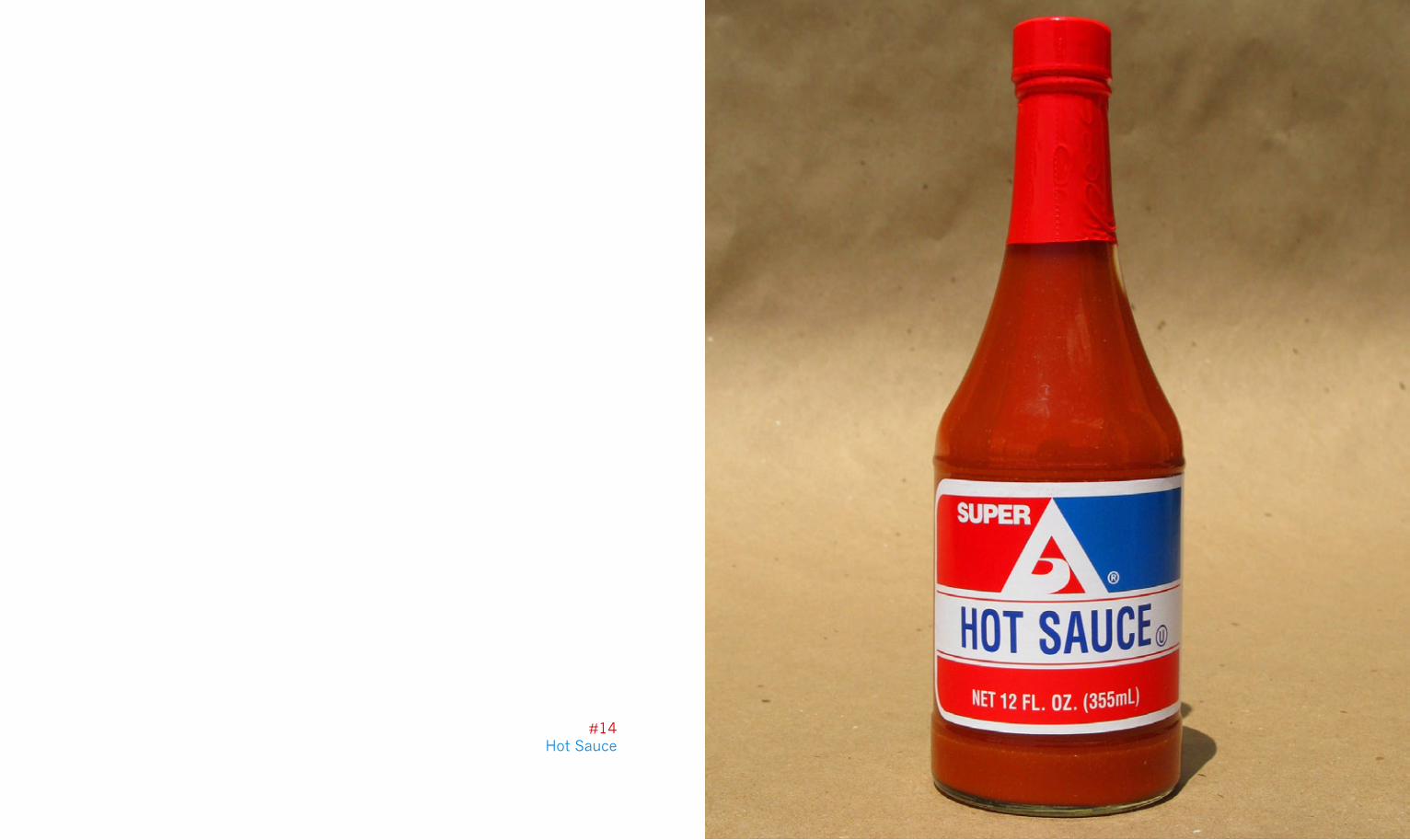
#14Hot Sauce

#15Iodized Salt
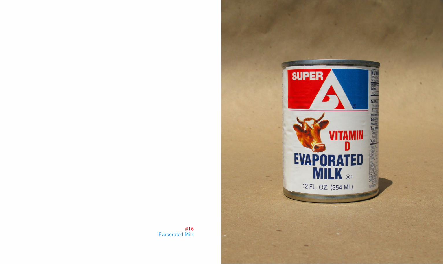
#16Evaporated Milk
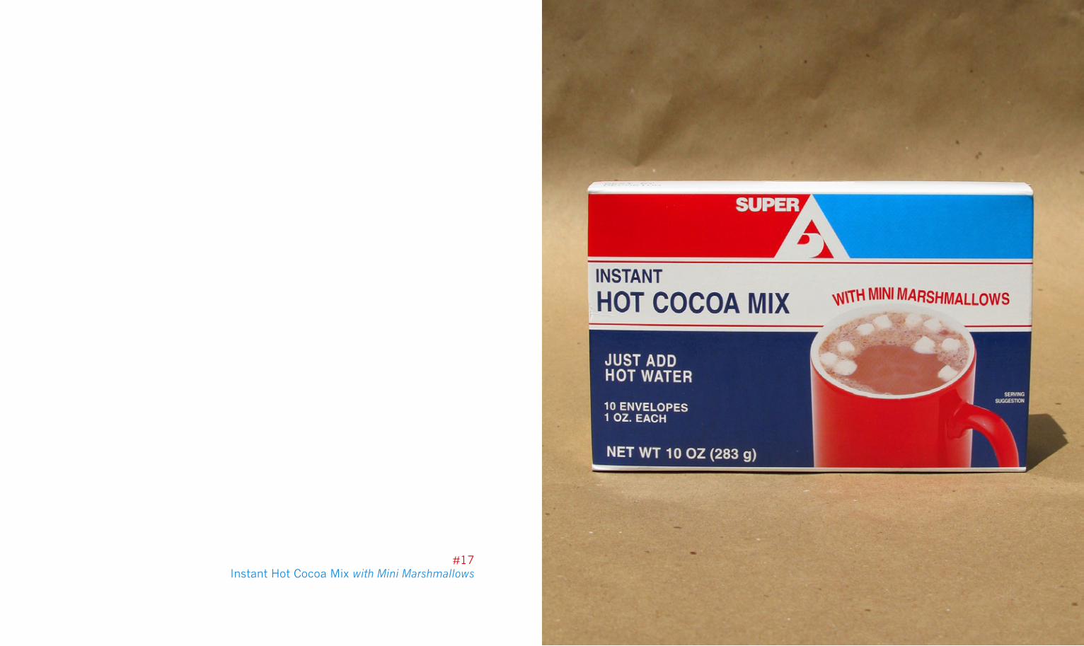
#17Instant Hot Cocoa Mix with Mini Marshmallows
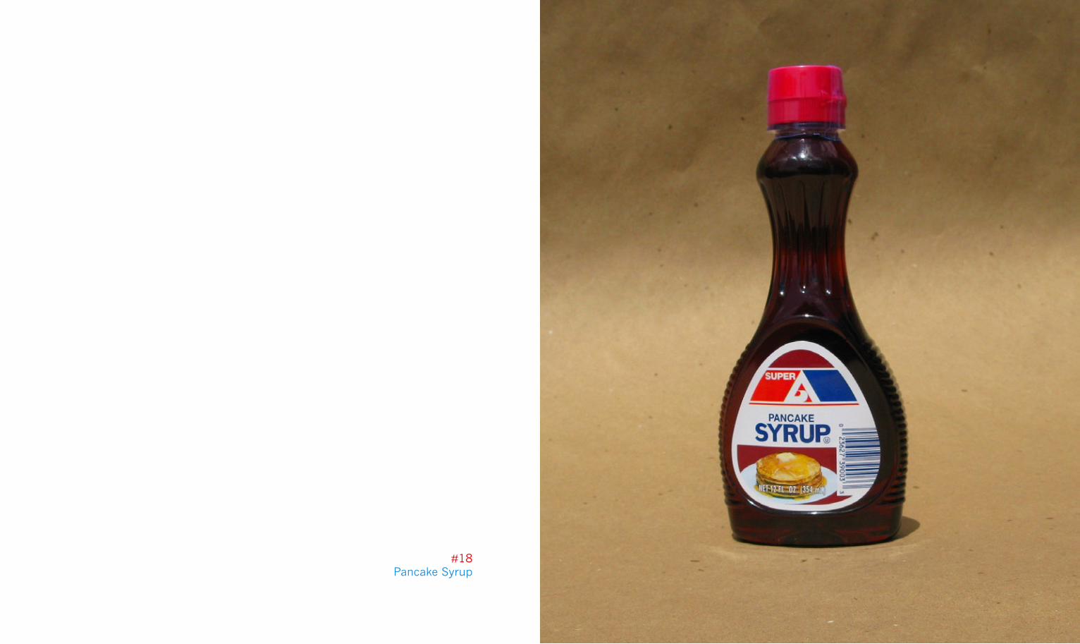
#18Pancake Syrup
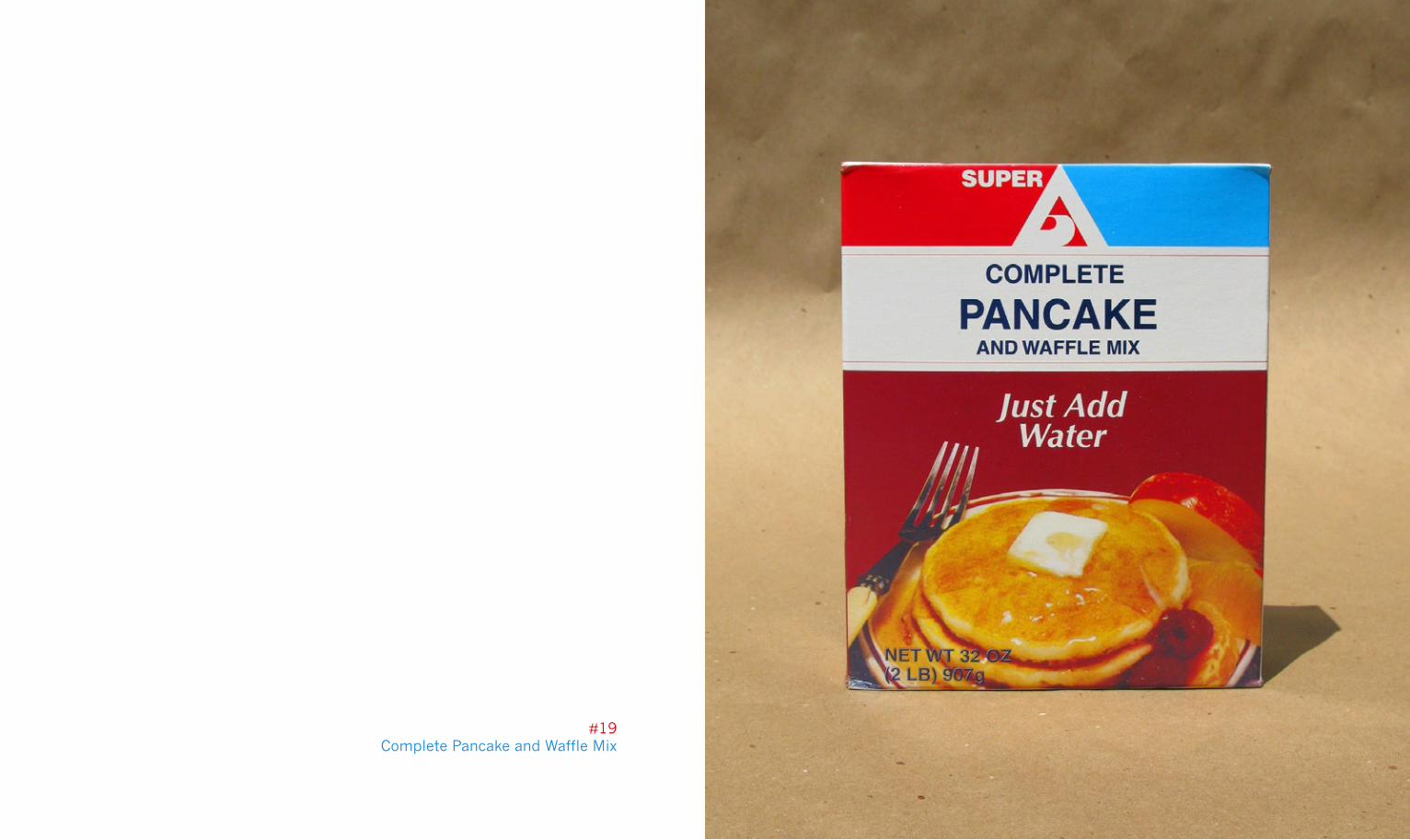
#19Complete Pancake and Waffle Mix
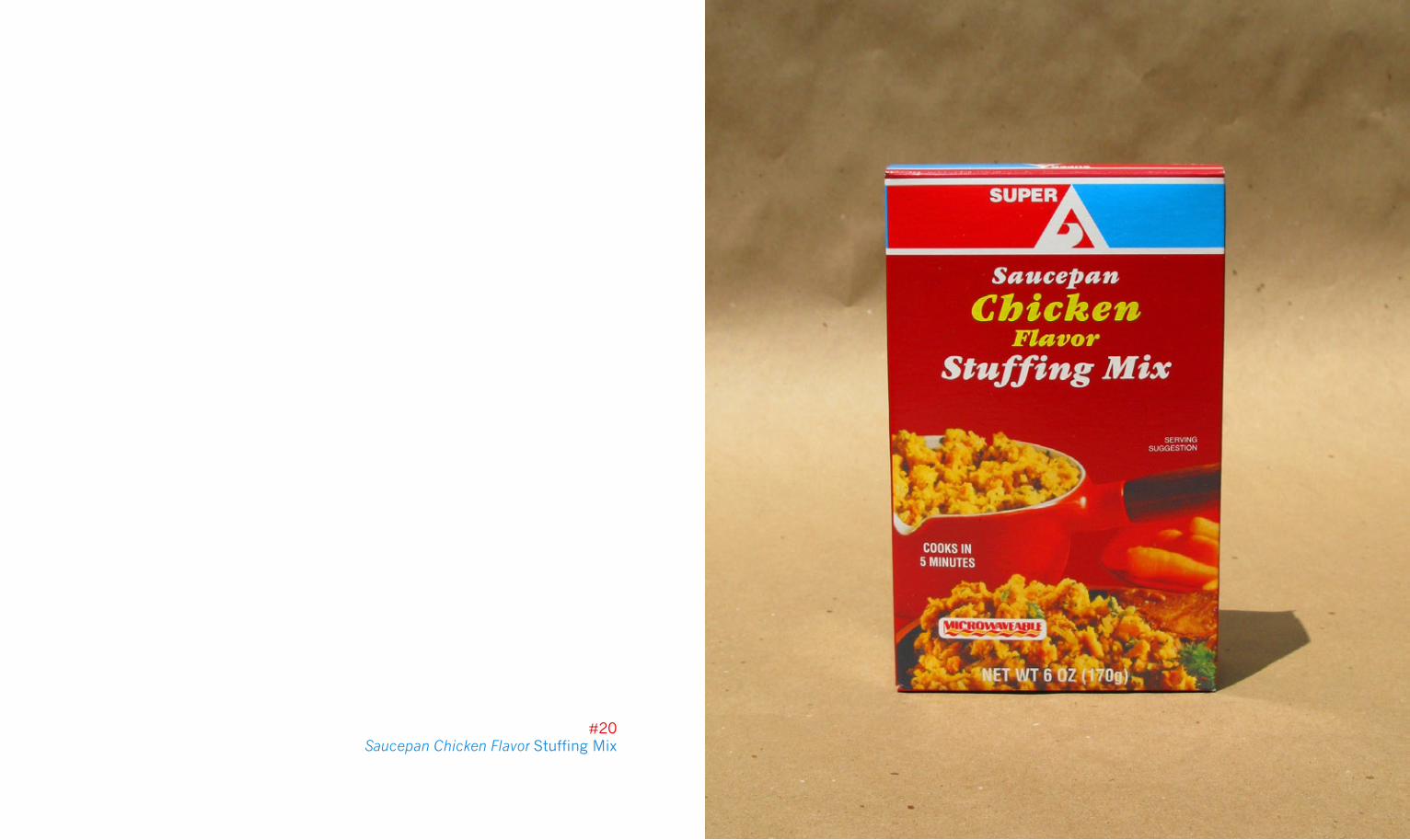
#20Saucepan Chicken Flavor Stuffing Mix
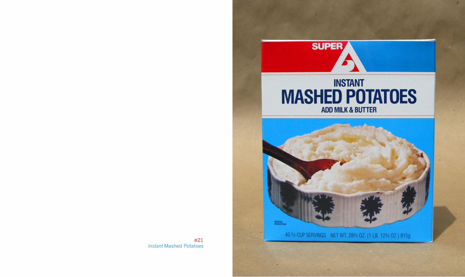
#21Instant Mashed Potatoes
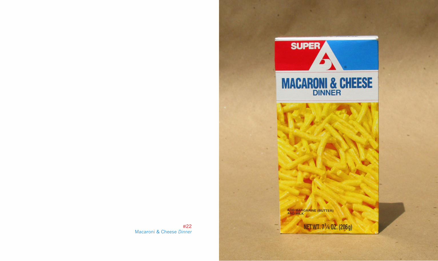
#22Macaroni & Cheese Dinner
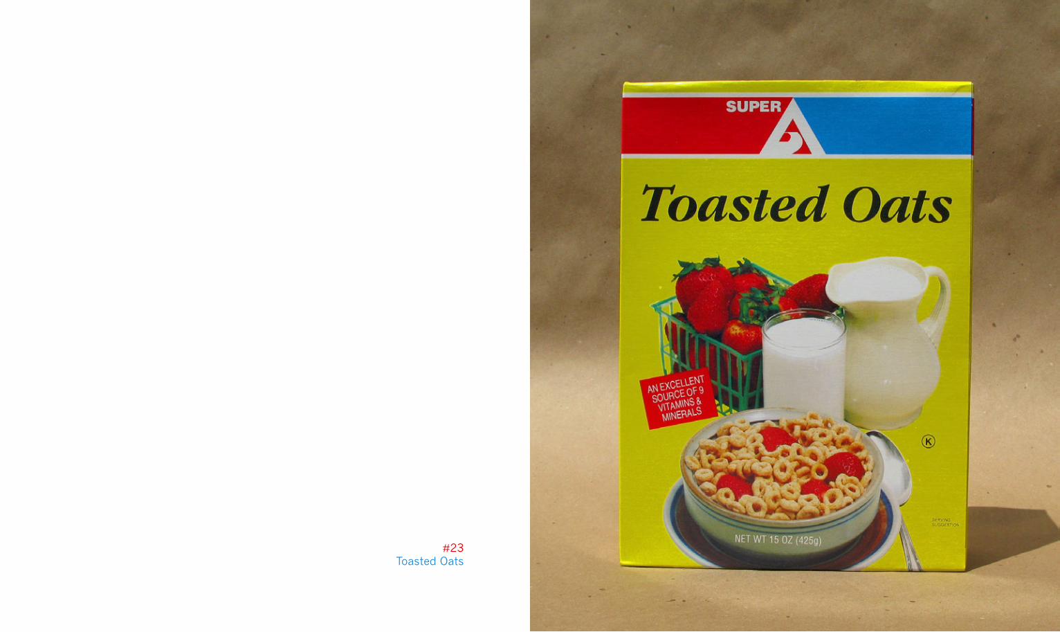
#23Toasted Oats
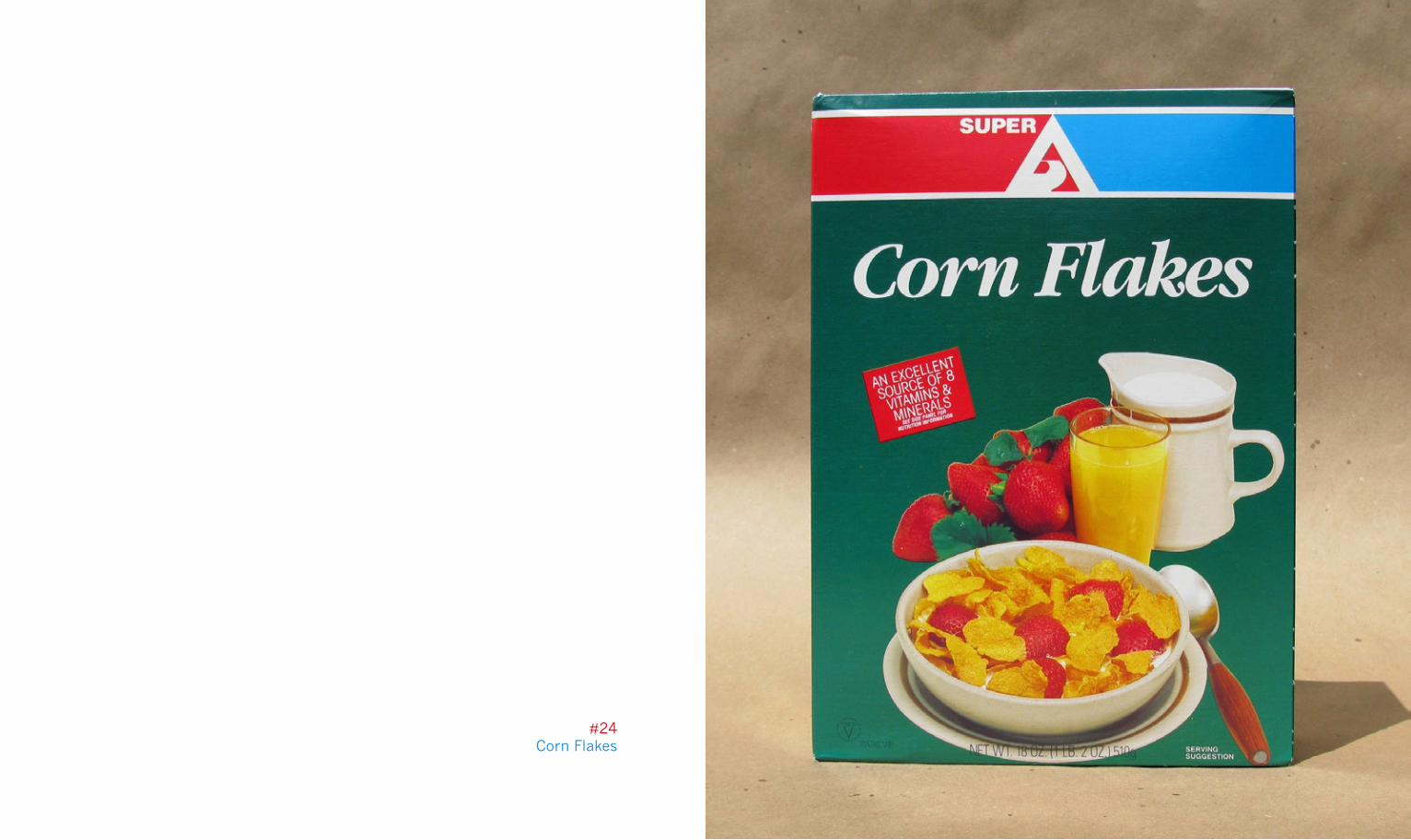
#24Corn Flakes
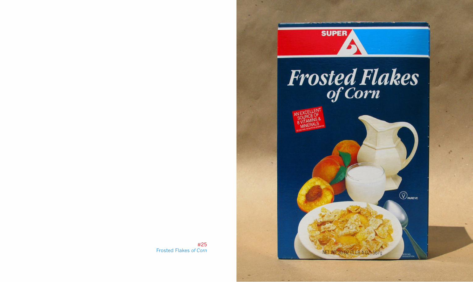
#25Frosted Flakes of Corn
Recommended