Art 243-Fall 2016 Prof. SchneiderAssignment + Reading Schedule Weighted Grading: 10% The Structure of Letterforms
5% Monogram 5% Monogram as Motif 5% Space as Meaning 5% Variations of Emphasis 5% Positioning Grid 1 5% Positioning Grid 2 5% Typographic Systems 5% Design Legends 20% Design Within Reach Catalog 10% Good Type Rules 10% Faces Have Voices 10% Final Exam
100% Final Grade
Aug
29 | 31 10 | 125 | 7 17 | 1912 | 14 24 | 26 21 | 2319 | 21 31 2 28 | 3026 | 28 7 | 9 5 | 73 | 5 14 | 16 12 | 14
NovSep DecOct
Final:12/12
176-207126-147 150-175108-12586-10572-83Reading: pgs 19-51
“Type”
Monogram as Motif Var. of Emphasis
Space & Meaning Positioning Grid 1 Positioning Grid 2
Typog. Systems
Design Legends
Design Within Reach Catalog
52-71
Good Type Rules Notebook
Faces Have Voices Group Project
Department of Art/CSUNIntro to Type/Art 243/Fall 2016
C O U R S E O U T L I N E
I NST RUC TOR: HOWA R D SCH N EI DER
C A T A L O G D E S C R I P T I O N
Theory and practice of letterforms and typography as they apply to graphics, advertising and other
areas of design and visual communication. Projects cover principles of typography, letter structure,
type face selection, fundamentals of computer typesetting, and typographic layout.
P R E R E Q U I S I T E : Art 140 / C O - P R E R E Q U I S I T E Art 200
T H E G OA L S O F T H E A RT D E PA RT M E N T are establishing and developing for students an
inclusive and balanced program in visual art, which encompass four areas of study: Art
Education, Art History, Studio Art, and Visual Communications.
A RT D E PA RT M E N T P RO G R A M G OA L S A D D R E S S E D I N T H I S C O U R S E :
> Basic Skills: Developing a foundation of art knowledge, theories, skills, craftsmanship and tech-
nologies, wheand concepts are communicated in writing, speaking and art making.
> Art Knowledge: Broadening knowledge of ancient through contemporary art and to develop an
understanding of art within theoretical, cultural, and historical contexts.
> Critical Thinking: Analyzing, interpreting, and questioning traditional methodologies and pre-
conceived notions of art and art making through the process of generating and solving problems.
> Interdisciplinary Connections: Exploring and engaging in interdisciplinary forms of art making.
> Global Perspectives: Promoting an appreciation and tolerance of diverse perspectives dealing with
art, culture, teaching and learning.
> Collaboration: Encouraging both individual and collaborative art experiences among students,
faculty, and community.
> Professional Preparation: Developing career paths for various art professions and an understand-
ing of the demands and expectations of those areas.
2
Department of Art/CSUNIntro to Type/Art 243/Fall 2016
C O U R S E O U T L I N E
COURSE OBJECTIVES
I. Typographic Knowledge
> Demonstrate an awareness of historical factors with reference to letterform development.
> Utilize typographic vocabulary.
> Demonstrate an awareness of typographic form.
> Demonstrate the concepts of legibility and readability.
> Recognize and demonstrate research methodologies in relation to project work.
> Recognize factors that influence informed typographic design practice across all media.
II. Lettering Skills & Craftsmanship
> Demonstrate the ability to produce tight penciled roughs displaying correct type and text
indication.
> Demonstrate through rendering, the structures, spacial relationships and nuances
inherent in letterforms and within the context of words.
> Demonstrate the ability to create professional-standard comprehensives, booklets and
mounted work.
III. Applied Typesetting Knowledge
> Demonstrate the ability to apply general typographic knowledge to exercises and
assignments.
> Utilize technology with competence and understanding.
> Mastery of digital media manipulation techniques.
> Demonstrate the ability to integrate digital solutions with traditional typographic methods
> Demonstrate knowledge and practical application of a grid.
IV. Participation & Presentation
> Demonstrate ability to apply technical and conceptual understanding of typography in
the evaluation of one’s own work and the work of others.
> Demonstrate ability to recognize and discuss current examples of professional typography
with applied knowledge and understanding.
> Demonstrate ability to present work clearly and with reason to both faculty and fellow
students.
3

Department of Art/CSUNIntro to Type/Art 243/Fall 2016
C O U R S E O U T L I N E
R E Q U I R E D T E X T
> Thinking With Type; 2nd edition; Ellen Lupton, author
> Typographic Systems; 1st edition; Kimberly Elam, author. (Good prices
through the publisher Princeton Press, in paperback:
http://www.papress.com/html/book.details.page.tpl?isbn=9781568986876
R E C O M M E N D E D T E X T
> Typographic Design: Form and Communication; 6th edition;
Rob Carter, Ben Day and Philip Meggs, authors.
> The Anatomy of Type: A Graphic Guide to 100 Typefaces, Stephen Coles
> Stop Stealing Sheep & Find Out How Type Works; Erik Spiekermann, author
> Typography Workbook; Timothy Samara, author
> Fonts & Logos; Doyald Young, author
R E Q U I R E D S O F T WA R E
> Adobe InDesign, Illustrator, Photoshop
O N L I N E R E S O U R C E S
> www.pinterest.com/hschneid2/type-history-from-wet-clay
> www.pinterest.com/hschneid2/type-history-pre-incunabula
> www.pinterest.com/hschneid2/for-typophiles
M A T E R I A L S
> HB, B or 2B real pencil. FINE-POINT MECHANICAL PENCILS = “F”
> 9"x12" or larger tracing pad
> Black chisel-point marker, or carpenter’s pencil+razor, or a piece of charcoal
> Fine point black marker
> Sharpie marker (typical “bullet” point nib)
> Steel ruler, non-skid, 18" minimum
> 30 or 45 degree triangle, 8" minimum, beveled edge
> Erasers: pink pearl, artgum, or kneaded
> 1" drafting or masking tape (3M brand, etc.)
> Flash drive or external hard drive
> Notebook or sketch book for discussions and critiques
4

Department of Art/CSUNIntro to Type/Art 243/Fall 2016
C O U R S E O U T L I N E
S T U D E N T L E A R N I N G O U T C O M E S :
> Produce work/works of art that communicate to a diverse audience through a demonstrated
understanding and fluency of expressive forms.
> Utilize and engage your intellectual and creative development within the arts and humanities.
AT T E N DA N C E is mandatory. Course information is not repeated, if you miss class it is your
responsibility to get relevant information from another student. I often adjust the schedule depend-
ing on class needs, so if you miss class it is in your best interest to call your partner to confirm the
following weeks activities. Penalties are as follows:
> If you are absent more than 2 classes, your final grade will be lowered by one-third of a grade
point and so on with each additional absence.
> If you are tardy 3 times, it will count as one absence. If you leave early, it will count as a tardy.
> If you are late for more than an hour, you will be marked absent.
> If you miss a crit, a discussion, or a presentation, it will also count as an absence.
> If you do not have your own materials for the day’s activities, you will be marked absent. > If you are paying attention to an electronic device or a computer during a lecture or critique (unless
otherwise directed) you will be marked absent.
Bottom line, if your course performance would normally have merited an “A”, but you missed two
classes and were late three more, you should expect a final grade of “A-”. If you missed four
classes, an A then would receive a B+, and so on.
Attendance is taken at the beginning of class. If you come in late it is your job to inform me that you are
present. If you are coming from the opposite end of campus (music lawn, Sierra Hall) please let me know.
This is important, so read it carefully: You get two excused absences. The two excused absences are
for illness and emergencies, not excused “cuts”. If an illness or emergency requires more than two
absences, official documentation will be required. Attendance and promptness can greatly affect your
overall final grade.
Students are responsible for contacting instructor regarding absences, expected late arrivals to class
or need to leave class early; no contact with instructor is interpreted as unexcused.
The university gives authorization to lower grades or fail students for poor attendance and tardiness
at the instructor’s discretion. (Students have known to get a very low grade because they come late
or are absent frequently.)
(Attendance continued on next page)
5

Department of Art/CSUNIntro to Type/Art 243/Fall 2016
C O U R S E O U T L I N E
AT T E N DA N C E (C O N T I N U E D)
THE FOLLOWING ARE EXAMPLES OF (BUT NOT LIMITED TO) NON-VIABLE EXCUSES:
1. Not finding a parking space. 2. Employment obligations. 3. Other classes. 4. Dog ate my home-
work. 5. Someone is getting married. 6. Planned a vacation to Hawaii (or elsewhere). 7. Weather: it’s
too hot, too cold, or it rained. If your work or personal life unexpectedly backs up on you, it’s under-
standable but neither is a viable excuse under any circumstances.
VIABLE EXCUSES:
(1) Receipt from clinic visit with a note from doctor with signature and date. (2) Receipt for car ser-
vice w/date and time. However, lack of attendance means lack of exposure to the class. No activities
can replace that absence of exposure, period. Partial withdrawl is strongly recommended for extend-
ed medical absences or extended personal emergency absences.
C L A S S R O O M C O U R T E S Y :
1. Be on time
2. Do not leave class early
4. Be respectful: to teacher and classmates always
5. Focus while in class: Leave all your other class work and problems outside this class.
5. Help others: If someone is struggling help them. We are a community of learners.
6. Practice: Spend the time to focus on your skills and learn as much skills as possible in and outside
of class.
7. ALL CELL PHONES MUST BE OFF OR SILENT DURING CLASS! Do not answer your phone
in class or walk out of the class to answer your phone. Turn your phone off and store it in your bag.
8. NO TEXT MESSAGING! NO INTERNET BROWSING, VIDEO-GAMING, WORKING ON
HOMEWORK OR PROJECTS FOR OTHER CLASSES. You may be asked to leave and you will
receive an absence for the day. If you have an emergency and need to access your messages or place
a call during class, please inform instructor in advance.
6
Department of Art/CSUNIntro to Type/Art 243/Fall 2016
C O U R S E O U T L I N E
G R A D I N G
You will be given a letter grade for each assignment or project. That letter corresponds with a number: A(11), A-(10), B+(9), B(8), B-(7), C+(6), C(5), C-(4), D+(3), D(2), D-(1) and F(0). Your final grade for the class will be determined by totaling the all of the number scores for all the projects and dividing that number by the total number of projects during the semester, then subtracting any penalties for attendance. The grading roster will be made available at student request anytime during the semester.
If you want to know your grade on an assignment, just ask me.
D E A D L I N E S :
All assignments and reading lists will be due at the start of class on the due date. Late work will
not be accepted for a grade. Email your work as a PDF or JPG if you know in advance that you
will be in atendance or simply, late.
G R A D I N G E VA L U A T I O N :
Depending on the assignment, grades are evaluated on some or all of the following six factors:
> How well have you been able to utilize principles of design composition? Have you demonstrated
a solid grasp of how these principles contribute to a successfully completed assignment?
> How well have you been able to utilize the principles of typography discovered through reading,
exercises, critiques and classroom discussions, and then to apply them?
> What was the nature of your learning process? Did you use class time effectively and come well
prepared?
> Did you demonstrate careful attention to execution, craft, technique and completion of projects?
> Have you participated in classroom discussion? Were you willing and able to discuss when called on?
SPECIAL NOTE: Confine your font usage to classic typefaces such as the ones displayed in the Faces Have Voices!
assignment. Do not under any circumstances add your own fonts to any campus computer. Doing
so will result in a failing grade for this class. Open Type fonts should be used exclusively.
7
Weighted Grading: 10% The Structure of Letterforms 5% Monogram 5% Monogram as Motif 5% Space as Meaning 5% Variations of Emphasis 5% Positioning Grid 1 5% Positioning Grid 2 5% Typographic Systems 5% Design Legends 20% Design Within Reach Catalog 10% Good Type Rules 10% Faces Have Voices 10% Final Exam
100% Final Grade
Department of Art/CSUNIntro to Type/Art 243/Fall 2016
C O U R S E O U T L I N E
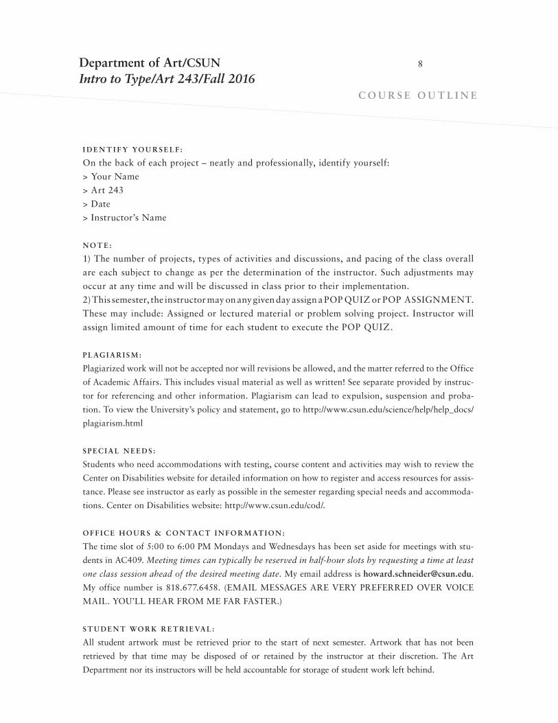
I D E N T I F Y YO U R S E L F :
On the back of each project – neatly and professionally, identify yourself:
> Your Name
> Art 243
> Date
> Instructor’s Name
N O T E :
1) The number of projects, types of activities and discussions, and pacing of the class overall
are each subject to change as per the determination of the instructor. Such adjustments may
occur at any time and will be discussed in class prior to their implementation.
2) This semester, the instructor may on any given day assign a POP QUIZ or POP ASSIGNMENT.
These may include: Assigned or lectured material or problem solving project. Instructor will
assign limited amount of time for each student to execute the POP QUIZ.
P L AG I A R I S M :
Plagiarized work will not be accepted nor will revisions be allowed, and the matter referred to the Office
of Academic Affairs. This includes visual material as well as written! See separate provided by instruc-
tor for referencing and other information. Plagiarism can lead to expulsion, suspension and proba-
tion. To view the University’s policy and statement, go to http://www.csun.edu/science/help/help_docs/
plagiarism.html
S P E C I A L N E E D S :
Students who need accommodations with testing, course content and activities may wish to review the
Center on Disabilities website for detailed information on how to register and access resources for assis-
tance. Please see instructor as early as possible in the semester regarding special needs and accommoda-
tions. Center on Disabilities website: http://www.csun.edu/cod/.
O F F I C E H O U R S & C O N TAC T I N F O R M AT I O N :
The time slot of 5:00 to 6:00 PM Mondays and Wednesdays has been set aside for meetings with stu-
dents in AC409. Meeting times can typically be reserved in half-hour slots by requesting a time at least
one class session ahead of the desired meeting date. My email address is [email protected].
My office number is 818.677.6458. (EMAIL MESSAGES ARE VERY PREFERRED OVER VOICE
MAIL. YOU’LL HEAR FROM ME FAR FASTER.) B
S T U D E N T WO R K R E T R I E VA L :
All student artwork must be retrieved prior to the start of next semester. Artwork that has not been
retrieved by that time may be disposed of or retained by the instructor at their discretion. The Art
Department nor its instructors will be held accountable for storage of student work left behind.
8

Department of Art/CSUNIntro to Type/Art 243/Fall 2016
C O U R S E O U T L I N E
ASSIGNMENTS
Faces Have Voices! Group Project (10%)
You will be part of a team whose responsibility it will be to marry an
image to a particular typeface as well as identify the type classification
of each typeface. Twenty-eight typefaces in total.
9
B

Department of Art/CSUNIntro to Type/Art 243/Fall 2016
C O U R S E O U T L I N E
ASSIGNMENTS
Good Type Rules! | Notebook (10%)
One of the most important projects for this semester consists of visual exam-
ples and definitions illustrating each of 19 commonly found “Good Type
Rules” or, simply put, good rules that govern type legibility and readability.
(Special thanks to Prof. James Kelley.)
Notebook:
Go to our Dropbox and find a PDF document in which each rule will be
described, one per page. Your objective is to find one example per each rule
“violation” and it’s remedy. Cut and paste both actual samples (like from a
magazine, etc.) on the actual page or scan them and then place it onto the
appropriate crime page. Submit the notebook in a three ring binder.
10
GoodTypeRules!
Find or create examples of violations and remedies
for the following “rules to live by” on good type
usage.
Paste up on the document and turn it in.

Department of Art/CSUNIntro to Type/Art 243/Fall 2016
C O U R S E O U T L I N E
ASSIGNMENTS
CREATING THE WORD (10%)
The Structure of Letterforms: Know Your (Typographic) Anatomy
Draw the word Type with either a HB, B or 2B pencil at 21/2" x-height on trac-
ing paper. Use the typeface Didot as your model. This will serve as a means to
understand the nuanced structure of letterforms and the words and spacial
relationships they create. NOTE: THE USE OF FINE-POINT MECHANICAL
PENCILS = “F”.
SYNTAX AND COMMUNICATION (5%)
Personal Monogram
In Illustrator, create a personal monogram using your first, middle and last ini-
tials. You can use a punctuation mark in place of a middle initial. The middle
initial or mark must be a negative shape linking the first and last initials.
Characters can be flopped or flipped or rotated. They cannot be distorted. One
color black. No gray. One 8.5x11 hard copy, name, class, instructor and date
on the back. You may use more than one font but there must be a sense for
contrast present.
HIERARCHY AND RHYTHM (5%)
Monogram as Motif
In Illustrator, use the pathfinder tool to crop your momogram down to the
essence of your design, where the three letterforms still yield recognition but
the positive/negative, form/counterform relationships begin to assume their
own internal rhythm. On a new tabloid-sized document, create a repeating and
varying motif/pattern using only your cropped momogram in different sizes
and individual tints of black. Your goal is to maximize positive/negative
dynamics and to create a deliberate visual hierarchy, including a main area of
interest (aka, focal point or primary active zone). One layout, unmounted,
name, date and class on the back.
11

Department of Art/CSUNIntro to Type/Art 243/Fall 2016
C O U R S E O U T L I N E
ASSIGNMENTS
ENHANCING MEANING (5%)
Space and Meaning:
Follow the instructions for the exercise on pages 106/107 in the Lupton book.
Working area size is 6" square. Must have a thin keyline. Must be created either
in InDesign or Illustrator. Three words: your first name, your last name, and
the word “designer”. One color, black. Develop three layouts but turn in one.
One hard copy, letter sized.
HIERARCHY 101 (5%)
Variations of Emphasis:
Create a document containing nine squares. Each square will contain the same
nine lines of text as all the other squares. The differences will occur in express-
ing the variety of ways for creating emphasis of the headline in order to distin-
guish it from the other text. Each square will be 2". Your InDesign document
will have a 1" margin all around. Go no larger than 9 point text size. Select a
san serif font family with a broad variety of weights like Helvetica Neue or
Univers. Here’s your text:
Marvel at the Tapestries
Gaze at the Carpets
Delight in the Weavings
Textiles to Dye For (featured headline)
From the Permanent Collection
21 January – 30 October
Historical pieces contrasted
with contemporary artworks
at the de Young Museum
12
Square #1: No emphasis
Square #2: Contrast by weight
Square #3: Contrast by color
Square #4: Contrast by alignment (outdent)
Square #5: Contrast by spacial intervals and not by alignment
(set the headline apart spacially above and below)
Square #6: Contrast by uppercase and spacial intervals
Square #7: Contrast by weight, color, spacial intervals and alignment
Square #8: Contrast by size, spacial intervals and alignment
Square #9: Contrast by italic, size, color, spacial interval and alignment

Department of Art/CSUNIntro to Type/Art 243/Fall 2016
C O U R S E O U T L I N E
ASSIGNMENTS
GRID SYSTEMS (5%)
Positiong Grid 1
Two primary grids are found in use arguably more than all others: Field &
Interval and Positioning. The former is the mostly implemented among web-
sites (NYTimes, etc.) and in printed publications such as catalogs and maga-
zines, annual reports, etc. The latter is traditionally seen in single, one-up
applications such as posters and more recently in interactive applications.
In Adobe InDesign create a 8” square using a 1 point line or rule. Using
guidelines, divide the area into eight 1” columns and eight 1” rows resulting in
64 perfect squares. Print it out.
Gather a wide variety of typography selections in a variety of different sizes
from newspapers or magazines. Make sure about 1/3rd of your selections are
justified (flush let and flush right) and 2/3rd are flush left, rag right. Selections
must be either white, black or gray type on white, black or gray backgrounds.
No other colors.
Based upon your master grid, you’ll be creating three layouts, each com-
posed five squares of type. Two layouts will be comprised of justified type and
one layout of flush left, rag right type.
Do not glue directly on this master grid. Instead place a sheet of tracing
paper over the grid to perform the next steps.
Using traditional cut and paste technique, cut your type down into perfect
squares of any size to represent justified type. Select, arrange and glue five
squares of any square proportion (1" min. and up) with the goal of achieving
(1) a focal point, (2) visual hierarchy, (3) compositional balance, (4) tension
and (4) depth.
For the flush left rag right layout, preserve the ragged right edge of each
type block and trim it’s left hand side. Each square must be aligned in the
upper left hand corner of any chosen grid field. Do not overlap squares. All
squares must be oriented horizontally; not rotated or angled.
Each layout must have a thin outline or keyline to identify the working
area. Photocopy or scan each of your three layouts.
Submit three hard copy layouts with your information written in pencil on
the back of each.
13

Department of Art/CSUNIntro to Type/Art 243/Fall 2016
C O U R S E O U T L I N E
ASSIGNMENTS
GRID SYSTEMS (5%)
Positiong Grid 2
Create an advertisement for a performance at VPAC entitled, Martha Graham
and American Music. The format size is 8" square and is the same positioning
grid as the previous exercise, however now it will be created entirely in
InDesign. Imagery and text do not have to conform to squarish sizes.
In this layout, you will have one image in addition to five modules of text.
Your responsibility will include creating (1) a focal point, (2) visual hierarchy,
(3) compositional balance, (4) tension and (4) depth.
Type can be black, gray or white. Image can only be black and white. Full
bleed is ok. Type modules/backgrounds can be clear or solid. Image can be
module based or can occupy the entire background and bleed.
Create three variations of the layout. Final product: three hard copy layouts.
Required text:
> Martha Graham and American Music
> VPAC
> wild Up | Christopher Rountree, Conductor
> Shape & Motion | VPAC Dance performances Series
> Saturday May 13, 2017 at 8:00 PM
THE ANTI-GRID (5%)
Typographic Systems
Take the same Positioning Grid 2 assignment but construct an advertisement
without a grid. Experiment with a composing your layout using any of the
eight arrangement systems as described in our text, Typographic Systems.
Create three variations of the layout. Final product: three hard copy layouts.
Required text:
> Martha Graham and American Music
> VPAC
> wild Up | Christopher Rountree, Conductor
> Shape & Motion | VPAC Dance performances Series
> Saturday May 13, 2017 at 8:00 PM
14
Department of Art/CSUNIntro to Type/Art 243/Fall 2016
C O U R S E O U T L I N E
ASSIGNMENTS
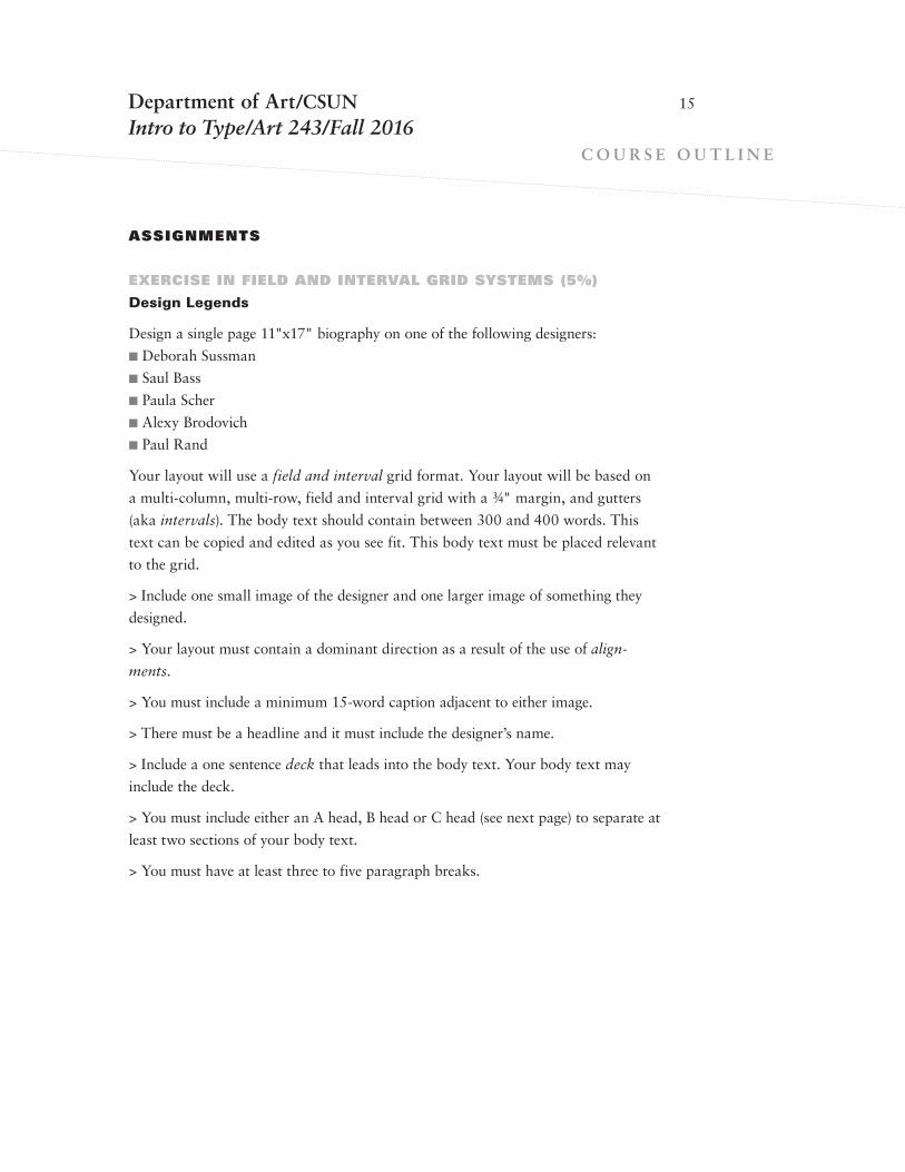
EXERCISE IN FIELD AND INTERVAL GRID SYSTEMS (5%)
Design Legends
Design a single page 11"x17" biography on one of the following designers:
n Deborah Sussman
n Saul Bass
n Paula Scher
n Alexy Brodovich
n Paul Rand
Your layout will use a field and interval grid format. Your layout will be based on
a multi-column, multi-row, field and interval grid with a 3/4" margin, and gutters
(aka intervals). The body text should contain between 300 and 400 words. This
text can be copied and edited as you see fit. This body text must be placed relevant
to the grid.
> Include one small image of the designer and one larger image of something they
designed.
> Your layout must contain a dominant direction as a result of the use of align-
ments.
> You must include a minimum 15-word caption adjacent to either image.
> There must be a headline and it must include the designer’s name.
> Include a one sentence deck that leads into the body text. Your body text may
include the deck.
> You must include either an A head, B head or C head (see next page) to separate at
least two sections of your body text.
> You must have at least three to five paragraph breaks.
15

Department of Art/CSUNIntro to Type/Art 243/Fall 2016
C O U R S E O U T L I N E
ASSIGNMENTS
TYPOGRAPHY AS STRUCTURE AND INFORMATION (20%)
Design Within Reach Catalog
Select one featured product designed by each of three of the most prominent product
designers of the 20th or 21st centuries currently being represented through Design
Within Reach (www.dwr.com). Design three spreads for three designers and a repre-
sentative product that each has created.
Three 11"x17" landscape layouts, each comprised of two 81/2"x11" pages (called a
spread). Each page will have .75" margins; 6 column and 8 rows, with 1p3 (one pica,
three points) gutters in both the horizontal (rows) and vertical (columns) directions.
Remember, the spacial gaps or intervals between columns and rows are called gutters.
The center of a spread is called a spine because it happens to be the backbone or hinge
of a book.
Each designer’s spread must contain:
> A field and interval grid system; identical for all three spreads
> Three or more images representing the design item or group
> A tight detail shot
> An smaller image of the designer
> A brief story about the designer
> A heading (name of the product)
> A deck (brief introductory text set in a larger size)
> Text description of the featured item(s) or dining group
> One caption that references an item for each spread
> The item’s written specifications including dimensions and primes
> Color swatches: fabric choices and / or finish choices with names typeset or size or
product variations where color variations are not applicable.
I’ll be looking for various hierarchies of typographic information — in other words
how you use hierarchy to establish what the viewer sees first, second, third and so
on. I’ll also be looking to see how you have established a dominant direction and
subordinate direction as well how you use flow lines. There must be a unique look
and feel to your layouts that connects all three. Consider integrating shapes, patterns
or textures into your layouts in ways that subtly enliven the look and feel. Always
run spell check on everything! (Select the text; go to Edit > Spelling > Check spelling.
Or just hit command i.)
16

Department of Art/CSUNIntro to Type/Art 243/Fall 2016
C O U R S E O U T L I N E
ASSIGNMENTS
TYPOGRAPHY AS STRUCTURE AND INFORMATION (20%)
Design Within Reach Catalog
step 1: research, designers: Pick three designers whose work appears in the
DWR online catalog (http://www.dwr.com/category/designers.do). Among designers
to consider: Florence Knoll Bassett, Henry Bertoia, Marcel Breuer, Le Corbusier,
Nels Diffrient, Charles and Ray Eames, Frank Gehry, Arne Jacobsen, George Nelson,
Isamu Noguchi, Eero Saarinen, Philippe Starck, Mies van der Rohe, Eva Zeisel.
step 2: research designer’s products: Become familiar with the home furnish-
ing items that each of your designers has designed. Research the history of each
designer and the significance that any of their designs or designers may have had.
The results of your research should be reflected in your text.
step 3, thumbnails. Using pencil and tracing paper, draw a 4" wide sketch of your
grid, including margins, gutters, rows and columns. Next, take a fresh sheet of trac-
ing, place it over the grid sketch and create 9 thumbnail sketches of one possible lay-
out: nine different and unique directions. We’ll select one direction and then you’ll
adapt the look and feel to your other two layouts, again on tracing paper.
Each spread must contain at least three images of product with one image being fea-
tured prominently. Include a relatively smaller image of the designer. Each spread will
contain a description of the product along with specifications, color or size options
and various hierarchies of typographic information.
step 4, content. When researching for a particular product image or of the design-
er, go online and search for larger images of the same product. Avoid pixelized imag-
es. Don’t worry if someone is already using the same image. It’s how you use the
image that makes all the difference. No product illustrations please, please do list the
product’s dimensions in smaller type. You must use double primes (Shift + Control +”)
instead of inches and single prime marks (Control+”) instead of feet. Digital roughs
will be created at the outset of the next point.
step 5, layout. Using InDesign, set up a document with Facing Pages. Set up your
margins, columns and rows as per our lecture. You must use a field and interval
grid with a margin. Each 81/2"x11" page with have .75" margins; 6 column and 8
rows, with 1p3 gutters in both directions.
17


S T U D E N T AG R E E M E N T
I have read the attached syllabus and fully agree that the maximum achievable grade in this Art 243 course can only be earned through abiding by its expectations and requirements.
________________________________________________________________________
student's name
________________________________________________________________________
student's signature
________________________________________________________________________
date
Department of Art/CSUNIntro to Type/Art 243/Fall 2016
18
Recommended


![INDEX [wakerly.org]wakerly.org/DDPP/DDPP3_mkt/ddpp3ix.pdf · INDEX Note: Page numbers for ... clocked assignment operator, := 628 clocked truth-table operator, :> 628 ... 243 Brayton,](https://img.pdfslide.net/doc/110x75/5ace2c0d7f8b9a93268e77ed/index-note-page-numbers-for-clocked-assignment-operator-628-clocked.jpg)