INTRO TO DRAWING
What makes a work of art “good”
Don’t forget the date!!!
September 2, 2011
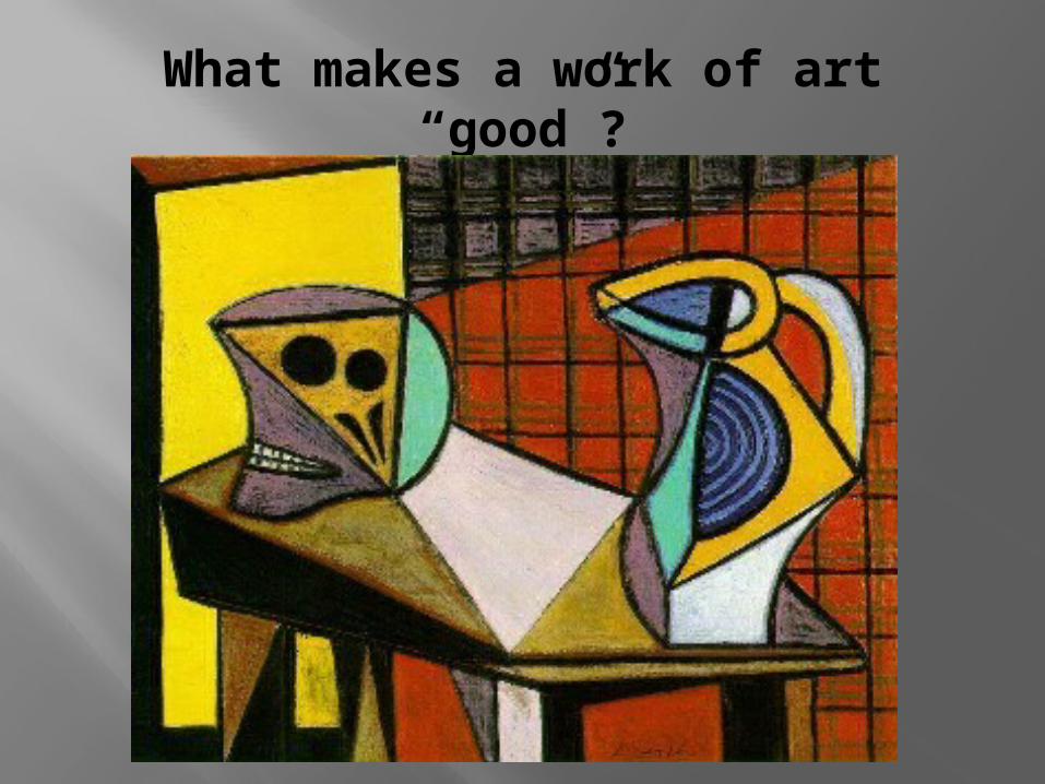
What makes a work of art “good”?
Examine the prints
Which one would you say is your favorite?
Why is it your favorite? What stands out about it? How does it emphasize the word at your
table? In what way does the other image fail? Does everyone in your group agree with
you? How can the artist of the other print (the
not good one) make it better?
Characteristics of art
GOOD NOT GOOD
Composition makes sense
Objects are grounded on the paper and fit correctly
Artist used all of the space around the objects
Artist added value to imply 3 Dimensions
Composition doesn’t make sense – why are these things together?
Objects are too small/too big and seem to be floating on the paper
The background is neglected
There is no shading or bad shading. It looks flat
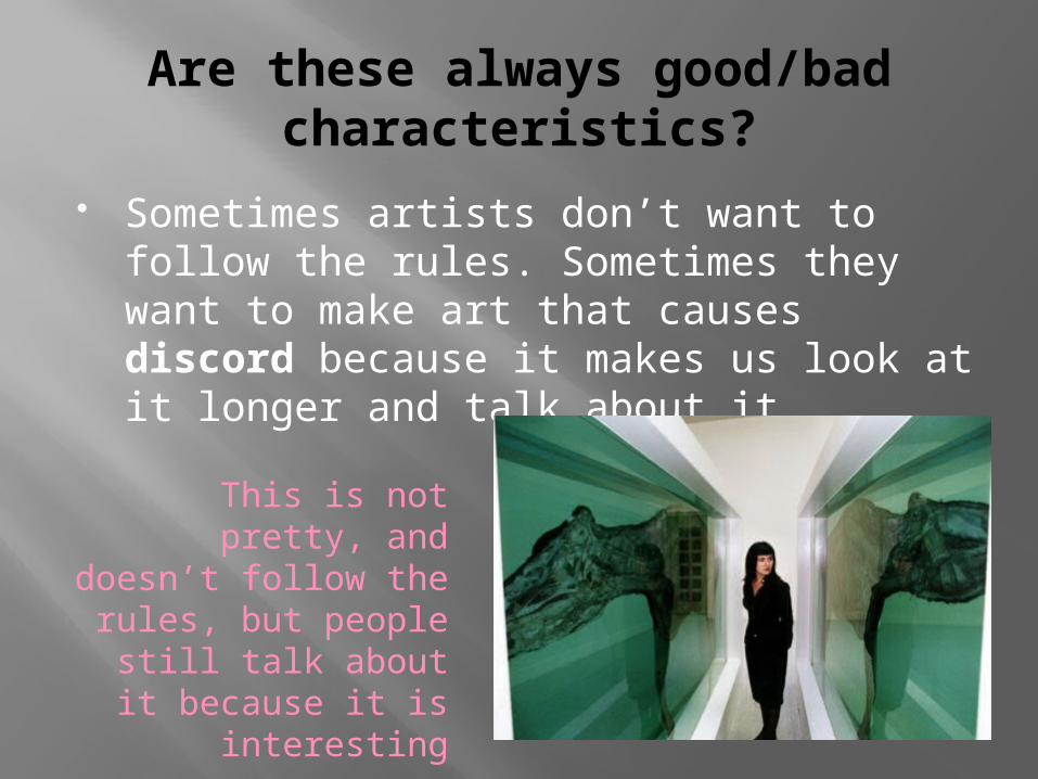
Are these always good/bad characteristics?
Sometimes artists don’t want to follow the rules. Sometimes they want to make art that causes discord because it makes us look at it longer and talk about it.
This is not pretty, and doesn’t follow the
rules, but people still talk about it because
it is interesting
Why do we use the elements/principles of art?Don’t forget the date!!!
September 9, 2011
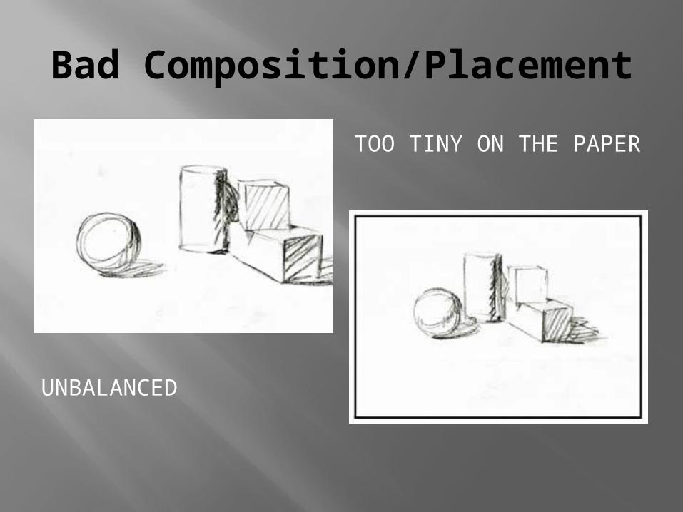
Bad Composition/Placement
UNBALANCED
TOO TINY ON THE PAPER
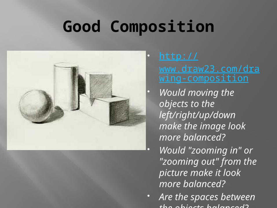
Good Composition
http://www.draw23.com/drawing-composition
Would moving the objects to the left/right/up/down make the image look more balanced?
Would "zooming in" or "zooming out" from the picture make it look more balanced?
Are the spaces between the objects balanced?
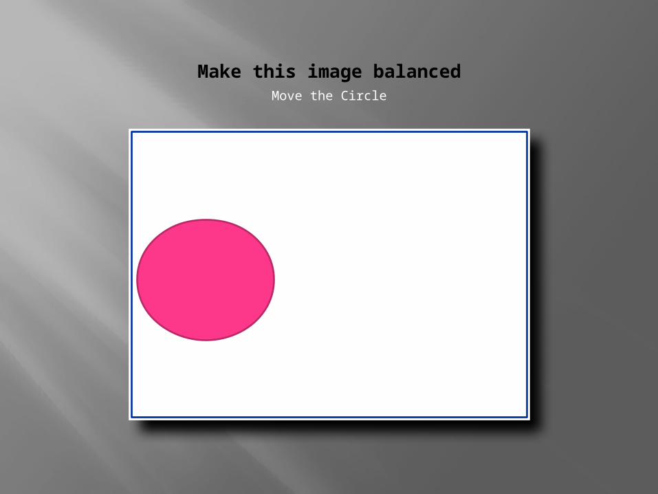
Make this image balanced
Click icon to add picture
Move the Circle
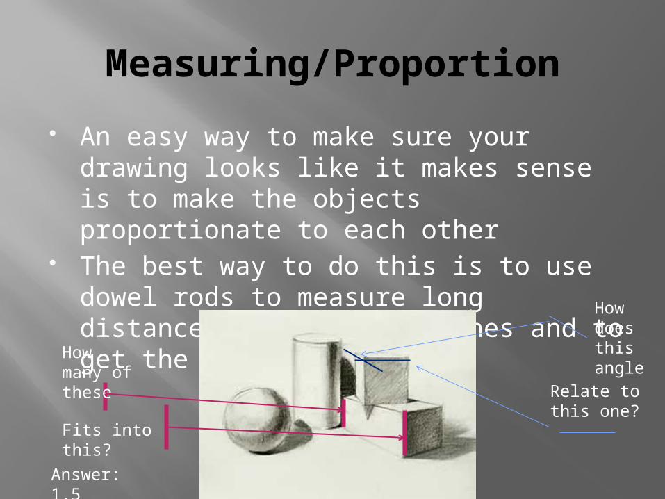
Measuring/Proportion
An easy way to make sure your drawing looks like it makes sense is to make the objects proportionate to each other
The best way to do this is to use dowel rods to measure long distances against short ones and to get the right angle.
How many of these
Fits into this?
Answer: 1.5
How does this angle
Relate to this one?
What are we doing?
Using three classroom objects, put together a still life.
Use the measuring techniques along with what we’ve learned about placement and composition to draw a contour drawing of your still life
Don’t worry too much about the details!! All we want is the outline.
Make sure it’s proportional!!!
Can a drawing go off the edge of a paper? Why/why not?Don’t forget the date!!!
September 16, 2011
Positive/Negative Space
Positive space is the object we are meaning to draw
Negative space is the around the object, often called the background
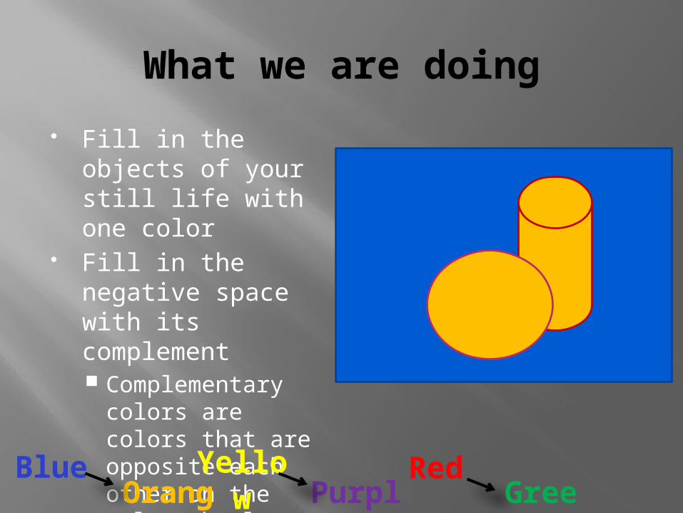
What we are doing
Fill in the objects of your still life with one color
Fill in the negative space with its complement Complementary
colors are colors that are opposite each other on the color wheel
BlueOrang
e
Yellow Purpl
e
RedGree
n
What is one way to make 2-D drawings look 3-D?Don’t forget the date!!!
September 23, 2011
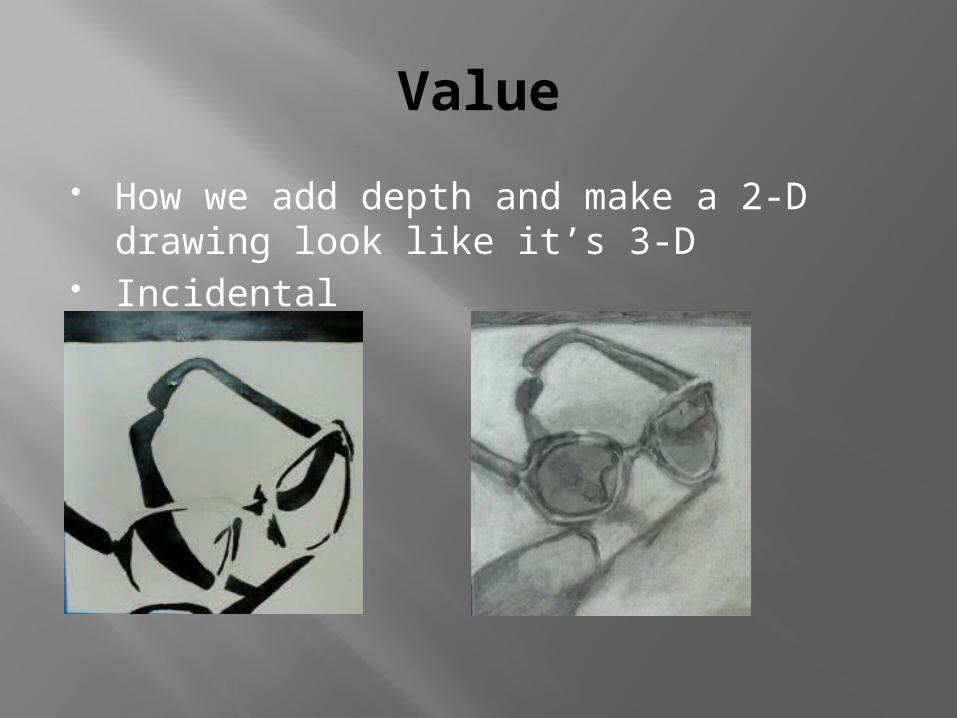
Value
How we add depth and make a 2-D drawing look like it’s 3-D
Incidental Inherent
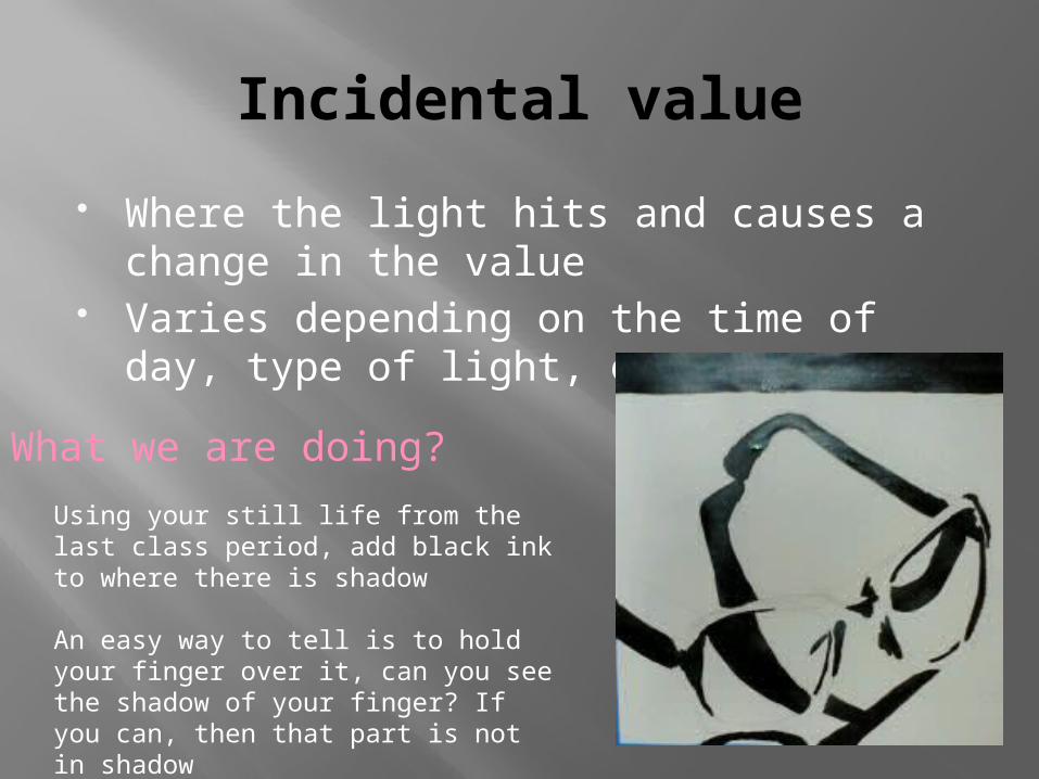
Incidental value
Where the light hits and causes a change in the value
Varies depending on the time of day, type of light, etc.
What we are doing?
Using your still life from the last class period, add black ink to where there is shadow
An easy way to tell is to hold your finger over it, can you see the shadow of your finger? If you can, then that part is not in shadowThe rest is left white
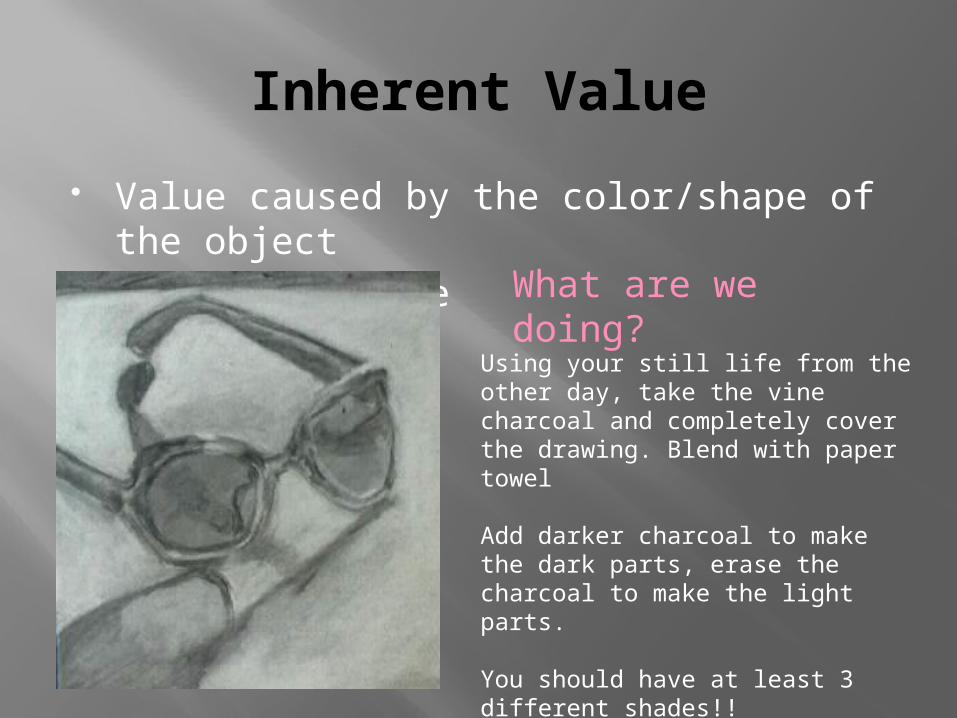
Inherent Value
Value caused by the color/shape of the object
Does not change What are we doing?
Using your still life from the other day, take the vine charcoal and completely cover the drawing. Blend with paper towel
Add darker charcoal to make the dark parts, erase the charcoal to make the light parts.
You should have at least 3 different shades!!
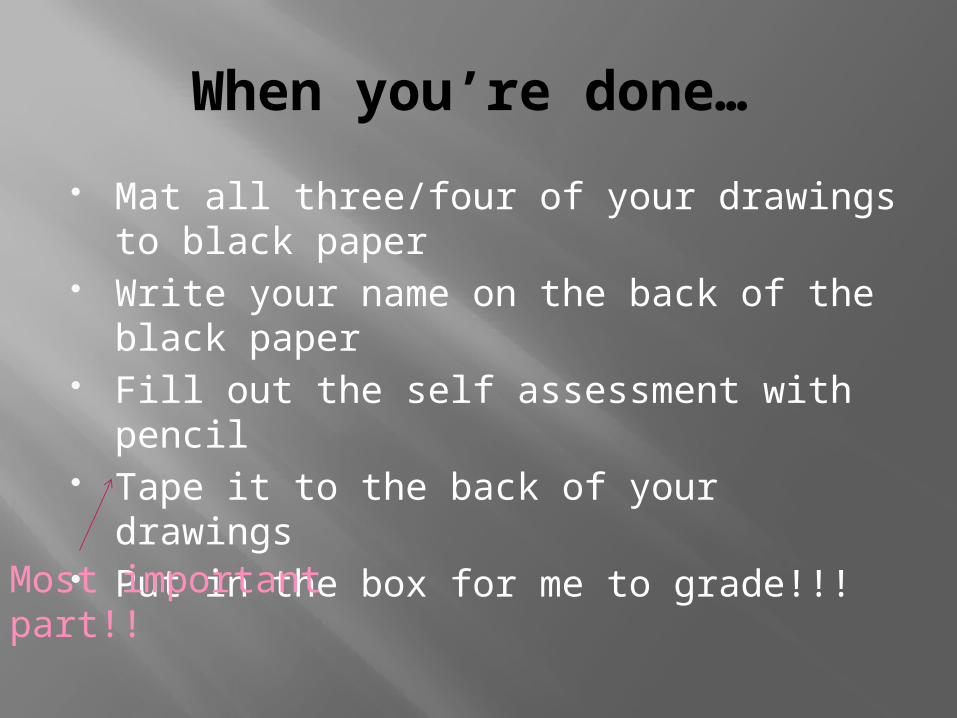
When you’re done…
Mat all three/four of your drawings to black paper
Write your name on the back of the black paper
Fill out the self assessment with pencil Tape it to the back of your drawings Put in the box for me to grade!!!
Most important part!!
Recommended