1
NPS Aquarius Web Data Portal
To view a video demonstration of what is written here, click the hyperlink in the box below.
The NPS Aquarius Web Data Portal (https://irma.nps.gov/aqwebportal) is a website designed to enable
public dissemination of both continuous time series and field visit data entered in the NPS Aquarius
Database. This document demonstrates how to use Aquarius Springboard Location Manager to
designate which data (Locations and Datasets) in the NPS’ Aquarius Database should be made
available in the NPS Aquarius Web Data Portal (‘WDP’ for short) and how to navigate within and
use the WDP to view and export data.
This tutorial assumes you are either familiar with Aquarius and/or have read the Springboard
overview document or watched the video demonstration.
How to Designate Publicly Available Data
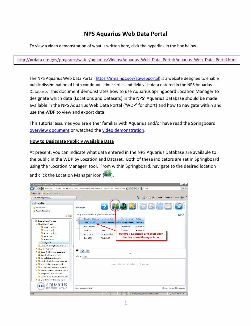
At present, you can indicate what data entered in the NPS Aquarius Database are available to
the public in the WDP by Location and Dataset. Both of these indicators are set in Springboard
using the ‘Location Manager’ tool. From within Springboard, navigate to the desired location
and click the Location Manager icon ( ).
http://nrdata.nps.gov/programs/water/aquarius/Videos/Aquarius_Web_Data_Portal/Aquarius_Web_Data_Portal.html

2
The ‘General’ tab of the Location Manager allows you to describe the location. One of the
‘Additional Attributes’ is called ‘Sensitivity’. The Sensitivity selection controls whether any of
the location’s information is available in the WDP. If you want some or all of the location’s
information (time series and field visits) to be available to the public, set the Sensitivity to
‘Public’ as shown below. If the Sensitivity is set to anything else (including ‘None’ – which is the
default of when no selection is made) the location and all its datasets will not be available in
the WDP.
To reiterate … if you want to share any data from the location with the WDP, the
location’s Sensitivity setting must be ‘Public’. By default, once you set the location’s Sensitivity
to ‘Public’, all of its time series and field visit datasets will be available in the WDP.
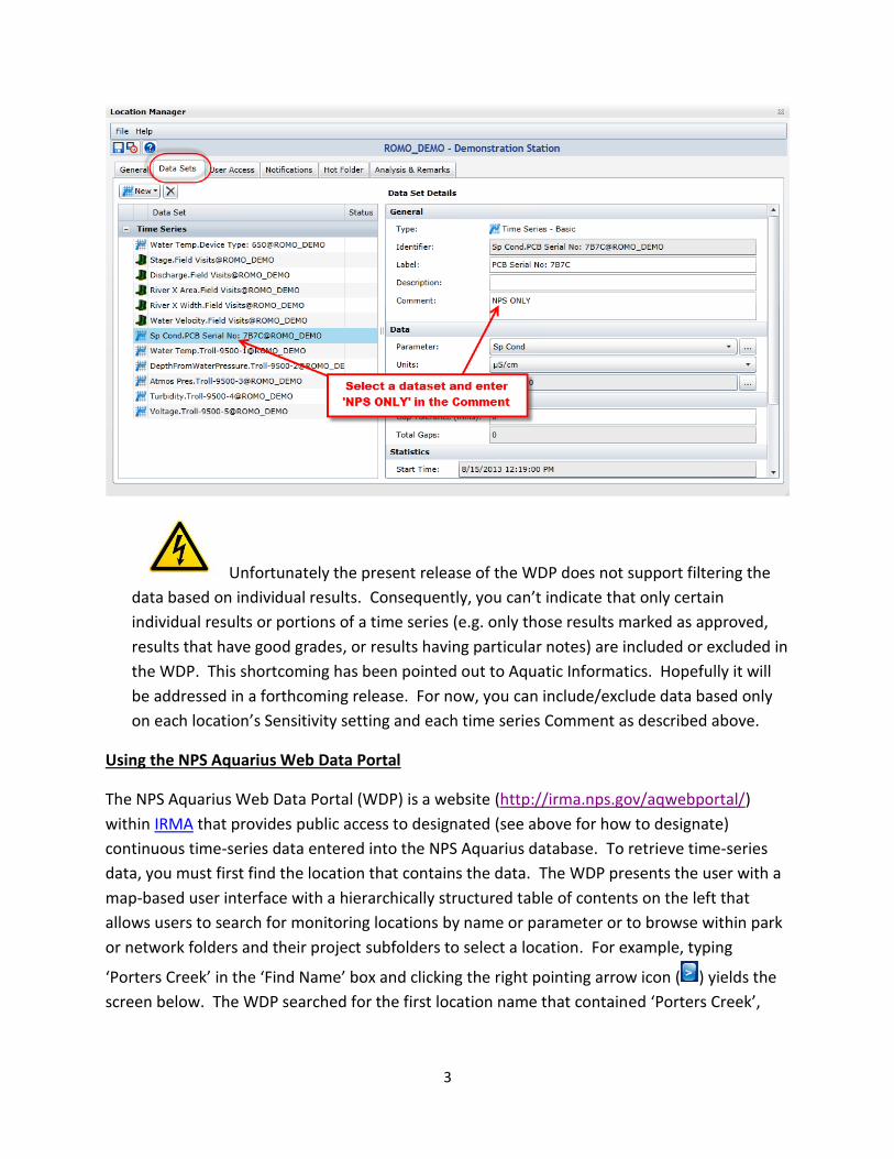
To limit which time series and field visit datasets are available at a ‘Public’ location, click on the
‘Data Sets’ tab in Location Manager. Select the dataset in the ‘Data Set’ panel on the left and in
the ‘Comment’ box in the ‘Data Set Details’ General section on the right, enter ‘NPS ONLY’. You
can enter ‘NPS ONLY’ (not case sensitive) anywhere in the ‘Comment’ field and it will have the
same effect: that particular time series will not be shown in the WDP. Enter ‘NPS ONLY’ in the
‘Comment’ field for every time series or field visit dataset you wish to hide from the public. Be
sure to click the Location Manager’s Save ( ) or Save and Exit ( ) icon to save the ‘Comment’
change so it will take effect on the WDP.
3
Unfortunately the present release of the WDP does not support filtering the
data based on individual results. Consequently, you can’t indicate that only certain
individual results or portions of a time series (e.g. only those results marked as approved,
results that have good grades, or results having particular notes) are included or excluded in
the WDP. This shortcoming has been pointed out to Aquatic Informatics. Hopefully it will
be addressed in a forthcoming release. For now, you can include/exclude data based only
on each location’s Sensitivity setting and each time series Comment as described above.
Using the NPS Aquarius Web Data Portal
The NPS Aquarius Web Data Portal (WDP) is a website (http://irma.nps.gov/aqwebportal/)
within IRMA that provides public access to designated (see above for how to designate)
continuous time-series data entered into the NPS Aquarius database. To retrieve time-series
data, you must first find the location that contains the data. The WDP presents the user with a
map-based user interface with a hierarchically structured table of contents on the left that
allows users to search for monitoring locations by name or parameter or to browse within park
or network folders and their project subfolders to select a location. For example, typing
‘Porters Creek’ in the ‘Find Name’ box and clicking the right pointing arrow icon ( ) yields the
screen below. The WDP searched for the first location name that contained ‘Porters Creek’,
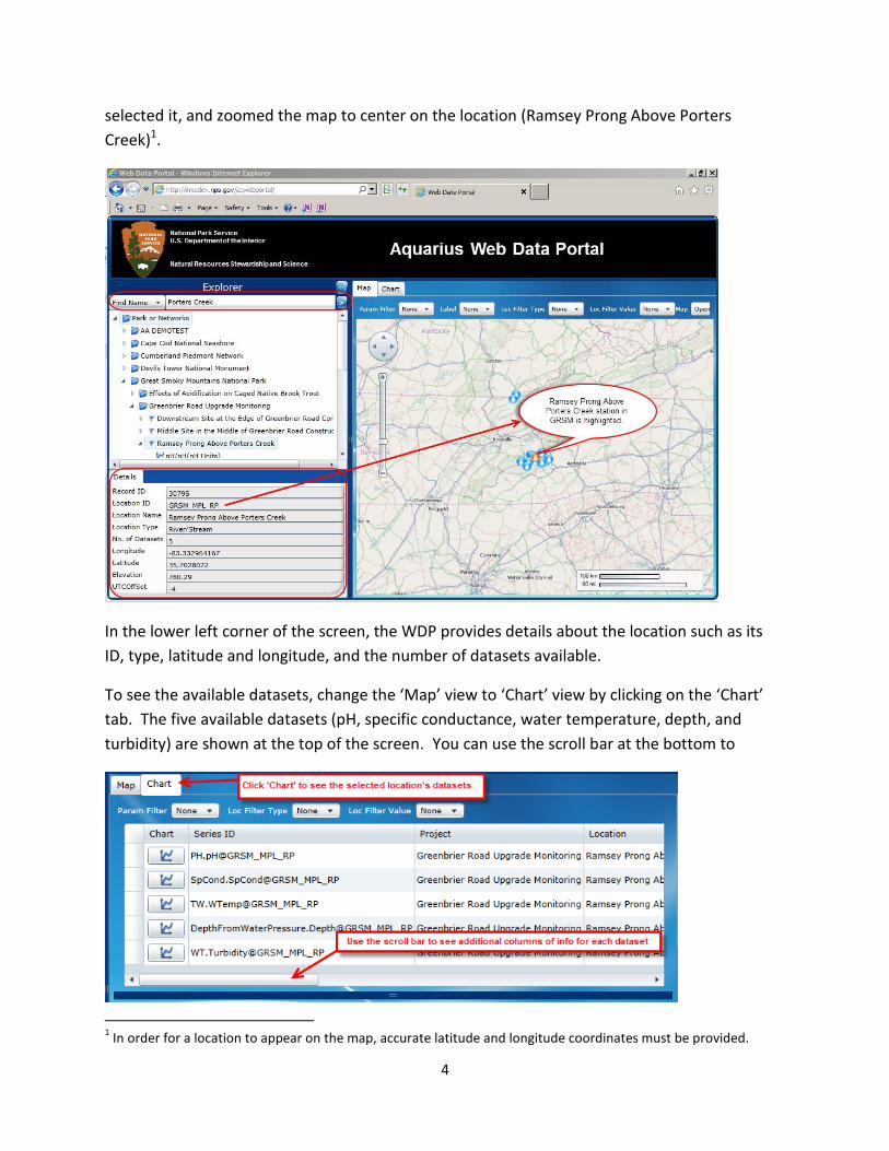
4
selected it, and zoomed the map to center on the location (Ramsey Prong Above Porters
Creek)1.
In the lower left corner of the screen, the WDP provides details about the location such as its
ID, type, latitude and longitude, and the number of datasets available.
To see the available datasets, change the ‘Map’ view to ‘Chart’ view by clicking on the ‘Chart’
tab. The five available datasets (pH, specific conductance, water temperature, depth, and
turbidity) are shown at the top of the screen. You can use the scroll bar at the bottom to
1 In order for a location to appear on the map, accurate latitude and longitude coordinates must be provided.

5
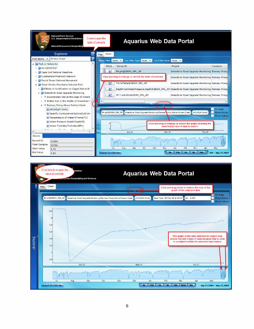
scroll the window to see other attributes about each time series such as start and end
date/time, minimum, maximum, mean, total, etc. Click on the time-series graph icon ( ) to
the left of the ‘Series ID’ to select it. The WDP will grey out momentarily as it retrieves the data
for the time series, selects it in the table of contents on the left, and displays it in two graphs at
the bottom of the form. The top graph shows the selected portion of the time series. The
bottom graph shows the entire time series and is used to select the portion of the data to be
displayed in the top graph and for export. The buttons (3H, 12H, 1D, 3D, 10D, 365D, All) allow
the user to quickly narrow the selected portion of the data in the bottom graph to the last X
hours, X days, or All the data. The user can also click and drag on the selection bars ( ) in the
bottom graph to place them at the start and end dates of the desired portion of data.
To improve viewing all the information the WDP tries to show on one screen, you can open and
close portions of the screen as shown in the first figure below. Closing the table of contents
and enlarging the graph window yields the display shown in the second figure below which
shows the last 3 days of the time series since that is what is contained between the selection
bars in the lower graph.
6
7
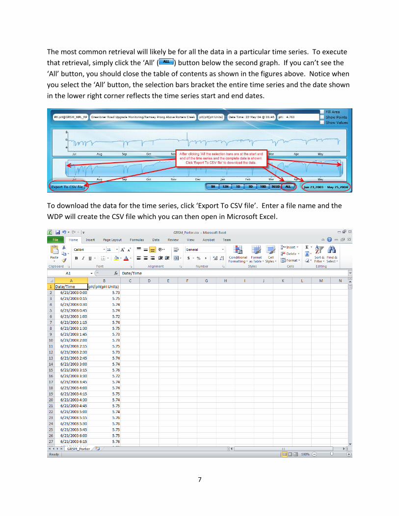
The most common retrieval will likely be for all the data in a particular time series. To execute
that retrieval, simply click the ‘All’ ( ) button below the second graph. If you can’t see the
‘All’ button, you should close the table of contents as shown in the figures above. Notice when
you select the ‘All’ button, the selection bars bracket the entire time series and the date shown
in the lower right corner reflects the time series start and end dates.
To download the data for the time series, click ‘Export To CSV file’. Enter a file name and the
WDP will create the CSV file which you can then open in Microsoft Excel.
8
With this version of the WDP, the export is sparse – just the date/time and the parameter
value. Aquatic Informatics has been asked to include additional information for each result
such as grades, approvals, notes, etc. so hopefully that will appear in a subsequent version.
Note: The number of results exported from the WDP for a time series may not match the
number of results reported for that time series in Aquarius due to Aquarius’ gap interval
processing. When Aquarius identifies a gap in a time series, it flags the gap by
repeating/duplicating the time series date and result before and after the gap. This adds two
extra records/results for every gap identified in the time series. In the example above, the pH
export contains 30,760 results. In Aquarius, the total number of samples/results is reported as
30,766 which indicates there are three gaps in the data in Aquarius where the time between
measurements exceeded the specified gap tolerance which in this dataset was 15 minutes.
Navigating the ‘Explorer’ (Table of Contents) Folders
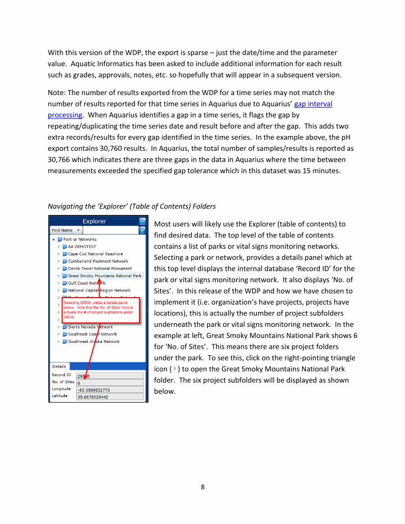
Most users will likely use the Explorer (table of contents) to
find desired data. The top level of the table of contents
contains a list of parks or vital signs monitoring networks.
Selecting a park or network, provides a details panel which at
this top level displays the internal database ‘Record ID’ for the
park or vital signs monitoring network. It also displays ‘No. of
Sites’. In this release of the WDP and how we have chosen to
implement it (i.e. organization’s have projects, projects have
locations), this is actually the number of project subfolders
underneath the park or vital signs monitoring network. In the
example at left, Great Smoky Mountains National Park shows 6
for ‘No. of Sites’. This means there are six project folders
under the park. To see this, click on the right-pointing triangle
icon ( ) to open the Great Smoky Mountains National Park
folder. The six project subfolders will be displayed as shown
below.
9
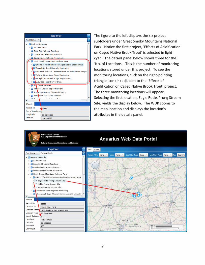
The figure to the left displays the six project
subfolders under Great Smoky Mountains National
Park. Notice the first project, ‘Effects of Acidification
on Caged Native Brook Trout’ is selected in light
cyan. The details panel below shows three for the
‘No. of Locations’. This is the number of monitoring
locations stored under this project. To see the
monitoring locations, click on the right-pointing
triangle icon ( ) adjacent to the ‘Effects of
Acidification on Caged Native Brook Trout’ project.
The three monitoring locations will appear.
Selecting the first location, Eagle Rocks Prong Stream
Site, yields the display below. The WDP zooms to
the map location and displays the location’s
attributes in the details panel.
10
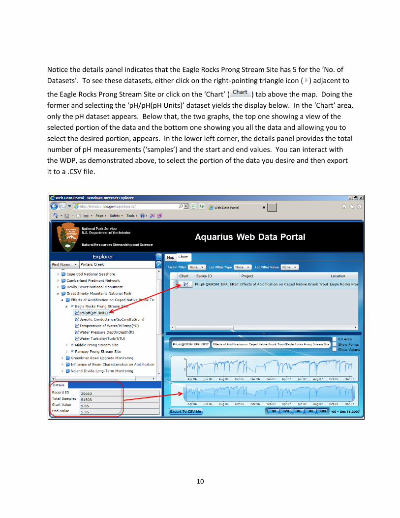
Notice the details panel indicates that the Eagle Rocks Prong Stream Site has 5 for the ‘No. of
Datasets’. To see these datasets, either click on the right-pointing triangle icon ( ) adjacent to
the Eagle Rocks Prong Stream Site or click on the ‘Chart’ ( ) tab above the map. Doing the
former and selecting the ‘pH/pH(pH Units)’ dataset yields the display below. In the ‘Chart’ area,
only the pH dataset appears. Below that, the two graphs, the top one showing a view of the
selected portion of the data and the bottom one showing you all the data and allowing you to
select the desired portion, appears. In the lower left corner, the details panel provides the total
number of pH measurements (‘samples’) and the start and end values. You can interact with
the WDP, as demonstrated above, to select the portion of the data you desire and then export
it to a .CSV file.
11
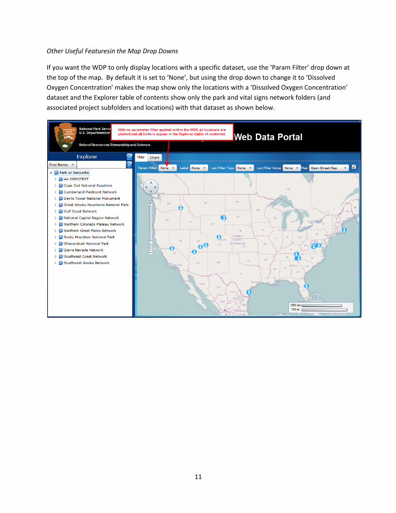
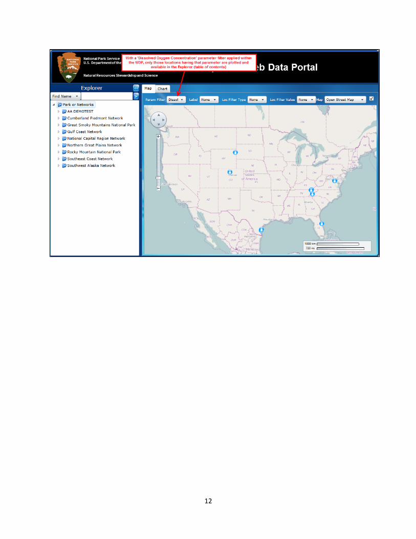
Other Useful Featuresin the Map Drop Downs
If you want the WDP to only display locations with a specific dataset, use the ‘Param Filter’ drop down at
the top of the map. By default it is set to ‘None’, but using the drop down to change it to ‘Dissolved
Oxygen Concentration’ makes the map show only the locations with a ‘Dissolved Oxygen Concentration’
dataset and the Explorer table of contents show only the park and vital signs network folders (and
associated project subfolders and locations) with that dataset as shown below.
12
13
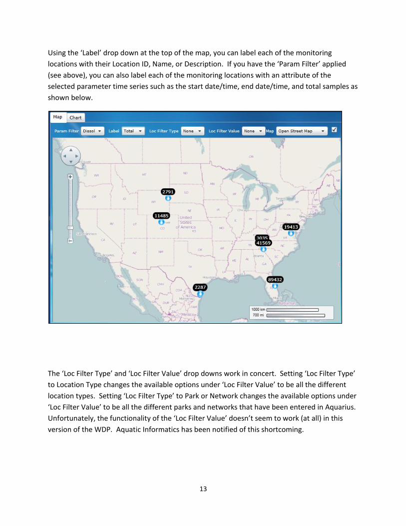
Using the ‘Label’ drop down at the top of the map, you can label each of the monitoring
locations with their Location ID, Name, or Description. If you have the ‘Param Filter’ applied
(see above), you can also label each of the monitoring locations with an attribute of the
selected parameter time series such as the start date/time, end date/time, and total samples as
shown below.
The ‘Loc Filter Type’ and ‘Loc Filter Value’ drop downs work in concert. Setting ‘Loc Filter Type’
to Location Type changes the available options under ‘Loc Filter Value’ to be all the different
location types. Setting ‘Loc Filter Type’ to Park or Network changes the available options under
‘Loc Filter Value’ to be all the different parks and networks that have been entered in Aquarius.
Unfortunately, the functionality of the ‘Loc Filter Value’ doesn’t seem to work (at all) in this
version of the WDP. Aquatic Informatics has been notified of this shortcoming.
14
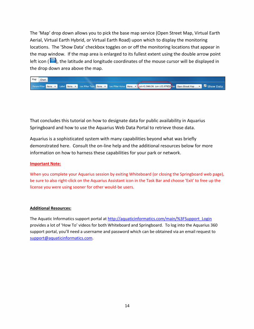
The ‘Map’ drop down allows you to pick the base map service (Open Street Map, Virtual Earth
Aerial, Virtual Earth Hybrid, or Virtual Earth Road) upon which to display the monitoring
locations. The 'Show Data’ checkbox toggles on or off the monitoring locations that appear in
the map window. If the map area is enlarged to its fullest extent using the double arrow point
left icon ( ), the latitude and longitude coordinates of the mouse cursor will be displayed in
the drop down area above the map.
That concludes this tutorial on how to designate data for public availability in Aquarius
Springboard and how to use the Aquarius Web Data Portal to retrieve those data.
Aquarius is a sophisticated system with many capabilities beyond what was briefly
demonstrated here. Consult the on-line help and the additional resources below for more
information on how to harness these capabilities for your park or network.
Important Note:
When you complete your Aquarius session by exiting Whiteboard (or closing the Springboard web page),
be sure to also right-click on the Aquarius Assistant icon in the Task Bar and choose 'Exit' to free up the
license you were using sooner for other would-be users.
Additional Resources:
The Aquatic Informatics support portal at http://aquaticinformatics.com/main/%3FSupport_Login
provides a lot of ‘How To’ videos for both Whiteboard and Springboard. To log into the Aquarius 360
support portal, you’ll need a username and password which can be obtained via an email request to
Recommended

![소프트웨어공학개론 Team 3dslab.konkuk.ac.kr/.../TeamA/TP4/[2015SE_A][T3]ST_PPT.pdf · 2015-11-25 · 3, data 4, data 5 data 6, data 7, data . NPS 211 0070 NPS 211 0080 NPS](https://img.pdfslide.net/doc/110x75/5f1ec369d1f44d23483cb0d5/oeeeoee-team-2015seat3stpptpdf-2015-11-25-3-data.jpg)