a process of Paramount /

a process of Paramount /
First copy hardcover image wrap copy printed in 2011, by Blurbbook printing:
Blurb, Inc.580 California Street, Suite 300San Francisco, CA 94104http://www.blurb.com
No part of this book should or may be reproduced in any manner with out written permission from the publisher, except in the context of reviews. Book context serves student and grading purposes only and used for no other use.
Designer: Courtney Shelton/ 2011
Researched, Written, & designed by Courtney Shelton /Influenced typeface design by Ondrej Job /
a process of Paramount /
I had seen it in two of Professor Black’s p
resentations during class previously
and absolutely loved it, w
hile wanting to know more about
it. Through only ju
st a brief knowledge of this d
esigner and typeface so
far, many iss
ues have become apparent such as his p
articular design
characteristics, in
terests, and design influences. O
ndrej Job uses a combination
of his own custom hand lettering with the stu
dy and knowledge of the
“Interpolation Theory” as well as “T
he Stroke Theory
of Writing” to
create his typeface , w
hich comes in a plus and minus weight, as
well as an italic style. I p
lan to study and manipulate this ty
peface by observing
and adding in hand drawn elements with curvin
g edges and counter qualities to
the plus style.
Type D
esign
er
Introd
uctio
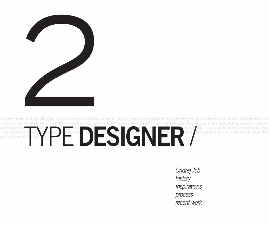
n ONDREJ JOBHistoryInspirationsProcessRecent work
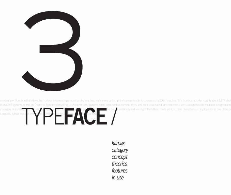
KLIMAXCategoryConceptTheoriesFeaturesIn Use
THOUGHTSThesisStatement
Influe
nced
Type
face
table of contents /
1 2 3
DRAWINGSSkeletonGlyph DissectionSketchesProcess CritiquesLetter evolution
Type selectionreasoningPlans of typemanipulation
Goals
& Re
ason
ing
The P
roce
ss
4 5
table of contents /
I had seen it in two of Professor Black’s presentations during class previously and absolutely loved it, while wanting to know more about it. Through only just a brief knowledge of this designer and typeface so far, many issues have become apparent such as his particular design characteristics, interests, and design infl ueneces. Ondrej Job uses a combination of his own custom hand lettering with the study and knowledge of the “Interpolation Theory” as well as “The Stroke Theory of Writing” to create his typeface Klimax, which comes in a plus and minus weight, as well as an italic style. I plan to study and manipulate this typeface by observing and adding in hand drawn elements with curving edges and counter qualities to the plus style.
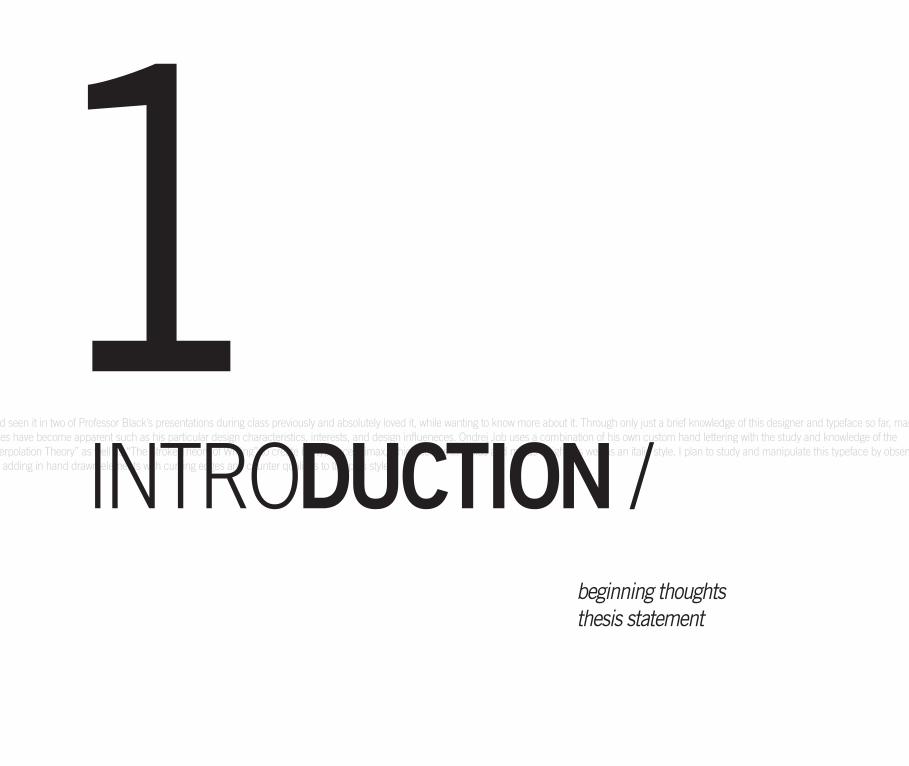
beginning thoughtsthesis statement
1INTRODUCTION /
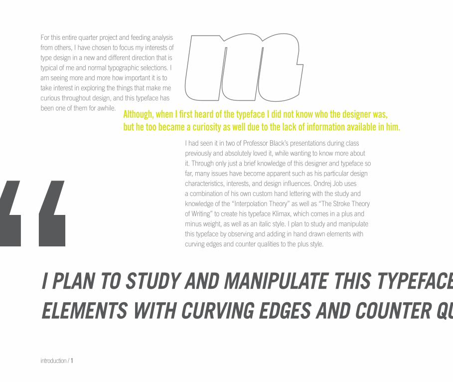
I PLAN TO STUDY AND MANIPULATE THIS TYPEFACE BY OBSERVING AND ADDING IN HAND DRAWNELEMENTS WITH CURVING EDGES AND COUNTER QUALITIES TO THE PLUS WEIGHT VERSION.“For this entire quarter project and feeding analysisfrom others, I have chosen to focus my interests of type design in a new and different direction that is typical of me and normal typographic selections. I am seeing more and more how important it is to take interest in exploring the things that make mecurious throughout design, and this typeface hasbeen one of them for awhile.
I had seen it in two of Professor Black’s presentations during class previously and absolutely loved it, while wanting to know more aboutit. Through only just a brief knowledge of this designer and typeface sofar, many issues have become apparent such as his particular design characteristics, interests, and design influences. Ondrej Job uses a combination of his own custom hand lettering with the study and knowledge of the “Interpolation Theory” as well as “The Stroke Theory of Writing” to create his typeface Klimax, which comes in a plus and minus weight, as well as an italic style. I plan to study and manipulate this typeface by observing and adding in hand drawn elements with curving edges and counter qualities to the plus style.
Although, when I first heard of the typeface I did not know who the designer was,but he too became a curiosity as well due to the lack of information available in him.
introduction / 1
I PLAN TO STUDY AND MANIPULATE THIS TYPEFACE BY OBSERVING AND ADDING IN HAND DRAWNELEMENTS WITH CURVING EDGES AND COUNTER QUALITIES TO THE PLUS WEIGHT VERSION.
“beginning thoughts /
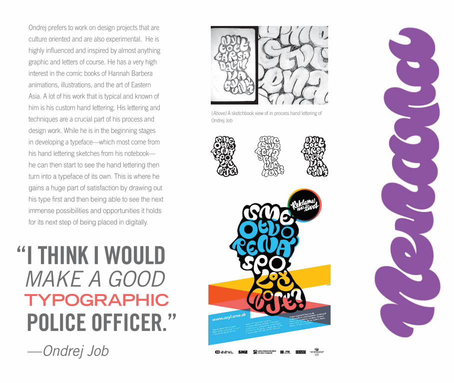
Ondrej prefers to work on design projects that are culture oriented and are also experimental. He is highly infl uenced and inspired by almost anything graphic and letters of course. He has a very high interest in the comic books of Hannah Barbera animations, illustrations, and the art of Eastern Asia. A lot of his work that is typical and known of him is his custom hand lettering. His lettering and technigques are a crucial part of his process and design work. While he is in the beginning stages in developing a typface—which most come from his hand lettering sketches from his notebook—which most come from his hand lettering sketches from his notebook— —he can then start to see the hand lettering then turn into a typeface of its own. This is where he gains a huge part of satisfaction by drawing out his type first and then being able to see the next immense possibilities and opportunities it holds for its next step of being placed in digitally.
Ondrej Jobhistoryinspirationsprocessrecent work
2TYPE DESIGNER /
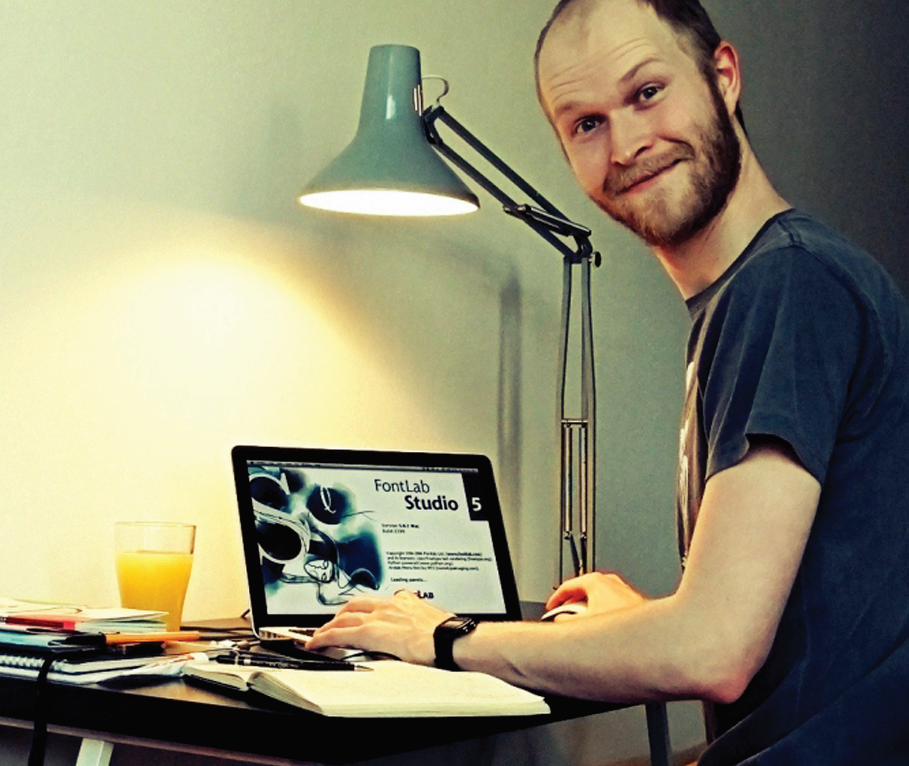
Ondrej prefers to work on design projects that are culture oriented and are also experimental. He is highly infl uenced and inspired by almost anything graphic and letters of course. He has a very high interest in the comic books of Hannah Barbera animations, illustrations, and the art of Eastern Asia. A lot of his work that is typical and known of him is his custom hand lettering. His lettering and technigques are a crucial part of
turn into a typeface of its own. This is where he gains a huge part of satisfaction by drawing out his type first and then being able to see the next immense possibilities and opportunities it holds for its next
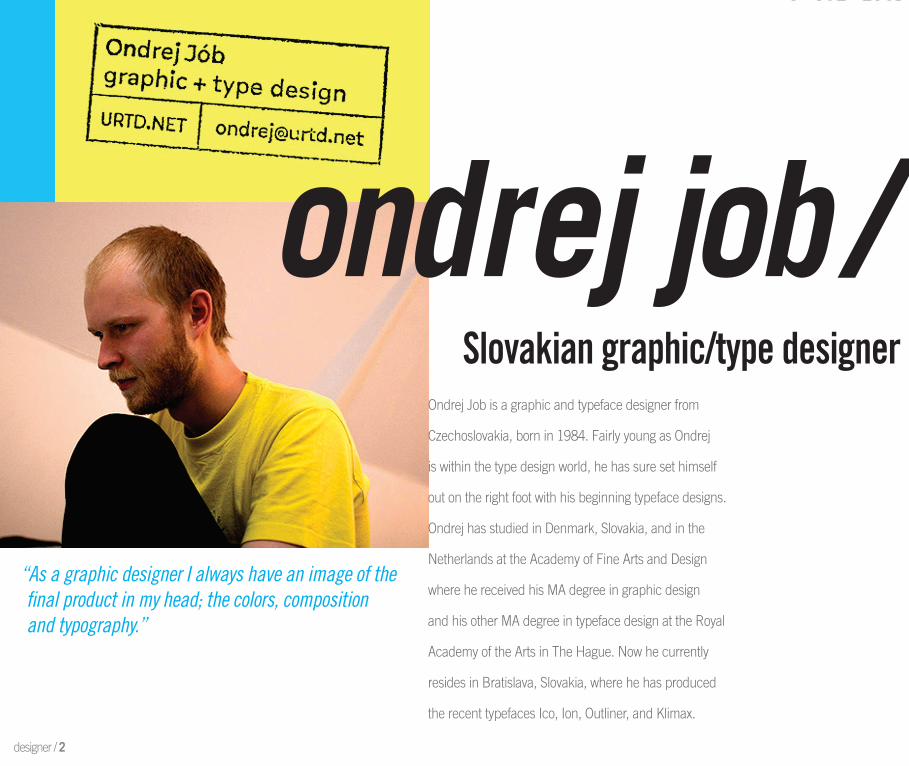
Ondrej Job is a graphic and typeface designer from Ondrej Job is a graphic and typeface designer from Czechoslovakia, born in 1984. Fairly young as Ondrej Czechoslovakia, born in 1984. Fairly young as Ondrej is within the type design world, he has sure set himself is within the type design world, he has sure set himself out on the right foot with his beginning typeface designs. out on the right foot with his beginning typeface designs. Ondrej has studied in Denmark, Slovakia, and in the Ondrej has studied in Denmark, Slovakia, and in the Netherlands at the Academy of Fine Arts and Design Netherlands at the Academy of Fine Arts and Design where he received his MA degree in graphic design where he received his MA degree in graphic design and his other MA degree in typeface design at the Royal and his other MA degree in typeface design at the Royal Academy of the Arts in The Hague. Now he currently Academy of the Arts in The Hague. Now he currently resides in Bratislava, Slovakia, where he has produced resides in Bratislava, Slovakia, where he has produced the recent typefaces Ico, Ion, Outliner, and Klimax.the recent typefaces Ico, Ion, Outliner, and Klimax.
Ondrej Job is a graphic and typeface designer from
Czechoslovakia, born in 1984. Fairly young as Ondrej
is within the type design world, he has sure set himself
out on the right foot with his beginning typeface designs.
Ondrej has studied in Denmark, Slovakia, and in the
Netherlands at the Academy of Fine Arts and Design
where he received his MA degree in graphic design
and his other MA degree in typeface design at the Royal
Academy of the Arts in The Hague. Now he currently
resides in Bratislava, Slovakia, where he has produced
the recent typefaces Ico, Ion, Outliner, and Klimax.
“As a graphic designer I always have an image of thefi nal product in my head; the colors, composition and typography.”
designer / 2
Slovakian graphic/type designer
ondrej job /
where he received his MA degree in graphic design and his other MA degree in typeface design at the Royal Academy of the Arts in The Hague. Now he currently resides in Bratislava, Slovakia, where he has produced the recent typefaces Ico, Ion, Outliner, and Klimax.
Slovakian graphic/type designer
ondrej job /
Ondrej prefers to work on design projects that are
culture oriented and are also experimental. He is
highly infl uenced and inspired by almost anything
graphic and letters of course. He has a very high
interest in the comic books of Hannah Barbera
animations, illustrations, and the art of Eastern
Asia. A lot of his work that is typical and known of
him is his custom hand lettering. His lettering and
techniques are a crucial part of his process and
design work. While he is in the beginning stages
in developing a typeface—which most come from
his hand lettering sketches from his notebook—
he can then start to see the hand lettering then
turn into a typeface of its own. This is where he
gains a huge part of satisfaction by drawing out
his type first and then being able to see the next
immense possibilities and opportunities it holds
for its next step of being placed in digitally.
“I THINK I WOULD
POLICE OFFICER.”
MAKE A GOOD
—Ondrej Job
TYPOGRAPHIC
(Above) A sketchbook view of in process hand lettering ofOndrej Job
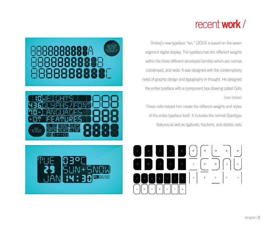
recent work /Ondrej’s new typeface “Ion,” (2010) is based on the seven
segment digital display. The typeface has ten different weights
within the three different developed families which are normal,
condensed, and wide. It was designed with the contemporary
need of graphic design and typography in thought. He designed
the entire typeface with a component box drawing called Cells.
(see below)
These cells helped him create the different weights and styles
of the entire typeface itself. It includes the normal Opentype
features as well as ligatures, fractions, and stylistic sets.
designer / 2
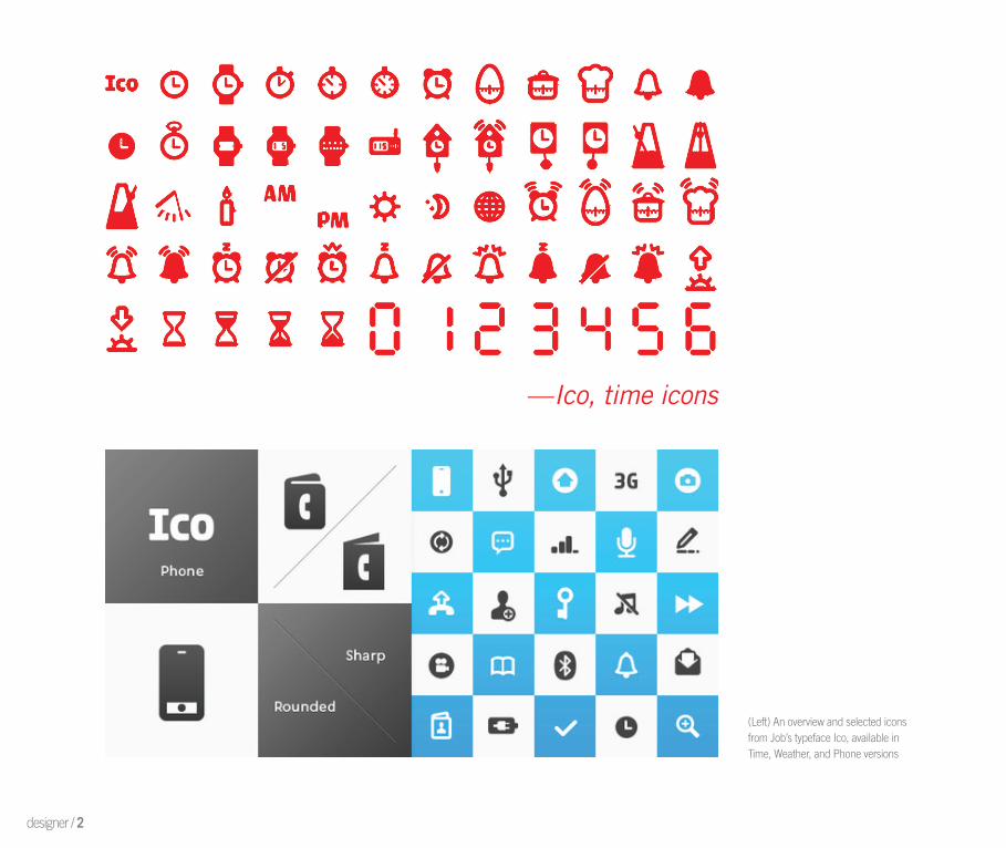
—Ico, time icons
(Left) An overview and selected iconsfrom Job’s typeface Ico, available inTime, Weather, and Phone versions
designer / 2

recent work /This typeface “Ico” is inspired by symbols and
dingbats of the typical monochromatic LCD display.
The mostly are all rounded and organic forms in
shape, while being constructed out of the least
amount of visual object as possible. These single
characters all possess the same lineweight and also
that of the before typeface Ion, making them both
designed to perfectly work with one another.
Ondrej has also just recently completed the design
of the type foundry Typotheque’s new website layout.
This new design generates test samples of text, has a
new font combiner, and a PDF tester. He has also
designed his own website that sells multiple products,
for example these T-shirt designs to the left.
(Top A screen view of the new redesigned Typotheque website.(Left) Products from Ondrej’swebsite available for sale.
klimaxcategoryconcepttheoriesfeaturesin use
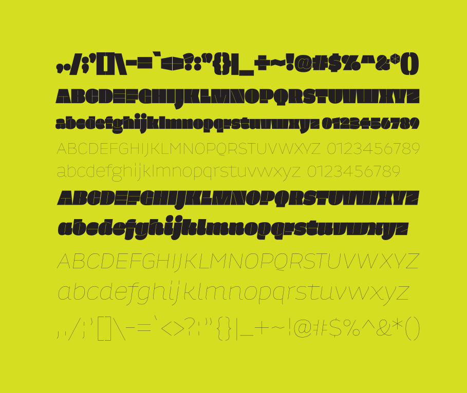
Klimax features Opentype that allows the typeface to have a larger number of characters, while some postscript fonts are only able to possess up to 256 characters. This typeface includes roughly about 1,177 glyphs
with also 285 ligatures as well. Its Opentype features of multilingual character sets, ligatures, small caps, various numeric styles, and contextual substitions make this a verstatile typeface for multi use design in almost
any category in any language. The standard ligatures here within the typeface are made to improve the overall readability and kerning of the letters. These are forms and characters coming together as one to increse
this process. Klimax includes over a total of 285 of these for use throughout the entire face.
3TYPEFACE /
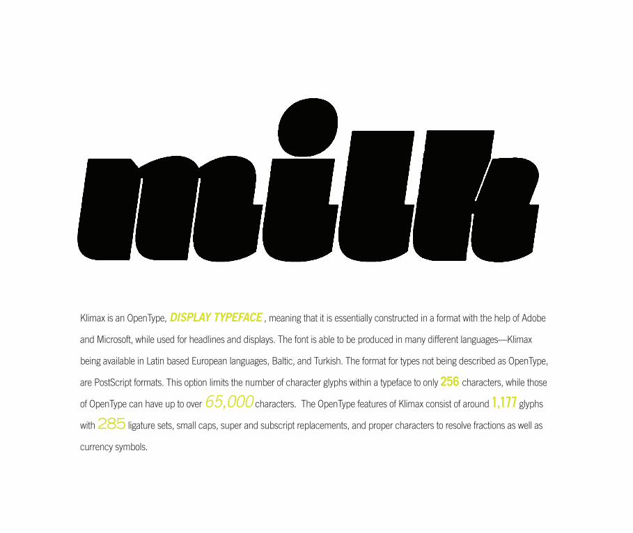
Klimax is an OpenType, DISPLAY TYPEFACE , meaning that it is essentially constructed in a format with the help of Adobe
and Microsoft, while used for headlines and displays. The font is able to be produced in many different languages—Klimax
being available in Latin based European languages, Baltic, and Turkish. The format for types not being described as OpenType,
are PostScript formats. This option limits the number of character glyphs within a typeface to only 256 characters, while those
of OpenType can have up to over 65,000 characters. The OpenType features of Klimax consist of around 1,177 glyphs
with 285 ligature sets, small caps, super and subscript replacements, and proper characters to resolve fractions as well as
currency symbols.
typeface / 3
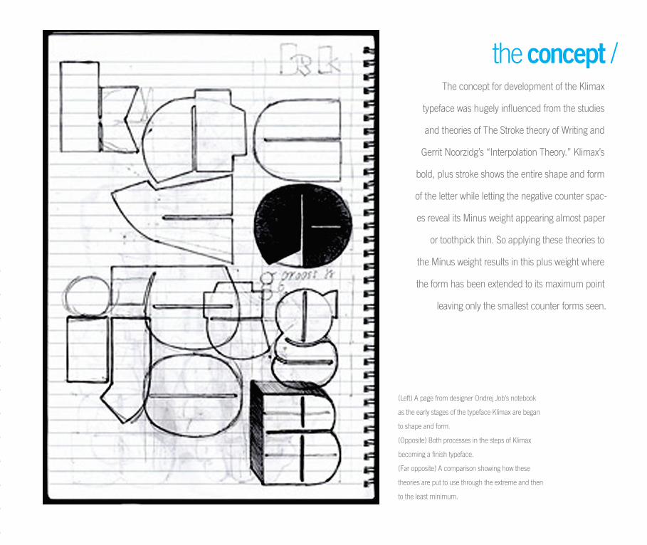
The concept for development of the Klimax
typeface was hugely influenced from the studies
and theories of The Stroke theory of Writing and
Gerrit Noorzidg’s “Interpolation Theory.” Klimax’s
bold, plus stroke shows the entire shape and form
of the letter while letting the negative counter spac-
es reveal its Minus weight appearing almost paper
or toothpick thin. So applying these theories to
the Minus weight results in this plus weight where
the form has been extended to its maximum point
leaving only the smallest counter forms seen.
the concept /
(Left) A page from designer Ondrej Job’s notebook
as the early stages of the typeface Klimax are began
to shape and form.
(Opposite) Both processes in the steps of Klimax
becoming a finish typeface.
(Far opposite) A comparison showing how these
theories are put to use through the extreme and then
to the least minimum.
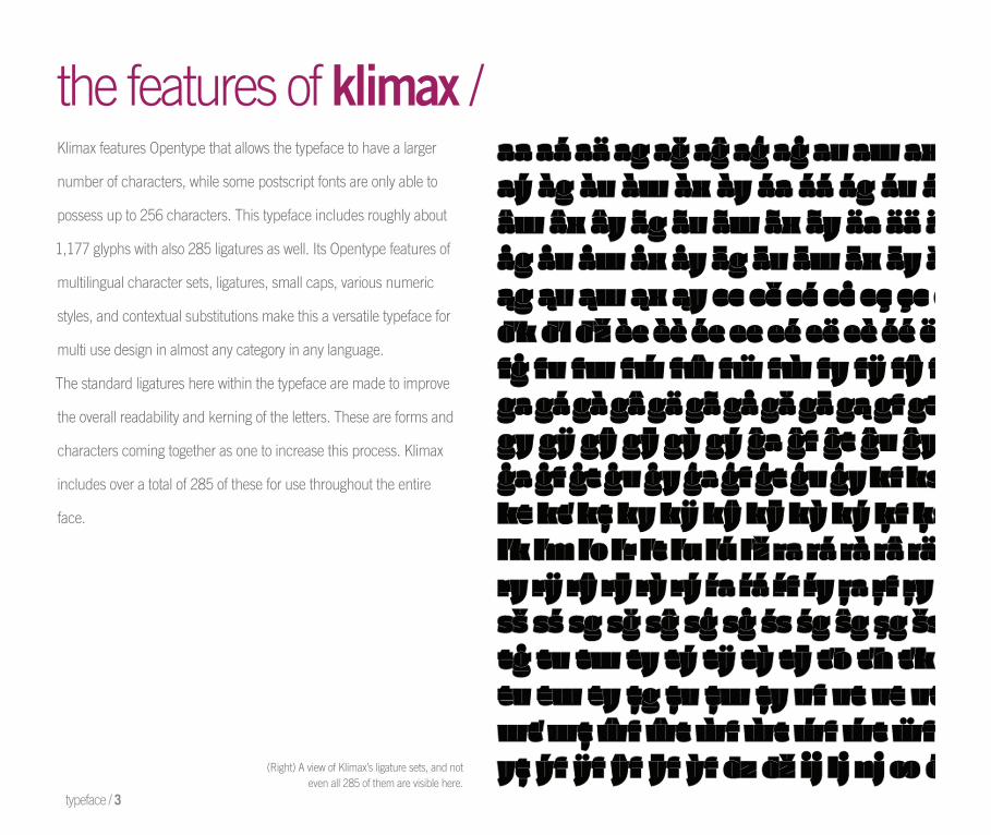
the features of klimax /Klimax features Opentype that allows the typeface to have a larger
number of characters, while some postscript fonts are only able to
possess up to 256 characters. This typeface includes roughly about
1,177 glyphs with also 285 ligatures as well. Its Opentype features of
multilingual character sets, ligatures, small caps, various numeric
styles, and contextual substitutions make this a versatile typeface for
multi use design in almost any category in any language.
The standard ligatures here within the typeface are made to improve
the overall readability and kerning of the letters. These are forms and
characters coming together as one to increase this process. Klimax
includes over a total of 285 of these for use throughout the entire
face.
typeface / 3
(Right) A view of Klimax’s ligature sets, and noteven all 285 of them are visible here.
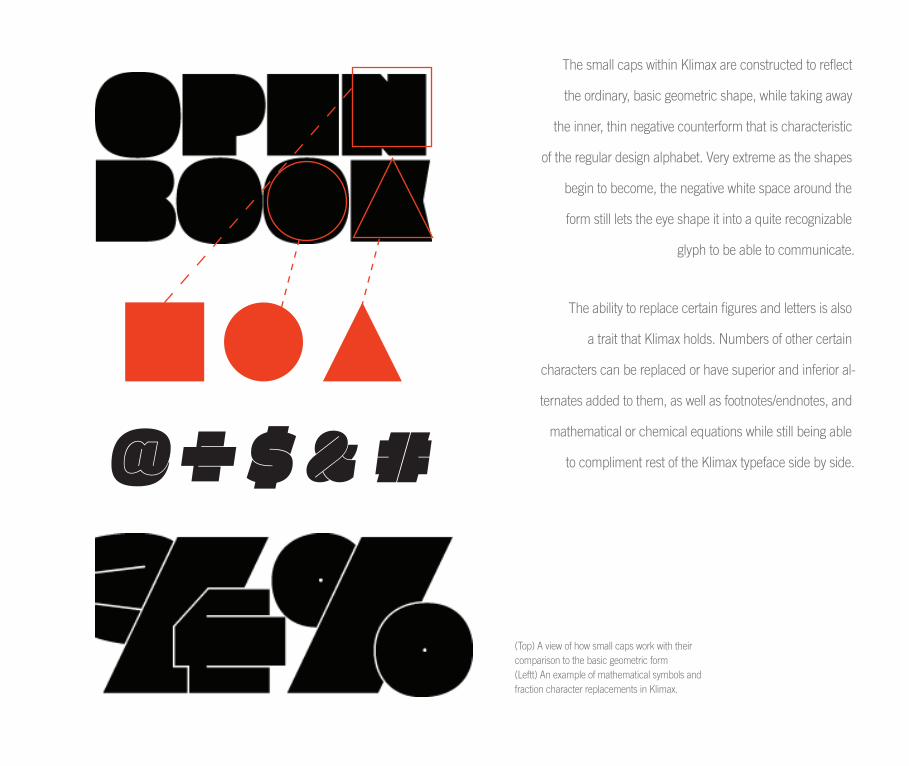
The small caps within Klimax are constructed to reflect
the ordinary, basic geometric shape, while taking away
the inner, thin negative counterform that is characteristic
of the regular design alphabet. Very extreme as the shapes
begin to become, the negative white space around the
form still lets the eye shape it into a quite recognizable
glyph to be able to communicate.
The ability to replace certain figures and letters is also
a trait that Klimax holds. Numbers of other certain
characters can be replaced or have superior and inferior al-
ternates added to them, as well as footnotes/endnotes, and
mathematical or chemical equations while still being able
to compliment rest of the Klimax typeface side by side.
(Top) A view of how small caps work with their comparison to the basic geometric form(Leftt) An example of mathematical symbols and fraction character replacements in Klimax.
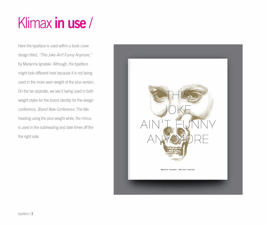
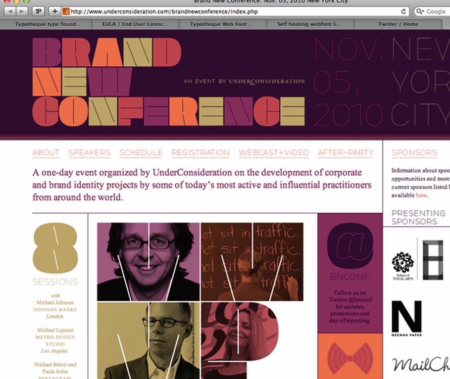
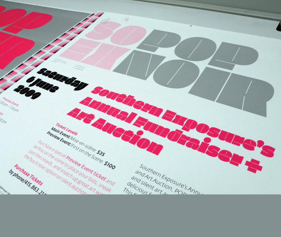
Klimax in use /Here the typeface is used within a book cover
design titled, “This Joke Ain’t Funny Anymore,”
by Marianna Ignataki. Although, the typeface
might look different here because it is not being
used in the more seen weight of the plus version.
On the far opposite, we see it being used in both
weight styles for the brand identity for the design
conference, Brand New Conference. The title
heading using the plus weight while, the minus
is used in the subheading and date times off the
the right side.
typeface / 3
type selection reasoningplans for manipulation
4GOALS & REASONING /

GOALS & REASONING /
I believe this is the reason that I was so drawn to this typeface in the beginning, and
then essentially wound up choosing it in the end decision. I love working with display
type a lot in the fi rst place, so when I could not stop randomly sketching or drawing
this typeface out in my sketchbook, I thought it would be a great one in fact to explore.
While fi rst exploring and observing this typeface, it is a bit confusing and hard to
fi gure out. Its reference and qualities are brought from the “Interpolation Theory” and
“Stroke Theory of Writing,” which is what gives it the extreme boldness, the plus and
extreme hairline stroke, the minus. Initially developing the skeletons was one of the
biggest struggles that I ran into while starting the process of dissecting this particular
typeface. Knowing where to place the stroke either in the middle of the form or further
to the left, or right for that matter was one of the confusing aspects.
esse
ntia
lly w
ound
up
choo
sing
it in
the
end
deci
sion.
I lo
ve w
orki
ng w
ith d
ispla
y ty
pe a
lot i
n
the
fi rst
pla
ce, s
o w
hen
I cou
ld n
ot s
top
rand
omly
sket
chin
g or
dra
win
g th
is ty
pefa
ce o
ut in
my
sket
chbo
ok, I
thou
ght i
t wou
ld b
e a
grea
t one
in fa
ct to
exp
lore
. Whi
le fi
rst e
xplo
ring
and
obse
rvin
g th
is ty
pefa
ce, i
t is
a bi
t con
fusin
g an
d ha
rd to
fi gu
re o
ut.
Its re
fere
nce
and
qual
ities
are
brou
ght f
rom
the
“Int
erpo
latio
n Th
eory
” an
d “S
troke
The
ory
of W
ritin
g,”
whi
ch is
wha
t this typeface out in my sketchbook, I thought it would be a great one in fact to explore.
are
brou
ght f
rom
the
“Int
erpo
latio
n Th
eory
” an
d “S
troke
The
ory
of W
ritin
g,”
whi
ch is
wha
t this typeface out in my sketchbook, I thought it would be a great one in fact to explore.
fi gure out. Its reference and qualities are brought from the “Interpolation Theory” and
are
brou
ght f
rom
the
“Int
erpo
latio
n Th
eory
” an
d “S
troke
The
ory
of W
ritin
g,”
whi
ch is
wha
t
fi gure out. Its reference and qualities are brought from the “Interpolation Theory” and
typeface. Knowing where to place the stroke either in the middle of the form or further
are
brou
ght f
rom
the
“Int
erpo
latio
n Th
eory
” an
d “S
troke
The
ory
of W
ritin
g,”
whi
ch is
wha
t
typeface. Knowing where to place the stroke either in the middle of the form or further
give
s it
the
extre
me
bold
ness
, the
plu
s an
d ex
trem
e ha
irlin
e st
roke
, the
min
us. I
nitia
lly d
evel
-
I believe this is the reason that I was so drawn to this typeface in the beginning, and
give
s it
the
extre
me
bold
ness
, the
plu
s an
d ex
trem
e ha
irlin
e st
roke
, the
min
us. I
nitia
lly d
evel
-
I believe this is the reason that I was so drawn to this typeface in the beginning, and
then essentially wound up choosing it in the end decision. I love working with display
give
s it
the
extre
me
bold
ness
, the
plu
s an
d ex
trem
e ha
irlin
e st
roke
, the
min
us. I
nitia
lly d
evel
-
then essentially wound up choosing it in the end decision. I love working with display
type a lot in the fi rst place, so when I could not stop randomly sketching or drawing
give
s it
the
extre
me
bold
ness
, the
plu
s an
d ex
trem
e ha
irlin
e st
roke
, the
min
us. I
nitia
lly d
evel
-
type a lot in the fi rst place, so when I could not stop randomly sketching or drawing
this typeface out in my sketchbook, I thought it would be a great one in fact to explore.
give
s it
the
extre
me
bold
ness
, the
plu
s an
d ex
trem
e ha
irlin
e st
roke
, the
min
us. I
nitia
lly d
evel
-this typeface out in my sketchbook, I thought it would be a great one in fact to explore.
While fi rst exploring and observing this typeface, it is a bit confusing and hard to gi
ves
it th
e ex
trem
e bo
ldne
ss, t
he p
lus
and
extre
me
hairl
ine
stro
ke, t
he m
inus
. Ini
tially
dev
el-
While fi rst exploring and observing this typeface, it is a bit confusing and hard to
fi gure out. Its reference and qualities are brought from the “Interpolation Theory” and
give
s it
the
extre
me
bold
ness
, the
plu
s an
d ex
trem
e ha
irlin
e st
roke
, the
min
us. I
nitia
lly d
evel
-
fi gure out. Its reference and qualities are brought from the “Interpolation Theory” and
“Stroke Theory of Writing,” which is what gives it the extreme boldness, the plus and
give
s it
the
extre
me
bold
ness
, the
plu
s an
d ex
trem
e ha
irlin
e st
roke
, the
min
us. I
nitia
lly d
evel
-
“Stroke Theory of Writing,” which is what gives it the extreme boldness, the plus and
give
s it
the
extre
me
bold
ness
, the
plu
s an
d ex
trem
e ha
irlin
e st
roke
, the
min
us. I
nitia
lly d
evel
-
extreme hairline stroke, the minus. Initially developing the skeletons was one of the
give
s it
the
extre
me
bold
ness
, the
plu
s an
d ex
trem
e ha
irlin
e st
roke
, the
min
us. I
nitia
lly d
evel
-
extreme hairline stroke, the minus. Initially developing the skeletons was one of the
biggest struggles that I ran into while starting the process of dissecting this particular
give
s it
the
extre
me
bold
ness
, the
plu
s an
d ex
trem
e ha
irlin
e st
roke
, the
min
us. I
nitia
lly d
evel
-
biggest struggles that I ran into while starting the process of dissecting this particular
typeface. Knowing where to place the stroke either in the middle of the form or further
give
s it
the
extre
me
bold
ness
, the
plu
s an
d ex
trem
e ha
irlin
e st
roke
, the
min
us. I
nitia
lly d
evel
-
typeface. Knowing where to place the stroke either in the middle of the form or further
opin
g th
e sk
elet
ons
was
one
of t
he b
igge
st s
trugg
les
that
I ra
n in
to w
hile
sta
rting
the
proc
ess
I believe this is the reason that I was so drawn to this typeface in the beginning, and
opin
g th
e sk
elet
ons
was
one
of t
he b
igge
st s
trugg
les
that
I ra
n in
to w
hile
sta
rting
the
proc
ess
I believe this is the reason that I was so drawn to this typeface in the beginning, and
then essentially wound up choosing it in the end decision. I love working with display
opin
g th
e sk
elet
ons
was
one
of t
he b
igge
st s
trugg
les
that
I ra
n in
to w
hile
sta
rting
the
proc
ess
then essentially wound up choosing it in the end decision. I love working with display
type a lot in the fi rst place, so when I could not stop randomly sketching or drawing
opin
g th
e sk
elet
ons
was
one
of t
he b
igge
st s
trugg
les
that
I ra
n in
to w
hile
sta
rting
the
proc
ess
type a lot in the fi rst place, so when I could not stop randomly sketching or drawing
this typeface out in my sketchbook, I thought it would be a great one in fact to explore.
opin
g th
e sk
elet
ons
was
one
of t
he b
igge
st s
trugg
les
that
I ra
n in
to w
hile
sta
rting
the
proc
ess
this typeface out in my sketchbook, I thought it would be a great one in fact to explore.
While fi rst exploring and observing this typeface, it is a bit confusing and hard to
opin
g th
e sk
elet
ons
was
one
of t
he b
igge
st s
trugg
les
that
I ra
n in
to w
hile
sta
rting
the
proc
ess
While fi rst exploring and observing this typeface, it is a bit confusing and hard to
fi gure out. Its reference and qualities are brought from the “Interpolation Theory” and op
ing
the
skel
eton
s w
as o
ne o
f the
big
gest
stru
ggle
s th
at I
ran
into
whi
le s
tarti
ng th
e pr
oces
s fi gure out. Its reference and qualities are brought from the “Interpolation Theory” and
“Stroke Theory of Writing,” which is what gives it the extreme boldness, the plus and
opin
g th
e sk
elet
ons
was
one
of t
he b
igge
st s
trugg
les
that
I ra
n in
to w
hile
sta
rting
the
proc
ess
“Stroke Theory of Writing,” which is what gives it the extreme boldness, the plus and
opin
g th
e sk
elet
ons
was
one
of t
he b
igge
st s
trugg
les
that
I ra
n in
to w
hile
sta
rting
the
proc
ess
extreme hairline stroke, the minus. Initially developing the skeletons was one of the
opin
g th
e sk
elet
ons
was
one
of t
he b
igge
st s
trugg
les
that
I ra
n in
to w
hile
sta
rting
the
proc
ess
extreme hairline stroke, the minus. Initially developing the skeletons was one of the
biggest struggles that I ran into while starting the process of dissecting this particular
opin
g th
e sk
elet
ons
was
one
of t
he b
igge
st s
trugg
les
that
I ra
n in
to w
hile
sta
rting
the
proc
ess
biggest struggles that I ran into while starting the process of dissecting this particular
typeface. Knowing where to place the stroke either in the middle of the form or further
opin
g th
e sk
elet
ons
was
one
of t
he b
igge
st s
trugg
les
that
I ra
n in
to w
hile
sta
rting
the
proc
ess
typeface. Knowing where to place the stroke either in the middle of the form or further
of d
issec
ting
this
parti
cula
r typ
efac
e. K
now
ing
whe
re to
pla
ce th
e st
roke
eith
er in
the
mid
dle
I believe this is the reason that I was so drawn to this typeface in the beginning, and
of d
issec
ting
this
parti
cula
r typ
efac
e. K
now
ing
whe
re to
pla
ce th
e st
roke
eith
er in
the
mid
dle
I believe this is the reason that I was so drawn to this typeface in the beginning, and
then essentially wound up choosing it in the end decision. I love working with display
of d
issec
ting
this
parti
cula
r typ
efac
e. K
now
ing
whe
re to
pla
ce th
e st
roke
eith
er in
the
mid
dle
then essentially wound up choosing it in the end decision. I love working with display
type a lot in the fi rst place, so when I could not stop randomly sketching or drawing
of d
issec
ting
this
parti
cula
r typ
efac
e. K
now
ing
whe
re to
pla
ce th
e st
roke
eith
er in
the
mid
dle
type a lot in the fi rst place, so when I could not stop randomly sketching or drawing
this typeface out in my sketchbook, I thought it would be a great one in fact to explore.
of d
issec
ting
this
parti
cula
r typ
efac
e. K
now
ing
whe
re to
pla
ce th
e st
roke
eith
er in
the
mid
dle
this typeface out in my sketchbook, I thought it would be a great one in fact to explore.
While fi rst exploring and observing this typeface, it is a bit confusing and hard to
of d
issec
ting
this
parti
cula
r typ
efac
e. K
now
ing
whe
re to
pla
ce th
e st
roke
eith
er in
the
mid
dle
While fi rst exploring and observing this typeface, it is a bit confusing and hard to
fi gure out. Its reference and qualities are brought from the “Interpolation Theory” and
of d
issec
ting
this
parti
cula
r typ
efac
e. K
now
ing
whe
re to
pla
ce th
e st
roke
eith
er in
the
mid
dle
fi gure out. Its reference and qualities are brought from the “Interpolation Theory” and
“Stroke Theory of Writing,” which is what gives it the extreme boldness, the plus and of
diss
ectin
g th
is pa
rticu
lar t
ypef
ace.
Kno
win
g w
here
to p
lace
the
stro
ke e
ither
in th
e m
iddl
e “Stroke Theory of Writing,” which is what gives it the extreme boldness, the plus and
of d
issec
ting
this
parti
cula
r typ
efac
e. K
now
ing
whe
re to
pla
ce th
e st
roke
eith
er in
the
mid
dle
extreme hairline stroke, the minus. Initially developing the skeletons was one of the
of d
issec
ting
this
parti
cula
r typ
efac
e. K
now
ing
whe
re to
pla
ce th
e st
roke
eith
er in
the
mid
dle
extreme hairline stroke, the minus. Initially developing the skeletons was one of the
biggest struggles that I ran into while starting the process of dissecting this particular
of d
issec
ting
this
parti
cula
r typ
efac
e. K
now
ing
whe
re to
pla
ce th
e st
roke
eith
er in
the
mid
dle
biggest struggles that I ran into while starting the process of dissecting this particular
typeface. Knowing where to place the stroke either in the middle of the form or further
of d
issec
ting
this
parti
cula
r typ
efac
e. K
now
ing
whe
re to
pla
ce th
e st
roke
eith
er in
the
mid
dle
typeface. Knowing where to place the stroke either in the middle of the form or further
to the left, or right for that matter was one of the confusing aspects.
of d
issec
ting
this
parti
cula
r typ
efac
e. K
now
ing
whe
re to
pla
ce th
e st
roke
eith
er in
the
mid
dle
to the left, or right for that matter was one of the confusing aspects.
of th
e fo
rm o
r fur
ther
to th
e le
ft, o
r rig
ht fo
r tha
t mat
ter w
as o
ne o
f the
con
fusin
g as
pect
s.
I believe this is the reason that I was so drawn to this typeface in the beginning, and
of th
e fo
rm o
r fur
ther
to th
e le
ft, o
r rig
ht fo
r tha
t mat
ter w
as o
ne o
f the
con
fusin
g as
pect
s.
I believe this is the reason that I was so drawn to this typeface in the beginning, and
then essentially wound up choosing it in the end decision. I love working with display
of th
e fo
rm o
r fur
ther
to th
e le
ft, o
r rig
ht fo
r tha
t mat
ter w
as o
ne o
f the
con
fusin
g as
pect
s.
then essentially wound up choosing it in the end decision. I love working with display
type a lot in the fi rst place, so when I could not stop randomly sketching or drawing
of th
e fo
rm o
r fur
ther
to th
e le
ft, o
r rig
ht fo
r tha
t mat
ter w
as o
ne o
f the
con
fusin
g as
pect
s.
type a lot in the fi rst place, so when I could not stop randomly sketching or drawing
this typeface out in my sketchbook, I thought it would be a great one in fact to explore.
of th
e fo
rm o
r fur
ther
to th
e le
ft, o
r rig
ht fo
r tha
t mat
ter w
as o
ne o
f the
con
fusin
g as
pect
s.
this typeface out in my sketchbook, I thought it would be a great one in fact to explore.
While fi rst exploring and observing this typeface, it is a bit confusing and hard to
of th
e fo
rm o
r fur
ther
to th
e le
ft, o
r rig
ht fo
r tha
t mat
ter w
as o
ne o
f the
con
fusin
g as
pect
s.
While fi rst exploring and observing this typeface, it is a bit confusing and hard to
fi gure out. Its reference and qualities are brought from the “Interpolation Theory” and
of th
e fo
rm o
r fur
ther
to th
e le
ft, o
r rig
ht fo
r tha
t mat
ter w
as o
ne o
f the
con
fusin
g as
pect
s.
fi gure out. Its reference and qualities are brought from the “Interpolation Theory” and
“Stroke Theory of Writing,” which is what gives it the extreme boldness, the plus and
of th
e fo
rm o
r fur
ther
to th
e le
ft, o
r rig
ht fo
r tha
t mat
ter w
as o
ne o
f the
con
fusin
g as
pect
s.“Stroke Theory of Writing,” which is what gives it the extreme boldness, the plus and
of th
e fo
rm o
r fur
ther
to th
e le
ft, o
r rig
ht fo
r tha
t mat
ter w
as o
ne o
f the
con
fusin
g as
pect
s.extreme hairline stroke, the minus. Initially developing the skeletons was one of the
of th
e fo
rm o
r fur
ther
to th
e le
ft, o
r rig
ht fo
r tha
t mat
ter w
as o
ne o
f the
con
fusin
g as
pect
s.extreme hairline stroke, the minus. Initially developing the skeletons was one of the
biggest struggles that I ran into while starting the process of dissecting this particular
of th
e fo
rm o
r fur
ther
to th
e le
ft, o
r rig
ht fo
r tha
t mat
ter w
as o
ne o
f the
con
fusin
g as
pect
s.
biggest struggles that I ran into while starting the process of dissecting this particular
typeface. Knowing where to place the stroke either in the middle of the form or further
of th
e fo
rm o
r fur
ther
to th
e le
ft, o
r rig
ht fo
r tha
t mat
ter w
as o
ne o
f the
con
fusin
g as
pect
s.
typeface. Knowing where to place the stroke either in the middle of the form or further
to the left, or right for that matter was one of the confusing aspects.
of th
e fo
rm o
r fur
ther
to th
e le
ft, o
r rig
ht fo
r tha
t mat
ter w
as o
ne o
f the
con
fusin
g as
pect
s.
to the left, or right for that matter was one of the confusing aspects.
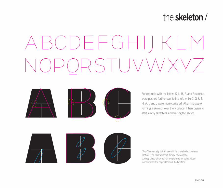
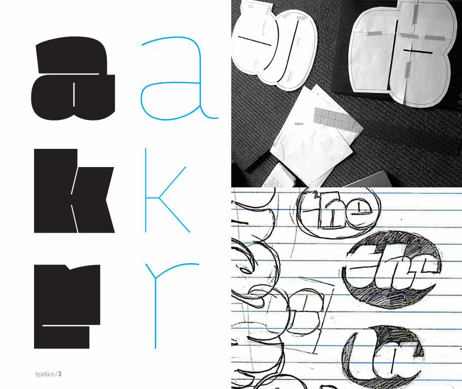
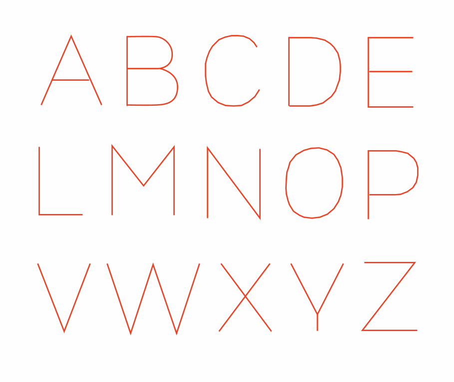
For example with the letters K, L, B, P, and R stroke’s
were pushed further over to the left, while O, Q S, T,
H, A, I, and J were more centered. After this step of
forming a skeleton over the typeface, I then began to
start simply sketching and tracing the glyphs.
(Top) The plus eight of Klimax with its underlinded skeleton (Bottom) The plus weight of Klimax, showing the curving, diagonal forms that are planned for being added to manipulate the original form of the typeface
the skeleton /
goals / 4
skeletongylph dissectiondrawingssketchesprocess critiqueletter evolution
o I began laying the plus and minus versions over and on top of each other to see what qualities were starting to form and then which ones were appealing to me most, but also worked aesthetically as well. As I began sketching, I started with just the plus weight and began adding a very thin, almost hairline serif to the ends of some of the forms and really liked how it was looking, so I continued on to about half way through the alphabet. Although I was happy with how this was looking, it was the very fi rst exploration, and I knew that I needed to explore further and could come back to this solution if necessary. Continuing on, since I was beginning this process with laying the different weights over the top of one another, I then thought of taking different elements from each weight and somehow trying to add them in together to form one fl uid typeface.
5THE PROCESS /
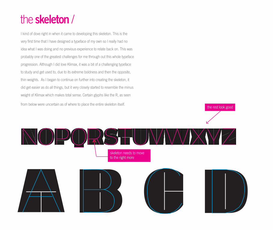
I kind of dove right in when it came to developing this skeleton. This is the
very first time that I have designed a typeface of my own so I really had no
idea what I was doing and no previous experience to relate back on. This was
probably one of the greatest challenges for me through out this whole typeface
progression. Although I did love Klimax, it was a bit of a challenging typeface
to study and get used to, due to its extreme boldness and then the opposite,
thin weights. As I began to continue on further into creating the skeleton, it
did get easier as do all things, but it very closely started to resemble the minus
weight of Klimax which makes total sense. Certain glyphs like the R, as seen
from below were uncertain as of where to place the entire skeleton itself.
the rest look good
skeleton needs to move to the right more
the skeleton /
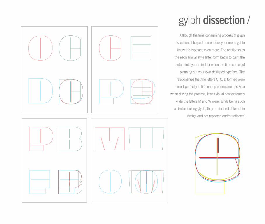
gylph dissection /Although the time consuming process of glyph
dissection, it helped tremendously for me to get to
know this typeface even more. The relationships
the each similar style letter form begin to paint the
picture into your mind for when the time comes of
planning out your own designed typeface. The
relationships that the letters O, C, D formed were
almost perfectly in line on top of one another. Also
when during the process, it was visual how extremely
wide the letters M and W were. While being such
a similar looking glyph, they are indeed different in
design and not repeated and/or reflected.
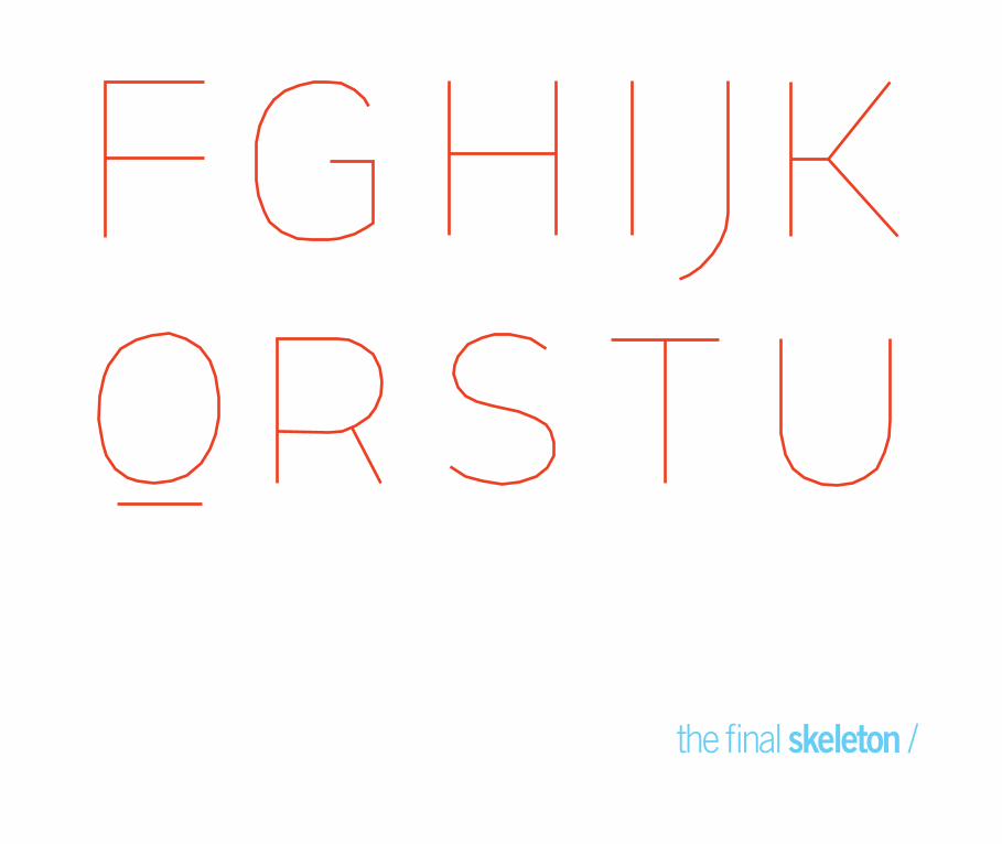
the final skeleton /
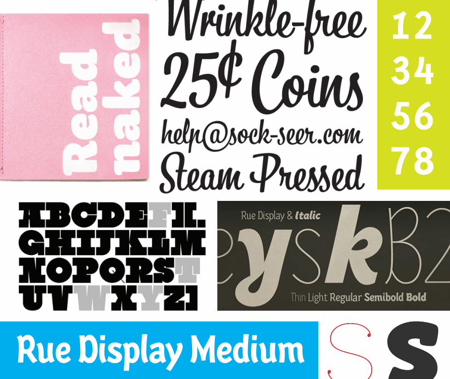
Rue Display Medium
123 45 67 8
SOMEinspirations
!@#$%^&*()/<>
ffl
process / 5
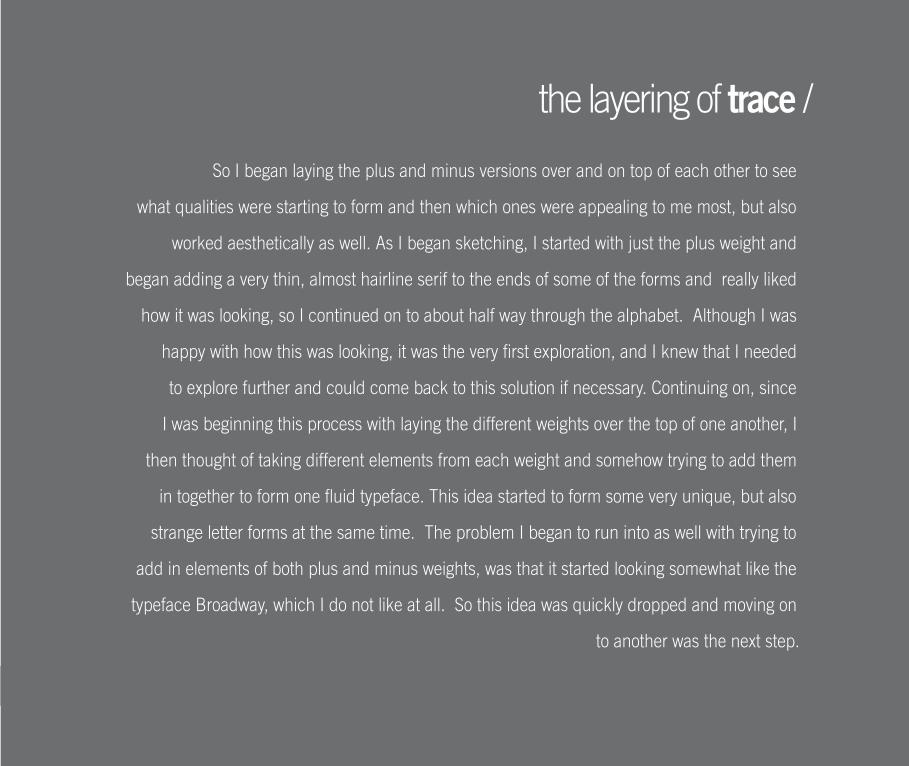
So I began laying the plus and minus versions over and on top of each other to see
what qualities were starting to form and then which ones were appealing to me most, but also
worked aesthetically as well. As I began sketching, I started with just the plus weight and
began adding a very thin, almost hairline serif to the ends of some of the forms and really liked
how it was looking, so I continued on to about half way through the alphabet. Although I was
happy with how this was looking, it was the very first exploration, and I knew that I needed
to explore further and could come back to this solution if necessary. Continuing on, since
I was beginning this process with laying the different weights over the top of one another, I
then thought of taking different elements from each weight and somehow trying to add them
in together to form one fluid typeface. This idea started to form some very unique, but also
strange letter forms at the same time. The problem I began to run into as well with trying to
add in elements of both plus and minus weights, was that it started looking somewhat like the
typeface Broadway, which I do not like at all. So this idea was quickly dropped and moving on
to another was the next step.
the layering of trace /
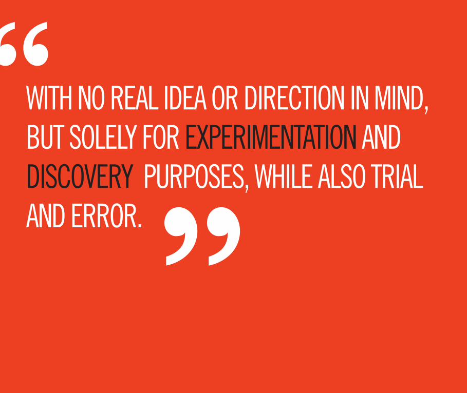
WITH NO REAL IDEA OR DIRECTION IN MIND, BUT SOLELY FOR EXPERIMENTATION AND DISCOVERY PURPOSES, WHILE ALSO TRIAL AND ERROR.
““
process / 5
I tried the typeface out again with just the plus weight, but only darkened
in one half vertically. This, after done on more letters was not looking right, so on the
process still continued. Many other little ideas similar to these were experimented,
but now I needed to focus my attention on the manipulation of the counters and see
where that would take me, instead of just looking at the positive spaces.
This next phase of sketching and drawing was the most beneficial for me
throughout the entire process I think; simply by tracing my skeleton in a larger scale
on normal letter sized sheets of white paper let me really see the forms and shapes
that the letters were creating and then how I wanted to change them into my own.
While drawing out my key glyphs first, O, C, D, G, E, and V, different manipulations
started to take place for each. I drew the forms in their original context, with curved
counters, serifs, rounded edges, condensed, italic, and stencil styles, and with
rounded and slanted counters. Finally after twenty-two pages of glyph drawings I
had decided on a style to execute. The most appealing to me became the slanted,
curved counters and the rounded edges that I had decided to experiment with in
the earlier stages.
the beginning of the process /
process / 5
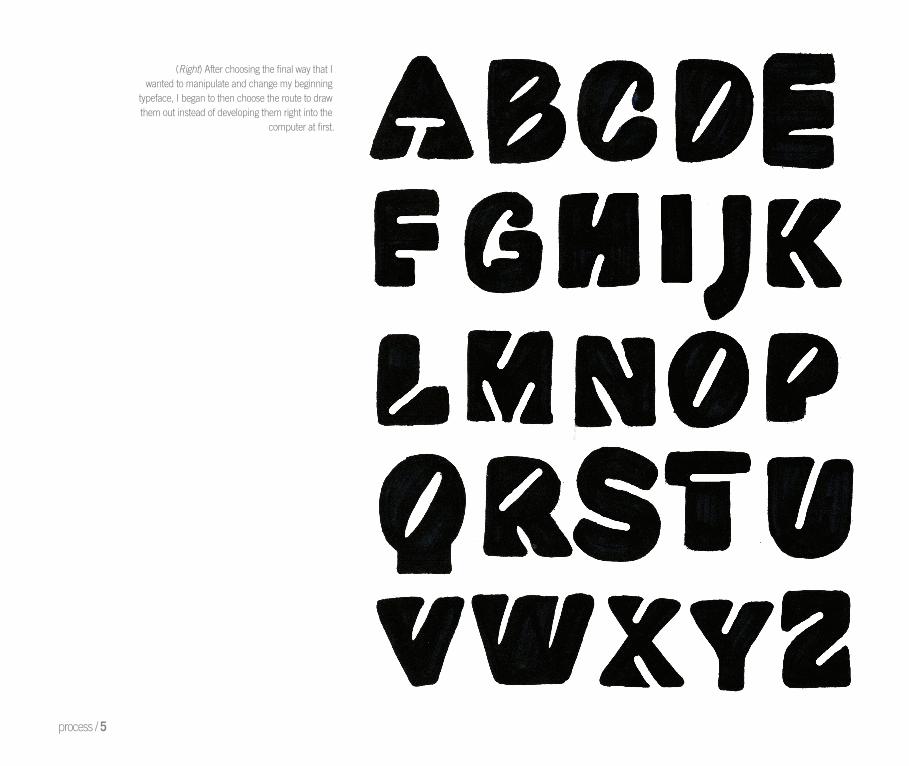
(Right) After choosing the fi nal way that I wanted to manipulate and change my beginning
typeface, I began to then choose the route to drawthem out instead of developing them right into the
computer at fi rst.
process / 5
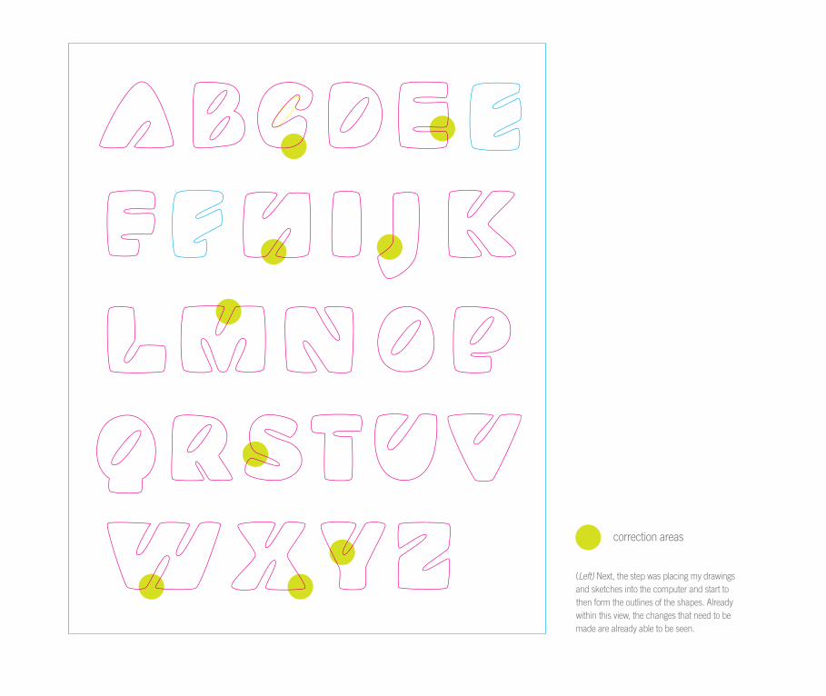
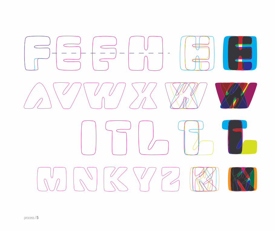
(Left) Next, the step was placing my drawings and sketches into the computer and start to then form the outlines of the shapes. Already within this view, the changes that need to bemade are already able to be seen.
correction areas
process / 5
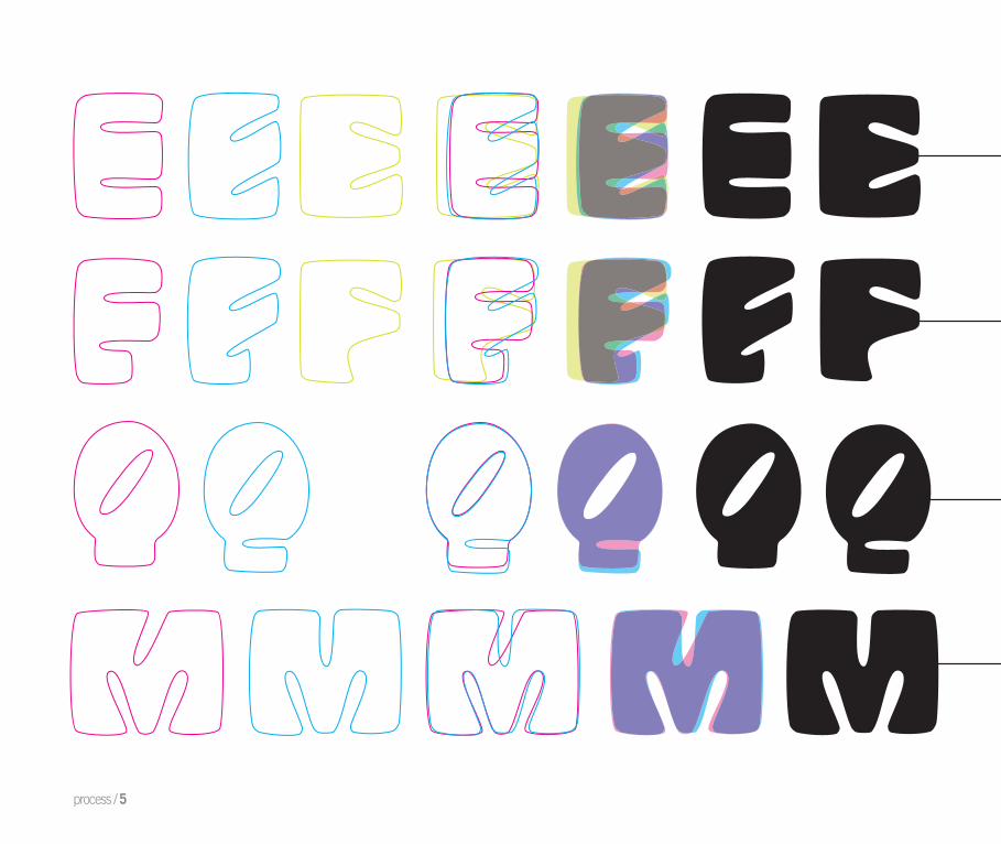
(First) This first E here to the left was how I
originally planned it to be. I looked at it and
saw that there was no diagonal element in
it so I started to experiment with that.
(Second) This thought was carried through
with the processes again the same way as
the letter E.
(Third) This letter was mostly done with
the beginning first sketches. Playing with
the form more to find innovative alternatives
was tried next, but only so many ways were
able to work to keep the letter still readable.
(Fourth) The M and the W were a lot of the
same characteristics of course, but took some
time in getting the diagonal counters in the
right places to improve it optically.
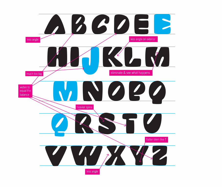
Changed glyphs (below) as well as ones colored BLUE which arealso other versions that I wanted to you to look at as well.
less angle less angle on exterior
eliminate & see what happens
heavier spine
less angle
flatter stem like T
widen toequal thebalance
much too big
Changed glyphs (below) as well as ones colored BLUE which arealso other versions that I wanted to you to look at as well.
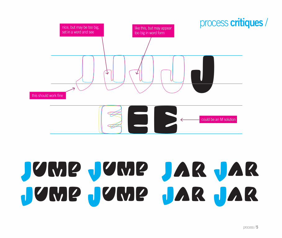
this should work fine
nice, but may be too big,set in a word and see
like this, but may appeartoo big in word form
could be an M solution
process / 5
process critiques /
process / 5
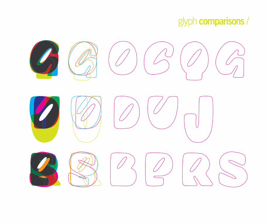
glyph comparisons /
widen more
smooth out, work on counter
keep working outcorrect character relationship?
process / 5
key glyphs /
Due to the first attempt at the letter E, and some
of the previous ones not working out, I came to the
idea and critique of classmates to try and maybe
develop and uppercase cursive E and see how
it looked. To the (left) a symmetrical version and
then to the (right) one that has its bottom terminal
extending out further. I liked it singular by itself, but
when placed into with the rest of the alphabet I did
not feel like it looked as though it fit in with rest of
the glyphs.
This version of the letter E here to the left is what
was first started with, but the middle arm was
almost opposite of the relationships that normally
occur within the arms of this letter. So it was then
changed to the outside arms being thickest and
the middle as the smaller.
Change of the E /
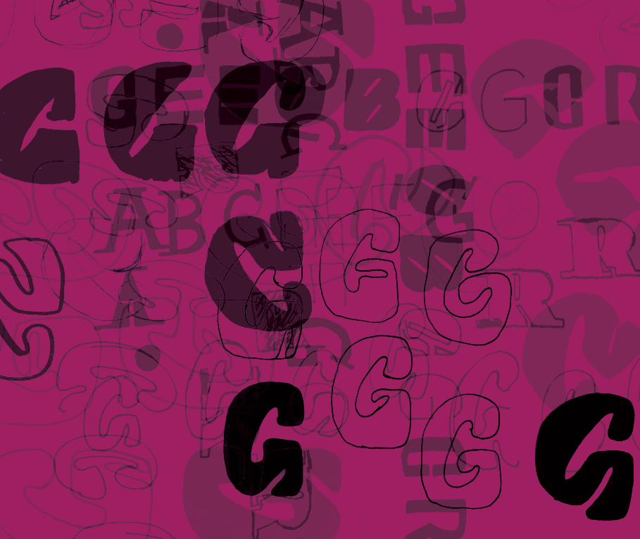
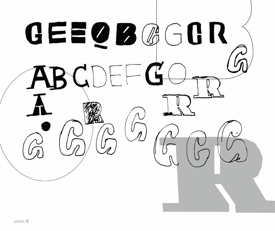
Evolution of the G / The letter G was my ultimate hardest glyph to
figure out. It in comparison to other typefaces was
my letter S. Trying to fit in the diagonal counter of
manipulation that I was going for in all the letters
was a great challenge for this letter because I also
had to make its inner crossbar and spur work together
with it as well. I had a basis down of the left side since
the letter C was already developed, but it took some
puzzling and trial and error to make the figure ground
relationships work between on the right half of the G.
process / 5
Klimax Plus Skeleton
This version here is where it was trying to add in the entire
mass of the bottom spur and crossbar as one whole shape
such as how it is done in the original version of Klimax. This
became too bulky and pointed at the end while not possessing
characteristics of then intended manipulation..
Next the adding in of the diagonal counter part gave some
more form and defi nition the glyph but it was still not the right
solution for the form.
The only difference here is the beginning stroke of the letter at
the top and the thickness in width of the descending spur as
well as its length which goes slightly further down in contrast to
the above.
This came to be the last, but then fi nal and correct solution for
the letter G. It still has the diagonal inner counter form, and
also communicates the letter successfully with a smaller
vertical counter to separate out the bottom spur.
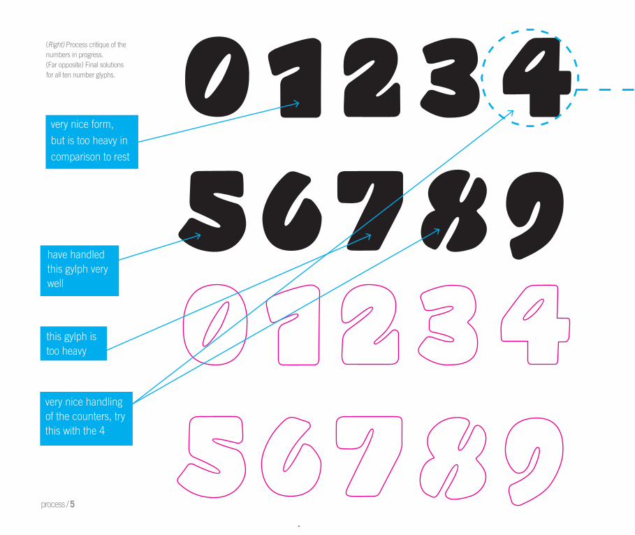
have handledthis gylph verywell
very nice form,
but is too heavy in
comparison to rest
this gylph istoo heavy
very nice handling of the counters, try this with the 4
process / 5
(Right) Process critique of the numbers in progress. (Far opposite) Final solutionsfor all ten number glyphs.
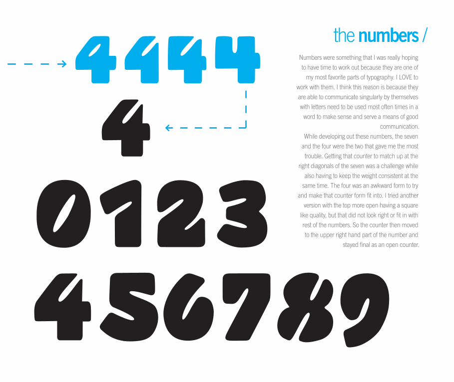
Numbers were something that I was really hoping
to have time to work out because they are one of
my most favorite parts of typography. I LOVE to
work with them. I think this reason is because they
are able to communicate singularly by themselves
with letters need to be used most often times in a
word to make sense and serve a means of good
communication.
While developing out these numbers, the seven
and the four were the two that gave me the most
trouble. Getting that counter to match up at the
right diagonals of the seven was a challenge while
also having to keep the weight consistent at the
same time. The four was an awkward form to try
and make that counter form fit into. I tried another
version with the top more open having a square
like quality, but that did not look right or fit in with
rest of the numbers. So the counter then moved
to the upper right hand part of the number and
stayed final as an open counter.
the numbers /
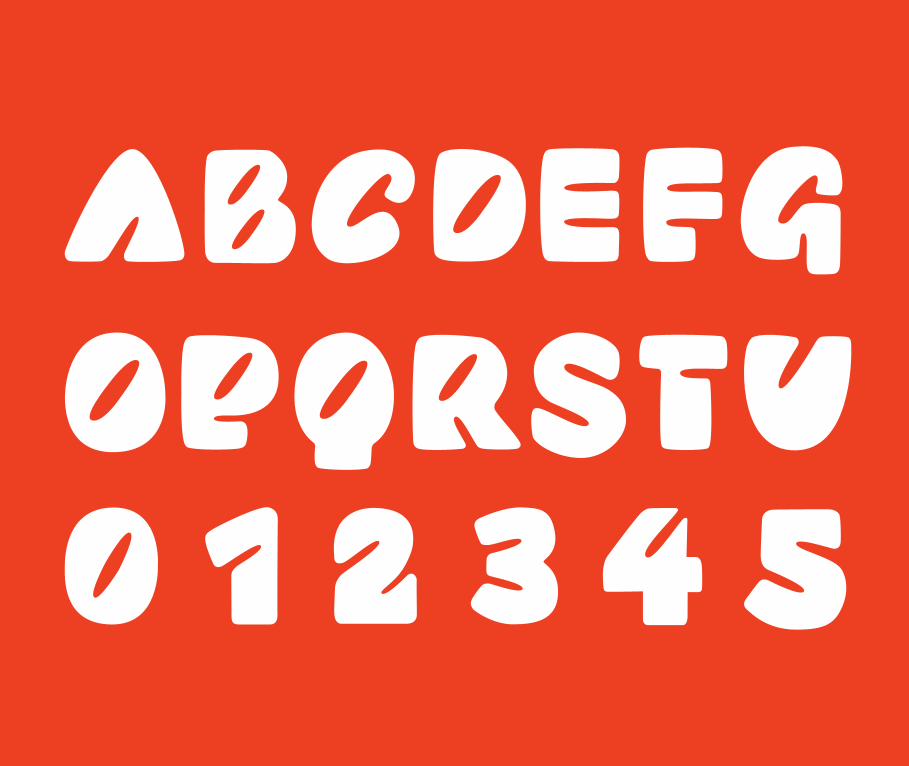
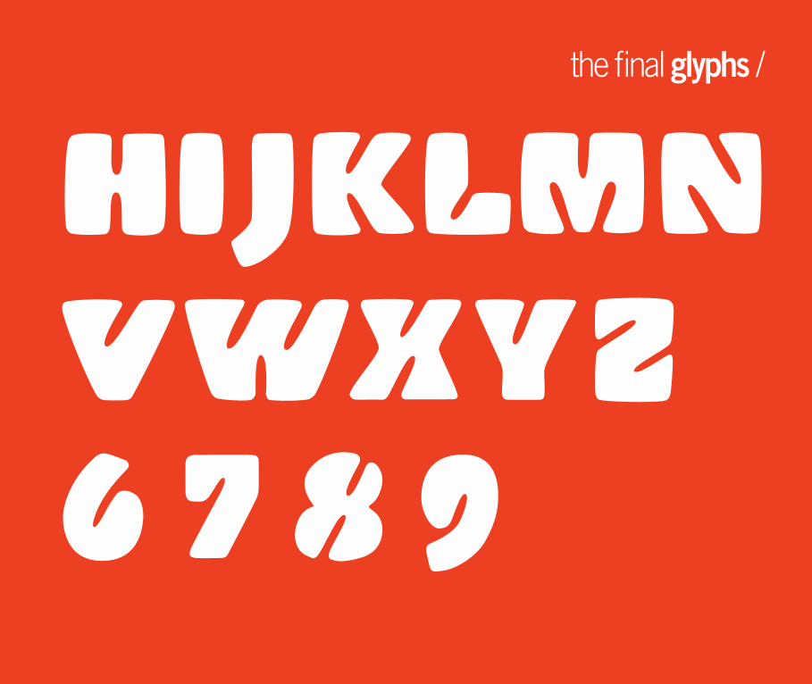
the final glyphs /
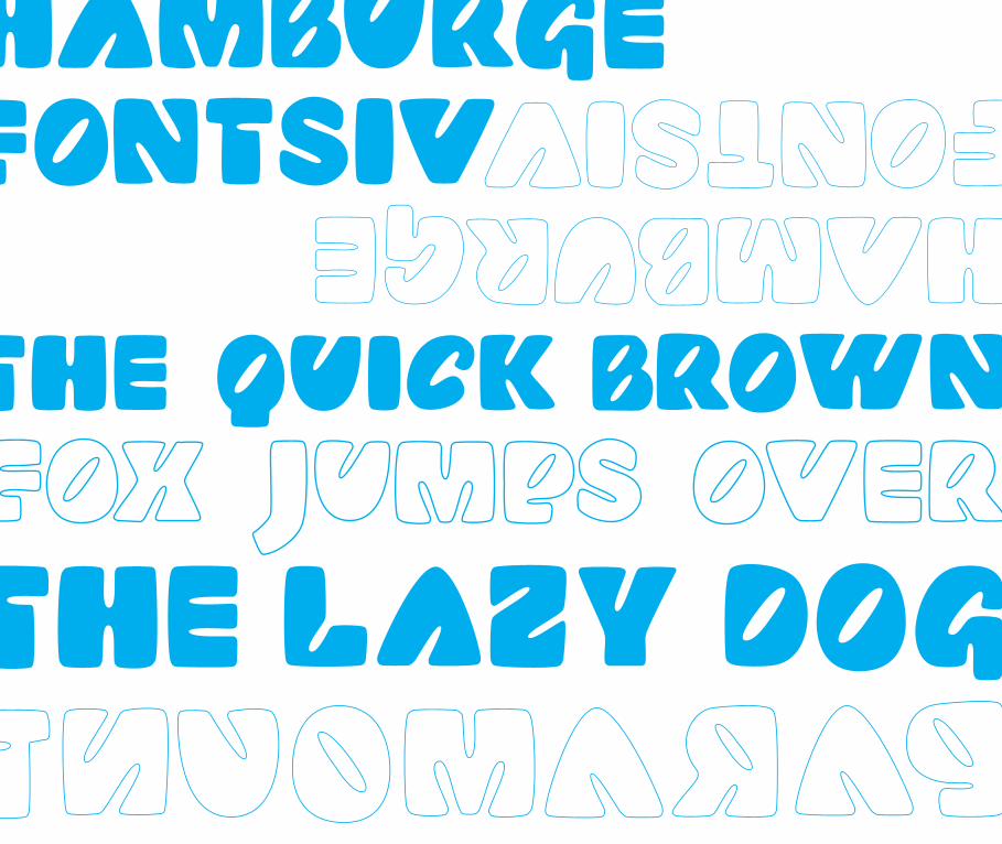

the Paramount /
process / 5
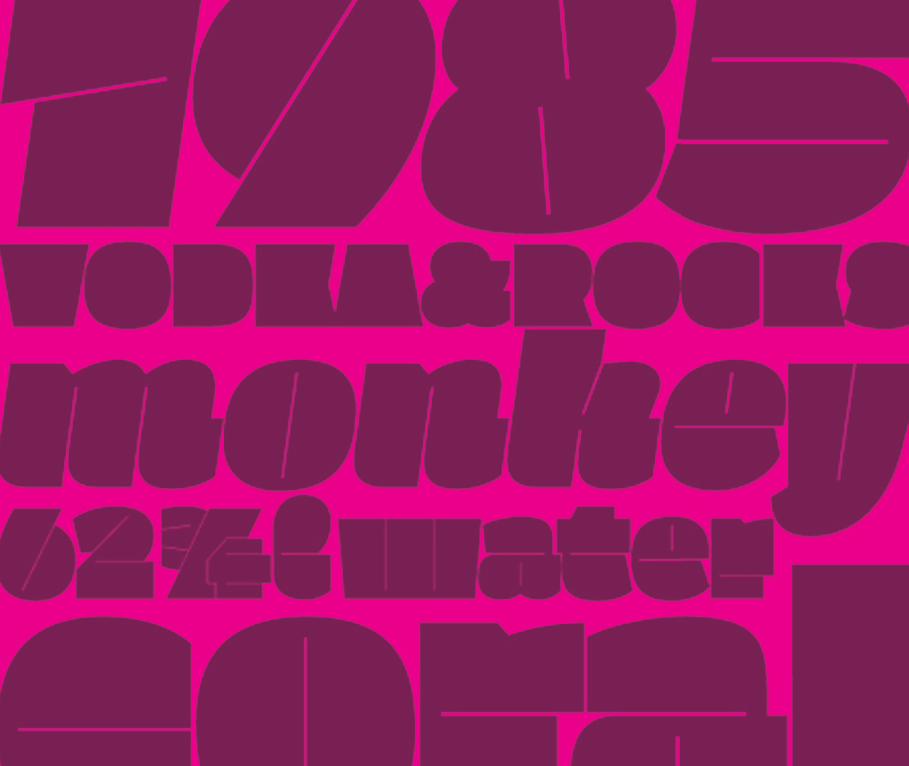
Paramount is a bold and fun display typeface
that is usable in almost any application, although
in most cases is too large for body copy typography.
It is an influenced design from the typeface Klimax,
designed by Slovakian designer Ondrej Job. It’s
concept relies heavily on the Interpolation Theory
of maximizing and minimizing the stroke weight of
the form. Paramount’s concept stays true to this as
well while adding in manipulations of rounded
edges and curved diagonal placed counters.
the context /
This book was designed using the typeface Trade
Gothic, in all varying weights, styles and sizes.
Trade Gothic is a sans-serif typeface designed in
1948 by James Burke. This type is most seen in
multimedia and advertising, while being combined
with a roman text. Most condensed versions of
the typeface are used and seen in headlines. The
subject matter of the book is about the typeface
in process which is, Paramount, an influenced
design from the font, Klimax, by typeface designer
Ondrej Job.
the colophon /

Recommended