Ministry of Education
Samples of Student Work:A Resource for Teachers
The Ontario Curriculum – ExemplarsGrades 2, 5, and 7
ISBN 0-7794-6655-1
03-273
© Queen’s Printer for Ontario, 2004
Printed on recycled paper
Visual Arts
The Ministry of Education wishes to acknowledge thecontributions of the many individuals, groups, andorganizations that participated in the developmentand refinement of this resource document.

Contents
Introduction . . . . . . . . . . . . . . . . . . . . . . . . . . . . . . . . . . . . . . . . . . . . . . . . . . . . . . 3Purpose of This Document . . . . . . . . . . . . . . . . . . . . . . . . . . . . . . . . . . . . . . . . . . 4Features of This Document . . . . . . . . . . . . . . . . . . . . . . . . . . . . . . . . . . . . . . . . . 4The Tasks . . . . . . . . . . . . . . . . . . . . . . . . . . . . . . . . . . . . . . . . . . . . . . . . . . . . . . . 5The Rubrics . . . . . . . . . . . . . . . . . . . . . . . . . . . . . . . . . . . . . . . . . . . . . . . . . . . . . . 5Use of the Student Samples . . . . . . . . . . . . . . . . . . . . . . . . . . . . . . . . . . . . . . . . . 5
Teachers and Administrators . . . . . . . . . . . . . . . . . . . . . . . . . . . . . . . . . . . . . . 5Parents . . . . . . . . . . . . . . . . . . . . . . . . . . . . . . . . . . . . . . . . . . . . . . . . . . . . . . . 6Students . . . . . . . . . . . . . . . . . . . . . . . . . . . . . . . . . . . . . . . . . . . . . . . . . . . . . . 6
Visual Arts, Grade 2 . . . . . . . . . . . . . . . . . . . . . . . . . . . . . . . . . . . . . . . . . . . . . . . . 7My Garden of Colour . . . . . . . . . . . . . . . . . . . . . . . . . . . . . . . . . . . . . . . . . . . . . . 8
The Task . . . . . . . . . . . . . . . . . . . . . . . . . . . . . . . . . . . . . . . . . . . . . . . . . . . . . . 8Expectations . . . . . . . . . . . . . . . . . . . . . . . . . . . . . . . . . . . . . . . . . . . . . . . . . . . 8Prior Knowledge and Skills . . . . . . . . . . . . . . . . . . . . . . . . . . . . . . . . . . . . . . . 8Task Rubric . . . . . . . . . . . . . . . . . . . . . . . . . . . . . . . . . . . . . . . . . . . . . . . . . . . . 9Student Samples . . . . . . . . . . . . . . . . . . . . . . . . . . . . . . . . . . . . . . . . . . . . . . . . . 10Teacher Package . . . . . . . . . . . . . . . . . . . . . . . . . . . . . . . . . . . . . . . . . . . . . . . . . 34
Visual Arts, Grade 5 . . . . . . . . . . . . . . . . . . . . . . . . . . . . . . . . . . . . . . . . . . . . . . . . 45Expressive Portrait . . . . . . . . . . . . . . . . . . . . . . . . . . . . . . . . . . . . . . . . . . . . . . . . . 46
The Task . . . . . . . . . . . . . . . . . . . . . . . . . . . . . . . . . . . . . . . . . . . . . . . . . . . . . . 46Expectations . . . . . . . . . . . . . . . . . . . . . . . . . . . . . . . . . . . . . . . . . . . . . . . . . . . 46Prior Knowledge and Skills . . . . . . . . . . . . . . . . . . . . . . . . . . . . . . . . . . . . . . . 47Task Rubric . . . . . . . . . . . . . . . . . . . . . . . . . . . . . . . . . . . . . . . . . . . . . . . . . . . . 48Student Samples . . . . . . . . . . . . . . . . . . . . . . . . . . . . . . . . . . . . . . . . . . . . . . . . . 49Teacher Package . . . . . . . . . . . . . . . . . . . . . . . . . . . . . . . . . . . . . . . . . . . . . . . . . 73
Visual Arts, Grade 7 . . . . . . . . . . . . . . . . . . . . . . . . . . . . . . . . . . . . . . . . . . . . . . . . 85My Canadian Landscape . . . . . . . . . . . . . . . . . . . . . . . . . . . . . . . . . . . . . . . . . . . . 86
The Task . . . . . . . . . . . . . . . . . . . . . . . . . . . . . . . . . . . . . . . . . . . . . . . . . . . . . . 86Expectations . . . . . . . . . . . . . . . . . . . . . . . . . . . . . . . . . . . . . . . . . . . . . . . . . . . 86Prior Knowledge and Skills . . . . . . . . . . . . . . . . . . . . . . . . . . . . . . . . . . . . . . . 87Task Rubric . . . . . . . . . . . . . . . . . . . . . . . . . . . . . . . . . . . . . . . . . . . . . . . . . . . . 88Student Samples . . . . . . . . . . . . . . . . . . . . . . . . . . . . . . . . . . . . . . . . . . . . . . . . . 89Teacher Package . . . . . . . . . . . . . . . . . . . . . . . . . . . . . . . . . . . . . . . . . . . . . . . . . 113
This publication is available on the Ministry of Education’s website athttp://www.edu.gov.on.ca.
3
In 1998, the Ministry of Education and Training published a new curriculum policydocument for the arts for Ontario elementary students entitled The Ontario Curriculum,Grades 1–8: The Arts, 1998. The new curriculum is more specific than previous cur-ricula with respect to both the knowledge and the skills that students are expected todevelop and demonstrate in each grade. The document contains the curriculumexpectations for each grade and an achievement chart that describes four levels ofstudent achievement to be used in assessing and evaluating student work.
The present document contains samples (“exemplars”) of student work at each levelof achievement for Grades 2, 5, and 7 in visual arts. It is part of a set of three exemplardocuments for the arts – one for visual arts, one for music, and one for drama anddance. These documents are intended to provide assistance to teachers in their assess-ment of student achievement of the curriculum expectations. The samples included inthe documents represent work produced at the end of the school year.
Teams of teachers and administrators from across the province were invited by theMinistry of Education to develop the assessment materials for the visual arts exemplars.They designed the tasks and scoring scales (“rubrics”) on the basis of selected Ontariocurriculum expectations, developed the teacher instructions, and field-tested the tasksin classrooms across the province. They then revised the tasks, rubrics, and instruc-tions, using information gathered from the field-tests, including suggestions forimprovement from teachers and students who participated in the field-tests. A team ofteachers for each grade subsequently scored the student work, and chose samples ofwork that exemplified student achievement at each of the four levels of achievement.
The selection of student samples that appears in this document reflects the professionaljudgement of teachers who participated in the exemplar project. No students, teachers,or schools have been identified.
The tasks, rubrics, and teacher’s notes developed for this exemplar document can serveas a model for boards, schools, and teachers in designing assessment tasks within thecontext of regular classroom work, developing rubrics, assessing the achievement oftheir own students, and planning for the improvement of students’ learning.
The samples in this document will provide parents1 with examples of student work tohelp them monitor their children’s progress. They also can provide a basis for discus-sions regarding student achievement and progress between teachers and parents andbetween teachers and students.
Introduction
1. In this document, parent(s) refers to parent(s) and guardian(s).

4 The Ontar io Curr iculum – Exemplars , Grades 2, 5 , and 7: The Arts
Purpose of This Document
This document was developed to:
• show the characteristics of student work at each of the four levels of achievementfor each grade;
• promote greater consistency in the assessment of student work across the province;
• provide an approach to improving student learning by demonstrating the use of clearcriteria applied to student work that was produced in response to a clearly definedassessment task;
• show the connections between what students are expected to learn (as stated in thecurriculum expectations) and how their work can be assessed using the levels ofachievement described in the curriculum policy document for the subject.
The samples in this document represent examples of student achievement obtainedusing only one method of assessment, called performance assessment. Teachers willalso make use of a variety of other assessment methods and strategies – such as tests,portfolios, and conferences – in evaluating student achievement over a school year.
Features of This Document
This document contains the following, for each of Grades 2, 5, and 7 in visual arts:
• a description of the performance task and the final product
• the curriculum expectations related to the task
• the task-specific assessment chart, or rubric, for each task
• two samples of student work for each of the four levels of achievement
• Teacher’s Notes for each sample, which indicate why the sample is assessed at a particular level for each criterion outlined in the four categories of knowledge and skills for the arts (i.e., Understanding of Concepts, Critical Analysis and Appreciation, Performance and Creative Work, and Communication)
• Comments, which provide overall statements about the student’s work
• Next Steps, which offer suggestions for improving performance
• the Teacher Package that was used by teachers in administering the task
This document does not include any student samples that were assessed using the rubricand judged to be below level 1. However, the characteristics of work of students whoare performing below level 1 should be reviewed in relation to the criteria outlined inthe rubric. Teachers are expected to work with these students, as well as with theirparents, to help the students improve their performance.

5Introduct ion
The Tasks
The performance tasks for visual arts were based directly on curriculum expectationsselected from the Visual Arts strand for Grades 2, 5, and 7 in The Ontario Curriculum,Grades 1–8: The Arts, 1998. The tasks encompassed the four categories of knowledgeand skills for the arts (i.e., Understanding of Concepts, Critical Analysis and Appreci-ation, Performance and Creative Work, and Communication), requiring students tointegrate their knowledge and skills in meaningful learning experiences. The tasksgave students an opportunity to demonstrate how well they could apply their knowledge and skills in a specific context.
The Rubrics
In this document, the term rubric refers to a scoring scale used to assess student workthat is done in response to a specific task. Task rubrics are developed in relation to theachievement chart in the curriculum policy document.
The task rubrics consist of a set of achievement criteria related to the four categoriesof knowledge and skills, as well as descriptions of the levels of achievement for eachof the criteria. The rubrics contain the following components:
• an identification (by number) of the expectations on which student achievement inthe task was assessed
• the four categories of knowledge and skills
• the relevant criteria for evaluating performance of the task
• descriptions of student performance at the four levels of achievement (level 3 onthe achievement chart in the curriculum policy document is considered to be theprovincial standard)
The teachers who administered the tasks for this exemplar project were required toexplain the scoring criteria and descriptions of the levels of achievement (i.e., theinformation in the task rubric) to the students before they began the task.
Use of the Student Samples
Teachers and Administrators
The samples of student work included in this document will assist teachers andadministrators by:
• providing student samples and criteria for assessment that will assist them in helping students improve their achievement;
• providing a basis for conversations among teachers, parents, and students about thecriteria used for assessment and evaluation of student achievement;
• facilitating communication with parents regarding the curriculum expectations, lev-els of achievement for the subject, and the criteria and standards for high-qualityperformance;
• promoting fair and consistent assessment within and across grades.
6 The Ontar io Curr iculum – Exemplars , Grades 2, 5 , and 7: The Arts
Teachers may choose to:
• use the task, rubric, and teaching/learning activities in this document with theirown classes;
• use the samples of student work at each level as reference points when assessingstudent work;
• use the task and rubric provided as models for other tasks and rubrics, to be developed independently or in collaboration with colleagues.
Administrators may choose to:
• encourage and facilitate teacher collaboration regarding standards and assessment;
• provide training to ensure that teachers understand the role of the exemplars inassessment, evaluation, and reporting;
• establish an external reference point for schools in planning student programs andfor school improvement;
• use this document as a basis for discussion of curriculum expectations, levels ofachievement, and standards for assessment with parents and school councils.
Parents
Parents may wish to use the samples of student work as a source of information tohelp their children monitor their achievement and improve their performance. Theymay also use the exemplars as a basis for discussing their children’s progress withtheir teachers.
Students
Students can use the document to:
• develop their understanding of the relationship between curriculum expectationsand specific tasks;
• learn how a rubric can be used to improve their performance on a task;
• develop the ability to discuss their achievement with their teachers and parentsmore effectively, and to ask more focused questions about their progress;
• learn how to better assess their own performance and identify the steps needed toimprove their performance.

Grade 2Visual Arts

8 The Ontar io Curr iculum – Exemplars , Grades 2, 5 , and 7: The Arts
My Garden of Colour
The Task
Part 1Each student was to create a painting that conveys his or herfeelings in an imaginary garden on a spring, summer, or fall day,using primary and secondary colours. Students were to mix theprimary colours (red, yellow, and blue) to produce a wide varietyof secondary colours, including a range of greens, oranges, andpurples. The paintings could include images of trees, plants,flowers, and people, as well as fences and buildings.
Part 2Students were also to provide a written response to their work,identifying the colours used, describing which primary colourswere used to make secondary colours, and explaining how theirpainting made them feel and why the colours chosen made themfeel this way. They were also asked to provide a title for theirpainting.
Expectations
This task gave students the opportunity to demonstrate achieve-ment of all or part of each of the following expectations selectedfrom the Visual Arts strand for Grade 2 in The Ontario Curriculum,Grades 1–8: The Arts, 1998. Note that the codes that follow theexpectations relate to the Ministry of Education’s CurriculumUnit Planner (CD-ROM).
Students will:
1. use the elements of design (colour, line, shape, form, space,texture), in ways appropriate for this grade, when producingand responding to works of art (2a29);
2. use correctly vocabulary and art terminology associated withthe specific expectations for this grade (2a31);
3. recognize and name the secondary colours of pigment (purple,orange, green) (2a32);
4. describe how the secondary colours can be created by mixingthe primary colours (2a33);
5. produce two- and three-dimensional works of art that commu-nicate their thoughts and feelings on familiar topics (2a40);
6. describe, using appropriate vocabulary, how artists use theelements of design to create a specific effect (2a44).
Prior Knowledge and Skills
To complete the task, students were expected to have someexperience with, or some knowledge or skills related to, the following:
• identifying primary and secondary colours
• explaining colours in their environment and the mood or feeling they evoke
• describing, using appropriate vocabulary, how artists use theelements of design to communicate information and create aparticular mood (e.g., bright primary and secondary coloursto suggest happiness)
For information on the process used to prepare students for the taskand on the materials and equipment required, see the TeacherPackage, reproduced on pages 34–44 of this document.

9 Grade 2 – Visual Arts
Task Rubric – Visual Arts, Grade 2: My Garden of Colour
Expectations*
3, 4
6
1, 4, 5
2, 6
Level 1
– demonstrates limited under-
standing of primary and second-
ary colours in the garden
painting
– explains with limited effective-
ness how his or her choices of
colour create a certain feeling
– mixes primary colours to pro-
duce secondary colours with
limited effectiveness
– uses primary and secondary
colours in the painting to convey
feelings with limited effectiveness
– makes limited use of appropriate
vocabulary and art terminology
Level 2
– demonstrates some understand-
ing of primary and secondary
colours in the garden painting
– explains with some effectiveness
how his or her choices of colour
create a certain feeling
– mixes primary colours to pro-
duce secondary colours with
some effectiveness
– uses primary and secondary
colours in the painting to convey
feelings with some effectiveness
– makes some use of appropriate
vocabulary and art terminology
Level 3
– demonstrates considerable
understanding of primary and
secondary colours in the garden
painting
– explains with considerable effec-
tiveness how his or her choices
of colour create a certain feeling
– mixes primary colours to pro-
duce secondary colours with
considerable effectiveness
– uses primary and secondary
colours in the painting to convey
feelings with considerable
effectiveness
– makes considerable use of
appropriate vocabulary and
art terminology
Level 4
– demonstrates thorough under-
standing of primary and second-
ary colours in the garden
painting
– explains effectively and with
insight how his or her choices
of colour create a certain feeling
– mixes primary colours to pro-
duce secondary colours with
a high degree of effectiveness
– uses primary and secondary
colours in the painting to convey
feelings with a high degree of
effectiveness
– makes extensive use of
appropriate vocabulary and
art terminology
Understanding of ConceptsThe student:
Critical Analysis and AppreciationThe student:
Performance and Creative WorkThe student:
CommunicationThe student:
*The expectations that correspond to the numbers given in this chart are listed on page 8.
Note: This rubric does not include criteria for assessing student performance that falls below level 1.

10 The Ontar io Curr iculum – Exemplars , Grades 2, 5 , and 7: The Arts
My Garden of Colour Level 1, Sample 1

11 Grade 2 – Visual Arts
A B

12 The Ontar io Curr iculum – Exemplars , Grades 2, 5 , and 7: The Arts
Teacher’s Notes
Understanding of Concepts
– The student demonstrates limited understanding of primary and secondary
colours in the garden painting. He or she correctly describes the colours
in the painting (i.e., “blue green yellow”) but uses them in a limited way
(e.g., paints both foreground and sky a single colour, blue). The student cor-
rectly identifies the primary colours used to create the one secondary colour
in the painting (i.e., “I used green and I used blue and yellow to mack it”).
Critical Analysis and Appreciation
– The student explains with limited effectiveness how his or her choices of
colour create a certain feeling. He or she gives a brief explanation of the
“happy” feeling that the garden painting evokes, but does not relate this
feeling to the use of any specific colours, referring only to colours in general
(e.g., “my painting makes me feel happy becase there is a hole bonch [whole
bunch] of courls mikst [colours mixed] together”).
Performance and Creative Work
– The student mixes primary colours to produce secondary colours with lim-
ited effectiveness. He or she produces only one secondary colour, painting
the trees and bushes green with little variation in hue.
– The student uses primary and secondary colours in the painting to convey
feelings with limited effectiveness. He or she attempts to convey a sense of
happiness using predominantly the primary colour blue.
Communication
– The student makes limited use of appropriate vocabulary and art terminology
to describe the painting and the feelings it conveys (e.g., “I would call mthe
[my] painting the forist becas I lots of trees”; “a hole bonch of courls mikst
together”).
Comments– The student’s painting shows limited use of colour to convey a mood, and
the scene depicted lacks variety and detail. The written response demon-
strates limited use of appropriate language to explain how colour is used to
convey a mood in the painting.
Next StepsIn order to improve his or her performance, the student needs to:
• show clear evidence, in the painting and the written response, that he or
she knows all the secondary colours;
• use more colours and include more detail in the garden painting;
• check his or her written work carefully for correct use of language conven-
tions (e.g., grammar, spelling, punctuation, capitalization);
• refer to classroom resources such as word charts, word banks, and a
personal dictionary to include a wider range of appropriate vocabulary.

13 Grade 2 – Visual Arts
My Garden of Colour Level 1, Sample 2

14 The Ontar io Curr iculum – Exemplars , Grades 2, 5 , and 7: The Arts
A B

15 Grade 2 – Visual Arts
Teacher’s Notes
Understanding of Concepts
– The student demonstrates limited understanding of primary and secondary
colours in the garden painting. He or she correctly describes the colours in
the painting (e.g., “I used blue – green”), but uses them in a limited way
(e.g., uses mostly a single colour in painting the head of the figure). The stu-
dent correctly identifies the primary colours used to create the secondary
colours in the painting (e.g., “I used yellow – blue to make green.”).
Critical Analysis and Appreciation
– The student explains with limited effectiveness how his or her choices of
colour create a certain feeling. He or she gives a brief explanation of the
“good” feeling that the garden painting evokes, but makes only a vague
connection between this feeling and the colours used (i.e., “It make me feel
good because it is me walk in the would [wood].”; “I like my colours becase
I like green – blue – brown.”).
Performance and Creative Work
– The student mixes primary colours to produce secondary colours with lim-
ited effectiveness. He or she produces two secondary colours (e.g., green
foliage and a purple tree trunk), but uses them without much variation in
hue.
– The student uses primary and secondary colours in the painting to convey
feelings with limited effectiveness. He or she says that the painting “make
me feel good”, but this mood is not consistent with the predominantly dark
colours used.
Communication
– The student makes limited use of appropriate vocabulary and art terminol-
ogy to describe the painting and the feelings it conveys (e.g., “It make me
feel good because it is me walk in the would.”; “blue – yellow – red to
make brown”).
Comments– The student’s painting shows limited use of colour to convey a mood, and
the scene depicted lacks detail. The written response demonstrates limited
use of appropriate language to explain how colour is used to convey a mood
in the painting.
Next StepsIn order to improve his or her performance, the student needs to:
• show clear evidence, in the painting and the written response, that he or
she knows all the secondary colours;
• use more colours and include more detail in the garden painting;
• check his or her written work carefully for correct use of language conven-
tions (e.g., grammar, spelling, punctuation);
• refer to classroom resources such as word charts, word banks, and a
personal dictionary to include a wider range of appropriate vocabulary.

16 The Ontar io Curr iculum – Exemplars , Grades 2, 5 , and 7: The Arts
My Garden of Colour Level 2, Sample 1

17 Grade 2 – Visual Arts
A B

18 The Ontar io Curr iculum – Exemplars , Grades 2, 5 , and 7: The Arts
Teacher’s Notes
Understanding of Concepts
– The student demonstrates some understanding of primary and secondary
colours in the garden painting. He or she paints the sky purple, the moon
and stars yellow, and the grass, plants, and tree-top green; however, it is
difficult to distinguish items painted in certain colours (e.g., blue clouds).
In a simple format, the student correctly identifies the primary colours used
to create the secondary colours in the painting (e.g., “green = yellow + blue”).
Critical Analysis and Appreciation
– The student explains with some effectiveness how his or her choices of
colour create a certain feeling. He or she gives an explanation of the feeling
that the garden painting evokes, relating it to ways in which the colours are
used (e.g., “these colours make me feel this way because there are light,
dark, muddy, and bright.”); however, the precise nature of the feeling is
not specified.
Performance and Creative Work
– The student mixes primary colours to produce secondary colours with some
effectiveness. He or she produces two secondary colours (i.e., green and
purple) and uses them with some variation in hue (e.g., the green used for
the grass differs from that used for the plants).
– The student uses primary and secondary colours in the painting to convey
feelings with some effectiveness. The contrasting light and dark colours
(e.g., yellow and red, and purple) reflect the varied feelings that may be
evoked by a night-time scene.
Communication
– The student makes some use of appropriate vocabulary and art terminology
to describe the painting and the feelings it conveys (e.g., “my painting call
night flowers”; “diffrent colour”; “light, dark, muddy, and bright”).
Comments– The student’s painting shows some effective use of colour to convey a mood.
Although predominantly dark colours are used, the student creates contrasts
with bright yellow and red so that the painting evokes a range of feelings.
The written response demonstrates some use of appropriate language to
explain how colour is used to convey a mood in the painting.
Next StepsIn order to improve his or her performance, the student needs to:
• show clear evidence, in the painting and the written response, that he or
she knows all the secondary colours;
• use more varied brush strokes to allow for greater detail and texture;
• clearly identify the mood he or she wants to convey;
• check his or her written work carefully for correct use of language conven-
tions (e.g., grammar, spelling, capitalization);
• refer to classroom resources such as word charts, word banks, and a
personal dictionary to include a wider range of appropriate vocabulary.
19 Grade 2 – Visual Arts
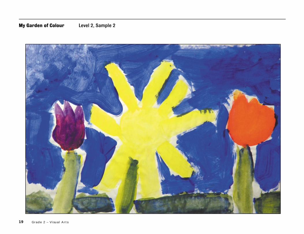
My Garden of Colour Level 2, Sample 2

20 The Ontar io Curr iculum – Exemplars , Grades 2, 5 , and 7: The Arts
A B

21 Grade 2 – Visual Arts
Teacher’s Notes
Understanding of Concepts
– The student demonstrates some understanding of primary and secondary
colours in the garden painting. He or she paints the sky blue, the grass and
plant stems green, and the flowers yellow, purple, and orange. The student
correctly identifies the primary colours used to create the secondary
colours in the painting (e.g., “I used green bie mixing yellow and blue.”).
Critical Analysis and Appreciation
– The student explains with some effectiveness how his or her choices of colour
create a certain feeling. He or she gives an explanation of the feelings that
the garden painting evokes, including some evidence to support the opinions
given. The student identifies feelings of happiness and sadness and relates
them to the use of contrasting colours in the painting (e.g., “It makes me
feel happy and sad because I have bright and dark colors in my painting.”).
Performance and Creative Work
– The student mixes primary colours to produce secondary colours with
some effectiveness. He or she uses a single shade of each secondary colour
(e.g., one purple flower, one orange flower, and the same green for the
grass and plant stems), all of which stand out clearly against the blue sky.
– The student uses primary and secondary colours in the painting to convey
feelings with some effectiveness. He or she contrasts the bright colours of
the flowers with the sombre green of the grass and the dark blue of the sky
to create a varied mood.
Communication
– The student makes some use of appropriate vocabulary and art terminology
to describe the painting and the feelings it conveys (e.g., “I called it light and
dark colors becaue I have light and dark colors in my painting.”; “I used
orange bie mixing yellow and red.”).
Comments– The student’s painting shows some effective use of colour to convey a mood.
The light and dark colours used correspond with the contrasting feelings
that the student associates with the painting. The written response demon-
strates some use of appropriate language to explain how colour is used to
convey a mood in the painting.
Next StepsIn order to improve his or her performance, the student needs to:
• use varied shades of secondary colours;
• use more varied brush strokes to allow for greater detail and texture;
• eliminate repetitive language and improve clarity of expression;
• check his or her written work carefully for correct use of language
conventions (e.g., sentence structure, spelling);
• refer to classroom resources such as word charts, word banks, and a
personal dictionary to include a wider range of appropriate vocabulary.

22 The Ontar io Curr iculum – Exemplars , Grades 2, 5 , and 7: The Arts
My Garden of Colour Level 3, Sample 1

23 Grade 2 – Visual Arts
A B

24 The Ontar io Curr iculum – Exemplars , Grades 2, 5 , and 7: The Arts
Teacher’s Notes
Understanding of Concepts
– The student demonstrates considerable understanding of primary and sec-
ondary colours in the garden painting. He or she effectively uses secondary
colours in painting the sun and flowers orange, the grass and plants green,
and part of the sky purple. The student accurately describes how the pri-
mary colours were used to create the secondary colours in the painting
(e.g., “I made green by using a little bit of yellow and a lot of blue. I even made
orange by using a little bit of red and a lot of yellow.”).
Critical Analysis and Appreciation
– The student explains with considerable effectiveness how his or her choices
of colour create a certain feeling. He or she gives a precise explanation of
the feeling that the garden painting evokes, including sufficient evidence to
support the opinions given. The student identifies feelings of loneliness and
sadness and relates these feelings to the overall tone of the painting as well
as to specific colours used (e.g., “It makes me feel lonley and a bit sad
because there are dark colours in my painting.”; “The colour purple made
me feel sad.”).
Performance and Creative Work
– The student mixes primary colours to produce secondary colours with
considerable effectiveness. He or she uses all the secondary colours, with
varied hues (e.g., several shades of purple in the sky; darker green for the
grass and plant stems than for the leaves).
– The student uses primary and secondary colours in the painting to convey
feelings with considerable effectiveness. The sad and lonely feeling identified
by the student is clearly evident through the use of sombre secondary
colours (e.g., dark purple in the sky, dark green for the grass).
Communication
– The student makes considerable use of appropriate vocabulary and art ter-
minology to describe the painting and the feelings it conveys (e.g., “I would
call my painting The garden of pretty colours because I love how it looks like
and the flowers look pretty.”; “I used a lot of blue and a little bit of red to
make purple.”).
Comments– The student effectively uses varied hues of secondary colours to convey the
feelings that he or she identifies in the painting. In the written response,
the student clearly explains which feelings are evoked by each of the main
colours used.
Next StepsIn order to improve his or her performance, the student needs to:
• include a more distinct use of the primary colour blue;
• use more varied brush strokes to allow for greater detail and texture;
• check his or her written work carefully for correct use of language
conventions (e.g., capitalization of titles);
• refer to classroom resources such as word charts, word banks, and a
personal dictionary to include a wider range of appropriate vocabulary.

25 Grade 2 – Visual Arts
My Garden of Colour Level 3, Sample 2

26 The Ontar io Curr iculum – Exemplars , Grades 2, 5 , and 7: The Arts
A B

27 Grade 2 – Visual Arts
Teacher’s Notes
Understanding of Concepts
– The student demonstrates considerable understanding of primary and sec-
ondary colours in the garden painting. He or she effectively uses primary
and secondary colours in painting the pond and blueberries blue, the grapes
purple, the grass green, the flowers red, orange, and purple, and the apples
red. The student correctly identifies the primary colours used to create the
secondary colours in the painting (e.g., “I made orang with red and yellow.”).
Critical Analysis and Appreciation
– The student explains with considerable effectiveness how his or her choices
of colour create a certain feeling. He or she gives a detailed explanation of
the feeling that the garden painting evokes, including sufficient evidence to
support the opinions given. The student identifies a feeling of peacefulness
and relates this feeling to the variety of bright colours used (e.g., “My panting
Makes me feel peasful.”; “Because my panting has lots of bright colurs”).
Performance and Creative Work
– The student mixes primary colours to produce secondary colours with
considerable effectiveness. He or she uses all the secondary colours with
varied hues to give a vivid sense of the riot of colour in the garden scene
(e.g., several shades of green for the leaves and grass; a range of purple
for the grapes and flowers).
– The student uses primary and secondary colours in the painting to convey
feelings with considerable effectiveness. The peaceful mood identified by
the student is clearly evident through the varied selection of bright primary
and secondary colours.
Communication
– The student makes considerable use of appropriate vocabulary and art ter-
minology to describe the painting and the feelings it conveys (e.g., “I would
call it “The Grate Garden of Dreams”. I would call it that because I have allway
dreamd of having a big garden with a pond in it”; “light green, light purple
and peach”; “lots of bright colurs”).
Comments– The student skilfully uses a range of primary and secondary colours
throughout the painting to convey the mood evoked by the garden scene. In
the written response, the student gives a detailed explanation as to why the
colours used, and certain aspects of the scene, convey this mood.
Next StepsIn order to improve his or her performance, the student needs to:
• include a more distinct use of the primary colour yellow;
• use more varied brush strokes to allow for greater detail and texture;
• check his or her written work carefully for correct use of language conven-
tions (e.g., grammar, spelling);
• refer to classroom resources such as word charts, word banks, and a
personal dictionary to include a wider range of appropriate vocabulary.

28 The Ontar io Curr iculum – Exemplars , Grades 2, 5 , and 7: The Arts
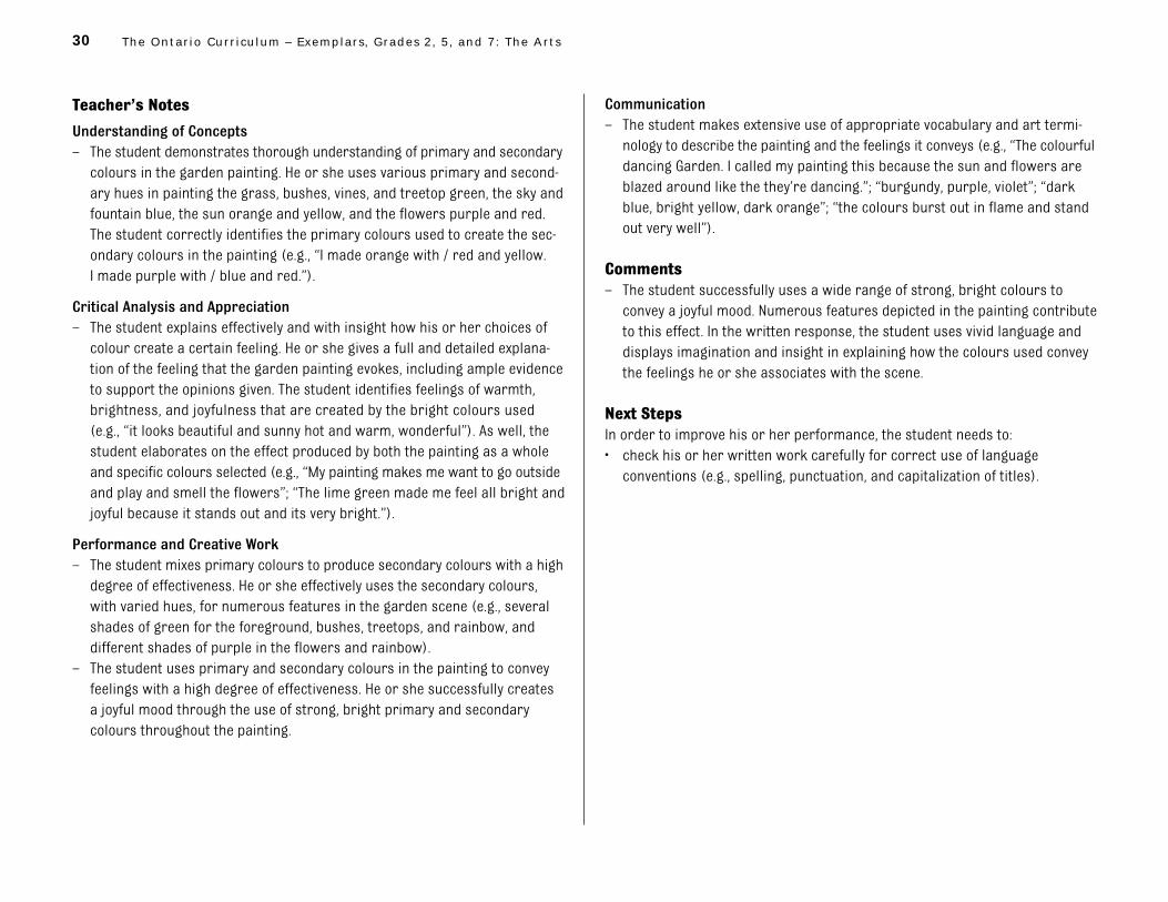
My Garden of Colour Level 4, Sample 1

29 Grade 2 – Visual Arts
A B
30 The Ontar io Curr iculum – Exemplars , Grades 2, 5 , and 7: The Arts
Teacher’s Notes
Understanding of Concepts
– The student demonstrates thorough understanding of primary and secondary
colours in the garden painting. He or she uses various primary and second-
ary hues in painting the grass, bushes, vines, and treetop green, the sky and
fountain blue, the sun orange and yellow, and the flowers purple and red.
The student correctly identifies the primary colours used to create the sec-
ondary colours in the painting (e.g., “I made orange with / red and yellow.
I made purple with / blue and red.”).
Critical Analysis and Appreciation
– The student explains effectively and with insight how his or her choices of
colour create a certain feeling. He or she gives a full and detailed explana-
tion of the feeling that the garden painting evokes, including ample evidence
to support the opinions given. The student identifies feelings of warmth,
brightness, and joyfulness that are created by the bright colours used
(e.g., “it looks beautiful and sunny hot and warm, wonderful”). As well, the
student elaborates on the effect produced by both the painting as a whole
and specific colours selected (e.g., “My painting makes me want to go outside
and play and smell the flowers”; “The lime green made me feel all bright and
joyful because it stands out and its very bright.”).
Performance and Creative Work
– The student mixes primary colours to produce secondary colours with a high
degree of effectiveness. He or she effectively uses the secondary colours,
with varied hues, for numerous features in the garden scene (e.g., several
shades of green for the foreground, bushes, treetops, and rainbow, and
different shades of purple in the flowers and rainbow).
– The student uses primary and secondary colours in the painting to convey
feelings with a high degree of effectiveness. He or she successfully creates
a joyful mood through the use of strong, bright primary and secondary
colours throughout the painting.
Communication
– The student makes extensive use of appropriate vocabulary and art termi-
nology to describe the painting and the feelings it conveys (e.g., “The colourful
dancing Garden. I called my painting this because the sun and flowers are
blazed around like the they’re dancing.”; “burgundy, purple, violet”; “dark
blue, bright yellow, dark orange”; “the colours burst out in flame and stand
out very well”).
Comments– The student successfully uses a wide range of strong, bright colours to
convey a joyful mood. Numerous features depicted in the painting contribute
to this effect. In the written response, the student uses vivid language and
displays imagination and insight in explaining how the colours used convey
the feelings he or she associates with the scene.
Next StepsIn order to improve his or her performance, the student needs to:
• check his or her written work carefully for correct use of language
conventions (e.g., spelling, punctuation, and capitalization of titles).

31 Grade 2 – Visual Arts
My Garden of Colour Level 4, Sample 2

32 The Ontar io Curr iculum – Exemplars , Grades 2, 5 , and 7: The Arts
A B

33 Grade 2 – Visual Arts
Teacher’s Notes
Understanding of Concepts
– The student demonstrates thorough understanding of primary and second-
ary colours in the garden painting. He or she uses the primary colours to
mix various hues of secondary colours in painting the flowers orange,
purple, and blue, and the stems, leaves, and background green. The student
accurately describes how the primary colours were used to create the sec-
ondary colours in the painting (e.g., “Too make purple I mixed red and blue
and to make orange I mixed red and yellow.”).
Critical Analysis and Appreciation
– The student explains effectively and with insight how his or her choices of
colour create a certain feeling. He or she gives a full and detailed explana-
tion of the feeling that the garden painting evokes, including ample evidence
to support the opinions given. The student identifies a feeling of calm and
relates this feeling not only to the colours used (e.g., “because all the flow-
ers are eather light, bright, dark or muddy”) but also to the way these
colours were mixed and applied (e.g., “because it looks like they where
dabed on and most of my painting has at least a little water mixed with the
paint”). As well, the student elaborates on the effect produced by the paint-
ing (e.g., “I feel like I am in the painting”).
Performance and Creative Work
– The student mixes primary colours to produce secondary colours with a
high degree of effectiveness. He or she imaginatively uses all the primary
colours to create a painting with varied hues of secondary colours (e.g., the
background and some flowers are lime green, and stems and leaves range
from dark to bright green; the other flowers include light and dark oranges).
– The student uses primary and secondary colours in the painting to convey
feelings with a high degree of effectiveness. He or she successfully creates
a calm mood through the use of “watery” secondary colours.
Communication
– The student makes extensive use of appropriate vocabulary and art termi-
nology to describe the painting and the feelings it conveys (e.g., “I would call
it the Paradice Garden of Secrets because it is so beautiful to me that I feel
like I am in paradice and in a garden at the same time and it is where I tell
secrets and it is secret.”; “light green, teal . . . dark purple, sky blue”; “light,
bright, dark or muddy”; “a little water mixed with the paint”).
Comments– The student uses colour in a highly imaginative way to convey a mood in
his or her painting. Both the choices of colour and the techniques used to
mix and apply the paint contribute effectively to the intended mood. In the
written response, the student provides a detailed and well-supported expla-
nation of how he or she used colour to achieve the desired effect.
Next StepsIn order to improve his or her performance, the student needs to:
• check his or her written work carefully for correct use of language conven-
tions (e.g., grammar, spelling, punctuation).

34 The Ontar io Curr iculum – Exemplars , Grades 2, 5 , and 7: The Arts
1
Title: My Garden of Colour
Time Requirement: 140–230 minutes (over several class periods)
Introductory activities• Pre-task 1: 30–50 minutes• Pre-task 2: 40–60 minutes
Exemplar task• Part 1: 60–100 minutes• Part 2: 10–20 minutes
Description of the Task
Part 1Each student will use primary and secondary colours to create a painting that conveys his or herfeelings in an imaginary garden on a spring, summer, or fall day. Students will mix the primarycolours (red, yellow, and blue) to produce a wide variety of secondary colours, including a rangeof greens, oranges, and purples. The paintings may include images of trees, plants, flowers, andpeople, as well as fences and buildings.
Part 2Students will provide a written response to their work, identifying the colours used, describingwhich primary colours were used to make secondary colours, and explaining how their paintingmakes them feel and why the colours chosen make them feel this way. Students will also provide atitle for their painting.
Concepts central to this task are the following:
• Colour can express moods and feelings.
• Secondary colours are made by mixing the primary colours.
Student ScenarioPresent the following scenario and instructions to the students:
Spring [Fall or Summer] is here and we’re celebrating colour! Imagine yourself in a beautifulgarden. Paint a picture of the garden, using primary and secondary colours to show your feelingson this day. Give your painting a title that describes the feelings you have shown. You will writeabout how your painting makes you feel and how the colours you used make you feel that way.
The Arts Exemplar TaskGrade 2 – Visual Arts
Teacher Package
Teacher Package

35Grade 2 – Visual Arts
*The rubric is reproduced on page 9 of this document.
2
Curriculum Expectations Addressed in the Task
This task gives students the opportunity to demonstrate achievement of all or part of each of the following expectations selected from the Visual Arts strand for Grade 2 in The OntarioCurriculum, Grades 1–8: The Arts, 1998. Note that the codes that follow the expectations relate to the Ministry of Education’s Curriculum Unit Planner (CD-ROM).
Students will:
1. use the elements of design (colour, line, shape, form, space, texture), in waysappropriate for this grade, when producing and responding to works of art (2a29);
2. use correctly vocabulary and art terminology associated with the specific expectationsfor this grade (2a31);
3. recognize and name the secondary colours of pigment (purple, orange, green) (2a32);
4. describe how the secondary colours can be created by mixing the primary colours(2a33);
5. produce two- and three-dimensional works of art that communicate their thoughts andfeelings on familiar topics (2a40);
6. describe, using appropriate vocabulary, how artists use the elements of design to createa specific effect (2a44).
Teacher Instructions
Prior Knowledge and Skills RequiredTo complete the task, students should have some experience with, or some knowledge or skillsrelated to, the following:
• identifying primary and secondary colours
• explaining colours in their environment and the mood or feeling they evoke
• describing, using appropriate vocabulary, how artists use the elements of design tocommunicate information and create a particular mood (e.g., bright primary and secondarycolours to suggest happiness)
Assessment and EvaluationThe rubric* provided with this exemplar task is to be used to assess students’ work. The rubric is based on the achievement levels outlined on page 9 of The Ontario Curriculum, Grades 1–8: The Arts, 1998.
Introduce the rubric to the students at the beginning of the exemplar task. Review the rubric withthe students to ensure that each student understands the criteria and the descriptions forachievement at each level. Allow ample class time for a thorough reading and discussion of theassessment criteria outlined in the rubric.
36 The Ontar io Curr iculum – Exemplars , Grades 2, 5 , and 7: The Arts
3
Some students may perform below level 1. Although the rubric does not include descriptions ofachievement below level 1, the characteristics of these students’ work should be reviewed inrelation to the criteria outlined in the rubric.
AccommodationsAccommodations that are normally provided in the regular classroom for students with specialneeds should be provided in the administration of the exemplar task.
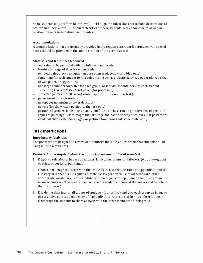
Materials and Resources RequiredStudents should be provided with the following materials:– brushes (a range of sizes is recommended)– tempera paint blocks or liquid tempera paint (red, yellow, and blue only)– something for each student to mix colours on, such as a plastic palette, a paper plate, a sheet
of wax paper, or egg cartons– one large container for water for each group, or individual containers for each student– 12" x 18" (30.48 cm x 45.72 cm) paper (for pre-task 2)– 18" x 24" (45.72 cm x 60.96 cm) white paper (for the exemplar task)– paper towel for each student– newspaper/newsprint to cover desktops– pencils (for the written portion of the task only)– pictures of gardens, landscapes, plants, and flowers (These can be photographs, or prints or
copies of paintings. Select images that are large and have a variety of colours. Art posters areideal, but slides, calendar images, or pictures from books will serve quite well.)
Task Instructions
Introductory ActivitiesThe pre-tasks are designed to review and reinforce the skills and concepts that students will beusing in the exemplar task.
Pre-task 1: Investigate Colour Use in the Environment (30–50 minutes)
1. Display a selection of images of gardens, landscapes, plants, and flowers. (e.g., photographs,or prints or copies of paintings).
2. Choose one image to discuss with the whole class. Use the questions in Appendix A and theGlossary in Appendix C as guides. Create a class-generated list of art words and otherappropriate vocabulary. Post for future reference. (Note: Keep in mind that there are noincorrect answers. The goal is to encourage the students to look at the images and to defendtheir responses.)
3. Divide the class into small groups of students (four or five) and give each group an image todiscuss. Give each student a copy of Appendix A to record his or her own observations.Encourage the students to share answers with the other members of their group.

37Grade 2 – Visual Arts
4
4. Circulate around the classroom, drawing out responses from individuals in each group.
5. Have each group present its observations to the class.
Pre-task 2: Explore Mixing Colours (Creating Secondary Colours) (40–60 minutes)
Part A
1. Set up desks into groups and put out paint for each group of students. (Use only red, blue,and yellow paint.)
2. Have the students collect their materials. Students will require their own palettes for mixingliquid tempera colours as well as a brush, paper, and a water container. If using temperablocks, students will mix colours right on the paper.
3. Give the students pieces of 12" x 18" paper. Demonstrate how to fold the paper into eightsections, if not prepared in advance.
4. Review with the students how to mix a new colour. Have them paint each new colour theyproduce onto a section of the 12" x 18" paper (they need not fill the whole section). Have thestudents ask themselves: What if I mix two colours together, or add a bit of the third as well?Challenge the students to use a wide variety of colours and to make each colour different.
5. Remind the students frequently to clean their brushes in order to achieve purity of colour andcolour mixture. You may need to review ways of cleaning brushes (e.g., squeezing out theextra water on a paper towel).
Part B
1. When their paintings are dry, ask the students to cut out their squares of colour. Set up twodisplay areas where the colour squares can be taped up. One area will be happy and the othersad. Each student will decide where to place each of his or her colours, in either the happy orthe sad area.
2. When all of the coloured squares are displayed, discuss with the students anything they maynotice about the two display areas. Questions you might ask are: Is yellow always happy? Are the sad colours mostly light or dark? (Note: Emphasize that each student may have apreference for particular colours and that these colours may have different effects ondifferent individuals. There may not be a right or a wrong answer to each question.)

38 The Ontar io Curr iculum – Exemplars , Grades 2, 5 , and 7: The Arts
5
Exemplar TaskEach student’s painting and completed Appendix B: My Painting are to be submitted formarking.
Part 1 (60–100 minutes)
1. Read the student scenario to the students and post it in the classroom.
2. Discuss the task rubric with the class.
3. Distribute materials and have the students paint the pictures of the garden they haveimagined.
4. Remind the students to use a wide variety of colours, including a range of greens, oranges,and purples.
5. Instruct the students to use the same techniques in their pictures that they used in the pre-tasks.
6. As the students complete their paintings, allow them to continue with part 2.
Part 2 (10–20 minutes)
1. Have the students individually complete a copy of Appendix B: My Painting. Tell them theyare to list the colours they used, describe how they created secondary colours, and reflect onhow their painting makes them feel, why the colours make them feel this way, and what theywould call the painting.
2. Have the students put their title on the back of their painting.

39Grade 2 – Visual Arts
6
Appendix A: The Artist’s Painting
Write down 5 different colours that the artist used in thepainting.
Describe the colours that the artist used most. (Are they light,dark, bright, muddy?)

40 The Ontar io Curr iculum – Exemplars , Grades 2, 5 , and 7: The Arts
7
How does this painting make you feel? Explain why it makes youfeel this way.
How do the colours that the artist used help to make you feelthis way?

41Grade 2 – Visual Arts
8
Appendix B: My Painting
Write down the different colours that you used in your painting.
Choose two of the secondary colours that you used. Whichprimary colours did you use to create them?

42 The Ontar io Curr iculum – Exemplars , Grades 2, 5 , and 7: The Arts
9
How does your painting make you feel? Explain why it makes youfeel this way.
How do the colours that you used help to make you feel this way?

43Grade 2 – Visual Arts
10
What would you call this painting? Why would you call it this?

44 The Ontar io Curr iculum – Exemplars , Grades 2, 5 , and 7: The Arts
11
Appendix C: Glossary
Background. The part of a composition thatappears to be farthest from the viewer.
Colour. An element of design. Colour is theparticular hue that is seen when light isreflected off an object.
Focal point. The element or object in a workof art on which the viewer’s attention isfocused.
Foreground. The area of a picture thatappears closest to the viewer. It is often at thebottom of the picture plane.
Horizon line. The “line” at which the sky andthe earth appear to meet.
Hue. The common name of a colour (e.g., red).
Line. An element of design. A line may bedefined as the visual path left by a movingpoint. It may be a continuous mark on asurface or implied by the edges of shapes andforms.
Mixing. The process of taking pure colourpaint (e.g., primary colours – red, yellow, andblue) and combining them to create othercolours (e.g., secondary colours: red + yellow= orange; yellow + blue = green; blue + red =purple).
Mood. The way in which the art work makesthe viewer feel.
Painting. Generally speaking, a type of art inwhich paint (liquid or semi-liquid colour) isapplied to a two-dimensional surface, such aspaper, canvas, wood, etc.
Primary colours. Colours that cannot becreated by mixing other colours, but that canbe mixed to produce all the other colours.Red, yellow, and blue are primary colours.
Secondary colours. Colours that are createdby mixing the primary colours. Orange, green,and purple are secondary colours.
Space. An element of design. Space is thearea around, within, or between images orelements. Space can be created on a two-dimensional surface by using such techniquesas overlapping of objects, varying of objectsize or placement, varying of colour intensityand value, and use of detail and diagonallines.
Value. The lightness or darkness of a colour(i.e., dark colours are low in value, lightcolours high in value).

Grade 5Visual Arts
46 The Ontar io Curr iculum – Exemplars , Grades 2, 5 , and 7: The Arts
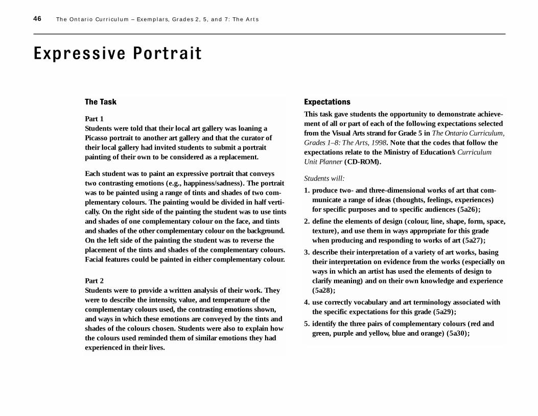
Expressive Portrait
The Task
Part 1Students were told that their local art gallery was loaning aPicasso portrait to another art gallery and that the curator oftheir local gallery had invited students to submit a portraitpainting of their own to be considered as a replacement.
Each student was to paint an expressive portrait that conveystwo contrasting emotions (e.g., happiness/sadness). The portraitwas to be painted using a range of tints and shades of two com-plementary colours. The painting would be divided in half verti-cally. On the right side of the painting the student was to use tintsand shades of one complementary colour on the face, and tintsand shades of the other complementary colour on the background.On the left side of the painting the student was to reverse theplacement of the tints and shades of the complementary colours.Facial features could be painted in either complementary colour.
Part 2Students were to provide a written analysis of their work. Theywere to describe the intensity, value, and temperature of thecomplementary colours used, the contrasting emotions shown,and ways in which these emotions are conveyed by the tints andshades of the colours chosen. Students were also to explain howthe colours used reminded them of similar emotions they hadexperienced in their lives.
Expectations
This task gave students the opportunity to demonstrate achieve-ment of all or part of each of the following expectations selectedfrom the Visual Arts strand for Grade 5 in The Ontario Curriculum,Grades 1–8: The Arts, 1998. Note that the codes that follow theexpectations relate to the Ministry of Education’s CurriculumUnit Planner (CD-ROM).
Students will:
1. produce two- and three-dimensional works of art that com-municate a range of ideas (thoughts, feelings, experiences) for specific purposes and to specific audiences (5a26);
2. define the elements of design (colour, line, shape, form, space,texture), and use them in ways appropriate for this gradewhen producing and responding to works of art (5a27);
3. describe their interpretation of a variety of art works, basingtheir interpretation on evidence from the works (especially onways in which an artist has used the elements of design toclarify meaning) and on their own knowledge and experience(5a28);
4. use correctly vocabulary and art terminology associated withthe specific expectations for this grade (5a29);
5. identify the three pairs of complementary colours (red andgreen, purple and yellow, blue and orange) (5a30);

47 Grade 5 – Visual Arts
6. select the most appropriate tools, materials, and techniquesfor a particular purpose, and use them correctly (5a37);
7. organize their art works to create a specific effect, using theelements of design (5a38);
8. produce two- and three-dimensional works of art (i.e., worksinvolving media and techniques used in drawing, painting,sculpting, printmaking) that communicate a range ofthoughts, feelings, and ideas for specific purposes and to specific audiences (5a39);
9. describe the connection between an element of design and aspecific artistic purpose, using appropriate vocabulary (5a43).
Prior Knowledge and Skills
To complete the task, students were expected to have someexperience with, or some knowledge or skills related to, the following:
• primary and secondary colours as well as temperature (warmvs. cool), value (light vs. dark), and intensity (bright vs. dull)of colour
• warm and cool colours and their emotional impact (e.g., a warmcolour scheme may make people feel warmer)
• mixing tints and shades of colours using paint
• looking at and talking about art (e.g., portraits and expressivepieces by various artists)
• analysing their own pieces of art based on set criteria
For information on the process used to prepare students for the taskand on the materials and equipment required, see the TeacherPackage, reproduced on pages 73–83 of this document.

48 The Ontar io Curr iculum – Exemplars , Grades 2, 5 , and 7: The Arts
Task Rubric – Visual Arts, Grade 5: Expressive Portrait
Expectations*
2, 5
3, 7, 9
1, 6, 7, 8
4, 9
Level 1
– demonstrates limited under-
standing of the intensity, value,
and temperature of one pair of
complementary colours
– demonstrates limited under-
standing of the concepts
involved in producing an expres-
sive portrait that shows con-
trasting emotions
– explains with limited effective-
ness the connection between the
colours used in the portrait and
emotions related to personal
experiences
– mixes and applies a range of
tints and shades of a pair of
complementary colours with
limited effectiveness
– shows contrasting emotions
through an expressive portrait
with limited effectiveness
– makes limited use of appropriate
vocabulary and art terminology
Level 2
– demonstrates some understand-
ing of the intensity, value, and
temperature of one pair of com-
plementary colours
– demonstrates some understand-
ing of the concepts involved in
producing an expressive portrait
that shows contrasting emotions
– explains with some effectiveness
the connection between the
colours used in the portrait and
emotions related to personal
experiences
– mixes and applies a range of
tints and shades of a pair of
complementary colours with
some effectiveness
– shows contrasting emotions
through an expressive portrait
with some effectiveness
– makes some use of appropriate
vocabulary and art terminology
Level 3
– demonstrates considerable
understanding of the intensity,
value, and temperature of one
pair of complementary colours
– demonstrates considerable
understanding of the concepts
involved in producing an
expressive portrait that shows
contrasting emotions
– explains with considerable effec-
tiveness the connection between
the colours used in the portrait
and emotions related to per-
sonal experiences
– mixes and applies a range of
tints and shades of a pair of
complementary colours with
considerable effectiveness
– shows contrasting emotions
through an expressive portrait
with considerable effectiveness
– makes considerable use of
appropriate vocabulary and
art terminology
Level 4
– demonstrates thorough under-
standing of the intensity, value,
and temperature of one pair of
complementary colours
– demonstrates thorough
understanding of the concepts
involved in producing an
expressive portrait that shows
contrasting emotions
– explains with a high degree of
effectiveness the connection
between the colours used in the
portrait and emotions related to
personal experiences
– mixes and applies a range of
tints and shades of a pair of
complementary colours with a
high degree of effectiveness
– shows contrasting emotions
through an expressive portrait
with a high degree of effectiveness
– makes extensive use of
appropriate vocabulary and
art terminology
Understanding of ConceptsThe student:
Critical Analysis and AppreciationThe student:
Performance and Creative WorkThe student:
CommunicationThe student:
*The expectations that correspond to the numbers given in this chart are listed on pages 46–47.
Note: This rubric does not include criteria for assessing student performance that falls below level 1.

49 Grade 5 – Visual Arts
Expressive Portrait Level 1, Sample 1

50 The Ontar io Curr iculum – Exemplars , Grades 2, 5 , and 7: The Arts
A B

51 Grade 5 – Visual Arts
Teacher’s Notes
Understanding of Concepts
– The student demonstrates limited understanding of the intensity, value, and
temperature of one pair of complementary colours. He or she uses purple
and yellow as complementary colours and describes their intensity, value,
and temperature, although the first of these qualities is not mentioned by
name. The student does not relate intensity to brightness/dullness, is only
partially correct in describing value (i.e., “means a dark colour”), and refers
to temperature incorrectly (i.e., “I used temperature that means lite
colours.”).
– The student demonstrates limited understanding of the concepts involved
in producing an expressive portrait that shows contrasting emotions. He or
she uses complementary colours to create contrast, but demonstrates lim-
ited understanding that contrasting emotions require different facial
expressions, changing only a single feature on the two sides of the portrait
(i.e., an open eye on the left side and a closed eye on the right).
Critical Analysis and Appreciation
– The student explains with limited effectiveness the connection between the
colours used in the portrait and emotions related to personal experiences.
He or she links the colours used with camping experiences and with school,
but does not relate them clearly to specific parts of the portrait (e.g., “The
lite yellow reminds me of when I went camping with my mom . . . because I’m
always happy when I go camping.”).
Performance and Creative Work
– The student mixes and applies a range of tints and shades of a pair of com-
plementary colours with limited effectiveness. The student uses a limited
range of tints and shades in the portrait. He or she uses pure yellow to
outline the face and to colour half of the face, and one tint of yellow is used
for the background and the neck. One shade of purple is used for both the
other half of the face and the opposite background.
– The student shows contrasting emotions through an expressive portrait
with limited effectiveness. He or she attempts to convey two emotions by
painting one eye open and the other eye closed. However, without any exag-
geration or rearrangement of features, the overall expression in the two
sides of the portrait is very similar.
Communication
– The student makes limited use of appropriate vocabulary and art terminology.
He or she uses art-related terms such as value, temperature, tints, and
shades, but does not describe concepts with clarity or precision (e.g., “I used
value that means a dark colour and I used temperature that means lite
colours.”).
CommentsThe student uses the contrasting colours purple and yellow, but makes limited
use of expressive characteristics to convey contrasting emotions and does not
explain how colour is used to convey such emotions. He or she demonstrates
limited understanding of the concepts and limited ability to apply the skills
and techniques required. The student does not communicate his or her under-
standing of concepts with clarity or precision.
Next StepsIn order to improve his or her performance, the student needs to:
• use a wider variety of tints and shades;
• include characteristics of an expressive portrait;
• clearly portray two contrasting emotions;
• clarify and explain in greater detail the concepts of intensity, value, and
temperature;
• edit and proofread his or her written work carefully to eliminate errors in
grammar and spelling.

52 The Ontar io Curr iculum – Exemplars , Grades 2, 5 , and 7: The Arts
Expressive Portrait Level 1, Sample 2

53 Grade 5 – Visual Arts
A B

54 The Ontar io Curr iculum – Exemplars , Grades 2, 5 , and 7: The Arts
Teacher’s Notes
Understanding of Concepts
– The student demonstrates limited understanding of the intensity, value, and
temperature of one pair of complementary colours. He or she uses blue and
orange as complementary colours in the portrait. In the written response,
the student does not distinguish between intensity and value and identifies
orange as both warm and cool (i.e., “The orange coulour looked warm
bright cool.”).
– The student demonstrates limited understanding of the concepts involved in
producing an expressive portrait that shows contrasting emotions. Although
the student uses complementary colours, the portrait does not convey
contrasting emotions. As well, no attempt has been made to rearrange or
exaggerate features in order to distinguish the two sides of the portrait.
Critical Analysis and Appreciation
– The student explains with limited effectiveness the connection between the
colours used in the portrait and emotions related to personal experiences.
He or she identifies the expression in the portrait with a single emotion
(i.e., “The portrait I have painted was a happy looking dude.”) but does not
link this emotion with the colours used. The student makes no reference to
emotions related to personal experiences.
Performance and Creative Work
– The student mixes and applies a range of tints and shades of a pair of
complementary colours with limited effectiveness. He or she attempts to
accentuate facial features by combining the two complementary colours,
but otherwise uses a limited range of tints and shades that provide little
visual impact. Only one shade of each colour is provided for the background
and one tint of each colour for the face.
– The student shows contrasting emotions through an expressive portrait
with limited effectiveness. He or she conveys a single emotion in the portrait
(i.e., happiness). A contrasting emotion was not included, as was required in
the assignment.
Communication
– The student makes limited use of appropriate vocabulary and art terminology.
He or she uses a few basic art-related terms, but uses them in inappropriate
or incorrect ways (e.g., “The orange coulour looked warm bright cool.”). In
describing the colours used, the student makes no reference to the con-
cepts of intensity, value, and temperature.
CommentsThe student uses the complementary colours blue and orange, but shows only a
single emotion in the portrait. He or she demonstrates limited understanding
of the concepts and limited ability to apply the required techniques. The portrait
and the written response do not reflect an understanding of the task require-
ment regarding the use of colour and expressive characteristics to convey
contrasting emotions.
Next StepsIn order to improve his or her performance, the student needs to:
• use a wider variety of tints and shades;
• include characteristics of an expressive portrait;
• clearly portray two contrasting emotions;
• discuss the concepts of intensity, value, and temperature;
• connect the colours used in the portrait with emotions related to personal
experiences;
• edit his or her written work carefully to achieve clearer communication;
• refer to a thesaurus and dictionary to expand his or her vocabulary.

55 Grade 5 – Visual Arts
Expressive Portrait Level 2, Sample 1

56 The Ontar io Curr iculum – Exemplars , Grades 2, 5 , and 7: The Arts
A B

57 Grade 5 – Visual Arts
Teacher’s Notes
Understanding of Concepts
– The student demonstrates some understanding of the intensity, value, and
temperature of one pair of complementary colours. He or she uses the
complementary colours blue and orange in the portrait and describes with
some accuracy their intensity and temperature (e.g., “The intensity of my
painting is the face of the happy side.”; “On the sad side of my painting, it is
mostly cool colours, and on the other side the colours are mostly hot
colours.”). No reference, however, is made to value.
– The student demonstrates some understanding of the concepts involved in
producing an expressive portrait that shows contrasting emotions. He or
she has some grasp of how different emotions can be conveyed through
the use of complementary colours and simple changes to facial features
(e.g., the line of the mouth curving up or down). However, the student has
not exaggerated or rearranged the features to make the portrait more
expressive.
Critical Analysis and Appreciation
– The student explains with some effectiveness the connection between the
colours used in the portrait and emotions related to personal experiences.
The student connects the background blue with his or her enjoyment of
swimming (i.e., “It makes me feel happy.”) and explains with some detail the
effect of the blue face (i.e., “The blue face makes me feel sad because blue is
a sad and cold colour.”). However, no mention is made of the other colour,
orange.
Performance and Creative Work
– The student mixes and applies a range of tints and shades of a pair of com-
plementary colours with some effectiveness. He or she creates a contrast
between the two sides of the portrait through the use of tints and shades in
the face and hair. The background is appropriately shaded (e.g., the blue
shade on the background of the happy side is warmer than the blue used
for the sad face).
– The student shows contrasting emotions through an expressive portrait
with some effectiveness. The two emotions are clearly defined, with some
attention to detail on both sides (e.g., the eyes and mouth). However, the art
work lacks characteristics of an expressive portrait such as exaggeration
or rearrangement of features.
Communication
– The student makes some use of appropriate vocabulary and art terminology.
He or she uses some art-related terms in an appropriate context (e.g., “On
the sad side of my painting it is mostly cool colours, and on the other side . . .
mostly hot colours.”; “I shaded the blue to have a sad feeling on the sad
face, and I tinted the orange to have a happy feeling on the happy face.”).
However, the concept of intensity is described in somewhat vague terms
(i.e., “The intensity of my painting is the face of the happy side.”).
CommentsThe student makes some appropriate use of the complementary colours blue
and orange to convey contrasting emotions, but does not demonstrate an
understanding of how to make his or her art work expressive. The written
response demonstrates some use of appropriate language to describe the
colours chosen and to explain how tints and shades are used to convey emo-
tions. The student communicates his or her understanding of concepts with
some clarity.
Next StepsIn order to improve his or her performance, the student needs to:
• use a greater variety of tints and shades;
• use characteristics of an expressive portrait to achieve more striking
effects;
• describe intensity, temperature, and value in more detail;
• edit and proofread his or her written work carefully to avoid repetitive
wording and to improve sentence structure.

58 The Ontar io Curr iculum – Exemplars , Grades 2, 5 , and 7: The Arts
Expressive Portrait Level 2, Sample 2

59 Grade 5 – Visual Arts
A B

60 The Ontar io Curr iculum – Exemplars , Grades 2, 5 , and 7: The Arts
Teacher’s Notes
Understanding of Concepts
– The student demonstrates some understanding of the intensity, value, and
temperature of one pair of complementary colours. He or she uses the
complementary colours red and green and refers to their temperature,
intensity, and value. However, the effect of using a particular colour quality
is not always clearly understood (e.g., “For both my colours I had both of the
temperatures because then it makes it look more abstract.”).
– The student demonstrates some understanding of the concepts involved in
producing an expressive portrait that shows contrasting emotions. The
student shows some understanding of the importance of colour and shape
in creating an expressive portrait; however, he or she has not shown
understanding that distinct differences in facial expression are required to
convey contrasting emotions.
Critical Analysis and Appreciation
– The student explains with some effectiveness the connection between the
colours used in the portrait and emotions related to personal experiences.
He or she connects the colours red and green with the happiness of Christ-
mas (e.g., “Green and red to me are happy colours. Green and red make me
happy because it reminds me of Christmas.”). However, this emotion bears
no relation to the portrait, in which red was intended to convey “mad” and
green “shy”.
Performance and Creative Work
– The student mixes and applies a range of tints and shades of a pair of com-
plementary colours with some effectiveness. He or she uses two tints and
shades of both red and green to create contrasts. Differences among tints
and shades are accentuated by the use of dark lines between sections of
the portrait.
– The student shows contrasting emotions through an expressive portrait
with some effectiveness. He or she includes a number of characteristics
that create an expressive portrait (e.g., bold use of complementary colours;
the use of flowing, curved lines to divide sections of the painting; exagger-
ated facial features). The student also appropriately chooses red to express
“mad”, but does not sufficiently vary the expression in the two parts of the
portrait to distinguish clearly the two emotions it is intended to convey.
Communication
– The student makes some use of appropriate vocabulary and art terminology.
He or she uses some art-related terms appropriately (e.g., “hues”, “temper-
atures”, “bright and dull”, “colourful”, “all sorts of different tints and shades”).
However, the student does not explain concepts clearly in relation to the
colours used (e.g., “I think mine is bright and dull”; “I used both my tints
and shades.”).
CommentsThe student has attempted to create an expressive portrait that displays two
contrasting emotions. He or she has successfully mixed some tints and shades
using two complementary colours, red and green. The student shows an under-
standing of some of the concepts and applies some of the skills and techniques
required. The student communicates his or her understanding of concepts
with some clarity and precision.
Next StepsIn order to improve his or her performance, the student needs to:
• portray two contrasting emotions more clearly;
• discuss intensity, value, and temperature in greater detail;
• connect the emotions conveyed by the portrait with personal experiences;
• refer to a thesaurus and dictionary to expand and enhance vocabulary.

61 Grade 5 – Visual Arts
Expressive Portrait Level 3, Sample 1
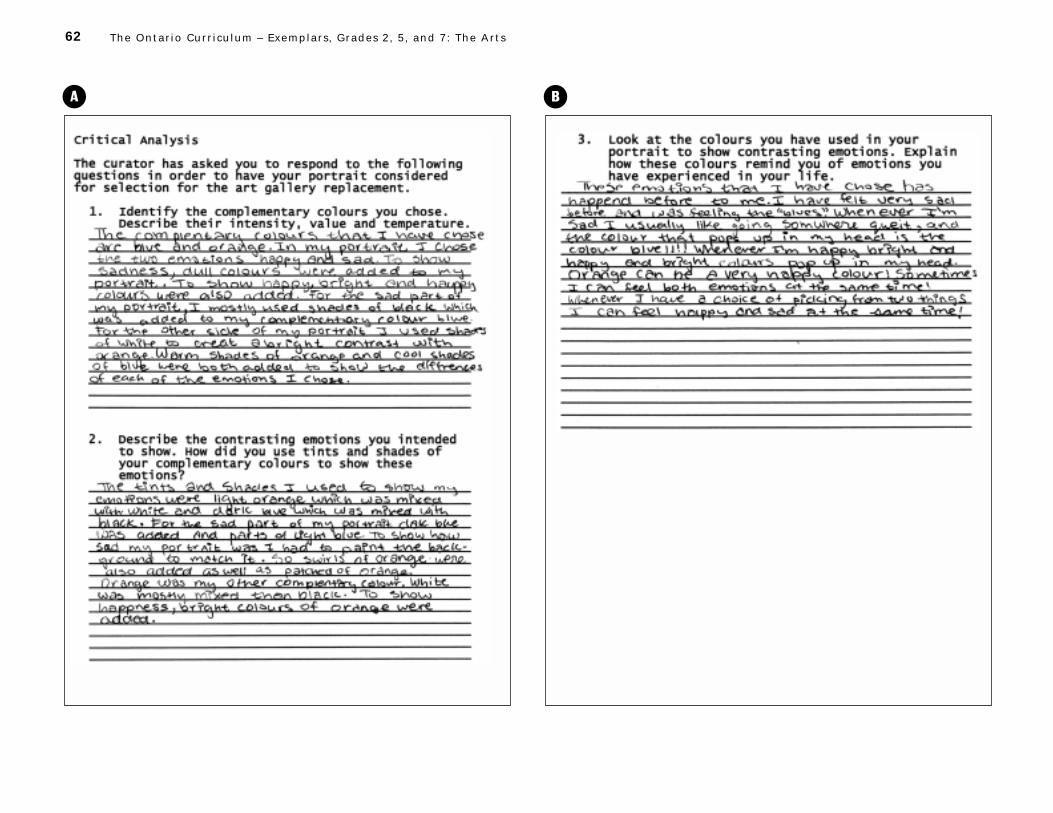
62 The Ontar io Curr iculum – Exemplars , Grades 2, 5 , and 7: The Arts
A B

63 Grade 5 – Visual Arts
Teacher’s Notes
Understanding of Concepts
– The student demonstrates considerable understanding of the intensity, value,
and temperature of one pair of complementary colours. He or she uses the
complementary colours orange and blue in the portrait and describes their
intensity, value, and temperature. The student effectively explains why he or
she used bright and dull colours and light and dark colours (e.g., “To show
sadness, dull colours were added to my portrait. To show happy, bright
and happy colours were also added.”), and demonstrates a clear under-
standing that warm and cool colours can be used to create contrasting
moods (e.g., “Warm shades of orange and cool shades of blue were both
added to show the differences of each of the emotions I chose.”).
– The student demonstrates considerable understanding of the concepts
involved in producing an expressive portrait that shows contrasting emotions.
He or she clearly understands how tints and shades can be contrasted to
highlight facial features and create two distinct emotions in the portrait.
The student also demonstrates a good understanding of the effect of colour
qualities such as intensity and value (e.g., “To show happiness, bright
colours of orange were added.”).
Critical Analysis and Appreciation
– The student explains with considerable effectiveness the connection
between the colours used in the portrait and emotions related to personal
experiences. He or she clearly identifies blue as a sad colour and orange as
a happy colour, and draws on memories of personal experiences to illustrate
the emotions connected with these two colours (e.g., “I had felt very sad
before and was feeling the ‘blues’. Whenever I’m sad I usually like going
somwhere queit, and the colour that pops up in my head is the colour
blue!!!!”).
Performance and Creative Work
– The student mixes and applies a range of tints and shades of a pair of com-
plementary colours with considerable effectiveness. He or she appropriately
places a wide range of tints and shades to highlight key facial features such
as the nose, eyes, and mouth. The eye on the right side of the face is effec-
tively accentuated by a dark blue-black area to show sadness.
– The student shows contrasting emotions through an expressive portrait
with considerable effectiveness. The two emotions (i.e., “happy and sad”)
are clearly defined. The warm colours and fluid lines of the happy side of
the face contrast strongly with the cool, dull colours and more static design
of the sad side of the face. Differences in the use of colour for the eyes and
mouth add to this contrast.
Communication
– The student makes considerable use of appropriate vocabulary and art
terminology. He or she uses a range of art-related terms in an appropriate
manner in describing how the effects of the portrait were created (e.g., “To
show how sad my portrait was I had to paint the background to match it. So
swirls of orange were also added as well as patches of orange.”). The quali-
ties of the colours used are also clearly described (e.g., “Warm shades of
orange and cool shades of blue”; “light orange which was mixed with white
and dark blue which was mixed with black”).
CommentsThe student has created an expressive portrait displaying two contrasting
emotions. He or she has successfully mixed a range of tints and shades using
two complementary colours, blue and orange. The placement of colour enhances
the overall effectiveness of the portrait. In the written response, the student
communicates his or her understanding of concepts with considerable accu-
racy and detail.
Next StepsIn order to improve his or her performance, the student needs to:
• create a stronger representation of contrasting emotions through greater
use of expressive characteristics;
• proofread his or her written work carefully to correct errors in grammar
and spelling.
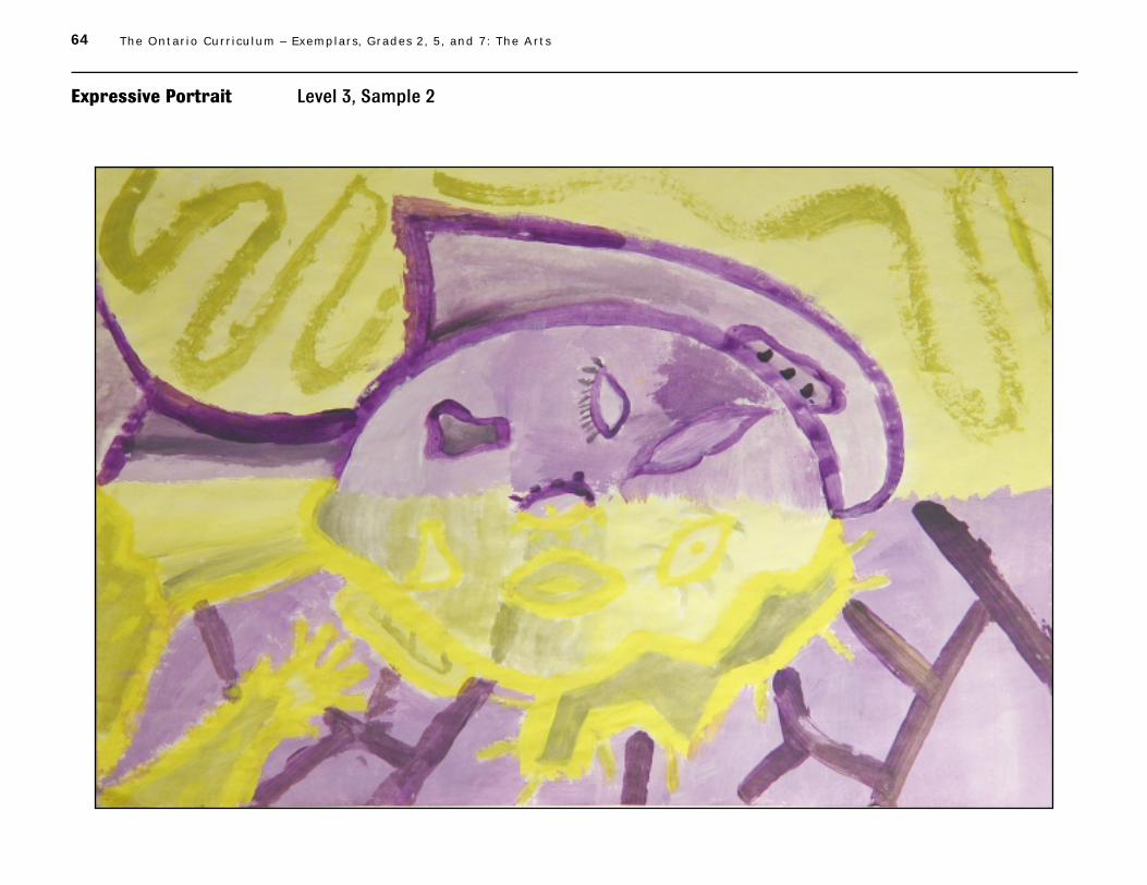
64 The Ontar io Curr iculum – Exemplars , Grades 2, 5 , and 7: The Arts
Expressive Portrait Level 3, Sample 2

65 Grade 5 – Visual Arts
A B

66 The Ontar io Curr iculum – Exemplars , Grades 2, 5 , and 7: The Arts
Teacher’s Notes
Understanding of Concepts
– The student demonstrates considerable understanding of the intensity,
value, and temperature of one pair of complementary colours. He or she
uses purple and yellow as complementary colours in the portrait and accu-
rately describes their intensity and temperature. The student clearly under-
stands that variations in these two qualities can be used to create striking
visual effects (e.g., “The colours . . . were more dull and pastel. I tryed to
make sure that the outline which was the pure colour was bright to make it
jump out at you.”).
– The student demonstrates considerable understanding of the concepts
involved in producing an expressive portrait that shows contrasting emo-
tions. He or she understands that facial features can be exaggerated and
rearranged to create a particular effect. The student also understands that
colour intensity and temperature can convey different emotions (e.g., “The
purple side was more calm, relaxed and cool. The yellow is more warm for
an excited emotion.”).
Critical Analysis and Appreciation
– The student explains with considerable effectiveness the connection between
the colours used in the portrait and emotions related to personal experiences.
He or she provides vivid examples from personal experiences to illustrate
the emotions evoked by the colours purple and yellow (i.e., “The light purple
reminds me of lavender in a calm garden. The light yellow reminds me of
peace when it is accented like in my room. The bright yellows remind me of
bright lights.”).
Performance and Creative Work
– The student mixes and applies a range of tints and shades of a pair of com-
plementary colours with considerable effectiveness. He or she uses a range
of tints and shades in a monochromatic style for each side of the face. Pure
colour outline is used to highlight key facial features (the mouth, eyes, and
nose), and tints and shades are used for detail on both the face and the
background.
– The student shows contrasting emotions through an expressive portrait
with considerable effectiveness. He or she makes good use of line to display
the two emotions, “relaxed” and “anxious” (e.g., “For the very anxious and
upset side I put jagged lines and more intense colours.”). The student’s
rearrangement of facial features and attention to detail also contribute to
the creation of an expressive portrait (e.g., smooth, tame hair is used for
the relaxed side, and jagged, spiky hair for the anxious side, with a similar
emphasis in the background).
Communication
– The student makes considerable use of appropriate vocabulary and art
terminology. He or she uses a range of art-related terms appropriately in
describing how the use of colour and line reflects the emotions conveyed
(e.g., “I used lighter pastel colours in the purple side being more cool and
curved lines.”). The intensity and temperature of the colours are also clearly
described (e.g., “The colours I used weren’t very intense. They were more
dull and pastel.”).
CommentsThe student has successfully created an expressive portrait, using a range of
tints and shades to convey contrasting emotions. He or she demonstrates an
understanding of the concepts, and applies required skills and techniques with
considerable effectiveness. In using colour contrasts to emphasize the shape
and placement of facial features, the student effectively conveys the contrast-
ing nature of the two emotions portrayed.
Next StepsIn order to improve his or her performance, the student needs to:
• discuss value to demonstrate an understanding of this concept;
• add greater detail about his or her own personal experiences in explaining
the connection between colours and emotions;
• proofread his or her written work carefully to correct errors in spelling and
punctuation.
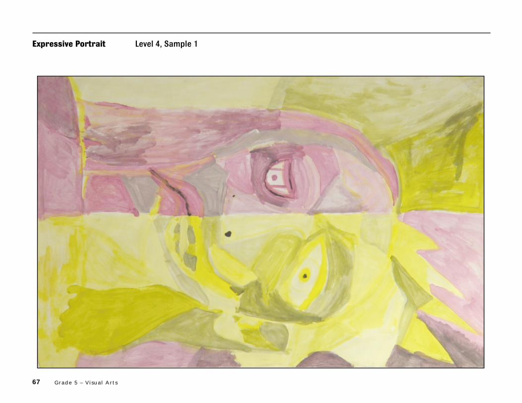
67 Grade 5 – Visual Arts
Expressive Portrait Level 4, Sample 1

68 The Ontar io Curr iculum – Exemplars , Grades 2, 5 , and 7: The Arts
A B

69 Grade 5 – Visual Arts
Teacher’s Notes
Understanding of Concepts
– The student demonstrates thorough understanding of the intensity, value,
and temperature of one pair of complementary colours. He or she uses the
complementary colours purple and yellow in the portrait, and accurately
describes his or her varied use of intensity, value, and temperature (e.g., “On
my happy side I used yellow with mostly bright intensity”; “on the yellow side
(happy side) I used light colours ... and on the purple side is dark purple”;
“the purple side is mostly cold, when you are sad you are cool which is
purple”).
– The student demonstrates thorough understanding of the concepts involved
in producing an expressive portrait that shows contrasting emotions. He or
she thoroughly understands how colours of different intensity and tempera-
ture can be used to convey contrasting emotions (e.g., “On the sad side I
mostly used dull intensity colours to show mostly sadness.”; “on the yellow
side I chose a warm colour to show that they are happy”). The student also
shows thorough understanding of the use of colour qualities (e.g., tint,
shade, intensity) to highlight features so that they add to the expressiveness
of the portrait (e.g., “The eyes are a big focus so they are really bright on
the yellow side.”; “The mouth is a dark shade of purple which makes it look
really sorrow.”).
Critical Analysis and Appreciation
– The student explains with a high degree of effectiveness the connection
between the colours used in the portrait and emotions related to personal
experiences. He or she provides clear and complete explanations of why the
colours purple and yellow are associated with particular emotions (e.g., “I
used a dull shade of purple, because when I am sad I am a cool colour like a
dull shade.”; “When I am happy I am excited. I remember when I went on a
boat I was really happy and excited, that is one reason why I chose yellow.”)
Performance and Creative Work
– The student mixes and applies a range of tints and shades of a pair of com-
plementary colours with a high degree of effectiveness. He or she uses many
light and dark yellows and many light and dark purples on both sides of the
face as well as in the background. These tints and shades successfully
highlight facial features such as the eyes and eyebrows, nose, mouth,
cheeks, and forehead.
– The student shows contrasting emotions through an expressive portrait
with a high degree of effectiveness. He or she represents the two emotions
(i.e., happy and sad) through a variety of tints and shades and an imagina-
tive exaggeration of certain features. A down-turned mouth, a partially
closed eye “placed low”, drooping lines around the head, and dark shading
around the mouth and eye indicate sadness. Happiness is shown by an
upturned mouth, a wide eye accentuated by bright colour and pale tints,
and sun-like spikes around the head.
Communication
– The student makes extensive use of appropriate vocabulary and art
terminology. He or she appropriately uses a wide array of art-related
terms in referring to colour qualities and explaining painting techniques
(e.g., “exagerated the mouth with a light tint”; “the hair is a brush stroke
with really dull intensity”; “used a dull shade of purple”).
CommentsThe student has skilfully portrayed two contrasting emotions using comple-
mentary colours that include a wide range of shades and tints. He or she
applies the skills and techniques required and shows a thorough understand-
ing of the concepts, which are described in the written response with clarity
and precision. The student’s use of expressive characteristics creates a
striking representation of the two emotions portrayed.
Next StepsIn order to improve his or her performance, the student needs to:
• discuss in more detail a personal experience that he or she remembers as
being sad;
• edit and proofread his or her written work carefully to improve sentence
structure and to eliminate errors in grammar and spelling.

70 The Ontar io Curr iculum – Exemplars , Grades 2, 5 , and 7: The Arts
Expressive Portrait Level 4, Sample 2
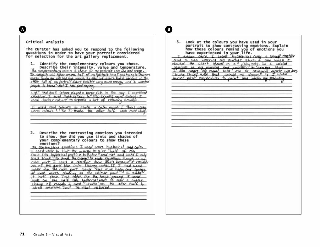
71 Grade 5 – Visual Arts
A B

72 The Ontar io Curr iculum – Exemplars , Grades 2, 5 , and 7: The Arts
Teacher’s Notes
Understanding of Concepts
– The student demonstrates thorough understanding of the intensity, value,
and temperature of one pair of complementary colours. He or she uses the
complementary colours blue and orange in the portrait, and describes
clearly and with insight the variations in the use of intensity, value, and tem-
perature (e.g., “The intensity was higher on one half of my portrait since I
was trying to show more energy.”; “I used darker colours to express a sort
of relaxing emotion.”; “ I used cool colours to make a calm mood.”).
– The student demonstrates thorough understanding of the concepts involved
in producing an expressive portrait that shows contrasting emotions. He or
she thoroughly understands the expressive effects that can be created by
larger-than-life physical features and by contrasts between the complemen-
tary colours (e.g., the use of blue for the eye and mouth on the orange side
of the portrait). The student also demonstrates thorough understanding of
the use of tints and shades to create particular effects (e.g., “I used white to
tint the orange to give half my face . . . a brighter and not sad look.”; “on my
calm part I used a darker blue. . . . If I had used lighter blue the calm part
would feel more happy and springy.”).
Critical Analysis and Appreciation
– The student explains with a high degree of effectiveness the connection
between the colours used in the portrait and emotions related to personal
experiences. He or she provides clear and complete explanations of why the
colours orange and blue are associated with particular emotions (e.g., “once
I went hysterical . . . I was wearing an orange shirt. . . . when I moved the
shirt moved in a jigley way.”; “When I was angry my mom told me to imagine
dark waters flowing slowly and that calmed me down.”).
Performance and Creative Work
– The student mixes and applies a range of tints and shades of a pair of
complementary colours with a high degree of effectiveness. The student’s
portrait has numerous shades and tints of orange and blue that are suc-
cessfully applied on both the face and the background (e.g., “For the back
ground I used tints on one half (the hysterical part) to add a sudden change
of moods. I used shades on the other half to blend emotions. Just to feel
relaxed.”). The use of white for tinting the hysterical side and of black for
shading the calm side is an effective application of tonal value.
– The student shows contrasting emotions through an expressive portrait
with a high degree of effectiveness. On the blue side, the student effectively
uses straight, geometric lines when forming the eye, nose, and jaw to show
“calm”; on the orange side, irregular shapes and curved lines are used
around the mouth and eye and for the eyebrow to show “hysterical”. The
student has skilfully chosen a shade of blue and a tint of orange to maximize
the contrast between the two sides of the portrait.
Communication
– The student makes extensive use of appropriate vocabulary and art termi-
nology. He or she appropriately uses art-related terms in referring to the
intensity and value of colours and in explaining how these qualities were
varied to reflect different emotions (e.g., “The intensity was higher on one
half of my portrait since I was trying to show more energy. Though one side
had high intensity the other half didn’t. That is because on the other half of
my portrait didn’t exhibit very much energy and I wanted people to know
what I was portraying.”).
CommentsThe student skilfully represents two contrasting emotions using complemen-
tary colours that include a variety of shades and tints. He or she applies the
skills and techniques required and demonstrates thorough understanding of
the concepts, which are described in the written response with clarity and
precision. The student’s use of colour and exaggerated features creates a
vivid contrast between the two emotions portrayed.
Next StepsIn order to improve his or her performance, the student needs to:
• explain temperature of colours in greater detail;
• explain how line is used to enhance the portrayal of emotions;
• proofread his or her written work carefully to eliminate errors in grammar
and spelling.

73
1
Title: Expressive Portrait
Time Requirement: 245–300 minutes (over several class periods)
Introductory activities• Pre-task 1: 15–20 minutes• Pre-task 2: 45–50 minutes• Pre-task 3: 60–80 minutes
Exemplar task• Part 1: 90–105 minutes• Part 2 : 35–45 minutes
Description of the Task
Part 1Each student will paint an expressive portrait that conveys two contrasting emotions (e.g., happiness/sadness). The portrait will be painted using a range of tints and shades of two complementarycolours. The painting will be divided in half vertically. On the right side of the painting thestudent will use tints and shades of one complementary colour on the face, and tints and shadesof the other complementary colour on the background. On the left side of the painting the studentwill reverse the placement of the tints and shades of the complementary colours. Facial featuresmay be painted in either complementary colour.
Part 2Students will provide a written analysis of their work. They will describe the intensity, value, andtemperature of the complementary colours used, the contrasting emotions shown, and ways inwhich these emotions are conveyed by the tints and shades of the colours chosen. Students willalso explain how the colours used remind them of similar emotions they have experienced in theirlives.
Concepts central to this task are the following:
• There are three pairs of complementary colours.
• The tints and shades of each of the two complementary colours elicit emotion.
• Each individual brings his or her own personal knowledge and experience to theinterpretation of works of art.
• Black and white, when mixed with a colour, change the colour’s intensity, value, and temperature.
The Arts Exemplar TaskGrade 5 – Visual Arts
Teacher Package
Teacher Package

74 The Ontar io Curr iculum – Exemplars , Grades 2, 5 , and 7: The Arts
2
Student ScenarioPresent the following scenario and instructions to the students:
Your local art gallery is loaning a Picasso portrait to another art gallery. The curator of the artgallery has asked you to submit an entry to be considered as a replacement. The painting must bean expressive portrait made up of a pair of complementary colours. You must also create tints andshades by mixing white and black with your complementary colours. Your painting will be dividedin half by a vertical line, and the two halves of the portrait will show two contrasting emotions.Your choice of colour will reflect the emotions being portrayed. In order to have your portraitselected, you must provide a written response to the curator, describing the colours used in thepainting and the emotions they convey, and explaining how these colours remind you of similaremotions you have experienced in your life.
Curriculum Expectations Addressed in the Task
This task gives students the opportunity to demonstrate achievement of all or part of each of thefollowing expectations selected from the Visual Arts strand for Grade 5 in The Ontario Curriculum,Grades 1–8: The Arts, 1998. Note that the codes that follow the expectations relate to the Ministryof Education’s Curriculum Unit Planner (CD-ROM).
Students will:
1. produce two- and three-dimensional works of art that communicate a range of ideas(thoughts, feelings, experiences) for specific purposes and to specific audiences (5a26);
2. define the elements of design (colour, line, shape, form, space, texture), and use them inways appropriate for this grade when producing and responding to works of art (5a27);
3. describe their interpretation of a variety of art works, basing their interpretation onevidence from the works (especially on ways in which an artist has used the elements ofdesign to clarify meaning) and on their own knowledge and experience (5a28);
4. use correctly vocabulary and art terminology associated with the specific expectationsfor this grade (5a29);
5. identify the three pairs of complementary colours (red and green, purple and yellow,blue and orange) (5a30);
6. select the most appropriate tools, materials, and techniques for a particular purpose,and use them correctly (5a37);
7. organize their art works to create a specific effect, using the elements of design (5a38);
8. produce two- and three-dimensional works of art (i.e., works involving media andtechniques used in drawing, painting, sculpting, printmaking) that communicate a rangeof thoughts, feelings, and ideas for specific purposes and to specific audiences (5a39);
9. describe the connection between an element of design and a specific artistic purpose,using appropriate vocabulary (5a43).

75Grade 5 – Visual Arts
*The rubric is reproduced on page 48 of this document.
3
Teacher Instructions
Prior Knowledge and Skills RequiredTo complete the task, students should have some experience with, or some knowledge or skillsrelated to, the following:
• primary and secondary colours as well as temperature (warm vs. cool), value (light vs. dark),and intensity (bright vs. dull) of colour
• warm and cool colours and their emotional impact (e.g., a warm colour scheme may makepeople feel warmer)
• mixing tints and shades of colours using paint
• looking at and talking about art (e.g., portraits and expressive pieces by various artists)
• analysing their own pieces of art based on set criteria
Assessment and EvaluationThe rubric* provided with this examplar task is to be used to assess students’ work. The rubric is based on the achievement levels outlined on page 9 of The Ontario Curriculum, Grades 1–8:The Arts, 1998.
Introduce the rubric to the students at the beginning of the exemplar task. Review the rubric with the students to ensure that each student understands the criteria and the descriptions forachievement at each level. Allow ample class time for a thorough reading and discussion of theassessment criteria outlined in the rubric.
Some students may perform below level 1. Although the rubric does not include descriptions ofachievement below level 1, the characteristics of these students’ work should be reviewed inrelation to the criteria outlined in the rubric.
AccommodationsAccommodations that are normally provided in the regular classroom for students with specialneeds should be provided in the administration of the exemplar task.
Materials and Resources RequiredStudents should be provided with the following materials:– visual images, examples of portraits (Note: It is suggested that teachers find suitable images.
The following are suggested sources and artists: sources – commercial art slides, posters, ortransparencies, as well as calendars and art books; artists – van Gogh, Gauguin, Matisse,Picasso, Dali, or Varley.)
– 8 1⁄2" x 11" sheets of plain white, red, blue, and yellow paper– tempera paint (primary colours – red, yellow, blue; secondary colours – green, orange, purple;
and black and white)– a variety of sizes of paint brushes

76 The Ontar io Curr iculum – Exemplars , Grades 2, 5 , and 7: The Arts
4
– palettes for mixing paint (waxed paper, plastic palettes, egg cartons, styrofoam meat trays, or small plastic containers may be used)
– water containers (one per student, if possible)– two buckets, one full of clean water and one empty (for the disposal of muddy water)– newsprint/newspaper to cover desktops– pencils (for the written portion of the task only)– 9" x 12" (22.86 cm x 30.48 cm) white paper– 12" x 18" (30.48 cm x 45.72 cm) white paper
Task Instructions
Introductory ActivitiesThe pre-tasks are designed to review and reinforce the skills and concepts that students will beusing in the exemplar task.
Pre-task 1: Looking Activity (15–20 minutes)
1. Read the student scenario to the students and post it in the classroom. Tell them that theexemplar task will involve the use of the skills and concepts reviewed in the pre-tasks.
2. Post 8 1⁄2" x 11" sheets of red, blue, and yellow paper in the classroom. Place the colouredsheets against a white background. Beside each coloured sheet, post a piece of 8 1⁄2" x 11"white paper.
3. Divide the class into groups and instruct the students in each group to stare intently at one ofthe coloured sheets for 30 seconds to one minute. Then have them look quickly at the whitepaper beside it.
4. Have the students, working in their groups, discuss what they see. Then have one studentfrom each group report the group’s observations. (Note: When students look at the whitepaper after staring at a coloured shape for an extended period of time, they will generallyobserve a ghost image of a colour “opposite” to the one they have stared at – e.g., a red ghostimage is observed after staring at a green shape. These are complementary pairs of colour:when one is placed beside the other, they both appear more intense. Complementary colourscontrast with each other and therefore draw the viewer’s eye.)
5. List the students’ observations on the board.
Pre-task 2: Art Appreciation, Mood in Portraits (45–50 minutes)
1. Display several visual images and portraits.
2. Review terms such as portrait, expressive use of colour, complementary colours, intensity (brightvs. dull), temperature (warm vs. cool), value (light vs. dark), and tints and shades. (See the Glossary in Appendix D.)
3. Brainstorm with the class possible contrasting emotions and record them on a chart. Post thechart in the classroom for future reference.

77Grade 5 – Visual Arts
5
4. Analyse with the students one visual image or portrait, using the following suggestedquestions as a guide:– Describe the colours the artist has used (i.e., hue, intensity, temperature, and value).– Describe areas where complementary colours and tints and shades have been used.– How does this piece of art make you feel?– What concepts and/or techniques has the artist used to convey this emotion? For example,
have certain features been enlarged or rearranged to make an expressive painting?– What does this picture remind you of?
Pre-task 3: Mixing Tints and Shades (60–80 minutes)
1. Refer the students to Mixing Tints and Shades (Appendix A).
2. Instruct the students to choose one primary or secondary colour and mix tints and shades,using the following instructions as a guide:– Paint white in #1.– Add a very small amount of the colour to the white to create a tint for #2.– Add a little more colour to create a tint for #3.– Add a little more colour to create a tint for #4.– Paint pure colour in #5.– Add a very tiny amount of black to the colour to create a shade for #6.– Add a very little more black to the colour to create a shade for #7.– Add a very little more black to the colour to create a shade for #8.– Paint black in #9.
3. Distribute white paper to each student. Tell the students to choose one of the followingcolours – red, yellow, blue, orange, green, purple – and make three versions of that colour bymixing it with grey. (Grey can be made by mixing black and white paint.) Ensure that all thecolours are chosen. Share the results with the class.
4. Tell the students that they will be applying these techniques in the exemplar task.

78 The Ontar io Curr iculum – Exemplars , Grades 2, 5 , and 7: The Arts
6
Exemplar TaskEach student’s painting (the expressive portrait) and the student’s completed Critical Analysissheet (Appendix C) are to be submitted for marking.
Part 1 (90–105 minutes)
1. Read the student scenario to the students again.
2. Discuss the task rubric with the students. Have them highlight or underline key words.
3. Discuss how features of the face may be enlarged or rearranged (e.g., with some featuresshown in frontal view, some in profile) to make an expressive painting.
4. Instruct the students to paint (without drawing first) the outline of the major shapes, using abrush and a colour of their choice (one of their complementary colours).
5. Refer the students to the Expressive Portrait Colour Placement Guide (Appendix B) andmake sure that they understand how the complementary colours are to be placed on oppositesides of the portrait.
6. Direct the students to use a variety of tints and shades in their painting for both the backgroundand foreground. Suggest that they blend colours in the background. Remind students that ineach half of the painting the background colour is to be the complementary colour of the face.
7. Instruct the students to cover the entire page with paint so that no white space is exposed.
Note: You may choose to have your students prepare a draft plan for their portrait, outliningfacial features and placement of colours (tints and shades) that show contrasting emotions.Students can also begin to prepare rough notes to justify choices made and explain connections with real-life experiences. This will help them with the critical analysis of their painting in part 2of the exemplar task.
Part 2 (35–45 minutes)
1. When the paintings are finished, have the students complete the Critical Analysis (Appendix C).
2. Review with the students the following suggested components of a well-written response:– using complete sentences– explaining ideas with clarity– providing examples– using rich vocabulary, including art terminology– addressing all parts of each question– revising and editing the written response

79Grade 5 – Visual Arts
7
Appendix A: Mixing Tints and Shades

80 The Ontar io Curr iculum – Exemplars , Grades 2, 5 , and 7: The Arts
8
Appendix B: Expressive Portrait Colour Placement Guide
The illustration below is meant as a guide only to show an example of placing the complementary colours(red and green, or blue and orange, or yellow and purple)on opposite sides of the portrait.

81Grade 5 – Visual Arts
9
Appendix C: Critical Analysis
The curator has asked you to respond to the followingquestions in order to have your portrait considered for selection for the art gallery replacement.
1. Identify the complementary colours you chose.Describe their intensity, value, and temperature.
2. Describe the contrasting emotions you intended to show. How did you use tints and shades of your complementary colours to show theseemotions?

82 The Ontar io Curr iculum – Exemplars , Grades 2, 5 , and 7: The Arts
10
3. Look at the colours you have used in yourportrait to show contrasting emotions. Explainhow these colours remind you of emotions you have experienced in your life.

83Grade 5 – Visual Arts
11
Appendix D: Glossary
Balance. A principle of design. A feeling ofbalance results when the elements of designare arranged to create the impression ofequality in weight or importance.
Colour. An element of design. Colour is theparticular hue that is seen when light isreflected off an object.
Complementary colours. Colours that aredirectly opposite each other on the colourwheel (e.g., red and green, blue and orange,yellow and purple).
Cool colours. Colours that suggest coolness(e.g., blue, green, purple). These colours tendto recede and appear smaller in an art work.
Hue. The common name of a colour (e.g., red).
Intensity. The brightness or dullness of acolour. Pure colour is the most intense;adding black or white will decrease itsintensity.
Shade. A dark value of a colour obtained byadding black to a pure colour.
Temperature of colour. Generally speaking,colours are either cool or warm.
Tint. A light value of a colour obtained byadding white to a pure colour.
Value. The lightness or darkness of a colour.
Warm colours. Colours that suggest warmth(e.g., red, orange, yellow). These colourstend to come forward and appear bigger in an art work.


Grade 7Visual Arts

86 The Ontar io Curr iculum – Exemplars , Grades 2, 5 , and 7: The Arts
My Canadian Landscape
The Task
Part 1Students were told that the National Gallery of Canada inOttawa was opening a new wing, which was to be dedicated tothe work of Canadian artists. To celebrate the opening of thenew wing, there would be an exhibition of Canadian landscapepaintings from the nineteenth century to the present. Studentswere invited to submit a painting of a Canadian landscape oftheir own to be considered for this exhibition.
Each student was to create a painting of a Canadian landscapethat conveys a sense of rhythm through the use of colour andshape. (Rhythm, or a sense of movement, is created by the repe-tition of colour and shape throughout the work.) Realism in thesubject matter was not a requirement of this task. Students wereto use a variety of paint and brush techniques to blend colours.
Part 2Students were also to provide a written critical analysis of theirwork, which would be given to the curator of the exhibition asan introduction to their work. In it, they were to explain howtheir painting represents a Canadian landscape and discuss howthey used colour and shape to create rhythm in the painting.
Expectations
This task gave students the opportunity to demonstrate achieve-ment of all or part of each of the following expectations selectedfrom the Visual Arts strand for Grade 7 in The Ontario Curricu-lum, Grades 1–8: The Arts, 1998. Note that the codes that followthe expectations relate to the Ministry of Education’s CurriculumUnit Planner (CD-ROM).
Students will:
1. identify the principles of design (emphasis, rhythm, balance,unity, variety, proportion), and use them in ways appropriatefor this grade when producing and responding to works of art(7a36);
2. use correctly vocabulary and art terminology associated withthe specific expectations for this grade (7a38);
3. describe how the repetition of elements is used to createrhythm (7a39);
4. use the appropriate tools, materials, and techniques correctly,selecting those that will create the desired effect (7a44);
5. produce two- and three-dimensional works of art (i.e., worksinvolving media and techniques used in drawing, painting,sculpting, printmaking) that communicate a range ofthoughts, feelings, and experiences for specific purposes andto specific audiences (7a46);
6. explain how the principles of design are used to organize awork, communicate feelings, and convey ideas, using appro-priate vocabulary and terminology (7a50).

87 Grade 7 – Visual Arts
Prior Knowledge and Skills
To complete the task, students were expected to have someexperience with, or some knowledge or skills related to, the following:
• using tempera paint to create desired effects (e.g., transparency,opacity, texture, blended tones, etc.) when painting pictures
• using colour schemes
• identifying colour relationships (e.g., understanding that thecombination of a primary and a secondary colour will create a tertiary colour)
For information on the process used to prepare students for the taskand on the materials and equipment required, see the TeacherPackage, reproduced on pages 113–120 of this document.

88 The Ontar io Curr iculum – Exemplars , Grades 2, 5 , and 7: The Arts
Task Rubric – Visual Arts, Grade 7: My Canadian Landscape
Expectations*
1, 3
3, 6
1, 4, 5
2, 6
Level 1
– demonstrates limited under-
standing of the use of repetition
of colour and shape to create
rhythm
– demonstrates limited under-
standing of the principles of
design
– explains with limited effective-
ness how colour and shape are
used to convey a sense of
rhythm
– uses colour with limited effec-
tiveness to produce a painting
that depicts a Canadian
landscape
– uses paint and brush techniques
with limited effectiveness to
blend colours for a variety of
painted effects
– makes limited use of appropriate
vocabulary and art terminology
when describing his or her art
work
Level 2
– demonstrates some understand-
ing of the use of repetition of
colour and shape to create
rhythm
– demonstrates some understand-
ing of the principles of design
– explains with some effectiveness
how colour and shape are used
to convey a sense of rhythm
– uses colour with some effective-
ness to produce a painting that
depicts a Canadian landscape
– uses paint and brush techniques
with some effectiveness to blend
colours for a variety of painted
effects
– makes some use of appropriate
vocabulary and art terminology
when describing his or her art
work
Level 3
– demonstrates considerable
understanding of the use of
repetition of colour and shape
to create rhythm
– demonstrates considerable
understanding of the principles
of design
– explains with considerable effec-
tiveness how colour and shape
are used to convey a sense of
rhythm
– uses colour with considerable
effectiveness to produce a paint-
ing that depicts a Canadian
landscape
– uses paint and brush techniques
with considerable effectiveness
to blend colours for a variety of
painted effects
– makes considerable use of
appropriate vocabulary and art
terminology when describing his
or her art work
Level 4
– demonstrates thorough under-
standing of the use of repetition
of colour and shape to create
rhythm
– demonstrates thorough under-
standing of the principles of
design
– explains with a high degree of
effectiveness, and with insight,
how colour and shape are used
to convey a sense of rhythm
– uses colour with a high degree
of effectiveness to produce a
painting that depicts a Canadian
landscape
– uses paint and brush techniques
with a high degree of effective-
ness to blend colours for a vari-
ety of painted effects
– makes extensive use of appropri-
ate vocabulary and art terminol-
ogy when describing his or her
art work
Understanding of ConceptsThe student:
Critical Analysis and AppreciationThe student:
Performance and Creative WorkThe student:
CommunicationThe student:
*The expectations that correspond to the numbers given in this chart are listed on page 86.
Note: This rubric does not include criteria for assessing student performance that falls below level 1.
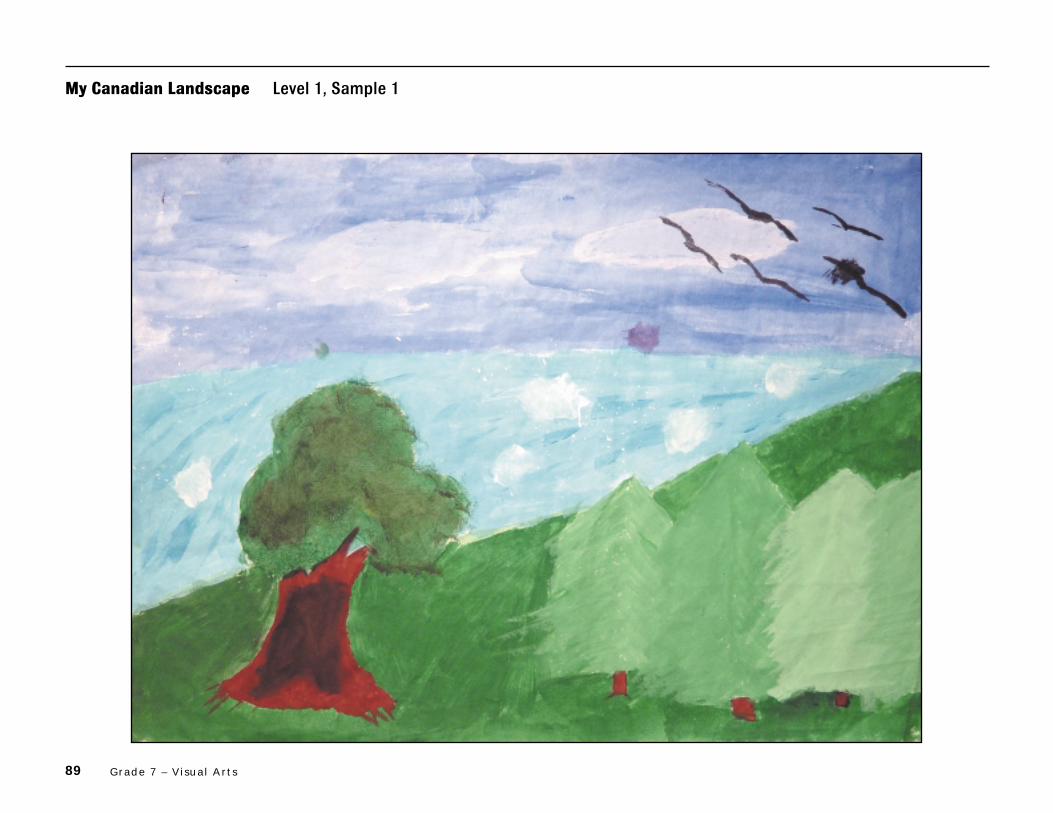
89 Grade 7 – Visual Arts
My Canadian Landscape Level 1, Sample 1

90 The Ontar io Curr iculum – Exemplars , Grades 2, 5 , and 7: The Arts
Teacher’s Notes
Understanding of Concepts
– The student demonstrates limited understanding of the use of repetition of
colour and shape to create rhythm. He or she uses the repeated shapes of
the clouds and of the whitecaps on the water to indicate movement. Other
shapes lack emphasis because of the predominant use of cool colours.
– The student demonstrates limited understanding of the principles of design.
He or she attempts to create a balance between the blue of the sky and
water and the green of the trees and grass. However, there is little variety
in the choice of colours, which are mostly cool and are used with a limited
range of value.
Critical Analysis and Appreciation
– The student explains with limited effectiveness how colour and shape are
used to convey a sense of rhythm. He or she links the rhythm achieved in the
painting with the effects created by the brushwork and the smoothness of
shapes (e.g., “I went all in one way strokes. I used Shape to acheive Rhythm is
the smoothness of the water and all the objects in my painting.”). However,
the student does not refer to specific colours and does not identify other
techniques used.
Performance and Creative Work
– The student uses colour with limited effectiveness to produce a painting
that depicts a Canadian landscape. He or she makes little attempt to blend
colours and uses a limited range of values for the predominant colours in
the painting.
– The student uses paint and brush techniques with limited effectiveness to
blend colours for a variety of painted effects. He or she applies layering of
colours and overlapping brush strokes (e.g., combines splattering and sim-
ple brush strokes in the water portion of the painting), but uses these tech-
niques in a limited way to blend colours.

91 Grade 7 – Visual Arts
Communication
– The student makes limited use of appropriate vocabulary and art terminology
when describing his or her art work. For example, the student describes in
only simple terms his or her use of brush strokes to create rhythm (e.g., “I
used my brush, I went all In one way strokes.”).
CommentsThe student’s painting shows limited use of colour and shape to convey a sense
of rhythm, and the written response demonstrates limited use of appropriate
language to explain the techniques used to create rhythm in the painting. The
student does not communicate his or her understanding of concepts with
clarity or precision.
Next StepsIn order to improve his or her performance, the student needs to:
• experiment with blending colours;
• balance warm and cool colours;
• edit his or her written work to express ideas more clearly;
• proofread his or her written work carefully to eliminate errors in grammar
and punctuation.

92 The Ontar io Curr iculum – Exemplars , Grades 2, 5 , and 7: The Arts
My Canadian Landscape Level 1, Sample 2
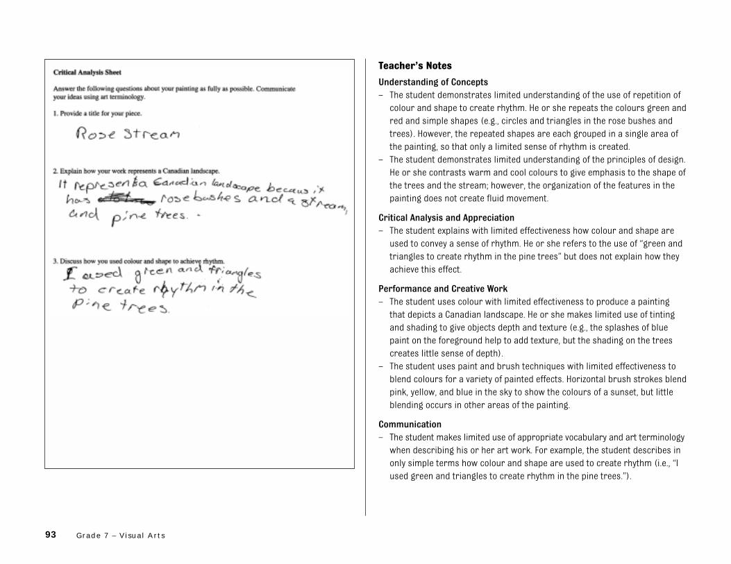
93 Grade 7 – Visual Arts
Teacher’s Notes
Understanding of Concepts
– The student demonstrates limited understanding of the use of repetition of
colour and shape to create rhythm. He or she repeats the colours green and
red and simple shapes (e.g., circles and triangles in the rose bushes and
trees). However, the repeated shapes are each grouped in a single area of
the painting, so that only a limited sense of rhythm is created.
– The student demonstrates limited understanding of the principles of design.
He or she contrasts warm and cool colours to give emphasis to the shape of
the trees and the stream; however, the organization of the features in the
painting does not create fluid movement.
Critical Analysis and Appreciation
– The student explains with limited effectiveness how colour and shape are
used to convey a sense of rhythm. He or she refers to the use of “green and
triangles to create rhythm in the pine trees” but does not explain how they
achieve this effect.
Performance and Creative Work
– The student uses colour with limited effectiveness to produce a painting
that depicts a Canadian landscape. He or she makes limited use of tinting
and shading to give objects depth and texture (e.g., the splashes of blue
paint on the foreground help to add texture, but the shading on the trees
creates little sense of depth).
– The student uses paint and brush techniques with limited effectiveness to
blend colours for a variety of painted effects. Horizontal brush strokes blend
pink, yellow, and blue in the sky to show the colours of a sunset, but little
blending occurs in other areas of the painting.
Communication
– The student makes limited use of appropriate vocabulary and art terminology
when describing his or her art work. For example, the student describes in
only simple terms how colour and shape are used to create rhythm (i.e., “I
used green and triangles to create rhythm in the pine trees.”).
94 The Ontar io Curr iculum – Exemplars , Grades 2, 5 , and 7: The Arts
CommentsThe student attempts to create emphasis through the use of contrasting
colours, and he or she experiments with depth, as shown in the trees, the
background, and the narrowing stream. Shapes are repeated in a limited way,
and there is little blending of paint except in the sky. The student demonstrates
limited ability to communicate his or her understanding of concepts.
Next StepsIn order to improve his or her performance, the student needs to:
• include more repetition of colour and shape to create rhythm;
• experiment with creating different values of colour;
• explain more clearly how rhythm is created in the painting;
• make greater use of art terminology in discussing his or her art work.

95 Grade 7 – Visual Arts
My Canadian Landscape Level 2, Sample 1

96 The Ontar io Curr iculum – Exemplars , Grades 2, 5 , and 7: The Arts
Teacher’s Notes
Understanding of Concepts
– The student demonstrates some understanding of the use of repetition of
colour and shape to create rhythm. He or she uses repeated vertical brush
strokes and paints a range of pinks to create rhythm and movement in the
sky. Some understanding of the way this effect was achieved is indicated in the
written response (e.g., “A colour pattern in my painting is how I did the
fethering technic with the yellow, orange, and pinkish purple.”).
– The student demonstrates some understanding of the principles of design.
He or she attempts to create balance by using cool colours for the water
and warm colours for the land and sky. Colours of different hue and inten-
sity have been arranged in the composition to create an emphasis on the
cliff and the movement of the waves.
Critical Analysis and Appreciation
– The student explains with some effectiveness how colour and shape are used
to convey a sense of rhythm. He or she links the rhythm achieved in the
painting with brush techniques, the use of “sharp edges”, and colour blend-
ing (e.g., “A shape rhythm also in my painting is sharp edges of the horizon”).
Performance and Creative Work
– The student uses colour with some effectiveness to produce a painting that
depicts a Canadian landscape. He or she uses contrasting warm and cool
colours, with some tints and shades, to give definition to the land, sky, and
water in the painting.
– The student uses paint and brush techniques with some effectiveness to
blend colours for a variety of painted effects. He or she demonstrates some
proficiency in blending colours to create a desired effect (e.g., to show the
water breaking against the cliff).
Communication
– The student makes some use of appropriate vocabulary and art terminology
when describing his or her art work. For example, the student uses some
appropriate terms in describing the techniques used in the painting (e.g., “A
colour pattern in my painting is how I did the fethering technic”; “I blended
different colours”).

97 Grade 7 – Visual Arts
CommentsThe student creates some balance and movement in the painting by juxtaposing
warm and cool colours, and he or she blends some tints and shades. The student
demonstrates some ability to communicate his or her understanding of the
techniques used to achieve rhythm.
Next StepsIn order to improve his or her performance, the student needs to:
• include more shapes to create rhythm;
• experiment with a variety of brush techniques;
• review art terminology to express his or her ideas more effectively;
• proofread his or her written work carefully to eliminate spelling errors.

98 The Ontar io Curr iculum – Exemplars , Grades 2, 5 , and 7: The Arts
My Canadian Landscape Level 2, Sample 2

99 Grade 7 – Visual Arts
Teacher’s Notes
Understanding of Concepts
– The student demonstrates some understanding of the use of repetition of
colour and shape to create rhythm. Repeated downward curving brush
strokes convey a sense of the movement of the water, and the use of light
and dark shades of green give depth to the foliage of the trees. The written
response indicates some understanding of how rhythm is created (i.e., “The
Swirling Blue at the end of the waterfall . . . [is] effective”).
– The student demonstrates some understanding of the principles of design.
He or she emphasizes the waterfall through the use of contrasting colours
and its central position in the painting. The way the vertical shape of the
tree trunks complements the jagged line at the top of the cliffs indicates
some understanding of how unity can be achieved.
Critical Analysis and Appreciation
– The student explains with some effectiveness how colour and shape are
used to convey a sense of rhythm. He or she identifies the circular brush
strokes at the bottom of the waterfall and the varied tones of green in the
trees as effective elements in the painting (i.e., “The Swirling Blue at the end
of the waterfall and the green leaves are effective”).
Performance and Creative Work
– The student uses colour with some effectiveness to produce a painting that
depicts a Canadian landscape. He or she uses contrasting warm and cool
colours, for the cliff and the water, to emphasize the shape and velocity of
the waterfall, while the red-brown of the tree trunks helps to define the
jagged line of the cliff tops.
– The student uses paint and brush techniques with some effectiveness to
blend colours for a variety of painted effects. He or she uses a thin applica-
tion of paint to cover the sky and the foliage of the trees so that they recede
into the background, allowing the more heavily painted waterfall to surge
into the foreground. The blending of yellow at the bottom of the cliffs helps
to define the edge of the water.

100 The Ontar io Curr iculum – Exemplars , Grades 2, 5 , and 7: The Arts
Communication
– The student makes some use of appropriate vocabulary and art terminology
when describing his or her art work. For example, the student uses some
appropriate terms in explaining the effects created by colour temperature
(e.g., the blue of the waterfall and the green of the leaves “are effective on
the painting because they bring a cool feeling”).
CommentsThe student’s art work shows some ability to create rhythm through repetition
of colour and shape and some understanding of principles of design, especially
in the upper portion of the painting. The student uses some art terminology
with some accuracy.
Next StepsIn order to improve his or her performance, the student needs to:
• experiment with different shading and blending techniques;
• extend his or her use of art terminology in discussing art work;
• proofread his or her written work carefully to eliminate spelling errors.
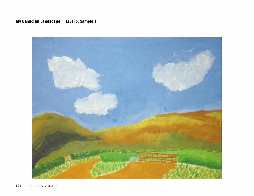
101 Grade 7 – Visual Arts
My Canadian Landscape Level 3, Sample 1

102 The Ontar io Curr iculum – Exemplars , Grades 2, 5 , and 7: The Arts
Teacher’s Notes
Understanding of Concepts
– The student demonstrates considerable understanding of the use of repetition
of colour and shape to create rhythm. He or she creates movement in the
foreground through repetition of colour, shape, line, and texture (e.g., flow-
ing lines, curved shapes, and stippling are used in painting the fields and
hillside so that the viewer’s eye moves naturally from foreground to back-
ground).
– The student demonstrates considerable understanding of the principles of
design. There is a strong sense of balance throughout the painting. The stu-
dent arranges areas of colour and shapes to give equal importance to the
land, with its contrasting shades of green, orange, and yellow, and to the
blue sky, with its white clouds.
Critical Analysis and Appreciation
– The student explains with considerable effectiveness how colour and shape
are used to convey a sense of rhythm. He or she provides clear and concise
explanations of how the colour combinations used create rhythm (e.g., “The
right portion of my painting has more intence and warm colours because I
ment for the sun to be shining down from the left.”; “The way I painted the
left hill makes it seem closer.”).
Performance and Creative Work
– The student uses colour with considerable effectiveness to produce a paint-
ing that depicts a Canadian landscape. He or she effectively contrasts and
blends colours and uses different values both to highlight specific features
in the foreground and to convey a sense of the broad expanse of the land
and the sky.
– The student uses paint and brush techniques with considerable effective-
ness to blend colours for a variety of painted effects. The student skilfully
combines stippling, shading, and dry brush techniques to create variety,
depth, and movement in the painting (e.g., he or she conveys the effect of
sun and shadow on the hillside by varying the intensity of colours and suc-
cessfully blending cool colours into the warm colours).

103 Grade 7 – Visual Arts
Communication
– The student makes considerable use of appropriate vocabulary and art
terminology when describing his or her art work. For example, the student
accurately describes the value, intensity, and temperature of the colours in
the painting (e.g., “The right portion of my painting has more intence and
warm colours”; “The other side has . . . dark cool colours because they are
in shadow.”).
CommentsThe student combines areas of colour and shapes to produce a painting that
effectively balances the two main aspects of the landscape: land and sky.
Skilful colour blending and use of colour contrasts create a considerable
sense of rhythm in the lower part of the painting. The student describes
portions of his or her painting, using appropriate art terminology, with clarity
and accuracy.
Next StepsIn order to improve his or her performance, the student needs to:
• experiment with blending additional colours to enhance effects created in
his or her art work;
• extend his or her understanding and use of art terminology;
• proofread his or her written work carefully to eliminate spelling errors.

104 The Ontar io Curr iculum – Exemplars , Grades 2, 5 , and 7: The Arts
My Canadian Landscape Level 3, Sample 2

105 Grade 7 – Visual Arts
Teacher’s Notes
Understanding of Concepts
– The student demonstrates considerable understanding of the use of repeti-
tion of colour and shape to create rhythm. In painting the mountains, he or
she intersperses the green of the foreground so that the viewer’s eye moves
up and down the scene depicted. Repetition of triangular shapes, accentu-
ated by dark outlines in the mountains, contributes to the sense of rhythm
in the painting.
– The student demonstrates considerable understanding of the principles of
design. He or she effectively balances the cool colours of the grass and
water and the warm colours of the sky to emphasize the mountains as the
focal point of the painting. The written response indicates considerable
understanding of how balance contributes to the overall effect of the art
work (e.g., “I really concentrated on the balance of my painting, so it doesn’t
look like some parts are over worked and others are plain.”).
Critical Analysis and Appreciation
– The student explains with considerable effectiveness how colour and shape
are used to convey a sense of rhythm. He or she provides a detailed descrip-
tion of the varied effects created by different colour qualities (e.g., “By using
value in my painting, you could see some effects of lightness or darkness
happening. Water in my painting is translucent and rocks are opaque.”).
Performance and Creative Work
– The student uses colour with considerable effectiveness to produce a paint-
ing that depicts a Canadian landscape. He or she demonstrates capable use
of value and intensity to create interest and variety in the definition of
shapes in the painting (e.g., the student has made a successful attempt to
combine warm and cool grays in the mountains by stippling the paint darkly
on one side and lightly on the other).
106 The Ontar io Curr iculum – Exemplars , Grades 2, 5 , and 7: The Arts
– The student uses paint and brush techniques with considerable effective-
ness to blend colours for a variety of painted effects. The student capably
distributes colour and applies varied brush techniques to create depth and
movement in the painting (e.g., he or she positions most of the reds and
oranges at the top and then blends them downwards to give an impression
of distance and depth in the mountains; the stippling used to apply red and
green to the mountain sides adds to this effect).
Communication
– The student makes considerable use of appropriate vocabulary and art
terminology when describing his or her art work. For example, the student
describes in considerable detail various techniques used in painting differ-
ent parts of the landscape (e.g., “I used combination of hues . . . ”; “Sky is
translucent . . . ”; “Texture was used in many places such as the rocks,
water . . . ”).
CommentsThe student makes considerable use of such visual characteristics as colour
blending and repetition of colour and shape to convey a sense of rhythm in the
painting. He or she demonstrates considerable understanding of painting
techniques and elements of design. The student provides a detailed description
of his or her painting, using appropriate art terminology with clarity and
accuracy.
Next StepsIn order to improve his or her performance, the student needs to:
• add more variety of shapes and subject matter;
• experiment with combining additional colours;
• review specific visual arts terminology to express ideas more effectively;
• proofread his or her written work carefully to eliminate errors in grammar.

107 Grade 7 – Visual Arts
My Canadian Landscape Level 4, Sample 1

108 The Ontar io Curr iculum – Exemplars , Grades 2, 5 , and 7: The Arts
Teacher’s Notes
Understanding of Concepts
– The student demonstrates thorough understanding of the use of repetition
of colour and shape to create rhythm. The mirroring of mountain and sky in
the surface of the lake, combined with the placement of colour on the diago-
nal, gives the art work a strong sense of rhythm. The student creates a clear
centre of interest, while leading the viewer’s eye to features throughout the
painting.
– The student demonstrates thorough understanding of the principles of design.
He or she depicts objects in proportion according to their placement in the
painting (e.g., the chair in the foreground, the mountain in the distance), and
uses colour blending and contrasts to create a landscape that possesses
both variety and unity.
Critical Analysis and Appreciation
– The student explains with a high degree of effectiveness, and with insight,
how colour and shape are used to convey a sense of rhythm. He or she pro-
vides a thoughtful discussion of the way in which tonal variations of light
and dark colours are applied in the painting, relating the effects created to
specific techniques used (e.g., “The farther away, the lower the intensity. . . .
used shading to try to create mouvement. . . . made depth by making the
tops of things brighter . . . the bottoms the darkest”).
Performance and Creative Work
– The student uses colour with a high degree of effectiveness to produce a
painting that depicts a Canadian landscape. He or she skilfully uses value,
intensity, and temperature to create focal points in the scene (e.g., the var-
ied tones of red and gray on the mountain give prominence to the peak
bathed in sunlight, and the contrast between warm and cool colours in the
foreground makes the back of the chair stand out clearly).
– The student uses paint and brush techniques with a high degree of effective-
ness to blend colours for a variety of painted effects. He or she skilfully
varies tones of colour to convey the effect of sunlight and shadow on the
mountain, and effectively blends colours in painting the sky and the reflec-
tion in the lake.

109 Grade 7 – Visual Arts
Communication
– The student makes extensive use of appropriate vocabulary and art termi-
nology when describing his or her art work. For example, the student
describes, with a high degree of clarity, the key elements of design used and
their intended effects (e.g., “value to make the picture . . . real”; “shading . . .
to create mouvement”; “depth . . . to show where light is hitting the object”).
CommentsThe student demonstrates a thorough command of paint and brush techniques
to create a powerful depiction of a Canadian landscape. He or she skilfully
blends colours and effectively contrasts areas of light and shadow. The student’s
art work contains striking visual effects, and its overall composition conveys a
strong sense of rhythm.
Next StepsIn order to improve his or her performance, the student needs to:
• refine his or her painting techniques by using a wider variety of brush
strokes;
• review specific visual arts terminology and use them to describe his or her
painting techniques more precisely.

110 The Ontar io Curr iculum – Exemplars , Grades 2, 5 , and 7: The Arts
My Canadian Landscape Level 4, Sample 2

111 Grade 7 – Visual Arts
Teacher’s Notes
Understanding of Concepts
– The student demonstrates thorough understanding of the use of repetition
of colour and shape to create rhythm. The blending of different tones of
green and the repeated triangular shape of the trees bring a strong sense
of rhythm and movement to the art work. This effect is reinforced by the
shimmering reflections in the water in the foreground. In the critical analy-
sis, the student describes how the colours used will affect the viewer’s
response (e.g., “The colour used most consistently in my painting is cool
colours so that makes your eyes follow almost the same pattern, of cool
patterns.”).
– The student demonstrates thorough understanding of the principles of
design. He or she combines a varied blend of colour and shape with finely
tuned painting techniques to create a composition that has a strong sense
of movement and successfully achieves a balance among the main features
of the landscape (e.g., the reflections in the water draw the viewer’s eye
upwards onto the land, where the gray mass of the rocks accentuates the
impression of depth in the trees conveyed by the varied tones of green).
Critical Analysis and Appreciation
– The student explains with a high degree of effectiveness, and with insight,
how colour and shape are used to convey a sense of rhythm. He or she
describes in detail the way the viewer’s eye moves over the painting as a
result of the shapes and colours used in specific parts of the composition
(e.g., “The painting moves upwards. But then sometimes it can also make
your eyes goes towards the right. The lake has small waves that move
towards the right.”).
Performance and Creative Work
– The student uses colour with a high degree of effectiveness to produce a
painting that depicts a Canadian landscape. He or she demonstrates profi-
cient use of colour as seen in the extensive shading of green that creates a
sense of depth in the trees, and in the use of “dull green near the lake [to
make] the land look higher and further than the lake”. The gray shading on
the boulders gives them a feeling of mass and solidity that enhances the
effect achieved in the trees.

112 The Ontar io Curr iculum – Exemplars , Grades 2, 5 , and 7: The Arts
– The student uses paint and brush techniques with a high degree of effective-
ness to blend colours for a variety of painted effects. He or she demonstrates
a high degree of skill in using the dry brush technique to create varied tints
and shades (e.g., the trees and water are expertly detailed to provide tex-
ture and interest).
Communication
– The student makes extensive use of appropriate vocabulary and art terminol-
ogy when describing his or her art work. For example, the student effectively
describes how depth and movement have been achieved in the painting
(e.g., “the alternating of intensity from dull shades of green to bright
shades of green”; “The dull green near the lake makes the land look higher
and further”).
CommentsThe student uses a highly proficient brush technique, as is demonstrated by
the varied effects created throughout the background. He or she demonstrates
significant control of the medium in painting the large gray boulders and their
reflections in the water. The student skilfully creates, through colour value and
movement, a highly atmospheric depiction of a Canadian landscape.
Next StepsIn order to improve his or her performance, the student needs to:
• review specific visual arts terminology to enhance his or her description of
painting techniques;
• proofread his or her written work carefully to eliminate errors in grammar
and sentence structure.

113
1
Title: My Canadian Landscape
Time Requirement: 280–420 minutes (over several class periods)
Introductory activities• Pre-task 1: 30–60 minutes• Pre-task 2: 60–80 minutes• Pre-task 3: 30–60 minutes
Exemplar task• Part 1: 100–140 minutes• Part 2: 60–80 minutes
Description of the Task
Part 1Each student will create a painting of a Canadian landscape that conveys a sense of rhythmthrough the use of colour and shape. (Rhythm, or a sense of movement, is created by therepetition of colour and shape throughout the work.) Realism in the subject matter is not arequirement of this task. Students will use a variety of paint and brush techniques to blendcolours.
Part 2Students will provide a written critical analysis of their work. They will explain how their paintingrepresents a Canadian landscape and discuss how they used colour and shape to create rhythm inthe painting.
Concepts central to this task are the following:
• Each individual brings his or her own knowledge and experience to works of art.
• Colour and rhythm can be vehicles for non-verbal communication.
• Rhythm is a unifying component of painting and the other arts that acts to create a sense ofmovement.
The Arts Exemplar TaskGrade 7 – Visual Arts
Teacher Package
Teacher Package

114 The Ontar io Curr iculum – Exemplars , Grades 2, 5 , and 7: The Arts
2
Student ScenarioPresent the following scenario and instructions to the students:
The National Gallery of Canada in Ottawa is opening a new wing, which will be dedicated toCanadian artists. Along with paintings by the great Canadian past masters, the new wing willdisplay works by contemporary Canadian artists. To celebrate the opening of the new wing, therewill be an exhibition of landscape paintings from the nineteenth century to the present. You havebeen asked to submit a painting of a Canadian landscape to be considered for this exhibition.
A successful piece of work will:
• use repetition of colour and shape to create rhythm;
• show blending of colours through the use of paint and brush techniques to create a desiredeffect (i.e., to create rhythm);
• be an interpretation of a Canadian landscape but will not necessarily include realism in thesubject matter.
You will be expected to introduce your work to the curator through a piece of writing that explainshow your work represents a Canadian landscape and discusses how you used colour and shape tocreate rhythm.
Curriculum Expectations Addressed in the Task
This task gives students the opportunity to demonstrate achievement of all or part of each of the following expectations selected from the Visual Arts strand for Grade 7 in The OntarioCurriculum, Grades 1–8: The Arts, 1998. Note that the codes that follow the expectations relateto the Ministry of Education’s Curriculum Unit Planner (CD-ROM).
Students will:
1. identify the principles of design (emphasis, rhythm, balance, unity, variety, proportion),and use them in ways appropriate for this grade when producing and responding toworks of art (7a36);
2. use correctly vocabulary and art terminology associated with the specific expectationsfor this grade (7a38);
3. describe how the repetition of elements is used to create rhythm (7a39);
4. use the appropriate tools, materials, and techniques correctly, selecting those that willcreate the desired effect (7a44);
5. produce two- and three-dimensional works of art (i.e., works involving media andtechniques used in drawing, painting, sculpting, printmaking) that communicate arange of thoughts, feelings, and experiences for specific purposes and to specificaudiences (7a46);
6. explain how the principles of design are used to organize a work, communicatefeelings, and convey ideas, using appropriate vocabulary and terminology (7a50).

115Grade 7 – Visual Arts
*The rubric is reproduced on page 88 of this document.
3
Teacher Instructions
Prior Knowledge and Skills RequiredTo complete the task, students should have some experience with, or some knowledge or skillsrelated to, the following:
• using tempera paint to create desired effects (e.g., transparency, opacity, texture, blendedtones, etc.) when painting pictures
• using colour schemes
• identifying colour relationships (e.g., understanding that the combination of a primary and a secondary colour will create a tertiary colour)
Assessment and EvaluationThe rubric* provided with this exemplar task is to be used to assess students’ work. The rubric is based on the achievement levels outlined on page 9 of The Ontario Curriculum, Grades 1–8:The Arts, 1998.
Introduce the rubric to the students at the beginning of the exemplar task. Review the rubric with the students to ensure that each student understands the criteria and the descriptions forachievement at each level. Allow ample class time for a thorough reading and discussion of theassessment criteria outlined in the rubric.
Some students may perform below level 1. Although the rubric does not include descriptions ofachievement below level 1, the characteristics of these students’ work should be reviewed inrelation to the criteria outlined in the rubric.
AccommodationsAccommodations that are normally provided in the regular classroom for students with specialneeds should be provided in the administration of the exemplar task.
Materials and Resources RequiredStudents should be provided with the following materials:– a colour image of a Canadian landscape painting (e.g., Credit Forks by A. J. Casson)– another landscape painting (selected by the teacher)– 18" x 24" (45.72 cm x 60.96 cm) white paper– various sizes of brushes (e.g., #2, #8, #10)– tempera paint (primary colours – red, yellow, blue; secondary colours – green, purple, orange;
and black and white)– palettes for mixing paint (waxed paper, plastic palettes, egg cartons, or small plastic
containers may be used)– water containers (one per student, if possible)– newsprint/newspaper to cover desktops– pencils– glue and scissors– 9" x 12" (22.86 cm x 30.48 cm) coloured construction paper

116 The Ontar io Curr iculum – Exemplars , Grades 2, 5 , and 7: The Arts
4
Task Instructions
Introductory ActivitiesThe pre-tasks are designed to review and reinforce the skills and concepts that students will beusing in the exemplar task.
Pre-task 1: Art Appreciation (30–60 minutes)
1. Read the student scenario to the students and post it in the classroom. Explain that the skillsbeing developed in the pre-tasks will be used in the exemplar task.
2. Display a copy of a Canadian landscape painting (e.g., Credit Forks by A. J. Casson).
3. Review with the students terms such as hue, intensity, colour, warm and cool colours, and valueas they apply to this painting (see the Glossary in Appendix C for definitions).
4. Review the idea of rhythm in art as illustrated in this painting.
5. Use the following as a guide to analyse the work with the students:– Describe the colours the artist has used. Describe their intensity, value, and temperature.– Describe areas of colour and shapes that are repeated throughout the painting.– Describe the path your eye follows from one area of colour to the next.– How does the artist effectively create a sense of rhythm through the use of colour and
shape?
6. Repeat the activity with another landscape painting of your choice and have the studentsrecord their responses on the Landscape Painting Analysis sheet in Appendix A.
Pre-task 2: Skills Activities Experimentation (60–80 minutes)
1. Review the blending of tempera paints to create areas of colour that vary in value andintensity.
2. Tell the students to experiment with blending colour, filling a 12" x 18" piece of paper.Encourage them to experiment with applications of paint (e.g., using opaque and translucentcolours) and with creating textured effects with brush strokes (e.g., stippling, splatter painting,dry brushing).
3. Remind the students not to paint recognizable objects but rather to strive for a variety ofeffects and colours.
4. Allow time for the paintings to dry.
5. Discuss the paintings with the students. Have them explain the applications and thetechniques they used. Ask them to consider how they will use these applications andtechniques in their landscape painting.

117Grade 7 – Visual Arts
5
Pre-task 3: Creating Rhythm (30–60 minutes)
1. Tell the students to trace or draw several copies (10 or more) of the same shape (e.g., circle,triangle) on the front of their painting from pre-task 2. Make sure that they vary the size ofthe shapes.
2. Have the students cut out the shapes and arrange them on a piece of coloured constructionpaper. Encourage students to overlap the shapes to create rhythm.
3. Tell the students to glue the shapes in place.
4. Discuss with the students how they created rhythm in their creations. Have them explain thetechniques they used (e.g., repetition of colour, textured effects, transitions in intensity and/orvalue). Ask them to consider how they will use these techniques in their landscape painting.
Exemplar TaskEach student’s painting and completed Critical Analysis sheet (Appendix B) are to be submittedfor marking.
Part 1 (100–140 minutes)
1. Review the student scenario with the students.
2. Present the task rubric to the students.
3. Instruct the students to use their accumulated knowledge from the pre-tasks to create alandscape painting, incorporating the elements of colour and shape to achieve rhythm.
Part 2 (60–80 minutes)
1. When their paintings are finished, have the students complete the Student Painting CriticalAnalysis sheet (Appendix B).
2. Remind the students that they are to analyse their own paintings.

118 The Ontar io Curr iculum – Exemplars , Grades 2, 5 , and 7: The Arts
6
Appendix A: Landscape Painting Analysis
Answer the following questions in recording your responses to the landscape painting you have analysed.
1. Describe the colours the artist has used. Describe their intensity, value, and temperature.
2. Describe areas of colour and shapes that are repeated throughout the painting.
3. Describe the path your eye follows from one area of colour to the next.
4. How does the artist effectively create a sense of rhythm through the use of colour and shape?

119Grade 7 – Visual Arts
7
Appendix B: Student Painting Critical Analysis
Answer the following questions about your painting as fully as possible. Communicate your ideas using art terminology.
1. Provide a title for your piece.
2. Explain how your work represents a Canadian landscape.
3. Discuss how you used colour and shape to achieve rhythm.
120 The Ontar io Curr iculum – Exemplars , Grades 2, 5 , and 7: The Arts
8
Appendix C: Glossary
Balance. A principle of design. A feeling ofbalance results when the elements of designare arranged to create the impression ofequality in weight or importance.
Colour. An element of design. Colour is theparticular hue that is seen when light isreflected off an object.
Cool colours. Colours that suggest coolness(e.g., blue, green, purple). These colours tendto recede and appear smaller in an art work.
Elements of design. Fundamentalcomponents of art works. They includecolour, line, texture, shape, form, and space.
Emphasis. A principle of design. Emphasismay be defined as the special attention orimportance given to one part or element in anart work. Emphasis can be achieved throughplacement, contrast, size, etc.
Hue. The common name of a colour (e.g., red).
Intensity. The brightness or dullness of acolour. Pure colour is the most intense; addingblack or white will decrease its intensity.
Movement. A principle of design. Movementis the way in which the elements of design areorganized so that the viewer’s eye is ledthrough the work of art in a systematic way.
Opaque colour. A flat colour, nottransparent.
Principles of design. Principles or guidelinesused by artists to organize the visual elementsof an art work. They include balance,emphasis, rhythm, unity, movement, variety,harmony, and proportion.
Rhythm. A principle of design. Rhythminvolves the repetition of elements to createthe illusion of movement.
Shade. A dark value of a colour obtained byadding black to a pure colour.
Temperature of colour. Generally speaking,colours are either cool or warm.
Texture. An element of design. Texture is thefeel or appearance of an object or material.
Tint. A light value of a colour obtained byadding white to a pure colour.
Translucent colour. A semi-transparentcolour.
Unity. A principle of design. Unity is thecoherence of a work that gives the viewer the feeling that all the parts of the piece areworking together.
Value. The lightness or darkness of a colour.
Variety. A principle of design. Achievingvariety involves the use of differences orcontrasts.
Warm colours. Colours that suggest warmth(e.g., red, orange, yellow). These colours tendto come forward and appear bigger in an artwork.
The Ministry of Education wishes to acknowledge thecontributions of the many individuals, groups, andorganizations that participated in the developmentand refinement of this resource document.

Ministry of Education
Samples of Student Work:A Resource for Teachers
The Ontario Curriculum – ExemplarsGrades 2, 5, and 7
ISBN 0-7794-6655-1
03-273
© Queen’s Printer for Ontario, 2004
Printed on recycled paper
Visual Arts
The Ministry of Education wishes to acknowledge thecontributions of the many individuals, groups, andorganizations that participated in the developmentand refinement of this resource document.
Recommended