Thinking Outside the Box ThatKeeps Moving
Tips and Tricks for a Responsive Web
/lukebrooker
ResponsiveTrivia

Round ÕFoundations
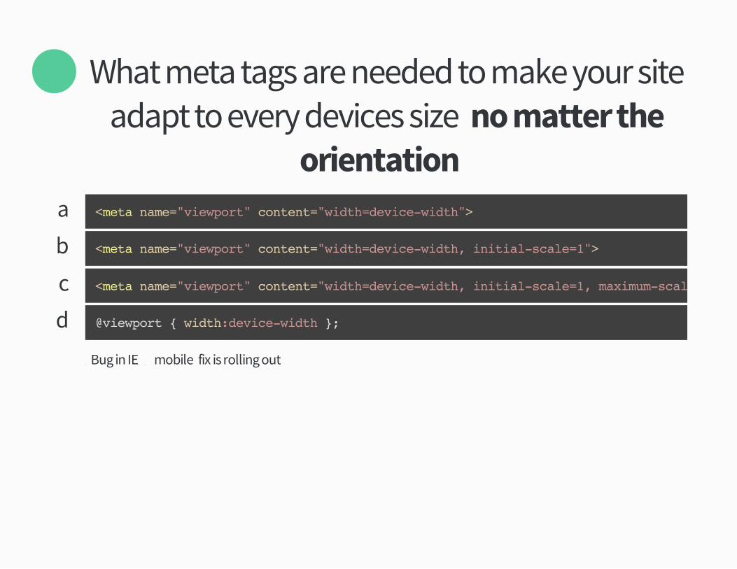
What meta tags are needed to make your siteadapt to every devices sizeý no matter the
orientation�
Õ
aü <meta name="viewport" content="width=device-width">
bü <meta name="viewport" content="width=device-width, initial-scale=1">
cü <meta name="viewport" content="width=device-width, initial-scale=1, maximum-scale=1">
dü
%Bug in IEÕÔ mobileý fix is rolling out
@viewport { width:device-width };
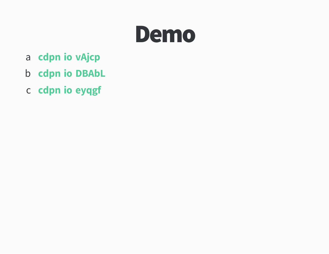
Demoaü cdpnüio!vAjcp
bü cdpnüio!DBAbL
cü cdpnüio!eyqgf
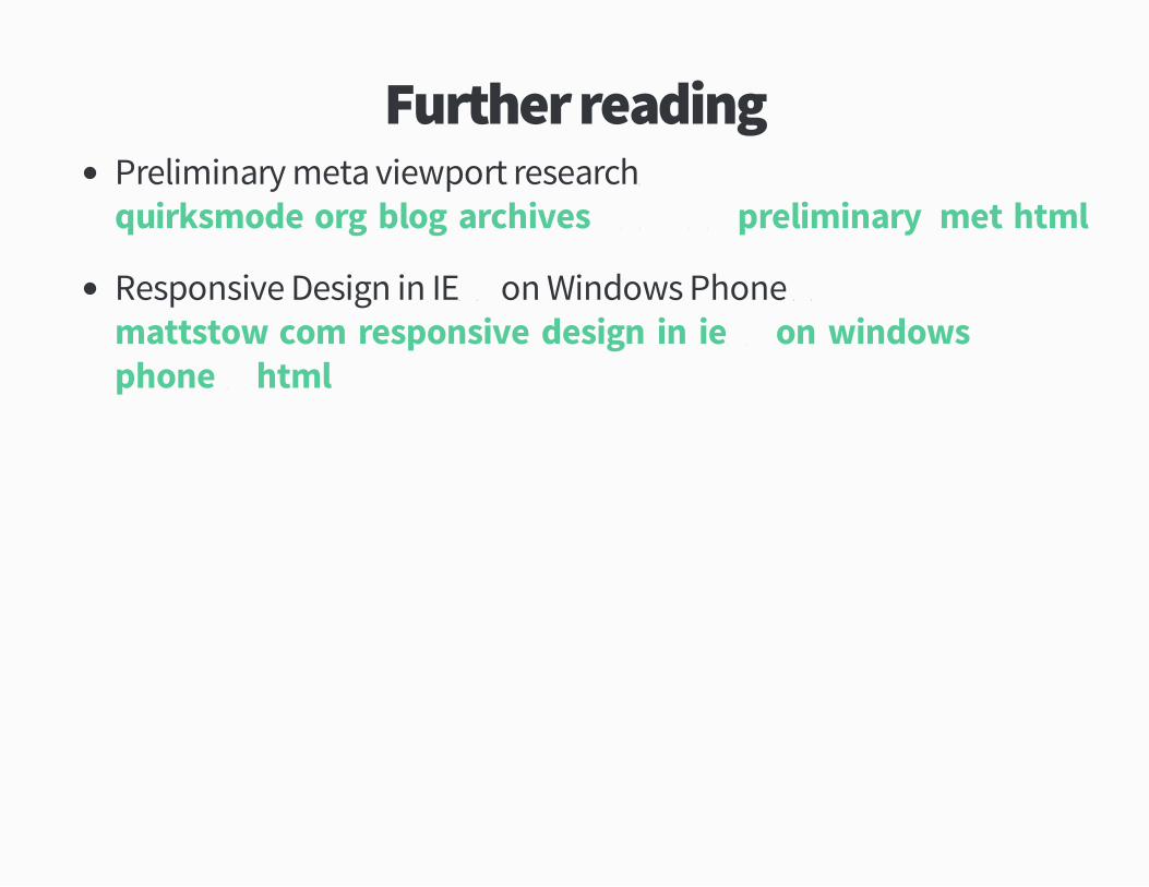
Further readingPreliminary meta viewport researchþ
Responsive Design in IEÕÔ on Windows Phone Üþ
quirksmodeüorg!blog!archives!ÖÔÕ×!ÕÔ!preliminary�metühtml
mattstowücom!responsive�design�in�ieÕÔ�on�windows�phone�Üühtml
According to Appleý what is the minimumsize a touch target should be�
Ö
aü ØÔpx
bü ØØpx
cü ØÙpx
dü ÙÛpx
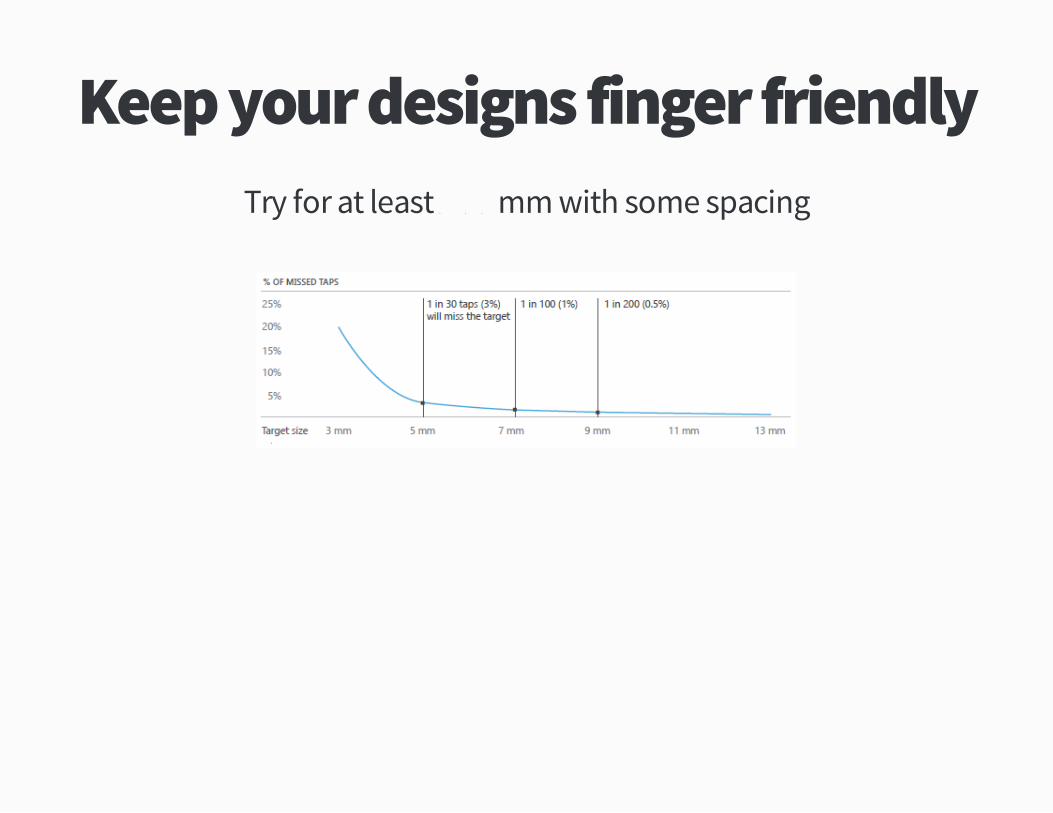
Keep your designs finger friendlyTry for at least Ü�ÕÔmm with some spacing
Further ReadingTouch Target Sizesþ
On Touch Target Sizeþ
lukewücom!ff!entryüasp�ÕÔÜÙ
mayaücom!the�feed!on�touch�target�size
Tipþ Build components
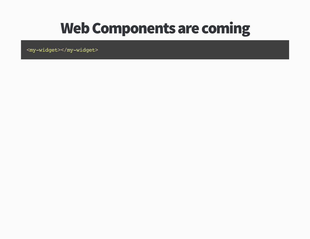
Web Components are coming<my-widget></my-widget>
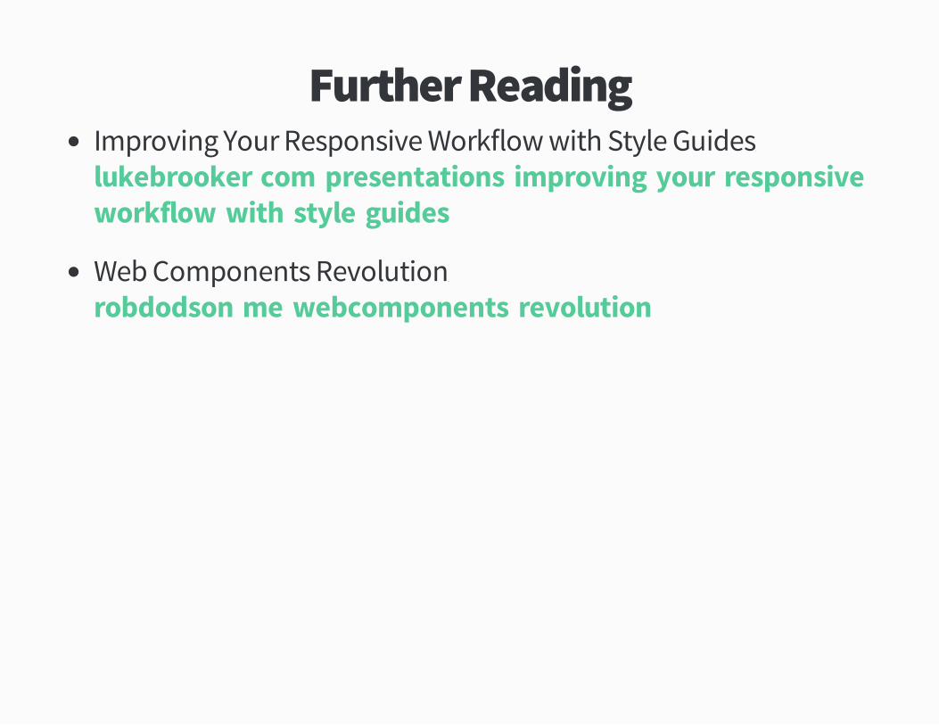
Further ReadingImproving Your Responsive Workflow with Style Guidesþ
Web Components Revolutionþ
lukebrookerücom!presentations!improving�your�responsive�workflow�with�style�guides
robdodsonüme!webcomponents�revolution
Tipþ Create guidelinesand stick to them
Save yourself from yourself
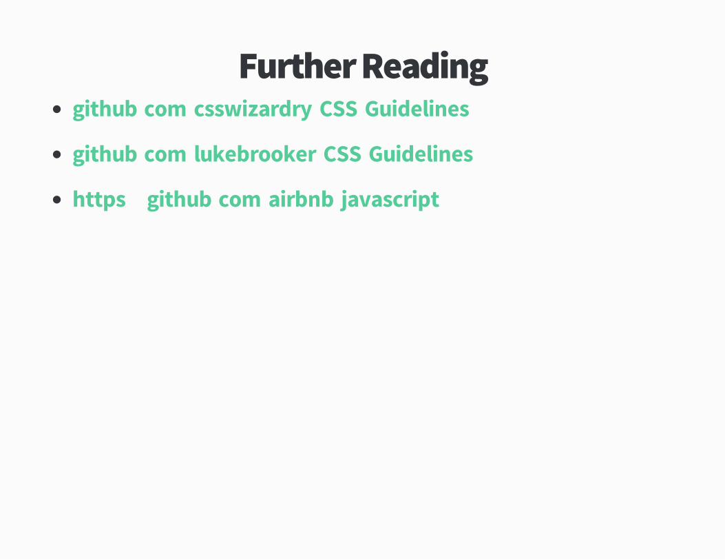
Further Readinggithubücom!csswizardry!CSS�Guidelines
githubücom!lukebrooker!CSS�Guidelines
httpsþ!!githubücom!airbnb!javascript

Round ÖAdaption
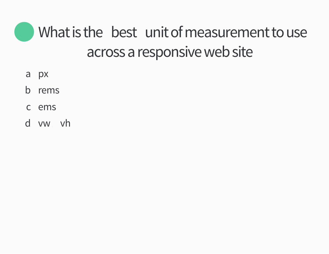
What is the �best� unit of measurement to useacross a responsive web site�
Õ
aü px
bü rems
cü ems
dü vw Ó vh
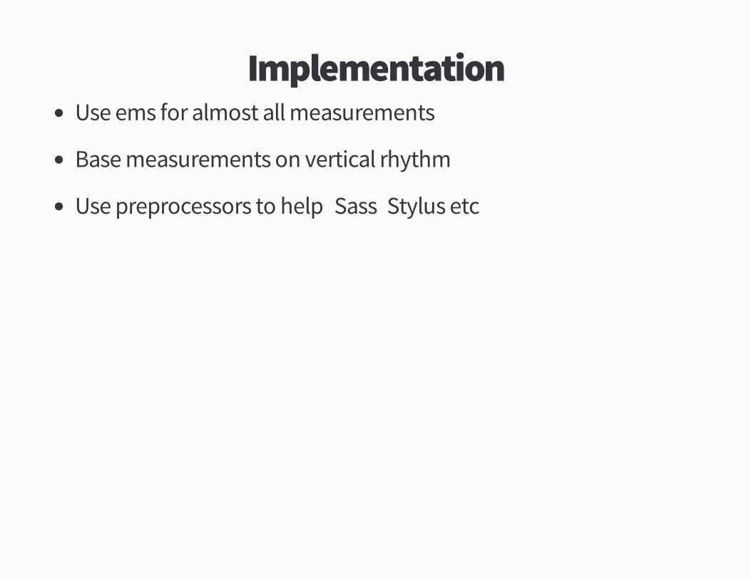
ImplementationUse ems for almost all measurements
Base measurements on vertical rhythm
Use preprocessors to help �Sassý Stylus etc�
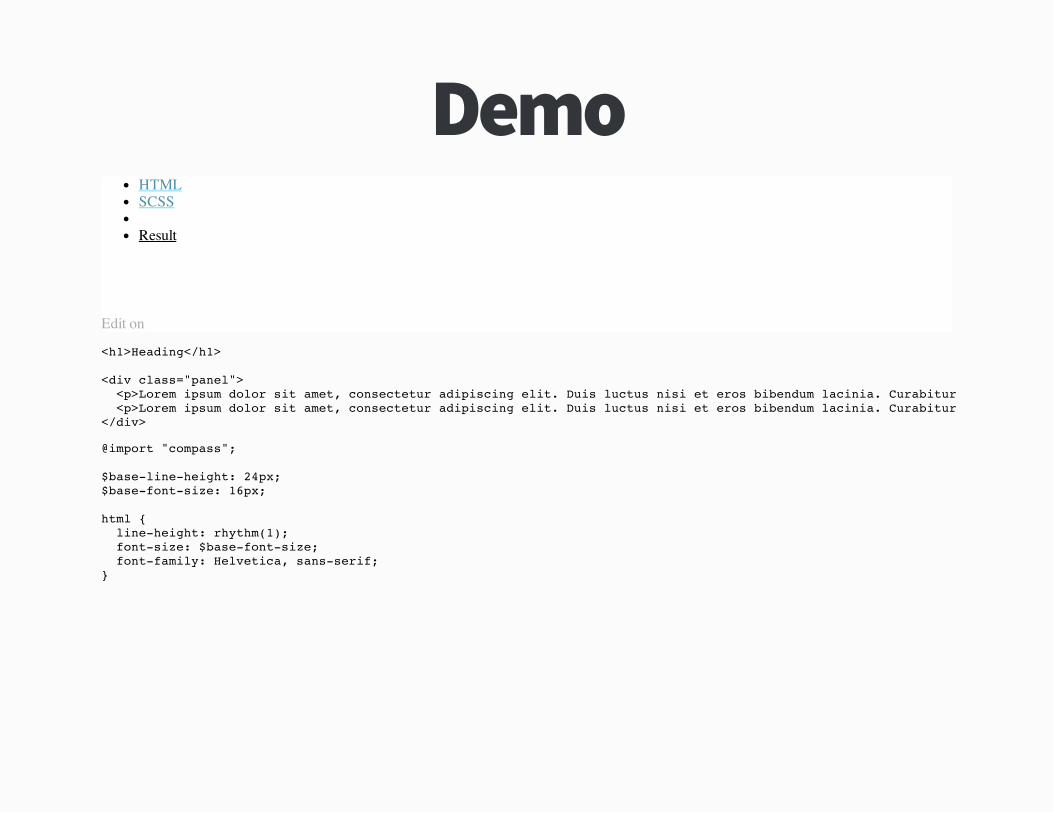
DemoHTMLSCSS
Result
Edit on
<h1>Heading</h1>
<div class="panel"> <p>Lorem ipsum dolor sit amet, consectetur adipiscing elit. Duis luctus nisi et eros bibendum lacinia. Curabitur sed est nec urna pretium vulputate ut eget lectus. In ultricies, tellus non vehicula malesuada, augue sem aliquet tellus, ut faucibus turpis ante quis nibh. Ut vel turpis tortor, a consectetur ipsum. Sed posuere commodo vestibulum. Pellentesque volutpat diam sem. <p>Lorem ipsum dolor sit amet, consectetur adipiscing elit. Duis luctus nisi et eros bibendum lacinia. Curabitur sed est nec urna pretium vulputate ut eget lectus. In ultricies, tellus non vehicula malesuada, augue sem aliquet tellus, ut faucibus turpis ante quis nibh. Ut vel turpis tortor, a consectetur ipsum. Sed posuere commodo vestibulum. Pellentesque volutpat diam sem.</div>
@import "compass";
$base-line-height: 24px;$base-font-size: 16px;
html { line-height: rhythm(1); font-size: $base-font-size; font-family: Helvetica, sans-serif;}
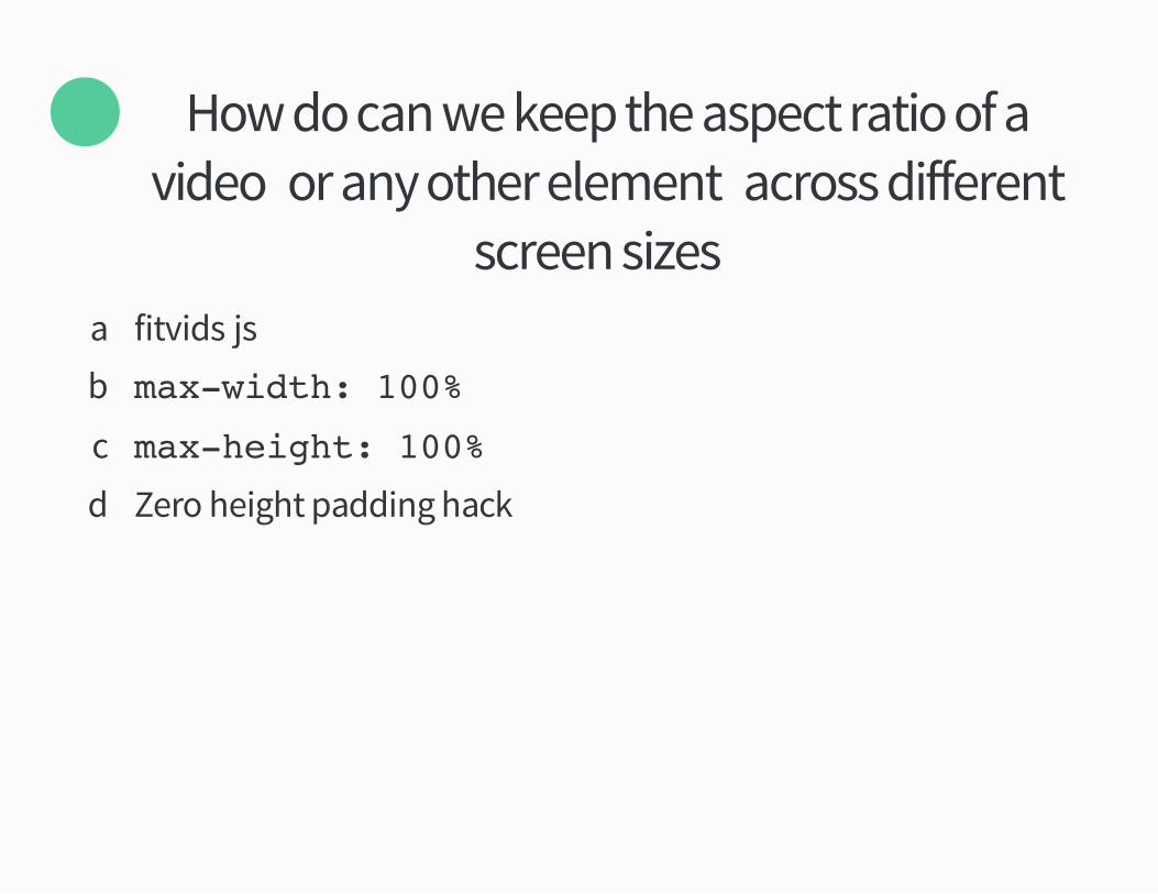
How do can we keep the aspect ratio of avideo �or any other element� across different
screen sizes�
Ö
aü fitvidsüjs
bü max-width: 100%
cü max-height: 100%
dü Zero height padding hack
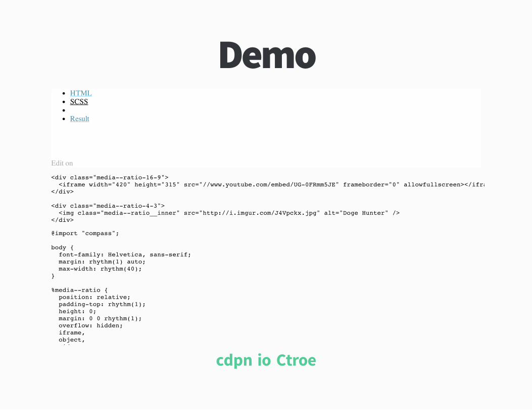
DemoHTMLSCSS
Result
Edit on
<div class="media--ratio-16-9"> <iframe width="420" height="315" src="//www.youtube.com/embed/UG-0FRmm5JE" frameborder="0" allowfullscreen></iframe</div>
<div class="media--ratio-4-3"> <img class="media--ratio__inner" src="http://i.imgur.com/J4Vpckx.jpg" alt="Doge Hunter" /></div>
@import "compass";
body { font-family: Helvetica, sans-serif; margin: rhythm(1) auto; max-width: rhythm(40);}
%media--ratio { position: relative; padding-top: rhythm(1); height: 0; margin: 0 0 rhythm(1); overflow: hidden; iframe, object, video,
cdpnüio!Ctroe
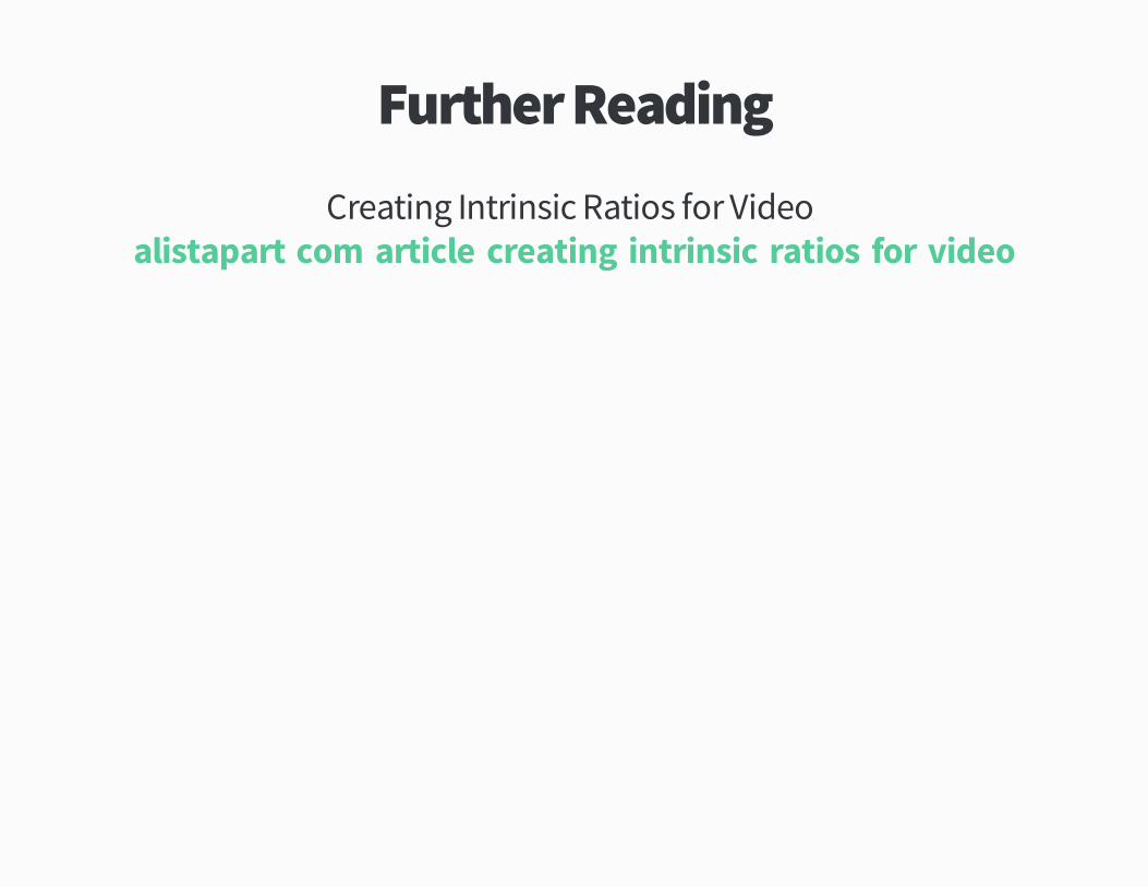
Further Reading
Creating Intrinsic Ratios for Videoþalistapartücom!article!creating�intrinsic�ratios�for�video
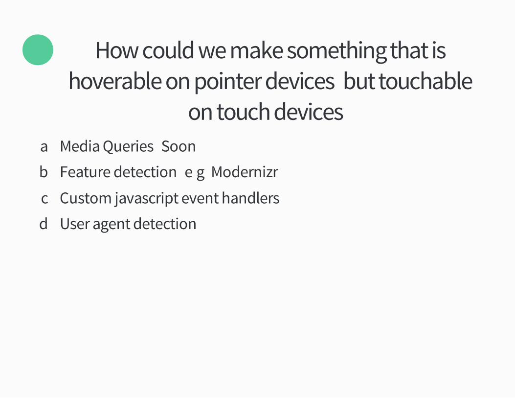
How could we make something that ishoverable on pointer devicesý but touchable
on touch devices�
×
aü Media Queries �Soon�
bü Feature detection �eügü Modernizr�
cü Custom javascript event handlers
dü User agent detection

DemoHTMLSCSSJSResult
Edit on
<p>Show the menu on hover, click or touch. Persist if it is click or touch.</p>
<div id="menu__container" class="menu__container">
<a href="#menu" id="menu__button" class="menu__button">Menu</a>
cdpnüio!aCiol
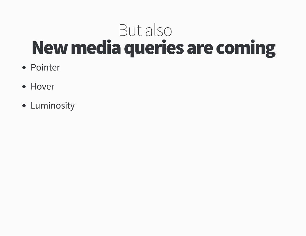
But also�New media queries are comingPointer
Hover
Luminosity
Further Readingjordanmücoüuk!post!ÚÙÛÛÚÚ×ÝÚÔÖ!responding�to�environmental�lighting�with�css�media
Tipþ Be specific with breakpoints
Further ReadingÛ Habits of Highly Effective Media Queriesbradfrostwebücom!blog!post!Û�habits�of�highly�effective�media�queries

Round ×Performance
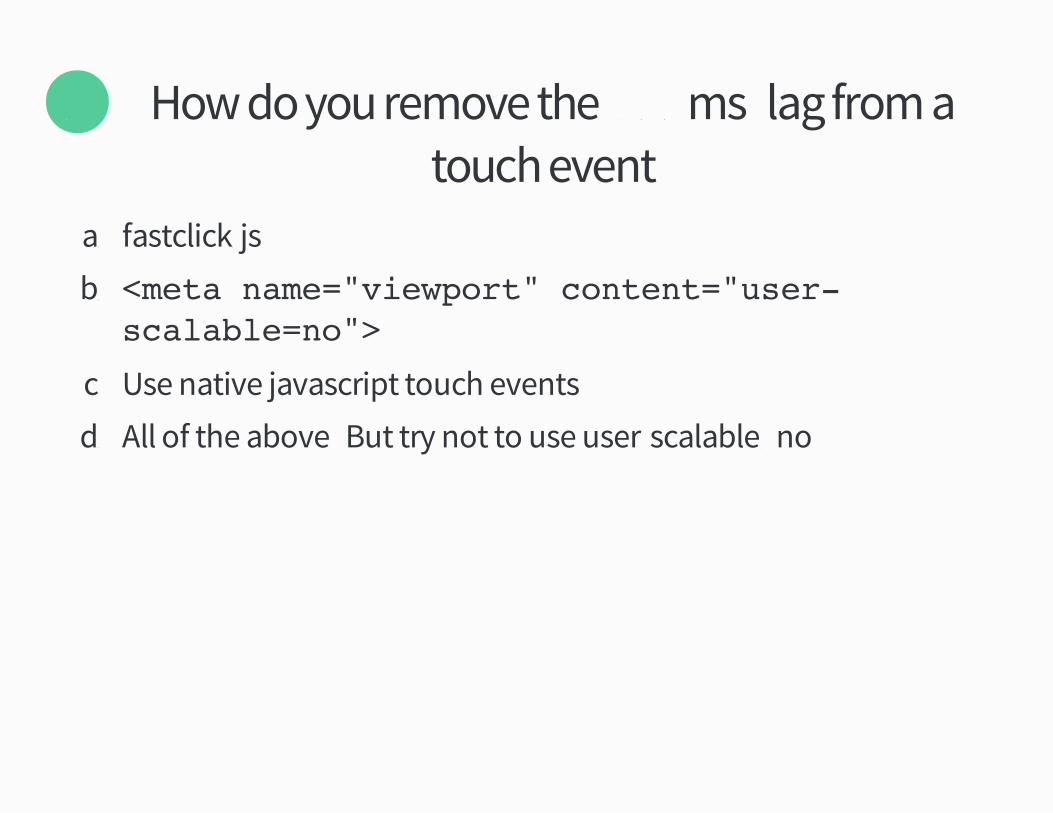
How do you remove the �×ÔÔms� lag from atouch event�
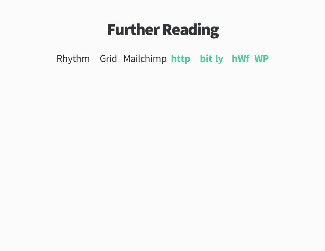
Õ
aü fastclicküjs
bü <meta name="viewport" content="user-scalable=no">
cü Use native javascript touch events
dü All of the above �But try not to use user�scalable²no�

Further ReadingTouch And Mouse � Together Again For The First TimeþhtmlÙrocksücom!en!mobile!touchandmouse
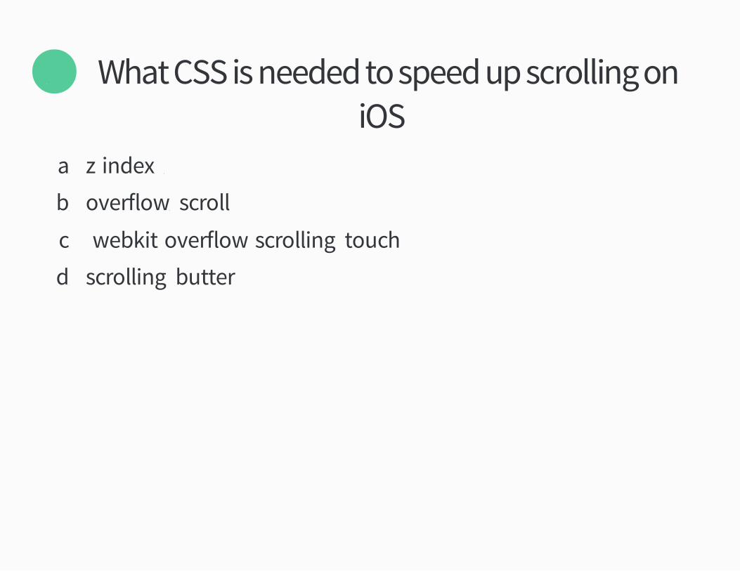
What CSS is needed to speed up scrolling oniOS�
Ö
aü z�indexþ Ô
bü overflowþ scroll
cü �webkit�overflow�scrollingþ touch
dü scrollingþ butter
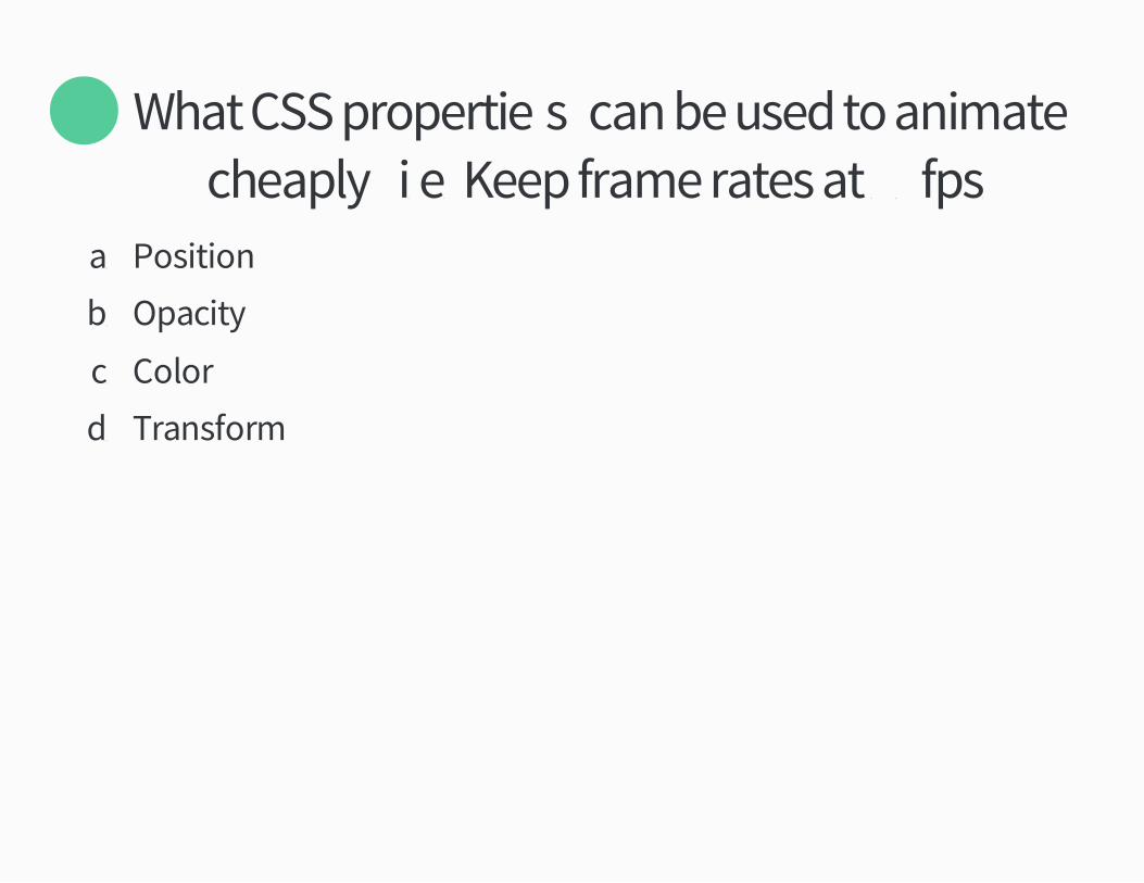
What CSS propertie�s� can be used to animatecheaply� iüeü Keep frame rates at ÚÔfpsü
×
aü Position
bü Opacity
cü Color
dü Transform
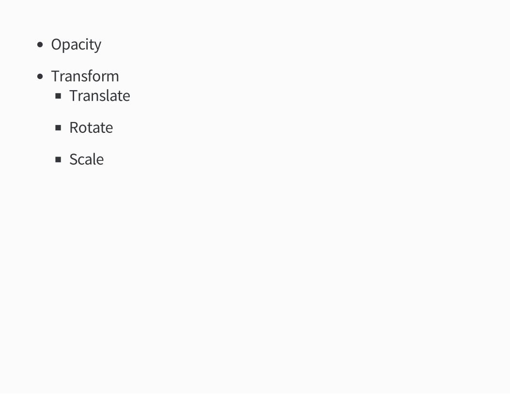
Opacity
TransformTranslate
Rotate
Scale

DemoCSS animation of top/left vs transform in slowmo.
0:00 / 1:03
Further Reading
High Performance AnimationsþhtmlÙrocksücom!en!tutorials!speed!high�performance�
animations
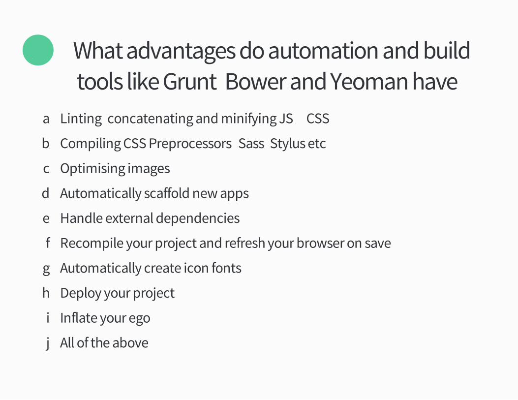
What advantages do automation and buildtools like Gruntý Bower and Yeoman have�
Ø
aü Lintingý concatenating and minifying JS Ó CSS
bü Compiling CSS Preprocessors �Sassý Stylus etc�
cü Optimising images
dü Automatically scaffold new apps
eü Handle external dependencies
fü Recompile your project and refresh your browser on save
gü Automatically create icon fonts
hü Deploy your project
iü Inflate your ego
jü All of the above

Further Reading
Automating Front�end Workflowspeakerdeckücom!addyosmani!automating�front�end�
workflow
Tipþ Get to know yourDeveloper Tools
Further ReadingChrome DevToolsþ developersügoogleücom!chrome�developer�tools

Round ØImages
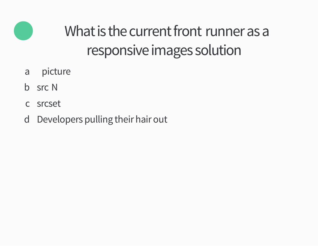
What is the current front�runner as aresponsive images solution�
Õ
aü ³picture´
bü src�N
cü srcset
dü Developers pulling their hair out
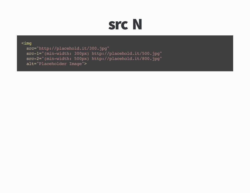
src�N<img src="http://placehold.it/300.jpg" src-1="(min-width: 300px) http://placehold.it/500.jpg" src-2="(min-width: 500px) http://placehold.it/800.jpg" alt="Placeholder Image">
Tipþ Other image solutions
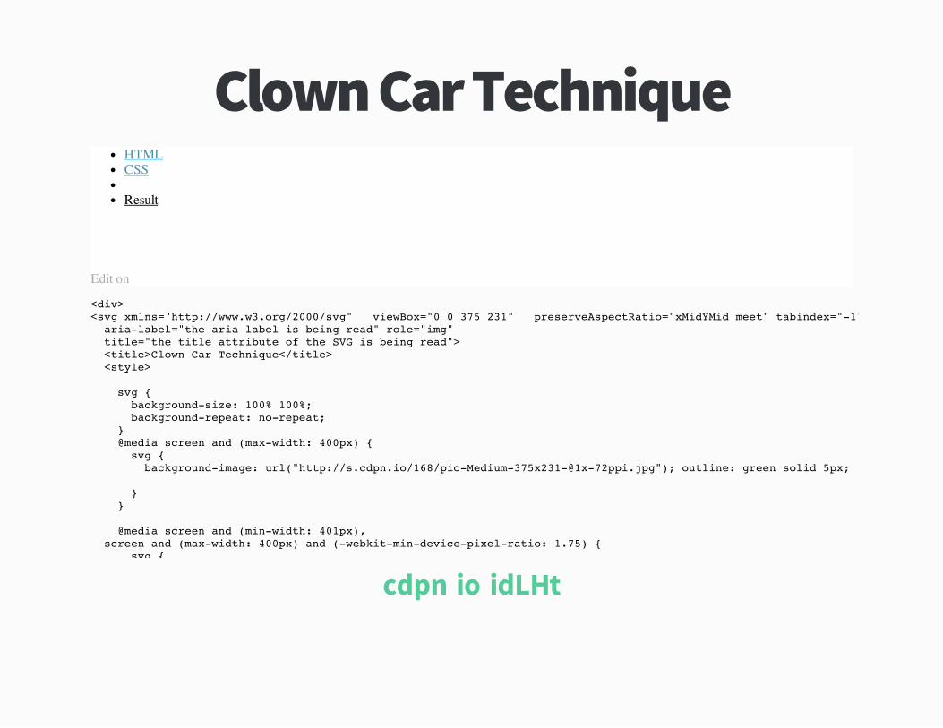
Clown Car TechniqueHTMLCSS
Result
Edit on
<div><svg xmlns="http://www.w3.org/2000/svg" viewBox="0 0 375 231" preserveAspectRatio="xMidYMid meet" tabindex="-1" aria-label="the aria label is being read" role="img" title="the title attribute of the SVG is being read"> <title>Clown Car Technique</title> <style>
svg { background-size: 100% 100%; background-repeat: no-repeat; } @media screen and (max-width: 400px) { svg { background-image: url("http://s.cdpn.io/168/[email protected]"); outline: green solid 5px;
} }
@media screen and (min-width: 401px), screen and (max-width: 400px) and (-webkit-min-device-pixel-ratio: 1.75) { svg {
cdpnüio!idLHt
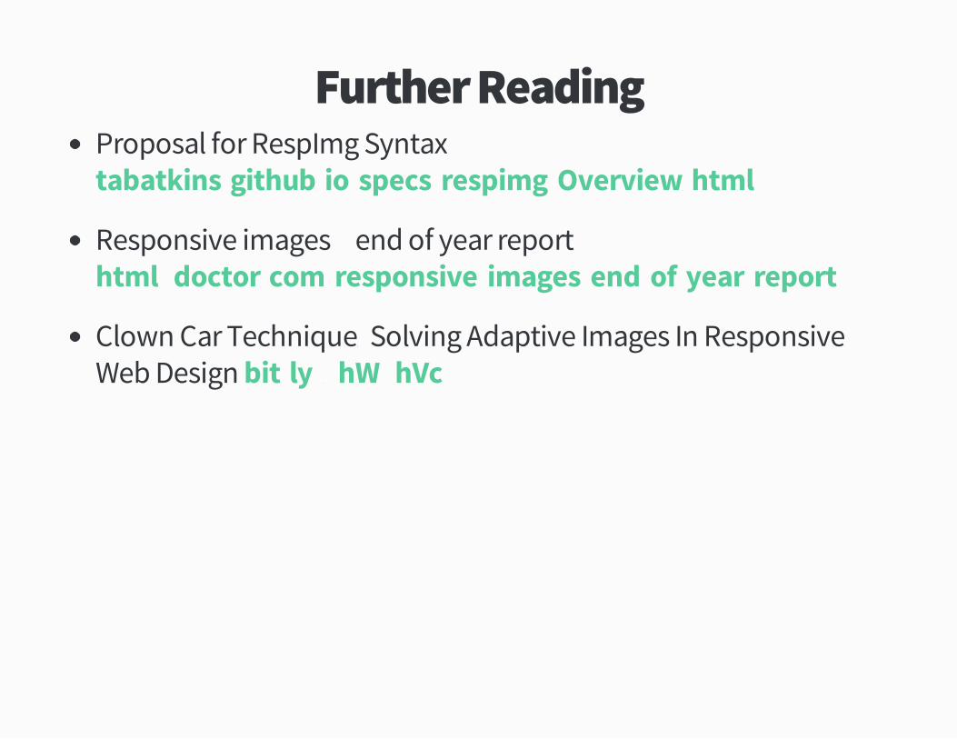
Further ReadingProposal for RespImg Syntax
Responsive images � end of year report
Clown Car Techniqueþ Solving Adaptive Images In ResponsiveWeb Design
tabatkinsügithubüio!specs!respimg!Overviewühtml
htmlÙdoctorücom!responsive�images�end�of�year�report
bitüly!ÕhWÝhVc

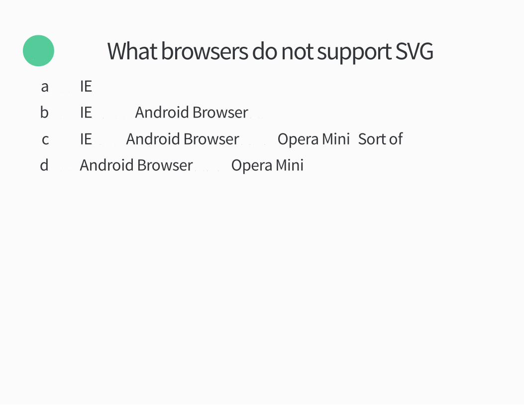
What browsers do not support SVG�Öaü ³² IEÜ
bü ³² IEÜ Ó ³² Android Browser Öü×
cü ³² IEÜý ³² Android Browser Öü× Ó Opera Mini �Sort of�
dü ³² Android Browser ØüØ Ó Opera Mini
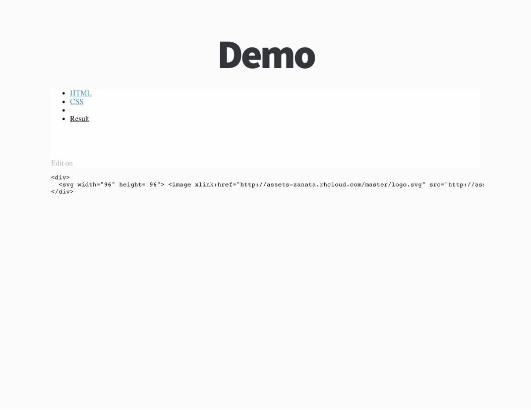
DemoHTMLCSS
Result
Edit on
<div> <svg width="96" height="96"> <image xlink:href="http://assets-zanata.rhcloud.com/master/logo.svg" src="http://assets-zanata.rhcloud.com/master/logo.png</div>
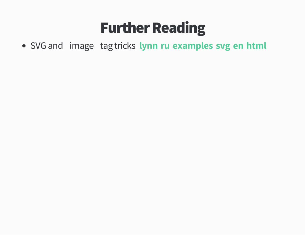
Further ReadingSVG and ³image´ tag tricksþ lynnüru!examples!svg!enühtml
Round ÙLayout
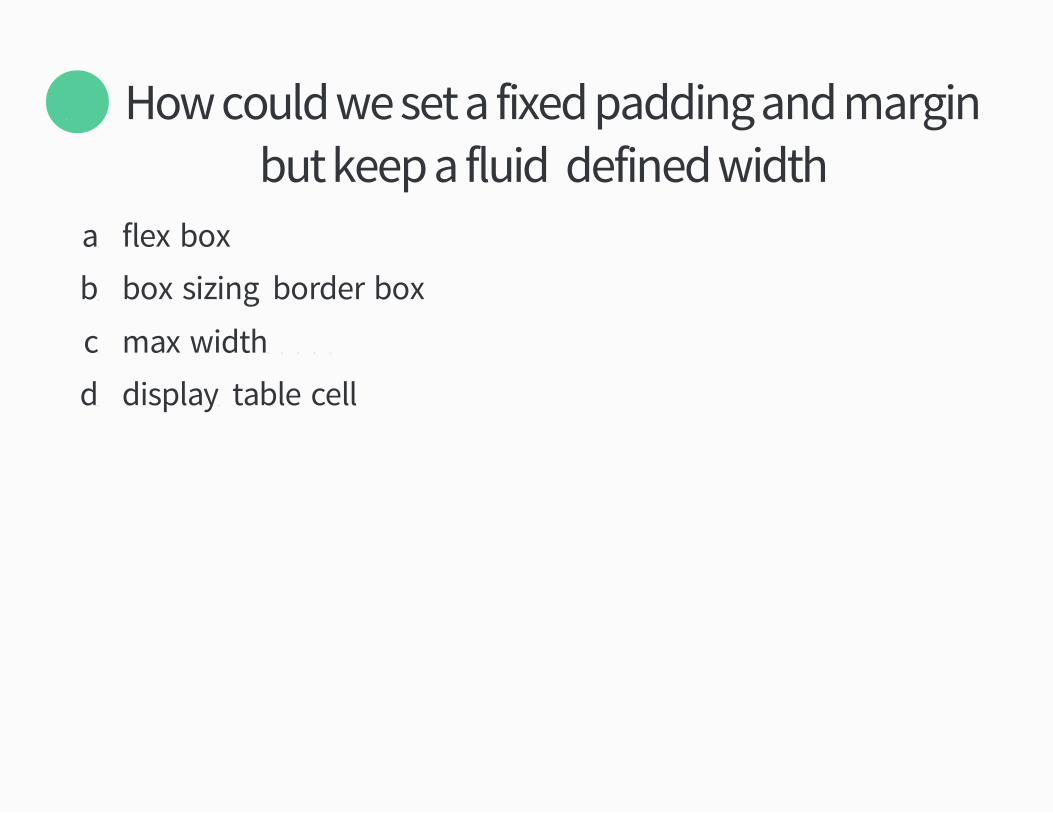
How could we set a fixed padding and marginbut keep a fluidý defined width�
Õ
aü flex�box
bü box�sizingþ border�box
cü max�widthþ ÕÔÔ¢
dü displayþ table�cell
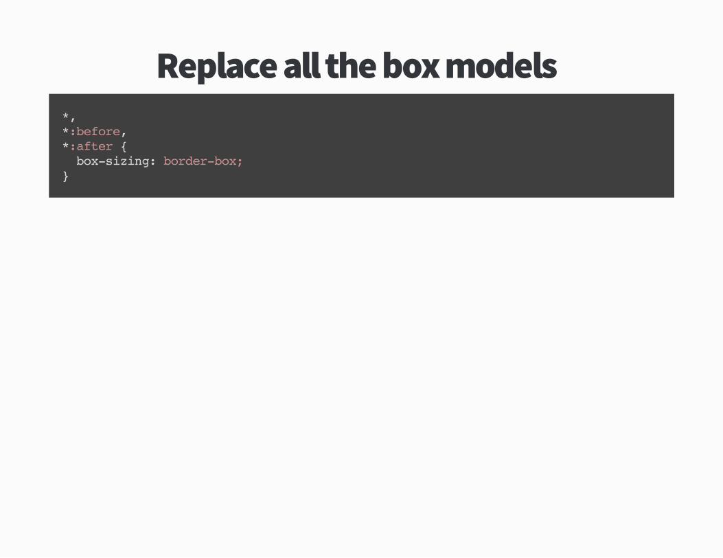
Replace all the box models�*,*:before,*:after { box-sizing: border-box;}
Further Reading
paulirishücom!ÖÔÕÖ!box�sizing�border�box�ftw
Tipþ Inline block grids

DemoHTMLSCSS
Result
Edit on
<ul class="g"> <li class="g__item w--1-4 ph">1 (1/4)</li> <li class="g__item w--1-2 ph">2 (1/2)</li> <li class="g__item w--1-4 ph">3 (1/4)</li> <li class="g__item w--1-4 ph">4 (1/4)</li> <li class="g__item w--1-4 ph">5 (1/4)</li> <li class="g__item w--1-4 ph">6 (1/4)</li> <li class="g__item w--1-8 ph">7 (1/8)</li> <li class="g__item w--1-8 ph">8 (1/8)</li></ul>
@import "compass";
$grid-padding: rhythm(1);
cdpnüio!GitgI
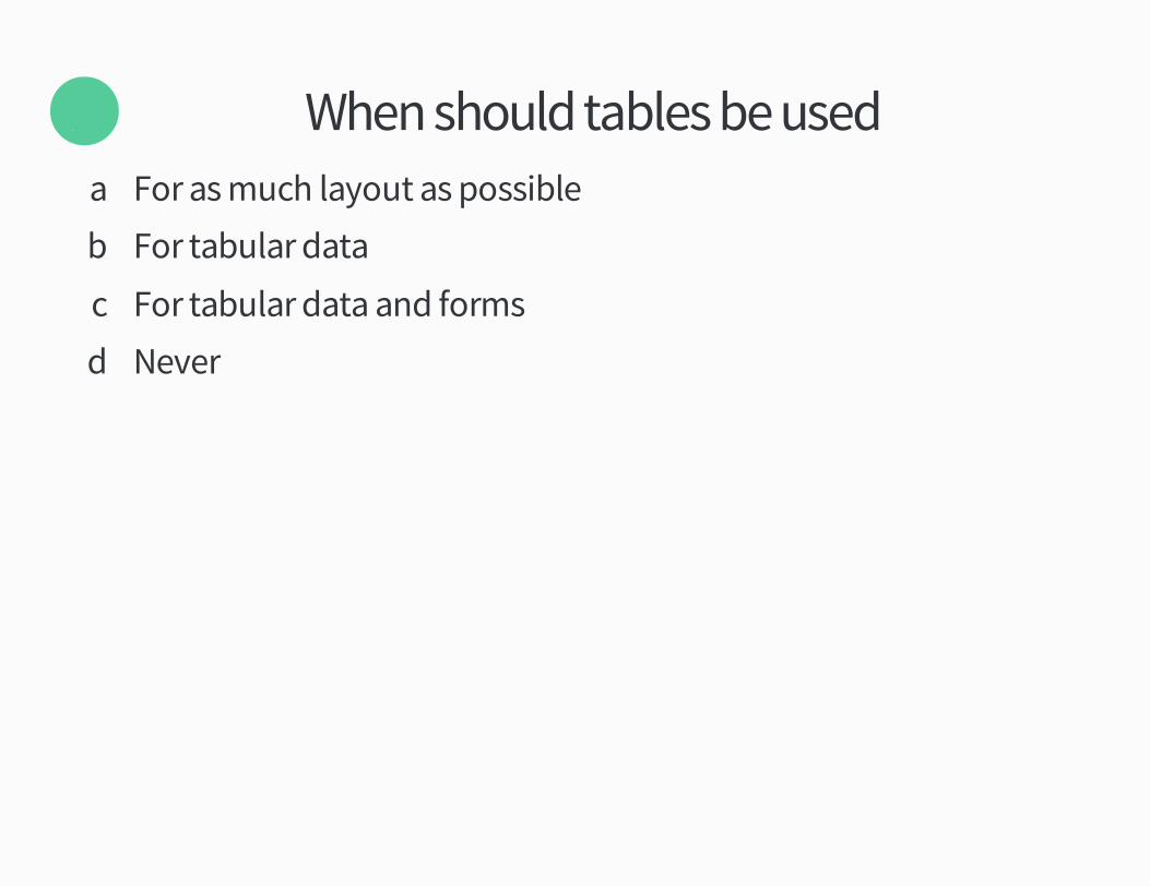
When should tables be used�Öaü For as much layout as possible
bü For tabular data
cü For tabular data and forms
dü Never
I�ve got ÝÝ tablesand a responsive solution for each oneü
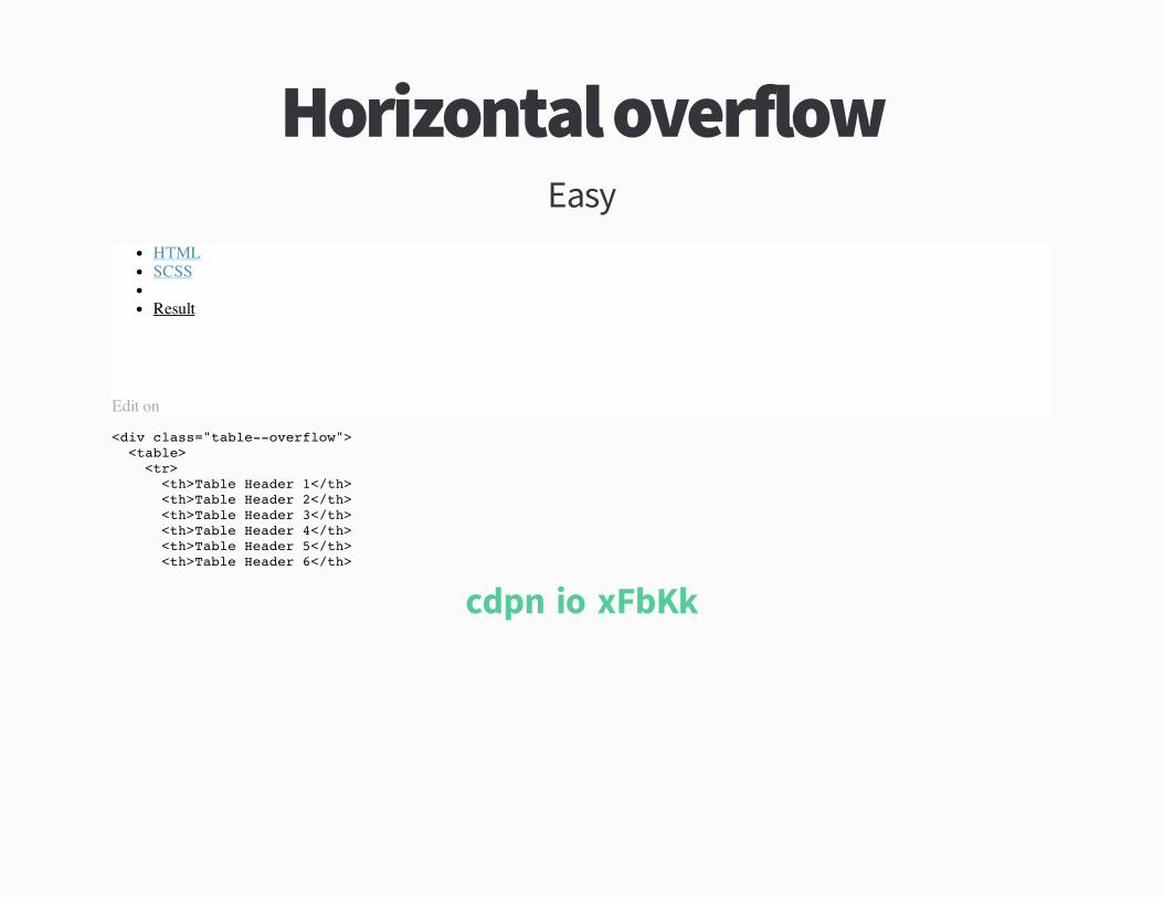
Horizontal overflowEasy
HTMLSCSS
Result
Edit on
<div class="table--overflow"> <table> <tr> <th>Table Header 1</th> <th>Table Header 2</th> <th>Table Header 3</th> <th>Table Header 4</th> <th>Table Header 5</th> <th>Table Header 6</th>
cdpnüio!xFbKk
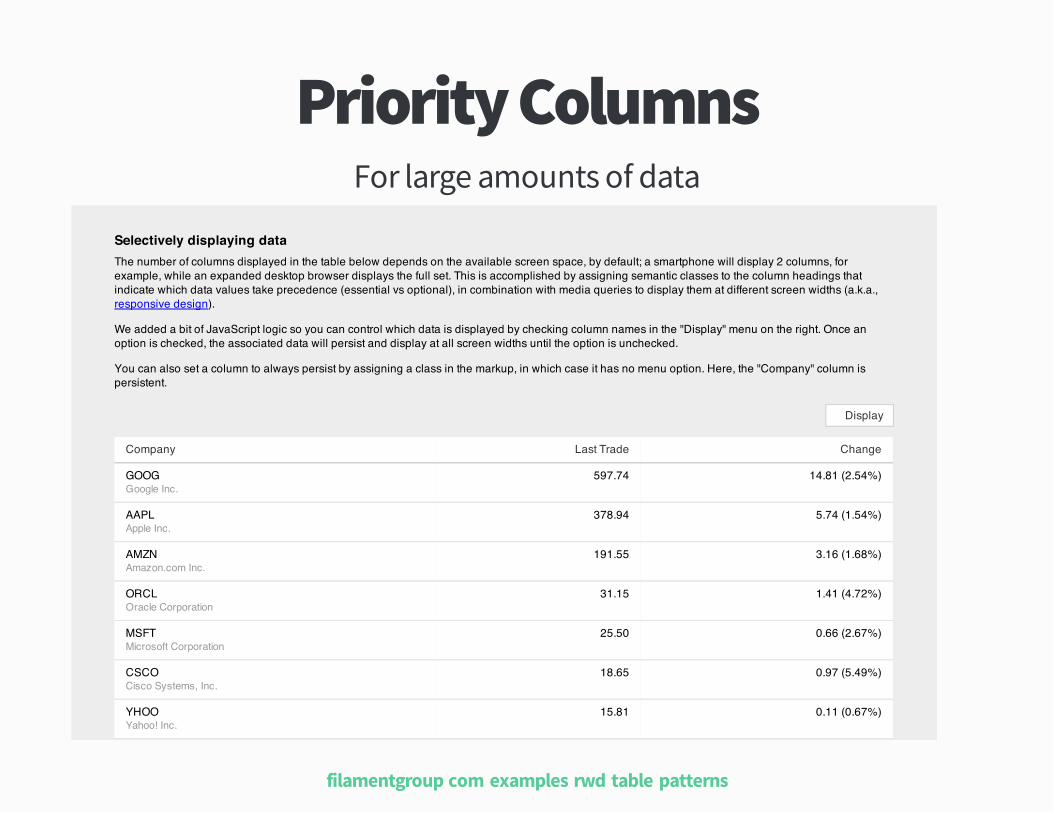
Priority ColumnsFor large amounts of data
Selectively displaying dataThe number of columns displayed in the table below depends on the available screen space, by default; a smartphone will display 2 columns, forexample, while an expanded desktop browser displays the full set. This is accomplished by assigning semantic classes to the column headings thatindicate which data values take precedence (essential vs optional), in combination with media queries to display them at different screen widths (a.k.a.,responsive design).
We added a bit of JavaScript logic so you can control which data is displayed by checking column names in the "Display" menu on the right. Once anoption is checked, the associated data will persist and display at all screen widths until the option is unchecked.
You can also set a column to always persist by assigning a class in the markup, in which case it has no menu option. Here, the "Company" column ispersistent.
Company Last Trade Change
GOOG 597.74 14.81 (2.54%)
AAPL 378.94 5.74 (1.54%)
AMZN 191.55 3.16 (1.68%)
ORCL 31.15 1.41 (4.72%)
MSFT 25.50 0.66 (2.67%)
CSCO 18.65 0.97 (5.49%)
YHOO 15.81 0.11 (0.67%)
Display
Google Inc.
Apple Inc.
Amazon.com Inc.
Oracle Corporation
Microsoft Corporation
Cisco Systems, Inc.
Yahoo! Inc.
filamentgroupücom!examples!rwd�table�patterns
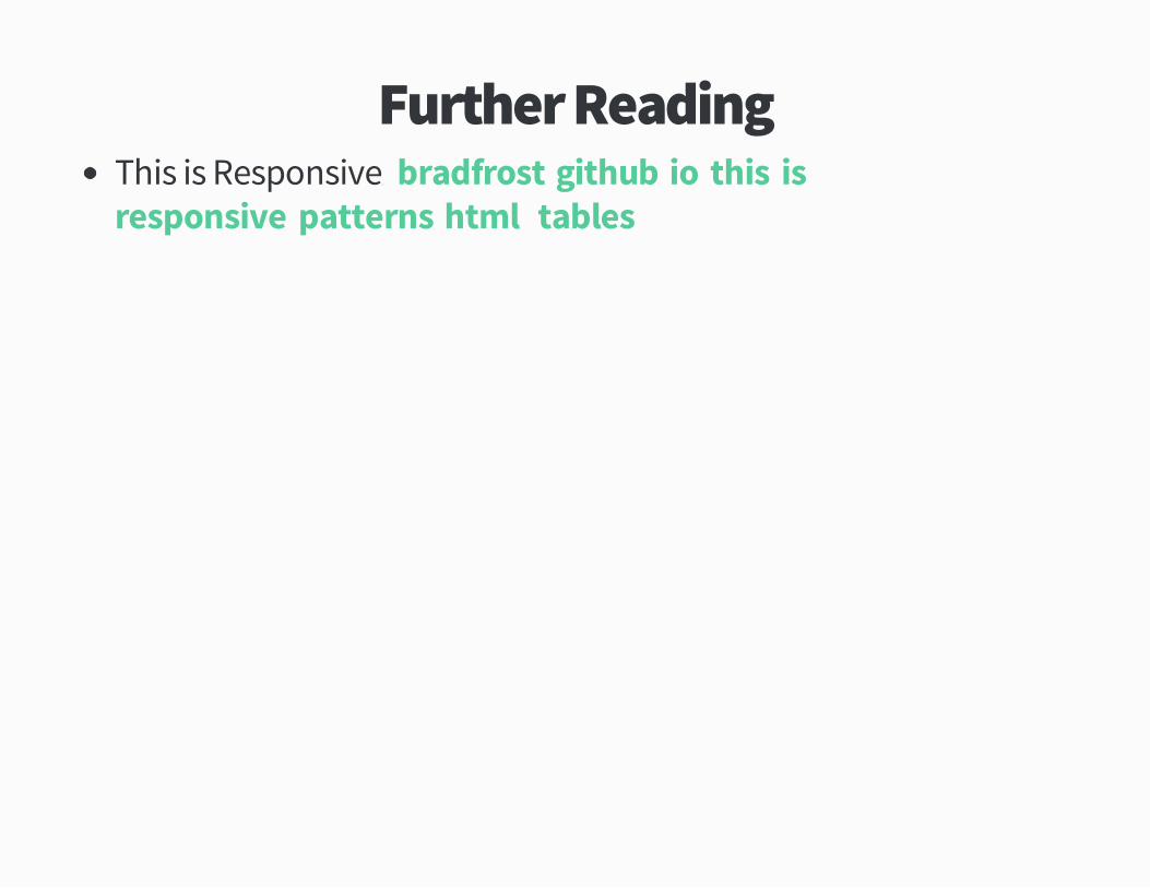
Further ReadingThis is Responsiveþ bradfrostügithubüio!this�is�responsive!patternsühtml1tables
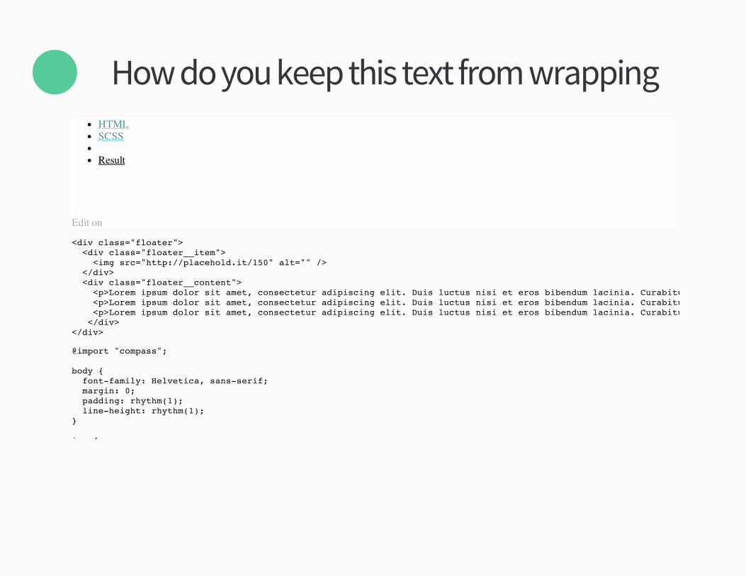
How do you keep this text from wrapping�×HTMLSCSS
Result
Edit on
<div class="floater"> <div class="floater__item"> <img src="http://placehold.it/150" alt="" /> </div> <div class="floater__content"> <p>Lorem ipsum dolor sit amet, consectetur adipiscing elit. Duis luctus nisi et eros bibendum lacinia. Curabitur sed est nec urna pretium vulputate ut eget lectus. In ultricies, tellus non vehicula malesuada, augue sem aliquet tellus, ut faucibus turpis ante quis nibh. Ut vel turpis tortor, a consectetur ipsum. Sed posuere commodo vestibulum. Pellentesque volutpat diam sem. <p>Lorem ipsum dolor sit amet, consectetur adipiscing elit. Duis luctus nisi et eros bibendum lacinia. Curabitur sed est nec urna pretium vulputate ut eget lectus. In ultricies, tellus non vehicula malesuada, augue sem aliquet tellus, ut faucibus turpis ante quis nibh. Ut vel turpis tortor, a consectetur ipsum. Sed posuere commodo vestibulum. Pellentesque volutpat diam sem. <p>Lorem ipsum dolor sit amet, consectetur adipiscing elit. Duis luctus nisi et eros bibendum lacinia. Curabitur sed est nec urna pretium vulputate ut eget lectus. In ultricies, tellus non vehicula malesuada, augue sem aliquet tellus, ut faucibus turpis ante quis nibh. Ut vel turpis tortor, a consectetur ipsum. Sed posuere commodo vestibulum. Pellentesque volutpat diam sem. </div></div>
@import "compass";
body { font-family: Helvetica, sans-serif; margin: 0; padding: rhythm(1); line-height: rhythm(1);}
img {
Finally
When should you use carousels�
Neverü
Recommended