Tips for making power point
presentation
Richa Shroff
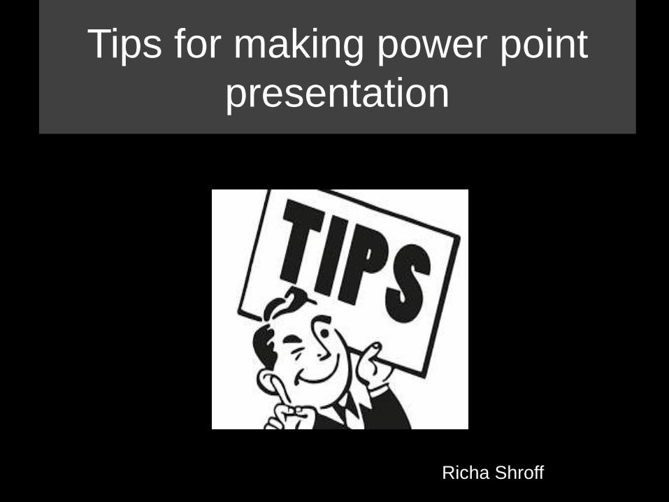
Example of a standard template
• Standard templates are too boring and
ugly
• They are not fun looking at
• They usually contain lots of text
• And they are unoriginal Don’t use these
templates
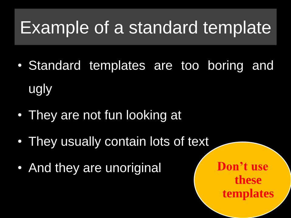
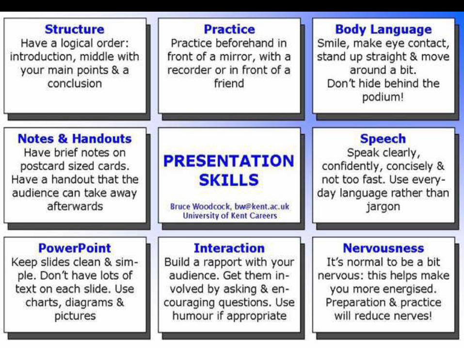
Presentation skills

Create your own
design
1
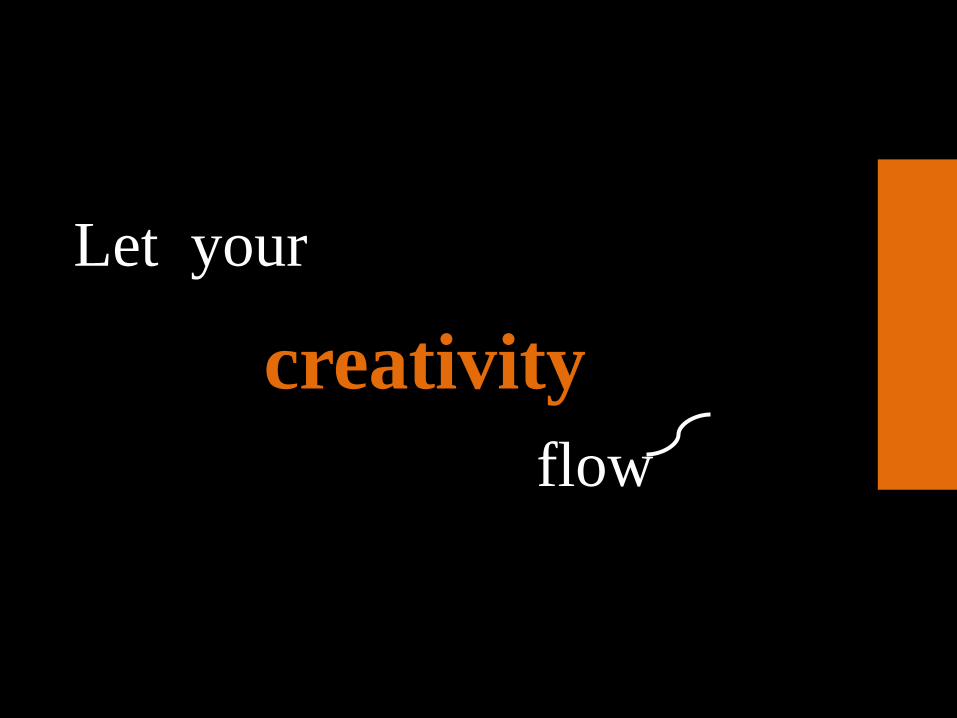
Let your
creativity
flow
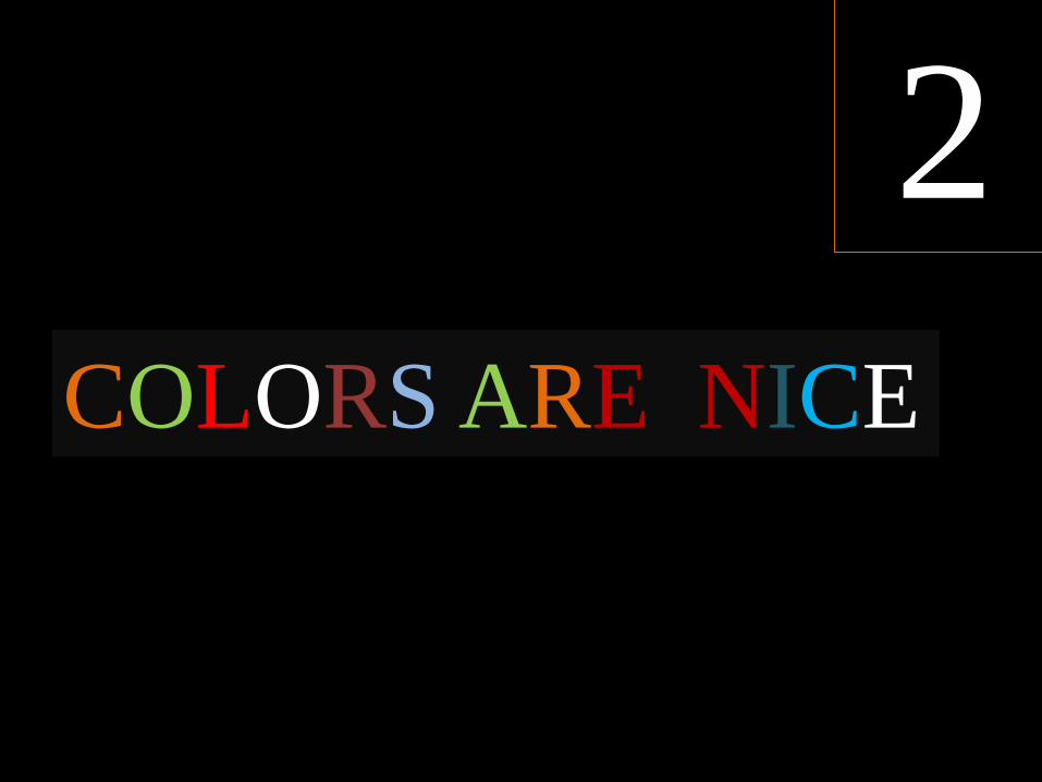
COLORS ARE NICE
2
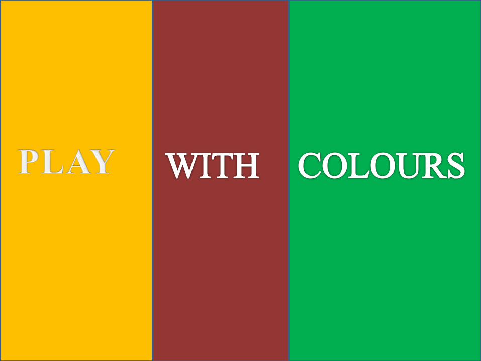

Find your like

FLAT COLORS MAKE PPT LOOK MORE
BEAUTIFUL

And
contrast
is your friend
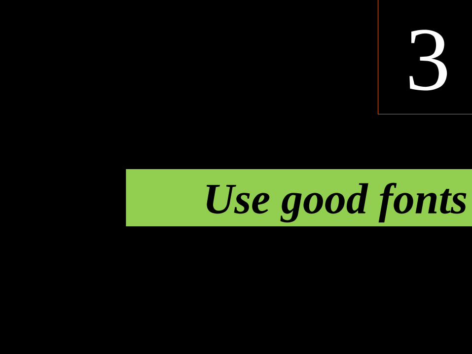
Use good fonts
3
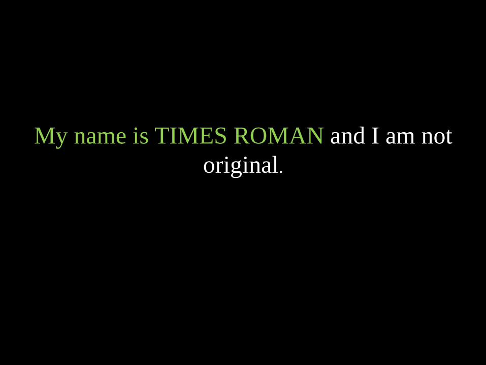
My name is TIMES ROMAN and I am not
original.

TEXT
TEXT
TEXT
TEXT
TEXT
TEXT
TEXT
TEXT
TEXT
IS EVIL..!!
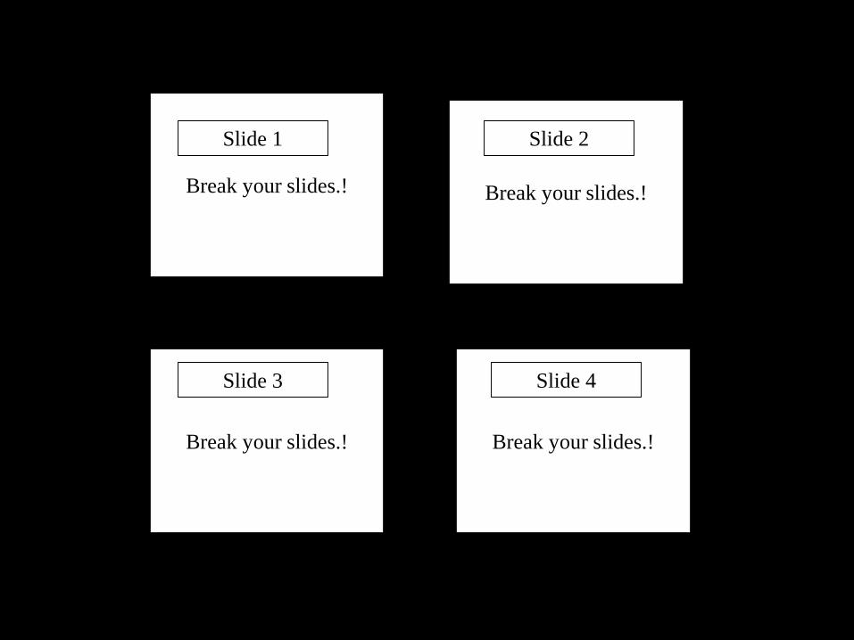
Break your slides.! Break your slides.!
Break your slides.! Break your slides.!
Slide 1 Slide 2
Slide 3 Slide 4
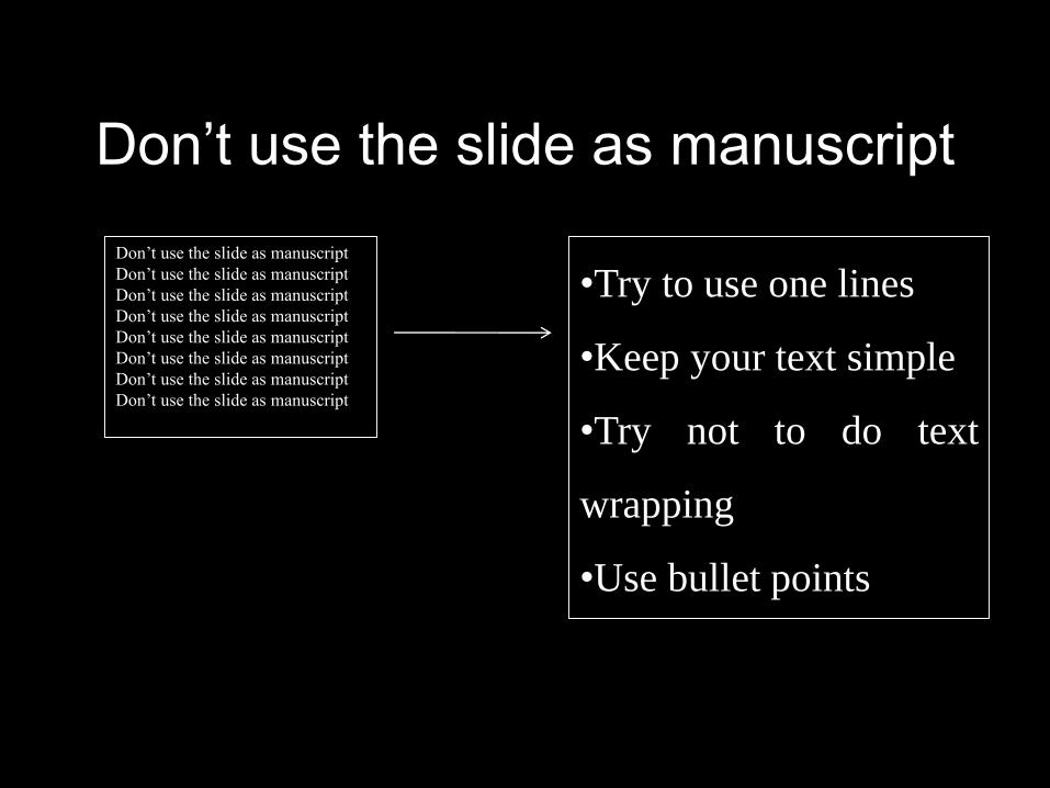
Don’t use the slide as manuscript
Don’t use the slide as manuscript
Don’t use the slide as manuscript
Don’t use the slide as manuscript
Don’t use the slide as manuscript
Don’t use the slide as manuscript
Don’t use the slide as manuscript
Don’t use the slide as manuscript
Don’t use the slide as manuscript
•Try to use one lines
•Keep your text simple
•Try not to do text
wrapping
•Use bullet points
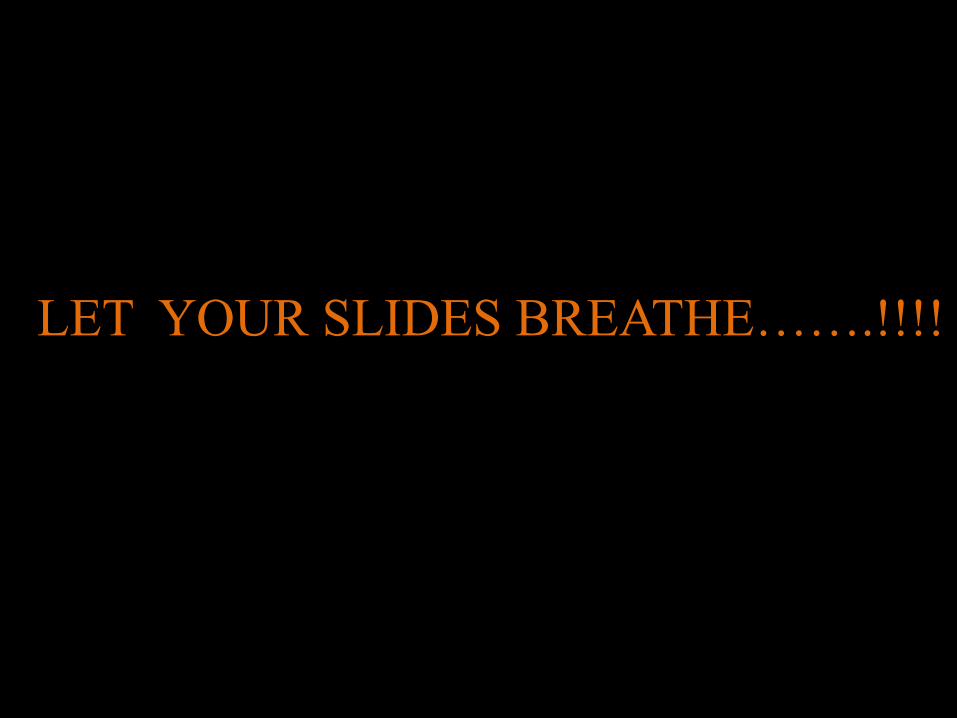
LET YOUR SLIDES BREATHE…….!!!!

It lets your audience listen to you..!!
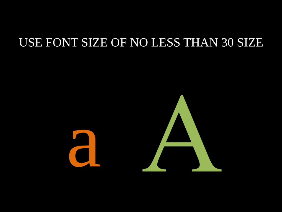
USE FONT SIZE OF NO LESS THAN 30 SIZE
a
Big font helps look
more clearer …!!

Info graphics-
are great.!
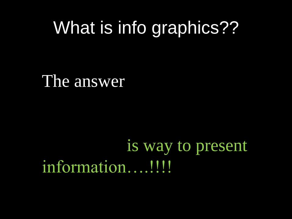
What is info graphics??
The answer
is way to present
information….!!!!

50% will Google
Info graphics after seeing this..!!

4
Images speak more
than a thousand words..!

Images tend to
catch people
attention…!!

5
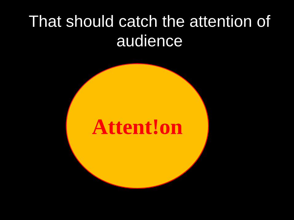
That should catch the attention of
audience
Attent!on

Don’t let your audience sleep!!!!

And wow them..!!
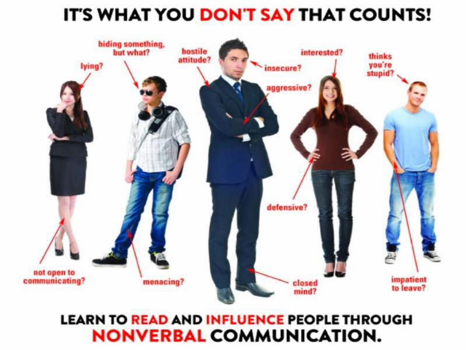
6Body Language is the first and
last impression…!!
How should
you
present yourself

The answer is
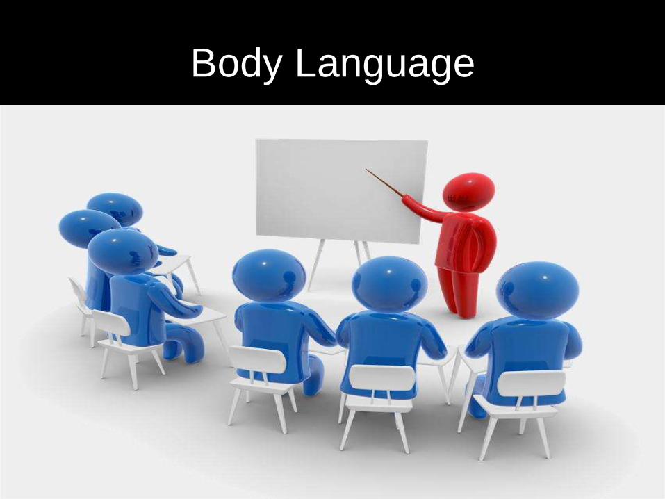
Body Language

Story * Voice = Impact
Recommended