Embed Size (px)
Citation preview
The kazutan.R: special held in Tokyo Hands on Session2: ggplot2
魅せる・際立つ・役立つグラフHands on!! ggplot2!!〜 ggplot2 導入編〜
Presenter:うなどんTwitter: @MrUnadon
2017年7月30日
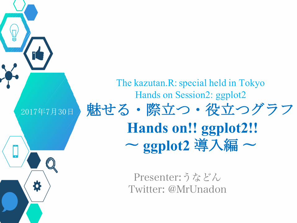
今日の目標①
今日の参照コード
・ハンズオンのコードはスライドに出します。・お⼿を拝借、ともに写経をしましょう。
・今⽇の内容 + α の情報→ “MrUnadon”で検索
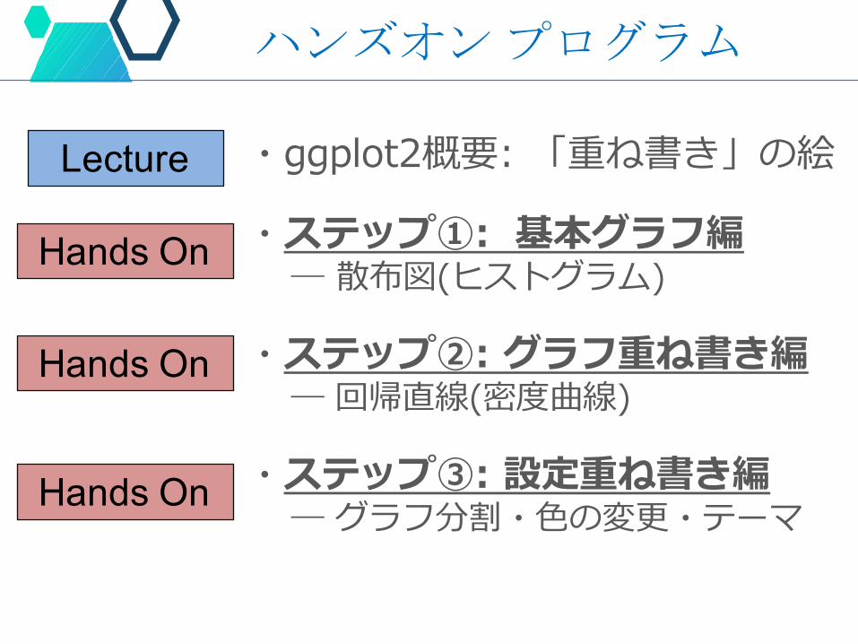
ハンズオンプログラム
・ggplot2概要: 「重ね書き」の絵
・ステップ①: 基本グラフ編― 散布図(ヒストグラム)
・ステップ②: グラフ重ね書き編― 回帰直線(密度曲線)
・ステップ③: 設定重ね書き編― グラフ分割・⾊の変更・テーマ
Lecture
Hands On
Hands On
Hands On
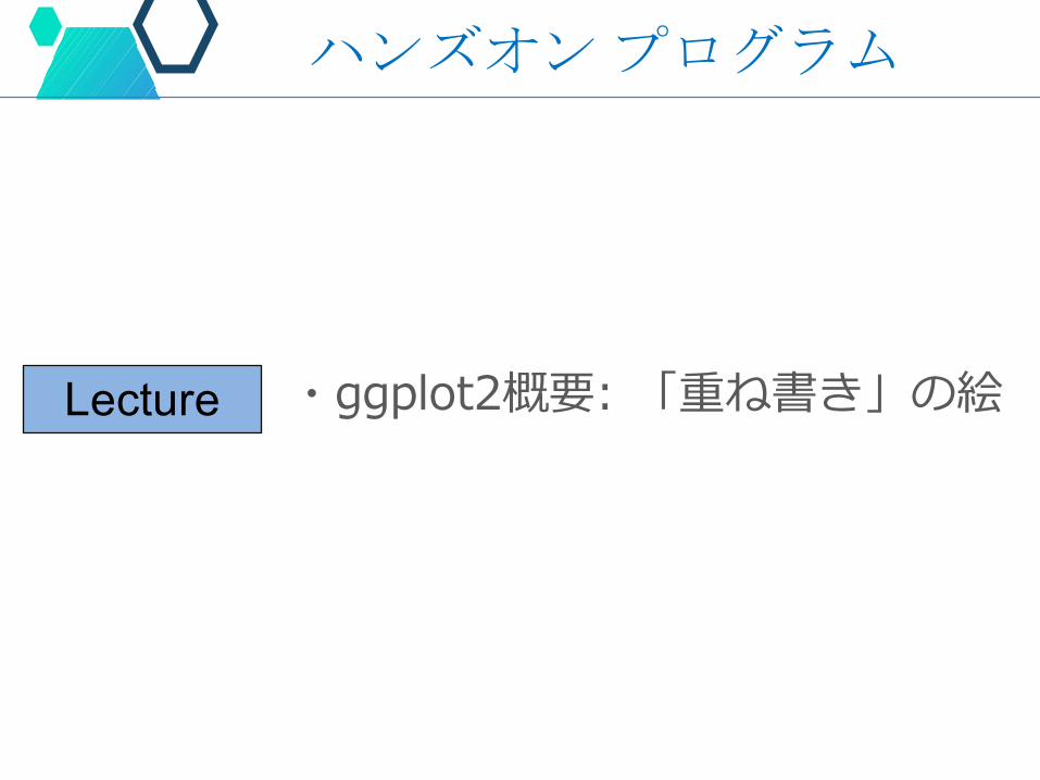
ハンズオンプログラム
・ggplot2概要: 「重ね書き」の絵Lecture
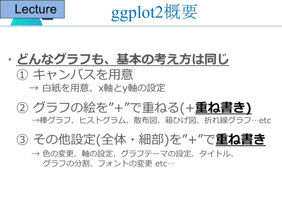
・どんなグラフも、基本の考え⽅は同じ① キャンバスを⽤意
→ ⽩紙を⽤意、x軸とy軸の設定
② グラフの絵を”+”で重ねる(+重ね書き)→棒グラフ、ヒストグラム、散布図、箱ひげ図、折れ線グラフ…etc
③ その他設定(全体・細部)を”+”で重ね書き→ ⾊の変更、軸の設定、グラフテーマの設定、タイトル、
グラフの分割、フォントの変更 etc…
ggplot2概要Lecture
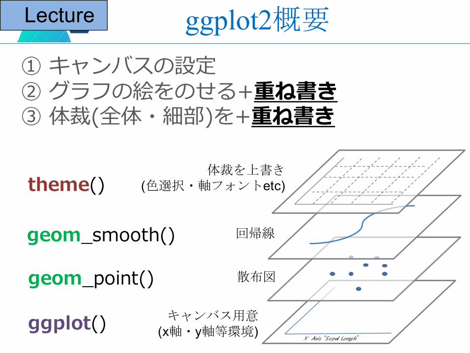
① キャンバスの設定② グラフの絵をのせる+重ね書き③ 体裁(全体・細部)を+重ね書き
キャンバス用意(x軸・y軸等環境)
散布図
回帰線
体裁を上書き(色選択・軸フォントetc)
X Axis “Sepal Length”
ggplot()
geom_point()
geom_smooth()
theme()
ggplot2概要Lecture
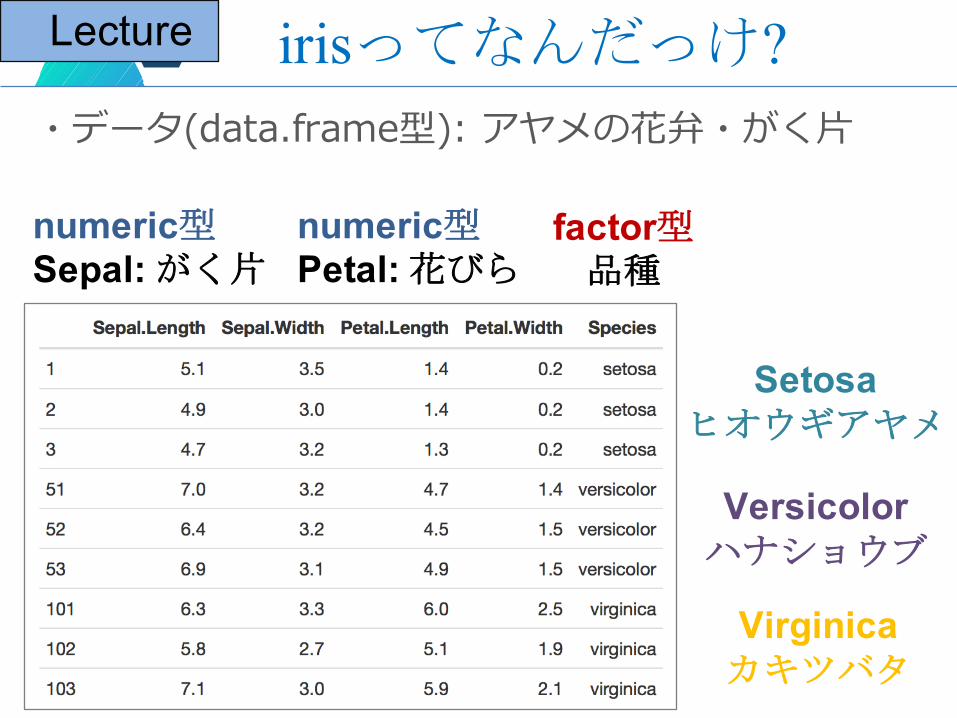
irisってなんだっけ?・データ(data.frame型): アヤメの花弁・がく⽚
numeric型Sepal: がく片
numeric型Petal: 花びら
factor型品種
Setosaヒオウギアヤメ
Versicolorハナショウブ
Virginicaカキツバタ
Lecture
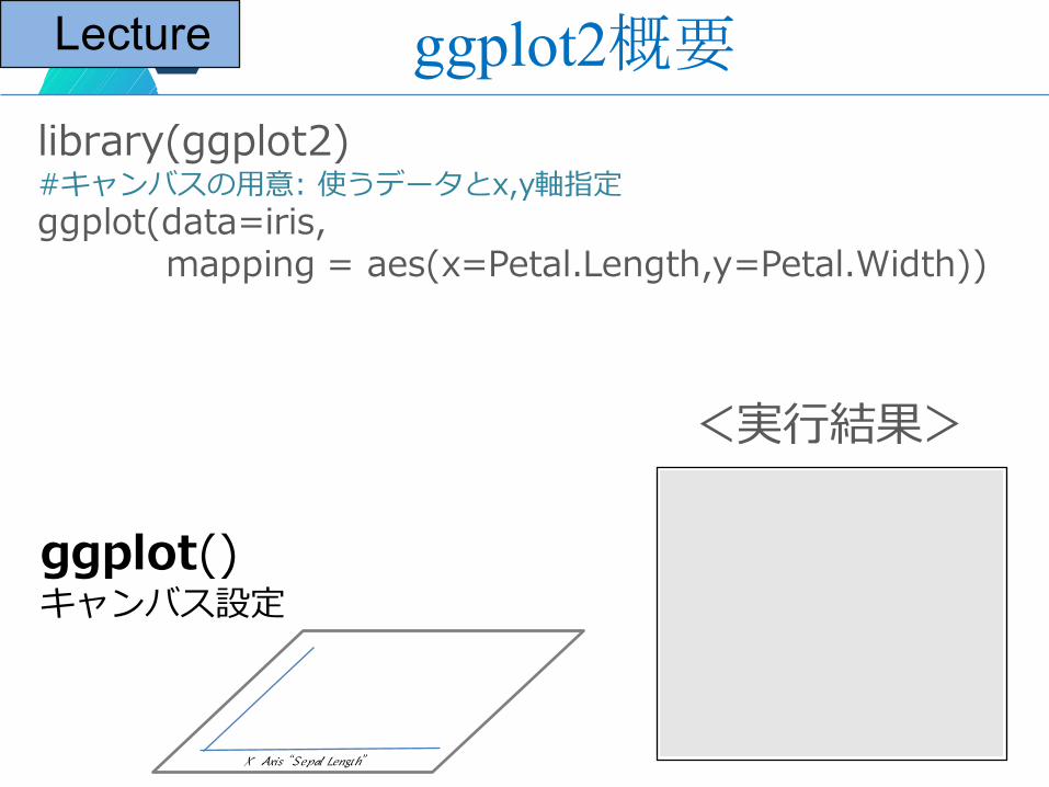
library(ggplot2)#キャンバスの⽤意: 使うデータとx,y軸指定ggplot(data=iris,
mapping = aes(x=Petal.Length,y=Petal.Width))
<実⾏結果>
X Axis “Sepal Length”
ggplot()キャンバス設定
ggplot2概要Lecture
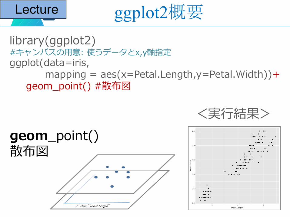
library(ggplot2)#キャンバスの⽤意: 使うデータとx,y軸指定ggplot(data=iris,
mapping = aes(x=Petal.Length,y=Petal.Width))+geom_point() #散布図
<実⾏結果>
X Axis “Sepal Length”
geom_point()散布図
ggplot2概要Lecture
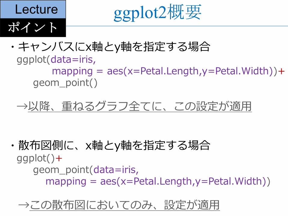
・散布図側に、x軸とy軸を指定する場合ggplot()+
geom_point(data=iris, mapping = aes(x=Petal.Length,y=Petal.Width))
→この散布図においてのみ、設定が適⽤
ggplot2概要Lecture
・キャンバスにx軸とy軸を指定する場合ggplot(data=iris,
mapping = aes(x=Petal.Length,y=Petal.Width))+geom_point()
→以降、重ねるグラフ全てに、この設定が適⽤
ポイント
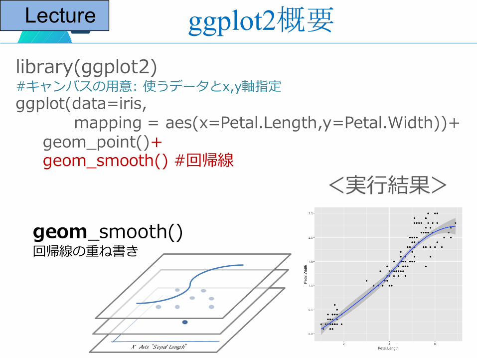
library(ggplot2)#キャンバスの⽤意: 使うデータとx,y軸指定ggplot(data=iris,
mapping = aes(x=Petal.Length,y=Petal.Width))+geom_point()+geom_smooth() #回帰線
<実⾏結果>
X Axis “Sepal Length”
geom_smooth()回帰線の重ね書き
ggplot2概要Lecture
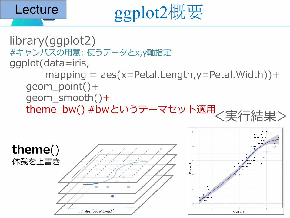
library(ggplot2)#キャンバスの⽤意: 使うデータとx,y軸指定ggplot(data=iris,
mapping = aes(x=Petal.Length,y=Petal.Width))+geom_point()+geom_smooth()+theme_bw() #bwというテーマセット適⽤<実⾏結果>
theme()体裁を上書き
X Axis “Sepal Length”
ggplot2概要Lecture
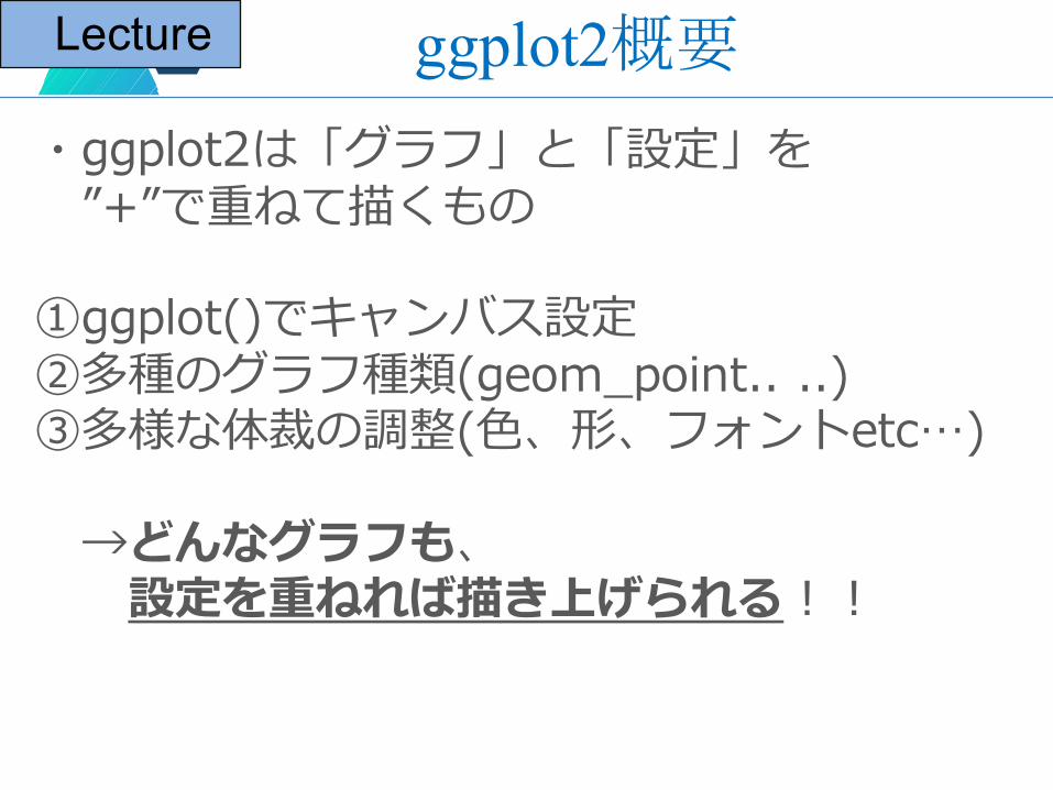
・ggplot2は「グラフ」と「設定」を”+”で重ねて描くもの
①ggplot()でキャンバス設定②多種のグラフ種類(geom_point.. ..)③多様な体裁の調整(⾊、形、フォントetc…)
→どんなグラフも、設定を重ねれば描き上げられる!!
ggplot2概要Lecture
ハンズオンプログラム
・ステップ①: 基本グラフ編― 散布図(ヒストグラム)
Hands On
ステップ①: 基本グラフ編Hands On
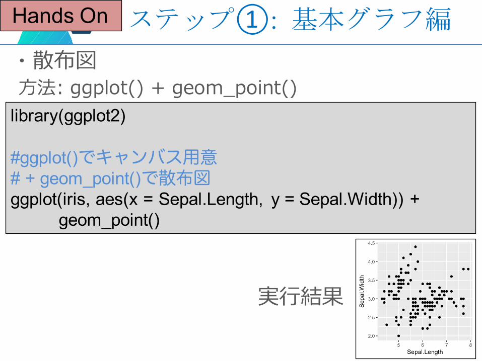
・散布図⽅法: ggplot() + geom_point()
library(ggplot2)
#ggplot()でキャンバス用意# + geom_point()で散布図ggplot(iris, aes(x = Sepal.Length, y = Sepal.Width)) +
geom_point()
実⾏結果
ステップ①: 基本グラフ編Hands On
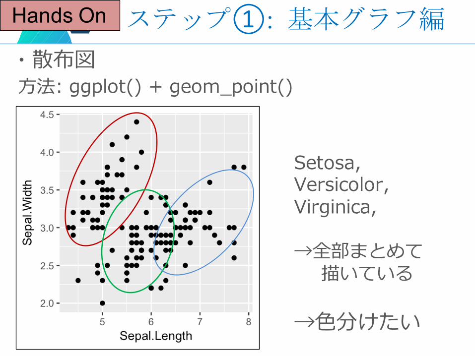
・散布図⽅法: ggplot() + geom_point()
Setosa,Versicolor,Virginica,
→全部まとめて描いている
→⾊分けたい
ステップ①: 基本グラフ編Hands On
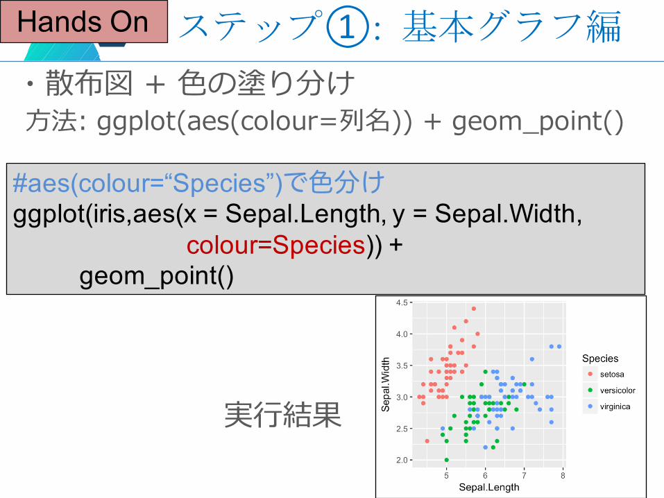
・散布図 + ⾊の塗り分け⽅法: ggplot(aes(colour=列名)) + geom_point()
#aes(colour=“Species”)で色分けggplot(iris,aes(x = Sepal.Length, y = Sepal.Width,
colour=Species)) +geom_point()
実⾏結果
ステップ①: 基本グラフ編Hands On
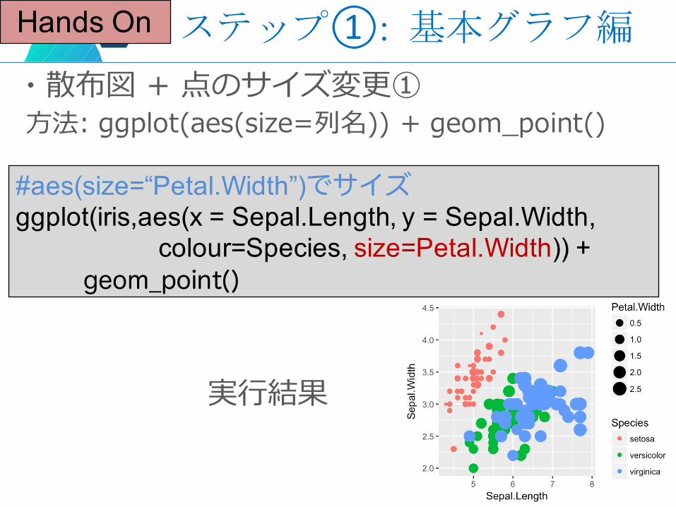
・散布図 + 点のサイズ変更①⽅法: ggplot(aes(size=列名)) + geom_point()
#aes(size=“Petal.Width”)でサイズggplot(iris,aes(x = Sepal.Length, y = Sepal.Width,
colour=Species, size=Petal.Width)) +geom_point()
実⾏結果
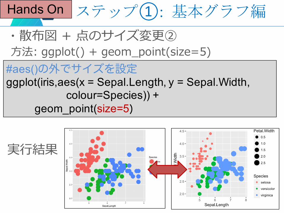
ステップ①: 基本グラフ編Hands On
・散布図 + 点のサイズ変更②⽅法: ggplot() + geom_point(size=5)
#aes()の外でサイズを設定ggplot(iris,aes(x = Sepal.Length, y = Sepal.Width,
colour=Species)) +geom_point(size=5)
実⾏結果
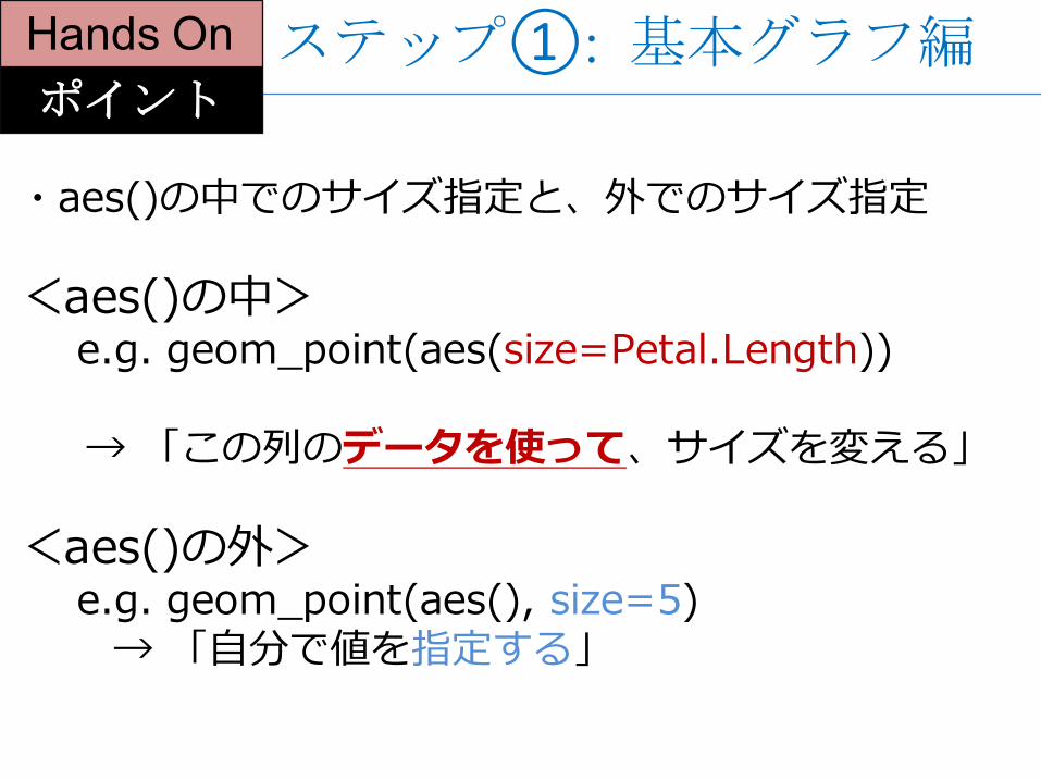
・aes()の中でのサイズ指定と、外でのサイズ指定
<aes()の中>e.g. geom_point(aes(size=Petal.Length))
→ 「この列のデータを使って、サイズを変える」
<aes()の外>e.g. geom_point(aes(), size=5)
→ 「⾃分で値を指定する」
ポイント
Hands On ステップ①: 基本グラフ編
ハンズオンプログラム
・ステップ②: グラフ重ね書き編― 回帰直線(密度曲線)Hands On
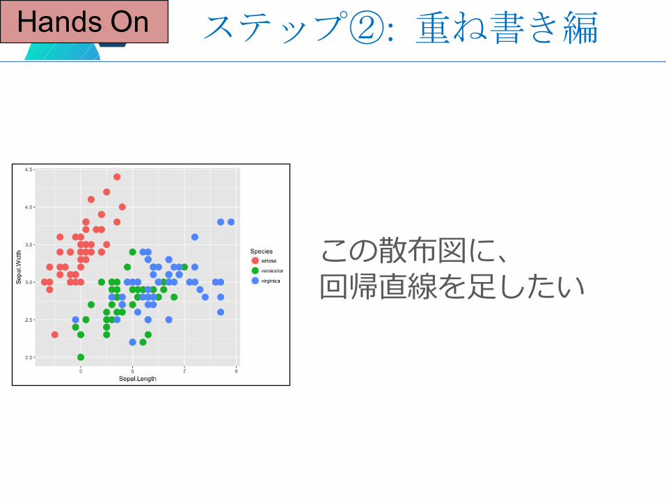
ステップ②: 重ね書き編Hands On
この散布図に、回帰直線を⾜したい
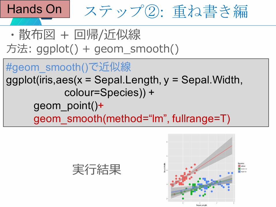
ステップ②: 重ね書き編Hands On
・散布図 + 回帰/近似線⽅法: ggplot() + geom_smooth()#geom_smooth()で近似線ggplot(iris,aes(x = Sepal.Length, y = Sepal.Width,
colour=Species)) +geom_point()+geom_smooth(method=“lm”, fullrange=T)
実⾏結果
ハンズオンプログラム
・ステップ③: 設定重ね書き編― グラフ分割・⾊の変更・テーマHands On
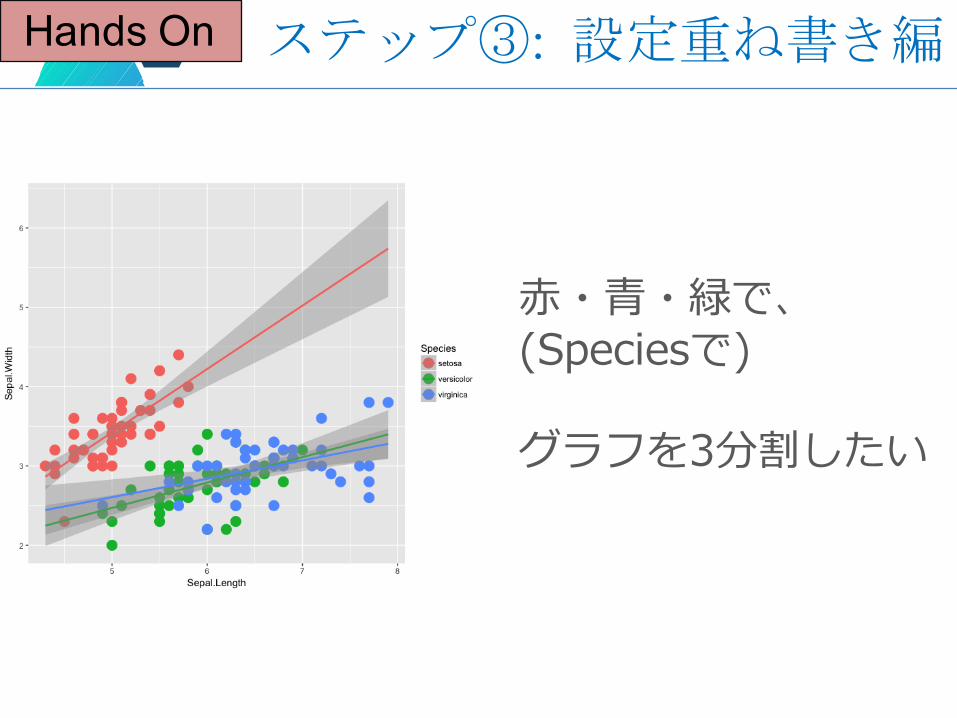
ステップ③: 設定重ね書き編Hands On
⾚・⻘・緑で、(Speciesで)
グラフを3分割したい
Hands On
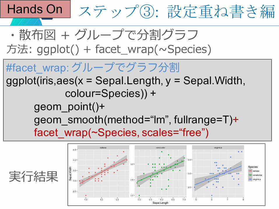
・散布図 + グループで分割グラフ⽅法: ggplot() + facet_wrap(~Species)#facet_wrap: グループでグラフ分割ggplot(iris,aes(x = Sepal.Length, y = Sepal.Width,
colour=Species)) +geom_point()+geom_smooth(method=“lm”, fullrange=T)+facet_wrap(~Species, scales=“free”)
実⾏結果
ステップ③: 設定重ね書き編
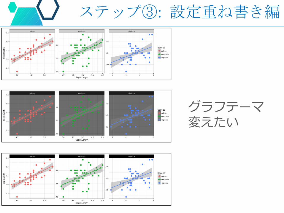
グラフテーマ変えたい
ステップ③: 設定重ね書き編
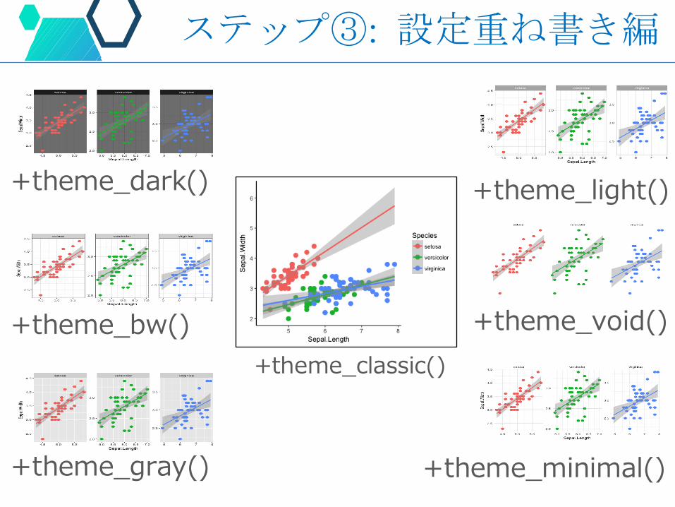
+theme_dark()
+theme_bw()
+theme_gray()
+theme_light()
+theme_void()
+theme_minimal()
+theme_classic()
ステップ③: 設定重ね書き編
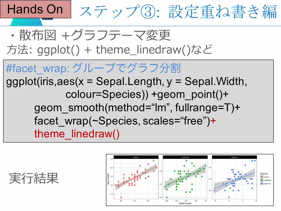
Hands On
・散布図 +グラフテーマ変更⽅法: ggplot() + theme_linedraw()など#facet_wrap: グループでグラフ分割ggplot(iris,aes(x = Sepal.Length, y = Sepal.Width,
colour=Species)) +geom_point()+geom_smooth(method=“lm”, fullrange=T)+facet_wrap(~Species, scales=“free”)+theme_linedraw()
実⾏結果
ステップ③: 設定重ね書き編
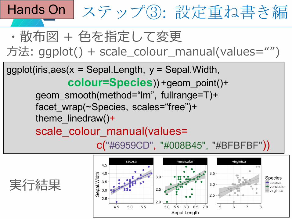
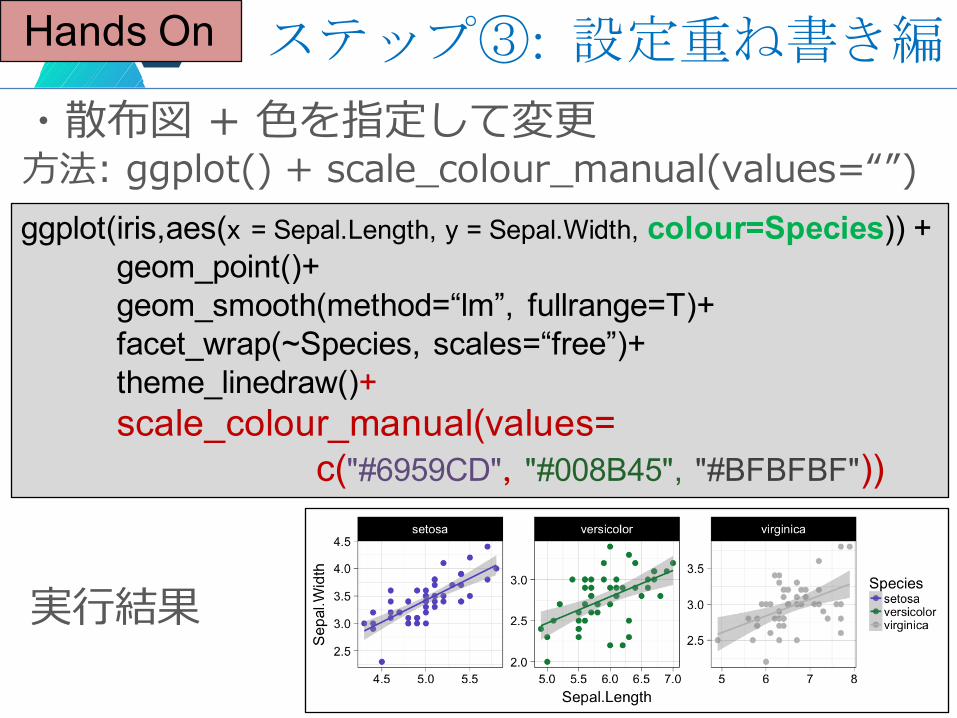
Hands On
・散布図 + ⾊を指定して変更⽅法: ggplot() + scale_colour_manual(values=“”)ggplot(iris,aes(x = Sepal.Length, y = Sepal.Width,
colour=Species)) +geom_point()+geom_smooth(method=“lm”, fullrange=T)+facet_wrap(~Species, scales=“free”)+theme_linedraw()+scale_colour_manual(values=
c("#6959CD", "#008B45", "#BFBFBF"))
実⾏結果
ステップ③: 設定重ね書き編
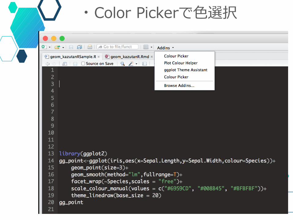
・Color Pickerで⾊選択
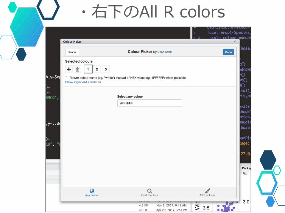
・右下のAll R colors
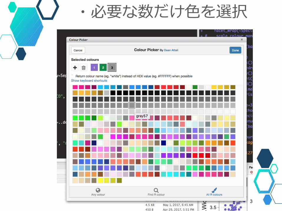
・必要な数だけ⾊を選択
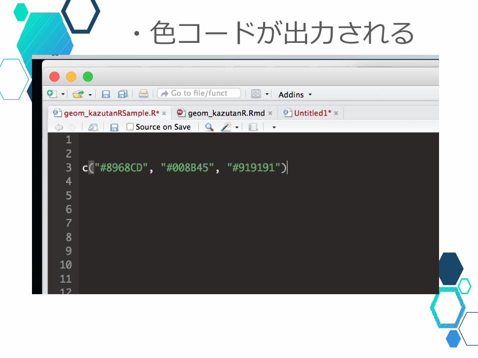
・⾊コードが出⼒される
Hands On
・散布図 + ⾊を指定して変更⽅法: ggplot() + scale_colour_manual(values=“”)ggplot(iris,aes(x = Sepal.Length, y = Sepal.Width, colour=Species)) +
geom_point()+geom_smooth(method=“lm”, fullrange=T)+facet_wrap(~Species, scales=“free”)+theme_linedraw()+scale_colour_manual(values=
c("#6959CD", "#008B45", "#BFBFBF"))
実⾏結果
ステップ③: 設定重ね書き編
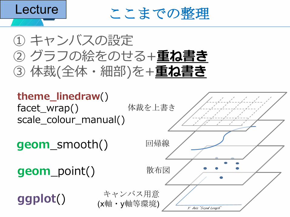
① キャンバスの設定② グラフの絵をのせる+重ね書き③ 体裁(全体・細部)を+重ね書き
キャンバス用意(x軸・y軸等環境)
散布図
回帰線
体裁を上書き
X Axis “Sepal Length”
ggplot()
geom_point()
geom_smooth()
theme_linedraw()facet_wrap()scale_colour_manual()
ここまでの整理Lecture
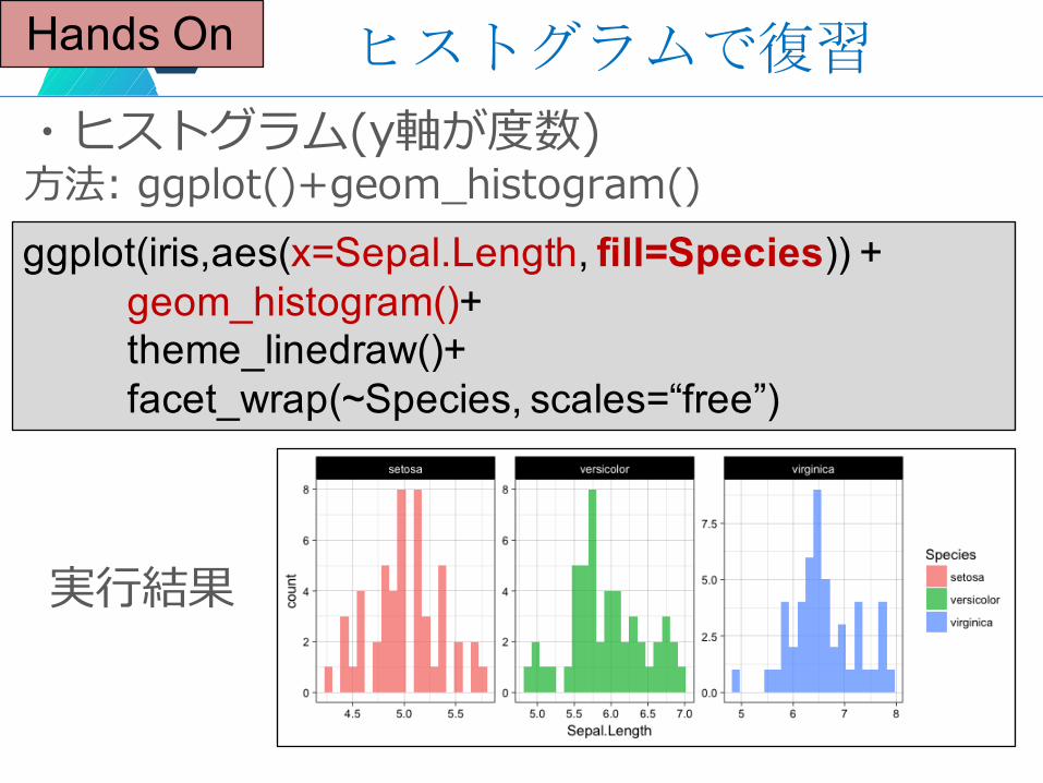
Hands On
・ヒストグラム(y軸が度数)⽅法: ggplot()+geom_histogram()ggplot(iris,aes(x=Sepal.Length, fill=Species)) +
geom_histogram()+theme_linedraw()+facet_wrap(~Species, scales=“free”)
実⾏結果
ヒストグラムで復習
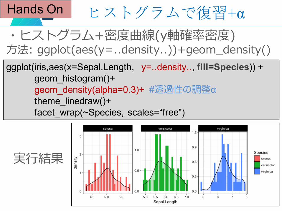
Hands On
・ヒストグラム+密度曲線(y軸確率密度)⽅法: ggplot(aes(y=..density..))+geom_density()ggplot(iris,aes(x=Sepal.Length, y=..density.., fill=Species)) +
geom_histogram()+geom_density(alpha=0.3)+ #透過性の調整αtheme_linedraw()+facet_wrap(~Species, scales=“free”)
実⾏結果
ヒストグラムで復習+α
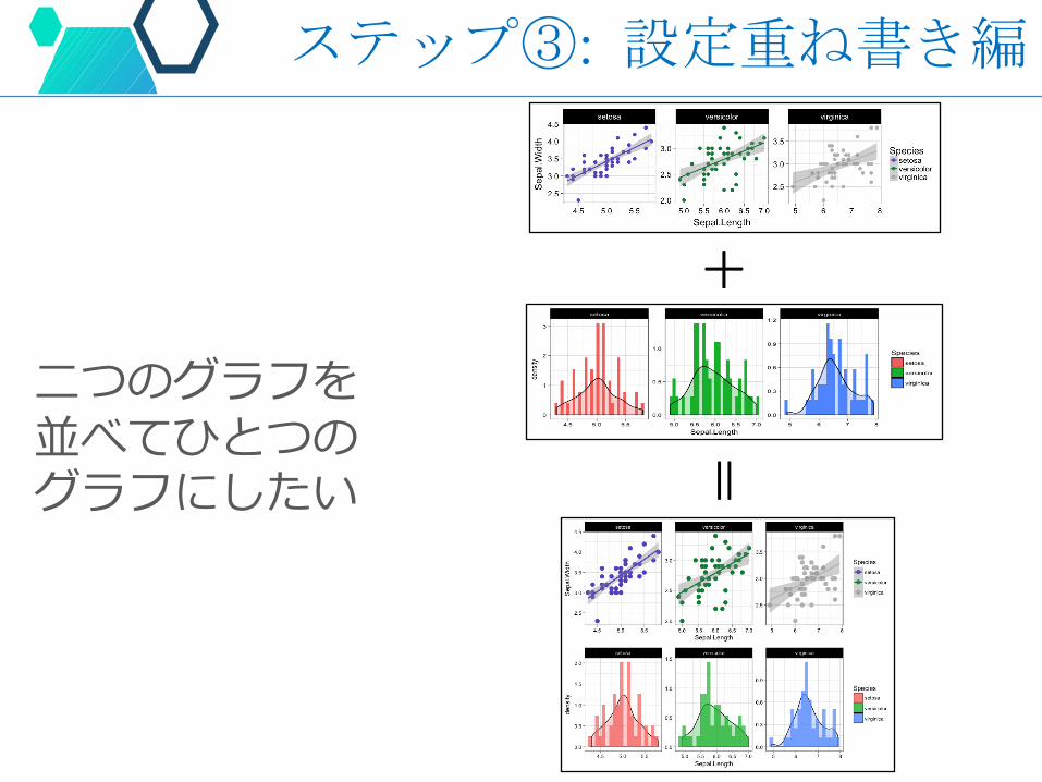
⼆つのグラフを並べてひとつのグラフにしたい
ステップ③: 設定重ね書き編
+=
Hands On
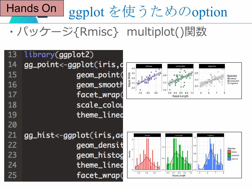
・パッケージ{Rmisc} multiplot()関数ggplotを使うためのoption
Hands On
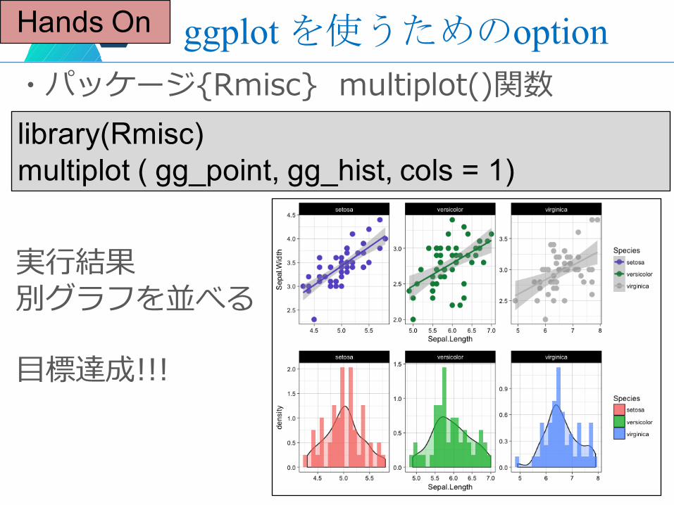
・パッケージ{Rmisc} multiplot()関数ggplotを使うためのoption
実⾏結果別グラフを並べる
⽬標達成!!!
library(Rmisc)multiplot ( gg_point, gg_hist, cols = 1)
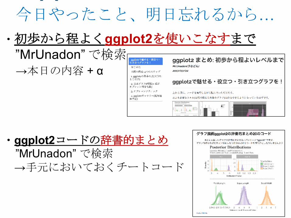
・ggplot2コードの辞書的まとめ”MrUnadon” で検索→手元においておくチートコード
・初歩から程よくggplot2を使いこなすまで”MrUnadon” で検索→本日の内容 + α
今日やったこと、明日忘れるから…
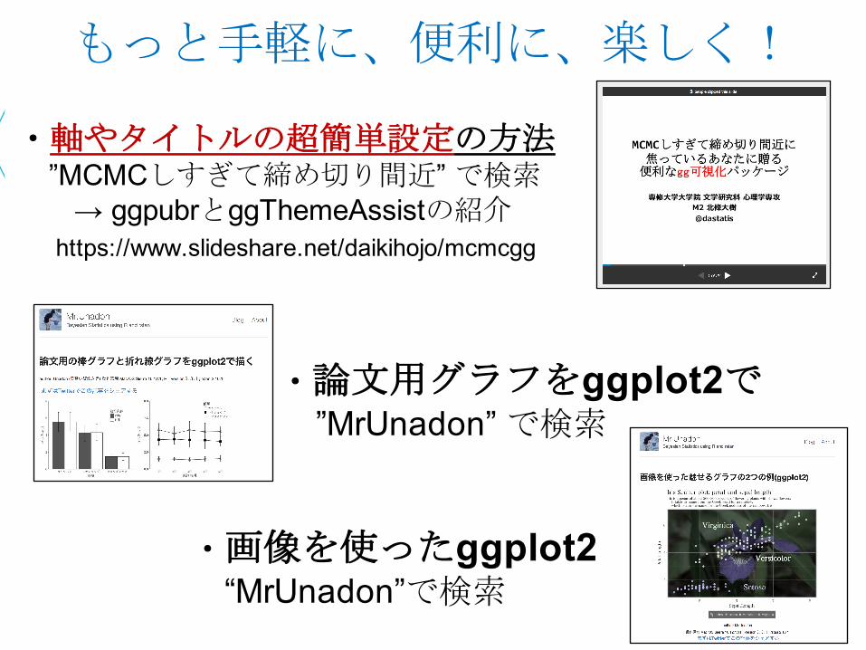
https://www.slideshare.net/daikihojo/mcmcgg
・軸やタイトルの超簡単設定の方法”MCMCしすぎて締め切り間近” で検索
→ ggpubrとggThemeAssistの紹介
・論文用グラフをggplot2で”MrUnadon” で検索
・画像を使ったggplot2“MrUnadon”で検索
もっと手軽に、便利に、楽しく!