Embed Size (px)
Citation preview

FMP EvaluationTom Nichol
Production Process Evaluation
ResearchStrengths• gathering ideas from current magazines to generate my own idea. • Asking people on what they thought of my idea helped me to focus on
what I'm going to produce & receiving positive feedback• Finding out the appropriate information like age range, gender,
Psychographic and social status and then working out what the demographic and content to appeal to the audience is going to be.
Weaknesses • Finding high quality images for my slides. • Getting the correct audience profile
PlanningStrengths • Ideas immerging out of other ideas• Knowing off the bat on what I was going to do• Making my logo all fancy • My first product with the star wars battle front poster cover. Weaknesses• Making a title for my magazine in a certain amount of time• Working too fast on my products • Finding fronts that looked good for my product • Trying to work to my schedule
Time ManagementStrengths • Having a lot of time to complete my work• I did 1 magazine cover per 1/2 days. • A lot of my covers look professional • I also did a magazine spread which I made I took a long time to doWeaknesses • Having too much time to complete my work• Not really sticking to my schedule• Looking back at 2 of my covers, I could of added more to them to make
them look more professional
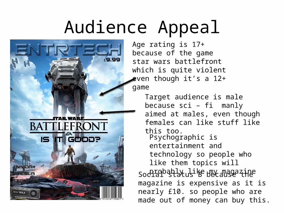
Audience AppealAge rating is 17+ because of the game star wars battlefront which is quite violent even though it’s a 12+ game
Target audience is male because sci – fi manly aimed at males, even though females can like stuff like this too.
Psychographic is entertainment and technology so people who like them topics will probably like my magazine
Social status B because the magazine is expensive as it is nearly £10. so people who are made out of money can buy this.
Technical Qualities
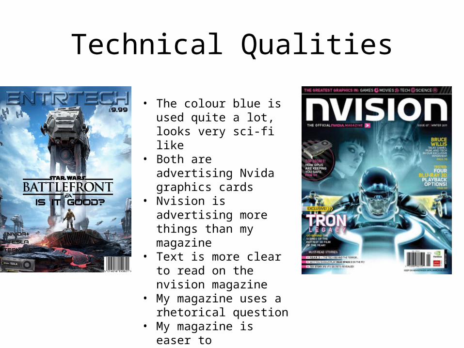
• The colour blue is used quite a lot, looks very sci-fi like
• Both are advertising Nvida graphics cards
• Nvision is advertising more things than my magazine
• Text is more clear to read on the nvision magazine
• My magazine uses a rhetorical question
• My magazine is easer to concentrate on because it uses less colours than nvision magazine

Aesthetic Qualities• I chose these covers because there the ones I like the most • These covers are very creative in that they are very different styles
but at the same time there not • Some of my magazine covers (that aren't shown) look rubbish
because I took less time to create them so I could probably improve them
Strengths • Knowing straight of the bat on what I was going to doWeaknesses • Rushing with some of my magazine covers • Time management
#PeerpresureFeedback
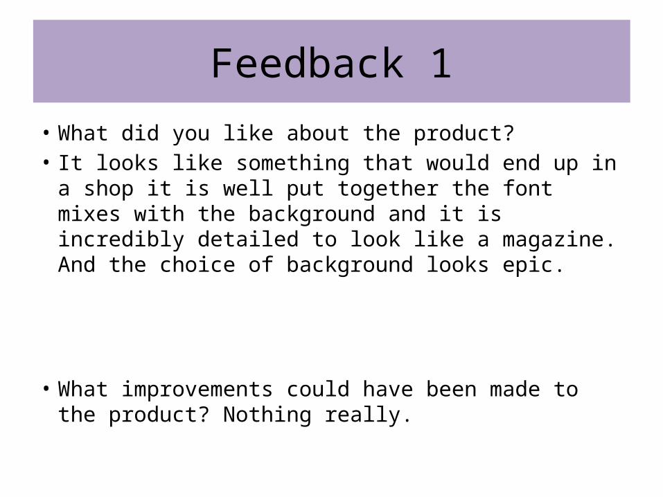
Feedback 1
• What did you like about the product?• It looks like something that would end up in a shop it is
well put together the font mixes with the background and it is incredibly detailed to look like a magazine. And the choice of background looks epic.
• What improvements could have been made to the product? Nothing really.

Feedback 2
• What did you like about the product?
– I like about this magazine cover is that it looks like a professional magazine front cover page. The font that has been chosen for this magazine does contrast with the theme of the magazine very good.
• What improvements could have been made to the product?– The improvements that they could make the colour better
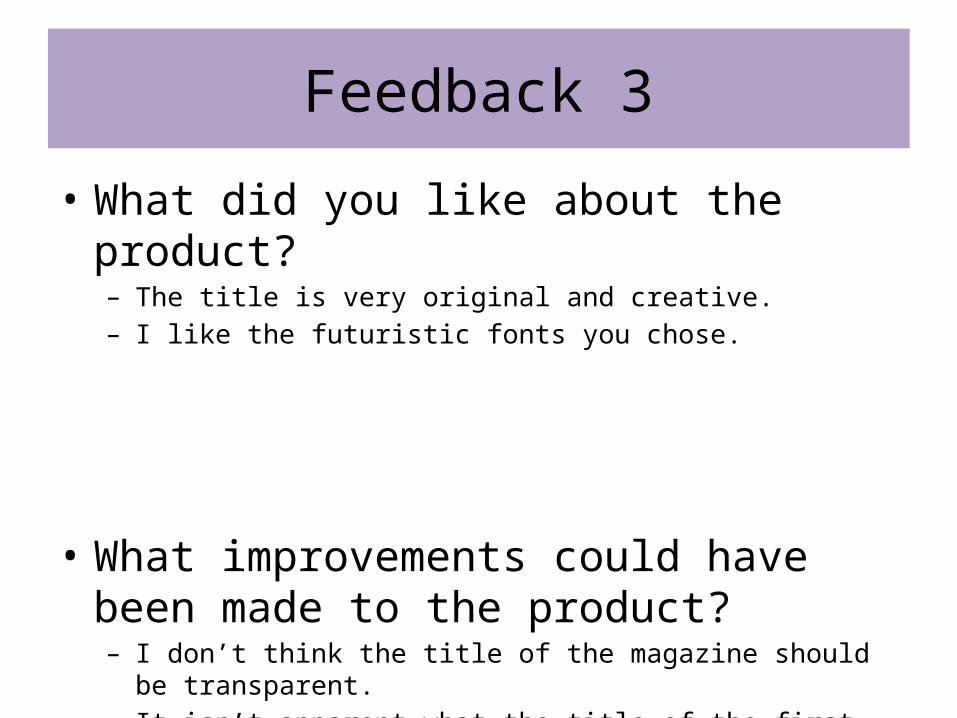
Feedback 3
• What did you like about the product?– The title is very original and creative.– I like the futuristic fonts you chose.
• What improvements could have been made to the product?– I don’t think the title of the magazine should be transparent.– It isn’t apparent what the title of the first movie is.
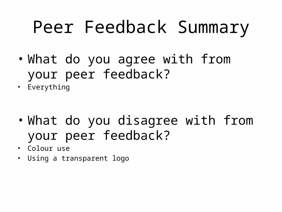
Peer Feedback Summary
• What do you agree with from your peer feedback?
• Everything
• What do you disagree with from your peer feedback?
• Colour use• Using a transparent logo
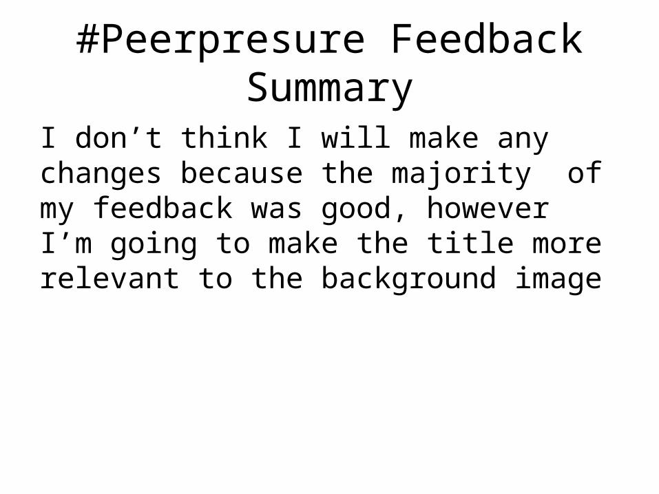
#Peerpresure Feedback Summary
I don’t think I will make any changes because the majority of my feedback was good, however I’m going to make the title more relevant to the background image