Embed Size (px)
Citation preview
Question 1
❖ In what ways does your media product use, develop or
challenge forms and conventions of real media
products?
❖ What are the conventions of a regional magazine?
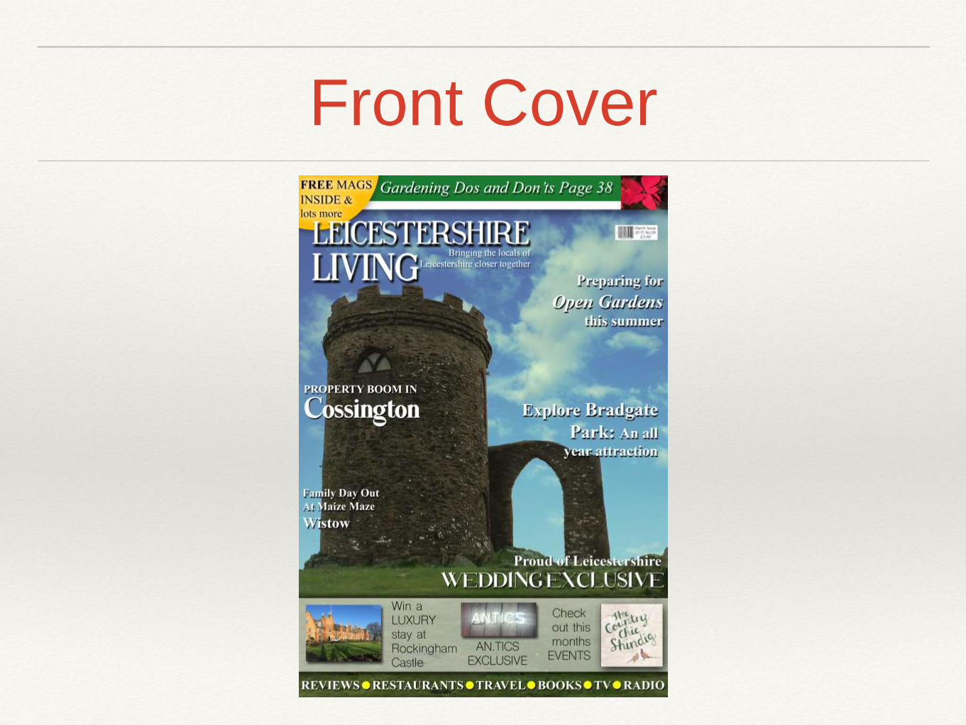
Front Cover
Conventions of a Front Cover
• A regional magazine will feature all the typical codes and conventions of a
magazine.
• Code and convention rules for a magazine front cover would include the
following:
• Masthead- clear title and the name of the regional magazine
• Cover stories- what the regional magazine features- using cover
stories as sell lines aims to persuade the reader to purchase the
magazine.
• Barcode
• Advertisement- in regional magazines this would uses include local
businesses
• A large image, that fills the majority of the page, normally focusing on
something in particular, for example a image of a local area as it is a
regional magazine.
In what ways does your media product use, develop or challenge forms and conventions of real media
products?
• My masthead conforms to the convention of it being clear and bold
❖ From all the font sizes on the page, the masthead’s is the largest as it
covers the first two top thirds when applying the rule of thirds. This, or the
covering of the whole top row is conventional for a regional magazine as
the masthead tends to be quite long. This is contrasting music genre
magazines like Q that only use one third.
❖ The use of a white masthead has connotations of purity and is used to
contrast the darker main image, if I used black for the masthead, it would
not be so vibrant and it would be hard to read. This creates a binary
opposition with the black that is used as a drop shadow, it reflects the
idea of nature containing purity and evil and this magazine overrules the
evil and focuses on the beauty of nature.
In what ways does your media product use, develop or challenge forms and conventions of real media
products?
• Cover stories- what the regional magazine features- using cover stories as
sell lines aims to persuade the reader to purchase the magazine. My
masthead conforms to the convention of it being clear and bold
❖ From all the font sizes on the page, the masthead’s is the largest as it
covers the first two top thirds when applying the rule of thirds. This, or the
covering of the whole top row is conventional for a regional magazine as
the masthead tends to be quite long. This is contrasting music genre
magazines like Q that only use one third.
❖ The use of a white masthead has connotations of purity and is used to
contrast the darker main image, if I used black for the masthead, it would
not be so vibrant and it would be hard to read. This creates a binary
opposition with the black that is used as a drop shadow, it reflects the idea
of nature containing purity and evil and this magazine overrules the evil
and focuses on the beauty of nature.
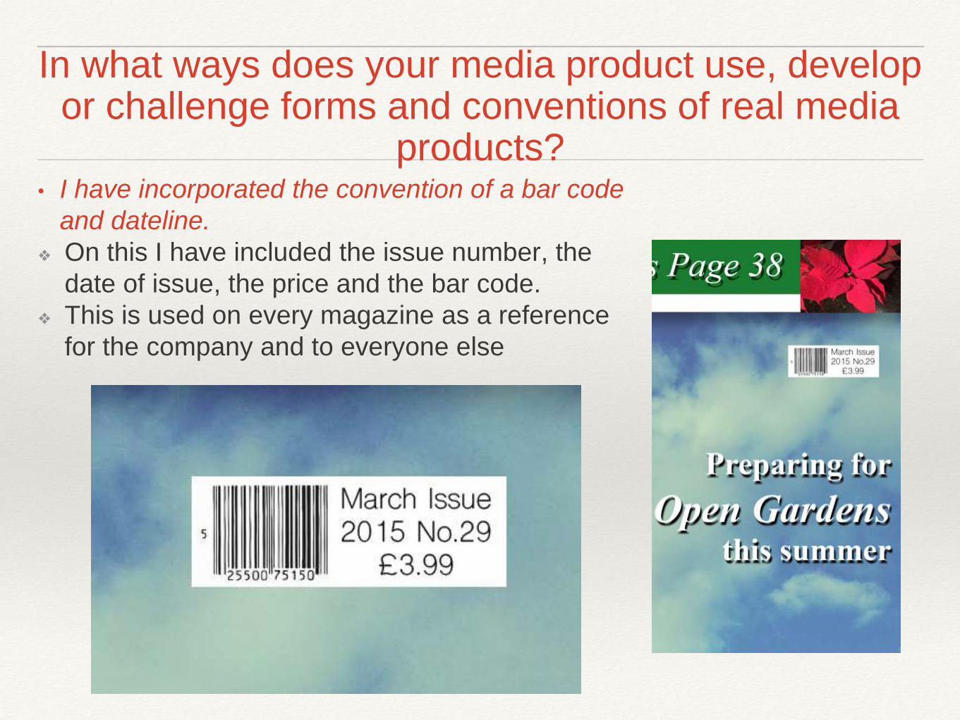
In what ways does your media product use, develop or challenge forms and conventions of real media
products?• I have incorporated the convention of a bar code
and dateline.
❖ On this I have included the issue number, the
date of issue, the price and the bar code.
❖ This is used on every magazine as a reference
for the company and to everyone else
Cover Lines
• My masthead conforms to the convention of it being clear and bold
• Masthead- clear title and the name of the regional magazine
• Cover stories- what the regional magazine features- using cover
stories as sell lines aims to persuade the reader to purchase the
magazine.
• Barcode
• Advertisement- in regional magazines this would uses include local
businesses
• A large image, that fills the majority of the page, normally focusing on
something in particular, for example a image of a local area as it is a
regional magazine.
In what ways does your media product use, develop or challenge forms and conventions of real media
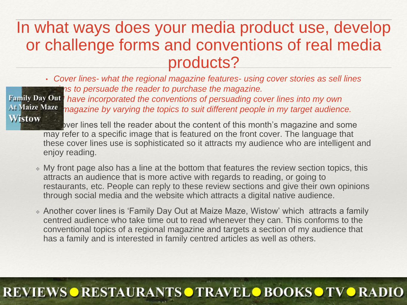
products?• Cover lines- what the regional magazine features- using cover stories as sell lines
aims to persuade the reader to purchase the magazine.
• I have incorporated the conventions of persuading cover lines into my own
magazine by varying the topics to suit different people in my target audience.
❖ My cover lines tell the reader about the content of this month’s magazine and some may refer to a specific image that is featured on the front cover. The language that these cover lines use is sophisticated so it attracts my audience who are intelligent and enjoy reading.
❖ My front page also has a line at the bottom that features the review section topics, this attracts an audience that is more active with regards to reading, or going to restaurants, etc. People can reply to these review sections and give their own opinions through social media and the website which attracts a digital native audience.
❖ Another cover lines is ‘Family Day Out at Maize Maze, Wistow’ which attracts a family centred audience who take time out to read whenever they can. This conforms to the conventional topics of a regional magazine and targets a section of my audience that has a family and is interested in family centred articles as well as others.
Barcode
• My masthead conforms to the convention of it being clear and bold
• Masthead- clear title and the name of the regional magazine
• Cover stories- what the regional magazine features- using cover
stories as sell lines aims to persuade the reader to purchase the
magazine.
• Barcode
• Advertisement- in regional magazines this would uses include local
businesses
• A large image, that fills the majority of the page, normally focusing on
something in particular, for example a image of a local area as it is a
regional magazine.
In what ways does your media product use, develop or challenge forms and conventions of real media
products?• It is important to have house colours that are consistent
through the magazine and other media products
• I have conformed to this convention as I have used black,
white, blue, green and a small amount of yellow
❖ My house colours are conventional for a regional magazine, many other magazine such as CountryFile and the Archant publications use blue a lot to complement the use of white and yellow. These connotations are of tranquility, intelligence, happiness, etc. When looking at my own magazine I can still create these connotations through the use of blue, green and the small usage of yellow that i included. The use of green creates a different look to other magazines on the market that this would be competing against, such as county magazines, or Countryfile, creating a USP
Advertisement
• My masthead conforms to the convention of it being clear and bold
• Masthead- clear title and the name of the regional magazine
• Cover stories- what the regional magazine features- using cover
stories as sell lines aims to persuade the reader to purchase the
magazine.
• Barcode
• Advertisement- in regional magazines this would uses include local
businesses
• A large image, that fills the majority of the page, normally focusing on
something in particular, for example a image of a local area as it is a
regional magazine.
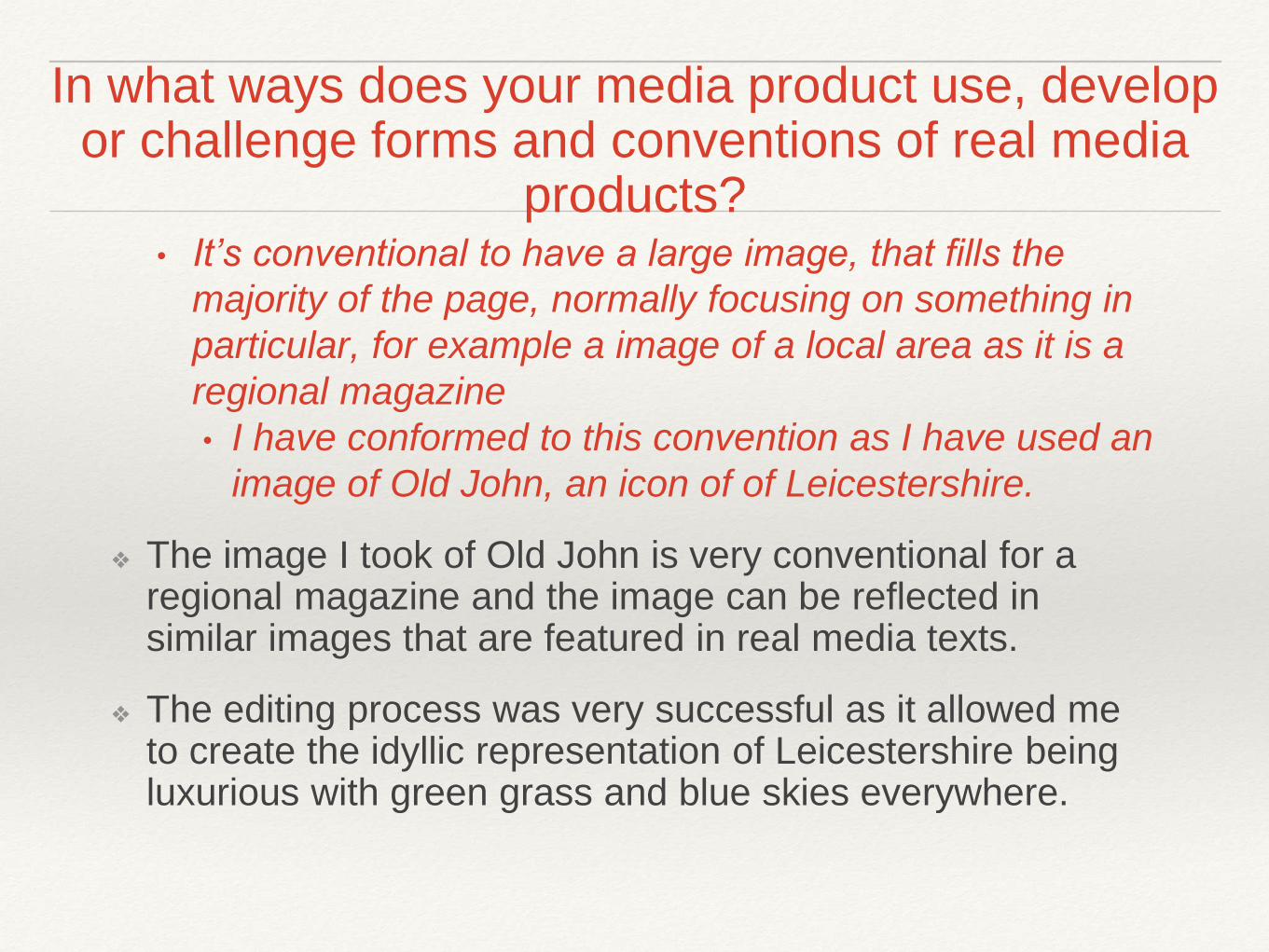
In what ways does your media product use, develop or challenge forms and conventions of real media
products?• It’s conventional to have a large image, that fills the
majority of the page, normally focusing on something in
particular, for example a image of a local area as it is a
regional magazine
• I have conformed to this convention as I have used an
image of Old John, an icon of of Leicestershire.
❖ The image I took of Old John is very conventional for a regional magazine and the image can be reflected in similar images that are featured in real media texts.
❖ The editing process was very successful as it allowed me to create the idyllic representation of Leicestershire being luxurious with green grass and blue skies everywhere.
Large Image
• My masthead conforms to the convention of it being clear and bold
• Masthead- clear title and the name of the regional magazine
• Cover stories- what the regional magazine features- using cover
stories as sell lines aims to persuade the reader to purchase the
magazine.
• Barcode
• Advertisement- in regional magazines this would uses include local
businesses
• A large image, that fills the majority of the page, normally focusing on
something in particular, for example a image of a local area as it is a
regional magazine.
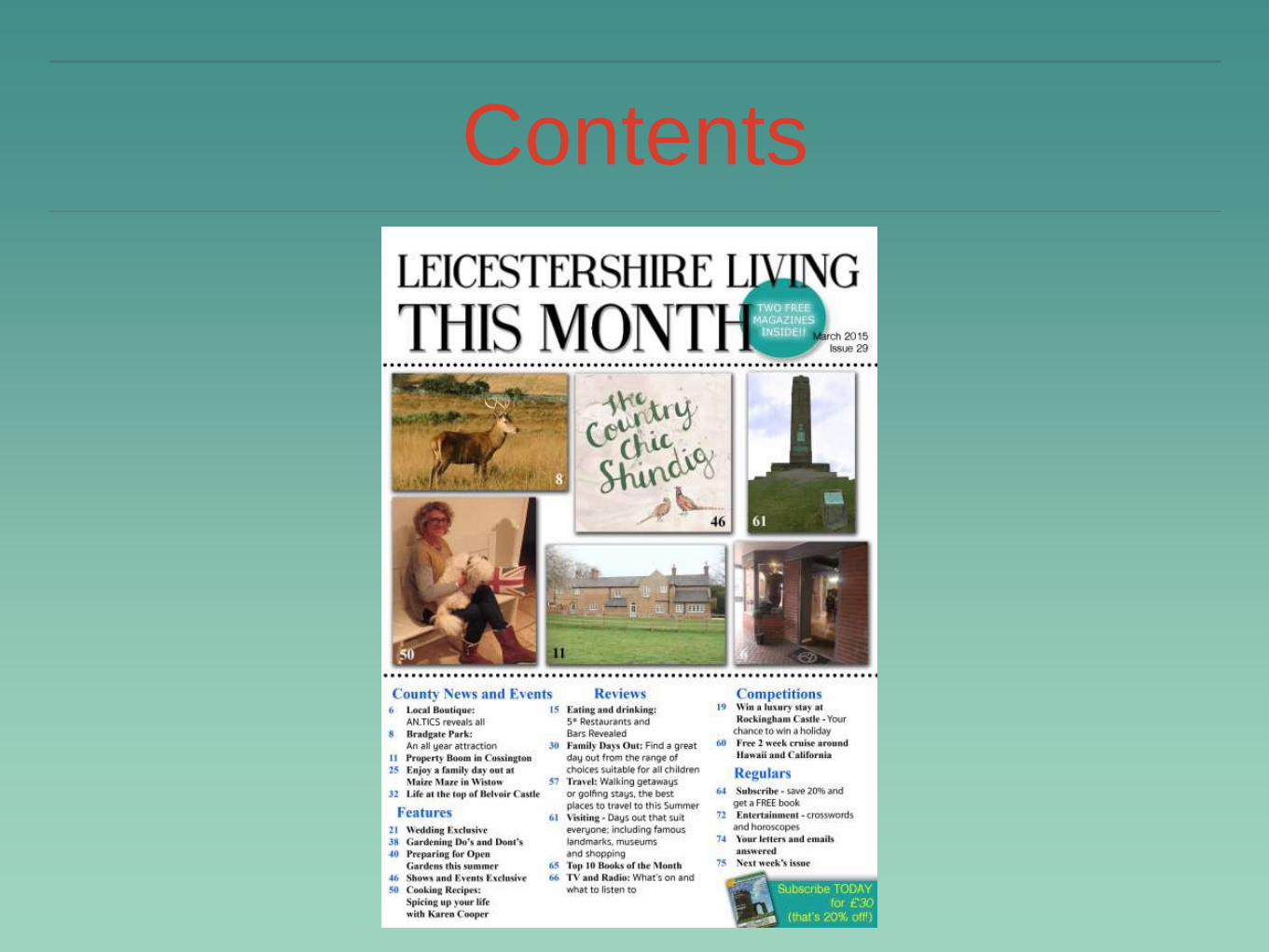
Contents
Conventions of a Contents Page
• Often the contents page is arranged in columns – 2/3
• A page number sometimes with a picture beside it to make it easier
for the reader to go to the page with the image that intrigues them.
• The magazine name will feature at the top of the page
• Often have a simple colour scheme to give a professional look
• Contents page in a regional magazine often covers 1-2 pages
• Information about subscription to the magazine are also featured to
gain extra custom.
• Sub - lines are also a key feature in a regional magazine
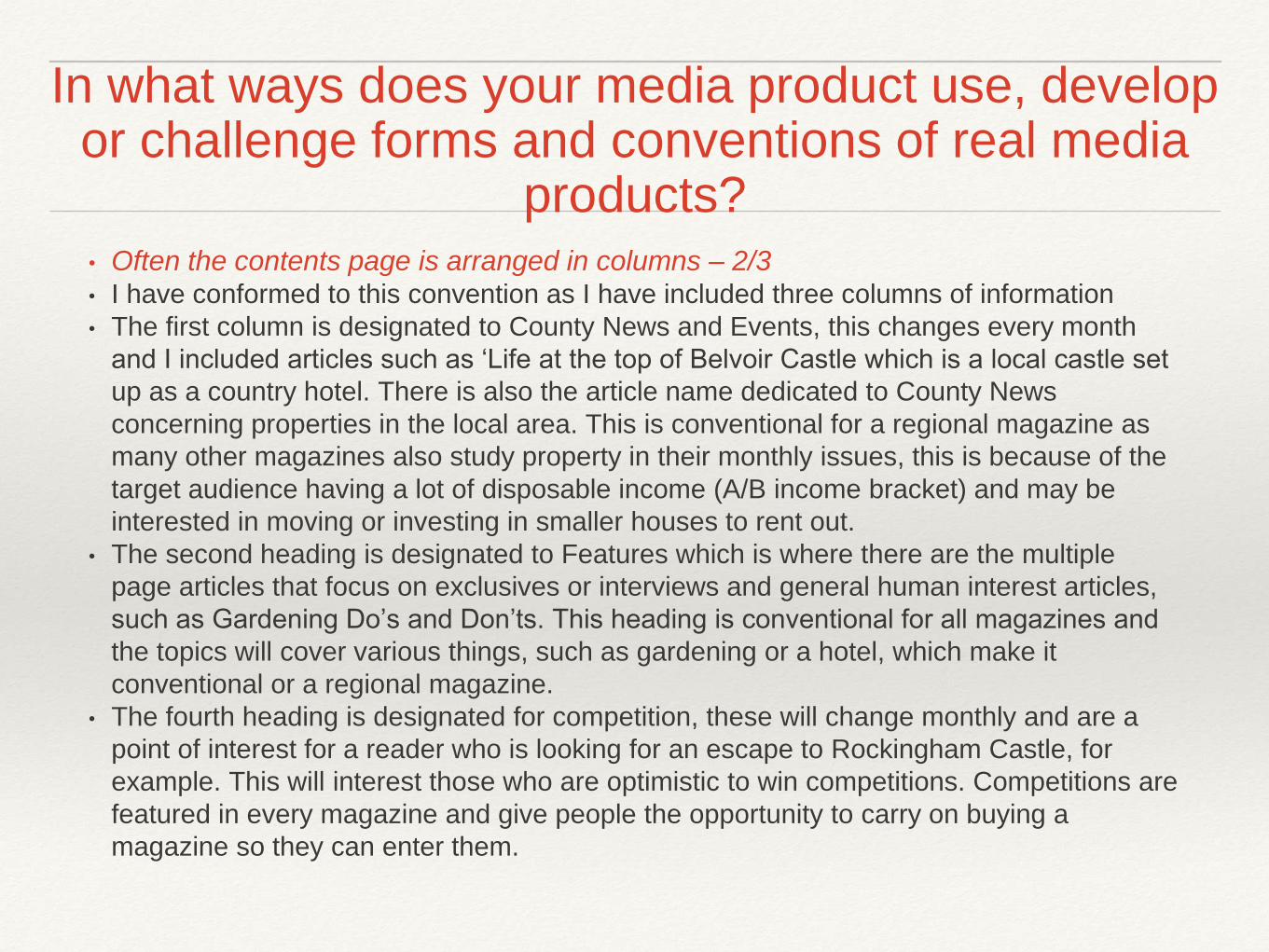
• Often the contents page is arranged in columns – 2/3• I have conformed to this convention as I have included three columns of information
• The first column is designated to County News and Events, this changes every month
and I included articles such as ‘Life at the top of Belvoir Castle which is a local castle set
up as a country hotel. There is also the article name dedicated to County News
concerning properties in the local area. This is conventional for a regional magazine as
many other magazines also study property in their monthly issues, this is because of the
target audience having a lot of disposable income (A/B income bracket) and may be
interested in moving or investing in smaller houses to rent out.
• The second heading is designated to Features which is where there are the multiple
page articles that focus on exclusives or interviews and general human interest articles,
such as Gardening Do’s and Don’ts. This heading is conventional for all magazines and
the topics will cover various things, such as gardening or a hotel, which make it
conventional or a regional magazine.
• The fourth heading is designated for competition, these will change monthly and are a
point of interest for a reader who is looking for an escape to Rockingham Castle, for
example. This will interest those who are optimistic to win competitions. Competitions are
featured in every magazine and give people the opportunity to carry on buying a
magazine so they can enter them.
In what ways does your media product use, develop or challenge forms and conventions of real media
products?
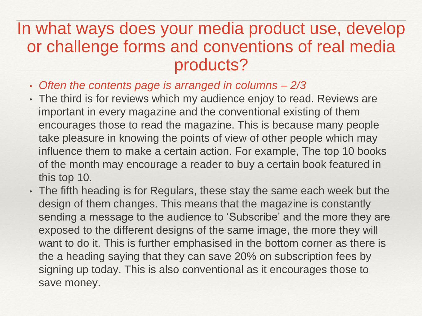
• Often the contents page is arranged in columns – 2/3• The third is for reviews which my audience enjoy to read. Reviews are
important in every magazine and the conventional existing of them
encourages those to read the magazine. This is because many people
take pleasure in knowing the points of view of other people which may
influence them to make a certain action. For example, The top 10 books
of the month may encourage a reader to buy a certain book featured in
this top 10.
• The fifth heading is for Regulars, these stay the same each week but the
design of them changes. This means that the magazine is constantly
sending a message to the audience to ‘Subscribe’ and the more they are
exposed to the different designs of the same image, the more they will
want to do it. This is further emphasised in the bottom corner as there is
the a heading saying that they can save 20% on subscription fees by
signing up today. This is also conventional as it encourages those to
save money.
In what ways does your media product use, develop or challenge forms and conventions of real media
products?
• A page number sometimes with a picture beside it to make it
easier for the reader to go to the page with the image that
intrigues them.• I have not included a page number on this as I did not think that it
would be covered in the contents page so the pages start from page
six.
• If I was to do this again, I would include the page numbers as this is
an important reference for other people can makes it easier for them
to navigate from page to page, and it is very unconventional not to
include them.
In what ways does your media product use, develop or challenge forms and conventions of real media
products?

• The magazine name will feature at the top of the page• I have conformed to this convention as Leicestershire Living is
featured at the top of the page covering all of the top row when
applying the rule of thirds.
• ‘Contents’ is featured underneath it in the same font but a bigger
size, this is conventional as it is focusing on the contents page as we
have already the seen the masthead on the front cover. The
Leicestershire Living masthead does not need to a focal point of this
page because people know that it is Leicestershire Living that they’re
reading.
In what ways does your media product use, develop or challenge forms and conventions of real media
products?
Conventions of a Contents Page
• Often have a simple colour scheme to give a professional look• I have conformed to this convention as I have carried on the house
style. I have focused more on using the green and used the blue for
the headlines. This is because a connotation of the colour blue is
intellect and this comes across through the text. The green has
connotations of harmony and this is better suited as a shape colour
to draw attention in as it stands out against the white.
Conventions of a Contents Page
• Contents page in a regional magazine often covers 1-2 pages• I have conformed to this convention as my contents is only featured
over one page. Originally when I first found the design of this contents
in Countryfile I wanted to create a double contents page to better
reflect real life text. If I was to do this again I would look into doing it
but I still think that the one page contents looks effective
• Information about subscription to the magazine are also featured
to gain extra custom.• I have spoken about this previously and I believe I have conformed to
this convention, also. In the heading ‘Regulars’ it shows that there is a
page dedicated to subscription information and also at the bottom of
the contents page there is a box about the subscription being 20%
cheaper if they bought it today. This form of marketing is successful
as it entices the audience into subscribing and reading the magazine
each month.

Double Page Spread
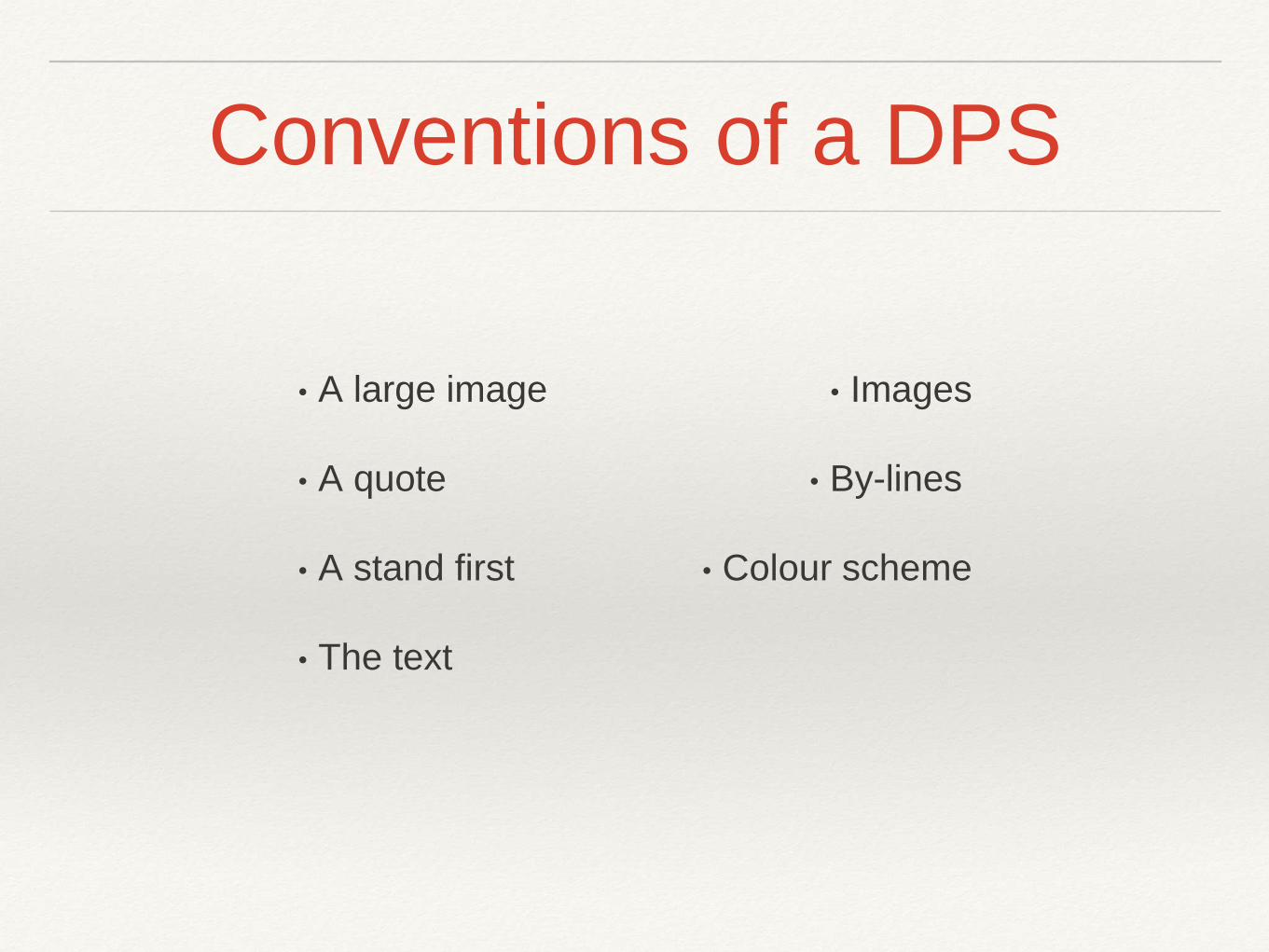
Conventions of a DPS
• Images
• By-lines
• Colour scheme
• A large image
• A quote
• A stand first
• The text
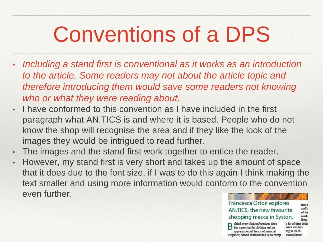
Conventions of a DPS• Including a stand first is conventional as it works as an introduction
to the article. Some readers may not about the article topic and
therefore introducing them would save some readers not knowing
who or what they were reading about.• I have conformed to this convention as I have included in the first
paragraph what AN.TICS is and where it is based. People who do not
know the shop will recognise the area and if they like the look of the
images they would be intrigued to read further.
• The images and the stand first work together to entice the reader.
• However, my stand first is very short and takes up the amount of space
that it does due to the font size, if I was to do this again I think making the
text smaller and using more information would conform to the convention
even further.
Conventions of a DPS
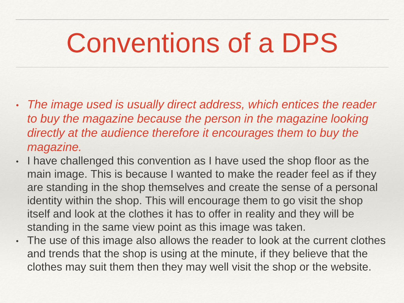
• The image used is usually direct address, which entices the reader
to buy the magazine because the person in the magazine looking
directly at the audience therefore it encourages them to buy the
magazine.• I have challenged this convention as I have used the shop floor as the
main image. This is because I wanted to make the reader feel as if they
are standing in the shop themselves and create the sense of a personal
identity within the shop. This will encourage them to go visit the shop
itself and look at the clothes it has to offer in reality and they will be
standing in the same view point as this image was taken.
• The use of this image also allows the reader to look at the current clothes
and trends that the shop is using at the minute, if they believe that the
clothes may suit them then they may well visit the shop or the website.
Conventions of a DPS
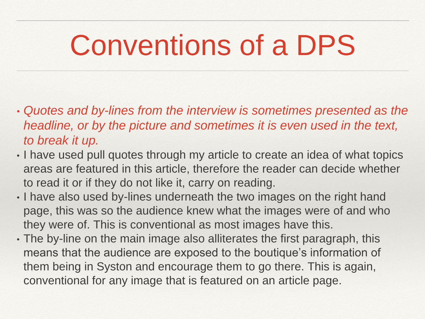
• Quotes and by-lines from the interview is sometimes presented as the
headline, or by the picture and sometimes it is even used in the text,
to break it up.• I have used pull quotes through my article to create an idea of what topics
areas are featured in this article, therefore the reader can decide whether
to read it or if they do not like it, carry on reading.
• I have also used by-lines underneath the two images on the right hand
page, this was so the audience knew what the images were of and who
they were of. This is conventional as most images have this.
• The by-line on the main image also alliterates the first paragraph, this
means that the audience are exposed to the boutique’s information of
them being in Syston and encourage them to go there. This is again,
conventional for any image that is featured on an article page.
Conventions of a DPS
All text on a double page spread is size 11 pt and is usually aerial font, however some magazines
make the font connote the genre. All double page spreads have a drop cap which shows the
reader when to start reading. The text is set into columns, usually 2-4 columns. This is to
make the text appear tidy and not all over the page. The page number, magazine name and
text throughout usually use the same font.
I have conformed to this text size as my text size is also a size 11. However, I have not used the
aerial font as I feel as if Times New Roman has better connotations of formality that will relate
more to my audience. The font used is very easy to read which will be positive for anyone
who reads it.
I have also conformed to the convention of a drop cap, I created a green box and edited the size
and colour of the ‘B’ so that it would feature through the first three lines of the paragraph.
I have conformed to convention of using 2-4 columns as I have used three on each page. I felt as if
two columns was too long winded for a line and thought that four columns was the complete
opposite, i feel as if using three was the correct decision and it follows conventions.
I have challenged this convention as my page numbers are in Times New Roman to match the
body, this is used for the magazine name at the top. I like this challenge of convention.
Conventions of a DPS
Double page spreads follow the same house style that is ran
throughout the magazine, it is usually simple so it doesn’t overpower
the article. The colour schemes used connote which genre the
magazine is.
This is a prominent feature as
• My drop quotes are in blue and the text information under the images is
also blue.
• My introductory paragraph is in green and so is the drop cap box. There
are also two leaves in each corner that are faded but green can be seen
on them
• The black and white is used as the background and the text colour. This is
important as it highlights text from their background and creates
connotations of formality and sophistication within the text itself. I have
conformed to the house style being present through the magazine, as all
of my house style colours are featured on this page.
Conventions of a DPS
The main image on the double page spread is usually on the left.
Sometimes the image bleeds over the whole page, although this
is not in every regional magazine, it is relatively common. The
picture on the double page spread always relates to the article
and the artist and are ascetically pleasing.• I have conformed to the convention of the image being on the left hand
side and the convention of an image spilling over to the next page, this
rejects the rule of thirds theory as it is less organised and the two pages
do not have a structure that abides by the rule of thirds.
• The image is of the shop floor that the article is dedicated to, so this
follows the conventions of the image corresponding with the article topic.
The image is also very effective, as I have already discussed and definitely
conforms to the aesthetically pleasing convention.